The Brief
Create a series of between 6 and 10 photographs on one of the following subjects:
- Things
- Views
- Heads
Some Thoughts on This Brief
The theme for this assignment is Collecting, which breaks down into three potential subject areas: Things, Views and Heads. One of the first things that sprang to mind was something that actually could fit into any of the three areas, but was best classed as ‘Things’. The more I consider my idea, the more I realise that it both challenges my photography in terms of technical and artistic perspective.
My Idea
Ut imago est animi voltus sic indices oculi’ (The face is a picture of the mind as the eyes are its interpreter), Cicero (106-43 B.C.)
A few weeks ago, I was off sick from work with the usual bout of winter flu-like illness that goes around a large office like mine. Not being able to do much, I watched a procession of films on the TV in between naps, not really paying much attention to what was happening on the screen. One of the films I watched that week was the 1991 film The Addams Family, which is enjoyable but not a particular favourite. However, I noticed during the film the interesting lighting arrangement for Anjelica Huston, who played the family matriarch, Morticia. The cinematographer had chosen to light her in just a very small region around her eyes to create a ghostly glow [1]. The effect is most noticeable when the character is in a low light scene, which is pretty much the whole film.

")
My curiosity led to some research into how this effect was created, but more importantly, I studied Huston’s face in photographs more closely in doing so. One of her characteristic features is her seemingly large eyes that are not easy to miss because of the way they dominate her facial expressions. In order to enhance the drama of Huston’s expression, the make-up artists added fillers to her eyelids to make them appear more wide and narrow.
Naturally, as an actress Huston uses her eyes more to express her emotions than the rest of her face, which is something not uncommon in the profession. The cinematographer had decided that in order to see the real Morticia as a ghost-like, mysterious character, the audience need only to focus their attention on her eyes [1]. I found this to be very effective when watching this film.
I also got to thinking about a photograph I took in Marrakech a few years ago. I was walking down a street in a beautiful city where I had had problems with the locals because of my camera. The Muslim faith sees photography as a stealing of the soul and as such many people in Marrakech are often hostile when confronted with a photographer. On this particular day however, I stopped to give a homeless lady some money. She had caught my attention because, in spite of her obvious predicament she was wearing very brightly coloured clothing. When I gave her the money, I asked her for a portrait which, to my surprise she agreed to. When I reviewed the photograph, I was struck by a couple of elements, namely the expression in her eyes [2] and the fact that only on close inspection do we see how young she is. When I shot her, I believed her to be elderly as her face was almost completely obscured. Her eyes were what reinforced my initial thought as they have a sad, resigned look to them; for me someone who had been in this state for a long time and was just used to it. At the time, I called this picture “Dignity”

The next step in the development of my concept came through a conversation with a friend of mine who pointed out that people with autism struggle to read emotions on the faces of others [3]. Further research revealed that indeed, autistic children become adept at reading people’s whole body languages [4] with time and teaching, but struggle with combinations of facial expressions that they haven’t seen before. When limited to just being able to see the eyes, an autistic child struggles even more, lacking the experience or ‘database’ to recognise what they have seen. It’s a bigger challenge to them as eye contact with others is difficult for them to begin with. As human beings, we express our emotions with our faces subconsciously but can also consciously change how we want them to be revealed. For example, a sarcastic person can pull an expression with the lower part of their face to hide whatever underpinning emotion (perhaps hurt or sadness) is being expressed by the eyes. An autistic child would struggle to read the two together, which causes them difficulty in how to behave in response. More information to corroborate a conclusion, like the whole body language, helps overcome missing these subtleties. Of course, reading body language is a complex skill that would be a strength in anyone in later life.
My idea for this assignment grew from there. Could I collect emotions through photographing the eyes of my subjects? Specifically ignoring most of the face, the eyes would raised questions in the mind of the viewer. The photographs would be similar yet provoke a different response in the viewer. The ‘collection’ would also need to stand on its own with each photograph having a place in the set with the others and demonstrate my learning from Parts 1 and 2 thus far.
Initial thoughts and questions
I decided early on that my research needed to take in the works of photographers and painters in equal measure as the latter created ways of guiding the viewer to the the context of their work without any ‘equipment’ constraints. The painters I would look at would be Da Vinci and Margaret Keane, all of which achieved emotion through concentrating on the eyes.
Firstly, I looked at the material supplied with the brief. On the subject of ‘things’, we are presented with different ways of achieving the sense of collecting. In both Ishiuchi Miyako and Andrew Langford’s work, the way each photograph is shot is pretty much the same, the former favouring a light table and the latter a high contrast low key look. In both cases, each image has a consistent arrangement that doesn’t depart much from the previous image in the collection and the subjects are allowed to speak for themselves, very much as Albert Renger-Patzsch achieved with his book “The World is Beautiful”. In contrast, Ed Ruscha’s 26 Gasoline Stations mixes both the aesthetic and the pictorial, with each viewpoint, perspective and time of day being different and seemingly disconnected. As a collection, it reminds me of Walker Evan’s ‘American Photographs’ in that the viewer knows there is a collection here, but the interpretation is left to them to decide. The obvious connections in both works with the American way of life stands out after some time lingering on each photograph, which for me moves away from the specific detail of the subjects themselves. The gas stations paint a picture of rural America and its sprawling frontier-like towns. One thing that definitely stood out for me was that I wasn’t interested in how the photographs were made, either technically or from a composition point of view. Ruscha’s photographs just drew me in.
In conclusion, I decided that I would work in the way that Miyako and Langford had; keeping the lighting and broad composition similar for the collection. I would also strive to make the photographs in a way that raised questions about their connection rather than how they had been shot, taking both Evan’s and Ruscha’s works as inspiration. I also decided early on that although initially inspired by the lighting in The Addams Family, I would not try to copy the effect used on Anjelica Huston. I wanted to make how I show my subject’s eyes to be personal and intimate. This led me to look at the painters.
We are all familiar with Da Vinci’s famous most famous painting, The Mona Lisa [5] and in particular with the enigmatic smile. The eyes have long been the subject of debate, not for emotional revelation but with the idea that Da Vinci painted them in such a way that they follow the viewer around the room; an idea that while mysterious, is dismissed by many.
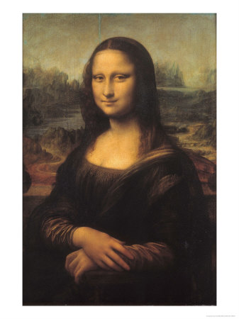
The Mona Lisa, Leonardo Da Vinci, 1503-1517
What is clear from the Mona Lisa is the skill with which Da Vinci creates duplicity in the painting. The image of the young woman who is calm, but distracted, serene but but with a piercing gaze. She looks toward the painter, yet appears to be looking through him. The mythology around the painting has only added to the fascination we have with it. To try to read something new into the image would be a little clichéd. Instead, I decided to look a Da Vinci work that is still a famous work, but in the shadow of the Mona Lisa.
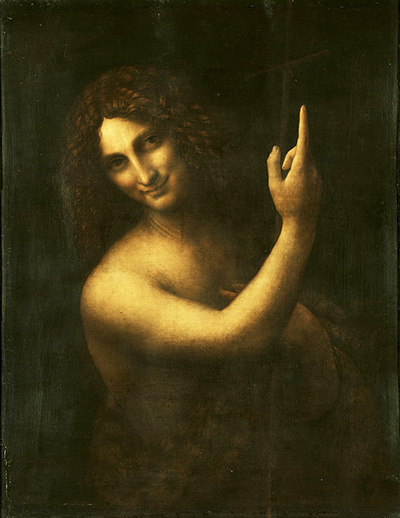
St John the Baptist, Leonardo Da Vinci, 1513 to 1519
St John the Baptist, by Da Vinci again shows the painter’s skill but also emphasises my thoughts as eyes as expressions of emotion [6]. Here, the subject is a famous religious figure, known for the pain and suffering he endured for his beliefs that ultimately led in his execution. Yet here is an image of man reassuring the viewer that all will be well, set against a minimal backdrop which contains only a feint image of a crucifix; a reminder of how much sacrifice supports his belief. Da Vinci drives home this reassuring, almost playful-looking saint by what he does with his eyes. Far from being sad, pensive or passionate, all of which might have worked in this painting, they say “Trust me”.
The other painter I became interested in was Margaret Keane. This artist was part of a huge art fraud in the 1960s when her husband claimed the credit for her bizarre paintings of people with oversized eyes. What interested me about her was not the scandal, her popularity in the face of the critics or her the fact that her work is now being reassessed. What appealed me was the fact that her work is the complete opposite of what I wanted to achieve with this exercise.


In both of these paintings, Keane’s style of creating large, empty gazes on two children drew heavy criticism in the art world. When it was rejected from The World’s Fair [7] in 1964, New York Times’ art critic John Canaday concurred with the decision.
“Mr. Keane is the painter who enjoys international celebration for grinding out formula pictures of wide‐eyed children of such appalling sentimentality that his product has become synonymous among critics with the very definition of tasteless hack work.”
John Canaday (incorrectly referring to Walter Keane at the time), 1964
For me, both paintings simply ascribe a miserable demeanour on the faces of the children, despite them being set in seemingly happy scenes. The eyes themselves have an empty, zombie-like appearance which gives the viewer nowhere to go beyond the conclusion that something is very wrong. While there is an aesthetic quality and questions raised by having to look carefully at the whole image, the eyes are such a dominant part of the paintings, that one cannot help but stare at them.
Preparing my Collection
The questions I tried to answer in preparing my idea were as described below:
- How many eyes do I need?
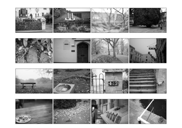
Sounds like a strange question, but I wanted to consider whether I needed subjects with two eyes shown or can the same be achieved with only one eye in the shot. I then thought that a subject with only had one eye or even someone with partial blindness would add interest to the set. Other ideas included eyes of different age-groups and ethnicities. However I quickly discounted these in line with feedback that I received for Assignment 1 that said I needed to keep the subject matter more simple and focused. I also needed to decide how many people I would shoot. For a set of 9 photographs, I would shoot three subjects to keep the set balanced in arrangement.
- How much of the face do I need to tell their story?
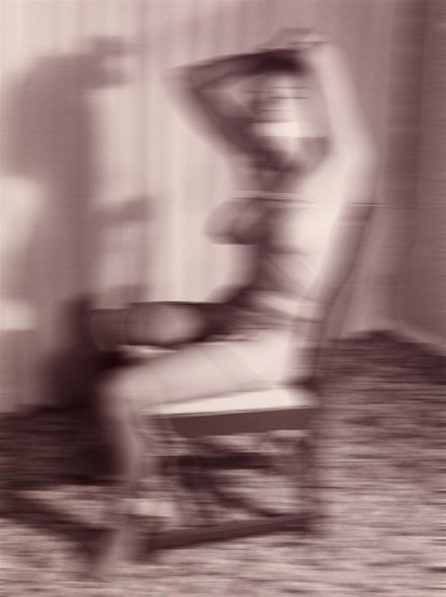
I wanted to capture emotion with the minimum distractions, but that doesn’t mean that I wanted 9 images that looked like an advertisement for an optician. Simply shooting the eyes would not be enough. So the question is in respect to how much of the rest of the face is needed to convey what how the subject feels? If, for example I shot a woman wearing a full niqab, the whole of their face is covered with the exception of the eyes. It’s a very private and guarded item of clothing, but can you see what she feels just by looking at her eyes? My starting point would be the region between the forehead and end of the subject’s nose as shown in the photograph below. I would vary the composition to remove the risk of repetition and avoid a very mechanical set of photographs.
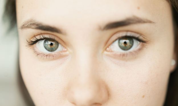
© JC Gellidon/Unsplash from MyBluPrint.com
- How would I shoot for emotions?
For this idea, I would need to identify and then capture the emotion of the subject. Would this be naturally occurring or would I seek to create that emotion in them somehow? A friend of mine is an actor, which got me thinking that I could mix the two approaches to create a set. According to psychologist Robert Plutchik [8], there are 8 basic emotions with further variations that can be derived from them.
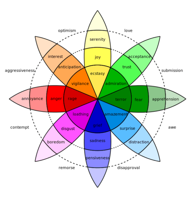
Visualisation of Emotion, Robert Plutchik 1980 [8]
- How to shoot it?
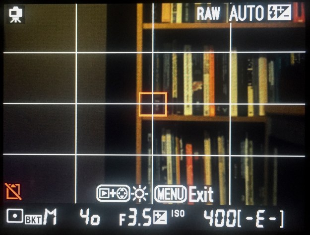
The best way to reliably capture what I’m looking for is to create a small studio environment. A simple set-up where I can control the environment and light around the subject. One of the most important things when shooting eyes in a portrait is to create some form of highlight, called a ‘catch light’ to make them stand out from the background [2]. A studio strobe-light setup would make this easier to achieve than attempting the same shoot with natural light. For each photograph, I would work with a plain background with a single soft-box with reflectors to fill any harsh shadow [2]. My setup is shown below. The first step was to create a workable environment, meter a subject and set the flash power to achieve correct exposure. My first experiments with the rig used a 70 to 200mm lens with an aperture of f8. The mid-range aperture would ensure that the subject would be isolated from the background while keeping flexibility in the flash power and distance between the subject and the light source. The main issue was that at 200mm, the lens would not focus close enough to fill the frame with the eye region only. In order to overcome this, I changed to a 200mm macro lens, which can focus much closer. Eventually, the setup was suitable for the shoot.
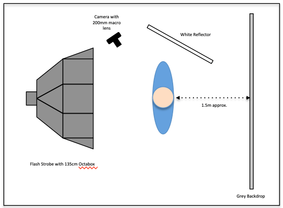
The setup using a studio flash strobe and octabox for soft, even light
The Shoot
I asked some friends Vikki and Ron to model for this assignment, along with my wife Jayne. By shooting close friends, I could focus on capturing completely natural expressions, something I had concluded was important for my collection. One of the challenges in this shoot would be capturing natural emotions instead of faked ones. Ron is a professional actor, which meant that he was aware of what his face was doing during each emotion as well as be able to mimic if necessary. I achieved natural emotion by giving each model time to relax and almost forget about the camera. The rawness of the emotions was maintained by not having any of them in make-up, which would normally be a consideration for studio work. Once we started, I asked one of the other models to start a conversation that would naturally provoke a reaction in the model being photographed. I shot around 300 images as each conversation progressed. As the models became acclimatised to the flash, they relaxed into the shoot. It proved to be a difficult shoot for us all as when, for example the topic became sad it would impact everyone in the room.
When reviewing the 300 images, I made my selection based upon two elements: the images that provoked the strongest response in me as a viewer, and those that best told the whole story of the shoot as a human experience. As the shoot progressed, the stories being told took the models down a number of different emotional paths which was something I wanted to use to join the collection together.
The Photographs
I decided to present the 9 images in a 3 x 3 grid in a similar way to Exercise 1.4. I wanted them to be viewed both individually and as a complete set with some visual balance. With the lighting and camera settings being consistent throughout, the only variables were the angle from the camera to model and the expressions themselves. In arranging them in the grid below, I intended the keep the models on their own row and for the central images of each to be with the eyes looking directly into the lens. In each row, the model experiences a range of emotions, both positive and negative.
-
- Vikki 1
-
- Vikki 2
-
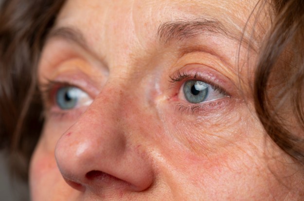
- Vikki 3
-
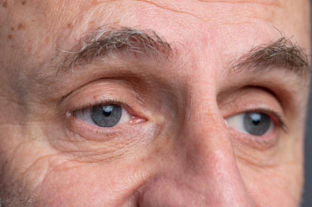
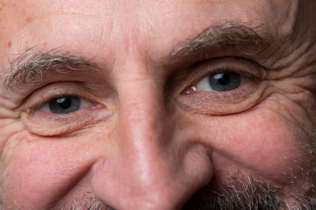
- Ron 1
-
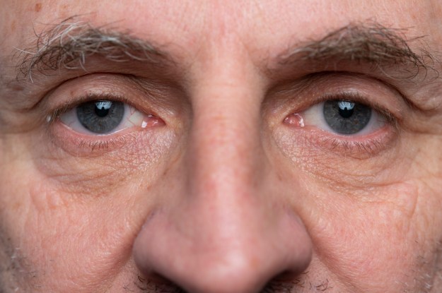
- Ron 2
-
- Ron 3
-
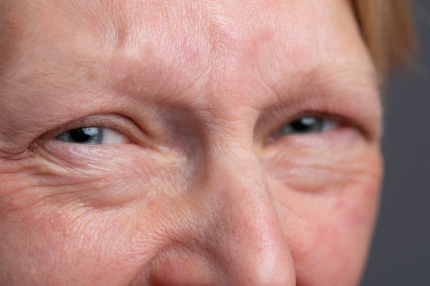
- Jayne 1
-
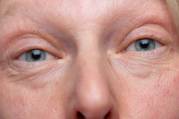
- Jayne 2
-
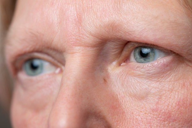
- Jayne 3
Reflection
My Thoughts
This assignment has been hugely challenging and enjoyable. The subject matter evolved as a result of a single inspiration and developed through conversation and research. As a result, I find myself studying people’s expressions by paying particular attention to their eyes. When I was considering a subject for this assignment, I wanted to do something different from photographing something physical. What I learned from Parts 1 and 2 was that expression of vision should not be restrained by so-called rules, that the aesthetic is more valuable in art than the formal, which is something I’ve never really considered prior to joining this course. However, I would need to work with people as the subject, carefully select the lens and the lighting in order to capture what I was intending to with this collection. The shoot was tough, particularly when trying to provoke the negative emotions such as anger and sadness. One notable moment was during a conversation about Vikki’s late father, which resulted in ‘Vikki 3’.
This assignment has pushed me to look carefully at how I react to that initial inspiration; in this case a chance encounter with a film I hadn’t seen in years. My instinct has always been to force a photograph to show it’s quality through composition and technical achievement, but for this assignment I moved completely away from that notion. Throughout working on this collection, I have questioned whether it was ‘the right subject’. and whether I could make it work. It was only when assembling the collection that I finally stopped worrying about it. This demonstrates how uncomfortable this assignment has, even if the result is something that I am happy with.
What worked
Reviewing the images, the stand out ones for me are how powerful the negative emotions are. ‘Vikki 3’ and ‘Ron 2’ were intended to be sadness and anger respectively. However, emotions can be combinations of feelings as postulated in Plutchik’s work, e.g. Awe can be a mix of fear and surprise, terror and amazement with the main difference being the relative intensity of the component parts. In the case of these two images, there is a mystery surrounding whether it’s sadness or remorse, anger or contempt. Without being in the room, the viewer has to reach their own conclusions.
What didn’t work as well
My only concerns about the collection stems from the decision to not make up the models. Each has a different skin tone and while the temperature of the light was taken from the specification of the strobe and adjustments made in Lightroom, I think the results are too varied. As a set, this isn’t a problem as each model has 3 photographs across the horizontal of the grid, creating balance. I’m not convinced that they work as well individually in terms of skin tone. When assembling the set I created a printed contact sheet so that I could arrange them in the order that worked best. In an effort to address skin tone, I printed a black & white version of the sheet. However, in those images, the impact of eye colour was lost, so ultimately I selected colour instead.
The other reservation comes from a question raised by Rob Bloomfield during our student video conference as to whether a series or collection can sustain losing an image, particularly a ‘strong’ one. In this regard, I believe that as in the case of a jigsaw puzzle a single piece removed would still reveal the overall image. In the case of this collection, I believe the stronger images would be missed if removed.
Meeting the Brief
In terms of the original brief, I believe I have created as series that meets it. The ‘things’ in this case are Emotions.
“Fragments of a vessel which are to be glued together must match one another in the smallest details although they need not be like one another” Walter Benjamin, 1936″
With regard to Benjamin’s quotation, I believe that I’ve kept that consideration in mind throughout the assignment. I kept the technical setup and the basic composition of the images the same, I changed position for each shot and mixed the direction that the model was looking. As the macro lens has a very shallow range of focus at all apertures, the shots where the model is looking away has the nearest eye to the camera sharp and the other rolling off out of focus with the rest of the face. Only when the model looks directly in the camera are both eyes sharp, which works for the emotions I was looking for in those images. The ‘vessel’ in this case is the human experience. By taking the models through a number of conversation topics, their experience of the shoot was happy, sad, angry etc as it progressed. As individual images, each has an initial impressions but raises questions about what the subject is thinking about – ‘what could have happened in that room to make them feel that way?’ I was reminded of my conversation with my colleague about children who could not interpret emotions from the eyes and face alone and how difficult it must be to guess what is going on.
References
[1] Holben J, 2018, “Eye Lights”, The American Society of Cinematographer, https://ascmag.com/blog/shot-craft/eye-lights
[2] Silverman R, 2016, “A Photographer’s Eye”, The New York Times, https://lens.blogs.nytimes.com/2016/06/08/the-photographers-eye-nicholas-nixon/
[3] Brewer R & Murphy J, 2016, “People with Autism Can Read Emotions, Feel Empathy”, Spectrum, http://www.scientificamerican.com
[4] Fessenden M, 2015, “Kids with Autism Can Read Emotions Through Body Language”, http://www.smithsonianmag.com
[5] “The Mona Lisa – by Leonardo Da Vinci,” https://www.leonardodavinci.net/the-mona-lisa.jsp, accessed December 2018.
[6] “St John the Baptist – by Leonardo Da Vinci”, http://www.leonardo-da-vinci.net/st-john-the-baptist/ accessed December 2018
[7] Queens History blog post, 2014, “Robert Moses rejected this terrifying Margaret Keane Painting from Hanging at the 1964-65 Worlds Fair”, The Bowery Boys http://www.boweryboyshistory.com/2014/11/robert-moses-rejected-this-terrifying.html
[8] Burton N, 2016, “What are Basic Emotions?”, Psychology Today, http://www.phsychologytoday.com
Tutor Feedback on Assignment 2
I’ve received my tutor’s feedback for this assignment recently. It was very positive about my approach to my collection, starting with my initial inspiration and progressing through my research. The variety of my research including Plutchik’s work on visualisation of emotions was highlighted in the feedback as well as the breadth of research into the painters.
The areas that were suggested to progress the assignment revolved around viewer response. Although my tutor stated that the images worked as a set, he suggested that feedback from others would give me sense of whether I had achieved what I set out to. I have since asked a number of people to read this blog post and they all confirm that what I described as my idea, works in the photographs.
I had another suggestion from my tutor to look more closely at the lighting effect used in the film that inspired me at the beginning. The use of the technique was used in early cinema to increase the mystery of the character.
On the whole, I’m very happy with how this assignment went and the reaction of everyone that has read the blog post so far.