Category Archives: Assignments

Re-working Assignment 5

Introduction

Following the feedback from my tutor on Assignment 5 and the subsequent research into other contemporary portrait artists, I decided to review my submission again with a view to improving the series.  There were clear indications in the feedback that some images were stronger that others, so that was where my review began.  The intention for the series was to take my continued theme of revelation and apply it to me as the subject.   While it was accepted that each image revealed new information about the me as per the brief, the intent behind each one and its impact was not thought to come through.   It was immediately clear on reflection that Seven (the guitar shot) didn’t really say anything about me at all, so this would be the first image I would seek to replace.  The other images that came in for criticism in the feedback were One and Ten, which were likened to a publicity photograph, again not really telling the viewer much about the subject.  I had created an aesthetic using Bailey as an inspiration to effectively start and finish the series the same way, but on reflection this was more a technical choice than a creative one.   The rest of the images still worked for me, though with each saying something about me that was intentional.  Without external contextual information, they offer a variety of different perspectives that I touched on in my Feedback essay and with the addition of context, the people I have shown then too have understood what I’m trying to say with them.

Back to Basics

Having decided to rework One, Seven and Ten, I went back to what I had originally intended for each.

DSC_3801

One

One was supposed to show me as a professional and somewhat serious man.  The resulting image shows me with a fairly blank expression, which some of the people who’ve seen it refer to as my ‘resting angry face’.  I wouldn’t describe myself as a miserable or sad person, but when I relax my face, that is what many people see.  With this first image in the series, I had wanted to portray my total discomfort at being in front of the camera.  I had believed that my natural expression of impassive, borderline grumpy would reveal that to the viewer, but instead I understand now that the result is a very formal photograph of me.  I could indeed use this as a profile photograph in my company because it is formal and well executed.   During my research into the portrait artists, I became interested in Edvard Munch’s work.  Munch painted what he felt about a subject rather than strictly what he saw, with The Scream as his most famous example.   In a similar vein, Eikoh Hosoe works in the surreal, combining contrasting but related subjects in his photographs.  Hosoe’s work excited me because there were so many elements that contributed to the different perspectives the viewer could adopt.  He also used photography to challenge realism by his use of technique; over and underexposure, unconventional composition and in the case of his portraits, real drama in the subject’s expressions [1].  If I wanted to portray my discomfort, One needed to be more about how I felt as I made the difficult decision to photograph myself.  I needed to say more about my starting point and my lack of confidence in approaching the assignment.   I actually really like the original One and am sad to be replacing it.  However, it appeals because it’s comfortable which is something I’ve had to remind myself during the latter stages of this course.

DSC_4043

Seven

Seven was supposed to reveal my recent interest in learning the guitar and how it helps me to relax.  The strength in the image is purely technical and at the time I was happy with the balance of the lighting, the guitar and how my hand was positioned in a ‘mid pick’.  The bonus of the subtle obscuring of the volume control was also something I was happy with, but unless the viewer knows the layout of the Fender Stratocaster, this is probably lost on them.   The image could be of anyone and there is little to describe the sense of relaxation that I was trying to portray.  On reflection, the guitar doesn’t relax me.  Instead, it offers a similar form of escapism that photography does and the reason I took it up was because of the time pressures I now place on myself with my work and this course.  The guitar needs to be practiced little and often, so is perfect for brief interlude of escape.  None of that context come across in this image though, so my new photograph would need to address the missing elements.  I still like the photograph and would have enjoyed the result a great deal when I was first experimenting with studio lighting.  However, it doesn’t work in the series so the decision to replace it was the right one.

DSC_4002

Ten

Ten was intended to reveal how my love of music has become an important and private place to retreat into.  While Seven deals with my desire to learn how to play, Ten was intended to draw the series to a close with the tie-back to The Cure who were one of my favourite bands as a teenager.   The idea of using the rare vinyl version of Pictures of You came about because I struggle to put on a relaxed expression without actually being relaxed.  Blowing the dust of a record would eliminate any sense of my expression being forced, while the special vinyl record and the way I carefully handle it would show how much I care about music.  Sadly, none of this really comes out in the photograph as again, the result could almost be a public relations shot for a radio DJ (this is the image my tutor conjured during our call).  When I reflected on the intended reveal, I questioned the connections between the elements.  Vinyl is something I’ve rediscovered in the past couple of years because I had completed the restoration of my parents old turntable.  The turntable itself has great sentimental value as well as offering the opportunity to collect records in the same way I collect cameras.  In reality, this image came about as a comfortable set of connections between collecting, a retro-aesthetic and my pride in re-discovering something that has previously fallen from fashion.  Of my camera collection, 85% of them are old film cameras that are over 40 years old so it wasn’t a surprise that this is what I naturally fell back on as a context for the image.  Also, the fact that the record is actually a translucent red, made the technical aspects of lighting the image more straightforward, again pointing to something I felt comfortable with.   What I actually see music as, is a private escape where I can focus purely on the listening.  I don’t have to be social if I don’t wish to be and similarly don’t have to care if other people like the same music as me.  It offers a place to hide and relax when I need it.  These elements are what needed to be impactful in the new version of Ten.

The New Images

DSC_6501

Revised One

The new version of One was inspired by Munch and describes my total discomfort at being the subject of the photograph and indeed the series.  I use a movement in a similar way to Francesca Woodman to portray the surprise realisation at what is happening.  The tape across my mouth symbolises my feeling that I have nothing to say as a subject, while my lack of clothing was inspired by the recurring nightmare that is fairly common when insecure people are struggling with life; that is turning up to a public gathering (birthday party, work presentation, school etc) and slowly realising that you are completely naked.  I wanted to include that fear in this photograph.  I was inspired by Hosoe to venture outside of the ‘perfect exposure’ and sought to create a visual where the subject’s discomfort comes from being under the spotlight.

The final photograph was made by using an exposure of 2 seconds using the continuous ‘modelling light’ function on my studio strobe.  As the exposure started, I flashed the strobe using the remote trigger with my head looking down.  I then flashed the strobe again just before the shutter closed to capture the second face.  I liked the accidental placement of the eye from the first face over the tape across the mouth of the second, as it adds the element of passively observing rather than speaking out.  No other photographs I took during the shoot had this element in them, which made the task of selection a great deal easier once I had noticed it.

DSC_6386

Revised Seven

For Seven, I was inspired by Woodman’s unusual compositions.  This image needed to show me with the guitar, something that the first version didn’t do.   In this image, I am seen emerging from the edge of the frame as a nod to just starting out with the instrument.   This is further emphasised by the plasters on three of my fingers; injury to the skin being a common occurrence when starting out with this instrument.  Finally, and the main element to the image is my shadow which looks like a more ‘established’ rock star profile than the actual enthusiastic expression on my face.  I used conventional elements such as the striped shirt to tie in with the guitar’s fret board and to contrast with the plain background.  I’ve tried, like Woodman to include me in the subject of the photograph without actually being the main focus of it.  In my image, the guitar and shadow are for me the dominant elements.  Unlike Woodman’s ghostly presence in her photographs, there is no movement in Seven.  Instead, my position in the image defies the convention by being right on the edge of the frame, with my index finger being on the right-hand ‘thirds’ line.   I shot this photograph against a wall my living room rather than a photographic backdrop and used only one strobe to create the harsh shadow on the wall.  I’m much happier with what this photograph says about my desire to be a musician and how that ambition would naturally outweigh my talent at this stage of learning.

DSC_6420

Revised Ten

For Ten, I was inspired by Hosoe’s work in Ordeal by Roses.  He often juxtaposed  the subject with the roses or something that was symbolic of the rose in an abstract composition.  For this, I wanted to keep the link back to The Cure.  The translucent property of the record meant that I could effectively be seen through it which would maintain my theme of retreating into music.  I used a bright and harsh flash to both back-light my head and create the halo as it passes through the record. The contrasty aesthetic that Hosoe created with his portrait series is echoed here with the only middle tones being my hand holding the record and the background.  I like this image because it makes music the obvious subject but looking more closely shows my relationship to it.  The vinyl is still present, but the way that I am holding the record removes my precious feeling toward the object itself (although I was naturally very careful).  For me, the context of the image is changed by the elements in the photograph more than in the previous, which relied on my describing what I was trying to say with it in words.

Another Change

Another point raised during the feedback conversation with my tutor was that Nine might be a little too obvious in its composition.  The photograph is inspired by Vivien Maier’s self-portraits in shop windows with her Rolleiflex.  I had chosen to tie in my love of photography with music by shooting something similar with my friend’s record shop window.  The resulting image had very obvious pointers to what the photograph was about and my tutor suggested a more extreme crop to make the composition more interesting.   I made two crop attempts, one that followed his suggestion and one in between it and my original version.  All three can be seen below.

My tutor suggested removing the obvious elements of the image (the camera, the sign, the record racks in the shop etc) and leave the subtle music references like the portrait of Ian Curtis and the distinctive Velvet Underground album with its iconic Warhol banana painting in the cover.  This crop can be seen on the right.  When I looked at this image again, I felt that removing the camera and the record racks took away too much from the photograph but that it was definitely more interesting without the window sign,  My crop in the centre image is a less extreme version of what my tutor was describing.  I kept the camera because my original concept for the image linked photography with music – losing the camera broke that connection for me.  I also felt that by keeping the record racks, there was more for the viewer to explore in the photograph than in the tighter crop.  The moody exposure with my shadow emerging from a dark background still works in all three, but I prefer the way that my version looks, so I included it as a revision to the series.

Re-ordering the Series

Having elected to shoot three of the photographs, I now had to consider how the series looked in sequence.  My original concept was to reveal a man with challenges in his life and show how he has responded to them through passions and coping strategies.  The questions now were whether that concept still worked with the image sequence and if it could be improved by shuffling the order.  The original sequence with the new images added can be seen below.

My first impression was that I should swap Three and Four in order to separate the two pictures with movement in them.   The result can be seen below.

What I realised with this sequence was that the ‘tension – depression – comfort’ theme of the original order was lost this way, so I discounted this as a change to make to the series.   The other change I considered making was to move the much stronger Seven to the Nine position as it now combined and contrasted my enthusiasm with wanting to learn music with the sanctuary that listening to music gives me.  The revised sequence can be seen below.


Now the series flowed how I wanted it to.  Starting with discomfort, moving through my mental health issues, my re-emergence and the challenges of open-water swimming and the peaceful solitude it provides.  Then onto my love of photography as an opportunity to understand the craft, in particular film photography and on to how music affects me as both a budding musician and as a place of sanctuary.   This is the order of the series that I decided to submit for assessment.

Conclusions

It’s fair to conclude that this assignment pushed me harder than the other four, which makes sense as it comes at the end of the course.  I worked hard enough to create the first submission and some of the feedback was difficult to accept at the time because of that.  In trying to address it however, I’ve learned that being uncomfortable with my art is not a negative thing.  Being uncomfortable has led me to shoot pictures that I would not have ordinarily considered.  When I showed One to my wife, her reaction was that it certainly said something powerfully and added that it was probably the most abstractly creative thing I’d ever produced.  In creating it, I experimented with the composition and lighting but wasn’t focused on creating the classical portrait. Two of my experiments can be seen below.


The left hand one was my establishing movement to create an almost ethereal impression of a man surprised by something, in this case the idea that he would be the subject of a photographic series.  I wasn’t using the strobes at this point, just the modelling lamp function that they have and while I liked the definition that face had, the idea of discomfort still didn’t come through.  The right hand image was using more extreme exposure and a longer exposure time, resulting in some detail in one eye. I liked this effect too, but it felt more like chaos than surprise.   Both images are far away from what I usually shoot and I enjoyed not really knowing whether the effect would grab me or not when it came to review.  It was a challenging shoot to do because I was both operating the shutter and the strobe trigger while trying to keep the natural flow of my movement through the frame.  When I finally realised I could partially freeze the movement this way, I thought carefully about what I was saying here.  The other elements added to the composition resulted in the final image which I think works well in the series as well as on its own.

As well as the realisation that moving away from what’s comfortable can be positive, I learned also that I don’t really care if people ‘like’ my photographs, only that they react to them in some way, whether seeing my perspective or creating their own.  This was reinforced during a conversation with our cleaner who came to look at the prints I was doing for assessment.  She said that with Assignment 2 (my collection of emotions through eyes), she didn’t want to look at them closely as they were unsettling to her.  We discussed why that was and she was reluctant to elaborate, simply stating that she didn’t like the set.  My conclusion was that that was perfectly alright by me.

References

[1] Article 2016, “The school of flesh: erotic portraits of Yukio Mishima, The Guardian, https://www.theguardian.com/artanddesign/gallery/2016/nov/03/yukio-mishima-erotic-portraits-eikoh-hosoe-ordeal-by-roses-in-pictures

Assignment 5 – Post-tutor feedback

Introduction

I have now had feedback on Assignment 5 ‘Photography is Simple’ from my tutor, which was in both verbal and written form.  As always, the feedback was very constructive and pointed out the areas that, with more consideration and the benefit of hindsight, were fairly obvious to me.  In this post, I address the feedback about the assignment itself and my thoughts about how it relates to my original intentions.  However, a significant part of the feedback was related to the limitations of my research which I also agreed with.  I look at some of the recommended contemporary artists working in the genre of portraiture in a separate blog post [1].

Feedback on my Images

I think I already knew which of the images was the weakest and it was confirmed in the feedback as Seven.  Although the photograph is well composed and lit, the hand could belong to anyone. The elements that I intended are present, but the whole image says very little about me.  When I re-visited this photograph as part of the set, I concluded the same and when reflecting on the period I was working on the assignment, I was probably least happy with it.  I plan to use the additional learning from my expanded research to re-shoot Seven before submitting for assessment.

My tutor thought that the strongest photograph in the set was Five which is one of the two images showing my love of outdoor swimming.  I intended this image to lead from the shots about the difficulties I’ve experienced with my mental health and showing a much stronger man in an almost heroic pose.  However, my tutor saw something different in the image which was more about being revealed from inside the protective wetsuit.  He particularly liked the fact that although it is clearly me, the composition has me looking away from the viewer.  He was complimentary about the technical achievement with the image as he was with the rest of the set.  I realised on reflection how well the image creates opportunities for multiple interpretations and that without the contextual narrative that I included, how different they can be.  My favourite image from the set was Four where I am pictured with my wife.  During our discussion, we agreed that this image worked well within the set in a similar way to Five, but that it was also an example of the critical feedback that the set was perhaps limited to the conventional (low key lighting, black background etc).  I believe this to be a fair comment.

Overall, the feedback was the that the collection of images was “a well considered set” and that “they all work well individually, if in a conventional way, and as a series”.

Limitations in Research

It has taken me a while to appreciate the feedback on my research, primarily because I felt at the time that I’d done everything possible to address the brief.  My initial reaction to our discussion that I had only researched the photographers that I appreciated or admired was, ‘isn’t that what inspiration is – taking something you admire as the basis for your work?’   If I’d previously researched all of the photographers that have been recommended in the feedback, would I have not just been inspired by one or two of them instead?  Of course, on reflection the answer is simple – I’m being pushed to demonstrate the beginnings of my own perspective or vision on photography and use my skills to say what I want to say.  There are few genres of photography, painting or sculpture that test this more than portraiture and I believe that was the point of the feedback.  I had chosen this challenging genre – now what am I going to do with it?Another difficult point to accept was that despite my best efforts and discomfort from being the subject as well as the photographer, I still relied on my technical knowledge to make the images stand out.  This was brought home to me by a comment that my tutor made during our call – you’ve demonstrated that you understand photography as a process and have a relationship with the camera where you know how to get a result from it.  Where are you going to take your photography next?  It was backed up by a comment that I could continue to strive for the perfect landscape, but would that progress my photography in an artistic way?

On reflection, I greatly appreciate these two observations and was reminded of the importance of the points in two discussions since the call.  The first was when talking to a colleague of mine, who was kind enough to give me some feedback on the assignment before I submitted it.  I was concerned that the course was having the effect of making me resent photography rather than build on my passion for it.  He likened it to his recent return to playing the guitar and the jazz group that he joined that is run by his tutor.  One of the pieces he was given to work on was going to come up in a future group session, so he learned and practiced it until it was ‘note-perfect’.  When he turned up to the session, his piece was incorporated into a jazz jam that was entirely improvised, meaning that there was no clean point at which he need to start to play and no structure to how it fitted in with the rest of the group.  Despite his best efforts, he’d missed the point of playing how he wanted to play; instead falling back on his technical understanding of the instrument.

The second conversation was with the local picture framer who has done a great deal of work for me over the past couple of years and who is going to prepare my assessment prints.  He made a comment during our discussion about mounting my assignment works, that my previous work always looked good with a particular selection of mount cards etc.  It dawned on me that his comment was naturally all about the tonality of the images, which have to date been predominantly black and white.  Was this the comfort zone that my tutor spoke of?  He asked me on the call why I tended towards black and white and I didn’t have the answer – it certainly isn’t because of some notion that it looks classier or more traditional, but there is something I love about it.  Rather than explore that, my realisation was that for the assignment I simple stayed within what I like and am comfortable with.  When considering the feedback that I had limited my research at the start of this post, I realised that we need examine the artists and works that we don’t resonate with as much as we do the ones that inspire us.   This is pretty common with other areas of learning and development, so I’m uncertain as to why I hadn’t realised it sooner.  However, it is something I will be working on as my learning progresses.

Other Feedback

In the written feedback a couple of other points were made:

“I think one telling comment from you notes is; ‘…many of my acquaintances see a confident man, while those who know me really well know that the opposite is often the case.’, which is perhaps not what you wanted”

I was a little confused by this observation initially as the original comment was made about the Who am I? slide that I orally presented at work.  My observation was that the images on the slide were snapshots of events in my life that were intended to signpost the icebreaker discussion, rather than reveal anything significant about me.  The images in the assignment though were trying to portray a conflicted man, one that is confident and professional and one that has been recovering from problems with his mental health for a number of years.  On reflection though,  it is external context that helps shape the viewer’s perspective on the work which I realise I had provided with the accompanying notes in the assignment.  When I showed the images to my friends and colleagues, I got a sense of what happens when that contextual information is not present and I was happy to listen to their different views.  On the subject of social media, Nan Goldin summed up the effect of its permeation into our lives during a in interview for an exhibition of hers in New York [2].  Speaking about a social media manager:

“She asked to see something on my phone; some paintings I’d done.  She went like that (swiping motion) and I so said ‘You didn’t look at them’.  ‘I saw them’.  Then I realised that’s how people look on Instagram…and I don’t want it”.  I’m not happy that that’s how people look now.  You can’t look at something in a microsecond.  You need time to look at things”  – Nan Goldin, talking to Lanka Tattersall, MOCA.

This resonated with me with regard to this assignment, because I believe that the images need to be looked at carefully to derive any meaning from them.  One thing that I noticed when showing them was how long people spent studying every element in the frame.

“Finally you write: ‘Photography itself is simple, but it has little meaning unless those relationships between photographer, camera and view are in harmony with each other.’ This could be disputed, technical supremacy is one thing, but pushing the boundaries of the medium is another, the latter is about experimentation and developing the potential language. The viewer mediates through their own experiences and understanding and this might differ considerably from the artist’s intention”

I completely agree with this feedback.  Rather than consider it a mistake in my assessment of the relationships between parties, I tried to reflect on why that made sense to me at the time.  I believe it to be a symptom of my falling back on what I know; the technical element of the image.  Pushing my photography by challenging the boundaries of the medium is how I avoid the stagnation that he referred to in our conversation.  In answering the question ‘where do I go from here?’ I believe the answer is to keep trying.

I have elected to re-shoot a  fewof the images from the assignment before formal assessment.  Ideas are beginning to form as I write, but it is clear that I need to keep challenging myself to leave my comfort zone.

References

[1] Fletcher, R, 2019 “Looking at Contemporary Portrait Artists (post Assignment 5), OCA Blog, https://wordpress.com/post/richardfletcherphotography.photo.blog/1420

[2] 2018, MOCA, “Nan Goldin in conversation with Lanka Tattersall”, https://www.youtube.com/watch?v=b2XrWPdJIBg


Assignment 4: The Languages of Light

The Brief

Revisit one of the exercises on daylight, artificial light or controlled light from Part Four (Ex 4.1, Ex 4.2 or Ex 4.3) and develop it into a formal assignment submission.  The submission requirement for this assignment is a set of between six and ten high-quality photographic prints.

Introduction

It is natural to expect the assignments for Expressing Your Vision to build on the learning    and expansion of our photographic viewpoint and subsequently for the assignments to become more open in brief.  During a recent video conference with the cohort, we examined Assignment 5, which most of the students on the call were not ready for, or thinking about at the time.  Why would we have read ahead to see what was coming? – a question that I posed internally.   The simple reason in this case was to highlight that inspiration and creativity are more of a challenge when there are fewer constraints in place; Assignment 5 being almost entirely free-form.  This conversation led me back to where I was in the course at that point and to thinking about which of the exercises in Part 4 I would be interested in expanding for Assignment 4.   With the freedom to explore any aspect of Part 4, I elected first to review how my work has evolved on this course and which areas of research have been most impactful.  I concluded that thus far, I have benefitted from working outside of what is comfortable, rather than shoot what I am used to, because I learn much more from those experiences.

What has interested me?

Looking back through my coursework, one of the underlying themes has been one of ‘revealing’ something unusual or different about the subject.  Way back in The Square Mile, my attention was captured by the evolution of how the rural population moved around their landscape.  With Collecting, I was in search of human emotion through the subject’s eyes alone and in The (In)decisive Moment, my aim was to exploit the coincidence of the photographer’s viewpoint with the obscuring of a subject as a moment occurs.  Thinking back to the research in Part 4, I found the use of light in the the film ‘In the Mood for Love’ the most fascinating.  Naturally, the clever use of light quality and direction is technically of interest, but the effect of the illumination picking out the subject in a seemingly simple way struck a chord with me.  The other area of research that followed a similar theme was the work of Sally Mann; not so much her landscapes but the way she uses light to lift a subject from the background.  Her work with her children, while controversial owing to their nudity, is for me an intimate perspective on the innocence of childhood; Mann creates this mood by using soft natural light to reveal the angelic [1].

Which Exercise?

The decision here was fairly simple.  I’ve had some experience of the studio environment previously and have applied some of these techniques in the macro photography I’ve included here.  For Collecting,  I used a large octobox diffuser to throw soft, flat light from my studio strobe onto the faces of the subjects which, combined with no make-up or post processing touches, empasised the purity of their expressions.  I was concerned  that re-visiting the studio might be too comfortable, so ruled Ex 4.3 out quickly. However, as a direct result of that consideration, I had an idea for Assignment 5 at a later date.  This left Natural vs Artificial light.   During the research on both topics, I became interested in the contrast between natural light and how it changes during the seasons, weather and time-of-day and the hidden beauty of the ‘ordinary’ artificial light we use as illumination.  Using the latter with seemingly ordinary subject matter appealed to me throughout and Ex 4.2 got me to look at the way artificial light changes a subject.  The ordinary can be interesting; the details of a subject that one would normally view in daylight, taking on a completely different mood.  One image that stood out in that research was Brassai’s street vendor from the Paris by Night collection [2].  That image was reminiscent of Rembrandt’s representation of light rolling off from the subject of interest.  We are aware of the setting as it is revealed by the light in a way that would not have been obvious without the act of photographing it.  The same approach taken by Shintaro in his long-exposure night photography creates a mood that wouldn’t be seen by the naked eye.  His elimination of people and their movement from the frame gave his compositions a simplicity, asking the view to simply appreciate the subjects.

Of the three exercises to choose from, 4.2 definitely offered scope for challenge and creativity because of the variety of sources and potential interpretations.

My Theme

As mentioned previously, there is a theme of ‘revelation’ running through my work on EYV to date.  For this assignment, my initial thoughts were toward revealing the detail of a subject as the light falls on it.  In Ex 4.2, the photograph that brought home the evenness in terms of glow and colour was the neon (below).

DSC_3021-2

In this photograph, the plain wall has no texture apart from a small flaw in the plasterwork that I didn’t notice until reviewing the images.  The only intentional textures are the lamp base and the covering of the chair it is sitting on.  In both cases the light is revealing the texture but the effect is very flat owing in part to the light intensity.  What I noted with this image is the way the light rolls off to darkness along the left side; I had made the room dark before I started shooting.   This led me to think about lighting dark areas, or more specifically dark corners and the use of artificial light to illuminate where there is no natural light.  Revealing Dark Corners is my theme for Assignment 4.

Planning the Shoot

My starting point was to plan the scenarios I wanted to include in my theme of lighting dark spaces.  The first thought was around the vintage lighting in the area around my home.  Malvern is a Victorian spa town that has attracted visitors to walk the hills and drink the water for decades.  One of the features of the area is its gas-powered street lamps, which emit a soft, but fairly low intensity light in the more rural parts of the town.   However, they are often combined with the more modern tungsten lights that are commonplace in town centres, so the combination of these light sources would potentially be interesting with the right subject.  I have a particular fondness of Malvern’s quirkiness, but during the research in Part 4, I learned to look closely at the more innocuous, everyday subjects that take on a different quality when lit by artificial light.  Ivan Radman’s simple composition from the OCA notes [2] shows a scene that likely goes completely unnoticed during the daytime, but takes on a haunting mood when lit by the tungsten street lamps.

The shoot would take place over a couple of late evenings when the only source of light would be from the town itself.  As it is meteorological summer at the time of writing, shooting would take place after 11pm.  To create a consistent series of images, they would all be shot with a 24 to 70mm lens or equivalent in order to cover the type of scenarios encountered by street photographers who typically use primes of 28, 35 and 50mm.   The camera would be mounted on a tripod to allow for long exposure and would be set to Manual mode to provide complete control over the shot.  I have learned from previous experience that when metering a scene for a landscape, the camera’s onboard spot meter can be sometimes be problematic. The main reason is because selecting the point to meter from is part of observing how the light falls in the scene and can be changed to alter the effect the photographer is looking for.  As Adam’s Zone System indicates [4], highlight and shadow can be positioned in a number of zones, depending on the dynamic range of the sensor (film, in his case) and the look that is being achieved.  Exposure is determined for the effect being created.  In the case of a modern DSLR, if the photographer has a found a composition, they must physically move the camera to spot meter for the selected tone in the image and re-compose.  This is repeated for any change in exposure metering that occurs in preparing for the shot.  For this reason, I use a handheld meter for spot metering a landscape scene and setting the camera accordingly, This way, the metering can be adjusted without having to change the composition by moving the camera.   The kit used for this shoot was as follows:-

  1. Nikon D4
  2. Nikon 24 to 70mm f/2.8 lens without filter
  3. Sekonic L758 Light Meter
  4. Gitzo Traveller 1 lightweight tripod
  5. Shutter Release

In considering the temperature the of the light, I adapted my approach from Assignment 4.2 to suit the shoot.  Instead of observing and selecting a White Balance for a given colour temperature in camera, I opted to shoot with Auto WB in the RAW image format, which has full control over the information captured by the camera.   White Balance would then be corrected in post processing.  In Ex 4.2, where the environment was largely under my control, I could take time to observe and adjust in-camera.  White Balance in DSLRs ensures that for a subject of a given colour temperature, the rendering of white is correct in the image.  As I was to be walking around the town and some residential areas at night, I wanted to limit the time taken for each shot to composing and metering when there would be multiple different light sources in my frames.   For me, it was important to observe the light source and have an understanding of the colour temperature, not at which point it was corrected.

Potential Subjects

Following a number of daytime walks around the town, I identified the following potential subjects:

  1. Gaslights.  As mentioned previously, they are a feature of Malvern and after some recent conservation efforts, reliably light at night.  They are positioned often in very dark areas, but sometimes combine with other street lighting for effect.
  2. Tungsten Lamps.  A number of buildings have lamps on their walls that point to the street to add additional lighting to that of the gaslights.  The fall of light and roll-off into shadow can be interesting with Victorian architecture.
  3. Shop windows.  The are some shops that use subtle lighting to illuminate their shop windows and in some cases, the products that they sell emit some form of light.
  4. Architecture.  Malvern has a mix of architecture dominated by classic Victorian buildings, alleyways and a park, all of which could look very different at night.

The Images

DSC_3059

Photo 1 (70mm, 9.7s at f/9, ISO100, 3400K as shot)

Photo 1 was shot on a very dark road leading out of the town after rainfall.  The challenge with this image was to preserve the shape and detail of the lamp, while capturing the illumination of its surroundings.  Metering for the pavement and using long exposure leads to the the very strong highlight to wash out, resulting in a point of light instead of a Victorian street lamp.  I didn’t want to use a filter on the lens because of the potential refraction effect through the glass elements.  I overcame the issue by using another light source to help illuminate the surrounding area – the headlights of an approaching vehicle.  The shot was metered for the lamp, placing it in Zone 8 to preserve its structure for an aperture of f/9.  The resulting shutter speed was determined to be between 10 seconds.  The shutter was opened in Bulb mode as a car approached from the left and closed again before it entered the frame.  The result was a more illumination of the lamppost and the grass around it, as well as the cat’s eyes on the road and the tree.  The highlight on the wet road was present without the car but balanced by its addition as it reveals more of the surface from the gloom.  As the scene is dominated by the gas light, I left the colour temperature as shot.

DSC_3072

Photo 2 (70mm, 15s at f/8, ISO100, 3100K as shot, adjusted to 3500K)

Photo 2 was taken from the Malvern Priory church yard, which is overlooked by a small curios shop.  I noticed the effect of the light from the small string of LEDs on the star in the top right of the window.   As the shop is on a corner of a path into the churchyard, there is another window to the right of the room as we see it here.  The ambient light from the street light reveals the depth of the space and a very small amount of detail of the wall around this window.  The LEDs themselves reveal what the shop sells.   I adjusted the White Balance slightly as the LEDs were warmer as observed.

DSC_3063

Photo 3 (70mm, 2s at f/8, ISO100, 3200K as shot)

Photo 3 – In the centre of the town, the gaslights are more decorative than practical as there are many large tungsten lamps lighting the streets and stairways.  I set this shot up to show more of the detail of the lamps themselves, which is ironically complemented by the other lighting.  Metering was on the side face of the stone wall on the lower left of the frame.

DSC_3033

Photo 4 (48mm, 128s at f/22, ISO100, 4350K as shot)

Photo 4 – These origami lanterns were made for us by a friend and contain low power LEDs as their light source.  Traditionally hung on the fireplace, I wanted to use them to reveal the subtlety of the marble’s white and grey pattern.  The lanterns alternate between translucent and opaque gold, the former throwing light and the latter reflecting it.  Overall the camera saw these as warm light sources owing to the paper modifiers, but the light thrown onto the marble changes along the string of lanterns.   I left the temperature as shot because the overall effect is warm light, despite the sources being LEDs.

DSC_3133

Photo 5 (48mm, 3s at f/4, ISO100, 3200K as shot, adjusted to 3800K)

Photo 5 was inspired by one of my reconnaissance walks around the town one evening.  I noticed a woman sitting in a car reading her mobile phone.  The ambient light was low, so the her face was illuminated by the screen.  From my experience of using strobe and continuous light, I knew that the effect was harsh and unflattering but that it could be balanced in a frame by something more pleasing.   My wife kindly posed for this image, which is lit by both the phone and the outside light of our summerhouse (see Photo 9).  I metered Jayne’s face for this shot increased the colour temperature slightly to achieve the right look for her knee.

DSC_3118

Photo 6 (24mm, 8s at f/22, ISO100, 2500K as shot, adjusted to 2850K)

Photo 6 is a shot of the Malvern Priory, a church in the centre of the town.  The building is lit by very large tungsten lights at night, which makes the stone work appear a rich gold colour.  I noticed how the position of the source at ground level lit the first window evenly, but the combination of angle and light fall-off results in the leading line into the gloom where the highlights are weaker and shadows stronger.  The camera read 2500K for white balance but this left the stonework with a cooler look than observed, so was adjusted to 2850K.

DSC_3071

Photo 7 (52mm, 120s at f22, ISO100, 2800K as shot, adjusted to 2850K)

Photo 7 was a similar shot of the Priory, but this time the focus was the lantern in the porch.  In this shot, the interior of the porch is revealed by the lantern despite the rest of the wall being illuminated by the building’s exterior lights.  What drew me to this composition was the symmetry, the conflicting but complimentary lighting in the light bulb vs. large floodlight and the shadows cast by the railings on the foreground.  The image was shot after rain which acts as boost to the contrast of highlight and shadow.  The temperature was determined as before by the floodlit stonework.

DSC_3114

Photo 8 (24mm, 3s at f/22, ISO100, 3400K as shot, adjusted to 4000K)

Photo 8 is of an old Victorian arcade in the town, which is home to three small businesses.  What drew me to this composition was the contrast between the traditional fixtures such as the cornicing and glasswork, and the utilitarian 1960s flooring, the end doorframe and above all, the strip lights.   There is no other light source in this image and it struck me as purely functional.  The elements in the image are revealed with all of their faults, while the light leads us to a doorway into a dark, uninviting space.  The camera judged the white balance to be 3400K, but the striplights themselves had very dirty diffusers which made their light more yellow.  I wanted to represent their condition in the lighting of the subjects in the frame, so warmed to 4000K.

DSC_3131

Photo 9 (29mm, 30s at f/10, ISO100, 3000K as shot)

Photo 9 is a shot of our summerhouse at the bottom of the garden.  When the building was designed, an external light was included to light the covered deck without the need for the interior lights being on.  The lamp comprises two LED arrays that face up to the roof and down toward the deck.  The resulting light is concentrated on the doors while being reflected more evenly onto the whole area in front of the house.  The tones of the wood reflect a warmer light, which the camera balanced with a temperature of 3000K. This shot was set up at midnight in windy but clear conditions.   What appealed with this shot was the way the light spills back into the house, revealing the interior furniture.  The roll-off of light towards the camera creates a leading line in the walkway to the deck.   The faint light pollution of the area behind the house reveals the clear sky with a few stars visible.

DSC_3123

Photo 10 (38mm, 20s at f/13, ISO100, 4050K as shot, adjusted to 2850K)

Photo 10 was a chance encounter with the Malvern Theatre unpacking a set for the next week’s performance.  The lorry trailer’s metal interior was being lit by a number of bright halogen lights which have a coolness to them.  There are three lights at play here; the lorry, the contrasting yellow of the street lamps to the right and side of the frame and the theatre’s interior lighting.  I set this shot up to have a leading line via the traffic cones to the lorry interior and metered the ramp for the exposure.  This scene had the removal team walking between the theatre and trailer, so in a similar way to Shintaro [5], I used long exposure to prevent them from appearing in the image.  The camera set the white balance to 4050K because of the strong presence of the street lighting, but I wanted to ensure that the cool white halogens were the focal point of the image, so adjusted the balance for tungsten at 2850K

Review

What went well

In review of the series, the first thing to note is how they are ordered.  The shoots were a combination of walking around my home town with the exception of Photos 5 and 9, which were set up at home.   On this course, I have learned the importance of connecting images together as a series and, despite the brief not requiring a narrative I consider the connections much more carefully than in my previous work.  For this series, there was a temptation to order the images logically in terms of the journey around the town.   However, when I created a slideshow for the second part of the selection process I considered a number of other connections, including alternate subjects (that is, no similar subjects next to each other), similar light sources and framing the outdoors within the indoor shots.  In the end, it was showing the series to my wife that determined the order.  She has an issue with her eyesight where her eyes are slow to react to rapid changes in light intensity, which made looking at the series a challenge for her.  The sequence is therefore light level, ranging from the ‘lowest’ in Photo 1 to the ‘brightest’ in Photo 10.  I was happy with this as a result as previous feedback was to keep it simple.  The other connections are that they are all colour and landscape 4 x 5 aspect ratio, so that the can be printed as 8 x 10 inches, a format that I find appealing.

The strongest image for me is Photo 10, which was almost a decisive moment in how it was first seen.  Shooting this picture not only required asking permission from the removal crew to take the picture (something I am generally not comfortable with), but also composing in a way where there was enough context in the frame without losing the impact of the trailer’s light.  Using long exposure was also beneficial in removing the inconvenience of the people moving around in the scene.

Other positives were the shooting of Photos 1 and 5 for similar reasons.  Both images had very strong light in the scene as well as subtle highlights that I wanted to capture.  In daylight, I would use a graduated filter but not wanting to risk refraction distortion was an important consideration for shooting at night.  In Photo 1, the use of additional light from the car headlights allowed me to concentrate on getting the gaslight right. In Photo 5, it was a trade-off between exposing for Jayne’s face without her having to stay still for many seconds and losing sharpness as a result.  I’m naturally grateful also that she agreed to be photographed with such unflattering light!

The final element that I believe worked in this assignment was the act of really looking at the light, almost dismissing the subject to begin with.  When doing the reconnaissance for Photo 8, there was a red waste bin outside the door at the end of the arcade, which under the lights, gave a sense of foreboding.  When I returned for the shoot, the bin had removed which I thought would ruin the shot.  However, I studied the how the light fell on the features in the image, from the classical architecture to the run-down modern elements like the cracked floor.  The light revealed the details that I would have missed under natural lighting conditions.

What could be improved

While I am happy with the series, there are a few things I would change.  Photo 3 is the weakest image, despite being a combination of light sources that I had seen contrasting each other.  The image does represent them well, but as a composition, it lacks interest in the rest of the frame.  All of the other images have visual tension to them, while this one feels more like a technical demonstration than a visual.

In addition, Photo 7 has a small error in the composition that I believe I will need to correct.  The main element to the composition is symmetry, but in the case of this photograph, the lantern is not within the exact centre of the archway, or the gate.  I’ve had this issue before related to where the tripod socket is on my camera with respect to the control on the tripod head.  In daylight it is easy to see the offset and correct accordingly before the shot, but in the case of this image at night I missed it.   Apart from this issue, I really like the image with the two light sources, the invitation into the porch that has a locked gate barring entry.  The good news is, the lighting is always there at night, so I simply need to reshoot after a rain shower, which should not be an issue before assessment.

Conclusion

On the whole, I believe this assignment meets the brief.  I selected and re-visited Ex 4.2 and shot a series of photographs that explores artificial light and the way even the most innocuous subject can take on a different mood when lit this way.  The light sources may not be beautiful, but alone or in combination can create an image that can be considered beautiful.  In the case of Photo 5, where portraits are traditionally shot with diffuse continuous lights or strobes, this image shows that combinations of light sources can create beauty and mystery.  The biggest single learning point during Part 4 has been to look closely at the quality of light and how it interacts with the subject and scene.

References

[1] Rong J, 2010, An Exclusive Interview with Sally Mann – “The Touch of an Angel” (2010), https://www.americansuburbx.com/2013/01/interview-sally-mann-the-touch-of-an-angel-2010.html.  Accessed May 2019

[2] Ray-Jones, T, 1970, “Tony Ray-Jones Interviews Brassaï, http://www.americansuburbx.com/2011/08/interview-brassai-with-tony-ray-jones.html

[3] Radman I, 2015, Image used by OCA, Photography 1 – Expressing Your Vision course notes

[4] Adams, A, 1948, “Chapter 4, The Zone System”, from the book “The Negative”

[5] Kurt, 2009, “Interview with Sato Shintaro”, http://www.japanexposures.com/2009/08/25/interview-with-shintaro-sato/


Assignment 5: Photography is Simple

The Brief

Take a series of 10 photographs of any subject of your choosing. Each photograph must be a unique view of the same subject; in other words, it must contain some ‘new information’ rather than repeat the information of the previous image. Pay attention to the order of the series: if you are submitting prints, number them on the back. There should be a clear sense of development through the sequence.

Initial Thoughts

Simple (adjective): Easily understood or done; presenting no difficulty – from Oxford English Dictionary

Throughout this course, I have resisted the temptation to read ahead as I wanted to progress my learning in a linear fashion. I guess my engineering background is probably the reason why I tend to look at things this way, however, I wrote this initial preparation paragraph while working through Part 4; following a recent course video conference with Robert Bloomfield. In that meeting, Assignment 5 was discussed at some length, in particular the fact that the open brief causes many students struggle with where to start.  To get a head start, the first section of this post outlines my initial thoughts on my subject and how it links to the brief.

Photography is simple? I must admit to never having seen it that way.  What I have observed is my continuing quest to make my photographs interesting, or at the very least not boring.  As a technical person, I’ve also observed the increasing complexity of the ‘process’ of photography, that is the way that camera evolution has almost made it easy to take the same photograph as the previous, or the next person.  When I started to ‘rebel’ against my DSLR a couple of years ago [1], I slowed things down and started shooting with all manual, film cameras to improve my technique.  This would allow me to focus on the look and feel of how I wanted the image to look, but ironically the technical rigour of film took my attention away from really looking at the scene.  During this course, my attention has shifted back towards the subject and what I’m trying to say about it. The discipline of creating a series of photographs has been a worthwhile change to my approach.

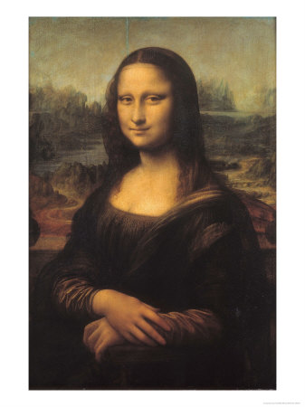
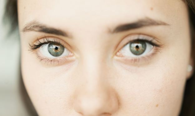
When starting to think about the assignment, I was drawn back to the research I did in Part 4 on how painters, in particular portrait painters, manipulated light. They are able to conjure light where it perhaps wasn’t previously present and interpret what is there  to create the shapes on a face or figure. Rembrandt was the master of this work and for this assignment, I wanted to play with some of the simple lighting arrangements that he was famous for.  For the subject, recalled Assignment 2 and how people reveal their emotions through the eye area of the face. I’m always fascinated by what makes us different and how we value that which we hold dear. My subject could therefore be the evolving way that people ‘cherish’ as they get older, which will provide the connection between what the brief describes as the information in the series.

I started to consider the concept of Window or Mirror, which was the topic addressed in the video call and a way of looking at how photography has evolved in its use.  The contrasting ideas of a photograph that reveals the subject in its truest form (the window) vs. the photographer’s perspective or views on it (the mirror), is a thesis well understood within the art.  Szarkowski’s book on the thesis [2] describes three significant photography releases during the 1950s; the first publishing of Aperture Magazine, the ‘Family of Man exhibition at MoMA and the publication of Robert Frank’s The Americans.  Each of these events had an impact on photography as a modern medium,  but for a variety of audiences and used photography in a different way from each other.  Aperture Magazine, although well known today reached a fairly limited audience at the time of its released.  This was considered to be because of the steady decline of the traditional photo magazine owing to their subject matter being more accessible to the public with advances in worldwide travel.  As with the publications it competed against, Aperture’s mission was to reproduce photographic works that revealed the subject in the best possible way (Szarkowski refers to the Adams and Weston ‘quest for the perfect negative’) and wasn’t really interested in anything more than documenting what was in front of the lens.   While influential to a whole raft of young photographers and of passing interest in magazine terms to a wider audience, Aperture’s initial impact was fairly limited.  By contrast, The Family of Man was a highly successful exhibition that revolved around the premise that all people were fundamentally the same although demonstrably not the case.  The photography for the exhibition was essentially curated to look the same from a technical perspective, while the subject matter varied considerably within the theme.  The people that saw the exhibition could relate to the familiarity and be challenged by the contrast.  Finally, The Americans looked at 1950s American life from the viewpoint of Frank.  The book highlights the social, political and racial tensions and contrasts the lives of members of the class systems in the US during a period of great change.   With these three events, we have windows and mirrors and a combination of both;  Aperture’s window on the world with its many different photographers revealing the subjects as best they can, Frank and his “searing personal view of this country the Eisenhower years”[2] mirroring his view of America into the public consciousness, and in the exhibition both cases.   The subject is revealed in a documentary style, but with the approach taken by MoMA to have consistency in the images themselves.  Here, the museum is forcing the perspective without necessarily changing the way we look at man, beyond the stark contrast of our similarities with differences.  For me, the categorisation of how photographers work with their art isn’t the important concept, but how simplicity of connection can make or break what the image means to the viewer.  I attribute this to the way I’ve historically looked at photographs, that is with much more bias toward the ‘window’.  When I first looked at The Americans, I struggled to make powerful connections between the images as to me, the seemed illogically ordered and often obscure in composition.  However, in progressing through the course, I’ve come to appreciate the visceral nature of Frank’s photographs as both a factual snapshot of 50s America, but also a bold statement of where the American dream had issues; something still very evident 60 years later.

Taking a Step Back

Following the completion of Assignment 4, I had a call with my tutor for feedback during which I asked how he thought I was doing so far.  My concern has been that I’m most comfortable with the technical aspects of photography than the artistic and I was keen to know from my previous work, what my tutor thought.  His feedback was that it was clear that I knew my way around a camera and the technical skills of shooting both digital and film.  However, these strong connections with the technical are evident in how I approach the work, often with the elements that link a series together being something to do with how the photograph was taken rather than intention.  The feedback was that I needed to look more closely at connecting the images with something more subtle, expanding more on the what I am trying to say about the subject and its context, than the technical achievement of shooting it.

At this point, I had a loose idea of shooting a subject with a single camera for my 10 images, but the idea revolved around the simplicity of the camera itself.  My medium-format pinhole camera is one of my favourites because of the unique look of the photographs it makes, but also the simplicity of its use.  For the assignment I planned to  shoot portraits of people with the theme of something they cherish or treasure with this camera and I went to the lengths of working out how long each exposure would be depending on the film, reciprocity failure etc etc.  This recent feedback, though had made me realise that once again, my ideas were technical; the camera is very simple to use, but the skill required to use it is much higher and I was drawn to how clever it would be.   I think this can be described as a ‘lightbulb’ moment which required me to reconsider this assignment; take a step back.

Ideas…Ideas…Ideas

With the objective now to connect to the subject in a way other than technical, I started to review the constant theme that has been running through my work on this course to date; revelation. As the brief calls for new information in each photograph in the series, my approach to composition or what is in the frame, would be similar to previous work. With regard to Window or Mirror, though how much would the subject reveal itself naturally and how much of my perspective would encourage the detail to be revealed?

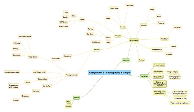
I started with thinking about the things that inspire me and created a mind-map. Mind-mapping has been a useful tool that I have used in my professional career, so my thinking was that I could use this to help encourage inspiration for this assignment, My mind-map is shown below:

Assignment 5 - Photography is Simple

While I’ve been interested in architecture and landscape for many years, my studies have moved more towards shooting what I’ve referred to as ‘pattern of life’, most of which involves people being in the frame. Assignment 3 on The Decisive Moment was the most challenging so far because of how I find shooting people an uncomfortable experience. Not wanting to duplicate the classic street photography style, I came back to my original thoughts about portraiture, which left me unable to decide who my subject should be. Lots of people inspire me, from my Dad who was the person who introduced me to photography in the first place (and has encouraged me ever since), to my wife Jayne, who’s athletic achievements are a constant inspiration.  My friends, colleagues and family all impact on me in more that one way, so perhaps one of them could be my subject.   A few years ago, I had the idea of following a friend around during a typical day in their life, which was inspired by the diversity of my friends’ professions and interests. The challenge would be avoiding simple documentary shots with something that obviously points towards the interesting element, for example a racing driver sitting in a racing car.  I would need to combine context with perspective to reveal the detail without leading the viewer to the answer; in the same example a close-up of a helmet visor or item of race clothing could reveal the information on its own.

My Idea

The mind-map itself wasn’t all that helpful in selecting a single subject for this assignment, but combined with an important meeting at work, I eventually settled on what I wanted for the series. As I’ve mentioned previously, I work in engineering and am part of the leadership team for our business.  Following a recent number of changes to our organisation, we held a 2 day leadership meeting away from the office to work on our future strategy.  As part of our preparation for the event, we were asked to put together a single presentation slide called Who Am I?   The slide was to contain photographs only, as opposed to a written narrative, that we would talk through as an ice-breaker at the beginning of the meeting. I  have done many exercises like this one before, but the concept of describing myself with pictures alone was a challenge.  I started with my parents and family and moved through my work, marriage and interests. The challenge here was to find a single image that told as much as possible about me as space on the slide was limited. The finished version of the slide can be seen below.

Screenshot 2019-09-18 at 09.01.42

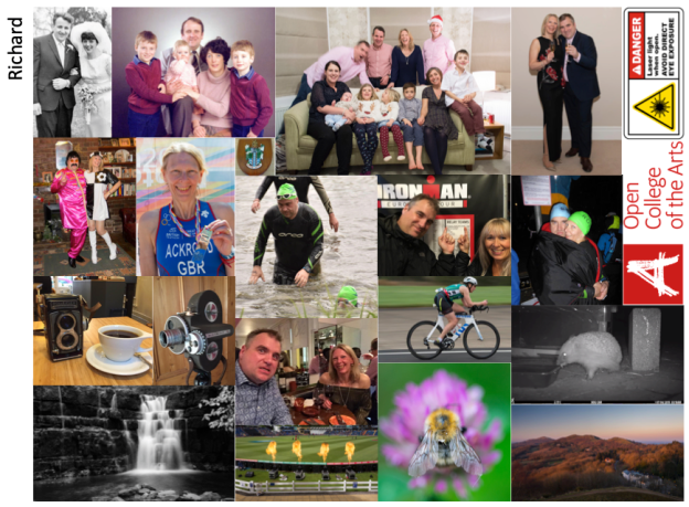
Who am I? slide presented at a work meeting

In a sense, this was a revelation of the important things in my life and I was happy with the result. The main issue for me was that despite careful selection, I still managed to miss out some of the things I hold dear; my love of motorcycling, the arts and charity interests.  This realisation brought Szarkowski’s window and mirror thesis back into my thinking.  Photography that exhibited the former tended to be representative and documentary in nature and during the 1950s it became clear that photography was not able to describe the scale or impact of events.  Szarkowski refers to Don McCullin’s photographs of the Vietnam war as being powerful and impactful, but that they didn’t directly affect the way that people saw the conflict on a larger scale.  It would seem that the window being described is actually fairly small.  As Meyerowitz described the viewfinder as the limited view we have by comparison with the field of view of the human eye,  Szarkowski concluded that the singular window was not enough. When I was compiling this slide, I paid careful attention to the sequence with regard to logical flow; my parents wedding in the top left corner and my cameras and wildlife interests in the bottom right. In this sense, the slide is a mirror of how I want myself described. Fairly quickly, I settled on the idea form this assignment. My series of shots would be self-portraits that describe who I am.  The key differences in my concept would be that in most cases, I would be directing another person to shoot my picture, rather than the now-all-familiar selfie which has become part of our daily lives.  The series would be intended to both mirror my own views of who I am as well as show enough of my personality to create a narrative in the viewer.  I would bring the simplicity to the series through the composition but not the technical aspects of each photograph.

Influences

When I think of self portraits and their ability to both reveal and mystify, I think of Vivian Maier. Maier was an unknown photographer who was discovered by accident when boxes of her possessions came up for sale in an estate auction in the US. When the new owner started to look through the boxes, he found thousands of images in negatives and undeveloped film rolls. As he started to catalogue and scan the find, the quality of Maier’s work became clear and although the nature of the discovery and its subsequent exploitation divides opinion, she is now a highly regarded artist.

The mystery of Maier for me is that despite the efforts to understand her life and work by the owner of her work, later described in the documentary film Finding Vivian Maier, little is really known about her. This makes the self portraits she took with her trusted Rolleiflex TLR camera all the more alluring. She was noted to be a quiet person by those who knew her, so why would she peer into her own eyes with her camera reflected in the glass of a shop window? I took this as the basis for my series and the simplicity of photography that the brief was asking for.

Another portrait influence of mine has been David Bailey.  Famous for shooting the famous, Bailey’s portrait work has always appealed to me as his approach is to shoot the subject in an apparently simple, high-key light setup.  His most famous work was, of course shot on black and white film, which emphasised the range from highlight to shadow and for me, reveals the complexity behind the simplicity of his images.  The engagement between photographer and subject is clear, but we are not sure how much of it is Bailey trying to capture what we know or how much the subject wants to show us.  In the case of his portraits then, Bailey is both window and mirror, with the subject playing their part to a greater or lesser extent.  One of favourite shots was of Jack Nicholson in 1984 (shown below).  When I saw the Stardust exhibition[3], this image in particular made me smile as I instantly related it to another print of Nicholson that I own.  Here we have Nicholson in Bailey’s traditional setup, but with a very simple Rembrandt light which I’ve used previously with a single diffused strobe and reflector.  However, this photograph is all about Nicholson and his eccentric character.  The image works because he is showing us what we know about him, lifting the impact from a simply-lit actor in a contrived fashion pose, to a snapshot of a larger-than-life personality.    Like the Family of Man exhibition, here we have the familiar speaking for itself and more importantly, being similar yet very different from the rest of the collection of Bailey’s images.   The other image I referred to earlier is a film promotion shot by Herb Ritts of Nicholson in his Joker make-up from the film Batman (1989).  The similarity in what the photographs ‘reveal’ about the actor is clear, even though the lighting and composition of the images is different.

Bailey Nicholson001

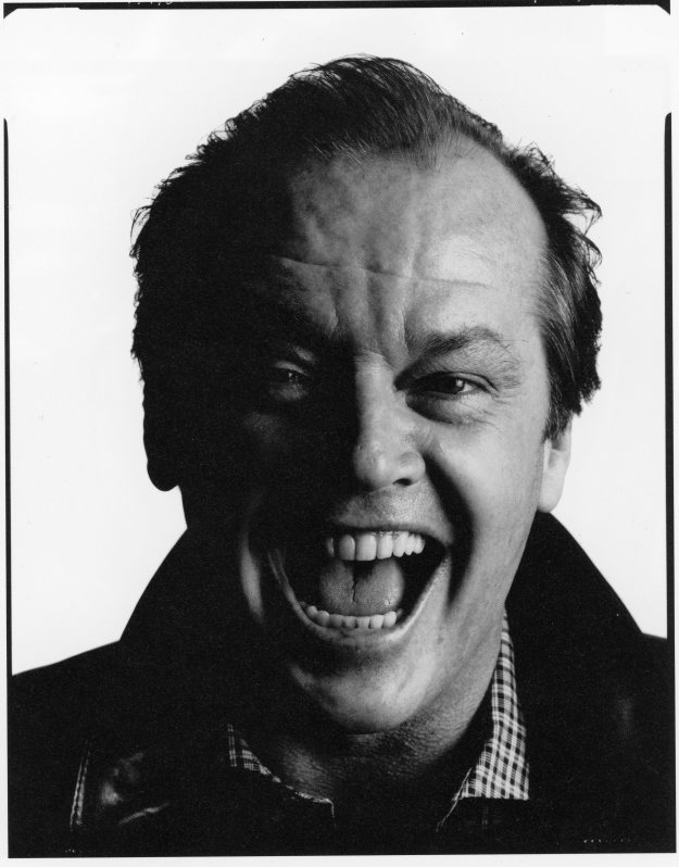
Jack Nicholson (1984) by David Bailey from Bailey’s Stardust

D-03-03

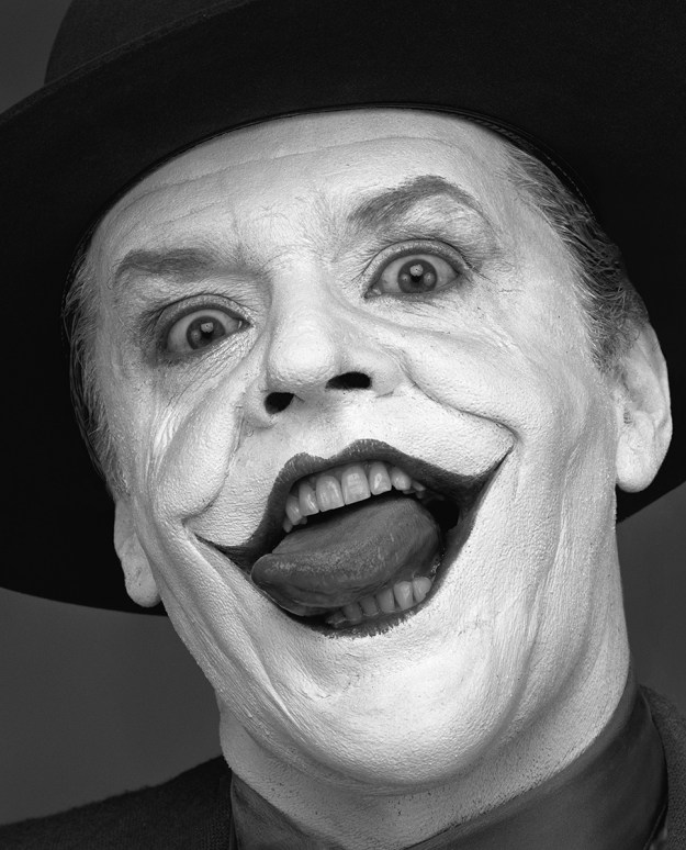
Jack Nicholson III (1988) by Herb Ritts []

The Shoot

The first aspect I settled on was the basic look of the images.  I’m a huge fan of black and white, mainly because of my passion  for film and driven the film stocks that are still available.   For this assignment, I wanted to combine digital and film if possible and with my favourite film cameras being 6x6cm medium format, decided that the series would be square crop black and white.

Beyond this decision, I wanted to limit my technical thinking and concentrate on the subject.   I’ll confess to being someone who does not enjoy having my photograph taken.  A friend recently pointed out that the images of me he has seen on social media were either with a serious expression or the extreme opposite ‘clowning around’, with very little in between.  This reminded me of my very first conversation with my tutor, where we discussed the importance of constructive feedback, no matter how uncomfortable.  I believe myself to have a good sense of humour and the ability to make my friends and loved ones laugh, but am also aware that it’s virtually impossible to switch this on and off.  Therefore, my images would reveal something about me in a completely natural expression, whatever that may be.

Equipment

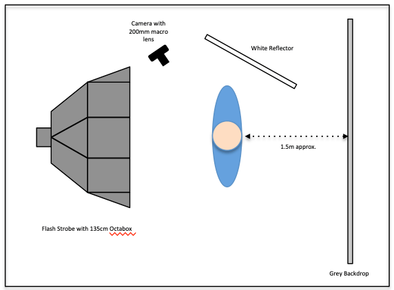
I used two cameras for this shoot; my Nikon D4 DSLR with three lenses (24 to 70mm, 70 to 200mm and 200mm macro) and my Hasselblad 500cm with an 80mm prime lens.  The film used was Ilford HP5+, ISO400 stock, which I developed myself at home.  I used a variety of light sources, but mainly my Elinchrom studio strobes with soft boxes, grids and snoots.   The main addition during this shoot was the discovery of the tethered web-based control for the D4, which I hadn’t known about.  This program made setting up and shooting myself much easier for some of the shots.

The Images –  Pictures of You?

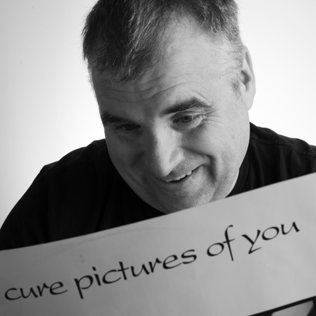
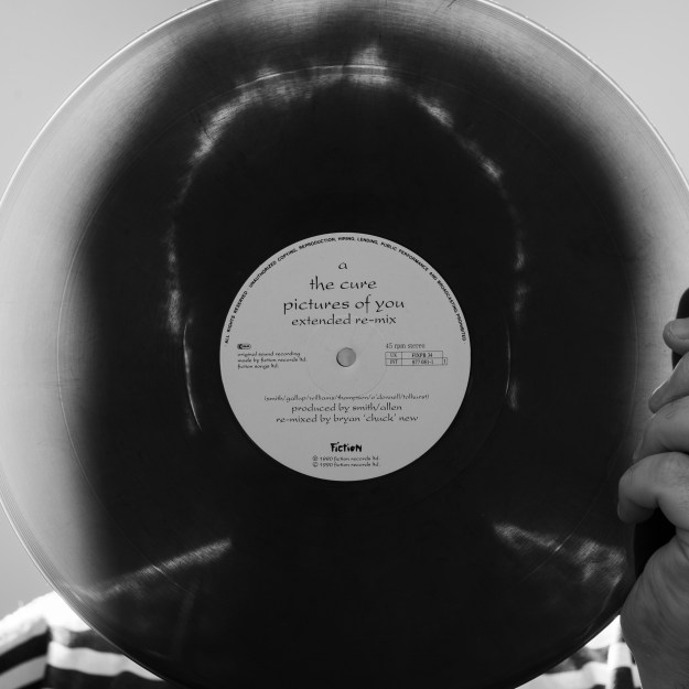
“I’ve been looking so long at this pictures of you, that I almost believed that they’re real”, Robert Smith, The Cure

Review

One


DSC_3801

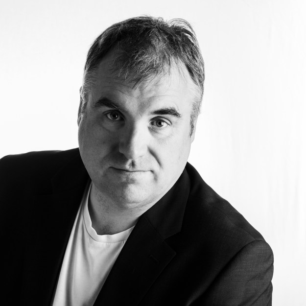
This shot was inspired by Bailey and his high contrast black portraits and is essentially what many people see in me.  I’m a professional with a senior management position, in which I’m expected to fit a certain mould.  For the most part, this isn’t a challenge although I don’t wish to be seen as a stuffy guy by the people who work for me.  I wanted to express the formal an informal here through the clothes and pose, but maintain a level of focus with my eye contact with the camera.

Two

DSC_3554

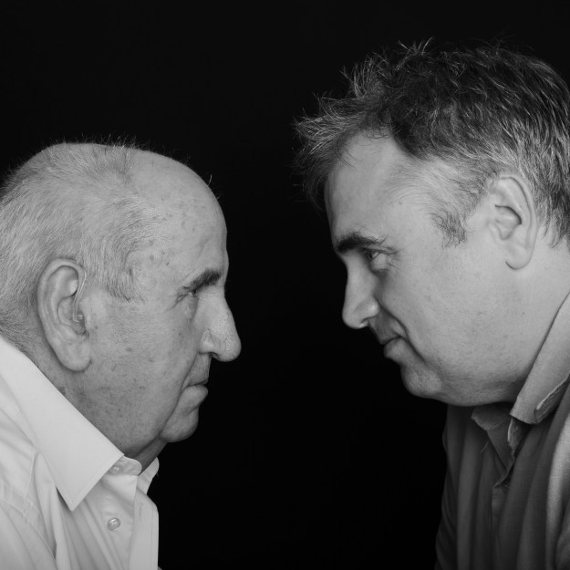
My Dad and his wife came to dinner recently and he very kindly agreed to sit for this portrait of us both.  For most of my life, people have pointed out our family resemblance which actually happened when I talked through the Who Am I? slide at work; my colleagues wondering how I’d travelled back to the 1960s for the wedding photograph!  As we’ve grown older, the differences between how we look have joined those similarities; something I wanted to capture in this photograph.  The composition was inspired by Mel Smith and Gruff Rhys Jones’ head to head segments in their comedy show in the 1980s.  During this shoot, our inability to stop laughing resulted in a number of different versions.  I chose this one, because as well as appearance we are also very alike in personality, which has led to tension from time to time; I believe this image reveals these details in what is a simple composition.

Three

DSC_4145-merged

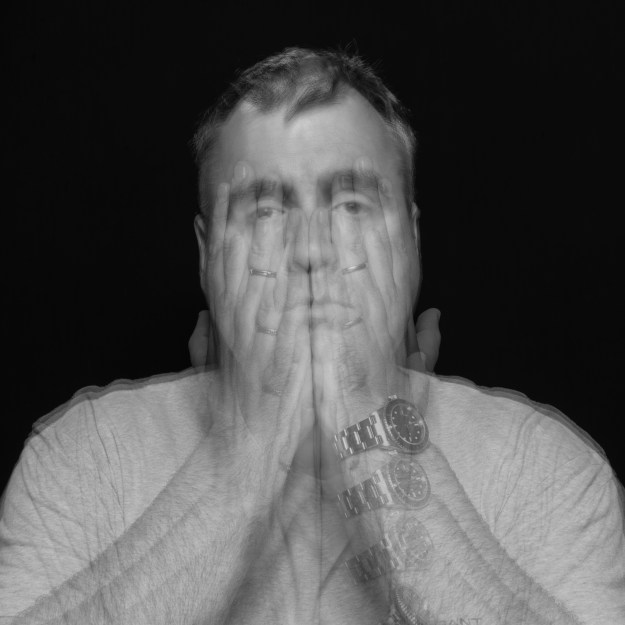
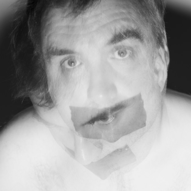
Following the death of my mother, I suffered from depression for over a decade which had a damaging affect on me and the people closest to me.  Apart from the classical symptoms, one of the noticeable issues was my desire to hide.  After many years of support, I started to venture out more both socially but also in terms of what made me happy.   Photography for me was one of the interests that came from that time and has been perhaps the most revealing part of who I am ever since.  It was my Dad that originally inspired me to pick up a camera, being a professional himself, so I feel this image naturally leads on from Two.  This picture is actually a digital ‘multiple exposure’ which was assembled in post-processing.

Four

DSC_3696

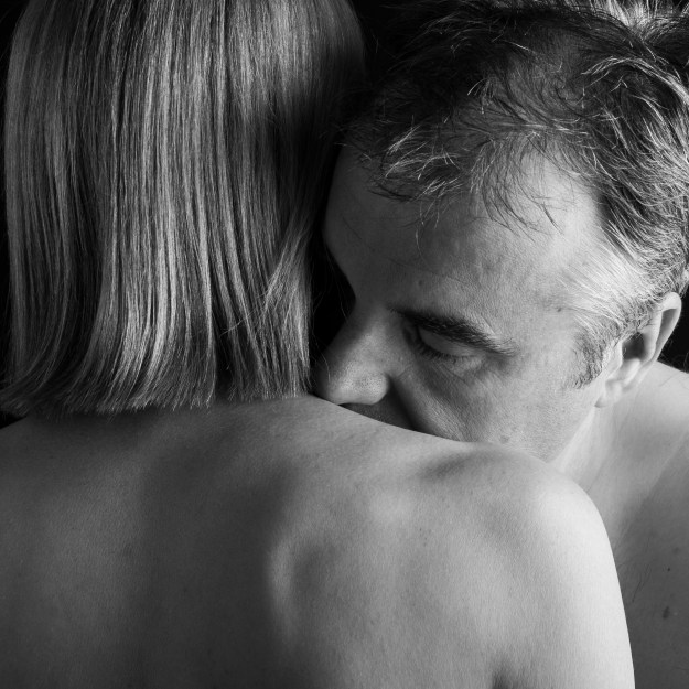
With that period of my life came also my getting married.  My wife has always been a great source of strength and support from recovery to furthering my career and starting this course.  I wanted to show my relationship with Jayne as naturally affectionate, but also completely open with the contrast of order and chaos; her straight blonde hair and perfect figure against my dishevelled hair and creased complexion.  I emphasised the closeness with the tightness of the crop and softness of light and shadow.

Five

DSC_3712

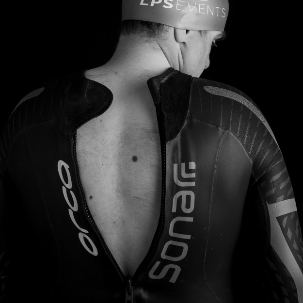
From relationships to interests and what links them.  I’m not a natural athlete, but after a long distance open-water charity swim in honour of my late mum, I became hooked.  The concept behind this shot was to show the vulnerable guy in Four in a more statuesque pose akin to an athlete.  The wetsuit being partly zipped up was to symbolise the transformation from being the slightly overweight forty-something to athlete, inspired by the myriad of superhero movies that surround us today.  The biggest challenge with this shot was not overheating as the outfit isn’t designed for the photographic studio.

Six

DSC_3518

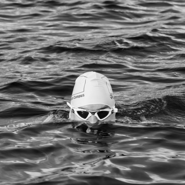
Leading on from Five is the sense of enjoyment and, more importantly peace that I get from swimming outside.  While I swim with others and compete in races, I see swimming as a solitary relaxation where problems can be worked through or let go of.  The composition is intended to reveal this, while, my partial obscuration (inspired by the Martin Parr work that I researched when shooting Assignment 3) shows the privacy of being alone in my thoughts.
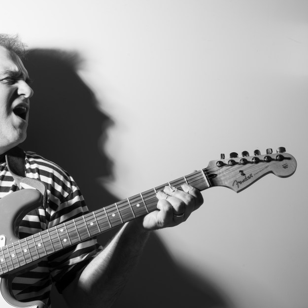
Seven

DSC_4043

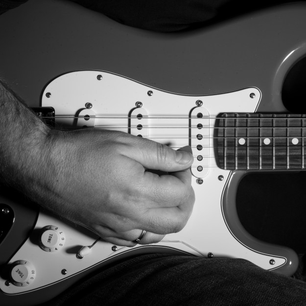
Another way that I relax is through my hobbies, in this case the guitar.  For this image, I wanted to avoid showing me playing the guitar as I’m very much a beginner.  The composition here is intended to show affection for the peace the guitar offers me.  My arm and hand are relaxed on the body of the instrument, almost cradling it.  I shot this without noticing my hand obscuring the volume control, but revealing the word Tone on the other control knobs.  In reviewing this photograph, the absence of volume actually describes how much the guitar relaxes my busy mind.

Eight

DSC_3871

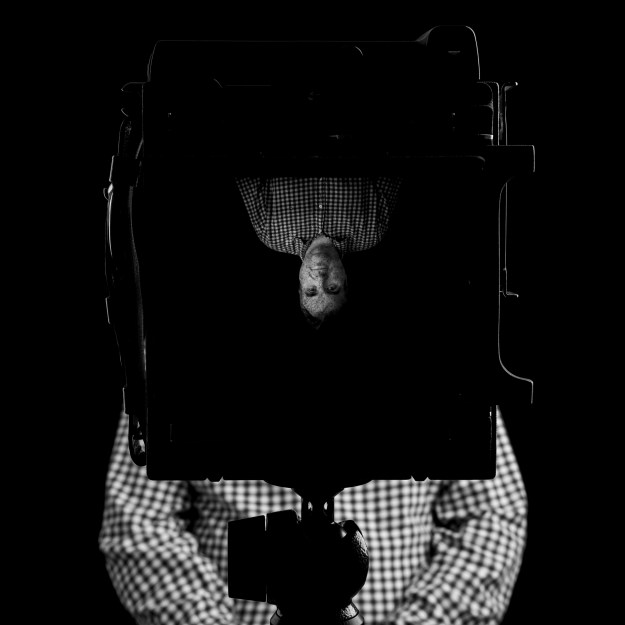
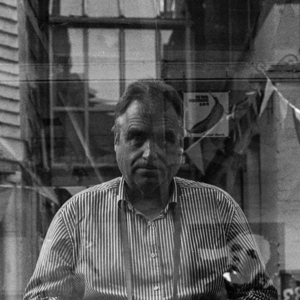
Photography is my main passion and more recently, my enjoyment of using film has led to a substantial collection of beautiful old cameras.  What I wanted to reveal here is my love of the technical with the aesthetic of the camera as an instrument in a more fun way than simply documenting me with one of them.  This shot came about after previous attempt at combining these elements (see Reflection).  I wanted something that wasn’t ordinary but that was still a portrait of me, which led to my using my Graflex Crown Graphic.  The inverted image of my head and shoulders connects back to the camera obscura, the most simple camera there is, while the rest of by body appears where it should.  I saw this as being the way my life has changed, almost turned upside-down by my passion for photography.   I used additional lighting to pick out the edges of the Graflex as its shape is unlike most common cameras.

Nine

Hassie 002

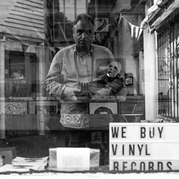
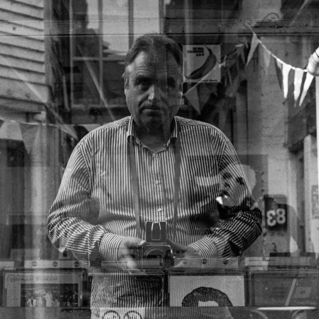
As well as a passion for photography, I’ve also loved music my whole life, even though I’ve not really played an instrument until my recent venture into the guitar.  I’m fortunate to live in a town with its own independent vinyl record shop where I can sometimes be found indulging my interest in both music and the artistic marvels of the vinyl album cover.  Inspired by Vivian Maier’s self portraits reflected in shop windows, I wanted to connect these two passions and emphasis my love for film cameras.  This image was shot with the Hasselblad in the image, was developed by me at home and led to a more traditional selection process based on a contact print (achieved using Lightroom).

Ten

DSC_4002

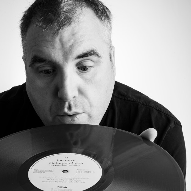
This final image came about following a visit to Carnival Records in my home town.  I’d purchased a rare 12 inch vinyl copy of the single Pictures of You, by The Cure.  Having been Cure fan since my teens, this single is one of my favourites and it was made more special by the fact that the vinyl itself is red rather than black.  I wanted to use this image to both provide a theme for the series but also to tie it up visually by returning to high-key lighting.  As I mentioned previously, I struggle to smile on demand, so in order to create a more relaxed view of me, I decided to blow imaginary dust from the record surface.

Reflection

When I first thought about Who Am I? as a concept, the first things that sprung to mind were the obvious.  The slide I had produced for work took significant time to assemble from the many photographs of me within the context of my life.  However, when I look at them, they are an almost ‘social media’ view of me, as opposed to something revealing.  What I mean be this statement is that by looking at what I choose to share willingly, it is easy to see what is important to me.  What it does not achieve is any sense of context. For example, many of my acquaintances see a confident man, while those who know me really well know that the opposite is often the case.  Many people know how unwell I was, but very few saw the struggle to return to whatever normality is.  In this series of photographs, I have sought to reveal the things that people don’t see through imagery that on the face of it is fairly self explanatory.  In terms of the Window vs. Mirror, I would say that I am completely in control of that revelation; that there is no documentary visual associated with the way I’ve shot this assignment.

For the first time since beginning this course, I’ve left my technical head behind and focused entirely on what I’m trying to say.  Even so, the technical elements have been highly complicated in creating these pictures, even though the subject and composition is simple enough.  That was only the most recent piece of advice from the many helpful critiques by my tutor throughout this course.  Following Assignment 1, it was about keeping the theme focused, resisting the temptation to expand the concept to something that could actually fill many themes.  With Assignment 2 it was getting that broad feedback and being prepared to change, should that feedback not align with what I’m trying to say.  After Assignment 3, I was encouraged to push myself outside of my comfort zone; accepting the difficulty that brings and finally Assigment 4 was about looking for deeper connections that just clever use of technique.  I feel with this assignment that I’ve taken these points on board and that the series is the most successful I have been at expressing my vision so far.

What Went Well

As with Assignment 4, I found that I had to stop myself from trying too hard to come up with a theme.  The open nature of the brief made this particularly difficult and I found I continually in danger of the huge potential scope problem that I had in Assignment 1.  Interestingly, it was an alternative thought about portraiture and turning the camera on myself that started this series.  In seeking to reveal myself, I tried lots of things; some working and some not. I’m very happy that each of the photographs leads on from the previous and in some cases refers back to others.  Some of the smaller details included in the shots, e.g. the use of contrasting stripes and checks of my shirts in the ‘photography’ pictures were intended to subtly reinforce the subject, in a similar way to Frank’s use of windows and flags in Frank’s The Americans.  Above all, I was able to see the images for what they mean rather than how well they were shot.  A good example of this is Two, where the reactions of my Dad and I were so different.  Dad was a professional portfolio and wedding photographer so was predictably concerned with the composition; me being higher in the frame etc.  I agreed that the composition probably wasn’t perfect, but the effect was what I was looking for.  I guess, like me, there will also be some element for him of not liking oneself in photographs at play too.

When it came to the strength of what I was trying to say, I concluded that two of my original set were not strong enough and needed to be re-shot.  The first (below) was the original concept for Eight.

DSC_3572

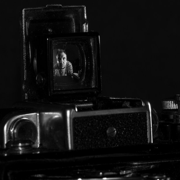
Rejected candidate for Eight

The rangefinder on my 1936 Zeiss Super Ikonta has a highly reflective mirror that I thought I could shoot my portrait reflected in.  The result was fine, but the use of a macro lens to get the portrait left too much of the camera out of the shot, which I felt didn’t do it justice.  I also realised that it meant that there were two very similar techniques in Eight and Nine if I included the shot in the series.  Replacing Eight with the Graflex brings balance to the series and improves the way the theme flows.

The second image (below) was a candidate for Ten.  My concept was to include a ‘happy’ version of me enjoying the record.  However, as I indicated previously my discomfort with being in photographs means that I can’t really create a false smile.  Every attempt a this shot looked artificial compared to the other photographs in the series.  I also realised that the record sleeve wasn’t actually that obvious either, instead potentially looking like a magazine or photograph.  I then decided to use the vinyl record itself, knowing that the red colour would present as a lighter tone than black in the final image.  By blowing the dust away from the record, I achieved a more natural look.

DSC_3960

Rejected candidate for Ten

In terms of the individual photographs, the most powerful for me is the one with Jayne.  I had the idea from a picture that I shot of our friends Janet and Bill at the end of Janet’s return to competition following her recovery from cancer[5].  That image was very powerful as although she was the subject of the picture, she wasn’t the only one in the frame.  With Four, I sought to show me in the context of the importance of my relationship with my wife.  The shot took some patience and careful setup, but both of us reacted the same way to the finished image.

What Could be Better

In this assignment, there weren’t really any significant things I would have done differently.  I was challenged to overcome my discomfort with being the subject, which I did through concentrating on what I wanted to say.  Arguably I still over-analysed my ideas and tried to force a theme, but quickly remembered my experience with Assignment 4 where I just went out and shot artificial lights to begin with.

In terms of the series, I think the one that doesn’t fit as clearly as the others is Seven, because although it fitted my narrative of the things that give me peace, I couldn’t find another composition that said that without cliché.  I’ve seen may close-up photographs of guitars and guitarists using shallow depth of focus to create a surreal effect, but that wasn’t what my connection with the instrument was about.  Having settled on the candidate for Seven, I struggled to find another that would work better in the series than the other 8 images.  That said, I’m happy with how the image itself turned out. My original idea was to capture my heart-rate monitor reading on my wrist, but the challenges became purely technical and I quickly concluded I was tying too hard to be clever.

Photography is Simple?

This was the theme for the assignment and it became a question for me.  As the subject for the assignment, I’m both cooperative and resistive which in any other case would mean that a photographer could let me speak for myself.  However, as the photographer as well, I was trying to tell the story of the subject from my own point of view.  If my points of view are from the same personality, I am both mirror and window with neither being necessarily the stronger approach.  Winnogrand said that he took photographs to see what things looked like when photographed,  going on to say that he had a burning desire to see how things looked like when they are photographed by him.  These are the classic window and mirror existing at the same time.  How can photography be simple in its representation of a subject when this is the case?  The answer to the question from my perspective is that the photograph is simply a connection between the viewer and the seemingly familiar.  We can limit our vision to the elements in the photograph while simultaneously looking for meaning in the things that are not in the frame. The complexity that makes that connection is the artistry of the photographer.  Photography itself is simple, but it has little meaning unless those relationships between photographer, camera and view are in harmony with each other.

Testing the Water

There was one question remaining as I completed this assignment, which was regarding how my personal voice has developed.  I was happy that the selection of images revealed what I intended, but as part of the write-up I naturally added external contextual information to each shot.  We know from Part 5 that context can be manipulated by factors within and outside of the photograph, so how would the set be received by people without the accompanying narrative?  I answered this question by showing the images to  my friends, family and colleagues, all of whom know me in different ways.  Their reaction was a rewarding experience as each saw the pictures very differently, but understood they connected as a set.  The image that provoked the most significant reaction was Four.  People saw affection and vulnerability, but also reluctance and distance.  The latter pointed to dominance and chauvinism, which couldn’t be further from reality.  I concluded that this image in particular created the improbability that we discussed in Project 2 by allowing the viewer to interpret a number different contexts from the composition alone.   I’m happy that the assignment meets the brief, but also that my approach expressed my vision as intended.

References

[1] Fletcher, R, October 2018, Learning Log Article “Always Meet your Heroes”, https://richardfletcherphotography.photo.blog/2018/10/26/always-meet-your-heroes/

[2] Szarkowski, J, 1978, “Mirrors and windows : American photography since 1960″ – page 16, MoMA. https://www.moma.org/documents/moma_catalogue_2347_300062558.pdf

[3] Bailey, D, 2014, “Bailey’s Stardust”, National Portrait Gallery Exhibition Catalogue

[4] Ritts, H, 1988 “Jack Nicholson III” – http://www.herbritts.com/archive/photo/jack-nicholson-iii-london-1988/

[5] Fletcher R, 2019 “Project 3 – What Matters is to Look”, https://wordpress.com/post/richardfletcherphotography.photo.blog/782


Acknowledgements

Thanks to my wonderfully patient wife for modelling, shooting and offering feedback when I needed to hear it.  To my Dad also, who started all this and to Chris Heard at Carnival Records for letting me shoot his shop window.

Assignment 3 – The (in)decisive moment

The Brief

Create a set of between six and ten finished images on the theme of the decisive moment.  You may chose to create imagery that supports the tradition of the ‘decisive moment’ or you may to question or invert the concept by presenting a series of ‘indecisive moments’. Your aim isn’t the tell a story, but in order to work naturally as a series there should be a linking theme, whether it is a location, event or particular period of time.

Include a written introduction to your work of between 500 and 1000 words outlining your initial ideas and subsequent development.  You’ll need to contextualise your response with photographers that you have looked at and don’t forget to reference the reading that you have done.

Initial Thoughts

The photographer’s eye is perpetually evaluating. A photographer can bring coincidence of line simply by moving his head a fraction of a millimeter. He can modify perspectives by a slight bending of the knees. By placing the camera closer to or farther from the subject, he draws a detail – and it can be subordinated, or it can be tyrannized by it. But he composes a picture in very nearly the same amount of time it takes to click the shutter, at the speed of a reflex action.

Sometimes it happens that you stall, delay, wait for something to happen. Sometimes you have the feeling that here are all the makings of a picture – except for just one thing that seems to be missing. But what one thing? Perhaps someone suddenly walks into your range of view. You follow his progress through the viewfinder. You wait and wait, and then finally you press the button – and you depart with the feeling (though you don’t know why) that you’ve really got something. Later, to substantiate this, you can take a print of this picture, trace it on the geometric figures which come up under analysis, and you’ll observe that, if the shutter was released at the decisive moment, you have instinctively fixed a geometric pattern without which the photograph would have been both formless and lifeless.  – Henri Cartier-Bresson, The Decisive Moment, p.8.

When beginning this assignment, I was already aware that this is a brief that causes some difficulty among students.  Following on from “Collecting” where the objective was to create a strong theme throughout that links the photographs, we are now presented with the additional challenge of supporting or inverting a concept by one of the most influential photographers of the 20th Century.  The decisive moment has had its supporters, adopters, doubters and opponents over the past 80 years, so how do we identify with one of these groups while putting our own interpretation into them.

‘The decisive moment is not a dramatic climax, but a visual one: the result is not a story but a picture’  – Szarkowski, 2007, p.5

Szarkowski’s assertion about the decisive moment is a good starting point as with most of his book [1].  Like most people, my early photography was snapping pictures of whatever was in front of me without any planning or understanding of what I was trying to get across.  Storytelling or a visual climax that has the view asking questions about what the photograph might mean, didn’t enter my ‘process’ of taking the picture.  As I progressed in confidence, my thoughts moved towards creating something that was pleasing to look at, which in turn drove me to photographing landscapes.  However, I was still trying to simply please the viewer rather than present them with a photograph that revealed the subject or, heaven forbid told a story.    The idea of some order to the photograph that includes visual and contextual balance along with inviting the viewer to create their own accompanying narrative, appeals to me.  However, I also see value in the counter-argument that the decisive moment does not describe the events prior to, or  following the moment the image is made.  To truly reveal what is going on with the passing of time needs more context, such as in the work of Graham and Luski [2].  While I admire the counters to the decisive moment, I am more interested in my own interpretation of the concept as defined by Cartier-Bresson.  As someone who has struggled to shoot this way, I wanted to shoot this assignment in tribute to it, as I believe it still has relevance today in its challenging the viewer to internally narrate what they see.

There were a two elements of research during Project 3 [2] that captured my interest.  The first being the admission by Cartier-Bresson that luck played a major part in one of his iconic decisive moments and the idea contrasted with really looking at the scene.  The second being the idea that a decisive moment cannot be forced or brought into being by the photographer.  I concluded from this that a plan is not a bad thing, thinking in particular about Cartier-Bresson’s Hyères, 1932 [3] but that in preparation for a photographs like that, the photographer has some element of control over when the decisive moment occurs.  In addition, one can work the subjects in the frame to gain the best chance of capturing the moment, by altering perspective or viewpoint and waiting for the rest of the picture to present itself.  The quotation from his book, The Decisive Moment places a great importance on the decision by the photographer to take the picture in addition to seeing the moment itself either instantaneously occurring or evolving in front of them.

Why have I struggled with this?

Simply put, my original interpretation of the decisive moment was being able to observe, identify and capture the moment instinctively and with alacrity.  Street photography that involves people forming part of the subject matter has always been a difficulty to me, owing in part to my lack of confidence in shooting discreet pictures of people.  However, knowing that I can set some parameters to the image before the moment occurs, gave me the inspiration to try street photography again during a recent trip to London.  An example of my work from that trip can be seen below.

Southbank, London 2019 by Richard Fletcher

I saw the man sat on one of the brightly coloured benches outside the Southbank Centre with his dog.  It was clear from his behaviour that he was waiting for someone to arrive. I was shooting with my Leica M6 with a 50mm lens mounted, which offers a very discreet shooting experience because of its quiet shutter but having a focal length that required me to be close to the subject.  I positioned myself where I could see the dog clearly and some contextual background in the canopies and the pathway that had many people walking along.   To be even more discreet, I asked my wife to sit just outside the frame on the right hand side so that it looked like I was photographing her.  When the woman appeared and greeted the dog, I shot two frames.  The luck element in this composition was the casual observer behind the subjects, which for me makes for the decisive moment.  My input to it was different to previous street photography experiences where I wandered around trying to will a picture into being by observation only.  My lack of speed with a camera as old as the Leica meant that I had previously missed many intended decisive moments.  Armed with this approach, I began researching the photographers that inspire me.

My Research

I’ve previously stated that the work of Joel Meyerowitz has inspired me a great deal in my photography over recent years.  My favourite photograph in any genre is one of his early colour street photographs that is a great example of the decisive moment (below).  This fleeting moment with its huge visual impact and potential for narrative captures my attention every time I look at it.  It’s not a surprise that his body of work contains many classical decisive moments.

Paris, France, 1967 by Joel Meyerowitz (from Taking My Time, Phaidon)

“A young man lies on the sidewalk with his arms outstretched. A workman with a hammer casually steps over his fallen body. A crowd stands at the entrance to the métro, stunned by curiosity into inaction. A cyclist and a pedestrian each turn over their shoulders to catch a last glimpse, while around them the traffic glides by. Which is the greater drama of life in the city: the fictitious clash between two figures that is implied, or the indifference of the one to the other that is actual? A photograph allows such contradictions to exist in everyday life; more than that, it encourages them. Photography is about being exquisitely present.” – Joel Meyerowitz talking about Paris, 1967 in 2014[4]

While I wanted to pay tribute to the decisive moment and this image in particular, I wanted to look at how the photographer’s decision can be brought directly into the image, using either subtle or exaggerated ‘working of the subject’ within the composition.  Reviewing Meyerowitz collective works book [5], one photograph struck me as an example of the photographer’s ‘decisive moment’.  This image can be seen below.

New York City, 1963 by Joel Meyerowitz

Here we are a lady in a ticket booth looking toward the photographer but her face is completely obscured by the microphone grille in the glass in front of her.  She is not in the plane of focus, instead Meyerowitz draws the attention to the glass screen and the information on the sign attached to it.  My initial reaction was to question whether it’s a decisive moment at all, but noticed that I was narrating what was occurring in the image.  I then realised that the moment is the photographer’s as a booth like this is intended for as brief an engagement as possible.  Meyerowitz had to see the juxtaposition of the woman and the grille, the frame created by the glass and the balance between in focus and out of focus elements, all presumably before holding up the line to the booth or being noticed by the subject herself.  For me, a decisive moment driven by perspective and deliberate obscuring of the main subject both spatially and in focally.

I recently had the opportunity to view exhibitions by Diane Arbus and Martin Parr; two photographers with very different styles.  In both collections, I saw images that follow similar lines to the above, placing the subject either in partial or full obscurity while having the impact of a fleeting moment.  The first, from Arbus’ exhibition at the Hayward Gallery in Southbank, London is a shot of a scene from the motion picture Baby Doll taken in 1956 in New York.

NYR_3408_0023

The scene is a a kiss, but the two people in the shot are almost completely lost in the way the photograph was exposed.  The lighting in the film was clearly to emphasise the female character’s eyes, which reminded me of my second assignment [6], but Arbus also underexposed the photograph in a way that preserved the few highlights while the boundaries of the composition are lost in darkening shadow.  The effect is that the image clearly shows the fleeting moment of the kiss in the linear timeline of the film, but Arbus creates the visual impact by obscuring any detail or distraction from the frame.  I don’t personally know the film, so the context of the scene invites speculation as opposed to the picture telling a story in its own right.

By contrast, the image using this approach that struck me from Martin Parr’s exhibition at The National Portrait Gallery [7] is a fun affair.  I’m a fan of Parr’s lighthearted perspective on life and social class, brought to life in almost over-saturated pictures.  They remind me of holiday snaps at first glance, but Parr’s technique is  to distract from clear photographic skill, leaving the subjects and settings to speak for themselves.  For his collection A Day at the Races, Parr took the photograph below using obscurity to emphasise the moment.

The Derby, Epsom, Surrey, England 2004 by Martin Parr

In this photograph, the conversation between the two main subjects is clearly cordial, but that’s about all we can see.  The man’s face is almost completely obscured by the hat and drink, which, along with the couple in them background set the context of the moment.  Unlike Arbus’ image, with this photograph Parr doesn’t take things too seriously and as with much of his work, the use of flash and the heavy saturation tend to polarise the public and critics alike.  However, the element of fun in this composition is something I intend to introduce to my collection for this assignment.

The final photographer I researched in preparation of this assignment was Garry Winogrand.  Winogrand was a photographer who didn’t approach his work with over-complexity or the need for a narrative.   In an interview towards the end of his life [8] he said

“A picture is about what’s photographed and how that exists in the photograph – so that’s what we’re talking about. What can happen in a frame? Because photographing something changes it. It’s interesting, I don’t have to have any storytelling responsibility to what I’m photographing. I have a responsibility to describe well.”  

What he was saying here is that a subject undergoes a change from the perspective of the viewer and the photographer is responsible for how it is presented, not what it might mean; very much in line with the devolved sentiments around the decisive moment.

While he photographed many subjects, he was known for challenging compositions that often caused controversy, for example his photograph of a young mixed-race couple carrying chimpanzees at Central Park Zoo [9].  The photograph was has a naturally balanced composition with the couple merely walking along, completely relaxed.  It was interpreted by a shocked America as a suggestion of what might happen if a mixed race couple were to have children.  Winogrand saw the likely problem at the time but asserted no responsibility for how others would interpret it.   The same drawing of conclusions beyond what is in the photograph as experienced in a decisive moment.

He took his documentary style of wanting to see how things looked then photographed [8] through a number of subject matters.  One of the first of Winogrand’s images that I saw was from his collection The Animals (below)

Central Park Zoo, New York City, 1962 by Garry Winogrand

Here we see a simple composition of a sign describing the occupant of the enclosure.  Only on closer inspection, we can see the moment where the bear’s jaw, its face obscured by the sign.  The image is devoid of clutter and the subjects within the frame all relate to each other. However, the brief moment of contact with bear indicates captivity, which can be interpreted a variety of different ways.  The convergence of the teeth and the cage sign occurs at the decisive moment, but the visual climax is made by how much of the bear we do not actually see.

My Idea

The works of these 4 photographers are different from each other in so many ways, but the common thread of these images is that they are a series of decisive moments, driven more by the photographer’s decision to release the shutter more than a specific action taking place.  Each has a planned feel to it, with the subject being worked to an extent before the moment that the photographer is trying to catch is committed as an image.  The missing elements caused by obscuring part of the subject causes the stand-alone visual climax that Swarkowski was referring to as well as promoting the narrative that might the reason behind the photograph.  Each photographer went about it in different ways and with different styles but reached the same outcome.

My series of photographs will be on the theme of unconventional perspectives on a moment that I decide to shoot, using some playful juxtaposition of subjects being partially obscured.

 Some Thoughts on Styles and Subjects

My first requirement was to try to emulate Parr’s sense of fun.  The subject must be in plain sight but not necessarily obvious as with Winogrand’s bear and there must be some context to where the subjects are within the frame.  Decisive moment may not tell a story, but the image must be in balance.  Street scenes were the obvious choice as there are people and situations that they find themselves in, no matter how mundane.  As well as partially obscured faces, I was looking for an obvious human form, but only part visible to the viewer to create a disembodiment, e.g limbs without bodies, floating heads etc.  The decisive moment still needed to be captured too, so staging images beyond the level that Cartier-Bresson did was something I would not do.  

I also wanted the images to be colour to connect with Parr’s style, but although dominant, vibrant colours would be an option, I did not want to limit the set by copying Parr.  Another consideration was a recent EYV video conference where the question of ‘what makes a collection?’ was discussed.  Among ideas such as similarity of subject, environment and light, we discussed the use of aspect ratio and adopting either ‘all colour’ or ‘all black and white’.  The latter could be an option for this assignment but I concluded quickly that it was a lazy way of connecting the images together.  During the days of black and white film, there was no choice in the matter but with colour, the opportunities to link bold colours or subtle background tones were open to me.

The Images

Photo 1

It occurred to me that the decisive moment didn’t have to be something organic, that it could also include repeating, fleeting moments as with Arbus’ Baby Doll image which was itself a frame on a piece of film.  I spotted this mobile phone shot covered in scaffolding and the rolling neon sign promising repairs inside.  The irony reminded me of Parr’s recent collection ‘Britain at the time of Brexit’ where confusion is represented both literally and metaphorically.

Photo 2

Walking around Bristol, I encountered people wearing huge billboards on their backs, which obscured all but their limbs from some angles.  I followed these on their mission to offer cheap bus rides to passing visitors.  It was difficult to shoot as they would quickly turn to look out for the rest of their group who had scattered around the square.

Photo 3 

A well known busker in Bristol, Junkoactive Wasteman captured the attention of some climate change campaigners.  This shot was fairly straight forward in that once the dustbin lid cymbal was positioned with respect to the subject, it was a matter of waiting for the dancing.

Photo 4

I noticed two postal workers carrying a parcel to their van and noticed the brief moment where they were completely obscured.  I wanted this to be a simple composition, so positioned the van to dominate the frame with the subject on the right hand third line.

Photo 5

A coffee shop in Malvern that piles the cups high.  I noticed that the only member of staff who regularly made coffee was the tallest one.  I shot several photographs trying to capture him using the milk steamer.  The decisive moment I ended up with was him reaching for a cup from the stack.

Photo 6

Is saw this scene unfold as the pavement narrows near where the couple had parked their car.  In trying to navigate through the people, I spotted the dog’s head above the line of the car boot.  I shot two frames as the moment passed very quickly.  As with Cartier-Bresson’s luck, only when I downloaded to the computer did I notice the family reflected in the glass of the car behind.

Reflection

This assignment was a huge challenge for a photographer not comfortable with street shooting.  When researching the decisive moment for Project 3, I decided that for this assignment I would try to make things easier for myself.  I wanted to work with the concept as I believe it to be an important cornerstone to photography revealing a subject as it is impacted by what is happening around it.  However, I wanted to show that the decisive moment was as much about the decision to release the shutter as the moment itself, something that Cartier-Bresson mentioned in the quote earlier, but seemingly left out of many analyses of his work.   The more I looked at this element of the decisive moment, the more I realised that it can be found everywhere.  The irony here is that in consciously adding the photographer’s influence in this way, I actually made the whole assignment much harder.  I’ve never been an instinctive photographer, preferring instead to carefully compose and choose the look and feel of the image before pressing the shutter button.  There is no room for it in this work, which pushed me further than previous exercises and assignments had done.

For me, the strongest image is Photo 6 as it combines my viewpoint and the decisive moment itself in one photograph.  The equipment frustrations that I had all the way through this work was more evident in this shot than the others.  I have perfect street cameras in the Leicas but they are both film and my skills with them are not as advanced as when using my DLSRs.  However, in the event that the subject has seen me raise my camera to my eye I may as well be pointing a Howitzer at them.  If they hadn’t seen me, the noise from the mirror slap is enough to attract attention.  In the case of Photo 6, I managed to get all elements to work together.   I noticed that one of the elements that connects the images together are the colours red and green.  In some cases, they are dominant and in others subtle.  The only photograph that doesn’t follow the theme is Photo 1.  I like the irony of the composition which isn’t part of the rest of the set, but don’t feel like this image is as strong as the others.   However, given the difficulty that I had shooting for this assignment, I elected to include Photo 1 as it points to the in-organic decisive moment where the others rely on a brief slice of time related to life.

Overall, I am happy with the collection.  Each image achieves the obscured feel that the photographers worked with, as well as a decisive moment playing out in front of the lens.  I believe the decision to shoot is strong in each, which is what I set out to explain with the collection.  I would improve the strength of the collection by seeking to improve my street photography, which is largely through building confidence with practice.

References

[1] Szarkowski, J, 2007 edition, “The Photographer’s Eye”, The Museum of Modern Art.

[2] Fletcher, R, 2019, “Project 3 – What Matters is to Look”, http://www.richardfletcherphotography.photo.blog, accessed March 2019

[3] Goldschmidt, M, 2014, Artist Entry, Tate Museum, https://www.tate.org.uk/art/artworks/cartier-bresson-hyeres-france-p13112, accessed March 2019

[4] Phaidon Publishing, 2014, “Why Joel Meyerowitz thinks this is his best photo”, https://uk.phaidon.com/agenda/photography/articles/2014/september/03/why-joel-meyerowitz-thinks-this-is-his-best-photo/, accessed March 2019

[5] Meyerowitz, J, 2012, “Taking my Time”, Phaidon Publishing

[6] Fletcher R, 2019, “Assignment 3 – Collecting”, http://www.richardfletcherphotography.photo.blog, accessed March 2019

[7] Parr, M, 2019, “Only Human – Exhibition Catalogue, National Portrait Gallery

[8] Moyers, B, 1982, “Garry Winogrand is interviewed by Bill Moyers, https://www.americansuburbx.com/2009/06/interview-garry-winogrand-excerpts-with.html, accessed March 2019

[9] Winogrand G, 1967, “About a Photograph”, https://journals.openedition.org/transatlantica/7084, accessed March 2019

Assignment 2 – Collecting

The Brief

Create a series of between 6 and 10 photographs on one of the following subjects:

  • Things
  • Views
  • Heads

Some Thoughts on This Brief

The theme for this assignment is Collecting, which breaks down into three potential subject areas: Things, Views and Heads.   One of the first things that sprang to mind was something that actually could fit into any of the three areas, but was best classed as ‘Things’.  The more I consider my idea, the more I realise that it both challenges my photography in terms of technical and artistic perspective.

My Idea

 Ut imago est animi voltus sic indices oculi’ (The face is a picture of the mind as the eyes are its interpreter),  Cicero (106-43 B.C.)

A few weeks ago, I was off sick from work with the usual bout of winter flu-like illness that goes around a large office like mine.   Not being able to do much, I watched a procession of films on the TV in between naps, not really paying much attention to what was happening on the screen.  One of the films I watched that week was the 1991 film The Addams Family, which is enjoyable but not a particular favourite.  However, I noticed during the film the interesting lighting arrangement for Anjelica Huston, who played the family matriarch, Morticia.  The cinematographer had chosen to light her in just a very small region around her eyes to create a ghostly glow [1].  The effect is most noticeable when the character is in a low light scene, which is pretty much the whole film.


My curiosity led to some research into how this effect was created, but more importantly, I studied Huston’s face in photographs more closely in doing so.  One of her characteristic features is her seemingly large eyes that are not easy to miss because of the way they dominate her facial expressions. In order to enhance the drama of Huston’s expression, the make-up artists added fillers to her eyelids to make them appear more wide and narrow.

Naturally, as an actress Huston uses her eyes more to express her emotions than the rest of her face, which is something not uncommon in the profession.  The cinematographer had decided that in order to see the real Morticia as a ghost-like, mysterious character, the audience need only to focus their attention on her eyes [1].  I found this to be very effective when watching this film.

I also got to thinking about a photograph I took in Marrakech a few years ago. I was walking down a street in a beautiful city where I had had problems with the locals because of my camera. The Muslim faith sees photography as a stealing of the soul and as such many people in Marrakech are often hostile when confronted with a photographer. On this particular day however, I stopped to give a homeless lady some money. She had caught my attention because, in spite of her obvious predicament she was wearing very brightly coloured clothing.  When I gave her the money, I asked her for a portrait which, to my surprise she agreed to.   When I reviewed the photograph, I was struck by a couple of elements, namely the expression in her eyes [2] and the fact that only on close inspection do we see how young she is.  When I shot her, I believed her to be elderly as her face was almost completely obscured.  Her eyes were what reinforced my initial thought as they have a sad, resigned look to them; for me someone who had been in this state for a long time and was just used to it.  At the time, I called this picture “Dignity”

Dignity

The next step in the development of my concept came through a conversation with a friend of mine who pointed out that people with autism struggle to read emotions on the faces of others [3].  Further research revealed that indeed, autistic children become adept at reading people’s whole body languages [4] with time and teaching, but struggle with combinations of facial expressions that they haven’t seen before.  When limited to just being able to see the eyes, an autistic child struggles even more, lacking the experience or ‘database’ to recognise what they have seen.  It’s a bigger challenge to them as eye contact with others is difficult for them to begin with.  As human beings, we express our emotions with our faces subconsciously but can also consciously change how we want them to be revealed.  For example, a sarcastic person can pull an expression with the lower part of their face to hide whatever underpinning emotion (perhaps hurt or sadness) is being expressed by the eyes.  An autistic child would struggle to read the two together, which causes them difficulty in how to behave in response.  More information to corroborate a conclusion, like the whole body language, helps overcome missing these subtleties.  Of course, reading body language is a complex skill that would be a strength in anyone in later life.

My idea for this assignment grew from there.   Could I collect emotions through photographing the eyes of my subjects?  Specifically ignoring most of the face, the eyes would raised questions in the mind of the viewer.  The photographs would be similar yet provoke a different response in the viewer.  The ‘collection’ would also need to stand on its own with each photograph having a place in the set with the others and demonstrate my learning from Parts 1 and 2 thus far.

Initial thoughts and questions

I decided early on that my research needed to take in the works of photographers and painters in equal measure as the latter created ways of guiding the viewer to the the context of their work without any ‘equipment’ constraints. The painters I would look at would be Da Vinci and Margaret Keane, all of which achieved emotion through concentrating on the eyes.

Firstly, I looked at the material supplied with the brief.   On the subject of ‘things’, we are presented with different ways of achieving the sense of collecting.  In both Ishiuchi Miyako and Andrew Langford’s work, the way each photograph is shot is pretty much the same, the former favouring a light table and the latter a high contrast low key look.  In both cases, each image has a consistent arrangement that doesn’t depart much from the previous image in the collection and the subjects are allowed to speak for themselves, very much as Albert Renger-Patzsch achieved with his book “The World is Beautiful”.  In contrast, Ed Ruscha’s 26 Gasoline Stations mixes both the aesthetic and the pictorial, with each viewpoint, perspective and time of day being different and seemingly disconnected.  As a collection, it reminds me of Walker Evan’s ‘American Photographs’ in that the viewer knows there is a collection here, but the interpretation is left to them to decide.  The obvious connections in both works with the American way of life stands out after some time lingering on each photograph, which for me moves away from the specific detail of the subjects themselves.  The gas stations paint a picture of rural America and its sprawling frontier-like towns.  One thing that definitely stood out for me was that I wasn’t interested in how the photographs were made, either technically or from a composition point of view.  Ruscha’s photographs just drew me in.

In conclusion, I decided  that I would work in the way that Miyako and Langford had; keeping the lighting and broad composition similar for the collection.  I would also strive to make the photographs in a way that raised questions about their connection rather than how they had been shot, taking both Evan’s and Ruscha’s works as inspiration.  I also decided early on that although initially inspired by the lighting in The Addams Family, I would not try to copy the effect used on Anjelica Huston. I wanted to make how I show my subject’s eyes to be personal and intimate.  This led me to look at the painters.

We are all familiar with Da Vinci’s famous most famous painting, The Mona Lisa [5] and in particular with the enigmatic smile.  The eyes have long been the subject of debate, not for emotional revelation but with the idea that Da Vinci painted them in such a way that they follow the viewer around the room; an idea that while mysterious, is dismissed by many.

vnzbf00z

The Mona Lisa, Leonardo Da Vinci, 1503-1517

What is clear from the Mona Lisa is the skill with which Da Vinci creates duplicity in the painting.  The image of the young woman who is calm, but distracted, serene but but with a piercing gaze.  She looks toward the painter, yet appears to be looking through him.  The mythology around the painting has only added to the fascination we have with it.  To try to read something new into the image would be a little clichéd.  Instead, I decided to look a Da Vinci work that is still a famous work, but in the shadow of the Mona Lisa.

st john the baptist leonardo da vinci

St John the Baptist, Leonardo Da Vinci, 1513 to 1519

St John the Baptist, by Da Vinci again shows the painter’s skill but also emphasises my thoughts as eyes as expressions of emotion [6].  Here, the subject is a famous religious figure, known for the pain and suffering he endured for his beliefs that ultimately led in his execution.  Yet here is an image of man reassuring the viewer that all will be well, set against a minimal backdrop which contains only a feint image of a crucifix; a reminder of how much sacrifice supports his belief.  Da Vinci drives home this reassuring, almost playful-looking saint by what he does with his eyes.  Far from being sad, pensive or passionate, all of which might have worked in this painting, they say “Trust me”.

The other painter I became interested in was Margaret Keane.  This artist was part of a huge art fraud in the 1960s when her husband claimed the credit for her bizarre paintings of people with oversized eyes.  What interested me about her was not the scandal, her popularity in the face of the critics or her the fact that her work is now being reassessed.  What appealed me was the fact that her work is the complete opposite of what I wanted to achieve with this exercise.

In both of these paintings, Keane’s style of creating large, empty gazes on two children drew heavy criticism in the art world.  When it was rejected from The World’s Fair [7] in 1964, New York Times’ art critic John Canaday concurred with the decision.

“Mr. Keane is the painter who enjoys international cele­bration for grinding out form­ula pictures of wide‐eyed children of such appalling sentimentality that his product has become synonymous among critics with the very definition of tasteless hack work.”

John Canaday (incorrectly referring  to Walter Keane at the time), 1964

For me, both paintings simply ascribe a miserable demeanour on the faces of the children, despite them being set in seemingly happy scenes.  The eyes themselves have an empty, zombie-like appearance which gives the viewer nowhere to go beyond the conclusion that something is very wrong.   While there is an aesthetic quality and questions raised by having to look carefully at the whole image, the eyes are such a dominant part of the paintings, that one cannot help but stare at them.

Preparing my Collection

The questions I tried to answer in preparing my idea were as described below:

  • How many eyes do I need?

Sounds like a strange question, but I wanted to consider whether I needed subjects with two eyes shown or can the same be achieved with only one eye in the shot.  I then thought that a subject with only had one eye or even someone with partial blindness would add interest to the set.  Other ideas included eyes of different age-groups and ethnicities.  However I quickly discounted these in line with feedback that I received for Assignment 1 that said I needed to keep the subject matter more simple and focused.  I also needed to decide how many people I would shoot.  For a set of 9 photographs, I would shoot three subjects to keep the set balanced in arrangement.

  • How much of the face do I need to tell their story?

I wanted to capture emotion with the minimum distractions, but that doesn’t mean that I wanted 9 images that looked like an advertisement for an optician. Simply shooting the eyes would not be enough. So the question is in respect to how much of the rest of the face is needed to convey what how the subject feels?  If, for example I shot a woman wearing a full niqab, the whole of their face is covered with the exception of the eyes. It’s a very private and guarded item of clothing, but can you see what she feels just by looking at her eyes?  My starting point would be the region between the forehead and end of the subject’s nose as shown in the photograph below.  I would vary the composition to remove the risk of repetition and avoid a very mechanical set of photographs.

© JC Gellidon/Unsplash from MyBluPrint.com

  • How would I shoot for emotions?

For this idea, I would need to identify and then capture the emotion of the subject.  Would this be naturally occurring or would I seek to create that emotion in them somehow?  A friend of mine is an actor, which got me thinking that I could mix the two approaches to create a set.  According to psychologist Robert Plutchik [8], there are 8 basic emotions with further variations that can be derived from them.

plutchik's wheel

Visualisation of Emotion, Robert Plutchik 1980 [8]

From Plutchik’s emotion wheel, the strength of emotion in the second ring from the centre could be captured in this collection.  My intention for the collection was to describe the human experience in 9 photographs, combining the obvious and hidden interpretations based on how the series was shot.

  •  How to shoot it?

The best way to reliably capture what I’m looking for is to create a small studio environment. A simple set-up where I can control the environment and light around the subject.  One of the most important things when shooting eyes in a portrait is to create some form of highlight, called a ‘catch light’ to make them stand out from the background [2].  A studio strobe-light setup would make this easier to achieve than attempting the same shoot with natural light.  For each photograph, I would work with a plain background with a single soft-box with reflectors to fill any harsh shadow [2].  My setup is shown below.  The first step was to create a workable environment, meter a subject and set the flash power to achieve correct exposure.  My first experiments with the rig used a 70 to 200mm lens with an aperture of f8.  The mid-range aperture would ensure that the subject would be isolated from the background while keeping flexibility in the flash power and distance between the subject and the light source.  The main issue was that at 200mm, the lens would not focus close enough to fill the frame with the eye region only.  In order to overcome this, I changed to a 200mm macro lens, which can focus much closer.  Eventually, the setup was suitable for the shoot.

The setup using a studio flash strobe and octabox for soft, even light


The Shoot

I asked some friends Vikki and Ron to model for this assignment, along with my wife Jayne.  By shooting close friends, I could focus on capturing completely natural expressions, something I had concluded was important for my collection.  One of the challenges in this shoot would be capturing natural emotions instead of faked ones.  Ron is a professional actor, which meant that he was aware of what his face was doing during each emotion as well as be able to mimic if necessary.    I achieved natural emotion by giving each model time to relax and almost forget about the camera.  The rawness of the emotions was maintained by not having any of them in make-up, which would normally be a consideration for studio work.  Once we started, I asked one of the other models to start a conversation that would naturally provoke a reaction in the model being photographed.  I shot around 300 images as each conversation progressed.  As the models became acclimatised to the flash, they relaxed into the shoot.  It proved to be a difficult shoot for us all as when, for example the topic became sad it would impact everyone in the room.

When reviewing the 300 images, I made my selection based upon two elements: the images that provoked the strongest response in me as a viewer, and those that best told the whole story of the shoot as a human experience.  As the shoot progressed, the stories being told took the models down a number of different emotional paths which was something I wanted to use to join the collection together.

The Photographs

I decided to present the 9 images in a 3 x 3 grid in a similar way to Exercise 1.4.  I wanted them to be viewed both individually and as a complete set with some visual balance.  With the lighting and camera settings being consistent throughout, the only variables were the angle from the camera to model and the expressions themselves.  In arranging them in the grid below, I intended the keep the models on their own row and for the central images of each to be with the eyes looking directly into the lens.   In each row, the model experiences a range of emotions, both positive and negative.

Reflection

My Thoughts

This assignment has been hugely challenging and enjoyable.  The subject matter evolved as a result of a single inspiration and developed through conversation and research.  As a result, I find myself studying people’s expressions by paying particular attention to their eyes.  When I was considering a subject for this assignment, I wanted to do something different from photographing something physical.  What I learned from Parts 1 and 2 was that expression of vision should not be restrained by so-called rules, that the aesthetic is more valuable in art than the formal, which is something I’ve never really considered prior to joining this course.  However, I would need to work with people as the subject, carefully select the lens and the lighting in order to capture what I was intending to with this collection.  The shoot was tough, particularly when trying to provoke the negative emotions such as anger and sadness.  One notable moment was during a conversation about Vikki’s late father, which resulted in ‘Vikki 3’.

This assignment has pushed me to look carefully at how I react to that initial inspiration; in this case a chance encounter with a film I hadn’t seen in years.  My instinct has always been to force a photograph to show it’s quality through composition and technical achievement, but for this assignment I moved completely away from that notion.  Throughout working on this collection, I have questioned whether it was ‘the right subject’. and whether I could make it work.   It was only when assembling the collection that I finally stopped worrying about it.  This demonstrates how uncomfortable this assignment has, even if the result is something that I am happy with.

What worked

Reviewing the images, the stand out ones for me are how powerful the negative emotions are.  ‘Vikki 3’ and ‘Ron 2’ were intended to be sadness and anger respectively.  However, emotions can be combinations of feelings as postulated in Plutchik’s work, e.g. Awe can be a mix of fear and surprise, terror and amazement with the main difference being the relative intensity of the component parts.  In the case of these two images, there is a mystery surrounding whether it’s sadness or remorse, anger or contempt.  Without being in the room, the viewer has to reach their own conclusions.

What didn’t work as well

My only concerns about the collection stems from the decision to not make up the models.  Each has a different skin tone and while the temperature of the light was taken from the specification of the strobe and adjustments made in Lightroom, I think the results are too varied.  As a set, this isn’t a problem as each model has 3 photographs across the horizontal of the grid, creating balance.  I’m not convinced that they work as well individually in terms of skin tone.  When assembling the set I created a printed contact sheet so that I could arrange them in the order that worked best.  In an effort to address skin tone, I printed a black & white version of the sheet.  However, in those images, the impact of eye colour was lost, so ultimately I selected colour instead.

The other reservation comes from a question raised by Rob Bloomfield during our student video conference as to whether a series or collection can sustain losing an image, particularly a ‘strong’ one.  In this regard, I believe that as in the case of a jigsaw puzzle a single piece removed would still reveal the overall image.  In the case of this collection, I believe the stronger images would be missed if removed.

Meeting the Brief

In terms of the original brief, I believe I have created as series that meets it.  The ‘things’ in this case are Emotions.

“Fragments of a vessel which are to be glued together must match one another in the smallest details although they need not be like one another”  Walter Benjamin, 1936″

With regard to Benjamin’s quotation, I believe that I’ve kept that consideration in mind throughout the assignment.  I kept the technical setup and the basic composition of the images the same, I changed position for each shot and mixed the direction that the model was looking.  As the macro lens has a very shallow range of focus at all apertures, the shots where the model is looking away has the nearest eye to the camera sharp and the other rolling off out of focus with the rest of the face.  Only when the model looks directly in the camera are both eyes sharp, which works for the emotions I was looking for in those images.  The ‘vessel’ in this case is the human experience. By taking the models through a number of conversation topics, their experience of the shoot was happy, sad, angry etc as it progressed.   As individual images, each has an initial impressions but raises questions about what the subject is thinking about – ‘what could have happened in that room to make them feel that way?’  I was reminded of my conversation with my colleague about children who could not interpret emotions from the eyes and face alone and how difficult it must be to guess what is going on.

References

[1] Holben J, 2018, “Eye Lights”, The American Society of Cinematographer, https://ascmag.com/blog/shot-craft/eye-lights

[2] Silverman R, 2016, “A Photographer’s Eye”, The New York Times, https://lens.blogs.nytimes.com/2016/06/08/the-photographers-eye-nicholas-nixon/

[3] Brewer R & Murphy J, 2016,  “People with Autism Can Read Emotions, Feel Empathy”, Spectrum, http://www.scientificamerican.com

[4] Fessenden M, 2015, “Kids with Autism Can Read Emotions Through Body Language”, http://www.smithsonianmag.com

[5] “The Mona Lisa – by Leonardo Da Vinci,” https://www.leonardodavinci.net/the-mona-lisa.jsp, accessed December 2018.

[6] “St John the Baptist – by Leonardo Da Vinci”, http://www.leonardo-da-vinci.net/st-john-the-baptist/ accessed December 2018

[7] Queens History blog post, 2014, “Robert Moses rejected this terrifying Margaret Keane Painting from Hanging at the 1964-65 Worlds Fair”, The Bowery Boys http://www.boweryboyshistory.com/2014/11/robert-moses-rejected-this-terrifying.html

[8] Burton N, 2016, “What are Basic Emotions?”, Psychology Today, http://www.phsychologytoday.com

Tutor Feedback on Assignment 2

I’ve received my tutor’s feedback for this assignment recently.  It was very positive about my approach to my collection, starting with my initial inspiration and progressing through my research.  The variety of my research including Plutchik’s work on visualisation of emotions was highlighted in the feedback as well as the breadth of research into the painters.

The areas that were suggested to progress the assignment revolved around viewer response.  Although my tutor stated that the images worked as a set, he suggested that feedback from others would give me sense of whether I had achieved what I set out to.   I have since asked a number of people to read this blog post and they all confirm that what I described as my idea, works in the photographs.

I had another suggestion from my tutor to look more closely at the lighting effect used in the film that inspired me at the beginning.  The use of the technique was used in early cinema to increase the mystery of the character.

On the whole, I’m very happy with how this assignment went and the reaction of everyone that has read the blog post so far.

Assignment 1 – ‘Square Mile’

“In our earliest years we know a patch of ground in a detail we will never know anywhere again – site of discovery and putting names to things – people and places – working with difference and similitude – favourite places, places to avoid – neighbours and their habits, gestures and stories – textures, smells – also of play, imagination, experiment – finding the best location for doing things – creating worlds under our own control, fantasy landscapes”   – Professor Michael Pearson


The Brief

Make a series of six to twelve photographs in response to the concept of ‘The Square Mile’. Use this as an opportunity to take a fresh and experimental look at your surroundings. You may wish to re-trace places you know very well, examining how they might have changed; or, particularly if you’re in a new environment, you may wish to use photography to explore your new surroundings and meet some of the people around you.

You may wish to explore the concept of Y Filltir Sgwar further, or you may deviate from this. You may want to focus on architecture and landscape, or you may prefer to photograph the people who you think have an interesting connection to the square mile within which you currently find yourself.


Initial thoughts

When I first opened the course materials and read the brief for this assignment, my mind immediately started to race.  So many possibilities that each raised their own questions, the first being that if I were to take the meaning of  Y Filltir Sgwar at face value, where would my patch of ground be?   I enrolled on this course while about to go on holiday, so would that location be more of an adventure than exploring the concept in my own back yard?  A holiday brings with it a certain time pressure, a great deal of patience from my wife and the need for clarity of thought around the subject for my photograph set.   The decision on the location for my square mile was made for me as when we arrived at our cottage, it was pointed out by the landlady that this was the 12th year we had visited the little Yorkshire Dales village of Askrigg in Wensleydale.  What was it that kept bringing us back?   The answer to that question would lead me to a number of ideas for the assignment and ultimately the subject I have chosen.

Askrigg is a tiny village in a very rural part of the country and, apart from the tourism created by its appearance in TV’s All Creatures Great and Small in the 1970s, the main sense I get whenever I come here is one of a tight-knit community.  The first few ideas I had around this square mile included the landscape, the local togetherness and the traditions of the village.  However, I grew to feel that these were a little obvious – I enjoy both landscape and people photography, so questioned whether this was really too comfortable.  The first thing that I have learned in starting this assignment is that you can overthink the scenario to a point of indecision and that the hardest thing about starting a course like this is to actually start.

My Theme

Eventually, I settled on something that connects the things I love about Askrigg together.  The people have to navigate this stunning landscape in which they live, so my theme was about the way that travelling through the Dales has evolved through history., starting with the early days of coach houses and farriers through to the modern pursuit of cycling that has gripped this area since the arrival of the Le Tour de Yorkshire.  I was going to be here for only a week, so needed a plan.

Research and Planning

In tackling this assignment, I split my research and planning into three parts.  The first was into the history of Askrigg with regard to my theme of travel through the Dales.  In order to identify key sub-themes to create my photo set from, I needed to better understand the village and its immediate surroundings rather than just putting on my walking shoes and looking for inspiration.

Finally, I decided how I wanted to shoot and present the photographs.   I decided that I would use just two lenses, 24 to 70mm and 70 to 200mm to capture both the space of the landscape and pick out the desired details of the subject of interest.  I also decided to restrict my use of Lightroom’s editing tools.  When I first discovered these tools, I was like most modern photographers, interested in what was possible.  As I’ve moved back into shooting film as a hobby, I’ve tried to do as much in the camera as possible, so for this assignment I have limited the use of post-processing to minor adjustments of cropping, white balance, contrast and saturation.  The reason for this particular restriction is that I shoot in RAW format, which always leaves the images looking flat if no adjustments are made.  For the crop, I decided on each being the same even though I wouldn’t be limiting myself to landscape or portrait only.  I planned 4×5 aspect as I usually print at 8 x 10 inches (for no other reason that the aspect ratio appeals to me).

Askrigg and Local Area –  My Square Mile

Askrigg has been a thriving village community for centuries.  It’s roots are can be traced back to a Saxon settlement, consumed by the Roman occupation and developed under by the Normans during the early part of the 12th Century.  The people have always farmed and as a result of moving cattle between farms and fields, a vast number of walking routes around the area exist as public footpaths today.  The advent of the  Yorkshire Dales National Park established this landscape as a popular destination for walkers.  In the 18th Century, Askrigg was a staging post and a turnpike for the highway between Richmond and Lancaster.  The resulting development of Askrigg as a town meant that most properties included some form of yard to stable horses.  Around this staging post developed a thriving horse breeding business, led in the ‘town’ by John Pratt, a wealthy breeder and jockey.  Pratt was a commoner, so in an effort to ingratiate himself with the Jockey Club, invented his own coat of arms and fake aristocratic status.   During the 19th Century, Askrigg was connected to the rest of the county by the railway.  Unfortunately, as with many rural lines, it was dismantled as part of the British Transport Commission’s rationalisation in 1964.  Askrigg then had to rely more on its road network which was already established during its years as a turnpike.  It remains a busy area through tourism, it’s use as a television location and subsequent cultural association with James Herriot.  The most recent evolution of transport around the area came in 2014 when the Tour de France announced Le Grand Depart would take place in Yorkshire.  Although it did not pass through Askrigg itself, the local village of Bainbridge within my Square Mile, was on the route.  The impact of the world’s most famous cycling race on the local community was a surge in cycling, both locals and tourists like, which in turn has boosted the cafe culture in the area.

The Images

I shot 116 photographs for this assignment, which were primarily setup shots, e.g. the exposing for the background in ‘Dales Highway’ before waiting for the right combinations of cars to pass through the scene.  I’ve included the contact sheets in a section later in this post.

The final selection of 12 images can be seen below.

The Narrative

Walk to the Church

This photograph shows a direct route through a field near Askrigg Church, where the landowner has put stones to show the direction of the path.  In reality, however the stones are not there for the walkers, but to protect the grass in the field from damage.

Crossing the Ford

Where the landscape overcomes the normal route, in this case the road, the people provide a way of bridging the water.  I intended this photograph to show the landscape and people co-existing through the use of a simple solution to travel.

Staging Post Central  

Little remains of Askrigg as a staging post for the ‘highway’, but many coach houses still have their large doorways into the yard behind.  This one, is quite literally in the centre of the village high street and hosts two Notice Boards.

Pratt’s Fake Coat

This drain spout on the side of John Pratt’s ‘Manor House’ shows the connection between Askrigg and the horse breeding/racing community.  The fact that it’s a fake coat of arms reveals Pratt’s obsession with putting himself and his village on the map.

No More Strain

This is one of the few reminders of the railway line that was.  A strainer to keep tension on the wire fence along the line has been left to rust.

The Bovine Line

This was made while walking the railway embankment.  This photograph is intended to show how the once industrial construction has been taken back by the rural landscape, just 50 years after its demise.

Bridge Out

Along the railway line, these beautifully built bridges are just supporting walls.  They were presumably removed for safety reasons, yet there is nothing preventing a fall from the embankment.

No Danger

This photograph was made to show the repurposing of the railway line, the fence strainer that once kept people away now being part of the public footpath.

Village Service

This photograph was made to show how the village maintains access to a food that Yorkshire is synonymous with through a mobile fish and chip van.

Dales Highway

Despite being a rural area, the road from Askrigg to Bainbridge is very busy.  I wanted to show this using light trails from passing cars at dusk.

Le Tour

This photograph intended to show the way the people engaged with the arrival of the Tour de France in their community.   The race built upon the legacy of the London Olympic Games but is generally credited for the increase in cycling in the area.  The simple, home-made sign in Bainbridge commemorates the event in a typically understated Yorkshire fashion.

Cafe Pit Stop 

I wanted to capture the effect of cycling in the area.  This couple, from a nearby town were stopping at a popular cafe in the village centre.  In capturing an older couple, I wanted to show cycling as a pastime adopted by everyone.

Reflection

Part 1 – Prior to tutor feedback

I have enjoyed this assignment as it has pushed me away from what I realise is my comfort zone.  As an engineer, I’ve always tried to understand how things work which has naturally served me well in my career.  However, I believe it to also be a big part of my photography over the past few years; the desire to learn how to make a photograph from a technical perspective.  The result has been to shoot an image, ensure that it is as good as I can make it in terms of exposure, use of depth of field, rules of composition etc. Until this assignment, I had never moved my focus to creating a set of photographs that tell a story or sit together.

What went well

I think that I quickly came up with ideas around the concept of Square Mile, once I had decided to make it about a place that I thought I knew well.  I could have looked at the obvious people culture in a rural Yorkshire village, their quirky traditions and acknowledgement of how they differ from people they refer to as ‘incomers’ (even after 20 years).  I could have looked at the distinctive architecture and particularly its use in television during All Creatures Great and Small.  However, it was the obvious reclamation of the railway line that steered me to my subject.  What would have been a scar on the landscape after the Beeching changes, it’s now seamlessly part of the Dales again.  Overall, I am happy with my choice of subject.   In terms of having a week to do it, I believed this to be a benefit as I definitely found starting the assignment the hardest part.  I recall on the first day when I shot ‘No More Strain’ that I couldn’t see me achieving 6 photographs, let alone 12.  By the middle of the week I was having to throw away photographs to bring the number down.  I learned from this experience to not over-think what I was trying to do, but to keep the narrative I wanted to portray in mind.  I ended up thinking about the assignment for the entirety of my holiday, looking for connections even when I didn’t have my camera to hand.  Of the images, the ones I am most happy with from a composition point of view are ‘The Bovine Line’ and ‘Dales Highway’.  The former because we were confronted by the cow on the embankment by chance; it’s curiosity could easily be confused with suspicion at our arrival.   I’m happy with Dales Highway because I’ve always been interested in expressing movement in a photograph.  I planned this shot, made a couple of photographs as tests and then waited for the right combination of car light trails.  As a set, I think the images work as a set, moving from walking to cycling through the history of the village.

What didn’t go well

Overall, while the set works for me, the individual images do not.  The weakest shots for me are ‘Crossing the Ford’ and ‘Pratt’s Fake Coat’.  The former because I struggled to find an angle on the bridge where I could capture water and the curve of the road leading up the hill.  The sky was overcast but very bright, which meant that even with a polariser, I couldn’t reduce the glare from the water in this composition.  While the image says what is intended, I feel that it is technically poor.  ‘Pratt’s Fake Coat’ is an example of struggling to find the right subject for the theme.  Little remains of Askrigg as a staging post and while I understand the connection with Pratt’s obsession for horses, horse staging and acceptance by the aristocracy, this image doesn’t convey that.  What I learned here is that  an image cannot be forced if the subject isn’t really there.  Historically, I’ve considered the technical competency of the image and the single subject it contains, e.g the shipwreck photograph on the front page of this blog.  This means that I’m not used to having to connect an image with a set and therefore the learning is very new to me.

In addition, while having a time limit made me decisive I felt that it also made me accepting of compositions that were not necessarily as good as I could make.  I like the set, but don’t love it.

The final reflection is on my plans and how they evolved.  I think letting go of my photographic comfort was a positive thing, but it also meant that some ideas came too late.  For example, half way through the assignment I decided to crop the images to squares, to connect back to the concept of square mile.  However, by that time a few of my compositions would not support that idea which resulted in me going back to 4×5.  I learned that some ideas over-complicate the work and that keeping it as simple as possible is more effective.

Part 2 – post tutor feedback

I had my tutor feedback on this assignment during our first Skype call this week.  The feedback offered some insights which, on reflection make perfect sense to me as well as being in agreement with my personal observations.  The key points were:

  1. While my approach to the brief was good, the subject I selected was very broad and as such, the limit of 12 photographs was probably insufficient to do it justice.  My tutor highlighted two areas of my submission, the loss of the railway and the village being in a popular television series as being potentially subjects for the assignment in their own right.  The absorption of the railway into the landscape following Beeching’s closures could be developed to include the socioeconomic impact on the village as well as other, related industrial absences that have been part of the village’s history.   The more interesting idea to me was our discussion about the television series.  My tutor comes from a film production background and worked in television.  The insight was that when television programmes are made, the producers define how they want the viewer to see the subject, as opposed to how it is in reality.  They do this for context as well as creating an asthenic in which the action can take place.  In the case of Askrigg, it would be interesting to compare the reality of Yorkshire village life with that created 40 years ago in All Creatures Great and Small.   A project for the future, for sure.
  2. The other notable feedback was on my use of titles for the photographs.  When you think about it, a title for a photograph suggests and even directs the viewer to what the photograph is about.  If the photographer is telling a story with an image or collection of images, there should be no real need to title the photograph.  This isn’t a hard rule, of course as many photographers title their work.  The feedback to me was to let the viewer make up their mind and see how effective that narrative is without the aid of direction.  I thought this was great advice.

On the whole, the feedback on the assignment was very positive, which has given me a great deal of confidence to proceed with the course.

The Contact Sheets

500 Word Submission

EYV-Assignment 1 – Square Mile