
Introduction
I have now received feedback from my tutor on my submission for Assignment Five: Your Inspiration. On the whole, the feedback was positive, with the view that my idea of re-telling the ghost story in the context of the modern digital life came through in the series. A number of suggestions were made as to how to improve the series impact and visual, which are described below. This post addresses the points made and any actions taken prior to submitting for assessment.
- The triptych of photographs (Three, Four and Five), that tell of the first meeting between the characters, was thought to be one image too many. The impact of the sequence and Eve’s sudden appearance was thought to be represented adequately by Three and Five.
- Eleven was thought to confuse the continuity of the sequence in that it doesn’t contain any indication of from whose viewpoint the door is being ‘seen’. This was in contrast to Nine which shows the man saying goodnight to the Eve at her front door.
- The man alternates from one hand to the other when holding his phone. Although this was felt to be a very subtle disruption in the continuity, it was noticed by my tutor.
- The final image reveals Eve to be something supernatural with the lingering doubt around whether she was a figment of the man’s imagination. In the picture she was felt to be too solid to maintain this mystery.
- The comic strip aesthetic could have been more impactful with a page layout rather than the traditional newspaper look that I had chosen. It was suggested that I look at the layouts of graphic novels as an inspiration for how to present my work here.
- Some of the captions were thought not to add to the image on the way that I intended. The example given was the use of *sigh* in Four. The man’s expression made the word redundant in terms of supporting the picture, in contrast to the use of *beep* in Two which signals the notification from the dating app.
Response
The feedback was interesting and matched some that I had received from members of my I&P cohort. My response to the feedback and rationale for making/not making changes is shown below:
Point 1
I understand the sentiment about Four and the idea that Eve’s appearance without any leading into the frame does suggest that she has materialised. I originally had the idea of a diptych for this part of the series during shooting and actually decided to include the third image to add another question to the sequence. The story has a continuous thread of modern technology, and our dependence on it, running throughout. One of the ideas being portrayed is the way that the mobile phone keeps our attention when lots of other things are happening around us. The original inclusion of this frame was intended to show the man not noticing Eve when she appears, either because he hasn’t noticed her materialisation or that he is transfixed by his phone. During our call, my tutor and I discussed 5) Exercise 2: Georges Perec, where we had to look at a scene in front of us and note what we had observed. One of things I noted during the exercise was the number of people sitting alone with their phones, almost existing within their own bubble. The other activity in the cafe scene had some interesting aspects, the grandfather carrying a baby in a papoose for example, which the phone users completely missed. When I reflect on this, I am guilty of the same thing whenever I’m by myself in a public place. In terms of this assignment, I am not inclined to remove the image because I believe that without it, this ambiguous situation and the question it raises about his awareness of her presence is missing.
Point 2
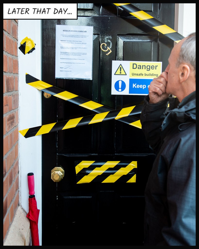
This was very valuable feedback as it is a subtlety of visual storytelling, particularly the mise-en-scène approach to cinematography. I hadn’t considered the jump between the man realising that there was something wrong (observed by the viewer) and the visual of the derelict front door. I decided to re-shoot this image as I still had access to the model and the props (the front door being my own). The new frame can be seen below:
Point 3
This was something I hadn’t noticed during shooting and post-production, but it was another good observation in the same context as Point 2. As it was accidental, there was no way of using any of the other photographs from the contact sheets to correct it. The result was that I had to leave the error in the series. As a side note, I discussed it with the model who stated that he naturally swaps hands with his phone, depending on the light and the function that he is using. It doesn’t distract from the point that I hadn’t spotted the disruption in continuity; something to watch for in future.
Point 4
This point was more of a comment on the creative decision that I’d made to have Eve standing over the man with an ethereal glow. My tutor felt that I could have placed her as a reflection in the painting on the back wall in a translucent visual, or with a different composition where she appears as his desktop image. My initial response to this point was to consider how I could make Eve less solid in Photoshop, but I quickly realised that my decision to light her with a different colour temperature to the man made it difficult to see a way achieving this. Even if I could make her less solid, the fact that she emits light in the form of a glow on the background, means that the result would not work technically. The other issue was that the lighting setup used in the shoot meant that I didn’t shoot other images with her missing from the frame that could be combined to achieve the effect. As I no longer had access to the both models and costumes, I elected not to re-shoot the picture. The idea of having her as a desktop or screensaver was something I had originally considered when preparing for the shoot, but I didn’t want to include more than one composite image using Photoshop (I already had created the fake dating app profile and layered it onto the phone screen in Two). On reflection, I didn’t agree with my tutor on this point as in following the original ghost story idea, Eve needed to be as real and believable as possible throughout, rather than follow the stereotypical notion of being transparent.
Point 5
This was perhaps the most difficult feedback because my intent for the series was not to present it as if it were a classic graphic novel. I wanted to include the textual elements as a nod to Barthes and the idea that they could support the main narrative, while leaving the images to reveal the other layers. The genre of graphic novels wasn’t the point, but by presenting this way I have received this feedback from more than one person. In response, I looked at modern examples of comic and graphic novel layouts with a view to arranging this series in a a more tabular form. As the feedback suggested, by laying out the panels together, the viewer is presented with the story in one instant. The viewer gets a sense of the action without linearly progressing through the panels. I could see the benefit in laying out my series in the same way. Unfortunately when it came to arranging my images, I realised that the comic panels generally followed a format where one of the dimension of each box was consistent with the others. The tessellation of the panels depends on the variation on the other dimension of the panels which, in terms of my series, presented a problem. I had shot each picture with the frame filled to the extent where I could then crop to my preferred 4×5 format. This meant that selecting another crop that would suit a comic book layout would potentially remove details that I had included in order to support the narrative. I concluded that in order to have made a traditional comic, I would have needed to have shot the pictures with that in mind.
Point 6
The final point made was related to the inclusion of some of the captions. My intent was to use text as a relay to the images, describing the main ghost story but not sighposting the more subtle elements of images themselves. The point was made that some of the images didn’t need their caption to increase their impact. Following this feedback, I removed the example that was given and re-reviewed the captions for the whole series.
Changes made to the series
In addressing the feedback, I made the following changes to the series:
- The most significant change was to the arrangement of the comic strip. I had struggled with the arrangement of the panels to fit a page, without making major changes to cropping of some of the photographs. As each image was a mini tableaux, I didn’t want to lose important symbolic messages within the frames by cropping just to make them fit. After careful consideration, images Seven, Eight and Twelve were changed from landscape to portrait without any loss of elements, which meant that I could make a 4 page comic. As most of the comics and graphic novels that I had looked at were in portrait format, the arrangement followed this style. To make each page more visually interesting, I made three images, where there is ‘close-up’ action taking place, stand out by rotating them slightly in their position on the page. This is frequently done in comics and graphic novels and has the effect of breaking up the static format of the panels.
- The final image where Eve is revealed is now a single page on its own. This decision suited both the layout of book and also the drama in that picture. In my previous layout, the image was somewhat lost because it was a portrait composition which reduced its size on the page. The picture now serves as the climax of the story and is large enough for all of the details to be seen clearly.
- I made some further changes to captions and sizes, removing those that didn’t contribute to the narrative and adjustments to make the size consistent when the panel sizes varied. The most notable removal of caption is the selfie picture where the activity is both obvious and also brought to the reader’s attention by the use of rotation mentioned previously. Some captions were adjusted to make the new sizes fit within the frame of the images, mostly on the first page where the landscape panels are smaller than pages 2 and 3.
Conclusion
In general, I was happy that the series achieved what I intended for it. The feedback from my tutor, family and friends, as well as my fellow cohort members, was constructive. I found that my initial reaction was to focus on what I agreed with them on and be less interested in anything that I thought was a misunderstanding of what I had intended for the series. However, I realised that the opposing views were still intended to help improve the series, so gave them more thought. The changes I made to series involved significant edits to the photographs, captions and the layout, all of which result in what I believe is a stronger series. The final presentation of this assignment can be seen in the original post Assignment Five: Your Inspiration linked here:
https://richardfletcherphotography.photo.blog/2021/12/27/assignment-five-your-inspiration/

Well written and honest reflection on the feedback you received. Well done Richard a great assignment.
Good luck getting your assessment together.
Kindest regards
Andrew
LikeLike
Thanks Andrew, much appreciated.
LikeLike
Pingback: Assignment Five: Your Inspiration | Richard Fletcher OCA Photography Blog