
Introduction
In this project, we are introduced to three different types of captions that are commonly used in conjunction with published photographs. All three have different meanings and impacts on the photograph that they accompany, ranging from pure documentary ‘explanation’ to the proposal of a meaning, whether factual or fictional. For this project I will look at the three types, directional, orientational and complementary when applied to a single photograph. The picture I have chosen is one that I shot of my wife competing in her first international multi-sport event as part of Team GB. It was published in our local newspaper at the time, with a caption that fits within the directional category.
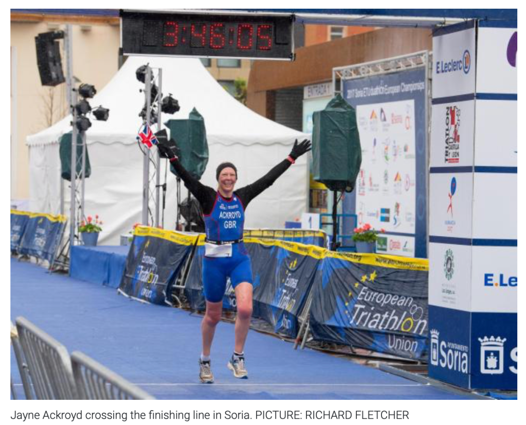
Here we have the photograph as published. It states that her name is Ackroyd, she is in Soria and she is crossing the finishing line. When we look at the picture, there are clear elements that the caption describes, e.g the location and my wife’s surname on her suit. The caption directs us to the meaning of the picture without us needing to view it for long. When we consider journalism, the basis for our consuming of news is that it should be presented rather than mined. This has had significant implications in the modern social media world because we apply that same ‘instant consumption’ to any news item put before us, whether truthful or not. The idea that someone would try to convince us of an untruth doesn’t naturally occur in most people, so on highly important subjects such as COVID-19, North Korea or Black Lives Matter, the potential for being misled is increased.
If we change the caption to one that fits within the orientation category, the image now requires more thought to understand the meaning. The contextual elements in the image are no longer directly referenced as we can’t really see the ‘elements’ being ‘battled’. What we do see, though is a celebration of completing something that has clearly taken a long time to accomplish. The geographical references are still there, so we know it’s a European triathlon. We know that Jayne is part of Team GB, which is an achievement in its own right. Perhaps the narrative now is something about a difficult journey against odds, such as bad weather, that leads us to this successful conclusion. What is clear is that we cannot just consume the picture as with the directional caption. The caption now adds part of the story, that is it sets the visual elements in the picture and helps support the creation of a narrative.
With the caption changed to one that is complementary, the picture becomes different again. Now, the text doesn’t refer to the activity at all, instead being an idiom often attributed to US founding father Benjamin Franklin [1]. The quote naturally links with the picture but not in a factual way. The questions raised by the combination could be related to overcoming adversity, procrastination or ignoring our passions until later life. The image becomes a metaphor for many aspects of life and its meaning could be taken as motivational or as a symbol of pride, but that decision lies firmly with the viewer.
What I take from this experiment is the importance of considering the caption for a photograph. During EYV I was given the feedback that the titles that I’d chosen for my photographs in one of the assignments were too prescriptive [2]. The comment was that as a viewer, it was difficult to draw any conclusions or form any narratives because the captions described what was going on. An example can be seen below.
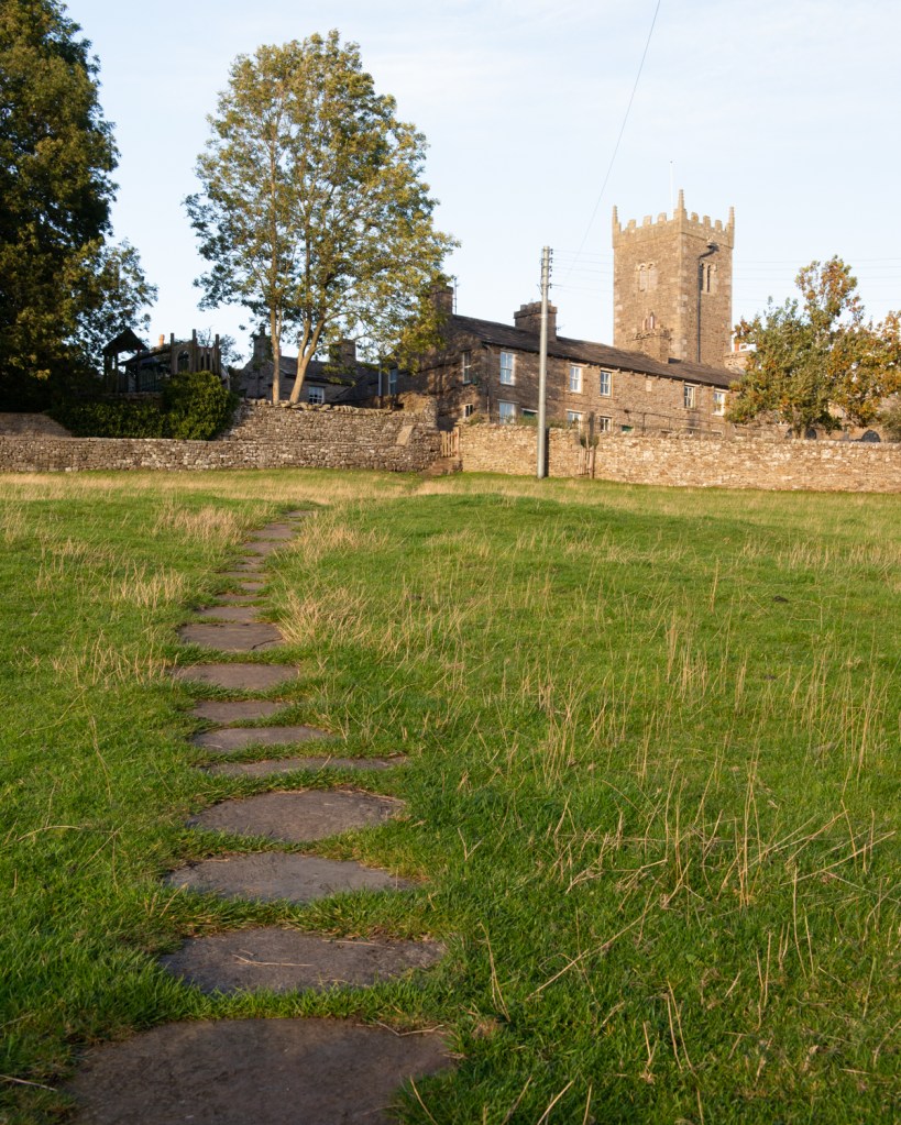
This caption clearly describes what this picture is about. Any thoughts about narratives around the church or the journey through the field are ended by the literal meaning of the caption. This use of the directional is not helpful in this case.
Rene Magritte (1898 to 1967)
We are introduced to the famous painting The Treachery of Images by René Magritte, which depicts a detailed rendering of a pipe, under which are the words “Ceci n’est pas une pipe” which translates to “This is not a pipe”. The story goes that the Magritte was tired of the idea that the written word, in particular works of poetry and philosophy were granted some superiority when it came to challenging our beliefs of what is real and what is imaginary. He set out to use painting to challenge our ideas of association and recognition with a series of works that included this one. As we know, Magritte stated that the image was not a pipe as it was impossible to fill and smoke it. It was instead a representation of a pipe that could occur on many levels. In his short film featuring this painting [3], Sergio Toporek takes the interpretation further. The original painting is actually a layer of paint on canvas, but if viewed as a print it’s a layer of dyes arranged in dots and on a screen, a sequence of RGB pixels etc…etc. What Magritte does is to challenge us to not simply dismiss the picture as being ‘a pipe’, because visual language tells us that’s what it is. Instead, he profers that the image is one thing and the text another. In another film about The Treachery of Images [4], the theory is that written descriptions of objects tend to connect with our visual understanding of an object in a way that actually transcends to being connected with the real thing. Hence, people see the representation of the pipe and automatically know what the real object is. These connections of names with objects was challenged by the philosophers, in particular Saussure [5], who postulated that the connection between descriptors and objects was in fact completely arbitrary outside of our societal associations using language. Magritte would almost have made as much sense to our application of these signifiers with his caption if he had said “This is a man” or “This is a double-decker bus”. Instead, his direct assertion that it was not a pipe challenges the viewer to decide what he means, with the obvious conclusion that it’s a representation of a pipe. However, there is also nothing to connect the text with the subject of the painting; they just appear on the same canvas. The word ‘this’ doesn’t have to refer to the image above it, it could equally refer to the blank space or the canvass itself. We now have a seemingly simple painting with many complex narratives associated with it – all through the combination of image and text in a complementary way.
I researched another example of Magritte’s work that demonstrates his use of title with image, but doesn’t include both within the frame. The painting The Human Condition (1933) shows a window view of a hillside landscape with a tree in the ‘foreground’. We soon realise that the centre of the painting is in fact another painting on an easel.
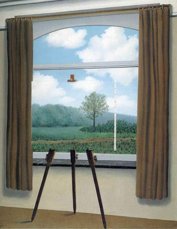
The painting is optically challenging because of this composition, but it’s when the title is added to it that we start to understand the narrative. Magritte was asked about this painting during an interview with writer Hyatt Carter in 1967[7]. Magritte said that the image challenges how we as humans assume we know something without really having the knowledge to back it up. The painting on the easel fits almost perfectly into the main image and with the alignment of the path, hedgerows and trees connecting them together, we naturally assume that what we see in the painting is actually the view beyond it. We don’t stop to ask what is really behind the easel, just convince ourselves that whoever painted it did so for the purpose of representation. Magritte further adds that this logical assumption is how we live our lives. We associate things with labels, interpret perspective even when it is obscured by something, as with this painting, and create our own world in our heads. None of this exists without the title of the work being complementary, not in a sense supporting the contents of the painting, but adding a sense of doubt about our preconceptions. It differs from the actual title of The Treachery of Images, which is itself orientational. For me, the two paintings demonstrate Magritte’s ability to combine image and text sending the narratives and assumptions created by the viewer into confusion, leading them to thing differently about what they see.
Barbara Kruger (1945 – )
We are introduced to Kruger’s very distinctive style of adding bold text using only a black and white font with red bordering. Kruger is a commentator, choosing to challenge assumptions about events, roles, politics etc through the kinds of imagery that we are familiar with in advertising media.
“I never really thought I could be an artist in the ‘art world’ sense of it. (…) But my job as a designer pretty quickly morphed into my work as an artist.”
Barbara Kruger, speaking with Naomi Martin, Artworld (2019)[8]
Kruger explains in the accompanying video [9] that she worked as an editorial designer after she left school and realised that during her editing process she was placing anchoring text over the photographs she was editing in preparation for the Copy Editors to add the real captions once they had finished writing the article. Her realisation that the text had the power to give the picture meaning and could literally be anything at all, gave rise to her creating art in her particular style. Kruger’s images are bold and unambiguous with lots of orientational and complementary text that is included in a way that makes it unavoidable. The text doesn’t lead the viewer to the meaning in the same way as a documentary-style caption, but suggests enough to provide a sense of what Kruger is trying to say. Her work differs from Magritte’s in that it doesn’t subvert, but is similar in the way that our vision of the world, driven by language, makes strong arguments about the subject of the picture.

In this picture, we see Kruger’s poster-like style with her use of bold text on a solid red background. The image of a woman’s face split down the centre with one half positive and one negative, could suggest yin/yang or symbolise the way that we are all more than one person depending what mood we are in. However when the text is added, the tone changes to one of conflict. The image was made in response to the slow erosion of the precedent set for a woman’s right to choose an abortion in the landmark Roe vs. Wade case in 1973. The poster is now a rallying cry for women to defend their rights to a say in what happens to their bodies. The expression on the woman’s face, with its steely gaze and impassive lips works with the text to suggest that the fight may actually be futile. Stylistically, the image invokes a sense of Orwell’s 1984 where free will is eradicated in a dystopian future. Most of Kruger’s work has this striking contrast of text and background inviting the viewer to react before even looking at the image that is included with it. She highlights and challenges the stereotypes of everyday life in an often brutally sensationalist way.
“I’m very interested in the everyday. I love the everyday and its repetitions, its conference. It’s the events that make me nuts. I like the moments between events”
Barbara Kruger [9]
Conclusions
We looked at text with pictures in Context and Narrative and I feel that this project has delved deeper into the impact that captions and titles can have on an image. Magritte’s work has an aesthetic that we associate with the surrealists such as Dali, Escher etc, but when he includes text as an image in its own right as in The Treachery of Images, the possible meanings grow to the extent of our imagination. I felt that the comment that a representation could be seen right down to the level of the paint strokes, ink dots or pixels, created a sense of a seemingly endless rabbit hole of possible interpretations. Even taking the literal idea that the pipe is not a pipe because it isn’t the real object, challenges the viewer to think about how we have evolved to use language to create a vision of the world around us. I think this best demonstrated by the assumptions and logic that automatically try to influence our viewing of works like The Human Condition. Magritte’s idea that what we see around us is a mental creation of a vision that is influenced by our experience is an interesting one. This can be seen in daily life when people who’ve travelled extensively and experienced many different cultures try to discuss something visually related with someone who hasn’t. A seemingly ordinary challenge shows clear signs of what Magritte was talking about in his conversation with Hyatt Carter [7]. With Kruger’s work, I feel that the use of complementary text in the image creates a strong connection with the viewer as if to grab their attention before the whole picture can be taken in. While both artists achieve similar impact on the viewer using this style of captioning, the subsequent reactions are very different. I’ve also realised the importance of directional and orientational text in imagery, because like all tools or constructs there is an appropriate context in which to use them. If every newspaper’s imagery used Magritte or Kruger’s style, we would either never understand the news or have a very limited perspective on it. I’m looking forward to experimenting further with all three types in future projects.
References
[1] Unknown author and date, “Benjamin Franklin Quotes”, BrainyQuote website, https://www.brainyquote.com/quotes/benjamin_franklin_151632
[2] Fletcher R, 2018, “Assignment 1 – Post Tutor Feedback”, OCA Blog Post, https://richardfletcherphotography.photo.blog/2020/01/27/assignment-1-post-tutor-feedback/
[3] Toporek S, 2016, “Beware of Images” via Transition21 on Youtube, https://www.youtube.com/watch?v=9pQ6KR7BbWA
[4] Puschak E, 2015, “What is The Treachery of Images?”, Youtube via Nerdwriter, https://www.youtube.com/watch?v=atHQpANmHCE
[5] Nicholas T, 2017, “Semiotics WTF? Introduction to Saussure, the Signifier and Signified”, Youtube, https://www.youtube.com/watch?v=0JtJu9HdQVM
[6] Image resource, 2021, “The Human Condition (1933)”, Rene Magritte Website https://www.renemagritte.org/the-human-condition.jsp
[7] Hyatt Carter, 1967, “My Interview with Rene Magritte”, HyC Adventures, http://www.hycadventures.com/page8.php
[8] Martin N, 2019, “Female Iconoclasts: Barbara Kruger, Artland Magazine, https://magazine.artland.com/female-iconoclasts-barbara-kruger/
[9] Los Angeles College of Art, 2020, “Picturing Barbara Kruger – Art + Film”, Youtube, https://www.youtube.com/watch?v=IJ3WIZeBRZg

Interesting subject Richard, I lean towards the latter two in my art, but never really considered the why’s and wherefores till now.
LikeLike
Pingback: 4) Exercise 2: Reflective Day | Richard Fletcher OCA Photography Blog
A really good, thought provoking post Richard, I found it very interesting.
LikeLike
Thanks Jonathan. I find it a fascinating subject.
LikeLike