
Introduction
Long before I started this course, I attended some classes in London to improve my fundamental understanding of how to take a photograph. Like many at the time, I had recently acquired a sophisticated new DSLR (a 40th Birthday present), the indomitable Nikon D4. This was the flagship Nikon professional camera at the time and ironically had fewer automatic functions than its lower specification consumer siblings. I already knew how to use the semi-automatic modes Aperture and Shutter Priority, but the courses I took in 2013 taught me much more about achieving accurate exposure. At the end of the introductory course, the tutor asked if any of us ever printed our work. It was one of those moments where you could hear a pin drop as it turned out that everyone in the room simply kept the work on their computers or mobile devices. When asked how people could access their work, most of the attendees cited social media as their primary way of getting it out there. The avid Flikr users had to admit that even their professional-looking platform was still a virtual way of getting seen. Nigel, the tutor recommended that we find a good printing service and get our work mounted, framed and hung on our walls, stating that there was no better way to view photographs than in print. What followed was a few encounters with print services which left me surprised at how costly the operation would be once taking into account the mounting and framing as well. I started to look at professional inkjet printers and the cost of home printing which resulted in the purchase of an Epson 3880 A2 size printer.
Printing is easy, right?
The first thing I realised once I’d made my purchase was the number of variables involved in getting a print that resembles anything like the image as shown on a computer screen. The first and most important difference was the computer screen backlights the image in a similar way to a positive slide in the film days. The brightness and the temperature of the source light made a huge difference to how the image looked on the screen to begin with. Once I started to modify the image in Adobe Lightroom, to adjust contrast, saturation, white balance etc, these changes would be made to an image with a reference point dependent on the computer. First thing to address was the calibration of the computer screen, which in simple terms adjusts both the luminance of the monitor (the Gamma) and how white is represented (the White Point) which is done by adjusting the color temperature with respect to the monitor’s native value. Thankfully, there are devices to profile monitors properly (I use a Spyder Pro) which achieve the correct setting by measuring both the screen output and the ambient light falling onto it from within the room. The software then programs the computer hardware to work with the display to achieve the correct visual. I learned quickly that I needed to keep this calibration up-to-date. Once this is achieved however, we are still left with the fact that the image is backlit. A print is, of course lit by light being reflected off its surface so it stands to reason that we need to still need to adjust the image to achieve the look we are after once it’s on paper. The other variables in the process are related to how the printer works with the paper being used. In most cases, the manufacturer of the paper can provide special software profiles (ICC profiles) that tell the printer how to work with the paper. For the completely obsessed, some paper manufacturers provide a custom profiling service for tuning out inaccuracy in the printer caused during its manufacture. Although I could have this done, I’m not that fussy, preferring instead to use proof printing to judge the photographs by eye.
Proof Printing
I covered proof printing and the virtual digital equivalent in a previous learning log post [1], where I describe the need to do some form of review of an image to determine its quality or potential for selection. I use Lightroom to select my images from digital contact sheets (albums with attribute tools) for both my DLSR and film photographs because I don’t print using traditional wet chemistry. The principle is essentially the same with only the need to get the digital image onto paper being the key difference from making a contact print. Both techniques have variables that work in the same way; the contact print is subject to the type of paper, developing chemicals, temperature etc in a similar way to digital printing.
My approach to proofing is to use the ‘Proof Copy’ function in Lightroom to mimic the behaviour fo the selected ICC profile for a given paper and make a contact sheet. As described in the course notes for Assignment 3, where printing is first introduced, it’s good to look at the contact prints under various lighting conditions to be happy that the image has the look we are after for the likely viewing environment. The point here is that we are not looking for perfect exposure, but one that matches the intent of the original image. For me, this is the creative part of printing that isn’t dependent on the technical aspects of the process, but rather the judgement of the photographer.
In Preparation for Assessment
In this section of this post, I am going to describe the process of printing Assignment 4 (The Languages of Light) as this one was predominantly shot at night with artificial light and therefore presented the greatest challenges to perfect. Firstly, a note on my working environment, which can be seen below.
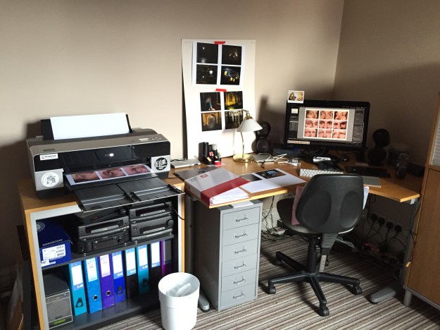
My office at home, showing the final print of Assignment 2 being produced
The challenge with my office is that it faces the front of the house which points broadly South East. The window of the room looks out alongside the main wall of the house so the sunlight that comes through it is predominantly diffuse or indirect; when the sun shines, only half the room is brightly lit and when overcast, the wall that my desk faces is illuminated as it appears in the above photograph.
After checking the calibration of the monitor and selecting the paper that I wanted to use for assessment, I loaded the ICC profile into Lightroom. I used a 270 gsm pearl lustre paper called Oyster 271 made by Permajet as its cool tone looks great when printing in both colour and black and white. It’s also a paper that I’ve used many times before, so I’m confident I how it prints on my Epson with its OEM ink set.
With regard to Assignment 4, I had previously created an album for the selecting process before submitting it back in July. The images can be seen in their original state in the picture below.

When viewed on a screen all of the images contain the details I was trying to capture when I shot them. First step was to create a contact sheet from the images was done using Lightoom’s ‘Print Tool’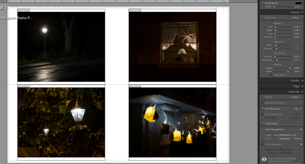
Printing 4 on a page with the paper ICC profile selected, the print was made as ‘Perceptual’, a printer setting that uses to ensure that it can print all of the colours in the image. It does this by converting any colours that fall outside of its gamut or printable colour space to something close that falls within it. The other setting that I could have used is called ‘Relative’, which effectively ignores any colours that the printer that fall outside of the gamut. Honestly, I leave this set to the default which is ‘Perceptual’ and maintain it consistently from print to print, which has resulted in my not really noticing any problems with my printed works.
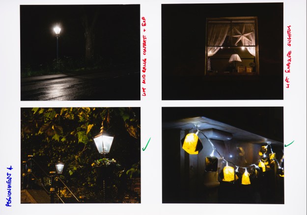
I printed blocks of 4 images from the assignment and pinned them to various surfaces in my office that were in natural light and then left them, periodically returning to review at different times of day and under differing lighting conditions. I then made notes on the paper next to each image with the types of adjustment that I wanted to make. Then, back in Lightroom, I created the virtual proofs to make the adjustments. This effectively leaves the original alone and produces a virtual version that can be printed from. For example, Photo 2 needed a small increase in brightness without making the highlights from the fairy lights too bright. The original and the proof image can be seen below.
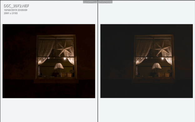
The left picture is the original image and the right has very slight adjustments to make the area around the window brighter
With the adjustments made, another set of proofs of just this image were made and displays alongside the rest of the set. The same procedure of looking at the images was repeated for each one that needed adjustment until I was happy with the result. In the end, several proof images were needed for the set, denoted in the image below by the folded left corners on the thumbnails.

Some Examples from Printing the Assignments
A few examples of proofing adjustments made to the assignments can be seen below with a description of what the intent was behind each.
Assignment 1
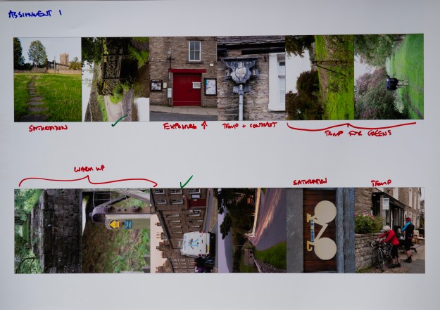
Here we see the main changes that I wanted to make were around colour temperature and saturation. This was the first assignment on the course and we were not expected to make any significant adjustments for its submission. However, as the course progressed the importance of colour temperature became more apparent to me. For that reason, I wanted to make adjustments to Assignment 1 to ensure that the photographs would look as good as they could be. Although two are shown as being correct above, I actually made further adjustments to the image of the bridge across the ford to ensure that the green saturation matched the overcast lighting conditions for that day. The only image I didn’t adjust was the fish and chip van as the evening sky already had the look and feel that I intended when I shot it. The updates were made and a second proof was done which can be seen below.
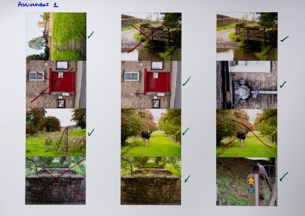
This time, the effects of warming and contrast can be seen. The images that were subsequently rejected are shown crossed-out.
Assignment 2
Assignment 2 was a series of emotions shown through the eye area and involving three models in a studio setup. The lighting remained exactly the same for each photograph, but obviously the models had different skin tones from each other. I had deliberately wanted the images to be raw so there was no make-up involved as there perhaps would be in a conventional studio shoot. After some thought, I decided to globally adjust the colour temperature to be close to my studio lights, leaving a small margin to create the slightly flushed tone to each image. To adjust each one would, for me take away from the natural groups of expressions that are in the photographs, particularly as the series was being presented as a grid of 9, rather than in sequence. The proof sheet can be seen below, along with the size that I settled on in order to make the large, multi-aperture print for the series.

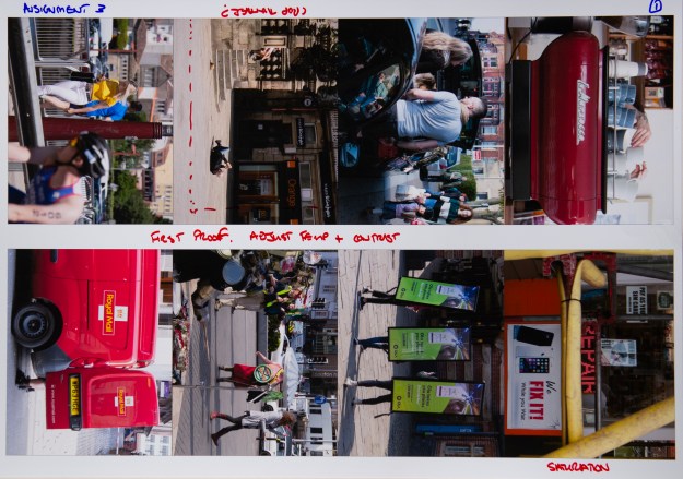
Assignment 3
For the third assignment, similar adjustments were called for, but I also had to consider the impact of the images in the series. When I originally reflected on the series and feedback, one of my conclusions was that my discomfort with photographing people on the street meant that I often shot from further away than ideal. To increase the impact of the series, I re-cropped two of the images. One of them is shown in the proof print below; the other having been done in a previous print.
Assignment 4
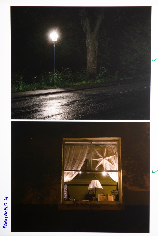
As discussed previously, the fourth assignment was shot at night with artificial light being illuminating dark corners as its theme. The adjustments I made to this series were predominantly to the exposure, highlights and contrast because colour temperature was addressed within the assignment. I was reviewing the images on the back of the camera to check for the latter and used the histogram to review the exposure detail, but only when seen on a larger computer screen was it possible to see what needed adjusting further. The proofs below show the thought processes and a final version of two of the darker images (the lighting for the shot of the proof actually reveals more than would be seen under natural light).
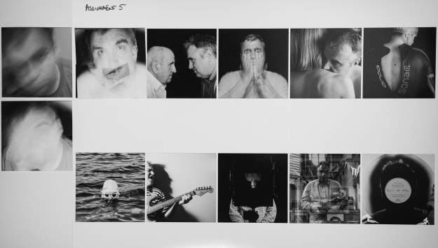
Assignment 5
For the final assignment, the main adjustment was contrast. After the feedback, it was clear that I needed to consider re-shooting some of the photographs to strengthen the series. This became the main purpose of proofing as I used the prints to try new photographs and see if I could live with them over time. The proof print below shows the final selection of the first image. I shot 3 (two of them are shown on the left of the picture) that were contenders and after a couple of reviews with them placed over the shot that was originally submitted, I settled on the best one to bring impact to the series.
Summary
Printing is an important part of both the technical and artistic processes that we use in creating our work and this approach is the one that I’ve taken for a number of years now. There is no substitute for experimenting with ‘lighting’ adjustments and paper types in the same way as the photographers who printed in the darkroom. The only drawback that I have found is that the convenience of being able to rapidly produce an inkjet print makes it possible to use a great deal of paper and printer ink; something that I encountered during the preparation of these 41 prints for assessment. In my opinion, it’s worth it to drive quality into the work, which I hope I’ve achieved with my EYV submission.
[1] Fletcher, R, 2019, “The Process of Selection”, OCA Blog, https://richardfletcherphotography.photo.blog/2019/07/05/the-process-of-selection/

Thanks for your thoughts and sharing your experience Richard, I am about to enter the world of printing but don’t have my own printer which is going to make things even more challenging. Good luck with the assessment.
LikeLike
Thanks Jenny. I can definitely recommend getting into printing, but there are plenty of good printing services out there.
Thanks for the good luck message. Preparing for assessment has been a real labour – fingers crossed. 👍
LikeLike