I’ve just received tutor feedback for Assignment 1 – The non-familiar. The overall view was that my submission met the brief with a series of portraits that worked well together, were technically good and sympathetic to the subjects. There were some interesting observations and recommendations for further consideration that I will address in this post. On reflection, I am really happy with how this assignment was received by not only my tutor, but everyone else who has seen the work.
Using Text with Images
“The use of text and image is an area that can be fraught with difficulties and needs careful consideration as to how text and image will work together. There is always the danger that text will swamp the narrative within the images and will not allow the viewer an independence of interpretation when viewing the work. Everything is directed through the text rather than letting the images reveal the narrative. When reflecting upon the images you might ask how will they be interpreted without the text?”
This is a really welcome observation as when I was getting to know my subjects, I was making mental notes about their story that I then wrote up when I left the conversation. I didn’t write lengthy commentaries, but just enough to prompt the memory of our conversation when I came to write up the assignment. At this point I was thinking that I may have many ‘interviews’ with subjects, so wanted to ensure that I didn’t overlook anything important. When it came to the write-up, I selected a a few of the notes to include with the pictures. It would have been easy to have written a very clear narrative from the notes that described in great detail how the subjects used the park. Of course, the more detail the less room for manoeuvre in interpreting the theme for the images and the series. I was reminded of Paul Seawright’s comment about narrative in the previous course and how the artist should give enough context to help the viewer reach a conclusion about the work. His work Sectarian Murder was a great example of pairing text with photographs and when I revisited my research into the work[1], I could see how I was influenced in my inclusion of text with these photographs. In Seawright’s photographs, the text suggested the horrors of the Irish conflict taking place at the seemingly peaceful scenes. The inclusion of the two contexts together tells a story that each cannot when considered individually. I think that my photographs in Assignment 1 refer to the subjects back-stories through both the text and their pose/expression, but when the text is removed, the scope for interpreting the meaning of the pictures expands. I believe that I managed to stay the right side of Seawright’s comment on narrative with each short paragraph revealing just enough about the subject to ask questions about why they visit the park.
Diversity of Subjects
“A wider range of age groups would have opened up other challenges in interpretation and it would have been interesting to see the images made from such encounters. But you have commented upon the absence of diverse groups in the park and considered this an area for further investigation. Perhaps this will result in a future project?”
The second piece of feedback that resonated with me was this comment about the lack of diversity in the shots, whether in terms of age or race. This was something that I reflected on during the shoot and certainly interested me from the point of view of the questions it raised. Why was the park used predominantly by white families and the middle-aged to elderly? It was particularly interesting because it wasn’t based on the lack of diversity in the town itself. Malvern has a number of private schools, so there are many young people around. It also has a large population of people from the Middle East, which is most noted in diversity of the businesses in the town. It’s perhaps easy to see why young families would visit with the children’s playground and the ducks around the lake. The concentration of middle-aged to elderly was also obvious to me at the time as there is a ‘retirement town’ vibe to the town, mainly because of its beautiful hills and rolling fields. The lack of young people and people from other ethnic groups was a puzzle, to the extent that I had looked out for them in the weeks after completing the shoot. What was more interesting was thinking about how a more diverse group would affect the narrative for the series. Their absence already points to a social typology for a space like a park, but by including some young adults or some families from the Iranian, Indian and Turkish communities, perhaps that would replace that idea with a statement on multiculturalism. I was reminded of the German obsession with physiognomy in the late 1920s, where pseudo-scientific conclusions were reached by a person’s physical characteristics. Perhaps a series with more diversity could seek to break any pre-existing assumptions about the park and perhaps, more interestingly a series made up entirely of a different culture, age group or culture could contrast with the gentile impression of our little Victorian town. It’s something I definitely want to pursue outside of my studies as it combines both the engagement with strangers with the development of an alternative story.
Overall Conclusions
In conclusion I was very happy with the feedback given. The warning of being over-prescriptive with the addition of text was a useful insight that I will keep an eye on in future projects. The recommendation about a project on the diversity of the park visitors is something I will be looking at in the future.
Your first assignment is to make five portraits of five different people from your local area who were previously unknown to you.
You will almost certainly find it challenging to take photographs of people you don’t know; it’s often much easier to photograph somebody you’re already familiar with.This could be referred to as the ‘comfort zone’ – and for the purposes of this assignment you will be specifically required to leave it!
Leaving technical photographic considerations aside, there are a whole range of issues to deal with in making a portrait of somebody you don’t know. This additional skill set should arguably be in every photographer’s kitbag, regardless of what genre of photography they end up working in. The ability to concentrate on technical and aesthetic considerations whilst engaging with a complete stranger brings a plethora of difficulties. Added to the fact that most people aren’t that comfortable with having their photograph taken anyway, then you can see why this could become a minefield!
Just as you learn the techniques behind how your photographic equipment works, there are techniques you can learn about how to photograph people you’ve never met before. Many historical and contemporary portrait photographers have written about this and one piece of advice stands out:
Tip
If it is at all possible, spend time with your subject, getting to know them and triggering a dialogue with them, prior to even showing them your camera.
“A portrait by photography needs more collaboration between the sitter and the artist than a painted portrait. To make satisfactory portraits of persons it is necessary for me to like them, to admire them, or at least to be interested in them. It is rather curious and difficult to explain exactly, but if I dislike my subject it is sure to come out in the resulting portrait. The camera is all recording and very sensitive to the slightest graduation of expression of the personality before it. Also the impression that I make on my sitter is as important as the effect he has on me. I make friends quickly and am interested in the mental alertness of the people I meet. You can know an artist or an author, to a certain extent, from his pictures or books before you meet him in the flesh, and I always try to acquire as much of this previous information as possible before venturing in the quest of great ones.”
Alvin Langdon Coburn
Who you photograph is entirely your choice but don’t give in to the temptation to photograph people you know!
Approaching strangers can be daunting at the best of times, let alone with a camera in your hands. But it doesn’t have to be. If you are really terrified, consider asking a friend or relative to be your assistant.
You may want to explore the idea of types, thus sticking to a theme. Or the sitters could be very disparate, linked only by the fact that they come from your local area. Give consideration to this and also how and where you photograph your sitters. Bearing in mind the strategies and techniques discussed in Part One, keep your set of images consistent and choose a technique that complements your conceptual approach. For example, do you want a series of location-based portraits? Do you want the portraits to be situated inside? If so, drawing on your experience in Exercise 2, how will you select your backgrounds in order to give context?
Reflection
Before you send your work to your tutor, check it against the assessment criteria listed in the introduction to this course guide and make sure it meets all the criteria. Make your evaluation available to your tutor.
Your tutor may take a while to get back to you. Carry on with the course while you are waiting, but please don’t attempt the next assignment until you’ve received your tutor’s feedback on this one.
Reworking your assignment
Following feedback from your tutor, you may wish to rework some of your assignment, especially if you plan to submit your work for formal assessment. If you do this, make sure you reflect on what you’ve done, and why, in your learning log.
Introduction
I first read the brief for this assignment when I enrolled on the course and was looking through the material for Part 1. My initial reaction, like those of many students I would suspect, was complete terror. As the brief suggests, this idea of approaching a complete stranger for their portrait feels unnatural. In my case however, I have done this before, most notably when on holiday in Canada in 2016 [1]. On the vineyard tour, I elected to photograph the people involved rather than simply documenting the surroundings because one field of vines is very much like another. I continued this theme when I visited California in 2019, photographing the people involved in making and selling wine during each visit.
Dave and John of the Homewood Winery, California (2019)
The first issue I wanted to explore with his assignment was why did I feel that terror if I had already done something similar in the past? The first consideration was that although unknown to me, my subjects and I were introduced to each other in a transactional way. I had paid for a tour of the vineyards and they were providing a service to me. The step from engaging on the tour and asking specifically for a portrait of them was not as great as it would have been with no connection at all. Coupled with this transaction was the fact that by profession, they were used to engaging with the public and therefore most likely more comfortable with having their picture taken. I certainly remember their reactions being more ‘surprise at being asked’ than any awkwardness over the act itself. In the case of the photograph above, both men were not comfortable with being photographed initially, but by talking to them about their passion for their boutique winery they lightened up for the shot itself.
The next consideration with regard to my discomfort was related to starting conversations that turn into an opportunity to take a portrait. Since leaving my job in engineering in January, I have walked to my local park to shoot photographs of the wildlife as part of my daily morning exercise. While shooting, I am regularly approached by other visitors to the park who are curious as to what I am doing. We usually have a brief chat about the animals that I’ve seen and how they behave and then go our separate ways. If I could chat to complete strangers in this context, why was I worried about approaching on this subject? I wondered whether that kind of conversation might be the way to introduce the idea of asking for a portrait. I tested this theory with one of the people that I regularly see in the park one morning. We had been talking about the elusive kingfisher that had been spotted at the lake. After about 5 minutes, I steered the conversation around to my redundancy and photographic studies. She was really interested in what I was doing and my plans for the future, but when I brought up the subject of the assignment, her reaction was “Oh, I wouldn’t let you take my picture”. After some exploring of the reasons why, she pointed to lockdown and how it had affected her appearance. I didn’t push this conversation further, but what understood Coburn was referring to in the quotation in the brief. The camera or the idea of it being used can affect the mood of the engagement, however brief. If the effect is received positively, the relationship is built between photographer and subject and the expression should be more natural in the portrait. However if there is some tension or awkwardness between photographer and subject, the resulting image will include that to some degree. With strangers, the amount of ‘stage management’ of the portrait is significantly lower than if the subject is paid to sit or has commissioned the picture. When we looked at traditional portraiture in Part 1, this context determines how much influence both photographer and subject have over the resulting portrait, set against the other elements in the frame. For this series, there is no real choice but to build some form of relationship with the subject before thinking of how to photograph them in a meaningful way.
My Theme
The COVID-19 pandemic has made meeting people more difficult that normal. Not only have the opportunities varied through multiple lockdowns, even when allowed out people are wary of getting too close to each other. The adoption of face coverings to protect from infection have added to the difficulties in getting people talking to each other, which presented challenges with how I approached this assignment. I decided to stick with where I had encountered the most people in the past year, the park in my home town. The central theme would be the people who visit and their stories about why they visit.
Approach
I used my Nikon D4 DSLR with an 85mm f/1.4 prime lens for all of the shots. This focal length is widely regarded as ideal for portraiture owing to the depth of field and subsequent ability to isolate the subject from the background. I shot each portrait at f/8 which is the sharpness sweet spot for the lens while maintaining subject separation through relatively shallow depth of focus. At this aperture, the subjects were isolated from the background but there was sufficient ‘sharpness’ behind them to provide context.
The downside of this combination of camera and lens is the physical size, which meant that I really needed to follow the advice in the brief about not introducing it too quickly to the conversation with my subjects. I composed the photographs to allow for a 8×10 crop, which for me gives a traditional feel to the shots; this format was popular in early portraiture with the development of 4×5 and 8×10 film cameras. The only other adjustments to the images were contrast, some highlight ‘dodging’ where the lighting conditions were harsh and tweaks to the white balance.
When it came to approaching subjects, I started a conversation with them about something that we might have both observed, such as wildlife behaviour, a rapid change in the weather etc. I would then steer them around to why they come to the park and make mental notes that I wrote up after the conversation. The only other information that I asked for was their first name. I then shot a number of portraits from different angles and distances, letting the subject relax into whatever expression they wanted to give me. I was inspired to do this by the Double Take work [2] where the photographer shot two portraits on one glass plate that resulted in subtle changes to the subject’s pose or expression as they relaxed into it.
The Series – People of the Park
The Photographs
Janet
“I tend to come out on my own now as my husband can’t walk at my pace anymore”
Janet walks through the park on her morning walk. She enjoys the fresh air and exercise that she often has to get for herself as her husband suffers ill-health. She is looking forward to group exercise starting up again for the social interaction.
I met Janet when she had stopped to look at a tribute to Sarah Everard, who was murdered on her way home in London recently. I was immediately struck by the poignancy of the situation (the park was pretty much deserted) and nearly didn’t approach her for a portrait because of it. However, she was very chatty with a great sense of humour. She referring to considering herself fortunate to have worn a hat as she couldn’t yet visit the hairdresser. When she told me her story, particularly the part about her husband’s health, she did so without being melancholy but with a sense of needing to grab opportunities to take care of her own wellbeing whenever she could.
Steve
“I thought you might get around to asking me…either that or you wanted to borrow some money”
Steve has only recently started visiting the park as a change from sitting on a bench in the town centre. His routine includes buying his morning coffee and then transferring it into a rival chain’s reusable mug, which he hides in his carrier bag.
I met Steve when I sat on a nearby bench, elsewhere in the park, to drink my coffee. He was drinking out of a huge, battered reusable mug from one of the well-known café chains and delighted in telling me that he actually bought his coffee from a rival. We talked about everything from COVID vaccinations, camper vans and cricket (we are both huge fans) to music, photography and my studies. When it came to having his portrait taken, nearly an hour had passed. He chose this bench for the portrait as he felt it was a nicer background than where we were sitting.
Wendy
“I come to the park at the moment because I’m really pissed off…ooh, pardon my French”
Wendy drives to the park every day with her dog, Alf. She has a challenging job in social care and within the past few days has suffered a bereavement and one of her nephews having major heart surgery. The park gives her a chance to relax and talk to other people as she throws Alf’s ball for him to fetch.
I had said hello to Wendy and Alf a few times over the past weeks when I’d been photographing the wildlife. On this particular morning, she was very stressed about what had happened to her in the past 48 hours. What concerned her more, as she told me her story, was the need to apologise for her language which seemed the least important thing to me. We talked at length about the discomfort of asking to photograph a stranger in the current social climate. COVID and the recent fears over women and children’s safety had made people more concerned about being approached by people they don’t know in any context, but particularly when that person is carrying a camera. Wendy assured me that ‘I didn’t come across as a weirdo’, which I really appreciated.
Les
“I feel sorry for these people who only have a concrete play park with those markings for games, you know like basketball or something – we are really lucky”
Les has worked for the Malvern Hills District Council for over 20 years and he loves his job. He takes great pride in how it helps keep the park looking good throughout the year. He’s very aware of how lucky we are to have such a beautiful green space.
I met Les as he was emptying the recycling bin next to my bench. In true British tradition we started to discuss the inclement weather and how much we were looking forward to emerging from lockdown. Les had seen me in the park before and asked if I had been lucky in photographing the resident kingfisher. I said that I hadn’t, but had been enjoying the other wildlife that could be more readily seen. When I described this assignment to him, he said that he could never do that. I initially mistook this for not wanting his photograph taken, but he was actually more than happy to help as long as he could continue on his rounds while we shot the picture.
Judith
“I like all my clothes to be colour coordinated… shame about this blessed mask. Shall I remove it?”
Judith retired to Malvern 5 years ago and lives in one of the smart new retirement developments near the park. She regularly walks around the park for fresh air and exercise, taking her shooting stool with her for when she wants to pause to take in the beauty of the scenery and its wildlife.
I met Judith when I was on my way home having shot what I thought were my 5 portraits. We started chatting about her ability to stop wherever she liked with her shooting stool. She moved to after over 50 year living in Somerset and said that she loved her new home. When we got around to discussing my assignment, she cheekily suggested how people might question my motives, acknowledging the difficulty in making an approach. For her shots, she played to the camera by shaking her finger at me in a mock outrage etc. I chose this one because it reflected her wonderful sense of humour and fashion without being too obvious. As we finished, she said “Might I know your name so I that may tell everyone about this when you are famous?”
The Rejected Image
To give myself some flexibility in assembling the series, I approached 6 people for their portraits during my time in the park. The sixth image was ultimately rejected because it was a group portrait. Until that point in the work, I was considering having mixed subjects, e.g couples, families, age groups etc, to be more reflective of the variety of people who visit the park. Malvern is a culturally diverse town, but for some reason I didn’t observe many people from those different cultures out walking or sitting in the park. This is something that could have multiple reasons, which I could explore further in other portraiture series in future. When it came to approaching families, I was extremely uncomfortable. There have been some fairly high profile cases of crimes against children in the county recently and I just felt approaching them was a step too far – this of course reflects more on my insecurities than it specifically being a bad idea. When it came to couples, they were the ones who rejected the approach, perhaps as one was more uncomfortable than the other which made ‘no’ an easier response. The shot I did get though, was an encounter with a group of ladies eating cake in the sunshine.
The Merry Widows
These ladies referred to themselves as The Merry Widows and were mother, daughter and close friend. They had been visiting the park to keep each other company, walk one of their many dogs (they were dog breeders) and each cake in the sunshine. I had a great conversation with them and they were the only people that volunteered to be part of this assignment without me actually asking them. I really liked this image as it had the contextual elements that supported happy ladies enjoying their treat in the park (their smiles, the bag and coffee mug being the main ones). The added bonus of the dog that sat patiently for the shot, reminded me of a portrait of my own family that I used in Exercise 4 [4]. Although I liked this shot, it didn’t fit with the rest of the series so was rejected in favour of Steve. Not only does the latter have a single subject, it also meant that I only had one shot at this same location within the park. Over the previous course units, I had learned the benefits of being self-critical and making tough edits, so this wasn’t really an issue for me.
Reflection
This assignment has undoubtedly been difficult because of the reasons mentioned previously. The most stressful part of the experience was finding an entry into a conversation with someone, however this wasn’t as bad as I had imagined. As suggested by Coburn, the establishment of some form of relationship is crucial to setting the tone of the resulting portrait. I have learned that this is also crucial in reducing any internal tensions that photographer and subject may have that are not necessarily obvious at the outset. With Janet for example, she may have been nervous about the approaching man in a fairly deserted park first, then anxious about where our conversation started to lead. By encouraging her to tell her story, almost in a ‘chat show host’ style, we both started to relax. At one point I told her that she was much more photogenic than she might have thought, to which she replied “you really know how to say the right things, don’t you?” with a big smile on her face. In the portrait that resulted, Janet’s discomfort at posing for the camera can still be seen, but it is combined with a wistful half smile which leads the viewer to ask what she is actually thinking about. When paired with the accompanying text, we see a woman who has a lot to deal with, but takes these moments in the park to seek some peace. Janet was the first person I approached and hers is my favourite of the series because I believe I’ve represented her both physically, but also how she came across emotionally.
With the others, our conversations varied in length from the 5 minutes or so chatting to Les as he worked, to the hour with Steve. In each case, I looked for something that described them but also their experience at the time I asked them to be my subject. This part of the assignment was the most rewarding as I felt that I had met some really interesting people who shared my passion for the park, but like me also used it to escape their complex, challenging lives. When we set the series agains the context of the national lockdown, the relationships between the subjects, the park and me take on a sense of ‘thanks for noticing me’. That sense comes through strongly with Judith and Les, the former because where she was sitting was blocking a footpath which would have been potentially been merely a nuisance to other people. With the latter, though there is a feeling that Les is almost invisible to other park users as it is his place of work. On reflection, I would have liked more background context with Les’s portrait his ‘props’ work well with his expression to represent the pride he has in his job which makes up for that.
When I consider my initial thoughts on this assignment right at the beginning of Part 1, I am surprised at the outcome. I didn’t take an easy route like advertising that I needed help or using interesting-looking cameras to lure people to me. Instead, I just showed some interest in them and introduced the idea of being photographed when we were both comfortable. On reflection, this was always the best way to approach this and I am happy to have conquered my anxieties about adopting it.
Against the Assessment Criteria
Demonstration of Technical and Visual Skills
All of the images are correctly exposed, sharp and the subjects are isolated from their background through the use of the lens focal length and aperture. Visually they all have good contrast between highlight and shadow, although the shot of Wendy had very challenging lighting conditions. The adjustments in post have reduced the high contrast on her face, but I would have preferred it to have been overcast. Each portrait includes background context that suggests a park and contextual links or props that support the context that is added by the supporting text.
Quality of Outcome
The series is presented in chronological order because that suited evolution of the assignment, starting with my initially awkward encounter with Janet and concluding with my very relaxed time with Judith. I believe the engagement between photographer and subject comes through in each photograph, particularly because I asked them not to adopt a what they might consider to be a traditional pose for me. It comes through most strongly in ‘Les’ and ‘Wendy’, both of which were shot as they were doing a specific activity. I asked them to carry on as normal and only got them to look at the camera when I saw the moment I wanted to capture. With Judith and Steve, I continued our conversation and shot them when I saw a moment that best represented our encounter. In terms of balance of subject selection, I tried to include both sexes as well as varying the age group where possible. The challenge here was that during a working week, the majority of visitors to the park are retired which resulted in all of them being older than me.
Demonstration of Creativity
I believe the series works in terms of revealing the people of the park in my town. Each story is different and by including a quotation and short commentary from each subject, I believe the personal connection between them and I is stronger. Each shot has different views of the park, from the bridge over the lake (Janet) to the elegant Victorian building that serves as the council offices (Les). Although I controlled the background and composition, I left the expression to the subject but prompted reactions from them by continuing our conversations. I believe this makes each as natural as possible. Finally, as I shot the series over 3 days, I was able to shoot under a variety of light conditions, weather and temperature which meant that each portrait has a different feel to it, despite them being shot in the same environment.
Context
I was heavily influenced by series Double Take[2] and the work of Sander[3] for this series. I set out to look for subtle changes in the expressions of the subjects by reading their reaction to our conversation, much like a studio portrait photographer would do. In Double Take, I was drawn to the way that the original photographer Keith Medley, shot two images per plate which elicited changes in the sitter during the process. The way that some shots were subsequently defaced because of some technical issue makes those differences intriguing when we look beyond the damage. In my case, I didn’t make many technical mistakes but still wanted to ‘watch and shoot’ rather than simply set up something static; I believe this comes through in the photographs. With Sander’s use of props and background, I was inspired to include just enough to ask questions about the subject and then add context with the inclusion of the few lines of their story and the quote. Sander caused me to think carefully about what to include and what to leave out. For example, I wanted to include the dog lead around Wendy’s neck because it contrasted with the other context of Alf being off the lead and ‘controlled’ by her having his ball. This creates a sense that the park is a place where dogs can run freely and that Wendy didn’t really need to use the lead. With Les there was plenty of context to suggest that he emptied the bins, but that isn’t his only job. The composition contains the obvious bin references but the inclusion of his MHDC fleece jacket suggests that he is not limited to this kind of work. With Steve, I had the story of his mug and how hid it in the bag and I wanted to avoid any really obvious context, such as asking him to hold the mug, that supported that narrative. The inclusion of the carrier bag coupled with Steve’s relaxed, inclined posture creates the narrative that here is a man who’s gotten away with something.
Project 3 introduces portraiture in the context of the the photographic archive. We’ve been introduced to the archive in photographic art in the previous module. The archives studied were appropriated by artists who were not originally involved in their curation. Instead, they used the archives to describe intimate histories, whether related to collections of family portraits as in the case of Nicky Bird[1] or social history in the case of Broomberg and Chanarin [2].
Archive (noun)
“a collection of historical documents or records providing information about a place, institution, or group of people”.
Oxford Languages [3]
By definition, an archive is something that is deliberately collected by someone over a period of time. Some archives are highly ordered and managed as ‘records’ of a particular subject and some are merely a gathering of items that mean something specifically to the curator. The key learning from previous work on archives was that whether the former or latter, an archive of photographs cannot be purely objective in its representation of the subject. When a photograph is ‘taken’, the photographer’s intent, the social and cultural situation at the time and the process of producing the final image, all make the photograph subjective in meaning. In their conversation about the future of the archive, Anne Blecksmith of The Huntingdon Library, San Marino said to Tracey Schuster:
“Photography is inherently a product of its historical moment and cultural context; photographers choose, stage, and capture their images for many reasons, some of which they might not even be aware of”
Anne Blecksmith in conversation with Tracey Schuster of Getty, 2016 [4]
While we like to think about the objectivity of photographs, we know from previous work that they have individual subjectivity that is created by variety of elements. It therefore stands to reason that the creator or curator of an archive shapes what the archive is actually about.
Archive vs. Collection
A colleague of mine recently returned my copy of Finding Vivian Maier, the documentary film about the discovery and rise in importance of the work of the mysterious nanny/photographer[5]. The film tells the story of how John Maloof discovered Maier’s photographs when buying boxes of possessions from house clearance sales in 2007. Maloof ‘found’ over 100,000 photographs, negatives and even undeveloped films that were stored in a number of boxes, some with clear notes and annotations and others without. Maloof proceeded to collect as much of Maier’s work as possible and then create an archive of them. For me, this highlights the fundamental difference between a collection and an archive. Maloof was looking for historical photographs of Chicago for a research project when he bought the first box of Maier’s possessions. He became fascinated with the idea of uncovering Maier’s life through collecting more and more of her possessions, not limited to just her photographs. In trying to understand the person behind the collection of photographs, Maloof created an archive with the purpose of revealing who she was. His archive, made up of mixed media and other artefacts, tells us about Maier, but the large collection of her photographs has been archived with other purposes in mind. Maloof made the discovery (described in the film) that Maier wasn’t, as initially assumed, reluctant to show her work to other people, more that she wasn’t particularly organised when it came to editing her works into some form of collection for exhibition. Maloof has since curated an archive of her work with the specific intent to show her as a talented artist. What started as a disparate collection of photographs was now an archive who’s sole purpose was to exhibit and sell the artist’s work. Maloof has since found himself at the centre of legal challenges by Maier’s estate, which consists of the families of her friends that featured in her will and often the subjects of her photographs. Their issues with Maloof creating his own story of Maier and profiting from it have only recently been resolved, allowing for the continued promotion of her work. I believe that Maloof’s original intention was to uncover the artist, but that it quickly became more about his direction of her story than a documentary of her life.
Thinking about the Personal Archive
I started to consider my own experiences of photographic archives outside of my studies. Photography has been a significant interest in my family for many years, so naturally there have been many photographs taken over that time. Of the photographers in my family, the only professional was my Dad who ran his own business for a decade or so. A few years ago, he decided to have a clear-out of his office and offered me what he described as ‘family photographs’ he had taken throughout my growing up. What he actually gave me was all of his photographs, predominantly 35mm slides, which also included a great deal of his professional work. The interesting thing was how they were assembled as a collection. In those days, photography was all film-based and the cameras that were most commonly used were either 35mm or medium format, the latter being less popular among amateurs for economic reasons. 35mm films typically contained 24 or 36 frames per roll and when they were commercially developed, they were usually printed and packaged with the original negatives. With positive slide film the results were often mounted in plastic frames for showing with a projector onto a screen, but the same pattern was present; each package represented a window of the time taken to shoot a single roll of film. My Dad’s collection of over 2000 slides wasn’t an archive in itself, but represented two streams of time. The first was document of the family through the kinds of events where he would take his camera, e.g. holidays, birthdays, family visits etc and the second was the progression through his professional career via portraiture, model portfolios and his own art. When I thought about these two different collections, I considered the intent behind them. One of the films contained images of one of the holidays we took in France with another family we were close to and depicted us doing what one would expect, eating out, visiting local attractions, playing cards outside our tent etc. The images don’t describe the holiday as they document only a small part of the trip, much as stated by Jenkins in Project 1. However, even as a disparate collection they invoke all of the memories of that holiday for me without really telling a story. If I were to create an archive of all the photographs of our holidays, they would be part of a wider narrative, but in order to tell the story from my perspective I would be potentially editing out shots to focus on a particular aspect of the subject matter.
Mark Durdan and Ken Grant – Double Take (2013)
We are introduced to the work of Durdan and Grant, who created a series called Double Take from the archive of a commercial photographer called Keith Medley. Medley’s archive was donated to the Liverpool John Moores University by his family and contained thousands of negatives and glass plates shot in the 1950s. Double Take shows pairs of portraits that were captured on single glass plates in an effort by the photographer to save money. The fact that they are on the same plate means that they were shot very close to each other in time and when we look at them, we see the subtle differences between the poses and expressions of the sitters. Durdan and Grant saw this as being an insight into how ordinary people react to having their picture taken; the brief respite between shots being enough for either relaxation or becoming more tense. An example of a pair can be seen below:
From the series Double Take, by Durdan and Grant (2013) – image from LJMU blog [6]
Here we have a plate with two portraits of a man seated away from but looking at the camera. He is in smart dress and sports a typically 1950s hair style. In the left frame, he looks somehow nervous or uncomfortable with an almost forced expression on his face. In the time it took Medley to reposition the glass plate and shoot the second frame, the subject becomes more relaxed. Perhaps the photographer said something to him to get him to calm down or perhaps made him laugh. What we now see is a man with a smile on his face and a much more relaxed demeanour. The two frames don’t tell us much about him or about the era that he lived in, but they do show how people can shift perspective of emotion in the blink of an eye. As viewers, do we notice these subtle differences or changes in expression? How many do we miss?
Killing Negatives
The note go on to show us that Medley was a careful curator of his archive, defacing the images that he didn’t feel were good enough or had some issue that made them unusable. As Medley didn’t break up his plates, these ‘deleted’ frames still exist within the archive and Durdan and Grant use these frames as part of Double Take. The same control of the archive source material is said to have happened in the case of the Roy E Stryker, who curated the Farming Security Administration’s (FSA) images of the impact of The Great Depression. In this case, the negatives were rendered unusable by punching holes in them so that any print would include a dark circle somewhere in the frame. Emerson was manager of the project and hence controlled its narrative. Instead of defacing or ‘killing’ negatives because they were of poor quality or lacked impact, Stryker took this extreme form of editing to any image that didn’t suit the editorial. As a result, the archive that the FSA curated was very specific in what could be derived from it, but like the Medley archive the killed negatives were left as part of it. Once discovered, the printing of these ‘killed’ negatives takes on a different meaning, owing in part to the seemingly random nature of the punching of holes. A couple of examples are shown below:
Untitled, by Russell Lee (1937)[7]
Untitled, attributed to Walker Evans, reproduced as part of 3000 killed by William E Jones [8]
In the first image, we see a farmer whose face is completely obscured by the punched hole. The man’s clothing and background suggest an agricultural worker or farmer clearly enough. Like Sander, the background showing a weather-beaten wooden wall indicates that this is a man who is not wealthy or anything other than working class. We would be right to question why Stryker censored this image in this way. Although we will never know because of the act of killing the negative, I suspect that the farmer was smiling in the original picture. Stryker may well have seen this expression as not lending itself to the narrative of the apocalyptic impact of the depression on the rural community. Indeed even when presented with immense hardship, some people are capable of incredible happiness and contentment. Here then, Stryker rendered this image both unusable and consigned its true meaning to the same fate by destroying the main subject. It’s clear from this that he wasn’t acting randomly at all, the alignment of the hole with the man’s features is perfect. By completely destroying the face, there is no crop or manipulation that can get back to the original sense of the portrait.
The second image is even more interesting. Here we have a black couple photographed on what looks like a bridge in a cityscape. The couple are looking in different directions, with the man engaging directly with the photographer while the woman looks off to the side. Both have expressions that look either angry or concerned, but we do not know why. Both are elegantly dressed, which suggests that they are relatively well off, yet somehow working class. Perhaps their dress is related to them attending an event or church service or perhaps they are the work clothes of people who working in some kind of service industry. The killing of this negative occurs centrally between the two figures rather than over their faces, which suggests that the Stryker was trying to ensure that the image could not be re-composed or cropped to achieve a result with them both in it. America was still a heavily segregated society in the 1930s, so the idea of including two healthy-looking black people in the narrative about the depression would have been unheard of.
What is striking about both images is that while there are clear reasons for Stryker not wanting to including them in the FSA editorial, both are without fault and are potentially interesting in their own right. The first is almost in the tradition of the portrait as Sander had been working only a few years earlier, while the second is a classic Walker Evans image, intriguing and natural. Stryker was ensuring that they were not just unavailable for his editorial, but also for any future publication. Of course, the work of artists like William E Jones[8] and Joel Daniel Phillips has brought the damaged negatives into their own. Now instead of the story that Stryker was telling, we can create a narrative about what was wrong with the whole FSA project as well as the cultural and socioeconomic issues of the 1930s.
Edward Chambré Hardman (1898 – 1988)
Hardman was a prolific photographer who’s career spanned the most significant period and events of the 20th Century and of the craft itself. In his lifetime he amassed a collection of more than 140,000 photographs that are now curated by The National Trust. His vast archive contains portraits of sitters taken many years apart and in the curated series Intermissions, they are shown together forming what is now called chronotype. An example can be seen below:
From the series Intermissions, curated from the archive of Edward Chambré Hardman [9]
In this shot pair of portraits, we see a man in both his military uniform and also in later life dressed in smart civilian clothing. When I saw this photograph I was reminded of the portraits of General Grant from my earlier work [10]. The man is easily recognisable from his facial features even though his clothing and facial hair is different in both. However, when we look closer we see the way that the passage of time between the portraits has affected the man. He has increased in weight and his posture has changed with a more pronounce slouch in his shoulders. The muscle definition in his face as slipped as one would expect with age, and even though the portraits are shot with very different lighting setups, the man’s steely gaze seems to aged from one to the other. In the case of the Grant portraits, the famous General had led the Union army in the one and become US President in the other. His appearance changed in a similar way to the above pair of shots and, in the same way, the viewer has no real idea what has happened in the intervening years. Hardman’s portraits represent the subject at two points along his timeline but they do not represent his life in terms of history. The viewer is left to determine for themselves what has happened in his life over that period, with no additional context beyond the subject’s appearance and attire.
The strange case of E. J. Bellocq’s Storyville Portraiture
The final example archives being manipulated or damaged is that of E. J. Bellocq’s Storyville Portraiture from around 1912. Bellocq was a relatively unknown commercial photographer who made his living like many early practitioners by making documentary images. His clients were typically industrial businesses who wanted to record certain structures and landscapes for their own use. However, Bellocq was interested in portraiture and secretly worked on his Storyville series, shot in the prostitute district of the same name in New Orleans. Bellocqs portraits of the prostitutes are not seedy in any way, despite his inclusion of nudes. At the time, prostitution was legal but still seen as immoral by the general public, so Bellocq kept his work secret. When it was discovered after his death in 1949, it became clear that without these very imitate depictions of the workers of Storyville, no record of the area as it once was would exist. Interest in his series grew once the famous photographer Lee Friedlander purchased the plates and started to make prints from them.
Untitled, E J Bellocq from his series Storyville (1912) [11]
Friedlander discovered that most of the plates had been damaged in some way to obscure some of the detail and to render them ‘unusable’. It is still a mystery as to who carried out this ‘killing’ of the plates, but there are theories as to the culprit. One theory is that Bellocq did the damage himself, possibly not seeing the value in the pictures or in some way to protect the identities of the women in the pictures [12]. Another theory is that his brother, a priest, discovered the images and defaced them because of their perceived indecency. Either way the act of damaging so many of them means that without Friedlander’s intervention, they would be lost. As with the previous damaged archives, the idea that the artist or someone close to them decided to change the story is in itself tantalising. For me, I’m simply glad that Storyville still exists as a sympathetic document of a lost area and history of New Orleans.
Conclusions
This has been an interesting research project. When I consider a collection of photographs such as the one I received from my father, I see something that has themes running through it but no real initial purpose behind their assembly in one place. We take pictures to capture memories, but actually the photograph itself merely helps invoke them along with the emotions and sensations that we can recall from an event. My Dad’s collection has no formal structure to it but certainly with my experiences of our family growing up, I could lay those images on a light box and quickly establish some kind of flow to them. It has always been a plan of mine to build a proper media library of the images for the future generations of my family to keep as a document. When I work on that project, my natural instinct will be to tell the story of the family through history. As we learned at the start of this unit, photographs don’t really serve as a statement of history unless they are part of a large number that describe something about a time and place. In my case, the archive could serve as a ‘historic’ document of my childhood, punctuated by the my memories that are perhaps incorporated as text. However, what has been interesting in this project has been what happens when a collection of disparate images becomes an archive in the hands of others. Now we have little or no connection between artist and the original intention of the photographer as in the case of Maloof and Maier – he built a picture of her life that in all likelihood would have horrified her if she saw it. His curation of an archive of her pictures serves to reveal the ordinary lives of her subjects, but he doesn’t know what motivated her to shoot her subjects the way she did. In the case of Durdan and Grant’s work Double Take, the artists add the act of undoing the photographers self-censorship by inviting the viewer to look at the subject in every context, even if the representation is flawed through the image being technically imperfect. In their work we see something about how people respond to having their portrait taken, even if they are a willing participant; the act of being photographed is not natural and this discomfort or awkwardness comes through in the series. The archive in this sense is just a vehicle for an alternative artwork, something that we see with the series’ created from the FSA images that were ‘killed’ by editorial censorship. In these damaged portraits, the viewer is being subverted by the removal of context and asked to consider what Stryker’s motivation was in his destruction of the works of other artists. The narratives that can be created from the killed pictures are now more compelling in the modern time than in the contemporary series that the FSA published. We see much more in the photographs than the stories of the post-depression migrants because of our reflective views on the issues of that time (racism, materialism etc).
Of the artists that curated archives of their own works , the most compelling one to me was Bellocq. The artist is said to have self-censored perfectly good glass plates by damaging them, which almost points to regretful reflection on his work. The idea that his puritanical brother further sought to destroy his work after his death because it was in some way obscene adds to the mystery of this particular photographer. When I looked at the Storyville series, I saw a combination of inclusion (being inside the culture – Bellocq was a customer of the girls) and of documentary of the livelihoods of prostitutes. The sub-narrative of seediness, moral judgement and shame was again more of a commentary on contemporary values of the time rather than of the subjects themselves.
My final conclusion from this work is to consider how I will curate my family archive. What story will I be trying to tell? Will it be how I remember it or will I invite the viewer to make their own mind up about the Fletchers?
“Memories evoked by a photograph do not simply spring out of the image itself, but are generated in a network, an intertext, of discourses that shift between past and present, spectator and image, and between all these and cultural contexts, historical moments”
Kuhn, A. Family Secrets: Acts of Memory and Imagination (2002) London: Verso. Pg 09.
Look through your own family archive and try to discover a series of portraits (four or five) that have existed within this archive, but have never been placed together before. The portraits can contain individuals or even couples; they may span generations, or just be of the same person throughout the years (chronotype). Whichever way you wish to tackle this exercise, there must be a reason or justification for your choices. What message are you trying to get across about these portraits?
Through doing this exercise, you are physically bringing together portraits that have never been viewed as a series prior to your intervention. Therefore, you need to think really clearly about what your choices are and who you decide to select.
You can either make physical copies of the originals and work with these in your learning log, or re-photograph them digitally (or scan) and post them on your blog. Either way, your thoughts about these portraits will be the key to this exercise. Try to articulate what is happening when you bring these images together for the first time. Apart from the obvious – the subject, perhaps – is there anything else that links the imagery together? The location? Dates? Activities?
Alan Fletcher (2018), OCA Image Library
Moving back to Annette Kuhn again here, think about any inscriptions that might be made on the imagery, detailing whom these inscriptions might have been for, in terms of perhaps owning the memory evoked by the image. In relation to one of her own family portraits, Kuhn describes a caption written by her mother, stating:
“This power-play was an attempt by her mother to force other memories into line with her own. Her mother was pinning the moment the photograph was taken of her daughter to an event that had happened in her own life. Her mother thus literally ‘writes’ herself into the picture (although not being present in it literally), by trying to claim the right to define the memories evoked by it, she is thus attempting to dictate the memory to the viewer.”
Kuhn, A. Family Secrets: Acts of Memory and Imagination (2002) London: Verso. Pg 17-18.
Write 500–800 words reflecting on this exercise and include it in yourlearning log or blog.
Initial Thougths
My collection of images naturally fell into two types of portraiture; those that were posed and those that were ‘opportunist’. Within these were the sub groups of ‘photographs of one subject’ and ‘group shots’. I was interested in the latter as they revealed a great deal about the interplay between the subjects. In each group shot, there was a clear sense of love, generosity and support that I associate with my family. It goes beyond the simple idea that families are loving environments, instead more to generations providing protection as well as support.
Central Themes
From the initial idea that my family means ‘support, protection and love’ to me, the following central themes started to emerge. The first was that there was usually a subject more important than the others who acted a the focal point for the others in the image. This theme applied to the posed portraits, but also to the more natural shots, where an obvious sign of affection was being seen without interruption. The second theme was more about the common signs of affection in the family. In some cases, the support being given was physical and in others more a small gesture where the obvious size and age differences created the context that supported this particular narrative. The final theme was the familiarity between shots. In the much older photographs taken before I was born, I obviously could have no memory of the events. However, the physical similarities in facial features etc that are strong in my family invoke memories of similar events that I was around for.
The Selection
The Photographs
1
This photograph shows my family gathers in the 1960s for a celebration of my great grandparents, possibly a wedding anniversary. I chose this photograph because of its composition with the couple seated at a table, surrounded by circles of extended family members. The other connections that stand out personally for me are my grandmother (the only one dressed in light clothing), who was one of the most important people in my life growing up, and my Dad who is the tallest person in the room. When I look at pictures of my Dad when he was younger, I see myself.
2
Fast forward to the early 1990s when this family portrait was taken. Here we see my mum sitting surrounded by her family. The family resemblance between the men in the picture is obvious, but for me link is stronger with Dad and I through 1). The supportive theme is strong in this image (my mum died only a few years after this was taken) with the family and the our dog all forming a bubble around my mother.
3
This shot is was taken a couple of years before 2. It’s B&W because by this time my Dad had become a professional photographer and was shooting, developing and printing at home. When I look at this photograph, I first see a happy representation of my mum and sister. However when I look closer, I notice the gestures of both. My sister’s hug is both affectionate and strong, while my mum’s hand is reassuringly placed around back. I know that this shot was taken on a hill walk where everyone was enjoying the outdoors, but when placed out of its original context and into this series, I believe the picture supports the protection narrative.
4
This photograph is deliberately unlike the rest of the series in that it only has one subject. I wanted to include it here because when in the context of the series, it supports the narrative. The photo is of my grandfather Charles who, like my grandmother was a huge influence over me growing up. To my generation they were particularly generous with their time and what money they had, always providing a wonderful environment for us whenever we visited. This shot though was taken well before I was born and shows my grandad in the kitchen preparing what looks like Christmas dinner. He was a very funny man with a wicked sense of humour, which doesn’t come through in this picture, perhaps because he had not long been part of his new family (he was my step-grandad), or maybe as a result of his continuing troubles with what he saw during his war service.
5
The final image is again one of my sister, taken on her 40th birthday last year, holding her son Charlie. What struck me about this photograph was the similarities between the way that he is holding on to her and the shot of his mum in 3.
Reflection
As with many exercises in this degree course, taking the time to observe and make connections between images is the key learning for me. My family archive is a mess, it’s too big and has no structure. However, looking through the shots with a theme in mind and recognising the contextual elements that lend themselves to that theme is an interesting and emotional experience.
In response to the work of the artists you’ve read about so far, try to create a photographic portraiture typology which attempts to bring together a collection of types. Think carefully about how you wish to classify these images; don’t make the series too literal and obvious.
Once complete, post these portraits on your blog or in your learning log, with a written statement contextualising the work.
Introduction
The brief asks us to consider the artists we have studied so far and their approach to portraiture. The two artists that I was most inspired by in this part were August Sander and Michael Wolf. Sander’s portraits are deceptively simple in their composition, yet they reveal a great deal about the subject through their expression and use of background. In Wolf’s case, his portraits of commuters on the Tokyo subway capture people who are united in their journeys to and from their places or work. Both artists used typology to connect together their portraits in both obvious and subtle ways. Sander was attempting to categorise professions of the people of Germany just as the Nazi party was rising to power. His typologies were factual, but they told a great deal about the social standing of differing professions within society which lent themselves to the fascination with the pseudo-science of physiognomy in the country at the time. While I learned to appreciate how the different elements work together in Sander and Wolf’s portraiture, I didn’t want to simply reproduce the ideas of these two artists for this exercise.
Initial thoughts
Over the past few weeks I have been visiting my local park with my camera with the intent to photograph an elusive kingfisher that visits the lake there. Although that remains a challenge with the bird not putting in an appearance when I am present, I have been noticing a number of other things about the park, its wildlife and the people who visit. The first was that the wildlife has become accustomed to being fed and while not particular tame, the animals are are more readily available to see and photograph. The second was that the same people visit the park every day and how familiar we had become with each other’s presence. In some cases, we engage in conversation and others, a quiet nod to acknowledge each other. I started to think about Assignement 1 at the end of this section, which calls for portraits of people that are unknown to us. These people in the park were indeed unknown to me, but that situation was slowly beginning to change over time. I started to think about the connection between the photographer and the portrait subject. In Sander’s work, the engagement was clear, the subject posing for the shot and looking straight at the photographer. In Wolf’s portraits, the people were being shot often without their knowledge and on occasion, in the cases when they realised they reacted badly. In both, the task of ‘revealing’ the subject was mostly down to the photographer, whether there was a specific typology or not. In the case of Vivian Maier, her street portraiture was shot with little awareness on the part of the subject that a picture was being made. Maier’s use of a TLR camera made this discrete way of shooting invisible to the subject; they simply engaged with the seemingly odd woman standing before them[1]. An example of this can be seen below:
May 1953. New York, NY, by Vivian Maier (VM1953W03398-08-MC)[2]
My Typologies
I decided to make my portraits of the people of my local park, but as strangers and from a distance. The intended typology was the fact that they were all interacting with a common space (the park) but were unknown to me or each other. I shot them with the 300mm lens that I was using for the wildlife to create the sense of observation and waited until they were specifically facing away from me to maintain the ‘anonymity’ and ‘stranger’ theme.
The Photographs
One
TwoThreeFourFive
Reflection
With these images I wanted to show the common location of the park through the use of the colour green in the frame. Each has a visual reference to this place, but some people are pausing to interact and some are transient, moving through the space. The park is central to a number of walking routes through the town, so I am happy that images Three, Four and Five reveal this about people moving through the space. It’s also hugely popular with dog walkers, so it was important to include the dog in Three to represent this. Finally, like me people stop to interact with nature so to capture the context of feeding the ducks (Two) and the man with the robin (One) was also important.
I feel that the central typology of ‘strangers in the park’ is clear but not necessarily obvious as there are many other potential typologies for the collection, namely the park itself and recreational activity within it. Overall, I’m happy that the set meets the brief.
Study Sander’s portraits in very close detail, making notes as you go.
Look at how his subjects are positioned in relation to each other or their environment. Are they facing the camera or looking away? What, if any, props does Sander use? Do these props seem relevant or are they strange? What physical stance does the subject adopt?
August Sander, Pharmacist, Linz (1931) Image courtesy of MoMA Gallery.[1]
At this point it might be useful to employ the ‘five element model’ as described by David Bate, which includes:
The Face: This can be used to illustrate the feelings of the sitter, given that facial expression can signify a repertoire of different states and moods including happiness, sadness, anger or frustration. It should be noted however that the expressions worn by the face are not necessarily indicative of a fixed state of being.
The Pose: Can be described as a visual argument in itself, or a form of rhetoric. The various body language conveyed by a sitter can be read in combination and can connote all kinds of perceived characteristics. Just as the expression of the face is the rhetoric of mood, so the pose contributes to the signification of character, attitude and social position.
The Clothing: Can be used to indicate a great deal about a sitter’s social identity and how they relate to that identity in their pose. Uniform’s for instance can not only differentiate a factory worker from a police officer, but can also specifically identify rank and the different regiments within the armed services.
The Prop: Can significantly alter the meaning given to the identity of the portrayed figure.
Detail was extremely important to August Sander and the background in his portraits was never left to chance.
Study the backgrounds of Sander’s portraits very closely and reflect upon what you see. Where does the subject sit in relation to the background? If location-based, does the head sit above or below the horizon? Has the background been deliberately blurred through the use of a wider aperture and therefore shorter depth of field? Does the background offer any meaning or context to the portrait?
Make a portrait of someone you know, paying very close attention to what is happening in the background of the shot. Be very particular about how you pose the subject and what you choose to include in the photograph. Ideally, the background should tell the viewer something about the subject being photographed. Reflect upon how successful this project was in your learning log or blog, discussing specifically what your intentions were in terms of the background you chose in your image.
Introduction
For my critique of Sander’s portraits, I have selected the following 3 from his wider project People of the Twentieth Century, shown below:
Part one of this exercise is to closely examine the portraits for the details contained within the composition. I started by looking at each image in turn and annotating what is immediately apparent, using the five element model as a guide. The yellow annotations are my observations about the man, his clothes and his props and the blue annotations refer to the background and setting.
Photograph 1 ‘The Master Bricklayer’, 1932
The Master Bricklayer (1932) by August Sander – annotated with notes from my review [2]
Here we have a man pictured at his place of work. The title refers to him being a master bricklayer but it is also obvious from his surroundings that this is his profession. He is standing in front of a stove between the partially completed fireplace structures that he is clearly building. Both side walls of bricks rise up to shoulder height and the man is leaning on one of them as if emphasising that he had created it. The fresh mortar between the bricks is visible, while the background wall and floor show signs of building work taking place with splashes of what we assume to be water. The man is dressed in plain, functional clothes that bear the signs of a physical trade (creased and with the sleeves rolled up). He is holding a brick laying trowel in one hand and a plasterer’s trowel in the other and in front of him is a large square bucket that looks like it has clearly been used for some from of brickwork or plastering in the past. The man’s stance is one of pride but his expression is of someone who looks annoyed at being disturbed. There is a fixed stare and no smile evident on his face. When I look at this picture I see a man who is clearly a skilled craftsman, standing in amongst the fruits of his labours. The way he is posed in front of his work, leaning with a fairly nonchalant stance on one of the brick pillars shows a pride in what he is doing, but his expression is blank, almost as if he is being interrupted. There is an eagerness to return to what he was doing before posing for the photograph. The main puzzle for me is that he is holding two trowels. The one in his left hand is what would be traditionally associated with mortaring bricks while the one on his right hand is more like a plaster’s smoothing trowel. From this, it appears that the man is more generally a builder but that is not the title that Sander gave him. Perhaps when it came to his typologies, Sander wanted to be more specific than general builder as a profession or perhaps the setting for the portrait presented itself before the subject, i.e. he came upon the man laying bricks. Either way it both classifies and unclassified the man’s profession which makes the image more intriguing as an artwork.
Photograph 2 ‘Circus Artist’ 1921
Circus Artist (1921) by August Sander – annotated with notes from my review [2]
Here we have a woman standing in front of a waggon. The wheel and steps leading into the waggon can be seen in the background, along with two side windows and bodywork that appears to be two different colours. The woman is dressed in loose trousers, an open robe with elaborate under garments and lots of beaded jewellery. Her shoes are smart sandals that look like ballet or dance shoes. Her stance is a relaxed pose, leaning against the side of the waggon with her left hand by her side and her right holding the beads that hang from around her waist. Her expression is one of engagement, as if she wants the photographer to see her in a seductive way. Her slight smile and the way she is standing with her robe open suggests her wanting to invite the photographer into her life in some way. The interesting thing about this image is that we can immediately tell that she is either a gyspy or circus performer of some sort because of her clothes and the waggon in the background. Her specific profession is not that clear, although her outfit, which is provocative for the era, suggests some form of dancer. If we assume that she is a dancer, then her expression makes more sense. As a dancer, she would engage with her audience by facial expression as well as movement so this photograph gives us an insight into her life and therefore her personality. With this photograph though, Sander catagorises her in more general terms than the previous one. As this preceded the previous image by around 11 years, it’s possible that Sander was evolving his project and the nature of his typologies as he was working.
Photograph 3 Lackarbeiter (Varnisher) 1930
The Lackarbeiter (Varnisher)[2]
Here we have another tradesman posing with the tools of his trade. We are told by the title that he is a varnisher, which again shows Sander’s interest in specific typologies as well as more generalised ones. The skill here is distinguished from that of a carpenter or joiner and the what is contained within the image reflects that. The man is standing in front of an open doorway of a building. The interior of the building is in very dark shadow with no detail visible, but the photographed is framed by the surrounding woodwork and area of outdoor ground that the man is standing on. The man is wearing dirty clothing and an apron that covers most of his torso. His clothes point to a man whose profession involves getting dirty and never really being able to keep anything clean long term. As with the first image, the man’s shirt is functional and has the sleeves rolled up in order, we assume to prevent him getting dirtier than necessary. His long dark trousers are almost entirely obscured but what we can see looks functional as one would expect from someone in the building trade. His shoes are interesting, being wooden clogs with no laces. This type of footwear may have been what was worn on a building site of that era, although curiously the bricklayer was wearing less robust shoes in his photograph just two years later. Perhaps then, this skill was less valuable and therefore the people employed in it were poorer than the builders and bricklayers. This detail challenges us to think about the position of the man in society, which was very much what the German fascination with physiognomy and class was about in the 1930s. The man is holding a single prop, which looks like a paint kettle (presumably filled with varnish). The only other details I noted when looking at this photograph were his relaxed stance and expression, which tells of a man who enjoys his work, as well as the condition of the wooden frame of the doorway. The man’s stare is intense but unlike the bricklayer, he is grinning as if the idea of being photographed amuses him in some way. Perhaps he wasn’t used to the attention in his given profession. Whatever the reason, Sander has captured someone who is engaging the camera in a friendly manner as with the circus artist. The detail in the woodwork reinforces the idea that this man works in decoration as the timber looks as though it needs attention. This minor element for me is part of Sander’s creative use of background to create the context for the photographs without the really obvious use of props. His prop use itself is subtle, but the background for me is what makes his images stand out. When we look at the original image in the brief of the pharmacist, the background is a combination of foliage and plain wall. We could interpret the foliage part to be about the man working with nature, which could connote biology just as easily. When combined with the plain wall, the background takes on a level of beauty, suggesting that the portrait has been shot in a classy area. When we combine the background with the subject himself, we see an older, distinguished-looking gentleman dressed in middle-class attire, which suggests a learned or scholarly professional. If I had seen this image without its title, I would have thought ‘doctor’ or ‘surgeon’ from his dress. The subtle use of background and absence of props means that the role of pharmacist is entirely believable.
Part 2 – My Portrait
Concept
Owing to the current restrictions caused by the COVID pandemic, I decided to shoot a portrait of my wife. This would mean that I didn’t need to work with someone outside of my household during a delicate phase where restrictions were planned to be lifted. The other reason I chose my wife is purely because she has an interesting passion. She is a triathlete who has competed in multiple distances and for the GB age group teams in European and World championships. I planned to use the observations of Sander’s work in this exercise to shoot a typographical portrait of her.
The Photograph
Reflection
The idea for how to shoot this photograph came at an opportune time as Jayne had been asked to provide a picture for a local news article on triathletes who had competed for Team GB. The kind of portrait that the newspaper as after was a simple shot of her in her triathlon suit, smiling at the camera or doing something related to the sport. For my portrait, I wanted to create something that represents her as a triathlete with the background context that would suggest someone who is serious about what is essentially a hobby. I decided to shoot my portrait in a similar style to Sander’s, with her placed almost centrally in the frame and as full-length. As triathlon is a sport consisting of three disciplines with a variety of equipment needed, I was concerned that including too many elements that describe it would be too obvious. Instead, I focused on cycling and wanted to emphasise the competitive side of her personality. Her triathlon suit clearly indicates Team GB and the inclusion of the high-performance bike suggests serious competition. However, the inclusion of the helmet with unrelated race sticker suggests that she competes elsewhere too. I asked Jayne to pose with her ‘race face’ on rather than having some impassive or smiling expression. I selected the location in order to emphasise the ‘racing’ theme; the winding road resembling a track of some sort. The presence of the trees counter this idea but neatly tied in with the weather conditions at the time. We were experiencing very windy weather that had brought down debris from the trees over the past few days. When we shot this photograph, the wind kept blowing her hair across her face. I selected this version of the picture because that effect works with the other elements in the composition to sat that she means business.
On reflection I am happy with the way that the portrait came out. If I take the fact that I know the subject well out of my assessment of the image, I note how she is represented as someone who belongs in the category of ‘athlete’. In this case, the background elements support this notion in a similar way to the circus performer by Sander. My portrait doesn’t show Jayne interacting in any way with her surroundings or the props that are included in the composition. Nevertheless, I think the balance of costume, props and background work well together.
Conclusion
I found this exercise interesting as I hadn’t previously considered how a portrait could use the composition, and in particular, the background to reveal a narrative about a subject. Sander’s work showed that the combining a simple composition with a few contextual elements in the background can result in a powerful ‘representation’ of the subject. His work trying to categorise the German people by professions and social class introduced ideas of how we recognise certain types; the portraits themselves tell what appears at first glance as being the obvious story, but in reality they offer the viewer more to look at. In the case of his master bricklayer, we get a sense of the pride the subject has through both his expression and the inclusion of his work in the background. Both of these elements also suggest that the man is a skilled tradesman, more than the other example included her, the varnisher. In the latter image, the man is far more engaging with the camera but the overall composition gives a sense that this is a less skilled member of society. Both pictures are very similar in composition, but their meanings derived from looking at them are very different. When it came to shooting my own portrait, I was happy that the result took cues from Sander’s work. I portrayed my wife in a way that doesn’t reveal much about her beyond her passion for competing as an athlete, which was the intention.
References
[1] Unknown, “Identity and Place – Part One: Origins of Photographic Portraiture”, Image Resource, OCA Course Notes.
Project 2 concludes with the portraiture work of three other photographers, two of which I have researched for previous modules on this course. Arbus was well known for her almost voyeuristic photography of people she found interesting. Mapplethorpe’s work gained controversy because of his exploration of sexual identity through images that were considered explicit. While I looked at their work from the perspectives of street photography and censorship previously, here I will look at their portraiture in the context of Part 1.
Diane Arbus (1923–71)
In 2018 I went to an exhibition of Arbus’ early work called In the Beginning at the Hayward Gallery in London [1]. The works in the exhibition were of a variety of subjects, from her portraits of the wealthy to the circus freaks of New York. What interested me at the time was the connection that she appeared to have with her subjects. Unlike many photographers, Arbus’s style involved engaging directly with her subject. Sounds pretty obvious when we think about portraiture, but Arbus’ photographs were very much brief interludes into the lives of her subjects; they were almost snapshots of people living their daily lives. Yet, like Sander, she was drawn to particular types of people and contexts. In a video documentary by her daughter Doon Arbus, the photographer Lisette Model described her typologies as being “freaks, homosexuals, lesbians, cripples, sick people, dying people and dead people” [2]. She went on to describe the reason for this darkness being the fact that people were not comfortable looking at these types of photograph. Model believed Arbus to have great courage in her depiction of these marginalised people and to show them as being ‘normal’ in every respect of their lives. This was a point that was famously disputed by Susan Sontag in the chapter America, seen through photographs, darkly in her book On Photography (1973)[3]. Sontag responded to similar claims about Arbus made following her tragic suicide in 1971 at the age of 48 and the subsequent retrospective of her work at MoMA. Sontag’s view was that far from being a sympathetic perspective on the marginalised, Arbus’ style of engaging with the subject so that they looked directly at her or her camera was almost voyeuristically exploitative. When viewed alongside the work of Nan Goldin a few years later, which dealt with some of the similar sections of society, I can relate to what Sontag meant. Goldin was shooting her friends and housemates in a way that not only naturally placed her as an insider, but highlighted the love that people had for each other and for their way of life. Arbus, by contrast posed her subjects in a particular way and although there are stories of her trying to blend in with them , for example she photographed naturists on a nudist beach by stripping off and joining them, Arbus was still on the outside looking at what we all consider to be different. Nevertheless, I reflect on the exhibition in London fondly as she definitely revealed something powerful about her subjects, even if there was something forced in the aesthetic.
Robert Mapplethorpe (1946 – 89)
Much has been written about the controversy surrounding Robert Mapplethorpe. His story of joining a youth culture that centred around the famous Chelsea Hotel in New York, which led to artistic and sexual experimentation, is well documented. His progression into what people considered to be obscene photography or pornography became the subject of a criminal prosecution [4]. Although I’ve looked at his work before and some of these problems that still surround it, I was more interested for this project in looking at how he got started. Mapplethorpe shot many different types of subject, but his portraiture has a definite use of typology running through it.
Mapplethorpe started out as an photo artist that produced his work from that of others. The American philosopher Arthur C Danto described Mapplethorpe’s early ‘career’ as being as a photographist [5], which placed him very much in observation of how people were represented by other photographic artists. Danto identified the point at which Mapplethorpe transitioned from photographist to photographer; in 1970, Mapplethorpe purchased a polaroid pack-film camera and began experimenting with it. His early exploration with this camera started with the people and objects that were closest to him, often shooting pictures of his then lover Patti Smith as well as men with whom he would start to explore his sexuality. The resulting photographs started to fall into particular typologies such as self portraiture and his body image. He depicted himself as the rebel or as some kind of sinful creature, as well as exploring how he looked in drag. His interest in his own body became the start of his more explicit work, often depicting his penis as in the famous self-portrait in the mirror [6] and in sado-masochism constume. He started to expand the subject matter to others but still represented his subjects along very specific lines. Some photographs were of his lovers, others of people he picked up of the street, while some explored race and homosexuality and the difference between how bodies look. As Mapplethorpe became more well known and progressed to better equipment, his work continued to follow the representation of cultures and practices that were not regularly discussed or acknowledged by most people. The results were indeed shocking, but for me Mapplethorpe represents originality in what is essentially his documentary of the life he was living and the beauty that he saw around him. Some images are extremely uncomfortable to look at because the sexual act being depicted is not commonplace, but that doesn’t make it any less representative of the world he lived in. His work wasn’t just sexually explicit though, as Mapplethorpe also shot portraits of very famous celebrities of the time. It is here that we see his use of background in a similar way to the previous exercise. Take the example of Debbie Harry, shot in 1978:
Debbie Harry (1978) by Robert Mapplethorpe, The Mapplethorpe Foundation[7]
Here we see the Blondie singer seated on what looks like a sofa staring straight at the camera. The composition is complete symmetrical about Harry’s strikingly beautiful but angular features. What is interesting here is not so much the subject but the background. Mapplethorpe shot this in his studio with a black backdrop, which creates a lot of contrast with Harry’s skin and hair. The dress was apparently light blue which blends in with the rest of the subject’s luminance. The only other detail is the studded top of the sofa which can be seen either side of her. In this one simple background detail, Mapplethorpe creates a sense of what the model is about. Harry’s rockstar looks are reinforced by the metal studs and seemingly leather covering of the sofa. Even though the background occupies a very small region, the effect of it in the image is very strong.
Jason Evans (1968 -)
The final photographer mentioned in this section is Jason Evans. His work Strictly with Simon Foxton uses typology and background to deliberately tell a different story to what might be immediately present at first glance. Evan’s project was very much in the fashion genre, working with a well known stylist in Foxton and the photographs are indeed centred around the styles of the clothing used. However, the work is intended to challenge how we typically see the typology of traditional fashion. In the series, the models are all young black British men and they are dressed and styled in what we would identify as being fashion poses. However, the clothes they are wearing are the opposite to what we would expect young people would wear. Instead, the selections of outfits invoke a sense of the dandy, a style that is associated with 18th Century extroverts. The culture of the dandy itself is predominantly white, so by dressing black men in these ‘costumes’, the artist is creating a counter-culture. This distortion is made into a more social commentary by Evans’ choice of backgrounds for his work. Each man is posed in an environment that we identify with as middle-class suburbia. In a video interview with Tate, Evans described the environments as what we think of as predominantly white neighbourhoods [8] and although there is nothing explicit in any of the shots to reinforce this, the contrast between the subjects, their clothing and the environment is striking. Evans and Foxton use typologies such as black youth, stylised fashion and suburbia in a way that creates an unexpected narrative.
From the series ‘Strictly’ by Jason Evans and Simon Foxton [9]
Here we have a young man dressed in a very striking, but smart three piece suit and polished shoes. He is standing in what looks at first like a comfortable pose that faces the camera. However, his hands look like they are not so comfortable as they are held awkwardly by his side. Their appearance suggests that the man is either not comfortable with the clothes he is wearing or having his portrait taken. In itself, the portrait reveals something about the man and contrasts his clothes with his age and cultural status. It’s when we look at the background that the additional context helps complete the narrative. The scene is a Victorian street in what looks like suburbia and there is relatively contemporary car in the middle distance. The man himself is standing in front of an open gate which suggests at first that he has just walked through it towards the camera. This contradiction between the young black man, his dandy clothes and the fenced off community behind him suggests all manner of prejudices and stereotypes about young black males.
Although the compositions share similarities with Sander’s work with the face-on, natural expressions, the context that is brought by the background is much more aligned with the street photography genre. In the pictures, we see the young men in a pose, but was that the interruption of their routine by the artists? Is the contrast between their clothes and ethnicity really a challenge of stereotypes or is there such a thing as a contemporary dandy? If there is, which ethnicities would we associate with them? When I think about these questions, I’m reminded of Julia Margaret Cameron’s combinations of what we can discern from the subject’s appearance with another story that might not be all that it seems.
Conclusion
The work in this Project and Exercise 2 has demonstrated the use of both typology and background to add context to a portrait. Since we all naturally categorise what we see in some way, typology is a tool that the artist can use to lead the viewer to an assumption about the subject, but also to mislead as to the intended meaning. When confusion is introduced into the portrait, the variety of possible narratives about the subject increases. The work of Cameron in Project 1 was pioneering in her use of photography to tell stories about her subjects, but the work of the typology photographers such as Sander and the Bechers helps to remove the obvious and get the viewer to concentrate more on any context that is available. With Sander and his use of backgrounds and costume, we have someone who went on to inspire the other photographers here; Arbus with her fascination with the freakish underbelly of society that nobody wants to think of, Mapplethorpe with his self exploration and breaking of sexual taboos and Evans with his statement on stereotypes in race and class. I’ve found this project to be revealing in that it has prompted me to think more about the story than I would previously have done so when shooting portraiture.
We were introduced to Roland Barthes in an early module as a philosopher who theorised concepts of structuralism and post-structuralism. His work The Death of the Author in 1962 challenged the notions of originality through the assembly of familiar cultural references. The author, according to Barthes, is a skilled practitioner in the construction of narratives by incorporating that which the reader uses in their own interpretation, the argument being that the reader has a much larger responsibility in the reading of a cultural text than originally considered. In his book Mythologies[1], a collection of essays on specific cultural myths, Barthes writes about The Blue Guide. The Blue Guides had been, at the time, highly respected travel books for around 150 years and Barthes’ essay discussed how they subliminally group key aspects of the culture of the destination in a way that leads the reader to a number of stereotypes. Barthes used as a top level example, the classification of ‘picturesque’ as being anything that was mountainous or interesting through not being flat. When people then see such a landscape, they can relate to the stereotype of the what they see as being ‘worthy of a picture’. The typology makes it easy to recognise and appreciate something like a mountainous or uneven landscape, but is just as powerful in what it excludes. When I think about it, the word is used to describe all sorts of landscapes that might have attributes that are shared with ‘non-picturesque’ views. For example, a railway line running through the Yorkshire Dales can easily be described as picturesque but view of a straight stretch of track across a flat plain or city would not be considered as such. When was the last time an empty, flat desert was described as picturesque, even though with some drifting sand sculpting the landscape, it can eventually be as such. Barthes isn’t saying that it’s wrong to classify things this way, only that typology in assigning labels to types in this way is a myth perpetuated by the middle class. His essay goes on to look more closely at The Blue Guides and in particular its classification of the types of men and their professions within the different regions.
“We find again here this disease of thinking in essences, which is at the bottom of every bourgeois mythology of man (which is why we come across it so often)”
Roland Barthes, Mythologies (1972)[1]
This quotation, used in the notes, is Barthes’ conclusion from The Blue Guide’s myths about the men of Spain which he bemoans as being taken as truth when read repeatedly. He goes on to criticise the Blue Guides for their further categorisation of Spanish culture, as if grouping its people and professions wasn’t bad enough. According to the Blue Guide, and its bourgeois readership, Spain was seen to be a culture derived entirely from Roman Catholic symbolism. The presence of its many churches, Christian sculpture and architecture are used as cultural attributes in the book which, like the attribution of picturesque, disregards any other reason to find Spanish culture interesting. Like the typology used to describe men and their professions, the impact of other religions on the history of Spain are seen less as a reason to visit, according to the guide. At the heart of the essay, Barthes highlights this as being a myth and warns the reader to be mindful of believing the resulting narratives.
Bernd and Hilla Becher
When it comes to the use of typologies in photography, we are introduced to the Bechers’ famous collections of industrial photographs, in particular Water Towers. The Bechers were conceptual photographic artists who explored the typologies in architecture extensively over many years. Their book Water Towers, published in 1988 is a collection of groups of images of water towers, shot with similar composition and technical aspects. On the surface they appear to be straight documentary shots of industrial architecture, but when we look more closely, the similarities and subtle differences become the main subject of interest.
From Water Towers by Bernd and Hilla Becher [2]
In this frame of 9 images we see a series of water towers that are clearly different from one another. When we look past the obvious similarities in composition (each being central with the water container at the top edge of the frame) and the lighting (featureless sky, overcast conditions with no strong highlight and shadow), we can see what the collection is about. Each tower is unique in design, but shares the elaborate lattice steelwork in its structural support. Each has a spherical water container mounted on the top with some from shaft to get the water in and out of it. They are all set in a seemingly uninteresting environment, which emphasises their architectural beauty and the smallest details in their design become more obvious the more we look at them. This is an interest or visual tension in the photographs that builds the longer the viewer spends really studying the details. It’s also a comment on the human endeavour with each tower being similar in concept and construction – the idea of best practice or great minds thinking alike is evident. The frame and the rest of the photographs in the book were also contextually set against the backdrop of the modernisation of their native Germany in the post war years. Although the book was published in 1988, the images were assembled over a period which eventually totalled over 40 years. The scale of the work reflects the concepts we were discussing in Project 1, where historical photographs don’t actually speak to history. The absence of any people in the Bechers’ photographs removes the temptation to say anything about the journey that Germany was on after the Second World War, merely that at certain points in time, this is what the industrial landscape looked like through the attribution of a particular subject.
Michael Wolf: Paris Tree Shadows and Tokyo Compression
While I was looking into the industrial architecture typologies of the Bechers. I came across Micheal Wolf’s work Paris Tree Shadows. In a similar way to the Bechers, Wolf created a collection of images with the typology of trees casting shadows onto the Paris architecture. What appealed to me with this work was the use of more creative composition. Two of the series can be seen below:
Images 2 and 3 from Michael Wolf’s Paris Tree Shadows [3]
In these photographs we see two portrait compositions of walls that have tree shadows cast onto them. These are part of a collection of 11 photographs that are grouped by a number of typological elements to them. They are all the same format, black and white and shot in bright sunlight to achieve the shadow. Each picture is of a Parisian wall, so they are all cityscapes and each image has texture made up of squares or rectangles; brickwork and stonework feature but so do doorways and windows. The tree shadow runs from the top to bottom of the frame and each is placed almost anchored to a vertical line or feature on the wall behind it. What struck me about the images as a collection was how at first glance they all look very similar as with Water Towers, but after a while the subtle differences between the trees themselves become apparent. Some of the trees are with foliage and some without. Some have multiple branches and some are solitary. This series, like the Bechers’ work, is anchored by multiple references, which make sense but invite more investigation of the subject that is the central player in each picture. We can see a group of tree shadows but we can also see a variety of locations that they are set in. Each Parisian wall is different but has the rigours of the wear of a city on them. Some walls are dirty, some windows need repair and there is evidence of maintenance work being done in one of them. One even has graffiti, which instead of drawing the viewer’s attention from the tree shadow, further emphasises its place in the scene. The images contrast the natural with the manmade in a way that could suggest the former is becoming less impactful on the latter or it could simply be that the organic nature of trees leaves its mark on the precisely uniform aesthetic of a cityscape. Either way, the use of typology in this way gives the viewer a comfort in the familiar by showing them repeated, associated visuals. Like Barthes’s problem with the stereotyping of people and culture in his essay, the typology here is presented to ‘get it out of the way’ so that we can look more carefully at the subjects themselves.
Wolf also worked in portraiture, which we are more interested in here. His series Tokyo Compression was shot in the subways of the Japanese capital after Wolf noticed that on the single line coming into the station, the people were packed into the carriages like sardines. His vantage point meant that he could shoot the commuters through the small windows of the carriages and show them uncomfortably packed into the confined space as they continue their journey. Two of the images from that series can be seen below:
From the series Tokyo Compression by Michael Wolf [4]
Here we see two of the commuters, seemingly asleep during their commute. In a video interview about the series [5], Wolf stated that his subjects looked exhausted and when the train stopped, the ones that were asleep would often wake and be greeted by the sight of him and his camera. Some elected to respond by covering their face or giving a rude gesture at Wolf, while others simply closed their eyes again to block out the intrusion. Whatever their reaction, Wolf’s portraits show the treadmill of life in the megacity that is Tokyo, the people ensuring discomfort in order to get to their destination. The photograph on the left shows the man with his face distorted by being pressed up against the window, but oddly he looks peaceful. How could this be so with what we suspect is an uncomfortable posture? Has he escaped through listening to something through his headphones or is he actually asleep? The photograph on the right shows a similar posture but the expression is one of a frown. Could this man be reacting to Wolf or is his just miserable about his situation. In both images, the view through the misted window emphasises the sense of confinement with others, which is a powerful aesthetic. When I first saw this series, I was struck by the presence of typology but also the many layers of interest in each image, which initially looks like all of the others. Wolf used typology throughout his work with what some would consider mundane subject matter. His ability to reveal powerful stories by gathering photographs that have the same attributes is equally effective in portraiture as it is in landscape.
August Sander (1876–1964)
August Sander was perhaps the most influential of photographers using typologies in his portraiture. His life-long project People of the 20th Century attempted to document the people of the Weimar Republic, which was the German state between the two World Wars. Sander started by photographing his subjects in the environmental context of their profession so that he could then categorise them in those terms. As the project progressed, his portraits became simpler in composition, with the profession being revealed by some contextual elements such as clothing or through use of props. His mammoth project was initially published as the book Face of Our Time. It was Sander’s intention that the book document the people of the state in a structured series of typologies arranged in an almost hierarchical way, trying to describe the rich variety of the culture. Around that time, there was great focus on assigning labels or categories to people based on their physiognomy. Sander fuelled debates about the characteristics of people as described by their physical features and his photographs, with political and academic critics taking their own positions on what is now regarded as pseudo-science[5]. What Sander’s political leanings for the work itself were are unclear, although he was definitely not a right-wing sympathiser. However his desire to ‘catalogue’ the people in terms of their social or cultural position in society played into the hands of those who saw physiognomy in terms of what was high class and what was common. Ultimately as Germany headed for the era of Nazism in the 1930s, Sander’s work was seen as anti-propaganda to the ideal of class and value to society that the right wing pushed. Sander pressed on with his wider project but ultimately the emergence of the Nazis meant the end of publication of his Face of Our Time.
Conclusion
This project has been interesting. When I first saw the Becher works, I couldn’t really see anything other than a group of photographs of the same thing. It almost reminded me of a commercial catalogue where one might be able to buy a water tower, because of the simplicity of the compositions and technical aspects. What I hadn’t realised was that the Becher photographs offer a common view of something that may at first glance seem banal, but actually brings together different regions and environmental elements that describe Germany. The images are as powerful for the subtle differences, almost personalities of the towers as they are for the quality of their production. I was reminded of a painting that I had almost purchased several years ago from a local gallery. It was a modern acrylic painting of a number of cigarette lighters arranged in a grid. Each was depicted in incredible, almost photographic detail and all the same size. The title of the work was 28 Stolen Lighters, which made me laugh as well as think about what was behind this gathering of similar subjects. In what way had they been stolen? Who were the original owners and how did they feel about losing them? When it came to the arrangement, the were all very different in appearance but common in construction. They were disposable lighters with lots of different designs, which told something of the kinds of people they had been ‘stolen’ from. In reality, the artist had borrowed the lighters over many nights out from his friends and neglected to give them back. His intentions were innocent absent-mindedness, but in using their forms as the typology their status as trophies from social encounters took on a different, more sinister meaning. What I’ve seen in the works of the Bechers, Wolf and Sander is an approach that gathers many versions of something apparently banal and tells a story in the variations that asks us to really look closely at the subject. It’s an interesting idea that I had not encountered thusfar.
References
[1] Barthes R, 1957( translated 1972), “Mythologies”, The Noonday Press, New York
Do some research into historic photographic portraiture.
Select one portrait to really study in depth. Write a maximum of 500 words about this portrait, but don’t merely ‘describe’ what you see. The idea behind this exercise is to encourage you to be more reflective in your written work (see Introduction), which means trying to elaborate upon the feelings and emotions evoked whilst viewing an image, perhaps developing a more imaginative investment for the image.
The portrait can be any of your choice, but try to choose a historic practitioner of note. This will make your research much easier, as the practitioner’s works will have been collected internationally by galleries and museums and written about extensively. Read what has already been written about your chosen practitioner’s archive, paying particular attention to what historians and other academics have highlighted in their texts.
To help with the writing, you might also want to use a model developed by Jo Spence and Rosy Martin in relation to helping dissect the image at a more forensic level, this includes:
The Physical Description: Consider the human subject within the photograph, then start with a forensic description, moving towards taking up the position of the sitter. Visualise yourself as the sitter in order to bring out the feelings associated with the photograph.
The Context of Production: C onsider the photographs context in terms of when, where, how, by whom and why the photograph was taken.
The Context of Convention: Place the photograph into context in terms of the technologies used, aesthetics employed, photographic conventions used.
The Currency: Consider the photographs currency within its context of reception, who or what was the photograph made for? Who owns it now and where is it kept? Who saw it then and who sees it now?
Post your thoughts in your learning log or blog.
Introduction
For this exercise, I chose the portrait ‘The Roaring Lion’, by Yousef Karsh in 1941:
The Roaring Lion, by Yousef Karsh (1941)[1]
The portrait is Karsh’s most famous, that of Prime Minister Sir Winston Churchill. He is dressed in a three-pieced suit with his trademark bow-tie and is seated in what appears a formal office setting, with wood panelling in the background. He is lit by a single light that emphasises his face and although some spills onto his hands and the background, there is little definition of the rest of his figure placed in dark shadow. Churchill’s expression is a direct gaze into the camera with a gruff, grumpy appearance.
At the time Churchill was visiting the cabinet chambers of the parliament of Ottawa, as a guest of the Prime Minister [2]. Karsh had been invited to listen to Churchill speaking but in a opportunistic way, set up his camera and lighting in speaker’s chambers the night before he was introduced to him. When Karsh switched on his continuous studio light it took Churchill by surprise as he hadn’t been told about the portrait. However, he duly sat for it. Karsh asked politely that he remove his trademark cigar, which was refused. Karsh then decided to grab the cigar from him.
“By the time I got back the four feet to my camera, he looked at me so beligerently that he could have devoured me. I clicked and this is the picture”
Yousef Karsh, recreating his most famous picture on 60 Minutes with Morley Safer, c1977 [2]
“You can even make a roaring lion stand still for a photograph”
Sir Winston Churchill to Yousef Karsh after the shoot was finished [2].
This image of Churchill is instantly recognisable, most likely because of the many years of documentary about him that has followed. When it was shot, the war was in its relative infancy, which is almost confirmed by the fact that he was across the Atlantic in Canada to begin with. Karsh’s formal setting provides Churchill with the statesman-like presence, but the use of a large format camera, with its higher degree of separation between in and out of focus areas, means that the background is a texture but not a distraction from the subject. The shallow depth of field also means that his hands are also not the first thing we look at as they too are soft. The single key light used on Churchill’s face draw us into his expression which is one that we now associate with his personalty. Karsh admitted that once this shot was done, Churchill invited him to take another portrait. In that one, we see a more relaxed man whose demeanour is staged for the photographer. The first image is the most famous and now hangs in the same speaker’s chambers. In 2017, Karsh’s portrait was immortalised in the public conscience when it was selected for the new polymer 5 pound note [3]. I believe this to be because of the way that Karsh managed to capture the entire essence of Churchill through one provocative act and the subsequent opening of the shutter.
“The portrait is a sign whose purpose is both the description of an individual and an inscription of social identity”
Tagg, J, The Burden of Representation: Essays on Photographies and Histories (1988), Minneapolis: University of Minnesota Press P37.
We are presented with this quotation by John Tagg at the start of this project with the question of the difference between ‘description of an individual’ and ‘inscription of social identity’. On the face of it, the difference appears simple enough; a description being a representation of the subject and an inscription being more of a narrative of the age, culture etc. Representation though has been a fluid concept throughout Level 1 of this course. We already know that the artist and the sitter influence what is ‘represented’ in a portrait, which has been true for centuries. Take the example of the famous portrait painter Hans Holbein, who painted English monarchy during the Tudor era. Holbein’s representations of his subjects were often defined by the need for a narrative about the person’s status or social standing during a time where many people in England had never actually seen them. The portraits needed to convey a persona for the public. which was largely based on how they should be seen. His most controversial work was undoubtedly that of Anne of Cleves (below) which was commissioned by King Henry VIII’s minister Thomas Cromwell in 1539. Holbien was to capture Anne’s likeness as part of a petition by Cromwell for Henry to marry her. Holbein duly completed the painting which depicts a pretty young woman in a regal pose.
Holbein, Portrait of Anne of Cleves (c.1539) Parchment mounted on canvas. Louvre, Paris[1]
When Henry actually met Anne, he was said to be less than impressed with her in part because she did not resemble her likeness. The deception is widely believed to be what led to Cromwell falling out of favour with the King and ultimately his execution. Holbein is remembered in history for this glaring error of judgement, although it is unlikely that the painting alone was responsible for the problems with the Queen that followed him painting it. Holbein though is shown to be pushing the boundaries of ‘representation’ with this painting.
The same representation can be seen in the early photographic portraits, which is not really surprise owing to the staged nature of the medium in its early days [2]. As photography was less time consuming (and presumably less expensive) than painting, subjects could more readily appear in many portraits over a period of time. Take the following examples of early portraits of Ulysses S Grant, who became the 18th President of the United States after leading the Union army to victory in the American Civil War. Grant had portraits made both using traditional painting and with photography and it’s the latter that I found to be most interesting.
Gen. U.S. Grant at his Cold Harbor, Va., headquarters. United States, 1864 by E.G. Fowx
In this photograph, Gen. Grant is shown standing in what looks like a tent, leaning against a tree that forms part of the structure. He is shown in his military uniform, but he is represented as a soldier whose stance gives the impression of a man taking a moment from the battle. As the location for the photograph is Grant’s headquarters at the battle of Cold Harbor, VA, it’s reasonable to assume some accuracy to the way he is being depicted. However, we know the photograph would have required some time to set and shoot, so the scene is very deliberately staged. Grant’s expression and pose suggest a relaxed, confident and solitary commander, with the only other element that is present in the image being a chair presumed to belong to him. The intensity of this image is impressive for the time because of how long the pose would have needed to be held for, while it’s contextual simplicity represents what the American people would have associated with the leaders of the two armies (the opposing leader General Robert E Lee was pictured in similar photographs).
The second image (below) shows Grant as the 18th President, taken some time between 1870 and 1880.
President Grant (circa 1870 to 1880), by Matthew Brady [4]
Here we see a very different man from the previous image that was taken probably only a decade before. Grant is now pictured in a formal suit in a pose that represents him as the leader of the country. Grant’s expression still shows the confident leader as before, but the formality of the image and complete lack of any other context reminds me of the professional profile pictures that are commonplace in the current digital age.
What these two portraits show is the public image of one of the United States’ most celebrated military and political leaders. Although they show very different men despite the short period of time between the dates they were taken, neither picture describes what happened to Grant in that period. The point being made by Jenkins in Re-thinking History (1991) is reinforced by these two images:
“We should distinguish between the two by calling ‘the past’ everything that has happened before and calling ‘historiography’ everything that has been written about the past”
Jenkins K, Re-thinking History (1991) London: Routledge. Pg.7.
The first image was seen as ‘the past’ when the second was taken, but it says nothing about the war, the losses or strategic decisions that the great general made, merely that he was there. Historical texts and reflection by the American people, leading to his election as President, provide the historiography that Jenkins refers to. The photographs support the narratives rather than create them by themselves. With the advent of the automated portrait that was used for formal identification of an individual, portraiture itself took on a different meaning. The images made no reference to social identity, financial status or public persona. Arguably, the creation of formal portraits of a person could, if assembled together, tell the story of someone’s change in appearance throughout their life, but little else would be gained from them beyond that. However, the advent of the selfie in the 21st Century provides much more contextual information about a person than before. Modern portraiture is much more accessible by all parts of society, which for me helps create that sense of identity within and between social groups.
Julia Margaret Cameron (1815 to 79)
One of the most innovative portrait photographers of the 19th Century, Julia Margaret Cameron sought to move away from the formal, scientific approach to portraiture that had been the norm since the medium was invented. Where other photographers made their portraits full or half length pictures of their subjects, including contextual references to represent them in a particular way, Cameron took a different approach. Her portraits were much more close-up in composition and used high contrast between highlight and shadow to increase the drama of her subject’s appearance. She also challenged the convention of sharp focus and long depth of field which made her pictures ethereal in appearance. After receiving significant criticism from the her contemporaries for this, she asked her friend Sir John Herschal:
“What is focus and who has the right to say what focus is the legitimate focus?”
Julia Margaret Cameron
Herschal was a famous astronomer so one would have expected him to have taken a similar view to the photographers who had criticised her. However, Hershal like many of the famous friends that Cameron had photographed, was a fan of what she was trying to do. One of her portraits of him took his profession as an eminent astronomer and portrayed him as how she saw him; as ‘teacher and high priest'[5].
Sir John Herschal by Julia Margaret Cameron (1815 to 1879)[6]
The portrait shows Herschal in extreme close-up with his wild hair lit to create an ethereal corona around his face. His piercing gaze points to his inquisitiveness and intellect. Cameron was using photography, in particular portraiture, to create art rather than scientific record. In her tableaux creations, her female characters often took on the appearance of the angelic, with pale, flawless skin lit in a way to make them almost unreal. Her male characters by contrast were lit in a way that highlighted the lines of their faces, their frowns and expressions that alluded to the learned men, often influenced by priests or prophets.
Tracing Echoes – Nicky Bird (2001)
I first came across Nicky Bird’s work during Context and Narrative where the artist had curated a collection of unwanted photographs that she had purchased on eBay [7]. In that work, Bird was creating narratives with the available information from the seller that gave the collected photographs new purpose. The act of creating an archive and her subsequent sale of the photographs highlighted the transient nature of history with their new owners adding to the story by purchasing what was once unwanted. I found Bird’s connections between the past and present fascinating, so when I started looking at Tracing Echoes I could see a similar theme running through the work. Bird’s work in this project isn’t limited to historical portraiture as the basis for it came from Bird’s time as artist in residence at Cameron’s home, Dimbola Lodge. It’s her portraiture that relevant to this course though and in the case of Tracing Echoes, Bird connected the past and present by shooting similar photographs of the descendants of Cameron’s subjects. When I look at these images and the accompanying text, I can see the clear connections between past and present. However, I get more of a sense of mimicry than I was expecting. The photographs that are included in the notes, for example (below) show the the shots by both artists side-by-side.
Clip from the Identity and Place course notes. Nicky Bird’s Tracing Echoes (2001)
Bird has selected a similar ‘facing’ pose for her two women but hasn’t used the same technical approach to the shots (background composition and lighting) as Cameron. Instead, her portraits look more natural than Cameron’s and because of the clear differences in the photographic technology in the intervening 130 years set Bird’s portraits very much in the present. We are presented with two elderly women without any other real context beyond their relationship to Cameron’s original subjects. My issue with Bird’s photograph is that it the passive expressions of her subjects look forced to me. It’s as though in asking her subjects to pose in a similar fashion to Cameron’s photograph, the result is something that doesn’t appear genuine. I really admire Bird’s work in exploring history and as such, Tracing Echoes is an important natural extension to Cameron’s story, which was so tragically cut short after a career of just 11 years [8]. However, as a celebration of Cameron’s innovative style, I don’t think it works – perhaps that wasn’t really Bird’s objective but it’s less impactful as I would have hoped.
Emil Otto Hoppé (1878-1972)
I admit to having never heard of Hoppé’s work until reading about him for this project. The story of what happened to his work underlines the points made by Tagg and Jenkins earlier in the notes with regard to representation and historiography. Although Hoppé was well known during his lifetime, his portraiture was not because of the decision to sell his catalogue to the Mansell Collection, a commercial picture house in London. The Mansell Collection was an early version of what we know now as a commercial picture library such as Shutterstock or Getty Images. In collecting the works of well known photographers, the Mansell Collection ensured that there was a rich variety for potential commercial use, but this was counterproductive in terms of art. The images were archived by subject rather than artist, which had two effects. The first was that the identifying factor for an image was what the subject was. In the case of portraiture, the picture literally represented a specific subject, e.g woman or child etc. rather than any other context included by the artist. It’s possible that the collection applied other references in its archiving decisions, but the effect was that the pictures were pigeonholed into certain categories. The second effect was the more damaging in that by assembling the collection in this way, Hoppé’s work was not curated as a collection in its own right. Therefore, anyone reviewing the available portraits in the Mansell Collection would not know the extent of his work. What made the latter effect worse was that the collection was not available to the public or any critics or historians for many years. To Jenkins’ point, this prevented any historiographical narratives to be created from the work and as such Hoppe’s portraits did not stand as historical documents.
When his portraiture work was eventually discovered, it confirmed his reputation as a master photographer. An example can be seen below:
Tilly Losch by E.O. Hoppé, 1928 [9]
In this shot of Austrian dancer and actress Tilly Losch, we see some similarities with the style that Cameron pioneered many decades before. Losch is pictured in extreme closeup and in soft focus, which creates an almost supernatural feel to the picture. However Hoppé’s use of light and the model’s expression is what leaps out of this image. Strong catchlights in her eyes draw the viewer to look straight into them and because of the tightness to the composition, we cannot help but look from one eye to the other as if in direct contact with her personality. The light picks up her flawless skin and the angle draws attention to her striking features. Perhaps the most interesting aspect of this photograph is what it doesn’t show. While Losch was a dancer, she was famous for her intricate and intense The Hand Dance, created 1930-33. The Hand Dance was obviously performed with Losch’s hands and one surviving film of her performance by Norman Bel Geddes [10] shows how little attention was on Losch’s facial features. Nevertheless, Hoppé’s portrait reveals to us her intense personality without showing her hands at all. For me, Hoppé’s seemingly simple technique achieves a great deal in representing Losch without any obvious nods to her profession as an artist.
Conclusion
This project has introduced the concept of portraiture as representation but not historical documentary without historiography, that is the additional context that history provides. As photography evolved as a technical discipline, the prophecy by Delaroche did not come true as such. Instead photography became a complimentary technique for portraiture with the pioneering work of early artists such as Cameron. Her approach of using photography to create caricatures of her subjects was definitely disruptive, with the technical establishment dismissing her both as a woman in a man’s world and as a practitioner of what they saw as science rather than art. When we look at Cameron’s portraits of famous sitters, we can draw our own conclusions about the representation but we need to consider the historiography in order for the images to say anything about historical context. The way that representation changes can be seen in the work of Hoppé with he unfortunate way that it was kept from the public and academia as well as being fragmented by categorisation. Curating his work affected the way people saw his portraiture and provided the ability to create the all-important social narratives that accompany them.
[3] Fowx, E. G., photographer. (1864) Gen. U.S. Grant at his Cold Harbor, Va., headquarters. United States, 1864. [June] [Photograph] Retrieved from the Library of Congress, https://www.loc.gov/item/2018667429/.
[6] Daniel, Malcolm. “Julia Margaret Cameron (1815–1879).” In Heilbrunn Timeline of Art History. New York: The Metropolitan Museum of Art, 2000–. http://www.metmuseum.org/toah/hd/camr/hd_camr.htm (October 2004)


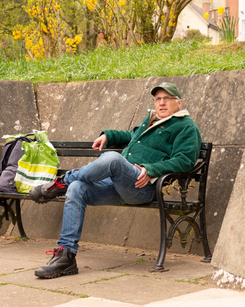

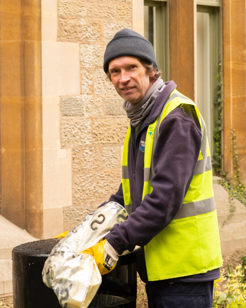
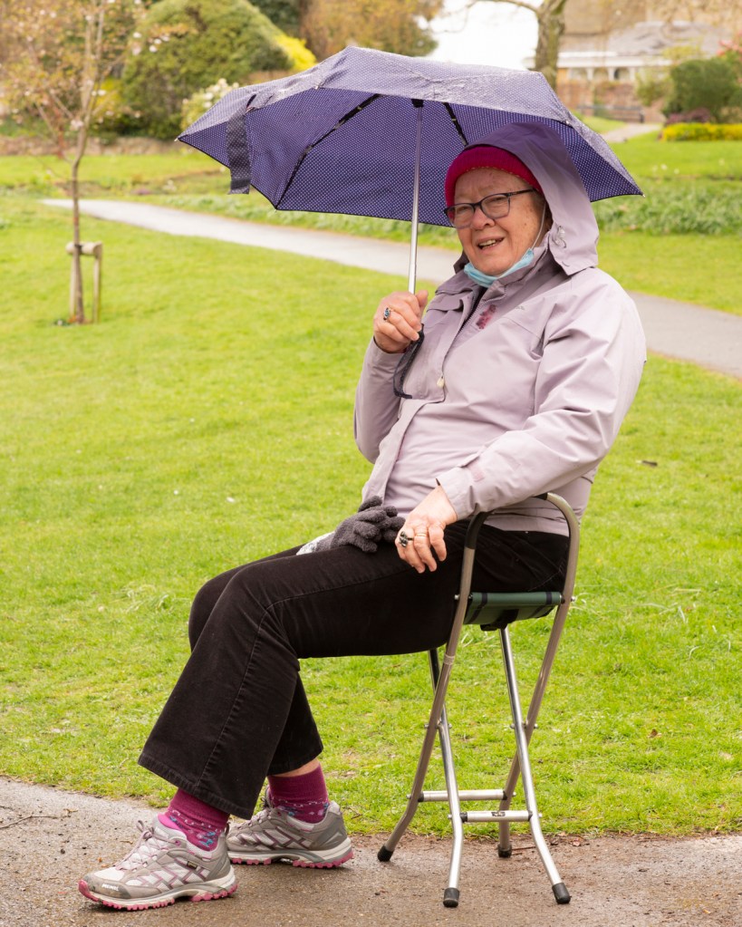
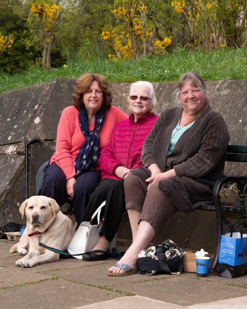

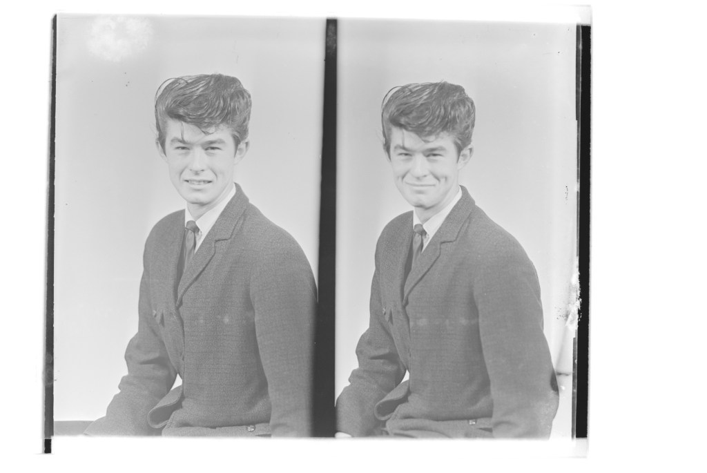
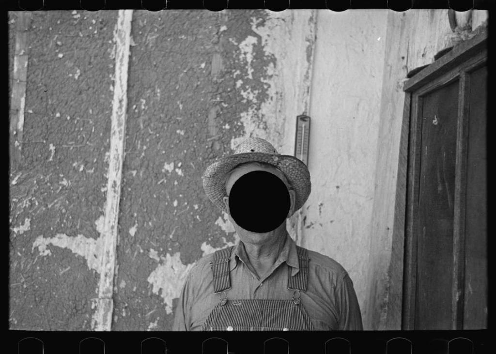
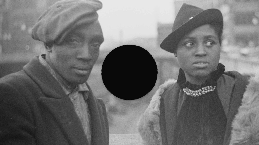

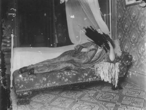
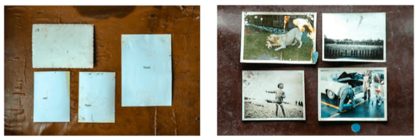
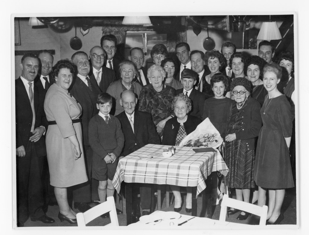
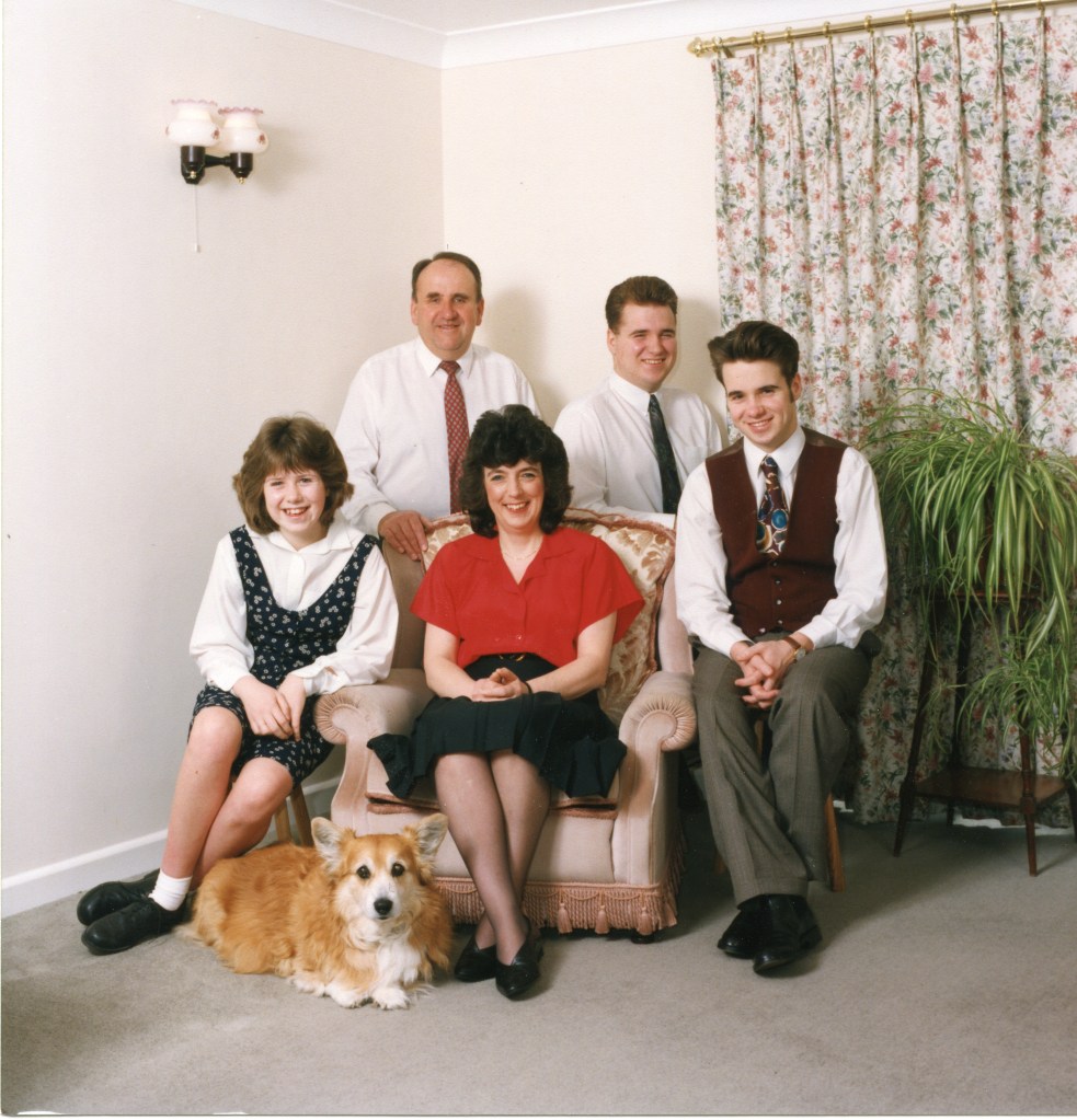

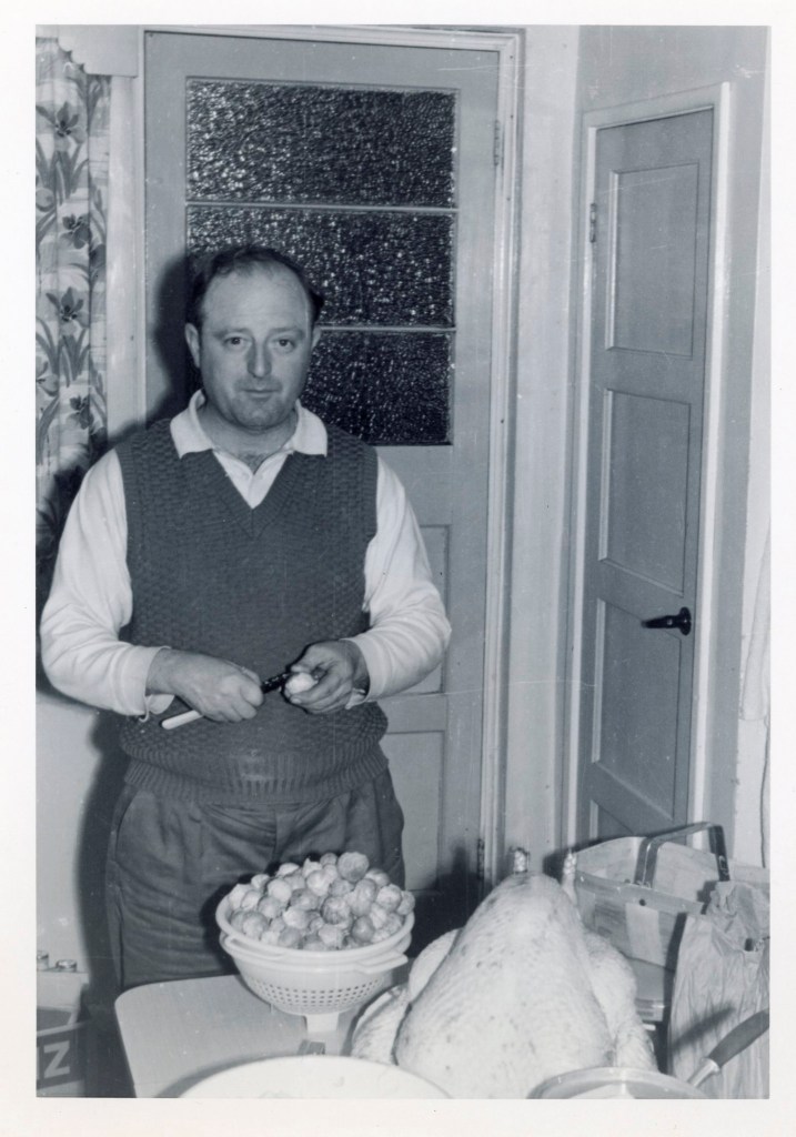
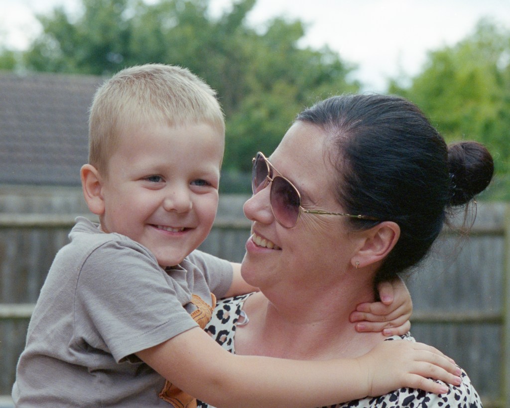

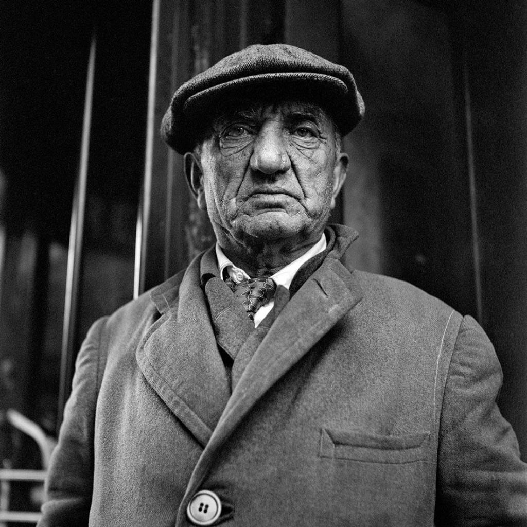


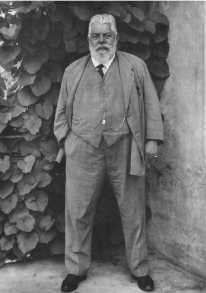
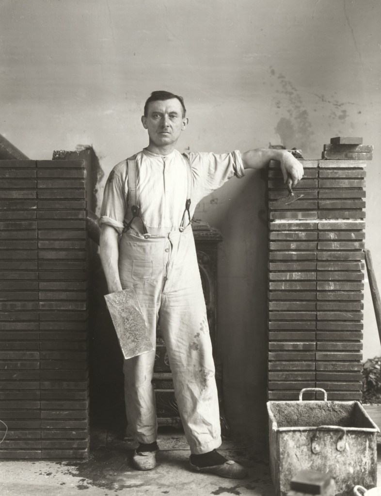
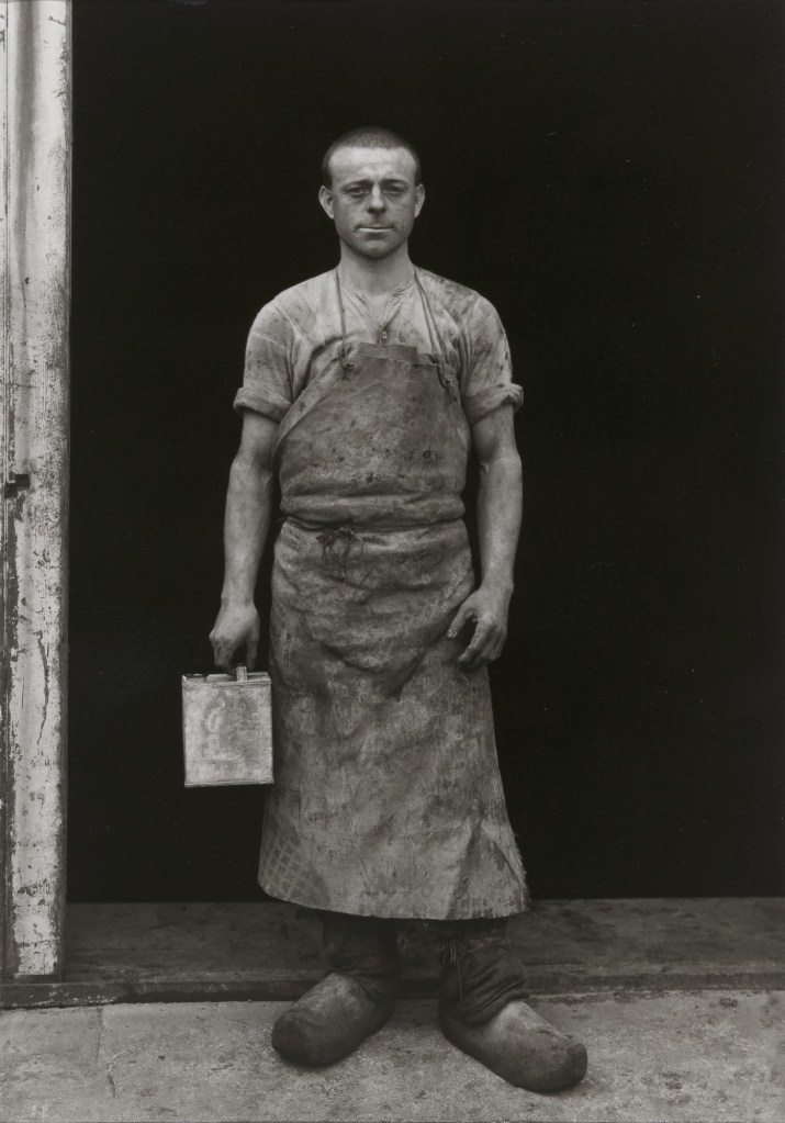
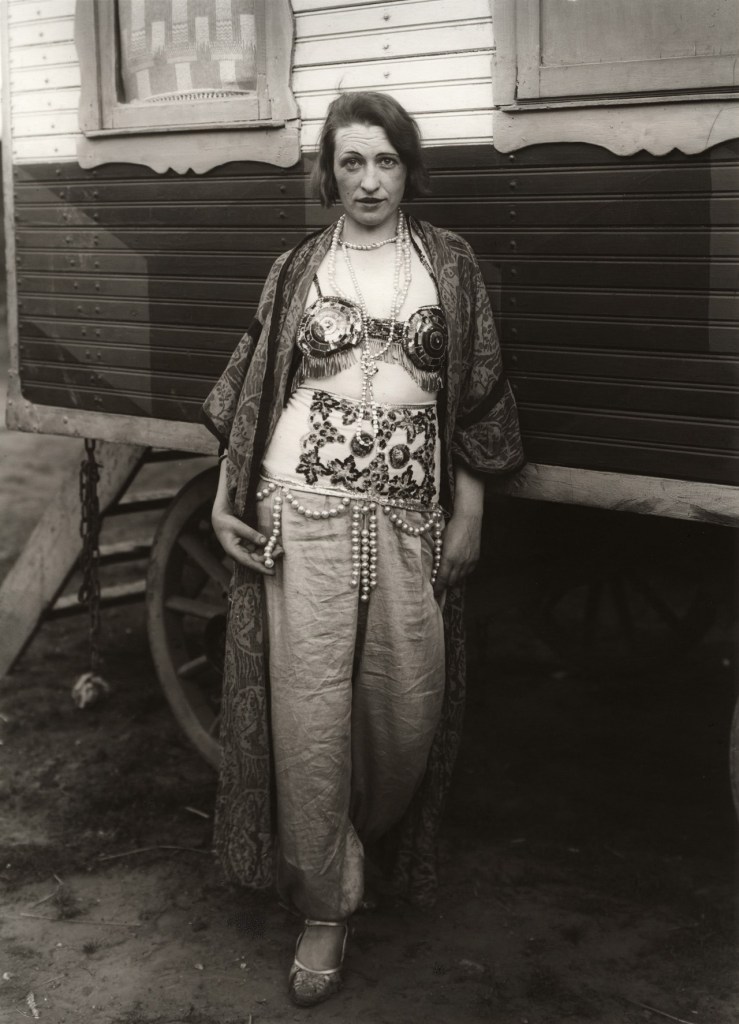
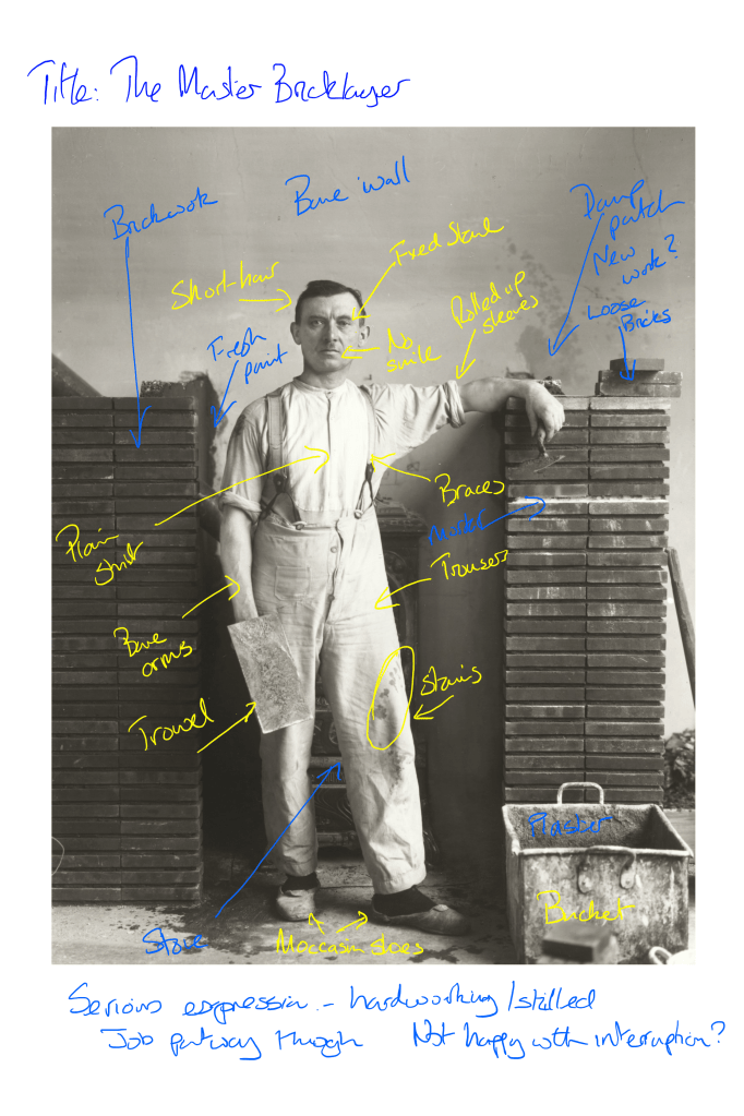
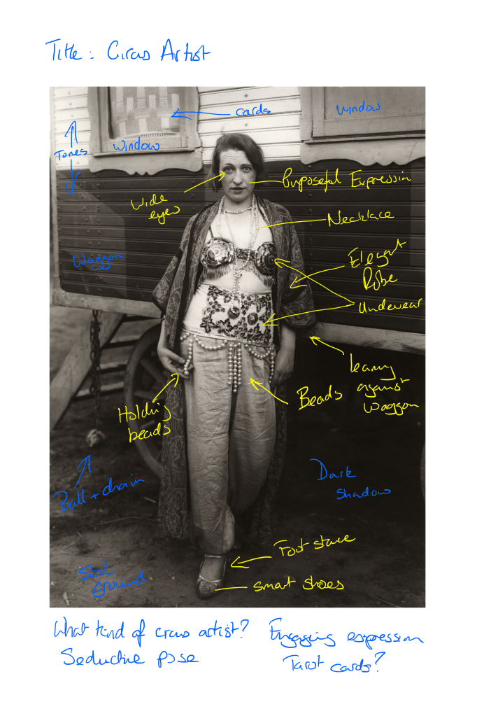
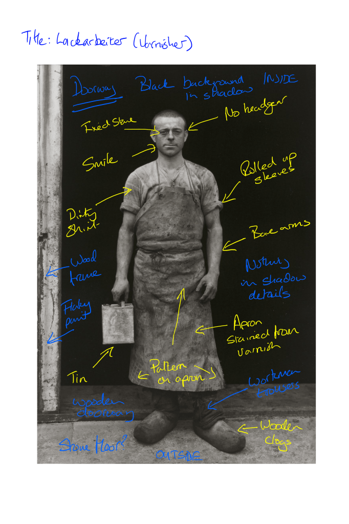
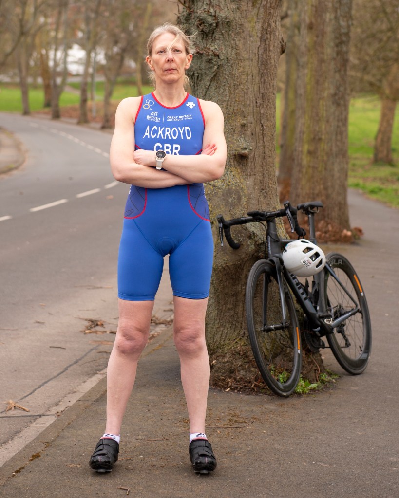
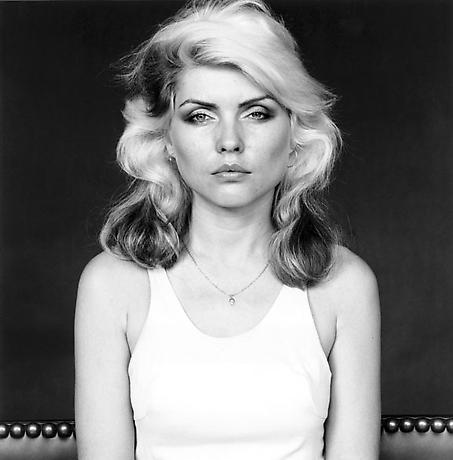
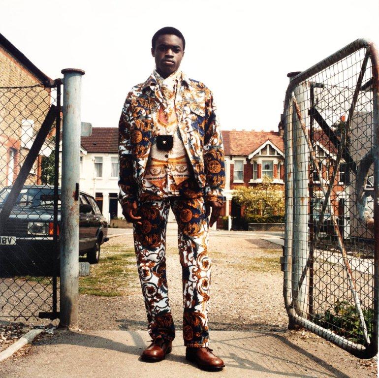

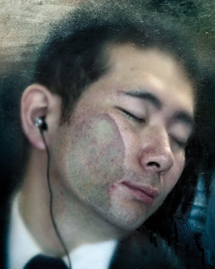
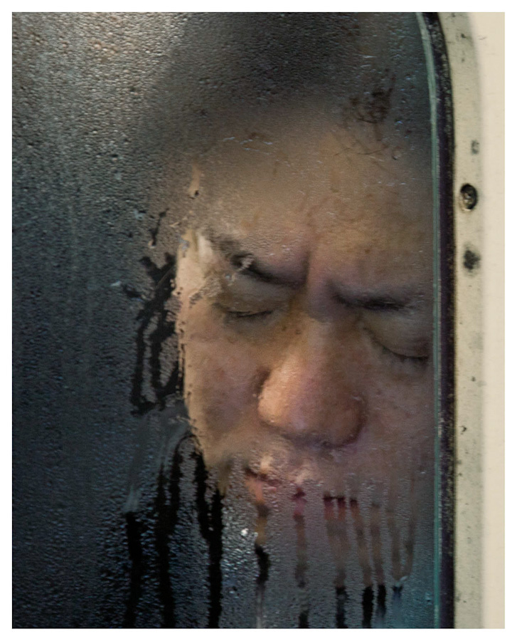

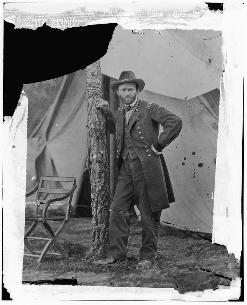
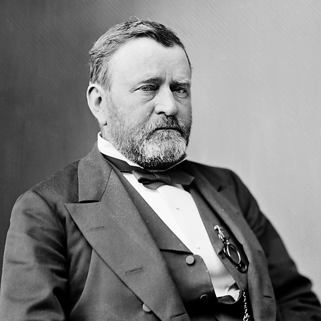
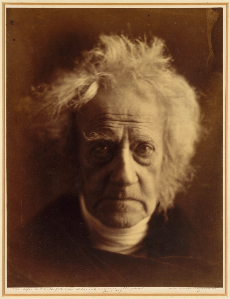
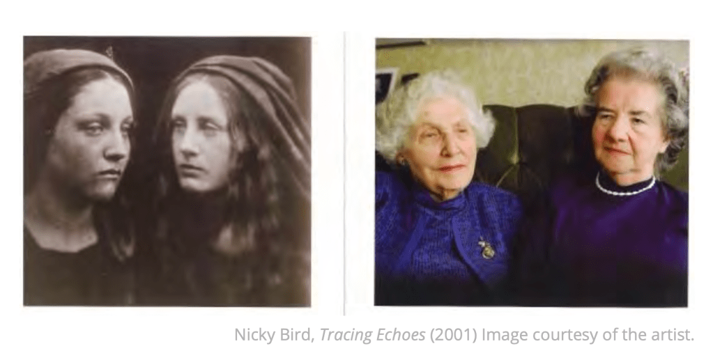

