Consider the work of both Callahan and Germain, then select a subject for a series of five portraits, varying the locations and backgrounds. The one consistent picture element must be the subject you have chosen, who must appear in all five images. Think carefully about where you choose to photograph them, either using a pose that offers a returned gaze to the camera, or simply captures them going about their daily business. The objective once again is to visually link the images together in some way.
You may choose a family member as a subject, like Callahan, or agree to photograph a colleague or friend, or even a willing participant who is either known or previously unknown to you, like Germain’s story about Charles Snelling.
Present your five images as a series and write around 500 words reflecting on the decisions you made. Include both of these in your learning log or blog.
My Idea
I was looking at my social media feed recently in response to a comment that a friend made about how few pictures there are of me. As most of the pictures I have shared over the years are of my wife, family and friends, I had to agree. When I do appear, it’s usually when we are on holiday or at an event or dinner. I considered how these few photos are a document of key points of my life and when I revisited them, how I had changed since they were taken. During Project 2, I was drawn to how the people in Meadows’ Omnibus project changed but remained recognisable in the 25 years between the shoot and the retrospective [1]. My initial idea was to select pictures from my Facebook feed and shoot current portraits of me wearing the same (or similar) clothes. I have home cinema in my house, so I would use the projector to make the photographs my different backgrounds. I would then position myself in front of the projected image and make the new photograph. I wanted the look of the series to resemble the background overlays used in movie scenes before the advances in CGI (see below)
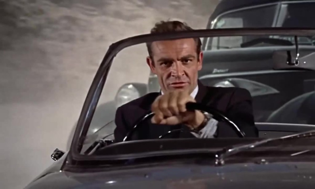
From the film Dr No (1962)[2]
As we can see in the still from the film Dr No, Sean Connery is shown in a car chase with a clear difference between the actor and the background. In reality, the car was shot on a stage with a back projection of a chasing car behind it.
A Change of Direction
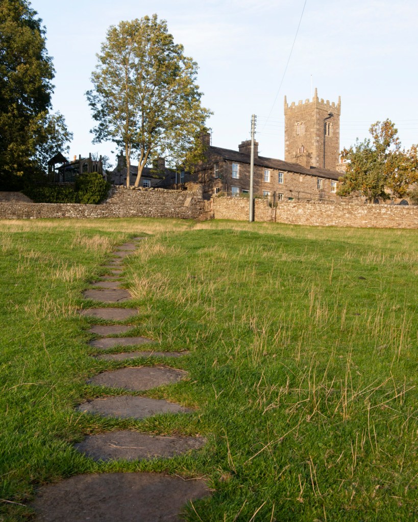
While my initial idea was sound, I was struggling with the execution of it. My problem was that the relationship between me and the background was merely a technical one. I had envisioned invoking some form of memory of the place I had previously visited , but after experimenting with contextual ideas e.g. wearing similar clothes as in the background picture, I realised that the connections were pretty weak. I was then presented with an opportunity while on holiday in one of my favourite parts of the Yorkshire Dales, which was coincidentally was where I shot the first assignment on this degree course, Square Mile. Where my initial idea of putting ‘current me’ into an old ‘background’ was about how I was connected to it but changed, the concept evolved into being about how an environment had changed subtly beyond my control or influence. I decided to make my presence a mere marker, similar to a map pin, on the landscapes that I shot two and half years ago. I decided to present the images as a series of diptychs.
The Photographs
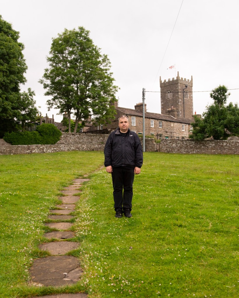
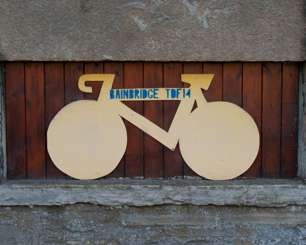
1 – To the Church
One
6 – The Bovine Line
Two
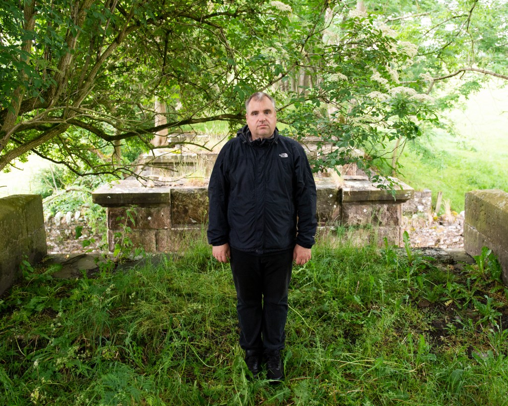
7 – Bridge Out
Three
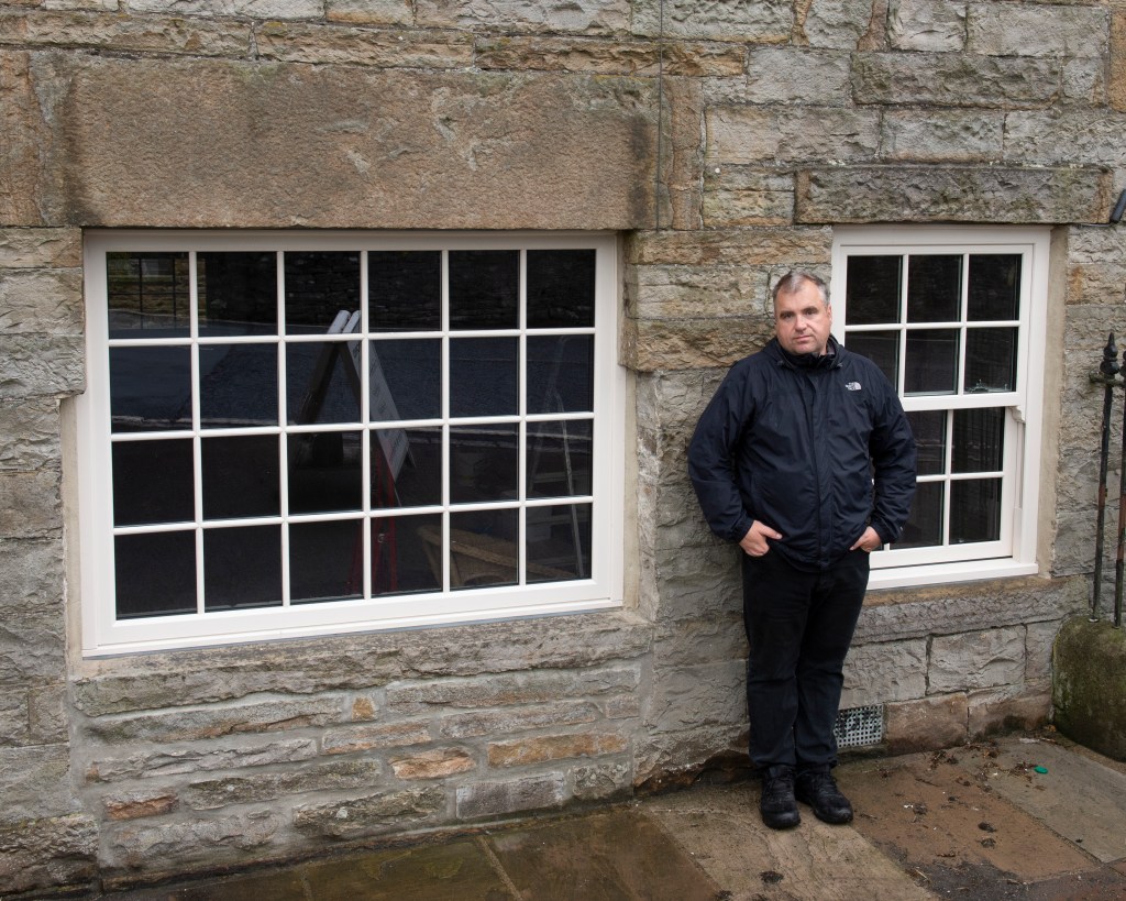
11 – Le Tour
Four
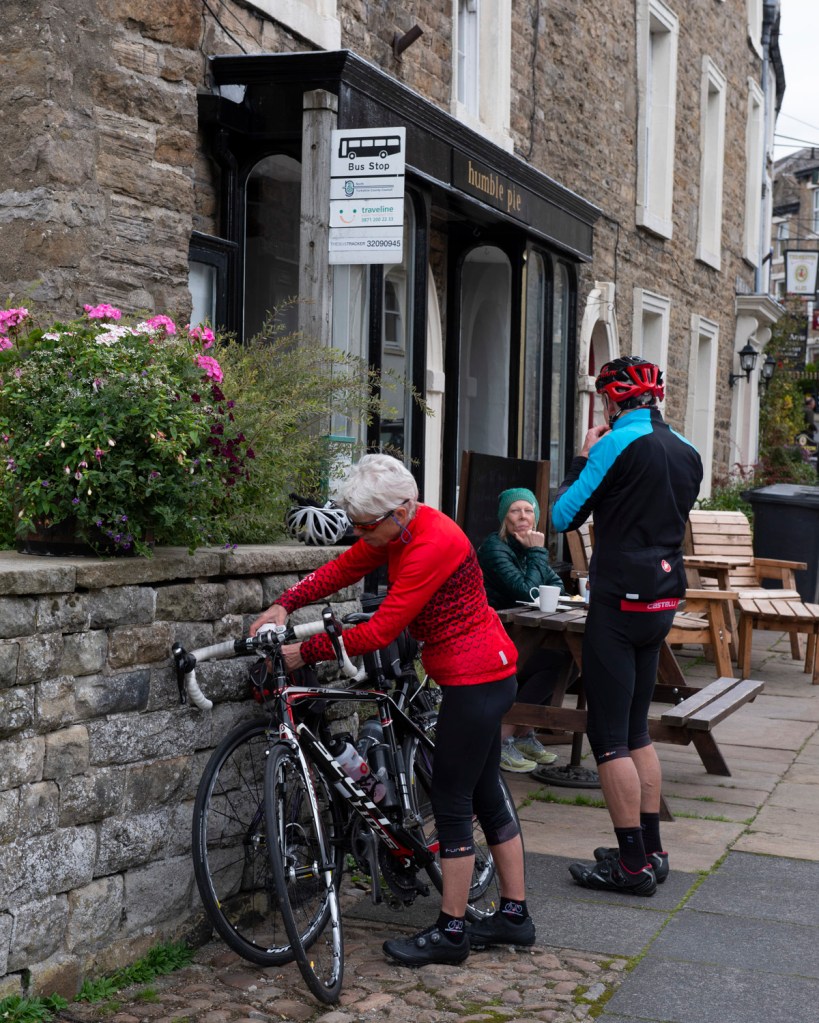
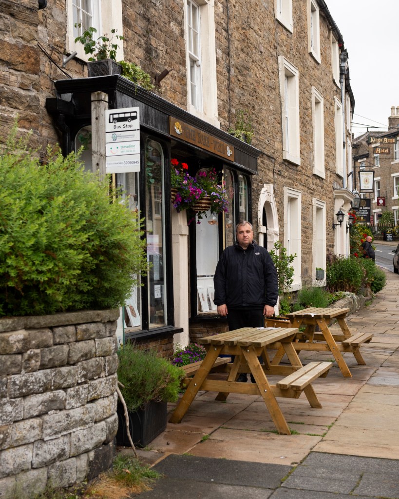
12 – Cafe Stop
Five
Reflection (500 Words)
This series evolved from an idea where the primary focus was the subject, which was was always intended to be me. I wanted to show how I had changed from the person in the social media memory, but struggled to find a way that was neither really obvious (using props) or merely showed me as an older, fatter version of myself. When the opportunity to shoot in the location of my first assignment came up, I realised that the background could actually be the subject. When we consider the portraits that Callahan took of his wife and daughter in the vast spaces[1], it is the impact of scale that first strikes us and it is the background that we find ourselves looking at. With my series, we see a landscape that is immediately familiar, but when we look more closely the changed that have occurred over time become obvious. Some are significant as in the case of Four, where the original location for the bike model had been replaced with a window as the building underwent renovation. In fact, it was difficult to identify the original aperture and I would most likely have missed it if I didn’t know the area so well. In Five, the cafe had changed hands and been renamed, with the transient detail of the cyclists no longer in the frame. With One, Two and Three we have the most subtle of changes, ranging from the length of the grass (One) and the difference in seasons shown in the tree foliage (Assignment One was shot in September, not July).
The introduction of me as a marker in the scene really only anchors the series together as in each case I am pretty much expressionless. When I reflect on this, I realise that my expression does change naturally from frame to frame. I conclude that this is because we have no true ‘steady state’ expression. What we express depends on what we are doing or thinking about, which in my case was instructing my wife on the composition before shooting. My expressions and stiff stance in the photographs ask questions of why I’m in the scene and what am I thinking about? I asked the same questions of Callahan’s portraits of Eleanor and their daughter.
In conclusion, I think this series works. My seemingly impassive position within the frame looks like a map marker, but there is something slightly different in each expression. The changes in the background range from subtle to obvious, but the scene remains very familiar. The images also have a sense of the nostalgic about them in the sense that growing up, some holiday photographs took on an uncomfortable feeling to them with the photographer more interested in recording the scene than making a good portrait of their family member.
As nursery rhymes are generally created for children to recite as a way of learning, the first reaction to the above rhyme from the US, which is still in existence today, is one of shock. What the rhyme symbolises is the common perception of racial division around the world which describes a simple colour categorisation into which everyone is placed. This simple idea became the root of ‘colourism’, whose origins date back to the days of colonialism and slavery. Black people were considered the underclass, had little in terms of education, were treated inhumanely and enslaved. The people that fitted into the Brown and Yellow categories were treated better respectively, with the White people being the originators of the scheme and as a result, the superior race. Despite the progress over the past 200 years, colourism still exists at a subconscious level in the way that some people view others of different ethnicity. A modern example was the casting of the film Straight Outta Compton (2015) which told the story of the up and coming rap scene in 1980s Los Angeles. The casting team categorised women who were potential extras in the film by grading their skin tone, which drew widespread criticism when it became public[2]. This identification and classification of non-white people exacerbates the tensions around racial equality and civil rights, which today is perhaps most widely epitomised in the media coverage of atrocities such as the murder of George Floyd by a white police officer in Minneapolis.
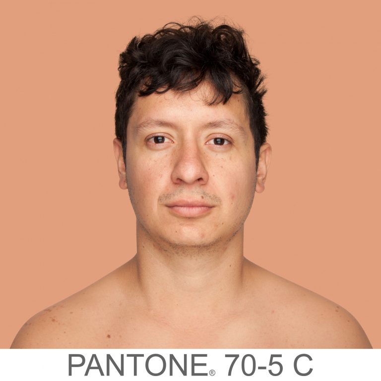
With her work Humanae, Angelica Dass wanted to show how much variety there was in skin colour across the world. Born into what she describes as a ‘colourful Brazilian family'[1], Dass affectionately refers to the chocolate, cinnamon and bronze tones of the members of her family. Growing up, Dass only really encountered colourism outside of her native Brazil.
Humanae is an unfinished work comprising of many thousands of portraits, all shot in the same way as Dass travelled the world. Her volunteer subjects are shot as head and shoulders only against a plain background, with the photographs cropped as squares. Dass then worked in post production to take a sample of the skin colour from a small region of the subject’s nose to gain their tone. She then used the international Pantone colour grading system[3] to change the background to match the subject’s tone, including the reference code as part of the image. A couple of examples can be seen below.
From the series Humanae, by Angelica Dass [4]From the series Humanae, by Angelica Dass [4]
Here we have two images of very different skin tone. What’s immediately obvious is that neither conform to the conventional Black, Brown, Yellow, White ideas of colourism. By altering the background colour, Dass draws our attention to the subtlety of the skin tones from shot to shot. The inclusion of the Pantone code gives us another anchor of difference but also a sense of the scientific. She is almost suggesting that the classification of colour has been done by a professional body, and that the classification is far from simple when attributing it to how people look. Dass has many thousands of pictures in her collection now and has been experimenting with how to present it to the world. By her own admission, the traditional presentation in a gallery isn’t really something she feels she fits within, allowing the viewers to choose to engage with the work or not. As a woman of colour, Dass connects more with confronting the audience with her work, so one exhibition was as billboards in the streets of major cities. This way, the audience is presented with the photographs as a matter of daily life. The effect of pushing the narrative of the complex differences in our appearances is more powerful when it cannot easy be ignored.
Conclusion
I found out about this work on social media a couple of weeks ago. With the completion of the exercises in Part 2, I was drawn to the use of subject and background as effectively a reinforcement of one another. The large expanse of the same colour as the skin tone makes makes me really notice how subtle the differences are between cultures, but also people within the same.. I really connected with the use of textual context in the shots too, the Pantone codes joining the series together as well as reinforcing the narrative. I can see other opportunities for the application of backgrounds this ways, for example contrasting perspectives on gender and age, social standing and materialism, sexuality, values and principles. It’s something I will explore elsewhere in this unit.
Following on from Exercise 3, we consider the idea of an artificially created background, the kind of which would traditionally be used in a studio environment. Studio can mean many things from a dedicated space in which professional lighting equipment and assistants work to shoot the picture, to a small corner of a room with a plain wall and some form of light source that works with the subject. My own experiences of studios tend towards the latter, with impromptu setups used to complete an assignment or project. I have the lights and equipment to shoot ‘businesslike’ portraits, but this post is about the use of such setups to create a series of pictures that reveal more about the subject than perhaps more clinical work.
Irving Penn – Worlds in a Small Room (1974)
Penn’s series Worlds in a Small Room makes use of a space in a room that has a background dressed for the portraits. The subjects are all shot within a small space with Penn not really trying to hide the fact that it’s a temporary studio. Penn used this temporary arrangement to then travel the world photographing people within his controlled setting. This approach offered Penn, who described himself as an ambulant studio photographer, a space that was both private and a known quantity. Although he used natural light for the portraits, he was able to control the highlights and shadows between shoots. The effect act it had on his subjects was one of neutral territory. Penn described his early engagements with some gypsies during a trip to Spain in 1964:
“The studio became, for each of us, a sort of neutral area. It was not their home, as I had brought this alien enclosure into their lives; it was not my home, as I had obviously come from elsewhere, from far away. But in this limbo there was for us both the possibility of contact that was a revelation to me and often, I could tell, a moving experience for the subjects themselves, who without words—by only their stance and their concentration—were able to say much that spanned the gulf between our different worlds”
Irving Penn[1]
As the shooting progressed, both parties became more comfortable with each other. The resulting portraits reveal the subjects in a way where the background context doesn’t really add anything to distract the viewer.
However, the idea that Penn’s studio was a neutral environment was challenged by scholar Jay Ruby at Temple University in 1977 [2]. He contended that the act of getting the subjects to relax was actually Penn asserting his control over the shoot. The studio, the arrangement of the camera etc were all the domain of the photographer with Jay suggesting:
“Stripped of their defenses these strangers would be free to communicate themselves “with dignity and a seriousness of concentration ” (p. 9). There is a fundamental flaw in Penn’s logic. While he was out of his culture in the sense that he did travel to these various locations, he always rented or constructed a studio to work in. The studio environment is one where Penn is clearly at home and totally in control. As wielder of the technology, Penn was literally calling the shots. The use of the portable studio offers a consistent background to the pictures that, like Evan’s Subway pictures, almost normalises the images in the series so we are no longer looking at it”.
Jay Ruby, 1977 [2]
When we think about this view, it’s the main issue with any kind of studio environment. I recall my own experiences of an art nude course that I did with the Royal Photographic Society in 2014. I had never done anything like it previously and my nervousness was a combination of operating professional lighting, directing a model and, of course her being nude. At the start of the course, my fellow students and I approached the shoot almost as children, asking the model for her help in posing and the tutor in terms of camera settings and lighting positions. With the increased confidence as the day progressed, we started to dictate the direction of the shoot. In my case, I started to break the composition rules that we had been told about regarding classic art nude photography, the two main ones being the model directly looking at the camera and smiling. The shot below is the picture I took that broke these rules, which the model was entertained by, but the tutor less so.
‘Fiona’ by Richard Fletcher (2014)
The point that I am making is that I have sympathy with Ruby’s viewpoint, but at the same time, Penn’s series documents the people of different cultures, some of which have either declined or may even have disappeared over time. Penn was fascinated with capturing and representing these people without any influence or interference. For me, the series works and is a great example of where to place the emphasis in portraiture.
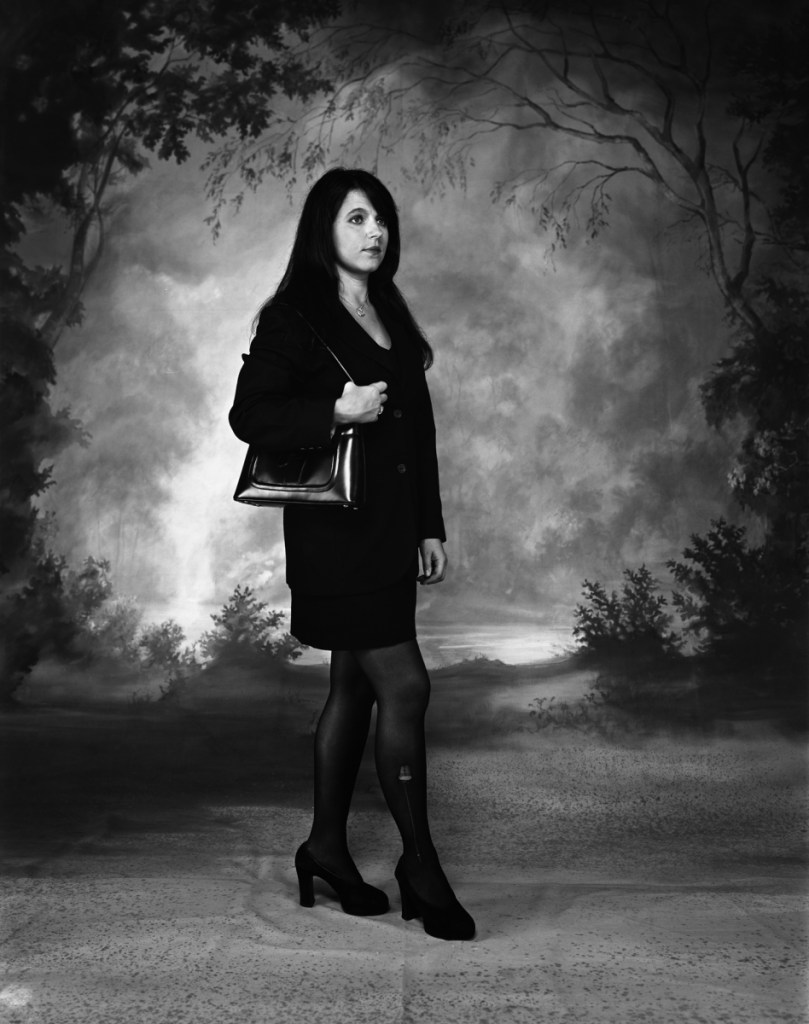
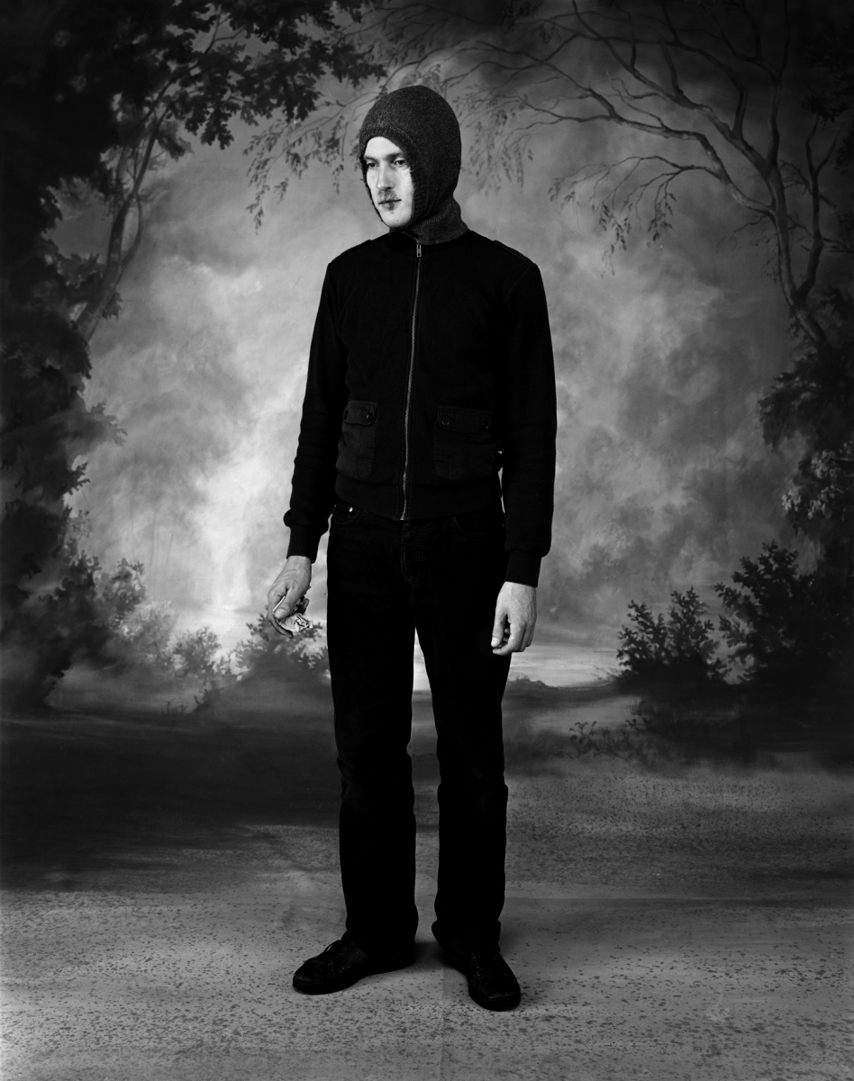
Clare Strand – Gone Astray (2002/3).
With Strand’s series Gone Astray, we have something similar to Penn’s work in the use of a single studio backdrop. In this work, the subjects are young people who look at first glance as if they have been brought into a studio to be photographed ‘as is’ by Strand. When we look closely however, we see that the subjects each have some kind of damage, either to themselves or their clothing that asks us to question how the series hangs together. Is it a series of random people that the artist has coopted to be in the photographs or is it a carefully controlled series of contextual elements that tells a story of the disaffected urban youth? The answer is, of course, that each image is staged as a series of cosplay situations with the props, clothes and poses being carefully stage-managed. Examples from the series can be seen below:
Fromthe series Gone Astray (2002/3) by Clare Strand [3] From the series ‘Gone Astray (2002/3) by Clare Strand [3]
In both shots, the studio is used in the same way with the lighting adjusted between shots. The first picture shows a professional woman posed as if she is walking, perhaps to work or a meeting. Her professional suit is marred by a small tear to her tights, which is the ‘damage context’ for the photograph. For me, the way that Strand poses the model and her expression suggests some form of masquerade where the outer projection of confidence is flawed by the imperfect appearance of her outfit. Her expression though feels crafted by Strand, but this sense is revealed when we look at the images closely and for a time. Her use of context is all about the model, while the contrasting backdrop provides a more obvious thread that runs through the series. The same is seen in the second image, which this time is of a young man in a hoodie top, holding some folded money. This aesthetic is more in keeping with what we associate with inner city youth culture. Societal prejudices and media portrayals of young men dressed this way create a sense of being threatened. The inclusion of the money suggests perhaps some illegal activity where cash-only transactions are commonplace. Perhaps the suggestion is that the man deals drugs, which is a narrative that is supported by the other contextual elements in the scene. When we look closely, we see the flaw which is a cold sore on the man’s lip. Cold sores are a strange viral condition that affects people of all ages and social standings and are exacerbated by lifestyle, hormones and even simply being exposed to excessive sunlight. Here then, Strand is including a contextual element that both supports and contradicts the idea that this man is a mere hooligan. If we relate to the cold sore as a sufferer, we could then see the man out of another contextual situation. Perhaps he’s buying something else with his money. If he was set in a chemist, it would make complete sense that he would be buying medication for his condition.
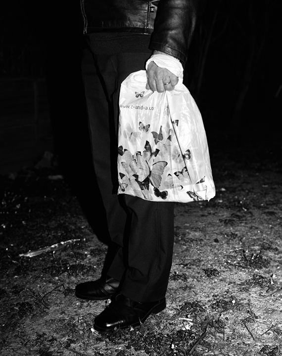
In the same year, Strand completed a second part to the Gone Astray series, called Gone Astray Details. In this series, the duality of inner-city life and rural is much more subtle, with the compositions being much more surreal. An example can be seen below:
From the series Gone Astray Details (2003), by Clare Strand [4]
Here we have a portrait where Strand has dispensed with the studio background and instead shot in a natural environment. The man is standing in what looks like a gravel or well-trodden pathway where the only signs of vegetation are trampled sticks. The hint of the rural is overwhelmed by the smart, city attire of the man which makes him look like he’s not out hiking in the country. The inclusion of a small part of the informal jacket raises questions about who this person is in the context of this composition. Strand further includes a carrier bag decorated with butterflies which adds a contrasting element to the image. The butterflies juxtaposed with the bag, which looks like it’s made of plastic, points to the conflict of the natural world vs. the city. This work and the others in the series mixes the ideas of studio and street photography as the composition has both a sense of being ‘captured’ and lit by artificial light (the flash reflections in the shoes). When paired with Gone Astray Portraits. it’s clear that Strand is not being governed by a particular style and almost challenges us to question what is going on, both aesthetically and from a visual perspective.
Conclusion
I really like the combination of natural and artificial in both of these artists’ work. With Penn, the concept of moving the studio around the world to access a variety of cultures is interesting, achieves a consistent series of images that are anchored by the setup and reveal something of the natural personalities of the subjects. However, I agree with Jay Ruby’s view that the narrative is being controlled to a large extent by the photographer. With this perspective comes the sense that we are viewing different cultures as we might view a museum exhibit. I was reminded of my visit to The Horniman museum on Forest Hill, London [5]. Frederick Horniman’s vision was to collect and exhibit artefacts from around the world to better educate the poor and disadvantaged in Victorian society. The museum is perhaps best known for its extensive taxidermy exhibit which contains many species of animals from all over the world displayed by genus. It’s a fascinating exhibition which invokes feelings of Darwin’s documentary of evolution. However, when I visited I could only see the specimens in the context of their small differences intra-species, that is the way that their are only small changes that took many years to become noticeable. For me, Penn’s series is like this. It feels like the subjects are merely placed in a display cabinet. In contrast, I find Stand’s work more interesting. She places actors in an identical scene and tells a story that is clearly constructed, but also rooted in a perception of inner city life for younger people. Her use of obvious and subtle context to both support and conflict with our prejudicial assumptions about her characters leads me to want to look at the images more and more closely. Her use of the Dick Whittington-esq background is surreal but serves the purpose of anchoring the series as well as suggesting that the countryside is the nirvana that everyone aspires to. Clearly this is not the case for everyone, but again it plays into the hands of the media portrayal of the countryside being somehow better. I think that this sense of conflict and contrast is what I will take into my series for Assignment 2.
Project 2 deals with a more complicit relationship between subject and photographer, placing the emphasis firmly on collaboration between the two.
From the course notes, page 10
Harry Callahan (1912-99)
Harry Callahan was a hugely influential photographer who’s work spanned some 50 years and crossed many genres. He is well known for his often abstract architectural photographs, his early use of colour slide film technology, and his portraits of his wife and daughter. The course notes refer to his large format portraits of his wife and their daughter Barbara set in huge, open landscapes which I’ll look at first. However, Callahan was an experimental photographer who essentially shot a particular subject type with a particular camera until he got bored and moved on to a different combination of both. In a television interview in 1981[1], Callahan said:
“What I’m trying to say is that when I got tired of one thing and, I wasn’t functioning properly, I would move to something else. If I had photographed nature, I would go to the city and after a while, when I felt that I was dead in the city…I would go to photograph people”
Harry Callahan speaking in 1981[1]
Callahan saw his photography as being development of experience but not a linear path where he constantly ‘improved’. He felt that he could look at his earlier work alongside his most recent and see them as different but equal. I found this interesting because as well as his large landscape images of Eleanor, he shot some double exposure nudes of her where subject and background are combined. These shots combine identity and place in a contrasting way to the other series. I’ll look at these ideas of identity and place secondly.
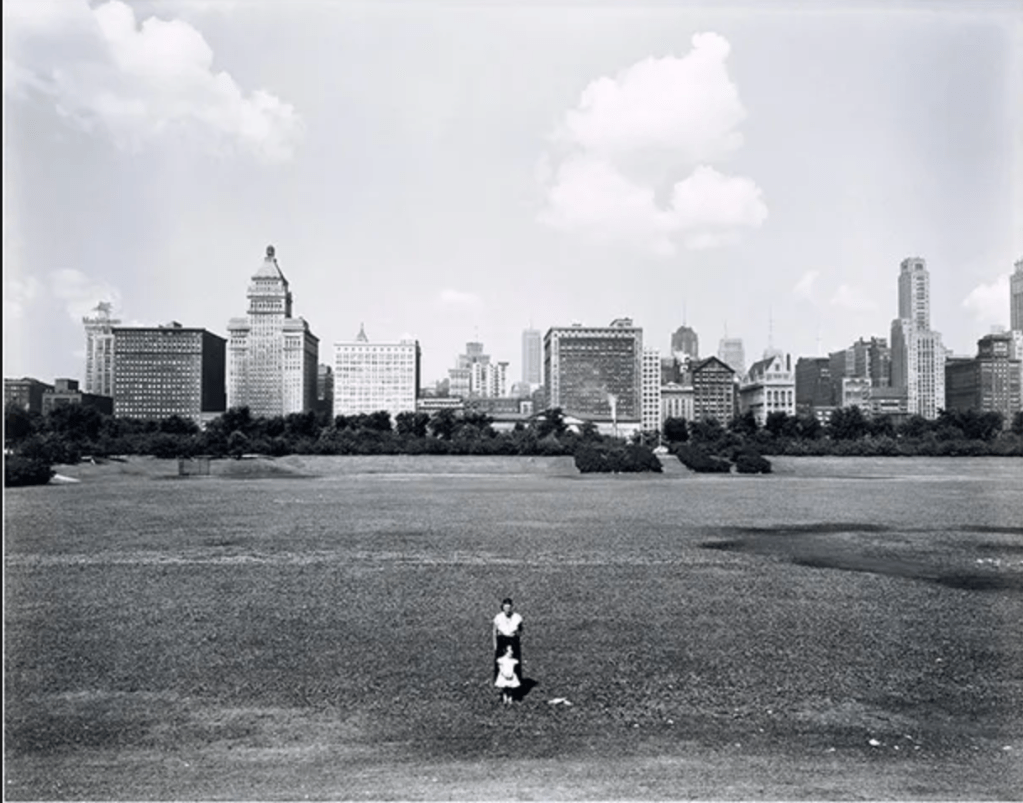
Eleanor and Barbara, Chicago by Harry Callahan (1953) [2]
In this photograph we see Callahan’s wife and daughter standing in the foreground of a wide cityscape. They are posed centrally, facing the camera, with Barbara standing directly in front of her mother. The skyline of Chicago is on the horizon, a considerable distance behind the subjects and it is noticeable that there aren’t really any other features in the frame between the foreground and background. When I look a this image and the others in the series, the first thing I notice is the lack of detail in Eleanor and Barbara themselves. The perspective that Callahan used renders them small and almost without detail, while the scale of the overall image is emphasised by his use of a large format camera to make the shot. Chicago appears as a looming presence with the implication of bustling and overcrowded life going on there. The vast space that the subjects are standing in gives a real sense of isolation from the crowded city. What is not immediately obvious is anything about the expressions of Eleanor and Barbara. This is where the questions around narrative arise. What are they thinking about? How do they feel about their surroundings or the act of being photographed, which they are more than aware of? The distance between photographer and subject and then background makes the series ask questions about the subjects’ places within the space while looking more like a documentary about Callahan’s family. Most people take these sort of staged portraits when they are enjoying a family day out or a holiday but in this series, Callahan teases the viewer with what the pictures are about. The inclusion of these contextual points e.g. the two small figures and the vastness and relative emptiness of the background, anchors the series together but also leaves plenty of space for the narrative to form.
Eleanor, Chicago 1954 by Harry Callahan
In this shot, we see Callahan blending portraiture with background in a different way. The double exposure of Eleanor in this shot serves as a canvas for the background detail, in this case a shrub or tree. Elements from both exposures interact with each other which leaves us with a sense of not really knowing what the picture is about beyond being a nude of his wife. The combination of Eleanor’s natural female shape and the natural arrangement of the branches in the environment point to Callahan’s observation of the beauty of both. It’s known that his nude photographs are mainly of his wife because as he stated [1]
“I didn’t feel that way about anybody else and she was good at it in the sense that she cooperated”.
For me, both types of portraits are constructed for different reasons and achieve different narratives. The former highlights the almost transient nature of people and in Callahan’s case, family as the move through landscapes that they have little apparent impact on, where the latter highlight the ways that natural beauty can be found in both. With the latter photographs, Callahan blends the two ideas of indoors and outdoors by using double exposure. While he’s not the first or only photographer to join these two senses of place together, his photographs are certainly thought-provoking.
Julian Germain (1962 – )
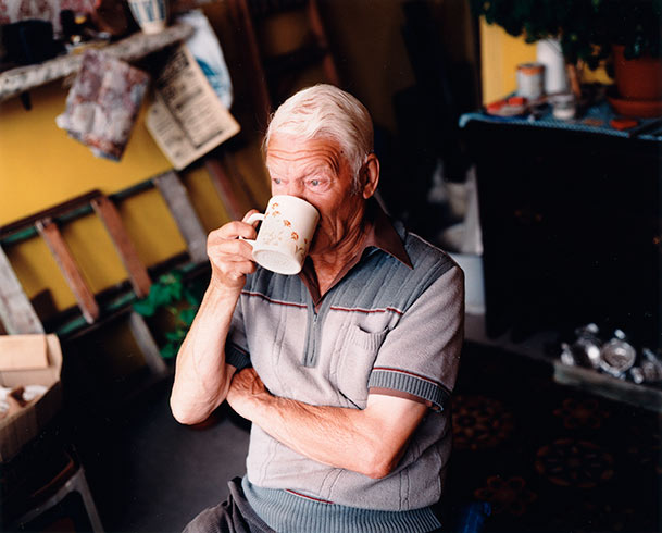
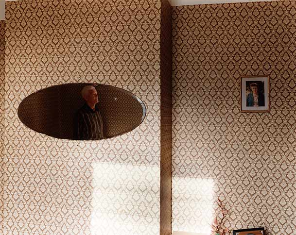
With his work For Every Minute You are Angry You Lose Sixty Seconds of Happiness, Germain was inspired by the simple, yet content life of an elderly widower called Charles Snelling. Germain became interested in his subject because of the way that Snelling made his home brightly coloured and cheerful as well as going about his daily life with a very positive outlook. Germain described Snelling’s way of life as ‘an antidote to modern living'[3] because of the way that he found happiness in things that were often of little or no cost. This idea of happiness being disconnected from wealth, status or the pursuit of ‘achievement’ is something that I find interesting as someone who has struggled with their mental health. Life is dominated by pressure to ‘get on’, to earn as much money as possible and acquire a commensurate amount of stuff to go with it. None of that personally makes me happy and when I think about it, the happiest people I know are not bogged down with these goals. As well as being a powerful theme to the project, Germain entered Snelling’s life and spent lots of time getting to know him and his routine. In the three photographs below, we see the mix of styles that Germain used to reveal Snelling’s attitude to life.
From the series For Every Minute You are Angry You Lose Sixty Seconds of Happiness, by Julian Germain, 2005[3]
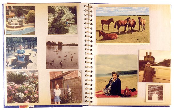
In the first image, we see Snelling drinking a cup of tea or coffee in what looks like his garage. He is lit by what could be either a studio light or by a large window, the light picking him from the background. His body language and expression appears entirely natural and the fact that he is not looking at the camera reinforces the sense that he is deep in thought. He looks contemplative and relaxed which, when included in the rest of these series, supports the narrative suggested by the title. The second image is very different. Now we have a change in location, with Snelling’s vintage decorated living room. He is shown as a reflection in a large mirror with the only other physical context in the frame being a portrait of what we assume to be his wife. This abstract composition suggests reflections on the present and the past, with Snelling’s expression again being completative. The theme is about being happy, but in both of these images he is not smiling or forcing a positive outlook. The sense of well-being is created by the sunlight that is streaming onto the wall through an unseen window. Germain’s presence doesn’t seem to affect his demeanour which suggests that he is comfortable being posed or captured candidly. We cannot be sure about how these two photographs were created, but the aesthetic certainly supports the idea of the photographer being part of the subject’s life. The final image is more of a mix of media for the series, which is repeated throughout. Instead of Snelling being the specific subject of the photographs, his life is documented instead. In this case, a page from one of his photo albums is shown which includes pictures of him but are mostly of his wife. The inclusion of this particular photograph supports the narrative of his life without his wife, but also for his love for her. While this unit of the course has been focused on portraiture and situation, this photograph reminded me that it’s important to include other context in the series if it supports the narrative.
I really like this series because Germain’s style adapts to elements of his subject’s life which strongly suggests that he really got to know him. The series sympathetically tells his story while never becoming kitsch or stereotypical. Snelling is a widower who clearly misses his wife, but at the same time is living his life as he sees fit. The message that we should take the time to notice the elderly also resonated with me.
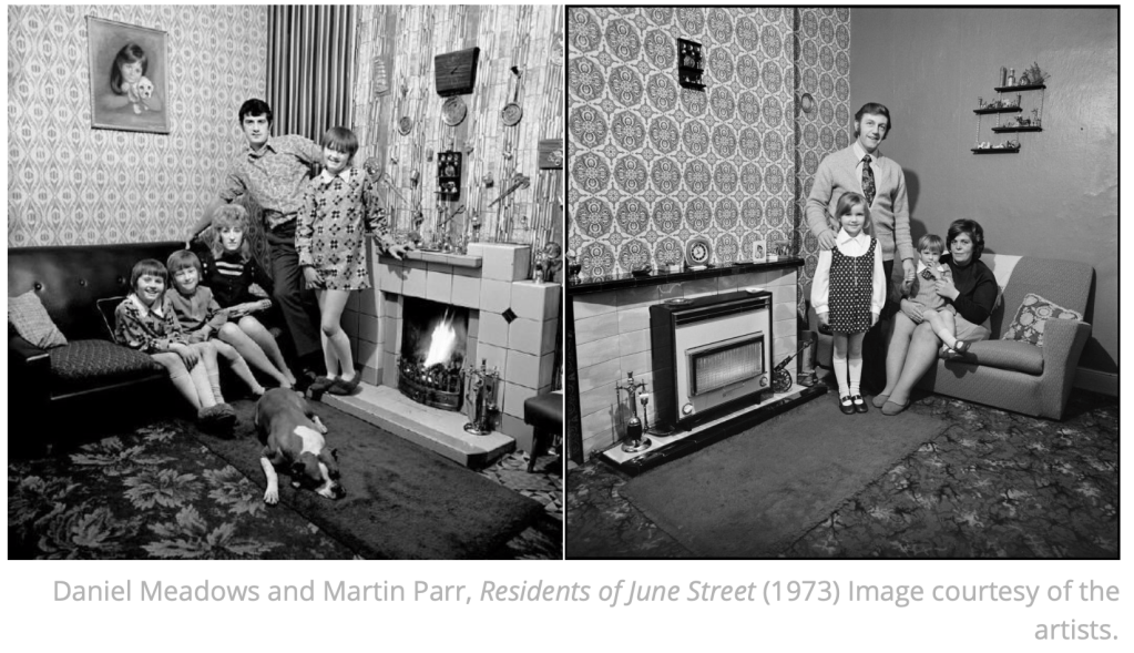
Daniel Meadows (1959 -)
We are introduced to a series created by Daniel Meadows and his friend, Martin Parr called June Street which was shot in 1973. The theme for the series was documenting the homes and lives of the residents of June Street, which was designated as a slum and scheduled for imminent demolition. The artists sought to reveal the lives of the residents as they were before being relocated to modern flats elsewhere in the Manchester area. The images in the series are of different residents and families, composed in a very similar way, in a corner of the main living room of the house. They all have similar key visual elements, namely a sofa or seating, a fireplace or chimney breast and the residents are standing or seated, looking directly at the camera. While they have a familiarity about them, there is no effort to hide what distinguishes the people of June Street. The decor and furnishing of the rooms depends on the age of the occupants, some being contemporary early 1970s and some much earlier. The subjects reflect this by being dressed in fashion for the period that they identify with. In his documentary video about the series[4], Meadows highlights how the details that appear consistently throughout the series resonated with people because they recognised them from their own childhood. He cited the gas fires in the shots as an a example as these were fairly common at the time and the variety of models that appeared in the series meant that people often saw one familiar to them. The series is anchored by the composition, which is always facing the corner of the room. As each house shared similar layouts and features, the photographs take on that connection between them even when the composition is of a different corner of the living room. The subjects themselves are posed formally but relaxed and are engaging directly with the photographers. This gives the sense that not only are they aware, they are invested in the photographs. Perhaps this is because they are about to leave their homes and wanted to see them documented for posterity. Perhaps they wanted to be seen instead of considered a statistic in the regeneration of housing in the area. Meadows goes on to state in the video [4] that they all had anxieties about the relocation ranging from whether they could take their pets to whether they would be allowed to decorate their new flats as before. The photographs in the series not only document the physical appearance of their homes, but when set against their stories we can get an insight into their lives at the time and how much they feared what was coming next. Later, the local BBC News used Meadows and Parr’s photographs as part of a video item about June Street which incorporated audio recordings of interviews with the residents. For me, the result was an article that removed any mystery to the shots, instead creating a straight documentary.
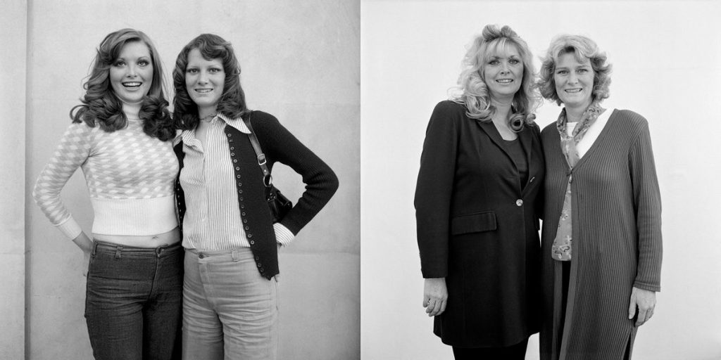
Meadows went on to start a community project called the Free Photographic Omnibus. He bought an old double decker bus, fitted it out to be his home, studio and darkroom and then travelled around the country taking photographs of people he met. Meadows’ idea was to document the cities and towns of the UK, offering to give prints of his pictures to the subjects if they returned to where he was parked the following day. Meadows admitted that he wasn’t interested in taking the details of his sitters, which at the time wasn’t a problem, but became an issue when he reviewed the work retrospectively. In an effort to find some of his subjects, the photographs were published in local newspapers in the areas where they were shot. The response was very positive with people coming forward over 25 years after they were photographed. Meadows then shot the subjects again, effectively evolving the project in a similar way to Edward Chambre Hardman’s portraits[5]. An example of this can be seen below:-
From the Photographic Omnibus Project by Daniel Meadows [7]
As we learned in Part 1, the pictures don’t serve as a representation of history, merely two points in the lives of the subjects. Here we see the two sisters in similar pose to the original shot. They have aged, but their features haven’t changed significantly and the way they engage with the camera is also very similar. The main difference that anchors the photographs as being from very different time periods is the fashion.
What I love about Meadows’s work in both cases is the what is not included in the pictures; a concept of the extraordinary or celebrity. In both series, Meadows (with Parr) are documenting the lives of ordinary people because they find them interesting. Meadows stated that he wasn’t interested in celebrity as the most interesting lives were the ones that surround us. Both Meadows and Parr have gone on to create work that reveals something about their subjects that most people might miss, while Parr in particular has used the seemingly ordinary people as cast members in his narrative works. For example, his perhaps most famous work The Last Resort is a commentary on the culture of British package holiday in a less than flattering way. Parr uses the people in those photographs as actors who play the part of memories of holidays for people of a certain generation. In doing so, he reveals the idiosyncrasies of the British people that we recognise in other society contexts.
Conclusions
I found this Project inserting from the point of view of the subjects being aware of the photographer but not necessarily posed in a traditional portrait style. Callahan used his wife and daughter in contrast to their surroundings and in the case of the double exposure nudes of Eleanor, his wife was part of the canvass. In both cases, Callahan reveals something about the physical attributes of the composition, whether one of scale contrast or simply the beauty in shape and contour. Germain’s photographs of Snelling are intimate and revealing without feeling like they are staged. Most of the series is deliberately set up by the photographer but at no time does the subject force an expression or look uncomfortable with the photographer’s presence. This is testimony to how well the photographer got to know his subject and the time he must have invested to get so close to him. I loved the use of contextual photographs of furniture and photograph albums to tell the story of Snelling’s love for his wife and the life they had together. This could have been done by photographing him, but was much better served by using context setting images instead. Meadows and Parr’s series about June Street is powerful because it documents a way of life that is about to come to an end. There is no trace of the houses today and we don’t know how the residents’ lives turned out after the shoot was completed. For me, their natural poses and ‘different but similar’ backgrounds make the photographs work together as a series. Meadows’ further work with the Omnibus seeks to reveal the interesting among the ordinary, which is further emphasised in the retrospective view that took place 25 years later. In this last set of images, the background is plain and featureless and it’s all about the subjects themselves. The background context is provided by the premise of shooting from a mobile photographic studio travelling around the country. Each artist approaches their subject differently, but they all place the same emphasis on their personality in a particular setting, whether a chance encounter or being part of their lives.
This exercise is essentially the same as the previous one, but instead of taking photographs of the same person, here you must make portraits of three different subjects, but keep the background to the image consistent (see Irving Penn and Clare Strand, above). There are many ways of exploring this exercise. You could either select an interesting backdrop to use inside (studio) or perhaps select an interesting backdrop on location (street). Whichever you choose, try to be as creative as you can and be prepared to justify your decisions through your supporting notes.
Again, present all three images together as a series and, in around 500 words, reflect upon how successful this exercise was in your learning log or blog.
Simon Chirgwin, Untitled (n.d) OCA Image Library.
You’ve looked at portraits taken of subjects who are either ‘aware’ or ‘unaware’ of the photographer’s interest. You should by now have thoroughly researched both areas and perhaps found some further examples of your own. Many of the practitioners highlighted here don’t necessarily work exclusively in one of these fields, but move between the two, depending upon what they’re trying to achieve through their imagery. There needs to be a reason for employing a particular method of working and it has been the intention of Part Two to provoke thought regarding what these reasons might be. The next assignment should test this reasoning to the full.
Introduction
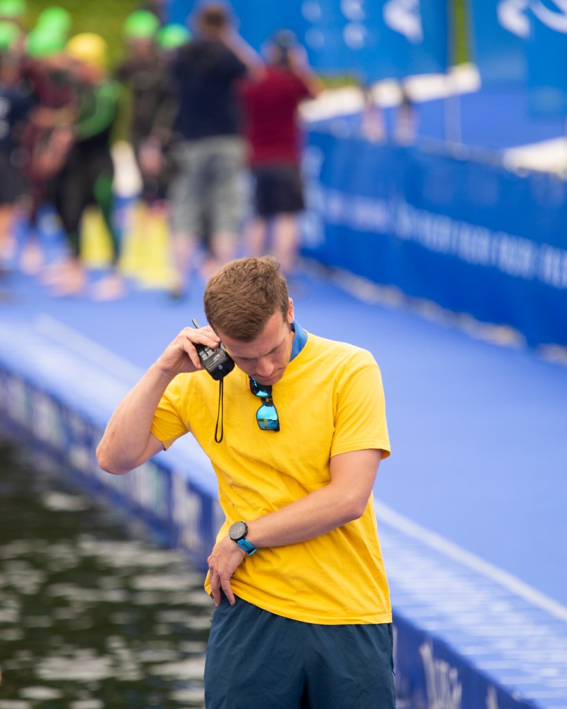
My wife recently competed in the World Triathlon Series event in Leeds, near her home town. This was the first event that we’d attended in over 18 months, so there was a feeling of ‘newness’ about the preparations and procedures that normally accompany these events. My series was shot at the lakeside where the swim leg of the event was being staged.
The Photographs
Reflection
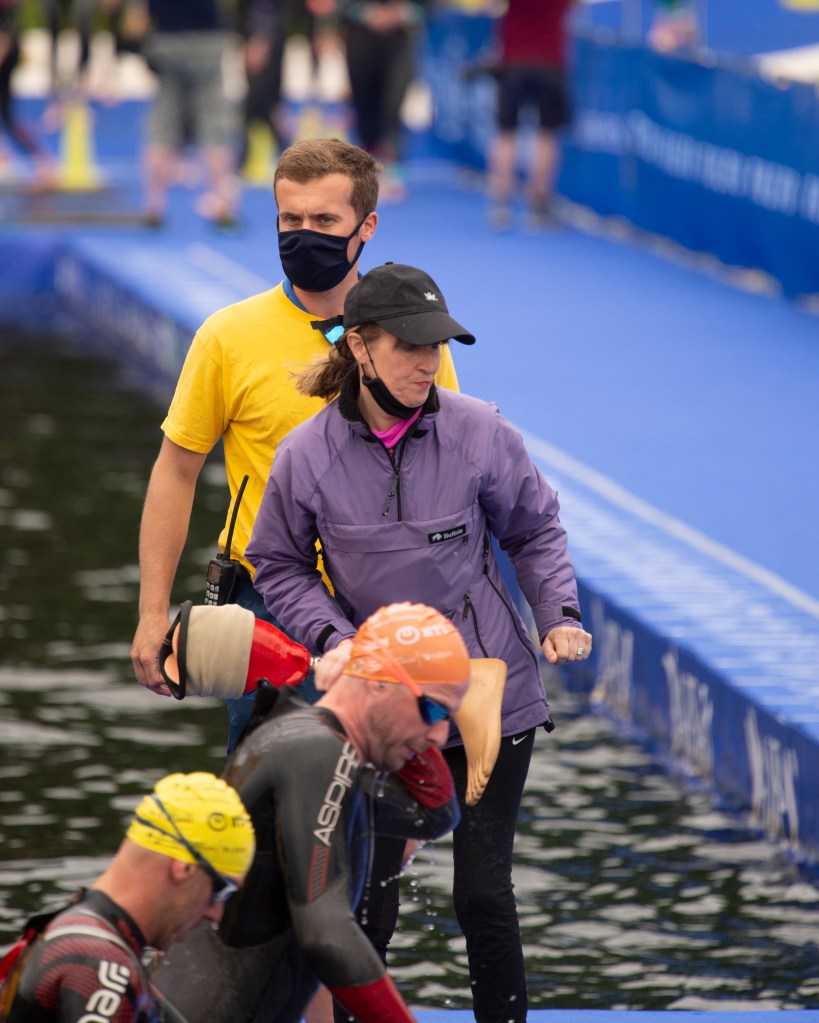
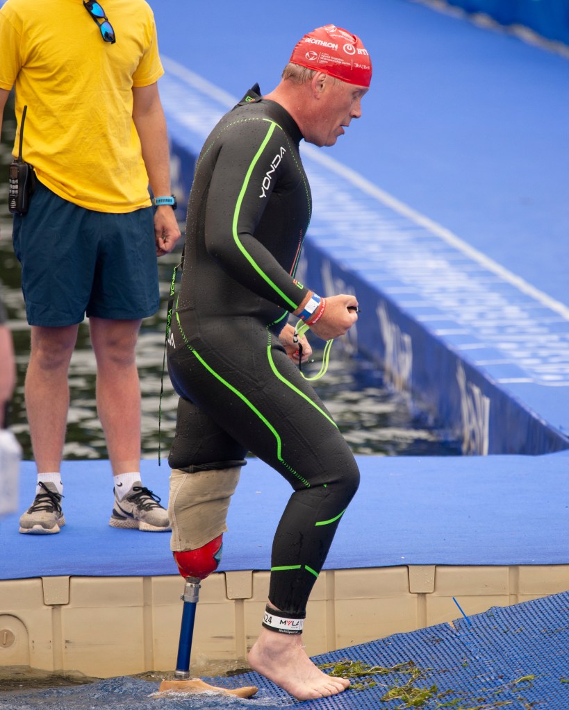
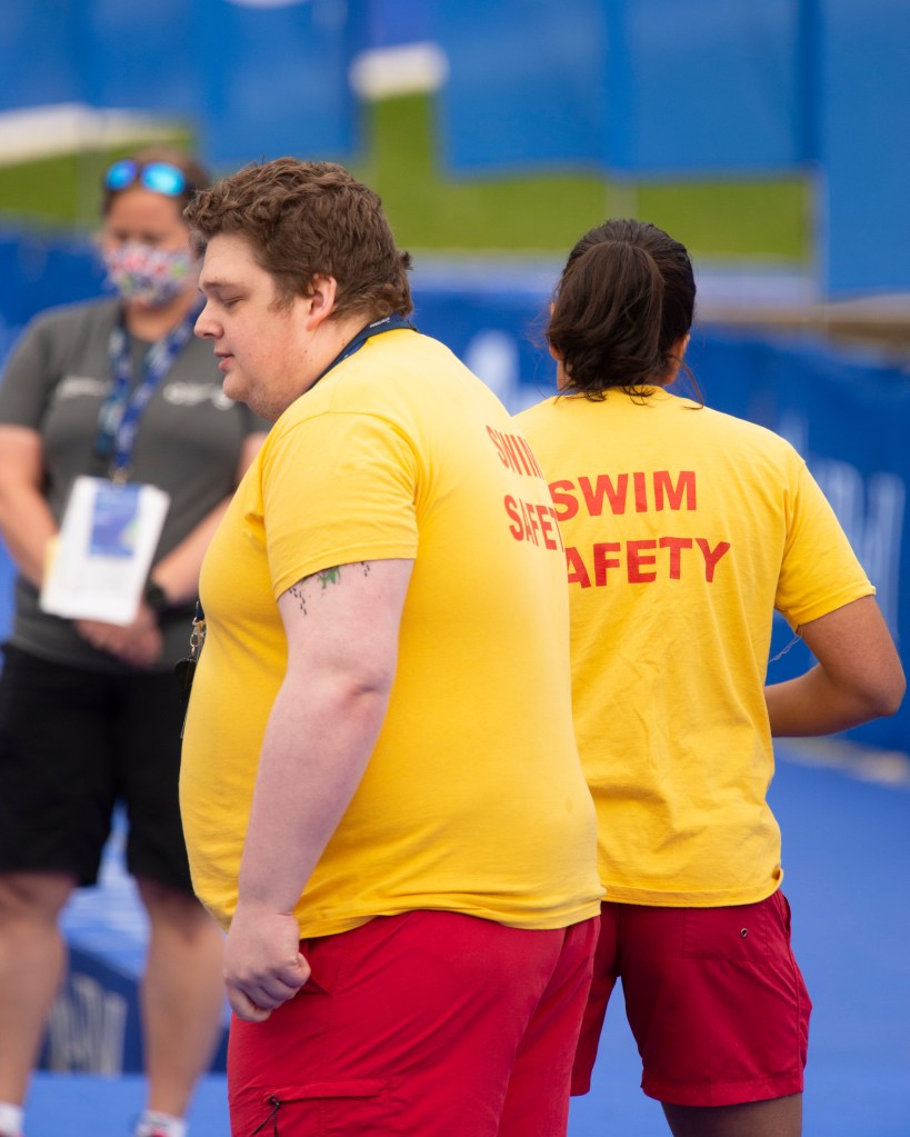
I had the idea for this series because it had been so long since we’d attended an event that I had forgotten how well they are organised. Watching the staff working to get the competitors safely out of the water, I also remembered that the World Tri Series is also a Paralympic qualifying event. I shot these three pictures to reveal how much care goes into the event, whether able-bodied or para-athlete. In the first, we see one of the Swim Safety staff discussing a detail of the event on his radio. I found myself wondering what the discussion was about – was he giving or receiving orders? was he preparing for something to happen at the start or someone to arrive at his station? With this photograph, I was intending that these questions be answered in someway by the end of the series. In the second we see another member of staff helping swimmers out of the water. The original subject from the first is shown in the background, linking this image to the first. The subject of the second is dressed differently to the other staff members and while it’s not clear in the series, she is actually one of the event officials. The questions that this image raise are around why she is standing there. When we look closely, we see that she is holding an artificial leg. The final image shows the owner of the leg who now having refitted it, is heading out of the water for the long run to the transition area. Three brings the series back to the start, with the suggestion that the Swim Safety official was preparing for the para athlete to arrive and to get his prosthetic ready in a way that he doesn’t waste too much time moving to the next stage of the race.
I think this series works because although the background varies from shot to shot, it’s sufficiently similar to anchor the subjects together. I interpreted the brief as the background proving an anchoring reference for the subjects in a way that reveals the connections between them, rather than being a distraction. In Strand’s Gone Astray, the subjects are connected together with their urban appearance and the effect of their perceived lifestyles showing. The background contrasts with an almost ‘Dick Whittington country lane’ feel to it. At the heart of the series, we are still being challenged to look at the subjects, the background underlines a narrative that they are placed within. In my series, the background is not the same in each picture; a few elements change to describe what is going on, but it nothing distracts from the story in the three subjects. The background provides the consistent context as with Strand and Penn’s work, but I have taken a slightly different perspective on its use.
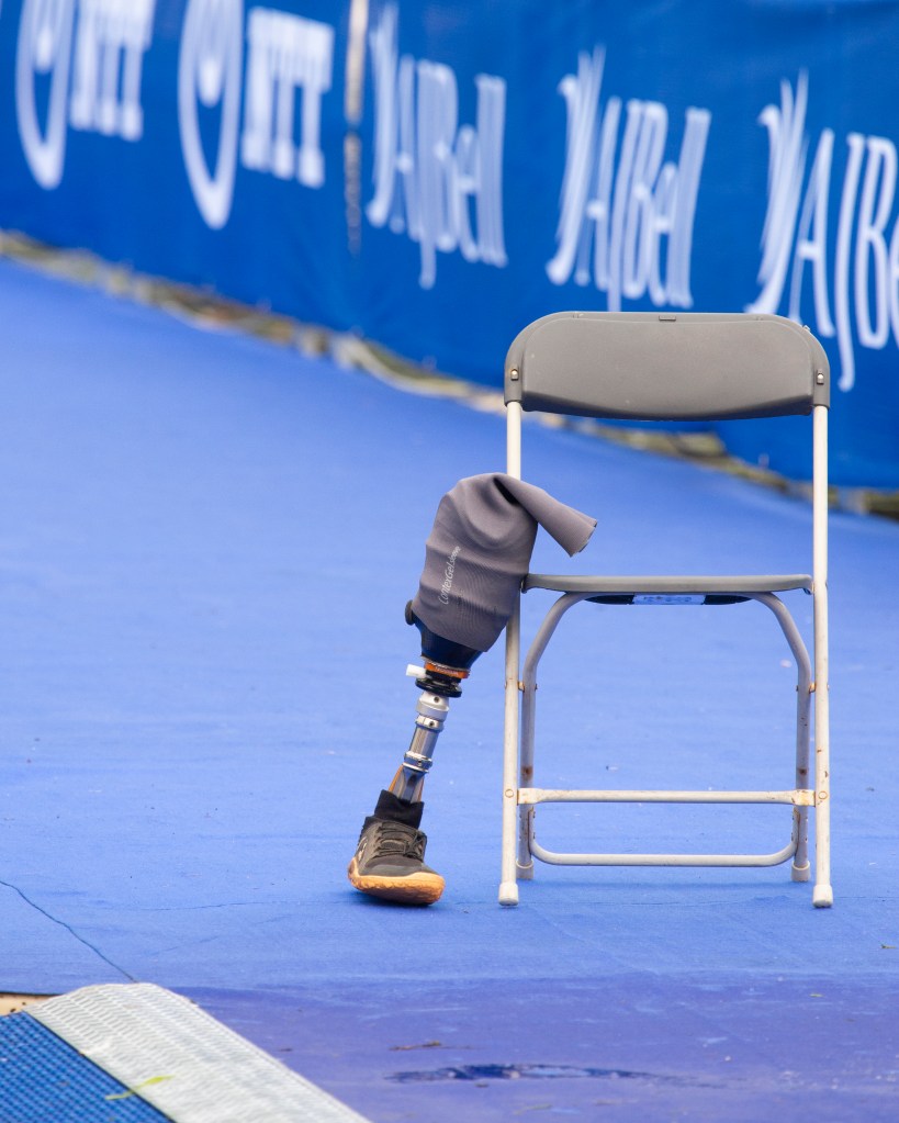
I extended this series with two more images that I thought would further enhance this story. These are shown below in the updated series.
Now we have more in terms of scene setting with the first image, while the final shot links back to the start. The intent was to suggest that this is a continual cycle of preparation and support to all competitors.
During our most recent Identity and Place cohort meeting, we conducted our usual review of each member’s recent work collectively. I shared my images from Part 2, Exercises 1 and 2 for discussion, during which we spent some time on the following photograph.
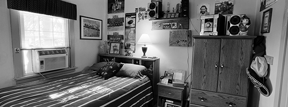
The photograph, from Exercise 1, is of my friends’ son Jamie in the place where he is at peace. We debated the concept of peace and tranquility because at first glance, this doesn’t look like something peaceful. Of course, the object of the exercise was to talk to our subjects to identify a place that they relate to in some way. As my series was about places where people feel at peace, this was the natural place for him to select. We all freely admitted that we weren’t able to relate because unlike the subject, we are not 17 years old. When we looked at this picture more closely, we started to discuss about the detail in the ‘place’ where I had shot him. I had elected not to ‘dress’ the setting because this wasn’t the point of the exercise. While I directed the subject’s pose and set the image up technically, I left the details of what Jamie described as “a typical teenager’s bedroom” as they were. When looking around this image, we see the mixture of teenager interests (the Star Wars models, the cluttered bookshelf etc), but we also see hints of his growing up (the stuffed toy and picture on the wall by his younger sister). The element that attracted my attention at the time was the fork in his pen holder. When I showed the picture to his mum, she laughed and said it was because he liked his “sneaky, late-night chips”.
When we discussed this as a cohort, I got to thinking about the tableau images we learned about in Context and Narrative where every detail of the image was stage-managed to tell a particular story. My photograph from Assignment 5 was an example of this (below).
The difference as I saw it was that the image of Jamie was something that I saw as a more factual representation of him, while Assignment 5 was telling a story that was partly fictional. In both cases, it struck me that I could represent Jamie without him actually being there, in a similar way to Nigel Safran’s ‘in absentia’ portraiture in C&N.
Ashley Gilbertson – Bedrooms of the Fallen (2014)
After the call, one of the students forwarded me a link to Ashley Gilbertson’s work Bedrooms of the Fallen (2014). This very poignant work documents the rooms of soldiers from all over the world who have died during the recent wars in Afghanistan and Iraq. Gilbertson, a photographer who was on assignment in the Middle East, conceived the project as an alternative way to tell the stories of the soldiers who were lost. Over a period of 7 years, he researched the soldiers, contacted their families and photographed the bedrooms of their family homes. He made the conscious decision to shoot only those that had been left untouched or had little in the way of changes made to them so that the viewer can get the sense of the space being left behind.
Army Cpl. Matthew J. Emerson, 20, was killed when his vehicle rolled over on Sep. 18, 2007 in Mosul, Iraq. He was from Grandview, Washington. His bedroom was photographed in February 2010.
From the book “Bedrooms of the Fallen”, by Ashley Gilbertson (2014)[1]
In the example above, we see a bedroom that looks like it’s just been cleaned. This effect of looking like the occupant might be back at any time is core throughout the series. Each picture serves as a snapshot of the soldier’s life frozen at the time they last left home for war. It’s very difficult to age the scene as most of the features are fairly contemporary. When we look closely we see a mixture of contextual elements that we can seek meaning from. The stuffed toy on his pillow contrasts with the photographs of what we assume to be his regiment on the wall behind the bed. The shelf with his trophies is also juxtaposed with photographs and ornaments. The big shelf speakers that form part of his hifi system have the style of someone young, with one positioned next to a statue of Donald Duck. The whole room reminds me in many ways of Jamie’s in my photograph. The room is kept as it was by the soldier’s parents, but there is nothing that is constructed or staged about it. We can almost imagine what the young man was like who lived here, without actually being able to see him. Unlike Safran’s ‘in absentia’ portraits, there is no pattern of life being revealed here as such but some pointers as to the subject’s personality.
Conclusion
I found this series both interesting and moving. What interested me was the natural sense of identity contained within a place, where the photographer was really only responsible for arranging a composition and lighting that highlighted the details so that the viewer could explore the context. When I photographed Jamie for Exercise 1, I experimented with the direction of my flash so that there was a soft, even light across him and his space. Naturally the key thing was to reveal the computer game, which drove the decisions around exposure and fill light. Like Gilbertson I didn’t interfere with the ‘place’, but in my case I had to arrange my subject in a way that didn’t clash with his environment. With Bedrooms of the Fallen, we have a powerful narrative about war and loss, but also an emotional insight into the young men that war consumes. We know that young people fight wars – it’s been a common trait of the forces for centuries. That preconception is really supported by the details of the space when we look at what the soldiers left behind. It’s as if a ghost of their personality still lives there and even though we don’t know the subjects personally, we can derive an empathy towards them through their stuff. Another layer of the narrative is, of course the impact on their families. They had elected to keep the rooms as either a sort of shrine or perhaps just somewhere they don’t want to be but similarly cannot bear to part with. This extra layer to the photographs really anchors the whole series together.
Approach this exercise with care and a diligent awareness of health and safety both for yourself and others.
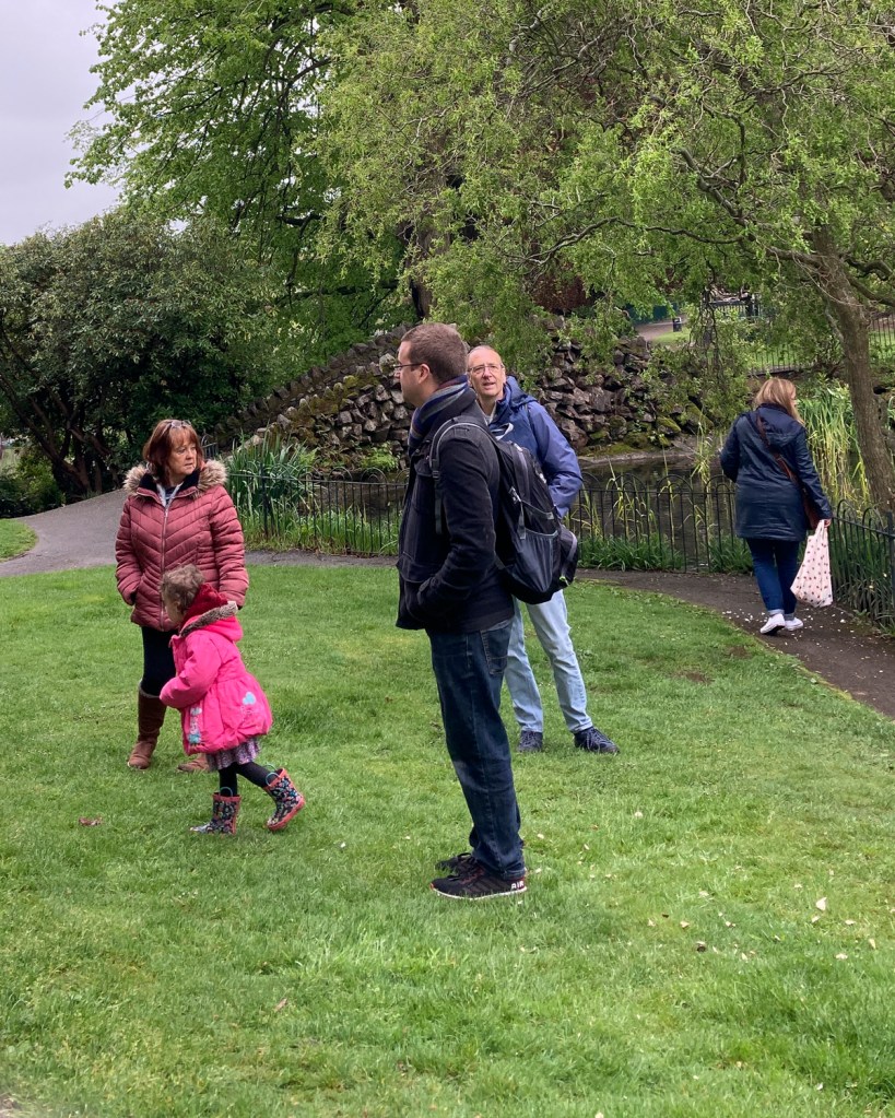
Closely consider the work of the practitioners discussed above, then try to shoot a series of five portraits of subjects who are unaware of the fact they are being photographed. As you’ve seen, there are many ways in which you can go about this, but we can’t stress enough that the objective here is not to offend your subjects or deliberately invade anyone’s privacy. If you don’t have permission to shoot in a privately-owned space, then you should only attempt this work in a public space, where permission to shoot is not necessarily required.
This is a very interesting challenge, which some students will find incredibly difficult. Remember that the creative outcome of the practitioners discussed above has come about through a sustained approach, which is then heavily edited for presentation. You’ll need to shoot many images in order to be able to present five final images that work together as a set.
Think everything through carefully before attempting this exercise as the responsibility for the outcome of the portraits rests entirely with you. If during the course of this exercise you are challenged in any way, be prepared to delete what you have shot. If you can see that you are annoying someone, or making them feel uncomfortable, stop shooting immediately. You’ll be required to operate with a degree of common sense here and not take unnecessary risks. There are ways of completing this exercise without incurring risk, such as shooting the work at a party you’ve been invited to, where all the guests have been invited for a particular celebration.
The reflection about your methodology (your approach to how you have achieved the images in relation to why you chose what you have chosen), will be as important as the final five images, so be prepared to write about how you found the experience (around 500 words) and present your findings via your learning log or blog.
Introduction
I started thinking about this exercise shortly after researching Walker Evans’ series Subways. His work was pioneering in capturing people off guard,but for me the way that it really works is the fact that they are completely unaware of the photographer working. What sets him out from the other practitioners in Part 2 is this stealthy approach. With Parr’s similar series, I suspect that his subjects were not entirely unaware they were being photographed in some cases. As discussed in Project 1 [1], I base this suspicion on the way that Parr shoots, close-up with flash. If the subjects were asleep, they would not be aware, but they could similarly be defensively trying to hide their faces. Japanese culture is one of deferential privacy, particularly on public transport which led me to conclude that some would just be hiding their gaze from Parr. diCorcia’s Heads series has the aesthetic of people being caught unaware through his use of a camera trap. However, diCorcia freely admits that he made himself visible throughout shooting and that people could see what he was doing[2]. They were certainly aware of being photographed as soon as the flash went off. With Tom Wood’s series Looking for Love, again the subjects were aware of his prescence but had gotten so used to him that he effectively became invisible. When Meyerowitz walked the streets of New York with his Leica, he shot people from very close up and in their sightline. Meyerowitz stated that people just didn’t believe that he was interested in them [3]. For me, the only practitioner that achieved complete anonymity was Evans, although people clearly found his attention to be suspicious – they weren’t aware of what he was actually doing.
For this exercise, I was inspired by Evans’ hidden camera. Instead of looking at people, I decided to shoot people who were behind me and outside of my sightline. I wanted to capture people moving behind me, queueing for something or just going about their business completely unaware of my presence. For me, this would be shooting the very unaware, with the added complexity of my also being unaware of the exact composition as the pictures were being made.
The Setup
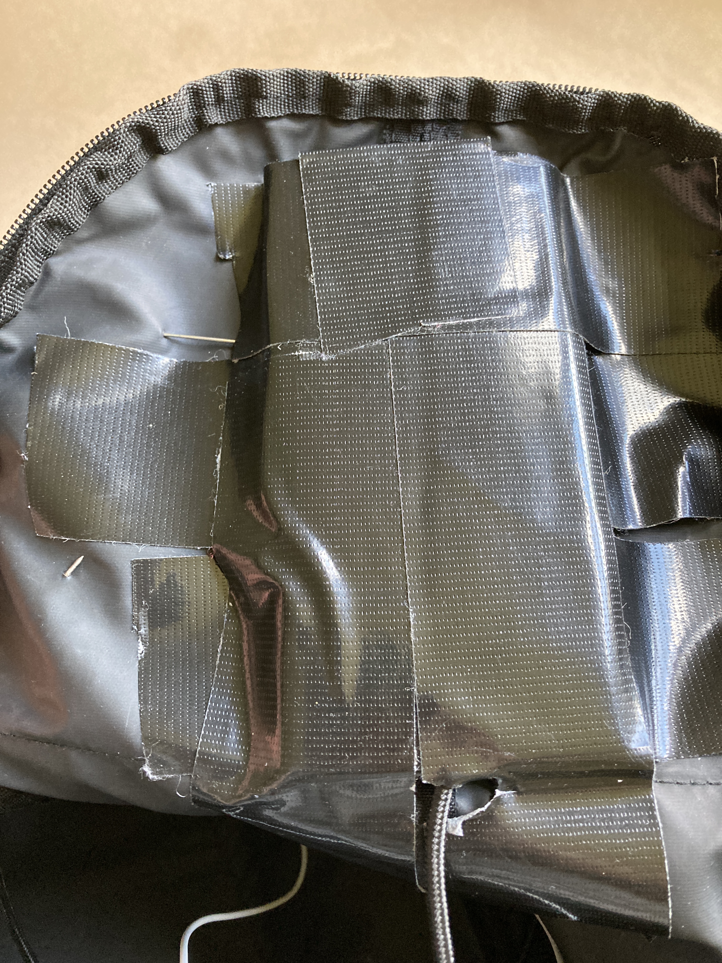
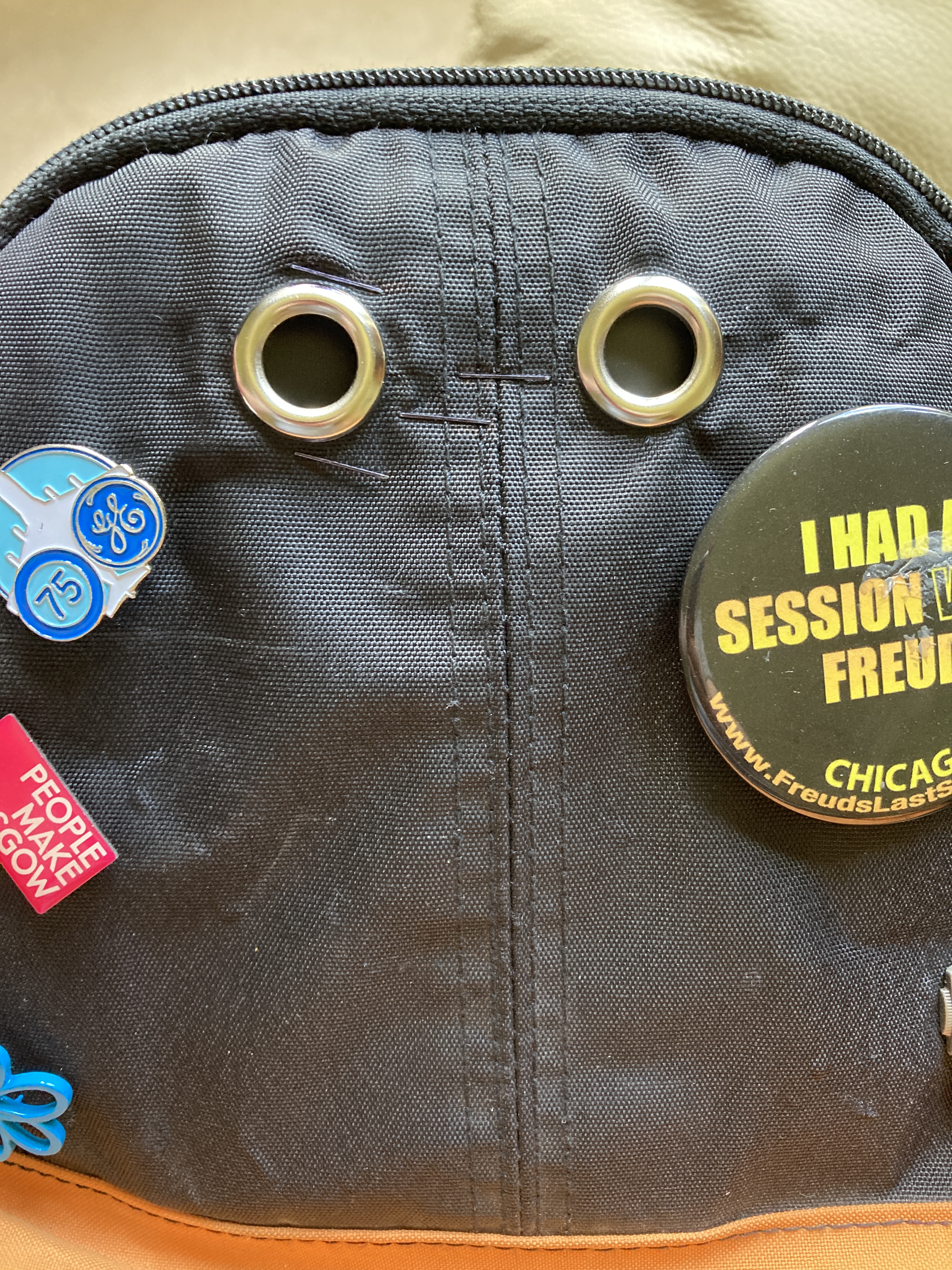
I thought about which camera to use from my collection and actually determined that my phone would be most suited because of its high resolution, wide angle lens and silent shutter. It also had a sophisticated automatic focus and exposure system that would avoid the need to pre-setting as Evans had do in the 1930s. The phone also had a remote shutter release in the form of its cable headphones, which meant that I could very discreetly take the picture through the seemingly unconnected gesture of adjusting the volume control. The next consideration was how to get the camera to face backwards, which I solved by installing my phone in a modified backpack. Although tricky to fabricate, I managed to get an aperture that the phone camera could view though and disguised in a way that it was hidden from my subjects. The completed rig is shown below:
The images show the makeshift phone holder, remote extension cable for the headphones to connect to and the apertures at the back of the backpack. The left hand aperture was aligned with the camera and the right hand one was a dummy. The badges were added to distract from the apertures themselves.
The rig was challenging to use because of the fact that I could position myself in what felt right relative to the subject but there was always the risk of it being completely off in terms of composition. Even if I was aligned properly, the angle of the backpack to the subject made for some interesting horizons. I also had problems with the phone itself – the cable kept coming out of the socket on the bottom, which meant that I missed many shots that I thought had worked.
The Images
When I reviewed the images that I did get, I was interested to observe how people interact with their environment and each other when they are not obviously observed. To add to my deception, I carried one of my old film cameras (without any film) so that I could pretend to be photographing in the opposite direction to the backpack. In shot One, one of the subjects can be seen looking in my direction – I assume it was the sight of the old camera that drew his attention. It was this sneaky look, coupled with my own subterfuge that led me to make the series about being ‘going unnoticed’
OneTwoThreeFourFive
Reflection
In this series, we have a mix of subjects with some single, some couples and a group shot. One each photograph, the subjects are going about their lives completely naturally without any idea that they are being photographed. To that extent, I think the photographs work in terms of The Unaware. As a series, the only anchor is the fact that they are all shot outside in my home town. Unlike Evans’ different subjects in a common environment, my series uses this anchor as well as the fact that they are all unobserved. With Evans’ series, the viewer is challenged to question what the subjects are talking or thinking about. In my series, the questions are more broad, e.g. in Two, the gentleman appears to be strolling through he park with a thoughtful expression on his face, where in Three there is a lively conversation taking place. What is the lone man thinking about as he walks and what are the two people talking about that creates such a lively expression through their gestures? I showed the series to a friend of mine when complete and he immediately pointed out that “he’d seen that person or those people before”. When I reflect on the series, I too see people that I recognise, not because I know them, but because of how familiar their activities are. The family walking through the park is typical of most families I encounter when I spend time there, often with 3 generations out enjoying each other’s company. The climate protestor is a regular sight in town as she sits motionless and disengaged from the people around her. Her demeanour clearly shows her determination to speak for the planet, not its people. Most of Malvern’s residents just walk past her and at first, I wanted to represent her apparent invisibility. However, where she now sits makes it easy to completely avoid walking past her, so there were no opportunities to capture this. Instead, we are left with the idea that she is a lone voice that nobody is seemingly paying attention to. The couple surrounded by plastic containers are part of a familiar group who drink the spring water from the well at the centre of town. As a Spa town, the consuming of the waters has been a fixture for over a century. These people are clearly taking it seriously judging by the number of containers. I loved the irony of their drinking takeaway coffee in preparation for collecting their water.
Overall, I am glad that I took the decision to try something similar to Evans but with that unseeing perspective. It had the same ‘hit or miss’ element to Evans in that I couldn’t guarantee what would be in the frame, but because I wasn’t actually watching my subject I feel there is a complete detachment between us. Yet, the impression that I have of the people of my town is reflected in the images when collected as a series. The main challenges with the exercise were technical, but I guess also my reluctance to put myself in a difficult position also drove me down this path. No doubt I could have shot better photographs technically with one of my proper cameras, but I am pleased with how the mobile phone performed here.
Our focus until this point has been how the portrait is a kind of relationship between the photographer and subject that is entered for a variety of reasons. In some cases, the relationship is purely transactional, i.e a payment or service is being exchanged that results in a picture. We have all experienced these situations during our lives, whether attending a studio or a wedding were there is a requirement to pose for a constructed shot. Another reason for the relationship could be purely artistic, with the photographer telling a story about the subject. We have covered this situation in Assignment 1 and Exercise 1 in this unit.
This project deals with the situation where no such relationship exists, i.e the subject is not aware that they are being photographed. In this situation, the photographer is observing the subject and deciding on how to represent them. We are presented with the quote:
“The guard is down and the mask is off”
Walker Evans (1938)
This is the obvious effect of shooting the unaware. There is no knowledge, pretence or preconceived idea of the image and we are truly seeing the subject in the context of their lives at that moment. We know nothing of the backstory that informs their expression or what they are thinking about when they are photographed. We do not know where they are coming from or where they are going to, just that they were photographed at a moment. The only control the photographer has is the decision to frame and shoot at that particular instant, which leaves their intention as well as the subject’s demeanour open to interpretation by the viewer. The act of photographing someone without their knowledge or consent has always raised questions about privacy and intrusion. In a similar way, photographing the unaware is as potentially socially awkward from that perspective, as asking a stranger for a portrait, which we did in Assignment 1. In this project, I’ll be looking at the artists mentioned in the course notes, many of which I’ve encountered before in my studies, but also more widely at the lesser known contemporary artists who practice this form of portraiture.
Walker Evans (1903 to 1975)
The first artist is Walker Evans, whose work for the Farm Security Administration (FSA) in the 1930s we have already been made aware of. Like his contemporaries, Evans was on assignment to represent the suffering of the displaced agricultural people of the US during the Depression. His images were carefully stage-managed for that documentary work and the relationship between photographer and subject comes through. However as we discovered previously, Evans’ and the other photographers were heavily censored by their editor[1] to keep consistency with the story being told.
In the late 1930s Evans started to experiment with another form of portraiture, namely covertly photographing people on the subway. His portraits were shot with Evans’ camera hidden in his clothing with the focus and exposure predetermined. Evans observed his subjects and shot the pictures with a remote shutter release that ran down his arm. His pictures reveal people going about their business, mostly oblivious to what Evans was doing. In the example below, one of the people is looking directly at Evans, which suggests that he has noticed the artist looking at him. While he may not have been aware of the photograph being taken, it certainly looks like the subject had some inkling that something was going on. His concerned, almost disapproving expression takes on a different aesthetic to the man next to him who doesn’t appear to have noticed Evans’ gaze.
From the book “Many are Called”, by Walker Evans (1938) [2]
Evans collaborated with writer James Agee on the book Many are Called (1938) which was made up of a selection from the 600 or so images that Evans shot on the subway [3]. When we look at these photographs, we see a cross-section of American city life with no connection with each other beyond the fact that they are travelling on the subway. The common environment ties the series together, while the candid images of the subjects ask questions about what is going on for them, what they are thinking about and where they are going, both literally and figuratively. When I reflect on Assignment 1, the common environment that I used tied the subjects together but more loosely than Evans’s pictures. My use of the park and its vast space contrasts with the small confinement of the subway carriages. The background through the windows differs from shot to shot, but the subjects are framed by the architecture of the carriage, which I think stitches them together in a clearer way than my Assignment 1 photographs.
Martin Parr – Japanese Commuters (1998)
When I first saw this series by Parr, I was intrigued. I’m a big fan of Parr’s work because of his unconventional approach. His photographs have always felt like the artist’s very carefully considered observations and compositions are similar to many other artists, but his approach the technical aspects of shooting is a style that he’s made his own. His shots, particularly his portraits are often lit by direct flash and are very saturated. This style and approach doesn’t lend itself to discreetly photographing people without their knowledge. By Parr’s admission:
“I go straight in very close to people and I do that because it’s the only way you can get the picture. You go right up to them. Even now, I don’t find it easy. I don’t announce it. I pretend to be focusing elsewhere. If you take someone’s photograph it is very difficult not to look at them just after. But it’s the one thing that gives the game away. I don’t try and hide what I’m doing – that would be folly”
Martin Parr interviewed by The British Journal of Photography in 1989
The other aspect that made me think twice about whether these were truly unaware arose from my own experience of Japan. The people are very guarded over their privacy, particularly on the subway where intrusion is something frowned upon by other commuters. I struggle with the idea that Parr was able to shoot so close to his subjects with flash and not have either them or the people around them know that it was happening. Perhaps instead some of the commuters were deliberately lowering their gaze in the presence of Parr rather than being asleep as is assumed/asserted. Whatever the circumstances, I am a huge fan of Parr’s work and style yet Japanese Commuters is my least favourite of his series.
From the series Tokyo Commuters by Martin Parr (1998), from the OCA course notes
In the example above, we see the subject looking down as if asleep. The frame is dominated by his head and chest and we see on a relatively small area off his face. However we can see a few details about the man, namely that he is wearing a suit and tie which suggests his is a professional of some sort. He is also fairly young, judging by his complexion and dark hair. Beyond that we can see little else in terms of context. The other portraits in the series are very similar in composition and reveal equally small amounts of context around the subject. I don’t like the series because for me it only raises two questions, the first about the wretched act of commuting which is suggested by the downward facing expression/sleep and the second being about invading people’s privacy by taking an extremely close, harsh photograph of them. The series feels more one-dimensional to me than Parr’s other work such as The Last Resort or Britain at Time of Brexit (covered previously in my research). I think that Michael Wolf’s series Tokyo Compression [4] offers more of an insight into the theme that Parr was exploring, but as we know some of the subjects were very aware of his photographing them through their abusive reactions.
Phillip-lorca dCorcia – Heads (1999)
In his series Heads, diCorcia set up a camera trap with remote controlled strobes set up under a building gantry. He used a telephoto lens from a fair distance from the trap which allowed people to see what he was doing., even if they weren’t sure what he was actually shooting. diCorcia then waited for people to walk into his trap, either by choice or by accident which creates a sense of blurring between ‘aware’ and ‘unaware’. Like Parr’s use of flash, diCorcia’s subjects would have known something was happening if they saw the light from the strobes, although in an interview in 2018 he stated that the flash was so fast that most didn’t notice[5]. With this series, diCorcia had many technical challenges caused by working from many feet away from the subjects. These included pre-focusing on where the subject might enter the frame which differed as their heights were varied. In addition to this, the people walking under the gantry were often in a crowd, so there were many shots where the subject was obscured by another person. This randomness reminded me more of Evans’ series on the subway because he could not frame his subjects beyond estimating the field of view of the camera and aiming approximately in their direction. diCorcia’s shots also raised questions about what is going on for the subject, what they are thinking about etc. as they walk the street. This was much more akin to Evans than Parr and Wolf.
Other Artists
Another artist we are introduced to is Lukas Kuzma, who’s book Transit is a collection of shots of commuters on the London Underground. When I look at Kuzma’s images I am reminded of a comment made by Joel Meyerowitz during the BBC documentary The Genius of Photography [6]. Meyerowitz would shoot on the streets of New York with his Leica film camera and frequently got close to his subjects, almost putting the camera into their faces. As the city is so densely populated, Meyerowitz asserted that they were aware of his presence but mostly couldn’t believe that he was interested in photographing them. The resulting photographs have the same ‘unnoticed observer’ feeling about them as Kuzma’s work. The photographer becomes a chameleon, just another person who is going about their business and not interested spectifically in the subject as far as they are concerned. The same sense of blending in is found in Tom Wood’s Looking for Love, which involved the artist spending increasing amounts of time being part of the same club scene as his subjects. Although they are aware of his presence, they are so accustomed to seeing him that there is no need to pay attention to themselves. The results are pretty close to natural.
These artists reminded me of an occasion where I shot photographs of the unaware. A few years ago, I photographed my friend’s vinyl record shop on World Record Store Day. The idea was to document the day where there is a greater focus on the medium and the revival of the record shop as a place to visit. I shot the pictures on high speed black and white film using my Leica M3. When I arrived to shoot, I was very uncomfortable with photographing people I didn’t know when they were minding their own business. Despite my friend and I agreeing on this being done, I wasn’t there in an official capacity, i.e. I wasn’t staff. After a few people being vocal about not wanting to be photographed, everyone started to become comfortable with my being there. I am also a vinyl fan, so I mixed the shoot with my own digging through the records. Eventually, I went unnoticed amongst the customers to the extent where they weren’t engaging with me at all. The resulting images were very natural in the way they revealed the people in the shop. A few examples can be seen below.
Conclusion
In conclusion I can see how the styles of photographing people without their awareness or participation has evolved since Evans’ subway photographs. His work is completely detached from the people sitting opposite him on the train, but he chose the moment to capture and therefore represent what he saw in their behaviour or expression. Looking at the work of artists that followed Evans in this area, we see the photographer becoming more bold in their shooting. Parr and Wolf’s photographing on the Japanese subway must have drawn attention, even if not from the intended subject. For me, this was a natural evolution from the increasing amount of street photography over the latter half of the 20th Century. People became accustomed to some intrusion from photography and they could choose to ignore or confront it as seen in both Parr and Wolf’s work in Japan. The further evolution of shooting the unaware is when the photographer becomes part of the background or activity. Kuzma and Wood’s active participation in the environment helped them disappear from view which allowed the subjects to continue to be themselves. These photographs have a different aesthetic to Evans’ original work in that they reveal the subject from different angles, distances and situations. The overall effect is the same, though. In each series, the photographer tells a story of what it’s like to travel around a city or party in a nightclub. The additional context that is available from the more contemporary approach perhaps leaves less to the viewer to work with. When I look at Evans’ pictures I want to know more about the people and what their lives are like. I don’t get the same sense from the works of the other artists.
In this exercise, you’ll build on your ‘Background as context’ exercise in Part One by taking the relationship between your subject and their surroundings a step further. The objective here is to try to create a link between the two components of your image, i.e. the subject and their surroundings.Make three different portraits using three different subjects. Prior to shooting your portraits, engage with your subjects and agree three different specific locations which have some relevance or significance to them individually. You’ve already tried to give a particular context to a portrait by considering how the background might link to the subject positioned in the foreground, but now you must go one step further and negotiate a specific physical location where you’ll photograph your subject. This can either be inside or on location, but the key to this portrait is the interaction you’ve had with your subject in identifying a place that has specific meaning for them.
Each portrait should be accompanied by a very short piece of text explaining the choice of location or venue. Don’t be tempted to create a work of complete fiction here; it might make life easier for you, but you’d be missing an opportunity to really engage with your subject and collaborate with them in the image-making process.You have complete freedom to work this out as you feel appropriate; for example, you may choose to theme the narrative behind all three portraits. Think carefully about how these images could work together as a set. For instance, if you plan to shoot outside, try to make sure the lighting conditions/ time of day/weather conditions all work coherently.
Present all three images together as a series and reflect upon how successful this exercise was in your learning log or blog. Write around 500 words.
This is my Church
For this exercise, one of the first things that occurred to me was that of comfort or peace. The past year or so has been tough on most people, with the restrictions on social contact and the constant anxiety of potentially catching the virus. When I think about my own situation, I know where I am most at peace. This past few months since leaving my job, I have found this place to be my morning visits to the local park. That realisation led to the series that I shot for Assignment 1 [1], where I sought to reveal something about why people specially visit the place and how it makes them feel. For this series, I decided to continue that theme and ask my subjects to take me to a place where they felt most at peace, for whatever reason. This wasn’t about being able to sleep or relax, but somewhere where they felt calm and balanced. It might be a room in a house, an outdoor space like a garden or somewhere that distracts them from what worries or stresses them. It could be more a state of mind than a physical space, which would potentially present a challenge in representation. The idea of This is My Church was to place the subject in their peaceful place and use the background context to tell the story. This exercise called for the use of a small amount of text to explain the location, which is something I had adopted for Assignment 1. In my feedback, it was suggested that care needed to be taken not to make the text more meaningful than the photograph that it accompanied. I managed that successfully before, but would need to be mindful of it here.
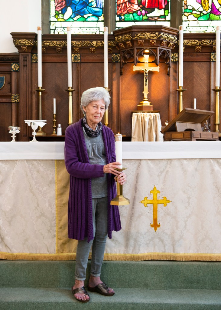
This is My Church
Hazel
Hazel is at peace in in her literal church. She’s both worshiper and warden, so her connection to the space is both spiritual and functional. Giving something to the community, whilst being in a sacred place gives her a great sense of peace.
Peter
Peter is a yoga teacher who has been working from his home studio during the pandemic. When he is not teaching, he is able to achieve peace through creating and practicing new routines for his classes.
Jamie
Jamie is a 6th form student who uses video gaming to achieve his peace. Games offer a sense of escape, for him, his headphones shutting out any distractions that may invade his space.
Reflection
My original intention for the series was to let the subject define the circumstances in which they achieve peace and how their environment helps create that sense. On each occasion I was struck by how powerful this sense of place was for my subjects. The first image of my mother-in-law was shot when her church was empty. She is a key-holder so this wasn’t a problem. I noticed during our time there that she still went about some of the activities that she would normally do as part of her warden role. In this pose, she is holding a large candle that she told me was actually a fake holder for mini tea light candles because they were more cost effective for the parish. I loved the way this contrasts to the opulence of the alter decoration and the silverware in the photograph. The other element that I think works well is the contrast of Hazel’s petite stature against the large alter which almost belies how crucial she is to the running of the church. In the second shot, Peter’s space is uncluttered simplicity which one would expect for a yoga studio. However, the space is used to broadcast his classes so not shown is the lighting setup he uses. What I like about this shot is that he looks as though he is working but his pose is a typical yoga stretch. This contrast is set off by the natural light that is flooding through the window to the right. With the final image, Jamie described his environment as a ‘typical teenager’s bedroom’, which is clear from the elements in his desk area. Unlike the other shots, I deliberately didn’t suggest stage-management of the background as I wanted it to speak directly to Jamie’s personality. His room is full of references to his growing up, with the added inclusion of his student card hanging on his monitor. I liked the inclusion of the fork along with his pens and pencils, suggesting he likes to snack in his room. Jamie’s pose with the game raging on his computer screen suggest someone for whom escapism is important. When I asked him about when he plays, he replied that it was he wanted to be at his best which sometimes meant playing after a good day but also after a bad one. I like this sense of balance, which I think comes through in the photograph itself.
Overall, the learning from this exercise was how a portrait can evolve from the conversation between photographer and subject. In each case the subject contributed to the inclusion or exclusion of elements that supported their idea of what makes them feel peace. Only in the last shot did I left the placement of the contextual elements as they were because I felt that they were more representative of the subject’s personality than we could probably manufacture between us. I’m really happy with how all three images turned out.