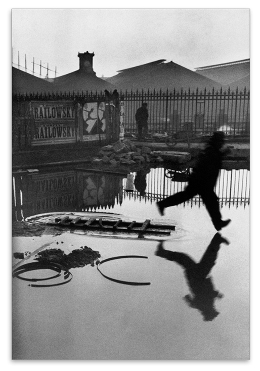
Exercise 5.3: Looking at Photography

The Brief

“When somebody sees something and experiences it – that’s when art happens” – Hans-Peter Feldman

If photography is an event then looking at photography should also be an event.   Look again at Henri Cartier-Bresson’s photograph Behind Gare Saint Lazare in Part Three. Is there a single element in the image that you could say is the pivotal point to which the eye returns again and again? What information does this point contain? Remember that a point is not a shape.  It may be a place or an discontinuity – a gap.  The most important thing is to try not to guess the ‘right answer’ but to make a creative response, to articulate your ‘personal voice’.

Include a short response to Behind Gare Saint-Lazare in your learning log.  You can be as imaginative as you like. In order to contextualise your discussion, you might want to include one or two of you own shots and you may wish to refer to Rinko Kawauchi’s photograph mentioned previously or the Theatres series by Hiroshi Sugimoto discussed in Part Three.  Write about 300 words.

The Photograph

Henri Cartier-Bresson's Behind the Gare Saint Lazare, 1932.

Henri Cartier-Bresson’s Behind the Gare Saint Lazare, 1932.

Response

Cartier-Bresson’s Behind Gare Saint-Lazare is the image that he is perhaps most famous for.  His concept of Decisive Moment is rightly described and appreciated through this photograph, where by his own admission he had not observed the leaping man.

When we examine the elements in the image, there are several that give us information about the scene, in stark contrast to the Kauwauchi’s frog photograph that I discussed in Project 2 [1].  The scene has some symmetry in the way the features of the railway yard are reflected in the perfectly still water.  There is a man looking further into the depth of the image through another set of railings in a similar way to Cartier-Bresson himself.  Intriguingly we do not know what he is looking at, in a similar way to Manuel Àveres Bravo’s Daughter of the Dancers, 1933.  The whole setting is untidy, almost run-down but functional with the detritus in the foreground and the battered poster attached to the railing. When we look closely at the poster, there is an image of a circus performer called Railowsky in similar pose to the leaping man.

When I look at the image, the element that I continue to return to is the closeness of the man to the water that he is trying to jump over.  I keep coming back to that point beneath his foot as I continue to question why he left the relative safety of the ladder to jump and whether he had realised that he would ultimately end up getting wet anyway.   It would be easy to consider the decisive moment here as the ‘pivotal point’ in the picture.  After all, Cartier-Bresson’s timing is perfect and the image’s impact is more about that than the fact that it was accidental.  My conclusion is that the pivotal point of the image is actually the ‘passing the point of no return’.  As suggested by Berger [2], the next frame of the story would likely have us witnessing a man cursing his own stupidity.  Or perhaps he had some kind of emergency that made him leap or maybe he was just inspired by the poster in the background.  We have no way of knowing that made the man commit to the leap, only that he did and that there was no going back.

References

[1] Fletcher, R, 2019, “5) Project 2 – Improbable Images”, Expressing your Vision blog post

[2] Berger, J, 1972, ‘Ways of Seeing”, Penguin Books.


5) Project 1 – The Distance Between Us

Introduction

During a recent call with my tutor, we discussed how my attitude to photography has changed over the first four parts of Expressing Your Vision.  I had already identified a theme running through my assignment work around ‘revelation’; starting with the history of a Yorkshire village, through human emotions and the humour in some decisive moments and on to the illumination of dark places.  My concern during the conversation was around whether my natural tendancy to ‘reveal’ was a genuine photographic voice or whether I was just being technically ‘clever’ in some way.  My question was “am I on the right track with this?” .  The conversation with my tutor was very helpful in establishing where I was in my photographic development.  Being an engineer meant that I could quickly grasp the technical aspects of photography and once I have the subject, represent it in the way the I intended.  However, my artistic voice was less prominent, but increasing in confidence throughout the course.  My tutor challenged me to think about how my experience differs from that of other professions and how easy or hard it might be for one person to do another’s job and vice versa.  If an artist could find engineering a steep learning curve, is it a surprise for the reverse to be the case?   In the final exercise of Part 4, I started to let photography be influenced by other life experience and observation, rather than ‘I think that would make an interesting photograph’.

In considering Part 5, I find myself presented with the camera as an instrument as we discussed in Part 1.  However, this time the camera captures an encounter between photographer and subject, not just as a window on a scene but a connection between the two parties.  When thinking about Alexia Clorinda’s quotation about measurement:

“I don’t pretend that I can describe the ‘other’.  The camera for me is more a meter the measures the distance between myself and the other.  It’s about the encounter between myself and the other; it’s not about the other” – Alexia Clorinda

I can relate to this in a way that I probably couldn’t before this course.  Clorinda is saying that she isn’t using the camera to describe or capture the subject, more to ‘measure’ the encounter between her and the subject.  Naturally, the use of words like ‘measure’ and ‘distance’ suggest the physical property that we can define using focus or depth of field, but the meaning here is about the relationship.  I’m reminded of the research in What Matters is to Look [1], where Aim Deulle Lu​ski was placing multi-aperture cameras in the centre of the scene he wanted to photograph.  He was trying to describe life in a unique way, by making the camera part of the scene rather than a passive viewer.  However, what wasn’t strong in his work was the connection between the artist and the scene.   I then realised that the personal connection that Clorinda refers to is often created by simply viewing.  Her work Morocco from Below [2] describes the political aftermath of the so-called Arab Spring, a period of uprising in the Middle East.  The ruling family in Morocco promised change, which was interpreted by some as a campaign to convince the rest of the world rather than help the people.  The mixture of uprising and consensus among the people was the basis for the series, which Clorinda observed by walking the streets of the major cities.  Clorinda herself describes the work as reportage, but when we look at the images, the personal connection is clearer than any narrative.  In most of the shots, there is eye contact between Clorinda and at least one of her subjects, which is a tricky prospect when taking photographs in a muslim country.  My own experiences in Morocco were that many people get angry when being photographed by a tourist as there is the belief that the image is removing their soul.  When I look at the people in Clorinda’s work, I feel the connection between them first and then gather information on context from the rest of the frame.

My initial conclusion is that photographs can describe more than what is in the frame by drawing attention to the subject in the context of the frame.  The camera is the instrument that describes the why, rather than the what in a way that is visualised by the photographer.  If you have no camera, the experience or connection remains memory which can evolve over time or change when described by the possessor.  I experienced something recently that lends itself to this theory.   While walking into town with my wife, we saw a pigeon chick walking along the pathway in front of us.  It had clearly fallen a long way from a nest above the road, but was developed enough to land on the pavement without being injured.  It walked slowly along the pavement alongside the wall that retained the hillside, clearly lost.  As it encountered each drainage hole in the wall, it peered into it to see if there was a way back to the nest.  During its walk, it repeatedly called out for help.  We watched for a couple of minutes as it made it’s lonely procession along the pathway and it was one of the saddest things I’ve ever seen.  For many years, I’ve had a powerful fear of loss so the scene playing out before me made a strong connection.  On this occasion, my instinct was to rescue the bird which is what we did; returning it to the area in the trees close to where it’s nest was. While I had a camera with me, I didn’t use it to measure the distance between us.  The memory, which is still very strong in its sadness now only exists in my wife and I and trying to describe it to others is very difficult.  The expression “you had to be there” takes on its true meaning.  Had I photographed the bird in a way that revealed our connection, that image could have provoked a response in other viewers.

My reaction to this event and Clorinda’s work prompted me to look into the role of the photographer, something that Azoulay discusses.  In her essay Unlearning Imperial Rights to Take (Photographs) [3], Azoulay describes how the initial promulgation of photography meant that parts of the world that had never encountered the medium were suddenly the subject of a photographers work.  She describes this as being akin to cheap labour.  The publications of the time were clamouring for images, regardless of the subject, context or any emotional narrative that might be at play.  The relationship between photographer and subject changed as the medium became more popular and the challenges of taking pictures that had perceived value became harder.  The photographer now found themselves as a broker or middle-man between the world and the media.  With the recent advances in social media and availability of cameras, everyone who addresses others through photographs can now become what Azoulay describes as a citizen of photography[3].  For me, the photographer has the same thoughts, feelings and emotions as their subjects so the connections made in a composition are more dynamic and frequent now than they have ever been.  Collectively, they make an image that provokes relatable and contradictory emotions in the viewer in the same way that other artists capture the imagination.  As uncomfortable as it may seem, the camera can both connect and disconnect, attract or repel the subject and viewer which is likely unnoticed when taking a selfie, but is much more important when trying to draw attention to what is an important message.

References

[1], Fletcher, R, 2019, “What Matters is to Look”, Expressing Your Vision Blog Post.

[2] Clorinda, A, 2013, “Morocco from Below”, alexia clorinda morocco from below

[3] Azoulay, A, 2018, Unlearning Imperial Rights to Take (Photographs), https://www.fotomuseum.ch/en/explore/still-searching/articles/155338_unlearning_imperial_rights_to_take_photographs

5) Project 2 – Improbable Images

How does a photograph contain information?

In starting this project, my first concern was what appeared to be a generalisation that photographs are all somehow informative.  The quotation by Flusser further suggests a quest to inform through ‘improbable’ images that offer something new.  My instinctive reaction to the quotation when I first read it was “Do I do that?”  When we consider the meaning of the words ‘information’ and ‘improbable’, the quotation makes more sense.

noun:information.   
facts provided or learned about something or someone.
“a vital piece of information”
adjective: improbable.  
not likely to be true or to happen.
“this account of events was seen by the jury as most improbable”

It would appear then that Flusser was referring to the creative process of ‘informing’ the viewer about the subject, but in a way that isn’t quite real or believable.  We have learned already how the context of an image can change the perceived meaning, but when we consider the internal context, that is what is present in the image, we have the ability to shape the meaning further through information or even disinformation.   In the course notes [1], the statement that a well exposed photograph contains more information than one that is under or over exposed is certainly true when considering an image as a technical achievement.  The way that light is represented on the ‘sensor’, whether film or electronic is the something that we strive to do with camera skill, but this achievement has little to do with the information that the photographer is trying to impart in the photograph.  The amount of information about the subject is completely under the control of the photographer, but whether or not that is what the viewer chooses to ‘consume’ is something that is again a potential contradiction.  In their blog article on information [2], the Oxford English Dictionary describe themselves as a vast source of information made more readily available by the internet age.  With all of this information to hand, their top searches for word meanings always include the word ‘fuck’; perhaps then, people’s interest in titivating swearwords means that they are more likely to consume that than what else is on offer.  The article also quotes President Obama as saying ‘information is a distraction’, which points to the way that the message cam be lost in amongst other information.  When we consider the technical use of depth of focus in photography, we can use a large aperture coupled with a long focal length to pick out the subject from the background.  It follows then that photographers can use their technical skill to control the risk of information distraction or overload.   I have found in my photography that landscapes are the biggest challenge to me, because I am striving to describe the beauty of something that I am seeing within the vista in front of me.  However, the usual convention for landscape photography is to include as much detail about every element as possible.  An example of this can be seen below.

DSC_6104

Santa Barbara Beach 2019 by R Fletcher

This photograph was shot during my recent holiday in California.  It’s pretty conventional in terms of composition with leading lines, rule of thirds etc.  It was also shot at a fairly small aperture at f/11 to preserve detail throughout the depth of the image.  However, what I wanted to convey was the hazy California light and how the mountainous regions are almost always blanketed in a fine mist (or just plain fog).  The challenge is emphasising that without losing the rest of the detail of what is a typical paradise beach on that coastline.  There is nothing about the image that is unreal or improbable, it is just factual.

Less is More

When we look at Kawauchi’s work in her book Illuminance, we are presented with what at first glance looks like minimal information about the subject.  Overexposure and colour saturation create the improbability, but when we look closer, the information that is needed to create that sense is there but just concentrated.   The shot below from her book is my favourite image from the book.

82a42507-cc2f-4d90-a4b7-f891d7f2d1d1

Untitled, by Rinko Kawauchi, from her book Illuminance [3]

Here we have a very small frog sitting on a hand.  The image is made surreal by the use of shallow depth of field and overexposure to remove the details from the hand and the background   The information, though is the scale and detail of the frog which creates the sense that this tiny creature is lost in its surroundings.  What we know is that it has clearly been picked up by a human hand, but where did it take place?  Without any external context, my initial interpretation is a slightly uncomfortable sensation that the frog has been held for the ubiquitous ‘holiday snap’ in the wild.  The hand, while gently providing a platform for the frog to sit on is that of a much larger and more powerful creature. In my interpretation the image is impactful, sad and almost unreal, but the context could equally be that the frog is an exotic pet that the owner clearly cares about.  The key point is that the information doesn’t have to be vast and detailed to create the context and provoke a reaction.

In Flusser’s Towards a Philosophy of Photography, he discusses the difference between the way we read text and how we look at photographs, the suggestion being that the former is linear and the latter, more of an ‘orbit’.  This theory reminded me of when, as a teenager, I read the original version of Mary Shelley’s Frankenstein.  Published in 1818, it was beautiful crafted, certainly using language and sentence structure that I wasn’t familiar with at the time.  Shelley also used embedded narrative to structure the story, where a number of characters and the writer herself assume the role of narrator.  The book unfolds with these viewpoints layered and interconnected, which requires ‘care’ when reading.   What I mean by ‘care’ is that important information can easily be missed if the reader is not concentrating.  My experience was that I would have to re-read some passages and even sentences to ensure that I was following the plot this, perhaps the most original horror story ever written.   Surely this is at odds with Flusser’s assertion that we don’t re-read?  In fact, it supports his notion that we consume the words linearly enough to understand what they are saying, where his comment about re-visiting photographic information is very different.   In this case, the viewer returns to the information either to gain further understanding or simply because it is what provokes the biggest reaction.   It could be that the information is not understood or that it is somehow unbelievable or improbable; the continued re-visiting being some way of trying to make sense of it.

As I’ve mentioned previously, my favourite street photograph is Joel Meyerowitz’s Paris France, 1967 because it has always appealed to me.

Paris France, 1967 by Joel Meyerowitz (from Taking My Time, Phaidon)

Looking at the photograph again, the context that I interpret comes from the information in the image.  The man lying on the ground with the hammer-carrying man standing over him and the public looking on.  The scene is clearly of the 1960s time period which presents as familiar but somehow different to someone like me who is in their mid-forties.   When I view this photograph, I keep coming back to the expression on the face of ‘hammer man’.  Is it shock at an unfortunate fall?  Or concern? Or is it the anger of an aggressor?  Meyerowitz considers this to be his greatest photograph and has been reluctant to give any information that supports any contexts.  For me, this certainly preserves the mystery of the photograph and means that I never tire of looking at it every morning (I have a print on my bedroom wall).

We can use this photograph to support the idea that John Berger discussed [4].  In his book, Berger describes the painting as presenting everything in a single moment to the viewer and it being their attention to each element that allows them to draw some form of conclusion.  He contrasts the single frame to a moving picture film where the instant now has time added to it.  The next image on the film strip will have different information that the viewer needs to consume quickly in and in sequence, in the same way as the written word.  For a single image, then this return to the photographs for new information has an almost a cumulative effect on our interpretation of the subject.  When it comes to the improbable, this can be an instant reaction as it was when I first saw Paris France, 1967.   Surely the man could not attack someone in broad daylight.  What happened in the instant after the event?  Did the man help the other up because it was a mere tumble in the street or was he arrested?  What part did Meyerowitz himself play in the scene that followed?  If it had been a movie, we would simply have to wait for the answer.  Like Berger’s comment that ‘paintings are often reproduced with words around them’, the photographer can choose to do the same or provide nothing to support or contradict the perceived context.  What they have is a toolkit to make the believable unbelievable with a single 2-dimensional view of the world.

References

[1] University of the Creative Arts, Expressing Your Vision Course Notes page 108.

[2] Proffitt, M, 2012, “Information”, Oxford English Dictionary Blog, https://public.oed.com/blog/word-stories-information/#, accessed November 2019
[3] Image Source, Lens Culture, https://www.lensculture.com/articles/rinko-kawauchi-illuminance#slideshow, accessed November 2019
[4] Berger, J, 1972, ‘Ways of Seeing”, Penguin Books.


Exercise 5.2 (Part 2) Some Examples of Homage

Introduction

After completing Exercise 5.2, I reviewed some of the photographs from my archive that were taken as an homage to another image.  In considering the context, I have been able to relate to why I chose the shots and how they work as an homage

The images

DSC02549

Shopping Centre shot inspired by Cartier-Bresson’s Hyères, 1932

I found myself waiting on the upper floor of a shopping centre for a short while.  The first thing I noticed was the people moving in and out of an area define by lines created by shadow and structures.  I recalled Cartier-Bresson waiting patiently for people to enter his frame and shot this image in the same style.

DSC02754

Jazz Man, San Francisco 2019 inspired by Joel Meyerowitz

I’ve described previously how Meyerowitz has inspired me over the past few years and whenever I look at what is before me in the street, I think of his pioneering work in colour street photography.  Previously colour was thought of as a distraction but it can be a way of connecting subjects in the frame while not being the main point of the image.  I shot this picture of the busker at a San Francisco Giants baseball game which has orange as part of its uniform.  The busker and the procession of his ‘audience’ are connected in this picture by the colour they share.  I shot Woman Crossing the Street (below) in the same style, observing the balance of the frame and the colours of the roof connecting with the woman’s clothing.

DSC_4604.jpg

Woman Crossing the Street, San Francisco 2019

DSC02756

San Francisco Light 1, 2019

DSC02757

San Francisco Light 2, 2019

Both photographs San Francisco Light 1 and 2 were shot in homage to Berenice Abbott.  She was famous for her high contrast black and white images of New York, but her observation of light and shadow make her work instantly recognisable.  While walking around San Francisco, it was difficult to miss the beauty of the light as it streamed through the buildings.  Abbott’s use of clean lines to achieve balance in her architectural shots emphasise the scale of the buildings, which was the inspiration for 2.

Exercise 5.2: Homage

The Brief

Select an image by any photographer of your choice and take a photograph in response to it.  You can respond in any way you like to the whole image or part of it, but you must be explicit in your notes what it is that you’re responding to.  Is it a stylistic device such as John Davies’ high viewpoint or Chris Steele Perkins’ juxtapositions?  Is it an idea such as the decisive moment?  Is it an approach, such as intention – creating a fully authored image rather than discovering the world through the viewfinder?

Add the original photograph together with your response to your learning log.  Which of the three types of information discussed by Barrett provides the context in this case?  Take your time writing your response because you’ll submit the relevant part of your learning log as part of Assignment Five.

Introduction

I began considering the concept of context as the ideas for Assignment 5 started to form, effectively working this exercise concurrently.  Reading Barrett’s article begins to make sense of the other side of our response to a photograph from the initial emotional reaction.  In all forms of learning about what is presented to us, we naturally consider any supporting information that might explain it, so it should be no surprise that we do the same analysis of context when we look at a picture.   We are brought up believing that ‘a picture tells a thousand words’, without considering how those words became the truth in the first place.  

When looking at the example of Dosineau’s ‘At the Cafe’, it is clear to see how the different contexts arose for the image.  In terms of internal context, we have the couple seated at the bar with a number of wine glasses in front of them.  There is an obvious age difference and the way they are related to each other in the frame points to a conversation being led by the man; the woman’s expression is fairly impassive but she appears to be listening.  If we ignore the external context, leaving that to the simple MoMA title of ‘Robert Doisneau At the Café, Chez Fraysse, Rue de Seine, Paris 1958′, the original context is a portrait image with the focal point being the woman.  She is both in focus and positioned in the upper left third intersection in the frame.  The man is slightly out of focus, making him secondary to her in terms of what we should look at.    When I first looked at this image, I found it difficult to see the cafe culture as the only element  that pointed toward it was the inclusion of the wine glasses and the way she was touching them.  I didn’t see the temperance context either, as neither appears to be suffering as a result of alcohol despite the presence of the glasses.  The context I noted was the newspaper’s topic of prostitution, primarily because of he being clearly older and her being apparently disinterested.  Interestingly, I showed the image to my wife while writing and without having read Barrett, she instantly concluded that the man was trying to pick up the woman and that she was not interested.  She was going on internal context alone, in the absence of the other two interpretations.

My Selection 

My selected image was the untitled self-portrait by Vivian Maier (below), a photographer that I first became aware of in 2012 during a visit to the Chicago History Museum.  The story of how she was discovered through her belongings being purchased at a storage sale, is well documented.  However, when I first saw this image set in New York it was while watching the documentary film ‘Finding Vivian Maier’, by John Maloof who is the current owner of her estate.

375010

Untitled Self Portrait, by Vivian Maier [1]

My Response

Hassie 002

‘Nine’  from Assignment 5

My Response

My idea for Assignment 5 was in support of my thread of ‘revelation’ that has run through Expressing Your Vision from the beginning, a series of self portraits.  The series would reveal the more intimate aspects of who I am as opposed to a simple documentary style.  One of the photographers that epitomised self discovery in an ironic way, was Vivian Maier.  I chose her self portrait not only because of what is contained in the frame but how she has been ‘presented’ as a person since the accidental discovery of her work.  Considering the internal context of the image to begin with, we have a subject who is reflected in the glass of a shop window but is not looking at herself.  Her old Rolleiflex camera has a chimney viewfinder, that is one where the photographer looks down into it, so the absence of any connection with the camera or herself in the shot fascinated me.  The rest of the frame contains the bustle of New York City going about its business around Maier as she stands impassively before the window.   The square format of a 6×6 camera like the Rolleiflex is notoriously difficult to use when composing an image as using the ‘rules’ that have evolved with photography, means that the space around the subject can be more limited than the 35mm format.  Maier has made the photograph about her but managed to include enough background elements to set the scene.   When considering the external context of the image, Maier is presented in almost every narrative as being a loner; a quiet and observational woman who took many photographs that remained either private or completely unseen for decades.  The fact that picture is called ‘Untitled’ further emphasises the point that we know nothing about her intent with the image and therefore the mystery of her photography.   My interpretation of the image is of a woman who is trying to announce her presence in the world but not being entirely successful.  The lack of engagement with the viewer and ghostly appearance caused by the reflection were the things I first noticed about the image.  When considering the original context,  the image is a straight-forward reflection of the photographer with some additional elements that describe her environment.  Of the three pieces of information, this is actually the one that inspired me to make my picture.

My image is part of a series of ten shot for Assignment 5 and it was the connection between the subject (me) and the setting (the record shop) that was my intention when I made the photograph.  I was trying to bring my love of photography, in particular using film, and my love of music together in one picture.  The series explores me and my often serious or thoughtful outlook from different aspects of my life, so Maier’s impassive expression in her image was a perfect mirror of my own feelings.  I’ve never been comfortable being centre of attention, which meant that the intent of this photograph was to join the dots of the elements for the series, while being its distant architect.  My response to Maier then, is a combination of the external context surrounding the photographer and how she placed herself in the picture (the internal context).  Although I own a Rolleiflex similar to hers, I used a more modern medium format camera from my collection to preserve the contemporary setting.  The other notable differences with my image are that I am looking into the scene as if looking through the shop window and use of a deeper depth of focus to preserve the details of the shop itself.

Conclusion

The introduction of context and the way we interpret photographs has significantly changed the way I look at photographs.  During this course, we have explored the emotional response to an image, asked questions about the what is in the frame, captured slices of time and created narratives for them and also noticed elements that were not part of the original inspiration for the shot.  The fact that a photograph can be appropriated for different purposes by changing context is both powerful in deriving meaning but also inspiring other photographs.  More than simple plagiarism, I’ve realised that the homage is more of a tribute to the meaning of the image.  In the case of this Maier shot, I sought to use my interpretation of the artist to tell my own story with my shot.  I believe I achieved that not only with Nine, but with the whole series for Assignment 5.

References

[1] Image source: https://www.anothermag.com/art-photography/10721/lost-photographs-documenting-new-yorks-streets-in-the-1950s

The Creativity of Children

A Different Experience

I’ve made no secret among friends and colleagues that my long term plan is to move away from engineering and to teach photography.  I made this decision shortly before starting this course, after realising that the most enjoyable thing about my job was mentoring and coaching people at the start of their careers.  Combining what I’ve learned about photography over the past 10 years with trying to inspire people with my passion for the medium, is what I plan to do for the remainder of my working life.

This has been well received by all those I’ve discussed it with, so it was a wonderful moment when a member of my work team approached me with a proposition last month.  The primary school that her son attends has an ‘Aspirational Week’ every year, where a number of guests are invited to talk to the children about their careers and interests in an effort to inspire them.  I don’t recall anything like this when I was at school; careers were encouraged by pushing the children to quickly make their minds up toward the end of their secondary school education.  I thought this was a wonderful idea and was very excited when she asked me if I would be interested in talking to the children about photography.   A conversation with the teacher resulted in a plan for me to talk to around 60 children between the ages of 8 and 10 in two presentation slots.  I planned a brief talk about how I got into photography and the showing of a couple of the more interesting cameras from my collection.  My props included some prints of photographs made by each one, a strip of negatives with images on them and a 4×5 colour slide for them to look through.  The star of the show was my Graflex Crown Graphic, which was set with the lens open so that they could see each other upside-down in the ground glass. After my talk, they would get to practice some basic composition techniques (rule of thirds, uncluttered backgrounds, framing etc) using the school’s iPads as cameras.  Each session went as planned and as they enthusiastically started shooting pictures, I started to think about creativity and how it evolves.

One of the children had asked me what I took pictures of and my answer was “whatever interests me or whatever I like”.  I realised that this is probably the starting point for all photographers.  I certainly remember pointing my first camera at anything and everything, without caring much about what was in the frame or whether it was in focus.   When we completed the iPad exercise, I was staggered at the quality of their images.   Being a primary school, the building we were in was brightly coloured with examples of the childrens’ work on the walls.  Almost every child in the room used their environment to make their pictures more interesting. They were utilising my very brief lesson on composition, but were seeing patterns and colours as well as related subjects when framing their shots.  To the casual observer, they were randomly running around, but their ability to see things and shoot was quite remarkable.

The stand-out image was shot by a lad who was fascinated by the Graflex earlier.  His shot, which I don’t have for obvious safeguarding reasons, was very similar to one of my pictures from Assignment 5 (see below) where I shot a self portrait through the ground glass.

DSC_3871

Eight, from Assignment 5 showing me inverted in the ground glass of my Graflex

What surprised me about the picture was how quickly he had seen the potential for combining both the inverted subject in the ground glass and as seen past the camera in the far field.  He placed the Graflex in the far left of the frame in order to fit it all in.  The resulting image was his friend inverted (in focus) and him as ‘normal’ with a small amount of bokeh in the background.  The shot was exposed properly, which was to be expected owing to the technology in the iPad camera.   However, what stood out for me was the fact that when I shot the above photograph, it came from an idea that took several hours to mature and perfect as part of my theme for Assignment 5 and here was a young boy shooting something very similar and of excellent quality in a matter of minutes.  How could this be?  I asked myself “what happens to our creativity as we get older?”

Was it a one off?

In an effort to understand what happens to our creativity, I first wanted to make sure that it wasn’t an isolated event; this boy and this class weren’t just the result of a great school (it has an excellent reputation in the area).  I thought back to the last time I spent time with children and cameras, which was back in 2015.  I was on a photography holiday in Marrakech with a group of other keen amateurs and our tutor.   We were staying at a retreat on the outskirts of the city that was owned by two former UN workers from the United States.  Their retreat was specifically for holidaymakers, but the owners also ran a community project called Project Soar.  The project was aimed at educating and inspiring the young girls of the local area; part of the progressive movement in the rural communities of Morocco.  During our trip their ‘activity’ was photography, which involved us ‘students’ handing over our expensive DSLRs for the girls to shoot with (on Auto).  The resulting images would then be printed for the girls to keep.  As the session progressed, I began to notice that the children were moving quickly around the retreat, shooting their friends against a variety of backgrounds and with a selection of teenage poses that they had picked up from the culture of their US teachers.  They were not dwelling on a place or composition, but shooting and moving on to the next location.  As with the children at the school, they were taking many photographs and because of the automatic capabilities of the camera, were getting successful exposures most of the time.  I contrasted this with my own experience as a child where the sophisticated electronics of modern DSLRs did not exist; my ‘hit rate’ was far lower and much more disappointing when the film had been developed.   The photographs that the girls of Marrakech had taken were similar in their quality to those at the school but there was also the same attention to the relationships between elements within the frame, related colours and textures and in some cases even the way the light fell on the subject.  Their unrestrained enthusiasm for creating an image outweighed any technical or artistic knowledge and, like the children at the school, it really didn’t matter.

DSC_1727

One of the shots from Marrakech taken by the one of the students

With these two similar experiences with groups of children of similar age groups and completely different backgrounds, I concluded that what I had seen was no lucky accident.  I started to think about what might be behind my observations.

A Theory

When we are very young, we have no rules.  Our parents begin our upbringing by prescribing standards, i.e. what is acceptable or unacceptable, what is right or wrong.  For example, my parents instilled in me that I was responsible for my younger brother’s behaviour when we were out playing.  My brother was always a more lively child than me and wanted to explore and take risks that were not my first instinct.  When we inevitably got into trouble because of that, it was me that was ‘held responsible’.   Years later, I understood why my parents wanted that to get this message across, but as we were only two years apart in age, it was never going to be realistic proposition.  It follows then that we begin to apply those rules to daily situations and test their effectiveness.  This learned behaviour tunes and increases our sense of ‘the rules’ and influences our behaviour.

The same can be said of how we try out things that we might be interested in.  We have not real clue how things should be done, but we have a go and see what the result is.  In my case, I loved the understanding of how my first camera (below) worked and the act of pointing at a subject but I had no idea how the image would turn out.  I certainly wasn’t seeing what was in the frame and the happy accidents of good composition were rare.  However, the hiatus between my early attempts and photography and my first DSLR included many opportunities to learn about my process of learning.  By the time I had taken a serious interest in photography, I knew that I needed to understand the technique and to look at what makes ‘a good picture’.   That became the basis for my taking photographs, rather than what I was trying to capture or say about the subject. For me, it is that which separates adults from children and sets boundaries to both our learning and our ‘creativity’.

DSC02814 copy

The Voigtländer Vitoret 110 – This was the first model camera I used as a child

In the case of the children, they saw what they liked or had an interested in and pointed the camera at it, without fearing disappointment in the result or believing that they had made a mistake; there was no mechanism that would hinder them.   With the digital cameras, they could quickly review and discard if necessary.  The key difference being that they had no investment in that particular image so if it didn’t work, they moved on.  At the end of both sessions, the school children were asked to show their two best pictures and every child quickly decided upon their favourites.  This could be because they weren’t concentrating on why they had taken the picture in the first place, so were re-discovering it or that they were filtering or mentally censoring  the images as they were shooting them.  Either way, they were not overthinking the process, the result or what the image meant to them because they had not had the experience of building rules or barriers to learning.

On a recent training course that I attended, I was introduced to the concept of ‘limiting beliefs’ [1]; the idea that we create barriers to doing certain things because we believe we will fail at them.  Experience and education both have the ability to create these barriers because the fear of failure is common in almost everyone, resulting in us trying everything possible to avoid it.   With no real experience or teaching in photography beyond exposure to the technology, the children didn’t fear failure but instead just wanted to enjoy the activity.  Further research for this essay led me to a TED presentation by Dr George Land [2], who discussed a study carried out by NASA on creativity.  Of a sample of 1600 children aged 4 to 5 years old, 98% of them met the study’s criteria for ‘genius’.  When they tested the same group of children 5 years later, the number fell to 30% and on to 12% when they reached the age of 15 years old.   By the time the sample were 30, the number was a mere 2%.  Land’s explanation wasn’t that they had somehow lost intellect, but that their thinking had moved from Divergent, that is idea-generating, inventive, to Convergent which is more problem-solving.  Education was what taught the children to combine both ways of thinking and their experience of growing up meant that they built internal rules, criticism and censorship of the creative part of their minds.  It would appear then, that my observations during the school visit are validated to some extent and that the children were unlikely to be mentally censoring their images during the exercise.

Conclusion

My visit to the school was a learning experience for the children and for me.  Most of them had never seen a film camera before (although one told me that their dad had a shelf collection of cameras he never used).  They had never held a positive slide or strip of negatives up to the light to see an image.  I had explained to them that when I first experienced these things, I believed photography to be magic, something that they all were quick to agree with.  The children had also never seen how a simple camera obscura could produce a picture, with most of them not believing it was a camera to begin with.   However, what I learned was important also.  Children are completely free to think divergently and do not fear making mistakes or not achieving what they set out to do.  By contrast, I realise that my photography has become very controlled by rules and generally accepted wisdom, which has often been at the detriment of the original idea or inspiration.  Surely this much change somehow in order for me to improve artistically.

“To stimulate creativity, one must develop the childlike inclination for play and the childlike desire for recognition” – Albert Einstein

What Einstein was saying is similar to Land’s conclusion in his TED talk [2], that we can access the area of our brains that works creatively, but in order to do so we need to become more like children in our outlook.  I’ve made many references to my engineering background and the challenges of letting that go to become an artist.  For me, I feel that I’ve learned a great deal about photography both before and during this course, but I need to find a way of looking at my art as a young boy before I apply that learning. .  If ever there was a perfectly timed trigger for this realisation, my school visit must have been it. 

References

[1] Burnford, J, 2019, “Limiting Beliefs:What are they and how can we overcome them?”, https://www.forbes.com/sites/joyburnford/2019/01/30/limiting-beliefs-what-are-they-and-how-can-you-overcome-them/#3fe8a9386303

[2] Skillicorn, N, 2016, “Evidence that children become less creative over time (and how to fix it)”, https://www.ideatovalue.com/crea/nickskillicorn/2016/08/evidence-children-become-less-creative-time-fix/


Exercise 5.1: The Distance Between Us

The Brief

Use your camera as a measuring device.  This doesn’t refer to the distance scale on the focus ring.  Rather, find a subject that you have an empathy with and take a sequence of shots to ‘explore the distance between you’.  Add the sequence to your learning log, indicating which is your ‘select’ – your best shot.

When you review the set to decide upon a ‘select’, don’t evaluate the shots just according to the idea you had when you took the photographs; instead evaluate it by what you discover within the frame (you’ve already done this in Exercise 1.4).  In other words, be open to the unexpected.  In conversation with the author, the photographer Alexia Clorinda expressed the idea in the following way:

Look critically at the work you did by including what you didn’t mean to do.  Include the mistake, your unconscious, or whatever you want to call it, and analyse it not from the point of view of your intention, but because it is there.

The Idea

My idea for this exercise started with something that I have an emotional connection with, the slow demise of the ‘High Street’ in my town.  Over the past few years, only the charity shops have thrived owing to heavily subsided rents.  While nobody has a problem with these shops, other independent shops and buisnesses have struggled to cope with the financial demands of the local council.  I have always felt like an observer in this story without any way of affecting it; in a similar way to Alexia Clorinda when shooting the protests in her series Morocco from Below.  For this exercise I looked at how this slow-burning problem affects me and to use my camera to reflect where I am relative to it.

The Images

DSC_6288

Photo 1

DSC_6296

Photo 2

DSC_6299

Photo 3

DSC_6301

Photo 4

DSC_6305

Photo 5

DSC_6321

Photo 6

DSC02812

Photo 7

Review

This was an interesting exercise because I set out to use the camera to observe from a perspective; distant view of the demise of the high street and up close with the way that life carries on despite what is happening.  What I learned, though is that I tend to look for the subject detail around which I can then compose my photographs and I don’t always then make best use of the connection with the viewer as I intended.  Photo 3 is a good example of this.  I knew of the recent opening of Malvern Radio through a mutual friend of the owner, but the element in the picture that I first noticed was the torn poster on the side of the telecom box.  The poster was protesting the Conservative influence over the town; Malvern has a strong liberal community and its juxtaposition with the new business was my intended show of defiance.  In the image, though this conflict isn’t all that strong, primarily as I couldn’t get close enough to the subject without being run over in the road.

The second learning, though was very much in line with Clorinda’s comment used in the brief.  I had intentions for Photo 3 but didn’t notice the pharmacy sign reflected in the window of the building.  As well as defiance, then the symbol of the healing of a new business adds to this picture.  The same occurred in Photos 1 and 2.  The former has the intended vision of the defunct estate agent being represented as a Let by itself, but what I did not notice was the way that the white car in the foreground was muddy.  Its less than pristine appearance matches the messy way the window has been painted, common when a business closes.    In Photo 2, I saw the sign advertising the building for rent and the last few items of the hairdresser’s behind the glass.  However, I hadn’t notice the way the mannequin is facing away from the viewer, nor the use of the word ‘Any’ in the advertisement.  In both examples, the impact of the images is enhanced by the accidents with the observational viewpoint of the camera stands out.

The Best Shot

Looking at the images individually and critically, I believe the best one is Photo 2, because of the elements that I didn’t see.  The hairdresser that occupied this building had been there for 100 years and its large neon sign has been part of the town’s landscape for aa many years (see below).  With Photo 2, the sadness of the largely empty window display and the way that the mannequin is looking away, perhaps in anger further adds to the sadness.  The desperate tone of “Any Enquiries” speaks to a landlord that has not had to advertise for a long time.  Photo 2 places the camera as very close observer and for me establishes contact with the subject.

DSC_1889

Burley’s Hairdresser, with its neon sign (from Exercise 1.4)

Exercise 4.4: Personal Voice

The Brief

Make a Google Images search for ‘landscape’, ‘portrait’ or any ordinary subject such as an ‘apple’ or ‘sunset’.  Add a screen grab of a representative page to your learning log and not down the similarities you find between the images.

Now take a number of your own photographs of the same subject, paying special attention to the ‘Creativity’ criteria at the end of Part One.  You might like the subject to appear ‘incidental’, for instance by using focus or framing.  Or you might begin with the observation of Ernst Haas , or the camera vision of Bill Brandt.  Or if you are feeling bold, you might forget about your camera completely and think of the tricky question of originality in a different way – http://penelopeumbrico.net/index.php/project/suns

Add a final image to your learning log, together with a selection of preparatory shots.  In your notes describe how your photograph or representation differs from your Google Image search of images of the same subject.

Introduction

In starting this exercise, I thought about what I had just been working on in Ex 4.3.  My subject was a small shell that I found on a beach.  Like Haas’ apple[1], I looked at the shell for a very long time, noticing the shape, colour and texture of the inner and outer surfaces.   I had seen many shells before, but I looked at the details of this one like it was the first one I’d really looked at.  I guess the difference between my reaction and Haas’ was that I wasn’t trying to describe the shell.  Instead, I was creating a narrative based upon what I saw and how those elements reminded me of completely different subjects.  Both mine and Haas’s reactions were emotional, but our creative viewpoint differed slightly.  When reading the notes leading up to this exercise, there was reference to the conflicting viewpoints of celebrated photographers appearing confusing at this stage in our studies.  For me, it’s not confusing but their combined effort in seeking originality.  As the very first page of this course showed us, the world has been completely photographed already, so our personal voice is how we bring originality to something that has most likely already gone before.

For this exercise, I chose to search for ‘church’ in Google Images, not because I have some connection with religion, but because I’ve always seen them as a part of the British landscape.   Living in a rural area, there are plenty of potential subjects and I already knew they were all different from each other in some way; size, layout, how elaborate or simple.   However, how would the photographers online see a church in their images?

The Search “Church”

Screenshot 2019-08-09 at 09.45.49.png

Reviewing the page from Google Images, the first thing I noted was the mix of external vs. internal shots.  Of the 32 images in the search window, there are 18 external and 14 internal shots which is pretty evenly balanced.  When we look closer at the perspectives of the photographs, we see that the external shots largely follow a pattern of traditional composition.  The viewpoints include the gable end of the building, predominantly where the spire or tower is.  The photographers compose so that the church is the dominant subject and often use the rule of thirds or centering to emphasise the traditional shape of the building.  For example:-

46076-old-church.630w.tn

From http://www.christianity.com article about Presbytarians

This image shows the church from the spire end and positioned slightly off the left third line, leaving a large blank area to the right.  The photographer looks to emphasise the abandoned feeling by placing the church against natural emptiness with just the trees and hedges surrounding it.  The use of high contrast and structure to the finished image further emphasises this.

Another representation of a church exterior shows the structure in symmetry.  Here, the emphasis is on the architecture itself with the clear, unfussy plasterwork contrasted against a bright blue sky.

AmmansvilleTexasPaintedChurch301.jpg

From http://www.texasescapes.com, St John the Baptist Church

Most of the other images in the search follow this style and the same can be seen even more clearly in the interior shots.  Here, the perspective of most photographers is to capture scale and symmetry.  Most of the shots are wide angle views down the aisle with the huge structures that make up the walls and roof on show in complete balance within the composition.  For example:-

winchester-20180430180356520_web

From http://www.churchtimes.co.uk, St Mary’s Church, Southampton

The second detail of the Google search was that the images are from churches all over the world.  The two exteriors shown above are both US, but there are also churches from the UK (as above), Australia and an interior shot from India.  It would appear, then that the global perspective of churches is about their lofty designs, scale and level of grandeur and that it’s almost unconnected to the denomination or culture.

The final detail I noticed from the search was about Google itself.  As a regular user, I’d seen the feature at the top of the window where the search engine groups popular searches together, but hadn’t recognised its significance.  In the context of this exercise, what the groups tell us is how people relate to the term ‘church’, particularly where iconography and photography are concerned.  With this search we see groups around religions (Catholic and Baptist), symbols such as crosses and alters and the connection with people (youth, family, weddings etc).  With this exercise, our voice is informed by what we’ve seen before as well as the subject’s historical relevance or connection to us.  This ties in with Burgin:

There can never be any question of ‘just looking’: vision is structured in such a way that the look will always-already entrain a history of the subject. (Burgin, 1982, p 88)

Of the photographers mentioned in the notes, Burgin who is more of a conceptual artist and writer than photographer, interested me the most.  I tend to agree with his appraisal that photography is manipulation; the image is constructed to either tell a story or connect with a viewer emotionally.  The idea that one cannot look at a subject without some form of idea about it in mind, or a story to tell resonates with me.  In his essay Art, Common Sense and Photography, Burgin states that “Photography wouldn’t exist without manipulation”, referring to its use in influencing socio-political points of view.

Developing my own Personal Voice

When I think of churches, I’m reminded of memories of my earliest encounters with them.  As a child, I was encouraged to attend Sunday school and the subsequent church service.  For some time, this was a given, but as I got older I began to value the weekend time away from school and it soon became a chore more than an enjoyment.  As a growing boy, I started to resent the idea of church and my engagement with it.  What I saw was an institution where people did what they were told, from kneeling to reciting the Lord’s Prayer out loud, something I refuse to do to this day.   Naturally, I progressed my understanding of the importance of church in the community, particularly in the rural areas where I have lived.  To Burgin’s point, my history with the church changed.  When I first looked at the Google Images search, I related to the grand buildings, vast interiors and orderly gatherings of people receiving the lesson.  This is how I started to see the church, more of a symbol than a building and an institution that I have had more contact with as an adult.  Now in my mid-forties, I’ve attended many weddings (including my own), christenings and an alarmingly increasing number of funerals in church.  Each of these has shaped how I see the physical manifestation of such a building.

For this exercise though, I wanted to create a viewpoint from my childhood.

The Images

The exercise called for a single image, but I elected to select a few that represented my vision.

DSC_3462-2

Photo 1

DSC_3470-2

Photo 2

DSC_3479-2

Photo 3

DSC_3486-2

Photo 4

DSC_3484-2

Photo 5

Review

Photo 1 

I saw this image whilst paying for my ticket in the car park opposite Tewkesbury Abbey.  The building can be seen from pretty much any position in the town, such is its imposing  size.  Here, the damaged car park sign declaring “No Exit” reminded me of the long slog through the services I attended as a child.  I made the Abbey the subject without being the point of focus.

Photo 2

Another view approaching the abbey was inspired by the idea of these buildings being large and important.  From the perspective of a child, the huge building partially hidden by the trees is an intimidating prospect and while my own memories are more of a quaint village church, the place still seemed vast to me.  The stormy weather adds to the sense of foreboding

Photo 3

This sign reminded me more of my earliest memories of churches for other purposes, in this case pointing to where you might end up if you don’t have a safe journey.  The first funeral that I attended that wasn’t an elderly family member was following the death of a friend of mine when we were 17.  Sadly, it was the beginning of something more regular in life as I got older.  I can’t help seeing the humour in this composition, though.

Photo 4

As with Photo 3, I’ve recently started to notice the impacts and often humour of signs and how they are juxtaposed with another subject.  I’m nearing completion of a series of photographs called Mixed Messages and while this isn’t really in keeping with its theme, I noticed the humour of a church being some kind of spiritual construction site.  It was certainly an expectation that I would attend church, even though I had no choice in the matter.  It was a while before I understood the religion that I was born into and the traditions of Christian worship.  Wanted to also emphasise scale in this image against the small construction sign.

Photo 5

This image captures the essence of what I was trying to create in this exercise.  The entrance to the Sunday school has what I have always thought as a statue of bored children.  While I doubt it’s what the artist intended when they sculpted it, the fact that it is overlooked by the huge bell tower of the abbey made this image fairly easy to visualise.  The bonus here was the mother and son who sat on the bench as I was setting up my photograph.  Shifting emphasis onto them, I was grateful for their naturally bored expressions, particularly the boy.  It reminded me of those Sunday school sessions that led to the long church service.

How do these differ from Google?

In conclusion, the obvious differences are that my photographs are about the abbey without actually being about the abbey itself.  I’ve tried to represent what the building and its purpose means to the child version of me and that is one of presence and purpose.  I chose the abbey because it is a typical building that has been photographed many times over the years.  A quick Google Image search of ‘Tewkesbury Abbey” yields the following.

Screenshot 2019-08-09 at 14.01.41.png

The pattern is the same as before.  Classical views of the structure both internal and external but unlike before, the grouping of the images is much more about the detail of the abbey itself, without the traditional religious iconography.   I look at these photographs and think back to Burgin and the idea that it’s easy to fall back on memory and subsequently easy to relate to everyone’s memories of a particular subject.  Breaking away from that requires either looking for something new in the subject, or connecting to something from the past.   I was reminded also of a photograph that I took a few years ago during some major flooding around the abbey.  What I saw was a proud building standing above the water with its reflection clear and sharp below.  I’ve included it here.

DSC_5693.jpg

The Flood, by Richard Fletcher

References

[1] Haas, E, ‘Ernst Haas, Colour Correction’, Visura Magazine, http://www.visuramagazine.com/ernst-haas

Exercise 4.3: Egg or Stone

The Brief

Use a combination of quality, contrast, direction and colour to light an object in oder to reveal its form.  For this exercise, we recommend a natural or organic object such as an egg or stone rather than a man-made object.  Man-made or cultural artefacts can be fascinating to light but they’re already authored to some degree, which requires interpretation by the photographer:  this exercise is just about controlling the light to reveal form.

Introduction

The further instructions for this exercise discuss how a simple, organic subject can be photographed with an equally simple ‘studio’ arrangement and selection of light source.  Over the years, I have enjoyed shooting in a studio environment and am still in the process of building my own at home.  The idea of being able to completely control the environment and concentrating what I see in the subject has always appealed to me, even though I have enjoyed spending long periods of time outside, shooting nature in uncontrollable natural light.  I believe the appeal stems from me not being a patient person; waiting for the perfect conditions to present themselves often causes me some challenges.  Studio work offers the ability to adapt quickly to something in the subject frees the photographer from the environmental elements.  Knowing that I have lots of studio equipment that could be used for this exercise, and the space to set some form of studio up, was reassuring.    However, the idea of keeping everything really simple made this exercise more interesting and in the end more rewarding.

The Subject

A recent weekend in Weymouth training for an upcoming swimming event, offered me plenty of interesting objects to chose from; a variety of textured pebbles, pieces of driftwood and shells.  After collecting a number of samples, I settled on the one shown below.


The shell has interesting textures but little in terms of colour variation, which I thought would make revealing it’s details more of a challenge both from a technical and artistic perspective.

The Setup

The first thing I wanted to decide upon was the type of shot I wanted to take for this series.  The options included high key, which traditionally uses a strong key light on the subject and a lit white background and low key, where the background is either black or a dark texture that doesn’t reflect light.  An example of both that I shot during an art nude workshop can be seen below.

Silk Angel

Example of high key lighting where the background and the model are lit

Standing Nude 3

Example of low key lighting where the model is lit against a dark background.

The simpler of the two setups is low key, being achieved with with minimal lighting.  I elected to use a piece of cardboard in an ‘infinity curve’ as described in the notes.  By curving the cardboard from the vertical to horizontal plane, there is no perceived join in the between the planes, making the background appear continuous.  If depth of field is set correctly and the light is at a level where it rolls off just behind the subje
ct, the card appears to be completely black.  My simple rig is shown below.

DSC02650

Infinity curve achieved by black card on a chair.  The height of the chair allowed complete freedom to move the light around the shell

For light, I turned to my continuous LED light by Manfrotto.  This small light array can be adjusted to three levels, is very lightweight for hand-holding and has a tripod socket.   The illumination is at a colour temperature of 5600K, which is somewhere between natural daylight and overcast sky.  I fitted the LED to a lighting stand to keep the illumination consistent for this shoot.   Other equipment included another small LED torch, my mobile phone,  tripod for the camera and a cable shutter release.

The brief was to take different photographs of the subject by varying either the light or perspective.  As my subject was quite small, I wanted to the shots to be close enough to reveal the details of the shell fully in the frame.  For this reason, I selected my 200mm f/4 macro lens, which creates a surreal look that I’ve used elsewhere on this course.

The Shoot

With the setup complete, I thought about all of the things that I found interesting about the shell.  The creature that had lived in it had shaped the interior with a strange texture in amongst the smoothness of the surface.  The outside of the shell was fairly featureless and polished smoothly by the sea and its time on the beach.  Opposite the main opening, there was a large hole or split that offered another view into the structure, while the shell thickness varied across its surface.  When I held it up to the sky, it was clear that the shell wasn’t completely opaque.

The shell was placed on the card and the composition set so that the shell was in the centre of the frame.  The extremely shallow depth of focus of the macro lens meant that I would be changing both the light position and the point of focus to create my images.

The Images

DSC_3151

Shell 1 (3s at f/32, ISO100)

Shell 1 – The light was set to the right of the subject at a similar height.  For this image, I  was inspired by the 50th anniversary of the lunar landing, which was the previous day.  The smooth external face of the shell and its twisted shape against the deep black background reminded me of a celestial body like an asteroid.


DSC_3156

Shell 2 (5s at f/40, ISO100)

For Shell 2, I put two strips of black tape across the front of the light to create a slot for the light to pass through.  Making the light more directional meant that I could control the way it rolls off the subject as there was now a hard edge to the source.  Studios and film sets often use ‘barn doors’ on lights; panels that can be moved in and out to effectively steer the way the light is projected.  My simple arrangement had a similar effect.  With this image I was trying to emphasis the space in the shell where the creature once lived.  The darkness of the back wall reminded me of an entrance to a cave.

DSC_3164

Shell 3 (20s at f/40, ISO100)

Shell 3 was the same composition, but this time I was interested in the detail on the far wall of the shell.  The hole to the right offered a way of illuminating the wall without lighting the rest of the shell.  The light was moved to the right and further away from the subject so that it’s intensity was reduced.  Experimenting with the exact position and angle, revealed the details I was after.  To me, the back wall looks like a cave painting of a woman running.

DSC_3171

Shell 4 (20s at f/40, ISO100)

Shell 4 was the result of looking at the jagged edge of the shell.  This was presumably where the other half of the shell would have been attached.  I was drawn to the jagged edge along the top, which reminded me of crooked teeth.  I refocussed to pick out the top edge and positioned the light to the left of the subject.  As the setup was on a chair, I was able to lift the light from below the subject to the point where it just caught the top of the feature.  I was surprised at how subtly the light rolls off onto the rest of the subject, which emphasised the thought I’d had when I looked at the jagged edge.  This picture looks like to me like a huge fish mouth coming out of the darkness.

DSC_3180

Shell 5 (20s at f/40, ISO 100)

For Shell 5, I wanted to exploit the thickness of the wall of the shell.  This time, I positioned my mobile phone underneath the shell to light through it.  The phone torch doesn’t have any control over it but the source is quite small.  I first punched a hole in the cardboard to eliminate stray light, but unfortunately wasn’t able to prevent spillage from underneath as the shell wasn’t perfectly flat.  I solved the problem by using a small square of cloth, with a hold punched through it, between the cardboard and the shell.  I could now push the folds of the cloth into the spaces where the light was spilling out.  I adjusted the angle of the shell to the camera slightly so that the warm glow of the source could be seen.   This photograph gives the impression of a cave, with its wall painting as in Shell 3 and a fire burning inside.  To remind the viewer that it was still the original shell, I lit the outer surface with the LED torch, which was a much weaker light to the phone.  The long exposure meant that the position or stillness of the handheld torch had little impact on the overall image.

Conclusion

This exercise was very rewarding as it pointed to the simplicity of photography that I often overlook.  The shell was a beautiful object to use as it had shape, texture and mystery about it.  The lighting setup was incredibly simple, but by experimenting with the position, intensity and some level of modification I am happy that the five images are very different from one another.

I’ve recently had feedback from my tutor that I needed to look for another level of connection with my work that just the technical.  My engineering background makes it very easy for me to consider the cleverness of an image and I’ve always looked at the technical challenge before the artistic.  This exercise has taught me the key skill of just looking closely at a subject and looking for an aesthetic that relates to something outside of photographic craft.   In order to get a different perspective, I asked some of my friends what they saw.

“An asteroid hurtling through space” (Shell 1)

“Ice Cream”  (Shell 1)

“Bird head skull” (Shell 2)

“A finger wrapped around a glowing orb”  (Shell 5)

“Warm and Cosy”  (Shell 5)


It proves how an image can provoke different feelings and perspectives in the viewer, even when the subject is completely different.

A Tale of Three Photographers

Introduction

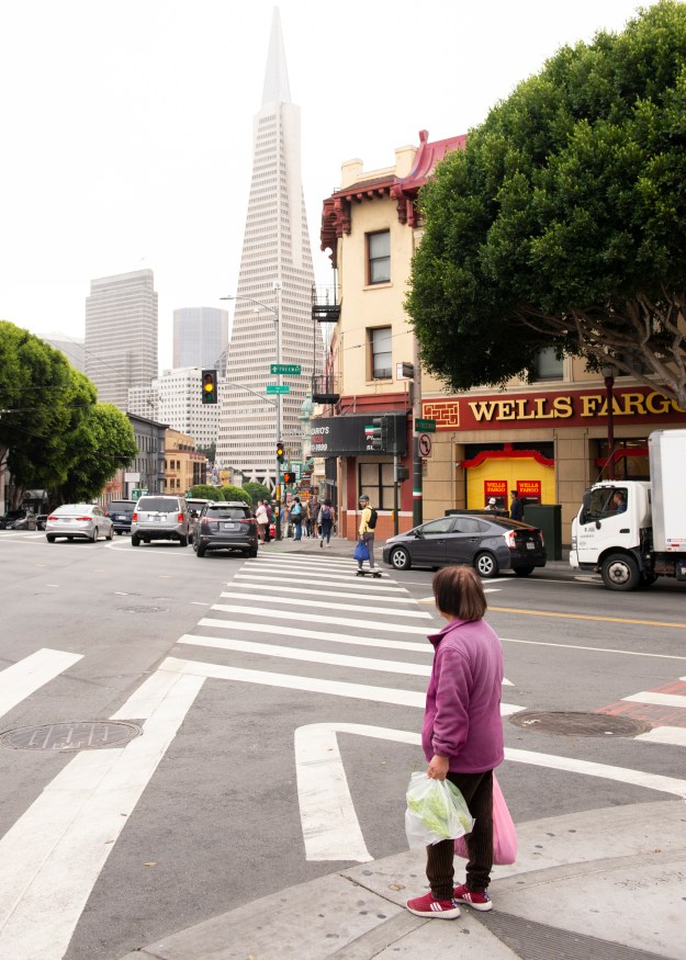
After a few hectic weeks at work and with some creative block regarding Assignment 3, I decided to take advantage of the fact that my wife was away and go to London for a few days.  My plan was to practice some street photography with my Leica M film cameras, to catch up with some friends and see some exhibitions that I’d been hoping to catch at some point.   The three exhibitions were:-

Diane Arbus – In the Beginning at the Hayward Gallery, Southbank.

Don McCullin at Tate Britain

Martin Parr – Only Human at the National Portrait Gallery

These are three well known photographers whose styles and subjects are very different from each other, so I was interested to examine the works being exhibited to gain more of an understanding of their approaches to their craft.  Here, I describe what I saw and what I have learned from seeing these collections.

Diane Arbus – In the Beginning

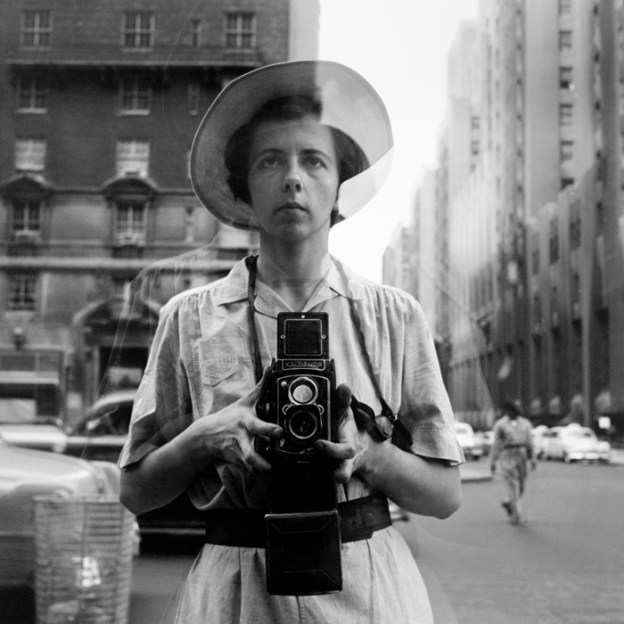
The first exhibition was Diane Arbus, who’s portrait work I was already familiar with and whose tragic end at the age of 48 is well documented.  This collection of photographs was curated by the Metropolitan Museum of Art in New York and adapted for the Hayward Gallery.  The importance of these photographs in the context of Arbus’ work is that they are from the very early years of her career between 1956 to 62, many of which have never been seen in the UK before.

The way the exhibition was set up was interesting to begin with.  The usual introduction abstract on the wall describes the photographs as not being a formal collection that must be seen in sequence.   Each photograph was declared to be a ‘beginning’ in its own right. In fact, the area of the Hayward is formed of a number of square pillars arranged in a grid with photographs hanging on opposite faces of each, which lends itself to not walking through the collection like a zombie conga line. The second interesting point was the complete absence of any context within Arbus’s life.  These were the beginnings of her career, not the events that led to her suicide, so unlike many retrospectives of late photographers, this exhibition stuck to Arbus working in an informative point in her photography.

Walking around the room, the first thing that struck me was the skill applied to the images.  Although early in her career, they could have easily been the result of many years experience.  Arbus’ subject matter varied almost as much as the techniques used to shoot them and I was struck by her desire to capture the moment, even if it was at the expense of good exposure, focus or outside the limits of the film she was using.  Several images have huge grain in them, which works aesthetically but belies the hard work in developing and printing that must have taken place.   In his review of the exhibition [1], Adrian Searle states that ‘Arbus seemed to arrive almost fully formed as a photographer’, a sentiment that I would echo from the impressive quality of the work over a relatively short period of 8 years.  The second thing that struck me was the use of very descriptive titles for the photographs.  Arbus was almost saying “here is exactly what this photograph is”, while inviting interpretation and development of a narrative based on everything else going on in the picture.

I found her choice of subjects compelling.  She photographed circus performers and drag artists getting ready to perform in an almost business-like fashion, showing the potential for any job to be routine.  Her street photographs capture the daily life, but also the surprise at being discovered by the camera.  Boy stepping off the curb, NYC, 1957-58 sums up Arbus’ approach to street photography.  Here we have a boy turning in surprise, but not stopping in his journey to cross the street.  Arbus captures his face and expression perfectly in highlight and the movement of his body.  The scene must have also surprised Arbus as the image isn’t really sharp anywhere in the frame.  The aesthetic of the image doesn’t need it to be, however.  When I look at this image I see the surprise, but also distraction from what is a dangerous job of crossing a New York street.  The boy is more interested in the viewer than his surroundings.

getimage.aspx.jpeg

Boy stepping off the curb, NYC, 1957-58, Diane Arbus

The intimacy of her street work is explored by Jeff L Rosenheim in his essay at the back of the exhibition guide.   He contrasts the classical street photographers of 20th Century: Walker Evans, Garry Winogrand, Lee Friedlander etc, with Arbus’ style.  Where they hid from their subject, preferring to observe, Arbus looked for ‘the poignancy of a direct encounter’ with her subjects.

“For me, the subject of the picture is always more important than the picture.  And more complicated”, Diane Arbus

By interacting in the slightest way with the subject, as with the photograph above, Arbus shows us something about them that we could miss by simple observation.

Arbus also tackled the subject of death and dying in her early work, which is what set the tone for me throughout.  Arbus’ own tragic death at the age of 48 following a history of mental illness, makes her observations about the subject of death interesting but sad.  A series of photographs of the elderly connect back to the origins of the American way of life, e.g Uncle Sam leaning on a cot at home, NYC, 1960 where an elderly gentlemen dressed as the iconic character, waves a flag in a fairly depressing room.  The image contrasts the American ideal with the reality of 1960s New York.  In another image, Arbus shoots an elderly lady in the shower (Lady in the Shower, Coney Island, N.Y 1959).  This image in contrast to Arbus’s other portraiture is taken without the subject’s knowledge.   We get a sense of the way age takes hold of the body physically as well as a feeling of loneliness as she showers in a large, empty changing room at Coney Island.  The effect of ageing is more dramatically demonstrated by Old Woman in a Hospital Bed, NYC. 1958 where a clearly frail and sick old woman is lying unconscious in a bed on a ward.  The photograph is shot with very low contrast, which creates an almost angelic effect.  The old lady, it would seem is close to death.

When she tackled death itself, Arbus’s work takes an almost documentary style.  A couple of images show a corpse during autopsy and a disinterred saint.  The pictures themselves feel unremarkable as the subjects are striking.  It’s not to say that Arbus found only darkness in this subject.  In one image, Headstone for “Killer” at Bide a Wee Cemetery, Wantagh, NY, 1960 we have a picture of a gravestone marking the resting place of someone or something called Killer.  With this image, Arbus tells the viewer that Killer is a pet by referring to the name of the cemetery in the title.  However, there is a dark humour to the image.  Killer appears to have lived a short life, but surely its not a nickname for a child.  Even if it was, it’s unlikely that any family would use if for a headstone.  The word headstone itself has different connotations, depending on what part of the world we are in; it’s a common word for a gravestone in the US.  When I looked at this image, with the word ‘headstone’ in the title, my mind wandered around all of these possibilities and I admit to a small grin when I realised how I’d been duped.

In conclusion, I really enjoyed this exhibition as it provided an insight to the early thoughts of someone who became a very famous photographer.  It was good to formally separate the work from the tragic course of her life, but that knowledge is always there when connecting with her photographs.  I had a sense of someone who recognised and empathised with the mundane and the darkness of her subjects, but also someone who was fascinated by the life going on around her.  Her interactions with her subjects add a sense of revelation, something that I am beginning to see in my own thought process.

Don McCullin

The second exhibition was Don McCullin at Tate Britain.  I had read reviews of this exhibition as perhaps the definitive collection of his work over many years as a photographer and photojournalist.    Th exhibition comprised nearly 270 prints, ranging from McCullin’s early work in the deprived areas of London through to more recent landscapes and ancient architectures.

McCullin is best known as a press photographer who worked in the worst war zones of the second half of the 20th Century.  He famously hates the title ‘War Photographer’, likening it to being an abattoir worker [1].  While other famous photographers we fans of his work, McCullin insists to this day that his war photographs take an insignificant role in the horror scenes in front of him and that he wanted to record them as a human, rather than a professional.  This modest approach is something I admire, although like many I wonder if the effects of what he saw have created this response in order to protect him emotionally.  I recall watching Sebastião Salgado’s TED talk The Silent Drama of Photography in which he talks about photographing the genocide in Rwanda[2].  When he started to suffer with severe physical health issues, his doctor told him that witnessing  so much death was effectively killing him.  McCullin photographed similar attrocities over a greater length of time, so perhaps it’s not surprising that he build coping strategies in order to protect himself, despite always debunking the notion that he suffers from PTSD. As a side note to visiting this exhibition, I was discussing McCullin with a friend of ours who spent a large part of his career as a press photographer for a major newspaper. He showed me a portrait of McCullin that he shot for a piece many years ago. The setting was his garden and he was holding one of his cats. The portrait, which I sadly don’t have for this article, depicts the photographer at rest which is not how we think of him when viewing most of his exhibition. When my friend attended the launch of the exhibition, he presented McCullin with a print of his photograph which although he didn’t remember the shoot, appreciated nonetheless.

There were many interesting elements to the exhibition, but the first thing that I noticed was the beauty in how the images were shot.  Beauty may seem like a strange word to use when the subject is a corpse of a man with half his face missing, but looking at the images from a straight composition and light perspective, McCullin uses highlight and shadow to draw the viewer’s attention to the detail of the subject.  Choice of exposure can make or break a photograph and in McCullin’s case, I couldn’t see a single image that didn’t please from the more technical point of view.

Martin Parr

The final exhibition was (mercifully) Martin Parr’s Only Human at the National Portrait Gallery. This was a far cry from McCullin’s work as it takes a light-hearted look at society in stark contrast to the war and deprivation I’d just been looking at. Parr has always been a favourite of mine since I first encountered the chapter on him in the BBC documentary “The Genius of Photography”. Parr’s almost haphazard approach to photography came out in that programme, where he’s seen wandering around a supermarket with a camera and on-board flash gun. His subjects were just members of the public going about their business and I was startled by the fact that few of them seemed bothered by his intrusion. As a consequence of his use of hash direct flash, Parr’s style is one that almost looks like the sort of photographs that everyone took during the film era. Brightly exposed with lots of saturated colours, his famous series “The Last Resort” takes a candid view at the now-declining British seaside holiday through a series of fun images. However, when looking more closely at the photographs, we can see the darker side to human behaviour when people let their hair down. The famous images of the scramble for the buffet suspends any notion of British reserve or politeness and could almost be shot on an African plain around a pride of hungry lions. Under the fun, almost amateurish looking compositions are cleverly worked subjects that I personally find exciting. Perhaps the best examples from Only Human of Parr’s commentary on British identity were those that were set against the backdrop of Brexit. A few of my favourites can be seen below.

NN11520294

Crisp ’N’ Fry, Spring Bank, Hull, England (2017) by Martin Parr

stack-it-high

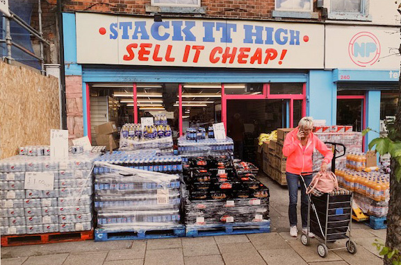
Stack It High, Hessle Road, Hull, England (2017) by Martin Parr

17Parr1-articleLarge

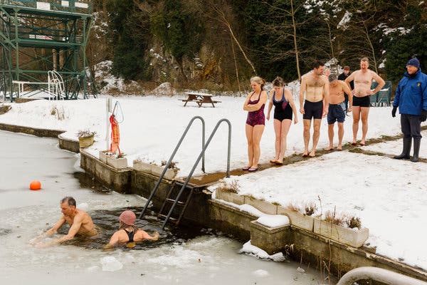
Henleaze Lake. Bristol, England (2018) by Martin Parr

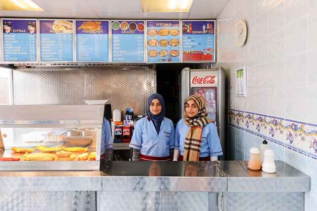
In the first, we see two Muslim girls behind the counter of a fish and chip shop. I found this image to be starling because here is a setting that every British person would recognise with the simple framing of two young women working. When we look at their fairly passive but welcoming expressions, we then jusxtapose with their traditional dress. For me, the sight of these women working is a fish and chip shop isn’t particularly interesting, but my second reaction is framed by the racial disharmony in Britain and picturing how some areas of society would view the image. I found this to be a depressing experience, when the initial feeling was that it was a pleasing and very British scene.

The second image is of the front of a cash and carry-style shop. The huge sign declares that they ‘Stack it High and Sell it Cheap’. A woman leaves with a trolley of goods but not even making a dent in the stack in front of the shop. This image was organised in the section of the exhibition about Brexit, which is known to stoke fear and uncertainty about what happens to our services, NHS etc. It was therefore easy for me to take the perspective that Parr is trying to say that Britain will be poorer and somehow cheapened by leaving Europe. However, I liked this image because of the observational humour of it. The lady leaving the shop is oblivious to the scale of the ‘stacking it high’ and is on her phone. Perhaps she’s telling her friends about it as though she had just discovered that such shops exist. For me, this image is a great example of a photograph that works with our own feelings about a subject to create multiple narratives.

The final image actually made me laugh during the exhibition when I saw it for the first time. Here we have a line of swimmers lining up on a jetty to jump into a frozen lake. They all look nervous and it’s as though they wanted to be anywhere but here. Again, this image was shown as part of Brexit Britain which for me comically described the feeling of uncertainty; lemmings jumping into the unknown. However, the image also had a personal connection to me as I’m also an open-water swimmer and know only too well the horror of preparing to jump into cold water.

Conclusion

This was a great visit to London as I was able to take in three very different exhibitions by very different photographers. From Arbus I learned the importance of strong connections with the subjects, which for me sets her apart from many people who have worked in street photography. Her use of movement and slower exposures in her early work created a warm and ghostly feel to her pictures, which is something I’ve not really explored to date. My images tend to be sharp and with as little grain or noise as possible, but I see the benefit of letting the subject and light speak for itself, regardless of any notions of technical perfection now that I’ve looked at Arbus’ work.

With McCullin I learned that we need to really look at what is going on when documenting something as stark or challenging as war or deprivation. McCullin’s work is factual, but sympathetic to the subjects and leaves the viewer with little doubt as to what is going on. I also learned that it’s really easy to pigeon-hole photographers because of the subjects they photograph. I hadn’t appreciated that McCullin had shot landscapes and to me they were beautiful. However, it took some effort to lift my viewpoint from the impression of McCullin as a documenter of the darker side of humanity. Finally, Parr taught me that humour in photography is something we can employ without it looking contrived or faked. I get the feeling that his work polarises people because of his use of colour and flash, but I think his use of many layers to his work is original and it inspires me to have more fun with my subject matter.

References

[1] 2015, “The Dark Landscapes of Don McCullin, Aperture Magazine, Flashback, https://aperture.org/blog/dark-landscapes-don-mccullin/

[2] 2013, “The Silent Drama of Photography”, TED video, https://www.ted.com/talks/sebastiao_salgado_the_silent_drama_of_photography?language=en