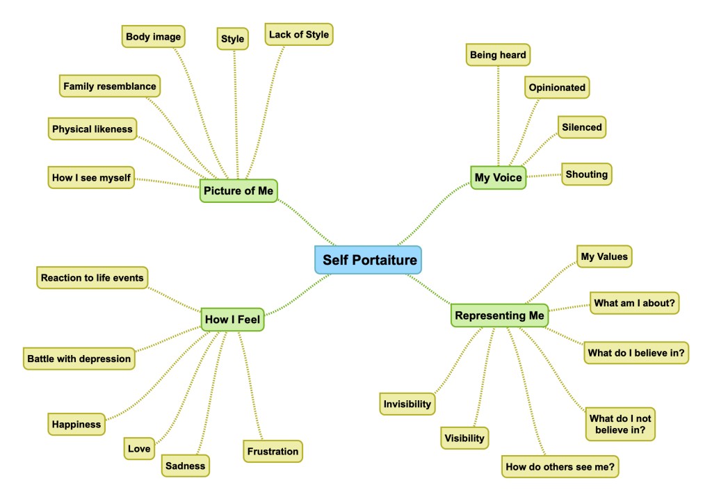
Rip out an advertising image from a newspaper supplement and circle and write on as many parts of the image as you can. Comment on what it is, what it says about the product and why you think it’s there. You could use this as the basis for your assignment if you feel it’s taking you somewhere interesting. Of you could adopt this method for your assignment preparation.
Come back to this exercise when you’ve reached the end of Part Four and see if you can add anything to your analysis.
The Advert
Advertisement from Waitrose Magazine
Here we have an advertisement for sliced ham. I have annotated the photograph in the advert with what I see as the contextual elements.
Deconstructing the Advert – what is there in the scene?
The first element that we notice when looking at this advert is the filled sandwich. It is an appealing looking roll that is arranged so that the contents are on display. The filling is made up from four distinct items, ham, cheese, some form of salad leaves and onions. The arrangement of these is such that the ham occupies the most space in the roll. Remnants of the filling are scattered around the roll on a wooden chopping board that the sandwich is arranged on. The other elements in the frame are the cloth to the left of the sandwich, the dark background that has no discernible detail detail and the light which is coming in from the right hand side. The elements that are not part of the subject, but are included in the frame are the ‘packet of ham’ graphic and the text. The text elements are divided into those that describe the product and those that inform as to the producer. One of the textual elements is contained within a speech or thought bubble that is pointing toward the roll.
Why might the elements be there?
The roll is oriented towards the viewer so that the filling is the first thing we are drawn to. It’s the vehicle for showing us the product but at this stage, it’s not clear what the ad is for. The filling is arranged so that the ham is the most visible element in comparison with the other foods. This points to the advert being about ham. The point is further emphasised by the use of contrasting colours of the other ingredients and the way that bits of them are scattered around the scene. The ham itself if arranged so that it is clear that it is sliced, suggesting that this is the type of product being advertised. The roll acts as a frame for the product, so that is what we are immediately drawn to. The blurred and contrasting background highlights the product as the anchoring point of the photograph.
The roll is placed on a wooden chopping board, which suggests that the sandwich has been naturally made. Combined with the cloth at the left of the frame, the impression created is one of the roll being specially made. The soft lighting highlights the subject in a soft way so that colour and texture are made clear without being jarring.
When considering the text separately, the first thing I noticed was the slogan. The slogan is a play on the phrase “the best thing since sliced bread”, a phrase that is recognisable by most British people. The substitution of ham for bread reveals that this is indeed and advert for sliced ham. The next noticeable text item is the speech bubble that declares the sandwich as being ‘free from nitrites’. This points to the product being healthy. The final text elements are the details of how to buy it. The matter-of-fact statements about it being available and the details of the company are there to inform the curious buyer. As a reminder of what they might be buying, we have a small graphic of a packet of sliced ham to reinforce the point.
What do the elements possibly mean?
Starting with the main subject, the roll itself and its filling are all intended to give the impression of good, nutritious food. The roll is rustic looking and it is arranged so that its contents are bursting out from it. The main ham filling is arranged so that it is honest about the nature of the product (sliced), but the supporting fillings of cheese, salad are not cooked or processed, suggesting a healthier combination. The use of contrasting colours makes us look at each individually and their arrangement, along with the scattered remnants and the rustic roll, suggests something home-made as opposed to mass produced. The wooden chopping board that the roll is sitting on suggests a kitchen rather than a factory and the cloth, although obscured by the main text, further emphasises that suggestion. The photograph used for the advert is enhanced by the use of text placement and language. The speech bubble that contains the phrase “made without nitrates” is an interesting one. The first observation is that the bubble doesn’t point to the ham, but the whole sandwich. The use of ‘made’ therefore seems to be aimed at the completed food, not just the product itself. The way that these two elements create this idea is subtle in getting the message across that the ham is a healthy product without simply coming out and saying that. In fact, nowhere in the advertisement does the manufacture make this claim directly. Instead, the viewer is led to the conclusion that it is because of the appetising-looking sandwich that can be created with the ham. The message is further emphasised by what is missing from the sandwich, the ‘nitrites’. Most of the general public is unlikely to know what nitrates are, but their use here suggests something bad. By stating that the sandwich contains no nitrites, the advert is saying that the public should be grateful that they have avoided this unhealthy thing. The use of fear of accidentally eating something unhealthy is very much in line with Derrida’s idea that a trace of what is missing is always present. The advertisement pushes health but also refers to the implications of not taking health seriously. In fact, nitrites are harmful. In processed meat, they are used to boost colour In this advertisement, there is no explanation other than that they are bad and the buyer doesn’t need to worry about it.
The other text in the advertisement tackles the ‘goodness’ of the product in slightly different ways. The main banner that announces ‘the best thing since slice ham’ pushes the message in a humorous way that this is an invention that is good for us. The play on words of the phrase ‘the best thing since sliced bread’ is intended to invoke the same idea. When bread was cut by hand in the old days, it was seen as a bit of a chore as well as being potentially wasteful depending on the person doing the cutting. The invention of sliced bread allowed for more convenience and less waste, a message that the ham manufacturer is making in this advertisement. They are making no secret that it is pre-processed and sliced (with the addition of the picture of a packed of ham), but making the point of ease of use in addition to the message about it not containing the traditional chemical additions (the nitrates) of other products. This is another point along the lines of Derrida’s trace of alternative meanings; the ham is better for you because you don’t have to do any work to use it. While this sounds odd, there are many people whose busy lives create a need, whether real or not, for time-saving food that lacks any additional hassle. The final element is the name of the product/manufacturer. The ideas that the word ‘naked’ creates lend themselves to the other messages about health and simplicity that the advertisement has pushed so far.
Naked (adjective)
being without clothing or covering; nude: naked children swimming in the lake.
without adequate clothing: a naked little beggar.
bare of any covering, overlying matter, vegetation, foliage, or the like: naked fields.
bare, stripped, or destitute (usually followed by of): The trees were suddenly naked of leaves.
without the customary covering, container, or protection: a naked sword; a naked flame.without carpets, hangings, or furnishings, as rooms or walls.
Dictionary Definition of Naked [3]
This is a product that is stripped back to its basic form, is not covered or has nothing to hide. The idea that the use of this word creates is one of openness that suggests it is a product unlike the others. Again, the advertisement seeks to separate itself from the rest.
Conclusion
This was an interesting exercise. The advertisement that I chose was just one at random, i.e. I didn’t chose it because of a connection with the product or the imagery, merely selected something from the magazine that I had in front of me. In deconstructing the imagery, I found that there were many subtle meanings and distinctions from other potential ideas. The ham was being touted as healthy and natural because of the way the photography was arranged with supporting text and language. The interesting realisation for me was that although all of these elements work to create that narrative, my perspective was unchanged – I don’t believe for a minute that processed ham is healthy. This is because I bring to the image my own understanding and experience to the analysis. My wife and I eat healthily for the most part and avoid things like processed meats. I know instinctively that the messages in the advert are wrong, but there are many who do not. The target population for the advertisement is the busy person or family member who doesn’t have time to buy fresh ham. There could also be the need for convenience or lower cost or simply wanting to make food last longer between shopping trips. Whatever the motivation, the buyers that are taken in by adverts like these, are not necessarily taking part in creating the narrative as described by Barthes. Instead, the advertisers simply have to signpost the meanings through what the buyer gets (goodness) and avoids (badness) through the use of imagery and text.
I found the multiple layering of this image fascinating. The brief suggests returning to this after Assignment 4, which I will consider doing.
This paper is in response to the work on Derrida and deconstruction, where a cultural text can be essentially broken down into multiple contextual elements with supporting and contradictory narratives that can be drawn from them. Derrida considered language to be a flawed way of communicating, asserting that as language was a human creation it was no surprise that it would include inherent biases and perspectives that steer the reader or viewer to a particular conclusion. With the idea that the visual arts can also be treated as a language, we are reintroduced to Barthes and his work on semiotics. Semiotics are the signs within language that can be used to make up meaning. When I first looked at the supporting notes for Semiotics, I was immediately struck by the ‘logical’ nature of the expressions which in the cases of Signs, Signifier and Signified look more like equations than anything to do with art. Of course, the labels that Barthes is applying to contextual elements and meanings are, in a way trying to apply some sense of reasoning to the critique of a photograph.
The Semiotics
We are given the simple descriptions of the semiotic terms that Barthes postulated in the notes[1], which are:
Sign: the overall effect of the phtograph
Signifier: the actual picture in terms of its formal and conceptual elements
Signified: what we think when we look at the picture
The Sign is expressed as the sum of the other two, which esesstially combines the formal visual with the viewer’s reaction to the image. This makes sense as the sign is the impact of the image not the viewer.
Denotation: the objective translation of the image – what does it contain?
Connotation: the interpretation of the elements, which can be widely variable depending on how we see them.
We use these expressions in the English language regularly when we are trying to describe the purpose of meaning of something, e.g. “this symbol denotes the status of the equipment” and “that decision has multiple connotations”. As a former engineer turned manager, I observe these expressions in common use respectively as the former works more in absolutes than the latter.
Studium: the general status quo of the image. The undying cultural, political or social meaning which is derived from most of its contextual elements.
Punctum: an element that disrupts or contradicts the Studium.
These two are driven more by the viewer’s own perception of culture, their political leanings and is shaped by there personality. While the contradiction of the elements might be visually obvious, my initial thoughts on how they are interpreted by the viewer will be more or less impacted by how strongly they feel about them.
Intertextuality: the final factor in viewing photographs being what the viewer brings to it. Like Studium and Punctum, the life experiences of the viewer will affect how they read the image. For me, this fits neatly with the ideas from Death of the Author [2] where Barthes incites the viewer or reader to take a bigger part in the narrative of the image or text, rather than trying to seek out what the artist intended. Intertextuality then, is the core of the our reaction to something we see that distinguishes our feelings or opinions from those of others.
Practical Example of Semiotics
In looking at each of the semiotics and how they are found in an image, I elected to choose a photograph to examine. The photograph is by one of my favourite photographers Joel Meyerowitz, whom I’ve discussed previously on this course. Meyerowitz was one of the early pioneers of using colour film for street photography, arguing that colour is more representative of how we see the world as well as suggesting that instead of a distraction, it could be used to add to the subject. The image I chose is shown below.
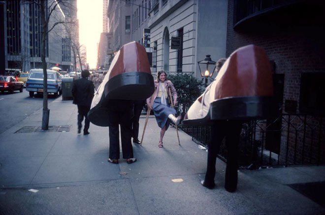
Untitled, by Joel Meyerowitz, from his selected works ’35mm Color Street Photography’ [3]
Starting with the signifiers, the image is of a street with buildings, people and cars at either dawn or dusk. Two people dressed in large shoe costumes are walking way from the camera, while a woman on crutches is walking toward them,. She has her clearly injured leg raised, pointed at one of the shoes and a smile on her face. Another man is see heading in the same direction as the shoes.
The signified for me is the humorous way the woman is pointing her foot at one of the large shoes. The reaction on her face suggests that she finds the encounter with the costumed people to be funny, presenting her injury for them to look at in an almost absurd way.
The sign for me is an absurd encounter with some people wearing large shoe costumes with a humorous play on the contrast between the characters.
In terms of denotation, the objective meaning of the image is fairly simple. Here are two people either going to a party or taking part in some form of advertising, walking down a city street. Their encounter with an injured woman causes an interaction which is observed from Meyerowitz’ perspective. We cannot see the face of the ‘shoe’ she is interacting with, but given the smile on her face it is reasonable to assume that it’s a cheerful one. The exaggeration of her walking style looks to be fun or with some level of mimicry which could be the reason for the jovial expression on her face. The other actors in the scene (the cars and the other pedestrian) are heading in the same direction as the shoes.
It’s when we consider the connotations of the elements described above that we start to deconstruct the image. The ‘shoes’, pedestrian and cars are all facing the same way toward the light at the end of the street. The use of leading lines in the composition suggests that the journey these actors are on is a long one. The scale of the shoes could be interpreted as everyone’s shoes and the way that they positioned could mean that everyone is heading down the street. The woman is the only element in the frame that is heading in the opposite direction, which could be interpreted as rebellion or some form of struggle against the tide; her injury gives weight to the latter. The humour that was signified in the first viewing of the image could be irony, with the smile being more sarcastic than genuine. The shoes take up a lot of the sidewalk, so perhaps the showing of her injury is an ironically angry gesture to get out of the way. What we cannot see in the image is the faces of the people wearing the shoes, which could be somehow dismissive of her presence. When we consider that there are no other faces in the other than the woman’s, we could interpret that as being that seemingly nobody caring about her or her predicament.
Now considering the studium, we see a city street in what looks like Manhattan in New York City. The connotations above when considered with the fact that Manhattan is considered to be an crowded place, create another narrative about the flow of people all heading in the same direction. The punctum is of course the woman who is defying the status quo by walking the other way. Her appearance and apparent disability offer a more sinister view of the big city and the struggles that some people have to fit into that society and culture. The photograph was shot in the 1970s, which has a naturally very different political feel to modern times.
The breakdown of the photograph offers multiple meanings which is what deconstruction and post-structuralism is all about. However, in terms of my interpretation, it is the intertextuality the largely defines how I react when I look at this picture. As I said, I am a fan of Meyerowitz and know that in terms of this picture he saw the amusement in the events unfolding in front of him. I’m also a huge fan of New York and it happens to be one of my favourite places to visit. Having these two personal connections means that I can only ever see this as a funny scene. New York is a place where anything or anyone out of the ordinary isn’t noticed or prejudiced against by the majority of the residents, so seeing two people wearing giant shoes wouldn’t have caused a stir. The woman’s reaction and her exaggerated walk is a celebration of that uniqueness for me and Meyerowitz’ perspective on street photography further strengthens my feelings when I see this picture:
“A lot of what I am looking for is a moment of astonishment,” he says. “Those moments of pure consciousness when you involuntarily inhale and say ‘Wow!’
Joel Meyerowitz
The Rhetoric of the Image – Panzani Advertisement
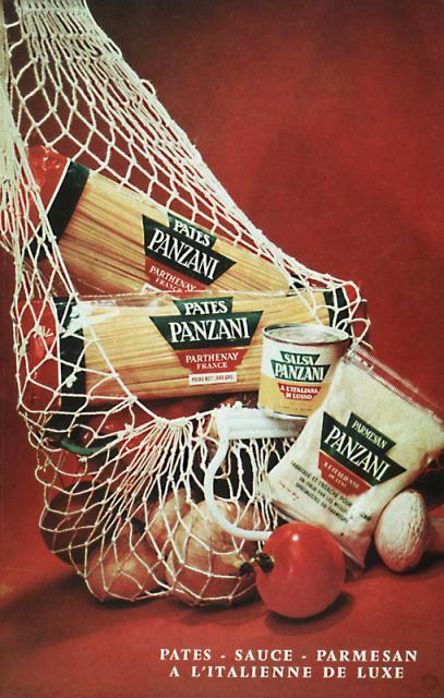
In his paper The Rhetoric of the Image [4], Barthes analysed an example of an image used in commercial advertising, specifically a printed advertisement for Panzani food products. In his treatment of this image, Barthes uncovered multiple signs (the overall meaning) and many signifieds within the frame that support them. His systematic breaking down of the image into it’s many potential meanings explains how we as viewers we are led to a conclusion based on ours or our culture’s visual references.
Panzani advertisement used by Barthes in The Rhetoric of the Image [4]
Barthes starts by pointing out the seemingly obvious element that we see when we look at the poster, the text both on the labels and in the caption. The use of the French language in the caption Barthes argues, is a coded sign about the way the product is Italian. This plays directly into our perception of other cultures in using a European language, the stereotypical idea of what being Italian is is emphasised and then further built by the labels on the food. The Panzani name drives home the message that these are Italian products for making Italian dishes.
In terms of the visual, Barthes discusses three further individual signs or meanings that the picture creates. The first is the way that the shopping bag is dropped on the table as if returning from a market or small shop. Barthes refers to the widespread cultural belief of shopping for groceries in this way being more natural than the alternative bulk buying context. The notion of naturally fresh comes with the way the produce is allowed to fall out of the bag, in contrast to the modern packed and refrigerated reality that most experience. The second sign that Barthes identifies is the use of the colours in the scene. The red, green and white themes in the image contour up the Italian flag, even though the products and colour pantones are all different. They are not even arranged as a flag, but the visual pointers along with the names on the labels drive home the sense of the food being Italian. A further sign is signified by the number of labels in the picture giving the impression that Panzani is a ‘one stop shop’ for Italian food. The final sign is the way the image speaks to still life, the signifier being the arrangement of the products and the way they are lit. This sign is more about not sending any cryptic messages about what the products are, merely that here they are for purchase. It’s no surprise that this sign is present as the picture is after all an advertisement. The more interesting point is that it’s probably not the first and most obvious of the signs. We instinctively know what an advertisement is, so only when looking at the image closely can we see the signifier that points to the classical still life paintings we are familiar with.
I found The Rhetoric of the Image an interesting paper to read. In breaking down the picture into the semiotic elements, Barthes changed the way that I looked at this seemingly uninteresting advertisement. The extract that I used for this post[] only dealt with signs, signifiers and signifieds, but Barthes goes on to consider the what the elements denote and connote and how our cultural viewpoints affect the reading of the image. I associate Italy and things Italian with the classical tourist impression of the country and its people. Flamboyant, brightly coloured fashions, exotic sports cars and glamour, as well as healthy food are all cultural references for me, so when I looked at the Panzani picture, I didn’t need the French caption to lead me to the conclusion that this weree good products. The thing that is interesting is that I have no evidence that beyond the tomatoes in the picture, the rest of the food is healthy or indeed any good. The visual signifiers and signifieds create those impressions in such as way as to my not wanting to question them. In his paper then, Barthes seeks to explain rather than contradict. His message lends itself to Derrida’s deconstruction idea that, that every element potentially has multiple meanings and traces of its opposite. In this case, the product looks Italian because the signs suggest so, but we also have the knowledge that we don’t know where Panzani products are manufactured. That and the many other distinctions leads us to challenge what we think we see in a photograph.
As an addendum to this, I recently revisited and completed Exercise 3 from Part 3 on Childhood Memories [5]. When I finished the work, I showed it to my wife and mother-in-law. I noticed something that I had not appreciated previously, that is the need to try to explain my photographs. I managed to stop myself from completely explaining the meaning of the image and instead observed their reaction to it. This is a key learning for me – whatever my intentions for a picture, how other people read it is dependent on my use of contextual elements and what they bring to the viewing.
References
[1] 2020, ‘Photography One – Context and Narrative Part 4, page 123, OCA Course Notes
[2] Barthes R, 1967, ‘The Death of the Author’, essay
Recreate a childhood memory in a photograph. Think carefully about the memory you choose and how you’ll recreate it. You’re free to approach this task in any way you wish.
Does the memory involve you directly or is it something you witnessed?
Will you include your adult self in the image (for example to stand in for your childhood self) or will you ask a model to represent you? Or will you be absent from the image altogether? (You’ll look at the work of some other artists who have chosen to depict some aspect of their life without including themselves in the image for the next project).
Will you try to recreate the memory literally or will you represent it in a more metaphorical way, as you did in Part Two?
Will you accompany your image with some text?
In you learning log, reflect on the outcome. How does the photograph resemble your memory? It is different from what you expected? What does it communicate to the viewer? How?
It might be interesting to show your photograph to friends or family members – perhaps someone who was there at the time and someone who wasn’t – and see what the image conveys to them.
The Memory
I’m not sure how, but I immediately settle upon a memory from my childhood when reading the brief for this exercise. I had a wonderful childhood as part of a family of 4 and then later with the arrival of my little sister. Although I was a very anxious child, I remember thinking throughout the early 1980s that we were a lucky family. My parents were good to us, Dad had a good job and we lived in a beautiful Cotswold town. The memory that I guess shattered this illusion was when my parents decided that I needed fairly major dental work to straighten my crooked teeth. I may have been given a choice but I was 12 years old in 1985, so probably didn’t know what was going to happen to me. I was taken to the dentist and was determined to have too many teeth overall. I had 4 removed and a removable retainer fitted to straighten the rest out. My overwhelming memory on returning home was total hopelessness. I couldn’t speak with the ‘brace’ in and eating was a challenge as removing it was initially painful because of the initial pressure it put on my teeth. I lay on my bedroom floor listening to records and retreating into my own thoughts; the isolation and escapism that music offers when I am stressed remains with me to this day. I still vividly remember the hopelessness of this new normal that I was expected to get used to for the next 2 years. Eventually I did get used to it of course and the brace became something I only really noticed when it was periodically tightened up. I have been grateful to my parents in later life for having them sorted out when I was young, as more recently my wife has gone through similar as an adult, which is apparently even more difficult.
First Idea
My first thought was to try to represent the change in my personality as a result of this traumatic event. I remembered the transformations of the television series’ of my childhood, most notable Bill Bixby into Lou Ferrigno in the 1970s The Incredible Hulk.
Bruce Banner (Bill Bixby) transforms in frames into The Hulk (Lou Ferrigno) [1]
I had transformed into a relatively ordinary boy with anxiety problems to someone who never really sees the world optimistically; could I represent that in a single image? I started by shooting a number of simple self portraits with a view to manipulating them into a single frame in Photoshop later.
Although I was able to create different expressions and subsequently an impression of the transformation in each portrait, I struggled to see how I would incorporate them in a blended image. I am not proficient in Photoshop as it isn’t a tool that interests me all that much. My fairly recent move to back to film photography has led me to try to reduce the amount of post processing that I do, so Lightroom adjustments are the limit to my knowledge. I experimented with Photoshop for an earlier exercise[2], but the time it took to learn the basics took away from the creative side of the exercise for me.
Second Idea
Once I had rejected the first idea, I paused this exercise to return to later. I was keen to progress to the Assignment 3 which was about Self Portraiture[3]. With hindsight, the learning that I did in the interim made returning to this exercise more rewarding. I had learned about how some artists play a part in their work rather than simply appearing as a traditional portrait subject and that in some cases, traces of context are used to help create narrative without being too obvious. With the completion of Assignment 3, I was also now much more comfortable in front of the camera than previously.
The second idea was to compose a scene that used props to suggest the nature of the event as seen through my now adult eyes. I wanted to include factual references about the evening after the dental work and the implied feelings that I experienced during that lonely first night. I would be play the part of the younger me in the composition.
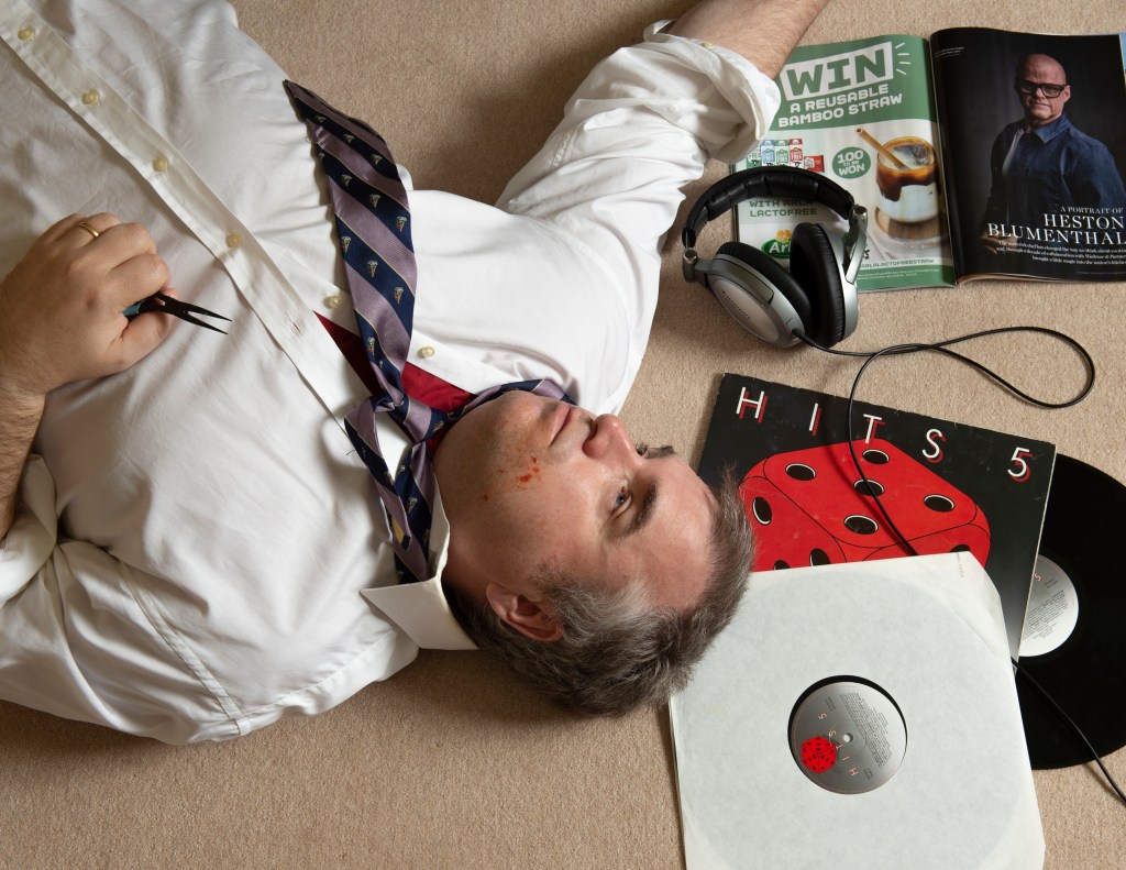
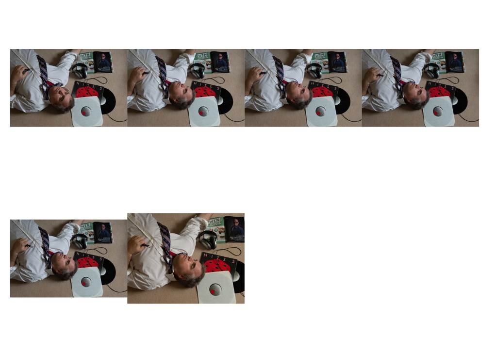
The Image
Intent and Reflection
Here we have the final image of me lying on the floor surrounded by my stuff. What I intended here was to play the part of the younger me, so the school shirt and tie is arranged to suggest a schoolboy. The pose is intended to represent the sheer shock of the event, which left me pretty numb that first night. The arrangement of the tie and my blank ‘eyes open’ expression suggests the severity of this experience for me; as though my enthusiasm has been choked out of me. I’m holding the pliers to symbolise the way that I had a choice in the matter and the blood on my face is perhaps the most obvious contextual element in the frame; something having happened to cause injury. The rest of the frame is arranged with some key things that describe my environment. The vinyl album isn’t actually the one that I listened on repeat that evening, but is from the same compilation series that I was into as a young boy. I chose this one for the bright red die on the front cover as I felt it would work better with the blood on my face. The arrangement of the album is exposed and disorganised, which again refers to my feelings of confusion and anxiety. The headphones serve as the anchor for losing myself in music to escape the situation, while the magazine was a fortunate addition. One of the biggest issues with the brace was eating as mentioned previously. The combination of the advert for a straw opposite the famous chef was intended to represent the changes I would have to make with my new ‘disability’. On the whole, I wanted to include the colour red, not only to symbolise the harm that had been done but also because the whole situation made me angry and hurt. I had used colours in my submission for Assignment 3 to represent the same emotion.
When I look at this image, I am happy with the way that it brings together the things that I remember from the experience of having my teeth fixed. One of the things that I learned during this exercise was the way that leaving an idea and returning to it later can be really helpful. My first thought for the picture was rejected when I realised that I wasn’t proficient enough in the post-processing software. When I returned to the exercise after Assignment 3, I had a new confidence in both using my self to express how I feel and also simply being in front of the camera. I arranged the elements in the frame carefully and I think they work. When I showed the image to my wife, she looked carefully around the frame at all of the contextual elements. After she had done so, I explained what my intention was with the image and the feedback was positive. During the feedback for Assignment 3, my tutor asked if I would feature in more of my work. I believe that rather than just being an uncomfortable experience that I have historically tried to avoid, using myself in a photograph can be a powerful way of telling a story.
We are introduced to the concept of deconstruction as the idea of language being inherently flawed in its articulation of the true meaning of a communication. The theory seeks to further challenge the notion of interpreting cultural texts (written word, cinema, visual arts etc) within a preconceived structure of meanings and relationships within language. These ideas formed the basis of structuralism which relied heavily on language being an infallible method of human communication. What followed was the challenge that language itself was a human idea, therefore it’s infallibility in communicating a message was open to interpretation and potential misunderstanding. This formed the basis of post-structuralism; a theory beyond the original understanding which deconstruction plays a major part in. In his excellent video about post-structuralism[1], academic Tom Nicholas cites the example of a reaction to a message or voicemail that was intended to mean one thing and was interpreted by the receiver as something completely different. The language is constant and well understood, but the meaning behind the use of each word and the assembled message can be misinterpreted. In trying to placate the reaction, we find ourselves trying to be more specific about what we mean – the only way we can do that is to continue to explain using the same language. The many possible interpretations of writing can exist at the same time, restrained by the core use of words, i.e. the core of the subject is understood. As with Barthes’s Death of the Author where he argues that the true intent of the author cannot every be truly understood, post structuralism challenges the viewer to become part of the creation of the meaning.
Nicholas’ treatment of deconstruction is interesting as it points to events and visual references that I had not considered until now. One of the examples was the deconstruction of the narrative around Apartheid and how the word itself was steeped in the European way of viewing racism in South Africa. Far from being an accurate way of separating the European ideals from the horrors of what was going on ‘over there’, the suggestion by deconstruction was the inherent presence of racism in that ideal. By pinning a label on racism, the very people using it could alternatively be revealing their own racial prejudices that stemmed back to the days of colonialism. I started to think about more recent examples where deconstruction of an event could yield an alternative interpretation. One thing that came to mind was an event that occurred at the start of the global COVID-19 pandemic that caused outrage among many people via social media platforms. A small group of famous Hollywood actors led by Gal Gadot, produced a video of them singing John Lennon’s Imagine [2]. The reaction to the video was brutal, with people immediately accusing the actors of turning the spotlight onto themselves and being detatched from the reality of the pandemic, which at the time meant millions of people across the world being locked down. When I watched the video, I found it to be achingly embarrassing. None of them could really sing, the video was recorded using mobile phones and as a result looked to me like many other pointless social media posts. My structural assessment of the video was not unlike other people’s and I recognised a solidarity in its derision in the media. In deconstructing it though, we consider the fact that like many, the actors were confined to their homes also. We have a perception of them as being somehow attention-seeking because of what they do as a profession, yet don’t necessarily consider that their profession is entertainment. The use of Imagine, perhaps Lennon’s most famous solo record and regarded as having a socialist theme and messages of human unity was clearly intended to be galvanising. Yet the opposite seemed to be the case, with many citing the terrible singing and production as sacrilegious. Whatever the motives behind the video, it can be interpreted as trying to make people feel better (Gadot was self-isolating with symptoms at the time), engendering unity and strength (even famous people aren’t safe). Like the racism discussion, perhaps the general interpretation is more about our having made these people famous and the resentment of what we perceive to be their world that is so different from our own. Deconstruction suggest that we should challenge what we think we know. In this case, we think we know celebrities because we are responsible for their creation, but in actual fact we cannot really know how they feel under the same set of circumstances that we are experiencing.
The 21st century technology and availability of information through 24/7 news coverage and social media has meant that we are presented with multiple cultural texts about the same subject. Does this help support the idea of post-structuralism or is it simply making more structures by which our interpretation of a subject is informed? Personally, I believe that the amount of information doesn’t absolve us from challenging what we see or read, but instead makes it even more important to take the time to do so.
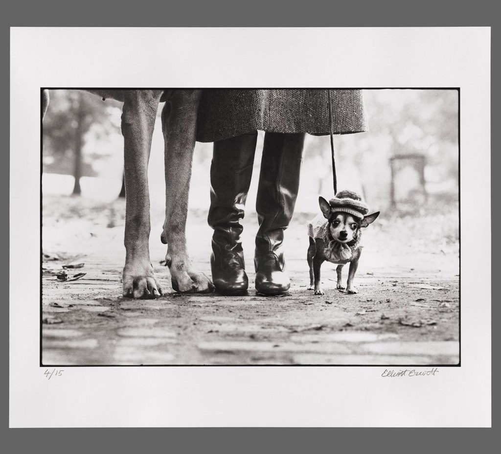
Look carefully at Erwitt’s image (below) and write some notes about how the subject matter is placed in the frame.
Dog Legs (1974) by Elliott Erwitt from Magnum Photos [1]
How has Erwitt structured the image?
What do you think the image is ‘saying’?
How does the structure contribute to this meaning?
Did you spot that the image is framed in stages of three?
How has Erwitt structured the image?
When I first saw this shot, I immediately noticed the shallow depth of field that throws the background completely out of focus. Erwitt wants attention to be on the three subjects in the foreground of the image. The next structural element that I noticed was the placing of the subjects. The feet sit on the lower third line in the frame and if we were to draw a centre line through the subjects, they sit on the left vertical third, the centre and the right vertical third lines. The obvious difference in scale of the subjects is emphasised by the way the larger pairs of legs extend out of the top of the frame, leaving the small dog as the only ‘complete’ subject. The image looks as though it is severely cropped, which I’ve seen in other pictures of chihuahuas in Elliott’s series – I used them in my blog article about my selection and editing workflow in EYV[2]
2. What do you think the image is saying?
When I look at this image, I see a humorous take on the attitude of small dogs. The obvious scale is emphasised with the owner’s legs, but we we see the humour in the other pair of legs belonging to a huge dog, this initial reaction is questioned. As the notes suggest, this funny combination of subjects could prompt the viewer to move on from the shot. However, for me as a so called ‘dog person’, I want to continue to look at the chihuahua. The little dog has the natural stance for the breed, which has an almost confrontational feel to it, particularly compared to the big dog’s straight-legged gait. The addition of the hat makes the chihuahua almost anthropomorphised, saying ‘here is a small but mighty dog’ with a human-like personality. When I look around the frame I further get the sense that the small dog is being restrained by its owner through the use of a tight leash. The image now makes me think of a commentary about the little guy being held back by the bigger one.
3. How does the structure contribute to this meaning?
The image structure emphasises the small dog and its expression as the only whole subject in the frame. The difference in scale is emphasised by the way the large dog and the owner cannot be seen beyond just their legs. Using the top of the frame as a hard limit for the perspective forces the viewer to continue to look at the lower parts of the frame. Composition ‘rules’ tend to suggest that using the edge of the frame to cut off part of a subject can distract the viewer from the main subject. However, Erwitt uses it to create enough of an impression of what might be outside of the frame without reducing the impact of the main subject. Even the inclusion of a small part of the larger dog’s belly and back leg are not sufficiently distracting, instead making it clear who the second pair of legs belong to.
4. As I mentioned in 1, the composition in threes was one of the first things I noticed about the image. The use of threes (the thirds lines, the three subjects etc) gives the picture balance.
Further questions raised from the analysis of this image were:
Does he like to help the underdog?
Does he prefer dogs to humans?
Is he making a statement about giving everyone a voice?
Or is he just making a joke?
The notes state quite reasonably that we cannot answer the questions from one single image, particularly when it is part of a body of work about dogs. The point about the context of the image as part of the series is naturally what we have been studying throughout Context and Narrative, so it comes as no surprise. My conclusion about the image as described previously tends towards the support of the underdog and the equality of voice raised in the above questions. However, when I look at the other images in the series that conclusion is challenged. For example:
Poodle, Birmingham, England (1991), by Elliott Erwitt – from Magnum Photos [3]
In this shot we see a poodle standing on its hind legs at what looks like a dog show. The pose of the dog and the way it looks at the same unseen subjects that the people around it are, again anthropomorphises the animal. In this image, I don’t create the same underdog narrative as in the previous shot; instead there is humour and beauty and a suggestion that our dogs take on our personalities. Along with every other shot in the series, Erwitt’s affection for dogs is very evident. Humour is a clear contextual element in the photographs, so our interpretations of the images have common themes. The differences come from our own experiences and interests. As the notes suggest, an alternative interpretation of the photograph could revolve around its location, perhaps of more interest to people of the UK than Erwitt’s native US with it having been shot in Birmingham.
Conclusion
This exercise has been interesting from the perspective of how we consume all of the parallel information in a photograph and draw our own interpretation based on our personal interests and experiences. There is a danger of overthinking the meaning behind each and the acceptance that where a viewer takes their narrative is beyond the control of the photographer are both important learning points. One can describe an image in such a factual way as to reveal the contextual elements included by the photographer, but when putting ourselves in the picture and interpreting meaning, the variances can be significant. What isn’t clear to me at this point is how a photograph can be a language for consistent communication. I guess that will become clear as Part 4 progresses.
I’ve just received the feedback on my submission for Assignment 3 on Self Portraiture. As with all of these video sessions, I find the constructive criticism really helpful and it often points me in the direction of photographers that I might be interested in. They may be artists that work in a similar or contrasting way to what I was trying to achieve in the assignment and they might inspire me to improve the series before submission. Whatever the connection, I find that I am looking at artists that I would not necessarily found through my own research.
The feedback was very positive about the originality of my idea, technical execution and how the images connected back to my diary. There were some good recommendations, such as re-visiting the cropping to more emphasise my face and reduce the dominance of the background colour. When I looked at the example my tutor shared, I could see how it would improve the shots by making a portrait crop. Other ideas included experimenting with the background, not just in terms of colours but also whether the setting could add to the narrative. Key among the comments were the recommended artists to look at.
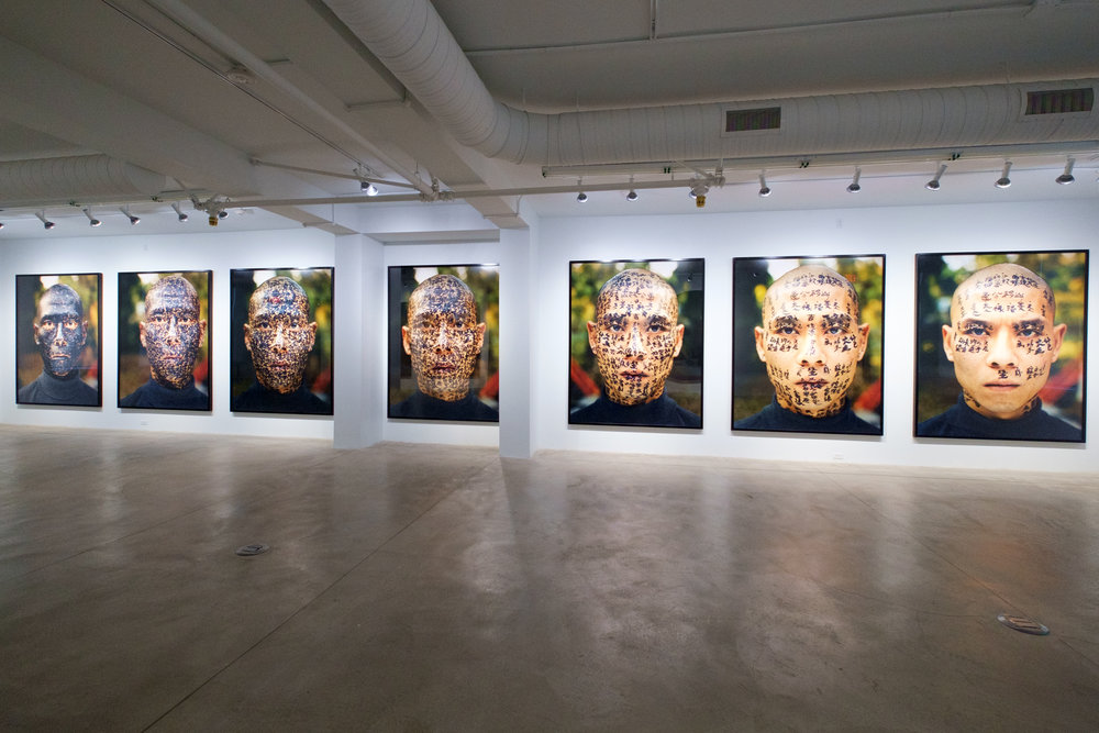
Zhang Huan (1965 -)
In his series Family Tree[1], Chinese artist Zhang Huan challenges the viewer by gradually covering his face in text until his skin is entirely obscured. He asked three calligraphers to write the text, which comprises Chinese folklore and commentaries on culture and the impact on family life, on his skin. The effect is a powerful one, with the ornate script that would be recognisable by someone who can read the language, slowly descending into a continuous covering. By the end of the series, the only features of Huan’s face that are recognisable are his eyes and lips. Like Morrissey’s work [2] that inspired my assignment, his expression is blank which becomes increasingly uncomfortable to look at as the series progresses. As suggested by my tutor in our feedback session, there is something disturbing about modification of the human face. The example of tattoos reinforces this sense. While they have become increasingly popular and widely accepted as body art during this century, there is still a stigma associated with them on the face. There a many stories of people struggling to get or hold onto a job because of tattoos on their faces as some people find it uncomfortable or somehow unacceptable to modify what is the main focus of communication between human beings. In his series, Huan was telling the story of culture and cultural change becoming so overwhelming that it almost smothers our sense of identity. His compositions suggest this overwhelming feeling but the ever present eyes and lips articulate his view that it can never take away our individuality that we have from birth. Huan’s series is very multi-layered when we look at how it came about. His fear of a serious health issue was the starting point for the series, which as a contextual element helps us understand Huan’s expression in the images – one of desperation or panic. The gradual build up of black ink on his face both gives us a sense of being smothered, but also shows us a gradual darkening of his normally pale skin. Huan himself indicates that this darkening is the passage of time from being born to old age or the way that a day turns into night. This is echoed in the way the background light gradually fades. The point made in my feedback about experimenting with backgrounds is made here. Huan uses a simple outdoor setting in natural light where the changes are noticeable as the series progresses. My series had consistent studio lighting that was effective but uniform from frame to frame. Perhaps I could have added the context of mood by including a more natural background with the colours represented in objects or textures that were more naturally occurring. The last of Huan’s frames is also slightly blurred, either by being deliberately out of focus or just as a result the dying light. Either way, the last frame suggests that Huan is still identifiable despite his environment. It reminded me of the Dylan Thomas poem that I used in an earlier exercise [3] – the idea of raging against the dying of the light.
Family Tree, by Zhang Huan (2000) [1]
When I look at the images, I recognise the similarities to Morrissey with her face painting. The storytelling is superb and the layers really emphasise the artist’s discomfort with modern life and his sense of mortality. The multi-layered story, like Morrissey reveals small details the more we look at the photographs. During our call, I mentioned that my impression of Morrissey and her relationship with her daughter was at the centre of the series. However, while we agreed that the references to child development and expression were very clear, I said that my initial reaction was that this was a little girl with an extremely cool mum. Who wouldn’t want a parent that lets them paint their face while all the time calling it ‘work’? This was something we both found amusing.
The main differences between Huan, Morrissey and what I had done in Assignment 3 was that they had actually modified themselves whereas I had added something in the way my face was lit by using the projector. While there was nothing wrong with my approach (indeed it was felt to be an interesting take on the brief), it was clear to me that the impact of the physical modification was higher than mine.
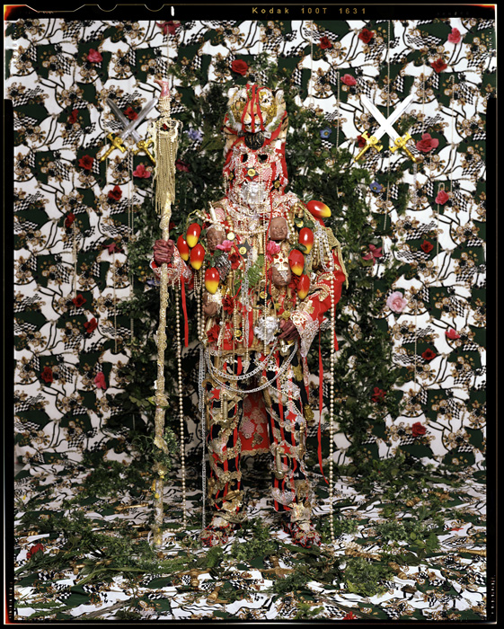
Hew Locke (1959 -)
Another artist mentioned in the feedback was Hew Locke. Locke is known as a sculptor rather than a photographer. He used both media to create his series ‘How do you want me?’, which portrays the many aspects of his Guyanan culture layered with the impact of history. Locke plays the central character in each photograph, although his features are almost entirely obscured by the props and elements he uses. An example can be seen below:
‘Tyger Tyger’ from the series ‘How do you want me?'{2007), by Hew Locke[4]
In ‘Tyger Tyger’, Locke presents himself in a solider stance, brandishing a decorative staff. His appearance is almost regal with what looks like a traditional head dress and lots of jewel-like decorations. The photograph is very busy with lots of props and potential contextual elements. When we look closer at the figure, it becomes clear that Locke is wearing a British Red Coat uniform that is synonymous with the colonial military that featured in many African conflicts in the 19th Century. The uniform is adorned with symbols of wealth such as pearls and ornate chains as well as contrasting symbols of African culture (exotic fruits and what looks like tribal heads). The whole scene is a mashup of cultures and eras that come together in what Locke calls “messed-up beauty”. When we first look at this image, it’s unclear as to whether this is a person or a statue. It’s only when we look more closely that the parts of Locke’s body that are not covered can be seen. Locke’s hands tie in with the rest of the composition through his skin colour, but the eyes are present but somehow missing. What we see is a pair of empty peep-holes that Locke is looking out through. It’s a very unsettling visual effect as we can relate to the weight of culture and cultural clashes in the piece, but we cannot see how Locke is reacting to it. Is he suffering under the physical and symbolic weight of the props and costume or is he revelling it it? What I see when I look at this image and others in the series is something closer to absentia than self portraiture. Locke uses himself as a canvass as I did, but his presence appears little more than a mannequin. With the similar discomfort, there is a great deal to look at with the series. Locke’s canvass works in a similar way to the others, but the sense of him is implied through his ancestry as opposed to the more obvious presence in the work of the other artists.
W M Hunt – The Unseen Eye
The final artist mentioned in the feedback discussion isn’t actually a photographer, but more a curator. W M Hunt has published a number of books of curated photographs on themes and the one that was raised was The Unseen Eye. This book is a large collection of photographs where the subjects either have their eyes obscured in some way or are deliberately not making eye contact with the viewer. The images are further examples of how unsettling it is when the face is modified in some way. The act of covering or averting the eyes makes us feel uncomfortable because it deprives us of our primary source of communication and our ability to read emotions. An example of one of the photographs from the book is seen below.
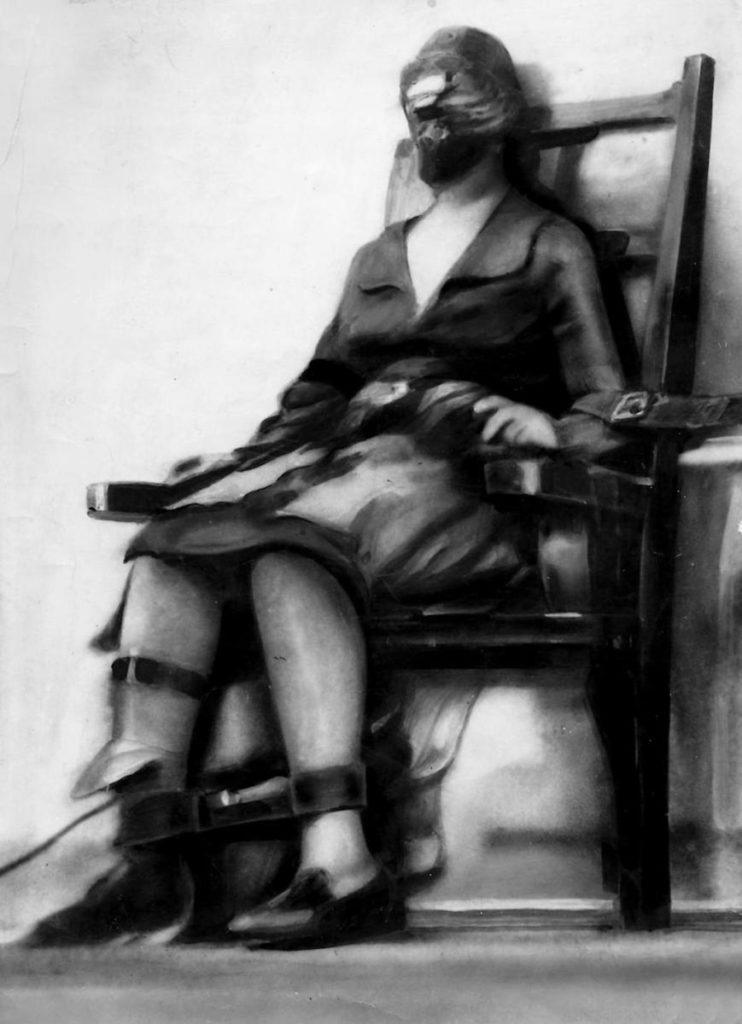
Execution of Ruth Snyder (1928) by Tom Howard; The Unseen Eye, W M Hunt [5}
This image of murderer Ruth Snyder being executed in the electric chair is in itself disturbing. Howard smuggled a tiny plate camera into the prison strapped to his ankle. He shot this image at the point Snyder was electrocuted and the result courted controversy across America regarding the cruel and unusual nature of the electric chair. However, it is included in the collection by Hunt because of the disturbing way that Snyder’s face is covered by the mask. She has no facial identity in this photograph, just the effect of the electricity on her body being observed by a slow shuttered camera. I find the ghoulish nature of this image interesting as a piece of the history of capital punishment in the USA. However, I have to force myself to look at Snyder’s face area because of the way the mask dehumanises her. Deserved or not, Snyder is experiencing her final moments and is pretty much invisible during that time. Looking at the image for a period of time conjures sadness as well as disgust.
Conclusion
In conclusion, the approach that I took with the use of my face as a canvass for my words was a sound one. Projecting the words onto my bare skin and using colour to reflect and evoke mood was thought to be a strong narrative. However, in looking at these three artists I realise how my series could have been made even more impactful through making it more personal. What I mean by that is the actual contact with or act of modifying me. Huan used ink in a similar way to Morrissey, but told a story of the passage of time with the ink coverage increasing to the point where he was almost lost in the image. The work of Locke also used the canvass approach but to much greater effect, almost asking us to question whether the subject was a real person or just a representation of a culture with all of its riches and threats. In the collection by Hunt, the subjects are almost dehumanised by their lack of engagement with the viewer or obscuration of their faces. Dehumanising is almost the way that all three work, but at the same time they are putting themselves in the picture, which is of course the topic of Part 3 of Context and Narrative. I found this research and reflection to be enlightening. My tutor asked me if I would feature in my work in such a personal way in the future. Despite not being comfortable in front of the camera, I can see from these three artists, in addition to the others in Part 3, that there is much more scope for experimenting with self-portraiture to tell a story.
Drawing upon examples in Part Three and your own research, you can approach your self-portraits however you see fit. You may choose to explore your identity or masquerade as someone else, or use empty locations or objects to speak of your experiences. However you choose to approach it, use yourself – directly or indirectly – as subject matter.
Keep a diary for a set time (at least two weeks). Each day write two or three pages about yourself – what you’ve been doing/thinking. This can be as specific or poetic as you wish. You may wish to pick a theme for the duration. This is an open brief designed to give you freedom to create something personal which suits you best. Use the artists you’ve looked at in Part Three for inspiration. Select the most interesting parts of the diary (which could be the most banal or mundane) and interpret them into a photographic project. A good way to approach selection could be to ask a friend/fellow student/stranger to read it and send back a highlighted version. You could then base your project on those parts. This would take the pressure off you to find a ‘good story’.
You may choose to select a few days or phrases that stark an idea for you, or you may wish to exaggerate how you were feeling one day into a parody of yourself or the circumstance. You may wish to create a ‘document’ of that time in a re-creation of events – or direct a model to act out some of the content of the diary, making your own ‘film-stills’.
You could present your chosen diary entries as a visual diary or use it as a springboard for further exploration. You may choose to insert the pictures like snapshots into your diary and hand it all in together. You don’t have to restrict yourself in the diary itself; you may decide to use it to take you into new territory.
Introduction
This assignment began with my diary [1] and an initial idea that took its inspiration from Larson and Hindelmann. The idea was to use my diary text to choose a location using the What Three Words navigation software. The tool uses a combination of three words as coordinates and is used as a simpler way of navigating than GPS. I would then visit the locations in a similar way to the artists in their Geolocations project and photograph myself as a positional marker in the scene. I would also follow a similar approach in choosing a composition that related to the diary text. This idea picked up on advice from the feedback in my previous assignment about having a structure to my planning and looked promising until I ran into difficulties with the technology that prevented my using What Three Words in this way. After reflecting on what I wanted to achieve with the work, I realised that I could explore the differences between my expression through the words in diary and the cold, impassive way that technology processes this kind of information. I would contrast the two interpretations and invite the viewer to draw their own conclusions by creating a linear series of photographs containing contextual references to the themes in the text. The evolution of these thoughts are captured in the blog post ‘Preparing for Assignment 3′[2].
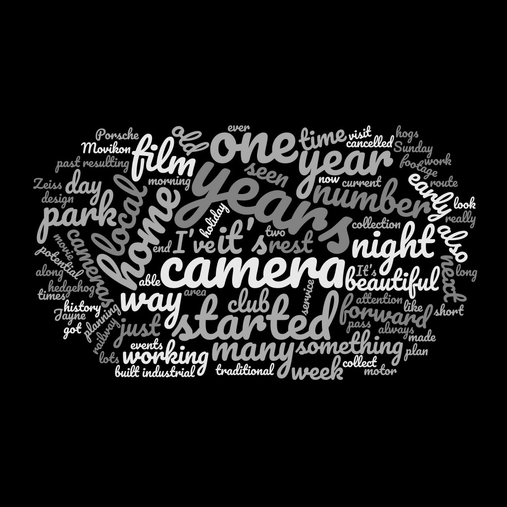
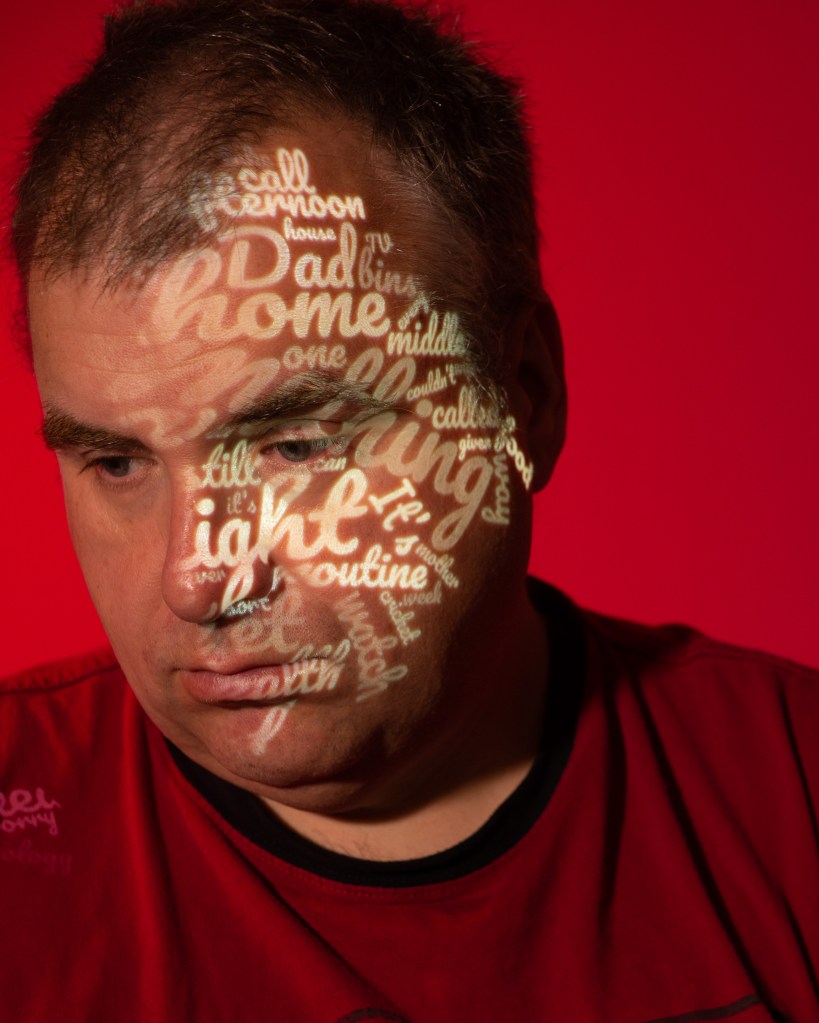
Summary of the Idea
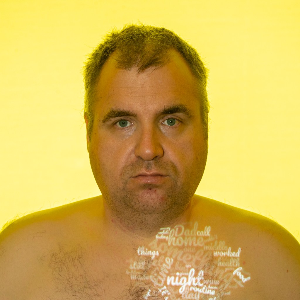
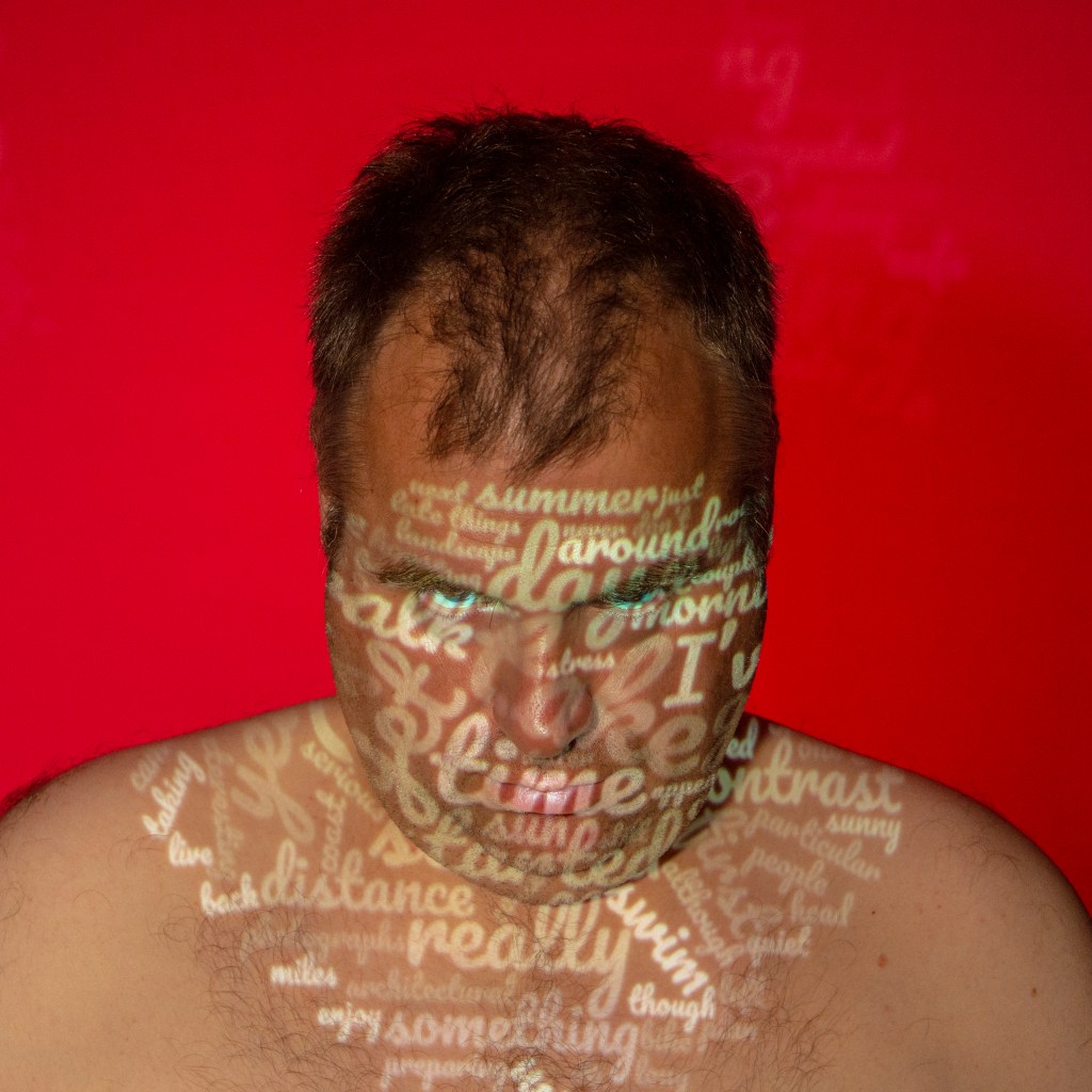
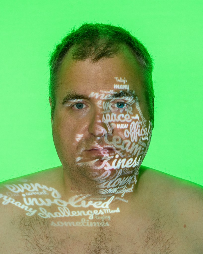
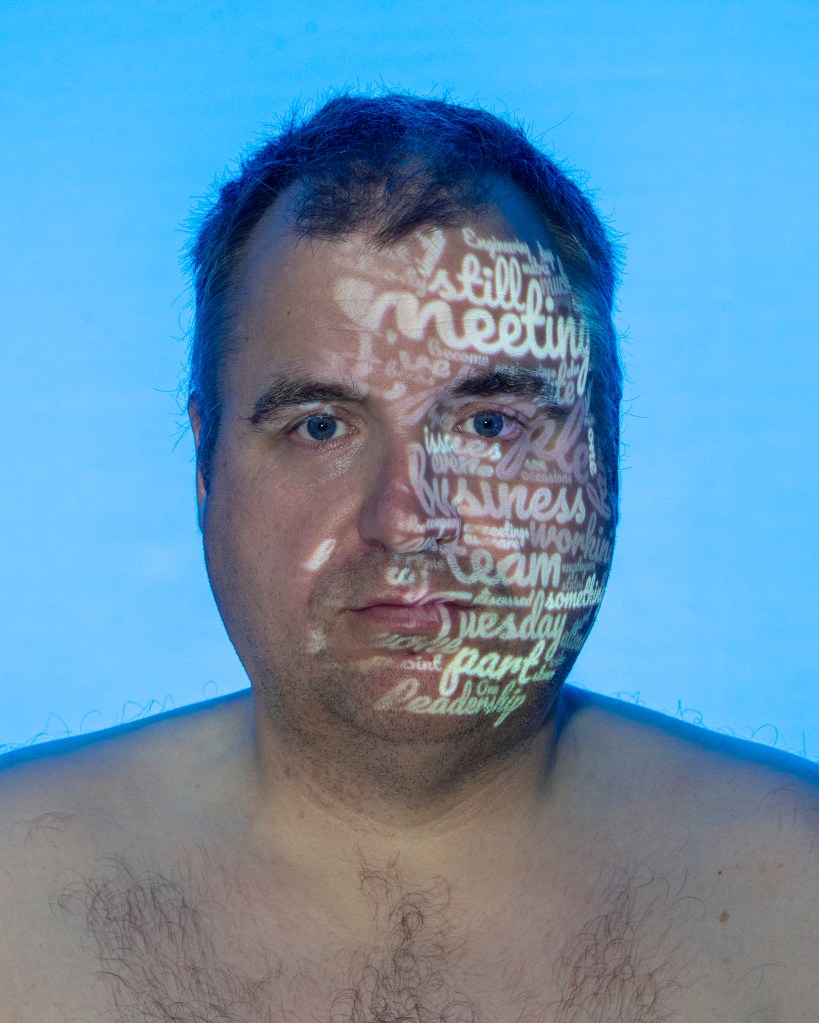
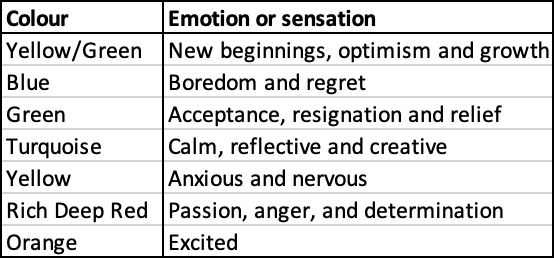
My idea was to take the text from each day of the diary and run them through a software tool to count the most frequently used words produce a word cloud of the most used words. The words are subsequently sized by their frequency, with the higher counts being the larger font size. This crude analysis of the diary produced an impassive assessment of my writing, which often contrasted with the original intent. I wanted to highlight these differences by projecting the words onto my expressionless face. I would further add to the contrast by lighting the background of the portraits with colours that represent or invoke emotional responses both in me and in the viewer. It would be up to the viewer as to how they interpreted the image in terms of narrative. Arranging a week’s worth of portraits would present the linear passing of time through the series. During the preparation work, I had decided to stop developing the idea so that I could shoot it. However, during further reflection I realised that the viewer would actually have to read the whole diary in order to appreciate the series. I felt that this would significantly lessen the impact of the images, so decided to include short paragraphs of the respective days alongside them. Each image would now be captioned, which I felt would make the series stronger.
Technical Approach
I set up a small studio with a plain grey background and a studio strobe fitted with different coloured gels. The camera, key light (the projector) and fill light (continuous LED) were positioned on stands and the camera on a tripod. I enlisted my wife to set the final position of the words onto my skin and operate the camera. Each portrait was then further post-processed and had the text added to it.
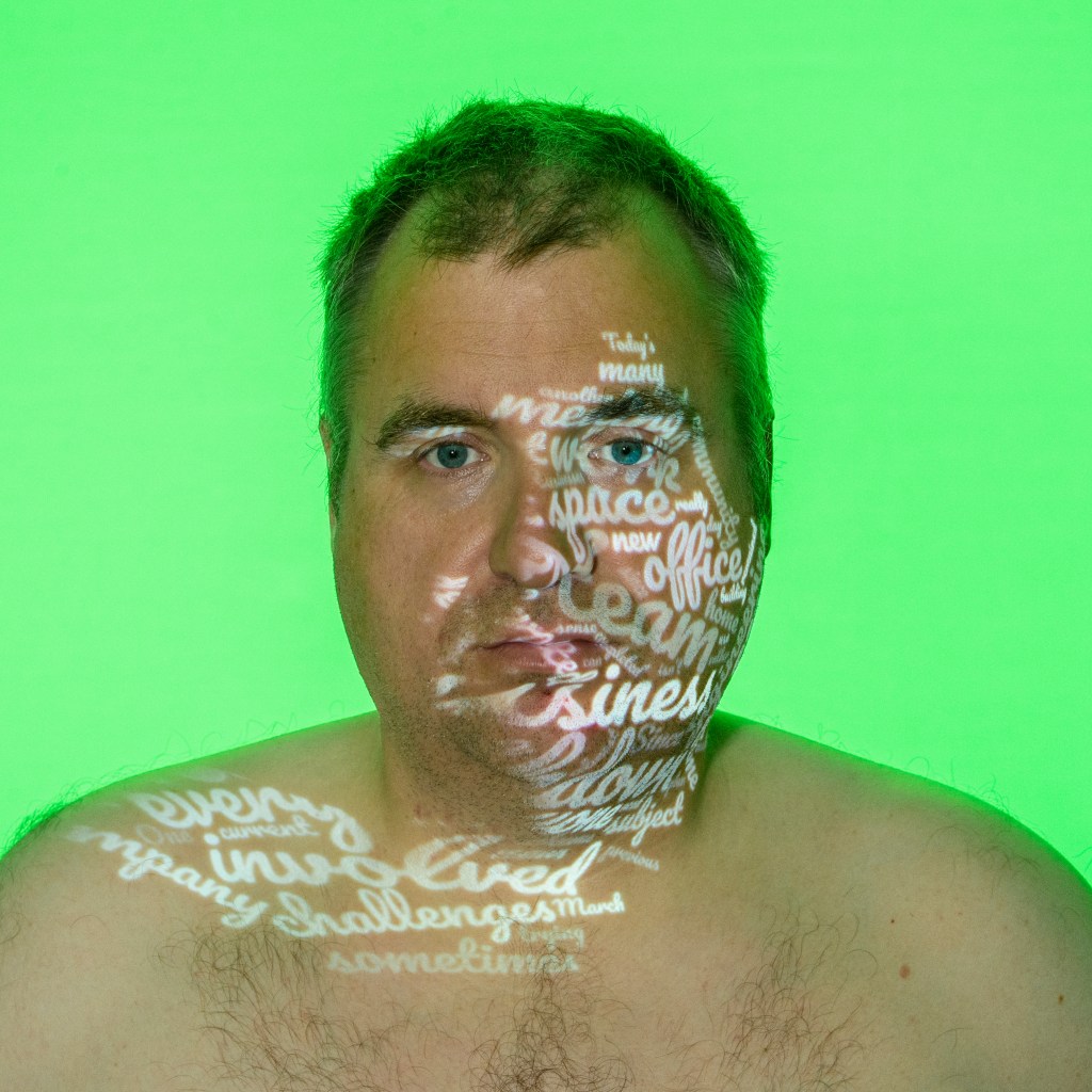
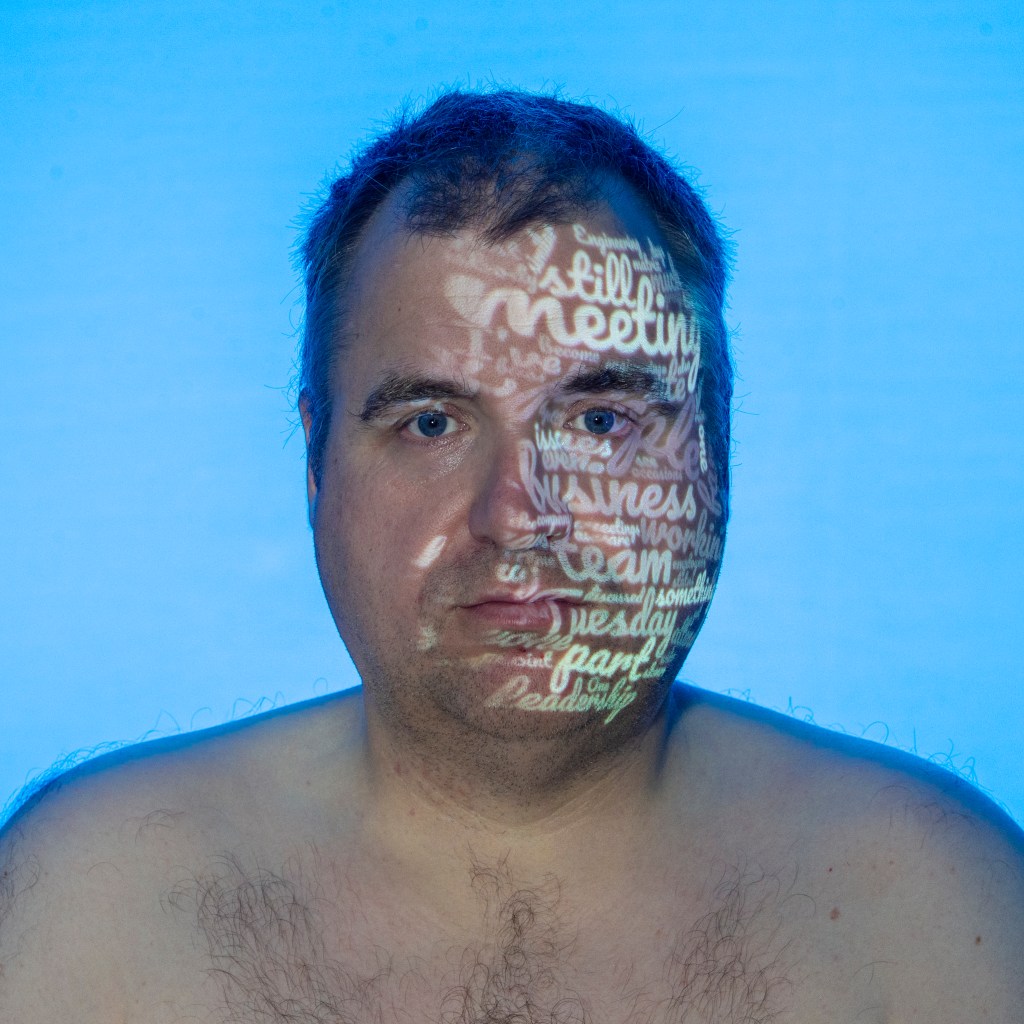
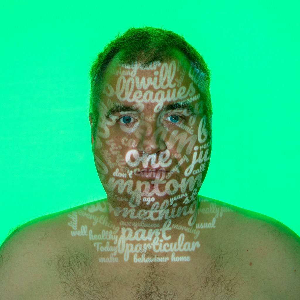
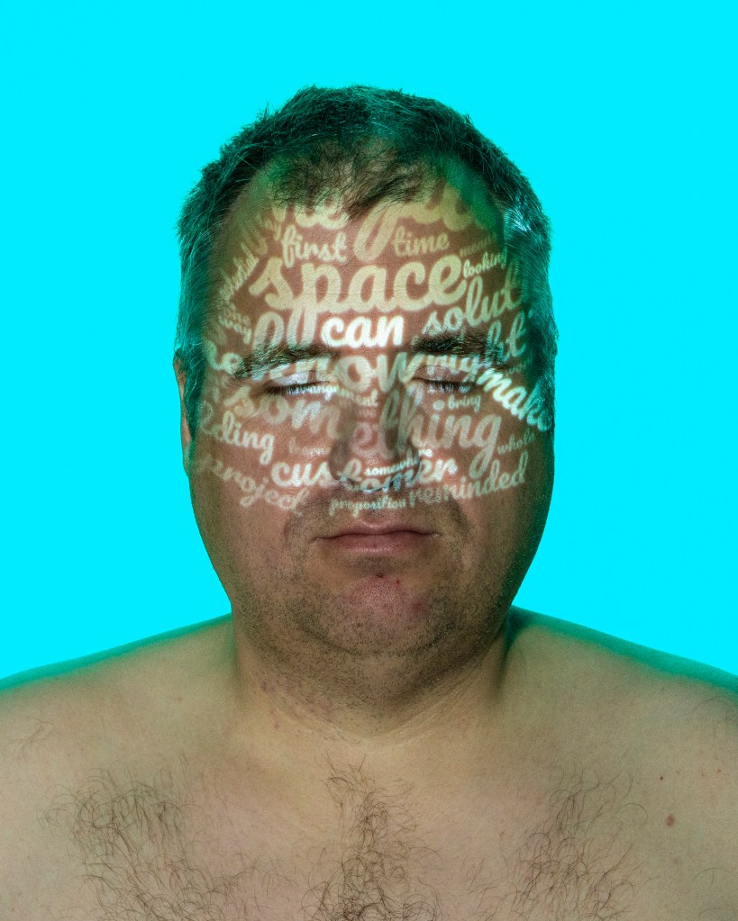
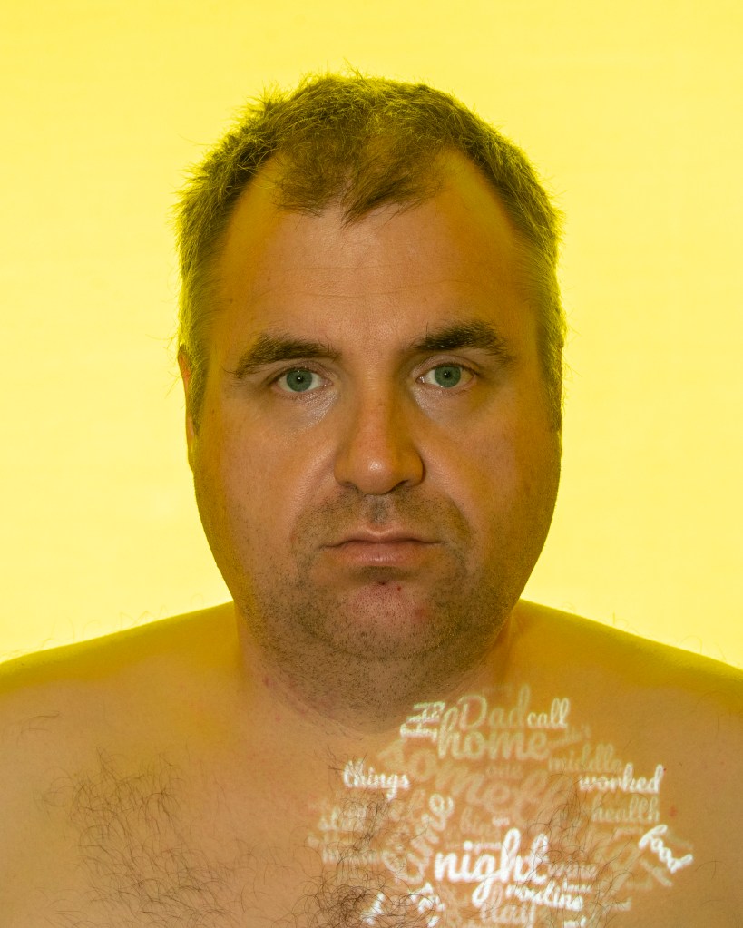
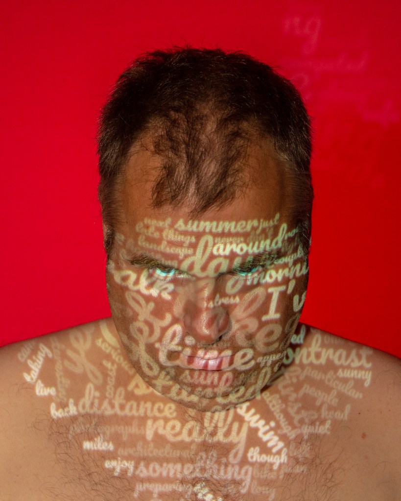
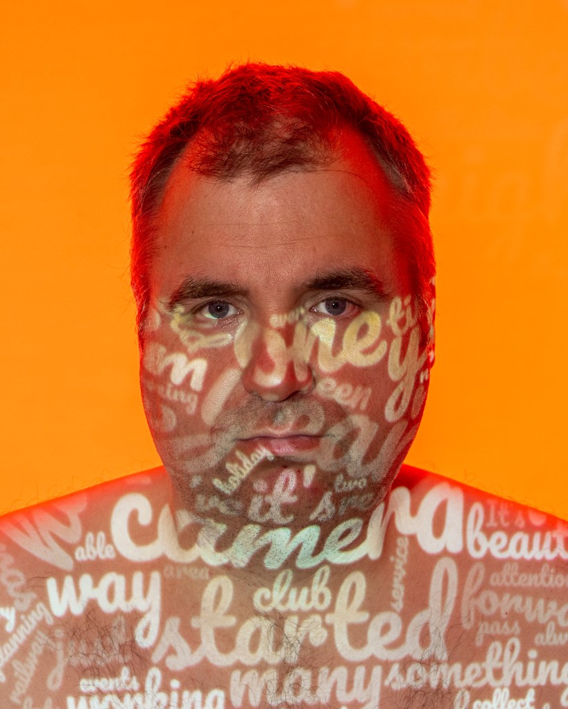
The Series: Mark My Words
Monday “Where there are questions or challenges from the team about what they are being told, I endeavour to resolve them if I can. It’s not always possible though,as the engineering leadership team isn’t currently involved in some of the higher-level discussions or decisions. At the point that we are, some of the information that is being briefed will be easier to explain. For now, though there is a sense of ‘no news is good news’ – a bizarre expression that suggests that ignorance of something happening is better than knowing”Tuesday “The meeting itself for me is only about 50% effective in discussing the important topics, so I find myself questioning the point of it. As Tuesday progresses, the topics become more interesting as more people are involved in their debate. Perhaps my reticence about the first meeting is more about it feeling like a morning prayers session than a constructive meeting”Wednesday “As we were all working from home, there was little to no risk of it causing an issue in the business, but it was still a theme that people would tell us about their symptoms on the morning call. On this particular morning, I realised how that doesnt happen at all now. Isolation was indeed a good way of reducing the risk to our health, it would seem. Today, everyone was in good form”Thursday “The need to de-personalise the workspaces is something that we aren’t undertaking lightly, but it won’t be seen that way by the people who work for us. I have a team member with four computer screens who is going to go mad when I tell her she can have only one. If I think about my own sense of home, I’m reminded of the time when home was the last place I wanted to be. I was being driven slowly mad by noise from our upstairs neighbour, which became the trigger for a series of serious depressive episodes that eventually landed me in hospital. I had no axe to grind with our neighbours and they could never have fully understood the damage they were doing to me”Friday “On this occasion one of her neighbours who has been looking out for her during lockdown, called to say she couldn’t get hold of her. While the neighbours have been great, this one is a bit of a busybody. She had become accustomed to watching Hazel’s routine of putting her recycling bins back in the garage after they had been emptied in the morning. On this day, the bins were still out in the afternoon. The neighbour had tried the house but got no answer, called her mobile and got her voicemail and, after some time called Jayne”Saturday “I’ve always felt proud of my own distance swimming achievements, though. My first distance swim was 2 miles open water, which is a massive challenge in its own right. Even though COVID has put paid to my training this year, I am determined to swim the 11 mile length of Lake Windermere before I am 50 in just under 2 and a half years’ time”Sunday “One the way home, we started planning our next holiday. We have had two cancelled this year so far, with a number of triathlon events that would include long weekends also being called off. With the rest of the year provisionally planned, we turned our attention to 2021 and 2022. Towards the end of this year, we have hired a camper van as a trial with a view to buying early next year. It’s something we are both very excited about because it give us a little more freedom to take off for short breaks whenever we like”
Reflection
This assignment was a labour of love. The process of developing an idea and trying to learn from my previous work was an interesting experience. One of the driving forces in this evolution was the need to not overthink what I was trying to do. Past experience has led to me shooting what comes naturally or is the most comfortable. I believe this to be the main reason for choosing to be in the photographs in the way normally associated with self-portaiture as opposed to one of the alternative interpretations. Although I was hugely inspired by Morrissey, I set out to create something different. The idea of projection as both communication and visualisation came to me when I was thinking about becoming a canvass. I was immediately drawn to the way that light bends around a curved surface, so with my face and body as the canvass this would be emphasised in the images. I’m happy with the way that the pictures are not of me, but are a carriage for my words. In essence, the diary and the computer’s highlighting of my impactful words is what is about me. The mood colours were essentially chosen by my wife, based on both my words and how she knows I feel about certain events or memories. This series has therefore become a very personal narrative about me with internal and external context leading through it. I still don’t like being in photographs, but here I believe I’ve succeeded in being both present and absent at the same time. I deliberately tested this assertion in the series itself as two of the photographs have slightly different poses to the others. When I was editing the series, the shot for Saturday was the one that naturally stood out when looking at them all on the same screen. However, the more subtle ‘eyes closed’ shot for Thursday went almost unnoticed. I found myself reading the words and taking in the bright colour of each frame, which was my original intent.
In preparing the text for the captions, I naturally re-read the diary carefully. It was interesting to see what my wife saw when she read it. The two weeks that I worked on it were a rollercoaster of emotions, actions and reactions that I could see more clearly in the context of the photographs I had been shooting. Monday to Thursday told a story of a man who was in control of his daily working life. Themes of acceptance, opportunity, boredom and frustration were evident, not surprising given the COVID-19 situation. The rest of the week centred around my creative time, my passion for photography and study, as well as planning ahead for more adventurous days. When I think about it, that is exactly what life is like for me at present.
Against the Assessment Criteria
Demonstration of Technical and Visual Skills
This assignment used multiple lighting sources in a challenging mini-studio setup. The light level of the project could not be adjusted, so using it as the key light presented exposure challenges. The main issue was that the background light could not be reduced in power any further, so selecting an exposure that flattered my skin was extremely difficult. However, I wanted to create the sense of emotion ‘aura’ by using real lighting instead of adding a background in post-processing (as Moffatt did in Scorpio) so I was happy with the result. Visually, I think the images all have very similar composition with the exception of the ‘Saturday’, which was shot near the end of the day. I liked the way that the slightly cynical expression echoed my experience of the diary and the duration of the shoot, so I left it in the series to add something different. When I look at the sequence together, I’m reminded of the pop art style adopted by Warhol and his peers, which was an unexpected visual but one I actually like.
Quality of Outcome
I set out to show my words as seen by me and by a machine set against the context of what I was experiencing emotionally in the diary. I believe that the series achieves this through as series of subtle layers to each image. Visual tension is maintained by the words on their contoured canvass. The connections to the diary are strong through use of a single paragraph and the contrast between the human and machine interpretation stands out. All of these elements distract from my being in the picture and to an extent I achieve anonymity in each composition.
Demonstration of Creativity
This assignment was the first time that I’ve rejected the notion of creating a work that a viewer may like. Instead of wondering “will my tutor like this?” or “will anyone understand what I mean?”, I simply created what I wanted. I drew heavily on influences from Part 3, but the end result is not in any way a facsimile. Each picture is different from the previous, so there is no sense of repetition or lack of originality between them. I also pushed myself further out of my comfort zone in the use of my face and body as the canvass. My initial thinking once I had the concept of projection onto my skin was to use my body more than my face. I liked the idea of curvature distorting the words, but ultimately rejected the idea because it could be the body of anyone rather than obviously mine. This was a creative decision based on how to give the photographs impact, something that I have learned throughout Context and Narrative.
Context
In the context of my learning on the course so far, this assignment takes influences from the photographers studied and results in something that I believe meets the brief. The scope of the assignment brief was very open, stating that we had freedom to experiment with our interpretation of it. My interpretation is very different from any other coursework completed so far; to that extent I am very happy with the outcome.
Special thanks to my very patient wife Jayne, who helped set up and was ultimately responsible for the shooting.
Post-Feedback Changes to Assignment 3
During the feedback session with my tutor, a number of ideas were proposed to enhance both my submission and my appreciation of similar work within the genre of self portraiture. In addressing the feedback, I conducted the recommended further research, described in the blog post Reflecting on Assignment 3 Feedback[3]. However, one of the suggestions related to my assignment photographs was to change the crop from square format to portrait. This would not only tie in with the idea of them being portraits but it would also emphasise the main subject by reducing the amount of background colour in the frames. I could immediately see the benefit of re-cropping so decided that my final submission should incorporate this change.
Revised Series
Monday “Where there are questions or challenges from the team about what they are being told, I endeavour to resolve them if I can. It’s not always possible though,as the engineering leadership team isn’t currently involved in some of the higher-level discussions or decisions. At the point that we are, some of the information that is being briefed will be easier to explain. For now, though there is a sense of ‘no news is good news’ – a bizarre expression that suggests that ignorance of something happening is better than knowing”Tuesday “The meeting itself for me is only about 50% effective in discussing the important topics, so I find myself questioning the point of it. As Tuesday progresses, the topics become more interesting as more people are involved in their debate. Perhaps my reticence about the first meeting is more about it feeling like a morning prayers session than a constructive meeting”Wednesday “As we were all working from home, there was little to no risk of it causing an issue in the business, but it was still a theme that people would tell us about their symptoms on the morning call. On this particular morning, I realised how that doesnt happen at all now. Isolation was indeed a good way of reducing the risk to our health, it would seem. Today, everyone was in good form”Thursday “The need to de-personalise the workspaces is something that we aren’t undertaking lightly, but it won’t be seen that way by the people who work for us. I have a team member with four computer screens who is going to go mad when I tell her she can have only one. If I think about my own sense of home, I’m reminded of the time when home was the last place I wanted to be. I was being driven slowly mad by noise from our upstairs neighbour, which became the trigger for a series of serious depressive episodes that eventually landed me in hospital. I had no axe to grind with our neighbours and they could never have fully understood the damage they were doing to me”Friday “On this occasion one of her neighbours who has been looking out for her during lockdown, called to say she couldn’t get hold of her. While the neighbours have been great, this one is a bit of a busybody. She had become accustomed to watching Hazel’s routine of putting her recycling bins back in the garage after they had been emptied in the morning. On this day, the bins were still out in the afternoon. The neighbour had tried the house but got no answer, called her mobile and got her voicemail and, after some time called Jayne”Saturday “I’ve always felt proud of my own distance swimming achievements, though. My first distance swim was 2 miles open water, which is a massive challenge in its own right. Even though COVID has put paid to my training this year, I am determined to swim the 11 mile length of Lake Windermere before I am 50 in just under 2 and a half years’ time”Sunday “One the way home, we started planning our next holiday. We have had two cancelled this year so far, with a number of triathlon events that would include long weekends also being called off. With the rest of the year provisionally planned, we turned our attention to 2021 and 2022. Towards the end of this year, we have hired a camper van as a trial with a view to buying early next year. It’s something we are both very excited about because it give us a little more freedom to take off for short breaks whenever we like”
Updated Conclusion
I believe that the re-crop makes the pictures more impactful. On reflection, the area of background colour was distracting from the main subject and although I liked the Warhol-esque feel that it created, I don’t think it has been diminished by making the area smaller. The revised crop also makes it easier to read some of the smaller words being projected. Overall, I’m happy with the revised set.
I have just received the feedback on Assignment 2 in a video call with my tutor. That was the first assignment in Context and Narrative that would count towards assessment at the end of the unit. I was hoping that I had met the brief, and indeed that was part of the summary, however the feedback that struck a chord was that I had made things harder than they need be by not having a methodology in the way I had approached the shoot. What that meant was that I had connected the text to the pictures, but I hadn’t had a strong common anchor between the images that would make searching for subjects more consistent. This is not to be confused with the theory of anchor and relay that Barthes postulated, but literally something that connects the photographs in some way. When I reflect on the work, I had been very stressed throughout shooting the photographs. I had formed an idea that I wanted to explore, mapped out in my logical brain which elements would represent trauma in the frame and set about taking the pictures. That was when the assignment became difficult and as I gradually found it harder and harder to find inspiring subjects, the more I tried to force creativity to come. I hadn’t set out with a common approach to the subjects in mind and had I done so, the creative part would have been more free-flowing. An example of an strong anchoring element would be Fox’s series “My Mother’s Cupboards and my Father’s words” [1] In this case, all of the pictures are not just of the same kind of subject, they are all of a particular subject that the artist was both familiar with and had ready access to. Her mother’s cupboards and their inherent tidiness was the anchor, the narrative forming around the contrast of order and the brutality of the words from her father. During the feedback call, my tutor suggested that if I’d travelled to the place where the traumas had taken place, that would have tied the images together more strongly. I had to agree with that sentiment.
Assignment 3
Usually I would not be thinking too much about the next assignment when working through the research and coursework that leads to it. However, the course notes steer us towards Assignment 3 with the writing of a daily diary [2]. I’ve been writing mine for about a week a the time of this post and it’s already been an interesting experience in terms of what happens to me during the course of a working day and the thoughts and feelings that are invoked. What we need to do for Assignment 3 is to include ourselves in the narrative in some way. The diary is supposed to stimulate ideas or be a part of the series in some way which builds on the storytelling we’ve been doing thus far.
I was reflecting on the feedback and discussing with my wife on our daily walk this afternoon. She could understand the points about anchoring the images together by having a structured approach to the shoot and we started talking about ideas for how to include me in the narrative without it being too prescriptive. This is still always a concern for me, which I believe stops me from completely letting go of my imagination. What my tutor meant by structure was more about having something that made the creation of the work consistent. She highlighted the series Geolocations by Nate Larson and Marni Shindelman, which I refer to in my assignment diary [3]. This was a series that took tweets from Twitter and used the publicly available geolocation data to find where precise location they were posted from. The photographers then visited the locations with a large format film camera and shot a photograph that was then paired with the words from the tweets. The creativity of the idea of shooting something that tells as story of the words and what may have been happening for the author, by using a visual from where it was written is obviously very powerful. Modern technology has allowed our precise position on Earth to be mapped to within a few metres and the idea of the trace of a story from the space we once occupied is fascinating. An example of the work can be seen below:
From the series Geolocations by Larson and Hindelman, 2007 [3]
Here we have a beautifully composed and lit photograph from the location where the emotional tweet was written. The tweeter is asking if they have made the right decision, which could mean anything but suggests a major decision made with relation to another person. Could it be that the tweeter has left a partner to be with the undisclosed person? Could it be an innocuous as someone making a purchase from that person? The accompanying image shows a lone car parked outside a motel, which could almost be from a David Lynch film. This visual tends to support the life-changing decision narrative and when coupled with the words, has great impact. When considering the concept of the series, I naturally identified with how clever it is to use the modern technology in conjunction with the uniquely personal written word. It’s also a strong narrative that tells both the story of the unfortunate tweets as well as revealing just how private our lives really are. The debate about sharing our innermost feelings on social media is one that has been raging since its inception, but here we have an almost voyeuristic element where anyone can find where we have been and place themselves in what they believe to be our story. What interested me was the structure or plan that was being followed. The photographers clearly selected the tweets that had the biggest impact on them and then methodically visited the scene. What they shot was going to be the creative element, but the ‘mechanical’ act of visiting the scenes removed the ambiguity of “How am I going to represent the words?” This was something I really struggled with in Assignment 2. I had the random thoughts as spoken by friends and the idea of representing the traumas through industrial and empty spaces, but spent a huge amount of time trying to find compositions that fit. This forced location-hunting and subsequent ‘creativity’ was exhausting. What I needed to do in Assignment 3 was to have a plan – form an idea and then focus on a workflow for the shoot. This would leave me with more capacity for creating the imagery that supported my idea.
The Diary
The idea of keeping the diary [2] was something that appealed to me from the start of Part 3. A simple document of my working days and free time was unlikely as most of the things that happen to me in my life prompt memories and reflections on things that have happened. I would describe myself as a reflective person in general and while I don’t live in the past, I am hugely appreciative of the things I have learned from my experiences. My plan was just to write what came to me that day and with this in mind, achieving the large number of pages set out in the course notes was never a concern. My plan from the start was to share the diary with my wife as she has known me better than almost anyone in my life so far. I would ask her to read the diary and just take on board her reaction to it. My thoughts were around a series that would describe how I felt during the two weeks rather than reporting what I had for breakfast.
Initial Idea
My first thought was around something similar to what Larson and Hindelman, using location technology to link to themes in my diary. I considered the fairly new application called What Three Words, which uses seemingly random words as a simple map reference for any 3x3m space in the world. A map from this software can be seen below:
‘Type.Heat.Sketch’ – the ‘What Three Words’ location for St Paul’s Cathedral in London
By choosing and searching on key words that support the themes of my diary entries, I planned to search locations and visit them. The photographs would be portraits of me standing in the precise location of my words, almost as a waypoint or position marker. I was interested in what I could create with the compositions and how they might link with my thoughts and feelings in the diary. My presence would be a reflection on my place in the world and that place would be something I had expressed with my writings. The idea was a good start, but I quickly ran into difficulties with the technology. What Three Words is a global system, so the grid of spaces it describes spans the whole globe in by using geolocation in the same way as twitter. I knew early on that if I chose the wrong words, I could be looking at a location on the other side of the world, which would be an obvious problem. My preparation for that would be using a thesaurus to come up with many different connotations that may yield more local targets. The main issue though, was the application doesn’t allow searching for locations through the individual words themselves. Currently, the only way it can be used is either by knowing the whole string of words, so Type.Heat.Sketch as in the above example or the landmark (St Paul’s) or the postal address. This was essentially a hurdle I could not overcome. However, it led to me thinking about what I wanted this assignment to say.
Back to the Drawing Board
Disappointing as the first idea was, I started to think about what I wanted my assignment to say. The subject was Self-Portraiture, so it needed to have a central theme about me, my perspective or my life experiences. I was still thinking about using location in some way but accepted that it my not fit my interpretation of the brief. I used a mind map to try to articulate my thoughts on the brief at this point.
Mind Map of Self Portraiture (as I saw it at this point).
At this point, I was still thinking of self portraiture in the traditional sense. A picture of me in some contextual setting with some narrative that could be drawn from it. The subsequent work in Part 3 introduced me to the works of Morrissey who placed herself in the lives of others[4] or used herself as a simple blank canvass [5] in a way that is clearly self portraiture. Then, with the addition of Calle, Kapajeva and Shafran, the concept of self portraiture as something that the artist has to be physically present in was challenged. With Moffat, the artist became an actor in the work with the connections between her sense of self and her subjects being imitation [6]. When I revisited the mind map, I could add ‘absentia’ and ‘mirror’ to the ideas of portraiture of myself. The work that really inspired me from those artists was that of Calle and Morrissey. Calle’s act of getting a group of people to articulate how she might be feeling about being dumped was almost creating the art automatically. The 107 women told Calle’s story from their own perspectives but in a way that anyone could relate to. She introduced humour in the destruction of the words which creates the narrative of taking away her ex partner’s power. Morrissey worked with her young daughter to produce a series about the way that children express themselves as they develop. Her role in the series was as a blank canvas for her daughter to paint on which also created a narrative about parents and children and their natural bond. The other artist that had inspired me from the start of this course was Anna Fox. In her work Cockroach Diary [7], Fox tells the story of her battle with her landlord over an infestation of cockroaches. She blends images of her handwritten diary that details her encounters with factual images of the insects either crawling around her flat or recently killed by the artist. What is a documentary struggle to persuade her landlord that there really is a problem they should be looking at, is also a commentary of life is like when you don’t have a comfortable home environment. Fox was a struggling artist and mother when this series was created and it really made me feel like a lucky man.
Another idea
My second idea for the assignment took cues from Calle, Morrissey and Moffat. I’ve always been told that I write well, which is partly down to the many reports and documents I’ve had to prepare in my career but also because of my passion for communicating with people. The written word is not necessarily the easiest medium for this as it is open to interpretation. Care needs to be taken to get the message across while accounting for how the audience may react which is a challenge that I always relish when I’m writing. During the writing of the diary, I enjoyed setting the scene for what I was trying to say and found myself drifting into my memories with ease. This is something I wanted to get across in the assignment in order to represent my personality. Like Calle, I wanted an alternative view of the text but instead of using other people I opted for technology to do the legwork for me.
In my line of work, there are always ways of collating messages from multiple sources e.g a survey or poll so that people can easily grasp the consensus. One of the techniques that emerged a number of years ago was the creation of a word map or cloud. They would be a collation of the most used words in a body of text or description or even a narrative that are represented visually. The most used words would be the largest font size, while the less frequent ones relegated to a smaller, less distracting size. The theory with this technique was that the importance was related to the number of times the word occurred. In the case of a survey, this is true as it’s usually a collection of many views – the more it occurs, the greater the consensus. An example of this can be seen below:
Example of a word map\
What is interesting about these maps is that they are specifically designed to draw our attention to a few key messages. I started thinking about how I write and the connections I make between subjects. This crude algorithmic representation could be used to represent my thoughts without actually forming sentences in the traditional structure. More importantly, running the diary entries through a word map generator would provide the structure that I was missing in my previous assignment. I did a quick search online for software that would create a word map from my diary and found one that would work well for this idea.
In terms of photographing to support the words, I was immediately drawn to Trish Morrissey’s work The Failed Realist [5] where she used her face as a blank canvass for her daughter to paint on. The consistent theme was her blank expression on the artist’s face and each composition being the same. The distinguishing features were the painting with their childlike interpretation and the image titles that tell us what each is supposed to be. I was really inspired by the self-portraiture being a canvass serving no other obvious purpose than to showcase something else. In reality, Morrissey’s part in the series is another layer of context pointing to her relationship with the other artist and, perhaps the visualisation of the child’s creativity through adult eyes. For my assignment I would use my physical self as a canvass for my diary by projecting the word maps onto my skin. I could create the context by choosing which part of my body to project on, depending on the words in the map. I was also inspired by Moffat’s use of photoshop to create an almost unreal visualisation of her as her subjects and decided to light the background in a way to both make as statement of my mood and make each image stand out on its own.
Initial Conclusions
At this point, I felt that I had achieved a number of milestones with this idea for the assignment. I had taken on board the feedback about having a structure to the approach in my work. I had taken inspiration from a variety of photographers studied in this section of the course and combined elements in my idea. I would be experimenting with the compositions so that they enhance the words.
Technical Approach
I started by finding a Word Map generator program that could analyse my diary. I chose an online tool called wordclouds.com which allows the user to upload large bodies of text, change the shape of the resulting map as well as colours and fonts. The most important feature was the ability to remove words from the map using the word count list. I decided that I wanted the most-used words to stand out in the word map, so I chose to delete all of those that appeared only once in the text.
The first step was to upload the text for each day of the diary and save local copies of the word maps for processing. I then removed the single-event words and experimented with the shape of the map. Different shapes meant that the words would be arranged differently when projected. I didn’t want the maps to be too contrived, so largely stuck to simple square and diamond patterns which resulted in aesthetically pleasing maps. Each processed map was saved as an image file.
The projector that I was using was connected to my computer and some tests were carried out on my skin. The first thing I noticed was that there was enough contrast to make the words stand out. The projection bent around the contours of my face and body, which was the effect I was after. However, I realised early on that the colours of the words were too much of a distraction and were actually only related to the word count. Since the size of the text was also related to word count I decided that I could remove the colour and still keep the look I was after. To achieve the final look, I converted the maps to black and white. An example of the word maps can be seen below:
Example of word map
At this point, I started thinking again of what I wanted to say with this series. I wanted to highlight the differences between the emotions and memories that I’d expressed in the diary and the impassive interpretation of a computer algorithm. The words created in the maps were the ones most commonly used in my writing, but their meaning collectively differed from the original text to such an extent that multiple narratives were possible when viewing them. I needed a way to bring that into the photographs, so I asked my wife to work through the diary again paying attention to the sense of emotion in each entry.
The conclusion from reviewing the diary entries was that the core themes in the two weeks of the diary could be grouped into emotional themes. Rather than a simplistic model of happy, sad, angry etc., the themes that Jayne recognised in the text were more about sensation or perception relating to the events being described. In this case, boredom and excitement were just as tangible as the traditional category of mood. These themes could be grouped across the 14 days of the diary into 7 clear ’emotions’ There is significant research into how emotions are both represented and invoked by our perception of colour. As our primary sense, the sight of colour can induce a mood that we subsequently associate with that colour subconsiously. For this series, I wanted to both represent my emotional responses by using colour but also to suggest to the viewer how they might feel about the image through its use.
Researching colours and emotions revealed both theory and empirical data that was promising for my group of emotional responses. I first looked at how colour is used in advertising to make the target audience feel a certain way. In an interesting article on the psychology of colour [8], the author suggests that our associations with colour can cover a variety of emotional reactions the follow a common relatable theme and that the reactions depend on the other contextual aspects of a situation or subject. For example, red is associated with anything that invokes passion but an image of glossy red lipstick invokes erotic or romantic feelings where a fire engine creates a sense of danger or hazard. The response to get the pulse racing is the same, but the stimulus is different depending on the situation. When used in a photograph, how the viewer responds will be dependent on what else is going on in the frame. The second research source was a survey of how men and women of different cultures react to colours when they see them [9]. The survey asked people to choose the emotion that best matched their reaction to a colour from a multiple choice list. The data was then collated to show the emotions that best correlate with colour. From the two papers, the following list of colours and emotions was created.
Grouped emotional responses with their associated colours
At this point, I shot another test, this time with a colour in the background created by a strobe and red gel.
Second Test – Using a red gel combined with the monochrome text projected onto my face.
The final stage was to experiment with composition. I was originally inspired in this idea by Trish Morrissey’s The Failed Realist, which revolved around just one composition where the artist looks straight into the camera. The frames were cropped to her head and shoulders and her expression is completely blank. There are no props, backgrounds or attention to her form such as hair and makeup – she literally uses her face as a blank canvass for her daughter. I wanted to something similar in order to focus the viewer on the words with only the background knowledge that they were mine. What makes each photograph interesting in that series is the different paintings and their titles. I needed to ensure that my images had that same variety to hold interest. As the diary was a linear progression of two weeks of my life and the colours mapped the emotions of each day, I decided that this was sufficient context to keep the series from looking like 7 versions of the same picture.
Conclusion
During this preparation phase, the idea had developed through my having a structured approach that would provide the baseline for creating the work – this was one key takeaway from the feedback after Assignment 2. I took inspiration from the photographers studied in Part 3 and my plan for this series should lead to a piece of work that highlights the contrast between expression seen through human eyes and those of a computer; the emotions being both a representation and invitation to the viewer to feel a certain way about the words. In conclusion, I feel that the series potentially has the multiple layers of context we’ve been working with throughout this unit as well as being uniquely personal to me in terms of creativity.
Go to the artist’s website and look at the other images in Shafran’s series.
You may have noticed that Washing-up is the only piece of work in Part Three created by a man. It is also the only one with no human figures in it, although family members are referred to in the captions.
In what ways might a photographer’s gender contribute to the creation and reading of an image?
What does the series achieve by not including people?
Do you regard them as interesting ‘still life’ compositions?
Critique
The brief draws attention to the work in Part 3 being almost entirely created by female artists, with Shafran being the exception. I hadn’t initially spotted that while working through the projects and exercises, so this was the first area I wanted to explore in answering the brief. My neutrality in appreciating the works naturally stems from my life experiences to date. Many of my strongest influences have come from the key women in my life and I believe that has shaped my perspective on how people share their opinions and emotions with others. It’s not to say that I haven’t had strong male role models of course, but I think the balance of both influences is responsible for the fact that I haven’t considered gender in my interpretation of the works in this unit.
With regard to how gender contributes to the work and its interpretation, I think the starting point for me is the artist’s experience within their environment. Men and women naturally have different experiences caused by their biology and so it’s not unreasonable to expect their expression of the emotions surrounding them to be different. For example, Brotherus’ story of unsuccessful IVF treatment is told from the painful perspective of being a woman unable to conceive. The women that I know who have been through that experience, all had huge doubts about themselves because of being unable to do what is the most natural thing in the world for their gender. Some felt like failures and shouldered the responsibility for any unsuccessful treatment cycles. Brotherus’ story is incredibly raw and moving, however her series also contains her references to her partner who is, for the want of a better expression ‘in the same boat’. His role in the work is relatively small compared to hers and the photographs say little about his experience. Would a series from his perspective be as powerful? Undoubtedly so, but perhaps it wouldn’t be as focused on the biological disfunction as hers. My male friends who’ve experienced IVF spoke of trying to remain supportive, calm and patient, despite sharing the anger and disappointment when it didn’t work. I believe a male perspective on the same event would have similar themes, but different narratives. In the case of Lee’s Projects, the artist explores the cultures and sub-cultures that were alien to her as a young Korean woman. The themes range from age to race, societal roles to sexuality and Lee places herself in this virtual world to experience and comment from within. In an interview [1], Lee said that she always includes other people in her work as she feels that she learns more about who she is through the eyes of the people around her. This self-perception is likely more about someone who emigrated to the US to complete her study (Lee moved to the US to study for her Masters degree), but there is also likely to be an element of gender, bias simply because she is of a generation where women were more empowered in their pursuit of career. While I cannot speak for all men, I personally don’t view myself through the eyes of other people, but do use their feedback to inform my opinions on my behaviour and the way that I interact with them. Perhaps then, I would have worked on Projects with more of a feeling of ‘outsider’ documenting human relationships, rather than their effect on my own self image. With Shafran’s Washing Up the subtle compositions have contextual elements that tell a story of daily life through the lens of what he and his partner have in common. When I look at the images, I see a very factual representation of domestic life and the cues such as paint brushes and brightly-coloured utensils don’t really have a gender bias. He creates as sense of ‘done’ about the subject (the washing up) as well as alluding to his and his partner’s presence or absence through the amount of crockery on the rack. I found the inclusion of the initials behind the taps to be an almost passive-aggressive statement because of the crudity of their construction, but they could have been created from the perspective of either of them. Where the other artists in Part 3 have told stories of events in their lives, Shafran tells a factual tale of the passage of daily life through a series of aesthetically appealing still life type shots.
With regard to Shafran omitting people from his compositions, I think that the overall effect is that of a broadly interpretable context. The pictures say something about the lives of the people involved, but tell very little about them personally. We cannot derive any information about age, looks or social standing, but these are traditional contextual elements for portraiture. Shafran isn’t interested in showing himself or his partner to the viewer, but instead tells a story of their lives through images of their environment. We are not distracted by wondering about the traditional contexts, but instead are looking at the evidence of their lives in a way that is relatable to everyone. We all have some type of kitchen domesticity to contend with. For me, the bottle of wine that appears next to the sink in a number of the pictures is a relatable feature of modern stressful living. The ever-present washing up gloves acting as separation from the task also tells me that there is an order to their world, without worrying about saying who wears them. Shafran’s work takes the concept of storytelling further than portraiture, making the statement that we are not just a physical presence to be captured, but our lives have an impact that can be just as interesting a document as a simple shot of the face.
When I look at Shafran’s Washing Up I do see a series that could easily be interpreted as a still life.
“Still life can be a celebration of material pleasures such as food and wine, or often a warning of the ephemerality of these pleasures and of the brevity of human life”
Tate Definition of Still Life [2]
Shafran’s images show everyday items in a recognisable scene that do indeed point the brevity of human life as above. The washing up Is either underway or finished which is a snapshot of time that may be repeated the following meal, but will be different each time. The lighting in the photographs emphasises the different textures and colours of the items in a way that traditional still life does, but their arrangement leads away from a simple appreciation of them with relation to each other. The other contrasting elements suggest more connection between the items and their surroundings; only after looking closely do we see that there might be a story about the owners being told here. As we move through the series, the items in the kitchen are either arranged differently or changed completely, which again suggests the images are not of the items but of their part in the daily routine of the owner’s life. To that end, still life isn’t really the right genre to assign to this work.
Conclusion
I find Shafran’s work interesting in it’s seemingly simple representation of the banal. The trace elements of his and his partner’s lives are very subtle, but Shafran bring them out of the background for the viewer to interpret how they wish to. In leaving himself and his family out of the photographs, there are no preconceptions about them only a suggestion of what they life might be like. I’m not convinced that Shafran’s gender is a contributing factor to the impact of his work as could potentially be said of the other artists in Part 3. Shafran talks of reacting to something he sees and wanting to communicate it in a simple way [3]. Perhaps the reaction is emotional or environmentally driven as with the other artists and that Shafran chooses to express himself through carefully using props instead of people. Whatever the reason, his work has a wonderful sense of the ordinary about it in the way that Anna Fox’s work did in Part 2.
References
[1] Unknown, 2013, “INNERView EP65 Who am I? The artist drawing attention in New York – Nikki S Lee, ARIRANG TV Youtube Channel, https://www.youtube.com/watch?v=YMychWgKedA
The concepts studied in Part 3 thus far have largely been what I’ve come to expect in the genre of portraiture. I could relate to the metaphorical story telling of Brotherus and the substitution work of Morrissey as their life and personality exist within the work either in their entirety or partially. However, this project introduces us to what at first glance appears to be a more tenuous form of portraiture, that of not being part of the image at all. Instead, the artist is represented by the inclusion of other people or in some cases, nobody at all. When considering this idea of self-absented portraiture, the immediate thought that it cannot be consider so if the artist is not in the picture, can be quickly dismissed when considering human imagination, interpretation and the creativity that it involves. People see things that remind them of life experiences, so it’s not difficult to connect other people that seem familiar to the artist or even simple environmental elements with a ‘sense of self’. In this project, we are introduced to two new artists and one that we looked at previously, all of whom have told their story or a expressed their life experiences through absented portraits.
Maria Kapejeva
Kapejeva’s Portrait of the Artist as a Young Woman takes it’s cues and inspiration from James Joyce’s similarly titled book Portrait of the Artist as a Young Man, which tells the story of the intellectual and religious awakening of a young man growing up in the Catholic faith in Ireland. Kapejeva grew up in Estonia in the 1970s and 80s where the culture dogmatically ordained that men and women would be considered equal in the workplace, but that women would be entirely responsible for domestic homemaking and raising the family. This latter imbalance meant that women could, but rarely did achieve successful careers, instead waiting around for a man to keep them well enough for focus on their domestic duties. Like Joyce’s lead character, Kapejava rebelled against the idea of her upbringing by using her photography to explore the alternatives to life as prescribed by her culture. These portraits are of women who Kapejeva relates to in her quest to break the stereotypes of women as she saw them. In each subject, she seeks to capture the strength of their intellects as well as their determination to flourish in their environment without conforming to expectation.
My two favourite images from the series are shown below.
Untitled, from the series ‘Portrait of the Artist as a Young Woman, by Maria Kapejeva 2012- [1]
Here we have a young woman dressed in modern clothing, holding a cat. Her fashion and makeup is bold an loud, yet she wears a scarf in what could suggest domesticity. Scarves like this were popular during the middle of the 20th Century with women who did domestic jobs that needed them to keep their hair tied up out of the way. In this image, though it both complements and contrasts the rest of her clothing which includes a fur coat. Fur coats used to symbolise status and standing in high society, again an older reference as with the scarf. I see the woman as being both successful and comfortable tacking everything that comes her way, even the drudgery of domestic life. For me, the most compelling element in the image is the cat. There is a common impression that some single people who have cats do so as a substitute to human company. The extension to that thought is that single women in particular are drawn to cats, which is as ridiculous as it is offensive. The woman in this picture cradles the cat with the defiant expression that suggests she needs nobody to make her life complete. As Kapajeva states in her description of the series, the women she encountered were realising their own potential rather than settling for a life of marriage and domesticity. This image embodies that thought perfectly for me.
Untitled, from the series ‘Portrait of the Artist as a Young Woman, by Maria Kapejeva 2012- [1]
In this photograph we have a young woman sitting at at table with the implication that she is completely nude under her jacket. The elements in this image include her sewing machine, anatomical statuette and a garment draped over what looks like an artist’s easel. They suggest that the woman is a fashion designer or seamstress sitting in her working environment, which is different from the previous photograph where the woman is sitting in a street scene. We also have a book titled ‘Seduction’ on the table that ties in with her nude figure. The model is posing in a seductive way, bearing one breast to the viewer wile the rest of her figure is covered up by her jacket. The only other item of clothing is her shoes which are a high heel design, also suggesting a seductive glamour. Finally, we have her expression which is one of a woman in complete control of her self image. Her gaze out of the photograph suggests that she has her own unique style and will play the part of ‘seducer’ on her own terms. When I look at this image, like the previous, I see a great strength and independent spirit coming through. It’s easy to see the connection with the artist in these individual images, but the messaging is much clearer when seen in the rest of the series. Kapajeva left Estonia to explore her own independence, strength and desire to create her own style. It’s clear to interpret these images as telling her story, even though she isn’t involved directly in the visual.
Sophie Calle
We were introduced to Sophie Calle in Project 2 of this course. Her famous work Take Care of Yourself tells the story of her being dumped by her lover via email. Her reaction to this remote, detached separation was to share the email with a group of women (107 of them). Calle asked the women to react or respond in their own way, resulting in a piece of work that was mixed media. In some cases, the women responded by critiquing or editing the text, while others physically destroyed a printed copy of it. One of the women was a biathlete who shot a copy of the email with her biathlon rifle. Rather than simply being a photographic project, Calle achieved a belittling and public shaming of her former lover without ever mentioning his name. She did, as the course notes describe, demean the power of the email and turned it into a joke for everyone to see. What interested me in re-visiting the work was that the common thread through the pieces within it was of course the email and that was something that was happening directly to Calle. She was the one receiving it and having to deal with the subsequent heartache. However, the women she sent the message to responded as if they were Calle. The concept of ‘Hell having no fury like a woman scorned” is real here as each woman reacts in a visceral way that their ‘sister’ might have. There is no indication that Calle was close to all who took part in the project, so the resulting message leaves us with an insight, but also mystery around Calle’s actual reaction. Perhaps the women were being extreme in their treatment of it, or perhaps they were merely an outlet for the extreme hurt and anger that the artist was suffering. Either way, the work is definitely a self-portrait of Calle’s emotion and personality in its curation and also of her gender and the solidarity of women wanting to be respected even when a relationship is coming to an end.
Nigel Shafran
In his work Washing Up, Shafran presents us with a series of images shot from similar perspectives of a kitchen sink space. Each composition contains common elements such as the sink, the worktops and the kitchen utensils hanging on the wall. However, each one is composed with some activity occurring or having just occurred within the space. Shafran describes with this images the way that our lives pass from the viewpoint of the seemingly banal. His kitchen sink has the remnants of a recent meal or a reference to the comings and goings of him and his partner, Ruth. Subtle changes in the lighting from natural to artificial and the inclusion of contextual reference such as tinsel lend suggest the passage of time. Consider the two pictures below:
From the series ‘Washing Up’, by Nigel Shafran (2000) [2]
From the series ‘Washing Up’, by Nigel Shafran (2000) [2]
In the first image, we have the kitchen sink with the the crockery from a meal drying on the rack. The scene is muted in colour apart from the boldness of the teapot, washing up gloves and the little blue figure sitting on top of the electrical outlet. The natural light and the teapot suggest the morning, but the intriguing elements in the frame are the letters behind the sink. The N and R on closer inspection are made from black electrical tape so are not part of the normal tiling of the kitchen. Their position behind the taps suggest a relationship with them and the initials themselves are those of Nigel and his partner, Ruth. What is this saying about them in this composition? Is there. suggestion of opposites or of conflicting moods? One could be considered hot and the other cold, like the taps themselves. The picture leads us to question why the lettering and the contrasting decorating of the wall with what looks like cards and photographs. Clearly something is being said about a point in Nigel’s routine here, but the contextual elements are broad enough for the viewer to draw their narrative.
When we look at the second image, which is the third one in the series, we see the same scene but with something different going on. Firstly, the lettering has gone, which further points to some temporary event or issue. We now have part of a bottle of wine and clear evidence of some kind of party. When we look closer still, there are a number of paint brushes drying on the counter and hanging from the rack. Perhaps there has been some decorating being celebrated or perhaps some other form of art is being created. The space in which to create the narrative is equally broad but in each case a different story is being told about Nigel’s life.
The interesting thing about this series is that as indicated in the notes, the photographer is not part of the composition. Unlike the direct connections that we have with Kapajeva and Calle, the only thing we know for sure is that this is Nigel’s home environment. His life is playing out in this ordinary scene and while elements are most likely constructed for the photographs, the sense of natural order and passage of time are strong in this work. Without knowing anything about the photographer, we are almost improvising a story around him through the simple elements or ‘stuff’ that he includes here.
Conclusion
In each example, the point that self-portraiture needs to have the artist present is reinforced. If narrative can be created by contextual elements that the artist includes, it makes sense that if those elements are part of their life then the work is a self-portrait. My conclusion from this research is that our traditional impression of what makes a self-portrait stems from the literal representation of the artist from early painting. Painters were hugely successful people, but because of the absence of print and photographic media, the only way people got to see them was through their self-portraits. Even then, the pictures were controlled by the artist, revealing just what he or she wanted representing. I’m reminded of the so-called likenesses that Holbein painted during the Tudor period. People saw beauty or ugliness, humour or meanness in his subjects which were controlled to the artist’s extent that the famous story of Anne of Cleves being nothing like her portrait [3] demonstrated the power of the painter. The same can be said for their self-portraits, which could mislead the viewer both in terms of their appearance and their personality.
If we move away from the traditional to the absent self-portrait, we have to derive meaning from very subtle contextual and cultural elements. We ask questions about Kapajeva’s actual experiences and Shafran’s actual life but that doesn’t stop us from having an impression of the artist, more that there are many different versions we can see and many different conclusions we can draw.
References
[1] Kapajeva M, 2012, Portrait of the artist as a young woman’, Artist Website, http://www.mariakapajeva.com/a-portrait-of-the-artist-as-a-young-woman/
[2]Shafran N, 2000, “Washing Up”, Artist’s Website, http://nigelshafran.com/category/washing-up-2000-2000/page/4/