Category Archives: Uncategorised

Case Study 1: Dzanghal – Gideon Mendel

Overview

Gideon Mendel’s exhibition called Dzhangal presented a mixture of photographic and object art as a portrait of the lives of the refugees who lived in the now-closed camp at Calais.  He recovered personal and environmental items from the camp and sought to create a document of the chaos of life as a refugee, by trying to apply some form of order to what he saw.

My analysis

Mendel was interviewed during the installation of his exhibition at the Autograph Gallery in London and described the way his original concept for his work had not been successful.  He had originally put the emphasis on photographing the refugees themselves, placing himself in their world.  He wanted to tell the world about their plight but ran into the seemingly obvious issue of them not wanting to be photographed for reasons of possible identification and the potential consequences thereof.  By shifting his emphasis to the trace elements of their existence, he created an equally powerful picture of life for the people of the camp.  I was particularly drawn to the mix of items in the exhibition.  For a photographer, Mendel’s exhibition contained a relatively small number of photographs compared to the physical items.  My initial conclusion was that Mendel didn’t want to use photography as a pseudo-objective way of telling the story, presumably because of the potential for criticism of bias. With the shifting political mood around the acceptance of immigrants into the UK at the time, the collection could be seen as an anti-policy statement being made by a non-UK artist.  As ridiculous as that might seem, the use of items collected from the camp as part of the exhibition does suggest objectivity.  As well as the curiosity of the items, such as the collection of toothbrushes that had Mendel wondering about the traces of DNA from their owners, the police tear gas canisters were also included.  The latter factually states that there were conflicts between the refugees and the authorities, whether we chose to acknowledge it or not.  It was when I watched the documentary [1] that I realised that even the objects themselves were chosen to emphasise that narrative.  The inclusion of the twisted bicycle pointed to a deliberate destructive act, but it could just have easily been damaged in the clearance of the camp.  Mendel’s own family were refugees that fled the holocaust, so it’s not really a surprise that he wanted to push the hardships suffered by the people of the camp.  When considering that context, the photographs in the collection actually focus more on the everyday life of the people rather than their experiences.  It isn’t lost on me that my perception of the exhibition changed with research, as external context can frequently shift the way we think about what we see, even by a tiny amount.

References

[1] 2017, “Calais Jungle Artist Gideon Mendel: ‘Nigel Farage would despise this exhibition’, Evening Standard Interview, https://www.youtube.com/watch?v=SVrn0XqfnBs


Exercise 4: Digital Manipulation

The Brief

Use digital software such as Photoshop to create a composite that visually appears to be a documentary photograph but which could never actually be.

My idea

For my composite, I wanted to play with the idea of the human head as a real part of the body and as seen my the medical profession.  This idea actually came about because I remembered someone visiting my house once and remarking that they didn’t like the phrenology head I had on my shelf.  Phrenology heads were part of a popular pseudoscience in the 18th Century that identified the physical shape of regions of the head with corresponding psychology.  By dividing up the regions around the skull into different physiological or behavioural attributes, phrenology could map the shape of the skull and conclude information about the patient.  Phrenology heads were porcelain busts with the regions labelled on the surface as shown in the photograph below.

Phrenology_Head_Bust

Phrenology Heads [1]

It was a head similar to these that my wife and I picked up in a junk shop shortly after we got married and while I like it, clearly others do not.  Using these heads involved taking measurements and comparing the regions on the bust in order to make a ‘medical’ judgement.  My first thought was to create a portrait of me with part of my face removed in Photoshop to reveal the map on the phrenology head beneath it.

I started by shooting two portraits in a carefully set up studio environment.   The first was a portrait of me and the second was of the bust positioned at exactly the same point in space as my head was.  I wanted to make the blending of the two photographs as seamless as possible, so everything including position, angle of incidence and lighting was maintained between the portraits.  The two images can be seen below:

I imported these into Photoshop

My Image

My early attempts to overlay and reveal the phrenology head beneath my skin failed dismally.  As I said, I’m not really a Photoshop guy and struggled to make the image look anything other than obviously fake.  I wanted this image to challenge the viewer perspective rather than be understood at a glance, so I instead decided to try to combine them.  I first converted both to black and white and incorporated them both in one project as layers.  My first job was to try to align the features of the smaller phrenology head with my own features.  I did this by overlaying my image onto the bust and reducing the opacity of the portrait to around 25%.  This meant that I could see the bust beneath my image.  By using the skew and distort transform functions, I was able to align them pretty well using the eyes and mouth as anchor points.  Next, I used a fill layer to provide a base layer background. This would be used to erase any unwanted features in the finished image and ensure that the dark areas of both frames were actually black. The next step was to overlay the images.  I used the pin light overlay on the portrait which forced the two images together.  After some tweaking to reintroduce some of my hair and some raising to shape just the head and remove the shoulders, the image was complete.

Manipulated Portrait2

The Phrenology Man

Review

This photograph turned out better than I could have expected.  When looking at it for the first time, it looks like a human face but something is already wrong before we read the inscriptions.  The completion has stubble but is also glass-like.  The nose looks natural but has a misshapen porcelain shape to it.  The eyes are real but with catchlights that make them also look glass-like.  For me, the face is a document that is only very slightly real and when we see the written inscriptions we wonder how the shape of the face actually relates to the words.

References

[1] Waters, J, ‘Phrenology Head Bust’, Wikipedia Commons

Pre-work Exercises 1, 2 and 3

Exercise 1) The Brief

Write a short paragraph or around 5 bullet points identifying what you want and what you might need from this course unit.


What I want and need from this course

  • To further my understanding of how the elements of a photograph create a meaning or affect the viewer’s perception
  • To improve my creativity so that I move further away from my technical comfort zone.
  • Ultimate ambition is to teach photography, so there is a general desire to broaden my view of it as an art form.
  • To reduce the amount of procrastination I encountered in EYV. I want to pick up the pace, so need to try things out quickly to validate my ideas.
  • To do more non-course research. I didn’t write up my experiences in my photography outside of EYV, which I intend to do more of in this unit.


Exercise 2) Setting up your learning log

I have a learning log that I intend to use for C&N.  However, as it forms part of my EYV submission, I want to wait until the assessment is complete in March before using it (to avoid any potential perceptions that I have modified that work.  For now, I will use word documents that are saved in the OCA cloud and will transfer them across to the blog at the end of March.

Exercise 3) Analysing and Reflecting

Choose one of the names from the list of creative practitioners given:

Elina Brotherus

Gideon Mendel

Hannah Starkey

Nigel Shafran

Choose one of their images and write about the elements in the image.  Then write a short piece about how I relate to the image.  Create a blog post for it.

Introduction

The image I selected is from Gideon Mendel’s series called Submerged Portraits.

Description

It shows a woman dressed in water waders, waist deep in flood water in her hallway.  She is looking straight at the camera with a bewildered and angry expression while the rest of the scene has everyday items you’d expect in a British home.  The calm water is almost glass.

What this image means to me

I relate to it firstly because of the topical subject of flooding, but secondly because to the contradictions within.  The glass-like water looks harmless but suggests complete devastation of the woman’s home.  Her expression is one of anger and “why me?” but distress is balanced by her being prepared for standing there.

The actual image


Assignment 3 – Post Tutor Feedback and Re-work

Introduction

This post is essentially a restructure of my thoughts and comments made immediately after I received the tutor feedback.  In preparation for assessment, I’ve further expanded my reflection on this assignment, considering some of the areas where it could have been enhanced or developed further.  This includes any additional research carried out and any re-working that I have done to improve the way the photographs meet the original brief.  The overall learning points are also summarised in my final post “Reflecting on Expressing Your Vision” which can be found in my Learning Log.

At the time that I received feedback on Assignment 3, I did not write a formal response.  The feedback had generally been positive about how I had approached the decisive moment, acknowledging my difficulties both with this genre of photography and my intention to include partial obscurity as a humorous element.  The original series can be seen below:

However, my overwhelming feeling from the feedback was that the series wasn’t particularly strong.  My tutor stated that he liked Photo 1 because of the colours more than the moment.  I was disappointed with as for me the ‘moment’ was the scrolling  ‘repair’ sign and the humour came from the fact that the building is covered in scaffolding.  Photos 2 and 5 were said to have worked in terms of the decisive moment, while 3 and 6 were said to be a little too busy to get the impact.  I thought at the time that these comments were fair as both appeared to lack balance in the elements around the frame.  Photo 4 was felt to be a little less interesting than it could have been.  I didn’t agree with that as the postmen in the image were working quickly and only in that position for the briefest of moments.  I do understand how that doesn’t come out in the image, however.   Further reflection on Photo 6 and some feedback from Rob Bloomfield during our cohort video call, led me to a different conclusion about how well it works.  I had just missed the moment I was looking for where the dog first emerged from the back of the car, but I’ve since noted the other moments that are going on in the photo.  The conversation between the owners of the car and the reaction of the little girl on the right hand side of the frame point to another moment in the image; when she sees the dog.  I always liked the balance of the image with the reflection of the rest of the girl’s family in the window of the car in the foreground.  My tutor was right about the original moment being missed, but as Rob stated on the call, the image still had impact.

I elected to keep it as part of the series as a result, but also because I had to present at least 6 images.    This was the overwhelming reaction to feedback on this assignment for me; the series was minimal in number and lacking in impact as a result.    I considered how I might address this beyond the assignment and realised that in learning about the decisive moment, I had learned how to look.   I rarely leave the house without a camera and had noticed since this series, that I was now looking for events unfolding in front of me more than I was before.  I decided that if I saw further moments I would consider adding them to this series to strengthen the impact.

Re-working the Assignment

Photo 3

The first change I made to the series was a re-crop of Photo 3.  This had been felt to be too busy, distracting from the main subject of the woman obscured by the makeshift cymbal.  The original and revised can be seen below, with some adjustments to the colour temperature added, which are present in the final version for assessment:

I considered the balance of the frame, so I still needed the drummer and the small group of people cheering her on to be in the image.  However, by reducing these elements, the main subject is now larger in the frame, which I think makes the picture more impactful.

Additions

During the months that followed, I continued to look for scenes that had both humour and the obscuring of the subject in the frame.  While supporting my wife at a triathlon event in Spain, I captured two moments that I felt fitted this series well.  These can be seen below.

Photo 7 was an encounter in one of the town’s historical squares during the ‘rest day’ at the event.  As we rounded the corner of the church, I saw the photographer roll onto his back to shoot his friends sitting on the steps.  He’d thrown his straw hat nonchalantly on the ground before setting up to take the shot.  It was a fleeting and amusing moment to me, made better by the fact that we can barely see his subjects behind the stonework.

Photo 8 was a moment that I had time to get into position to capture.  My friend who was shooting the race with me pointed out the young lady walking along the pavement from a distance.  I took this shot as the cyclist came into view and it shows him looking to his right as he passes her.  The bridge we were on was completely straight, so the cyclist had clearly started to look at her when she was obscured by the lamppost between them.  I liked the way this moment was captured as the obscuration is between the two subjects in the frame rather than the subject and viewer.

With these two images added, the series was now presented as below.

Conclusion

After making the changes to the series, I was happy that it now had more impact.  I was always uncomfortable with shooting this assignment because it involved photographing people without them knowing, required me to get closer than I would normally do and was made more difficult with my inclusion of the other themes.  I don’t find this style of photography any easier for having done this assignment, but I did learn to keep looking even though the project was complete.  I also learned that I overthink projects which effectively paralyses me in getting started; this assignment taking the longest to complete of the five during this course.  What I should have done was more experimentation to try, and potentially dismiss anything that I didn’t feel worked on the fly.  That way, I would have settled on the idea more quickly and completed the series without the self-imposed time pressure that I had experienced.

Assignment 2 – Post Tutor Feedback

Introduction

This post is essentially a restructure of my thoughts and comments made immediately after I received the tutor feedback.  In preparation for assessment, I’ve further expanded my reflection on this assignment, considering some of the areas where it could have been enhanced or developed further.  This includes any additional research carried out and any re-working that I have done to improve the way the photographs meet the original brief.  The overall learning points are also summarised in my final post “Reflecting on Expressing Your Vision” which can be found in my Learning Log.

Initial Response to Feedback (from the original blog post)

I’ve received my tutor’s feedback for this assignment recently.  It was very positive about my approach to my collection, starting with my initial inspiration and progressing through my research.  The variety of my research including Plutchik’s work on visualisation of emotions was highlighted in the feedback as well as the breadth of research into the painters.

The areas that were suggested to progress the assignment revolved around viewer response.  Although my tutor stated that the images worked as a set, he suggested that feedback from others would give me sense of whether I had achieved what I set out to.   I have since asked a number of people to read this blog post and they all confirm that what I described as my idea, works in the photographs.

I had another suggestion from my tutor to look more closely at the lighting effect used in the film that inspired me at the beginning.  The use of the technique was used in early cinema to increase the mystery of the character.

On the whole, I’m very happy with how this assignment went and the reaction of everyone that has read the blog post so far.

Expanding my Review (January 2020)

In the 12 or so months since I submitted this assignment to my tutor, I have been testing how people have reacted to it as suggested in the feedback.  The first decision I made in presenting the work to people was to to continue with the ‘grid of 9’ format.  This came from a period where I reflected on each image as part of a series.  My conclusion from that review was that each image does have impact in its own right, but the cumulative effect of showing them all at once is far stronger.  In the grid we see the differences in emotions from each model, as well as common groups of expressions that could create similar viewer perspectives across the different models.  When I recall the studio time, I remember how each model sat for the shoot and as the conversation flowed, their emotions changed with each topic.  I feel this is much more strongly represented when the images are shown as a grid as we can almost see this evolution across them.

I then began to show the work to a number of people who had some interest in art, whether as a photographer or painter.  The first reaction was from a fellow photographer with whom I had discussed the idea for this assignment before shooting it. His reaction was largely technical and while he appreciated the shoot maintaining the same lighting and broad composition, he was disappointed that I had limited my attention to the eyes only.  His understanding of my idea was more around the power of eye expression within the context of the rest of the face.  Although he accepted that he had perhaps misunderstood my idea, he didn’t believe that the series worked.  I tried to get him to be more specific about his criticism, but he wasn’t comfortable doing so.   This was a learning point for me as I realised at that moment that I was looking for people to ‘like’ my work.   The fact that we are friends meant that he wasn’t really prepared to explain why he didn’t for fear of offending me.

The next few critics of the work were much more appreciative of the way the images worked in the set.  One piece of feedback was that one could look at them for a long time before forming a confident view of which emotions were being revealed.  Also, taking time to review them together revealed the connections between the way they were arranged as I mentioned previously.  One person suggested that the symmetry of the compositions was almost like that of a flag.

A discussion with a local painter was different again.  She stated categorically that she didn’t like the work as it made her feel uncomfortable.  She appreciated what I was saying with the piece, but felt that she didn’t really want to look at it for any length of time.  I wondered if this was more about human contact than looking at a photograph, and after some research concluded that her reaction may have been about making eye contact.  There are many studies about why people struggle to make eye contact apart from the problems suffered by autistic children that I mentioned  in the original assignment post.  People believe that they are being penetrated by the viewer’s gaze, whether it is welcome or not.  An article in business magazine Inc [1] described this as:

Direct eye contact opens a door to the person inside you, without your permission. The less authentic you are — and the more you worry about being judged, the more the more uncomfortable this feels. If you overcome this by over-compensating, you could lose trust.  [1]

While I don’t believe that my friend has a problem with authenticity, I would describe her as very private, so it made sense that she might have felt that the eyes were looking at her from the picture.  What I also learned from this feedback was that I shouldn’t be looking for people to like my work, but to have some form of reaction or experience by viewing it.  I pointed out to her that I really didn’t mind that she had reacted that way.

The final feedback I received was when the images were being mounted for assessment. The picture framer and I were discussing the distances between the photographs in the multi-aperture mount that they would be presented in.  Her view was that they needed to be seen without the viewer having to actively look around the frame.  Instead, there should be an initial viewpoint from which the viewer can then look more closely at each image in the set.  I was reminded of Exercise 1.4 – Frame earlier in the course where we had to place our subject at a specific position in the frame.  Only afterwards were we to consider the rest of the space.  That exercise was the inspiration for my presenting the photographs together, so I felt that this feedback supported my original intention.

Overall, I was very happy with this set and elected not to re-shoot any of the images.

References

[1] Storoni, M, 2017, “If You Don’t Know Why Eye Contact Makes You Uncomfortable, This Is It”, Inc.com, https://www.inc.com/mithu-storoni/the-powerful-reason-youre-so-afraid-of-looking-int.html

Exercise 3.2: Trace

The Brief

Start doing your own research into some of the artists discussed above.  Then, using slow shutter speeds, ,multiple exposure function, or another technique inspired by the examples above, try to record the trace of movement within the frame.  You can be as experimental as you like.  Add a selection of shots together with relevant shooting data and description of process (how you captured the shots) to your learning log.

My inspiration

Prior to starting part 3, I had already become familiar with the use of shutter speed to record or freeze time.  Over the past few years, my two most common types of photography have been shooting sporting events and landscape.  In the former, the freezing of time is generally used to show the action, where a technique commonly used in the latter incorporates capturing movement of clouds, water etc through the use of slow shutter speeds.  What I learned in part 3 was that the movement within the frame is the third dimension to the image, whether it is time between events or simply relative movement between the camera or the subject.  The impression of speed of the subject can be created by using a slow speed to capture motion blur, while the same effect can be used to express chaos and panic by capturing the camera movement.  In an artistic sense, it doesn’t matter which tool is used to create the effect as long as the photograph works.  My research into the decisive moment (Project 3) led me to examine the works of highly creative artists such as Aïm Deüelle Lüski, who uses both long and multiple exposures combined to produce ethereal, semi-realistic images with the camera as part of the scene.  As a film shooter, I was also aware of the classic technique of multiple short exposure of single frames of film to create the effect of a long exposure, the motivation being to retain texture and avoid issues with reciprocity failure of slow films.

Last year, I purchases a long focal length macro lens for my D4.  At 200mm, it offers both the very short focus distance and telephoto magnification, which has allowed me to capture very small subjects such as bees with high precision.  I’ve grown to love the details this lens reveals, so my starting point for this exercise was small movement in the frame.

The images

The E String (3s at f/40, ISO 800)

This first image was inspired by my renewed interest in the guitar and the memory of a late friend once trying to teach me, to no avail.  I borrowed an electric 6 string guitar from a colleague so that I could capture the tiny movements in a string when it is plucked; in this case, the E string.  My first attempt at this shot was ruined by my being too heavy-handed with the string.  The vibrations induced into the rest of the guitar made all of the strings move.  Eventually, my plucking of the string was gentle enough to keep everything else still.   I used a continuous LED light from the left of the frame to light the strings and pickup.

Vinyl Queen (composite of  6 frames all 1/400th at f4.8, ISO6400)

This image was inspired by my recent rediscovery of vinyl records and of the band Queen, following the recent film biopic Bohemian Rhapsody.  I started listening to vinyl again because of the tactile nature of the medium, which has been lost in the digital era. For this image, I shot the record label with the camera on a tripod and the shutter release set to High Speed Continuous.  With the same LED light at 45 degrees from the lens, I shot 6 frames as the turntable rotated.  In Photoshop, I combined the images as layers with increasing opacity up to the final frame.  This is essentially the equivalent to shooting multiple exposures of a single frame as one would in film, the key difference being that there is always only one photograph in that medium.  As I’ve progressed as a photographer, I’ve moved away from using digital manipulation in Photoshop and Lightroom.  However, the effect is what I was looking for and as the man said:

“The negative is the score, and the print is the performance.” – Ansel Adams

View from the Deck (GoPro at 30fps, combined in Photoshop)

For my final shot, I was inspired by the works of Lüski   I placed a GoPro camera on the turntable of my record player, facing outwards.  With the camera set to 30pfs burst photo mode, I rotated the turntable and shot a 360 degree panorama of the room.  I used the same process of layering different opacity frames in Photoshop to create one image.

Reflection

I enjoyed shooting for this exercise as I was able to try three different techniques to capture movement within the frame.  The first image showcases macro photography and in particular how it reveals detail that the eye struggles to see.  The use of traditional slow shutter speed captures the difference between the strings well and the composition is clearly of a guitar pickup and fret board.  The second image is more technical, post-processing than photography, but it is a variation of a classical approach to slow speed film photography.  I like the way that the text is still legible this way, as with simple long exposure the effect is not as easily achieved.   The final image was my tribute to Lüski.  I loved the concept of the camera being part of the image rather than a tool for capturing what’s in front of it.  In this image, we can see all of the elements that make up the scene, from the record player’s tonearm and bright green cartridge to the ceiling cornicing, sofas and even my camera on its tripod.  The camera appears twice as it is also reflected from the inside of the record-player’s perspex lid.   I love the way that the only stationary element is the turntable mat in front of the camera and the way that the finished image is lo-fi, in a similar way to Lüski’s pinhole shots.

2) Project 2 – Lens Work

Depth of Field and the Realism of Photography

When I first started taking photographs as a child, my keenness to operate the camera correctly far outweighed my concentration on what I was pointing it at.  If a photograph was, albeit it accidentally, exposed correctly then the result would be straight representation of what I was looking at.  Needing no skill beyond pressing a button and waiting for the film to be processed, this child-like documentary vision was easy to achieve and its importance as a piece of work, fairly trivial.  I was listening to a podcast recently where one of the hosts talked about ‘found film’; that is film left in cameras that he had purchased in a thrift store or flea market.  He was routinely processing these rolls and in many cases finding photographs that were like my early efforts.  What was interesting was that many of these fairly uninteresting photographs were shot over 50 years ago.  The fact that they were straight documentary wasn’t interesting but the clear view of how the world and subjects had changed over that time, elevated the images to art.

“Deep focus gives the eye autonomy to roam over the picture space so that the viewer is at least given the opportunity to edit the scene himself, to select the aspects of it to which he will attend” (Bazin, 1948).

The Bazin quote rings true in the above case because as the eye wanders the frame, the passing of the time since the photograph provokes either a feeling of unknown (if the viewer has no memory of the time) or the familiar in the case of the older generation.

Ansel Adams is one of my favourite landscape photographers but although I’ve marvelled at his famous works like most others, his main influence has been technical.  Through his collection of books: The Camera, The Negative and The Print, I’ve sought to improve my technical skills in both film and digital photography.

In his early years as a photographer, he used technical skill to enhance or emphasise beauty in an image, to move away from the mechanical representation of the subject.  The more pictorial style [4] was still very evident in photography during the early 20th Century, so it was a natural reaction to want to embellish the image to stand out from the crowd.  When Adams encountered Edward Weston and Dorothea Lange and went on to form the f64 group, his view had changed dramatically to using photography to reveal what is already there, concluding that there was beauty to be found in the subject already and that it was the job of the photographer to bring it out.  Small apertures were the way to achieve this.  Weston said his own work “Such prints retain most of the original negative quality. Subterfuge becomes impossible. Every defect is exposed, all weakness equally with strength. I want the sharp beauty a lens can so exactly render,” [1] 

Adams went on to demonstrate the power of this approach to landscape photography to influence the politics around nature, wilderness and the environment; most notably in putting the case for the Kings Canyon National Part in Sierra Nevada.  The staggering detail and beauty of his work proved persuasive in the argument being put to the National Park Service.[1]

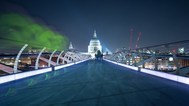
What I find interesting about this approach is that the need for strong composition, light and being able to see the moment are even more important if the photographer wants to convey beauty than if lens distortion is being used to focus awareness on a particular element in the scene.   In the case of the photograph in the course notes by Fay Godwin (below), the subjects and their relationships to each other already have the potential to tell their story.  Careful composition and large depth of field avoid tricking the eye with perspective and exaggerated depth or space.

FG6916-3-13

Fay Godwin, Night Guard, Stonehenge

In this image, the large rock anchors the sense of space and points to natural history, while the ancient monument of Stonehenge invites the eye into the frame.  The difference in size of the structures asks questions about whether the large rock is a natural occurrence and whether it is dominating the impact of man.  The final element in the frame is the closing off of the subject.  The fence and its clear guard measures deliberately prevent the viewer from investigating the subject further.   This photograph holds attention because everything is sharp and while wide angle, the perspective doesn’t create a sense of unreality.

By stark contrast, the work of Gianluca-cosci adopts extreme shallow depth of field to lead the viewer to the obscure but recognisable.  In his collection ‘Panem et Circenses’, he   often uses the camera on the ground to create a large textured out-of-focus region to exaggerate the perspective.  Interestingly, not all of the sharp subjects are actually sharp which is as if the photographer wants the view to decide as opposed to automatically seeking out that point.  The lessons from the Woodpecker exercise are evident here, with the view appreciating the soft, texture and colour of the bokeh without it being a distraction.  For me, the choice of subjects for the collection don’t work on a personal level in the same way as with Mona Kuhn, the other photographer mentioned in the course notes as while I appreciate their aesthetic qualities I find it difficult to connect with what they mean as an intimate collection.

Mona Kuhn’s collection ‘Evidence’ takes the very familiar subject of the naked body and creates a strikingly intimate aesthetic.  The achievement through her approach is to reveal beauty, ask questions using what isn’t in the frame and keep the viewer’s attention  through the interest in the out-of-focus regions.  A good example from that collection can be seen below.

aa353899b6b69412b226c08a10e8defb

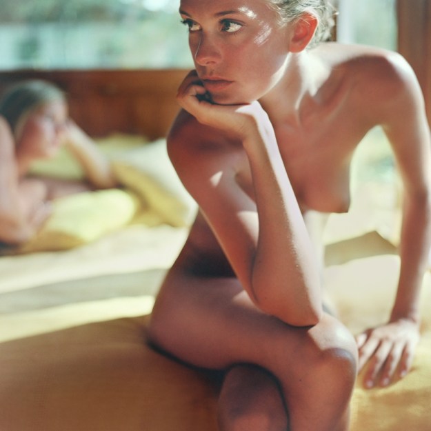
Fatale, Mona Kuhn, from the series ‘Evidence’

What we see here is a beautiful woman sitting on the end of a bed that has another girl on it. The point of focus is the eyes which are looking out of the frame at something unknown. The fact that both subjects are nude suggests an intimate moment, but steers away from the overtly sexual.  The demeanour of both women is ambiguous and more thoughtful than passionate, so what is going on here?  Are they lovers who have had a disagreement or are they sharing a daydream moment together?  The title of the photograph suggests danger or seduction, so why the separation.  I really like this photograph because it doesn’t conform to the rules of composition and majors on an aesthetic that could only really work with a shallow depth of field; the impact and mystery would have been reduced if any of the other detail in the frame was embellished in any way.

The conclusion of the exercises in Part 2 refers back to how photographers have forged their own way in expressing their vision.  Looking at my own historical work, I’m honestly unaware of any conscious decision to use depth of focus in the ways described here.  However, when I moved on from the style, or lack thereof, I had when I was a child, I have tried to keep composition simple and used both perspective and depth of field to steer the viewer to the heart of the photograph.  Of the works that I’ve looked at in this project, it’s Mona Kuhn’s collection that is most powerful to me, which isn’t a surprise when shallow depth of field has been a tool I’ve used many times in my photographs.  What is different here is it’s use to create an aesthetic.
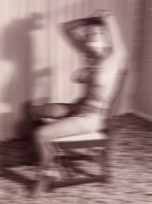
My image

dsc_7258

Confidence, R Fletcher, 2017

I shot this photograph of my friend Clive about to take part in a long distance triathlon a couple of years ago.  The first discipline in the race is an open water swim, which well known to be the least enjoyable event for him.  Using a long telephoto lens at f2.8, I wanted to isolate Clive from the rest of the swim pack and with the early morning sunlight, I really liked this image.   I’ve called it ‘Confidence’ as with the Kuhn photo above, there is not obvious story here.  In actual fact, he is looking at the lady in front of him who is his wife.  They frequently take part in events together and when I look at this image, his expression points to looking for a sign that the race will be ok.

References

[1] Robert Turnage, The Living Wilderness, reprinted by The Ansel Adams Gallery

[2] Gianluca-cosci, Panem Et Circense, http://www.gianluca-cosci.com

[3] Mona Kuhn, ‘Artworks’, accessed via http://www.mona-kuhn.com

[4]. The Art Story, ‘Pictoralism Movement’, https://www.theartstory.org/movement-pictorialism.htm


Exercise 2.4 – Woodpecker

The Brief

Find a subject in front of a background with depth.  Take a very close viewpoint and zoom in; you’ll need to be aware of the minimum focusing distance of your lens.  Focus on the subject and take a single shot.  Then, without changing the focal length or framing, set your focus to infinity and tone a second shot.

Without moving the camera, select a very small aperture and find a point of

 My Approach

Using the same camera setup as the previous exercise, I found an old wrought iron gate at the end of a pathway to shoot.


My first attempt at this exercise wasn’t all that successful as I made a simple error that is common with modern zoom lenses such as my 70 to 200mm.  The lens has a manual override of the auto-focus function which means that if a subject is locked in focus, the photographer can manual adjust the focus to something different simply by grabbing the focus ring.  I always shoot with a single, central focusing point because of my enthusiasm for old film cameras which often don’t have a fancy autofocus system.  When I reviewed these images, it was clear that I must have momentarily let go of the shutter release button between frames which allowed the camera to do the focussing for me.  In Photo 2, the sign is sharp but beyond that point the effect of using f8 is seen with the railing and dust losing sharpness.  I concluded from this that the camera was not focused at infinity.

Second Attempt

This time, I shot through the railings of the bandstand in the Winter Gardens park.  In these two photographs, the focus was achieved as directed in the brief.


Reviewing the Images

The effect of leading the eye to the area or subject that is sharp is clear in all 4 photographs.  This effect was first highlighted to me long before starting this course, however.  During some previous learning it was suggested that I watch a drama programme on television and pay attention to scenes where multiple characters in dialogue with each other.  When the subjects are in the frame together, i.e not in individual close-up shots, the camera operator shifts focus between the characters when they speak.  The connection between the dialogue (sound) and the action (vision) is made by exploiting the left hemisphere of the brain’s need to look at the subject that is sharp.  Throughout the scene, the viewer is aware of the other characters and their surroundings, but don’t consciously look at them until the camera focus changes.  This is what this exercise reminds me of and indeed was the most significant shift in my early photography away from simply documenting what I see as ‘photorealistic’.  Looking at Photo 3, the detail in the railing really stands out because it is sharp and the shapes lead the eye around the detail of the ironwork.  However, the depth of the image is something that the viewer is aware of;  there is clearly a path leading off into the distance and some kind of staircase in the distance. The sign on the right only becomes clear when the focus shifts, though.  In Photo 1, the viewer can see the detail of the wrought iron and if looking carefully, the tiny lights that are around it.  However, the effect of shifting focus in the composition in Photo 2 creates the bokeh effect on one of the lights, which now becomes something the viewer is aware of, even though the subject that is sharp is the sign in the background.


For the third image, I had to return to the subject some time after the original shots. I set the camera to 200mm and selected the smallest aperture possible, which was f22. In order to get a decent exposure, I had to increase the ISO to 3200 to accommodate the low, overcast light. Photo 4 was shot with the foreground in sharp focus, but the background can be resolved easily when looking around the frame. Photo 5 shows the inverse with the focus set to infinity and the detail in the close-up subject being easy to see despite not being the point of focus.

Surface and Depth Revisited

This is about seeing and not seeing, about the hole in the wall acting as a round lens letting light into a dark camera interior, about framing of vision, oppositions of dark and light, the curiosity of looking into a dark space, and about the figure caught between two objects that capture her image, the hole – her face – and the camera – her body.’ – Leonard Folgarit

The Daughter of the Dancers, by Manuel Álvarez Bravo, 1933

This was Leonard Folgarit’s review of The Daughter of the Dancers, by Manuel Àlveres Bravo that was quoted at the start of this Project.  The concept being established in this section of EYV was of The Aesthetic.  According to the Stanford Lexicon, “the term ‘aesthetic’ has come to be used to designate, among other things, a kind of object, a kind of judgment, a kind of attitude, a kind of experience, and a kind of value”.  In the context of this course and, more importantly my approach to photography, the concept of a picture having any of these elements to it is a further departure from what I am used to.  Sure, I have been told about a photograph telling a story and having meaning, but my reaction has been to carefully place subjects in the frame to create an interesting composition.  Any emotion or judgement or value attached to the image would be fortunate at best and accidental at worst.

The review of Thomas Ruff’s work interested me, not because of the visual tension his images created when viewed, but the increased sense of what was happening in the picture, enhanced by having all the technical detail stripped away.  My only issue really being that his use of other people’s photographs moved him away from ‘photographer’ in my mind and towards ‘artist’.  I was discussing his work with a colleague today, who is also a photographer.  When I explained the story of Ruff’s ruined images of the 911 attacks and his subsequent downloading of low-resolution versions of other people’s work, he was horrified.  “Can you even do that?”

I got to thinking about the work of modern artists such as Tracey Emin and Damien Hirst.   Like all artists who create art from seemingly ordinary objects or collages of images, they are effectively not something they own.  Emin’s bed, for example is at face value (Surface) as being simply the creation of any teenager, but when asking questions about how the individual elements came to be there can easily lead to the artist’s narrative.  However,  many people including myself saw what was in front of them and the judgement of it being a wasteful, almost narcissistic statement by someone with clear issues now appears to be as valid as the emotions Emin was trying to convey about a dark time in her life.   Everyone will have a different view.  What makes the difference to me is, like The Daughter of the Dancers, the viewer cannot see what is going on beyond the obvious ‘surface’.  What is happening deeper in this picture?  How did the owner of the bed get both it (and presumably themselves) into such as state?

My Bed by Tracey Emin, 1998

Coming back to Ruff’s work, I decided to look at other examples of his work and found a collection he created in the early part of this century called Nudes.  Like jpegs, Nudes is a seemingly obvious subject that achieves an aesthetic when a level of distortion is applied.  However, in this case Ruff downloaded pornographic images from the internet to make his art.  What reaction do these photographs create?  For me, initially shock followed by a softer appraisal of what could easily be a classical art nude, with all its potential beauty.  But it’s still porn at the heart of it.

From the collection ‘Nudes’ by Thomas Ruff, 2000

The difference between my predecessors and me is that they believed to have captured reality and I believe to have created a picture. We all lost, bit by bit, the belief in this so-called objective capturing of real reality.

Each of my series has a visual idea behind it, which I develop during my research. Sometimes the development follows a straight line from A to B; sometimes something completely new and interesting shows up, which makes me leave the straight path and follow a more indirect one with new rules.
—Thomas Ruff

Reflection on my Work

With the distinction between the concepts of formal and aesthetic better understood, I reviewed some photographs from a recent test of an old Olympus XA film camera I had picked up on eBay.  This was a few rolls just seeing how it performed as an instrument and I was shooting them during a visit to London on holiday.  One image in particular stood out as demonstrating both the formal and the aesthetic which can be seen below.

Retrochrome004

The photograph was made using an expired Kodak Ektachrome slide film, a characteristic of which is a colour shift caused by age.  This was simply a test of the camera’s ability to meter the scene (no evaluative metering on a camera from 1979!).  The dominant light from a very sunny day and the composition with the subject on the right hand third line was all planned.  However, in review there are aesthetic questions that arise.  We cannot see what the gentleman is doing.  Is he reading a phone while waiting for someone or is this quiet cafe a regular haunt for him?  I was hoping for more detail in what was beyond the cafe’s window, but the fact that there isn’t asks what would people see if they looked in at this man?    I was surprised to realise that the image, while a simple and seemingly boring test of an old camera and film actually asks more questions than it answers.  For me, not dissimilar to my reaction when I saw Bravo’s photograph.

Ever the engineer, I wanted to look at this further with another recent photograph.  This time, I had shot a performance of The Ladykillers by a local theatre company for their publicity and personal use.  This one photograph illustrates for me the difference between creating an aesthetic and a formal composition.

The Ladykillers, 2018

In this scene, the lead character looks under the cover over a bird cage.  While his reaction to the horror within is clear, the only aesthetic is not being able to see the bird.  From the formal composition, it is clear how the two subjects are interacting and obvious that the cage contains some kind of bird or animal.  For me, the photograph works well as a composition but doesn’t provoke any real emotion or judgement.

In conclusion, I found this Project fascinating as it reveals what can be achieved without the necessity to be obvious, technically accurate or abiding by the rules.

Here goes…

Hello everyone.  My name is Richard Fletcher and I’m a keen amateur photographer who has reached a point in life where I am looking to take my photography more seriously.  So, here we are about to embark on a degree in Photography with the Open College of Arts (OCA).  This blog features as part of the course as I progress through the assignments.

“You fill up the frame with feelings, energy, discovery and risk, and leave room enough for someone else to get in there”.   Joel Meyerowitz

DSC_7058.jpg