Category Archives: Uncategorised

Project 1, Research Task: What do photo ethics mean to you?

Complete these two tasks:

How do you currently understand photography ethics? Reflecting on Chrystal’s quote about ‘digging into your discomfort’can you identify any areas in your experience as a photographer where you felt unsure or unclear about what you were doing in your photographic role? How might you revisit that time now, what might you do differently?  Post your thoughts to your learning log. You might also like to share your reflection on the Ethics and Representation Forum.

My Understanding of Photography Ethics

Cambridge Dictionary definition of Ethics:

“the study of what is morally right and what is not:”

(ethics, 2023)[1]

Simply put, ethics is a determination of whether something is appropriate to a level of moral standard, or contravenes that standard in some way. As human beings, our standards of morality vary between people, are shaped by culture and experience, and define an internal barometer for our behaviour. When applied to photography and photographers, the ethical considerations apply to the decision to make work that represents people or events that impact their lives. How a subject is represented is a hugely complex space, which covers everything from ethnicity and sexuality, to behaviour and personal circumstance. In the interview with Chrystal Ding[2], I recognised the discomfort that she talks about in some of my own work where I’ve photographed people in a certain context. The first example was a trip that I went on in 2015 to Morocco. I’d already been told how its people didn’t like to be photographed, because in the Muslim religion, the creation of a person’s image is said to be taking part of their soul. At the time, my view was that it was an organised photographic trip, so that in some way entitled me to take photographs while on excursion. Like any tourist, I was 100% observer, having no experience, connection or relationship with my potential subjects. What happened was that we, as a group, encountered a great deal of hostility because we were photographing when consent was clearly not given. I recall the first evening’s call to prayer in Marrakesh, when an elderly man got his mat out in the street, knelt on it, then looked up at me with extreme anger in his eyes. I had my camera around my neck, but was not holding it in a way that suggested I was about to photograph him. He gave me the middle finger and shouted to me to “fuck off”, which was possibly the only English words he knew. Clearly, his assumption was that I would not respect his sacred moment of prayer, perhaps driven by the behaviour of other tourists in the city, and that his gesture would somehow put me off taking a picture of him. The irony is that the middle finger would have produced an image that reflected the mood perfectly. If I had shot and disseminated such a photograph, I would have further conveyed the stereotype that the people of Morocco don’t like tourists, particularly photographers. In actual fact, there were a few instances where a brief conversation with the subject, and a monetary transaction, secured an image. What I take from this now, with the benefit of Ding’s interview, was my lack of preparation or research into how to represent my trip in a culturally respectful manner. Even though I’d acted appropriately at the time, it was likely driven by fear for my safety than the moral judgement that it wasn’t appropriate to photograph him. I would not repeat this experience as I didn’t really connect with the country or the city. However if presented with photographing the people of another country, I would certainly carry out more research into its people, how they want to be viewed (if at all) and which part of their culture or daily lives I would want to represent. Only then could I make the decisions need in preparation for shooting the work.

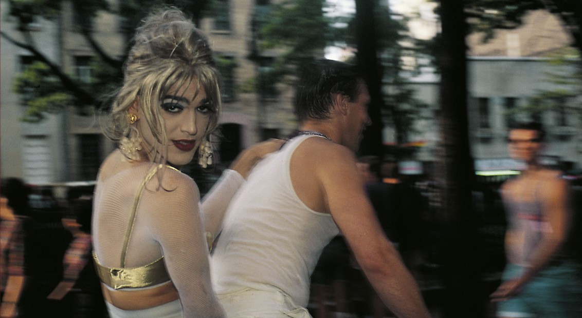
The second example plays more to Ding’s comments about observer vs. participant, which is also highlighted in the interview with Savannah Dodd [3]. Last year, I was engaged to photograph the Malvern Pride event by a friend of mine who was on the committee. I was happy to volunteer to do this as I had wanted to engage with more local civic activities after living in Malvern for over 20 years. The brief was simple: to document the day in its entirety. Although apparently simple, there were many aspects I needed to consider before shooting. Firstly the idea of approaching people to ask for a picture (consent) and to capture the ‘unaware’ documentary images of the event itself. Most of the people I talked to on the day were happy to be photographed but some were not. Our conversations were generally around whether or not they were having a good time, whether they enjoyed the acts etc. However, on a couple of occasions, I was confronted with “oh, I’m not gay…why would you want to photograph me?” At the time, I diffused their discomfort by point out that I wasn’t gay either, but on reflection I believe their discomfort was related to somehow being fraudulently represented in an event that they were simply attending because it was in a public park. My pithy reaction was a way of assuaging my own discomfort at being a straight man photographing an LGBT event. Aside from this, the other ethical concern that I now have when reflecting on the event was “am I representing the event appropriately?” I had been told by the organisers that this was a party, a celebration of the LGBT community that was new for our little Victorian town. However, the local council had rejected the committee’s request for a march through the town, which is actually the core purpose of pride. The marches show the world that the community is proud of who they are and is, by definition, a protest against prejudice and discrimination aimed at their community. Without the marching, the mood of the event was indeed a party, but my responsibility as a photographer should have been to represent the whole purpose of the event, rather than the convenient part, which positively demonstrated the LGBT community as being inclusive in the context of the Malvern residents. There was one image from the event that I feel represented the protest context of Pride, shown below:

From Malvern Pride 2022, but Richard Fletcher

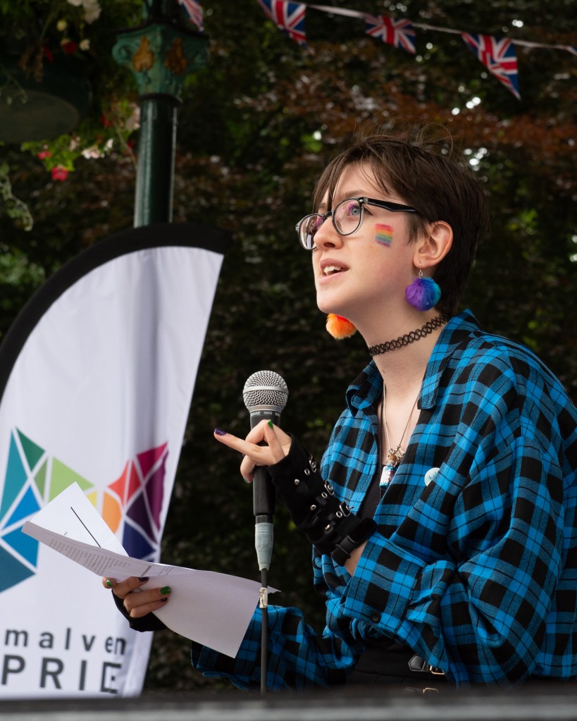
In this image, a speaker is reading out her protest poetry about the treatment of young trans people by the elements of society that don’t recognise their gender. This image is the only one in the series of 90 images where the subject isn’t smiling or enjoying themselves. I took the picture because I suddenly became aware of the need to photograph the counter-aesthetic, but on reflection I should have made that part of my practice on the day.

Conclusion

In conclusion, what photographic ethics means to me is the application of a continually evolving set of questions about the subject and my relationship with it. Do I have the right in some related context, to photograph this situation, and if I do then how does that affect my judgement in representing it? The strength of that relationship defines how uncomfortable I am in taking photographs. Rather than finding a connection that justifies the work, I have a need to establish it before that discomfort abates. I agree with Chrystal Ding’s comments about digging into what makes us uncomfortable as this is the sub-conscious ethical standards we all have that are speaking to us. I’m not sure that I would go to the lengths of prior research that she does before photographing, though. This may be because I recognise an impatience in myself that would prevent me from focusing on a single objective for that long without some form of visual experimentation taking place. However, she and Savannah both make the point that considering ethics is a dynamic activity that evolves with our continued development as photographers. The point that we will always have gaps in our knowledge or research, that we will still make decisions we may eventually regret, and should embrace them, really resonated with me.

References

[1] ethics (2023) At: https://dictionary.cambridge.org/dictionary/english/ethics (Accessed 17/03/2023).

[2] Chrystal Ding: On learning through discomfort (2021) At: https://www.photoethics.org/podcast/chrystal-ding (Accessed 18/03/2023).

[3] Collective, T. P. of R. (2019) Interview with Savannah Dodd, Photography Ethics Centre. At: https://medium.com/the-politics-of-representation/interview-with-savannah-dodd-photography-ethics-centre-ca173c5a9f83 (Accessed 18/03/2023).

Post Assignment 5 Feedback

Introduction

I have just received the feedback from my tutor for Assignment 5: Making it Up. Overall, the assignment was very well received, with the comments that my single fabricated image both met the brief and was a well thought out, original piece of work. My approach of gaining the feedback of others was highlighted again as in Assignment 3. I had felt that to be the most effective way of testing whether my intent had come through in the image, even though I had also hoped for variety in the narratives that were being created. The feedback contained two areas for consideration, directed more at the next part of the degree than as changes to my assignment submission. I will explore those points here.

Feedback

“You’ve clearly thought quite deeply about this assignment and have documented your thought process is very well. You may want to however cite another photographer who also work with archival family photography as a way to contextualise the work you’ve done. I’d recommend perhaps here looking at the work of Nicky Bird here perhaps, who also uses archival family photography to think about place class and culture.”

Assignment 5 feedback, January 2021

This was interesting feedback for two reasons. The first being that we looked at Nicky Bird’s work Questions for the Seller in Part 5[1] where she purchased collections of photographs that nobody was interested in from eBay. She created an archive of family stories by including the answers to some questions that she posed to the sellers before making the purchases. In some cases, the stories were powerful which invoked the sense of sadness that the photographs were no longer needed, and in others the scant information pointed to the stories being lost. Bird curated the collection as a set of lots that had internal connections of their own but also related to the other groups of photographs in the overall archive. Eventually, Bird sold the photographs in an auction of her own at the gallery where they were being displayed. Her creation of a transient archive being broken up and passed on to the next generation of people who might appreciate the images, struck a chord with me. Historical stories are built from knowledge of events and added to as they continue to be told, but we are merely playing a part in them for a brief moment in time. The reference to Bird in the feedback made me think about the image that I had created and how it is essentially my own version of Jayne’s family history, that could be included in a family archive. I hadn’t previously made the link between the documentary nature of the pictures of her grandfather and father and my version of reality in Sanctum. If they were all stored together as part of an archive, anyone looking at them many years from now might miss the fact that the later image isn’t ‘true’. Therefore, for a brief moment, I have essentially subverted Jayne’s family history by creating a work that steers the viewer towards a certain tale of her grief and love for these two men. We’re not talking about chaos theory here, though; the ‘truth’ that my story tells isn’t that far from reality, it’s just another way of looking at grandfathers, fathers and daughters.

The second reason that this feedback interested me is because of my own situation described in my post reflecting on Photography 1 so far [2]. I have recently left my job as an Engineering Manager to pursue other interests aligned with my studies. One of the tasks that I’ve set myself in the coming year is to curate an archive from the thousands of photographs and slides that I was given by my father a few years ago. My work on Context and Narrative this year has led me to reconsider how I would approach this task. Instead of simply creating a volume that can be accessed by my family for their own purposes, I intend to tell the story of my family through it. I intend to take the work of Bird as well as Bloomberg & Chanarin[3] as inspiration for my archive in order to create my own original work from what is essentially box-loads of disparate images. I will be including this project later in blog when complete.

|”What I would recommend is thinking about this: for your image to work most successfully, I think it should in some way be accompanied by the two archival images that inform it – as it’s these three images together that create the enduring message about repetition memory family inheritance and belonging. Somehow these three images must be brought together to tell this one story. It did occur to me looking at your original image of your wife (in other words the image that you choose to make your shooting notes on – the image of her shot in daylight in the greenhouse) that if you’d printed this image out and then nested it into a clear folder with the other two photographs – a series of three found images photographed together would also made for a very successful piece of work.”

Assignment 5 feedback, January 2021

This comment interested me because of how the sight of the two original images together had made me feel when I found them [4]. Bryan had clearly seen the connection between the photograph of his father and the one that he had taken in his greenhouse. The result was to keep them together in an album that would go unseen for several years until I went through it, looking for inspiration. The idea of incorporating them together with this memory and realisation about the album’s hidden history gave me an idea for further version.

Jayne’s parents house has a number of classical pieces of furniture, some of which were made by her father (a woodwork craftsman and teacher by profession). One of the pieces is a large bureau where he kept all of his important documents and stationery. During the time that I knew Bryan, he kept the bureau private and rarely, if ever left it open long enough to see what was inside.

In this scene, the photographs that I found are included with the shots that I took for Assignment 5 in a vintage photo album. The album is set in its own fabricated image using the bureau as the set. The intent is to tell the story of the discovery of the photographs in the context of a family archive, with the new image Sanctum being part of the archive. Effectively this would add a layer of fabrication with the juxtaposition of new and old within a further constructed narrative.

Conclusion

I was delighted that my Assignment 5 submission was so well received. I pointed out on the call that I had enjoyed the creative process immensely as it gave me an escape from the difficulties I was experiencing at work at that time. The role of director was fun, with everything from the challenges of dressing the set with only what I wanted to include, to keeping the rain off my studio strobes during the setup. I was pleased with the feedback that has pushed my thinking around family stories and believable fabricated images still further; this has been the most interesting assignment of the course so far.

References

[1] Fletcher R, 2020, “5) Exercise 2: Re-situated Art”, OCA Blog Post, https://richardfletcherphotography.photo.blog/2020/12/20/5-exercise-2-re-situated-art/

[2] Fletcher R, 2020, “Reflecting on Photography 1 – how things have changed so far”, OCA Blog Post, https://richardfletcherphotography.photo.blog/2020/12/27/reflecting-on-photography-1-how-things-have-changed-so-far/

[3] Fletcher R, 2020, “Project 2: The Archive”, OCA Blog Post, https://richardfletcherphotography.photo.blog/2020/12/20/project-2-the-archive/

[4] Fletcher R, 2020, “Assignment 5: Making it Up”, OCA Blog Post, https://richardfletcherphotography.photo.blog/2020/12/24/assignment-5-making-it-up/

Exercise 2.1: The Dad Project

The Brief

  1. How does Bryony Campbell’s The Dad Project compare to Country Doctor
  2. What do you think she means by ‘an ending without an ending’


In Project 1 I discussed the two photographic essays Country Doctor and The Dad Project [1].  This exercise reviews the differences between them.

Similar But Different

I think the first fundamental difference in the two series’ is how they came about in the first place.  In the case of Country Doctor, we have an assignment for LIFE magazine and although we cannot be sure how the subject was chosen or how much of it was Smith’s natural observation, there is an element of editorial motive in the series.  The story being told is a remote perspective of life in a rural community and the hard work of the local physician.  The documentary style of the story is clearly aimed at informing an audience that is not all that familiar with the subject with a feel-good element of knowing that such heroic people exist in the country.  The audience then is perhaps akin to a collection of movie-goers who bring to it little or no predetermined knowledge of the story before it is told.  The series is powerful and it is shot as if a window on the doctor’s working life, but Smith put himself in the environment to such an extent that he was a silent participant in the events that make up the story.  It is clear from the photographs that he would have reacted to the situations both as the photographer and as the audience.  From a narrative perspective, Smith builds complex layers in the sequence by including elements that are obvious to the viewer and those that need more thought.  In the shots where the doctor is not the central focal point of the composition, the viewer has to reach their own conclusion as to what is going on, e.g. the doctor treating the little girl’s broken arm [1].

In Campbell’s essay, we have a much more intimate story being told.  This time, Campbell includes herself in the story, both as daughter and photographer.  The story is about her saying goodbye to her dad, which meant that she had to capture the relationship as if she wasn’t the photographer.  This ‘insider’ perspective is the first difference between the two stories.  The second is that her father actively participated in the story.  Some of the shots in the series had his direct engagement, something that wasn’t present at any time in Smith’s work.  The accompanying video to the series further emphasises this point and perhaps a very obvious difference in the use of mixed media.  Technology allowed Campbell’s father to describe what the project would mean to him in a contextual way that was not available to Smith in 1948.   Campbell’s use of subjects other than her father is similar to Smith’s in making the viewer look for the meaning rather than being signposted to it. She also uses compositions of seemingly unconnected subjects, such as the spilled milkshake alongside more obvious imagery.  In the case of the milkshake, Campbell’s father had dropped it on the floor in a minor accident caused by his declining strength.  Alone the shot doesn’t tell us much, but woven into the sequence, it gently points us to the shift in what is normal.  Campbell describes the series as gentle and quiet, which comes through strongly as the the story progresses.  Contrasting with Smith’s often dramatic images of surgery and the doctor’s exhausting work, Campbell’s work doesn’t set out to make us feel a particular way.  Instead it relies on the viewer knowing enough about the pain of losing someone to cancer as a backdrop.  With the current pressures of daily life with COVID-19 and my own personal experience of losing my mother to cancer, I procrastinated about completing this research work and writing because it was just too hard.  While Smith’s work won acclaim for its clever storytelling, Campbell’s has been praised for offering comfort to people who are experiencing similar losses.

An Ending without an Ending

The second part of this exercise asks about the statement made by Campbell in The Dad Project.  My thoughts on what she meant by this centre around the way that the narrative doesn’t end with the photographs themselves.  This series walks the viewer through the final months of her Dad’s life from the perspective of him fading away, but also the struggle of his family to adapt to the dynamic nature of his decline.  Campbell states that it was a way of saying goodbye to him with the help of her camera, but his death in many ways was the start of the project.  What I mean by this is in the same way that a death begins the process of mourning, it is also in this case the beginning of the response to the work.  In her appraisal of the project Campbell writes as a retrospective some 3 months after his death.  The ending without an ending for me is the ongoing story of Campbell coming to terms with her loss through reflecting on both the work and the way people respond to it.  As Campbell states in her writing, the effect of the project of spreading her grief out means that it takes on different meaning with the passing of time.  In the short term, the story would be raw and painful but with the gathering interest in the work it would become more of a celebration of her father. She writes that she wishes he could read the letters she had received in response to the project’s publication, because it would have given him a sense of pride.

When compared to Country Doctor, which documented a slice of the life of someone fairly anonymous to the photographer, The Dad Project is clearly acting as a catharsis for Campbell many years after it notionally ended.

References

[1] Fletcher, R, 2020, “Project 1: Telling a Story”, C&N Blog Post, https://richardfletcherphotography.photo.blog/2020/05/29/project-1-telling-a-story/


Case Study 2: Imperial Courts – Dana Lixenberg

Imperial Courts – Dana Lixenberg

With Lixenberg’s Imperial Courts, we see another subtly different approach to documentary photography.  Here, the photographer spends a long time becoming an insider in the community she is photographing.  Unlike previous examples where images have been shot of subjects either without them knowing or being aware of the implications of being photographed, Lixenberg used a 4×5 camera.  My own experiences of the two cameras that I own are that they take a longer time to set up for a shoot and cannot be used discreetly.  This meant that Lixenberg had to have the cooperation of her subjects.  She shot Polaroid images as part of her workflow, which is a common way of checking composition and exposure with these cameras.  By gifiting them to her subjects, she was able to win their trust.  Most of all, though her photographs are not conceived with any additional drama or sensationalised as the notes put it.  The subjects are shot in simple poses with enough background detail to place them in contextual terms but not in a way that steers the viewer to feel a particular range of emotions.  Lixenberg’s intention was to create a body of work that showed the people in their daily lives.  It wasn’t until she returned later in the project to shoot the environment and social impacts on the people who lived in Imperial Courts, do we see a combination of images that document life.  When I look at the imagery, I see a flow of story-telling centred around how the people in her photographs had changed over the many years of the project.  In the a video interview [1], one of Lixenberg’s subjects talks about three images in sequence in the book.  The first is of her son, who she states was murdered in the neighbourhood.  The second is of her that she describes as ‘breathing but not ok’ and the final image is of the place where her son was shot dead.  In three images we see a young man full of life, a mother holding onto her dignity and the tragic reality of the area. For me, Lixenberg’s skill in the series is as much about the honesty of the photographs and the clear affection she has for the people than the story she is telling.

References

[1] Unknown, 2015, “Deutsche Boerse Photography Foundation Prize 2017: Dana Lixenberg”, MUSEUM MMK FÜR MODERNE KUNST, https://www.youtube.com/watch?v=MUhX56bbkrg

Exercise 3: Public Order

The Brief

Look at some more images from this series on the artist’s website

  • How do Pickering’s images make you feel?
  • Is Public Order an effective use of documentary or misleading?


Sarah Pickering’s series Public Order does something different again to Seawright’s.  This time we are presented with images of a deserted town that could be anywhere.  When I look at them, I am reminded of the run-down areas of industrial West Yorkshire, where my wife is from.  Boarded up businesses and seedy looking night clubs like the one in the notes are commonplace.  While areas of the town are recovering from the socio-economic problems related to the decline of the steel and textile industries, there are areas where those problems are still obvious. The collection moves through the desolate town-scape leaving me with a sense of sadness more than fear because of my relationship with those areas.  I was actually disappointed at the feeling of being deceived as the collection becomes more obviously ‘not real’.  The compositions themselves use leading lines, shapes and textures beautifully, but I couldn’t initially see what the artist was trying to say.    While Flicks Night Club caused me to create a narrative about deserted streets, something very relevant to the current Coronavirus pandemic, the complementary image Behind Flicks Night Club says nothing to me apart from a pleasing matching of shape and colour.   I started to think more about what Pickering was looking for when she shot the series and in a video interview with Aperture [1], she describes the relationship she has with rules and authority.  She talks of her father being very much a fan of rules, so perhaps she was saying that beneath the surface there is a fabrication or fantasy.  The pictures that contain evidence of the ‘riot’ damage caused by the police training that takes place in the town, suggest that it’s ok to rebel authority, real or otherwise.

For me, as an art collection Public Order works well as each image connects with the other sand they are aesthetically pleasing.  However, unlike Seawright’s Sectarian Murder the context is all within the image i.e. without the key information that this is a police training ground, so the narrative is vague for me.  I confess that I don’t personally like the work as much as Seawright’s as the impact is less powerful on me.  Do I think it’s a misleading use of documentary?  I would say that it’s not more misleading that any of the work I’ve looked at so far.  The police do deal with riots and towns like this do exist, even if the details are embellished.

References

[1] Aperture Foundation, 2018, “Sarah Pickering on Public Order & Explosion series Excerpt, https://www.youtube.com/watch?v=oQRAW_cPvfY&list=PLvAytXgNgEllIfZ7aw0pinYQjYVqqPDXq&index=34&t=0s

Project 4: The Gallery Wall – Documentary as Art

Research Task – Paul Seawright’s “Sectarian Murders”

Introduction

When first looking at the series Sectarion Murders, I naturally read the accompanying narratives taken from the press and then looked at the photographs.  Seawright’s use of text taken from news reports of sectarian murders is powerful in its own right.  He removed any reference to which side of the Northern Ireland conflict was being held responsible for the killings, instead leaving just the flat, sadness of the facts.  With each image, the backdrop of the text is then used by the viewer to allow them to create their own narrative.

The first shot in the series has the text:

‘The sixteen year old youth was standing at the corner of Dandy Street talking, when a motorcycle with two youths on it drove by.  The pillion passenger was carrying a Sterling sub-machine gun and opened fire on the group.  The boy fell dying in a hail of bullets’

 The text starts by factually reporting the incident as if it were a police record; the use of the word ‘youth’ and the detailed identification of the weapon used.  Towards the end, the piece introduces the tragedy element with ‘the boy fell dying in a hail of bullets’.  This single sentence introduces the more human element, connecting the age at the start of the piece with the fact that this was a 16 year old child.  The extremely violent nature of his death is further emphasised by the ‘hail of bullets’.  I found the building horror of the text to be interesting even before viewing Seawright’s accompanying picture.

The image itself depicts a street corner, assumed to be the place where the shooting took place.  The bleak environment has a couple of streat signs and a small caravan parked on the corner.  The image is shot with a flash that picks out the stop sign and a reflective stripe on the motorcyclist passing in the background.  When I viewed the image, I was first struck by the emptiness of the frame which created a bleak view.  The large areas of ground and sky have little interest in them beyond being either sunrise or sunset.  The approaching bike is small in the frame and while the context is all about the murder being a drive-by shooting, it creates a sense of unseen and unexpected.  I look at the small caravan and think ‘few witnesses, if any’.  The final element of the bright ‘Stop’ sign is to me a narrative of the horror of the killing of a child, suggesting that this kind of act cannot continue.   All of these narrative elements in my interpretation come from having read the contextual text first. Without it, the scene is an early morning or late evening bike ride at first glance. The context is critical to the narrative.

The Video Interview

In the video [1], Seawright comments on the extremes of having too loose a context and being too prescriptive, citing the former to be having little obvious meaning and the latter being journalistic.  Looking at his series, I understand what he means here.  The images themselves are interesting from a composition and lighting perspective but they only had an impact on me with the accompanying context.  Seawright moves us away from the vague, but does not add so much context to make the image too easy to navigate.  He talks about the viewer creating the narrative rather than him and that in order to do that, they need the space and time to do so.  I was reminded of a previous piece of research that I did for EYV where Nan Goldin was talking to an audience about how she feels about the Instagram generation [2].  She talked about being in a conversation with a social media manager about some paintings that she had done.  When that person looked at them on her phone, she swiped through the collection very quickly.  Goldin challenged her that she hadn’t looked at them, only to be told “I saw them”.  Goldin’s realisation that this is how the world looks at images led her to dislike the platform.   The same is true here.  As Seawright states that a journalistic image needs only the briefest of glances to understand what is going on, art needs space and time for the viewer to appreciate the image as they create the narrative internally.  I agree with this sentiment as I’ve had feedback from people viewing my own photographs where I’ve not tried to be too vague or obvious about the meaning.  In terms of whether we can re-classify documentary as a piece of art with or without changing the meaning, I believe that to be dependent on the image’s internal context.  Looking at Seawright’s collection, there are no internal contexts that point to sectarian murder.  In several of the images in the collection, Seawright draws us into the frame with traditional techniques and  elements that are often playful and seemingly innocuous.  He challenges the seemingly idyllic with the horror of the external context, leaving the viewer re-considering how they originally felt about the picture.  For me, that challenge is very much key to art.

Sarah Pickering – Public Order (from Exercise 3)

Sarah Pickering’s series Public Order does something different again to Seawright’s.  This time we are presented with images of a deserted town that could be anywhere.  When I look at them, I am reminded of the run-down areas of industrial West Yorkshire, where my wife is from.  Boarded up businesses and seedy looking night clubs like the one in the notes are commonplace.  While areas of the town are recovering from the socio-economic problems related to the decline of the steel and textile industries, there are areas where those problems are still obvious. The collection moves through the desolate town-scape leaving me with a sense of sadness more than fear because of my relationship with those areas.  I was actually disappointed at the feeling of being deceived as the collection becomes more obviously ‘not real’.  The compositions themselves use leading lines, shapes and textures beautifully, but I couldn’t initially see what the artist was trying to say.    While Flicks Night Club caused me to create a narrative about deserted streets, something very relevant to the current Coronavirus pandemic, the complementary image Behind Flicks Night Club says nothing to me apart from a pleasing matching of shape and colour.   I started to think more about what Pickering was looking for when she shot the series and in a video interview with Aperture [3], she describes the relationship she has with rules and authority.  She talks of her father being very much a fan of rules, so perhaps she was saying that beneath the surface there is a fabrication or fantasy.  The pictures that contain evidence of the ‘riot’ damage caused by the police training that takes place in the town, suggest that it’s ok to rebel authority, real or otherwise.

For me, as an art collection Public Order works well as each image connects with the other sand they are aesthetically pleasing.  However, unlike Seawright’s Sectarian Murder the context is all within the image i.e. without the key information that this is a police training ground, so the narrative is vague for me.  I confess that I don’t personally like the work as much as Seawright’s as the impact is less powerful on me.  Do I think it’s a misleading use of documentary?  I would say that it’s not more misleading that any of the work I’ve looked at so far.  The police do deal with riots and towns like this do exist, even if the details are embellished.

Assesandra Sanguinetti. The Adventures of Guille and Belinda and The Enigmatic Meaning of Their Dreams

Here we have a series about two young cousins growing up in rural Buenos Aires.  Sanguinetti observed the clear differences in appearance between the two girls, one larger and more mature looking than the other.  When set against the backdrop of their lives, the series could have simply documented their growing up within a particular way of life.  Instead, Sanguinetti adds another layer to her work, by documenting the way the girls play. Their imaginations and depictions of events from dreams moves straight documentary with context, to something more impossible or fantastical.  Consider the example below:

ARGENTINA. Buenos Aires. 2001. Ophelias.


Ophelias, by Alessandra Sanguinetti, 2001[4]

Here we have the classical depiction of Ophelia from Hamlet.  She is the tragic potential wife of Prince Hamlet who descends into madness during the events of the play, ultimately drowning in a river in a suspected suicide.  The fact that the cousins act out this scene is interesting.  Ophelia was described in the play as a great beauty, which the girls could well be aspiring to.  Their physical differences are noticeable, yet hidden by their fine clothing and the way they are posed for this shot.  Sanguinetti uses the famous painting by John Everett Millais as inspiration for the composition, which depicts Ophelia at peace in the water. The girls in turn look peaceful and their appearance has a sense of equality to it.  A darker interpretation of the image could be that they long for any kind of escape from rural Brazil, even if it means death.  By incorporating multiple contexts within the frame, Sanguinetti leaves plenty of room for the narrative to be created.  Other images in the series deal with fantasies of beauty, divinity and death, but at the core of all of them are two little girls spending time with each other.

For me, this sums up the variability of documentary photography and its intent.  It can be both truth-teller and storyteller.  It can describe factual events without actually showing them as well as associating patterns and textures with the mood of the photographer.  Too prescriptive and it can be a brief news item and too vague leaves any interpretation possible.  When I look at this series, I see a story built from many fantastical layers, with the only real ‘fact’ that is documented being two little girls who like dressing up.  It’s a fascinating and compelling art collection.

References

[1] 2014, “Catalyst:Paul Seawright”, https://vimeo.com/76940827

[2] Tattersall, L, 2018, “Nan Goldin in Conversation with Lanka Tattersall”, MOCA, https://www.youtube.com/watch?v=b2XrWPdJIBg

[3] Aperture Foundation, 2018, “Sarah Pickering on Public Order & Explosion series Excerpt, https://www.youtube.com/watch?v=oQRAW_cPvfY&list=PLvAytXgNgEllIfZ7aw0pinYQjYVqqPDXq&index=34&t=0s

[4] Sanguinetti, A, 1999 -2001, “The Adventures of Guille and Belinda and the Enigmatic Meaning of their Dreams”. Magnum Photos Portfolio, https://pro.magnumphotos.com/C.aspx?VP3=SearchResult&ALID=2K7O3RHJ7TOL

Exercise 2: Street Photography

The Brief

1) Find a street that particularly interests you – it may be local or further afield.  Shoot 30 colour images and 30 black and white images in a street photography style.

2) In your learning log, comment on the differences between the two formats.

3) What difference does colour make?  Which set do you prefer and why?

Introduction

For this exercise, I chose Tewkesbury High Street which is reasonably local to me.  It interests me because of its history and the fact that my family’s origins can be traced back around 250 years or so.  For the shoot, I decided to use film as the colour and black and white images would be correctly represented, as opposed to performing a conversion in Lightroom.  I shot one roll of Kodak Portra 400 colour and one of Kodak TMax 400 black and white in my Nikon F6 and had them both developed professionally.  After selection, the total images for each type were not quite 30, but I was able to review enough shots to answer the questions set by the brief.

The Colour Images

Throughout my photographic learning, colour has always been the ‘normal’ in pictures.  What I mean by this is that even its most basic in terms of light, composition and interest, colour images represent what we remember how the scene looked when we shot it.  As a child, I randomly shot whatever interested me without any consideration of how the colours balanced or impacted a scene. As I’ve got older, the learning has been around ensuring that colour doesn’t distract from the subject of the photograph.  Finally, with my interest in shooting film in the past few years, I’ve learned that colour can be used to draw attention to a subject, set it within a colour environment that makes it appealing and as a visual frame.  Including elements of colour that complement the subject can help support the story being told just as contrasting colour can distract from it.

For my street photographs in Tewkesbury, I was shooting on a sunny day with intermittent clouds which meant that I also had the colour of the light to work with.

A few examples of my colour images can be seen below:

Ex120200313_12270898_0054-2

In the first shot, I spotted the No Parking sign that had seen better days with two silver cars parked seemingly in violation of the instruction.  My first thought when I took this photograph was that the cars were the same colour (if silver can be considered a colour).  What I didn’t realise until the film was developed was the sense of balance in the frame.  The red brick and the white window frames introduce a symmetry against which the key components contrast.  The signs are both clearly visible but the contrast between their messages is more obvious because of the colour.  A happy accident, but this image works in colour because of the way the frame is filled with a subtle, muted palette.

Ex120200313_12255222_0052-2

The second image was something I noticed as I walked past an old barber’s shop.  The first thing that I saw was their use of tabloid newspapers to screen the windows of the now-empty shop door.  As I looked at the door, I then noticed its bold colour which frames the window.  I think that this image works because of the additional interest introduced by the paper and the door frame.  They create a playful feel to the image, which belies the fact that the door leads into a shop that is now empty.

Ex120200313_12513040_0069-2

The third image selected here is of a bargain basket of Valentine’s Day gifts that I spotted outside a shop.  The Valentine’s theme of pink runs through the whole picture and reinforces the message of the celebration being about love.  The reason I took this photograph was to highlight the sadness of such celebrations, that have become highly commercialised, coming to an end.  I am trying to show the wasteful throw-away culture of our lives with this shot, which I think is enhanced by the impactful colour.

The Black and White Images


Ex120200313_11404149_0002

The first of the black and white images was of a woman walking away from me in some highly colourful trousers.  I was struck by the boldness of this lady’s style and how she confidently down the street.  In order to capture that confidence, I could have shot the picture in colour to highlight the drama of her clothes.  However, I had the black and white film in the camera at this point.  When I look at this photograph, I still see the confidence but I also note the visual clutter of the building works capture in the frame.  The brightly coloured warning foam on the scaffolding and the roadworks sigh would, on reflection, been a clash with the subject.   I think black and white works here because the drama is captured without distraction.

Ex120200313_11582705_0021


The second image is of a scooter rider in the high street.  The weather was turning at the point that I shot this image, with the sun emerging from the clouds. What I think works with this being black and white is the contrast of the tones on the scooter.  Black and white can be very punchy when the light works with the reflectance of the subject and this is a good example of this.  The lower contrast background doesn’t distract or dampen the mood of the image.

Ex120200313_11435365_0006

The third image is of a book shop window.  Tewkesbury has a strong Campaign for Real Ale presence in the town and part of it is a celebration of the history of pubs and brewing. It’s common to see these signs declaring a now-closed pub.  What struck me about this one was sadness at the statement ‘for unknown reasons’.  I shot this in black and white because I wanted to show this feeling of sadness, even though it closed long before I was born and the building still serves the public as a bookshop.  The building itself, typical of Tewkesbury, is from the 1600s and I think the timber frame that is visible in the image is best represented in black and white because it connects with the early photography of this buildings which were all that way.

Conclusion – What are the differences?

If documentary photography is used to tell a story and be used by the photographer to emphasise an element of it, then the differences between colour and black and white can be significant.  In reviewing them, I conclude:

  • Colour can be a distraction. When a scene has many elements, but the story is about one of them, clashing colours can take away from the story.  In my first black and white shot, the subject would have been lost with the addition of colour.
  • Colour can add to the story when it reveals something about subject. My example of the Valentine’s sale has more impact because of the pink theme running through it.
  • In both formats, balance is essential. Too much contrast or colour can distract from the story.  In the examples of No Parking and Scooter, they work because there are no extremes.  The colours are muted and link together in the former and the contrast separates the scooter from the background in the latter.

My personal preference has always been black and white.  When reflecting on why that is, I considered the fact that the images look recognisable but somehow different to how we see the world.  In the days when there was only black and white, we accepted that we couldn’t see the subject as we would if we were looking at it because there was no alternative.  With the advent of colour, the images became more like our observation.  Early pioneers of street photography, such as Meyerowitz and Winogrand saw the progression from black and white to colour as perfectly natural because of that distinction, but they experienced a snobbery from the art world who believed black and white to be higher quality.  For me, I love the way that light can be represented in black and white tones and the punch that can be achieved with it.  However, I also believe that in the hands of a skilled street artist colour can be the differentiator between a good image and one that has impact.  Perhaps it is my own limited experience with the genre that steers me away from it.

Contact Sheets

Project 3 – Reportage

What is Reportage?

In attempting to answer this question, I took the approach that most start with, a Google search.  The answers were particularly puzzling.  Most, including the dictionary definition refer to reporting an event in some form of broadcast media:

reportage

noun [ U ]   formal

UK  /ˌrep.ɔːˈtɑːʒ/ US  /rɪˈpɔːr.t̬ɪdʒ/

the activity of, or style of, reporting events in newspapers or broadcasting them on television or radio

from the Cambridge English Dictionary [1]

The ambiguity in defining the level of objectivity or subjectivity in photography was not really a surprise, given the work so far in Part 1.  The photographer has the power to tell a story that looks like the truth, but from their point of view.  The concept of inside/outside can grant the photographer a form of credibility which they can use to draw attention to the key elements of the story.  This level of manipulation of the viewer, while very clever and often subtle, still needs the elements in the image to make it work.   In the case of the post-event ‘late’ photography the element of time is removed but the juxtaposition of the subject and background, along with the supporting external narrative tells the story.   Intriguingly, the first image in Project 3 is one where an event isn’t occurring at all.   Edgar Martins’ image [2] is of a large empty room, lit from the opposite end to the viewer by French windows.  The only details in the room itself are the elegant architecture, the wooden floor with leaves strewn across it.

05-Conneticut-New-England

A room at 14 Baldwin Farms South, Greenwich Conn., 2009 by Edgar Martins [2]

Why is this image considered to be reportage?  The answer as I see it is that it is a document of the room.  The image shows the elegance of the space that is not in a state of decay but appears to be well looked after. The ‘neglect’ in the image comes from the emptiness and the leaves, suggesting that the room has been abandoned, albeit recently.  The image, for me tells a story in one frame but that story has no supporting context to steer the viewer in any way.  When we consider the series that the image came from, we see a story of the collapse of the American economy following the sub-prime mortgage scandal of 2008.  Power messages of houses in a state of decay or being reclaimed by nature make the series a compelling one.  What was shocking was that the photographs were digitally manipulated by Martins without the knowledge of the commissioning body, The New York Times.  In the image we have, close inspection reveals cloning of the leaves on the floor and of the light switches in the wooden panelling [3].  The outrage caused by Martins’ seemingly distorting the truth about the subject was dismissed by the artist as being a misunderstanding [4]

“It is crucial that both the commissioning entity and the photographer can articulate their goals and parameters clearly. In this specific case there was a clear misunderstanding concerning the values and rights associated with the creative process that led a renowned publication like the New York Times Magazine to commission an artist, such as myself, to depict a very specific view of reality without taking all the necessary measures to ensure that I was fully aware of its journalistic parameters and limits.”

What he was saying was that he didn’t appreciate the newspaper’s intention to limit his creativeness to tell a truthful story.  For me, this lack of expectation management reveals how photography itself can be manipulated to suit a single purpose.

When considering the decisive moment, where the events are unfolding in real time, I see a similarity to modern citizen journalism.  Cartier-Bresson was sensitive to all of the elements in the frame as opposed to the subject matter alone, which allowed him to tell the story through a single moment in time.  Optimal placement of the elements, no matter how subtle can tell a much broader story as with the image in the notes.

Bresson’s Dessau shows a Gestapo spy being shown to the crowd she was trying to hide in.  The elements that make up the frame are compelling as they contain multiple expressions of anger and disgust on the faces of the crowd and the woman who is detaining her.  The prisoner has an expression of shame as the person she is brought before reviews her papers.  It’s little wonder that this image told the tale of the turning tide of the war in a single frame.  The Gestapo were a feared Nazi secret police force who were known for turning citizens into spies and informants within the ranks of ordinary people and resistance fighters alike.  The image of one being captured is about as good a piece of propaganda for the allies as there is, but as with all decisive moment imagery, we interpret what happened immediately before and after the shot by the elements in this single snapshot of time.  Objectivity is not really anywhere to be seen.

References

[1] 2020, Unknown author, ‘Dictionary Definition of Reportage’. Cambridge English Dictionary, https://dictionary.cambridge.org/dictionary/english/reportage

[2] Martins, E, 2008, “This is not a House”, Artist website, http://www.edgarmartins.com/work/this-is-not-a-house/?show=photographs

[3] Various, 2009, “Truthy lies: photographers speak out on Edgar Martins”, Critical Terrain Blog Post, https://criticalterrain.wordpress.com/2009/07/23/truthy-lies-photographers-speak-out-on-edgar-martins/

[4] Beesley, R, 2012, “This is not a House”, Aesthetica Magazine, https://aestheticamagazine.com/this-is-not-a-house/

Aftermath and Aesthetics

In regard to Campany’s essay ‘Safety in Numbness’

Introduction

Campany’s essay was in response to the post-911 photography project by Joel Meyerowitz, the only photographer given access to the ruins of the World Trade Center towers during the recovery operation.  His assertion is that images shot after an event that capture only traces of what has happened are an aid to memory of it, rather than a document of it.  The stillness created by an image of aftermath is more about the photographer’s skill in creating an aesthetic rather than the impact of the event itself.

My consideration of the essay

When I read this essay, I was already looking at it defensively.  Meyerowitz is arguably my favourite photographer and I initially felt that this was a patronising look at what was a well-intended project to record the tragedy of 911 for the American people.  However as with most challenging material, when we look beyond initial perceptions or even predjudice we can identify with some of the key messages.

I found Campany’s comments about the role of photography with the development of moving picture technology interesting.  In the days before mass print journalism, photography provided the single moment of an event to inform the public of something relating to it.  The lack of real-time information didn’t really matter because there was not alternative at the time.  With the advances in print media, photography became the way of emphasising the impact of an event or series of events, e.g. the great depression of the 1930s.   It was later criticised for being narrow in its perspective when bringing the general hell of war to the people.  However, Campany adds that photography ceased to be used as the primary documentary tool for war zones after Vietnam.  I was a teenager when the first Gulf War took place and hadn’t really appreciated until reading Campany that video and moving imagery were the primary ways for us to understand the conflict.  I remember the first still images (that weren’t freeze frames from video) being after the allies had gone into Kuwait after the Iraqi surrender.  The still nature of those images are, as Campany describes, horrific but numbing.

In terms of he comment on Meyerowitz, I can see the point being made that despite the photographer asserting that the subject ‘told him how to shoot it’, his skill means that the images take on a certain beauty that is almost counter to the idea of documentation. I have the photographs in Meyerowitz’s collected works book ‘Taking my Time’ and they no longer remind me of how tragic 911 was.  Instead, they serve as a collection in the canon of one of my favourite artists.

Project 2: Photojournalism

Considering the three viewpoints, Charity, Compassion Fatigue and Inside/Out

Martha Rosler

Rosler’s assertion that the use of photography by social-conscience photographers increased the gap between social classes is an interesting one.  Her essay ‘The Bowery in two inadequate descriptive systems’ looks at the photographers who documented the Bowery slums during the Depression era.  Her view was that the use of photography to highlight the plight of the poor and the homeless was considered an attempt to bring their world into that of the higher classes to affect change.  While on the surface it looks like a noble effort, Rosler stated that the effect of pointing out that ‘you have much better lives than them’ merely galvanised the class structure.  For me, the criticism of the sentiment is harsh.  As with the work of the FSA, the intention was to effect change by ensuring that the wealthy did not forget the problems of the poorer classes.  In the case of the photographers working for the Farm Security Administration, the scale of the geography involved could only really be reported through photographs as many of the upper classes were not centred in rural America.  Was it pushing a socalist agenda?  Undoubtedly so, but when considering the imagery in a non-photographic review, I admire what they were trying to do.  Where I agree with Rosler is the exploitative nature of the work in the Bowery slums.  Here the photographers were capturing images of people who had little in terms of voice or in some cases, even consciousness.  Alcohol and drug abuse was rife at the time, so many of the subjects would not have even been aware of the context the photographers were looking for.  Some may have not registered that they were being photographed at all.   I immediately saw the connection with Mendel’s Dzhangal, where the people themselves didn’t want to be photographed.  By using their possessions without them being part of the project, Mendel essentially avoids any counter discussion about the lives of the people at the camp.  The other connection I drew was when people photograph wild cats.  Most access to wild cats is via a zoo or rescue centre, where an animal has limited ability to be as it would in the wild.  Like many photographers who have shot these sort of pictures, I have waited for long periods to capture what I think is the behaviour of the cats and what I want the people who view my photographs to see.  In fact, if I really wanted to document a lion or tiger as it should be seen, I’d have to go on a safari.  Here, the constraints of environment are removed which allows the subject to act entirely naturally.  Friends who have shot in these conditions say that there are many more opportunities to observe the animals when not trying to control them. When I read Rosler’s paper, I concluded that the Bowery and the social circumstances were the constraints and the people were effectively being watched for certain patterns of behaviour.  I concluded then that this use of documentary photography is exploitative, even if that wasn’t the original intention.

In terms of its ability to effect change, I believe that photography is a powerful addition to wider perspective, either written or spoken.  The irony of the socially conscious image that seeks to change, is that the only way it becomes well known is for it to be distributed.  Distribution usually involves some form of financial benefit, whether through purchase or enhanced exposure.  With the advances in social media and camera technology, that benefit is more widely acquired, but for me the expectation of some form of altruism in return is a naïve one.  With Lange’s famous image ‘Migrant Mother’, the subject complained that she never benefited from the success of the photograph despite the photographer having done so.  I suppose the thought was that the impact of the work of the FSA would outweigh any royalties, but nevertheless Rosler’s theory that the divide between rich and poor increases, is validated by the apparent lack of support.

Over the decades, we have seen examples of imagery provoking action in people, from Live Aid to Climate Change.  In some cases, the appeal is for help while others seek to shock.  The sheer volume of photographs that are taken of a single subject is, in my view, having a greater impact because of the perception that they statistically support the argument.  For example, the bombardment of the suffering of animals due to habitat loss through climate change, provokes a sensibility in many (particular in the UK, where people are considered animal lovers) that sparks people into action.  This plays somewhat into Sontag’s argument about compassion fatigue, but it’s demonstrably successful with animal charities being among the most supported in the UK.

Susan Sontag

Compassion Fatigue is a feeling that I regularly get when viewing photographs.  Last year, I visited Tate Britain to see Don McCullin’s major exhibition.  The collection contained some 270 photographs spanning McCullin’s time as a war photographer.  The imagery was naturally harrowing but because there was so much of it, I found myself beginning to look at the way the photographs were shot rather than at the subject itself.  I had become disinterested in the horrors of the images and even applied the same disengaged fatigue to his lighter landscape work towards the end of the exhibition. I think the shock value of war photography starts by making the viewer feel like it’s something real to them, but as the number of images increases, the sensation moves to one of normalisation.  With that normalisation comes a sense of ‘it’s not real to me’.  In my experience during the McCullin exhibition, I found that my sense of empathy toward the subjects dulled with the increasing number of photographs, but also my ability to reset my perspective when it came to less harrowing imagery.  McCullin’s landscape photographs of the flood water on the Somerset Levels in late 1990s were bleak in the way they were photographed.   As the majority of the other work was war or conflict, my natural tendency was to see the destruction of the flood water, rather than the dramatic power of nature.  Similar to Mendel’s images of people in flood water, there is both resignation in the expressions of the subjects as well as a sense of comfort in a few of them.  How can we tell the difference in the photographer’s intention?

Abigail Solomon-Godeau

The answer to my last question comes from the essay by Abigail Solomon-Godeau.  The concept of being an insider vs a spectator perhaps offers the explanation of the flood images.  In Mendel’s images, the flood victims have let him into their lives to capture what are very clearly posed photographs. In the case of the photograph of the woman in her hallway that I described at the start of this course, the sense of being inside is even stronger because the photographer lives in the UK and is very much part of the society devastated by the weather of that time.  In the case of his photographs from India, that connection is missing which for me turns him (and us) into the tourists described by Sontag.  For me, then, the difference is around how we relate the image to our own lives or supporting context, in this case what we know about the artist’s body of work.  During Expressing Your Vision, I looked at Nan Goldin’s work “The Ballad of Sexual Dependency” that is referenced by Solomon-Godeau in her essay.  My research took in a number of interviews with Goldin[1] where she talked about her years living in what others called the fringe society in New York.  Her subjects often lived with her and as a consequence, Goldin’s photographs in that piece often show her friends in everyday relationship situations, some good and some bad.  Goldin shows her subjects from a viewpoint of a clear closeness that can only really be achieved by being an insider.  When I visited the Diane Arbus exhibition in London in spring 2019, I was struck by her early work photographing circus performers.  As Sontag postulated, Arbus’ photographs were more of an impassioned look at her subjects and we really get that sense of ‘look at how different this person is?’ when we look a them.  An example from each photographer can be seen below.

2015.136

Female impersonator holding long gloves, Hempstead, L.I. by Diane Arbus, 1959 [2]

HERO_NAN_GOLDIN_THE_OTHER_SIDE_5-1132x620-1573142125

Jimmy Paulette on David’s Bike, NYC,  by Nan Goldin, 1991 [3]

Solomon-Godeau also makes the point that no matter what the intention, there is a risk simply by looking at a photograph that the subject becomes objectified.  In the example of transvestites, whether inside or out the photograph itself merely shows someone’s sexuality or way of life.  Without any other contextual information in the photograph, the interpretation becomes determined by the viewer’s own perspective on sexuality or gender irrespective of the intention.  Goldin stated many times that her and her friends didn’t see themselves as on the fringes of society, but clearly most people viewing her images are not from her world so we can expect interpretations to be different.  Solomon-Godeau’s view of Rosler’s Bowery images was something that interested me.  Removing the people from the photographs creates a sense of representation without turning the people themselves into a spectacle.  It connects neatly back to Mendel’s Dzanghal where lives were described without the people themselves.

In terms of what makes a successful documentary project, I am left with the thought that it very much depends on what the photographer believes to be their viewing audience to be and the nature of the subject itself. I’m currently working on a personal project to document the decline of the high street in my town.  I’m visiting and revisiting the town centre as part of my daily walk and trying, without bias to capture the changes.  When I started the work, I hadn’t begun this course and in terms of reflection I realise that I am both inside and outside.  I am passionate about my home town after living here for 20 years and the fact that I have friends who own businesses here makes me an insider.  However, I’m not a business owner by profession and so don’t fully appreciate or connect with their struggle, which in turn makes me an outsider.  I’m also conscious of the glimmers of optimism that are around the town which I am photographing in equal measure, trying to maintain a balance.  All of my photographs to date have been devoid of people, but trying to capture the essence of the business that was there before. I guess I have been subconsciously trying to work more like Rosler.  The long term nature of the project means that this may evolve as things change around me. In conclusion, I believe that balance of subject, empathy and perspective of the photographer is the compromise to achieving as objective document within a single photograph or series.  I’ll revisit these thoughts are the project progresses.

References

[1] Reeves, E, 2017, “On the Ballad of Sexual Dependency”, MOCA, https://www.youtube.com/watch?v=iDSvD0yhjWQ

[2] O’Regan, K, 2019, “Diane Arbus’ unflinching portraits of outcasts are more impactful now than ever”, Sleek Magazine, https://www.sleek-mag.com/article/diane-arbus-hayward/

[3] Finn, B, 2019, “A new book documenting Nan Goldin’s journey through drag”, HERO magazine,  http://hero-magazine.com/article/159524/a-new-book-documenting-nan-goldins-journey-through-drag/