Project 5 has taken the idea of socially responsible documentary on from photographing people that might be unfamiliar, but from a similar culture, through to those historically termed ‘the others’. We have seen how cultures have been both actively and passively appropriated over time, and how contemporary artists are seeking to address these historical issues in their work. Most of the artists included in Project 5 were connected directly with the communities or cultures they were representing in their work, e.g. Ryan Christopher Jones with both his Mexican and American heritage, but what happens when the photographer is a total stranger to the ‘others’ they are trying to represent?
This assignment calls for a review of Assignment 2, in which we engaged with and photographed a community we were not part of, and I had chosen the Malvern Hills Trust volunteers. Reflecting on that work, I question whether the group could be considered as ‘the others’, given my connections to the town. Consider the questions posed by the brief:
What assumptions did you have about that community before you started the project?
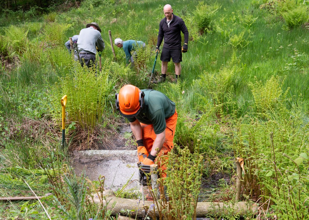
Malvern is a largely white community, with only small number of Eastern European and Middle Eastern making up the general populous. It is also largely known as a retirement town, with many retirement homes and complexes in the area. These two pieces of knowledge led me to assume that the volunteers would be older white people who had retired and had the time to carry out this type of work. When I attended the shoot, my assumptions were largely correct, with the exception of the group leader (employed by the MHT) and Giles, a man in his early 30s.
The leader Ben with Giles in the background, both much younger than the other volunteers
Looking back at your project now, how did your assumptions shape the photographs you took? What stereotypes or visual tropes did you replicate?
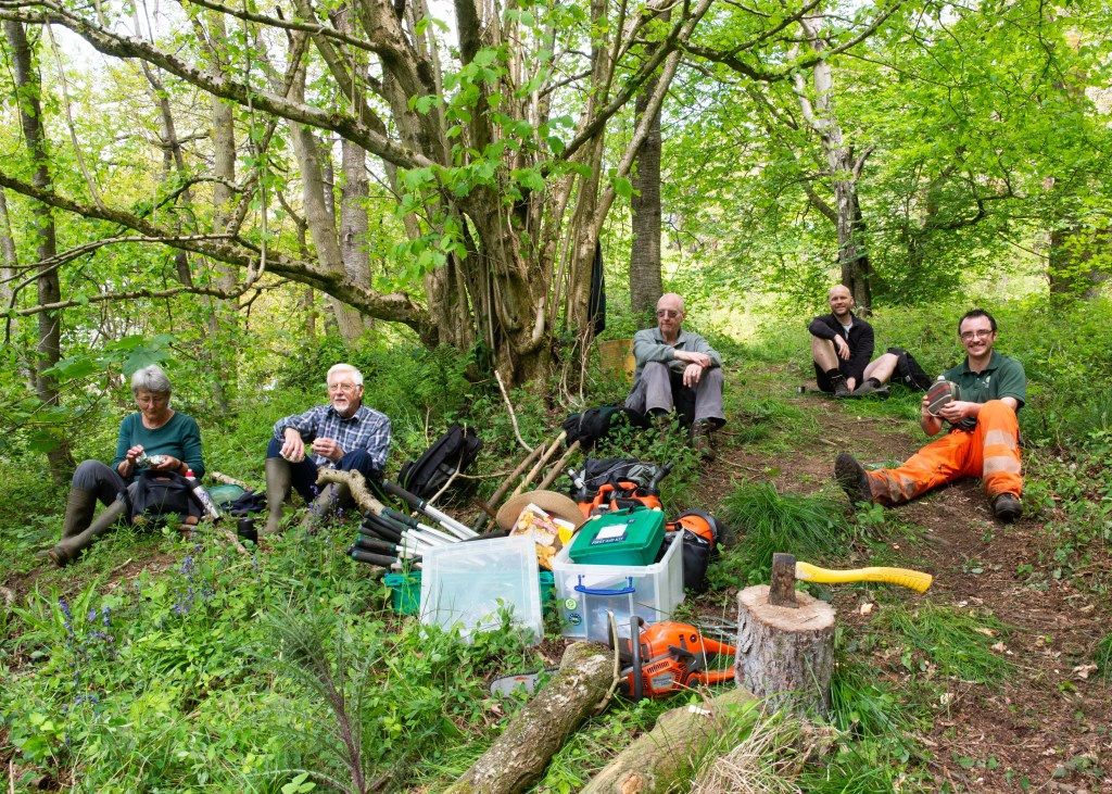
My assumptions guided my thinking on composition in the opposite way to the stereotypes of older people being somehow slower or frailer than younger people. The work they were doing was manual, gruelling, and required the use of tools, which is what I wanted to represent in the series. In the picture above, I show the leader of the group, Ben, operating a chainsaw with Giles just behind him. Although only Ben was trained and insured to use the chainsaw, the image visually conforms to the older people stereotype; the youngster uses the heavy equipment. I put this down to my own unconscious bias that is created by my being middle-age. In the rest of the series, only the images of the tea break conformed to a visual stereotype of British people in that tea breaks are very much part of our working culture.
Everything stops for tea
The fact that everyone was white was considered almost a given because I had no control over the group that I was engaged with. The other assumptions that I made were about the scenic nature of the work. Malvern is known to be a beautiful landscape, and my images visually represent this with the shots all being of the work and where it was situated. The dominant colours are derived from the greenery and the sky, and the light being typical of British summer.
Did making that work challenge your assumptions? How else have you learned to challenge your assumptions?
The only assumption challenged in the work is that the older generation cannot do physically demanding work. I was consciously seeking to reveal this about them after we first met. Aside from that, I don’t believe that I did enough to represent their passion for their own environment, focusing on the work more than the people. At this point in the course, we had been introduced to the ideas of getting to know the subjects, and I did spend time with each of them to do so. However, we had yet to encounter artists like Anthony Luvera and Margaret Mitchell, who had made their projects over many years, inviting more collaboration from them. This is something I am currently addressing in my SDP, having spent hours interviewing my subjects and exploring how they represent themselves before considering the context and balance of future series about the LGBTQ+ community. Ryan Jones’ work made me think about how an intended story can change as the work progresses and assumptions are disproved, with the idea of documenting housing issues in New York becoming a commentary on the inversion of the ideas of US prosperity and Mexican destitution.
If you were to re-do this project, how would you approach the project differently?
Approaching this project again, I would consider starting from a different place, as with Chimamanda Ngozi Adichie’s TED talk. Perhaps the series should have started with the need for the maintenance work and the efforts of MHT and its role in the community. Exploring the way MHT raises the profile of the environmental needs of the Malvern Hills could anchor the series in the socio-political landscape where climate change is a continuing worry. The call to arms nature of what the Trust’s volunteers could set the starting position for a documentary series about the work that introduces the people without any predisposed bias. It’s clear, as with Jones’s project, that the story could evolve to be more about the people involved the work and their motivations for being involved. I think this approach would reduce the risk of dwelling on stereotypes related to age.
With regard to my Self-directed Project
While there are a few stereotypes relating to Assignment 2, this reflection is probably more appropriate to my planned SDP. We learned that colonisation doesn’t only relate to race or culture, but also gender and sexuality. In Authority Collective (2020). The Photographers Guide to Inclusive Photography”, two authors gave advice on socially responsible photography of gender and, more specifically, the LGBTQAI community. As my project is about that community, its struggles and the continuing need for Pride, the latter of the articles resonated with me. In particular, I was drawn to the dangers of seeing the community as a curiosity and photographing the people as if they were some kind of show. The article makes the point that sexuality makes up only a small part of our identity, which is something I’ve observed in my interviews with my SDP subjects. We don’t walk around with a label that states our sexuality or gender identity, but for some reason people who are LGBTQAI are given labels and judged on the basis of them. One of the themes I want to explore is why straight people feel the need to label and categorise people who have one aspect of their identity that is different. With catagorisation comes stereotyping; all gay men are flamboyant and camp, all lesbian women are either classically glamorous or somehow masculine, etc. My subjects have universally raised the idea of referring to them as a community, as if they were some kind of social group, where the opposite is in fact the truth. From my perspective as a straight man who is an ally to LGBTQAI, I have to find away of staying clear of these stereotypes and the dangers of telling only one story about people that I have built relationships with, that have so far revealed interesting and complex lives behind identity.
My current idea for my SDP is a documentary series about Malvern Pride, and event that I photographed in a professional capacity in 2022, and will be repeating this year. In preparation for the event, I met with the organising committee and volunteers to discuss the practical details of the day. I had the opportunity to talk to the assembled group, most of whom are part of the LGBTQ+ community, about my social documentary project, and in particular the ‘socially engaged’ element. I told them that I wanted my work to be from the perspective of people within the community, rather than as seen by an outsider like myself. It would require voluntary interviews and collaborative portraits of the individuals. There were many people who were interested in taking part.
The Group for Mature Lesbians
One of the committee members said that she wanted to be part of the project, but I might want to talk to a group that she belonged to that was founded by a friend of hers. It was formed to support lesbian women living in Malvern, acting as a social network because the founder felt that her demographic was under-represented in the town. She thought that I could tell the story of the group and its members as part of my project. I reflected on whether this could be the total focus of my SDP as an alternative to Pride, but said that I was interested in meeting with them to discuss further.
The Difficult Conversation
During this discussion, we were joined by another woman in her 60s who said that she’d only recently moved to Malvern and was volunteering for the first time. She asked me about the project and why I wanted to do it, which I explained. During my description, I used the terms positive and negative to describe the two sides of the meaning of Pride, the positive being the celebration of the LGBTQ+ community, and the negative being the ongoing protest against prejudice and the demand for equality and respect. Her reaction was instantly anger, which made me quickly realise my blunder. She demanded to know why protest was ‘negative’, which I answered by immediately apologising for my clumsy use of language. The other woman jumped to my defence, pointing out what she saw as the meaning of what I’d said. She suggested that the lady was overreacting, which didn’t pacify her. I continued to apologise and explain what I meant in a couple of alternative ways, until she calmed down and we moved on. I believed that things were now ok and we continued to discuss Pride and its importance to the town.
Aftermath
About a week later, I bumped into the committee member in the street, and our conversation soon turned to the group that she was a member of. She informed me that she didn’t think it would work, because the woman from the meeting, who was a member of the group, had mentioned me to the others. The content of the discussion wasn’t clear, but the result was that the members were now anxious about engaging with me. While the committee member was going to talk to the founder privately, she didn’t think the damage could be undone.
Reflection and Learning Points
It was clearly a disappointing outcome that occurred because of my carelessness with the language. In the follow-up discusson, my friend suggested that it wasn’t a big deal, but clearly it angered the woman.
Ethically, it’s my responsibility to navigate the sensitivities around a subject where a subconscious bias might be at play. I genuinely don’t see protest or campaigning for rights as ‘negative’, but I can imagine that many straight people do. Protest is a basic human right in this country, but as we see in the media coverage of disruptor protests such as Extinction Rebellion and Just Stop Oil, the wider public finds the methods to be frustrating and problematic. Ironically, that’s the point of their methods. In my case, I represent to the woman, a middle-aged, middle-class, white heterosexual male, who is most likely the demographic responsible for categorising LGBTQ+ people to suit their own ends.
I acted appropriately and did my best to recover the situation. I later learned in another encounter with her that she is just a generally angry person. It wasn’t aimed at me personally, but it was sufficient for her to have (allegedly) spoiled a potential constructive relationship with an interesting group of people. I learned to quickly move on and look for alternative subjects and ideas.
While it’s an important learning point, it’s also set in a much wider context of the project, which isn’t focused on a particular gender or sexuality group within the LGBTQ+ community. I have alternative options, so am not dwelling on what is a fairly small incident.
Select a broad theme as your individual starting point and research how it is expressed photographically through different genres by different practitioners.
Some examples of broad themes include (but are not limited to):
The Body
Identity
Friendship
Systems
Home
Environment
Anthropocene
Power
The Gaze
Materiality
Otherness
Time
Family
You can choose one of these, a variation, or something else. Assignment 3 is designed to help by making connections within your analysis.
Response
The broad theme that I have chosen is ‘Communication’, as it is something that I’ve been interested in since Identity and Place. Communication covers a very large area of established norms in the natural world, but in human life it has continued to evolve at pace over the past century or so. What interests me is not so much the methods for communicating a message between people, but how our understanding of visual or symbolic communication has changed with the advances in technology and the impact it has had on our general awareness of what is going on around us. For example, I was in town this week and noticed the increased presence of Union Jack flags hanging from the buildings in the centre. On its own, the flag symbolises the national identity for the UK and stirs many emotions and memories from its use in the sports events such as the Olympic Games to the uniforms of our Armed Services. The current context for its use in Malvern is the upcoming Queen’s Platinum Jubilee. We recognise this without any prompting, because the many methods we use to communicate information tell us that this event, unique in British history, is very soon. The message is reinforced further by the addition of banners and signs in shop windows, but only when we pay attention to them, do they have a conscious effect on us. Subconsciously, we know that there is a celebration coming.
In Assignment 4 of I&P, I paired transcripts of the government COVID briefings with imagery that suggested a contrast between the mood of my town and the messaging coming from our leadership. The briefings were televised, which in itself presented us with a visual communication of how serious the situation was, while trying to reassure the public that those in charge were working the problem.
Fig 1. Prime Minister’s statement on coronavirus (COVID-19): 12 March 2020 (s.d.)
This still, taken from one of the broadcasts, contains the visual elements we came to expect. The Prime Minister flanked by his scientific experts, standing at lecterns, which themselves are symbols of education or presentation. The setting is grand and important-looking and in the centre are two Union Jack flags, creating a sense of national identity and unity as explained previously. The modern use of a website address completes the message ‘if you are unsure, for any reason, go check the website’. The impact of this visual (even in video) is different from the written words that I included in Assignment 4 as they create more internal context, leaving little to our own interpretation. This is where I am interested in our attention to such communication, how it has changed with technological distraction and the effect it has had on our daily lives.
In exploring this theme, I started to observe examples around me and took a few photographs to start shaping my thoughts.
OneTwoThree
Research into how my broad theme fits or overlaps into the genres, as well as practitioners can be found in the Padlet linked below:
My broad theme is actually vast. Communication is clearly a word that covers many different ways of establishing an understanding between people, whether on a one-to-one basis or as a broadcast. How information is received is as important and as varied because expectation and ideas of truth are influenced my many social factors and personal beliefs. Aside from the physical communication mentioned here, there are cultural understandings that we learn to the extent where concentration on the meaning is negated, such as the Union Jack symbolism.
During a recent cohort call, my peers analysed my three images above using Barrett’s CRIT process. Amongst the feedback was a comment about the deckchairs in the beach shot. They are positioned together and facing the sea, which when we think about it is the usual position for deckchairs when we see them for real or in an image. The communication comes in the form of an invitation to ‘sit, with company and admire the shore’. As well as the work in the Padlet, this feedback led me to think about the participants in a communication series that I might create. Are the messages I want to present between people within the frame (or implied within the frame) or is the viewer part of the message? For example, a still life image representing communication needs the direct engagement with the viewer because it is a relationship between them and the artist. However, in my three images above, the relationships are between the signs and the people within the compositions. I believe the answer to this is not a simple choice of one or the other for a documentary series that merges with the still life and portraiture genres, instead it is a hierarchy of meaning. I need to choose which form of communication, it’s participants and the general idea of what the image means as a priority, letting the viewer look beyond that to the alternative ideas.
This broad theme is going to form the basis of my Self Directed Project in the second half of the course, because I see a number of strong areas for exploration through photographs.
● Becker, H. S. (1974) Photography and Sociology, Studies in VisualCommunication. Pg 3-26.
Reflect on the similarities (and differences) between social research and photography and documentary’s combination of a “journalistic and ethnographic style with a self-conscious and deliberate artistic purpose” (Becker, 1974: 5).
Follow the ‘reading images’ exercise as outlined by Becker (1974) in the above essay using any well known documentary photograph you wish or, as Becker advises, one that is presented in the essay.
● Use key words to describe the content of the image. What exactly is in the picture? What is it about? Note these down in your learning log / blog.
● Make a list of what you understand the ‘visual grammar and syntax’ of the picture.
● Can you identify and compare a number of images which show “pictures of something that was not done just for the photographer’s benefit” (Becker, 1974:14). Can you give an example of a picture which shows something or someone that was done for the photographer?Add notes and reflections to your learning log
Reflecting on Social Research and Photography
As the Documentary Traditions notes begin by directly quoting Becker[1], sociology and photography have been around for a similar amount of time. This opening line in Becker’s paper indicates that one methodology for exploring society is no more advanced or developed than the other, which appears to me to be a rare occurrence. Other genres of art that have been assigned to photography have their origins in classical art, which was the standard for all visual representations of subjects. Photography was the newcomer, so perhaps the assignment of traditional ways of looking at a subject from classical painting was to be expected. Photography could be used to ‘capture’ the scene, which Becker suggests is the root of the plausibility of photography for documentary – the myth that the camera merely records whatever is in front of it. While Becker goes on to suggest that photography as a tool can be turned to any avenue in the right hands (his typewriter analogy being that the machine doesn’t determine how it used), but the inherent believe of the photographic image as being objective underpins it. By contrast, ethnography which is defined as being way of qualitative research by immersing oneself in the culture or society[2], relies on observation, empirical proof of behaviours and traditions that take written form. Both approaches contain potential for ambiguity, photography tends to be influenced by how the photographer sees rather than what they see. Research as a science tends to avoid such bias. Becker goes on to make the point that as photography advanced, it was used more and more to highlight the societal or cultural issues that the public weren’t aware of. Photographers such as the group assembled by the Farm Security Administration to photograph the migration of the poor from Depression hit communities to the cities of America, were highlighting the situation that the subjects faced. However, as we also know they were not representing the suffering of the people alone, but documenting everything that they encountered which resonated with them. The editorial as the function that determined the ‘correct’ messaging for publication, which resulted in images being rendered unprintable [3]. The ‘conscious’ view of the photographer results, according the Becker, in the the separation between sociology and photography; photographers don’t back up their visual representations with research and sociologists don’t support their findings with photographs. For me, the two approaches to exploring society are essentially trying to achieve the same thing, a better appreciation for societal or cultural behaviours and problems, but from different directions. Both involved a deep understanding of their subject and reflect the real events, but sociology doesn’t ask the viewer to bring their own knowledge or experience to the reading of research, where documentary photography hasn’t really moved far from it’s artistic leanings. I wonder what the FSA series would have looked like with a few of the Walker Evans images, particularly the happy farmer and the young, middle-class black couple walking in Chicago, both of which were real observations, but were ‘killed’ by the editor[4]
Reading Images Example
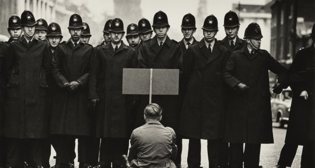
For my reading example, I’ve chosen this image by Don McCullin taking in London in 1963.
Fig 1. Don McCullin, Protester, Cuban Missile Crisis, Whitehall, London (1963)
Visual breakdown
The image contains a man sitting with his back to the camera, holding what looks like a placard. He is facing a line of British police officers in constable uniform, forming two lines across the frame. They are facing him. To the right of the scene, the line is one deep and has a gap in it. The last ‘complete’ officer to the right of the frame is reaching across to another who is partially out of frame. The scene is clearly a city street with the background detail blurred out of focus. The only other element is the partial view of a car in the broken line of police.
In interpreting what the image is about, we are immediately struck by the contrast of the characters. The police in their uniforms that appear black because the image is black and white, appear menacing when compared to the single man dressed in lighter, casual clothing. We cannot see his placard, so without the context of the title of the image, we cannot be clear on what it might say. When we include the title context, we assume it is a protest placard. I was struck by this image, because my immediate conclusion was that the barrier of police were somehow threatening the man, for reasons that include the above. However, I wondered why I had jumped to that conclusion. The man looks peaceful and in no way a threat to the police. My interpretation takes into account the way the police line isn’t complete. This raises the idea that the police feel vulnerable without that gap being filled, yet there are no other protestors present. It looks like an overreaction by them to a minimal threat. Of course, what is happening is that I am bringing to the reading, my own perspectives on the way that the police ‘manage’ protests, particularly peaceful ones. McCullin was documenting a protest during the Cuban Missile Crisis but Britain’s role was relatively small, with agreements being made for US arms to be located in nearby British colonies. The protest was therefore fairly distant., but without the context of what is written on the placard, we cannot know the strength of feeling at the time. My own perception is defined by protests that have occurred in my lifetime, some of which have been documented by photographers and film makers in a similar way to McCullin’s approach in this image. The protestor is being oppressed by the state via their police force. The identical uniforms and extreme visual contrast summon images of Nazism, even though there is nothing to suggest any trouble. In fact, when we look more closely a the image, the police officers look fairly relaxed, some are in fact smiling. The meaning of the image could just as easily be that the police were in the process of closing a street when the protestor arrived, perhaps being the first one to arrive. The visual language of the man being outnumbered by the police, the tonality and the way the composition allows for just the interplay between the people in the frame as context, evokes social post-memory which could be argued was as powerful then as it is now. I think this image is definitely more about the photographer’s perspective on the strength of the oppressed man than an actual document of the protest.
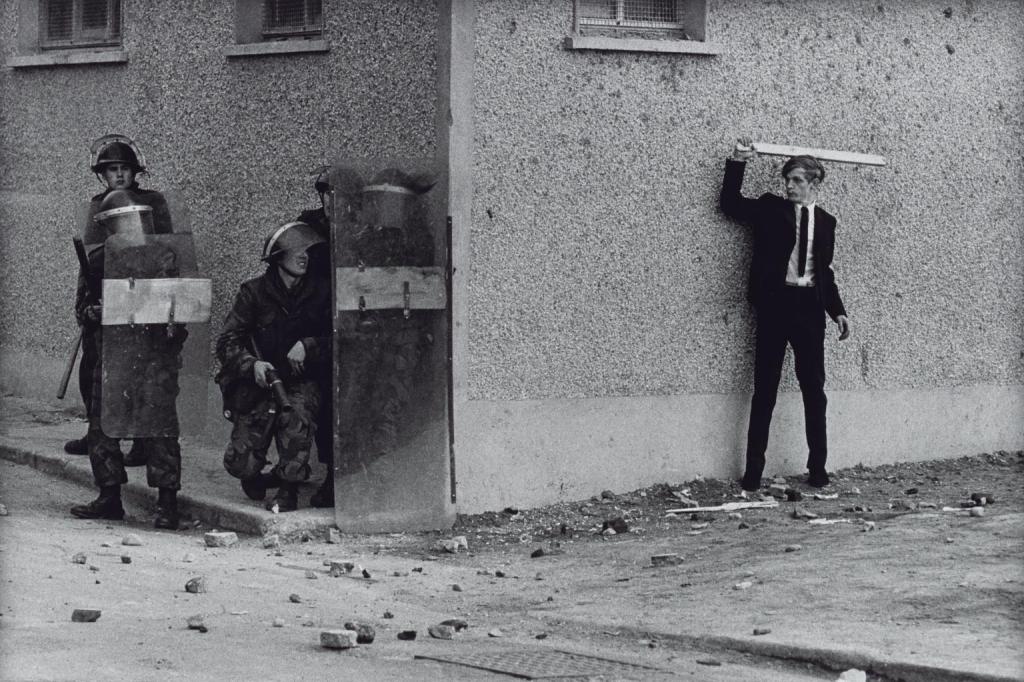
Examples of images that were not done for the benefit of the photographer include other work by McCullin. The image below was taken in Belfast during The Troubles. This shot is more in keeping with Cartier-Bresson’s decisive moment, with the two sides of the conflict about to clash on the street. The picture is one of a triptych of the ensuing confrontation.
Fig 2. Northern Ireland, The Bogside, Londonderry 1971, printed 2013 Don McCullin born 1935 ARTIST ROOMS Tate and National Galleries of Scotland. Purchased with the assistance of the ARTIST ROOMS Endowment, supported by the Henry Moore Foundation and Tate Members 2014 http://www.tate.org.uk/art/work/AR01189
This image contains similar elements to the previous one. A small force of riot police approach the edge of a wall, behind which a young man waits with a plank of wood. Unlike the previous photograph, McCullin has no control over the composition as the events are unfolding in front of him. We don’t know what has transpired before the sequence frames, but we can deduce from the scene that some form of pursuit is likely. McCullin is capturing the events unfolding but not approaching the image in the same pre-visual way.
In Becker, the comparison between socialolgy and documentary photography is described in terms of the approaches taken. The former is the based in scientific gathering of empirical data and its interpretation through analysis, while the latter tends towards the photographer’s reading of a scene. McCullin’s triptych, taken over a period of a few seconds, documents the impending ambush on the police in a way that lends itself to a more scientific data gathering than the first image.
When it comes to the photographer creating something for the benefit of themselves, I immediately thought of Walker Evans’ Subway series. The shots, taken using a hidden camera, are documents but are very much how Evans saw his fellow passengers. If he had shot them at regular intervals, say every 10 minutes, the resulting series would have been more methodical and arguably more ‘objective’
We are introduced to the ideas of Place and Space, which when I think about it, have always naturally meant the same thing to me. That’s not to say that they have the same meaning, as described in the notes. I think my interpretation of both has been influenced by my experience of mental illness, during which the idea of the two was significantly blurred. People talk about ‘head space’ and ‘happy place’, referring to a situation that is contained within our minds rather than being something tangible. To maintain your head space is to keep a clear mind and similarly, to go to one’s happy place is to mentally escape an experience by consciously thinking about something or somewhere that makes us happy. When I was unwell, I felt that my head space and the physical space around me were essentially the same thing. If something bad was happening around me, my mind focused on that to the detriment of any other, more positive thoughts. Being someone who found it difficult to hide what they were feeling, it was as if I had become transparent. I didn’t really take in my surroundings either for fear of becoming fixated on the negative.
Since my recovery, I’ve been successful at keeping reality and my imagination separate while allowing the former to inspire the latter. Enrolling on this degree course was one of those inspirations. I am now content in being able to imagine a ‘place’ that is inspired by something I see around me or online, as well as being able to appreciate a physical ‘space’ and the things that influence it. I had always been able to appreciate a beautiful view (as long as there wasn’t something negative to interpret from it), so now when I pause to take one in, I’m more likely to linger on thinking about the seasons, the history and how people have shaped the landscape. If I’m looking at a building, I try to imagine what it was like when it was built – did it have a special history etc? When I first bought my house, which was build in 1897, my brother-in-law asked me if it was haunted. We had a laugh about it, but when we think about old houses and the history they have ‘seen’, the concept of something supernatural existing within its walls isn’t that crazy an idea. In it’s 124 year history, the house has stood through 2 World Wars, the smallpox epidemic, financial crashes etc and has been shaped by the people who have lived there. My contribution to its history is tiny by comparison.
When it comes to ‘looking’ at space, this course has taught me to take my time and to not seek somebody else’s intent for it. What I mean by this is that I try to reach my own conclusion about what I’m looking at without wanting an explanation. My problem is that when I create a photograph or series, I look to explain it to the viewer. This is perhaps because of the way I perceive people looking at space. I’ve mentioned previously about Nan Goldin’s distaste for social media because of the way it’s shortened our attention span when looking at pictures. Indeed if we look at her masterpiece The Ballad of Sexual Dependence with this way of viewing, we’d miss the messages it contains (I regularly look at the book when I feel uninspired). People have become accustomed to seeing the objects within a picture without wanting to imagine why they occupy a particular space or interact with something else present. In Project 1, we looked at human behaviour in photographs that contained no people. If we just looked at the dishes in Shafran’s Washing Up for example, we’d probably not understand the meaning of the work. Such is our dependence on the visuals provided by our phones that we feel completely naked without them. A friend of mine was recently telling me of a traditional London pub that has a ban on mobile phones being used – whenever someone takes one out of their pocket, they are first warned and then thrown out. The idea is to appreciate the simpler interactions between people and the environment (and beer) that the pub has worked hard to provide. I mused at how long my wife and I would last.
Research Task: Your Environment
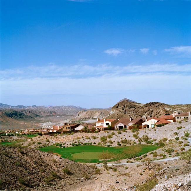
In considering the above and my own environment, I realise how much my ‘visual awareness’ has changed since finishing work. I walk a 3 mile route around my town every day, which varies only slightly depending on whether I need to shop for food or do some work. I started this routine nearly 12 months ago in an effort to get fitter, but I soon started to notice how the space is affected by the change of seasons. Traditionally, we know that when winter moves to spring, there is new plant life, changes in the colours of trees etc, but the first thing I noted was the way that the buildings changed. People stopped spreading salt on the pavement outside their business and houses to prevent ice, the number of chimneys expelling smoke and vapour from their heating systems gradually declined as the weather warmed. The wildfowl at the lake in our park started to breed and nest in the newly shaded trees. My walk was staying the same, but I was seeing a different town to the one from the version I saw during winter. What remains consistent with the seasons, however is the sense of familiarity and comfort. I’ve lived here for over 20 years and although the town continually evolves, the daily walk makes me feel at home when I see the familiar environment. My wife and I were out recently with some friends who pointed out that there had been a surge in new and interesting places to eat in the town. We recognised this change in the demographic, but it was lost in our sense of belonging here. When I looked at Robert Harding Pittman’s Anonymization, I could see the artist’s connection with the natural world being challenged by the behaviour of man. His images of the beginnings of ground works for buildings struck a chord with me as they symbolised change. The seemingly relentless progression of building ‘desirable’ living spaces is revealed in Pittman’s work as disrespectful to the natural world; the proliferation of the pattern making the landscape essentially anonymous. When we think of the lack of harmony between man’s needs and the natural world, there are many examples that immediately spring to mind. The urbanisation of California is a good example, where a landscape that sits on a major tectonic plate is cultivated because of its warm, dry climate. Millions of people live in the shadow of potential natural disaster and the rapidly advancing signs of global warming (the state suffers catastrophic fires every year nowadays). In spite of this, the people continue to build towns of houses with lush gardens and swimming pools because of what they see as the beauty of the environment. One image in Pittman’s series that stood out for me was the one below:
Lake Las Vegas Resort, Las Vegas, NV (2015) by Robert Harding Pittman[1]
Here we have a beautifully shot scene of the landscape of Nevada under a deep blue sky. The subject is a hotel-style development called the Lake Las Vegas Resort. What immediately struck me about this photograph was what was missing from the image. There is no lake to speak of, which when considering that Las Vegas in in the Nevada desert, isn’t a surprise. This awkward naming of the hotel seems incongruous in the landscape and is further emphasised by the lush green golf course in the foreground. The resort is billing itself as being Las Vegas which translates to ‘The Meadows’ because of the surprisingly well irrigated regions in the desert, but the golf course has the appearance of being entirely fabricated. The image screams insensitivity to me, highlighting the irresponsible development of the natural world for what is an entertainment venue. Other images in the series suggest a scale of this attitude, depending on social or economic status and some developments paying lip service to their surroundings. Whatever the social or political perspectives of the viewer, the series is interesting because it deals with people and culture by exploring their actions and their environments.
Stephen Shore (1947 -)
We are introduced to Stephen Shore in the context of the photographic journey. Like Walker Evans and Robert Frank before him, Shore photographed what at first glance appear to be uninteresting locations. The title of is book Uncommon Places mixes these images with slightly abstract portraiture and still life work, much like that of Eggleston. The title, as the notes suggest, is at odds with the banality that the subject matter appears to exhibit – this invites us to look closer at the series. Like Frank, Shore’s journeys that became the setting for his series was one of personal discovery. He was 23 years old before he realised that he’d not set foot outside of his native New York and that resolve to learn about the rest of the United States drove the observations in his book. The ‘Uncommon’ in the title could instead refer to that exploration or that the locations and experiences of the trip might be familiar but new to anyone looking at the images. Whatever Shore’s intention, the images have a sense of what it is like to be in America to natives and strangers alike. The notes refer to the comment by Szarkowski about Eggleston’s Memphis being a faithful representation to the uninitiated and the same being said of Shore’s work. For me, the work echoes the Italianicity that Barthes talked about[2]. Modern American culture surrounds most of the western world and unlike Frank’s look behind the curtain of it, Shore takes it head on. His work has drawn critical review that catagorises it as ‘formal, clinical, objective, impersonal and dispassionate’, which almost suggests little part of the photographer’s eye in the creation.
“She looked at them and said: ‘So, Stephen, you want to photograph every main street.’ I replied, ‘No, Hilla, that’s what you want to do. I want to photograph the quintessential main street.’”
Stephen Shore in conversation with Hilla Becher, quoted in an interview with The Guardian[3]
In the above quotation, Shore was telling Becher, one of the typology pioneers studied in Part 1[4] that he was interested in capturing the idea of an American street as seen by most people. Uncommon Places achieves that for me with its many cultural elements.
Personal Reflection
The notes ask us to consider where we would do a project of the scale of Shore’s or Frank’s and I think mine would probably be about a culture within a culture. The UK is a truly multicultural society, which has its successes and its problems in terms of acceptance. We are very familiar with the clashes of different races and the fight by many ethnic minorities against racism and everyday prejudice, but I am more interested in the cultures that interact with the wider population but quietly avoid becoming part of it. The one area that I would explore is the traditional Romani gypsies, who unlike the generic term ‘traveller’, live their lives within traditional family structures and customs. Our interactions with true Romanis are few and far between, limited to door-to-door sales and travelling fairgrounds. My series would explore life for the Romani in the UK, beginning with the densely populated regions such as Greater London and ending with in the more rural areas. It would seek to reveal there world by capturing their act of travelling around, so becoming journey within a journey.
Paul Gaffney and Alec Soth
Paul Gaffney series We Make the Path by Walking(2013) is a book that captures the beauty of the natural world shot during many long walks. When I looked through the book, there were a few things that stood out for me. The notes refer to the mindfulness evoked by the images, but for me the key theme is the sense of familiar and unfamiliar. I regularly walk around the area that I live in and inevitably take photographs of the things that are obvious to its location and some that are not. Gaffney’s series contains familiar images of grasses and tree-lined pathways that could just as well be where I live. As well as the beautiful aesthetic, it is this familiarity that invokes a sense of peace in me. Gaffney further enhances this by not giving any clues as to where they were shot. Conversely, the viewer is invited to appreciate the nature surrounding the artist while he walks in a place that is unfamiliar to them.
“I always wanted the images to evoke rather than describe, and for people to engage with the work and to bring their own experience to it, rather than it just being about my own experiences. I sometimes recorded ambient sounds which I have considered using in an installation, and I was also thinking about recording conversations with people along the way, but it was always going to make things overly complicated and as it becomes complicated, it tends to bring you further away from the experience.”
Paul Gaffney in conversation with Walter Lewis for Photomonitor[5]
Gaffney’s ‘simple’ approach to his work leaves the viewer free to draw their own conclusions about the environment, the act of walking through it and connecting with nature. Some of the images contain humerous elements such as the blocked off mountain bike ramp, while some show the struggle between man-made objects and nature like the one below:
We Make the Path by Walking – 2012 by Paul Gaffney [6]
I particularly like this image because it is both beautifully shot and asks questions about nature coexisting with the manufactured. Depending on our reading of the image, nature could be seen to be fighting back or the enduring ‘permanency’ of concrete could make the battle a futile one. Man is not shown, but is observed by man moving through the space, which makes pictures like this really powerful within the series.
Alec Soth has been heralded as the modern day Robert Frank; his story-telling being of a similar style in its exploration of that which is behind the facade of culture. In his collaborative book with Patrica Hampl, Soth explores the Mississippi region alongside the great river of the same name. The photographs span a wide range of cultural elements, some specifically about people that are shot in portraiture and some that capture the traces of personalities and behaviours. They all serve to tell as story of a region that is not mainstream America, in the same way that Frank’s The Americans did many years before. The image from Soth’s series that struck me was Cape Giirardeau, MO, 2002[7] which shows the wall of a room with some kind of laminate panelling and an a painted section that used to have pictures hung on it. The pictures are gone, but the hooks and outlines remain in the discolouring of the paintwork. The only things left attached to the wall are a fragment of newspaper with the word ‘Folklore’ on it and part of Ansel Adams’ famous picture The Grand Tetons and the Snake River. This picture invites so many questions about the human condition through a very simple composition. The derelict state of the wall looks like it’s been abandoned with the pictures removed and presumably taken away. The newspaper fragment suggests that the owner was collecting some new stories, but we can only imagine their subject. The inclusion of Adams’ picture suggests that a desire to get away to another place, yet we have only part of the image. Could this instead mean that the vista wasn’t important beyond the visual aesthetic? Why did they leave it behind? For me, this was one of the most powerful images in the series, because of what is not contained within the frame. Soth’s images create a sense of the region and it’s people being a kind of subculture, in a similar way to Goldin’s work. It has the aesthetic quality of Crewdson’s tableau and the use of bright, contrasting colours pioneered by Eggleston and Meyerowitz.
David Spero and Martina Lindqvist
David Spero’s work Settlements takes a very personal view of subculture. Unlike Soth’s representation, Spero blends photographs of off-grid living arrangements from sheds to bothies with traditional portraits of the people who live in them. The latter are, in some cases, staged like family photos which gives them a warmth that we would not necessarily have if limited to the photographs of their homes. Some of the portraits depict more of the way of life of the people to add the overall sense that we are invited to look at their settlement rather than being an observer. This plays well into the outsider/insider idea suggested by Abigail Solomon-Godeau (studied in C&N)[7] with Spero becoming part of the culture he is representing. The interior shots of the homes take on an aesthetic that is similar to the tableaux work we have looked at, yet there is a documentary feel to them. The artist is representing another way of life rather than making a personal statement about what he sees – this is in contrast to how I read Soth.
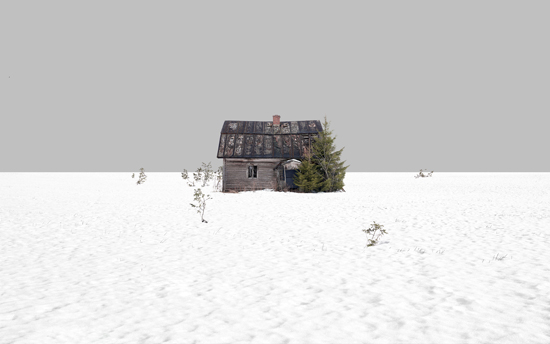
With Martina Lindqvist’s Neighbours, we see architecture in a different light again. Where Spero had created a sense of the community and variety of the homes that his subjects lived in, Lindqvist uses very simple composition to tell a story about private space and isolation. An example can be seen below:
Untitled 08(Neighbours) (2013) by Martina Lindqvist[7]
In this picture we see a simple composition of equal land vs. sky with a solitary house in the middle of the frame(the whole series is shot like this). The bleakness of the environment around the house and the snow on the ground contrasts with the greenery of the trees. The mood created by the composition could be bleak but the juxtaposition of the tree and house suggests a pride in their home. The small trees that poke out of the snow invite the viewer to imagine what the land around the house might look like beneath it. In every picture the thought is that the neighbour is in their house, which may not be true. We are left wondering what they are like, purely on the basis of their home.
Conclusion
This has been an interesting project because each of the artists represents the concept of place in a different way. Pittman’s apparent despair at the way that we impact the natural world is more political than say, Gaffney’s while both artists make a statement about the struggle between nature and man. The idea of a culture as seen through representation in Shore’s work is very different from that of Soth, even though both artists are exploring something new (Shore having not experienced travel until he was in his 20s). The concept of home is explored by Spero and Lindqvist with a not to the diversity of how people choose to live, however the former is very much from within the culture while the latter takes a remote perspective. What is clear from this and the other work in Part 5 is that people move through the world leaving a trace of themselves, their behaviour or decisions and their culture behind. The artists we have covered in both projects are tuned into these traces without worrying too much about including the people themselves. What results can be powerful from a social and political perspective, act as educator or myth-dispeller, with the one thing in common; they all ask questions of the viewer and rely on them bringing their own life experiences to the reading of the work.
As you’ve seen, there are many examples of photography that avoid the use of the human figure in order to communicate truths and stories about humanity. Do your own research into areas you’ve been inspired by in this project; delve deeper into the areas that interest you. Continue to think about how this might inform your own practice.
Introduction
Within the second half of Project 1, we are introduced to the genre of still life. During the previous units, my research has led me to look a the practice of traditional painters, most of whom worked in still life at some point in their career. Famous painters such as Cezanne, Van Es and Gaugin painted still life with one thing specifically in common, their paintings had a quality of ‘the ordinary’ paired with the trace of someone having been present to influence the scene before it was painted. In some cases, such as the one below, the image could represent a moment for pause with an activity about to proceed when the person has returned.
Untitled by Pieter Claesz c.1640[1]
In this classical scene, we see what looks like a dining table with a part-consumed meal on it. The image could be read a number of ways, the first being a document of the structures of natural and ‘made’ food; the cross-sectioned pie and grapefruit. The second reading could be that this meal has had to be halted for some reason while the person leaves the room momentarily. With the former reading, we can also see the use of light and shadow in the composition, which is subtle enough to draw our attention first to the fruit and then to the bread and pie. The second reading uses the light to create a sense of evening with its muted tones. Whatever the reading, there is both technical revelation and the pausing of human life contained within what looks like a banal scene.
Sam Taylor-Wood (1967 -)
With her short film Still Life (2001), Sam Taylor-Wood takes a classic scene of some fruit as painted by one of the master painters and films a time-lapse of it decaying from fresh to pulp. The resulting film reveals a number of ideas that we might not consider until presented with what is a long-term activity, in real-time. The first is the passing of time itself. As the film advances, the light in the scene changes subtly which literally describes the passing of time for the fruit. The second, more obvious one is the actual decaying of the fruit which gradually develops discolouration as the flesh rots. During this process, the emergence of fungus becomes obvious which feeds on the decaying fruit. The film concludes with the ‘death’ of the fungus also and the appearance of flies that feed on what remains. The film is powerful because it suggests a documentary of something happening as with Claesz’ picture but also a continuation of life in the scene. The fruit decays, leading to new life in the fungus with that too dying eventually. After a time what is left further attracts other life to consume it. The element that isn’t included but is also palpable, is the sense of neglect on the part of the owner. Someone has left this here to rot for a long time, which begs the question ‘why?’ That in turn provokes different reactions depending on how we see waste or laziness and in itself could be a metaphor for the human condition and its behaviour toward the neglect of the natural world.
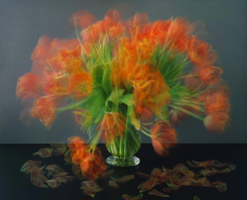
When I first saw the film, I was reminded of Michael Wesley’s Still Lives (2003) which depicts vases of flowers decaying over time.
Still Lives, 2003 by Michael Wesley[2]
The images were made using very long exposures on film which result in the movement of the flowers as they decay being visible in the single frame. Again, this series has the metaphorical sense of abandonment and carelessness. The flowers have been cut from their natural habitat, used in a display for a person who then promptly lets them decay. The person isn’t present but their actions most definitely are.
Jeff Wall (1946 -) and Laura Letinsky (1962 -)
With these two artists, the idea of still life is taken a step further with the images tending to be created more for their aesthetic than any iconic or symbolic messages. Special attention is paid to elevating the banality of the objects in their photographs by careful composition of form, tone and colour so that the viewer is left with the immediate impact of a visual before trying to understand the meaning of the image. The aesthetic is, as the notes suggest, pushing the viewer to try to appreciate the visual rather than the subject specifically, i.e. to ask whether it is ‘art’ or not.
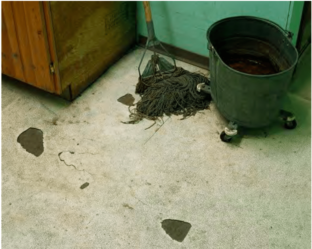
Diagonal Composition No.3 (2000), by Jeff Wall – taken from the course notes
In the photograph above, Wall uses diagonal ‘lines’ in the frame and in the subjects to create a geometric composition. Everything from the lines of the wall and cupboard, to the arrangement of the wheels on the bucket point to order, while the floor and cupboard have contrasting rough textures and dirty appearances to them. The final layer is the tone and colour, which work together in the subjects and their backgrounds. Wall is making something with atheistic ‘appeal’ that also has the foundations of still life with traces of human contact. Something has been removed from the floor which has left the bare patches. The mop looks like it has been left there temporarily rather than being put away in the cupboard. The work asks questions about behaviour but also about the coincidence that the objects appear in balance. We suspect it’s deliberate but we cannot be sure.
With Laura Letinsky’s work, we see a similar approach to making the still life ‘look’ like the works of the classic painters. Her work takes the banal subjects that we have seen with other artists and places them in a stylised environment, dominated by pastel shades and soft tones. In an interview for Aperture[3], Letinsky speaks of her initial interest as being the characterisations of the subjects (mainly fruit in her case) as being somehow unimportant; their appearance having strong lines to femininity (the way she lights her still life accentuates this idea). Finallly, there is the layer of domesticity that we’ve seen before; food preparation that is paused midway through as if life has somehow gotten in the way. Letinsky went on to discuss the duality of photographic representation, which I found interesting.
“Alongside its ability to provoke sensations, photography has a way of homogenizing experience. A piece of schmutz and a Tiffany diamond become the same thing once they’re photographed—they become photographs. I have a love/hate relationship with this power of the camera to flatten difference”
Laura Letinsky
What she is saying here is that photographs simultaneously provoke emotional reactions in the viewe while the camera doesn’t naturally emphasise the beautiful over the bland in a single image. If we consider this in the context of how we look at things around us, the concepts of beauty and ugliness (or blandness) are created by our personalities. The image then invokes a subconscious response (emotional or post-memory) while the visual is something we can decide to consider as beauty or not. As the notes point out, Letinsky’s later work includes representations of still life subjects instead of the actual object, which for me is taking a strong influence from Magritte and his assertion that a representation is not ‘the object’; this is not a pipe.
Nigel Shafran (1964 -) and Sarah Lynch
We encountered Nigel Shafran’s work Washing Up(2000) during Context and Narrative[4] and I was drawn to his use of ‘post-event’ contextual elements in his pictures. At the time, we were considering the work as absenteeism portraiture because the items in the compositions told us a story about the people who lived in the environment. The subtle and careful placement of the pots and pans, empty wine bottles etc set the images in a particular time of day as we start to imagine what the preceding meal was like. Some of the items suggest a convivial situation while others a potentially tense one, but that is up the viewer’s own recognition of the scene to conclude. Of the artists in Context and Narrative, Shafran (along with Wall and diCorcia) influenced my view of story-telling more than the others.
Sarah Lynch’s work is unlike the other artists here although the origins are clearly still life. Lynch makes a small number of objects the focus of her photographs, with little in terms of background or additional contextual elements. Her subjects are typically everyday and instantly recognisable to most people, but here they are represented in the composition in a way that makes the viewer consider them carefully. In one (Circles No.5)[5], a single circle of electrical wire sits in an empty space. The circle is perpendicular to the viewer, so that the shape is clearly seen. The wire is looped a few times and secured by a small thread that is the same colour as the plain background. The image is lit so that the bold copper colour of the wire contrasts with the otherwise pastel background, resulting in the viewer only looking at the one subject. At first glance, it’s not clear why this picture deserves any real attention. When I looked at it, I was struck by how the wire appears under tension, restrained by the thin thread that barely looks strong enough to hold it. I’m immediately struck by what would happen if the thread snapped. Would the wire spring out and lose its shape? Would that movement topple the wire so that the circle it envelopes also collapses? Is the wire a metaphor for the fragility of life?
“I would like to think that my work does show importance and beauty in everything, be it objects, space or time. I hope it is a reminder for us to appreciate life so as not waste our short time being angry or hurtful. I think being reminded of our fragile states, both in the sense of our own mortality and the transient nature of our being, helps put our small selves into perspective. We should be marvelling at the constant movement of energy that we are part of; we shouldn’t be trying to divide, package and control it all”
Sarah Lynch in conversation with Sharon Boothroyd[6]
This quotation from her interview with Sharon Boothroyd suggests that my reaction is similar to her intent for the work. Here then, we have traces of human interaction because the wire was put into a circle deliberately and restrained by the use of the thread. The human input has a transformative quality to the wire, which now takes a shape it’s not supposed to be in. Having said that, wire is normally formed on a reel, so it could be argued that the act of winding it in this way is a pseudo-natural manipulation in an almost passive-aggressive fashion. The person who did it is no longer there in terms of the picture but their impact is still felt. The wire though, could break free at any moment, either by accident or intentionally. The potential for moving from one state to another is very much a metaphor for life and death. The triviality of the wire and its surroundings is for me a metaphor for our own insignificance in the context of the universe.
Susan Lipper and Penny Klepuszewska
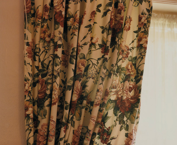
The final two artists in this project play heavily on stereotypes in their still life work. Lipper made a series called Bed and Breakfast (1998) which uses a mixture of still life and candid ‘holiday snap’ photographs to create a sense of the English holiday. What’s interesting is that the stereotype is being interpreted by an American. Even so, she takes the most familiar parts of the British holiday experience that people of that culture instantly recognise. The work exploits the minor, apparently unimportant details of the traditional British holiday in a way that invokes memory. As the notes suggest, the memories that the images provoke are not limited to the visual. Those of a certain age would associate the image of the curtains (below) with an old, slightly musty smell that tell of a room needing some modernisation. That sense works with the visual aspect, which is more obvious in the same way. The tone of the image and the peach-colour of the wall suggest a quaintness that is often associated with small, British hotels and B&Bs. To look further, the cheerful pattern of the curtains themselves belie the mood of the rest of the series which has a tired, clichéd feel to it.
Untitled, from the series ‘Bed & Breakfast'(1998), by Susan Lipper[7]
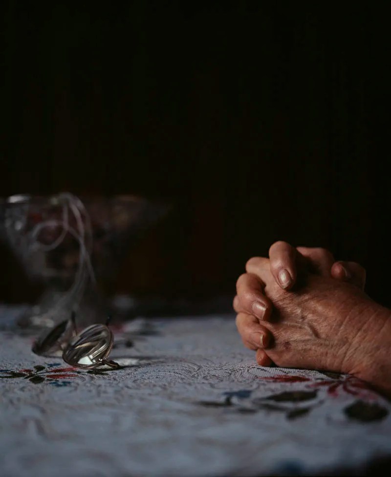
A similar set of emotions are invoked when we look at the work of Penny Klepuszewska. Her series Living Arrangements (2001) uses still life to represent familiar items in a nursing home. The series is shot as ‘low-key’, which adds immediately adds a sense of gentle discovery as if the scene is being illuminated from the darkness by torchlight. The artist uses the small amount of light to pick out the edges of some structures, while placing others in shadow which, when I viewed it, made me feel like I was moving through the ‘scene’, gaining mere glimpses of the items. Like Lipper, Klepuszewska does include people in her scenes but instead of the emphasis being about them, they are almost ‘models’ for the other elements in the frame. In the picture below, for example, Klepuszewska uses the old lady’s hands to model ideas about the lace tablecloth and the glasses.
Living Arrangements No.5 (2001) by Penny Klepuszewska[8]
This image struck me as we have a blending of still-live with portraiture that creates a strong sense of someone’s life without being to see much of them. We don’t know anything beyond the age of the hands and that they look feminine. The arrangement of the hands is as if in prayer which sets this image out from the rest of the series in that it suggests both comfort and loneliness in the same picture. The rest of the series appears almost documentary in nature with the selection of items that a nursing home would have within it. This image reminded me of Bryony Campbell’s Dad Project, studied in Context & Narrative[9]. Campbell included photographs of her Dad’s physical decline without showing his face or any emotions that he may have been experiencing. The final picture in that series, of Campbell holding his hand after his death, was for me the most powerful in terms of a metaphor fro the passing of time and our physical forms acting as a vessel. In the picture above, we have the old hands pausing for prayer at a table, which creates a sense of someone’s faith that they are not alone. The use of light suggests the prayer is before bed, which is a strong, recognisable idea in people who are deeply religious and traditional about their faith. The inclusion of the glasses that have been neatly folded and placed, further emphasises the sense of the day ‘being over’. The who image could be read as a metaphor for old age and impending death, or indeed the gratitude for each day despite the surroundings the person finds themselves in. There is a layer of joy in the image, which fits very neatly into the rest of the series.
Conclusion
I’ve found this project very interesting because of the different ways that absenteeism and still life can be used to tell relatable human stories. Each artist has used the genre slightly differently, from Wall’s discovered beauty in banality to Letinsky’s metaphors for the grace and fragility of the physical. Shafran’s Washing Up always appealed to me as it was the first time I really looked at an image for signs of life. The life is definitely there in the subtle inclusion of everyday objects, but the questions that it raises are so vast that the imagination of the viewer can run wild. The series by Klepuszewska struck me as sensitive and caring, perhaps because I can relate to the messages about the final phases of life. We can see a nursing home as being a terrible idea for our loved ones or we can see them as a safe haven for the elderly to continue with their customs or traditions. Whatever the viewer brings to the viewing influences how the series makes them feel.
In terms of how this work (and the rest of Project 1) will influence my work, I am planning to incorporate some form of still life tableau into my story for Assignment 5. The challenge for me will be not including too much detail that restricts the viewer in understanding the picture itself and how it fits into the rest of the series.
We are introduced to a number of artists who have elected to take the ‘bring your imagination’ to their work. Where the previous artists had represented their subject’s identities in the context of daily life, their real or imaginary environment, the next idea being investigated is when the subject is absent. In the first Research Task [1] we consider how removing the subject affects the photographer’s role as documenter or storyteller, as well as thinking about our own thoughts on how it might affect our work going forward. In this post, I will be looking at the artists themselves.
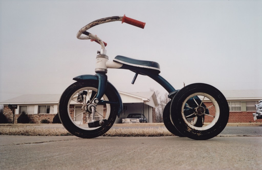
William Eggleston (1939 -)
William Eggleston is a photographer that divides opinion. His work is considered pioneering and overrated, seemingly in equal measure, but one thing that anyone would struggle to do is ignore it. The notes refer to the duality of his shooting a particular place that we may or may not be familiar with and representing it in a way that the viewer has to decide how real or not that may be. Perhaps his most talked about photograph (below) is a great example of this.
Memphis, 1969 by William Eggleston [2]
Here, the child’s tricycle looks like it has seen better days and is apparently abandoned at the side of an ordinary-looking street. In an interview with the Whitney Museum [3], Eggleston refers to his walking around an ordinary neighbourhood in Memphis without any particular purpose. While sitting on the curb, he noticed the tricycle close by. His photograph puts the viewer at the same level as his subject and it dominates the frame. We cannot help but look at the tricycle as if from a child’s perspective. Why was it left there? What happened to the owner? More importantly, the viewer is encouraged to look beyond the dominant subject at the background. The street looks fairly featureless, but the questions about the neighbourhood are instant. What is the place like? Do people litter the streets with stray children’s toys? We know nothing really about the street or its inhabitants, but Eggleston creates his own version of it through an image of an everyday object in the context of its environment. It’s condition and the fact that it is left out on a pavement lets us draw our own conclusions about it, based on our experiences, prejudices and cultural view of the South US. Eggleston claims that he just likes taking pictures of what he sees, but in looking at his work, there is a great deal more to it than that. In his book Election Eve(1977), he shoots a series of pictures that refer to traces of the subject alluded to by the title, but in reality it’s more about small town American life away from the hysteria of the election. In most cases the images show only traces of the people in the town, with those where we can see them are composed in a way that doesn’t distract the viewer to the other elements in the frame.
Untitled from the book Election Eve (1977) by William Eggleston [3]
In this image, Eggleston creates a sense of rural America through his use of colour and tone. The use of colour is something that Eggleston is famous for as one of the pioneers of its use when high art was still firmly in black and white. Here, the rich brown tones of the porch and the car are made vivid by the film and the light in the scene. The mood that Eggleston creates is a clash with the urban aesthetic that we would naturally associate with Washington, where the presidential election was taking place. The image, and indeed the series, suggest a ‘meanwhile, away from the noise’ response to the events. Eggleston includes traces of people in this frame (the car, the deckchairs on the porch etc) and also someone on the very edge of the frame. By leaving the woman half in the composition, Eggleston gives the sense that the people of this rural area are somehow unimportant.
“On the eve of the election, when nothing had yet been decided, when everything–whatever that everything was–hung in the balance, Eggleston made an elegy…a statement of perfect calm. To say, however, that these photographs are romantic, sorrowful and quiet is not to imply that they are easy or in any sense comforting. They are richer and more sensual in some ways than Eggleston’s other work, but they are not less penetrating or unsettling. In them Eggleston seems bent, as always, on recording those unremarked units of spatial perception by which the everyday world is unconsciously ordered”
Lloyd Fonvielle writing in the introduction to Election Eve (1976)[4]
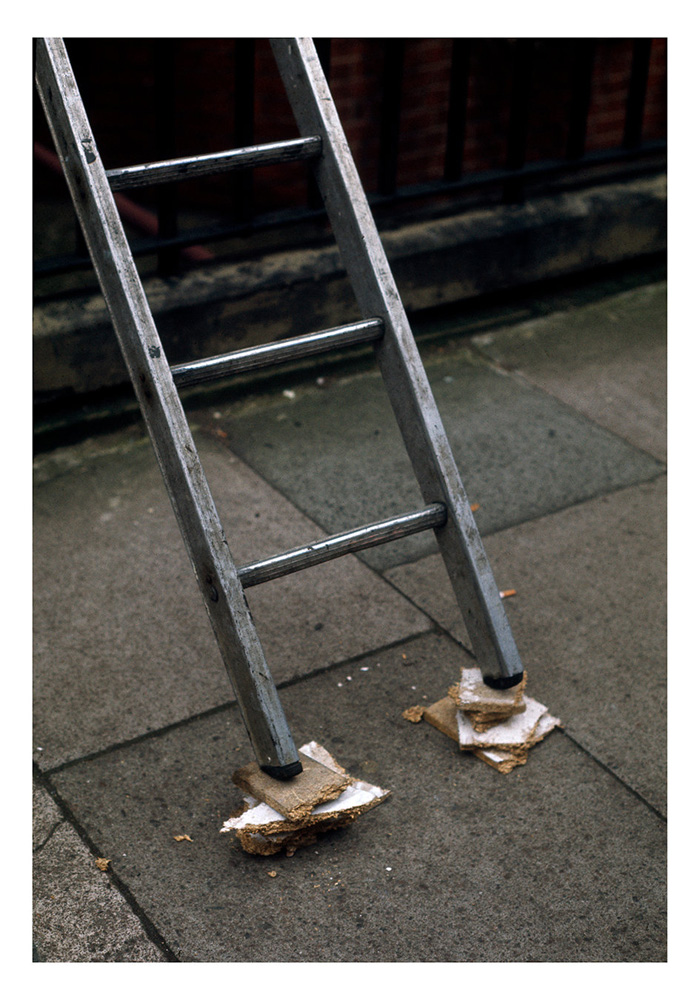
Richard Wentworth (1947 -)
In his book Making Do and Getting By (1984), Wentworth presents everyday banality in the same way as Eggleston, only here we have traces of people doing the best they can with whatever is available to them. In a humerous way, Wentworth’s series looks like a collection of badly executed DIY repairs, ranging from the hoarding around the base of the lamp post shown in the notes to the use of the hammer to lift a door off the ground. There are a number of layers of narrative in these works, staring with the obvious poking fun at the ineptitude of what cases of ‘making do’ with botched repairs. However, we also see situations created by people who have little choice as in the image below.
From the book ‘Making Do and Getting By’ (1984) by Richard Wentworth[5]
In this picture we see a ladder precariously balanced on blocks of chipboard. Aside from the perceived stupidity of the arrangement which looks dangerous, we also wonder how the operator concluded that this was the right way to go. Did they have no other alternative or is this the reality of working in the city vs. the countryside? We cannot see the operator and don’t know if they used this setup or not. The picture asks questions of us as a resourceful species, the societal aspects of what is acceptable risk and of the person taking that risk, despite there being nobody in the photograph. In addition to these interpretations, the image is a 2D representation of what could be a modern art sculpture. In the banality of the composition, Wentworth creates a simple but challenging narrative that combines the serious with the satirical. Like Eggleston, Wentworth takes his time to observer, citing the artist’s responsibility is to be vigilant [6]. In looking for the things that we might not notice in the chaos of daily life, both artists create a commentary on an aspect of society that we are all familiar with, even if we are not within it.
Elliott Wilcox (1987 -)
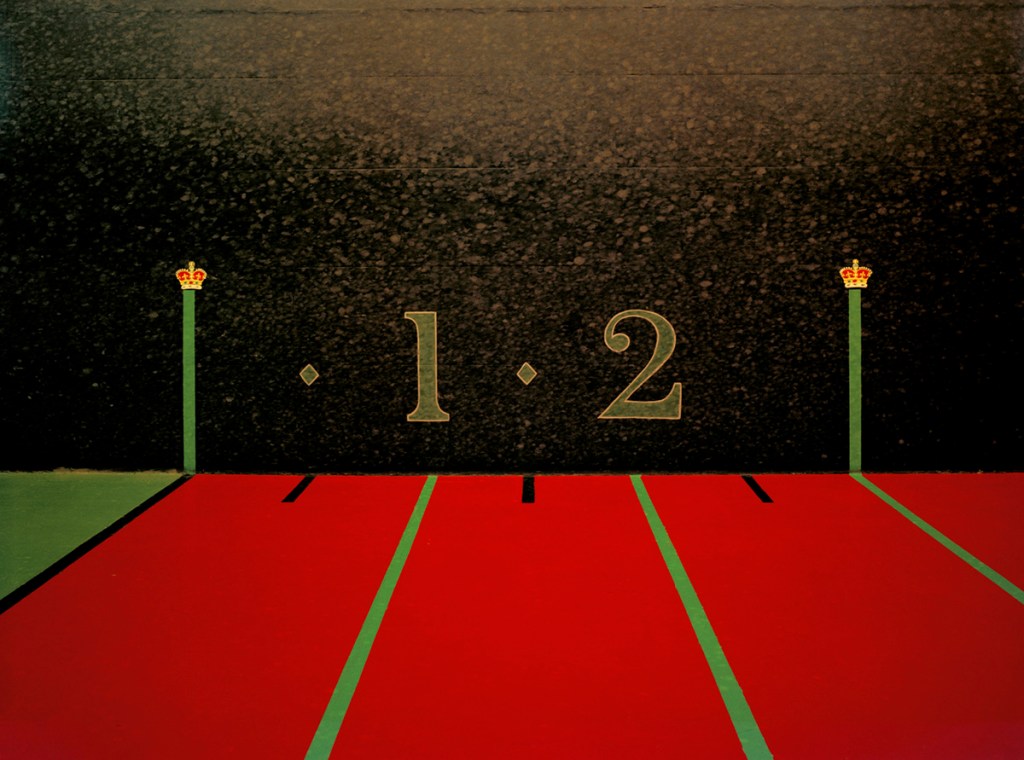
In Wilcox’s work we have much more abstract traces of human life. Both series are shot with tight fields of view which result in shots that ask questions about the subject itself. In Courts his shots of a Real Tennis court, a game popularised in the Tudor era, offer the viewer a perspective on a space that has a vintage feel to it.
From the series ‘Courts’ (2008), by Elliott Wilcox[7]
The inclusion of crowns painted on the walls suggest that something important or upper class takes place on the court, which in turn sets the space into a societal context. When we look more closely, we see the marks left by the tennis balls striking the once-pristine paintwork. In other images, there are cracks in the surface which future emphasis the sense of intensity in the sport. This points to the passage of time and the vast number of people who have competed in this space. We get sense of the activity and the people taking part without them needed to be there. The notes refer to his other work ‘Walls’, which takes the same approach with a variety of climbing walls. the tight compositions accentuate the minute traces of people left on the walls, but the subjects themselves are often obscure to the point of becoming abstract.
Sarah Pickering (1972 – )
We’ve encountered Sarah Pieckering’s Public Order series in a previous unit[8]. Her bleak architectural landscape shots of a fake town that is used to train police officers in public disorder management are strange but familiar. At the time, I associated the work with the familiar aesthetic of the area where my wife grew up in industrial West Yorkshire. I was considering Pickering’s use of the space, texture and implied dereliction of an urban area, but when I think about it now, I re-evaluate what I brought to that original interpretation. If I were to walk around the area that I am familiar with, I would see the features of the environment in the context of the people who live there, which would in fact tell a story about everyday life. That everyday life would include not only the physical decline, but also the changes in cultural influence. I would be able to see positives and negatives within that area’s identity. When I look at Pickering’s work, however, there is no reference to actual people. We are presented with a visual where we create our own population that might inhabit it. That creation is based in ‘fact’, i.e. what we bring to the reading of the image, but also has a fantastical element to it.
With her other work Incident (2008), I am instantly reminded of the work of mid-20th Century crime photographer Weegee, who for many years turned to crime scenes with his large format press camera to shoot the immediate aftermath of a heinous crime. In those images, the scene was often ‘managed’ in some way by the police presence, which leaves the viewer wondering with many questions about what had just occurred.
Untitled by Weegee (1941)[9]
In this image, we see a police officer and another man looking at a covered body on what looks like a pier. The actual story is of a stampede that killed the woman lying on the ground and we see on further inspection that the wasn’t the only one. However, without the knowledge of the story, we are left with questions about the victims, whether they were linked to each other in any way as well as the obvious ‘what happened here?’ Weegee included enough to suggest documentary, but left enough room for the viewer to make up their own story that fitted the elements in the frame.
From the series ‘Incident (2008)’, but Sarah Pickering[9]
With this image we see a collection of burnt out white goods. At first the damage points to our inner fear of a fire breaking out in our homes, but on closer inspection the items don’t appear to be severely damaged. The soot that covers their surface came from another part of the building, which leaves us wondering about what happened. The domestic nature of the image suggests, but doesn’t specifically include people as with the other artists here. We recognise the machines as part of our daily lives which are now in some way unavailable to the owner. As well as the big questions of whether the people managed to survive the fire, we are also wondering how their lives will need to be rebuilt, starting with these appliances that they/we depend on daily. Of course, the series isn’t about any real people, instead being a training exercise for firefighters. By including familiar objects and linking them with our primeval fear of fire, Pickering creates an anxiety where we hope that our imaginary occupants made it out alive.
Conclusion
The artists in this project have succeeded in making work about people, whether real or imaginary, without any being present in the images. By using subjects that point to some event or activity that people might participate in, the viewer is given a sense of who the absent person might be. However, in leaving the space to create our own impressions the artists make the work more about how we imagine life to be rather than limiting the reading to our own experiences. As Szarkowski pointed out in his introduction to Eggleston’s work, the idea of the picture being more than just an assumed reflection on real life means that there is a great deal more to connect with when we view it. When this happens, the apparent banality of the subject is in fact the art, rather than a statement of fact. For me, the suggestion of identity though the use of traces gives a freedom to the work for which there is no right or wrong interpretation.
We are introduced to a number of artists who have used conversations or discussions to describe or invoke memories. As we learned in Part 3, memories can take the form of our own past experiences, those passed down through generations or even those that are created by a major cultural event such as The Holocaust or the assassination of JFK. The phrase “Do you remember where you were when…?” evokes memories that may not be our own but are our acknowledgement of what happened and the cultural circumstances that gave rise to it.
David Favrod (1982 -)
In his work Hikari (2014), Favrod addresses a single conversation that he had with his grandparents about the events and aftermath of World War 2 in Japan, which included the dropping of the atomic bomb on Hiroshima in 1945. Favrod remembered this conversation that was never revisited or discussed subsequently and as he described in an article for LensCulture[1], he had borrowed their memories and used them for his own testimony. In doing so, he used an increasingly fading direct memory (as survivors of the war are dying out) to highlight his own coming to terms being half-Japanese and not being able to gain duel citizenship. The series combines different styles, ranging from straight documentary, through fictional and conceptual images. In each case, Favrod leaves a large amount of ‘space’ for the viewer to bring their own experiences to the interpretation. Some images are stark but conventional compositions, while others contain graphical annotations or text. Most notable is the shot below:
Baoummm (2012) by David Favrod[2]
What is interesting about this photograph is not so much the desolate aesthetic, with the bright sun and rising smoke from what we presume is a fire. Instead the Japanese text that has been added is the representation of Baoummm, the sound that conjours the explosion of a bomb. As we look at the image, anyone who does not understand the inscription has the title to go by, which when spoken out loud phonetically describes an explosion. The rest of the image immediately suggests total destruction, which two cities in Japan suffered when the atomic bomb was used. The image now suggests that perhaps this landscape looked different before a catastrophic event with the remnants being the bright light of a fire and smoke on the horizon. The added aural information connects directly with the memory of Favrod’s grandparents and is constructed in a way that the noise could still be felt in the present. When we look at this image in the series, the duality of the narratives becomes more apparent. Knowing that Favrod tried and failed to become part of the culture that half his family were from, this shot takes on an empty, almost pointless feeling to it. The news would have been devastating, so the combination of the wasteland and the shock of the sound connect with his experience as well as that of his grandparents.
Another image that stood out for me was the one below:
Le Bunker, by David Favrod (2012)[2]
Here we have a shadow puppet being cast onto a concrete wall and a title that suggests that it’s the wall of a bunker. In the interview with Sharon Boothroyd [2], Favrod describes the fact that in his home country of Switzerland there is a law stating that houses must have some form of underground shelter in case of nuclear accident. Knowing just this one piece of information through its title, we can read the image as being about freedom because of the symbolism of the bird ‘sculpture’ being made with the hands. When we add the context of Favrod’s duel citizenship issue, the image could take a more political meaning where the artist is being actively excluded from part of his ancestral heritage. However, we also have the anecdotal information about how the atomic bomb blasts scorched patterns of living things into walls and other structures owing to the intense heat. Now the image has a sense of duality about it that is influenced by the spoken word and historical memory more than the title. We’ve all been to a gallery or museum where an exhibition has a brief introduction to the artist or an audio clip where they introduce the series. These quotations or spoken words set the scene for the series before the viewer looks at the pictures and serves to provide a small amount of detail, the expectation being that viewer bring their own interpretation to the work. In the case of Hikari, the viewer doesn’t need to be experienced in Japanese culture in order to read the images. They could simply bring their idea of Japan in a similar way to the concept of ‘Italianicity’ in Barthes’s paper[3].
Sharon Boothroyd (1982 -)
In her series ‘If you get married again, will you still love me?’, Boothroyd attempts to show us the unspoken emotions experienced by children when their father is absent from their lives. Instead of straight documentary of a particular situation or reaction to it, Boothroyd takes a more constructed approach. In an interview with LensCulture, Boothroyd described how her discussions with separated fathers and their children, while revealing, didn’t uncover the truth about the pain caused by the situation. She decided to take the anecdotes from her interviews and create a series of tableaux to reflect her interpretation of the feelings the children were experiencing. Boothroyd tried to get inside the child’s experience and represent that in her photographs. The series doesn’t contain any additional context beyond the main title and it is up to the viewer to interpret the images in conjunction with it. Although many people don’t experience the loss of a father figure through divorce or separation, what is powerful in this series is that everyone has dark moments where they are isolated or anxious. For example:
From the series “If you get married again, will you still love me?”, by Sharon Boothroyd (2012)[4]
In this picture, a girl and (we presume) her father are sitting in a cafe sharing a portion of chips. The immediate thing that we notice is the physical distance between the two and their total lack of engagement. Without knowing that the series is about absenteeism, it could be interpreted as a teenage daughter behaving like a teenager. However on close inspection there is a real difference visible in the expressions of the two; the girls anger and the father’s sadness. Now the image can be read as a drifting apart that a portion of chips isn’t sufficient to bridge. We can interpret the offering of food as a way of breaking the ice or diffusing tension, but also as a poor way of making an unhappy person feel better. Perhaps the gesture itself is what has made the girl angry. In my interpretation, I am conscious of my own experiences as a teenager which don’t necessarily reflect that of other viewers; this is the point of the series. The viewer brings their own empathy, intolerance or feelings of love, anger and sadness to their interpretation of the image with only the title of the series to go on. The learning point here is that we don’t have to include text to create an open narrative, but some small gesture of context-setting helps guide the viewer in their understanding of the work.
Kaylynn Deveney and Duane Michals
The next two artists we are introduced to have both made use of annotation in their works. Kaylynn Deveney’s series “The Day-to-Day Life of Albert Hastings” is just that. The artist got to know her subject, an elderly gentleman that lived in the same area of South Wales, and photographed him going about his day. While we have encountered a number of artists who have done this sort of thing, what is interesting about Deveney series is that it is annotated by the subject. In her introduction to the series, Deveney describes how she wanted to explore Albert’s experience of being photographed and how it differed from how she perceived him as a subject. When we look at the annotations that he added, we get an insight into his personality that supports the image. Some are banal, which is how Deveney describes the particular event being photographed, for example:
P.Jays Drying, by Kaylynn Deveney (2001) [5]
In this image, we have an interesting composition, with the subject framed by his pyjamas, yet he simply states the fact that they are drying. I find the brevity of the annotation interesting because when we look more closely, Albert is doing something else in his laundry. Although not entirely clear, he looks as though he is ironing some other clothes. This raises questions about how he saw this domestic activity and why when he looked at the print, his attention was focussed on his pyjamas. Elsewhere in the series, we learn that his pyjamas are a source of physical comfort to him, so perhaps this image can be read as him acknowledging his priorities rather than simply doing his chores.
Other annotations in the series are more humorous, with for example Albert joking about opening his veil-like curtains as opposed to talking to a ghost. Others go further into his philosophical side with notable example being a close-up portrait with the caption:
“Could this be a presumptive picture of my futuristic soul regarding a past world and friends?”
With the variation of commentary provided by Albert, we get an insight not only into his day-to-day life of chores and pleasures, but also his outlook and mood over time. Deveney states that she photographed him living in a number of flats over a couple of years and as she got to know him better, he started to open up about the past life he refers to above, providing the artist with family photographs, drawings and poems that he had written. All of these appear in the series, which further emphasises the sense of Albert’s identity without merely telling his story.
We discussed Michals’ use of text on a photograph in Context and Narrative[6], with the image This Photograph is my Proof (1967). That image showed a couple sitting on a bed in an affectionate embrace. The accompanying text stated that the moment captured was proof that the relationship was good at one point, which created a different narrative within the image. Now, instead of the joy read in the iconic message in the image, we have a reflection on a memory that is sad and regretful. The narrator is challenging the notion that their relationship had always been bad by pointing out something that visually proves it to not be the case. As well as invoking a sense of ‘I told you so”, the image also highlights our inherent belief that what we see in a photograph is the truth. Whatever the real truth of the situation being described, the image is presented as evidence even though the poses, expressions etc could be manufactured or exaggerated in some way. Michals uses text to help tell stories that are wrapped up in the journey of life towards death and his annotated series’ deal with related topics like reincarnation (The Bewitched Bee, 1986)[7]. In this example, Michals’ use of relay text invokes the emotions of feeling lost, found and then lost again, with the subject being transformed by a bee sting into a majestic antlered creature. When I first saw this series, I wasn’t immediately taken by the aesthetic quality of the photographs but by the way each picture built an emotional response throughout the sequence. Michals’ himself stated:
“I’m not interested in what something looks like, I want to know what it feels like.”
Duane Michals [7]
In my reading of The Bewitched Bee, I am bringing some of my own past experiences of establishing identity which in turn invoke memory and provoke emotion.
The Spoken Word
While each of these artists have exploited the written word in creating their narratives, the one that differs slightly from the others is Sharon Boothroyd. In her series, she used conversations with separated fathers to gather some questions that were asked by their children, which used as the background for her series. Only the title explicitly quoted the question, but the anecdotal spoken work comes through strongly in the images that make up the series. The common theme through the works of all of the artists is the power of the subject’s perspective, whether it is the interpretation of the memory of a conversation as with Favrod, or the actual writings from the subject as with Deveney. When an artist includes the subject to provide a commentary to the work, the resulting narratives can take on a wider meaning, as with the first example in the notes, Sophie Calle’s Take Care of Yourself. We first encountered this work in Context and Narrative where we explored Calle’s approach of seeking the views of multiple viewers to help establish the narrative. When we consider it in terms of the spoken word, however we can read more than just the opinions of individuals. Calle had asked a large number of women to read the break-up email from her partner and respond in some way. What she got back was a broad interpretation of the email’s contents, emotional reactions to the sentiments of its writer and suggestions about how to deal with it. The work’s title, which highlights a patronising platitude who’s use is somehow meant to placate the reader, suggested to me that the narrative was about anger and resentment at Calle’s treatment. However, now I read something else about our culture. The response are essentially putting the viewer in Calle’s place, asking how they would react if they’d received the email. The breadth of female solidarity comes through but the for me the more impactful element is how that is expressed. Modern society is much more expressive with the advances in communication technology, so people are almost less restrained when it comes to putting their view across. This is my experience, which when I bring to the viewing means that Calle’s work now takes on a sense of “is it just me or…?”, as if she is seeking some form of approval of her own reaction to the email.
With Anna Fox’s My Mother’s Cupboards and My Father’s Words, the artist combines direct quotations from her father with the ordered, banal and almost claustrophobic spaces that her mother kept. Fox’s father was gravely ill and would verbally lash out at her mother and her regularly. The brutality of the rants and in many cases, threats of violence contrast with the domestic bleakness of the images.
From My Mother’s Cupboards and My Father’s Words, by Anna Fox [8]
What is most powerful here is the insight it gives us into a fragile relationship without either participant being seen. Where the other artists covered in this Project have used reflections on conversations and the real viewpoints of their subjects in their work, Fox creates a window for the viewer to see ‘what was really said’ by one spouse to another. Through that window we get a sense of the tension in the household, with domestic life continuing as normal as possible. We are left with questions about many aspects of the work that don’t appear as iconic context in the photographs. Was her father’s aggression wholly caused by his illness or was it endemic in their relationship? What was her mother’s response to the abuse? What kind of person was she and how did that affect Fox’s outlook on life?
Conclusion
In reflecting on the use of text either as part of or in conjunction with images, I can’t help but focus on the relative impact of words in invoking memory. Whether invoking educational memory, such as Lurpak’s clever use of strength and masculinity to create a sense of Viking or the Orwellian aesthetic of Kruger’s social commentary on gender equality, artists significanly increase the emotional connection with their work through words. This increases further when the text is derived from a living memory or sense of identity or empathy that the artist is still experiencing. Boothroyd’s approach of listening to the testimony of absent fathers and children allowed her to put herself in place of them both when creating her very precise tableaux. Deveney’s deeply moving documentary of the life of an elderly man is made more powerful when his perspectives on the images are annotated on them. In this case, the directly quoted words become part of the image itself, offering some insight into how Albert felt and what he thought about this project. In Michals’ work, his quest to understand how something feels overrides any sense of direct quotation, its loose narrative being relatable in many different ways without necessarily understanding the artist’s intent. Calle takes the broader reactions to her experience and presents them to the viewer as if to ask if they can empathise and even agree. With Fox’s series, the fantastical threats of violence collide with the banality of the images, with each entirely dependent on the other to have impact. What I’ve learned from this project is that the numerous ways we can pick up fragments or whole texts leaves plenty of room for us to bring our own experiences, but all the time there is a sense of legitimacy because someone else has spoken or written them. The originator is sometimes the artist and sometimes not. Either way, the inclusion of such text or speech connects us more with those people in a way that documentary captioning cannot.
So far in Part 4, we’ve looked at the use of text or the spoken word to tell factual stories about a subject that we can relate to as real. From the examples of remembering a brief conversation (Favrod), the experiences of domestic abuse (Fox) to the simple yet powerful emotions of a child wanting to establish their relationship with an absent father (Boothroyd), they are all narratives about real life. The photographs aren’t in themselves about real life, though. In Boothroyd’s series [1], the images are carefully constructed tableaux that, as we know, need not be about real events. Instead they need to provide the viewer with enough signifieds that help build a narrative that broadly aligns with the artist’s intent. Our imaginations and specific experiences fill in the blanks in the narratives, for example my own experiences of feeling isolated as a teenager and subsequent mental illness related to the death of my mother, made Boothroyd’s series resonate with me in a way that every tableau made sense to me. This is what we have learned about reading photographs; there is an artist intent that revolves around a personal interest, experience or story that they want to tell. What we realise though is that the story doesn’t have to be factual in nature – the photographer has an imagination as well. So what happens when the imagery and text are freed from being firmly anchored in reality?
Michael Colvin – Rubber Flapper (2015)
This narrative series by Colvin is the subject of an interview that he gave with OCA, where he describes how his ideas for narratives came about. The basis for the series comes from the refusal of Staten Island Officials in New York to acknowledge the sexuality and relationship of 19th Century photographer Alice Austen. Austen and Gertrude Tate lived together as ‘companions’ and partners in the tea room they ran in Clear Comfort, NY. The extent of their relationship was both hidden from and denied by the women’s families to the extent that their final wishes to be buried together was ignored. Colvin related to the denial of gay sexuality and used the further historical control of Austen’s estate, principally the refusal to allow research of her archive of work at the time of his assignment, to create a fictional documentary of a secretive woman who lived in a self-cleaning house. The narrative that the series creates a sense of observing the bizarre, sympathetically trying to uncover the ‘truth’ of the character’s life and a sense of unwanted intrusion when he makes progress with this quest. We have a combination of words and text that make the character come to life as Colvin places himself in the role of investigator. Colvin’s use of text is interesting here because he combines a related event with complete works of fiction. In the example below, we see what looks like a real newspaper cutting about an mysterious woman and her new husband living in a self-cleaning house. It’s based on Colvin’s discovery that someone did build such a house and lived in it for many years, but the cutting is a prop created by the artist. He includes it as a sort of scrapbook image with a more readable transcript telling some of the Flapper’s story to the viewer.
Newspaper cutting from Rubber Flapper by Michael Colvin (2015)[2]
Another textual element comes in the form of a letter from the legal representative in charge of the character’s estate who withdraw’s consent to use material from her archive when the artist uncovers her sexuality. This connection to Austen, while fictional, tells a story about cultural attitudes towards lesbianism both historically and in the contemporary sense. Colvin’s series is shot to look archival and is so convincing that it’s difficult to tell real from imaginary. I find Colvin’s attention to detail astonishing, from the carefully constructed props to the post-processing and collage work that create the scrapbook aesthetic. What the combination of constructed text achieves here is the storytelling pointers that provide the context needed to interpret the series. By making the text the actual image as in the above, the series is completely plausible. Without the inclusion of these self-contained iconic messages, the series remains fantastical but lacks the glue to holds the narrative together.
Christian Patterson – Redheaded Peckerwood (2011)
With Patterson’s series, the key difference is that while Colvin was creating a fictional story that had some element of believable ‘truth’ to it, Redheaded Peckerwood is based on an actual event. The killing spree of two Wyoming teenagers in the 1950s was a notorious enough story to the extent that it had been used as the inspiration for a film called Badlands. In an interview with Jörg Colberg[3], Patterson said that he was surprised at how the real story of the murders was stranger and more tragic than the fictional portrayal in the film and he went on to think about how to tell that story through his own imagery. Patterson followed the route taken by the killers, investigated a variety of aspects of the case and used a mixture of real imagery (forensic photographs, news reports) alongside his own recreated tableaux photographs. He mixed composition style, colour vs. black and white and in some cased fabricated an image in terms of its place in the timeline, all to tell the story from his perspective and point of interest.
“I often say that Redheaded Peckerwood is a body of photographs, documents and objects that utilizes a true crime story as a spine. The story continually served as a source of inspiration and ideas, but what really excited me about my work was the expansion of my own artistic practice”
Christian Patterson[3]
Perhaps the most unusual images in the series are the constructed pseudo-quotations like the one below:
Shit from Shinola, from the series Redheaded Peckerwood, by Christian Patterson (2011)[4]
The phrase “you don’t know shit from Shinola” has been part of the US lexicon for many years, even after Shinola, a well known brand of shoe polish, went out of production. It’s a term that means ‘ignorant’ through the suggestion that someone cannot tell one thing from another. The image itself shows the product spilling over a surface and revealing a texture which isn’t obvious. Perhaps its addition in the series suggests that all is not what it seems in the story of the two killers. Aesthetically the image could be straight out of a 1950s advertisement, which matches most of the photography in the rest of the series. This is what the series has in common with Colvin’s. The fantastical meanings are there to be seen, but the photography and use of fiction makes us question the almost-default idea of the medium being truthful of documentary. We don’t know what is real and what is imaginary in either case, but both tell a couples story.
“Ultimately, I wanted the work to act as a more complex, enigmatic visual crime dossier — a mixed collection of cryptic clues, random facts and fictions that the viewer had to deal with on their own, to some extent.”
Christian Patterson[3]
Joan Fontcuberta – Stranger Than Fiction
The last of the artist mentioned in this Project is Joan Fontcuberta who takes the confusion with what is real and what isn’t to a whole other level. His series Stranger Than Fiction shows us fantastical ‘evidence’ of creatures, plants, people etc. that are so outragrous as to lead us to question what we know. When I first saw them I was reminded of the spoof journalism of the tabloids with their photographic proof of things like ‘a double decker bus found on the moon’ that were so ridiculous that they couldn’t possibly be real. Such lunacy doesn’t bring our faith in journalism or photography evidence of the truth into question, but there is something about Fontcuberta’s work that makes us wonder. Take the example below from the sub-narrative set called Sirens.
Hydropitecus of Tanaron 2, from the series Sirens (2001) by Joan Fontcuberta[5]
This photograph depicts the remains of a mythical creature call the Hydropitecus which clearly has the tail of a fish and humanoid skeleton, making it a siren or mermaid. The creature is fossilised in rock, lending credence to its age. We are told by the story that accompanies the series that the creature was discovered by a priest called Jean Fontana and is detailed in published scientific journals. The whole thing looks convincing enough that we need to apply our knowledge of history, folklore and mythology to review the narrative, after which we realise that it is totally fake. Then we notice the similarities between the artist’s name and the priest in the story, which sets our minds at ease – we were not fooled after all. The rest of Fontcuberta’s work in the series messes with what we believe to be true, with millipedes sporting full limbs, monkeys with turtle heads etc an in each case some legitimacy added by text or supporting documents.
“The idea that photography lies is based on a complete misunderstanding of what photography actually is or does. Photographs, by themselves, don’t do anything. They’re just photographs. But they can be made to tell a story or tall tale or outright lie when they are being placed in context, when they’re used to tell a story that might or might not be true”.
Jörg Colberg discussing the work of Joan Fontcuberta[6]
Open vs. Closed Narratives
The final part of this section of the course notes deals with the difference between open and closed narratives. Open narratives are those where the viewer or reader is invited to bring their own interpretation to the work through the text that is included in some way. The artists we have covered in Part 4 use primarily open narratives because it gives the work more depth; the text acts as relay in guiding them to a conclusion about what the work means. When we incorporate text that informs more than invites, i.e. anchors the story, we leave little room for the viewer to create their own. Examples of literature and cinema could be considered more closed than open. The notes highlight the importance of the difference between closed narratives and ‘closure’, the latter being inviting the viewer to draw their own conclusion from the many narrative paths to achieve some understanding. Closure does not mean that the narrative lacks the space for the viewer to bring their own ideas, more that it helps with the decision being made. The notes conclude with ways of thinking about narratives and how to use both fiction and non-fiction to enhance the visuals in our artwork.
Conclusion
The main learning from this project is that we as artists have the flexibility to completely fabricate our own truths with our work. This shouldn’t come as a surprise, but it does. The truth of photography as a medium is that people still see it as a factual representation that must real in some way. The artists here have used photography as a tool to challenge both our understanding of the medium but also so tell a story a particular way. Colvin explores the politics of sexuality and the denial or shame that society still struggles with when being honest about how they feel. We find ourselves wanting to know more about his character while all the time being taken in by the apparent authenticity of the documentary. Patterson combines the real story with his own research and perspective on the horrific crimes. The series mixes aesthetics but still manages to leave us confused about what is historical fact and the views of a contemporary artist. Finally, Fontcuberto messes with our belief system by making us look closely at the often jarringly obvious fabrications, as if asking “can you be sure, though?”. One consistency though is the impact of words in the form of text, supporting notes or as visuals themselves. Without the words, each artwork remains interesting but will little cohesion. Whether or not we choose to be inspired to be real or imaginary is really down to personal choice.
In this project, we are introduced to three different types of captions that are commonly used in conjunction with published photographs. All three have different meanings and impacts on the photograph that they accompany, ranging from pure documentary ‘explanation’ to the proposal of a meaning, whether factual or fictional. For this project I will look at the three types, directional, orientational and complementary when applied to a single photograph. The picture I have chosen is one that I shot of my wife competing in her first international multi-sport event as part of Team GB. It was published in our local newspaper at the time, with a caption that fits within the directional category.
Here we have the photograph as published. It states that her name is Ackroyd, she is in Soria and she is crossing the finishing line. When we look at the picture, there are clear elements that the caption describes, e.g the location and my wife’s surname on her suit. The caption directs us to the meaning of the picture without us needing to view it for long. When we consider journalism, the basis for our consuming of news is that it should be presented rather than mined. This has had significant implications in the modern social media world because we apply that same ‘instant consumption’ to any news item put before us, whether truthful or not. The idea that someone would try to convince us of an untruth doesn’t naturally occur in most people, so on highly important subjects such as COVID-19, North Korea or Black Lives Matter, the potential for being misled is increased.
Battling the Elements
If we change the caption to one that fits within the orientation category, the image now requires more thought to understand the meaning. The contextual elements in the image are no longer directly referenced as we can’t really see the ‘elements’ being ‘battled’. What we do see, though is a celebration of completing something that has clearly taken a long time to accomplish. The geographical references are still there, so we know it’s a European triathlon. We know that Jayne is part of Team GB, which is an achievement in its own right. Perhaps the narrative now is something about a difficult journey against odds, such as bad weather, that leads us to this successful conclusion. What is clear is that we cannot just consume the picture as with the directional caption. The caption now adds part of the story, that is it sets the visual elements in the picture and helps support the creation of a narrative.
Never leave that till tomorrow which you can do today
With the caption changed to one that is complementary, the picture becomes different again. Now, the text doesn’t refer to the activity at all, instead being an idiom often attributed to US founding father Benjamin Franklin [1]. The quote naturally links with the picture but not in a factual way. The questions raised by the combination could be related to overcoming adversity, procrastination or ignoring our passions until later life. The image becomes a metaphor for many aspects of life and its meaning could be taken as motivational or as a symbol of pride, but that decision lies firmly with the viewer.
What I take from this experiment is the importance of considering the caption for a photograph. During EYV I was given the feedback that the titles that I’d chosen for my photographs in one of the assignments were too prescriptive [2]. The comment was that as a viewer, it was difficult to draw any conclusions or form any narratives because the captions described what was going on. An example can be seen below.
Walk to the Church (42mm, 1/100th at f11, ISO1250)
This caption clearly describes what this picture is about. Any thoughts about narratives around the church or the journey through the field are ended by the literal meaning of the caption. This use of the directional is not helpful in this case.
Rene Magritte (1898 to 1967)
We are introduced to the famous painting The Treachery of Images by René Magritte, which depicts a detailed rendering of a pipe, under which are the words “Ceci n’est pas une pipe” which translates to “This is not a pipe”. The story goes that the Magritte was tired of the idea that the written word, in particular works of poetry and philosophy were granted some superiority when it came to challenging our beliefs of what is real and what is imaginary. He set out to use painting to challenge our ideas of association and recognition with a series of works that included this one. As we know, Magritte stated that the image was not a pipe as it was impossible to fill and smoke it. It was instead a representation of a pipe that could occur on many levels. In his short film featuring this painting [3], Sergio Toporek takes the interpretation further. The original painting is actually a layer of paint on canvas, but if viewed as a print it’s a layer of dyes arranged in dots and on a screen, a sequence of RGB pixels etc…etc. What Magritte does is to challenge us to not simply dismiss the picture as being ‘a pipe’, because visual language tells us that’s what it is. Instead, he profers that the image is one thing and the text another. In another film about The Treachery of Images [4], the theory is that written descriptions of objects tend to connect with our visual understanding of an object in a way that actually transcends to being connected with the real thing. Hence, people see the representation of the pipe and automatically know what the real object is. These connections of names with objects was challenged by the philosophers, in particular Saussure [5], who postulated that the connection between descriptors and objects was in fact completely arbitrary outside of our societal associations using language. Magritte would almost have made as much sense to our application of these signifiers with his caption if he had said “This is a man” or “This is a double-decker bus”. Instead, his direct assertion that it was not a pipe challenges the viewer to decide what he means, with the obvious conclusion that it’s a representation of a pipe. However, there is also nothing to connect the text with the subject of the painting; they just appear on the same canvas. The word ‘this’ doesn’t have to refer to the image above it, it could equally refer to the blank space or the canvass itself. We now have a seemingly simple painting with many complex narratives associated with it – all through the combination of image and text in a complementary way.
I researched another example of Magritte’s work that demonstrates his use of title with image, but doesn’t include both within the frame. The painting The Human Condition (1933) shows a window view of a hillside landscape with a tree in the ‘foreground’. We soon realise that the centre of the painting is in fact another painting on an easel.
The Human Condition (1933), by Rene Magritte [6]
The painting is optically challenging because of this composition, but it’s when the title is added to it that we start to understand the narrative. Magritte was asked about this painting during an interview with writer Hyatt Carter in 1967[7]. Magritte said that the image challenges how we as humans assume we know something without really having the knowledge to back it up. The painting on the easel fits almost perfectly into the main image and with the alignment of the path, hedgerows and trees connecting them together, we naturally assume that what we see in the painting is actually the view beyond it. We don’t stop to ask what is really behind the easel, just convince ourselves that whoever painted it did so for the purpose of representation. Magritte further adds that this logical assumption is how we live our lives. We associate things with labels, interpret perspective even when it is obscured by something, as with this painting, and create our own world in our heads. None of this exists without the title of the work being complementary, not in a sense supporting the contents of the painting, but adding a sense of doubt about our preconceptions. It differs from the actual title of The Treachery of Images, which is itself orientational. For me, the two paintings demonstrate Magritte’s ability to combine image and text sending the narratives and assumptions created by the viewer into confusion, leading them to thing differently about what they see.
Barbara Kruger (1945 – )
We are introduced to Kruger’s very distinctive style of adding bold text using only a black and white font with red bordering. Kruger is a commentator, choosing to challenge assumptions about events, roles, politics etc through the kinds of imagery that we are familiar with in advertising media.
“I never really thought I could be an artist in the ‘art world’ sense of it. (…) But my job as a designer pretty quickly morphed into my work as an artist.”
Barbara Kruger, speaking with Naomi Martin, Artworld (2019)[8]
Kruger explains in the accompanying video [9] that she worked as an editorial designer after she left school and realised that during her editing process she was placing anchoring text over the photographs she was editing in preparation for the Copy Editors to add the real captions once they had finished writing the article. Her realisation that the text had the power to give the picture meaning and could literally be anything at all, gave rise to her creating art in her particular style. Kruger’s images are bold and unambiguous with lots of orientational and complementary text that is included in a way that makes it unavoidable. The text doesn’t lead the viewer to the meaning in the same way as a documentary-style caption, but suggests enough to provide a sense of what Kruger is trying to say. Her work differs from Magritte’s in that it doesn’t subvert, but is similar in the way that our vision of the world, driven by language, makes strong arguments about the subject of the picture.
(Untitled) Your body is a battleground (1990) by Barbara Kruger [9]
In this picture, we see Kruger’s poster-like style with her use of bold text on a solid red background. The image of a woman’s face split down the centre with one half positive and one negative, could suggest yin/yang or symbolise the way that we are all more than one person depending what mood we are in. However when the text is added, the tone changes to one of conflict. The image was made in response to the slow erosion of the precedent set for a woman’s right to choose an abortion in the landmark Roe vs. Wade case in 1973. The poster is now a rallying cry for women to defend their rights to a say in what happens to their bodies. The expression on the woman’s face, with its steely gaze and impassive lips works with the text to suggest that the fight may actually be futile. Stylistically, the image invokes a sense of Orwell’s 1984 where free will is eradicated in a dystopian future. Most of Kruger’s work has this striking contrast of text and background inviting the viewer to react before even looking at the image that is included with it. She highlights and challenges the stereotypes of everyday life in an often brutally sensationalist way.
“I’m very interested in the everyday. I love the everyday and its repetitions, its conference. It’s the events that make me nuts. I like the moments between events”
Barbara Kruger [9]
Conclusions
We looked at text with pictures in Context and Narrative and I feel that this project has delved deeper into the impact that captions and titles can have on an image. Magritte’s work has an aesthetic that we associate with the surrealists such as Dali, Escher etc, but when he includes text as an image in its own right as in The Treachery of Images, the possible meanings grow to the extent of our imagination. I felt that the comment that a representation could be seen right down to the level of the paint strokes, ink dots or pixels, created a sense of a seemingly endless rabbit hole of possible interpretations. Even taking the literal idea that the pipe is not a pipe because it isn’t the real object, challenges the viewer to think about how we have evolved to use language to create a vision of the world around us. I think this best demonstrated by the assumptions and logic that automatically try to influence our viewing of works like The Human Condition. Magritte’s idea that what we see around us is a mental creation of a vision that is influenced by our experience is an interesting one. This can be seen in daily life when people who’ve travelled extensively and experienced many different cultures try to discuss something visually related with someone who hasn’t. A seemingly ordinary challenge shows clear signs of what Magritte was talking about in his conversation with Hyatt Carter [7]. With Kruger’s work, I feel that the use of complementary text in the image creates a strong connection with the viewer as if to grab their attention before the whole picture can be taken in. While both artists achieve similar impact on the viewer using this style of captioning, the subsequent reactions are very different. I’ve also realised the importance of directional and orientational text in imagery, because like all tools or constructs there is an appropriate context in which to use them. If every newspaper’s imagery used Magritte or Kruger’s style, we would either never understand the news or have a very limited perspective on it. I’m looking forward to experimenting further with all three types in future projects.