Category Archives: Photography 2.1: Challenging Genres

Project 2: Exercise 1: Denotation and Connotation

Introduction

For Part 1, I created a Padlet to capture my thoughts and observations and for Part 2, a Padlet for each image analysis. This blog post simply contains reflections on both pieces of work. The Padlets can be found at the following addresses:

Part 1: https://oca.padlet.org/richard5198861/jofu35hc1njbw93r

Part 2: https://oca.padlet.org/richard5198861/b7v6mxqna7lg2bsr

Reflections Part 1

The source material draws our attention to what Rose (2001,p25) referred to as the three sites of a visual image; the site of the production, the site of the image and the site where audiences will view it. These aspects form meaning in interpreting an image and are the most debated in terms of the importance placed upon them. The idea that there could be shifting emphasis on the importance of all three reasonably suggests that there are many potential interpretations of what is ‘truth’ in documentary. The rhetoric of an image is dependent on how the photographer has used photographic codes to influence the reading. I was taken by the idea that for every ‘rule’ there is subversion and the clues as to how that makes a photograph believable or otherwise is down to how the image is broken down.

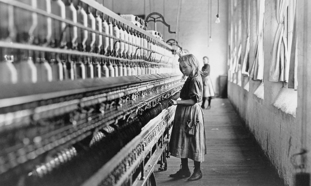
The artists included in the both the notes and the embedded exercise have all taken the idea of documenting using a camera in different directions. The first thing that I noted was the exploratory nature that evolved over time. The early photographers, such as Fox-Talbot were interested in how to capture a significant event visually, e.g. the building of Nelson’s column in Trafalgar Square. Although a fairly simple composition, use of visual codes such as scale and perspective, coupled with the rudimentary equipment and processing used to make the picture, raise questions that change over time. Shafran makes the point that the image has a modern feel to it with only the necessary elements included (e.g. the column’s base but not the statue) and the advertising hoardings in the frame. Was Fox-Talbot establishing photographic composition codes from the outset or have modern analyses of the visual image and structuralist ideas made sense of his work after the fact? The collection of artists impressions in We are Here have the common notion of re-visiting works of lesser known photographers with a post-structuralist eye. Works by Hinde and Charles Jones break down the codes of very simple compositions to give clues as to an area of society that we might not be familiar with. I was drawn to the catalogue photographs of pristine vegetables as if being judged in a horticultural show as shot by Jones. They use technical codes such as light and composition (uncluttered, filling the frame etc) to bring out the natural beauty of the subjects. The subjects, although familiar are shown to have been cared for and made as good as possible for the camera to document, asking the viewer to see how important horticulture is to some people.

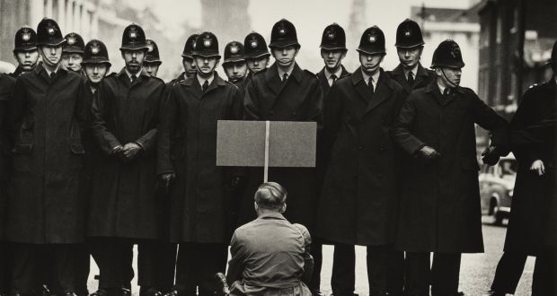
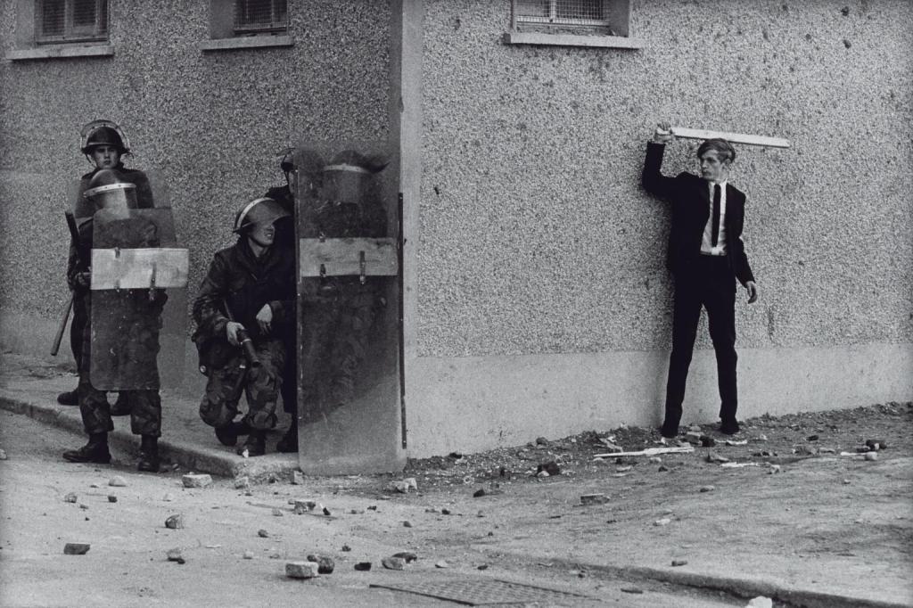
As the 20th Century progressed, the subjects and approaches to documenting them became more experimental. Photographers began subverting the ideas of their time, such as Munby’s portraits of dirty women. His idea of humorously substituting the female form into male professions and further subverting the notions of class in Victorian England mirror the work of Julia Margaret Cameron, who was pilloried by the establishment for what was seen to be poor technical skills. Her pictures create a real sense of her subject’s personality as she saw them, rather than majoring on the accurate representation of their features. Towards the 1960s and 70s, we see more voyeristic style of documentary, taking cues from classic and contemporary street photography. Here we saw the visual codes of separation, isolation through focus and highlight as well as the decisive moment, being used by the viewer to create narratives as though they were part of the scene. In the V&A article about South Africa, the cultural evolution of the country with its troubled recent history is documented through an approach that highlights what we may have no experience of. We can see influences of early practitioners such as the FSA group in Jodi Bieber’s Women Who Murder Their Husbands. The horror of the women’s acts is contrasted with their visual aesthetic and being surrounded by their meagre possessions in their cells. We don’t even need the additional context of why they committed their crimes to break down the visual clues in their portraits. The pictures are constructed and don’t tell the subject’s whole story, but Bieber makes us connect with them as if we were actually visiting and asks us to consider gender violence and societal bias when viewing the images. This fabricated reality theme is naturally present in the works of Crewdson, Wall and diCorcia who direct their pictures so that they viewer can create a narrative based on their own experiences and perspectives.

The final artist in the reference material was Richard Misrach, who’s series Destroy this Memory is a documentary of the region of Louisiana that was devastated by Hurricane Katrina. The series focuses on the people of the towns that were worst hit through the graffiti they left behind. This included messages of hope in preparation for the storm, fear of the event and the shock of the aftermath. Messages warning looters and asking people to call their families as well as rages against the state government and insurance companies are curated into a series that explores the human response to crisis. There is some gallows humour in amongst the desperation, which Misrach uses to punctuate the series. The interesting thing about the series is the apparent lack of technical setup in the images. Misrach made the series from his scouting photographs which were taking with a basic digital camera. As a result, the style isn’t cinematic or constructed, but more snapshot as if a tourist (or the viewer) took the pictures. Composition is ‘careful’ but doesn’t have a sense of planning about it. This style brings the viewer closer to the scenes as the photographer saw them. The absence of people creates the eerie sense of emptiness but their wrecked possessions and their need to write something on them is compelling.

It’s clear from the reference material that documentary has evolved from the straight ‘truth’ of presenting something to the camera, through coded composition, rebelling against convention and the subversion of cultural understanding, to the more intimate act of being part of what is happening.

“I guess that is how photographic culture shifts and changes as time passes. We think that everything’s been done, but, of course, there are many things that haven’t. In twenty years’ time we will be shocked by how certain works are perceived, and that’s exciting.”

Martin Parr, 2007

Reflection Part 2

My conclusion from part 2 of this exercise is summarised in the following key points:-

  • The analysis of an image using semiotics can be applied to any of the genres, even when at first glance, the image contains signifiers that do not have apparent connotations. I chose 4 random images by famous photographers of the 20th century as well as contemporary artists and my choices were purely aesthetic. When looking at the codes that help to identify an image as being part of a genre, we know that the visual aesthetic is one of the most common; a portrait contains a person and little else, a landscape contains a view of some sort etc. When analysing, I could determine the denoting elements and derive some connotations from them with little difficulty between genres.
  • The connotations are greatly affected by the social and cultural perspective from which the elements are viewed. For example, Ansel Adams shot with black and white film in 1947 because that was the established technology, not because he was looking for an aesthetic. The drama of his landscape is enhanced by its use and the technical approach to highlight and shadow with each element, certainly helped support the narrative that I saw within the image. Similarly with Winogrand’s image, I would argue that it is as shocking in today’s culture where racial prejudice has often been seen to be worse than the 1960s.
  • The technical codes direct the viewer to not only the elements that are ‘important’ through use of depth of field and framing, but also create a mood through lighting and colour temperature. In Djikstra’s portrait, the tones of the image contriubte to the sterile connotations of the subject against the background, while the low contrast offers a bleak feel to the subject’s experience.
  • What we bring to the interpretation of an image. In the case of Adams’ image, I saw religious connotations in the snaking river that was lit to reveal its surface texture. Although I’m not particularly religious, the combination of the scale of the mountains and their reaching the dramatic sky, invoked the creationism stories I was taught as a child. Other cultures would not necessarily prioritise the connotations in the way that I did, instead introducing their own meanings allied to their own experiences.

Overall, I found this exercise to be interesting because of the application of the structure of linguistics to a variety of images. It focuses our attention on what is physically present and what each element might mean.

Bibliography

Please see the Padlets linked previously

Research Task: Terms and Definitions

Read Chapter 2: Photography Theory in David Bate, Photography: The Key Concepts(2009) Bloomsbury.

Make notes about: 

  • Structuralism.
  • Semiotics.
  • Photography codes.
  • Rhetoric.
  • Denotation and connotation.
  • Reality and realism.
  • Poststructuralism.

Add these terms and definitions to your Glossary – you may wish to do your own further and independent research and reading to enhance your understanding of these terms.

Response

I completed this research task in the form of a Padlet that can be found at this address:

https://oca.padlet.org/richard5198861/77jby60olpbg8t94

This isn’t available to the public (outside of the OCA) without a request to share it. Please comment below if you wish to have permission to view.

Assignment 1: Understanding Genre

Create a Padlet that presents a critical and reflective summary of the conventions, expectations and meanings of a genre of your choosing.

For this assignment you will use Padlet to present a summary of your understanding of the key concepts (conventions, expectations, meanings) of a chosen genre from the materials you have engaged with. The readings, research and activities will have enabled you to think about genre in a variety of ways and you can reflect on this in your assignment.

Within Padlet you can use image, video, text and sound as ways to summarise and critically reflect on what you have discovered so far. It will be useful to go back over your learning log and think about the ideas that have sparked your interest. 

You may wish to write freely in a journal style extended reflection to give yourself room to explore and think through your ideas about genre so far. This could be presented on your learning log and then summarised or tightened into a shorter version for the Padlet presentation. Alternatively, you could format this as a PDF and upload to your padlet.

This assignment will be built upon throughout the rest of the course, so although you may choose one genre for focus now, by the end of the course you will have explored and created work across Landscape, Documentary, Portraiture and Still Life. 

Suggested 750 words/annotation, or 6 minute presentation.

Ensure you correctly credit and reference any images/quotes used throughout the course.

You may find it useful to compare and explore areas of similarity or difference across Landscape, Documentary, Portraiture, and Still Life. Consider theoretical features, characteristics, histories, and techniques. How has this project enabled you to think differently or expand your understanding of particular elements of the genre you have studied?

Introduction

The genre I have chosen is Documentary, owing to its close relationship and maturity to the social sciences, principally sociology. While it is clearly not the only genre to focus on the exploration of human society, it is a genre where the ideas of objectivity and creativity are blurred. The idea of documentary suggests ‘truth’, which drives both the academic exploration of culture and is believed implicit in documentary photography. However, as we have learned in previous units, the concept of the camera faithfully documenting what it sees is a flawed foundation upon which to build an understanding.

During the reading around Documentary, I have created a Padlet to show how the various ideas and relationships between the academic and the artistic approaches are connected. It can be found at this address:

https://oca.padlet.org/richard5198861/w68jsm0wo53epcly

Analysis of the Documentary Genre (750 words)

The immediate conclusion from reading Becker[1] might be that the relationship between sociology and documentary photography is a strong one. However, while they have the same fundamental objective of the exploration of social and culture, they go about it in almost opposing ways. Sociology bases itself in the science of gathering observed data or testimony, its analysis and logical conclusions. Photography creates a visual document of what the camera, and more importantly the photographer sees. They both need to be immersed in the ‘subject’ but sociologists view their technical approach as less prone to creative intervention. They believe the camera to be an objective instrument, but not in the hands of a creative photographer. In The Currency of the Photograph, Tagg[2] describes a presentation by Berenice Abbott where she describes realism being defined by the artist. This seems like a strange claim until we think about how we define reality. It’s almost as much about how it’s perceived, culturally and historically as it is about something being recorded. Documentary photography then follows the photographer’s physical process (lens selection, aperture, shutter speed etc) and incorporates their observation of the scene or event as a complimentary creative process. The viewing audience brings their own context in the reading of the elements that asserts whatever realism the image represents. In reality, both photography and the social sciences are constrained by the editorial practice. With the former, the results of analysis might not be shared widely of the message is potentially catastrophic (consider the impact of commercial logging on the climate being aimed more at the consumer rather than the communities who depend solely upon it). The famous ‘killing’ of negatives by FSA editor Roy Strkyer demonstrated this censorship. That series, like many others of the time sought to ‘document’ the plight of one area of society to another who was oblivious. The rise of the magazine editorial revealed topics such as child exploitation as in Lewis Hine’s photographs from Child Labors of the Carolinas[3], a collaborative paper with investigative journalist A J McKelway in 1909. The work was intended to both educate and shock the higher classes of American society from their apathy when it came to textiles. It is within works like Hine and The FSA that we see where the documentary genre borrows from others. For example, consider the image below:

No. 22.–LANCASTER S. C.
Spinner. A type of many in the mill. If they are children of widows or of disabled fathers, they may legally work until nine p. m., while other children must legally quit at eight pm [Fig. 1]

The image is documentary because it records an example of a young child working in an dangerous environment. Here we have a strong connection with sociology, with girl’s details contained in the caption. The composition emphasises the scale by revealing the seemingly endless loom reaching out into the distance in a way similar to the leading lines of a landscape photograph. The exposure’s sublime aesthetic is also borrowed from the landscape genre to further emphasise the child’s tough life. When we look closely at the image, we see little movement in the girl.  At this point in photography, film speed and artificial lighting was still fairly primitive, so its unsurprising that some level of staging in order to get the sharp picture that we see here. When we consider her expression, small stature and the context of the background worker, we can surmise that the image borrows from the portraiture genre.

Conclusion

In conclusion, the documentary covers many aspects of the human condition, whether about cultural development, behaviour or events that impact people and their environment. Documentary photography strives to faithfully reveal the subject and tell the story of it, but its direction is driven by what the photographer sees and their reaction to it. The criticism of photography from the sciences is that this creative ‘direction’ is more akin to art than evidence-based analysis. In reality there is always some direction taken by the audience for the work in both fields. As the genre covers some many areas of life from the everyday to the landmark events, documentary borrows from the other conventions such as portraiture and landscape, using them to emphasise the story behind the image or series. I’m interested in this genre because above all else, there is the common misconception that the camera tells the truth. How this idea can be used to subvert documentary is something I want to pursue in this unit.

Against the Learning Objectives 

LO1: Compare the theoretical features, characteristics and histories of different photographic genres. 

Read across the genre and its place within wider documentary. Reviewed the theoretical approach and incorporated areas that are borrowed from landscape and portraiture with examples. Reviewed the work of a number of practitioners who have worked in different areas of the genre

LO2: Deconstruct a given genres’ conventions and create visual material informed by that knowledge.

Deconstructed the visual ideas and approach to documentary. No creative work in the assignment aligned with this LO.

LO3: Produce new visual work informed by your research. 

Not applicable for this assignment

LO4: Analyse the wider global contexts surrounding contemporary image making.

Not applicable for this assignment – the work focuses on the history of the genre.

References

Figures

[Fig. 1] Child labor, a sore spot in US’ human rights record – Global Times (s.d.) At: https://www.globaltimes.cn/page/202106/1225421.shtml (Accessed 03/04/2022).

Bibliography

[1] Becker, H. S. (1974) ‘Photography and Sociology’ In: Studies in the Anthropology of Visual Communication 1 (1) pp.3–26.

[2]Tagg, J. (2002) The burden of representation: essays on photographies and histories. (Transferred to digital print) Basingstoke: Palgrave Macmillan.

[3] A. J. McKelway (Alexander Jeffrey), 1866-1918. Child Labor in the Carolinas: [A]ccount of Investigations Made in the Cotton Mills of North and South Carolina, by Rev. A. E. Seddon, A. H. Ulm and Lewis W. Hine, under the Direction of the Southern Office of the National Child Labor Committee (s.d.) At: https://docsouth.unc.edu/nc/childlabor/childlabor.html(Accessed 03/04/2022).

Project 1 – Exercise 1: Analysis

From the Documentary Traditions Course Note:

Exercise 1: Humanism

● Becker, H. S. (1974) Photography and Sociology, Studies in Visual Communication. Pg 3-26.

Reflect on the similarities (and differences) between social research and photography and documentary’s combination of a “journalistic and ethnographic style with a self-conscious and deliberate artistic purpose” (Becker, 1974: 5).

Follow the ‘reading images’ exercise as outlined by Becker (1974) in the above essay using any well known documentary photograph you wish or, as Becker advises, one that is presented in the essay.

  • ●  Use key words to describe the content of the image. What exactly is in the picture? What is it about? Note these down in your learning log / blog.
  • ●  Make a list of what you understand the ‘visual grammar and syntax’ of the picture.
  • ●  Can you identify and compare a number of images which show “pictures of something that was not done just for the photographer’s benefit” (Becker, 1974:14). Can you give an example of a picture which shows something or someone that was done for the photographer?Add notes and reflections to your learning log

Reflecting on Social Research and Photography

As the Documentary Traditions notes begin by directly quoting Becker[1], sociology and photography have been around for a similar amount of time. This opening line in Becker’s paper indicates that one methodology for exploring society is no more advanced or developed than the other, which appears to me to be a rare occurrence. Other genres of art that have been assigned to photography have their origins in classical art, which was the standard for all visual representations of subjects. Photography was the newcomer, so perhaps the assignment of traditional ways of looking at a subject from classical painting was to be expected. Photography could be used to ‘capture’ the scene, which Becker suggests is the root of the plausibility of photography for documentary – the myth that the camera merely records whatever is in front of it. While Becker goes on to suggest that photography as a tool can be turned to any avenue in the right hands (his typewriter analogy being that the machine doesn’t determine how it used), but the inherent believe of the photographic image as being objective underpins it. By contrast, ethnography which is defined as being way of qualitative research by immersing oneself in the culture or society[2], relies on observation, empirical proof of behaviours and traditions that take written form. Both approaches contain potential for ambiguity, photography tends to be influenced by how the photographer sees rather than what they see. Research as a science tends to avoid such bias. Becker goes on to make the point that as photography advanced, it was used more and more to highlight the societal or cultural issues that the public weren’t aware of. Photographers such as the group assembled by the Farm Security Administration to photograph the migration of the poor from Depression hit communities to the cities of America, were highlighting the situation that the subjects faced. However, as we also know they were not representing the suffering of the people alone, but documenting everything that they encountered which resonated with them. The editorial as the function that determined the ‘correct’ messaging for publication, which resulted in images being rendered unprintable [3]. The ‘conscious’ view of the photographer results, according the Becker, in the the separation between sociology and photography; photographers don’t back up their visual representations with research and sociologists don’t support their findings with photographs. For me, the two approaches to exploring society are essentially trying to achieve the same thing, a better appreciation for societal or cultural behaviours and problems, but from different directions. Both involved a deep understanding of their subject and reflect the real events, but sociology doesn’t ask the viewer to bring their own knowledge or experience to the reading of research, where documentary photography hasn’t really moved far from it’s artistic leanings. I wonder what the FSA series would have looked like with a few of the Walker Evans images, particularly the happy farmer and the young, middle-class black couple walking in Chicago, both of which were real observations, but were ‘killed’ by the editor[4]

Reading Images Example

For my reading example, I’ve chosen this image by Don McCullin taking in London in 1963.

Fig 1. Don McCullin, Protester, Cuban Missile Crisis, Whitehall, London (1963)

Visual breakdown

The image contains a man sitting with his back to the camera, holding what looks like a placard. He is facing a line of British police officers in constable uniform, forming two lines across the frame. They are facing him. To the right of the scene, the line is one deep and has a gap in it. The last ‘complete’ officer to the right of the frame is reaching across to another who is partially out of frame. The scene is clearly a city street with the background detail blurred out of focus. The only other element is the partial view of a car in the broken line of police.

In interpreting what the image is about, we are immediately struck by the contrast of the characters. The police in their uniforms that appear black because the image is black and white, appear menacing when compared to the single man dressed in lighter, casual clothing. We cannot see his placard, so without the context of the title of the image, we cannot be clear on what it might say. When we include the title context, we assume it is a protest placard. I was struck by this image, because my immediate conclusion was that the barrier of police were somehow threatening the man, for reasons that include the above. However, I wondered why I had jumped to that conclusion. The man looks peaceful and in no way a threat to the police. My interpretation takes into account the way the police line isn’t complete. This raises the idea that the police feel vulnerable without that gap being filled, yet there are no other protestors present. It looks like an overreaction by them to a minimal threat. Of course, what is happening is that I am bringing to the reading, my own perspectives on the way that the police ‘manage’ protests, particularly peaceful ones. McCullin was documenting a protest during the Cuban Missile Crisis but Britain’s role was relatively small, with agreements being made for US arms to be located in nearby British colonies. The protest was therefore fairly distant., but without the context of what is written on the placard, we cannot know the strength of feeling at the time. My own perception is defined by protests that have occurred in my lifetime, some of which have been documented by photographers and film makers in a similar way to McCullin’s approach in this image. The protestor is being oppressed by the state via their police force. The identical uniforms and extreme visual contrast summon images of Nazism, even though there is nothing to suggest any trouble. In fact, when we look more closely a the image, the police officers look fairly relaxed, some are in fact smiling. The meaning of the image could just as easily be that the police were in the process of closing a street when the protestor arrived, perhaps being the first one to arrive. The visual language of the man being outnumbered by the police, the tonality and the way the composition allows for just the interplay between the people in the frame as context, evokes social post-memory which could be argued was as powerful then as it is now. I think this image is definitely more about the photographer’s perspective on the strength of the oppressed man than an actual document of the protest.

Examples of images that were not done for the benefit of the photographer include other work by McCullin. The image below was taken in Belfast during The Troubles. This shot is more in keeping with Cartier-Bresson’s decisive moment, with the two sides of the conflict about to clash on the street. The picture is one of a triptych of the ensuing confrontation.

Fig 2. Northern Ireland, The Bogside, Londonderry 1971, printed 2013 Don McCullin born 1935 ARTIST ROOMS Tate and National Galleries of Scotland. Purchased with the assistance of the ARTIST ROOMS Endowment, supported by the Henry Moore Foundation and Tate Members 2014 http://www.tate.org.uk/art/work/AR01189

This image contains similar elements to the previous one. A small force of riot police approach the edge of a wall, behind which a young man waits with a plank of wood. Unlike the previous photograph, McCullin has no control over the composition as the events are unfolding in front of him. We don’t know what has transpired before the sequence frames, but we can deduce from the scene that some form of pursuit is likely. McCullin is capturing the events unfolding but not approaching the image in the same pre-visual way.

In Becker, the comparison between socialolgy and documentary photography is described in terms of the approaches taken. The former is the based in scientific gathering of empirical data and its interpretation through analysis, while the latter tends towards the photographer’s reading of a scene. McCullin’s triptych, taken over a period of a few seconds, documents the impending ambush on the police in a way that lends itself to a more scientific data gathering than the first image.

When it comes to the photographer creating something for the benefit of themselves, I immediately thought of Walker Evans’ Subway series. The shots, taken using a hidden camera, are documents but are very much how Evans saw his fellow passengers. If he had shot them at regular intervals, say every 10 minutes, the resulting series would have been more methodical and arguably more ‘objective’

Image References

Fig.1: Sheehan, S. (s.d.) Don McCullin: Photographs you can’t look away from. At: https://www.irishtimes.com/culture/art-and-design/visual-art/don-mccullin-photographs-you-can-t-look-away-from-1.3792696 (Accessed 21/03/2022).

Fig 2: Tate (s.d.) ‘Northern Ireland, The Bogside, Londonderry’, Don McCullin, 1971, printed 2013. At: https://www.tate.org.uk/art/artworks/mccullin-northern-ireland-the-bogside-londonderry-ar01189 (Accessed 22/03/2022).

Bibliography

[1] Becker, H. S. (1974) ‘Photography and Sociology’ In: Studies in the Anthropology of Visual Communication 1 (1) pp.3–26.

[2] A guide to ethnography (2020) At: https://www.scribbr.com/methodology/ethnography/ (Accessed 16/03/2022).

[3]Sucker punch: destroyed images of 1930s rural America – in pictures (2016) In: the Guardian 18/04/2016 At: http://www.theguardian.com/artanddesign/gallery/2016/apr/18/bill-mcdowell-ground-photography-fsa (Accessed 30/03/2022).

[4]Rejected & 3000 Killed | William E Jones (s.d.) At: https://www.williamejones.com/portfolio/rejected-3000-killed/(Accessed 30/03/2022).

Project 1 – Exercise 2: Recreate

  • Recreate a well-known image in any of the 4 genres you have explored. Consider the conventions, styles and themes specific to the genre and how the image you choose to re-create speaks to those. You are free to interpret ‘re-creation’ as imaginatively as you like, subverting conventions or adhering to them.
  • Using the Challenging Genres Forum share your work, including; your image, the image that inspired it and a short paragraph explaining your process.
  • Write up the activity on your learning log. After sharing the image and receiving some feedback, reflect on the experience in a short post on your learning log.

Introduction

“What all portraits have in common , in their overlapping and different ways is the central point that the portrait is a means employed to establish the identity of the sitters, regardless of whether they are viewed as a social problem or as human beings with positive features”.

David Bate, Photography: The Key Concepts, p 89.[1]

When I read Chapter 4 of Bate’s Photography: The Key Concepts, I was struck by this quotation. It followed an explanation of the evolution of the portraiture genre from early 19th Century societal pictures that demonstrated wealth and influence, through the working class use of it to establish identity or true likeness whether on one side of the law or the other, and onto the portrayal of someone’s personality. The quote essentially says that the establishment of identity of the sitter is common to all uses of portraiture to some extent.

For this exercise, I decided to look at a non-human portrait with the quotation in mind and read the image in terms of the 5 elements of portraiture that Bate describes. In doing so, I wanted to test whether the same conventions used with portraits of people apply with images of, say dogs.

The Image

USA. New York City. 1946.[2]

This is one of the most famous images from Elliott Erwitt’s book Dogs (1998) and it shows a chihuahua standing on a sidewalk on New York City. The first question to consider is whether it is a portrait or documentary photograph because although there is a clear subject in the frame, Erwitt was a respected street photographer (a sub-genre of documentary). The image was also a severe crop from a much larger 6×6 frame – the crop is shown below:

Contact Sheet Print: Chihuahua New York [3]

When we look at the rest of the images from the roll, we can see the variety of angles and the natural movement of the owners being captured as if in a street photography style; only when the dog is isolated by the crop does the meaning change. I hope to demonstrate that it is a portrait by discussing the elements as laid out by Bate and how my process of recreating further established it for me.

Bate considers the 5 elements of a portrait as face, pose, clothing, location and props which all have an impact in this image. When we look at the dog’s face, we see the lively expression of a content animal. Our cultural understanding and appreciation of dogs as pets tells us that the panting expression means exercise, thirst or excitement. When I read the dog’s expression, my tendency is to see the latter, particularly given his gaze at the photographer. His pose tells us more about his character. Chihuahuas are small dogs, which is further borne out by his location and the scale of his owner’s feet. His pose, however connotes confidence with his wide, head-on stance. Combined with his face, he looks like a dog squaring up to something or someone, as if he doesn’t fear them. Now the face takes on the potential meaning that he is mid-bark, which further emphasises that he’s a confident dog. The clothing is a simple coat (black and white robs us of knowing if it was brightly coloured or not), but when considered with his surroundings and the seemingly elaborate shoes for dog-walking, the coat may connote a privileged class pet. The location of the image is clearly an American city sidewalk and we are informed of its actual location by the title. The location and what we know of NYC’s skyline plays a further part in emphasising the dog’s diminutive stature. The position of the dog with respect to his owner’s feet and legs completes the idea of his size belying his large personality. The props in the image for me are the shoes his owner is wearing. While they don’t really add impact, I think they work with the setting to connote their social standing.

My Image

Chihuahua, Great Malvern (2022)

My approach to this image was to take a portrait of the dog (called Togo), with the same or similar conventions from the original image. The first difference is that I shot this picture while lying the ground and attempting to frame them in the same way. Togo is taller than original chihuahua but shares the relative scale that the breed is known for. His direct gaze, alert expression and stance are all similar with the exception of the panting – this image is defintely all about him. His coat when considered with the glamorous shoes suggests a cherished pet as in the original. The location is a street similar but much smaller than the original, so the scale isn’t as clear. To shift the establishment of location I included the context of the Stars and Stripes details on the shoes. Finally, the high heels and below-the-knee skirt emphasises Togo’s size in a similar way to the original image. However, it’s clear that the dog in Erwitt’s picture is smaller and stood a little behind his owner, which makes that difference much more impactful. I made the image black and white because I didn’t feel that including colour (dominated by the shoes) really added to the aesthetic and made it further from a recreation of the original picture.

Peer Group Feedback

I’ve now received some feedback from my peers. The image was generally seen as being a good recreation of the original. As I didn’t directly copy the picture (I wasn’t in the right city, didn’t have exactly the same dog, shoes etc), my interpretation of the picture from a portraiture perspective appears to worked within the conventions. When viewing the picture, the reaction is one of humour, both at the stature and personality of the dog and the choice of shoes as a prop. Moving the location of the picture from the background context to the prop in this way has added to the sense of fun in the overall image.

Reflection

In reflection, my objective was to take a non-human portrait and demonstrate that it does work with the conventions of portraiture. What Erwitt saw in the dog’s face and posture combined with his relative size to the surroundings, takes into account the conventions of portraiture as postulated by Bate. How these conventions balance is very important in terms of how the picture will be read. The viewer brings the vital interpretation of each element and the importance placed on each will determine the overall reading of the image. For example, an American might see the shoes as something patriotic in terms of the dog and owner’s identity rather than a signifier of the location. This actually happened when an American follower of mine on Instagram saw the picture – his first reaction was to express his being impressed by the shoes. In my recreation, there is a visual element that I removed in post processing in order to make it look more like the original. In my version Togo was on a short lead and a small piece of it was visible in the unedited version. I elected to remove this digitally to match the dog in the original who wasn’t being restrained. If I’d left it in the picture, the context of the dog’s pose changes, as well as his interaction with his location. An alternative reading of the image is now likely – some might see the dog as being less confident in some way. Either way, the elements that are being read are present. In cropping his image the way he did, Erwitt draws our attention to them rather than any other distractions such as the woman’s hands in the full frame.

Bibliography

[1] Bate, David (s.d.) Photography: The Key Concepts. (s.l.): (s.n.).

[2] Chinese Year of the Dog • Elliott Erwitt • Magnum Photos Magnum Photos (s.d.) At: https://www.magnumphotos.com/arts-culture/art/elliott-erwitt-dog-dogs/ (Accessed 13/03/2022).

[3] Contact Sheet Print: Chihuahua New York (s.d.) At: https://www.magnumphotos.com/shop/collections/contact-sheet-prints/contact-sheet-print-chihuahua-new-york/ (Accessed 13/03/2022).