This exercise is in preparation for the formal critical review in Assignment 5 at the end of the project. As given, the critical review brief is as follows:
Compare the theoretical features, characteristics and histories of one or more photographic genres
Use your research skills competently to deconstruct a given genres’ conventions
Demonstrate an awareness of the multiple readings of the histories that have informed genre in a global context
The critical review takes the learning from parts 3 and 4 and picks up from the comparative analysis completed in Project 2, which can be found here:
For this exercise, I will briefly review the above analysis and update with what I’ve learned since. I will then decide on my area of interest for the review within this project.
Summary of Project 2: Exercise 2: Comparative Analysis
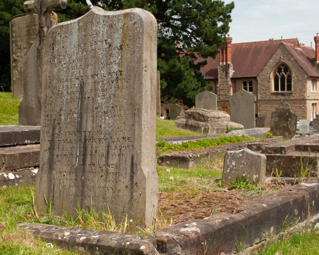
For the exercise, I chose two landscape images; Ansel Adams’ Moonrise over Hernandez, New Mexico (1941) and Richard Misrach’s Bonne Carre Slipway, Norco, Louisiana (1988). Both images are classical landscape in terms of their visual codes. My comparison related to the contextual emphasis of each image, rather than their aesthetic merits. With regard to the latter, I drew attention to the similarities and differences, one being black and white, both featuring manmade structures, one being more traditional in the use of thirds and the other, not so. However, with the context the two photographers differed considerably, despite them both being interested in conservation of the natural world. Adams’ image reveals the majesty of the landscape and man’s insignificance both in scale and when considered within the construct of religion. By contrast, Misrach’s image shows us how man is impacting the landscape, his subject being an oil refinery.
Having completed parts 3 and 4, I am now familiar with the works that formed the New Topographics exhibition in 1975, where the artists moved away from the aesthetic beauty of the landscape to show how construction and human behaviour fit within it. This made sense of where Misrach’s inspiration came from. The series that his picture comes from walks the viewer through the routine of petrochemical processing in Louisiana, an area that for most part is rural country. His images follow the landscape traditions in terms of composition, but having now covered the difference between the interpretations (beautiful, picturesque, sublime), I now appreciate the narratives that can be derived from them more. The series is actually terrifying, as the destruction of the natural world is almost desensitised owing to the world’s reliance of the fossil fuel being processed. Images of dead trees, hazardous waste dumps and abandoned dwellings reveal what has taken place and continues to do so at such a slow pace that nobody notices. Unlike Adams, Misrach is showing what we can’t or won’t see about how we live, in a similar way to the likes of Lewis Hines and Martha Rosler with their documentary advocacy.
Thoughts on a Critical Review
I considered revisiting my analysis as the context of the additional learning explained the motivation behind the images, Misrach’s in particular. However, I have been interested in a question from Part 4, which is related to landscape but could be applied to the other genres as well.
In Colin Pantall’s lecture and supporting presentation notes, titled The Way We See, Where We Look and What we Show, he said
“Landscapes can show the infrastructure of power, can show the dividing lines of power. Sometimes we don’t think of these as landscape, but they are, because that is the defining part of them”
(Colin Pantall Presentation, s.d., video timestamp 11m,50s)
At the point that he says this, the presentation is showing this photograph by Mohammed Borrouisa from his series Périphérique.
From the series Périphérique, by Mohamed Bourouisa [1]
I was confused by the comment as Landscape was not my initial reading of this photograph. Instead, I believed it to be more documentary or one of the sub-genres, street photography. This was the basis for my critical analysis – what is it that makes this a landscape and how does the reading of the internal and external context affect our classification of a photograph?
The research for the essay can be found in the Padlet:
“Which is it? – How contexts can alter our interpretation of the genre of a photograph?”
Additional Note
At this point, I received feedback that my literal interpretation of the brief for Assignment 5 may result in lots of repetition. With this in mind, I focused my attention on gathering research and writing my submission. I am offering the draft as my completed essay, electing to update ahead of assessment if required. For this reason, there is no write-up for Exercises 2 and 3.
Make a small series or piece of work that responds to your theme, supported by the activities, reading and research you are doing into different genres.
You should experiment with producing different sets of images to explore your idea(s). You will need to add evidence of your work to your blog.
You should show your process, investigations, and your thinking through a combination of contact sheets, reflections, exploring the presentation of different combinations of images and reflecting on these different outcomes.
You should evidence your reflections on reading and research as well evidencing your engagement with the suggested course materials which will support your study.
You might explore ways of combining your genres – to find overlaps and ways of merging the genres together into something different and new. You might also develop work that challenges a particular genre convention and produce work that plays with the audience’s expectations.
You may decide to produce a set of images for each genre and then put a selection of the images together to explore the narrative that may be created across genres in combination.
Introduction
During the previous projects I identified a broad theme that has many potential projects that could be developed from it. My interest in communication, how it has changed and how people respond to it, resulted in my shooting a number of experimental photographs. These images were not centred on a single narrative, instead covering a number of areas. Nor were they rooted in a single genre. In parts 3 and 4, I deliberately selected source texts that covered the genres that are particular to my general theme, but have concluded that the active use of multiple genres within a body of work can be both powerful in shaping the narrative, but also more provocative in how the viewer interprets them. For example, the use of portraiture to can be used to challenge a cultural stereotype, even thought the series may be about a landscape, whether literal or geo-political. Landscape or still life images create the sense of place, but the portraiture invites the viewer to understand that place as seen through the eyes of its people. They are stitched together using the photographer’s observations either as part of the subject, or as an observer and it is this that can drive the way the genres are used to tell the story.
Approach
In my experiments, my perceptions of the changes in communication were driven by a middle-aged perspective, but one that worked in engineering and technology for many years. I have mixed feelings of embracing technology. It has to relevant to me and I need to understand. I tend to reject areas that are aimed more squarely at people younger than me. I also have elderly family members, for which communication technology is like a completely foreign language, which gives me an empathy with those who cannot work with it. The other area of my personality that was revealed by thinking about this theme, was my sense of compliance and order. I was brought up to follow the rules and to an extent that makes me compliant. It’s when I know that something doesn’t makes sense, that I rebel against what I consider to be ‘petty authority’. I acknowledge that this is why I’m drawn to artists like Martin Parr, Nan Goldin, Garry Winogrand and Robert Mapplethorpe, all of whom pushed back about strict ideas about expectation, fun, love, relationships and towing the line.
For this assignment, my approach was to take the narrower themes of ‘rebellion’ and ‘subliminal communication’ and curate two brief series from my experiments.
The starting point, an unedited collection of experimental images can be found in this Padlet:
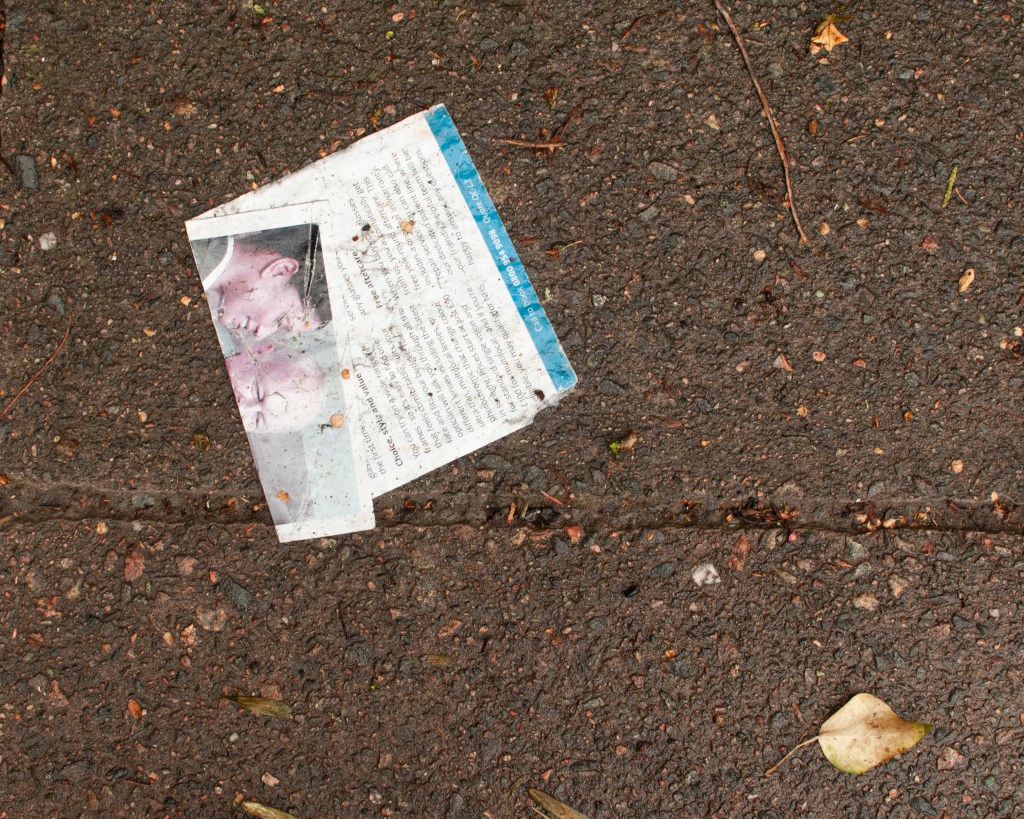
In these series, the images work across the documentary, landscape and still life genres. We can say that because the obvious visual conventions come through in the images. The documentary images say something about the people and place, through observation of behaviour or previously established norms. For example, the small boy defying the traditional autumnal weather conditions at the seaside in My Way, speaks to the British attitude to their climate – if it isn’t thunderstorm or freezing cold, why not run around in your swimming costumes? The visual elements of that image firmly establish where it was taken, how bad the weather was and the contrasting attitudes of young and old. When it comes to the landscape images, such as the mown pathway in Why Not?, we have traditional ideas of foreground, mid-ground and background. There is land and sky, as well as a path leading through them. With the still life images, the elements suggest meaning through their placement, such as the discarded flyer shot in My Way. These conventions are apparent in my work here, but they do not define the way the images work as a series. Indeed, I didn’t set out to shoot within a particular genre, but instead wanted to explore a theme that speaks to our adoption of technology within the culture that I am part or, how we take cues from what we see and, sometimes, disregard what we are being told. When looking at this single-sentence description, it’s not easy to see a single genre that covers how it should be represented. We are left with considering how impactful a genre might be in creating a narrative. For this, it’s easier to see how I curated the both series from my experiments.
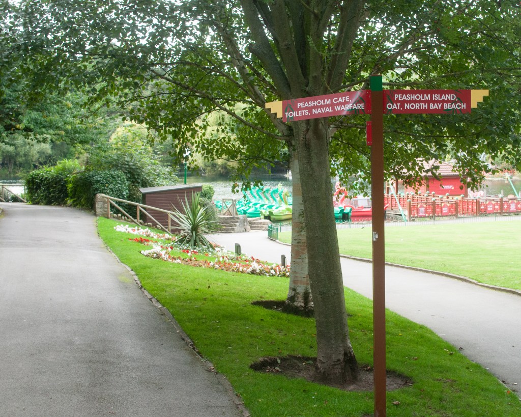
For example, Image 4 in Why Not? is a landscape with a sign pointing towards two paths. There are indications of the presence of people having been in the place (the garden, the damage to one of the signs etc), but there are no people in the frame. The image is highlighting the assumption that the viewer understands that there isn’t actually some ‘naval warfare’ going on, that the sign didn’t have enough space for the word museum or memorial. As a stand alone image, it suggests something that we can’t really place in the context of the town and its people, because there are few identifiers or ways to connect with it. However, when we add it to Image 3, which adds a documentary element to what is also essentially a landscape, we have much more information to help create the narrative. Now we see the disabled buggy, the old-style public toilets, the flag etc. We get the sense of a classical British town as a concept, as well as the ‘that’ll do’ element of its people (the use of the buggy as an advertising billboard). Perhaps the buggy goes around the town as a mobile advertising board. On its own, landscape part has impact, but when combined with the conventions of documentary, it’s increased. I had inadvertently crossed two genres with these two images. The series also include still life in some of their compositions.
When considering artists and works that fit within a single genre, I see a more tightly focused idea being explored than mere observation of a response to communication. For example, Trish Morrissey’s recreation of her family archive in her series Seven Years [1] transports the artist to a time in her family history. She plays the part of her parents and others in the fashions of the period, alongside her elder sister. The series not only crosses history, but also revisits the situational tensions of the original images through their adoption of body language and the micro-expressions contained within any family portrait. Morrissey doesn’t venture outside traditional portraiture because the source material for her exploration doesn’t. The genre unifies the concept behind the family portrait – it’s a picture of a person or people, everything else is the underlying narrative about the situation. We learn about the characters through her acting, in a similar way to Rosy Martin’s performance as her mother in Getting Changed [2]. While both artists’ work sit largely within the portraiture genre, they directly challenge some the traditional concepts that the genre is associated with, namely the faithful representation of a real person. As with other artists such as Cindy Sherman and Francesca Woodman who used themselves as performance ‘canvasses’, both Morrissey and Martin use their pictures to comment on generational differences, personal experiences in their growing up and the memories invoked by life events. All of these are a far cry from the use of portraiture to identify (passport) or classify (August Sander).
The works of Martin Parr, Anna Fox and Chris Coekin heavily influenced the curation of my own series above. These artists use different genres to highlight or ‘zoom into and out from’ a cultural idea or setting in a way that punctuates the wider series. Parr’s From The Pope to a Flat White (1979 to 2019) [3] mixes staged portraiture with street photography (a sub-genre of documentary) and the occasional still life under the banner of documentary to show how much the country has changed over many years. Similarly, Fox’s Work Stations (1986 to 88) [4] mixes the conventions of portraiture, street photography and urban landscape to create a mock news article about corporate finance. The series invokes the memories of 1980s Britain and the post-memory associated with the cultural and political landscape of the time and, more importantly, how it ultimately led to failure. Coekin’s series Knock Three Times takes a similar approach to working class culture in the face of political turbulence (studied in Exercise 1 [5]. All three spent time within the environment as observers and represented their experiences both past and present, using whichever visual style suited at the time. In my experiments, I was looking for example of my theme in action but it was in the curation that I selected which images had the biggest impact. Like these artists, I used crossing genres to make a point if the visual impact of the series was enhanced in some way.
Conclusion
This assignment is the culmination of the research from Parts 3 and 4 of the course, which started with identifying a broad theme, developing some more focused ideas from it and mapping them onto the concepts of genre and the artists who have worked with similar ideas. When it came to Part 4, the research was focused on how landscape has evolved from the traditional picturesque to the ideas of power, ownership and the symbiotic relationship between man and the natural world. Artists working in this area were creating landscape as we know it, but using the visual codes of the other genres to make their point about the subject. At this point, I struggled to recognise landscape as a pure genre. If Sibusiso Behka’s night-time images of his district of Joburg were landscapes, how come they contained people living their lives as principle subjects in the compositions? When it came to the other source text that I examined, Backwards and Forwards in Time, the works were blended by including images that were recognisable as having the visual codes of all the genres. The meaning of the works themselves came across, but not in a way that favoured any one of them. After reviewing and curating my own experiments into two mini series, I realised that genre wasn’t what I was particularly cognisant of when shooting; like some kind of automatic pilot. What was important was to create the context and narratives for the theme with whatever got the point across with most impact. I observed the artists that I had been researching as having drawn attention to a detail of their story or setting a scene/establishing a location for the work, by crossing into still life and landscape, but all the time maintaining the conventions of documentary for the whole series. I conclude from this that genres, while a way of classifying an image or series, actually don’t define them in terms of meaning or relevance to wider context. We don’t look at the works of Ansel Adams as excellent examples of a genre, more that they capture and represent the beauty of the natural world. We could equally represent that same beauty through an image of a flower or some wildlife, but the common thread through both works would be our intention, rather than the genre that we used. I recently read Stephen King’s latest novel Fairy Tale (2022) [6] whose plot explores the tropes of traditional ‘fairy tale’ folklore. We recognise the genre as being fantastical stories told to children in schools and before bed, but we associate King with the genre of horror fiction. Of course, we know that the origins of many fairy tales are in classical stories by the likes of the Grimm brothers and H. P. Lovecraft, whose writings were more akin to horror than children’s fiction. What King recognised in his latest work was the connection between the two and, more importantly, the common themes that can be represented by both, such as the repercussions of trusting the wrong person or making a bad decision, the dangers of avarice and ill-treatment of others etc. With photography, we can represent ideas like ‘delusion of grandeur’ by creating a mise-en-scéne composition, shoot a self-portrait as someone else (Sherman’s Centrefold) or capture a still life that invokes some form of post-memory (Martin’s Too Close to Home). For me, how we use genres beyond being comfortable with the the ability to identify visual codes, is pretty irrelevant to creating art.
My conclusion isn’t firm, however. I still have questions about how we decide what makes us comfortable. In Colin Pantall’s presentation The Way We See, How We Look and What We Show [7], he refers to the image below as a landscape.
Périphérique. (Mohamed Bourouissa, s.d.)[8]
While there is a landscape element to it and, while we know from the rest of the series that this is a place which is contested in terms of cultural ownership and racial dominance, I didn’t seen that when looking at this image in isolation. I saw it more as documentary (despite it being a staged photograph), so what is it what leads some to see one genre when others see another? I will be using this as the question to answer in Part 5.
LO1: Compare the theoretical features, characteristics and histories of different photographic genres.
Completed research into landscape and documentary within Exercise 1.
LO2: Deconstruct a given genres’ conventions and create visual material informed by that knowledge.
Reviewed and updated experimental images from Part 3.
LO3: Produce new visual work informed by your research.
Created two stand-alone series derived from my broad theme of Communication; one about how people rebel against communication that is forced upon them and the other about subliminal messaging that we acknowledge but don’t think about or recognise as having an impact on us.
LO4: Analyse the wider global contexts surrounding contemporary image making.
Examined how genres are crossed by contemporary artists who use the visual codes from each to create blended narratives. Discuss my thoughts on whether genre is useful for anything other than labelling what we recognise.
In this post, and the accompanying Padlets, I revisit two of the sources texts in more detail. My broad theme of Communication was explored in the context of the genres of Documentary and Portraiture in Part 3, because at first glance the ideas of the history of culture, technology and identity was felt to fit naturally within them. In this project though, the ideas of how landscape is both defined and affected by mankind, as well as the inverse impact on our behaviour are presented. This offers a whole area to research, starting with Source Text 1- Colin Pantall’s lecture on The Way We See. As I have been considering how my theme could become a focused project, I’ve thought about cultural perspective and the potential audience for the series. When reading the source texts, the other work that stood out to me related to ideas of representation, being inside the culture or observing it. This picks up on the ideas of Insider/Outside that Martha Rosler discussed in her work in the Bowery district of New York. Chris Coekin’s work Backwards and Forwards in Time is the second Source Text discussed here.
Colin Pantall – The Way We See
During the course of the lecture, Pantall poses a series of questions. I’ve condensed them into a single question for each section of the lecture in order to address them here.
How are maps used now and how, if all, do they affect how we experience a place?
When considering a beautiful, picturesque or sublime landscape, are there any problems with tending to the beautiful?
Does the wilderness still exist and can a landscape be tamed by the photographer?
How can photography be used to record the changing landscape and is it capable of driving real change?
How does a landscape make us feel and what tangible elements are there that contribute to this comfort?
This source text covered a lot of ground, but the first and perhaps most obvious lesson was that the landscape is something actively defined by the viewer, rather than being something that generally surrounds us. Landscape as a photographic construct says much more about the environment and culture of a region `than just what is contained the aesthetic. When considering place, we use technology to inform us both how to travel and what to expect when we get there. The former is the rise is popularity of digital maps such as Google Maps and Google Earth. The latter is provided by the shared experiences of others through review sites and social media. Where traditional maps told us about what was important to our national identity and culture, we have the rest of the internet to use for the same research. Our ideas of what a landscape looks like come from the picturesque imagery that is produced as a byproduct of tourism and aesthetic visualisation by some photographers. It makes us want to seek out the views that we are presented with so that we might have that same experience. In the case of Jacqui Kenny who suffers from agoraphobia, the artist uses the millions of available snapshots available as part of Google’s Street View to explore places that are not physically accessible to her. The photographic process is more akin to curation as Kenny suggests [1], but in a way the process she uses to review the images is akin to being present in the scene. She is a cold observer, able to draw her own conclusions about the environment and its people by incorporating the appropriate visual elements to convey some form of meaning from her work. Her work tends away from the traditional notions of aesthetic beauty in favour of some statement about human life in the landscape, which is more in keeping with the New Topographics ideas of the 1970s than with the early landscape photographers. This movement invoked as sense of irony for me about Ansel Adams. In his quest to capture the beauty of the wilderness and protect nature, Adams actually contributed a cultural idea of what wilderness was. The creation of the national parks in the US had the effect of preserving an aesthetic idea of wilderness, while inviting people to go visit. This explains the complexity of the definition within The Wilderness Act (1964), which sought to appease both sides of the argument over it being purely natural or influenced but culture. The proof that Adams’ was applying his own ideas to landscape comes from his production of thousands of different prints from a single negative. In the example of his famous Moonrise, Hernandez, New Mexico(1941), the emphasis of the elements in the composition changed from early to late prints. The acknowledgement that man changes the landscape led to the rephotography projects that set out to highlight the negative side of our existence. Photography is used in this case to document the damage, but also on occasion, the progress – Sebastio Salgado is the notable example with his ‘rephotography’ of his rainforest reintroduction project. In other cases, such as Nick J Stone, rephotography documents how things can be redeveloped. His Ghosting History images show us how things changed after the Second World War, but in a way that is familiar to us. Familiarity is one aspect of our comfort with the landscape that is inextricably linked with our identity. In Britain, the recognition of a street that hasn’t changed that much since the war, but has overcome the damage in the overlaid photograph gives us a sense of comfort. Comfort is associated with well-being and while the idea of the natural landscape being peaceful and somehow nourishing is well established, a city landscape or a space that creates strong memory and postmemory is equally comforting.
The interesting learning from this source text is how landscape connects with ideas of identity and the human experience. The former is something we would traditionally associate with portraiture, while the latter is more closely linked with documentary. In both cases, the exploration of how the landscape is theoretically and physically formed by our need or desire from some ‘value’ has led to explorations of our own behaviour. Whether the documentary of potential resources as with Timothy O’Sullivan or the way an urban district takes on a sublime feeling in Sibusiso Bheka, the relationship between man and landscape remains at the heart of photographic practice.
Chris Coekin – Backwards and Forwards in Time
This source text took the form of a Padlet that describes Coekin’s background, influences and three of his works, Knock Three Times, The Hitcher and The Altogether. I’ll be exploring his works and the connections to his influences, both historical and contemporary.
As the title of his Padlet suggests, Coekin’s work explores the traditional ideas of class culture through a number of documentary series. He achieves this by exploiting the main visual codes in each of the major genres to produce work that spans them all without drawing the viewer’s attention to any particular classification of the images. What is most interesting to me is the use of candid and staged portraiture, the former being akin to the snapshot that has been perhaps the most popular use of photography since its invention. We all recognise the style of the snapshot; the lack of direct engagement between photographer and subject, the use of flash that appears to be difficult to control with it’s washed out highlights and dark shadows, and the subject appearing to be ‘doing something natural’. In his use of snapshots in Knock Three Times and The Hitcher, Coekin introduces a sense of being an observer. In the former, his images capture the members of the club chatting, drinking and even leaving their gathering. Coekin is watching, rather than taking part. On image of a man urinating provokes the viewer in thinking about this voyerism; such an image would not be something most people would consider shooting as it’s an intrusion on a private moment. It contrasts with a similar image in Nan Goldin’s Ballad of Sexual Dependence (Goldin, 2012, p.74) which, apart from being far more explicit, reveals a definite connection with between artist and subject. The other style of portraiture in Coekin’s series’ are posed or staged. In The Hitcher, the artist asks for a staged portrait of the people who picked him up while hitchhiking. These pictures provoke a variety of emotions within them, ranging from the appreciation of being noticed for the act to the discomfort at the highlighting of the deed. In some cases, the artist’s direction can clearly be seen as with the image analysed in the Padlet. However, this is most evident in The Altogether, which is stylistically similar to the work of August Sander. Where Sander was looking to document people and their professions, Coekin’s work is more contradictory to the stereotypes of the working class factory worker. They appear in combative stances, comradely group shots and with iconic ideas of struggle factored into the pose. For me, the combination of the two styles of portraiture add to each other, much as in Larry Sultan’s Pictures from Home. However, I get more of a sense of exploring the artist’s feelings about their own experiences from Coekin’s series’, particularly in The Hitcher, where he places himself in the centre of the story and explores modern society’s view of the age-old tradition of hitchhiking. In all of the works here, Coekin uses his own experiences to influence how he represents the subject, but achieves this by being both participant and casual observer through his use of portraiture. The series’ also include still life, which Coekin uses to punctuate the narrative. In Knock Three Times, we see the elements that characterise the idea of a working men’s club (drinks and empty glasses, snooker tables, beer mats etc), but we also see traces of the people who were using them. In The Hitcher, the still life images of discarded items at the side of the road, speak to the current state of our environment and infrastructure. In one picture, a dead rabbit is shown between the kerbside and painted line of a road. The animal is arranged as if viewed running, while the line has an imprint of a vehicle tyre in its surface, likely made when the paint was still wet. The image’s potential narratives about the threat to wildlife caused by the roads, the way it should have been ‘safe’ where it was and the correlation with the dangers of hitchhiking are palpable. In one picture we see the fact that countryside is a dangerous place and that the romantic idea of wandering the roads doesn’t necessarily translate into modern times.
Conclusion
In conclusion, there are a number of key points to consider from these source texts in terms of my own work. They are:
How we see the landscape is very much driven by both our place within and our perspective on what is happening to it. We might recognise cultural or historical significance to an aspect of landscape, how it has changed over time and concern for its future. These are strong drivers for how artists and photographers represent landscape.
A landscape can be defined by its people in a way that doesn’t, at first glance centre on the landscape. For example, an image in Mohammed Bouroissa’s Périphérique that is described in Pantall’s lecture, is referred to as landscape despite the main subjects being the people in the frame. The region in Paris where the images were set, has gone through significant cultural, racial and economic change which Bouroissa represents in a series of mise-en-scéne photographs. This question about how an image is identified within genre is something I want to explore in Part 5 for the critical essay.
In a similar way to 2), the work of Sibusiso Bheka highlights another aspect of landscape in its treatment of an urban environment at night. The behaviour of the people and the way the images are lit by the artificial light coming from houses etc, all serve to create a sense of the sublime. Where sublime landscapes tended to centre around the alluring threat of the natural world, Bheka’s pictures drop the viewer into a potentially dangerous, yet fascinating night scape.
Within the portraiture genre, the methods for making pictures vary along with their interpretation. Snapshots and staged portraits combine well in Coekin’s and present the viewer with a perspective driven by the artist’s connection with the subject, as well as an detached observer.
Including still life in a series can add a form of punctuation to the narrative. In the case of Coekin’s work, the still life adds the situational information, whether supporting or challenging a known stereotype such as the working classes.
This has been an interesting exercise in terms of seeing how the visual codes from a genre aren’t always read a certain way, how our own identity affects how we might represent a subject and how the technical approaches within a genre can be used to achieve different, but interconnected meanings.
The main focus of Project 4 is developing your own work. In support of that activity, use the Source Text and Case Study examples to further your practice and research as you develop your understanding and awareness of complex boundaries of artistic practice and research themes and genres.
Start by browsing the four sources below before returning to two of these in more depth.
The Source Texts – Notes
Part four introduces us to source texts that deal with the changing perspectives on landscape and how it has historically been represented, as well as exploration of our identity within the world. These are inextricably linked in the work of the artists and critics in this section and the first thing to note is the absence of boundaries between the genres exploited to tell these stories. In Colin Pantall’s Ways of Seeing, there are recognisable landscape photographs that obey the conventions of the beautiful, the picturesque and the sublime, mixed with a documentary and even ‘still life’ style such as the work of Ester Wonplon. Her series explores the threat to the glaciers caused by climate change in a mixed media presentation.
(ESTER VONPLON_Nuit de l’Année 2015, 2015)
Her theme is one of documentary in the traditions of the advocates of the early 20th Century. She highlights the impact of human behaviour but set against the specific backdrop of the landscape. Pantall discusses the move away from straight representation of the landscape with the New Topographics exhibition in 1975, which focused on more man’s place and influence on it. The aesthetics were significantly different, but the ideas were important because they now started to associate our identity in terms of the world around us. When we consider these additional elements, such as buildings, telegraph poles etc, we can connect with the idea of an object’s impact on the landscape. Artists are able to blur the lines between the landscape genre and still-life in order to say something that is inherently documentary. With Wonplon’s series, the sheets of fabric used to reflect the sun’s rays and keep the ice cool, are themselves treated in some frames as still life. The images become more about the futility of the idea, with the frayed fabric suffering from the environment that it is being used to protect. It speaks to the desperation and arrogance of man; that the impact of human behaviour could be restricted once the damage has been done.
In Sibusiso Bheka’s At Night They Walk With Me, the artist explores the evolving landscape of his home town of Johannesburg, viewed at night. He brings perceptions of the streets and neighbourhoods from his childhood into the work, revealing how areas take on a different feeling to the daytime, how the people behave towards each other etc. The idea of a landscape shaping and being shaped by people draws on the conventions of portraiture and documentary in the context of observation. The work invites the viewer to appreciate the sense of community after hours, while making it clear that the progressiveness of Joburg, and it’s continuing battles with poverty and crime, still has a long way to go. Some of these themes are also present in the other source texts, but I’ll be returning to this specifically in Part 2 of the exercise. In Stacey Tyrell’s Self-Portrait and the Colonial Gaze Padlet, the artist explores the preconceptions of her origins as seen through the eyes of a black girl growing up in a predominantly white region. She looks at how her ancestry and DNA comprises a significant mix of European and African ethnicities, but she was never comfortable or culturally expected to celebrate her non-black origin. Her self-portraits take their cues from traditional painted images of white icons, with her playing the white part using make-up. The questions it raised with me were around appropriation, hers in playing the part of another ethnicity (much like Nikki S Lee, who Tyrrel cites as an inspiration), but also by society. We associate world regions with races in a way that is rooted in history, or more importantly the documentation of history. Black people are associated with Africa and the Caribbean, and white people, Europe etc. Even though the modern world has a greater understanding of our mixed origins through DNA technology, these associations are almost as rigid as those for the portraiture genre itself.
In Chris Coekin’s Forwards and Backwards in Time, we see an exploration of identity from within a community, where there is an ideological bubble around its people, as well as an observer of where a community sits within the grander idea of British society. Coekin’s inspirations are artists who have taken an idea of how an area of society lives or is expected to behave, and both celebrates and challenges those stereotypes. I was particularly drawn to Case Histories by Boris Mikhailov, which explores the effects of the break up the USSR on the people of Ukraine. His images contrast the progression of capitalism and the idea of prosperity away from the Soviet regime, with the destitution, poverty and abuse of the disaffected. The photographer invites the viewer to see the people through their obviously desperate circumstances, even paying them to strip nude to make the point. His pictures don’t create a sense of poverty tourism however, but instead document the fact that they exist in a society that generally dismisses them. This work is even more poignant with the present day conflict in Ukraine, leaving the viewer wondering what might become of these people in the long term. In Coekin’s own work, he explores a variety of societal constructs, including the working class and the idea of free roaming in the UK. I’ll be looking at his work more closely in part two of this exercise.
In the final source text, Andy Hughes explores the human impact on the ocean environment with his series ‘Dominant Wave Theory’ about plastic pollution. The images are still-life, taking their cues from momento mori, defined as:
…a Latin phrase meaning ‘remember you must die’. A basic memento mori painting would be a portrait with a skull but other symbols commonly found are hour glasses or clocks, extinguished or guttering candles, fruit, and flowers.
(Tate, s.d.)
Closely linked to Vanitas, which was the sub-genre of still life painting that looked at in Assignment 2[2], the idea of remembering our mortality comes through in Hughes’ images, where the scale and position of the objects within the frame give the viewer nowhere else to look. With each image, the object is made to represent something different from what it actually is. An example can be seen below:
Sandwich, by Andy Hughes (2003), (dominantwavetheory, s.d.)
In this picture, a discarded sandwich wrapper rises from the floor like a mountain. Its appearance resembles the classical representation of mountains, in particular the iconic view of Mount Fuji in Japan. The use of shallow depth of field gives the sense that the object is being viewed from far away, which further enhances the illusion of the wrapper being transformed. The image utilises other visual codes that suggest that no good comes from this plastic object, namely the black backround from which it is revealed. The suggestion here is that at some point, there will be nothing else other than plastic in the natural world. The wet surface suggests it being impervious to the elements, which predicts the fact the object will not degrade quickly. All of these things serve to shock the viewer back into realising that it’s just a sandwich wrapper, but that it could mean so much more if the human disregard for waste continues. Like the Vanitas paintings of the 17th Century, the use of simple objects as powerful symbols convey much more than they do at first.
Conclusion
In conclusion, each of the source texts use a particular genre to describe something about mankind, either on a macro level (our impact on the environment and attitudes towards it) or on a micro level (specific cultural behaviours and histories). For me, they are all equally effective but I found the use of landscape and still-life most interesting. There is a clear overlap between landscape and documentary within Pantall’s Ways of Seeing, which I intend to explore further. I was also drawn towards Coekin’s combination of portraiture and documentary, which is an area I touched on in Assignment 3, but need to investigate in light of my feedback from that work.
Create a visual working map or diagram of the theme you are exploring. This is to help you visualise the shifting boundaries, the connections, the overlaps and historical territories. You will map how contemporary practitioners are expanding or shifting the boundaries and consider sub categories within genre classifications.
Introduction
Continuing with my broad theme of communication, the work carried out for this assignment is contained in the following Padlet:-
The work is supported first by Exercise 1- Select a Broad Theme [1], where I attempted to break down communication into sub-categories and identify the genres and practitioners whose work connects with my understanding. It’s further supported by Exercise 2 – Review your Broad Themes [2], where I selected Documentary and Portraiture as the two genres I believed the idea to spanned in terms of territory. Finally, I created a Padlet for my ‘experiments’, which are photographs I shot throughout Part 3 that helped me explore Communication as a theme which I plan to take into my Self-Directed Project later in the course. This Padlet can be found here:-
This assignment was a challenge for a number of reasons. The first was that my broad theme was precisely that. Communication and the ways in which it affects us, is a vast subject that is inextricably linked with our identities (real or created), our age group and familiarity with technology, as well as our willingness to engage with the world around us. I had feedback on my very first assignment in Expressing Your Vision that warned of the dangers of a theme for a series being too broad, which is something I’ve taken forward throughout my studies. The work in this assignment has helped my understanding of how my theme is/could be represented by one or more genres and how it relates to the work of practitioners who have worked across them. In addition, it has helped me identify the areas of the theme that interest me with regard to the later Self-Directed Project.
The biggest learning point here was that the boundaries between formal photographic genres are not rigid. With the exception of Documentary, the key genres have evolved from classical art which neatly categorised the visual and technical approaches so that we recognise them. This would be ok if the meaning of the image was solely driven by the genre of the work. For example, Alec Soth’s Sleeping By The Mississippi, all of the traditional genres are utilised to describe the region, its ecology and its people. Portraiture sits alongside Landscape and Still Life that lend context to identity. Some images use the codes of mise-en-scène, the constructed image, while others appear more natural. What Soth is trying to say with the series is something about the culture of the region and how it’s largely incongruous with the public image of the Unites States. The hardships and economic decline of the region forces the people to adapt, which in turn influences their identity. For me, Soth’s main aim is to narrate his observations as observer, with the genres as mere tools to achieve this.
“I believe that photography is essentially non-narrative. That, while it aches to tell stories, it doesn’t really tell stories that have a beginning, middle and end. This has constantly frustrated me about the medium, and I’ve been constantly battling it. What I’ve come up with, is that when I’m looking at a photographer’s work, I’m looking as much at that person’s experience as a photographer in the world, almost as if they are a first-person narrator, as I’m looking at the subjects of the photographs.”
(Alec Soth, Sleeping By The Mississippi, s.d.)
Thinking about how to recognise genre codes and manipulate them, led me experiment with shooting images related to my theme. I then analysed them to see how effectively they supported a narrative and also how they use multiple codes. I also incorporated an image from my family archive in one of the comparative analyses to identify how it crossed genre boundaries. I concluded that I had become more aware of the photographic codes available to me and how to blend them to represent the ideas I have about a topic.
The map that I created is the start of a further analysis of my theme, but still only scratches the surface. I used the Documentary and Portraiture source material as the basis of the work in this part and the resulting overlay of the theme does show the crossing of the boundaries of these genres. That isn’t to say that Still Life and Landscape don’t have a part in the map, more that they don’t appear to be as relevant at this stage. This may well change as the unit progresses.
With regard to taking my theme further, I have identified the following ideas that interest me:
What happens when we reject the real world information in favour of the cyber world? Is our obsession with technology creating a virtual reality where our aspirations are social media followers and our voices are from behind a keyboard? I could explore this either from a position of ‘Devil’s Advocate’ or from my own perspective of having computer technology until my teens.
How are people consciously rejecting the connected world? The narrative could be driven by fear, lack of understanding or simply protest.
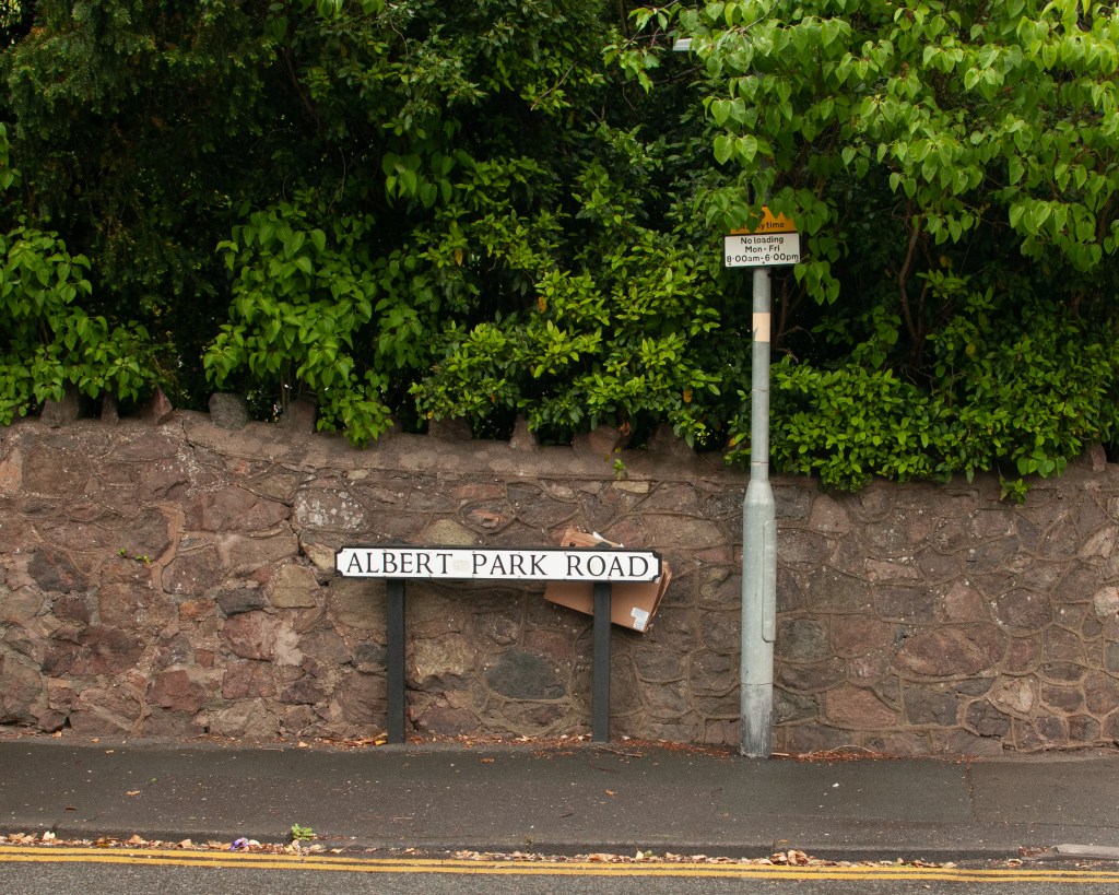
Protesting the idea of the ‘Nanny State’. There has been a lot of recent discussion in politics about the ‘regulation’ of the country, which plays into my initial thoughts about the number of directional or mandating signage we encounter day-to-day. As with 1, it could be straight reportage (drawing people’s attention to it) or from my own perspective and experience.
At this stage, I am keen to pursue one of these smaller ideas as my Self-Directed Project.
Against the Learning Objectives
LO1: Compare the theoretical features, characteristics and histories of different photographic genres.
The exercises in Part 3 explore documentary, portraiture and how my theme spans them. I have included historical terms and definitions from that work into my glossary.
LO2: Deconstruct a given genres’ conventions and create visual material informed by that knowledge.
Retrospectively analysed an image from my family archive using Barrett’s CRIT process. Determined that there are mixed codes from the documentary and portraiture genres.
LO3: Produce new visual work informed by your research.
Created experimental work along the ideas of my broad theme and analysed them to verify that they contain the visual codes of the genres and compare their potential narratives with contrasting images shot the same way.
LO4: Analyse the wider global contexts surrounding contemporary image making.
Looked at Alec Soth’s Sleeping by the Mississippi as an example of a cross-genre contemporary series.
The glossary you started to build in Project 1 will most likely exist as a list of terms which help you to construct, define and classify. However, these terms can also be considered as the beginning of marking out a territory for any work.Your glossary can help you as you start to build a map, or diagram, which includes the broad theme you are investigating, noting some of the key terms, theories and practitioners whose work may overlap or have strands of practice which sit in different territories.
Response
Following Exercise 2[1], the following terms are added to my glossary.
Reformism – the approach of documentary photographers to drive some form of social change through their work. Covers the revealing of something kept hidden or disregarded by society – bringing to light a subject that is uncomfortable or disturbing to shock people into changing the status quo.
Concerned – the concerned photographer who is personally bought into the issue that they are revealing, e.g. Salgado and his documenting of the fragility of his immediate environment as well as the planet[2].
Compassion Fatigue – the saturation of a message through imagery where the senses are overwhelmed. Example of my own experience at the Don McCullin exhibition [2].
Advocacy – linked to reformism, but more about the photographer trying to act on behalf of the subject. Example – Lewis Hine accessing the textile mills under an assumed identity to photograph the child workers. Hine was giving voice to the children who were an accepted and forgotten element of textile production at the time[2].
Mass Observation – large scale documentary projects aimed at social anthropology. Voyerisitic observation of people, their places in society and the context of their surroundings. Grandiose ideas similar to Sander’s portraits of Germans and their professions, but more emphasis on ‘the camera sees’
Self – the concept of one’s identity as actively portrayed through photography. The pursuit of the perfect representation of how we see ourselves. The ideas that we can portray ourselves in terms of our ambitions or alignment with cultural expectation. Example – ‘Come to Dubai’ and ‘Sober for..’ [3]. Transformational identities where artists become someone else to challenge assumptions about gender, race or sexuality. Examples: Jo Spence and Rosy Martin [3].
Theatre of Self – presenting an aspect of our identity and it affects our lives. Peter Mansell’s series’ about his disability[2] which don’t tell the complete story of his identity, but give an insight to those who are not familiar to the struggles of it.
Voyeurism – Martin Parr admitted to being voyeuristic in his approach to photography and highlighted the way that other photographers tend to avoid the term. His work is a blend of very carefully observed and composed images with the aesthetic of a family snapshot. It’s become a visual code in its own right.
Begin by browsing the Source Texts and Case Studies and make notes of at least 5 broad themes you can identify that interest you. Identify at least 2 source texts or case studies that you can work through to help develop your own practice and have these ready to support your Project 4 work. List other possible broad themes that you think could have potential for yourself, your peers or other practitioners that interest you.
My idea of exploring communication as a broad theme (Exercise 1 [1]) led me to consider the further themes that overlap the idea. My starting point was the way that communication has evolved in recent years, with the advent of mobile phones, messaging platforms and social media. This led to the first broad theme of ‘Technology’. In moving to a more digital interaction, I was interested in the way that we communicate with each other and how that had changed. Personal engagements are influenced by who we are, where we fit into a social or familial hierarchy. This led into the broad themes of ‘Identity’, ‘Family’ and ‘Relationships’. I realised also that we are surrounded by information that instructs and prohibits our behaviour, most of which are technology agnostic, that is they require no expert knowledge beyond our way of reading (visually, braille or audible) in order to be effective. Our engagement though, is ultimately driven by our willingness to consume. My final theme is around ‘Rebellion’.
Reading the Source Texts and Case Studies, I selected “Look at Me! The Representation of Self” and “Documentary Depictions and Dilemmas” because they cover the central aspects of what I am interested in. The former deals with representation of personality both as the artist sees it, but also the ideas of projecting a persona, something that is highly relevant to the online world of imagery. The latter deals with the historical shift from straight representation of a scene or event with a view to revelation or social change, to the photographer guiding the narrative according to their perspective. I thought this to be particularly relevant as my ideas communication and its impact on our seeing the world around us, also beg the questions “Does it matter?” and “If there is no noticeable harm, does it matter?” I want to pursue this later in my SDP.
Reviewing the Source Texts
I used Padlet to map the key learnings and messages from the two source texts. They can be found at:
The first conclusion from this exercise was that my broad theme of Communication does indeed span the 5 other themes that identified. There is a strong theme of change in how we engage with each other and the wider population, which is contiguous with the attitudes of the photographers who pioneered documentary. Their intentions evolved from straight reporting and furthering the idea of the camera being a tool, to growing a conscience and becoming both reporter and advocate. The photographers who wanted to reveal poor living conditions or human rights violations, broke the conventions. It’s no surprise that these photographers were unaffectionately known as ‘muckrakers’ owing to their deliberate attempts to let the viewer into an aspect of humanity to be ashamed of. The emergence of the mass observation and curated stories of the 1930s could be argued to mirror the broadening collective of modern media outlets that push specific narratives across the internet, furthering a confusion over what is truth. The ‘truth’ of the photographic representation in the mid-20th Century became less important than the tactic to present or shock the audience. In a parallel with the idea presented in “Look at me…” that Big Brother created an apathy in the audience with regard to the ‘reality’ of reality television, the full context of stories such as the migrant sharecroppers or the people of the Bowery in New York, was no longer important – just as long as the editorial was ‘broadcast’ Similarly with Cindy Sherman, Jo Spence and Rosy Martin, we had serious assumptions about contemporary and generational female identities challenged by the artists acting as other people. With both genres, external context such as our preconceived ideas of a culture or gender, our memories of how things used to be and our recognition of ‘progress’ are increasingly introduced into our reading of an image when stories are being told instead of relayed.
For my theme, I will need to consider how to home in on the core messages I want to convey. This exercise has allowed me to gather my thoughts about the various aspects of communication as a theme and, most importantly, how I react to them.
Select a broad theme as your individual starting point and research how it is expressed photographically through different genres by different practitioners.
Some examples of broad themes include (but are not limited to):
The Body
Identity
Friendship
Systems
Home
Environment
Anthropocene
Power
The Gaze
Materiality
Otherness
Time
Family
You can choose one of these, a variation, or something else. Assignment 3 is designed to help by making connections within your analysis.
Response
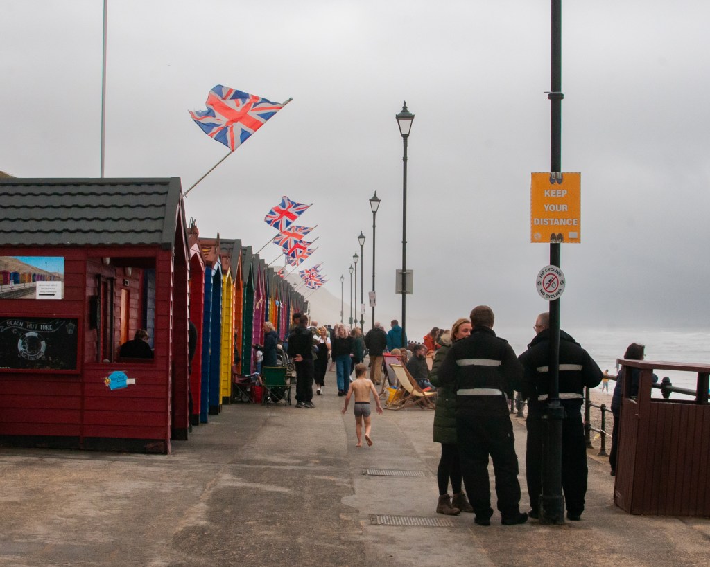
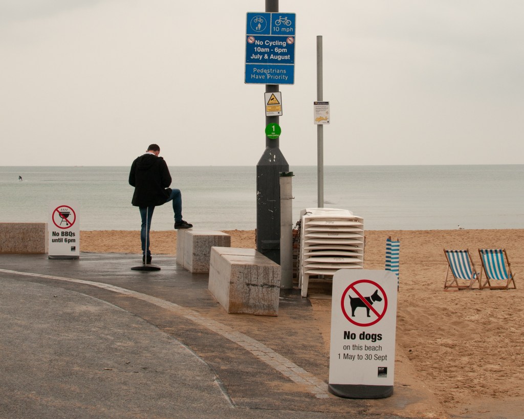
The broad theme that I have chosen is ‘Communication’, as it is something that I’ve been interested in since Identity and Place. Communication covers a very large area of established norms in the natural world, but in human life it has continued to evolve at pace over the past century or so. What interests me is not so much the methods for communicating a message between people, but how our understanding of visual or symbolic communication has changed with the advances in technology and the impact it has had on our general awareness of what is going on around us. For example, I was in town this week and noticed the increased presence of Union Jack flags hanging from the buildings in the centre. On its own, the flag symbolises the national identity for the UK and stirs many emotions and memories from its use in the sports events such as the Olympic Games to the uniforms of our Armed Services. The current context for its use in Malvern is the upcoming Queen’s Platinum Jubilee. We recognise this without any prompting, because the many methods we use to communicate information tell us that this event, unique in British history, is very soon. The message is reinforced further by the addition of banners and signs in shop windows, but only when we pay attention to them, do they have a conscious effect on us. Subconsciously, we know that there is a celebration coming.
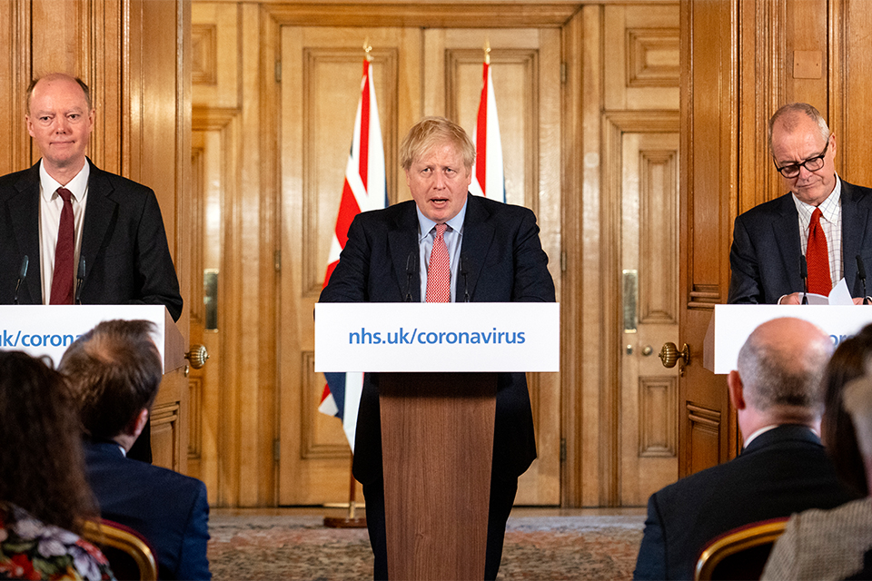
In Assignment 4 of I&P, I paired transcripts of the government COVID briefings with imagery that suggested a contrast between the mood of my town and the messaging coming from our leadership. The briefings were televised, which in itself presented us with a visual communication of how serious the situation was, while trying to reassure the public that those in charge were working the problem.
Fig 1. Prime Minister’s statement on coronavirus (COVID-19): 12 March 2020 (s.d.)
This still, taken from one of the broadcasts, contains the visual elements we came to expect. The Prime Minister flanked by his scientific experts, standing at lecterns, which themselves are symbols of education or presentation. The setting is grand and important-looking and in the centre are two Union Jack flags, creating a sense of national identity and unity as explained previously. The modern use of a website address completes the message ‘if you are unsure, for any reason, go check the website’. The impact of this visual (even in video) is different from the written words that I included in Assignment 4 as they create more internal context, leaving little to our own interpretation. This is where I am interested in our attention to such communication, how it has changed with technological distraction and the effect it has had on our daily lives.
In exploring this theme, I started to observe examples around me and took a few photographs to start shaping my thoughts.
OneTwoThree
Research into how my broad theme fits or overlaps into the genres, as well as practitioners can be found in the Padlet linked below:
My broad theme is actually vast. Communication is clearly a word that covers many different ways of establishing an understanding between people, whether on a one-to-one basis or as a broadcast. How information is received is as important and as varied because expectation and ideas of truth are influenced my many social factors and personal beliefs. Aside from the physical communication mentioned here, there are cultural understandings that we learn to the extent where concentration on the meaning is negated, such as the Union Jack symbolism.
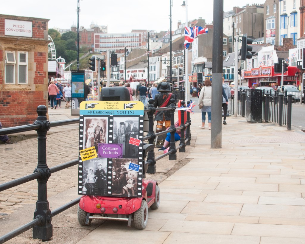
During a recent cohort call, my peers analysed my three images above using Barrett’s CRIT process. Amongst the feedback was a comment about the deckchairs in the beach shot. They are positioned together and facing the sea, which when we think about it is the usual position for deckchairs when we see them for real or in an image. The communication comes in the form of an invitation to ‘sit, with company and admire the shore’. As well as the work in the Padlet, this feedback led me to think about the participants in a communication series that I might create. Are the messages I want to present between people within the frame (or implied within the frame) or is the viewer part of the message? For example, a still life image representing communication needs the direct engagement with the viewer because it is a relationship between them and the artist. However, in my three images above, the relationships are between the signs and the people within the compositions. I believe the answer to this is not a simple choice of one or the other for a documentary series that merges with the still life and portraiture genres, instead it is a hierarchy of meaning. I need to choose which form of communication, it’s participants and the general idea of what the image means as a priority, letting the viewer look beyond that to the alternative ideas.
This broad theme is going to form the basis of my Self Directed Project in the second half of the course, because I see a number of strong areas for exploration through photographs.
Make reflective notes on your reading and the comparisons that are being drawn in this chapter – add these to your learning log.
Choose an image from Art History which you will visually respond to and reflect on your choice on your learning log (you might initially choose several before narrowing it down, and you can write about the choices and ideas you are considering).
Developing your work from Project 1, make your own photographic image, or set of images that explores, challenges, or pays homage to the conventions and visual codes of the original image.
Reflection on Photography and the Art of the Past (Kingsley, 2012)
The essay begins by defining historicism as photography’s use of traditions from art history in terms of inspiration rather than straight reproduction or homage to the genres. I was struck by the popularity of art history conventions in modern photography with the examples given, although there is a definite sense that it is less so than the Victorian era when the ‘new medium’ of photography was in its infancy. The emergence of photography as a way of recording classical painting shouldn’t be a surprise, given the mechanical/physical processes it uses. What interested me was the move towards creating work that looked like them, not just in the visual aesthetic, but also the subject matter. Julia Margeret Cameron’s portrait Light and Love (1865) has the hallmarks of a Victorian portrait (black and white, the soft focus of old lens technology etc), but Cameron dresses her mother figure in a similar scarf to that used in The Holy Family with Child, by Bartolomeo Schedoni (c1613). Cameron was portraying the love of a mother for a child to the Madonna using a nest-like setting for the infant to belie the period the picture was taken. This idea of using the visual codes and signifiers that typically represent the Holy birth as the basis for what Cameron saw as every mother’s love for their child is compelling. This was the example in the essay that resonated with me, because although my modern reading of Cameron’s image is based upon the knowledge that photographers take inspiration from paintings, she was actually merely trying to produce a more accessible version of them using photography. Her contemporaries were similarly using the medium to effectively copy similar works. In doing so, they were able to recognise the style and techniques used in order to create their own original work. In the case of some artists, the paintings themselves feature in new photographic work. The essay discusses Jorma Puranen’s Shadows and Reflections (after Goya) 2011 which connects photography with the past through deliberately revealing the techniques used to make Goya’s famous portrait of The Duke of Wellington. The structures of the canvas and brush strokes, coupled with Wellington’s gaze from the portrait give a sense of intrusion into the making of the famous image, the sitter almost being exposed by the new perspective on the original process.
The main conclusion. from this essay is that modern artists are still inspired by the ideas and techniques employed in traditional painting, with some seeking to use the technical codes and some the iconography that was popular throughout art history.
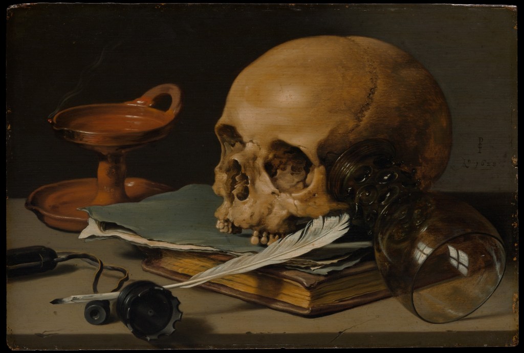
Example for Analysis
I have chosen a still life by Dutch painter Pieter Claesz (1597 to 1660 called Still Life with a Skull and Writing Quill (1628). The image is from the sub-genre of Still Life called Vanitas, defined as:
“A still life artwork which includes various symbolic objects designed to remind the viewer of their mortality and of the worthlessness of worldly goods and pleasures”
(Tate, s.d.)
Fig 1. (Pieter Claesz | Still Life with a Skull and a Writing Quill, s.d.)
Vanitas images deal specifically with mortality, with the reminder of the fragility of a life in balance. They almost always contain signifiers of the end of things, with skulls, writings, candles and empty vessels such as wine glasses to connote the impending. In this image, the dominant element is the skull, which faces the light. It’s condition with its lower mandible and some teeth missing, signifies age which ties in with our rational perspective on death – old people die. The empty candle holder is clean, which suggests it’s either never been used or has been tidied after death. This could connote regret for things not done or started during life or what remains of the flame once long extinguished. The skull rests against an upturned wine glass which is empty. This empty vessel points to previous pleasures, something that many Vanitas images have in common. Others contain musical instruments, food etc, all of which connote better times. The final elements in the image are the quill, the journals and the upturned inkwell. All of these signify labour and their aged appearance connotes something that has been done for a long time. The quill’s repose is such that the writer may be back at any time, or could have left for good. All of the elements are placed on a worn stone table or platter, which connotes the slow passage of time, but presents something familiar about the composition; the artist not simply presented disconnected items to the viewer.
Visually, the image contains elements that are all similar on colour and tone; there are not dramatic contrasts. This is reflected in the lighting, which owing to the lack of a candle is assumed to be natural. These images are deeply rooted in religious iconography so the choice of lighting could connote the ascension to the afterlife or the antithesis of the end of the day/end of the life.
This painting and the others of the same sub-genre appealed to me because they use still life in a way that I had not considered. Other artists were painting images of bountiful life, with exotic fruits, wines and flowers being the most popular themes. Vanitas serves as a reminder that things don’t last for ever and while often extreme in their execution, their style lends itself to story-telling.
My Image
Vanitas still life resonated with me because of the transitional messaging within the image. The ideas of being reminded of mortality while simultaneously celebrating the good things in life connected with a recent change in my own life. I recently gave up alcohol, not because of some problem, diagnosis or epiphany but more because of the way it, in small measure, become part of routine. Lockdown and changes in my working life meant that it was easy to indulge in the weekend treat more regularly than before. My decision to stop has had a huge impact on my wellbeing and made me reflective about the health issues caused by alcohol, some of which are very serious. I wanted to explore this with a Vanitas-style image.
Key elements to reproduce:
Sense of warning represented in the paintings by a skull.
Direction of light – ethereal and from above as if suggesting divine light.
Enjoyment of life’s pleasures – hobbies, food etc.
The sense of timing – being warned about the future, but also the present moment.
My Image
Temperance, after Claesz (2022) by Richard Fletcher
Analysis
For an analysis of my image using Barrett’s tools for critique, please see Padlet below:
The combination of analysing Claesz and making my own still life that uses similar codes and ideas has given me a new perspective on the genre. More than the classical fruit scenes, the Vanitas still life paintings were multi-layered in their connotations, using signs that provoke a sense of dread in the viewer. They combined the artist’s skill in representing light with an understanding of form and luminance that draw the attention of the viewer to the powerful iconography. With my image, I tried to assemble a collection of items that paid homage to Claesz’s image, as well as recreating the directional lighting and matched tones. Once I’d included the camera as representation of ‘enjoyable pursuits’, I realised that there was going to be some diversion from the tonal qualities by introducing harsh highlights. When I realised this, I included my watch to add balance to the spatial composition. One element in classical still life that intrigued me was the use of candle light. For me, this was where the differences in the skills of the classical painters varied considerably. Some master practitioners, such as Rembrandt, really gave a sense of the scene being lit by this natural source, while others used artistic licence with the brightness of the flame and its fluid movement. That inspired my lighthearted criticism in including the flaming cocktail. I wanted the scene to appear to be lit by the flame alone and for it to look completely natural. For this, I used a slow shutter speed rather than a fast one to freeze the flame. The scene is fill-lit by a two strobes and a further LED with a warm colour temperature, which when combined with the key light gives a natural feel. The most important part of this assignment for me was the post-production analysis using the ideas of Terry Barrett, with which I was able to re-evaluate what I had intended to achieve with the picture.
“Thus, all photographs, even straightforward, direct and realistic-looking ones, need to be interpreted. They are not innocent, free of insinuations and devoid of prejudices, nor are they simple mirror images. They are made, taken, and constructed by skillful artists and deserve to be read, explained, analyzed and deconstructed”
(Barrett, 2006)
This assertion by Barrett resonated with me in Exercise 1[2], where I made the selection of the images from each genre randomly. At first glance, the Ansel Adams landscape is a beautiful representation, but by analysing using semiotics, a number of meanings could be derived from the elements and and what they connote. Barrett’s approach simplifies the reading of an image in my opinion, which makes it more intuitive to use.
In conclusion to this assignment, I am happy with my still life. I’ve received feedback from my peers about both the connotations of some elements and the relationship between my composition and that of Claesz. These observations lead me to think about how close to the original image my photograph is and whether that is important. Other feedback questioned how it fits with contemporary Vanitas works. I had partly been inspired to look at the still life genre after analysing Paulette Tavormina’s Banquet (2017) in Exercise [2]. Her use of including movement with the birds in flight, but in a staged fashion, led me to question the movement of candles in other paintings. By incorporating ‘real’ movement into still life, does it still fit with the codes of that genre? Is it truly ‘still’? Looking at Ori Gersht’s Exploding Flowers [3], where the movement from the dispersing petals is clearly there but frozen by a fast shutter speed, I would argue that it’s a difference in detail definition. My flame is clearly identifiable, yet the movement is more life-like owing to the longer exposure. Therefore in terms of being an homage to still life, and in particular Vanitas, I am happy that my image meets the original intent.
Against the Learning Objectives
LO1: Compare the theoretical features, characteristics and histories of different photographic genres.
The features of Still Life were studied in Exercise 1 and brought into this assignment.
LO2: Deconstruct a given genres’ conventions and create visual material informed by that knowledge.
Visual codes such as composition, lighting etc for Still Life were recreated in my image. I took the idea of Vanitas, a sub-genre of Still Life and made it about the warnings of health impact from alcohol instead of mortality. I used similar internal contextual elements as laid out in my post analysis in the Padlet
LO3: Produce new visual work informed by your research.
I produced an image that pays homage to Claesz’s work but isn’t a replication of it. The contextual elements are similar but the overall meanings that can be connoted from them lend themselves to my story.
LO4: Analyse the wider global contexts surrounding contemporary image making.
I was inspired by Paulette Tavormina’s Banquet (2017) which took the classical ideas of a feast in still life and incorporated a flock of birds descending to eat the food. The ambiguity of their presence (see Exercise 1) added a layer of narrative to the image, which in every other regard looked like a painting.
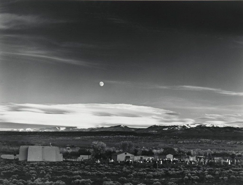
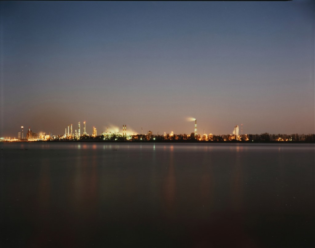
For this exercise, I have chosen two landscape photographs; Moonrise over Hernandez, New Mexico (1941), by Ansel Adams and Bonne Carre Slipway, Norco, Louisiana (1988), by Richard Misrach
[Fig1] Moonrise over Hernandez, New Mexico (1941), Ansel Adams[Fig 2] Bonne Carre Slipway, Norco, Louisiana (1988), by Richard Misrach
These images are visually very similar, both depicting a wide-open landscape with some form of human presence within the frame. They are both shot on large format film with the obvious difference being one is colour and the other is black and white. Moonrise… is perhaps the most famous image by Adams, probably the most recognised landscape photographer in history. This image is famous for the story about how it was made almost as much as the composition. Adams was travelling back from a failed day’s shooting and saw the gibbous moon, lit by the fading sunset. He rushed to set the camera up, couldn’t find his light meter and worked out the exposure from his knowledge of the luminance of the moon. The story reinforced the legend of Adams as a ‘technical’ photographer. Misrach’s image, has no back story, being part of a documentary series about the impact of the petrochemical industry on the environment in ‘cancer alley'[1], a region of Louisiana. Outside of the artistic intensions, the images have other visual differences. Moonrise… is very precise and sharp, exposed carefully for the moon’s luminance, whereas Misrach’s picture is a deliberately long exposure. The fine details of the refinery are lost in the flattened movement of the water and the smoke rising from the buildings. Where Adams captures the natural light impacting on the buildings, Misrach represents the light pollution impacting on the environment; the antithesis of each other. The technical codes used create a sense of wonder in Adams’s picture and his familiar use of scale makes the manmade part less significant in the context of the desert space, where Misrach’s image is depressing. The light pollution creates artificial colour in the sky and is reflected in the water in lines that lead towards the viewer. Misrach’s image relies on colour to create this mood.
I chose these pictures because of the aesthetic similarities and the obvious technical codes that identify each as landscape. They also both contain natural and man-made context in similar compositions. However, it is clear that even without knowing of either artist’s work, they are very different ‘cultural tones’. Where one is rich in detail and natural beauty (then moon, the almost clear sky and the highlights from the sun setting behind the viewer), the other is devoid of the same elements. The composition is simpler but the use of polluting rather than natural light immediately sets this in a environmental/political space. It’s no longer a pure landscape but a documentary protest. With the rest of Misrach’s series, the images serve as a stark warning. Adams’ image isn’t part of a series, but an observation of a moment of natural beauty. Both could be argued to be ‘documents’, but Misrach’s is more of a commentary on man’s destruction of his environment.
“I photographed the landscape, but where it collided with civilization,” he said…
…while Misrach outgrew Adams’ influence, he still reveres the nature photographer. In fact, he has a typewritten letter Adams sent him in 1979 framed on his wall at home. Adams had sent it to Misrach’s first gallery, expressing his admiration for the work…
…“He’s still my hero,” Misrach said.
(Richard Misrach Photographer | All About Photo, s.d.)