Category Archives: Photography 1 – Identity and Place

Reflecting on Identity and Place

Introduction

I have now completed the coursework and assignments for Identity and Place, which also concludes Level 1 of the degree course. This post is a reflection on the key learnings from this unit and how it has changed me as a photographer.

Reflection

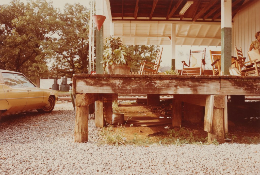
I suppose the first real learning point for me in Identity and Place was that the very definitions of these two words are not a obvious as they first appear. Identity is not limited to the facsimile of our faces and Place is not necessarily a physical location. An identity can be represented by the place that a person occupies and a place can represent the identities of the people who live there or are part of the culture. In many cases, a person doesn’t need to be physically present in order to represent them or their identity. Similarly, props and backgrounds in a portrait can speak volumes about the place that someone occupies in society.

We looked at the origins of photographic portraiture and the way that a picture represents a person as a collaboration between artist and sitter. The idea that portraiture tells a story about the person at some point in their life but nothing about the history leading to that point was something I hadn’t occurred to me before. While the photograph can more readily capture the differences in a person’s face at intervals, say separated by years, any interpretation of what has happened to them in the intervening period is created by the viewer using the visual cues included by the photographer. In the first project of Part 1[1], I looked at two very different portraits of General Ulysses S Grant, later President Grant, taken when he was a serving army officer and one in office. The pictures were clearly of the same person, but the years and events had changed the way he both looked and carried himself. In both cases, the photographers were representing Grant’s status as a man of action, but with different environmental influences. The same research looked at the works of Julia Margaret Cameron, who was one of the pioneers of the photographer deliberately presenting their subject as they saw them. Her images were deliberately blurred with motion, harshly lit or slightly out-of-focus as a way of revealing their character. This learning was another element that reinforced the fact that photography as a technical process is secondary to the idea that is being presented. If the technical perfection is subverted to tell us something about the subject, that’s fine. It’s important for me to remember this point, given my technical background.

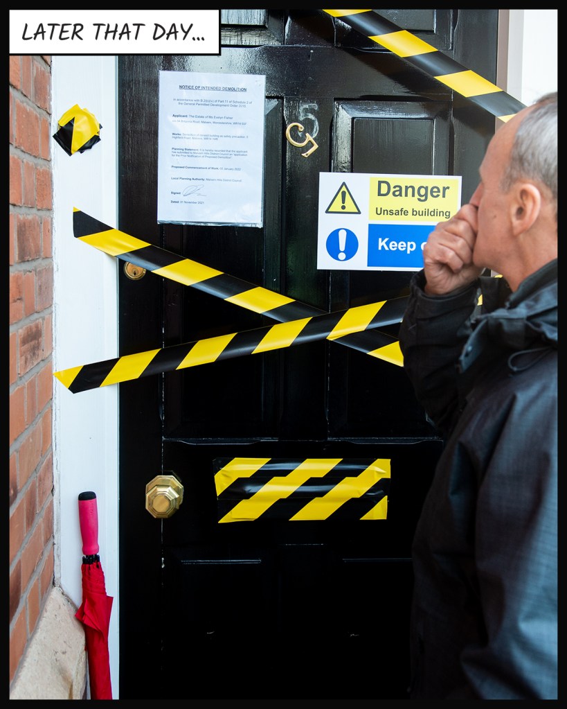
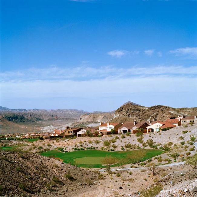
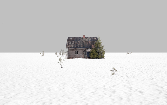
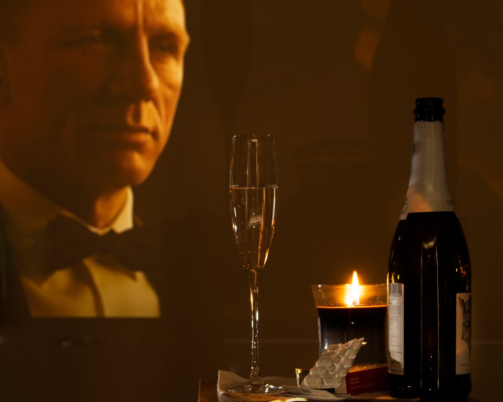
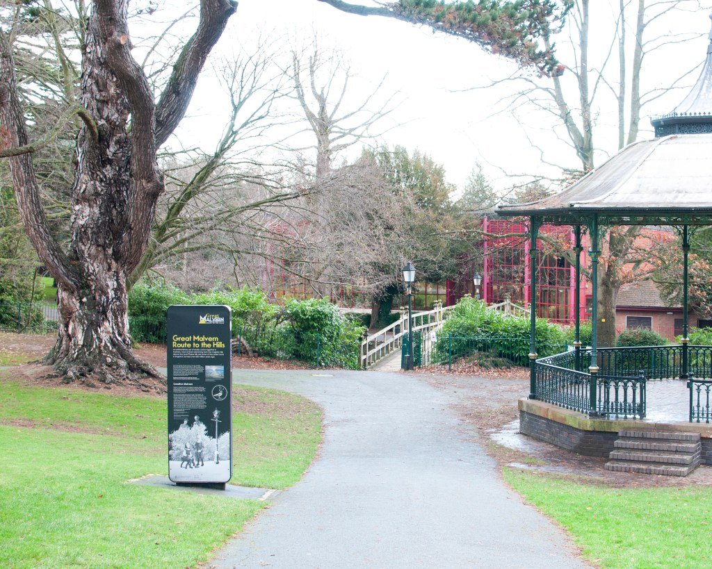
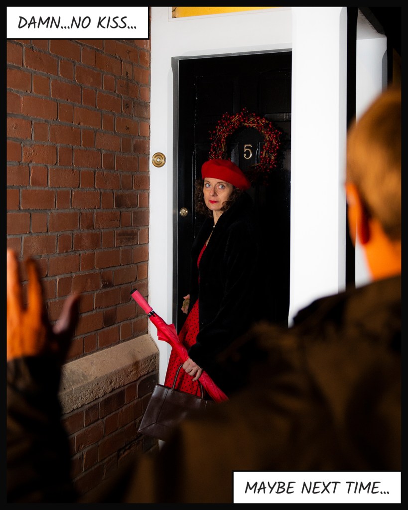
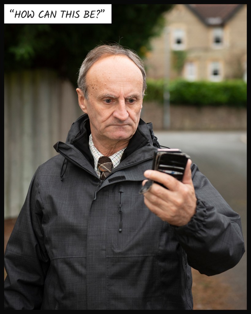
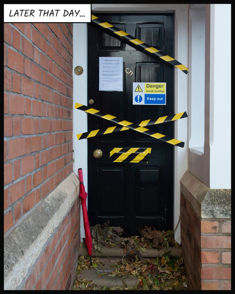
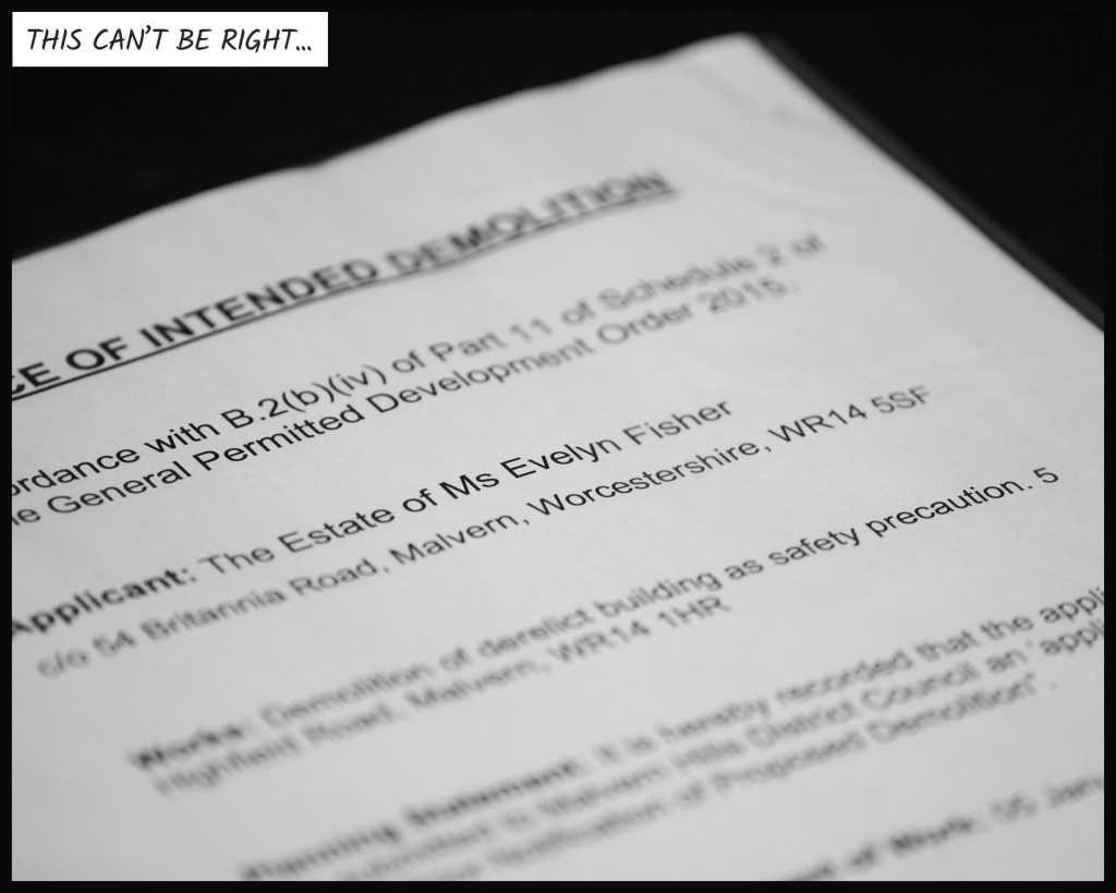
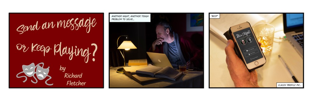
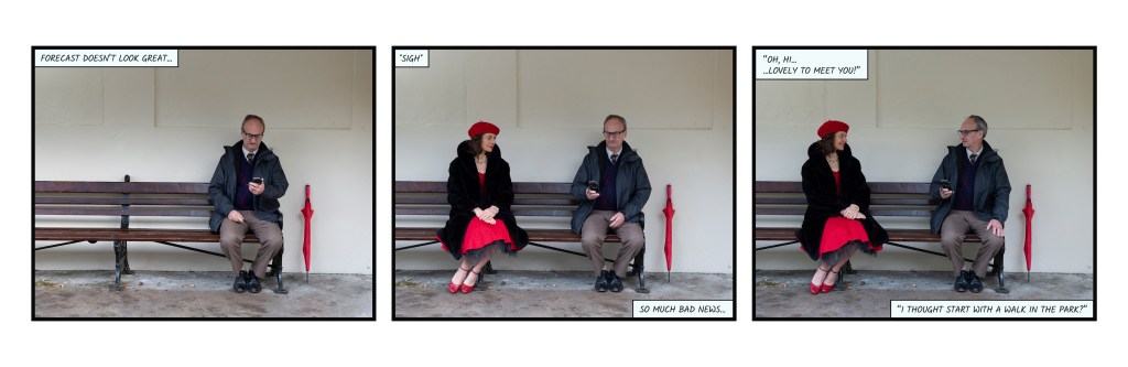
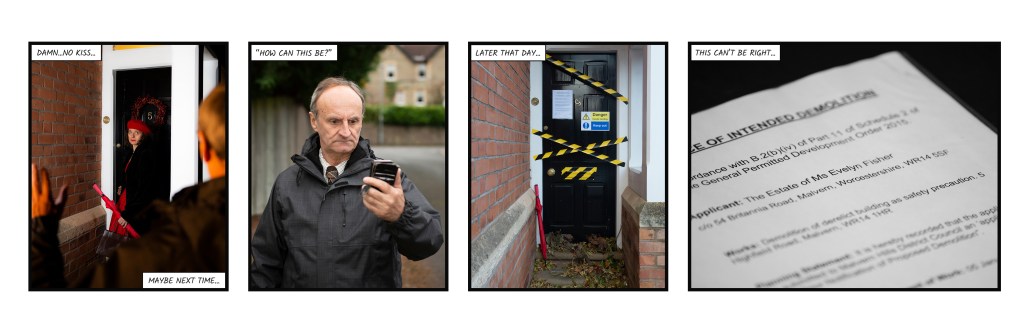
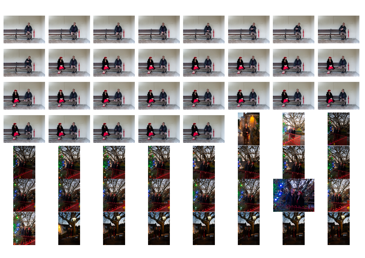
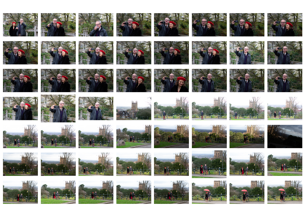
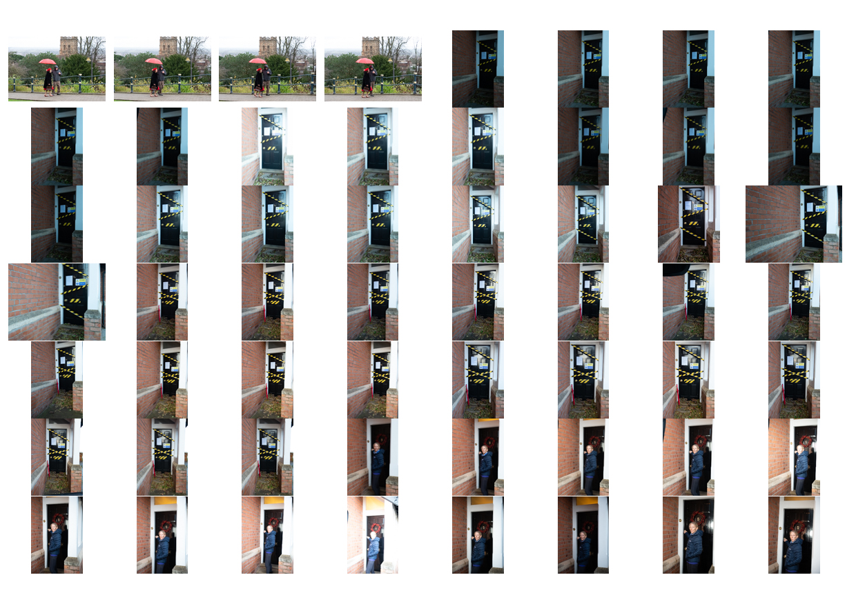
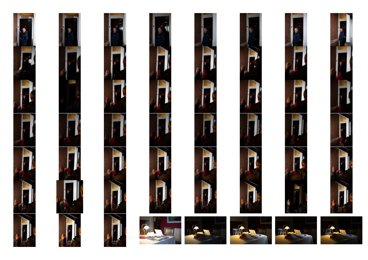
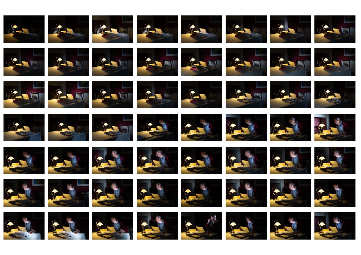
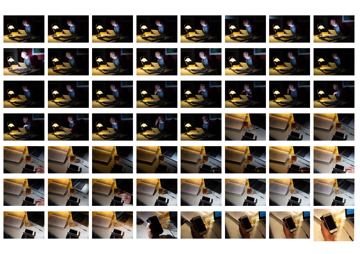
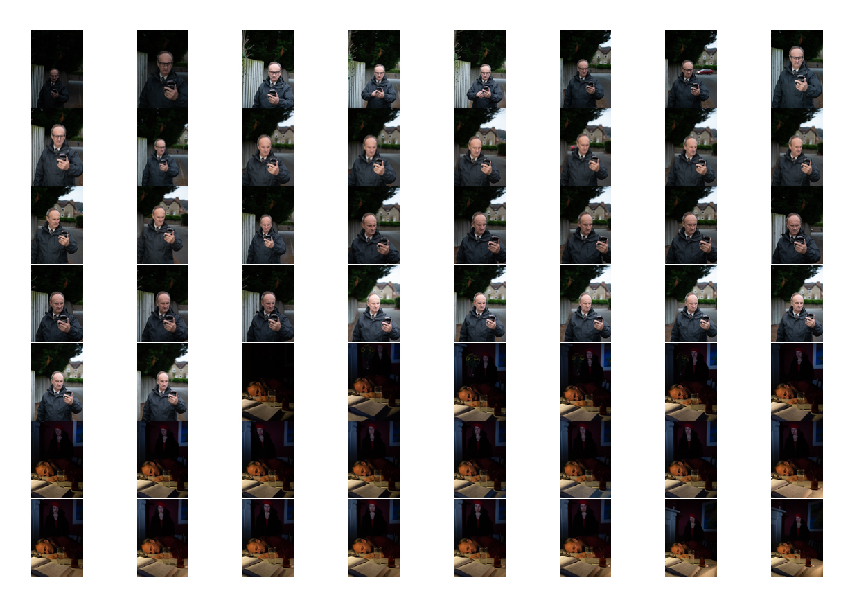
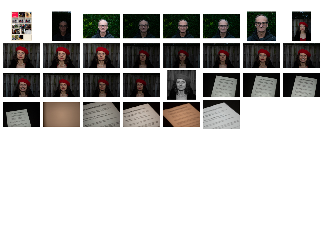
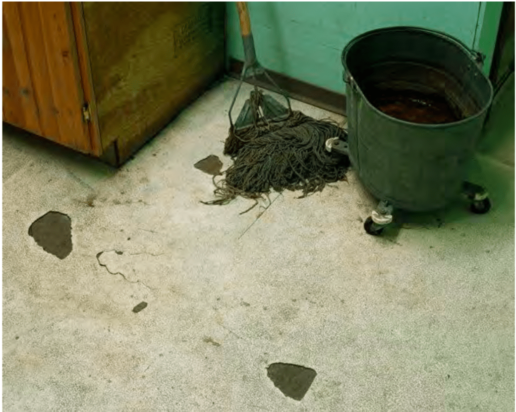
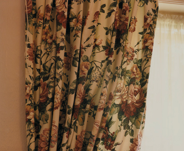
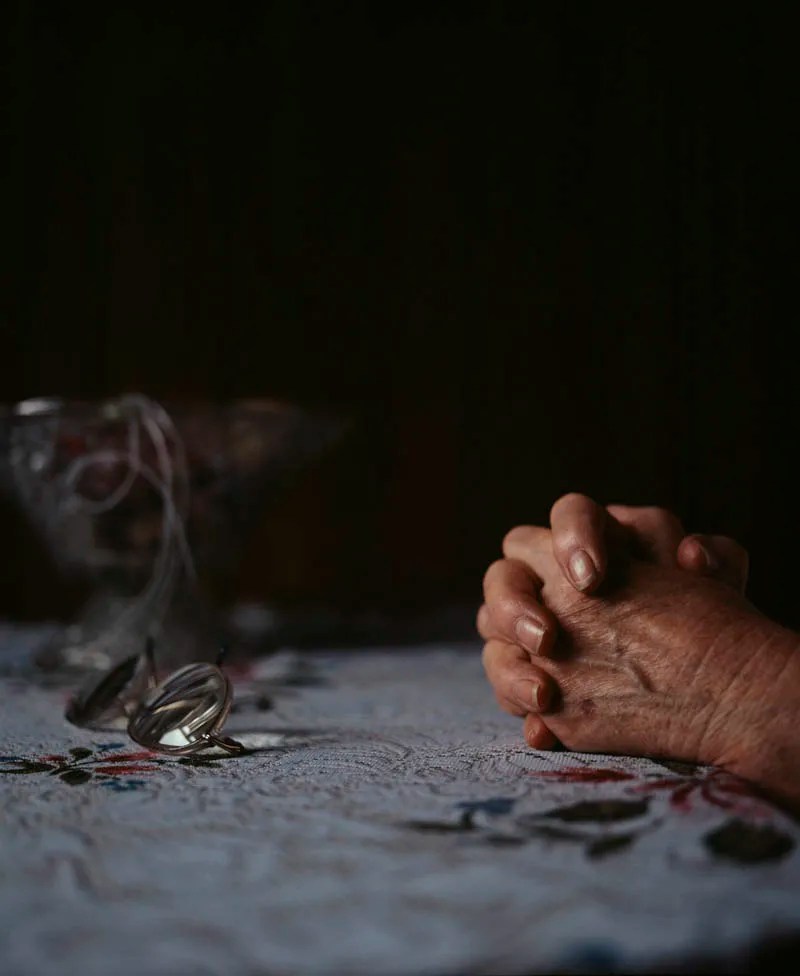
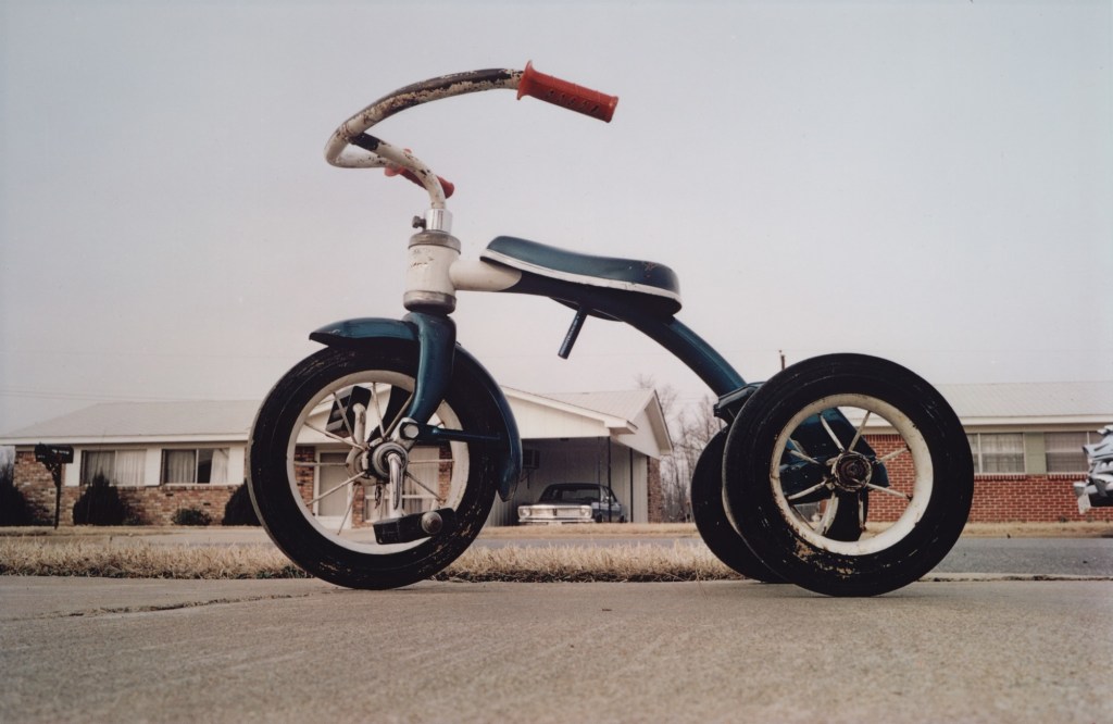
The other artists that struck chords with me were Walker Evans and August Sander. The former is someone I was aware of from his book American Photographs (1938). His work in this unit was uses to explore the idea of subjects that are unaware of being photographed. The Subway series revealed the lives of the people on the train with Evans in a way that was entirely natural. Their interactions with each other and the occasional suspicious glances towards Evans and his hidden camera, made me ask questions about life in 1930s New York, which tied in with the later work on Postmemory. In that piece of work [2] we learned that postmemory isn’t just limited to our own experiences, but includes that of our ancestors and our culture. In the case of Evans, I am a huge fan of New York and have travelled on the same subway many times. My reading of Evans’ series was naturally influenced by my own experiences as well as the traditional images of the city from history. With Sander, we have another revelation of identity whose origins were in a sinister cataloguing of German society between the world wars. Sander’s subjects are pictured in the clothing that they would wear for their profession but there are also tools, props and the background, all of which help ‘place’ the person and identify their category.. The intention for the work may have been a flawed pseudo-science, but the resulting series speaks of the individuals as well as society at what was a fragile time. Sander’s work heavily influenced my submission for Assignment Two in which I used inappropriate dress for particular activities [3]. For me, Sander’s work continued my fascination with constructed tableaux. His portraits reveal a great deal about the subject and their ‘place’ despite looking at first glance like a practical document. Tableaux has featured in my all of my assignment submissions since Assignment Two, with the only departure being a more documentary approach in Assignment Four Even in that assignment, I was carefully including contextual elements in a semi-constructed manner and specifically excluding others, for example people. The research into in absentia portraiture followed on from what we learned in Context and Narrative with further emphasis on the traces of human activity. I was particularly struck by the artists Alec Soth and Martina Lindqvist, who asked questions of the viewer with their images of recent events within a specific culture. The latter’s seemingly simple compositions of buildings in a snowy landscape contain many subtle layers of meaning, inviting the viewer to ask questions about the people who live there and how their lives are affected by their environment. Soth’s series about Mississippi revealed wide ranging aspects of live in the region, some which are stereotypical and influenced by media perception and some that are testimony to the uniqueness of the culture. Where one aspect ends and the other begins isn’t always clear, which adds to the intrigue of the artist’s intent. This style of work has had an impact on how I approach a series, asking myself what I am really trying to say with my own work. When it came to Assignment One: The Unfamiliar, Sander shaped how I approached what was a challenging piece of work. Like many students, I found approaching strangers and asking them for a portrait very uncomfortable. In my series, I was trying to reveal what the local park meant to people who visited it and, though conversation something about their lives. Sander’s setting a subject into a specific context and Coburn’s comments about the establishment of a relationship with them made this assignment less of an issue than I thought it would be. Sander continued to influence my thinking when it came to Assignment Two, where I subverted the expected style of dress in certain social or cultural situations. In this assignment, I allowed my sense of humour to feature in the work which is something I’ve learned to do throughout Level 1 of the degree course. I learned a valuable lesson about my integrity as an artist at the end of Assignment Two with the criticism I received for self-censorship. What was an intended protection of my subjects (who are my friends), actually said more about my idea of what is acceptable and what is not. My image of the school teacher dressed as a saloon girl was the one that stood out as the model didn’t care who saw it. My own sensibilities wanted to avoid any form of online backlash given her position on the school board of governors. I learned about committing to an idea and being confident to share the outcomes, wherever they might lead. This self-awareness continued into Assignment Three [4] where I told the story of vinyl’s decline and resurgence through photographs of my own life growing up. The work was inspired by Trish Morrissey and Hans Eijkelboom[5] who physically placed themselves in the portraits of others. Both artists manage to blend in and stand out from the subjects around them in a way that makes the viewer question what they are looking at. In my series, my very personal family photographs took the form of album covers and were placed in the setting of a vinyl record shop. I enjoyed the opportunity to play with tableaux construction in that assignment, which gave me increased confidence in the rest of the unit. Assignment Four[6] took its inspiration from Barthes’ paper Rhetoric of the Image, which discussed the use of relay text as complimentary context for the iconic and symbolic messages in a photograph. The pairing of scenes with quotations from the Government COVID-19 briefings was a powerful combination that received positive feedback from everyone who has seen the series. I think that this assignment taught me how to really observe a scene and think about how it fitted a narrative that I had already. The idea stemmed from an idea I had considered for an ebook which, thanks to Assignment Four, is something I am now pursuing outside of this course. The most significant learning from the unit came in the final part. Until that point, my work had been rooted in factual stories or situations, whether viewed from my perspective or deliberately subverted in some way. In Part 5, I was inspired by Michael Colvin’s Rubber Flapper[7] series to explore something fictional. His story of an eccentric woman living in a self-cleaning house, whose private life was a mystery being investigated by the artist, was so apparently real that I found myself instinctively Googling the story. Colvin constructed the character around his own experiences of privacy and acceptance of his sexuality, based it on some real events in the early 20th Century and cleverly used modern props to help the narrative through the series. I took Colvin’s work as inspiration for Assignment Five[8]. This departure from representing real people, events or cultures was like a release of my imagination. My series explored modern society’s reliance on communication technology through the re-telling of The Vanishing Hitchhiker, a ghost story that has become an urban legend. I really enjoyed the creative process of framing the story, choosing the costumes, props and lighting and the curation of the series in a way that I hadn’t really experienced since Assignment 5 of Context and Narrative[9]. I also worked with models, something that I have really learned to embrace in this unit as it gives me the opportunity to build those relationships to the extent where everyone involved is bought into the intended narrative. My models (also my close friends) contributed ideas for their characters throughout the shoot which I felt made the series more impactful; this was an experience I had in Assignment Two.

The experience of taking something that interested me (the ghost story) and relating it to the struggles of modern life prompted me to start carrying a small ‘ideas’ notebook around with me. When a similar idea comes to me, I write down the key details to be expanded later. Identity and Place has taught me to be more observant, look for meanings in images and not be afraid to let my imagination take over when I feel like it. It has changed my perspective on photography as an art form, which is most noticeable when I look at aesthetically beautiful pictures. If the image doesn’t tell me something about the place, it’s identity or that of the people who inhabit it, I get bored fairly quickly. In conclusion, the unit has continued to push me from taking such aesthetically pleasing photographs to creating work where a story is being told, asking the viewer to look carefully at the contextual elements in order to create narratives.

References

[1] Fletcher R, 2021, “1) Project 1: Historical Photographic Portraiture”, OCA Blog Post, https://richardfletcherphotography.photo.blog/2021/02/23/1-project-1-historical-photographic-portraiture/

[2] Fletcher R, 2021, “3) Project 2 – The Gaze”, OCA Blog Post, https://richardfletcherphotography.photo.blog/2021/09/02/project-2-the-gaze/

[3] Fletcher R, 2021, “Assignment Two: Vice Versa”, OCA Blog Post, https://richardfletcherphotography.photo.blog/2021/06/25/assignment-two-%E2%80%8Bvice-versa/

[4] Fletcher R, 2021,”Assignment Three: Mirrors or Windows, OCA Blog Post, https://richardfletcherphotography.photo.blog/2021/09/06/assignment-three-%E2%80%8Bmirrors-or-windows/

[5] Fletcher R, 2021, ” 3) Project 1: Mirrors”, OCA Blog Post, https://richardfletcherphotography.photo.blog/2021/08/11/3-project-1-mirrors/

[6] Fletcher R, 2021, “Assignment Four: Image and Text”, OCA Blog Post, https://richardfletcherphotography.photo.blog/2021/11/06/

[7] Fletcher R, 2021, “4) Project 3: Fictional Texts”, OCA Blog Post, https://richardfletcherphotography.photo.blog/2021/11/05/4-project-3-fictional-texts/

[8] Fletcher R, 2021, “Assignment Five: Your Inspiration”, OCA Blog Post, https://richardfletcherphotography.photo.blog/2021/12/27/assignment-five-your-inspiration/

[9] Fletcher R, 2020, “Assignment 5: Making it Up”, OCA Blog Post, https://richardfletcherphotography.photo.blog/2020/12/24/assignment-5-making-it-up/

Post Assignment Five Feedback

Introduction

I have now received feedback from my tutor on my submission for Assignment Five: Your Inspiration. On the whole, the feedback was positive, with the view that my idea of re-telling the ghost story in the context of the modern digital life came through in the series. A number of suggestions were made as to how to improve the series impact and visual, which are described below. This post addresses the points made and any actions taken prior to submitting for assessment.

  1. The triptych of photographs (Three, Four and Five), that tell of the first meeting between the characters, was thought to be one image too many. The impact of the sequence and Eve’s sudden appearance was thought to be represented adequately by Three and Five.
  2. Eleven was thought to confuse the continuity of the sequence in that it doesn’t contain any indication of from whose viewpoint the door is being ‘seen’. This was in contrast to Nine which shows the man saying goodnight to the Eve at her front door.
  3. The man alternates from one hand to the other when holding his phone. Although this was felt to be a very subtle disruption in the continuity, it was noticed by my tutor.
  4. The final image reveals Eve to be something supernatural with the lingering doubt around whether she was a figment of the man’s imagination. In the picture she was felt to be too solid to maintain this mystery.
  5. The comic strip aesthetic could have been more impactful with a page layout rather than the traditional newspaper look that I had chosen. It was suggested that I look at the layouts of graphic novels as an inspiration for how to present my work here.
  6. Some of the captions were thought not to add to the image on the way that I intended. The example given was the use of *sigh* in Four. The man’s expression made the word redundant in terms of supporting the picture, in contrast to the use of *beep* in Two which signals the notification from the dating app.

Response

The feedback was interesting and matched some that I had received from members of my I&P cohort. My response to the feedback and rationale for making/not making changes is shown below:

Point 1

I understand the sentiment about Four and the idea that Eve’s appearance without any leading into the frame does suggest that she has materialised. I originally had the idea of a diptych for this part of the series during shooting and actually decided to include the third image to add another question to the sequence. The story has a continuous thread of modern technology, and our dependence on it, running throughout. One of the ideas being portrayed is the way that the mobile phone keeps our attention when lots of other things are happening around us. The original inclusion of this frame was intended to show the man not noticing Eve when she appears, either because he hasn’t noticed her materialisation or that he is transfixed by his phone. During our call, my tutor and I discussed 5) Exercise 2: Georges Perec, where we had to look at a scene in front of us and note what we had observed. One of things I noted during the exercise was the number of people sitting alone with their phones, almost existing within their own bubble. The other activity in the cafe scene had some interesting aspects, the grandfather carrying a baby in a papoose for example, which the phone users completely missed. When I reflect on this, I am guilty of the same thing whenever I’m by myself in a public place. In terms of this assignment, I am not inclined to remove the image because I believe that without it, this ambiguous situation and the question it raises about his awareness of her presence is missing.

Point 2

This was very valuable feedback as it is a subtlety of visual storytelling, particularly the mise-en-scène approach to cinematography. I hadn’t considered the jump between the man realising that there was something wrong (observed by the viewer) and the visual of the derelict front door. I decided to re-shoot this image as I still had access to the model and the props (the front door being my own). The new frame can be seen below:

Point 3

This was something I hadn’t noticed during shooting and post-production, but it was another good observation in the same context as Point 2. As it was accidental, there was no way of using any of the other photographs from the contact sheets to correct it. The result was that I had to leave the error in the series. As a side note, I discussed it with the model who stated that he naturally swaps hands with his phone, depending on the light and the function that he is using. It doesn’t distract from the point that I hadn’t spotted the disruption in continuity; something to watch for in future.

Point 4

This point was more of a comment on the creative decision that I’d made to have Eve standing over the man with an ethereal glow. My tutor felt that I could have placed her as a reflection in the painting on the back wall in a translucent visual, or with a different composition where she appears as his desktop image. My initial response to this point was to consider how I could make Eve less solid in Photoshop, but I quickly realised that my decision to light her with a different colour temperature to the man made it difficult to see a way achieving this. Even if I could make her less solid, the fact that she emits light in the form of a glow on the background, means that the result would not work technically. The other issue was that the lighting setup used in the shoot meant that I didn’t shoot other images with her missing from the frame that could be combined to achieve the effect. As I no longer had access to the both models and costumes, I elected not to re-shoot the picture. The idea of having her as a desktop or screensaver was something I had originally considered when preparing for the shoot, but I didn’t want to include more than one composite image using Photoshop (I already had created the fake dating app profile and layered it onto the phone screen in Two). On reflection, I didn’t agree with my tutor on this point as in following the original ghost story idea, Eve needed to be as real and believable as possible throughout, rather than follow the stereotypical notion of being transparent.

Point 5

This was perhaps the most difficult feedback because my intent for the series was not to present it as if it were a classic graphic novel. I wanted to include the textual elements as a nod to Barthes and the idea that they could support the main narrative, while leaving the images to reveal the other layers. The genre of graphic novels wasn’t the point, but by presenting this way I have received this feedback from more than one person. In response, I looked at modern examples of comic and graphic novel layouts with a view to arranging this series in a a more tabular form. As the feedback suggested, by laying out the panels together, the viewer is presented with the story in one instant. The viewer gets a sense of the action without linearly progressing through the panels. I could see the benefit in laying out my series in the same way. Unfortunately when it came to arranging my images, I realised that the comic panels generally followed a format where one of the dimension of each box was consistent with the others. The tessellation of the panels depends on the variation on the other dimension of the panels which, in terms of my series, presented a problem. I had shot each picture with the frame filled to the extent where I could then crop to my preferred 4×5 format. This meant that selecting another crop that would suit a comic book layout would potentially remove details that I had included in order to support the narrative. I concluded that in order to have made a traditional comic, I would have needed to have shot the pictures with that in mind.

Point 6

The final point made was related to the inclusion of some of the captions. My intent was to use text as a relay to the images, describing the main ghost story but not sighposting the more subtle elements of images themselves. The point was made that some of the images didn’t need their caption to increase their impact. Following this feedback, I removed the example that was given and re-reviewed the captions for the whole series.

Changes made to the series

In addressing the feedback, I made the following changes to the series:

  1. The most significant change was to the arrangement of the comic strip. I had struggled with the arrangement of the panels to fit a page, without making major changes to cropping of some of the photographs. As each image was a mini tableaux, I didn’t want to lose important symbolic messages within the frames by cropping just to make them fit. After careful consideration, images Seven, Eight and Twelve were changed from landscape to portrait without any loss of elements, which meant that I could make a 4 page comic. As most of the comics and graphic novels that I had looked at were in portrait format, the arrangement followed this style. To make each page more visually interesting, I made three images, where there is ‘close-up’ action taking place, stand out by rotating them slightly in their position on the page. This is frequently done in comics and graphic novels and has the effect of breaking up the static format of the panels.
  2. The final image where Eve is revealed is now a single page on its own. This decision suited both the layout of book and also the drama in that picture. In my previous layout, the image was somewhat lost because it was a portrait composition which reduced its size on the page. The picture now serves as the climax of the story and is large enough for all of the details to be seen clearly.
  3. I made some further changes to captions and sizes, removing those that didn’t contribute to the narrative and adjustments to make the size consistent when the panel sizes varied. The most notable removal of caption is the selfie picture where the activity is both obvious and also brought to the reader’s attention by the use of rotation mentioned previously. Some captions were adjusted to make the new sizes fit within the frame of the images, mostly on the first page where the landscape panels are smaller than pages 2 and 3.

Conclusion

In general, I was happy that the series achieved what I intended for it. The feedback from my tutor, family and friends, as well as my fellow cohort members, was constructive. I found that my initial reaction was to focus on what I agreed with them on and be less interested in anything that I thought was a misunderstanding of what I had intended for the series. However, I realised that the opposing views were still intended to help improve the series, so gave them more thought. The changes I made to series involved significant edits to the photographs, captions and the layout, all of which result in what I believe is a stronger series. The final presentation of this assignment can be seen in the original post Assignment Five: Your Inspiration linked here:

https://richardfletcherphotography.photo.blog/2021/12/27/assignment-five-your-inspiration/

5) Project 2: Places and Spaces

Introduction

We are introduced to the ideas of Place and Space, which when I think about it, have always naturally meant the same thing to me. That’s not to say that they have the same meaning, as described in the notes. I think my interpretation of both has been influenced by my experience of mental illness, during which the idea of the two was significantly blurred. People talk about ‘head space’ and ‘happy place’, referring to a situation that is contained within our minds rather than being something tangible. To maintain your head space is to keep a clear mind and similarly, to go to one’s happy place is to mentally escape an experience by consciously thinking about something or somewhere that makes us happy. When I was unwell, I felt that my head space and the physical space around me were essentially the same thing. If something bad was happening around me, my mind focused on that to the detriment of any other, more positive thoughts. Being someone who found it difficult to hide what they were feeling, it was as if I had become transparent. I didn’t really take in my surroundings either for fear of becoming fixated on the negative.

Since my recovery, I’ve been successful at keeping reality and my imagination separate while allowing the former to inspire the latter. Enrolling on this degree course was one of those inspirations. I am now content in being able to imagine a ‘place’ that is inspired by something I see around me or online, as well as being able to appreciate a physical ‘space’ and the things that influence it. I had always been able to appreciate a beautiful view (as long as there wasn’t something negative to interpret from it), so now when I pause to take one in, I’m more likely to linger on thinking about the seasons, the history and how people have shaped the landscape. If I’m looking at a building, I try to imagine what it was like when it was built – did it have a special history etc? When I first bought my house, which was build in 1897, my brother-in-law asked me if it was haunted. We had a laugh about it, but when we think about old houses and the history they have ‘seen’, the concept of something supernatural existing within its walls isn’t that crazy an idea. In it’s 124 year history, the house has stood through 2 World Wars, the smallpox epidemic, financial crashes etc and has been shaped by the people who have lived there. My contribution to its history is tiny by comparison.

When it comes to ‘looking’ at space, this course has taught me to take my time and to not seek somebody else’s intent for it. What I mean by this is that I try to reach my own conclusion about what I’m looking at without wanting an explanation. My problem is that when I create a photograph or series, I look to explain it to the viewer. This is perhaps because of the way I perceive people looking at space. I’ve mentioned previously about Nan Goldin’s distaste for social media because of the way it’s shortened our attention span when looking at pictures. Indeed if we look at her masterpiece The Ballad of Sexual Dependence with this way of viewing, we’d miss the messages it contains (I regularly look at the book when I feel uninspired). People have become accustomed to seeing the objects within a picture without wanting to imagine why they occupy a particular space or interact with something else present. In Project 1, we looked at human behaviour in photographs that contained no people. If we just looked at the dishes in Shafran’s Washing Up for example, we’d probably not understand the meaning of the work. Such is our dependence on the visuals provided by our phones that we feel completely naked without them. A friend of mine was recently telling me of a traditional London pub that has a ban on mobile phones being used – whenever someone takes one out of their pocket, they are first warned and then thrown out. The idea is to appreciate the simpler interactions between people and the environment (and beer) that the pub has worked hard to provide. I mused at how long my wife and I would last.

Research Task: Your Environment

In considering the above and my own environment, I realise how much my ‘visual awareness’ has changed since finishing work. I walk a 3 mile route around my town every day, which varies only slightly depending on whether I need to shop for food or do some work. I started this routine nearly 12 months ago in an effort to get fitter, but I soon started to notice how the space is affected by the change of seasons. Traditionally, we know that when winter moves to spring, there is new plant life, changes in the colours of trees etc, but the first thing I noted was the way that the buildings changed. People stopped spreading salt on the pavement outside their business and houses to prevent ice, the number of chimneys expelling smoke and vapour from their heating systems gradually declined as the weather warmed. The wildfowl at the lake in our park started to breed and nest in the newly shaded trees. My walk was staying the same, but I was seeing a different town to the one from the version I saw during winter. What remains consistent with the seasons, however is the sense of familiarity and comfort. I’ve lived here for over 20 years and although the town continually evolves, the daily walk makes me feel at home when I see the familiar environment. My wife and I were out recently with some friends who pointed out that there had been a surge in new and interesting places to eat in the town. We recognised this change in the demographic, but it was lost in our sense of belonging here. When I looked at Robert Harding Pittman’s Anonymization, I could see the artist’s connection with the natural world being challenged by the behaviour of man. His images of the beginnings of ground works for buildings struck a chord with me as they symbolised change. The seemingly relentless progression of building ‘desirable’ living spaces is revealed in Pittman’s work as disrespectful to the natural world; the proliferation of the pattern making the landscape essentially anonymous. When we think of the lack of harmony between man’s needs and the natural world, there are many examples that immediately spring to mind. The urbanisation of California is a good example, where a landscape that sits on a major tectonic plate is cultivated because of its warm, dry climate. Millions of people live in the shadow of potential natural disaster and the rapidly advancing signs of global warming (the state suffers catastrophic fires every year nowadays). In spite of this, the people continue to build towns of houses with lush gardens and swimming pools because of what they see as the beauty of the environment. One image in Pittman’s series that stood out for me was the one below:

Lake Las Vegas Resort, Las Vegas, NV (2015) by Robert Harding Pittman[1]

Here we have a beautifully shot scene of the landscape of Nevada under a deep blue sky. The subject is a hotel-style development called the Lake Las Vegas Resort. What immediately struck me about this photograph was what was missing from the image. There is no lake to speak of, which when considering that Las Vegas in in the Nevada desert, isn’t a surprise. This awkward naming of the hotel seems incongruous in the landscape and is further emphasised by the lush green golf course in the foreground. The resort is billing itself as being Las Vegas which translates to ‘The Meadows’ because of the surprisingly well irrigated regions in the desert, but the golf course has the appearance of being entirely fabricated. The image screams insensitivity to me, highlighting the irresponsible development of the natural world for what is an entertainment venue. Other images in the series suggest a scale of this attitude, depending on social or economic status and some developments paying lip service to their surroundings. Whatever the social or political perspectives of the viewer, the series is interesting because it deals with people and culture by exploring their actions and their environments.

Stephen Shore (1947 -)

We are introduced to Stephen Shore in the context of the photographic journey. Like Walker Evans and Robert Frank before him, Shore photographed what at first glance appear to be uninteresting locations. The title of is book Uncommon Places mixes these images with slightly abstract portraiture and still life work, much like that of Eggleston. The title, as the notes suggest, is at odds with the banality that the subject matter appears to exhibit – this invites us to look closer at the series. Like Frank, Shore’s journeys that became the setting for his series was one of personal discovery. He was 23 years old before he realised that he’d not set foot outside of his native New York and that resolve to learn about the rest of the United States drove the observations in his book. The ‘Uncommon’ in the title could instead refer to that exploration or that the locations and experiences of the trip might be familiar but new to anyone looking at the images. Whatever Shore’s intention, the images have a sense of what it is like to be in America to natives and strangers alike. The notes refer to the comment by Szarkowski about Eggleston’s Memphis being a faithful representation to the uninitiated and the same being said of Shore’s work. For me, the work echoes the Italianicity that Barthes talked about[2]. Modern American culture surrounds most of the western world and unlike Frank’s look behind the curtain of it, Shore takes it head on. His work has drawn critical review that catagorises it as ‘formal, clinical, objective, impersonal and dispassionate’, which almost suggests little part of the photographer’s eye in the creation.

“She looked at them and said: ‘So, Stephen, you want to photograph every main street.’ I replied, ‘No, Hilla, that’s what you want to do. I want to photograph the quintessential main street.’”

Stephen Shore in conversation with Hilla Becher, quoted in an interview with The Guardian[3]

In the above quotation, Shore was telling Becher, one of the typology pioneers studied in Part 1[4] that he was interested in capturing the idea of an American street as seen by most people. Uncommon Places achieves that for me with its many cultural elements.

Personal Reflection

The notes ask us to consider where we would do a project of the scale of Shore’s or Frank’s and I think mine would probably be about a culture within a culture. The UK is a truly multicultural society, which has its successes and its problems in terms of acceptance. We are very familiar with the clashes of different races and the fight by many ethnic minorities against racism and everyday prejudice, but I am more interested in the cultures that interact with the wider population but quietly avoid becoming part of it. The one area that I would explore is the traditional Romani gypsies, who unlike the generic term ‘traveller’, live their lives within traditional family structures and customs. Our interactions with true Romanis are few and far between, limited to door-to-door sales and travelling fairgrounds. My series would explore life for the Romani in the UK, beginning with the densely populated regions such as Greater London and ending with in the more rural areas. It would seek to reveal there world by capturing their act of travelling around, so becoming journey within a journey.

Paul Gaffney and Alec Soth

Paul Gaffney series We Make the Path by Walking (2013) is a book that captures the beauty of the natural world shot during many long walks. When I looked through the book, there were a few things that stood out for me. The notes refer to the mindfulness evoked by the images, but for me the key theme is the sense of familiar and unfamiliar. I regularly walk around the area that I live in and inevitably take photographs of the things that are obvious to its location and some that are not. Gaffney’s series contains familiar images of grasses and tree-lined pathways that could just as well be where I live. As well as the beautiful aesthetic, it is this familiarity that invokes a sense of peace in me. Gaffney further enhances this by not giving any clues as to where they were shot. Conversely, the viewer is invited to appreciate the nature surrounding the artist while he walks in a place that is unfamiliar to them.

“I always wanted the images to evoke rather than describe, and for people to engage with the work and to bring their own experience to it, rather than it just being about my own experiences. I sometimes recorded ambient sounds which I have considered using in an installation, and I was also thinking about recording conversations with people along the way, but it was always going to make things overly complicated and as it becomes complicated, it tends to bring you further away from the experience.”

Paul Gaffney in conversation with Walter Lewis for Photomonitor[5]

Gaffney’s ‘simple’ approach to his work leaves the viewer free to draw their own conclusions about the environment, the act of walking through it and connecting with nature. Some of the images contain humerous elements such as the blocked off mountain bike ramp, while some show the struggle between man-made objects and nature like the one below:

We Make the Path by Walking – 2012 by Paul Gaffney [6]

I particularly like this image because it is both beautifully shot and asks questions about nature coexisting with the manufactured. Depending on our reading of the image, nature could be seen to be fighting back or the enduring ‘permanency’ of concrete could make the battle a futile one. Man is not shown, but is observed by man moving through the space, which makes pictures like this really powerful within the series.

Alec Soth has been heralded as the modern day Robert Frank; his story-telling being of a similar style in its exploration of that which is behind the facade of culture. In his collaborative book with Patrica Hampl, Soth explores the Mississippi region alongside the great river of the same name. The photographs span a wide range of cultural elements, some specifically about people that are shot in portraiture and some that capture the traces of personalities and behaviours. They all serve to tell as story of a region that is not mainstream America, in the same way that Frank’s The Americans did many years before. The image from Soth’s series that struck me was Cape Giirardeau, MO, 2002[7] which shows the wall of a room with some kind of laminate panelling and an a painted section that used to have pictures hung on it. The pictures are gone, but the hooks and outlines remain in the discolouring of the paintwork. The only things left attached to the wall are a fragment of newspaper with the word ‘Folklore’ on it and part of Ansel Adams’ famous picture The Grand Tetons and the Snake River. This picture invites so many questions about the human condition through a very simple composition. The derelict state of the wall looks like it’s been abandoned with the pictures removed and presumably taken away. The newspaper fragment suggests that the owner was collecting some new stories, but we can only imagine their subject. The inclusion of Adams’ picture suggests that a desire to get away to another place, yet we have only part of the image. Could this instead mean that the vista wasn’t important beyond the visual aesthetic? Why did they leave it behind? For me, this was one of the most powerful images in the series, because of what is not contained within the frame. Soth’s images create a sense of the region and it’s people being a kind of subculture, in a similar way to Goldin’s work. It has the aesthetic quality of Crewdson’s tableau and the use of bright, contrasting colours pioneered by Eggleston and Meyerowitz.

David Spero and Martina Lindqvist

David Spero’s work Settlements takes a very personal view of subculture. Unlike Soth’s representation, Spero blends photographs of off-grid living arrangements from sheds to bothies with traditional portraits of the people who live in them. The latter are, in some cases, staged like family photos which gives them a warmth that we would not necessarily have if limited to the photographs of their homes. Some of the portraits depict more of the way of life of the people to add the overall sense that we are invited to look at their settlement rather than being an observer. This plays well into the outsider/insider idea suggested by Abigail Solomon-Godeau (studied in C&N)[7] with Spero becoming part of the culture he is representing. The interior shots of the homes take on an aesthetic that is similar to the tableaux work we have looked at, yet there is a documentary feel to them. The artist is representing another way of life rather than making a personal statement about what he sees – this is in contrast to how I read Soth.

With Martina Lindqvist’s Neighbours, we see architecture in a different light again. Where Spero had created a sense of the community and variety of the homes that his subjects lived in, Lindqvist uses very simple composition to tell a story about private space and isolation. An example can be seen below:

Untitled 08(Neighbours) (2013) by Martina Lindqvist[7]

In this picture we see a simple composition of equal land vs. sky with a solitary house in the middle of the frame(the whole series is shot like this). The bleakness of the environment around the house and the snow on the ground contrasts with the greenery of the trees. The mood created by the composition could be bleak but the juxtaposition of the tree and house suggests a pride in their home. The small trees that poke out of the snow invite the viewer to imagine what the land around the house might look like beneath it. In every picture the thought is that the neighbour is in their house, which may not be true. We are left wondering what they are like, purely on the basis of their home.

Conclusion

This has been an interesting project because each of the artists represents the concept of place in a different way. Pittman’s apparent despair at the way that we impact the natural world is more political than say, Gaffney’s while both artists make a statement about the struggle between nature and man. The idea of a culture as seen through representation in Shore’s work is very different from that of Soth, even though both artists are exploring something new (Shore having not experienced travel until he was in his 20s). The concept of home is explored by Spero and Lindqvist with a not to the diversity of how people choose to live, however the former is very much from within the culture while the latter takes a remote perspective. What is clear from this and the other work in Part 5 is that people move through the world leaving a trace of themselves, their behaviour or decisions and their culture behind. The artists we have covered in both projects are tuned into these traces without worrying too much about including the people themselves. What results can be powerful from a social and political perspective, act as educator or myth-dispeller, with the one thing in common; they all ask questions of the viewer and rely on them bringing their own life experiences to the reading of the work.

References

[1] Smithson A, 2015, “Robert Harding Pittman, Anonymization”, Image Resource, LensScratch, http://lenscratch.com/2015/05/robert-harding-pittman-anonymization/

[2]Fletcher R, 2021, “Research Task: Rhetoric of the Image”, OCA Blog Post, https://richardfletcherphotography.photo.blog/2021/11/05/research-task-rhetoric-of-the-image/

[3] O’Hagan S, 2020, “Stephen Shore: ‘People would chase me off their lawns with my Leica'”, Guardian Interview, The Guardian, https://www.theguardian.com/artanddesign/2020/feb/29/stephen-shore-ordinary-america-photographs-interview-plate-camera-leica

[4] Fletcher R, 2021, “1) Project 2: Typologies”, OCA Blog Post, https://richardfletcherphotography.photo.blog/2021/03/04/project-2-typologies/

[5] Lewis W, 2014, “Paul Gaffney/We Make the Path by Walking”, Interview, Photomonitor, https://photomonitor.co.uk/interview/we-make-the-path-by-walking-3/

[6]Gaffney P, 2014, “We Make the Path by Walking”, Image Resource, Artist’s Website, http://www.paulgaffneyphotography.com/We-Make-the-Path-by-Walking

[7] Lindqvist M, 2013, “Untitled 08, Neighbours”, Image Resource, Artist Website, http://www.martinalindqvist.com/neighbours08.html

5) Exercise 1: Still Life

● Create a set of still-life pictures showing traces of life without using people.

You could do this with your camera phone to reflect the vernacular and transient nature of these moments or you could choose to use high-quality imagery to give these moments gravitas, like Nigel Shafran.

● Your technical decisions should back up your ideas, so write a short reflective commentary detailing these decisions and the reasons for them.

Introduction

For my series, I chose the theme of the aftermath of activities related to Christmas, but not in the context of the joy of the season. I love Christmas, but am increasingly bothered by how much work goes into preparing for a single day. I get to a point with certain jobs where I am either distracted by something more enjoyable or just walk away in frustration. This series is intended to use still life to evoke a sense of how I feel at those points.

The Series – Christmas Passed

One
Two
Three
Four
Five

Review

I deliberately shot each of these still life photographs in a different style, mainly because each situation has a different mood to invoke from the others. In One, the elements point to a need to relax and do something enjoyable. The person watching the film has a fancy drink to enjoy and a candle to provide muted lighting. The film frame is from a James Bond Skyfall, showing the character dressed in a dinner suit, which furthers the sense of luxury or indulgence. The lighting also highlights a packet of tablets on the table. Perhaps this person has overindulged as many do at Christmas, which means the image could take on one of exhaustion which is something I tend to feel once the day’s festivities are done.

Two is a take on the tradition of leaving a drink and mince pie out for Father Christmas, but instead there is evidence of a cocktail with the thin slice of orange peel used. I love the Old Fashioned cocktail but am always disappointed at how wasteful the use of the orange peel is. The other elements in the frame are the well-stocked drinks cabinet, which suggests the the person isn’t a stranger to drinking, the bourbon bottle and the drink itself. The inclusion of the ‘cigar’ is a nod to how times have changed in celebrations at Christmas through my life. I remember every adult in my family smoking when we got together, so this inclusion (which is actually a cinnamon stick) is about how it’s no longer acceptable. Most people don’t have ashtrays anymore, so I made one of the mince pie trays into a makeshift ashtray for the consumer of this Christmas treat.

Three is something that I think everyone experiences at this time; the wrapping of Christmas presents. In this frame, the tape has run out and the person has presumably got to find some more. I always end up with odd scraps of badly cut paper as well as running the gauntlet with how much I can get done with the remaining tape. This image is intended to express the sense of the unwanted pause in proceedings and was inspired, along with Two, by the classical still life paintings of half-eaten food[2]. These ask the viewer to imagine what might be going on for the consumer before and up to the point the image was captured.

Four is a intended to be a humorous representation of the aftermath of the Christmas feast, where most of the food has gone save the leftovers. In our house, leftover meat ends up in a curry, so this picture shows the slim pickings left for that meal. There is always some beer and wine left over, so this was included to jokingly suggest that there is some sort of complete meal to be had.

Five came about because of a real experience I had last year with some Christmas lights that got tangled to the extent that it would take hours to untangle them. I am too tight to throw them out and get some new ones, so I promised myself this year that I would put the time in to sort them out. I didn’t, of course which leaves the fallback position of cutting them with the scissors.

Conclusion

I really enjoyed this exercise because it was both creatively and technically challenging. The removal of the person from the image leaves the potential for creating broad narratives that tell the story of them in absentia. I used my own experiences to guide the creation of the series and each idea came with a technical challenge to represent the different moods. Lighting Is key to this, with a mix of flash, hot lights and sources that naturally occur in the environment. For example, using the light from the projector in One as the key light, left me with filling in the edges of the glass and bottle with an LED panel. Conversely, the fill light in Five was provided by the illuminated Christmas lights (the frustrating thing being that they still work, despite being tangled) and I used a further key light for the scissors. What I’ve learned builds on the tableaux work from last year, with particular attention to putting just enough context in the frame to create the mood. Using props like the cigar and the fridge evokes memories of the smell of cigar smoke and the cold storage of food, which is stimulating senses other than our sight. During this shoot, I was reminded of David Favrod’s use of phonics in some of his images in the series Hikari[2]. Still Life is something I intend to continue exploring.

References

[1] Fletcher R, 2021, “Research Task: Still Life”, OCA Blog Post, https://richardfletcherphotography.photo.blog/2021/12/03/research-task-still-life/

[2]Fletcher R, 2021, “4) Project 2: Memories and Speech, OCA Blog Post, https://richardfletcherphotography.photo.blog/2021/11/05/4-project-2-memories-and-speech/

5) Exercise 3: Your Journey

Your journey may not involve travelling the world or an excursion across Russia, but you might see your journey to the post office every Monday as particularly relevant – or the journey from your bed to the kitchen in the morning.

●  Note the journeys you go on regularly and reflect upon them.

●  Now photograph them.Remember to aim for consistency in your pictures. If you choose to photograph all the charity shops you’ve visited in a week, try to photograph them all using the same camera, lens, standing position, lighting, etc. This will help keep your project honed to the subject matter rather than you, the photographer

My Journey

Every weekday since leaving my job, I make the same journey into town to my favourite café, where I work on my laptop amongst other people. Since COVID kept us all in our homes and my subsequent redundancy reduced my daily contact with friends and colleagues dramatically, I have felt the need to make this small pilgrimage to give me a sense of belonging in a crowd. I rarely engage with anyone else barring my friend who sometimes does something similar, and the staff in the café who now recognise me as a regular. The walk takes the same route every day and I spend most of the journey listening to music or an audiobook and walking on ‘auto-pilot’. For this series of photographs, I wanted to represent the journey as a physical route from my home (about a mile away) to the café. I decided to take a single camera/lens combination and use the same settings throughout (f/4 in Aperture Priority Mode, ISO 800). I did the walk out of context, i.e. not going specifically for a coffee and making use of a different time of day to my usual morning stroll. From a composition perspective I wanted to keep it simple. Each image would have a road or path leading to a vanishing point in the image, would contain some form or sign to place the location either in the context of geography or the town demographic and contain a representation of people going about their business. The latter was decided because I have photographed parts of the route many times before as empty space – something I didn’t want to repeat. I wanted the series to be about the town as observed through a camera while walking.

The Images

One
Two
Three
Four
Five
Six
Seven
Eight
Nine
Ten

Review

With these images, I wanted to set my journey in the context of the environment without any strong perspectives on it from me. This is naturally very difficult as I’ve lived here for over 20 years and seen many changes to the fabric of the town. That said, its Victorian Spa roots are very much part of its history which attracts visitors all year round. To that end, a lot of the aesthetic quality doesn’t change that much. With this particular walk, I found myself being much more observant of things that gave a sense of the town. Many people retire here and the telltale traces of that are seen in some of the photographs, principally Two and Three. The history of the town can be seen in references to the Museum and the black and white imagery of the sign in Nine. The town’s identity as being on the hills that bear the same name can be seen in Two, but its ideas of how it sees itself are evident in Five and Eight; there are no “Superstores” in the context of a big town and the evolution of the children’s playground is seen somehow as progress. The playground that featured in Assignment 4 is the one being replaced here, which makes me a little sad. I guess that my feelings on the topic of Malvern still come through in the series, despite the effort to not make it all about me.

Conclusion

I found this exercise interesting as it called for observation of a slightly different nature to previous work. I wanted the series to ‘describe’ my journey from the perspective of a walker who is perhaps discovering the environment for the first time. The key elements that are seemingly dull or uninteresting at first glance, but when combined allow the viewer to draw some conclusion about this lovely little town. While I was shooting the pictures, I considered the idea at the start of the unit that was explained by John Szarkowski with respect to William Eggleston’s tricycle[1]. Those who have not walked the same path will gain a sense of Malvern from the series, but unless they actually have experience of it, that sense could be way off. Like all of the series in this unit, I’ve tried to leave plenty of room for multiple interpretations and physical anchors for the pictures, e.g. the Worcester City logo on the side of the bus in Five. It’s not until Six that we get the actual location confirmed by the signpost to the Malvern Museum – I consciously limited the recognisable landmarks to a single shot of the hills. This series was derived from a group of 44 shots taken on the walk, which meant that I had to carefully edit so to avoid the pictures being too prescriptive, which is a similar process to before. It’s the change of emphasis in observation that is the main learning point for me as some of the pictures are structured around subjects that I hadn’t seen before, event with my familiarity with the area. As Richard Wentworth said in the documentary about his work in London [1], it is the responsibility of the artist to observe. This exercise challenged me to do just that.

References

[1] OCA, 2021, “Identity and Place Part Five – Removing the Figure”, OCA Course Notes, Page 111.

[2] Phaidon, 2015, “Akademie X:Richard Wentworth”, Youtube, https://www.youtube.com/watch?v=0jsivEAXRwg

Reading Task: Something and Nothing

Read Chapter 4, ‘​Something and Nothing’ ​in Cotton, C. (2014) The Photograph as Contemporary Art (3rd edition) London: Thames & Hudson. You will find this on the student website.

  • To what extent do you think the strategy of using objects or environments as metaphor is a useful tool in photography?
  • When might it fall down?

Write some reflective notes on these points in your learning log.

Introduction

The chapter ‘Something and Nothing’ deals with the variety of approaches taken by artists to photographing the everyday things that we are not necessarily looking for. The Nothing is described as the missed item and the act of photographing it shifts its meaning to Something, even thought quite what that may be is defined but the artistic intent. When I read this chapter, I was a little overwhelmed by the sheer number of artists it contains. Some of them I am already familiar with through my studies thus far, but others are completely new to me. Each has demonstrated a different way of ‘seeing’ the apparently banal and representing it visually using photography. Some, like Jason Fulford [1] incorporate texture of manmade and natural objects with the accidental humour that might otherwise go unnoticed. His shot Atlanta, GA, 2017 shows a window in a brick wall surrounded by bushes and grasses. The window contains a translucent sign advertising photocopying, which is something fairly ordinary in itself. However, the bright sunlight casts an image of the sign on the sun blinds behind it. The word ‘Copies’ is effectively ‘copied’ which conjurs the idea of mans insignificance in the face of the natural world. The ordered arrangement of the brick wall and graphic design is upstaged by nature, both in terms of the foliage in the foreground and the sunlight. Other artists like Wolfgang Tillmans [2] document what remains from human activity. In his image Suit, we see a seemingly discarded. We are left wondering about its ‘placement’, who wore it and why it might have been left this way.

To what extent do you think the strategy of using objects or environments as metaphor is a useful tool in photography?

Both examples above demonstrate the use of metaphor, described as:

“An expression, often found in literature that describes a person or object by referring to something that is considered to have similar characteristics to that person or object.”

Cambridge Dictionary Definition [3]

Metaphors are for me a clever way of using what is a literal tool or process in a more creative way. We have learned throughout Level 1 that there is a tendency to believe the literal interpretation of what is contained within a photograph; that the medium is objectively truthful. What metaphorical images achieve is a suspension of reading what the photograph contains in terms of objects and try to understand why they are represented in the context of the rest of the frame. Metaphors encourage a more detailed review of the picture to uncover some sense of what its about, which we learned way back in EYV. The idea of an image having sufficient technical ‘visual tension’ to make us stop and really look, coupled with the layers of meaning we uncovered when linguistically analysing a photograph enriches the viewer’s experience. In each example covered in chapter, empty scenes, strangely juxtaposed objects and the results of human behaviour are presented to the viewer as observed by the photographer. Once the viewer has got past the literal, the possible meanings begin to emerge, influenced by the not only the artist but also the culture, experience and opinions of the viewer. I was reminded of this recently when I showed my Assignment 4 to some members of my family. Our connection to each other is naturally very personal and strong, so when presented with the images of my town during COVID, they tended towards the literal interpretations. They saw blank, but recognisable spaces and picked up on the mood introduced by the use of black and white film. In the case of my mother-in-law, she instantly recognised her daughter in one of the shots which while factually correct was not the intent for her inclusion in the image. Once they had all had time to dwell on the text and the image, the metaphors presented themselves. In particular with the image below:

“His mother and siblings are showing symptoms of the virus, and they were unable to say their final goodbyes at his funeral. In their despair, the loving, dignified tributes from Ismail’s parents are truly haunting.”

Michael Gove, Chancellor of the Duchy of Lancaster, April 2020

This image was intended to use the hedgehog rocker as a metaphor for children when paired with the quotation about one of the first child casualties of COVID-19. The endangered status of real hedgehogs was intended to ask the question “are our children next with this disease?”. The image and text really resonated with the people that saw this series as it sums up the fears of the time, while actually being of an empty playground (as a side note, the whole playground has been demolished to make way for a new one – something I will consider for extending that series).

When might it fall down?

For me, overuse of metaphor runs the risk of confusing the viewer. In order to grasp some meaning to the image, the viewer brings their life experiences and perspectives to their interpretation. If the metaphor is very specific to a culture or section within society, those from outside it will see something very different. For example, I recently started a small series on the careless traces of people while on holiday in Yorkshire. When people intentionally discard something without thinking about its impact on others, it really irritates me, because of the way I was brought up. My series is intended to highlight how my sensibilities are challenged by the sometimes sinister acts of others and the acceptance that I must exhibit in most social contexts. It’s also a commentary on how I believe I can handle confrontation but generally avoid it, choosing to ‘quietly seethe’. The image below was one of the first images I shot for the series.

Untitled (2021) by Richard Fletcher.

This photograph intended to use the discarded food as a metaphor for the disrespect of a way of life, in this case that of Yorkshire. The people of Yorkshire are, in my experience extremely generous with their hospitality, so the idea of someone having most of their food in a cafe irritated me. The visual context in this shot is pretty clear, the cafe being typical of the small community ones that cater for tourists as well as the locals. The small Yorkshire Tea bag sets the location further, however my idea of the discarded food as a metaphor for an insult is pretty thin. I was present when the people (who were tourists). got up and left without finishing their food, but there is nothing in the image that suggests that is what I have just witnessed. The viewer can ask questions about the people but the connection with my intent is not particularly strong. I think like many styles in art, something that is used inappropriately can leave the viewer cold. As artists, we need to be able to explore ideas that need more explanation with more literal references, leaving the use of metaphor to layers that complement the main story.

References

[1] Cotton C, 2004, “The Photograph as Comtemporary Art”, Page 127

[2] Cotton C, 2004, “The Photograph as Contemporary Art”, Page 137

[3] Unknown Author and Date, “Metaphor: Meaning in the Cambridge English Dictionary”, Cambridge Dictionary Online, https://dictionary.cambridge.org/dictionary/english/metaphor

Assignment Five: Your Inspiration

Look back at the themes we’ve examined relating to place and our presence within it. What areas inspired you most? The culmination of this course is a self-directed assignment where you have free rein to choose a subject that relates to any of the material discussed in the course. You may have gathered skills and insights through the projects that you want to revisit or you may have been inspired by other ideas.

The only stipulation is that the final outcome must represent a notion of identity and place that you are personally inspired by. Make sure that your work is visually consistent, relevant to the subject matter you choose and holds together well as a set, both visually and conceptually. Think carefully about your editing decisions.

  • Which images need to be there?
  • Which ones repeat other images?
  • Are you holding on to a favourite that is no longer required?
  • Do you need to re-shoot anything?

Aim for a coherent set of no more than 15 pictures, accompanied by a reflective commentary of no more than 500 words.

Reflection

Before you send your work to your tutor, check it against the assessment criteria listed in the introduction to this course guide and make sure that it meets all the criteria. Make your evaluation available to your tutor.

Reworking your assignment

Following feedback from your tutor, you may wish to rework some of your assignment, especially if you plan to submit your work for formal assessment. If you do this, make sure you reflect on what you’ve done, and why, in your learning log.

Introduction

Reflecting on Identity & Place, I consider the key learning to be about how I relate to personal stories and the context within which they are placed. At the beginning of the unit, we looked at portraiture as a way of representing a person or something about their personality. We looked at how artists incorporate elements like props and backgrounds, include text to describe and to steer a narrative and remove items, sometimes including the subject themselves. My reading of the course ‘intent’ was it being about placing a character, whether real or fictional, within an environment or context (the place) where a story could be told. The representation of a real person could be driven by either the artist or the subject (or in some cases both), while a fictional character could be entirely constructed by the artist from post memory or cultural influences with almost limitless creativity. Throughout the course, I have strived to say something about real people, from the complete strangers of Assignment 1 to the collective experiences of my town in Assignment 4. I decided towards the end of Research Task: Personal Reflection[1] that this assignment would instead be fictional, drawing on real-life references and questions about ourselves and technology. The story would take the urban legend of The Vanishing Hitchhiker as its inspiration.

The Vanishing Hitchhiker & Other Urban Ghost Stories

The telling of an urban legend is one that I think everyone in the western world experiences at some point in their lives. Someone confidently telling a story that happened to a ‘friend of a friend’ or distant family member, that they ‘swear is true’. In some cases the desire to believe is overwhelming, while in others the ‘truth’ is debunked easily enough. I first heard this story when I was around 10 years old. A man, driving alone at night picks up a beautiful female hitchhiker who shivers with cold on their journey to her home. The man gives her his coat and she inadvertently gets out of the car while still wearing it. Later realising his coat is missing, the man goes back to the house that he dropped her off at the following morning, only to find a distraught family member who tells him the girl has been dead for years. Uncertain of what to believe, he goes to her grave in the local cemetery only to discover his coat neatly folded on her gravestone. The story of the vanishing hitchhiker takes many forms and has varying degrees of believability folded into it. While researching for this assignment, I found out about a ghost called The Metheringham Lass[2], who is reputed to haunt the road where she had been involved in a motorcycle accident with her fiancé while stationed at a nearby airbase during the Second World War. ‘The Lass’ as she is known, flags down motorists for help her fiancé, gets in the car and promptly vanishes before the driver’s eyes. Sounds plausible, until we discover that the alleged facts about the girl cannot be verified in any electoral roll or airforce records. Still, there are many people who claim to have seen her on the stretch of road. We don’t know why urban legends, and ghost stories in particular, hold such fascination, but my theory is pretty simple. We want to believe there is something beyond death; the traditional notion of the afterlife but where people can still interact with the living. In addition, we want to imagine what the experience was like for the unfortunate driver (in the case of the Metheringham Lass), whether we ourselves would be utterly terrified by it or somehow sad that the person turned out not to be real. Some accounts of The Lass are truly harrowing (empty sockets for eyes, stench of rotting flesh etc) while some are desperately sad in their telling. Whatever the reason for the story’s continued existence in folklore, the vanishing hitchhiker struck me as a story that could somehow be retold in the context of modern society, social anxiety and mental stress.

My Inspiration

Aside from the initial interest in the ghost story, my inspiration for this assignment came from a couple of recent conversations with friends. We were talking about the longevity of relationships and how we’d met our wives of many years (in my case 20). We talked about the huge business of dating agencies that operate through phone apps, e.g. Tinder, where the customer base could be looking for anything from casual hookup to long-term relationship. As neither of us had any experience of this sort of thing, we questioned how accurately people portray themselves as well as the chances of these apps/sites leading to a long and happy marriage. This made me think about how we are surrounded by digital imagery of what is considered perfect or beautiful and how that affects our mental health. There have been many studies about the impact of body shaming, for example, and its effect on teenage girls with many documented cases of depression and in the worst case, suicide. I started to think about how the classical urban legend could be updated to tell a story about modern life in the digital age.

I was greatly inspired by the series Rubber Flapper by former OCA student Michael Colvin[3]as well as the tableaux works of artists like diCorcia[4] and Wall[5], studied previously. Colvin’s work intrigued me as his use of carefully created props were so convincing that I found myself wanting to ‘Google’ his fictional character to learn more about her. With my series, I wanted to maintain the thread of the ghost story so wouldn’t follow Colvin’s that closely. However, I would create my own props and sets in which to shoot. Another inspiration came from the 1999 film The Sixth Sense[6], where the lead character is counsellor to a child who can see and interact with ghosts, only to be revealed as one himself at the end of the film. The child character takes on the role of counseller from the lead, which for me was one of the biggest plot twists that I had seen in film. I wanted to create a sense of the ordinary and then extraordinary with my series, taking cues from that film to help shape the narrative without being too literal.

My final inspiration came from reading Barthes’ The Rhetoric of the Image[7] which discussed, amongst other things, the way that comic strips use text as a relay to the action in a way that can create a sense of the story on its own. When paired with the images, the story becomes whole but still leaves plenty of room for interpretation by the reader. I decided early on that I wanted to present my series as a comic or graphic novel.

The Series “Send a Message or Keep Playing?”

The individual comic strip panels can be seen in sequence below. The complete arrangement of panels can be seen also. For assessment, I intend to present as an ebook in a configuration similar to a comic strip.

Comic Strip Layout

Reflection (500 words)

This series has its origins in the classic urban legend ghost stories that have been told and retold for many years by people who ‘swear that this is true’.  These stories are able to suspend our disbelief because in every telling, there is something that we recognise as part of the human condition.  With this series, I wanted to bring the particular story of The Vanishing Hitchhiker up to date, choosing instead to have phantom girl appear in the cyberspace world of online dating.  In doing so, I wanted to comment on how our modern-day dependence on technology for everything from shopping to finding love has resulted in a great deal of ‘taking things at face value’.  I think the series successfully tells the story of a lonely man who is matched via a dating app, meets her and experiences the pleasure and then disappointment of things not turning out to be as they first appeared.  We have indications of a rational, logical man who has no reason to disbelieve his good fortune at meeting the girl, who herself has contextual elements that suggest she is somehow ‘out of her time’.  The ‘reveal’ in the last panels is intended to lead the viewer, but still leaves sufficient ambiguity as to the fate of both characters. 

I drew significantly on the Rubber Flapper series by Michael Colvin as it encouraged me to explore the fictional that is linked to reality, but not established as such. In this series, the core story is pretty clear, but the more subtle symbolic messages leave us with questions about our sanity, how hard modern life is and how even with technology, it’s not easy to really meet people in the real world when we are awkward about such things.  I was fascinated by Barthes’ discussion of comic strips and their use of relay text, which led me to work this series in that style.   The text establishes a timeline and some of the man’s thoughts, but it’s not sufficient to distract from the need to study the pictures, something I’ve been careful about throughout this unit.  

For me, the strongest images are the first and last, in which the man’s character is established and Eve is ‘revealed’.  I took inspiration from the Rembrandt portraits of scholars by warm candlelight, electing to light Eve with a different colour temperature.  Putting her slightly out of focus further emphasises her apparently ‘unrealness’.  I cannot easily identify ‘weak’ images as previously, because even simple shots like man’s reaction to his phone are deliberately included to anchor the series.  Overall, I believe the text in the series links the story together without being too prescriptive, which was the main goal.  

The people that have seen the series in development have commented on how they feel drawn to the less obvious elements in the images, while understanding what the central storyline is.  This feedback supports my intention for the series.  

My thanks to my wonderful models, Vikki and Ron, whose contribution towards the shaping of this series cannot be understated.

Post Assignment Five Feedback Updates (edited January 2022)

Following the feedback session with my tutor, I made a number of changes to this assignment as detailed in the reflection document Post Assignment Five Feedback which can be found here:

https://richardfletcherphotography.photo.blog/2022/01/17/post-assignment-5-feedback-2/

Reflecting on the feedback and the changes made in the above document, I now believe the series to be much stronger. The new crops to Seven, Eight and Twelve from landscape to portrait makes the tessellation of the photographs as comic panels more effective. The rotations applied to Seven, Twelve and Thirteen not only makes the images fit the pages but take their cues from graphic novel design. With the story presented by page, I now understand my tutor’s point about being presented with the story all at once. We still read the panels sequentially as we would a book, but we can see the action unfold further ahead, which builds anticipation in the reader. I hadn’t appreciated this as a strength of graphic novels and this learning has sparked a new interest in how they are created.

The key learnings from updating my series are as follows:

  1. When more than one person gives the same piece of feedback, it’s worth putting aside the original artistic intent to consider how it might improve the work. I went from the phase of trying to push back against this feedback, highlighting that I didn’t think they understood what I was trying to achieve, to seeing a way of making the impact of my work more powerful.
  2. In addition to the above, the work should be worth taking the time to reconsider. What I mean by this is that the series it was a lot of work to create the initial series, which meant that I had the overwhelming feeling of wanting it to be as good as it could be. That is why I made these significant changes to series and how it’s presented. If the work is personally important, why wouldn’t an artist consider all feedback as an opportunity to make it more meaningful?
  3. I had the idea of using a comic or graphic novel as the presentation for my series, but didn’t start out by shooting this way. The result was a challenge to achieve that wouldn’t have been a problem had I included it in my planning. I’ve learned that the final presentation should feature in the original development of an idea rather than being a consideration at the end.

My final presentation of this assignment can be found here:

https://heyzine.com/flip-book/aeff6fdf94.html

Overall, I am happy with the final outcome and grateful to my tutor, my family and fellow I&P cohort members for their help and support throughout the updates.

Against the Assessment Criteria

Demonstration of Technical Skills

This assignment combined both studio setups and outdoor compositions, which introduced some challenging lighting requirements. For the outside shots, fill light was provided by a remote speedlight flash and for the indoors a combination of studio strobes and hot lights were used. The second image required the use of Photoshop to place the dating app onto the actor’s mobile phone in a shot that was taken during the studio shoot. The shot of the demolition notice was taken with a macro lens to carefully highlight the text ‘subject’ while not being distracted by the rest of the frame. The split-lighting of the last frame was achieved using hot lights to light the man and strobe & snoot to light Eve. Overall, I think the application of technical skills was vital to the impact of the images, both invidually and as a series.

Quality of Outcome

All of the images in the series work together to tell the story. There are 14 in total but the selection was made from a much larger collections shots that included different poses and facial expressions for each character. I believe the images to all have their own strengths, with those that tie the story together being of the same level of quality to those that clearly tell the story of the characters.

Demonstration of Creativity

This work marks a departure from factual storytelling in that I’ve taken a fictional idea and included a thread of reality throughout. The man is someone who’s awkwardness we can identify with, particularly when meeting someone new. We have no clue as to how the girl connected with online dating beyond the fact that the man believed her to be real. We don’t know if his mental state, dependency on technology of just his will to believe what he sees prompts him to go on the date. The disappointment of things not being as they seem can be related to the convincing nature of the false information that surrounds us but masquerades as truth. The series combines my fascination with ghost stories and our eagerness to believe them, while complementing the everyday hardships of modern life; something I’d not really considered for an assignment previously.

Context

The series works in establishing a relatable character’s identity and an insight into his world, while his place in this context is more virtual than real. The two lives are connected by Eve but cannot exist together, which leaves questions about what ‘contemporary’ people are really about.

Contact Sheets

References

[1] Fletcher R, 2021, “5) Research Task: Personal Reflection”, OCA Blog Post, https://richardfletcherphotography.photo.blog/2021/11/16/5-research-task-personal-reflection/

[2] Halpenny B, 2009, “The ‘Metheringham Lass’ Haunting”, News Article, BBC Lincolnshire Online, http://news.bbc.co.uk/local/lincolnshire/hi/people_and_places/history/newsid_8332000/8332848.stm

[3] Colvin M, 2015, “Assignment 2 – Rubber Flapper”, OCA Blog Post, http://apartialmoment.blogspot.com/2015/01/assignment-2-rubber-flapper.html

[4] Fletcher R, 2020, “Assignment 4: A Picture Tells a Thousand Words”, OCA Blog Post, https://richardfletcherphotography.photo.blog/2020/11/13/assignment-4-a-picture-tells-a-thousand-words/

[5] Fletcher R, 2020, “Research Task: Insomnia”, OCA Blog Post, https://richardfletcherphotography.photo.blog/2020/11/13/research-task-insomnia/

[6] Hollywood Pictures et al, 1999, “The Sixth Sense”, Film by M Night Shyamalan, detailed by IMDB,https://www.imdb.com/title/tt0167404/?ref_=ttco_co_tt

[7] Fletcher R, 2020, “Research Task: Rhetoric of the Image”, OCA Blog Post, https://richardfletcherphotography.photo.blog/2021/11/05/research-task-rhetoric-of-the-image/

5) Exercise 2: Georges Perec

The French writer Georges Perec wrote a book called An Attempt at Exhausting a Place in Paris (​ 1975) in which he wrote down everything he could see from a certain viewpoint. You may like to read it.

A further work by Perec is entitled ‘​Species of Spaces and Other Pieces, the first chapter of which attempts an interesting classification of spaces, ranging from the page itself to world and space outside. Again, this might help in relation to the following exercise.

Choose a viewpoint, perhaps looking out of your window or from a café in the central square, and write down everything you can see. No matter how boring it seems or how detailed, just write it down. Spend at least an hour on this exercise.

Here are some areas to consider:

  • Can you transform this into a photography version?
  •  Would you stay in the same place or get in close to the things you listed?
  • Would you choose to use your camera phone in order to be discreet or would you
  • get your tripod out?
  • Would it be better in black and white or colour?
  • Would you include your list with the final images?

You may choose to turn this into a photography project if it interests you.

The Setting

Sitting at the back of a large café, furthest from the door. From my vantage point, I can see all fo the other customers, the counter and the staff. There is nothing behind me, so I don’t need to change my position or turn my head to see.

What’s going on.

  • Wood panelling needing attention
  • Canvas photographs of people presumably from Italian culture on the walls.
  • Large litter bin with LITTER written on it. Almost overflowing
  • Couple sit down with coffee and cake. She is dressed in a glamorous coat, he in his scruffs
  • Man reading the Daily Mail with his reading glasses on. Ignoring his phone.
  • Woman scrolling through social media by herself.
  • Man finishing his coffee and putting on his coat
  • He gets up and leaves.
  • Family with small children sit down. Proud grandparents, new parents, all of the items associated with having a new baby.
  • Granddad chases his granddaughter around the café to try to keep her under control.
  • Friend of mine enters, still recognisable despite wearing a mask. Orders a coffee and uses the loyalty app. Finds a seat, not near me. He hasn’t seen me.
  • More children enter. Parents struggling to keep them under control.
  • Pensioners sit down and loudly chatting. Perhaps they are deaf.
  • Windows have misted up because of the stormy weather outside. Door being held open for someone to enter slowly. Temperature is dropping because of the wind outside.
  • Smell of toast burning at the counter.
  • Lady joins one who is waiting, they get up and leave quickly. Didn’t have coffee.
  • Staff buzzing around clearing tables.
  • Lady walks past me to go to the loo. Uses the disabled toilet instead of the main one for women.
  • Proud granddad helping young father with baby. Grandad wearing a papoose.
  • Friend gets up and walks the counter to talk to the staff. He is given a small pot of milk
  • Man with the paper now doing the crossword
  • Bright red umbrella seen passing by the steamed up windows
  • Woman next to me checking the weather forecast app.
  • The floor is wet from the recent visitors.
  • Staff member hading over a takeaway bag to a customer. He is wearing a ‘staff in training’ T-shirt which is different from the other staff members.
  • Scruffy man and glamourous lady arguing about something. Getting animated.
  • Man enters with a very serious-looking medical mask.
  • Little girl drags grandma to the front door because she wants to look outside at the rain. Grandad sits down looking exhausted. Still wearing his papoose.
  • Woman checks her loyalty card to see if she has a free coffee.
  • Laughter from the pensioners table at the other end of the cafe.
  • Woman takes off her coat 10 mins after arriving. Must have dried out. Wearing an elegant dress under it.
  • Woman tries the disabled toilet door but the previous lady still in there.
  • Man finishes the crossword and is heading out. He is wearing a colour coordinated mask and coat with bizarre camouflage pattern.
  • Grandma persuades the little girl to return to her seat while she heads for the occupied toilet.
  • Woman chuckles loudly at something on her phone.
  • Couple’s argument appears to be over. All quiet.
  • Queue forming at the loo.
  • Sound of coffee grinder over the rest of the noise.
  • Couple enter, shaking their umbrella and searching for their masks
  • Staff member ambling aimlessly around the café
  • Little girl crawling on the floor. Trying to lift the one-way arrow up.

Review

This view of cafe life could be turned into a photography project with a number of themes. The first is about family and friends, with the three generations of one family being the most consistently active in the scene. This theme could challenge the traditional roles of family, where the grandfather was carrying the baby in a papoose, something that is traditionally worn by a parent. The second would be about the way the café is used for many different purposes; I was there working while there were people doing the crossword etc. The final one would be something about the contrast of social/antisocial where some people are in groups and some sit alone looking at their mobile phones.

It would be easy to use a hidden camera technique similar to Walker Evans [1] to document the movements and interactions between people. Moving around the cafe with this technique would introduce an element of risk to composition, as I discovered in the Covert exercise[2]. While not an issue, the random nature of this style of shooting removes some of the planning that I think such a series would benefit from. Instead, I would consider discussing the use of the space for the series with the café owner and create a more metaphorical series using tableaux. I’ve found two elements in story-telling very useful during this past year or so, the first being summoning the courage to ask for help with an image or series. e.g. the lorry picture in Assignment 4 of EYV[3] where I asked the removals people if I could shoot with them (admittedly blurred out) in the frame and in this unit with the strangers in Assignment 1 [4]. The second has been the use of carefully constructed images to create a multi-layered narrative as opposed to being literal. This has been my preferred way of helping the viewer see many different potential meanings to a work and it’s been useful in most of my assignments and exercises in this unit. For this case, I would split the action and inaction into individual images, principally because there are not perceivable interactions between the groups of people beyond that of staff/customer. By breaking the scene into individual tableaux, I think the multiplicity nature of the café in our culture could be emphasised by individual stories that have no apparent connection; almost challenging the idea of a café being a social place.

In answer to the questions of representation (black and white or colour, text or no text), I look back at Perec’s document of Paris. He describes the sights and sounds, movements and behaviours as they are presented to his eyes. Part of this vision is colour, which he documents when he notices something about it. For me, this visual distinction is important to a photographic project, so I cannot see the benefit of using black and white. In terms of using text, Perec uses it to make a physical note of what he sees. In a photographic project, I would use the tableaux to steer the narrative rather than include text. Perhaps the title of the image or series could be used to set the basis for it as with Boothroyd’s If you get remarried, will you still love me?

Conclusion

I found this exercise interesting as Perec’s assertion that we only really notice the sensational resonated with me. We are surrounded by 24hr news, most of which is dramatic and frightening in nature. We are almost desensitised to the information and take no part understanding what is being asked or told.

“The daily papers talk of everything but the daily. The papers annoy me, they teach me nothing. What they recount doesn’t concern me, doesn’t ask me questions and doesn’t answer the questions I ask, or would like to ask”

Georges Perec, from Approaches to What? (1973)[5]

The result of this bombardment is the notion that our individual lives, society and culture are defined by the big things that happen around us (and often to other people). Perec noticed that our lives are actually defined by habit and routine, some of which describe what we like and some which show us coping with the unseen aspects of daily life. His contemplative work Attempting at Exhausting a Place in Paris (1975) produced a document of precisely what he observed over 3 days in a particular place in the city. What struck me wasn’t just the observation, but the descriptions of things he didn’t really understand or could be certain of. One great example is when he believes he is being photographed from a bus by a Japanese tourist. Instead of applying his interpretation of who the tourist was or why they might be taking his picture, he simply documented what he thought was happening in a factual way. Perec almost takes Barthes’ reading of visual images (in this case what he sees in front of him) at its face value, without conscious bias or cultural interpretation. My conclusion from this exercise centres around the need to really look at the what before getting into the why. The work by Perec could act as a catalyst for creating a story because it focuses on the everyday experience rather that the media-driven narrative about the state of the world.

References

[1]Fletcher R, 2021, “2) Project 1: The Unaware”, OCA Blog Post, https://richardfletcherphotography.photo.blog/2021/05/24/2-project-1-the-unaware/

[2] Fletcher R, 2021, “2) Exercise 2: Covert”, OCA Blog Post, https://richardfletcherphotography.photo.blog/2021/05/24/exercise-2-%E2%80%8Bcovert/

[3] Fletcher R, 2019 “Assignment 4: The Languages of Light”, OCA Blog Post, https://richardfletcherphotography.photo.blog/2019/06/30/assignment-4-the-languages-of-light/

[4] Fletcher R, 2021, “Assignment 1: The non-familiar”, OCA Blog Post, https://richardfletcherphotography.photo.blog/2021/04/11/assignment-one-%E2%80%8Bthe-non-familiar/

[5] Perec G, 1974, “Approaches to What? (!973)” from Species of Spaces and other Pieces (1974), published by Penguin Books

Research Task: Still Life

The Brief

As you’ve seen, there are many examples of photography that avoid the use of the human figure in order to communicate truths and stories about humanity. Do your own​ research into areas you’ve been inspired by in this project; delve deeper into the areas that interest you. Continue to think about how this might inform your own practice.

Introduction

Within the second half of Project 1, we are introduced to the genre of still life. During the previous units, my research has led me to look a the practice of traditional painters, most of whom worked in still life at some point in their career. Famous painters such as Cezanne, Van Es and Gaugin painted still life with one thing specifically in common, their paintings had a quality of ‘the ordinary’ paired with the trace of someone having been present to influence the scene before it was painted. In some cases, such as the one below, the image could represent a moment for pause with an activity about to proceed when the person has returned.

Untitled by Pieter Claesz c.1640[1]

In this classical scene, we see what looks like a dining table with a part-consumed meal on it. The image could be read a number of ways, the first being a document of the structures of natural and ‘made’ food; the cross-sectioned pie and grapefruit. The second reading could be that this meal has had to be halted for some reason while the person leaves the room momentarily. With the former reading, we can also see the use of light and shadow in the composition, which is subtle enough to draw our attention first to the fruit and then to the bread and pie. The second reading uses the light to create a sense of evening with its muted tones. Whatever the reading, there is both technical revelation and the pausing of human life contained within what looks like a banal scene.

Sam Taylor-Wood (1967 -)

With her short film Still Life (2001), Sam Taylor-Wood takes a classic scene of some fruit as painted by one of the master painters and films a time-lapse of it decaying from fresh to pulp. The resulting film reveals a number of ideas that we might not consider until presented with what is a long-term activity, in real-time. The first is the passing of time itself. As the film advances, the light in the scene changes subtly which literally describes the passing of time for the fruit. The second, more obvious one is the actual decaying of the fruit which gradually develops discolouration as the flesh rots. During this process, the emergence of fungus becomes obvious which feeds on the decaying fruit. The film concludes with the ‘death’ of the fungus also and the appearance of flies that feed on what remains. The film is powerful because it suggests a documentary of something happening as with Claesz’ picture but also a continuation of life in the scene. The fruit decays, leading to new life in the fungus with that too dying eventually. After a time what is left further attracts other life to consume it. The element that isn’t included but is also palpable, is the sense of neglect on the part of the owner. Someone has left this here to rot for a long time, which begs the question ‘why?’ That in turn provokes different reactions depending on how we see waste or laziness and in itself could be a metaphor for the human condition and its behaviour toward the neglect of the natural world.

When I first saw the film, I was reminded of Michael Wesley’s Still Lives (2003) which depicts vases of flowers decaying over time.

Still Lives, 2003 by Michael Wesley[2]

The images were made using very long exposures on film which result in the movement of the flowers as they decay being visible in the single frame. Again, this series has the metaphorical sense of abandonment and carelessness. The flowers have been cut from their natural habitat, used in a display for a person who then promptly lets them decay. The person isn’t present but their actions most definitely are.

Jeff Wall (1946 -) and Laura Letinsky (1962 -)

With these two artists, the idea of still life is taken a step further with the images tending to be created more for their aesthetic than any iconic or symbolic messages. Special attention is paid to elevating the banality of the objects in their photographs by careful composition of form, tone and colour so that the viewer is left with the immediate impact of a visual before trying to understand the meaning of the image. The aesthetic is, as the notes suggest, pushing the viewer to try to appreciate the visual rather than the subject specifically, i.e. to ask whether it is ‘art’ or not.

Diagonal Composition No.3 (2000), by Jeff Wall – taken from the course notes

In the photograph above, Wall uses diagonal ‘lines’ in the frame and in the subjects to create a geometric composition. Everything from the lines of the wall and cupboard, to the arrangement of the wheels on the bucket point to order, while the floor and cupboard have contrasting rough textures and dirty appearances to them. The final layer is the tone and colour, which work together in the subjects and their backgrounds. Wall is making something with atheistic ‘appeal’ that also has the foundations of still life with traces of human contact. Something has been removed from the floor which has left the bare patches. The mop looks like it has been left there temporarily rather than being put away in the cupboard. The work asks questions about behaviour but also about the coincidence that the objects appear in balance. We suspect it’s deliberate but we cannot be sure.

With Laura Letinsky’s work, we see a similar approach to making the still life ‘look’ like the works of the classic painters. Her work takes the banal subjects that we have seen with other artists and places them in a stylised environment, dominated by pastel shades and soft tones. In an interview for Aperture[3], Letinsky speaks of her initial interest as being the characterisations of the subjects (mainly fruit in her case) as being somehow unimportant; their appearance having strong lines to femininity (the way she lights her still life accentuates this idea). Finallly, there is the layer of domesticity that we’ve seen before; food preparation that is paused midway through as if life has somehow gotten in the way. Letinsky went on to discuss the duality of photographic representation, which I found interesting.

“Alongside its ability to provoke sensations, photography has a way of homogenizing experience. A piece of schmutz and a Tiffany diamond become the same thing once they’re photographed—they become photographs. I have a love/hate relationship with this power of the camera to flatten difference”

Laura Letinsky

What she is saying here is that photographs simultaneously provoke emotional reactions in the viewe while the camera doesn’t naturally emphasise the beautiful over the bland in a single image. If we consider this in the context of how we look at things around us, the concepts of beauty and ugliness (or blandness) are created by our personalities. The image then invokes a subconscious response (emotional or post-memory) while the visual is something we can decide to consider as beauty or not. As the notes point out, Letinsky’s later work includes representations of still life subjects instead of the actual object, which for me is taking a strong influence from Magritte and his assertion that a representation is not ‘the object’; this is not a pipe.

Nigel Shafran (1964 -) and Sarah Lynch

We encountered Nigel Shafran’s work Washing Up(2000) during Context and Narrative[4] and I was drawn to his use of ‘post-event’ contextual elements in his pictures. At the time, we were considering the work as absenteeism portraiture because the items in the compositions told us a story about the people who lived in the environment. The subtle and careful placement of the pots and pans, empty wine bottles etc set the images in a particular time of day as we start to imagine what the preceding meal was like. Some of the items suggest a convivial situation while others a potentially tense one, but that is up the viewer’s own recognition of the scene to conclude. Of the artists in Context and Narrative, Shafran (along with Wall and diCorcia) influenced my view of story-telling more than the others.

Sarah Lynch’s work is unlike the other artists here although the origins are clearly still life. Lynch makes a small number of objects the focus of her photographs, with little in terms of background or additional contextual elements. Her subjects are typically everyday and instantly recognisable to most people, but here they are represented in the composition in a way that makes the viewer consider them carefully. In one (Circles No.5)[5], a single circle of electrical wire sits in an empty space. The circle is perpendicular to the viewer, so that the shape is clearly seen. The wire is looped a few times and secured by a small thread that is the same colour as the plain background. The image is lit so that the bold copper colour of the wire contrasts with the otherwise pastel background, resulting in the viewer only looking at the one subject. At first glance, it’s not clear why this picture deserves any real attention. When I looked at it, I was struck by how the wire appears under tension, restrained by the thin thread that barely looks strong enough to hold it. I’m immediately struck by what would happen if the thread snapped. Would the wire spring out and lose its shape? Would that movement topple the wire so that the circle it envelopes also collapses? Is the wire a metaphor for the fragility of life?

“I would like to think that my work does show importance and beauty in everything, be it objects, space or time.  I hope it is a reminder for us to appreciate life so as not waste our short time being angry or hurtful. I think being reminded of our fragile states, both in the sense of our own mortality and the transient nature of our being, helps put our small selves into perspective. We should be marvelling at the constant movement of energy that we are part of; we shouldn’t be trying to divide, package and control it all”

Sarah Lynch in conversation with Sharon Boothroyd[6]

This quotation from her interview with Sharon Boothroyd suggests that my reaction is similar to her intent for the work. Here then, we have traces of human interaction because the wire was put into a circle deliberately and restrained by the use of the thread. The human input has a transformative quality to the wire, which now takes a shape it’s not supposed to be in. Having said that, wire is normally formed on a reel, so it could be argued that the act of winding it in this way is a pseudo-natural manipulation in an almost passive-aggressive fashion. The person who did it is no longer there in terms of the picture but their impact is still felt. The wire though, could break free at any moment, either by accident or intentionally. The potential for moving from one state to another is very much a metaphor for life and death. The triviality of the wire and its surroundings is for me a metaphor for our own insignificance in the context of the universe.

Susan Lipper and Penny Klepuszewska

The final two artists in this project play heavily on stereotypes in their still life work. Lipper made a series called Bed and Breakfast (1998) which uses a mixture of still life and candid ‘holiday snap’ photographs to create a sense of the English holiday. What’s interesting is that the stereotype is being interpreted by an American. Even so, she takes the most familiar parts of the British holiday experience that people of that culture instantly recognise. The work exploits the minor, apparently unimportant details of the traditional British holiday in a way that invokes memory. As the notes suggest, the memories that the images provoke are not limited to the visual. Those of a certain age would associate the image of the curtains (below) with an old, slightly musty smell that tell of a room needing some modernisation. That sense works with the visual aspect, which is more obvious in the same way. The tone of the image and the peach-colour of the wall suggest a quaintness that is often associated with small, British hotels and B&Bs. To look further, the cheerful pattern of the curtains themselves belie the mood of the rest of the series which has a tired, clichéd feel to it.

Untitled, from the series ‘Bed & Breakfast'(1998), by Susan Lipper[7]

A similar set of emotions are invoked when we look at the work of Penny Klepuszewska. Her series Living Arrangements (2001) uses still life to represent familiar items in a nursing home. The series is shot as ‘low-key’, which adds immediately adds a sense of gentle discovery as if the scene is being illuminated from the darkness by torchlight. The artist uses the small amount of light to pick out the edges of some structures, while placing others in shadow which, when I viewed it, made me feel like I was moving through the ‘scene’, gaining mere glimpses of the items. Like Lipper, Klepuszewska does include people in her scenes but instead of the emphasis being about them, they are almost ‘models’ for the other elements in the frame. In the picture below, for example, Klepuszewska uses the old lady’s hands to model ideas about the lace tablecloth and the glasses.

Living Arrangements No.5 (2001) by Penny Klepuszewska[8]

This image struck me as we have a blending of still-live with portraiture that creates a strong sense of someone’s life without being to see much of them. We don’t know anything beyond the age of the hands and that they look feminine. The arrangement of the hands is as if in prayer which sets this image out from the rest of the series in that it suggests both comfort and loneliness in the same picture. The rest of the series appears almost documentary in nature with the selection of items that a nursing home would have within it. This image reminded me of Bryony Campbell’s Dad Project, studied in Context & Narrative[9]. Campbell included photographs of her Dad’s physical decline without showing his face or any emotions that he may have been experiencing. The final picture in that series, of Campbell holding his hand after his death, was for me the most powerful in terms of a metaphor fro the passing of time and our physical forms acting as a vessel. In the picture above, we have the old hands pausing for prayer at a table, which creates a sense of someone’s faith that they are not alone. The use of light suggests the prayer is before bed, which is a strong, recognisable idea in people who are deeply religious and traditional about their faith. The inclusion of the glasses that have been neatly folded and placed, further emphasises the sense of the day ‘being over’. The who image could be read as a metaphor for old age and impending death, or indeed the gratitude for each day despite the surroundings the person finds themselves in. There is a layer of joy in the image, which fits very neatly into the rest of the series.

Conclusion

I’ve found this project very interesting because of the different ways that absenteeism and still life can be used to tell relatable human stories. Each artist has used the genre slightly differently, from Wall’s discovered beauty in banality to Letinsky’s metaphors for the grace and fragility of the physical. Shafran’s Washing Up always appealed to me as it was the first time I really looked at an image for signs of life. The life is definitely there in the subtle inclusion of everyday objects, but the questions that it raises are so vast that the imagination of the viewer can run wild. The series by Klepuszewska struck me as sensitive and caring, perhaps because I can relate to the messages about the final phases of life. We can see a nursing home as being a terrible idea for our loved ones or we can see them as a safe haven for the elderly to continue with their customs or traditions. Whatever the viewer brings to the viewing influences how the series makes them feel.

In terms of how this work (and the rest of Project 1) will influence my work, I am planning to incorporate some form of still life tableau into my story for Assignment 5. The challenge for me will be not including too much detail that restricts the viewer in understanding the picture itself and how it fits into the rest of the series.

References

[1] Jansa, Date Unknown, “Famous Still Life Paintings By Dutch Artist Pieter Claesz”, Image Resource, Fine Art Blogger, https://fineartblogger.com/famous-still-life-paintings-dutch-artist-pieter-claesz/

[2] Gramovich M, 2015, Time Shows, Ultra-long exposures in the work of Michael Wesley, https://birdinflight.com/inspiration/experience/time-shows-ultra-long-exposure-in-works-of-michael-wesely.html,

[3] Sholis B, 2013, “Interview with Laura Letinsky”, Aperture Magazine, https://aperture.org/editorial/interview-with-laura-letinsky/

[4] Fletcher R, 2020, “3) Exercise 3: Shafran Critique”, OCA Blog Post, https://richardfletcherphotography.photo.blog/2020/09/04/3-exercise-4-shafran-critique/

[5] Lynch S, 202, “Circles No.5”, Artist Website, https://www.sarahlynchphotography.com/Artist.asp?ArtistID=27088&Akey=S3LFXAM4&ajx=1#!pf66333_im4

[6] Boothroyd S, 2012, “Sarah Lynch Interview”, Photoparley Blog, https://photoparley.wordpress.com/category/sarah-lynch/

[7] Lipper S, 1998, “Bed & Breakfast”, Image Resource, Artist Website, https://www.susanlipper.com/bb_08.html

[8] Klepuszewska P, 2001, “Living Arrangements”, Image Resource, Artist Website, https://www.arts.ac.uk/colleges/london-college-of-communication/sproxton-award-for-photography/penny-klepuszewska

[9] Fletcher R, 2020, “Exercise 2.1: The Dad Project”, OCA Blog Post, https://richardfletcherphotography.photo.blog/2020/05/29/exercise-2-1-the-dad-project/

5) Project 1: Absence and signs of life

Introduction

We are introduced to a number of artists who have elected to take the ‘bring your imagination’ to their work. Where the previous artists had represented their subject’s identities in the context of daily life, their real or imaginary environment, the next idea being investigated is when the subject is absent. In the first Research Task [1] we consider how removing the subject affects the photographer’s role as documenter or storyteller, as well as thinking about our own thoughts on how it might affect our work going forward. In this post, I will be looking at the artists themselves.

William Eggleston (1939 -)

William Eggleston is a photographer that divides opinion. His work is considered pioneering and overrated, seemingly in equal measure, but one thing that anyone would struggle to do is ignore it. The notes refer to the duality of his shooting a particular place that we may or may not be familiar with and representing it in a way that the viewer has to decide how real or not that may be. Perhaps his most talked about photograph (below) is a great example of this.

Memphis, 1969 by William Eggleston [2]

Here, the child’s tricycle looks like it has seen better days and is apparently abandoned at the side of an ordinary-looking street. In an interview with the Whitney Museum [3], Eggleston refers to his walking around an ordinary neighbourhood in Memphis without any particular purpose. While sitting on the curb, he noticed the tricycle close by. His photograph puts the viewer at the same level as his subject and it dominates the frame. We cannot help but look at the tricycle as if from a child’s perspective. Why was it left there? What happened to the owner? More importantly, the viewer is encouraged to look beyond the dominant subject at the background. The street looks fairly featureless, but the questions about the neighbourhood are instant. What is the place like? Do people litter the streets with stray children’s toys? We know nothing really about the street or its inhabitants, but Eggleston creates his own version of it through an image of an everyday object in the context of its environment. It’s condition and the fact that it is left out on a pavement lets us draw our own conclusions about it, based on our experiences, prejudices and cultural view of the South US. Eggleston claims that he just likes taking pictures of what he sees, but in looking at his work, there is a great deal more to it than that. In his book Election Eve (1977), he shoots a series of pictures that refer to traces of the subject alluded to by the title, but in reality it’s more about small town American life away from the hysteria of the election. In most cases the images show only traces of the people in the town, with those where we can see them are composed in a way that doesn’t distract the viewer to the other elements in the frame.

Untitled from the book Election Eve (1977) by William Eggleston [3]

In this image, Eggleston creates a sense of rural America through his use of colour and tone. The use of colour is something that Eggleston is famous for as one of the pioneers of its use when high art was still firmly in black and white. Here, the rich brown tones of the porch and the car are made vivid by the film and the light in the scene. The mood that Eggleston creates is a clash with the urban aesthetic that we would naturally associate with Washington, where the presidential election was taking place. The image, and indeed the series, suggest a ‘meanwhile, away from the noise’ response to the events. Eggleston includes traces of people in this frame (the car, the deckchairs on the porch etc) and also someone on the very edge of the frame. By leaving the woman half in the composition, Eggleston gives the sense that the people of this rural area are somehow unimportant.

“On the eve of the election, when nothing had yet been decided, when everything–whatever that everything was–hung in the balance, Eggleston made an elegy…a statement of perfect calm. To say, however, that these photographs are romantic, sorrowful and quiet is not to imply that they are easy or in any sense comforting. They are richer and more sensual in some ways than Eggleston’s other work, but they are not less penetrating or unsettling. In them Eggleston seems bent, as always, on recording those unremarked units of spatial perception by which the everyday world is unconsciously ordered”

Lloyd Fonvielle writing in the introduction to Election Eve (1976)[4]

Richard Wentworth (1947 -)

In his book Making Do and Getting By (1984), Wentworth presents everyday banality in the same way as Eggleston, only here we have traces of people doing the best they can with whatever is available to them. In a humerous way, Wentworth’s series looks like a collection of badly executed DIY repairs, ranging from the hoarding around the base of the lamp post shown in the notes to the use of the hammer to lift a door off the ground. There are a number of layers of narrative in these works, staring with the obvious poking fun at the ineptitude of what cases of ‘making do’ with botched repairs. However, we also see situations created by people who have little choice as in the image below.

From the book ‘Making Do and Getting By’ (1984) by Richard Wentworth[5]

In this picture we see a ladder precariously balanced on blocks of chipboard. Aside from the perceived stupidity of the arrangement which looks dangerous, we also wonder how the operator concluded that this was the right way to go. Did they have no other alternative or is this the reality of working in the city vs. the countryside? We cannot see the operator and don’t know if they used this setup or not. The picture asks questions of us as a resourceful species, the societal aspects of what is acceptable risk and of the person taking that risk, despite there being nobody in the photograph. In addition to these interpretations, the image is a 2D representation of what could be a modern art sculpture. In the banality of the composition, Wentworth creates a simple but challenging narrative that combines the serious with the satirical. Like Eggleston, Wentworth takes his time to observer, citing the artist’s responsibility is to be vigilant [6]. In looking for the things that we might not notice in the chaos of daily life, both artists create a commentary on an aspect of society that we are all familiar with, even if we are not within it.

Elliott Wilcox (1987 -)

In Wilcox’s work we have much more abstract traces of human life. Both series are shot with tight fields of view which result in shots that ask questions about the subject itself. In Courts his shots of a Real Tennis court, a game popularised in the Tudor era, offer the viewer a perspective on a space that has a vintage feel to it.

From the series ‘Courts’ (2008), by Elliott Wilcox[7]

The inclusion of crowns painted on the walls suggest that something important or upper class takes place on the court, which in turn sets the space into a societal context. When we look more closely, we see the marks left by the tennis balls striking the once-pristine paintwork. In other images, there are cracks in the surface which future emphasis the sense of intensity in the sport. This points to the passage of time and the vast number of people who have competed in this space. We get sense of the activity and the people taking part without them needed to be there. The notes refer to his other work ‘Walls’, which takes the same approach with a variety of climbing walls. the tight compositions accentuate the minute traces of people left on the walls, but the subjects themselves are often obscure to the point of becoming abstract.

Sarah Pickering (1972 – )

We’ve encountered Sarah Pieckering’s Public Order series in a previous unit[8]. Her bleak architectural landscape shots of a fake town that is used to train police officers in public disorder management are strange but familiar. At the time, I associated the work with the familiar aesthetic of the area where my wife grew up in industrial West Yorkshire. I was considering Pickering’s use of the space, texture and implied dereliction of an urban area, but when I think about it now, I re-evaluate what I brought to that original interpretation. If I were to walk around the area that I am familiar with, I would see the features of the environment in the context of the people who live there, which would in fact tell a story about everyday life. That everyday life would include not only the physical decline, but also the changes in cultural influence. I would be able to see positives and negatives within that area’s identity. When I look at Pickering’s work, however, there is no reference to actual people. We are presented with a visual where we create our own population that might inhabit it. That creation is based in ‘fact’, i.e. what we bring to the reading of the image, but also has a fantastical element to it.

With her other work Incident (2008), I am instantly reminded of the work of mid-20th Century crime photographer Weegee, who for many years turned to crime scenes with his large format press camera to shoot the immediate aftermath of a heinous crime. In those images, the scene was often ‘managed’ in some way by the police presence, which leaves the viewer wondering with many questions about what had just occurred.

Untitled by Weegee (1941)[9]

In this image, we see a police officer and another man looking at a covered body on what looks like a pier. The actual story is of a stampede that killed the woman lying on the ground and we see on further inspection that the wasn’t the only one. However, without the knowledge of the story, we are left with questions about the victims, whether they were linked to each other in any way as well as the obvious ‘what happened here?’ Weegee included enough to suggest documentary, but left enough room for the viewer to make up their own story that fitted the elements in the frame.

From the series ‘Incident (2008)’, but Sarah Pickering[9]

With this image we see a collection of burnt out white goods. At first the damage points to our inner fear of a fire breaking out in our homes, but on closer inspection the items don’t appear to be severely damaged. The soot that covers their surface came from another part of the building, which leaves us wondering about what happened. The domestic nature of the image suggests, but doesn’t specifically include people as with the other artists here. We recognise the machines as part of our daily lives which are now in some way unavailable to the owner. As well as the big questions of whether the people managed to survive the fire, we are also wondering how their lives will need to be rebuilt, starting with these appliances that they/we depend on daily. Of course, the series isn’t about any real people, instead being a training exercise for firefighters. By including familiar objects and linking them with our primeval fear of fire, Pickering creates an anxiety where we hope that our imaginary occupants made it out alive.

Conclusion

The artists in this project have succeeded in making work about people, whether real or imaginary, without any being present in the images. By using subjects that point to some event or activity that people might participate in, the viewer is given a sense of who the absent person might be. However, in leaving the space to create our own impressions the artists make the work more about how we imagine life to be rather than limiting the reading to our own experiences. As Szarkowski pointed out in his introduction to Eggleston’s work, the idea of the picture being more than just an assumed reflection on real life means that there is a great deal more to connect with when we view it. When this happens, the apparent banality of the subject is in fact the art, rather than a statement of fact. For me, the suggestion of identity though the use of traces gives a freedom to the work for which there is no right or wrong interpretation.

References

[1] Fletcher R, 2021, “5) Exercise 1: Personal Reflection”, OCA Blog Post, https://richardfletcherphotography.photo.blog/2021/11/16/5-research-task-personal-reflection/

[2] Eggleston W, 1969, “Memphis”, Image Resource, MoMA, https://www.moma.org/collection/works/51630

[3] Sothebys, 2021, “Election Eve: 50 Masterworks to celebrate 50 Years of Sotheby’s Photographs”, Image Resource, https://www.sothebys.com/en/buy/auction/2021/50-masterworks-to-celebrate-50-years-of-sothebys-photographs-2/election-eve

[4] Editorial, 2010, “William Eggleston: Preface from Election Eve (1977)”, American Suburb X, https://americansuburbx.com/2010/09/william-eggleston-preface-from-election.html

[5] Unknown, 2019, “Richard Wentworth”, Exhibition Catalogue, XIBIT Magazine, https://www.xibtmagazine.com/en/events/richard-wentworth/

[6] Phaidon, 2015, “Akademie X:Richard Wentworth”, Youtube, https://www.youtube.com/watch?v=0jsivEAXRwg

[7]Unknown, 2021, “Elliott Wilcox – Crane Kalman Brighton, Gallery Brochure, https://cranekalmanbrighton.com/artists/elliott-wilcox-biography/

[8] Fletcher R, 2020, “Exercise 3: Public Order”. OCA Blog Post, https://richardfletcherphotography.photo.blog/2020/05/12/exercise-3-public-order/

[9] Unknown, 2012, “Shot Dead: Weegee’s murder photographs go on show – in pictures”, The Guardian. https://www.theguardian.com/artanddesign/gallery/2012/jan/19/weegee-murder-photographs-pictures-new-york

[10] Pickering S, 2008, “Incident”, Image Resource, Artist Website, https://www.sarahpickering.co.uk/works/incident/