Record a real conversation with a friend. (It’s up to you whether you ask permission or not!). Before listening to the recording, write you account of both sides of the conversation.
Then listen to the recording and make a note of the discrepancies. Perhaps there are unfinished sentences, stammers, pauses, miscommunications etc.
Reflect upon the believability of re-enacted narratives and how this can be applied to constructed photography. What do you learn from the conversation process and how can you transfer what you learned into making pictures?
The Conversation
For this exercise I decided to record a conversation between my wife and I about a goal I plan to set for 2021. I asked her permission to record the conversation beforehand, but asked her to put aside this fact in order to keep the discussion as natural as possible. The conversation was something that I had considered over the Christmas period, following a difficult December which resulted in my being made redundant and electing not to get another job in the short term. As well as focusing on my studies and building my experience as a photographer, I wanted to focus on a goal that I had set myself before COVID-19 took hold last year. As a keen open-water swimmer I wanted to complete the longest single lake swim in the UK, an 11 mile endurance race in Lake Windermere that prospective Channel swimmers use for practice. My wife, who is an accomplished athlete was the first person I needed to discuss training with.
I started by laying out what I needed from her in terms of advice on preparation, specifically the program of getting back in the swimming pool after being away from it for most of 2020. We talked about the potential distances that I would need to cover to get to a level of stamina that would accelerate my first lake swims, due to start in May. We talked about having structure to my day once I had finished my full-time job in January, part of which would include my daily exercise. Jayne talked about the quieter times that were available at the pool for swimming and how I could balance this training with my rowing machine, cycling and walking. We also discussed working on elements of my swimming other than just the stamina. Instead of just racking up the miles, Jayne talked about strength and speed sessions in the pool for the obvious benefits as well as keeping it interesting.
Listening to the Playback
The first noticeable detail in the recording was the relaxed manner in which it took place. This shouldn’t be a surprise, given that it was a discussion between husband and wife about a shared interest; my training for a big challenge. However, I noticed that the volume and tempo of the conversation didn’t change throughout the recording. It was clear from the dialogue that this was a subject that both parties had knowledge about, so while the conversation was essentially me asking Jayne for advice, the tone was one of agreement rather than ‘challenge’. Each point that was made was met with agreement from the other party in the form of ‘yeah’ or ‘uh huh’ which is different from a written discourse. Another observation about conversational communication was that the answers to questions or points were constructed in real time, which led to both of us starting a sentence and then starting it again, for example “It would be nice to…er..it would be nice to…”. This ‘live’ narration is something that we only see in verbal communication to the extent that when we are presented with a consummate public speaker (using a prepared autocue), it is noticeably absent. I was reminded of this recently when viewing the last of President Obama’s speeches at the White House Press Corps dinner in 2016 [1]. Obama’s impeccable delivery was aided by the fact that the speech was in front of him, but reading lines has the same pitfalls as talking off-the-cuff. His skill as an orator was more about taking his time, judging the reactions to his many jokes and not filling the silences that most people would naturally insert into such dialogue.
Other observations about our conversation were how different messages were delivered through the tone and pitch of our voices, as well as the use of interruption to pick up on a point and re-emphasise or contradict. An example of the former was when Jayne was talking about mixing the training schedule up with swimming drills rather than just focusing on distance. Her voice changed pitch at this suggestion as if drawing my attention to a specific piece of information in her advice. Also, when the conversation drew to a close, the ‘conclusion’ that I described about how I would train tailed off in terms of pitch, as if introducing a finality to the discussion.
The believability of re-enacted narratives in constructed photographs
My initial thoughts after listening to the recording of our conversation were that it generally reflected I had believed it to have gone from memory. The discussion was helpful in gathering thoughts about my training program and I got what I needed from my wife’s experiences as an athlete. The main difference was that I had a great deal of contextual information before and during the conversation. When I listened to the recording, the inflections, hesitations and two way dialogue was different from my memory. As with the visual, the audible response is open to interpretation of only what is presented (think our emotional reaction to music). In that case, if the discrepancies in communication are detected audibly, the same can be said for the elements included in an image. If our conversation was represented visually, the picture might convey a polite, loving relationship with nobody taking the role of teacher or student, so how would the viewer know what the conversation was actually about? If the inflections were represented by strong visuals over other weaker ones, how would that affect how the viewer reads the picture? If the viewer is responsible for the narrative (Barthes)[2], does the artist have any accountability for the ‘meaning’ of the photograph?
For me, the artist creates the image with just enough context to help the forming of a narrative in the viewer, that will differ from person to person. If the picture is intended to recreate an emotional sensation or invoke a memory, the more the artist includes to make it more real for them, the less likely the viewer is to read the meaning. For example, Paul Seawright stated that he had been criticised for creating work that was impenetrable because of the lack of contextual elements; the viewer struggling to create a narrative from what was presented. The work may have been important to Seawright, but if the image didn’t get the message across in a way that the viewer could understand, its impact is diminished. I think the ‘believability’ of an image comes from the way that the elements are treated as a language, such that there is a clear story distinguished by the contrast between the signs, studium and punctum. If the artist wants to draw attention to the mood of a particular element, it is their responsibility to ensure that the viewer sees if as they prepare their internal narrative. For example, in Wall’s image Insomnia, the passage of time is represented by the setting being at night and the trace evidence of there having been a clock on the wall. If the artist wanted to signpost the meaning, he could have left the clock in place. In choosing to leave just the mark on the wall where the clock used to be, he introduces the question of just how long the subject has been in the kitchen. When coupled with the clear nighttime feel incorporating the blacked out window, the artist suggests that time is dragging or has even possibly stopped completely for the sufferer. There is no uncertainty or debate about the hopelessness of suffering from insomnia and the imprisonment it creates, no gentle debate between the artist and viewer but instead the relationship of clear communication.
Conclusion
In preparing the submission for Assignment 5, I am considering the learning from looking at Wall, Crewdson and diCorcia, all of whom created fabricated realities through very careful placement of elements in the scene. If any component introduced confusion in the viewer, it was left out or re-imagined to be more impactful. It has been interesting to contrast my understanding of a conversation vs. the actual verbal dialogue that took place. It is little wonder that we encounter misunderstanding in our daily communications, particularly non-verbal. My conclusion from this exercise is that clarity of the written word, with its intentions or unintended consequences is more akin to the way that fabricated images appeal to the viewer. Viewers should have room to explore the work and create their narrative, but the intent, whether atmosphere, political statement or emotion should be clear enough for that process to be able to begin.
Do you think there is more to this work than aesthetic beauty?
Do you think Crewdson succeeds in making this work ‘psychological’? What does this mean?
What is your main goal in making pictures? Do you think there is anything wrong with making beauty your main goal? Why or why not?
Introduction
I first encountered the work of Gregory Crewdson in 2013 when I watched the BBC documentary series The Genius of Photography[1]. Crewdson was one of the artists who featured in the series, specifically highlighting his large scale shoots and meticulous attention to detail in creating his images. The picture that was being shot was Untitled(Brief Encounter), one of the series of Beneath the Roses(2003 to 2007), featuring an American street scene during a snowy winter. The main theme of the documentary was the way that Crewdson worked. He created a huge set by closing off an entire street so that the snow could accumulate undisturbed and placed very specific details, actors and lighting in the composition. Crewdson’s attention to detail became clear in the film when he notices someone entering the set and disturbing the snow. After evicting them, machines were brought in to resurface the area where they were walking. Other details such as the traffic lights being under his control for the duration of the shoot pointed to someone leaving as little to chance as possible. The end result was an large format 8×10 film negative that could be blown up to the massive prints that show off Crewdson’s elaborate tableaux. For this research task, I focused on Cathedral of the Pines (2013 to 2014), which was series prompted by Crewdson’s relocation to rural Massachusetts following his divorce in 2011. Inspired by a walking trail that he discovered in the area of his new home, Cathedral of the Pines is considered be the point at which Crewdson altered the approach to his art, favouring a more intimate, small scale production to the large, cinematic style of Beneath the Roses. In choosing this series instead, I wanted to examine the work with regard to the questions being posed in the brief.
Do you think there is more to this work than aesthetic beauty?
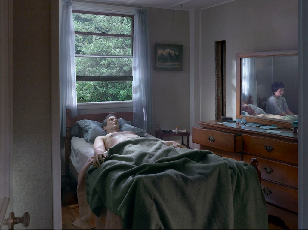
Consider the photograph below from Crewdson’s series Cathedral of the Pines (2013 2014).
Father and Son (2013) by Gregory Crewdson[2]
Here we have a scene of a man lying in bed in a pose that suggests that he is either dying or has recently passed away. A soft, ethereal light streams through the open window at the head of the bed and illuminates the man’s pale skin with very little contrast between highlight and shadow. We see a reflection of a boy sitting by the man’s bedside in the mirror but cannot physically see him as he is obscured by a partial wall on the left of the frame. The expression on the boy’s face is one of sadness akin to that of a visitor to a hospital bedside or a mourner. This image is a classic Crewdson tableau with a mixture of natural and artificial light and a carefully constructed set. Every detail within the space is lit in a way that draws the eye around the composition looking for meanings. For example, Why is the dresser drawer partially open? Why is there no physical connection between the two subjects? Is the man posed as if lying in state, i.e. has he already died and is this the calm aftermath we are witnessing. There is no escaping the emotional feel of the photograph.
Do you think Crewdson succeeds in making this work ‘psychological’? What does this mean?
However, there is also a psychological element to the picture. The way the boy is hidden creates a feeling of the supernatural, with us only being able to see his reflection in the mirror. As with Hannah Starkey’s use of reflections, there is something unreal about the boy’s appearance in the photograph. He is lit in a similar, soft way as his father, which creates the physical connection between them. Perhaps the man has passed away and his son is greeting him from the other side having died previously? The way the boy is not looking at his father points to his being present to support, but he is not willing the man to recover or wake up. When I looked at this photograph, I was reminded of the immediate aftermath of my mother’s death, where everything took on a stillness once the immediate release of emotions had passed. We were sitting with what remained of her but what made her our mum had already left and that felt ok. The final element that supports this almost supernatural feeling is the relationship between outside and inside, something that Crewdson made a central theme to the series. The beauty of the pine trees outside of the bedroom window and the small painting of a pine landscape on the wall suggest a peaceful place in which to die. The way the light comes through the window is similar to the way that we are shown souls transcending to heaven in modern visual art. The shaft of light only really picks up the man’s body and the boy rather than flooding the whole room. For me, this suggestion that all is well, that the man has passed into the afterlife with his boy to help him is a deeply psychological meaning that we all hope is waiting at the end of our lives. Crewdson said in an interview[3] that his pictures were derived from his personal psychological anxieties, fears and desires. He went on to make that point that he, like many photographers, feel disconnected from the world, his work being a way of seeking connection with the people and places while at the same time being a remote observer of the same emotions in them. For me, the psychological meanings of the works in Cathedral of the Pines come through clearly. Crewdson depicts lovers in terms of affection and total absence of it, young people at play or in lonely isolation within their environment and older people struggling with the realisation that they are late in life. Yet he does this without the pictures having a sinister aesthetic; each incorporates light in a subtle but revealing way as if highlighted by some supernatural entity.
What is your main goal in making pictures? Do you think there is anything wrong with making beauty your main goal? Why or why not?
Prior to starting this degree, my goal was to make photographs that ‘looked good’, which essentially meant getting the technical aspects right. As I learned my technique, naturally I developed more of an understanding of composition, but it was still largely focused on making images that were pleasing to look at. I guess that pictorial beauty then extended into the subjects that I chose to shoot, which were primarily landscapes and architecture that used light to show them at their best. Since joining OCA, my ambitions for my pictures have grown beyond my original interest in photography. The main goal of my work now is to create something that challenges the viewer into asking what the picture is about. My work in Assignment 3[4] was the first time that I’d asked the viewer to make up their own mind about meaning. Combining the projected words and the extracts from my diary offered some insight into my life, while the use of my skin as a canvass and the lighting behind gave some idea of how I felt during each day of the series. When I showed the work to my friends, I had to stop myself from explaining it – this was a difficult thing to achieve because previously I had planned every element of my ‘static’ pictures in a way that an explanation came naturally to me. Now I was stepping back from the pictures and letting them speak for themselves, or not as the case may be. What the portraits are not is classically beautiful, so I had subconsciously moved away from this as an idea.
However, as with everything I have a tendency to explore the boundaries of ideas before settling on what makes me interested or happy. In the case of my work, I actually see no problem with making beauty a central theme to my photographs. Crewdson and diCorcia in particular have demonstrated the ability to combine beauty with deeper meaning such as fear, sadness and corruption through their use of light, contrast and saturation. diCorcia worked for many years for a fashion magazine, whose primary goal was to interest the readers in the latest fashion. By definition, the work needed to showcase the fashion items in the most beautiful way possible in the context of whatever the story might be behind it. It’s the subtle layering of the contextual elements that now appeals to me more than the aesthetic beauty which is why I’ve found the work of the artists in this section fascinating. The impact of their work doesn’t for me reside in the beauty of the image and even in a subject that is clearly beautiful, it’s in the use of light and very deliberate composition of the elements that helps create the ‘feel’ of the photograph. Part of the enticement of Crewdson’s work and the way the images draw us in is that they are very easy to look at. The huge negatives he produces with his 8×10 camera capture the tiniest details that the artist has placed in the scene and the production aesthetics mean that it’s easy for the viewer to spend time fully engaging with the photograph. So, while beauty is one of the elements that is at our disposal, consideration must be given to the wider context of the artwork when we make it a theme.
Since being introduced to the works of Jeff Wall in Part 4, the most striking thing about his work is actually highlighted in Part 5. Wall’s attention to the tiniest detail of composition is similar to the way that a cinematographer and director create the look of a movie film. The notes refer to his image After ‘Invisible Man’ Ralph Ellison, the Prologue(1999-2001) which is interesting because it takes its inspiration from literature as opposed to an experience that the artist is trying to tell us about. The novel (not to be confused by H.G. Wells’ classic tale of scientific experimentation gone wrong) is the story of a black man subjected to persecution by white society and his subsequent involvement in the growing racial war in New York. The story starts with the central character, also the narrator, reflecting on the physical and metaphorical invisibility of his life, represented by him living in a derelict basement lit by many bare light bulbs. Wall’s picture looks as if it could be a still frame from a movie adaptation of the book because it faithfully reproduces the scene being described by the narrator. However, as we know the visual representation is ‘directed’ by the storyteller, in this case the photographer. We also know that a movie has time to introduce contextual elements to help the viewer build a narrative around the action[1]. In a still photograph, we know that the artist must include all of the elements that help the narrative and in this case, the viewer is not expected to really appreciate the literary inspiration, in this case the novel[1]. Wall’s picture shows a black man sitting in a chaotic space that is littered with elements that tell us about his life. Clothing hanging up to dry and discarded washing up show a man who is making do with his environment but doesn’t care about its neatness. The space is littered with papers and notes, as if the man is trying to either order his life or document it in some way. The main focus of the picture however is the huge collection of light bulbs hanging from the ceiling. This direct connection with the novel also emphasises the desperation of the man in the image. Wall’s attention to detail that includes the amateurish way the lights are rigged up to the electrical supply (the character in the book is stealing the power from a nearby station), which shows the care that went into the picture. The viewer has enough elements to create their own understanding of what the man is going through and if they have read Ellison’s novel, the picture serves as a visual representation of what is a powerful prologue to the story. Until now, I’d considered these tableau works to be generally inspired by the artist’s experience, whether something that happened in their life of just something that they had seen. The idea of work being inspired by a different art form is interesting and we are introduced to a number of artists that adopt similar approach.
Hannah Starkey (1971 – )
With Hannah Starkey’s exhibition in 2010 at the Maureen Paley gallery, the artist drew her inspiration from Tennyson’s The Lady of Shallott, which is about a cursed maiden who can only view the world through reflections in a mirror in her room. When she seduced into looking at the real world directly, she breaks the mirror and dies. The poem, which is long and complex in its story-telling offers a number of potential narratives about personal connection, taking risks and the blurring of reality and fantasy. Starkey’s images for her untitled exhibition use women, reflections and distorted reality as their central theme, but each uses the same approach of including just enough contextual elements to aid the creation of a narrative.
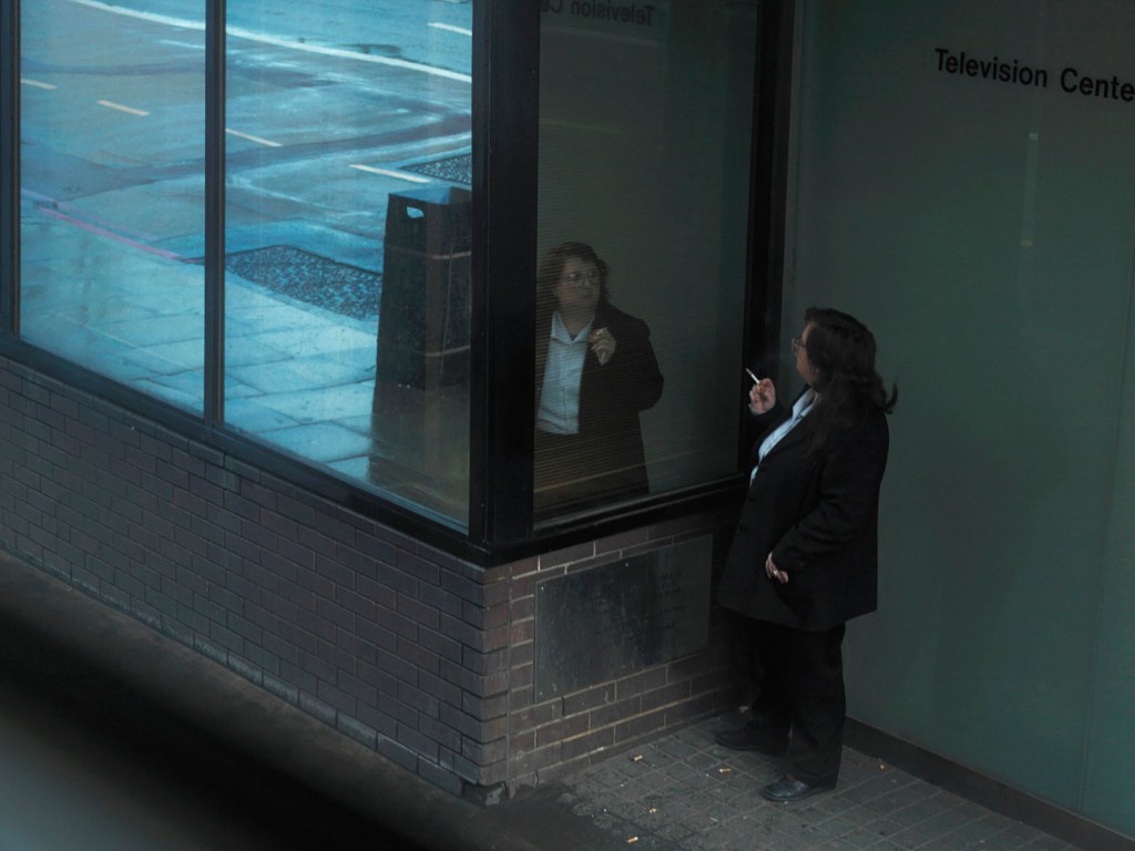
Untitled, November 2009 by Hannah Starkey[2]
In this photograph we see a woman having a cigarette break outside what looks like a corporate building. She looks at her own reflection in the glass of the building, which immediately begs the question “what is she thinking about regarding her own image?” She may be judging her appearance in some way or even regretting the habit she is indulging. What we see from the viewer perspective is more of her expression in the glass than when we look at her directly. The idea of the reflection being an alternative reality is emphasised here. When we look further, we see that the scene is actually a woman sheltering from the rain; the evidence is shown by the contrast of the tone of the dry patch of ground she is standing on to the wet pavement. The left hand side of the frame reveals the wet ground reflected in the same glass building that the woman is looking at. For me, this is a very strong connection with Tennyson’s poem. The lady in the scene can only see the reflection of herself and her environment in the glass rather than turning to look out into the world. While perhaps not as obvious as Wall’s Invisible Man, the image asks the same questions around how and why the woman finds herself gazing on her own reflection. The notes refer to the false sense of intimacy of reflected self-portraiture and I believe this image makes that point. We can relate to the woman on her break and we can see her whole face in the glass but not when we look directly at her. There is almost a sense of connection but detachment in the way the subject is arranged with relation to her reflection. The image also contrasts light and dark in the larger reflection of the street, which for me points to a further detachment of the woman from the rest of the world. Starkey has clearly taken inspiration from literature in a similar way to Wall, but instead of creating a visual for the text that comes through as the main narrative for the image, she makes her work much more metaphorical. In her later work, Starkey declared that she wanted to represent women honestly and without judgement, citing ““I really think that visual culture is the last battleground for women’s equality and freedom” [3]. When we read these words, they starkly contrast the situation that The Lady of Shallott found herself in, unable to connect with or appreciated the world without temptation from the opposite sex. That temptation ultimately led to her destruction. Starkey’s work appears to suggest that while these constraints are clearly not real, they are often the perception of others.
Tom Hunter (1965 – )
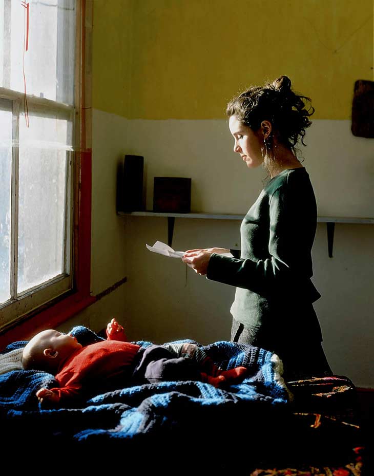
In Tom Hunter’s work Living in Hell and Other Stories the use of art and documentary is even more clear than in that of Wall and Starkey. Where Wall took Invisible Man as his literary inspiration and created his own visual, and Starkey combined poetry with her perspective on the struggles of women, Hunter took both newspapers and classical paintings for his tableau. According to the artist[4], newspapers have long sought the macabre fascination and horror in a society story in order to sell copy. In particular he draws on the Hackney Gazette, his local tabloid newspaper, and its obsession with painting Hackney as being degenerate and full of the dregs of society. With the news stories themselves as his inspiration, he created the visual to ‘accompany’ them in the style of a classical painting. Johaness Vermeer, perhaps most famous for his portrait Girl with a Pearl Earring, is the artist whose style can be seen throughout the series with Hunter taking many technical cues in terms of lighting and composition. In an interview with Adorama[5], Hunter talks about wanting to debunk the ideas of his neighbours and friends being ‘scum’ and to portray them with a sense of dignity. He likened this to the struggle that Vermeer had during his working life where the people of Holland were being oppressed by the Spanish who occupied their land. The Dutch fight for independence comes through in Vermeer’s paintings and Hunter capitalises on that style to make similar points in his photographs. The two images below are representative of Hunter’s approach to his work.
The image on the left is called Girl Reading a Letter at an Open Window, painted in 1659 by Johannes Vermeer[6] and on the right is Tom Hunter’s Woman Reading a Repossession Order (1998)[7]. When we look at these two side-by-side, the similarities are immediately striking. Both portray women in front of a window reading a letter with a bed or table in the foreground. The image by Vermeer depicts a young woman anxiously reading a letter which we assume is from a loved one. The open window suggests that she is awaiting some piece of news in whatever form possible, even listening out for a sign. The girl has a hint of a smile, which suggests that the letter is a welcome one and the point is further emphasised by the use of fruit, in particular the sectioned peach. The peach is believed by art historians to symbolise the presence of an extramarital relationship[7], so the girl appears to be reading a letter from her lover. By contrast, Hunter’s photograph has a completely different tone to it before we consider the title. The woman’s expression is one of sadness and instead of the fruit, we have a baby in lying on the bed in the foreground. Hunter tells us that the letter is a possession order that is demanding the mother and child leave the place they are living in. In his photograph, Hunter uses Vermeer’s technical approach and composition to create a similar look to his photograph, but in doing so is portraying the woman in a similar way despite the obvious difference in circumstances. The young mother is celebrated as being a human being put in an extraordinary position and having to consider her young child. Both pictures have the drama of being embroiled in something that is seemingly beyond their control. The series that Hunter’s image is taken from is called Persons Unknown, a reference to the way that the authorities and landlords of the Hackney slums referred to Hunter and his friends who were squatting in the buildings [5]. The inspiration that Hunter draws from Vermeer and other artists of the era and how he contrasts it with the lives of his subjects is another powerful use of tableau to tell a story.
Taryn Simon (1975 -)
The third artist in this section of the Part 5 is Taryn Simon, whose series The Innocents (2002) depicts men who were wrongly convicted of horrific crimes in a setting that was part of the story of their arrest. This is an extraordinary work in concept alone and when I first viewed it, I was reminded of Chloe Matthews’ Shot at Dawn from Part 1[8]. Like Simon, Matthews used the actual execution sites where deserters were shot in The Great War, paired with the name, date and time of the event as the title. The effect was a sense of what had passed and the trace of the human element that is often lost in historical records. That work struck a chord with me because of the powerful unseen element (the victim) and the meticulous way that the scene was captured by the artist. In a similar way, but using tableau, Simon uses the location and adds the key elements to create the sense of what occurred. As a result her subjects are part actor, part narrator. The underlying theme of the stories is not captured in the photographs but indirectly referred to throughout the series; the unreliability of photography as a truthful representation. Since all of the men in the series were cases of mistaken identity through eyewitness recall and photofit likenesses, what Simon achieves with her work is an ‘is it or isn’t it real?’ feel as with Wall’s work.
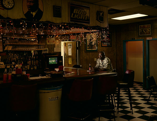
From the series The Innocents (2002) by Taryn Simon [9]. Frederick Daye. Alibi location, American Legion Post 310 San Diego, California, where 13 witnesses placed Daye at the time of the crime Served 10 years of a Life sentence for Rape, Kidnapping and Vehicle Theft
In the picture above we have see a black man sitting alone in a room that has the aesthetic of an American dive bar. The lighting is very subdued with the subject, Frederick Daye lit by a key light. His expression is one of resentment as he stares straight at the camera, which suggests that this man is frustrated by the intrusion in some way. When we read the accompanying text, we see that this was where he was witnessed drinking at the time of the crime he was eventually convicted of. He served 10 years for a crime that he couldn’t have committed because of the disregard of witness testimony. When I look at this image, I see an isolated man, which speaks to the police’s unwillingness to consider that he was witnessed by others. The lack of other people in the frame further emphasises that there were ‘no witnesses’. Daye’s pose with a single beer in front of him suggests a man just enjoying a simple pleasure by himself. His expression, which first looked like intrusion now looks like a frustrated ‘I am here, can’t you see me here?”, a direct protest of not being believed at the time. The image is powerful in that it combines real life elements with an artificially crafted set. This really did happen to Frederick Daye and we can see that it didn’t take much in the way of acting to portray his anger and frustration. The set is so well created that the initial thought is that this is happening in real time. What I think Simon achieves with this photograph is a sense of the injustice and the impact of mistaken identity, while challenging the viewer to believe of disbelieve the reality of the composition. The other images in the series vary in terms of the relevance of the scene to the crime and the way that the victim is represented, but they all have the challenge of whether the images are real or not.
Philip-lorca diCorcia (1951 – )
The final artist introduced in this section was Philip-lorca diCorcia, who was the subject of my Assignment 4 submission[10][11]. I have long been a fan of the carefully crafted realities of his work, starting with his career as a fashion magazine photographer. His series Hustlers (2013) has a similar feel to Simon’s series discussed previously. In Hustlers, diCorcia sought to represent the male prostitutes in a scene that we might expect when thinking about their profession. In crafting an artificial scene rather than just shooting them in their usual environment, diCorcia challenges our stereotype views of these young men. He described them as essentially actors of their client’s fantasies, so the scenes he put them in gave them a platform to act on. However, what was diCorcia was also doing with Hustlers was challenging the idea that the outward appearance of a person and our preconceptions are not necessarily the same as that person’s internal self. By adding the name, location and their price he almost suggests that each encounter was a genuine experience rather than a fabricated reality. Like the other photographers here, diCorcia’s skill is in giving just the right amount of context for the viewer to tell their own story, while ensuring that that context was realistic in appearance.
Conclusion
All of the artists here are exceptional examples of the fabricated reality taking inspiration from documentary or literature. They all have a slightly different approach and their relationships with their subjects differ, but they use a common approach to only include only what is believable. What I hadn’t realised before looking into their work was the vast freedom an artist has when they are ‘making it up’. In drawing and painting, the act of changing how something is represented is under the control of the brush as well as the placement of the subjects in the composition. I’m reminded of J M W Turner’s The Fighting Temeraire (1838), which depicted the grand old warship being towed to its final destination to be scrapped. Although Turner witnessed some of the event, it’s well known that he embellished his painting with additional details such as a dark, cloudy sky, where in reality the day was bright and sunny. He did this to add the patriotic drama of the passing of the great ship, the clouds symbolising the darkness descending on the mighty vessel that had been so crucial during the Napoleonic wars. With photography, the only control the artist has is the way the scene is constructed. Clever use of sets, props, lighting and actors create the sense of reality normally only found in cinema. The layers of complexity of the narrative are steered by the inclusion of some elements and the exclusion of others. The level of artist control and licence to play with what is real, was the key learning from the previous section though. In this section we have learned how inspiration can be drawn from other art, literature and documentary. For me, this offers a good starting point for the creative process which could lead to a tableau rather than relying on a memory, observation or political statement. ‘How to start’ has been something I’ve found challenging throughout this course.
Don’t read on until you’ve answered the following questions:
What does this scene tell you about the main character?
How does it do this? List the ‘clues’
Make some notes in your learning log.
What does this scene tell you about the main character?
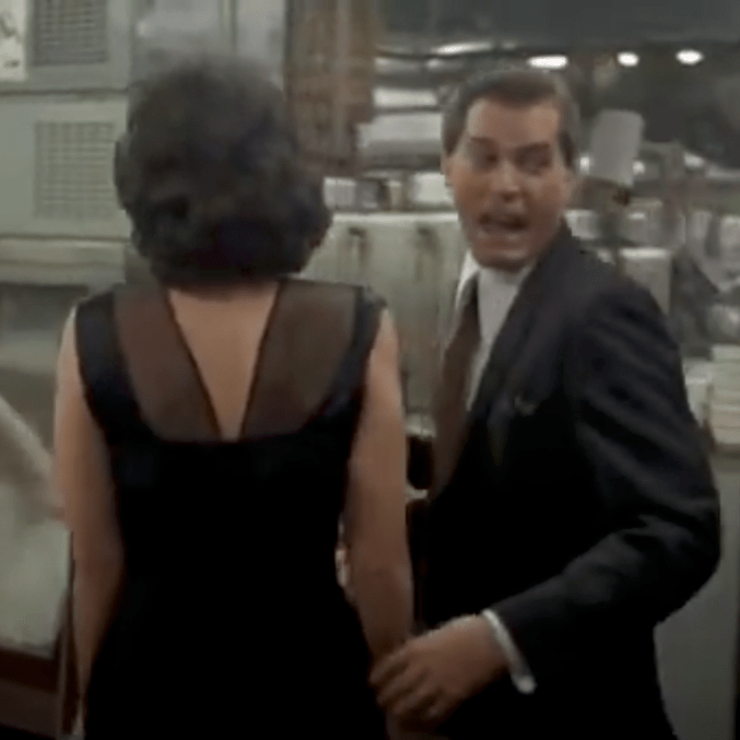
From the first frame of this scene, we see a generous man. The initial shot is of a hand passing a money tip to another hand with what we initially assume to be the main character thanking the other person. It transpires from the dialogue that this man is going to look after his car with him citing that it was quicker than fighting through the crowds at the end of the night.
The shot essentially follows the man and his companion from a close distance behind them as they walk through the back door of the club, down stairs, through the kitchen and eventually into the main space. The whole scene is set to the song Then he Kissed Me by The Crystals (1963), which is a description of a romantic encounter told from the perspective of the woman. The song tells a story of a man taking control of the encounter that leads to a relationship and eventually marriage. Although a love song, it’s difficult to get away from the ‘he did this, he did that…and then he kissed me’ theme of male ‘confidence’. The lyrics to the song and ‘the tip’ are the first clue that this man is of some importance with some power associated with it.
How does it do this?
As the shot progresses, the next clue is that at each internal doorway on their journey, the couple are greeted by doormen, who each receive a tip from the man. He also refers to each by their first name, which suggests that his presence is somehow regular and revered. This theme continues as the shot progresses with each person they come into contact being greeted jovially by the man, but not the woman – she is largely anonymous in the scene. The way the shot is created, the woman’s face is never seen in any detail for any length of time, contrasted against the man, who regularly looks either way and even back toward the camera. This effect makes the viewer almost forget that she is there.
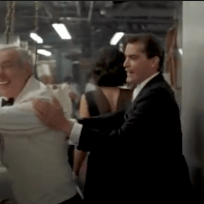
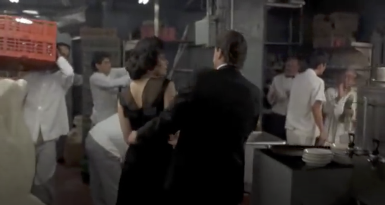
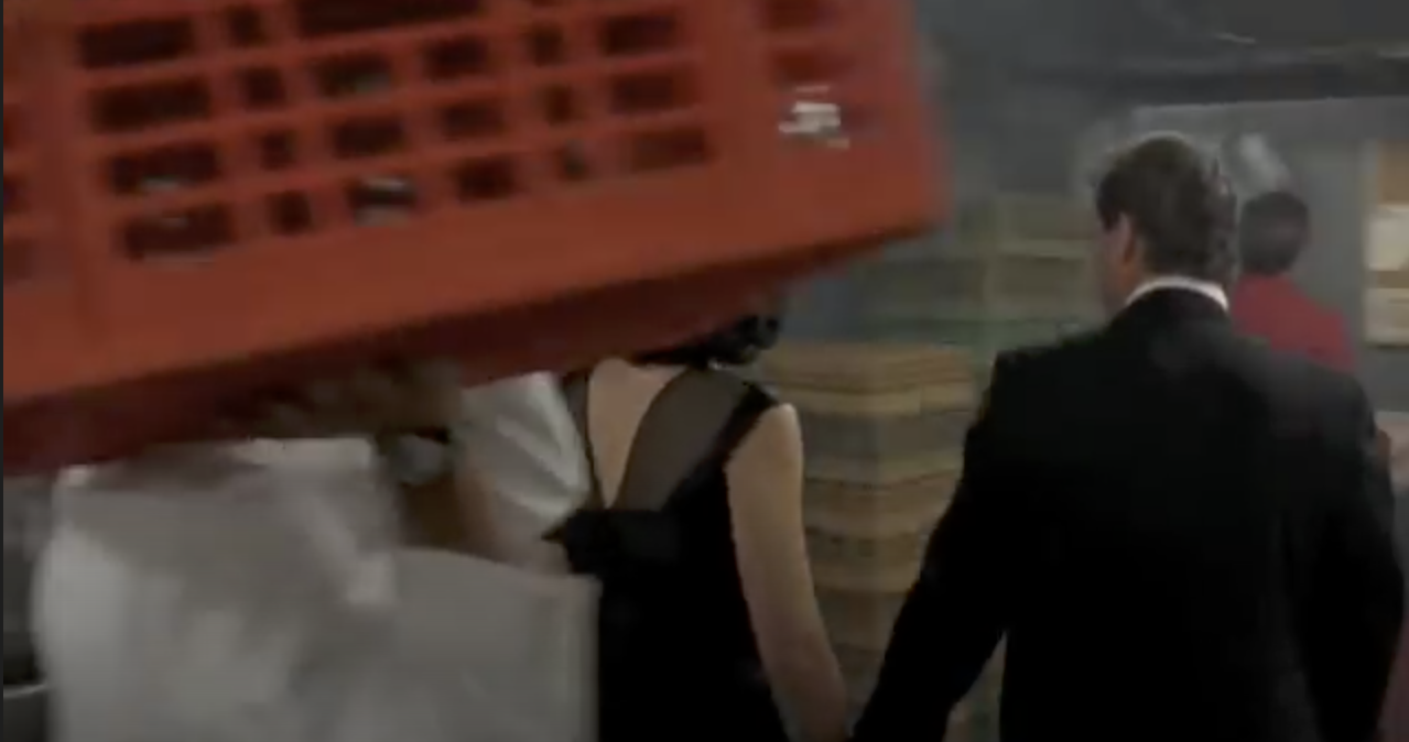
As the action moves through the kitchen, everyone that they pass acknowledges them in some way, either directly or just with a look. Then another clue to his importance, or rather the viewer’s lack of importance is seen. A chef carrying a large red box of ingredients enters the frame from the left and passes between the camera and the couple. He moves away to the right hand side of the frame continuing his journey.
This use of space between the camera and subject both enhances the natural perspective of the sequence as the couple make their way through the kitchen, as well as putting a division between the viewer and the subject. The chef doesn’t walk in front of the man, but doesn’t hesitate in walking between us and him, thus setting the tone of our relative importance to one another.
When the couple make their way into the club, they are greeted by groups of men who are arranged in a way that suggests they are part of some organisation or gang. The manager instinctively signals to some waiters who bring table and proceed to set it up in a space in the busy dining room. This whole scene is observed by everyone present and we hear the manager rebuking someone who protests because they were also waiting for a table. This build-up of clues makes the man go from merely a generous patron who may know the staff, to someone with much greater significance. His treatment by the manager and staff isn’t asked for at any point in the scene, it just happens.
More people are introduced to the man but not the woman, further emphasising his importance. The scene draws to a close with a bottle of wine being brought over with compliments of a man called Mr Tony who we see when the camera pans left. He is surrounded by men who we assume to be bodyguards or associates. The final sequence shows a stand-up comic beginning his act. The act begins almost immediately after the couple sit down and the woman asks the man what he does for a living, another sign that things wait for the man. She asks in a way that suggests that they don’t really know each other and with an air of surprise at the deference shown by everyone they encounter on their way into the club.
Scorsese shoots this scene in a very particular way, with each element being relevant to the meaning he is trying to create. The long following shot itself suggests a man who leads the way, his girl by his side being directed in her every move by his hand. The shot moves through he areas of the club that wouldn’t normally be seen, the back-of-house areas like the kitchen. His walking through this space with confidence and the staff reactions to him elevate the main character in our minds to someone of great importance, both in terms of power and also in their lives. The club is lit with very subdued lighting, which coupled with the groups of men gathered at tables suggests an establishment where all is not all it seems. Goodfellas is a gangster movie, so by dressing the men in business suits with some wearing sunglasses (inexplicably), Scorsese creates a sense of underworld. The deep red colour of the club suggests that this is perhaps Hell where monsters live, which all plays into the aesthetic of the underworld. It’s a very cleverly shot sequence that keeps us looking at this important man without any changes in perspective or field of view, which builds his character from being a generous patron to someone of great significance in the space of a few minutes.
Tableaux Photography
We’ve already been introduced to Jeff Wall through his photograph Insomnia (2008), which is an example of a carefully crafted scene. The photograph contains only the elements that help add context to the subject and in turn build the narrative in within the viewer. In his exhibition at Tate Modern in 2005, Wall was interviewed about his work in an article by the museum called Beyond the Threshold[1] in which he describes his approach to working. The picture that the interview focuses on is View from an Apartment (2004-5). Form this image, Wall rented an apartment that up until then had been occupied by a young couple. He wanted to create something that was inherently interior while also containing some exterior as most his photographs of living spaces tended to rely heavily on the former. His choice of apartment had a view across one of the harbour areas of Vancouver and would make a good set for his image. In a way similar to the directors and the mise en scene, the art of tableaux photography builds a set, dresses and lights it and finally adds the subjects or actors. In this case, Wall dressed the apartment with items he had collected from other photographs as well as things one would normally find in a living space.
A View from an Apartment (2004-5) by Jeff Wall[1]
The actors were a woman that Wall hired specifically and her friend. Choosing two actors creates more of a sense of daily life in the scene, even though it’s not clear that these women are partners in any way. The apartment is littered with evidence of their lives while the ironing board and laundry suggest some action that might be thing place. The woman who isn’t ironing is completely disengaged from the rest of the room and all that is going on around her, preferring instead to read her magazine. What is interesting about this shot is the fact that everything in the apartment was put there by Wall in an almost cinematic way – when the interviewer went to see this set, she was asked to be careful not to touch anything in the scene[1].
Wall’s approach to meticulous planning and executing of his images stems from his not wanting to photograph something that is happening in a documentary or snapshot style, but to recreate a memory of something that interested him[2]. When I think about this approach to photography, I am drawn to the fact that Wall is remembering a story, in the same way as someone telling us or watching a movie. He makes a mental note of the details of the story and then tries to recreate them in his photography. I wondered if that act of reflection and recreation actually makes it easier for Wall to tell a story as our minds have the ability to add of fill in any details we may have forgotten. Wall states in an interview [2] that his photographs are what is left of a story when the words that describe them are stripped away, that is taking away any context or intent and letting the story tell itself. I was fascinated by this idea that as well as creating something that is a representation of an event, Wall is also invoking the emotion of the memory of the event, adding his perspective on the image through the way it is constructed. Like diCorcia he isn’t trying to dictate the narrative as he sees that as the responsibility of the viewer, but his feelings visibly run through the work. The previous example of Insomnia is a powerful telling of the horror of not being able to sleep and its effect on the human emotional state – this ties in with the general tenor of his work as director and screenwriter for his own dramas.
Conclusion
I found this exercise interesting because it does highlight the similarities and differences between moving pictures and stills when it comes to telling a story. Scorsese’s scene builds the story as it rolls through, leading eventually to the realisation that the character is powerful, mysterious and living a comfortable but dangerous life. By contrast, Wall’s narrative has to be derived from a single visualisation of the story, meaning that the photograph has one chance to get the information across. Wall achieves his work by the act of not photographing initially, but observing the scene and remembering not just the details, but what interested him in it to begin with. The act of recreation tells Wall’s story with the artist controlling how we consume the information in the frame by careful use of the elements of mise en scene. This is definitely something to consider throughout Part 5.
Mise en scène, pronounced meez-ahn-sen, is a term used to describe the setting of a scene in a play or a film. It refers to everything placed on the stage or in front of the camera—including people. In other words, mise en scène is a catch-all for everything that contributes to the visual presentation and overall “look” of a production. When translated from French, it means “placing on stage.”
Definition of mise en scène in film [1]
We are introduced to this expression a the beginning of Part 5, which for me ties in with neatly with the photographer that I studied for Assignment 4, Philip-lorca diCorcia – his series Hustlers is covered in this section of the course notes. Along with Jeff Wall and Gregory Crewdson, diCorcia is a photographer who carefully creates a scene with characters, lighting and props to tell a story. A quick search for a description of mise en scène brought me to the Masterclass website, a company that sells courses in a variety of creative subjects from cookery to screenwriting led by famous people in those fields. Along with the definition cited, there were some elements of mise en scène to consider, some obvious and some not so. The obvious ones included choice of actors, location, set design, lighting etc which we have seen in the works of the photographers in Part 4. However the not so obvious ones to me were camera placement (shot blocking), depth of space and film stock, which I found interesting.
Shot Blocking is the positioning and relative movements of the actors to each other and the camera and includes the position of the camera itself. In a way, this could be considered ‘perspective’, but it goes further in describing how the actors and viewer relate to each other. When working on Assignment 4, one of the elements used by diCorcia was the cinematic style [2], referring to how the viewer is looking on the scene ‘square on’. The idea is that the viewer is watching the action from an orthogonal perspective that allows them to explore the whole scene and feel like they could step into it. The contrasting viewpoint would be one determined by the forcing the viewer into a particular space with a more contrived perspective, restricting both the way they see the action and their building of a narrative. In his placement of the subjects relative to the camera in this style, diCorcia creates an almost voyeristic feel for his photographs, particularly ones involving intimate perspectives on somebody’s life. In terms of the way that actors interact with each other, the key difference between moving pictures and photographs is that the former has more time to build the narrative with the viewer as the film progresses; the stills photographer having to include everything in a single frame. The movement between actors is real in film, so careful thought is put in to how the movements look as the scene builds.
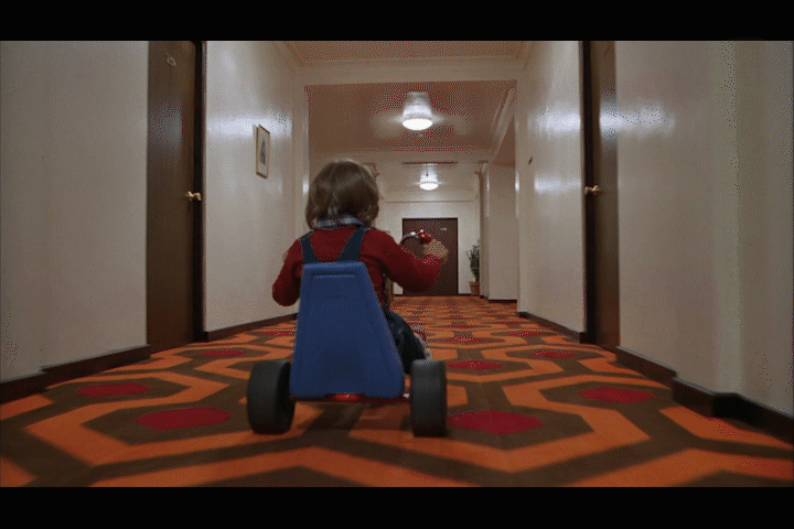
Depth of Space is something else that resonated with me and reminded me that it had come up in a conversation with my tutor on the previous unit, EYV. He had a career in television and talked about the creation of depth in a scene being important in suggesting the temp or mood of the work. If, for example a sense of scale is needed in a battle scene, the cinematographer wouldn’t make a shot that highlighted only a handful of soldiers, they would incorporate large, wide views of the whole scene to let the viewer know this was a large battle. Similarly, if a sense of imprisonment was needed, a smaller scene would be more impactful, e.g a wide angle shot of a cramped cell with actors close together. In Jeff Walls’ Insomnia[3], the scene is constricted by the use of a wide angle lens in a narrow space and further enhanced by the inclusion of the large table in the middle of the scene. The person in the picture is almost dwarfed by his surroundings, creating a sense of being imprisoned. I was further reminded again of the power of creating a depth of space in cinema recently when I saw the Stanley Kubrick film The Shining (1980). The film is famed for creating shots that closely follow the actors through large spaces from their perspective. Take for example, the scenes where the young boy Danny is riding his tricycle around the hotel’s vast corridors (below). The camera follows Danny from just behind him but at his eye level.
Danny Torrance on his tricycle, The Shining (1980) [4]
As he races around the hotel, we see what Danny sees but in a third person view, similar to many modern video games. At this early point in the movie, we already know that there is something very wrong with the hotel, so the long corridors create a sense of scale relative to the little boy that is intimidating. As he turns each corner into the next corridor, the camera follows him and builds the suspense; we have no idea what horrors are waiting for him around the next blind turn. Kubrick further increases the tension through use of sound. As Danny moves from carpet to hard floor and back again, the noise made by his wheels sounds almost like a sinister breathing as if the hotel is actively pursuing him. It’s the space and scape that makes this seemingly innocent scene of a little boy on his trike utterly terrifying.
Other elements that resonated with me were lighting and costume. The former may appear fairly obvious, but we have already seen the impact the creative use of light in a ‘staged’ image. The cold, fluorescent-style lighting in Insomnia creates a different effect to natural light, so if this were indeed an actual kitchen shot in daylight the sense of desperation and dread would be completely lost. With the costumes, though the choice of wardrobe can be a central theme to a film’s narrative. For example, in The Untouchables (1987), the job of dressing the cast was given to famous fashion designer Giorgio Armani. His reputation for stylish, expensive fashion was already established but in this film his creations were very carefully designed to support the film’s narrative. The main cast is the classic good vs. evil, with Eliot Ness and his Untouchables on one side and Al Capone and his gang on the other. For the lawmen, Armani created a feeling of hardworking, strength while fitting in with the idea that everyone wore smart suits and ties in the 1930s. For the Capone gang, though he created the opposite sense of rich opulence to support the idea that these people were living off the ill-gotten gains of exploiting the people of Chicago. The images below show the contrast between the two aesthetics.
Eliot Ness and team from The Untouchables (1987) [5]The Capone Gang, from The Untouchables (1987) [6]
Conclusion
The phrase mise en scène seems fairly self-explanatory, but as with most of this course the importance of setting the scene is subtle. The use of carefully placed visual elements and composition is similar in still and motion picture photography alike, but the freedom and pace at which a narrative can be realised differs between the two. Where a photographer has a single frame in which to include everything, a filmmaker has more time to build these subtle ‘background’ references in parallel with the more obvious acting that is occurring in the ‘foreground’. In the case of Kubrick, his directional style of shooting the same scene over and over to achieve both his vision and to drive (almost bully) the actors to be more naturally in the moment, is well documented (the famous baseball bat scene in The Shining was shot 127 times)[6]. That obsession with getting the most out of the cast and how they interact is often the thing we connect with, but in fact the cinematography, set design, costumes and lighting play a major part in how the viewer creates their narrative. In the case of diCorcia and Wall, their work uses the same techniques to lead the viewer around the frame but only have that one chance to give them what they need. As I move toward Assignment 5, the final one in this unit, the need to appreciate these elements is made clear by the simple idea of setting the scene.
“When somebody sees something and experiences it – that’s when art happens” – Hans-Peter Feldman
If photography is an event then looking at photography should also be an event. Look again at Henri Cartier-Bresson’s photograph Behind Gare Saint Lazare in Part Three. Is there a single element in the image that you could say is the pivotal point to which the eye returns again and again? What information does this point contain? Remember that a point is not a shape. It may be a place or an discontinuity – a gap. The most important thing is to try not to guess the ‘right answer’ but to make a creative response, to articulate your ‘personal voice’.
Include a short response to Behind Gare Saint-Lazare in your learning log. You can be as imaginative as you like. In order to contextualise your discussion, you might want to include one or two of you own shots and you may wish to refer to Rinko Kawauchi’s photograph mentioned previously or the Theatres series by Hiroshi Sugimoto discussed in Part Three. Write about 300 words.
The Photograph
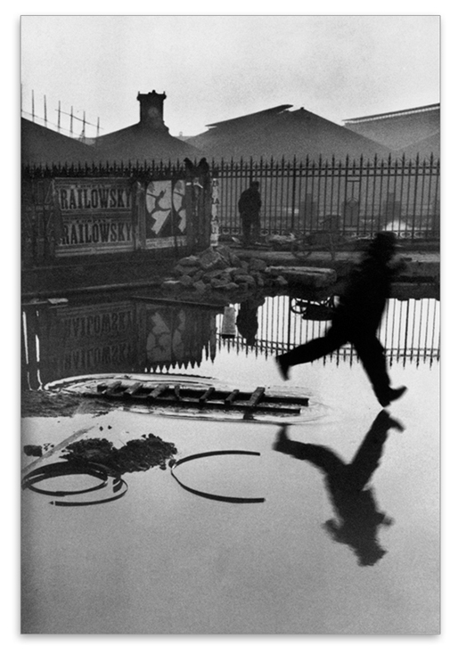
Henri Cartier-Bresson’s Behind the Gare Saint Lazare, 1932.
Response
Cartier-Bresson’s Behind Gare Saint-Lazare is the image that he is perhaps most famous for. His concept of Decisive Moment is rightly described and appreciated through this photograph, where by his own admission he had not observed the leaping man.
When we examine the elements in the image, there are several that give us information about the scene, in stark contrast to the Kauwauchi’s frog photograph that I discussed in Project 2 [1]. The scene has some symmetry in the way the features of the railway yard are reflected in the perfectly still water. There is a man looking further into the depth of the image through another set of railings in a similar way to Cartier-Bresson himself. Intriguingly we do not know what he is looking at, in a similar way to Manuel Àveres Bravo’s Daughter of the Dancers, 1933. The whole setting is untidy, almost run-down but functional with the detritus in the foreground and the battered poster attached to the railing. When we look closely at the poster, there is an image of a circus performer called Railowsky in similar pose to the leaping man.
When I look at the image, the element that I continue to return to is the closeness of the man to the water that he is trying to jump over. I keep coming back to that point beneath his foot as I continue to question why he left the relative safety of the ladder to jump and whether he had realised that he would ultimately end up getting wet anyway. It would be easy to consider the decisive moment here as the ‘pivotal point’ in the picture. After all, Cartier-Bresson’s timing is perfect and the image’s impact is more about that than the fact that it was accidental. My conclusion is that the pivotal point of the image is actually the ‘passing the point of no return’. As suggested by Berger [2], the next frame of the story would likely have us witnessing a man cursing his own stupidity. Or perhaps he had some kind of emergency that made him leap or maybe he was just inspired by the poster in the background. We have no way of knowing that made the man commit to the leap, only that he did and that there was no going back.
References
[1] Fletcher, R, 2019, “5) Project 2 – Improbable Images”, Expressing your Vision blog post
[2] Berger, J, 1972, ‘Ways of Seeing”, Penguin Books.
During a recent call with my tutor, we discussed how my attitude to photography has changed over the first four parts of Expressing Your Vision. I had already identified a theme running through my assignment work around ‘revelation’; starting with the history of a Yorkshire village, through human emotions and the humour in some decisive moments and on to the illumination of dark places. My concern during the conversation was around whether my natural tendancy to ‘reveal’ was a genuine photographic voice or whether I was just being technically ‘clever’ in some way. My question was “am I on the right track with this?” . The conversation with my tutor was very helpful in establishing where I was in my photographic development. Being an engineer meant that I could quickly grasp the technical aspects of photography and once I have the subject, represent it in the way the I intended. However, my artistic voice was less prominent, but increasing in confidence throughout the course. My tutor challenged me to think about how my experience differs from that of other professions and how easy or hard it might be for one person to do another’s job and vice versa. If an artist could find engineering a steep learning curve, is it a surprise for the reverse to be the case? In the final exercise of Part 4, I started to let photography be influenced by other life experience and observation, rather than ‘I think that would make an interesting photograph’.
In considering Part 5, I find myself presented with the camera as an instrument as we discussed in Part 1. However, this time the camera captures an encounter between photographer and subject, not just as a window on a scene but a connection between the two parties. When thinking about Alexia Clorinda’s quotation about measurement:
“I don’t pretend that I can describe the ‘other’. The camera for me is more a meter the measures the distance between myself and the other. It’s about the encounter between myself and the other; it’s not about the other” – Alexia Clorinda
I can relate to this in a way that I probably couldn’t before this course. Clorinda is saying that she isn’t using the camera to describe or capture the subject, more to ‘measure’ the encounter between her and the subject. Naturally, the use of words like ‘measure’ and ‘distance’ suggest the physical property that we can define using focus or depth of field, but the meaning here is about the relationship. I’m reminded of the research in What Matters is to Look [1], where Aim Deulle Luski was placing multi-aperture cameras in the centre of the scene he wanted to photograph. He was trying to describe life in a unique way, by making the camera part of the scene rather than a passive viewer. However, what wasn’t strong in his work was the connection between the artist and the scene. I then realised that the personal connection that Clorinda refers to is often created by simply viewing. Her work Morocco from Below [2] describes the political aftermath of the so-called Arab Spring, a period of uprising in the Middle East. The ruling family in Morocco promised change, which was interpreted by some as a campaign to convince the rest of the world rather than help the people. The mixture of uprising and consensus among the people was the basis for the series, which Clorinda observed by walking the streets of the major cities. Clorinda herself describes the work as reportage, but when we look at the images, the personal connection is clearer than any narrative. In most of the shots, there is eye contact between Clorinda and at least one of her subjects, which is a tricky prospect when taking photographs in a muslim country. My own experiences in Morocco were that many people get angry when being photographed by a tourist as there is the belief that the image is removing their soul. When I look at the people in Clorinda’s work, I feel the connection between them first and then gather information on context from the rest of the frame.
My initial conclusion is that photographs can describe more than what is in the frame by drawing attention to the subject in the context of the frame. The camera is the instrument that describes the why, rather than the what in a way that is visualised by the photographer. If you have no camera, the experience or connection remains memory which can evolve over time or change when described by the possessor. I experienced something recently that lends itself to this theory. While walking into town with my wife, we saw a pigeon chick walking along the pathway in front of us. It had clearly fallen a long way from a nest above the road, but was developed enough to land on the pavement without being injured. It walked slowly along the pavement alongside the wall that retained the hillside, clearly lost. As it encountered each drainage hole in the wall, it peered into it to see if there was a way back to the nest. During its walk, it repeatedly called out for help. We watched for a couple of minutes as it made it’s lonely procession along the pathway and it was one of the saddest things I’ve ever seen. For many years, I’ve had a powerful fear of loss so the scene playing out before me made a strong connection. On this occasion, my instinct was to rescue the bird which is what we did; returning it to the area in the trees close to where it’s nest was. While I had a camera with me, I didn’t use it to measure the distance between us. The memory, which is still very strong in its sadness now only exists in my wife and I and trying to describe it to others is very difficult. The expression “you had to be there” takes on its true meaning. Had I photographed the bird in a way that revealed our connection, that image could have provoked a response in other viewers.
My reaction to this event and Clorinda’s work prompted me to look into the role of the photographer, something that Azoulay discusses. In her essay Unlearning Imperial Rights to Take (Photographs) [3], Azoulay describes how the initial promulgation of photography meant that parts of the world that had never encountered the medium were suddenly the subject of a photographers work. She describes this as being akin to cheap labour. The publications of the time were clamouring for images, regardless of the subject, context or any emotional narrative that might be at play. The relationship between photographer and subject changed as the medium became more popular and the challenges of taking pictures that had perceived value became harder. The photographer now found themselves as a broker or middle-man between the world and the media. With the recent advances in social media and availability of cameras, everyone who addresses others through photographs can now become what Azoulay describes as a citizen of photography[3]. For me, the photographer has the same thoughts, feelings and emotions as their subjects so the connections made in a composition are more dynamic and frequent now than they have ever been. Collectively, they make an image that provokes relatable and contradictory emotions in the viewer in the same way that other artists capture the imagination. As uncomfortable as it may seem, the camera can both connect and disconnect, attract or repel the subject and viewer which is likely unnoticed when taking a selfie, but is much more important when trying to draw attention to what is an important message.
References
[1], Fletcher, R, 2019, “What Matters is to Look”, Expressing Your Vision Blog Post.
In starting this project, my first concern was what appeared to be a generalisation that photographs are all somehow informative. The quotation by Flusser further suggests a quest to inform through ‘improbable’ images that offer something new. My instinctive reaction to the quotation when I first read it was “Do I do that?” When we consider the meaning of the words ‘information’ and ‘improbable’, the quotation makes more sense.
noun:information.
facts provided or learned about something or someone.
“a vital piece of information”
adjective: improbable.
not likely to be true or to happen.
“this account of events was seen by the jury as most improbable”
It would appear then that Flusser was referring to the creative process of ‘informing’ the viewer about the subject, but in a way that isn’t quite real or believable. We have learned already how the context of an image can change the perceived meaning, but when we consider the internal context, that is what is present in the image, we have the ability to shape the meaning further through information or even disinformation. In the course notes [1], the statement that a well exposed photograph contains more information than one that is under or over exposed is certainly true when considering an image as a technical achievement. The way that light is represented on the ‘sensor’, whether film or electronic is the something that we strive to do with camera skill, but this achievement has little to do with the information that the photographer is trying to impart in the photograph. The amount of information about the subject is completely under the control of the photographer, but whether or not that is what the viewer chooses to ‘consume’ is something that is again a potential contradiction. In their blog article on information [2], the Oxford English Dictionary describe themselves as a vast source of information made more readily available by the internet age. With all of this information to hand, their top searches for word meanings always include the word ‘fuck’; perhaps then, people’s interest in titivating swearwords means that they are more likely to consume that than what else is on offer. The article also quotes President Obama as saying ‘information is a distraction’, which points to the way that the message cam be lost in amongst other information. When we consider the technical use of depth of focus in photography, we can use a large aperture coupled with a long focal length to pick out the subject from the background. It follows then that photographers can use their technical skill to control the risk of information distraction or overload. I have found in my photography that landscapes are the biggest challenge to me, because I am striving to describe the beauty of something that I am seeing within the vista in front of me. However, the usual convention for landscape photography is to include as much detail about every element as possible. An example of this can be seen below.
Santa Barbara Beach 2019 by R Fletcher
This photograph was shot during my recent holiday in California. It’s pretty conventional in terms of composition with leading lines, rule of thirds etc. It was also shot at a fairly small aperture at f/11 to preserve detail throughout the depth of the image. However, what I wanted to convey was the hazy California light and how the mountainous regions are almost always blanketed in a fine mist (or just plain fog). The challenge is emphasising that without losing the rest of the detail of what is a typical paradise beach on that coastline. There is nothing about the image that is unreal or improbable, it is just factual.
Less is More
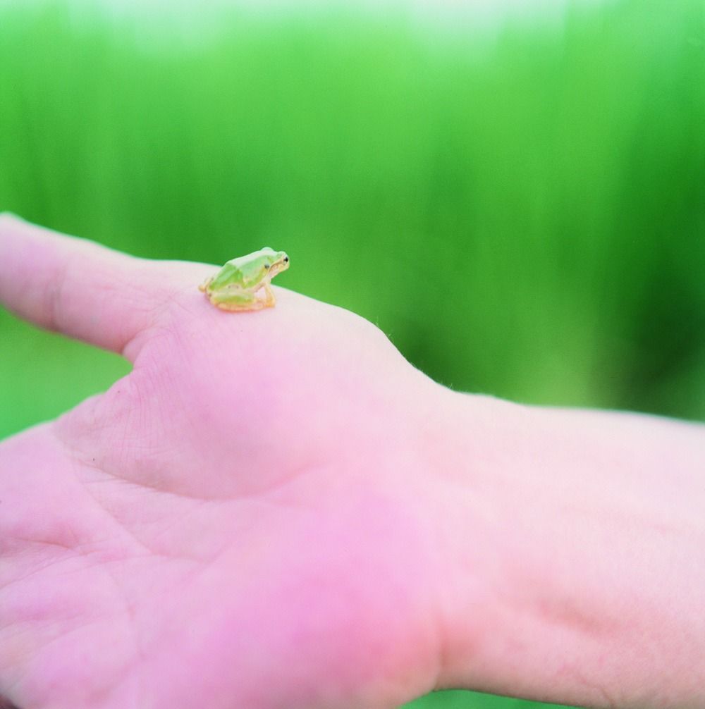
When we look at Kawauchi’s work in her book Illuminance, we are presented with what at first glance looks like minimal information about the subject. Overexposure and colour saturation create the improbability, but when we look closer, the information that is needed to create that sense is there but just concentrated. The shot below from her book is my favourite image from the book.
Untitled, by Rinko Kawauchi, from her book Illuminance [3]
Here we have a very small frog sitting on a hand. The image is made surreal by the use of shallow depth of field and overexposure to remove the details from the hand and the background The information, though is the scale and detail of the frog which creates the sense that this tiny creature is lost in its surroundings. What we know is that it has clearly been picked up by a human hand, but where did it take place? Without any external context, my initial interpretation is a slightly uncomfortable sensation that the frog has been held for the ubiquitous ‘holiday snap’ in the wild. The hand, while gently providing a platform for the frog to sit on is that of a much larger and more powerful creature. In my interpretation the image is impactful, sad and almost unreal, but the context could equally be that the frog is an exotic pet that the owner clearly cares about. The key point is that the information doesn’t have to be vast and detailed to create the context and provoke a reaction.
In Flusser’s Towards a Philosophy of Photography, he discusses the difference between the way we read text and how we look at photographs, the suggestion being that the former is linear and the latter, more of an ‘orbit’. This theory reminded me of when, as a teenager, I read the original version of Mary Shelley’s Frankenstein. Published in 1818, it was beautiful crafted, certainly using language and sentence structure that I wasn’t familiar with at the time. Shelley also used embedded narrative to structure the story, where a number of characters and the writer herself assume the role of narrator. The book unfolds with these viewpoints layered and interconnected, which requires ‘care’ when reading. What I mean by ‘care’ is that important information can easily be missed if the reader is not concentrating. My experience was that I would have to re-read some passages and even sentences to ensure that I was following the plot this, perhaps the most original horror story ever written. Surely this is at odds with Flusser’s assertion that we don’t re-read? In fact, it supports his notion that we consume the words linearly enough to understand what they are saying, where his comment about re-visiting photographic information is very different. In this case, the viewer returns to the information either to gain further understanding or simply because it is what provokes the biggest reaction. It could be that the information is not understood or that it is somehow unbelievable or improbable; the continued re-visiting being some way of trying to make sense of it.
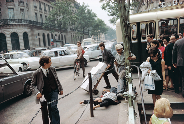
As I’ve mentioned previously, my favourite street photograph is Joel Meyerowitz’s Paris France, 1967 because it has always appealed to me.
Paris France, 1967 by Joel Meyerowitz (from Taking My Time, Phaidon)
Looking at the photograph again, the context that I interpret comes from the information in the image. The man lying on the ground with the hammer-carrying man standing over him and the public looking on. The scene is clearly of the 1960s time period which presents as familiar but somehow different to someone like me who is in their mid-forties. When I view this photograph, I keep coming back to the expression on the face of ‘hammer man’. Is it shock at an unfortunate fall? Or concern? Or is it the anger of an aggressor? Meyerowitz considers this to be his greatest photograph and has been reluctant to give any information that supports any contexts. For me, this certainly preserves the mystery of the photograph and means that I never tire of looking at it every morning (I have a print on my bedroom wall).
We can use this photograph to support the idea that John Berger discussed [4]. In his book, Berger describes the painting as presenting everything in a single moment to the viewer and it being their attention to each element that allows them to draw some form of conclusion. He contrasts the single frame to a moving picture film where the instant now has time added to it. The next image on the film strip will have different information that the viewer needs to consume quickly in and in sequence, in the same way as the written word. For a single image, then this return to the photographs for new information has an almost a cumulative effect on our interpretation of the subject. When it comes to the improbable, this can be an instant reaction as it was when I first saw Paris France, 1967. Surely the man could not attack someone in broad daylight. What happened in the instant after the event? Did the man help the other up because it was a mere tumble in the street or was he arrested? What part did Meyerowitz himself play in the scene that followed? If it had been a movie, we would simply have to wait for the answer. Like Berger’s comment that ‘paintings are often reproduced with words around them’, the photographer can choose to do the same or provide nothing to support or contradict the perceived context. What they have is a toolkit to make the believable unbelievable with a single 2-dimensional view of the world.
References
[1] University of the Creative Arts, Expressing Your Vision Course Notes page 108.
Select an image by any photographer of your choice and take a photograph in response to it. You can respond in any way you like to the whole image or part of it, but you must be explicit in your notes what it is that you’re responding to. Is it a stylistic device such as John Davies’ high viewpoint or Chris Steele Perkins’ juxtapositions? Is it an idea such as the decisive moment? Is it an approach, such as intention – creating a fully authored image rather than discovering the world through the viewfinder?
Add the original photograph together with your response to your learning log. Which of the three types of information discussed by Barrett provides the context in this case? Take your time writing your response because you’ll submit the relevant part of your learning log as part of Assignment Five.
Introduction
I began considering the concept of context as the ideas for Assignment 5 started to form, effectively working this exercise concurrently. Reading Barrett’s article begins to make sense of the other side of our response to a photograph from the initial emotional reaction. In all forms of learning about what is presented to us, we naturally consider any supporting information that might explain it, so it should be no surprise that we do the same analysis of context when we look at a picture. We are brought up believing that ‘a picture tells a thousand words’, without considering how those words became the truth in the first place.
When looking at the example of Dosineau’s ‘At the Cafe’, it is clear to see how the different contexts arose for the image. In terms of internal context, we have the couple seated at the bar with a number of wine glasses in front of them. There is an obvious age difference and the way they are related to each other in the frame points to a conversation being led by the man; the woman’s expression is fairly impassive but she appears to be listening. If we ignore the external context, leaving that to the simple MoMA title of ‘Robert Doisneau At the Café, Chez Fraysse, Rue de Seine, Paris 1958′, the original context is a portrait image with the focal point being the woman. She is both in focus and positioned in the upper left third intersection in the frame. The man is slightly out of focus, making him secondary to her in terms of what we should look at. When I first looked at this image, I found it difficult to see the cafe culture as the only element that pointed toward it was the inclusion of the wine glasses and the way she was touching them. I didn’t see the temperance context either, as neither appears to be suffering as a result of alcohol despite the presence of the glasses. The context I noted was the newspaper’s topic of prostitution, primarily because of he being clearly older and her being apparently disinterested. Interestingly, I showed the image to my wife while writing and without having read Barrett, she instantly concluded that the man was trying to pick up the woman and that she was not interested. She was going on internal context alone, in the absence of the other two interpretations.
My Selection
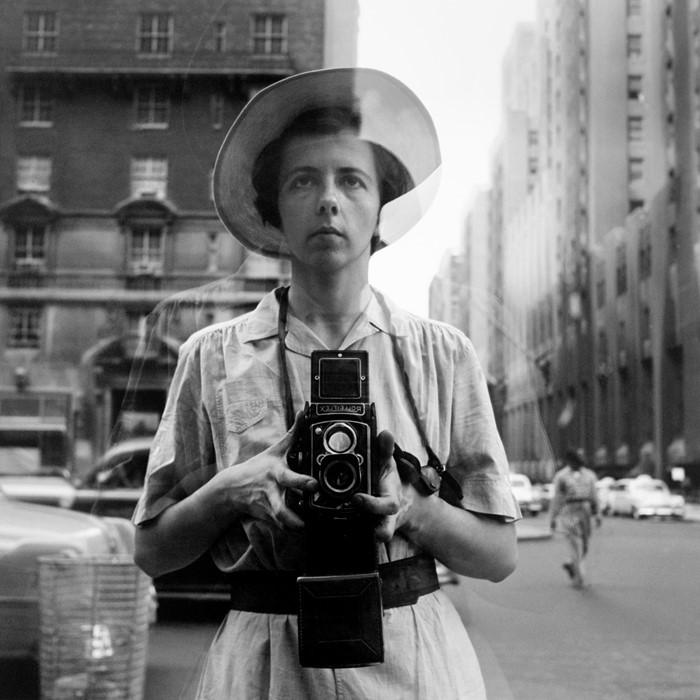
My selected image was the untitled self-portrait by Vivian Maier (below), a photographer that I first became aware of in 2012 during a visit to the Chicago History Museum. The story of how she was discovered through her belongings being purchased at a storage sale, is well documented. However, when I first saw this image set in New York it was while watching the documentary film ‘Finding Vivian Maier’, by John Maloof who is the current owner of her estate.
Untitled Self Portrait, by Vivian Maier [1]
My Response
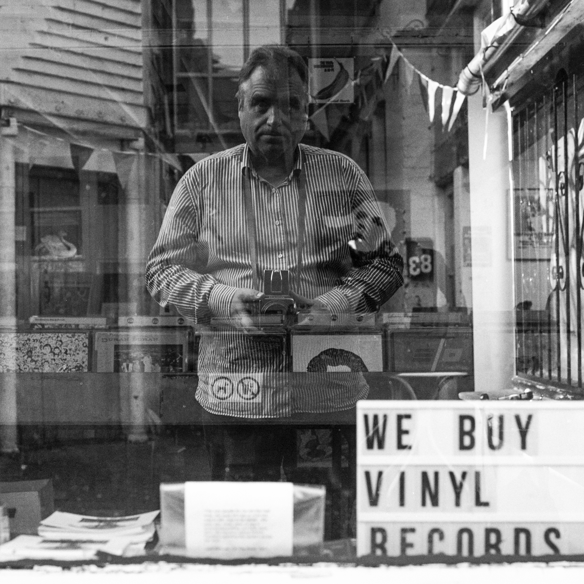
‘Nine’ from Assignment 5
My Response
My idea for Assignment 5 was in support of my thread of ‘revelation’ that has run through Expressing Your Vision from the beginning, a series of self portraits. The series would reveal the more intimate aspects of who I am as opposed to a simple documentary style. One of the photographers that epitomised self discovery in an ironic way, was Vivian Maier. I chose her self portrait not only because of what is contained in the frame but how she has been ‘presented’ as a person since the accidental discovery of her work. Considering the internal context of the image to begin with, we have a subject who is reflected in the glass of a shop window but is not looking at herself. Her old Rolleiflex camera has a chimney viewfinder, that is one where the photographer looks down into it, so the absence of any connection with the camera or herself in the shot fascinated me. The rest of the frame contains the bustle of New York City going about its business around Maier as she stands impassively before the window. The square format of a 6×6 camera like the Rolleiflex is notoriously difficult to use when composing an image as using the ‘rules’ that have evolved with photography, means that the space around the subject can be more limited than the 35mm format. Maier has made the photograph about her but managed to include enough background elements to set the scene. When considering the external context of the image, Maier is presented in almost every narrative as being a loner; a quiet and observational woman who took many photographs that remained either private or completely unseen for decades. The fact that picture is called ‘Untitled’ further emphasises the point that we know nothing about her intent with the image and therefore the mystery of her photography. My interpretation of the image is of a woman who is trying to announce her presence in the world but not being entirely successful. The lack of engagement with the viewer and ghostly appearance caused by the reflection were the things I first noticed about the image. When considering the original context, the image is a straight-forward reflection of the photographer with some additional elements that describe her environment. Of the three pieces of information, this is actually the one that inspired me to make my picture.
My image is part of a series of ten shot for Assignment 5 and it was the connection between the subject (me) and the setting (the record shop) that was my intention when I made the photograph. I was trying to bring my love of photography, in particular using film, and my love of music together in one picture. The series explores me and my often serious or thoughtful outlook from different aspects of my life, so Maier’s impassive expression in her image was a perfect mirror of my own feelings. I’ve never been comfortable being centre of attention, which meant that the intent of this photograph was to join the dots of the elements for the series, while being its distant architect. My response to Maier then, is a combination of the external context surrounding the photographer and how she placed herself in the picture (the internal context). Although I own a Rolleiflex similar to hers, I used a more modern medium format camera from my collection to preserve the contemporary setting. The other notable differences with my image are that I am looking into the scene as if looking through the shop window and use of a deeper depth of focus to preserve the details of the shop itself.
Conclusion
The introduction of context and the way we interpret photographs has significantly changed the way I look at photographs. During this course, we have explored the emotional response to an image, asked questions about the what is in the frame, captured slices of time and created narratives for them and also noticed elements that were not part of the original inspiration for the shot. The fact that a photograph can be appropriated for different purposes by changing context is both powerful in deriving meaning but also inspiring other photographs. More than simple plagiarism, I’ve realised that the homage is more of a tribute to the meaning of the image. In the case of this Maier shot, I sought to use my interpretation of the artist to tell my own story with my shot. I believe I achieved that not only with Nine, but with the whole series for Assignment 5.
Use your camera as a measuring device. This doesn’t refer to the distance scale on the focus ring. Rather, find a subject that you have an empathy with and take a sequence of shots to ‘explore the distance between you’. Add the sequence to your learning log, indicating which is your ‘select’ – your best shot.
When you review the set to decide upon a ‘select’, don’t evaluate the shots just according to the idea you had when you took the photographs; instead evaluate it by what you discover within the frame (you’ve already done this in Exercise 1.4). In other words, be open to the unexpected. In conversation with the author, the photographer Alexia Clorinda expressed the idea in the following way:
Look critically at the work you did by including what you didn’t mean to do. Include the mistake, your unconscious, or whatever you want to call it, and analyse it not from the point of view of your intention, but because it is there.
The Idea
My idea for this exercise started with something that I have an emotional connection with, the slow demise of the ‘High Street’ in my town. Over the past few years, only the charity shops have thrived owing to heavily subsided rents. While nobody has a problem with these shops, other independent shops and buisnesses have struggled to cope with the financial demands of the local council. I have always felt like an observer in this story without any way of affecting it; in a similar way to Alexia Clorinda when shooting the protests in her series Morocco from Below. For this exercise I looked at how this slow-burning problem affects me and to use my camera to reflect where I am relative to it.
The Images
Photo 1
Photo 2
Photo 3
Photo 4
Photo 5
Photo 6
Photo 7
Review
This was an interesting exercise because I set out to use the camera to observe from a perspective; distant view of the demise of the high street and up close with the way that life carries on despite what is happening. What I learned, though is that I tend to look for the subject detail around which I can then compose my photographs and I don’t always then make best use of the connection with the viewer as I intended. Photo 3 is a good example of this. I knew of the recent opening of Malvern Radio through a mutual friend of the owner, but the element in the picture that I first noticed was the torn poster on the side of the telecom box. The poster was protesting the Conservative influence over the town; Malvern has a strong liberal community and its juxtaposition with the new business was my intended show of defiance. In the image, though this conflict isn’t all that strong, primarily as I couldn’t get close enough to the subject without being run over in the road.
The second learning, though was very much in line with Clorinda’s comment used in the brief. I had intentions for Photo 3 but didn’t notice the pharmacy sign reflected in the window of the building. As well as defiance, then the symbol of the healing of a new business adds to this picture. The same occurred in Photos 1 and 2. The former has the intended vision of the defunct estate agent being represented as a Let by itself, but what I did not notice was the way that the white car in the foreground was muddy. Its less than pristine appearance matches the messy way the window has been painted, common when a business closes. In Photo 2, I saw the sign advertising the building for rent and the last few items of the hairdresser’s behind the glass. However, I hadn’t notice the way the mannequin is facing away from the viewer, nor the use of the word ‘Any’ in the advertisement. In both examples, the impact of the images is enhanced by the accidents with the observational viewpoint of the camera stands out.
The Best Shot
Looking at the images individually and critically, I believe the best one is Photo 2, because of the elements that I didn’t see. The hairdresser that occupied this building had been there for 100 years and its large neon sign has been part of the town’s landscape for aa many years (see below). With Photo 2, the sadness of the largely empty window display and the way that the mannequin is looking away, perhaps in anger further adds to the sadness. The desperate tone of “Any Enquiries” speaks to a landlord that has not had to advertise for a long time. Photo 2 places the camera as very close observer and for me establishes contact with the subject.
Burley’s Hairdresser, with its neon sign (from Exercise 1.4)