Category Archives: Part 4

On Barthes – Tools for Deconstruction

Introduction

This paper is in response to the work on Derrida and deconstruction, where a cultural text can be essentially broken down into multiple contextual elements with supporting and contradictory narratives that can be drawn from them. Derrida considered language to be a flawed way of communicating, asserting that as language was a human creation it was no surprise that it would include inherent biases and perspectives that steer the reader or viewer to a particular conclusion. With the idea that the visual arts can also be treated as a language, we are reintroduced to Barthes and his work on semiotics. Semiotics are the signs within language that can be used to make up meaning. When I first looked at the supporting notes for Semiotics, I was immediately struck by the ‘logical’ nature of the expressions which in the cases of Signs, Signifier and Signified look more like equations than anything to do with art. Of course, the labels that Barthes is applying to contextual elements and meanings are, in a way trying to apply some sense of reasoning to the critique of a photograph.

The Semiotics

We are given the simple descriptions of the semiotic terms that Barthes postulated in the notes[1], which are:

Sign: the overall effect of the phtograph

Signifier: the actual picture in terms of its formal and conceptual elements

Signified: what we think when we look at the picture

The Sign is expressed as the sum of the other two, which esesstially combines the formal visual with the viewer’s reaction to the image. This makes sense as the sign is the impact of the image not the viewer.

Denotation: the objective translation of the image – what does it contain?

Connotation: the interpretation of the elements, which can be widely variable depending on how we see them.

We use these expressions in the English language regularly when we are trying to describe the purpose of meaning of something, e.g. “this symbol denotes the status of the equipment” and “that decision has multiple connotations”. As a former engineer turned manager, I observe these expressions in common use respectively as the former works more in absolutes than the latter.

Studium: the general status quo of the image. The undying cultural, political or social meaning which is derived from most of its contextual elements.

Punctum: an element that disrupts or contradicts the Studium.

These two are driven more by the viewer’s own perception of culture, their political leanings and is shaped by there personality. While the contradiction of the elements might be visually obvious, my initial thoughts on how they are interpreted by the viewer will be more or less impacted by how strongly they feel about them.

Intertextuality: the final factor in viewing photographs being what the viewer brings to it. Like Studium and Punctum, the life experiences of the viewer will affect how they read the image. For me, this fits neatly with the ideas from Death of the Author [2] where Barthes incites the viewer or reader to take a bigger part in the narrative of the image or text, rather than trying to seek out what the artist intended. Intertextuality then, is the core of the our reaction to something we see that distinguishes our feelings or opinions from those of others.

Practical Example of Semiotics

In looking at each of the semiotics and how they are found in an image, I elected to choose a photograph to examine. The photograph is by one of my favourite photographers Joel Meyerowitz, whom I’ve discussed previously on this course. Meyerowitz was one of the early pioneers of using colour film for street photography, arguing that colour is more representative of how we see the world as well as suggesting that instead of a distraction, it could be used to add to the subject. The image I chose is shown below.

Untitled, by Joel Meyerowitz, from his selected works ’35mm Color Street Photography’ [3]

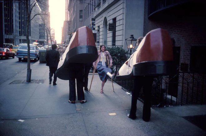
Starting with the signifiers, the image is of a street with buildings, people and cars at either dawn or dusk. Two people dressed in large shoe costumes are walking way from the camera, while a woman on crutches is walking toward them,. She has her clearly injured leg raised, pointed at one of the shoes and a smile on her face. Another man is see heading in the same direction as the shoes.

The signified for me is the humorous way the woman is pointing her foot at one of the large shoes. The reaction on her face suggests that she finds the encounter with the costumed people to be funny, presenting her injury for them to look at in an almost absurd way.

The sign for me is an absurd encounter with some people wearing large shoe costumes with a humorous play on the contrast between the characters.

In terms of denotation, the objective meaning of the image is fairly simple. Here are two people either going to a party or taking part in some form of advertising, walking down a city street. Their encounter with an injured woman causes an interaction which is observed from Meyerowitz’ perspective. We cannot see the face of the ‘shoe’ she is interacting with, but given the smile on her face it is reasonable to assume that it’s a cheerful one. The exaggeration of her walking style looks to be fun or with some level of mimicry which could be the reason for the jovial expression on her face. The other actors in the scene (the cars and the other pedestrian) are heading in the same direction as the shoes.

It’s when we consider the connotations of the elements described above that we start to deconstruct the image. The ‘shoes’, pedestrian and cars are all facing the same way toward the light at the end of the street. The use of leading lines in the composition suggests that the journey these actors are on is a long one. The scale of the shoes could be interpreted as everyone’s shoes and the way that they positioned could mean that everyone is heading down the street. The woman is the only element in the frame that is heading in the opposite direction, which could be interpreted as rebellion or some form of struggle against the tide; her injury gives weight to the latter. The humour that was signified in the first viewing of the image could be irony, with the smile being more sarcastic than genuine. The shoes take up a lot of the sidewalk, so perhaps the showing of her injury is an ironically angry gesture to get out of the way. What we cannot see in the image is the faces of the people wearing the shoes, which could be somehow dismissive of her presence. When we consider that there are no other faces in the other than the woman’s, we could interpret that as being that seemingly nobody caring about her or her predicament.

Now considering the studium, we see a city street in what looks like Manhattan in New York City. The connotations above when considered with the fact that Manhattan is considered to be an crowded place, create another narrative about the flow of people all heading in the same direction. The punctum is of course the woman who is defying the status quo by walking the other way. Her appearance and apparent disability offer a more sinister view of the big city and the struggles that some people have to fit into that society and culture. The photograph was shot in the 1970s, which has a naturally very different political feel to modern times.

The breakdown of the photograph offers multiple meanings which is what deconstruction and post-structuralism is all about. However, in terms of my interpretation, it is the intertextuality the largely defines how I react when I look at this picture. As I said, I am a fan of Meyerowitz and know that in terms of this picture he saw the amusement in the events unfolding in front of him. I’m also a huge fan of New York and it happens to be one of my favourite places to visit. Having these two personal connections means that I can only ever see this as a funny scene. New York is a place where anything or anyone out of the ordinary isn’t noticed or prejudiced against by the majority of the residents, so seeing two people wearing giant shoes wouldn’t have caused a stir. The woman’s reaction and her exaggerated walk is a celebration of that uniqueness for me and Meyerowitz’ perspective on street photography further strengthens my feelings when I see this picture:

“A lot of what I am looking for is a moment of astonishment,” he says. “Those moments of pure consciousness when you involuntarily inhale and say ‘Wow!’

Joel Meyerowitz

The Rhetoric of the Image – Panzani Advertisement

In his paper The Rhetoric of the Image [4], Barthes analysed an example of an image used in commercial advertising, specifically a printed advertisement for Panzani food products. In his treatment of this image, Barthes uncovered multiple signs (the overall meaning) and many signifieds within the frame that support them. His systematic breaking down of the image into it’s many potential meanings explains how we as viewers we are led to a conclusion based on ours or our culture’s visual references.

Panzani advertisement used by Barthes in The Rhetoric of the Image [4]

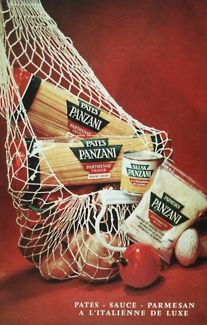
Barthes starts by pointing out the seemingly obvious element that we see when we look at the poster, the text both on the labels and in the caption. The use of the French language in the caption Barthes argues, is a coded sign about the way the product is Italian. This plays directly into our perception of other cultures in using a European language, the stereotypical idea of what being Italian is is emphasised and then further built by the labels on the food. The Panzani name drives home the message that these are Italian products for making Italian dishes.

In terms of the visual, Barthes discusses three further individual signs or meanings that the picture creates. The first is the way that the shopping bag is dropped on the table as if returning from a market or small shop. Barthes refers to the widespread cultural belief of shopping for groceries in this way being more natural than the alternative bulk buying context. The notion of naturally fresh comes with the way the produce is allowed to fall out of the bag, in contrast to the modern packed and refrigerated reality that most experience. The second sign that Barthes identifies is the use of the colours in the scene. The red, green and white themes in the image contour up the Italian flag, even though the products and colour pantones are all different. They are not even arranged as a flag, but the visual pointers along with the names on the labels drive home the sense of the food being Italian. A further sign is signified by the number of labels in the picture giving the impression that Panzani is a ‘one stop shop’ for Italian food. The final sign is the way the image speaks to still life, the signifier being the arrangement of the products and the way they are lit. This sign is more about not sending any cryptic messages about what the products are, merely that here they are for purchase. It’s no surprise that this sign is present as the picture is after all an advertisement. The more interesting point is that it’s probably not the first and most obvious of the signs. We instinctively know what an advertisement is, so only when looking at the image closely can we see the signifier that points to the classical still life paintings we are familiar with.

I found The Rhetoric of the Image an interesting paper to read. In breaking down the picture into the semiotic elements, Barthes changed the way that I looked at this seemingly uninteresting advertisement. The extract that I used for this post[] only dealt with signs, signifiers and signifieds, but Barthes goes on to consider the what the elements denote and connote and how our cultural viewpoints affect the reading of the image. I associate Italy and things Italian with the classical tourist impression of the country and its people. Flamboyant, brightly coloured fashions, exotic sports cars and glamour, as well as healthy food are all cultural references for me, so when I looked at the Panzani picture, I didn’t need the French caption to lead me to the conclusion that this weree good products. The thing that is interesting is that I have no evidence that beyond the tomatoes in the picture, the rest of the food is healthy or indeed any good. The visual signifiers and signifieds create those impressions in such as way as to my not wanting to question them. In his paper then, Barthes seeks to explain rather than contradict. His message lends itself to Derrida’s deconstruction idea that, that every element potentially has multiple meanings and traces of its opposite. In this case, the product looks Italian because the signs suggest so, but we also have the knowledge that we don’t know where Panzani products are manufactured. That and the many other distinctions leads us to challenge what we think we see in a photograph.

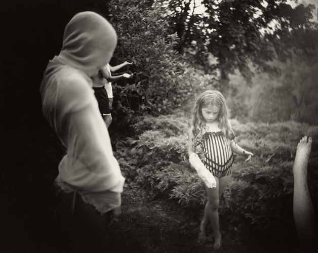
As an addendum to this, I recently revisited and completed Exercise 3 from Part 3 on Childhood Memories [5]. When I finished the work, I showed it to my wife and mother-in-law. I noticed something that I had not appreciated previously, that is the need to try to explain my photographs. I managed to stop myself from completely explaining the meaning of the image and instead observed their reaction to it. This is a key learning for me – whatever my intentions for a picture, how other people read it is dependent on my use of contextual elements and what they bring to the viewing.

References

[1] 2020, ‘Photography One – Context and Narrative Part 4, page 123, OCA Course Notes

[2] Barthes R, 1967, ‘The Death of the Author’, essay

[3] Meyerowitz J, ’35mm Color Street Photography’, Artist’s Website, https://www.joelmeyerowitz.com/street-photography

[4] Frieze C, ‘Excerpt from Rhetoric of the Image, Carnegie Mellon University Course, https://www.cs.cmu.edu/~cfrieze/courses/Barthes.pdf

[5] Fletcher R, 2020, ‘3) Exercise 3: Childhood Memories’, OCA Blog Post, https://richardfletcherphotography.photo.blog/2020/10/18/3-exercise-3-childhood-memories/

4) Project 2: Reading Pictures

In Understanding Deconstruction

We are introduced to the concept of deconstruction as the idea of language being inherently flawed in its articulation of the true meaning of a communication. The theory seeks to further challenge the notion of interpreting cultural texts (written word, cinema, visual arts etc) within a preconceived structure of meanings and relationships within language. These ideas formed the basis of structuralism which relied heavily on language being an infallible method of human communication. What followed was the challenge that language itself was a human idea, therefore it’s infallibility in communicating a message was open to interpretation and potential misunderstanding. This formed the basis of post-structuralism; a theory beyond the original understanding which deconstruction plays a major part in. In his excellent video about post-structuralism[1], academic Tom Nicholas cites the example of a reaction to a message or voicemail that was intended to mean one thing and was interpreted by the receiver as something completely different. The language is constant and well understood, but the meaning behind the use of each word and the assembled message can be misinterpreted. In trying to placate the reaction, we find ourselves trying to be more specific about what we mean – the only way we can do that is to continue to explain using the same language. The many possible interpretations of writing can exist at the same time, restrained by the core use of words, i.e. the core of the subject is understood. As with Barthes’s Death of the Author where he argues that the true intent of the author cannot every be truly understood, post structuralism challenges the viewer to become part of the creation of the meaning.

Nicholas’ treatment of deconstruction is interesting as it points to events and visual references that I had not considered until now. One of the examples was the deconstruction of the narrative around Apartheid and how the word itself was steeped in the European way of viewing racism in South Africa. Far from being an accurate way of separating the European ideals from the horrors of what was going on ‘over there’, the suggestion by deconstruction was the inherent presence of racism in that ideal. By pinning a label on racism, the very people using it could alternatively be revealing their own racial prejudices that stemmed back to the days of colonialism. I started to think about more recent examples where deconstruction of an event could yield an alternative interpretation. One thing that came to mind was an event that occurred at the start of the global COVID-19 pandemic that caused outrage among many people via social media platforms. A small group of famous Hollywood actors led by Gal Gadot, produced a video of them singing John Lennon’s Imagine [2]. The reaction to the video was brutal, with people immediately accusing the actors of turning the spotlight onto themselves and being detatched from the reality of the pandemic, which at the time meant millions of people across the world being locked down. When I watched the video, I found it to be achingly embarrassing. None of them could really sing, the video was recorded using mobile phones and as a result looked to me like many other pointless social media posts. My structural assessment of the video was not unlike other people’s and I recognised a solidarity in its derision in the media. In deconstructing it though, we consider the fact that like many, the actors were confined to their homes also. We have a perception of them as being somehow attention-seeking because of what they do as a profession, yet don’t necessarily consider that their profession is entertainment. The use of Imagine, perhaps Lennon’s most famous solo record and regarded as having a socialist theme and messages of human unity was clearly intended to be galvanising. Yet the opposite seemed to be the case, with many citing the terrible singing and production as sacrilegious. Whatever the motives behind the video, it can be interpreted as trying to make people feel better (Gadot was self-isolating with symptoms at the time), engendering unity and strength (even famous people aren’t safe). Like the racism discussion, perhaps the general interpretation is more about our having made these people famous and the resentment of what we perceive to be their world that is so different from our own. Deconstruction suggest that we should challenge what we think we know. In this case, we think we know celebrities because we are responsible for their creation, but in actual fact we cannot really know how they feel under the same set of circumstances that we are experiencing.

The 21st century technology and availability of information through 24/7 news coverage and social media has meant that we are presented with multiple cultural texts about the same subject. Does this help support the idea of post-structuralism or is it simply making more structures by which our interpretation of a subject is informed? Personally, I believe that the amount of information doesn’t absolve us from challenging what we see or read, but instead makes it even more important to take the time to do so.

References

[1] Nicholas T, 2019, ‘Poststructurualism: WTF Derrida, Deconstruction and Poststructuralist Theory Explained’, Youtube, https://www.youtube.com/watch?v=P2eb52fUgTk

[2]Gadot G, 2020, Instagram Post, https://www.instagram.com/tv/B95M4kNhbzz/?hl=en

[3] Caramanica J, 2020, ‘This ‘Imagine’ Cover is No Heaven, The New York Times, https://www.nytimes.com/2020/03/20/arts/music/coronavirus-gal-gadot-imagine.html

Part 4: Exercise 1 – Erwitt Analysis

The Brief

Look carefully at Erwitt’s image (below) and write some notes about how the subject matter is placed in the frame.

Dog Legs (1974) by Elliott Erwitt from Magnum Photos [1]
  • How has Erwitt structured the image?
  • What do you think the image is ‘saying’?
  • How does the structure contribute to this meaning?
  • Did you spot that the image is framed in stages of three?
  1. How has Erwitt structured the image?

When I first saw this shot, I immediately noticed the shallow depth of field that throws the background completely out of focus. Erwitt wants attention to be on the three subjects in the foreground of the image. The next structural element that I noticed was the placing of the subjects. The feet sit on the lower third line in the frame and if we were to draw a centre line through the subjects, they sit on the left vertical third, the centre and the right vertical third lines. The obvious difference in scale of the subjects is emphasised by the way the larger pairs of legs extend out of the top of the frame, leaving the small dog as the only ‘complete’ subject. The image looks as though it is severely cropped, which I’ve seen in other pictures of chihuahuas in Elliott’s series – I used them in my blog article about my selection and editing workflow in EYV[2]

2. What do you think the image is saying?

When I look at this image, I see a humorous take on the attitude of small dogs. The obvious scale is emphasised with the owner’s legs, but we we see the humour in the other pair of legs belonging to a huge dog, this initial reaction is questioned. As the notes suggest, this funny combination of subjects could prompt the viewer to move on from the shot. However, for me as a so called ‘dog person’, I want to continue to look at the chihuahua. The little dog has the natural stance for the breed, which has an almost confrontational feel to it, particularly compared to the big dog’s straight-legged gait. The addition of the hat makes the chihuahua almost anthropomorphised, saying ‘here is a small but mighty dog’ with a human-like personality. When I look around the frame I further get the sense that the small dog is being restrained by its owner through the use of a tight leash. The image now makes me think of a commentary about the little guy being held back by the bigger one.

3. How does the structure contribute to this meaning?

The image structure emphasises the small dog and its expression as the only whole subject in the frame. The difference in scale is emphasised by the way the large dog and the owner cannot be seen beyond just their legs. Using the top of the frame as a hard limit for the perspective forces the viewer to continue to look at the lower parts of the frame. Composition ‘rules’ tend to suggest that using the edge of the frame to cut off part of a subject can distract the viewer from the main subject. However, Erwitt uses it to create enough of an impression of what might be outside of the frame without reducing the impact of the main subject. Even the inclusion of a small part of the larger dog’s belly and back leg are not sufficiently distracting, instead making it clear who the second pair of legs belong to.

4. As I mentioned in 1, the composition in threes was one of the first things I noticed about the image. The use of threes (the thirds lines, the three subjects etc) gives the picture balance.

Further questions raised from the analysis of this image were:

  • Does he like to help the underdog?
  • Does he prefer dogs to humans?
  • Is he making a statement about giving everyone a voice?
  • Or is he just making a joke?

The notes state quite reasonably that we cannot answer the questions from one single image, particularly when it is part of a body of work about dogs. The point about the context of the image as part of the series is naturally what we have been studying throughout Context and Narrative, so it comes as no surprise. My conclusion about the image as described previously tends towards the support of the underdog and the equality of voice raised in the above questions. However, when I look at the other images in the series that conclusion is challenged. For example:

Poodle, Birmingham, England (1991), by Elliott Erwitt – from Magnum Photos [3]

In this shot we see a poodle standing on its hind legs at what looks like a dog show. The pose of the dog and the way it looks at the same unseen subjects that the people around it are, again anthropomorphises the animal. In this image, I don’t create the same underdog narrative as in the previous shot; instead there is humour and beauty and a suggestion that our dogs take on our personalities. Along with every other shot in the series, Erwitt’s affection for dogs is very evident. Humour is a clear contextual element in the photographs, so our interpretations of the images have common themes. The differences come from our own experiences and interests. As the notes suggest, an alternative interpretation of the photograph could revolve around its location, perhaps of more interest to people of the UK than Erwitt’s native US with it having been shot in Birmingham.

Conclusion

This exercise has been interesting from the perspective of how we consume all of the parallel information in a photograph and draw our own interpretation based on our personal interests and experiences. There is a danger of overthinking the meaning behind each and the acceptance that where a viewer takes their narrative is beyond the control of the photographer are both important learning points. One can describe an image in such a factual way as to reveal the contextual elements included by the photographer, but when putting ourselves in the picture and interpreting meaning, the variances can be significant. What isn’t clear to me at this point is how a photograph can be a language for consistent communication. I guess that will become clear as Part 4 progresses.

References

[1] Image resource, Magnum Photos Fine Art Collection, https://www.magnumphotos.com/shop/collections/fine-prints/18-new-york-city-1974-dog-legs/

[2] Fletcher R, 2019, “The Process of Selection”, OCA Blog Post, https://richardfletcherphotography.photo.blog/2019/07/05/the-process-of-selection/

[3] Image Resource, “The Year of the Dog Dogs”, Magnum Photos, https://www.magnumphotos.com/arts-culture/art/elliott-erwitt-dog-dogs/

Exercise 4.4: Personal Voice

The Brief

Make a Google Images search for ‘landscape’, ‘portrait’ or any ordinary subject such as an ‘apple’ or ‘sunset’.  Add a screen grab of a representative page to your learning log and not down the similarities you find between the images.

Now take a number of your own photographs of the same subject, paying special attention to the ‘Creativity’ criteria at the end of Part One.  You might like the subject to appear ‘incidental’, for instance by using focus or framing.  Or you might begin with the observation of Ernst Haas , or the camera vision of Bill Brandt.  Or if you are feeling bold, you might forget about your camera completely and think of the tricky question of originality in a different way – http://penelopeumbrico.net/index.php/project/suns

Add a final image to your learning log, together with a selection of preparatory shots.  In your notes describe how your photograph or representation differs from your Google Image search of images of the same subject.

Introduction

In starting this exercise, I thought about what I had just been working on in Ex 4.3.  My subject was a small shell that I found on a beach.  Like Haas’ apple[1], I looked at the shell for a very long time, noticing the shape, colour and texture of the inner and outer surfaces.   I had seen many shells before, but I looked at the details of this one like it was the first one I’d really looked at.  I guess the difference between my reaction and Haas’ was that I wasn’t trying to describe the shell.  Instead, I was creating a narrative based upon what I saw and how those elements reminded me of completely different subjects.  Both mine and Haas’s reactions were emotional, but our creative viewpoint differed slightly.  When reading the notes leading up to this exercise, there was reference to the conflicting viewpoints of celebrated photographers appearing confusing at this stage in our studies.  For me, it’s not confusing but their combined effort in seeking originality.  As the very first page of this course showed us, the world has been completely photographed already, so our personal voice is how we bring originality to something that has most likely already gone before.

For this exercise, I chose to search for ‘church’ in Google Images, not because I have some connection with religion, but because I’ve always seen them as a part of the British landscape.   Living in a rural area, there are plenty of potential subjects and I already knew they were all different from each other in some way; size, layout, how elaborate or simple.   However, how would the photographers online see a church in their images?

The Search “Church”

Screenshot 2019-08-09 at 09.45.49.png

Reviewing the page from Google Images, the first thing I noted was the mix of external vs. internal shots.  Of the 32 images in the search window, there are 18 external and 14 internal shots which is pretty evenly balanced.  When we look closer at the perspectives of the photographs, we see that the external shots largely follow a pattern of traditional composition.  The viewpoints include the gable end of the building, predominantly where the spire or tower is.  The photographers compose so that the church is the dominant subject and often use the rule of thirds or centering to emphasise the traditional shape of the building.  For example:-

46076-old-church.630w.tn

From http://www.christianity.com article about Presbytarians

This image shows the church from the spire end and positioned slightly off the left third line, leaving a large blank area to the right.  The photographer looks to emphasise the abandoned feeling by placing the church against natural emptiness with just the trees and hedges surrounding it.  The use of high contrast and structure to the finished image further emphasises this.

Another representation of a church exterior shows the structure in symmetry.  Here, the emphasis is on the architecture itself with the clear, unfussy plasterwork contrasted against a bright blue sky.

AmmansvilleTexasPaintedChurch301.jpg

From http://www.texasescapes.com, St John the Baptist Church

Most of the other images in the search follow this style and the same can be seen even more clearly in the interior shots.  Here, the perspective of most photographers is to capture scale and symmetry.  Most of the shots are wide angle views down the aisle with the huge structures that make up the walls and roof on show in complete balance within the composition.  For example:-

winchester-20180430180356520_web

From http://www.churchtimes.co.uk, St Mary’s Church, Southampton

The second detail of the Google search was that the images are from churches all over the world.  The two exteriors shown above are both US, but there are also churches from the UK (as above), Australia and an interior shot from India.  It would appear, then that the global perspective of churches is about their lofty designs, scale and level of grandeur and that it’s almost unconnected to the denomination or culture.

The final detail I noticed from the search was about Google itself.  As a regular user, I’d seen the feature at the top of the window where the search engine groups popular searches together, but hadn’t recognised its significance.  In the context of this exercise, what the groups tell us is how people relate to the term ‘church’, particularly where iconography and photography are concerned.  With this search we see groups around religions (Catholic and Baptist), symbols such as crosses and alters and the connection with people (youth, family, weddings etc).  With this exercise, our voice is informed by what we’ve seen before as well as the subject’s historical relevance or connection to us.  This ties in with Burgin:

There can never be any question of ‘just looking’: vision is structured in such a way that the look will always-already entrain a history of the subject. (Burgin, 1982, p 88)

Of the photographers mentioned in the notes, Burgin who is more of a conceptual artist and writer than photographer, interested me the most.  I tend to agree with his appraisal that photography is manipulation; the image is constructed to either tell a story or connect with a viewer emotionally.  The idea that one cannot look at a subject without some form of idea about it in mind, or a story to tell resonates with me.  In his essay Art, Common Sense and Photography, Burgin states that “Photography wouldn’t exist without manipulation”, referring to its use in influencing socio-political points of view.

Developing my own Personal Voice

When I think of churches, I’m reminded of memories of my earliest encounters with them.  As a child, I was encouraged to attend Sunday school and the subsequent church service.  For some time, this was a given, but as I got older I began to value the weekend time away from school and it soon became a chore more than an enjoyment.  As a growing boy, I started to resent the idea of church and my engagement with it.  What I saw was an institution where people did what they were told, from kneeling to reciting the Lord’s Prayer out loud, something I refuse to do to this day.   Naturally, I progressed my understanding of the importance of church in the community, particularly in the rural areas where I have lived.  To Burgin’s point, my history with the church changed.  When I first looked at the Google Images search, I related to the grand buildings, vast interiors and orderly gatherings of people receiving the lesson.  This is how I started to see the church, more of a symbol than a building and an institution that I have had more contact with as an adult.  Now in my mid-forties, I’ve attended many weddings (including my own), christenings and an alarmingly increasing number of funerals in church.  Each of these has shaped how I see the physical manifestation of such a building.

For this exercise though, I wanted to create a viewpoint from my childhood.

The Images

The exercise called for a single image, but I elected to select a few that represented my vision.

DSC_3462-2

Photo 1

DSC_3470-2

Photo 2

DSC_3479-2

Photo 3

DSC_3486-2

Photo 4

DSC_3484-2

Photo 5

Review

Photo 1 

I saw this image whilst paying for my ticket in the car park opposite Tewkesbury Abbey.  The building can be seen from pretty much any position in the town, such is its imposing  size.  Here, the damaged car park sign declaring “No Exit” reminded me of the long slog through the services I attended as a child.  I made the Abbey the subject without being the point of focus.

Photo 2

Another view approaching the abbey was inspired by the idea of these buildings being large and important.  From the perspective of a child, the huge building partially hidden by the trees is an intimidating prospect and while my own memories are more of a quaint village church, the place still seemed vast to me.  The stormy weather adds to the sense of foreboding

Photo 3

This sign reminded me more of my earliest memories of churches for other purposes, in this case pointing to where you might end up if you don’t have a safe journey.  The first funeral that I attended that wasn’t an elderly family member was following the death of a friend of mine when we were 17.  Sadly, it was the beginning of something more regular in life as I got older.  I can’t help seeing the humour in this composition, though.

Photo 4

As with Photo 3, I’ve recently started to notice the impacts and often humour of signs and how they are juxtaposed with another subject.  I’m nearing completion of a series of photographs called Mixed Messages and while this isn’t really in keeping with its theme, I noticed the humour of a church being some kind of spiritual construction site.  It was certainly an expectation that I would attend church, even though I had no choice in the matter.  It was a while before I understood the religion that I was born into and the traditions of Christian worship.  Wanted to also emphasise scale in this image against the small construction sign.

Photo 5

This image captures the essence of what I was trying to create in this exercise.  The entrance to the Sunday school has what I have always thought as a statue of bored children.  While I doubt it’s what the artist intended when they sculpted it, the fact that it is overlooked by the huge bell tower of the abbey made this image fairly easy to visualise.  The bonus here was the mother and son who sat on the bench as I was setting up my photograph.  Shifting emphasis onto them, I was grateful for their naturally bored expressions, particularly the boy.  It reminded me of those Sunday school sessions that led to the long church service.

How do these differ from Google?

In conclusion, the obvious differences are that my photographs are about the abbey without actually being about the abbey itself.  I’ve tried to represent what the building and its purpose means to the child version of me and that is one of presence and purpose.  I chose the abbey because it is a typical building that has been photographed many times over the years.  A quick Google Image search of ‘Tewkesbury Abbey” yields the following.

Screenshot 2019-08-09 at 14.01.41.png

The pattern is the same as before.  Classical views of the structure both internal and external but unlike before, the grouping of the images is much more about the detail of the abbey itself, without the traditional religious iconography.   I look at these photographs and think back to Burgin and the idea that it’s easy to fall back on memory and subsequently easy to relate to everyone’s memories of a particular subject.  Breaking away from that requires either looking for something new in the subject, or connecting to something from the past.   I was reminded also of a photograph that I took a few years ago during some major flooding around the abbey.  What I saw was a proud building standing above the water with its reflection clear and sharp below.  I’ve included it here.

DSC_5693.jpg

The Flood, by Richard Fletcher

References

[1] Haas, E, ‘Ernst Haas, Colour Correction’, Visura Magazine, http://www.visuramagazine.com/ernst-haas

Exercise 4.3: Egg or Stone

The Brief

Use a combination of quality, contrast, direction and colour to light an object in oder to reveal its form.  For this exercise, we recommend a natural or organic object such as an egg or stone rather than a man-made object.  Man-made or cultural artefacts can be fascinating to light but they’re already authored to some degree, which requires interpretation by the photographer:  this exercise is just about controlling the light to reveal form.

Introduction

The further instructions for this exercise discuss how a simple, organic subject can be photographed with an equally simple ‘studio’ arrangement and selection of light source.  Over the years, I have enjoyed shooting in a studio environment and am still in the process of building my own at home.  The idea of being able to completely control the environment and concentrating what I see in the subject has always appealed to me, even though I have enjoyed spending long periods of time outside, shooting nature in uncontrollable natural light.  I believe the appeal stems from me not being a patient person; waiting for the perfect conditions to present themselves often causes me some challenges.  Studio work offers the ability to adapt quickly to something in the subject frees the photographer from the environmental elements.  Knowing that I have lots of studio equipment that could be used for this exercise, and the space to set some form of studio up, was reassuring.    However, the idea of keeping everything really simple made this exercise more interesting and in the end more rewarding.

The Subject

A recent weekend in Weymouth training for an upcoming swimming event, offered me plenty of interesting objects to chose from; a variety of textured pebbles, pieces of driftwood and shells.  After collecting a number of samples, I settled on the one shown below.


The shell has interesting textures but little in terms of colour variation, which I thought would make revealing it’s details more of a challenge both from a technical and artistic perspective.

The Setup

The first thing I wanted to decide upon was the type of shot I wanted to take for this series.  The options included high key, which traditionally uses a strong key light on the subject and a lit white background and low key, where the background is either black or a dark texture that doesn’t reflect light.  An example of both that I shot during an art nude workshop can be seen below.

Silk Angel

Example of high key lighting where the background and the model are lit

Standing Nude 3

Example of low key lighting where the model is lit against a dark background.

The simpler of the two setups is low key, being achieved with with minimal lighting.  I elected to use a piece of cardboard in an ‘infinity curve’ as described in the notes.  By curving the cardboard from the vertical to horizontal plane, there is no perceived join in the between the planes, making the background appear continuous.  If depth of field is set correctly and the light is at a level where it rolls off just behind the subje
ct, the card appears to be completely black.  My simple rig is shown below.

DSC02650

Infinity curve achieved by black card on a chair.  The height of the chair allowed complete freedom to move the light around the shell

For light, I turned to my continuous LED light by Manfrotto.  This small light array can be adjusted to three levels, is very lightweight for hand-holding and has a tripod socket.   The illumination is at a colour temperature of 5600K, which is somewhere between natural daylight and overcast sky.  I fitted the LED to a lighting stand to keep the illumination consistent for this shoot.   Other equipment included another small LED torch, my mobile phone,  tripod for the camera and a cable shutter release.

The brief was to take different photographs of the subject by varying either the light or perspective.  As my subject was quite small, I wanted to the shots to be close enough to reveal the details of the shell fully in the frame.  For this reason, I selected my 200mm f/4 macro lens, which creates a surreal look that I’ve used elsewhere on this course.

The Shoot

With the setup complete, I thought about all of the things that I found interesting about the shell.  The creature that had lived in it had shaped the interior with a strange texture in amongst the smoothness of the surface.  The outside of the shell was fairly featureless and polished smoothly by the sea and its time on the beach.  Opposite the main opening, there was a large hole or split that offered another view into the structure, while the shell thickness varied across its surface.  When I held it up to the sky, it was clear that the shell wasn’t completely opaque.

The shell was placed on the card and the composition set so that the shell was in the centre of the frame.  The extremely shallow depth of focus of the macro lens meant that I would be changing both the light position and the point of focus to create my images.

The Images

DSC_3151

Shell 1 (3s at f/32, ISO100)

Shell 1 – The light was set to the right of the subject at a similar height.  For this image, I  was inspired by the 50th anniversary of the lunar landing, which was the previous day.  The smooth external face of the shell and its twisted shape against the deep black background reminded me of a celestial body like an asteroid.


DSC_3156

Shell 2 (5s at f/40, ISO100)

For Shell 2, I put two strips of black tape across the front of the light to create a slot for the light to pass through.  Making the light more directional meant that I could control the way it rolls off the subject as there was now a hard edge to the source.  Studios and film sets often use ‘barn doors’ on lights; panels that can be moved in and out to effectively steer the way the light is projected.  My simple arrangement had a similar effect.  With this image I was trying to emphasis the space in the shell where the creature once lived.  The darkness of the back wall reminded me of an entrance to a cave.

DSC_3164

Shell 3 (20s at f/40, ISO100)

Shell 3 was the same composition, but this time I was interested in the detail on the far wall of the shell.  The hole to the right offered a way of illuminating the wall without lighting the rest of the shell.  The light was moved to the right and further away from the subject so that it’s intensity was reduced.  Experimenting with the exact position and angle, revealed the details I was after.  To me, the back wall looks like a cave painting of a woman running.

DSC_3171

Shell 4 (20s at f/40, ISO100)

Shell 4 was the result of looking at the jagged edge of the shell.  This was presumably where the other half of the shell would have been attached.  I was drawn to the jagged edge along the top, which reminded me of crooked teeth.  I refocussed to pick out the top edge and positioned the light to the left of the subject.  As the setup was on a chair, I was able to lift the light from below the subject to the point where it just caught the top of the feature.  I was surprised at how subtly the light rolls off onto the rest of the subject, which emphasised the thought I’d had when I looked at the jagged edge.  This picture looks like to me like a huge fish mouth coming out of the darkness.

DSC_3180

Shell 5 (20s at f/40, ISO 100)

For Shell 5, I wanted to exploit the thickness of the wall of the shell.  This time, I positioned my mobile phone underneath the shell to light through it.  The phone torch doesn’t have any control over it but the source is quite small.  I first punched a hole in the cardboard to eliminate stray light, but unfortunately wasn’t able to prevent spillage from underneath as the shell wasn’t perfectly flat.  I solved the problem by using a small square of cloth, with a hold punched through it, between the cardboard and the shell.  I could now push the folds of the cloth into the spaces where the light was spilling out.  I adjusted the angle of the shell to the camera slightly so that the warm glow of the source could be seen.   This photograph gives the impression of a cave, with its wall painting as in Shell 3 and a fire burning inside.  To remind the viewer that it was still the original shell, I lit the outer surface with the LED torch, which was a much weaker light to the phone.  The long exposure meant that the position or stillness of the handheld torch had little impact on the overall image.

Conclusion

This exercise was very rewarding as it pointed to the simplicity of photography that I often overlook.  The shell was a beautiful object to use as it had shape, texture and mystery about it.  The lighting setup was incredibly simple, but by experimenting with the position, intensity and some level of modification I am happy that the five images are very different from one another.

I’ve recently had feedback from my tutor that I needed to look for another level of connection with my work that just the technical.  My engineering background makes it very easy for me to consider the cleverness of an image and I’ve always looked at the technical challenge before the artistic.  This exercise has taught me the key skill of just looking closely at a subject and looking for an aesthetic that relates to something outside of photographic craft.   In order to get a different perspective, I asked some of my friends what they saw.

“An asteroid hurtling through space” (Shell 1)

“Ice Cream”  (Shell 1)

“Bird head skull” (Shell 2)

“A finger wrapped around a glowing orb”  (Shell 5)

“Warm and Cosy”  (Shell 5)


It proves how an image can provoke different feelings and perspectives in the viewer, even when the subject is completely different.

Exercise 4.2: Artificial Light

The Brief

Capture ‘the beauty of  artificial light’ in a short sequence of shots (‘beauty’ is, of course, a subjective term). The correct white balance setting will be important; this can get tricky -but interesting – if there are mixed light sources of different colour temperatures in the same shot.  You can shoot indoors or outside and the light can be ambient or a handheld flash.

Add the sequence to your learning log.  In your notes try to describe the difference in quality of the light from the daylight shots in Exercise 4.1

Introduction

In preparing for this exercise, I started by considering the variety of light sources that are now available to us as a result of developments in technology.  In my early career, I used low power Light Emitting Diodes (LEDs) regularly in my electronics, but they were not able to produce high light levels at that time.  With advances in car headlight technology over the years, high power LEDs are now available for multiple uses, including as continuous lighting for photographers.  The unit that I commonly use by Manfrotto emits a bright white light that has a colour temperature of 5600K, which is considered a cool white.   I’ve used it many times to light still life and macro photographs, some of which are included here in EYV.   These lights, along with their colour modifiers can produce even illumination, which for me has a quality its own right as simple and uncomplicated.  How the light interacts with the subject and the photographer is up for grabs, but starting I was interested in exploring the purity of this kind of light in simple scenes.

The Images

DSC_2931

Photo 1 (1/500th at f/4.5, ISO800.  Colour Temp 3600K)

DSC_2932

Photo 2 (1/400th at F2.8, ISO1000.  Colour Temp 3750K)

DSC_3021-2

Photo 3 (2s at f/8, ISO100. Colour Temp 4750K)

Review

Photo 1 

This image was shot in a cafe whilst I was waiting for my wife.  I notices the huge vaulted ceiling of the building and this long panel of LED lighting that ran around in a square.  The box section that contained the light ensured that the light was directed down into the room.  However, at each corner a section of the reflector was removed, allowing some of the light to flood upwards onto the roof beam.  I was struck by the evenness of the light coming toward me and the way that the intensity along the beam rolled off as away from its source.

Photo 2

In a darker area of the same cafe, I noticed this emergency exit sign with a small LED on the casing, presumably indicating that the sign had power supplied to it.  The way the green light spread down the white brickwork had a similar appeal to the light in Photo 1 only this time, the spread is more tightly contained with the LED effectively producing a pinpoint of light.  The scene itself was fairly dark, which itself enhances the distance the light reaches before it rolls off completely.  The pattern of the brick work introduces a similar texture effect to Photo 1.

Photo 3

A couple of years ago, my wife and I found a shop that sold low power neon lamps.  Traditionally used in the second half of the last century in advertising, neons produce light by discharging current between two electrodes in a tube of neon gas, in a similar way to fluorescent tubes.  The lamps we bought varied in design an colour but each is often used as subdued lighting in dark corners of rooms in the house.  I noticed the uniformity of the light and the softness with which it lights the area around it.  In setting up this photograph, I positioned the neon on a fabric covered chair against a plain wall.   The uniformity of the red was so intense that the separation between the wall, the lamp and the chair were lost in my early images.  To introduce separation, I added my white Manfrotto LED under the chair, pointed upwards.  The result now is the two light sources blending together and the red glow of the lamp rolling off with distance from the course. I metered for the base of the map and increased by half a stop to get glow to be more even below the lamp, which resulted in the beautiful red colouring.  To preserve warmth, I set the colour temperature to 4750K. This was just at the point where the white light from the LED remained cool in appearance.  The lamp itself was burning much more brightly so takes on a yellow-orange glow.

Conclusion

This short sequence of shots appeals to me as the light in each the light interacts with the rest of the frame in different ways, while preserving the simplicity of a simple uniform light.  I’ve shot the light sources themselves rather than a subject that is lit by them because I tend like most, to look at how the subject looks under different conditions.  This is most obvious when shooting with natural light, over which we have little control other than how much of it enters the camera.  In each of these images, there were no filters used, light modification or adjustment of temperature in post-processing, merely observing the light for what it was.  There are great examples of capturing the beauty of natural light in its own right; I have mentioned Meyerowitz’s Cape Light series before, where the compositions are often beautifully simple, but this exercise has shown me that quality of light isn’t limited to that occurring in nature.   The exercise has also given me a theme for Assignment 4.

4) Project 2: The Beauty of Artificial Light

Introduction

The natural world provides us with a huge and complex light source that varies with the time of day, the weather and the season.  It interacts with our subject in an even broader range of ways, which we can manipulate to achieve the photographs we want.  However, the visual impact of light we create artificially goes somewhat unnoticed by many.  This kind of light is created to draw attention to a subject such as an advertising poster or to allow us to see where there is no natural illumination.  As with the early days of photography and the evolution of flash light sources, artificial light was a tool to be used to capture the image on film rather than be something that could independently considered beautiful.

Creative Control

The first idea we are introduced to in this project is the use of light in motion picture film, the example being In the Mood for Love by Wong Kar-Wai.   This movie depicts a love story between two people who’ve discovered that their partners are being unfaithful with each other and how their own fantasy affair develops.  The film is shot predominantly at night and the lighting used creates the sense of clandestine activity in between the highlights and shadows.  The dismal nature of their environment is contrasted by the lighting of the female character, Su’s colourful clothing and throughout the film, the angles used by the cameraman further emphasise the voyeristic aesthetic that the street lamps and lightbulbs reveal to the viewer.    When I saw this film, I was struck by the simple way that fluorescent lights used cast colour on the character’s skin that one would expect to be harsh in its unrealistic luminance.  However, the way that the faces of the characters are picked out draws attention to their mood in a way that almost makes the colour cast unnoticeable.  One frame from the film is discussed by Ian Bryce Jones on his blog:

screen-shot-2015-06-09-at-12-11-18-pm.png

From ‘In the Mood for Love”, Wong Kai-War [1]

Everything about this shot is utterly stunning. The light on Su’s face is perhaps the most dramatic in the entire film: bright, sharp, highlighting the shadows under her cheekbones and her winged eyeliner, and also very artificially coloured, almost golden, making her lipstick look brighter and her features more defined. Chow is behind her, in a different depth of field; still, we can tell that his gaze is on her, and the resultant tension is incredible.  – Ian Bryce Jones, 2015 [1]

What interested me about this shot was the control used by the cinematographer, Christopher Doyle.  The whole film was shot on Kodak Vision 500T and 800T colour negative film [2] which is about as good as it gets for truly representing colours in artificial light (T is for tungsten balanced)  It’s most common use is for indoor shots where fluorescent lighting would normally create a colour cast like the one in the photograph above.  Therefore in order to create this effect on Su’s face, Doyle had to use a light that would overcome the effect of the tungsten balance reaction of the film emulsion.  As Ian Bryce Jones states, the use of this golden light emphasises not only the expression of her face in terms of highlight and shadow, but the cast brings out the boldness of her lipstick.  The male character behind her is lit by the spill from the key lighting, which when coupled with his being out of focus, offers minimal information beyond the fact that he is looking intently at her.  It is a remarkable frame from an impressive film.

Colour balance in modern terms

As mentioned, the film stock used in that film is biased towards rendering natural colours from artificial light.  It is designed to represent colours in light of a certain colour temperature and cannot be physically changed outside of using additional filters on the camera.  Colour temperature refers to a measurement of the electromagnetic radiation that makes up the visible light region and varies depending one the light source.  The scale of colour temperature (in degrees Kelvin) runs broadly as follows:

colour-temperature

With digital cameras, balancing for colour temperature (referred to as white balance), is something we have control over as opposed to choosing a film to cope with one scenario. If the camera is set to automatically assess the light in the scene, it will correct for the dominant colour temperature.  Many photographers will work this way and correct in post processing, which is most effective when shooting in the RAW format.  As we can see from the frame from the movie though, careful selection of colour balance is important in creating the aesthetic using artificial light.  If, for example we import the image into photoshop and autocorrect for the dominant light source, we get the image below.  The skin may be more ‘representative, but the whole feel of the image is now changed and in my view, worse for it.

screen-shot-2015-06-09-at-12-11-18-pm

Colour corrected version of the previous image.

The Photographers

The three photographers mentioned in the course notes all use the impact of artificial light that is present at night on the streets.  Shintaro’s work in the bright metropolis of Tokyo, deals with the varied and impactful way that light is used to get the attention of the people, whether it be informational or as advertising.  The landscapes are dominated by strong lighting but with contrasting colours that spill into the shadow regions and reveal hidden textures.  Shintaro’s images are largely free of people, which the artist ensures by using long exposures.  When people walked into his frame, he would temporarily cover the lens and wait for them to move on, which meant that although the exposure was a total of 30 seconds, a single shot might take 30 minutes to produce.

“I wanted to show the thing itself. If people show up in the frame, the viewer sees people. Just the signs, just light, just colors, just the thing itself. And the rhythm these things were making.” – Sato Shintaro, 2009 [3]

Shintaro’s photographs empty the scene of distractions, yet the subjects still point to a pattern or even struggle of life.

shintaro-sato-shinkoiwayukiebi-900x576

Tokyo Twilight Zone, 2008, Sato Shintaro [4]

In the photograph above, from his series Twilight Zone we have a mix of the light pollution from the city at the horizon with the light from the houses in the foreground.  The combination powerfully shows thousands of people living their lives without a single person being in the image.  The statement of Tokyo confronting the night with lots of its own light is enough to be an interesting subject, but the beauty of the light graduating from cool tones of the foreground to the warmer skyline makes it a photograph to linger on.

A consequence of long exposure that makes Shintaro’s work so powerful is what cannot be seen by the human eye or appreciated by the bran in real time, something I have experienced during night photography shoots.  As I’ve mentioned previously [5], the human eye and brain are continuously adjusting ‘exposure’ so that we have consistency of vision.  Where there is a high dynamic range of light, we often miss the subtlety of the low lit areas of a scene because of the way we process what the eye sees.  In the case of a slow changing scene with very low light dynamic range, we can see things that we would ordinarily miss; consider the mariners who see iridescent algae when at sea when there is little light pollution from other sources.  With long exposures, we can see reflections and subdues shadow tones that our brains tune out in the presence of a dominant light source.  Take the image below for example:

DSC_4294

St Paul’s Cathedral, 2017, by Richard Fletcher

This shot was taken on a rooftop in London on a very stormy night.  When I set the shot up originally I had observed the way St Paul’s was reflected in the water, but I hadn’t spotted the lighting of the cloud above the dome.  By exposing for longer, this effect became more obvious.

London-A-Modern-Project-1995-Rut-Blees-Luxemburg

London – A Modern Project, Rut Blees, 1995

With Rut Blees Luxemburg’s’ famous image used on the cover of The Street’s debut album, we have a similar feel to Shintaro.  This time, the gloomy London sky is punctuated by yellow street and building lights.  What is interesting here is her observation of light that is similar being altered by the people producing it.  The building has a mixture of different curtains and window coverings that alter the intensity and colour, drawing the eye around the subject and revealing textures that would ordinarily be missed.   By using a long exposure, the dynamics of the lives of the people who live there are also captured via the lights from their apartments.  As with Kar-Wai’s film, the general darkness of the frame and the incandescent lighting create the urban effect that appealed to the musicians that used the image.  The image was originally part of the collection London – A Modern Project, 1995 where the theme uses the same lighting ideas throughout.

I think the sculptural quality of the block is what makes the picture work. The lights break up the grid, but at the same time they are little illuminations, which tell us about the people who live there. While the camera shutter was open, people came home and turned their lights on or off. The brightest rooms either had their lights on for the longest, or they had stronger lights. And in some, you can see people watching television. In that sense, the picture is a living sculpture.  – Rut Blees, talking to The Guardian in 2009 [6]

The final photographer mentioned in the course notes was Brassaï, who worked in the early part of the 20th Century.  His work in Paris in the early 1930s observed the way that simple street lighting interacting with the environment and weather to create surreal views of the famous city.  What differs with Brassaï’s work from the others researched here is the more traditional approach of showing people in their environment.  He used high contrast imagery to reveal the contrast of Paris itself, ranging from the glitz and glamour of the Eiffel Tower to the depression of homelessness in the deprived areas of the city.   He worked in black and white film, which was the only practical medium available to him, resulting in a large grain effect under low light conditions, further enhancing the gritty nature of his images.

“The surreal effect of my pictures was nothing more than reality made fantastic through a particular vision. All I wanted to express was reality, for nothing is more surreal” – Brassai, on the publishing of Paris de Nuit, 1933

In his interview with Tony Ray-Jones in 1970, Brassaï discusses the origins of his work which drew on his early days as a painter and were inspired by, among others Georges de la Tour, a 17th Century French painter.  La Tour’s paintings of subjects lit simply by candlelight, were not unlike other painters of the time.  However, like Rembrandt, who was 13 years his junior, La Tour carefully used the single candlelight source to draw the eye to the main subject and let the viewer explore the the areas where highlight descends into shadow.  One can see the influence of the painters in some of Brassaï’s ‘portraiture’ that makes up his collection Paris de Nuit.  An example can be seen below.  The primary light source reveals the vendor and just enough of the setting around him for the viewer to see his profession.  His expression is one of concentration but not awareness of his surroundings or the fact that he is being photographed.   It is also a good example of Brassaï’s honesty in his photographs, where the image retains large areas of dark shadow that many would have considered cropping out. Brassaï believed that photographs should have order and that the composition should represent the subject faithfully, particularly when photographing people [7].

1802-5077.original

Kiosque à Journaux, Paris 1930-32 by Brassaï

Conclusions

This project has led me to re-evaluate artificial light, which until now has mainly been the use of strobes in portraiture.  While I’ve always appreciated how this kind of light affects the subject and its setting, particularly when combined with long exposure techniques, I have yet to explore the quality of the light itself.  Of the creative uses of artificial light examined here, the most interesting to me from an aesthetic point of view is the cinematography on the film “In the Mood for Love”.  Here, seemingly ordinary tungsten lighting creates a beautiful, secretive, but painful mood throughout the film.  It has made me see all sources of light from a different perspective.

References

[1] Bryce-Jones, I, 2015, “Silhouettes, Shadows & Smoke: Lighting in In the Mood for Love”, https://intermittentmechanism.blog/2015/06/10/silhouettes-shadows-smoke-lighting-in-in-the-mood-for-love, accessed June 2019

[2] Unknown Author,  2012 -2019, “In the Mood for Love (2000) Technical Specifications, https://shotonwhat.com/in-the-mood-for-love-2000

[3] Kurt, 2009, “Interview with Sato Shintaro”, http://www.japanexposures.com/2009/08/25/interview-with-shintaro-sato/

[4] Dirk, 2008, “Sato Shintaro – Twilight Zone”, http://www.japanexposures.com/2008/09/24/sato-shintaro-twilight-zone/

[5] Fletcher, R, 2019, “Light Meters” https://wordpress.com/post/richardfletcherphotography.photo.blog/876

[6] Benedictus, L, 2009, “Photographer Rut Blees Luxemburg’s Best Shot”, https://www.theguardian.com/artanddesign/2009/apr/23/rut-blees-luxemburg-best-shot-photography

[7] Ray-Jones, T, 1970, “Tony Ray-Jones Interviews Brassaï, http://www.americansuburbx.com/2011/08/interview-brassai-with-tony-ray-jones.html


Exercise 4.1: Daylight

The Brief

Taking the photography of Mann, Atget or Schmidt or a photographer of your own choosing as a starting point, shoot a number of photographs exploring the quality of natural light.  The exercise should be done in manual mode and the important thing is to observe the light, not just photograph it.  In your learning log and using the descriptions above as a starting point, try to describe the quality of the light in your photographs in own words

My Approach

From my research in Project 1, my inspiration for this exercise is Sally Mann, but not in particular her use of light in her Southern Landscape series, but her more intimate family portraits as her children were growing up.  These images continue to cause controversy in the US because they predominately include nudity, but running throughout is how Mann uses light.  Always shot in black and white, Mann’s photographs have the main subject picked out by soft, but bright light while the rest of the image is subdued by the contrasting shadow.  An example of this can be seen below.

From Family Pictures, by Sally Mann [1]


In this image, we see Mann’s daughter lit by an almost ethereal light while the rest of the frame rolls off into vignette.  Mann puts some of this down to her old large format film camera and its uncoated lens, but the effect is a constant in this body of work.

In my previous landscape photographs, I’ve tried to achieve a similar effect of picking out the subject with a ‘highlight’ against a contrasting background, so my first task was to review what I had done before.   An example from my previous work can be seen below:

Tallybont Reservoir, 2016 by Richard Fletcher

This photograph was made using a 6 stop ND (neutral density) filter to achieve long exposure with the spot metering done from the grey cloud overhead.  The weather was sunshine and cloud so it was a matter of waiting for the light to pick up the tower structure.  Apart from the colour correction needed when using this type of filter (mine has a blue cast), the image has only had some contrast adjustment and a crop.

With this effect in mind, I looked for subjects and conditions to shoot.  Since the images didn’t need to be a collection for this exercise, I took opportunities to shoot whenever I saw a subject under these conditions.

The Images

Leica 100519006

Skate Park, London 2019

DSC_2779

Scooters, Pontevedra 2019

DSC_2780

Waiter, Pontevedra 2019

DSC_2749

Palms, Pontevedra 2019

Review

Skate Park, London 2019 (Kodak Ekachrome 100, shot in a Leica M6, 50mm, 1/60th at f/2.8).

I was hoping to shoot the skaters that gather in this underpass on the embankment in London.  It was a cold day, so I guess they had better things to do.  However, as I looked a the graffiti which has become part of the vibe of this area, I noticed the message at the top of the pillar.   I metered the scene, which was always going to be a challenge using slow slide film like Ektachrome, but was surprised to find the meter reading 1/125th at f/2.8 on the pillar itself.    I decided to lift the exposure on the pillar to make the light more impactful and in an effort to get more detail in the shadowed graffiti in the background.  1 stop more exposure was given in shutter speed.

Scooters, Pontevedra 2019 (ISO100, f=45mm, 1/125th at f/2.8, black and white conversion)

My wife and I were in Spain for her multi-sport competition and visited the beautiful old town area of Pontevedra.  I saw this scene in front of my and my intention was to pick out the sign on the cafe canopy.  For this shot, I metered the shadows rather than the highlights as before.  Adjusting down by 2 stops, I then noticed the boys entering the scene.  They were not highlighted in the same way because of the shadow cast by the building to the left of the frame, but I like the way they are subtly lit.  A happy accident.

Waiter, Pontevedra 2019 (ISO100, f=24, 1/640th at f/2.8, circular polarising filter)

The light was very bright when we entered this square.  Using the polariser to reduce the harshness of the light reflected from the canopies and darken the sky, I decided to shoot wide open at f2/8.  I then metered the shadow under the canopies where I could see the waiter serving.  I reduced the exposure by 1 stop to 1/640th and waited for the waiter to emerge from the shadow.  I like this photograph but believe that I was a split second too eager in taking it.  The waiter is indeed picked out, but the impact could have been higher if I had waited.  I included anyway, because I think it is a good example of reading the light, getting the camera ready and waiting for the action.

Palms, Pontevedra 2019 (ISO100, f=48, 1/25th at f2.8)

Walking along the river in Pontevedra, I spotted the light coming through the branches of the palm trees and casting the pattern on the pavement in front of us.  Not strictly the same approach as before, but in this photograph I metered for the shadow on the floor and lowered by 1 stop to make them dark enough to have impact.  The highlights above the bridge were a little brighter than I wanted, but they are not washed out so I left the exposure as is.

Conclusion

This exercise has been useful in two respects, metering for the light or shadow and placing it within the exposure to suit the intent and taking time to observe the light in the scene.   The former is something I was already familiar with from working with film, but the latter requires more thought.  Moving from shooting a photograph with reliance on one of the semi-automatic modes that all modern cameras have is a daunting prospect.  Moving away from matrix metering brings with it another aspect that most are not used to.  This greater control over how we want to the photograph to look is more akin to the representation of light that painters have been doing for centuries.  The alteration of the light in Skate Park, London for example made the pillar more dramatic.  To someone looking at that scene quickly the contrast between highlight and shadow would probably not be as obvious. I had time to view the light in the scene, so could make a decision as to what the photograph should look like.  When this is achieved, we see how beautifully natural light plays on subjects, folding around surfaces and being reflected and filtered as it reaches our eye.  My images here were not shot at different times of the day, something obvious from the challenges around Waiter.  However, the variation of light is something I have observed in my earlier photography and in the research for Project 1 [2].

My main conclusion from this exercise is that we don’t always have time to shoot manually or to take time to evaluate light, but we should consider how any image should work in natural highlight and shadow.

References

[1] Image source, Sally Mann Selected Works, www.sallymann.com

[2] Part 4, Project 1 – “Layered, complex and mysterious”, https://wordpress.com/post/richardfletcherphotography.photo.blog/898

4) Project 1 – ‘Layered, complex and mysterious’


Let there be Light

The introduction to this project provided in the course notes, calls out our experiences where our images don’t match our expectations.  “Why did that photograph end up under-exposed? Is there something wrong with my camera?”.  While this happens to everybody from time to time, my earliest recollection of the phenomenon was a defeating experience.   My first camera was 110 Voightländer Vitoret that my father loaned me while I saved for my own.  This was a typically simple camera, with zone focusing and autoexposure.   I recall shooting my first few cartridges of 110 film with that camera and getting the results back from the local chemist.  Some of the frames were ok, but most had the dreaded sticker applied to the print, informing me of what I got wrong.  Under or over-exposed was the most commonly suggested by the developer, although a small boy would also get his thumb in front of the lens.   Forty years later and with lots of other photographic experiences behind me, the natural conclusion would be that I knew nothing about light, or how the camera would attempt to represent it on the film.  Light for me was just a judgement in determining the selection of film speed for my camera.

In beginning research for this project, I wanted to understand the different ways light had been manipulated by photographers; strong and diffuse, natural and artificial, highlight and shadow.  In the earliest period of modern photography, light was used to create images for contrast, where a subject’s obscuring of light against the blankness of the paper was the effect being sought.  William Henry Fox Talbot, who is credited with the invention of the photographic paper process created a number of photogenic drawings by placing leaves on photo paper and exposing them to sunlight (below).  The resulting negative prints show the detail of the leaf structure captured as the light is passed, obscured and partially obscured as it travels to the paper.  These early prints were subsequently used by botanists in their research of plant structures.  However, in the photographic sense, light was merely the tool to create a drawing [1]; something that Fox Talbot admitted to being poor at.

whft066.jpg

Photogenic Drawing of a Leaf by William Henry Fox Talbot, c 1839

The technique naturally became the method for making contact prints by placing negatives onto photographic paper to create a positive, but artists continued to create surreal pieces using the original idea, e.g the film strip images by Man Ray [2].

The evolution of the use of light to simply get an exposure continued through the Victorian era with the light being created by exploding magnesium powder.  This use of artificially-created light might seem at first glance, but the quality of the exposure could be surprisingly good with its ethereal tones [3].  Victorian photographers experimented with multiple lights, double exposures that led to the infamous paranormal photography craze and was ultimately succeeded by the precision flash tubes of the early 20th Century.

Representation vs Capture

The etymology of the word photography can be traced back to the mid 19th Century coined by Hercule Florence in 1833 [4].  Florence was a draftsman working  in a team of sketch artists in Brazil with a botany expedition.   Fox Talbot contacted Florence’s employer to pitch his idea of using photogenics for examining the structures of plant life (the image above).  He didn’t realise that Florence had already worked out his own method for capturing ‘drawings’ using photosensitive materials, coinciding with both Fox Talbot’s work with silver-salt negatives and Louis Deguerre’s wet ‘tin type’ method.  Unlike his more famous European peers in the field, Florence is credited with the first use of the term photographie, literally translated as light drawing in his native French. Although drawing with light was the principle of faithfully reproducing what would have been a sketch of a subject as opposed to art, photography offered some ability to be creative in the early days.  However, it would some years until the idea of visualising light and representing it would be part of photography in stark contrast to the painters and sketch artists from history.   Their genre required carefully looking at the light on their subject and determining the most impactful way of representing it in the picture.   Two renowned painters famous for their mastery of visualising light and representing it on canvass were J.M.W. Turner and Rembrandt Harmenszoon van Rijn.

Turner was known for his dramatic landscapes depicting dramatic scenes set against the backdrop of turbulent weather and the violence of the natural world.  To create impact, he was known to experiment with colourisation elements of his paintings, creating a sense of the surreal while maintaining enough realism to the subject.  He famous work Rain, Steam and Speed – The Great Western Railway, 1844 demonstrates Turner’s manipulation of light to suit the drama of a scene.

Turner_-_Rain,_Steam_and_Speed_-_National_Gallery_file

Rain, Steam and Speed – The Great Western Railway, J.M.W. Turner, 1844

The scene depicts a steam train racing over a viaduct on a stormy day.  In this image, Turner take what would have been largely defuse light experienced in heavy rain and cloud and creates a complex luminance to the scene.  When I first saw this painting many years ago, I asked myself “Where is the light coming from?”.  At first glance is is not the obvious but the light under the main and left viaduct suggests the light is coming from the right of the painting.  The shadows on the viaduct support also support this assertion.  However, the lighting and contrast of the train itself suggests some artist licence to give a sense of thundering movement toward the viewer.  Turner’s use of ambiguous colour for both the landscape and cloud suggests chaos in the weather and while there is not clarity in the rain itself, the mood of the sky and blurring of the foreground detail points to a train battling through very bad weather.   This painting clearly could not have been painted in real-time, but Turner was able to place the dramatic subject in his equally dramatic landscape and create the impact by manipulating light and colour to great effect.

By contrast, Rembrandt was known predominantly as a portrait painter whose fascination with studying people either singularly or as part of a scene comprising multiple subjects.  Rather than create an impressionist aesthetic, Rembrandt wanted to best convey the natural complexity of the subject’s face and expression to allow the viewer to draw conclusions about what is happening for the subject.   Rembrandt painted many self-portraits over his later life, documenting the changes in his own physical form.

“Life etches itself onto our faces as we grow older, showing our violence, excesses or kindnesses.”  Rembrandt van Rijn

In his famous painting The Anatomy Lesson of Dr Nicolaes Tulp, we see a human dissection taking place in front of a group of students.  This painting, regarded as one of Rembrandt’s early masterpieces as it was a commission when Rembrandt was just 26 years old.  As well as being a technically detailed work with a realistic representation of the dissection and the expressions of onlookers, it is a great example of Rembrandt’s use of light.  The scene is tightly lit from the left of the painting but some unseen source, but presented in a way that reflects the needs of the work being done in the scene.  The light rolls away from the centre of the painting so that there are few distractions at the edges of the scene and while the corpse is the brightest element, its face is partially obscured by shadow so as to avoid distracting from Tulp working on the arm.  What’s most interesting, though is the lighting of the faces of Tulp’s students.  This is an example of Rembrandt’s technique that inspired the well-known Rembrandt Lighting that is used in modern portrait photography.


The close-up view shows two of the students with similar lighting on their faces.  The left side of the face is lit brightly, but the nose casts a shadow onto the right side of the face which results in a partial eclipse effect, apart from a small triangle of light that folds around the bridge of the nose.  This effect was used in many of Rembrandt’s paintings to accentuate the details of the face and its expression.  It is used as a staple setup in modern studio portrait photography as shown in the photograph below.

For me, Rembrandt was someone who observed the light play on his subjects in almost micro-detail, and as a result his work has an almost photorealistic quality to it.  The skill applying natural light in oil paint is essentially hidden from the viewer as they are left to study the subject without distraction.  In The Anatomy Lesson of Dr Nicolaes, the first thing that strikes me is the highlighting of the procedure taking place, which points to the importance of the relatively new science of anatomy.  The students themselves are not traditional youth, but scholarly middle-aged gentlemen who themselves are already presumably of well regard.  When attention is drawn to the dissection itself, the ‘reality’ of the painting comes back into focus.  The arm with its musculature and vessels prompts the question “How is this level of detail possible?”.  The answer, according a medical paper by the University Medical Center Groningen in the Netherlands [5], is takes us back to the idea of representation rather than capture.  

A public anatomic lesson in the 17th century usu- ally started with dissecting the perishable organs of the abdomen and thorax; the extremities were the last to be dissected.1–3 In Rembrandt’s painting, how- ever, the forearm already has been dissected whereas the rest of the body still is intact. This is another reason to believe that Rembrandt’s painting does not record the real situation of Dr. Tulp’s dissection but rather represents a symbolic interpretation.

The Anatomy Lesson of Dr. Nicolaes Tulp by Rembrandt (1632): A Comparison of the Painting With a Dissected Left Forearm of a Dutch Male Cadaver

The paper asserts that the anatomical realism created by Rembrandt is so inaccurate that the artist couldn’t have been in the room, even to sketch the scene.


A portrait painter’s success depended heavily on his skills to produce an acceptable likeness of his sitters following existing visual conventions,37 but did Rembrandt record an exact representation of the public anatomic lesson held on January 31, 1632? None of the anatomy paintings of the Amsterdam Guild of Surgeons display an exact representation of an anatomic lesson  They are all group portraits and commemorate the tenure of a Praelector Anatomiae or membership of the Amsterdam Guild of Surgeons.  Rembrandt seems to have painted a realistic reproduction of an anatomy lesson.

Middelkoop N, Noble P, Wadum J, Broos B. Rembrandt under the scalpel. The Anatomy Lesson of Dr Nicolaes Tulp dissected

What is clear is that Rembrandt created his masterpiece using some unconfirmed prior medical knowledge or research and painted and idealistic representation of the marvel of modern medicine; a propaganda piece for Dr Tulp.  His command of light and its natural ‘behaviour’ allows him to draw the viewer to the action whilst maintaining a sense of gravitas in the subjects themselves.  The painting’s accuracy and artistic merit have been debated for over 350 years, which points to the impact of the work.Rembrandt’s lesser known work confirms his abilities with representing natural light.  In The Rich Fool, 1632 (below), Rembrandt’s single light source is a candle directly in front of the subject’s face.

Rembrandt_-_The_Parable_of_the_Rich_Fool

The Rich Fool, Rembrandt van Rijn, 1632


When we examine the painting, the first thing we notice is the softness of the candlelight as it rolls off in luminance. We cannot see the flame as the subject’s hand is shielding it, but the light is spread across the the area of the desk and gloomily reveals some detail in the room behind.  Shadows are where we would expect them to be on the books and the subject’s face.  The artist reveals only the details that support the meaning of the image; the parable of the rich fool from the Bible.   The story of the man whose selfish amassing of possession to guarantee his future is shown represented by what the light falls on; the vast ledgers and legal documents, the coins and man’s fine clothes coupled with his pained but determined expression are what Rembrandt uses to press home the need to not be selfish.

The Photographers

The course notes point to three very different photographers in Sally Mann, Michael Schmidt and Eugene Atget.   The work of each demonstrates the observing and capturing of light in a way that best enhances their subject.

In the interview “The Touch of an Angel” [6], Mann refers to the translucency and fragility of light, in particular the way that it is affected by location; drawing a distinction between the light in the North and South of the US.   As photographers, we all observe the difference is in spring/summer vs. autumn/winter light quality and the variations throughout the day.  The more interesting thing about her work in ‘Southern Landcapes’ though, is how Mann uses light to convey a sense of feeling in her photographs.  The emphasis of the series of pictures isn’t the interest in the subject matter or the precision of composition and focus.  Instead, she uses light and shadow to describe the environment she is in.  We can get a sense of the weather, the season and even the temperature from what is essentially a series of monochrome images.  She admits in the interview that light is softer owing to the lack of coating on the lens, which enhances the dreamy feel of her pictures.  I’ve discovered over the past few years that the age of the lens, coupled with the type of film emulsion used, can create a photograph that has an antique look to it.  By making her images more about her observation of the luminance in the scene rather than the technicality of exposure, Mann creates a series that could have been shot 100 years before.

Using what at first looks like boring, flat light, Michael Schmidt’s series Waffenruhe has a ‘what you see is what you get’ feel to them.  Simple compositions with the eye drawn to the subjects using depth of focus etc… all things we have learned here already.

‘The viewer must allow the objects portrayed in the photograph to take their effect upon him without being distracted by shadow or other mood effects’ – Michael Schmidt

Waffenruhe-by-Michael-Schmidt-Tipibookshop-15-450x450

Waffenruhe, Michael Schmidt, 1987


In the photograph from he series, the Berlin Wall can be seen leading away from left to right.  The first thing we see is the walls set against a plain sky, which suggests a dull, overcast day where the light is flat.  The subject itself has little shadow which reveals the details of the graffiti along its length.  The one area of shadowsw and highlight in the photograph is the wasteland area in front of the wall, but there is little to distract from the main subject as described by Schmidt in his quote.  In a video documentary [7], Gabriele Franziska Götz, who was involved in printing Schmidt’s book Berlin-Wedding, described printing ‘as grey as possible’, likening the overall effect to being that of a photocopy.   By his admission [8], black and white photography also “guarantees the viewer a maximum amount of neutrality within the limits of the medium. It reduces and neutralizes the coloured world to a finely nuanced range of greys, thus precluding an individual way of seeing (personal colour tastes) by the viewer”.

This flatness of exposure can be seen in Eugene Atget’s Documents pour Artistes, the factual, documentary photographs that Atget made his living creating [9].   As he didn’t see himself as an artist in his early years, nor did he care much about the conditions of the light.  The film he was using was not particularly sensitive to the blue region of the spectrum, so the skies in many of his photographs were plain white, with no cloud detail.  Little is known about his workflow, but at some point he must have realised that the softness and even angular quality of light varies during different parts of the day.  Two of Atget’s contrasting works can be seen below.

The first is an image of the Paris Atget was trying to preserve in his documents.  Shot with minimal variation in lighting, apart from the rooftops of the buildings.  The image is precise in how it reveals the architecture of the city but there is little to describe what it was like to live there.  The second image by contrast is from his Parc de Sceaux series and it is immediately clear what the differences are.  This photograph uses highlight and shadow to create an ethereal view; the biblical stature looking into the distance where the contrast fades with the luminance of the horizon.  This image as a factual document is not as useful as the first in that only the details that create the mood can are revealed by Atget.

Perhaps the best way to see how Atget developed his approach, without knowing a great deal about the man, is to look at the work of his mentee and champion of his work, Berenice Abbott.  Abbott was hugely influenced by Atget, so it isn’t a surprise that when documenting the urban development of New York City that she uses light in a dramatic way.  The photograph below shows one of Abbott’s New York scenes; Grand Central Terminus.

Bernice+Abbott

Portrait of New York 5, Berenice Abbott, 1929

Conclusion

This project interested me as someone who, like many was taught to use light in a composition without the emphasis being on really observing its behaviour.  For me, light has just been a tool for the medium, much like the Fox-Talbot photogenics where it is used to reveal something else.  Reviewing Sally Mann’s work and how she uses the light’s own subtle beauty to create a mood, made me realise that looking at a scene was far more than just how to focus, compose and what shutter speed to use.  Her emotive landscapes as well as her more controversial portraits of her family, share the use of light to draw more attention from the viewer.   Looking at Rembrandt’s mastery of imagining and representing light led me down a different way of thinking, more akin to artificial light and deliberately controlling the aesthetic.  In stark contrast to both Mann and Rembrandt, the notion of simply documenting the scene without using light and shadow is also intriguing, particularly as most photographers are taught effectively not to do this.  Schmidt’s approach forces us to appreciate the flatly lit detail of each scene, to appreciate the interest in the subject chosen as opposed to any mood it might create.   One thing is certain, light whether observed, captured or represented is a complex element to photography and its many uses offer huge diversity in photography.

References

[1] Fleury P, 2015, Salt and Silver, Tate Britain Exhibition, MACK Books

[2] Radnitzky E, 1923, Rayograph, Museum of Modern Art (MOMA), https://www.moma.org/collection/works/46483?artist_id=3716&locale=en&page=1&sov_referrer=artist, accessed May 2019

[3] Cangemi M, 2017, My/AP Workshop Ep4 – Magnesium Flash Photography video, https://www.youtube.com/watch?v=zbAcOL4oR7M, accessed May 2019

[4] Brizuela N, 2014, Light Writing in the Tropics, The Story of Hercule Florence, Aperture. https://aperture.org/blog/light-writing-tropics/, accessed May 2019

[5] Frank F et al, 2006, The Anatomy Lesson of Dr. Nicolaes Tulp by Rembrandt (1632): A Comparison of the Painting With a Dissected Left Forearm of a Dutch Male Cadaver, https://web.archive.org/web/20070926154457/http://www.handsurg.eu/resources/rembrandt_en.pdf. Accessed May 2019

[6] Rong J, 2010, An Exclusive Interview with Sally Mann – “The Touch of an Angel” (2010), https://www.americansuburbx.com/2013/01/interview-sally-mann-the-touch-of-an-angel-2010.html.  Accessed May 2019

[7] Langfeld A & Paulsen S, 2016, Werkstatt für Photographie: 1976-1986. Micheal Schmidt. Teil 4, https://www.youtube.com/watch?v=4m4Fc1UPUd8. Accessed May 2019

[8] Schmidt M, 1979, “Thoughts About My Way of Working” (1979), https://www.americansuburbx.com/2010/10/michael-schmidt-thoughts-about-my-way-of-working-1979.html.  Accessed May 2019

[9] Dupêcher N, 2017, Eugene Atget, French 1857-1927 – Museum of Modern Art (MOMA), https://www.moma.org/artists/229, accessed May 2019