Create a series of 4-8 images exploring family, drawing from the writing and contemporary practitioners discussed in this project.
Family as defined here is not limited to any traditional sense of the word and you are encouraged to define ‘family’ on your own terms in your written reflection.
Please remember to gain written consent from family members if they feature in the work. You may wish to refer back to the terms of engagement in collaborative practices discussed in Project 2. You may choose to share these photographs in the unit forum or privately with your tutor (asynchronously).
Write a reflection in your learning log (around 500 words). Use this as an opportunity to reflect on the activity. Describe the context, your approach, your ethics, any challenges you faced, and how your family members feel about the images that you have produced.
Introduction
The concept and preparatory work for this assignment can be seen in the sketchbook:
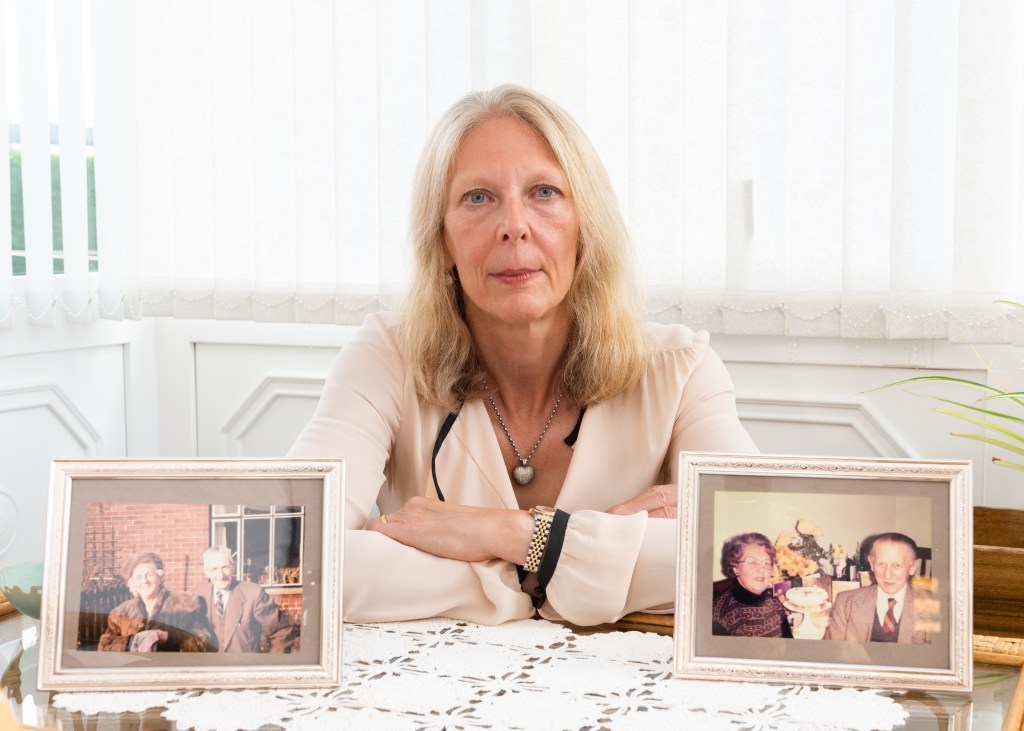
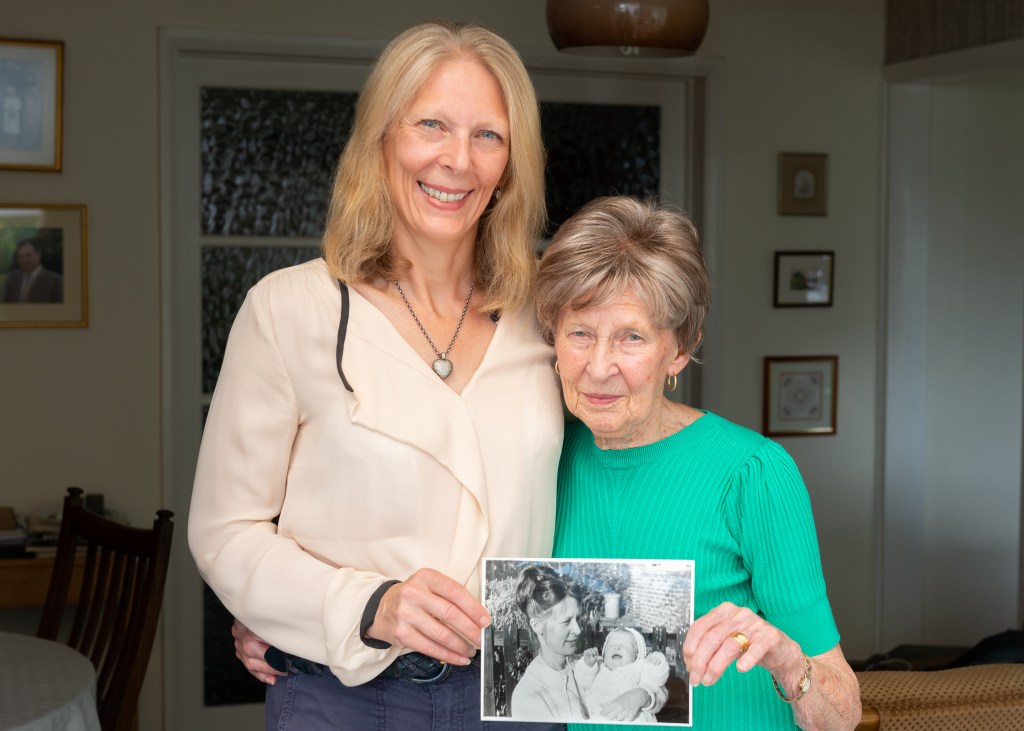
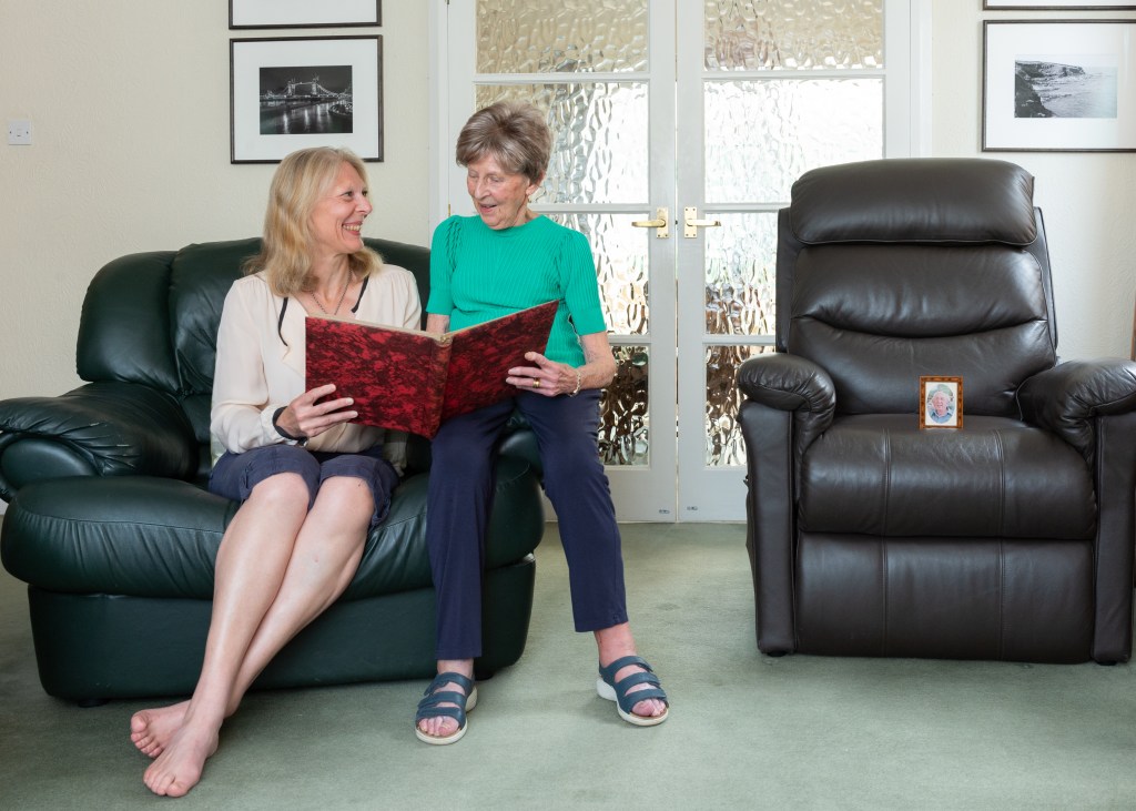
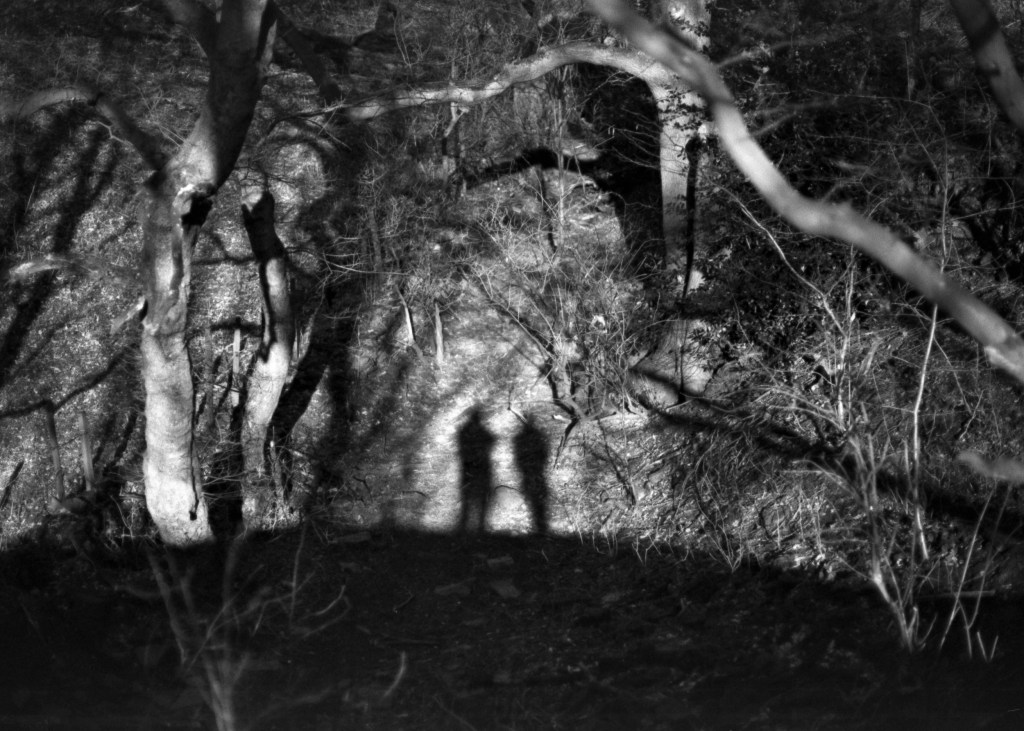
I chose my wife Jayne’s family as my subject because when we met, there were just three close relatives, her parents and uncle. The family is now just Jayne, her mum Hazel and me. The audio interviews recorded by my father-in-law with his parents started me thinking about familial relationships and visual similarities that photographs document over time.
My approach was to talk through my idea with Jayne and Hazel ahead of a visit in August. I suggested spending an afternoon looking through the family albums to find pictures that could be incorporated in the compositions ,and then shooting the following day. The images weren’t a collaboration in the same way as in part 3, as we had a relatively short period of time for the work. Seeing the old photographs invoked emotional reactions in them, which led to them being distracted. This needed to be carefully managed. They had both volunteered to support me with this, which led to my not pushing for any decisions or answers on a particular idea, choosing instead to let that first afternoon flow. When it came to the shoot, the first challenge was their preference to be directed. I found that I had to just throw out ideas as alternative to instruction, as I wanted their poses and interactions to be as natural as possible. Secondly, Hazel wasn’t feeling all that well, and it was obvious at the start that she only had limited patience for the shoot, being in discomfort. I understood the need to keep the shoot moving along so that she could rest in between compositions.
Overall, the shoot was successful as I believe the images represent what I set out to reveal. The working dynamic was interesting, as both women are used my camera. Although this made consent easy to acquire, Jayne pointed out a nervousness of committing to it formally. Perhaps that highlights the difference between perceptions of the role of family member and photographer. There was definite trust that was brought to the session, firstly that the images would be aesthetically respectful, and secondly that I would discuss any deviation in the intent for the work. For example, I didn’t want to represent Hazel as a stereotypical widow but to make the point that Bryan was no longer with us. The last two images involved open discussion about that intent. Interestingly, I have yet to share the work beyond the OCA group, my reluctance being about inviting the public into my family circle. As a private person, balancing the role of documentarist and proxy subject was definitely a challenge.
The work in part 4 has influenced the way I’m thinking about my SDP, in particular Mitchells’ subject interviews and the idea of dynamic ‘agency’; the review and re-work process that needs a strong connection between photographer and subject to be successful. My SDP has already built fledgling relationships with my portraiture subjects, which are yielding a greater understanding of what the LGBTQ+ community struggles with every day.
Reflect on and summarise the ethical considerations of the case study (150 words) andpost this to your learning log.
Reflection
McKinney raises the problematic nature of photographing outwardly private people, against a backdrop of homophobic perspectives on domestic life, perpetuated by Sontag’s blood family. We see how consent, first implied in the posed portraits, is questioned when Sontag became perceivably too ill to comprehend being photographed. All evidence points to her tacit understanding of pictures having distribution as their primary purpose, so how do modern sensitivities around privacy and respect for the dead influence our view of art? A point is made that family see themselves as the owner of a loved-one’s posthumous representation above all others, this case including Sontag’s 15 year romantic partner. Core themes of ‘disrespect’ run through criticism of Liebowitz, possibly because her photographic craft often transgresses perceived decency, but also because of her gender and sexuality. The piece highlights the strength of family influence, and how this must be considered in the context of gaining, and maintaining, consent.
Make a small series or piece of work that responds to your theme, supported by the activities, reading and research you are doing into different genres.
You should experiment with producing different sets of images to explore your idea(s). You will need to add evidence of your work to your blog.
You should show your process, investigations, and your thinking through a combination of contact sheets, reflections, exploring the presentation of different combinations of images and reflecting on these different outcomes.
You should evidence your reflections on reading and research as well evidencing your engagement with the suggested course materials which will support your study.
You might explore ways of combining your genres – to find overlaps and ways of merging the genres together into something different and new. You might also develop work that challenges a particular genre convention and produce work that plays with the audience’s expectations.
You may decide to produce a set of images for each genre and then put a selection of the images together to explore the narrative that may be created across genres in combination.
Introduction
During the previous projects I identified a broad theme that has many potential projects that could be developed from it. My interest in communication, how it has changed and how people respond to it, resulted in my shooting a number of experimental photographs. These images were not centred on a single narrative, instead covering a number of areas. Nor were they rooted in a single genre. In parts 3 and 4, I deliberately selected source texts that covered the genres that are particular to my general theme, but have concluded that the active use of multiple genres within a body of work can be both powerful in shaping the narrative, but also more provocative in how the viewer interprets them. For example, the use of portraiture to can be used to challenge a cultural stereotype, even thought the series may be about a landscape, whether literal or geo-political. Landscape or still life images create the sense of place, but the portraiture invites the viewer to understand that place as seen through the eyes of its people. They are stitched together using the photographer’s observations either as part of the subject, or as an observer and it is this that can drive the way the genres are used to tell the story.
Approach
In my experiments, my perceptions of the changes in communication were driven by a middle-aged perspective, but one that worked in engineering and technology for many years. I have mixed feelings of embracing technology. It has to relevant to me and I need to understand. I tend to reject areas that are aimed more squarely at people younger than me. I also have elderly family members, for which communication technology is like a completely foreign language, which gives me an empathy with those who cannot work with it. The other area of my personality that was revealed by thinking about this theme, was my sense of compliance and order. I was brought up to follow the rules and to an extent that makes me compliant. It’s when I know that something doesn’t makes sense, that I rebel against what I consider to be ‘petty authority’. I acknowledge that this is why I’m drawn to artists like Martin Parr, Nan Goldin, Garry Winogrand and Robert Mapplethorpe, all of whom pushed back about strict ideas about expectation, fun, love, relationships and towing the line.
For this assignment, my approach was to take the narrower themes of ‘rebellion’ and ‘subliminal communication’ and curate two brief series from my experiments.
The starting point, an unedited collection of experimental images can be found in this Padlet:
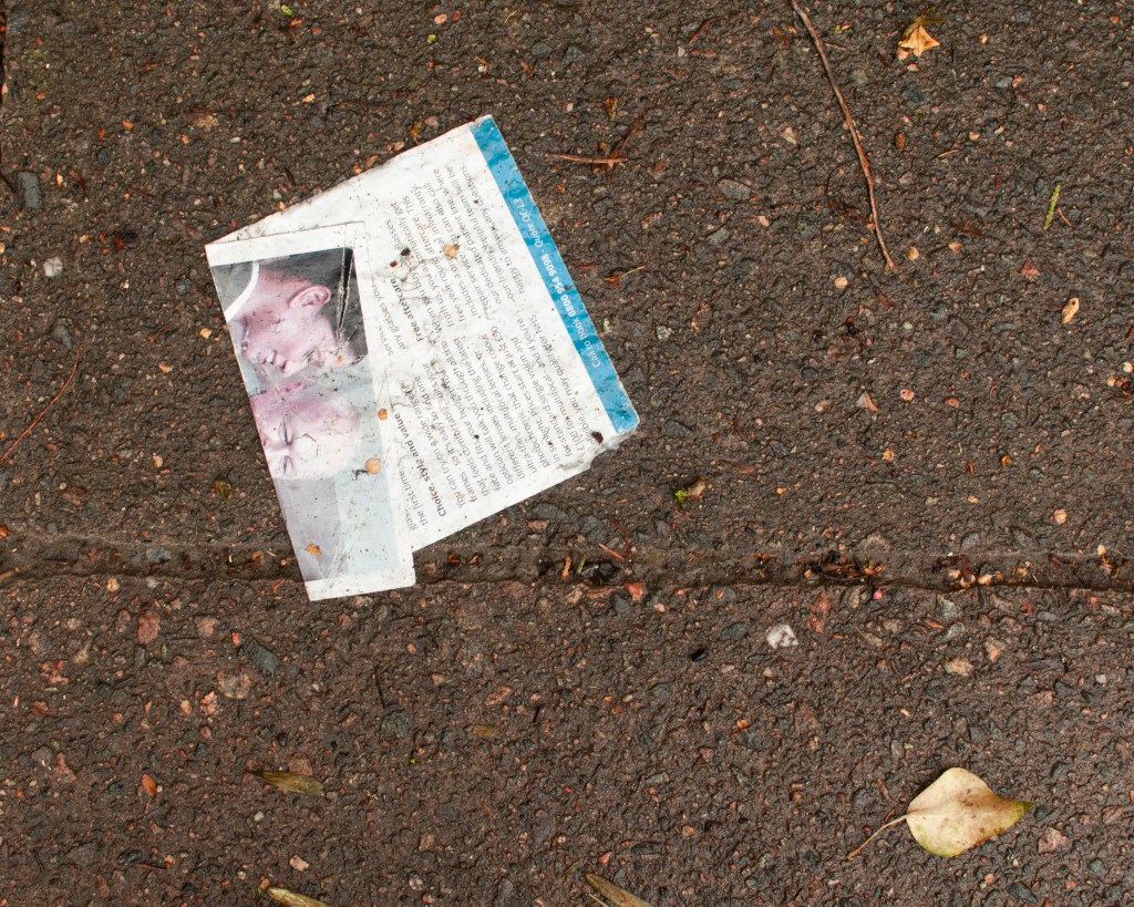
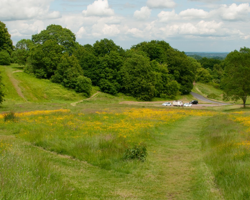
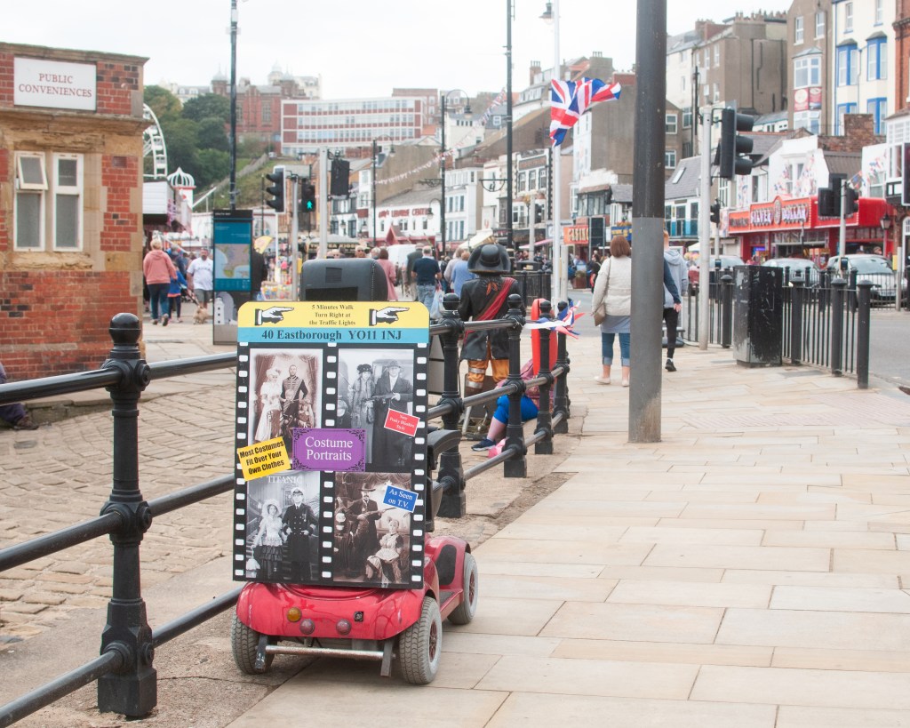
In these series, the images work across the documentary, landscape and still life genres. We can say that because the obvious visual conventions come through in the images. The documentary images say something about the people and place, through observation of behaviour or previously established norms. For example, the small boy defying the traditional autumnal weather conditions at the seaside in My Way, speaks to the British attitude to their climate – if it isn’t thunderstorm or freezing cold, why not run around in your swimming costumes? The visual elements of that image firmly establish where it was taken, how bad the weather was and the contrasting attitudes of young and old. When it comes to the landscape images, such as the mown pathway in Why Not?, we have traditional ideas of foreground, mid-ground and background. There is land and sky, as well as a path leading through them. With the still life images, the elements suggest meaning through their placement, such as the discarded flyer shot in My Way. These conventions are apparent in my work here, but they do not define the way the images work as a series. Indeed, I didn’t set out to shoot within a particular genre, but instead wanted to explore a theme that speaks to our adoption of technology within the culture that I am part or, how we take cues from what we see and, sometimes, disregard what we are being told. When looking at this single-sentence description, it’s not easy to see a single genre that covers how it should be represented. We are left with considering how impactful a genre might be in creating a narrative. For this, it’s easier to see how I curated the both series from my experiments.
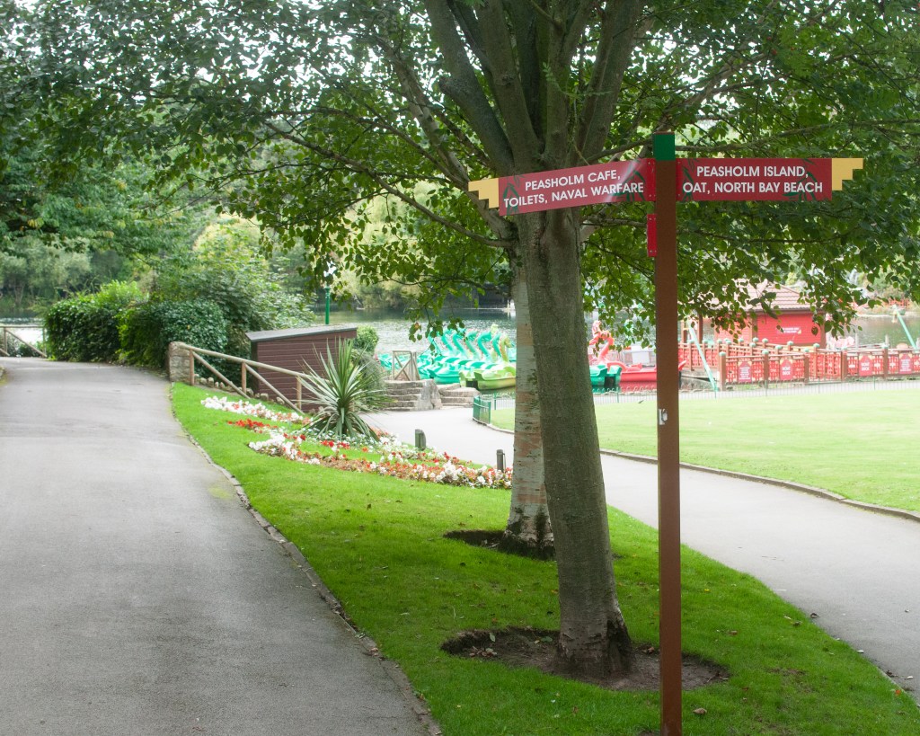
For example, Image 4 in Why Not? is a landscape with a sign pointing towards two paths. There are indications of the presence of people having been in the place (the garden, the damage to one of the signs etc), but there are no people in the frame. The image is highlighting the assumption that the viewer understands that there isn’t actually some ‘naval warfare’ going on, that the sign didn’t have enough space for the word museum or memorial. As a stand alone image, it suggests something that we can’t really place in the context of the town and its people, because there are few identifiers or ways to connect with it. However, when we add it to Image 3, which adds a documentary element to what is also essentially a landscape, we have much more information to help create the narrative. Now we see the disabled buggy, the old-style public toilets, the flag etc. We get the sense of a classical British town as a concept, as well as the ‘that’ll do’ element of its people (the use of the buggy as an advertising billboard). Perhaps the buggy goes around the town as a mobile advertising board. On its own, landscape part has impact, but when combined with the conventions of documentary, it’s increased. I had inadvertently crossed two genres with these two images. The series also include still life in some of their compositions.
When considering artists and works that fit within a single genre, I see a more tightly focused idea being explored than mere observation of a response to communication. For example, Trish Morrissey’s recreation of her family archive in her series Seven Years [1] transports the artist to a time in her family history. She plays the part of her parents and others in the fashions of the period, alongside her elder sister. The series not only crosses history, but also revisits the situational tensions of the original images through their adoption of body language and the micro-expressions contained within any family portrait. Morrissey doesn’t venture outside traditional portraiture because the source material for her exploration doesn’t. The genre unifies the concept behind the family portrait – it’s a picture of a person or people, everything else is the underlying narrative about the situation. We learn about the characters through her acting, in a similar way to Rosy Martin’s performance as her mother in Getting Changed [2]. While both artists’ work sit largely within the portraiture genre, they directly challenge some the traditional concepts that the genre is associated with, namely the faithful representation of a real person. As with other artists such as Cindy Sherman and Francesca Woodman who used themselves as performance ‘canvasses’, both Morrissey and Martin use their pictures to comment on generational differences, personal experiences in their growing up and the memories invoked by life events. All of these are a far cry from the use of portraiture to identify (passport) or classify (August Sander).
The works of Martin Parr, Anna Fox and Chris Coekin heavily influenced the curation of my own series above. These artists use different genres to highlight or ‘zoom into and out from’ a cultural idea or setting in a way that punctuates the wider series. Parr’s From The Pope to a Flat White (1979 to 2019) [3] mixes staged portraiture with street photography (a sub-genre of documentary) and the occasional still life under the banner of documentary to show how much the country has changed over many years. Similarly, Fox’s Work Stations (1986 to 88) [4] mixes the conventions of portraiture, street photography and urban landscape to create a mock news article about corporate finance. The series invokes the memories of 1980s Britain and the post-memory associated with the cultural and political landscape of the time and, more importantly, how it ultimately led to failure. Coekin’s series Knock Three Times takes a similar approach to working class culture in the face of political turbulence (studied in Exercise 1 [5]. All three spent time within the environment as observers and represented their experiences both past and present, using whichever visual style suited at the time. In my experiments, I was looking for example of my theme in action but it was in the curation that I selected which images had the biggest impact. Like these artists, I used crossing genres to make a point if the visual impact of the series was enhanced in some way.
Conclusion
This assignment is the culmination of the research from Parts 3 and 4 of the course, which started with identifying a broad theme, developing some more focused ideas from it and mapping them onto the concepts of genre and the artists who have worked with similar ideas. When it came to Part 4, the research was focused on how landscape has evolved from the traditional picturesque to the ideas of power, ownership and the symbiotic relationship between man and the natural world. Artists working in this area were creating landscape as we know it, but using the visual codes of the other genres to make their point about the subject. At this point, I struggled to recognise landscape as a pure genre. If Sibusiso Behka’s night-time images of his district of Joburg were landscapes, how come they contained people living their lives as principle subjects in the compositions? When it came to the other source text that I examined, Backwards and Forwards in Time, the works were blended by including images that were recognisable as having the visual codes of all the genres. The meaning of the works themselves came across, but not in a way that favoured any one of them. After reviewing and curating my own experiments into two mini series, I realised that genre wasn’t what I was particularly cognisant of when shooting; like some kind of automatic pilot. What was important was to create the context and narratives for the theme with whatever got the point across with most impact. I observed the artists that I had been researching as having drawn attention to a detail of their story or setting a scene/establishing a location for the work, by crossing into still life and landscape, but all the time maintaining the conventions of documentary for the whole series. I conclude from this that genres, while a way of classifying an image or series, actually don’t define them in terms of meaning or relevance to wider context. We don’t look at the works of Ansel Adams as excellent examples of a genre, more that they capture and represent the beauty of the natural world. We could equally represent that same beauty through an image of a flower or some wildlife, but the common thread through both works would be our intention, rather than the genre that we used. I recently read Stephen King’s latest novel Fairy Tale (2022) [6] whose plot explores the tropes of traditional ‘fairy tale’ folklore. We recognise the genre as being fantastical stories told to children in schools and before bed, but we associate King with the genre of horror fiction. Of course, we know that the origins of many fairy tales are in classical stories by the likes of the Grimm brothers and H. P. Lovecraft, whose writings were more akin to horror than children’s fiction. What King recognised in his latest work was the connection between the two and, more importantly, the common themes that can be represented by both, such as the repercussions of trusting the wrong person or making a bad decision, the dangers of avarice and ill-treatment of others etc. With photography, we can represent ideas like ‘delusion of grandeur’ by creating a mise-en-scéne composition, shoot a self-portrait as someone else (Sherman’s Centrefold) or capture a still life that invokes some form of post-memory (Martin’s Too Close to Home). For me, how we use genres beyond being comfortable with the the ability to identify visual codes, is pretty irrelevant to creating art.
My conclusion isn’t firm, however. I still have questions about how we decide what makes us comfortable. In Colin Pantall’s presentation The Way We See, How We Look and What We Show [7], he refers to the image below as a landscape.
Périphérique. (Mohamed Bourouissa, s.d.)[8]
While there is a landscape element to it and, while we know from the rest of the series that this is a place which is contested in terms of cultural ownership and racial dominance, I didn’t seen that when looking at this image in isolation. I saw it more as documentary (despite it being a staged photograph), so what is it what leads some to see one genre when others see another? I will be using this as the question to answer in Part 5.
LO1: Compare the theoretical features, characteristics and histories of different photographic genres.
Completed research into landscape and documentary within Exercise 1.
LO2: Deconstruct a given genres’ conventions and create visual material informed by that knowledge.
Reviewed and updated experimental images from Part 3.
LO3: Produce new visual work informed by your research.
Created two stand-alone series derived from my broad theme of Communication; one about how people rebel against communication that is forced upon them and the other about subliminal messaging that we acknowledge but don’t think about or recognise as having an impact on us.
LO4: Analyse the wider global contexts surrounding contemporary image making.
Examined how genres are crossed by contemporary artists who use the visual codes from each to create blended narratives. Discuss my thoughts on whether genre is useful for anything other than labelling what we recognise.
In this post, and the accompanying Padlets, I revisit two of the sources texts in more detail. My broad theme of Communication was explored in the context of the genres of Documentary and Portraiture in Part 3, because at first glance the ideas of the history of culture, technology and identity was felt to fit naturally within them. In this project though, the ideas of how landscape is both defined and affected by mankind, as well as the inverse impact on our behaviour are presented. This offers a whole area to research, starting with Source Text 1- Colin Pantall’s lecture on The Way We See. As I have been considering how my theme could become a focused project, I’ve thought about cultural perspective and the potential audience for the series. When reading the source texts, the other work that stood out to me related to ideas of representation, being inside the culture or observing it. This picks up on the ideas of Insider/Outside that Martha Rosler discussed in her work in the Bowery district of New York. Chris Coekin’s work Backwards and Forwards in Time is the second Source Text discussed here.
Colin Pantall – The Way We See
During the course of the lecture, Pantall poses a series of questions. I’ve condensed them into a single question for each section of the lecture in order to address them here.
How are maps used now and how, if all, do they affect how we experience a place?
When considering a beautiful, picturesque or sublime landscape, are there any problems with tending to the beautiful?
Does the wilderness still exist and can a landscape be tamed by the photographer?
How can photography be used to record the changing landscape and is it capable of driving real change?
How does a landscape make us feel and what tangible elements are there that contribute to this comfort?
This source text covered a lot of ground, but the first and perhaps most obvious lesson was that the landscape is something actively defined by the viewer, rather than being something that generally surrounds us. Landscape as a photographic construct says much more about the environment and culture of a region `than just what is contained the aesthetic. When considering place, we use technology to inform us both how to travel and what to expect when we get there. The former is the rise is popularity of digital maps such as Google Maps and Google Earth. The latter is provided by the shared experiences of others through review sites and social media. Where traditional maps told us about what was important to our national identity and culture, we have the rest of the internet to use for the same research. Our ideas of what a landscape looks like come from the picturesque imagery that is produced as a byproduct of tourism and aesthetic visualisation by some photographers. It makes us want to seek out the views that we are presented with so that we might have that same experience. In the case of Jacqui Kenny who suffers from agoraphobia, the artist uses the millions of available snapshots available as part of Google’s Street View to explore places that are not physically accessible to her. The photographic process is more akin to curation as Kenny suggests [1], but in a way the process she uses to review the images is akin to being present in the scene. She is a cold observer, able to draw her own conclusions about the environment and its people by incorporating the appropriate visual elements to convey some form of meaning from her work. Her work tends away from the traditional notions of aesthetic beauty in favour of some statement about human life in the landscape, which is more in keeping with the New Topographics ideas of the 1970s than with the early landscape photographers. This movement invoked as sense of irony for me about Ansel Adams. In his quest to capture the beauty of the wilderness and protect nature, Adams actually contributed a cultural idea of what wilderness was. The creation of the national parks in the US had the effect of preserving an aesthetic idea of wilderness, while inviting people to go visit. This explains the complexity of the definition within The Wilderness Act (1964), which sought to appease both sides of the argument over it being purely natural or influenced but culture. The proof that Adams’ was applying his own ideas to landscape comes from his production of thousands of different prints from a single negative. In the example of his famous Moonrise, Hernandez, New Mexico(1941), the emphasis of the elements in the composition changed from early to late prints. The acknowledgement that man changes the landscape led to the rephotography projects that set out to highlight the negative side of our existence. Photography is used in this case to document the damage, but also on occasion, the progress – Sebastio Salgado is the notable example with his ‘rephotography’ of his rainforest reintroduction project. In other cases, such as Nick J Stone, rephotography documents how things can be redeveloped. His Ghosting History images show us how things changed after the Second World War, but in a way that is familiar to us. Familiarity is one aspect of our comfort with the landscape that is inextricably linked with our identity. In Britain, the recognition of a street that hasn’t changed that much since the war, but has overcome the damage in the overlaid photograph gives us a sense of comfort. Comfort is associated with well-being and while the idea of the natural landscape being peaceful and somehow nourishing is well established, a city landscape or a space that creates strong memory and postmemory is equally comforting.
The interesting learning from this source text is how landscape connects with ideas of identity and the human experience. The former is something we would traditionally associate with portraiture, while the latter is more closely linked with documentary. In both cases, the exploration of how the landscape is theoretically and physically formed by our need or desire from some ‘value’ has led to explorations of our own behaviour. Whether the documentary of potential resources as with Timothy O’Sullivan or the way an urban district takes on a sublime feeling in Sibusiso Bheka, the relationship between man and landscape remains at the heart of photographic practice.
Chris Coekin – Backwards and Forwards in Time
This source text took the form of a Padlet that describes Coekin’s background, influences and three of his works, Knock Three Times, The Hitcher and The Altogether. I’ll be exploring his works and the connections to his influences, both historical and contemporary.
As the title of his Padlet suggests, Coekin’s work explores the traditional ideas of class culture through a number of documentary series. He achieves this by exploiting the main visual codes in each of the major genres to produce work that spans them all without drawing the viewer’s attention to any particular classification of the images. What is most interesting to me is the use of candid and staged portraiture, the former being akin to the snapshot that has been perhaps the most popular use of photography since its invention. We all recognise the style of the snapshot; the lack of direct engagement between photographer and subject, the use of flash that appears to be difficult to control with it’s washed out highlights and dark shadows, and the subject appearing to be ‘doing something natural’. In his use of snapshots in Knock Three Times and The Hitcher, Coekin introduces a sense of being an observer. In the former, his images capture the members of the club chatting, drinking and even leaving their gathering. Coekin is watching, rather than taking part. On image of a man urinating provokes the viewer in thinking about this voyerism; such an image would not be something most people would consider shooting as it’s an intrusion on a private moment. It contrasts with a similar image in Nan Goldin’s Ballad of Sexual Dependence (Goldin, 2012, p.74) which, apart from being far more explicit, reveals a definite connection with between artist and subject. The other style of portraiture in Coekin’s series’ are posed or staged. In The Hitcher, the artist asks for a staged portrait of the people who picked him up while hitchhiking. These pictures provoke a variety of emotions within them, ranging from the appreciation of being noticed for the act to the discomfort at the highlighting of the deed. In some cases, the artist’s direction can clearly be seen as with the image analysed in the Padlet. However, this is most evident in The Altogether, which is stylistically similar to the work of August Sander. Where Sander was looking to document people and their professions, Coekin’s work is more contradictory to the stereotypes of the working class factory worker. They appear in combative stances, comradely group shots and with iconic ideas of struggle factored into the pose. For me, the combination of the two styles of portraiture add to each other, much as in Larry Sultan’s Pictures from Home. However, I get more of a sense of exploring the artist’s feelings about their own experiences from Coekin’s series’, particularly in The Hitcher, where he places himself in the centre of the story and explores modern society’s view of the age-old tradition of hitchhiking. In all of the works here, Coekin uses his own experiences to influence how he represents the subject, but achieves this by being both participant and casual observer through his use of portraiture. The series’ also include still life, which Coekin uses to punctuate the narrative. In Knock Three Times, we see the elements that characterise the idea of a working men’s club (drinks and empty glasses, snooker tables, beer mats etc), but we also see traces of the people who were using them. In The Hitcher, the still life images of discarded items at the side of the road, speak to the current state of our environment and infrastructure. In one picture, a dead rabbit is shown between the kerbside and painted line of a road. The animal is arranged as if viewed running, while the line has an imprint of a vehicle tyre in its surface, likely made when the paint was still wet. The image’s potential narratives about the threat to wildlife caused by the roads, the way it should have been ‘safe’ where it was and the correlation with the dangers of hitchhiking are palpable. In one picture we see the fact that countryside is a dangerous place and that the romantic idea of wandering the roads doesn’t necessarily translate into modern times.
Conclusion
In conclusion, there are a number of key points to consider from these source texts in terms of my own work. They are:
How we see the landscape is very much driven by both our place within and our perspective on what is happening to it. We might recognise cultural or historical significance to an aspect of landscape, how it has changed over time and concern for its future. These are strong drivers for how artists and photographers represent landscape.
A landscape can be defined by its people in a way that doesn’t, at first glance centre on the landscape. For example, an image in Mohammed Bouroissa’s Périphérique that is described in Pantall’s lecture, is referred to as landscape despite the main subjects being the people in the frame. The region in Paris where the images were set, has gone through significant cultural, racial and economic change which Bouroissa represents in a series of mise-en-scéne photographs. This question about how an image is identified within genre is something I want to explore in Part 5 for the critical essay.
In a similar way to 2), the work of Sibusiso Bheka highlights another aspect of landscape in its treatment of an urban environment at night. The behaviour of the people and the way the images are lit by the artificial light coming from houses etc, all serve to create a sense of the sublime. Where sublime landscapes tended to centre around the alluring threat of the natural world, Bheka’s pictures drop the viewer into a potentially dangerous, yet fascinating night scape.
Within the portraiture genre, the methods for making pictures vary along with their interpretation. Snapshots and staged portraits combine well in Coekin’s and present the viewer with a perspective driven by the artist’s connection with the subject, as well as an detached observer.
Including still life in a series can add a form of punctuation to the narrative. In the case of Coekin’s work, the still life adds the situational information, whether supporting or challenging a known stereotype such as the working classes.
This has been an interesting exercise in terms of seeing how the visual codes from a genre aren’t always read a certain way, how our own identity affects how we might represent a subject and how the technical approaches within a genre can be used to achieve different, but interconnected meanings.
The main focus of Project 4 is developing your own work. In support of that activity, use the Source Text and Case Study examples to further your practice and research as you develop your understanding and awareness of complex boundaries of artistic practice and research themes and genres.
Start by browsing the four sources below before returning to two of these in more depth.
The Source Texts – Notes
Part four introduces us to source texts that deal with the changing perspectives on landscape and how it has historically been represented, as well as exploration of our identity within the world. These are inextricably linked in the work of the artists and critics in this section and the first thing to note is the absence of boundaries between the genres exploited to tell these stories. In Colin Pantall’s Ways of Seeing, there are recognisable landscape photographs that obey the conventions of the beautiful, the picturesque and the sublime, mixed with a documentary and even ‘still life’ style such as the work of Ester Wonplon. Her series explores the threat to the glaciers caused by climate change in a mixed media presentation.
(ESTER VONPLON_Nuit de l’Année 2015, 2015)
Her theme is one of documentary in the traditions of the advocates of the early 20th Century. She highlights the impact of human behaviour but set against the specific backdrop of the landscape. Pantall discusses the move away from straight representation of the landscape with the New Topographics exhibition in 1975, which focused on more man’s place and influence on it. The aesthetics were significantly different, but the ideas were important because they now started to associate our identity in terms of the world around us. When we consider these additional elements, such as buildings, telegraph poles etc, we can connect with the idea of an object’s impact on the landscape. Artists are able to blur the lines between the landscape genre and still-life in order to say something that is inherently documentary. With Wonplon’s series, the sheets of fabric used to reflect the sun’s rays and keep the ice cool, are themselves treated in some frames as still life. The images become more about the futility of the idea, with the frayed fabric suffering from the environment that it is being used to protect. It speaks to the desperation and arrogance of man; that the impact of human behaviour could be restricted once the damage has been done.
In Sibusiso Bheka’s At Night They Walk With Me, the artist explores the evolving landscape of his home town of Johannesburg, viewed at night. He brings perceptions of the streets and neighbourhoods from his childhood into the work, revealing how areas take on a different feeling to the daytime, how the people behave towards each other etc. The idea of a landscape shaping and being shaped by people draws on the conventions of portraiture and documentary in the context of observation. The work invites the viewer to appreciate the sense of community after hours, while making it clear that the progressiveness of Joburg, and it’s continuing battles with poverty and crime, still has a long way to go. Some of these themes are also present in the other source texts, but I’ll be returning to this specifically in Part 2 of the exercise. In Stacey Tyrell’s Self-Portrait and the Colonial Gaze Padlet, the artist explores the preconceptions of her origins as seen through the eyes of a black girl growing up in a predominantly white region. She looks at how her ancestry and DNA comprises a significant mix of European and African ethnicities, but she was never comfortable or culturally expected to celebrate her non-black origin. Her self-portraits take their cues from traditional painted images of white icons, with her playing the white part using make-up. The questions it raised with me were around appropriation, hers in playing the part of another ethnicity (much like Nikki S Lee, who Tyrrel cites as an inspiration), but also by society. We associate world regions with races in a way that is rooted in history, or more importantly the documentation of history. Black people are associated with Africa and the Caribbean, and white people, Europe etc. Even though the modern world has a greater understanding of our mixed origins through DNA technology, these associations are almost as rigid as those for the portraiture genre itself.
In Chris Coekin’s Forwards and Backwards in Time, we see an exploration of identity from within a community, where there is an ideological bubble around its people, as well as an observer of where a community sits within the grander idea of British society. Coekin’s inspirations are artists who have taken an idea of how an area of society lives or is expected to behave, and both celebrates and challenges those stereotypes. I was particularly drawn to Case Histories by Boris Mikhailov, which explores the effects of the break up the USSR on the people of Ukraine. His images contrast the progression of capitalism and the idea of prosperity away from the Soviet regime, with the destitution, poverty and abuse of the disaffected. The photographer invites the viewer to see the people through their obviously desperate circumstances, even paying them to strip nude to make the point. His pictures don’t create a sense of poverty tourism however, but instead document the fact that they exist in a society that generally dismisses them. This work is even more poignant with the present day conflict in Ukraine, leaving the viewer wondering what might become of these people in the long term. In Coekin’s own work, he explores a variety of societal constructs, including the working class and the idea of free roaming in the UK. I’ll be looking at his work more closely in part two of this exercise.
In the final source text, Andy Hughes explores the human impact on the ocean environment with his series ‘Dominant Wave Theory’ about plastic pollution. The images are still-life, taking their cues from momento mori, defined as:
…a Latin phrase meaning ‘remember you must die’. A basic memento mori painting would be a portrait with a skull but other symbols commonly found are hour glasses or clocks, extinguished or guttering candles, fruit, and flowers.
(Tate, s.d.)
Closely linked to Vanitas, which was the sub-genre of still life painting that looked at in Assignment 2[2], the idea of remembering our mortality comes through in Hughes’ images, where the scale and position of the objects within the frame give the viewer nowhere else to look. With each image, the object is made to represent something different from what it actually is. An example can be seen below:
Sandwich, by Andy Hughes (2003), (dominantwavetheory, s.d.)
In this picture, a discarded sandwich wrapper rises from the floor like a mountain. Its appearance resembles the classical representation of mountains, in particular the iconic view of Mount Fuji in Japan. The use of shallow depth of field gives the sense that the object is being viewed from far away, which further enhances the illusion of the wrapper being transformed. The image utilises other visual codes that suggest that no good comes from this plastic object, namely the black backround from which it is revealed. The suggestion here is that at some point, there will be nothing else other than plastic in the natural world. The wet surface suggests it being impervious to the elements, which predicts the fact the object will not degrade quickly. All of these things serve to shock the viewer back into realising that it’s just a sandwich wrapper, but that it could mean so much more if the human disregard for waste continues. Like the Vanitas paintings of the 17th Century, the use of simple objects as powerful symbols convey much more than they do at first.
Conclusion
In conclusion, each of the source texts use a particular genre to describe something about mankind, either on a macro level (our impact on the environment and attitudes towards it) or on a micro level (specific cultural behaviours and histories). For me, they are all equally effective but I found the use of landscape and still-life most interesting. There is a clear overlap between landscape and documentary within Pantall’s Ways of Seeing, which I intend to explore further. I was also drawn towards Coekin’s combination of portraiture and documentary, which is an area I touched on in Assignment 3, but need to investigate in light of my feedback from that work.
Find words that have been written or spoken by someone else. You can gather these words from a variety of means – interviews, journals, archives, eavesdropping. Your subject may be a friend, stranger, alive or dead. Select your five favourite examples and create five images that do justice to the essence of those words.
You may choose to present your images with or without the original words. Either way, make sure that the images are working hard to tell a story. If you decide to include the words, ensure that they add to the meaning rather than describing the image or shutting it down. Try to keep your image-and-text combinations consistent – perhaps they are all overheard conversations on a bus or all come from an old newspaper report. Keep them part of a story.
Consider different ways of presenting the words. Audio or video might lend itself well to this kind of work, or a projection of images using voice-over. Experiment.
Inspiration
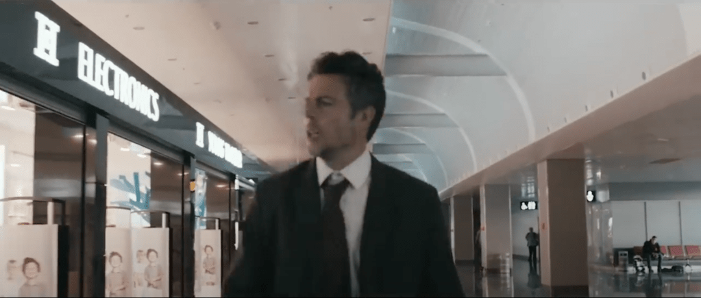
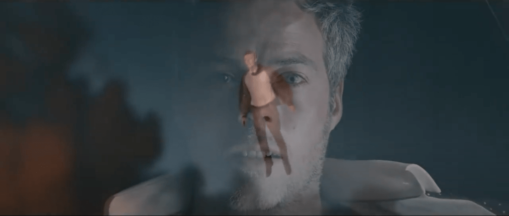
The inspiration for this series came from having recently seen the official video for a song that I’d heard playing in a cafe. The song is called ‘Let it Happen’, by an Australian band called Tame Impala. The song is about how some things just have to be accepted when there is no point in resisting anymore and it resonated with me because of the challenges of leaving work earlier in the year. We’ve already seen how art is open to interpretation, but the same is also true of music. Everything from the use of language to the singer’s inflections help set the mood and tell a story. How we interact with the story is up to us. I was surprised when I saw the video for the track, which depicts a stressed businessman running for a plane. On arriving in the airport, he collapses with what appears to a heart attack and is attended to by someone from the airline. However, he finds himself moving from one place to another, eventually ending up on a plane where all of the other passengers appear to be asleep. He hallucinates for a short while before the plane loses cabin pressure and his seat is sucked out into the sky. We then begin to see that he’s actually still in the airport with the staff desperately trying to revive him and it soon becomes clear that he’s died and the plane, falling chair etc is all part of moving into the afterlife. With the video and lyrics together, the song takes on a more sinister meaning that death we must accept, we must ‘let it happen’.
I wanted to play around with this song and its video by taking some of the lyrics, the corresponding frames from the video and putting them with my own photographs to try to tell the story. My images would be very different but contain enough contextual elements to be able to be read as a series with the stills from the video. The text would connect both together.
The Video
The full video for the track can be seen at this address:
“It’s always around me, all this noise”“Not nearly as loud as the voice saying “Let it Happen”[1]“A notion growing inside”[1]“All the others seem shallow” “I can hear an alarm”“Must be morning”[1]“Something’s trying to get out”[1]“and it’s never been closer”<instrumental>“I was ready, all along”[1]
Reflection
With this exercise, I tried to tell one story with two very different sets of images, distinguished by their different aspect ratios. The frame grabs from the official music video are in a cinematic 16:9 format, where my images are 8×10. In order to understand whether my images worked as part of the combined series, I deliberately mixed up the sequence so that it didn’t look in any way linear. Does it work?
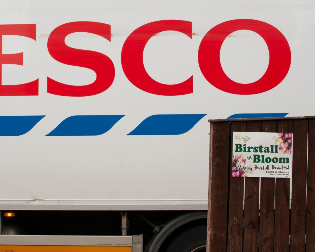
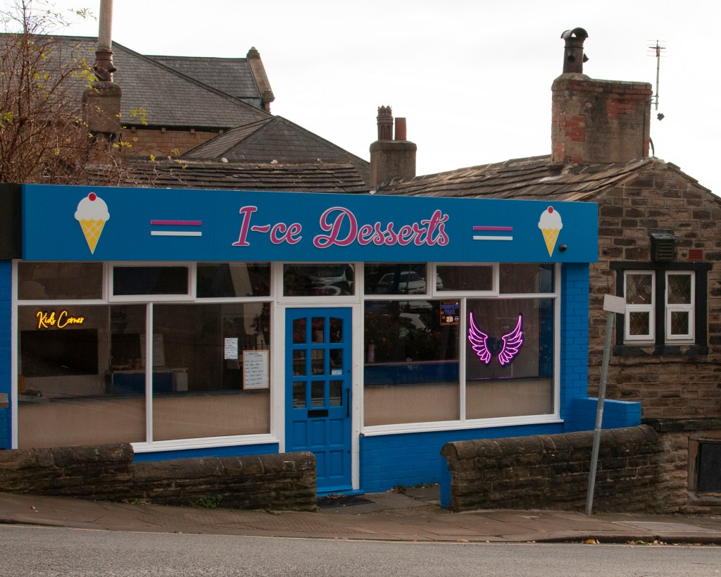
My images were shot around the area of Birstall, near where my wife grew up. The town has been consumed into the wider Kirklees district over the years and suffers from the same sort of socioeconomic hardship that is common in the former textile area of West Yorkshire. That’s not to say that there aren’t businesses or people thriving here, though. The town has a unique identity with some interesting aspects to it. I wanted to combine the sense of preconception about the area with the fantastical idea of the final flight to the afterlife in the music video. I used the lyrics from the song as relay text for my photographs and as ‘time markers’ for the frame grabs, i.e. what’s being sung when that frame appears. My photographs include metaphors for the sentiments in the lyrics, e,g. the tiny advert for Birstall in Bloom being dwarfed by the supermarket livery. There are also more obvious connections such as the angel wings in the ice-cream parlour window. In answer to my question, I think the images do work when complemented by the text because without the lyrics, the series makes no sense. I believe that if I wanted to expand a series just about Birstall, I would definitely benefit from some relay text to help put them into context. The learning from this exercise, and indeed Part 4, is that we can create a series of images without the addition of relay text, e.g Robert Frank’s The Americans[2], which uses the arrangement of iconic messages to establish the ‘story’ (Frank did use anchor text for each image title in the book). However, text is a very powerful way of either raising more questions about a work or helping the viewer create their own narrative within a bounded space. What interested me about this exercise is that the last frame grab from the video happened to be at the moment where one visual faded to another. This is something that video has as part of its construction in order to transition smoothly between shots. I was wondering how a collage of still images would work with the right relay text. This is something I may well explore in the future.
Create a series of work (aim for 7–10 images) which in some way reflects upon the ideas surrounding identity and place that you’ve looked at so far in this course. Use the written word to play a part in its creation.
You may be inspired by a poem, song or a novel or decide to write your own fictive piece. You may draw upon other people’s words via eavesdropping or another source or use extracts from journals. You might find interesting textual accounts in archives in libraries that could inform this assignment. Allow your creativity to be spurred on by spending time with these words and reflecting on them.
Be wary of illustrating your text with pictures and vice versa. Allow for the viewers’ interpretation to be opened up rather than shut down by the pairings. You may decide not to include the actual words in the final production; that’s fine, as long as they have in some way informed the research and development of the concepts and have pushed the imagery further as a result.
Write a short reflective commentary (around 500 words) describing how your chosen ‘words’ have informed your series of images and make this available to your tutor alongside your images.
Introduction
The ideas of using text and images to create challenging narratives had quite an effect on my from the latter stages of Context and Narrative, and on into Identity and Place in early this year. When I started this unit, I had recently left my job as part of a redundancy programme and the country was in its third national lockdown. Although not as restrictive as the previous two lockdowns, which were aimed at preventing a second spike in infections throughout the UK, there was a general feeling of “is this going to ever improve?” and “will we ever return to a normal life?”. A number of vaccines were being given to those who wanted them, but I was struck by how different the sense of feeling was in my town compared to the rhetoric from the government. I had the idea to explore these contrasting experiences at some point, either as part of this course or as a photo book project. However, the ‘project’ was put on hold during the Spring and Summer as I struggled to mentally adjust to my being out of work.
When I read ahead to this assignment during Part 4, I saw a way of revisiting my embryonic idea and see if I could create a series of images with text to explore the theme of ‘similar but different’; the similarity of message from our country’s leadership over time with against what I observed to be the mood in our little town. I started shooting as the course progressed, completing the set during this assignment. I decided to use quotations from the Government daily briefings over a specific period to act as the relay text for my contemporary images. When I started to read the briefing transcripts I soon recognised patterns in the messages, particularly in the very first 3 months of the first lockdown. Among the core messages to “stay safe” and “protect the NHS”, there were real stories of the impact of the virus and optimism for the future. My series would pair quotations with images to tell the story of the first three months through the lens of the past three.
The Photographs
I decided early on that I wanted a visual aesthetic that suited the time. I’ve been a film photographer for several years and was interested in using this medium to create a visual mood through its ‘imperfection’. I settled on a recently re-introduced film stock made by Ferrania called P30. Ferrania P30 had a difficult re-birth with hurdles put in their way by everything from outdated machinery to the Italian Government demanding that the factory pay to re-route a local river as part of the planning deal. Their story of conquering adversity immediately stood out for me. Better still, the film is a slow speed black and while emulsion that has a 1930s film noir feel to it (this is what Ferrania were originally famous for). To add to this visual, I wanted the whole series to have a dreamlike feel to them to reflect the time they were shot; it felt like we were living in a nightmare. I achieved this by using a special lens for my Leica M6 that has an f/0.95 maximum aperture which I shot for many of the photographs as wide open as possible.
Inspiration for the Series
There are many artists covered in Part 4 that inspired me when creating this series. David Favrod’s Hikari [1] made me think about how a simple conversation can resonate with the viewer and invoke not just direct memories, but also the mood and emotion of point in history. Favrod’s annotations varied from being added to the picture as a graphic to the use of titles, all the time helping the viewer create a narrative. I was conscious of how immediate assumptions that I made about the series were affected by the method used for including text. With the example of Baoummm, the image has a feeling of desolation without being able to understand the Japanese text is that is added to it. When we realise the title is actually a phonetical representation of the explosion, we get a sense of shock. That shock then ties in with the feelings of rejection that Favrod is exploring regarding his attempts to gain dual citizenship. The series leaves more questions than answers, an approach which is further exploited in Sharon Boothroyd’s series [1]. Now we have a conversation that isn’t directly quoted apart from in the series’ title. The title sets a baseline by which the series is observed and her careful use of tableaux allows the viewer to put themselves in the place of both central characters; the child and the father. Michals and Deveney were also influential in his use of direct quotations forming part of the image presentation. The inclusion of the ‘spoken’ words helped narrate without actually referring to any specific element in the photograph, as in Michals’ The Enchanted Bee. The final inspiration for this series was the essay by Barthes. His analysis of the symbolic messages within an image and the use of relay text to ‘control’ but not describe the narrative is the core intent within my series. I was intrigued by his example of the comic strip being driven by the incorporated text for expediency but working in partnership with the image to tell the story. Anna Fox achieved this with My Mother’s Cupboards… with the quotation being part of the image that is almost read first and separate from the partnering photograph. I would take a similar approach to my series.
The Series – Next Slide Please…
“Coronavirus is a powerful enemy, but I believe the power of human ingenuity is stronger. Every day the science gets better and we gather more information, we understand more about how to defeat this virus.”
Matthew Hancock, Secretary of State for Health and Social Care, April 2020“Last night, Her Majesty the Queen reflected on the national spirit of unity and resolve that we are seeing in our country, as well as the collective effort we need to tackle the disease. From our heroic doctors, nurses and careworkers, through to those manning the tills at supermarkets and pharmacies, those driving the lorries and the buses. They are all worthy of our applause, they are all worthy of our admiration.”
Dominic Raab, Foreign Secretary, April 2020“His mother and siblings are showing symptoms of the virus, and they were unable to say their final goodbyes at his funeral. In their despair, the loving, dignified tributes from Ismail’s parents are truly haunting.”
Michael Gove, Chancellor of the Duchy of Lancaster, April 2020“So I want to say this to anyone who has been finding it hard. These are tough times. It is OK to be not OK. And it is normal to feel low, anxious, or unhappy sometimes.”
Matthew Hancock, Secretary of State for Health and Social Care, May 2020“We can all play our part in the national effort, getting R down and keeping R down, and controlling the virus so we can restore more of the things that make life worth living.”
Matthew Hancock, Secretary of State for Health and Social Care, May 2020“We’re absolutely determined to defeat coronavirus, and also to defeat those trying to exploit the situation for their own nefarious ends.”
Boris Johnson, Prime Minister, May 2020“In spite of the tireless effort of our scientists, it is possible that we may never find a successful coronavirus vaccine.”
Alok Sharma, Secretary of State for Business, Energy and Industrial Strategy, May 2020“Across the country, office lights will be turned on and windows thrown open. Work clothes and school uniforms will be pulled out of the wardrobe. Shops and factories will start to hum with activity. As we enter this new phase, things will change.”
Rishi Sunak, Chancellor of the Exchequer, May 2020“And I want to stress one final point which may be relevant today as the weather threatens I think to take a turn for the worse. Some of you may be tempted to move the gatherings you’ve been enjoying outdoors, indoors, out of the rain. I really urge you – don’t do that”
Boris Johnson, Prime Minister, June 2020“Critically, we can make a change to the guidance on two metres, which kept us safe while transmission of the virus was high but which can now be modified.”
Boris Johnson, Prime Minister, June 2020
Note: This isn’t how the series is to be presented for assessment, but it is shown this way because of limitations in WordPress. The final presentation of this series is as an ebook, which can be found at this address:
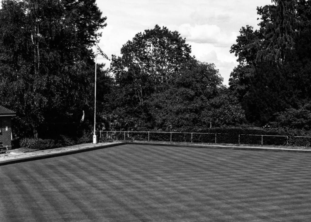
My intention for this series was to use quotations from the Government COVID-19 briefings as relay captions for photographs with metaphorical iconic messages. Reflecting on the series, I think the questions that each pairing raises and the possible narratives that they create, make it work well overall. The overall aesthetic of black and white ties in with how I was feeling at the time, which I perceived to be a similar experience to others in my home town. The sequence of the series also leaves the impression of déja vu with the text being from nearly a year before the photographs were shot. We learned previously that photographs do not describe the passage of time specifically but highlight the impact of its passing [3]. In this series, the captions clearly anchor the time of the statements being made and the images show how little actually changed during the intervening year. In the selection of shots for the series from the 70 or so taken, I deliberately avoided using straight images of people, instead choosing to use space as the metaphors for the people of the town and only including traces of them where they are seen (Four, Five, Seven and Ten). With a nod to the reading of an image as proposed by Barthes, the text included in the images themselves is kept to a minimum and in those cases, the words do not describe the rest of the photograph. Only in Seven does the word ‘Pharmacy’ actually refer to the decal of the woman in the abandoned building window. In review, I don’t find that where these signs exist, the impact of the images are strengthened over the photographs where they are not present. For example, in Two, the Queen’s comments about the nation pulling together is paired with an image of a bowling green with a union flag in the corner. When I saw this composition originally, I thought about the precise criss-cross pattern of the mown grass and how it reminding me of an order of people gathering, much like a regiment of soldiers standing before the flag. When paired with the text, that narrative was strong enough without needed any other signage relating to the bowling green being included.
The most impactful images for me are Three and Four, with the former having the desperately sad announcement of one of the first child deaths from COVID-19. The photograph came from seeing the empty playground which was naturally closed at the time and the rockers which featured a hedgehog as the point of focus. It resonated with me because I’ve been an active carer and campaigner for the plight of hedgehogs for the past few years and the fear that they might be extinct within a decade is of obvious concern. I like the way the text works to reinforce the narrative that nobody, including our children, is safe from the virus. In Four I saw the distorted reflection and the way that it cut the man entering the frame in half to be a metaphor for the effect lockdown was having on our mental health. In this case, the words offer reassurance that it is not unusual, but is ok to react this way, For me, this contrasting pairing makes the photograph work.
The two images that I think could have been a little stronger are Six and Seven, for the main reason that I couldn’t get a better position to shoot from. In Six, I wanted to emphasise the Orwellian conspiracy poster while still giving the impression of a small, vintage shop. The resulting composition was a compromise between making the former element bold enough that it could be read with including the other elements of the shop front. The same issue occurred with Seven, trading the smaller words ‘pharmacy’ and ‘drugs’ with the decal and the rest of the window detail. That said, I think there are still enough contextual elements to support narratives when combined with their captions, which shockingly refer to people criminally exploiting the impact of COVID and the admission that there may never be an effective vaccine. Both issues from 2020 didn’t really exist when we entered 2021 so I like the way they work with the contemporary images.
My main conclusion from this assignment is that I can see how far I’ve come in terms of telling stories with my photographs. The fact that I was looking for metaphors in the context of a project about lockdown and its impact on my community before I started thinking about the assignment, shows to me that my ‘process’ has changed. As Elina Brotherus said in her Q&A with the students of OCA[4], the curation of a project from themed photographs is where her creation of art happens. I feel that with this series, I took a strong set of photographs and turned them into a commentary on the different experiences of a shared crisis like COVID, by using rhetoric being broadcast at the time. When I reflect on the series, it invokes a cultural post-memory of the radio broadcasts that were put out by Pathé and the BBC during the Second World War. The experiences of the people listening were far different from the perspective of the country’s leadership and some of the general ideas of giving reassurance, encouragement and ‘stiff-upper-lippedness’ still resonate us today.
Against the Assessment Criteria
Demonstration of Technical and Visual Skills
The photographs were shot with a view to creating a visual aesthetic that reflected my mood during the more recent restrictions caused by the pandemic. I deliberately used a high contrast film stock previously used in early black and white cinema, and a lens that creates a dreamlike visual to further emphasise how unreal the experience has been. All of the images are composed to emphasise the contextual elements that support narrative creation, while reducing unnecessary clutter. The exposures are all as shot with the only post-processing being slight contrast enhancement to compensate for the scans, cropping and dust removal.
Quality of Outcome
I believe the images are of good quality and are visually pleasing. This course has taught me to let go of my reliance on seeking traditional ‘technical excellence’ at the expense of what the photographs are trying to say. For example, these shots are not razor sharp because the lens doesn’t allow for that when shot wide open – this was intentional to create the visual. When paired with the text, a variety of narratives can be created from the pictures, but within a construct as indicated by Barthes’ treatment of the symbolic message.
Demonstration of Creativity
I have had feedback from those who have seen this series to that they needed to study the pictures carefully and for a significant time to get their own sense of meaning. They agreed with the mood that the images have though, which I take to meaning that the series meets my intent for answering the brief. My choice to experiment with chronology within the series by using quotations from the previous year helps to reveal that ‘not much has really changed since the pandemic began’. As indicated in my Reflection, the series invokes post-memory of the broadcasts from the leadership and Royal family during the war, which contrasted in many cases to the experiences of the people living with the day-to-day impact. I feel that this series represents my most creative work to date in both the photography but also the curation of the images with the challenging captions that go with them.
Context
I was inspired by the duality of Favrod’s work where the images are often obscure, stark in the way they are shot and could have a wide variety of interpretations without the accompanying captions and annotations. When they are included, the series really does relate his grandparents verbal commentary with his own personal struggle with identity. In my series, I only included traces of people, for example graphical representation (the decal), in in reflection (Four) or Shadow (Ten) rather than making this a portrait series. I was inspired to do this by Favrod’s fantastical representation of people in his images, e.g. with the watermelon helmet. I believe this series takes its inspiration from the work of most of the artist in Part 4.
We are introduced to a number of artists who have used conversations or discussions to describe or invoke memories. As we learned in Part 3, memories can take the form of our own past experiences, those passed down through generations or even those that are created by a major cultural event such as The Holocaust or the assassination of JFK. The phrase “Do you remember where you were when…?” evokes memories that may not be our own but are our acknowledgement of what happened and the cultural circumstances that gave rise to it.
David Favrod (1982 -)
In his work Hikari (2014), Favrod addresses a single conversation that he had with his grandparents about the events and aftermath of World War 2 in Japan, which included the dropping of the atomic bomb on Hiroshima in 1945. Favrod remembered this conversation that was never revisited or discussed subsequently and as he described in an article for LensCulture[1], he had borrowed their memories and used them for his own testimony. In doing so, he used an increasingly fading direct memory (as survivors of the war are dying out) to highlight his own coming to terms being half-Japanese and not being able to gain duel citizenship. The series combines different styles, ranging from straight documentary, through fictional and conceptual images. In each case, Favrod leaves a large amount of ‘space’ for the viewer to bring their own experiences to the interpretation. Some images are stark but conventional compositions, while others contain graphical annotations or text. Most notable is the shot below:
Baoummm (2012) by David Favrod[2]
What is interesting about this photograph is not so much the desolate aesthetic, with the bright sun and rising smoke from what we presume is a fire. Instead the Japanese text that has been added is the representation of Baoummm, the sound that conjours the explosion of a bomb. As we look at the image, anyone who does not understand the inscription has the title to go by, which when spoken out loud phonetically describes an explosion. The rest of the image immediately suggests total destruction, which two cities in Japan suffered when the atomic bomb was used. The image now suggests that perhaps this landscape looked different before a catastrophic event with the remnants being the bright light of a fire and smoke on the horizon. The added aural information connects directly with the memory of Favrod’s grandparents and is constructed in a way that the noise could still be felt in the present. When we look at this image in the series, the duality of the narratives becomes more apparent. Knowing that Favrod tried and failed to become part of the culture that half his family were from, this shot takes on an empty, almost pointless feeling to it. The news would have been devastating, so the combination of the wasteland and the shock of the sound connect with his experience as well as that of his grandparents.
Another image that stood out for me was the one below:
Le Bunker, by David Favrod (2012)[2]
Here we have a shadow puppet being cast onto a concrete wall and a title that suggests that it’s the wall of a bunker. In the interview with Sharon Boothroyd [2], Favrod describes the fact that in his home country of Switzerland there is a law stating that houses must have some form of underground shelter in case of nuclear accident. Knowing just this one piece of information through its title, we can read the image as being about freedom because of the symbolism of the bird ‘sculpture’ being made with the hands. When we add the context of Favrod’s duel citizenship issue, the image could take a more political meaning where the artist is being actively excluded from part of his ancestral heritage. However, we also have the anecdotal information about how the atomic bomb blasts scorched patterns of living things into walls and other structures owing to the intense heat. Now the image has a sense of duality about it that is influenced by the spoken word and historical memory more than the title. We’ve all been to a gallery or museum where an exhibition has a brief introduction to the artist or an audio clip where they introduce the series. These quotations or spoken words set the scene for the series before the viewer looks at the pictures and serves to provide a small amount of detail, the expectation being that viewer bring their own interpretation to the work. In the case of Hikari, the viewer doesn’t need to be experienced in Japanese culture in order to read the images. They could simply bring their idea of Japan in a similar way to the concept of ‘Italianicity’ in Barthes’s paper[3].
Sharon Boothroyd (1982 -)
In her series ‘If you get married again, will you still love me?’, Boothroyd attempts to show us the unspoken emotions experienced by children when their father is absent from their lives. Instead of straight documentary of a particular situation or reaction to it, Boothroyd takes a more constructed approach. In an interview with LensCulture, Boothroyd described how her discussions with separated fathers and their children, while revealing, didn’t uncover the truth about the pain caused by the situation. She decided to take the anecdotes from her interviews and create a series of tableaux to reflect her interpretation of the feelings the children were experiencing. Boothroyd tried to get inside the child’s experience and represent that in her photographs. The series doesn’t contain any additional context beyond the main title and it is up to the viewer to interpret the images in conjunction with it. Although many people don’t experience the loss of a father figure through divorce or separation, what is powerful in this series is that everyone has dark moments where they are isolated or anxious. For example:
From the series “If you get married again, will you still love me?”, by Sharon Boothroyd (2012)[4]
In this picture, a girl and (we presume) her father are sitting in a cafe sharing a portion of chips. The immediate thing that we notice is the physical distance between the two and their total lack of engagement. Without knowing that the series is about absenteeism, it could be interpreted as a teenage daughter behaving like a teenager. However on close inspection there is a real difference visible in the expressions of the two; the girls anger and the father’s sadness. Now the image can be read as a drifting apart that a portion of chips isn’t sufficient to bridge. We can interpret the offering of food as a way of breaking the ice or diffusing tension, but also as a poor way of making an unhappy person feel better. Perhaps the gesture itself is what has made the girl angry. In my interpretation, I am conscious of my own experiences as a teenager which don’t necessarily reflect that of other viewers; this is the point of the series. The viewer brings their own empathy, intolerance or feelings of love, anger and sadness to their interpretation of the image with only the title of the series to go on. The learning point here is that we don’t have to include text to create an open narrative, but some small gesture of context-setting helps guide the viewer in their understanding of the work.
Kaylynn Deveney and Duane Michals
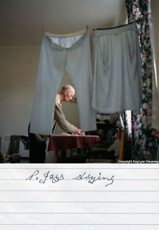
The next two artists we are introduced to have both made use of annotation in their works. Kaylynn Deveney’s series “The Day-to-Day Life of Albert Hastings” is just that. The artist got to know her subject, an elderly gentleman that lived in the same area of South Wales, and photographed him going about his day. While we have encountered a number of artists who have done this sort of thing, what is interesting about Deveney series is that it is annotated by the subject. In her introduction to the series, Deveney describes how she wanted to explore Albert’s experience of being photographed and how it differed from how she perceived him as a subject. When we look at the annotations that he added, we get an insight into his personality that supports the image. Some are banal, which is how Deveney describes the particular event being photographed, for example:
P.Jays Drying, by Kaylynn Deveney (2001) [5]
In this image, we have an interesting composition, with the subject framed by his pyjamas, yet he simply states the fact that they are drying. I find the brevity of the annotation interesting because when we look more closely, Albert is doing something else in his laundry. Although not entirely clear, he looks as though he is ironing some other clothes. This raises questions about how he saw this domestic activity and why when he looked at the print, his attention was focussed on his pyjamas. Elsewhere in the series, we learn that his pyjamas are a source of physical comfort to him, so perhaps this image can be read as him acknowledging his priorities rather than simply doing his chores.
Other annotations in the series are more humorous, with for example Albert joking about opening his veil-like curtains as opposed to talking to a ghost. Others go further into his philosophical side with notable example being a close-up portrait with the caption:
“Could this be a presumptive picture of my futuristic soul regarding a past world and friends?”
With the variation of commentary provided by Albert, we get an insight not only into his day-to-day life of chores and pleasures, but also his outlook and mood over time. Deveney states that she photographed him living in a number of flats over a couple of years and as she got to know him better, he started to open up about the past life he refers to above, providing the artist with family photographs, drawings and poems that he had written. All of these appear in the series, which further emphasises the sense of Albert’s identity without merely telling his story.
We discussed Michals’ use of text on a photograph in Context and Narrative[6], with the image This Photograph is my Proof (1967). That image showed a couple sitting on a bed in an affectionate embrace. The accompanying text stated that the moment captured was proof that the relationship was good at one point, which created a different narrative within the image. Now, instead of the joy read in the iconic message in the image, we have a reflection on a memory that is sad and regretful. The narrator is challenging the notion that their relationship had always been bad by pointing out something that visually proves it to not be the case. As well as invoking a sense of ‘I told you so”, the image also highlights our inherent belief that what we see in a photograph is the truth. Whatever the real truth of the situation being described, the image is presented as evidence even though the poses, expressions etc could be manufactured or exaggerated in some way. Michals uses text to help tell stories that are wrapped up in the journey of life towards death and his annotated series’ deal with related topics like reincarnation (The Bewitched Bee, 1986)[7]. In this example, Michals’ use of relay text invokes the emotions of feeling lost, found and then lost again, with the subject being transformed by a bee sting into a majestic antlered creature. When I first saw this series, I wasn’t immediately taken by the aesthetic quality of the photographs but by the way each picture built an emotional response throughout the sequence. Michals’ himself stated:
“I’m not interested in what something looks like, I want to know what it feels like.”
Duane Michals [7]
In my reading of The Bewitched Bee, I am bringing some of my own past experiences of establishing identity which in turn invoke memory and provoke emotion.
The Spoken Word
While each of these artists have exploited the written word in creating their narratives, the one that differs slightly from the others is Sharon Boothroyd. In her series, she used conversations with separated fathers to gather some questions that were asked by their children, which used as the background for her series. Only the title explicitly quoted the question, but the anecdotal spoken work comes through strongly in the images that make up the series. The common theme through the works of all of the artists is the power of the subject’s perspective, whether it is the interpretation of the memory of a conversation as with Favrod, or the actual writings from the subject as with Deveney. When an artist includes the subject to provide a commentary to the work, the resulting narratives can take on a wider meaning, as with the first example in the notes, Sophie Calle’s Take Care of Yourself. We first encountered this work in Context and Narrative where we explored Calle’s approach of seeking the views of multiple viewers to help establish the narrative. When we consider it in terms of the spoken word, however we can read more than just the opinions of individuals. Calle had asked a large number of women to read the break-up email from her partner and respond in some way. What she got back was a broad interpretation of the email’s contents, emotional reactions to the sentiments of its writer and suggestions about how to deal with it. The work’s title, which highlights a patronising platitude who’s use is somehow meant to placate the reader, suggested to me that the narrative was about anger and resentment at Calle’s treatment. However, now I read something else about our culture. The response are essentially putting the viewer in Calle’s place, asking how they would react if they’d received the email. The breadth of female solidarity comes through but the for me the more impactful element is how that is expressed. Modern society is much more expressive with the advances in communication technology, so people are almost less restrained when it comes to putting their view across. This is my experience, which when I bring to the viewing means that Calle’s work now takes on a sense of “is it just me or…?”, as if she is seeking some form of approval of her own reaction to the email.
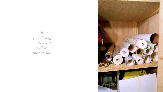
With Anna Fox’s My Mother’s Cupboards and My Father’s Words, the artist combines direct quotations from her father with the ordered, banal and almost claustrophobic spaces that her mother kept. Fox’s father was gravely ill and would verbally lash out at her mother and her regularly. The brutality of the rants and in many cases, threats of violence contrast with the domestic bleakness of the images.
From My Mother’s Cupboards and My Father’s Words, by Anna Fox [8]
What is most powerful here is the insight it gives us into a fragile relationship without either participant being seen. Where the other artists covered in this Project have used reflections on conversations and the real viewpoints of their subjects in their work, Fox creates a window for the viewer to see ‘what was really said’ by one spouse to another. Through that window we get a sense of the tension in the household, with domestic life continuing as normal as possible. We are left with questions about many aspects of the work that don’t appear as iconic context in the photographs. Was her father’s aggression wholly caused by his illness or was it endemic in their relationship? What was her mother’s response to the abuse? What kind of person was she and how did that affect Fox’s outlook on life?
Conclusion
In reflecting on the use of text either as part of or in conjunction with images, I can’t help but focus on the relative impact of words in invoking memory. Whether invoking educational memory, such as Lurpak’s clever use of strength and masculinity to create a sense of Viking or the Orwellian aesthetic of Kruger’s social commentary on gender equality, artists significanly increase the emotional connection with their work through words. This increases further when the text is derived from a living memory or sense of identity or empathy that the artist is still experiencing. Boothroyd’s approach of listening to the testimony of absent fathers and children allowed her to put herself in place of them both when creating her very precise tableaux. Deveney’s deeply moving documentary of the life of an elderly man is made more powerful when his perspectives on the images are annotated on them. In this case, the directly quoted words become part of the image itself, offering some insight into how Albert felt and what he thought about this project. In Michals’ work, his quest to understand how something feels overrides any sense of direct quotation, its loose narrative being relatable in many different ways without necessarily understanding the artist’s intent. Calle takes the broader reactions to her experience and presents them to the viewer as if to ask if they can empathise and even agree. With Fox’s series, the fantastical threats of violence collide with the banality of the images, with each entirely dependent on the other to have impact. What I’ve learned from this project is that the numerous ways we can pick up fragments or whole texts leaves plenty of room for us to bring our own experiences, but all the time there is a sense of legitimacy because someone else has spoken or written them. The originator is sometimes the artist and sometimes not. Either way, the inclusion of such text or speech connects us more with those people in a way that documentary captioning cannot.
So far in Part 4, we’ve looked at the use of text or the spoken word to tell factual stories about a subject that we can relate to as real. From the examples of remembering a brief conversation (Favrod), the experiences of domestic abuse (Fox) to the simple yet powerful emotions of a child wanting to establish their relationship with an absent father (Boothroyd), they are all narratives about real life. The photographs aren’t in themselves about real life, though. In Boothroyd’s series [1], the images are carefully constructed tableaux that, as we know, need not be about real events. Instead they need to provide the viewer with enough signifieds that help build a narrative that broadly aligns with the artist’s intent. Our imaginations and specific experiences fill in the blanks in the narratives, for example my own experiences of feeling isolated as a teenager and subsequent mental illness related to the death of my mother, made Boothroyd’s series resonate with me in a way that every tableau made sense to me. This is what we have learned about reading photographs; there is an artist intent that revolves around a personal interest, experience or story that they want to tell. What we realise though is that the story doesn’t have to be factual in nature – the photographer has an imagination as well. So what happens when the imagery and text are freed from being firmly anchored in reality?
Michael Colvin – Rubber Flapper (2015)
This narrative series by Colvin is the subject of an interview that he gave with OCA, where he describes how his ideas for narratives came about. The basis for the series comes from the refusal of Staten Island Officials in New York to acknowledge the sexuality and relationship of 19th Century photographer Alice Austen. Austen and Gertrude Tate lived together as ‘companions’ and partners in the tea room they ran in Clear Comfort, NY. The extent of their relationship was both hidden from and denied by the women’s families to the extent that their final wishes to be buried together was ignored. Colvin related to the denial of gay sexuality and used the further historical control of Austen’s estate, principally the refusal to allow research of her archive of work at the time of his assignment, to create a fictional documentary of a secretive woman who lived in a self-cleaning house. The narrative that the series creates a sense of observing the bizarre, sympathetically trying to uncover the ‘truth’ of the character’s life and a sense of unwanted intrusion when he makes progress with this quest. We have a combination of words and text that make the character come to life as Colvin places himself in the role of investigator. Colvin’s use of text is interesting here because he combines a related event with complete works of fiction. In the example below, we see what looks like a real newspaper cutting about an mysterious woman and her new husband living in a self-cleaning house. It’s based on Colvin’s discovery that someone did build such a house and lived in it for many years, but the cutting is a prop created by the artist. He includes it as a sort of scrapbook image with a more readable transcript telling some of the Flapper’s story to the viewer.
Newspaper cutting from Rubber Flapper by Michael Colvin (2015)[2]
Another textual element comes in the form of a letter from the legal representative in charge of the character’s estate who withdraw’s consent to use material from her archive when the artist uncovers her sexuality. This connection to Austen, while fictional, tells a story about cultural attitudes towards lesbianism both historically and in the contemporary sense. Colvin’s series is shot to look archival and is so convincing that it’s difficult to tell real from imaginary. I find Colvin’s attention to detail astonishing, from the carefully constructed props to the post-processing and collage work that create the scrapbook aesthetic. What the combination of constructed text achieves here is the storytelling pointers that provide the context needed to interpret the series. By making the text the actual image as in the above, the series is completely plausible. Without the inclusion of these self-contained iconic messages, the series remains fantastical but lacks the glue to holds the narrative together.
Christian Patterson – Redheaded Peckerwood (2011)
With Patterson’s series, the key difference is that while Colvin was creating a fictional story that had some element of believable ‘truth’ to it, Redheaded Peckerwood is based on an actual event. The killing spree of two Wyoming teenagers in the 1950s was a notorious enough story to the extent that it had been used as the inspiration for a film called Badlands. In an interview with Jörg Colberg[3], Patterson said that he was surprised at how the real story of the murders was stranger and more tragic than the fictional portrayal in the film and he went on to think about how to tell that story through his own imagery. Patterson followed the route taken by the killers, investigated a variety of aspects of the case and used a mixture of real imagery (forensic photographs, news reports) alongside his own recreated tableaux photographs. He mixed composition style, colour vs. black and white and in some cased fabricated an image in terms of its place in the timeline, all to tell the story from his perspective and point of interest.
“I often say that Redheaded Peckerwood is a body of photographs, documents and objects that utilizes a true crime story as a spine. The story continually served as a source of inspiration and ideas, but what really excited me about my work was the expansion of my own artistic practice”
Christian Patterson[3]
Perhaps the most unusual images in the series are the constructed pseudo-quotations like the one below:
Shit from Shinola, from the series Redheaded Peckerwood, by Christian Patterson (2011)[4]
The phrase “you don’t know shit from Shinola” has been part of the US lexicon for many years, even after Shinola, a well known brand of shoe polish, went out of production. It’s a term that means ‘ignorant’ through the suggestion that someone cannot tell one thing from another. The image itself shows the product spilling over a surface and revealing a texture which isn’t obvious. Perhaps its addition in the series suggests that all is not what it seems in the story of the two killers. Aesthetically the image could be straight out of a 1950s advertisement, which matches most of the photography in the rest of the series. This is what the series has in common with Colvin’s. The fantastical meanings are there to be seen, but the photography and use of fiction makes us question the almost-default idea of the medium being truthful of documentary. We don’t know what is real and what is imaginary in either case, but both tell a couples story.
“Ultimately, I wanted the work to act as a more complex, enigmatic visual crime dossier — a mixed collection of cryptic clues, random facts and fictions that the viewer had to deal with on their own, to some extent.”
Christian Patterson[3]
Joan Fontcuberta – Stranger Than Fiction
The last of the artist mentioned in this Project is Joan Fontcuberta who takes the confusion with what is real and what isn’t to a whole other level. His series Stranger Than Fiction shows us fantastical ‘evidence’ of creatures, plants, people etc. that are so outragrous as to lead us to question what we know. When I first saw them I was reminded of the spoof journalism of the tabloids with their photographic proof of things like ‘a double decker bus found on the moon’ that were so ridiculous that they couldn’t possibly be real. Such lunacy doesn’t bring our faith in journalism or photography evidence of the truth into question, but there is something about Fontcuberta’s work that makes us wonder. Take the example below from the sub-narrative set called Sirens.
Hydropitecus of Tanaron 2, from the series Sirens (2001) by Joan Fontcuberta[5]
This photograph depicts the remains of a mythical creature call the Hydropitecus which clearly has the tail of a fish and humanoid skeleton, making it a siren or mermaid. The creature is fossilised in rock, lending credence to its age. We are told by the story that accompanies the series that the creature was discovered by a priest called Jean Fontana and is detailed in published scientific journals. The whole thing looks convincing enough that we need to apply our knowledge of history, folklore and mythology to review the narrative, after which we realise that it is totally fake. Then we notice the similarities between the artist’s name and the priest in the story, which sets our minds at ease – we were not fooled after all. The rest of Fontcuberta’s work in the series messes with what we believe to be true, with millipedes sporting full limbs, monkeys with turtle heads etc an in each case some legitimacy added by text or supporting documents.
“The idea that photography lies is based on a complete misunderstanding of what photography actually is or does. Photographs, by themselves, don’t do anything. They’re just photographs. But they can be made to tell a story or tall tale or outright lie when they are being placed in context, when they’re used to tell a story that might or might not be true”.
Jörg Colberg discussing the work of Joan Fontcuberta[6]
Open vs. Closed Narratives
The final part of this section of the course notes deals with the difference between open and closed narratives. Open narratives are those where the viewer or reader is invited to bring their own interpretation to the work through the text that is included in some way. The artists we have covered in Part 4 use primarily open narratives because it gives the work more depth; the text acts as relay in guiding them to a conclusion about what the work means. When we incorporate text that informs more than invites, i.e. anchors the story, we leave little room for the viewer to create their own. Examples of literature and cinema could be considered more closed than open. The notes highlight the importance of the difference between closed narratives and ‘closure’, the latter being inviting the viewer to draw their own conclusion from the many narrative paths to achieve some understanding. Closure does not mean that the narrative lacks the space for the viewer to bring their own ideas, more that it helps with the decision being made. The notes conclude with ways of thinking about narratives and how to use both fiction and non-fiction to enhance the visuals in our artwork.
Conclusion
The main learning from this project is that we as artists have the flexibility to completely fabricate our own truths with our work. This shouldn’t come as a surprise, but it does. The truth of photography as a medium is that people still see it as a factual representation that must real in some way. The artists here have used photography as a tool to challenge both our understanding of the medium but also so tell a story a particular way. Colvin explores the politics of sexuality and the denial or shame that society still struggles with when being honest about how they feel. We find ourselves wanting to know more about his character while all the time being taken in by the apparent authenticity of the documentary. Patterson combines the real story with his own research and perspective on the horrific crimes. The series mixes aesthetics but still manages to leave us confused about what is historical fact and the views of a contemporary artist. Finally, Fontcuberto messes with our belief system by making us look closely at the often jarringly obvious fabrications, as if asking “can you be sure, though?”. One consistency though is the impact of words in the form of text, supporting notes or as visuals themselves. Without the words, each artwork remains interesting but will little cohesion. Whether or not we choose to be inspired to be real or imaginary is really down to personal choice.
Over the space of a few weeks gather newspapers that you can cut up, preferably including a mixture of different political points of view. Have a look through and cut out some images without their captions. You could choose advertising images or news. For each image, write three or four different captions that enable you to bend the image to different and conflicting points of view.
What does this tell you about the power of text and image combinations?
Now write some text that re-contextualises these images and opens them up toalternative interpretations.
Write some notes in your learning log about this exercise.
● How might you use what you’ve learnt to add a new dimension to your own work?
Introduction
In Exercise 1 [1], we looked at the power of deliberately using text to create a particular. narrative about what is going on in an advertising image. The advertisement was interesting because it was specifically designed to invoke the sense of masculinity and strength using iconic references to ‘good, homemade food’ and textual elements that played to the product’s Scandinavian history, Vikings etc. For this exercise, I was interested in the use of text to create alternative narratives to stock imagery. The brief refers to photographs that are included in press reporting or newspaper advertising, but when I started to gather some pictures together, I noticed that in everyday, non-sensationalist stories, the news outlets tend to go with any image that vaguely refers to something in the story. Only when the story is specifically about a person or an event that they want the public to really engage with, do newspapers use specific photographs. I chose 3 for this exercise with varying degrees of specificity to explore how easy it would be to change the narrative of each story.
The ‘Raw’ Images
One
“Pubs and bars are still hotbeds for COVID-19”
“Bars feeling the pressure of post-pandemic staff shortages”
“Grant temporary visas to European workers, Government told“
Here we have three different captions for the image which tell different stories, two about the pandemic and one we assume about Brexit. The text connects strongly because of the gathering in the bar and the use/not use of face masks, which emphasise that this as a contemporary image. The actual caption is:
“Put down the pinot: benefits of a single glass of wine debunked”
With this image, the signs are about having a good time, signified by the gathering of people, the alcohol and the waiter. Although there is no wine in the image, this sign is sufficient to suggest that drinking is generally bad for us. WIth my captions, the text works with different elements in the picture, namely the fact that not everyone is wearing a mask but the man serving the drinks is. Given the current situation, we assume he is a waiter rather than one of their friends. The man behind him, trying to get his attention, could be read as an expectant customer which makes links with the caption about temporary visas and staff shortages. The inconsistent wearing of masks throughout the image serves as a warning in the first caption, suggesting that gatherings of this nature are still dangerous without the right precautions.
Two
“Liv Tyler and fiance spotted in Soho hotspot”
“Liv Tyler on struggling with her father’s fame and leading a normal life”
“Liv Tyler and Dave Gardner have confirmed that they are dating”
This is an example of a completely innocuous image that can be manipulated almost indefinitely. Shots like this, which are often taken by friends or fans, really only depict a mood. In this case, Liv Tyler and her partner look happy, so the natural assumption for a caption might reflect that. In fact the real caption is:
“Liv Tyler ‘splits from fiancé Dave Gardner’ after 7 years”.
Now we have the inverse of the mood with the image pointing to happier times. The caption itself which contains a quote within a quote, suggests a finality to the message – ‘They were once a happy couple but now it is most definitely over’. The one caption of mine which works slightly differently is the second one. It relies on the viewer bringing the knowledge that Liv Tyler is the daughter of famous rockstar Steve Tyler of Aerosmith. Without that, the picture and text don’t really work because the text doesn’t connect with the iconic messages in the image, only getting the viewer to ask “who is that?”
Three
“Severe delays expected as works begin”
“Terrorist threats to UK infrastrcuture”
“Road network crumbling, say ministers”
In this case, the image is very generic as would be found in an image library. This photograph appeared in my local paper, which is well known for gathering pictures from stock or from the public (they have used plenty of mine in the past). The three captions tie into different elements in the picture. The road closure itself works with the construction themes of the two of the captions, while its use refers to keeping people out or keeping the public safe when considered with the terrorist headline. In such news stories, there are few images that can be anchored with text as actual footage of an attack is usually video and tightly controlled. When faced with this, newspapers tend to use generic, often bland imagery and create the story in the caption. In this case, the ‘infrastructure’ under attach is suggested as being the motorway network somewhere out of sight with the sentiment ‘keep out and be safe from what you cannot see’. In fact the caption was:
“Two teenagers die after car crashes into tree”
This caption refers to what is not in the image. There isn’t a tree as such and there are no cars visible. The absence of these and the warning to not proceed any further suggests that this horrible accident is somewhere up the road. The aftermath of the road being closed adds both importance to the event and also a sadness at its impact on everyday life, which carries on.
Conclusion
In all three images, the ‘stock’ nature of the signs and signifiers means that a wide range of narratives can be created by carefully using captions. I conclude that where the reading of the advertisement in Exercise 1 was relatively straightforward as one might expect, there are more questions raised when there are fewer directly-related contextual elements in the image. In the case of the Liv Tyler image, there is nothing to say that is her (without us knowing that to begin with) and the happy image could literally be interpreted any way we want. The caption is what creates the sense of happy or sad with the picture. In further conclusion, the addition of text in these circumstances is vital to any narrative that might be created. The text effectively becomes part of the image. I’m reminded of Michal’s “This photograph is my proof” from Context and Narrative [2] where the image contains precious little in terms of signs but the text tells a complete story that the image then emphasises. This is something I intend to consider in Assignment 4.