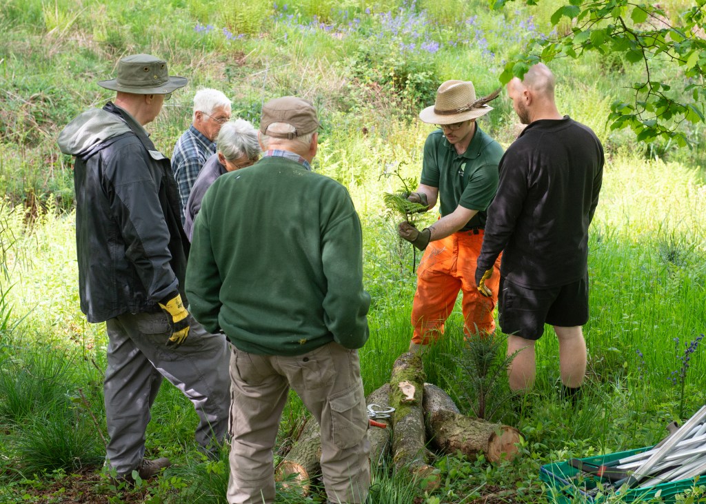
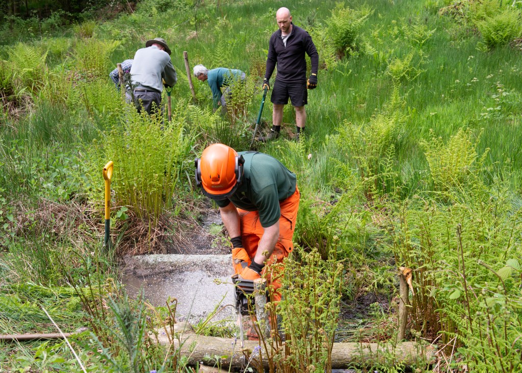
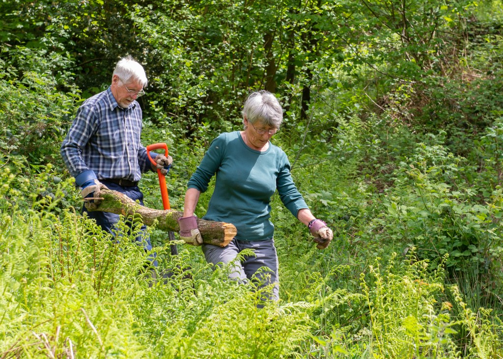
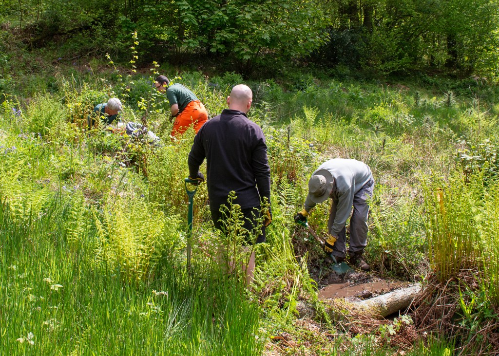
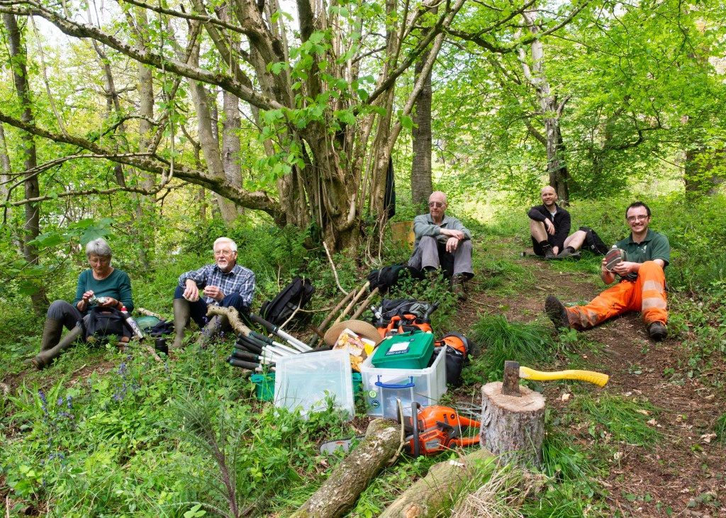
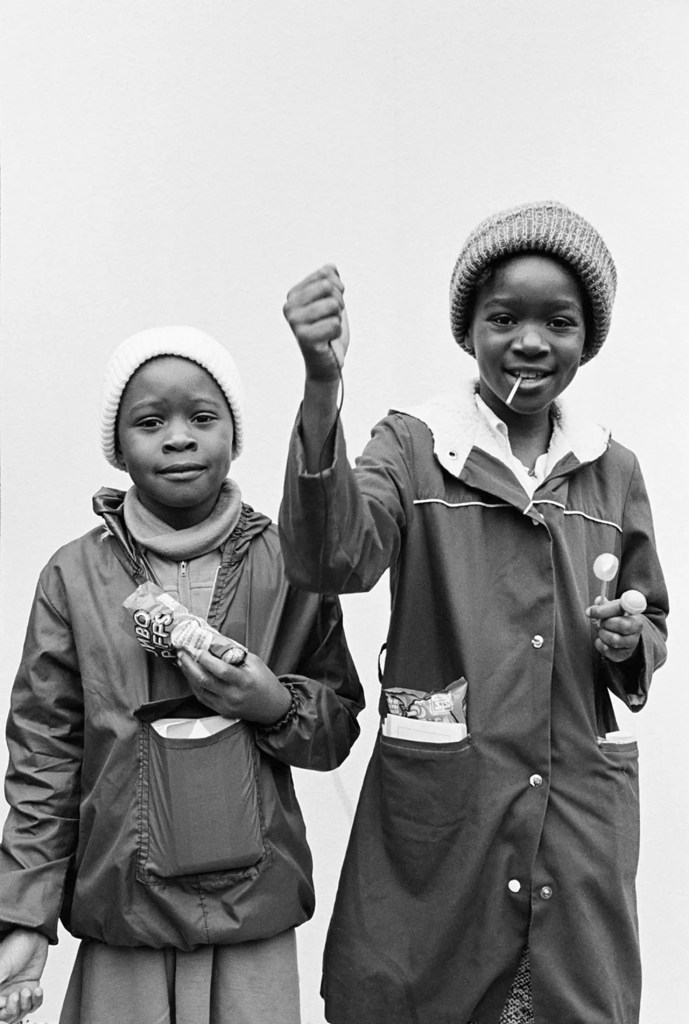
Create a series of 6-8 images of individuals from one particular community that you are not connected to or part of.
Keep in mind that “community” can be interpreted in a variety of ways, for this assignment the community you choose to photograph should reflect an experience and/or perspective that is different to yours. For example, they may be shop owners in a particular neighbourhood, or members of a particular club, or a group of individuals that work in the same trade or organisation. You may also decide to photograph people who belong to a different ethnic group or religious tradition from yourself.
Don’t forget to implement your model release or consent form, and gain written consent from the individuals featured in the work. You may choose to share these photographs in the Ethics and Representation Forum or privately (e.g. via a private learning log link) with your tutor.
Think carefully about the visual language of your photographs – how you compose your images should reflect something about the individual and the community they are part of. What might your position be? What might you need to be aware of going into a community to which you are an ‘outsider’? How did you approach these exercises and what did you learn from them? Would you make any changes to your process for any future work?
Supporting Padlet
For more details on how I approached this assignment, please see the below Padlet:
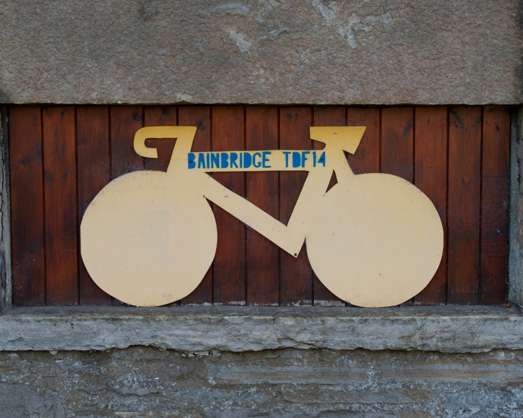
On reflection, my choice of community suited this assignment. I approached the group in advance, explaining my intentions, the idea of informed consent etc and gained agreement from the leadership to proceed. On the day, I used a personal experience of not being asked for consent to give context to the discussion and gain their trust. During the session, I talked to them about their individual reasons for volunteering, concluding that the series shouldn’t be about them as individuals, but as a team. This informed how I curated the final series, majoring on the collaborative nature of their work, while including visual references to their reasons for being there. I struggled with the consent form, because when I first met them, we were outside getting ready for their work. If I’d sent it in advance, the initial conversation we had would have been circumvented by formality. I sent the form after the fact, which was good for them as I followed up on my ‘promises’. However, it wasn’t helpful in my ability to use the images if, say, I’d been on paid assignment. I conclude that securing informed consent to shoot is easy if you build a rapport, but closing the second loop, the use of images, is more ethically challenging in terms of when the form is produced. Ethically, my concern was being respectful, documenting the work but not photographing people stumbling or wearing expressions that could embarrass them. As the series was an outside perspective, built purely on my observation of something I wasn’t part of, it didn’t feel like a transaction that needed the legal formality of the form. I suspect this is more an assumption of needing to protect from a threat, which I didn’t see during this shoot. I didn’t have to work that hard to gain their trust. I think the form works well for more formal photography, perhaps more transactional than this event. However, I will explore this further as I consider my SDP, which will contain both ‘street’ style observations and formal portraiture.
The final part of the brief for this exercise calls for an analysis of works by two of the photographers from the lecture[1]. I chose Handsworth Self-Portraits (1979) by Bishton, Homer and Reardon, and Imperial Courts (1993 – 2015) by Dana Lixenberg for this part.
Comparative Analysis (450 words)
The first, observation about these works is that they are both traditional ‘documentary’, namely they are recording the lives of two communities. These communities share common themes too, with Lixenberg’s subjects being marginalised African-Americans living in a prosperous US city, and the Handsworth project being a multicultural district in Birmingham with similar challenges and tensions. Their approaches differ, with Lixenberg seeking to be both insider and outsider simultaneously (DANA LIXENBERG – Interview 2017 – YouTube, s.d.) in a semi-directional style, as demonstrated in the photograph below.
Fresh, Real, Flave and 4Doe (Real Fresh Crew), from the series “Imperial Courts”, 2008 (Dana Lixenberg, s.d.)
Here a group of young men clearly posing for her portrait. In 2017 interview, Lixenberg tells of the boys wanting to flash their gang signs. After discussion and the showing of Polaroid test images, she got them to understand that the work wasn’t explicitly about their gang, but their place in the wider community. The result is a collaboration between photographer and subject, established over time.
From the exhibition Handsworth Self Portrait: 40 Years On by Derek Bishton, Brian Homer and John Reardon (Smyth, 2019)
By contrast, the second image from Handsworth, shows the subjects taking complete control over their representation. The photographers have set up the camera given them the camera trigger, allowing them to engage with the camera as much or as little as they want. Rosler dicusses the camera’s ‘power’ as seen by the subject and the effect it has on their reaction. We see a different reaction to the instrument when the photographer is directly involved. Bishton et al democratise this power by conceding the ‘moment’, while Lixenberg dilutes it through continual dialogue. Neither image is more ‘truthful’ than the other, as all the subjects play ‘characters’ of themselves. However, where Handsworth removes environmental distractions, the decaying infrastructure, evidence of intolerance etc, by using a plain background, Lixenberg supplements her work with carefully selected backgrounds, landscape, and still-life images. With the former, we gain a knowledge of the people and their cultural and personal differences, and the latter, a narrative about the place as well as the community. Other similarties include both artists engaging with their subjects in a transactional way to build trust, either through the giving of Polaroids (Lixenberg) or the offer of prints (Bishton et al). They built a reputation with their subjects that encouraged even the most reluctant take part in the work and avoid the pure spectator approach described by Bey (Bey D, 2019) or the ‘super tourism’ postulate by Sontag (Solomon-Godeau A, 1994) by living or working within the community. In doing so, their approaches challenging the concept of ‘binarism’.
The viewer recognises in both, the humanity of people and a hint of what their lives are like, even without any real knowledge beyond judgmental media portrayal. Both series achieve this via different routes, but the effect remains very similar.
Make reflective notes on your reading and the comparisons that are being drawn in this chapter – add these to your learning log.
Choose an image from Art History which you will visually respond to and reflect on your choice on your learning log (you might initially choose several before narrowing it down, and you can write about the choices and ideas you are considering).
Developing your work from Project 1, make your own photographic image, or set of images that explores, challenges, or pays homage to the conventions and visual codes of the original image.
Reflection on Photography and the Art of the Past (Kingsley, 2012)
The essay begins by defining historicism as photography’s use of traditions from art history in terms of inspiration rather than straight reproduction or homage to the genres. I was struck by the popularity of art history conventions in modern photography with the examples given, although there is a definite sense that it is less so than the Victorian era when the ‘new medium’ of photography was in its infancy. The emergence of photography as a way of recording classical painting shouldn’t be a surprise, given the mechanical/physical processes it uses. What interested me was the move towards creating work that looked like them, not just in the visual aesthetic, but also the subject matter. Julia Margeret Cameron’s portrait Light and Love (1865) has the hallmarks of a Victorian portrait (black and white, the soft focus of old lens technology etc), but Cameron dresses her mother figure in a similar scarf to that used in The Holy Family with Child, by Bartolomeo Schedoni (c1613). Cameron was portraying the love of a mother for a child to the Madonna using a nest-like setting for the infant to belie the period the picture was taken. This idea of using the visual codes and signifiers that typically represent the Holy birth as the basis for what Cameron saw as every mother’s love for their child is compelling. This was the example in the essay that resonated with me, because although my modern reading of Cameron’s image is based upon the knowledge that photographers take inspiration from paintings, she was actually merely trying to produce a more accessible version of them using photography. Her contemporaries were similarly using the medium to effectively copy similar works. In doing so, they were able to recognise the style and techniques used in order to create their own original work. In the case of some artists, the paintings themselves feature in new photographic work. The essay discusses Jorma Puranen’s Shadows and Reflections (after Goya) 2011 which connects photography with the past through deliberately revealing the techniques used to make Goya’s famous portrait of The Duke of Wellington. The structures of the canvas and brush strokes, coupled with Wellington’s gaze from the portrait give a sense of intrusion into the making of the famous image, the sitter almost being exposed by the new perspective on the original process.
The main conclusion. from this essay is that modern artists are still inspired by the ideas and techniques employed in traditional painting, with some seeking to use the technical codes and some the iconography that was popular throughout art history.
Example for Analysis
I have chosen a still life by Dutch painter Pieter Claesz (1597 to 1660 called Still Life with a Skull and Writing Quill (1628). The image is from the sub-genre of Still Life called Vanitas, defined as:
“A still life artwork which includes various symbolic objects designed to remind the viewer of their mortality and of the worthlessness of worldly goods and pleasures”
(Tate, s.d.)
Fig 1. (Pieter Claesz | Still Life with a Skull and a Writing Quill, s.d.)
Vanitas images deal specifically with mortality, with the reminder of the fragility of a life in balance. They almost always contain signifiers of the end of things, with skulls, writings, candles and empty vessels such as wine glasses to connote the impending. In this image, the dominant element is the skull, which faces the light. It’s condition with its lower mandible and some teeth missing, signifies age which ties in with our rational perspective on death – old people die. The empty candle holder is clean, which suggests it’s either never been used or has been tidied after death. This could connote regret for things not done or started during life or what remains of the flame once long extinguished. The skull rests against an upturned wine glass which is empty. This empty vessel points to previous pleasures, something that many Vanitas images have in common. Others contain musical instruments, food etc, all of which connote better times. The final elements in the image are the quill, the journals and the upturned inkwell. All of these signify labour and their aged appearance connotes something that has been done for a long time. The quill’s repose is such that the writer may be back at any time, or could have left for good. All of the elements are placed on a worn stone table or platter, which connotes the slow passage of time, but presents something familiar about the composition; the artist not simply presented disconnected items to the viewer.
Visually, the image contains elements that are all similar on colour and tone; there are not dramatic contrasts. This is reflected in the lighting, which owing to the lack of a candle is assumed to be natural. These images are deeply rooted in religious iconography so the choice of lighting could connote the ascension to the afterlife or the antithesis of the end of the day/end of the life.
This painting and the others of the same sub-genre appealed to me because they use still life in a way that I had not considered. Other artists were painting images of bountiful life, with exotic fruits, wines and flowers being the most popular themes. Vanitas serves as a reminder that things don’t last for ever and while often extreme in their execution, their style lends itself to story-telling.
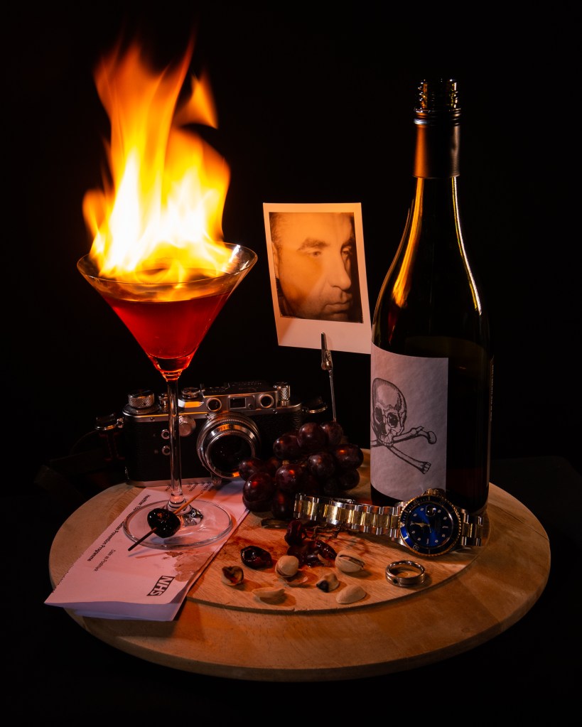
My Image
Vanitas still life resonated with me because of the transitional messaging within the image. The ideas of being reminded of mortality while simultaneously celebrating the good things in life connected with a recent change in my own life. I recently gave up alcohol, not because of some problem, diagnosis or epiphany but more because of the way it, in small measure, become part of routine. Lockdown and changes in my working life meant that it was easy to indulge in the weekend treat more regularly than before. My decision to stop has had a huge impact on my wellbeing and made me reflective about the health issues caused by alcohol, some of which are very serious. I wanted to explore this with a Vanitas-style image.
Key elements to reproduce:
Sense of warning represented in the paintings by a skull.
Direction of light – ethereal and from above as if suggesting divine light.
Enjoyment of life’s pleasures – hobbies, food etc.
The sense of timing – being warned about the future, but also the present moment.
My Image
Temperance, after Claesz (2022) by Richard Fletcher
Analysis
For an analysis of my image using Barrett’s tools for critique, please see Padlet below:
The combination of analysing Claesz and making my own still life that uses similar codes and ideas has given me a new perspective on the genre. More than the classical fruit scenes, the Vanitas still life paintings were multi-layered in their connotations, using signs that provoke a sense of dread in the viewer. They combined the artist’s skill in representing light with an understanding of form and luminance that draw the attention of the viewer to the powerful iconography. With my image, I tried to assemble a collection of items that paid homage to Claesz’s image, as well as recreating the directional lighting and matched tones. Once I’d included the camera as representation of ‘enjoyable pursuits’, I realised that there was going to be some diversion from the tonal qualities by introducing harsh highlights. When I realised this, I included my watch to add balance to the spatial composition. One element in classical still life that intrigued me was the use of candle light. For me, this was where the differences in the skills of the classical painters varied considerably. Some master practitioners, such as Rembrandt, really gave a sense of the scene being lit by this natural source, while others used artistic licence with the brightness of the flame and its fluid movement. That inspired my lighthearted criticism in including the flaming cocktail. I wanted the scene to appear to be lit by the flame alone and for it to look completely natural. For this, I used a slow shutter speed rather than a fast one to freeze the flame. The scene is fill-lit by a two strobes and a further LED with a warm colour temperature, which when combined with the key light gives a natural feel. The most important part of this assignment for me was the post-production analysis using the ideas of Terry Barrett, with which I was able to re-evaluate what I had intended to achieve with the picture.
“Thus, all photographs, even straightforward, direct and realistic-looking ones, need to be interpreted. They are not innocent, free of insinuations and devoid of prejudices, nor are they simple mirror images. They are made, taken, and constructed by skillful artists and deserve to be read, explained, analyzed and deconstructed”
(Barrett, 2006)
This assertion by Barrett resonated with me in Exercise 1[2], where I made the selection of the images from each genre randomly. At first glance, the Ansel Adams landscape is a beautiful representation, but by analysing using semiotics, a number of meanings could be derived from the elements and and what they connote. Barrett’s approach simplifies the reading of an image in my opinion, which makes it more intuitive to use.
In conclusion to this assignment, I am happy with my still life. I’ve received feedback from my peers about both the connotations of some elements and the relationship between my composition and that of Claesz. These observations lead me to think about how close to the original image my photograph is and whether that is important. Other feedback questioned how it fits with contemporary Vanitas works. I had partly been inspired to look at the still life genre after analysing Paulette Tavormina’s Banquet (2017) in Exercise [2]. Her use of including movement with the birds in flight, but in a staged fashion, led me to question the movement of candles in other paintings. By incorporating ‘real’ movement into still life, does it still fit with the codes of that genre? Is it truly ‘still’? Looking at Ori Gersht’s Exploding Flowers [3], where the movement from the dispersing petals is clearly there but frozen by a fast shutter speed, I would argue that it’s a difference in detail definition. My flame is clearly identifiable, yet the movement is more life-like owing to the longer exposure. Therefore in terms of being an homage to still life, and in particular Vanitas, I am happy that my image meets the original intent.
Against the Learning Objectives
LO1: Compare the theoretical features, characteristics and histories of different photographic genres.
The features of Still Life were studied in Exercise 1 and brought into this assignment.
LO2: Deconstruct a given genres’ conventions and create visual material informed by that knowledge.
Visual codes such as composition, lighting etc for Still Life were recreated in my image. I took the idea of Vanitas, a sub-genre of Still Life and made it about the warnings of health impact from alcohol instead of mortality. I used similar internal contextual elements as laid out in my post analysis in the Padlet
LO3: Produce new visual work informed by your research.
I produced an image that pays homage to Claesz’s work but isn’t a replication of it. The contextual elements are similar but the overall meanings that can be connoted from them lend themselves to my story.
LO4: Analyse the wider global contexts surrounding contemporary image making.
I was inspired by Paulette Tavormina’s Banquet (2017) which took the classical ideas of a feast in still life and incorporated a flock of birds descending to eat the food. The ambiguity of their presence (see Exercise 1) added a layer of narrative to the image, which in every other regard looked like a painting.
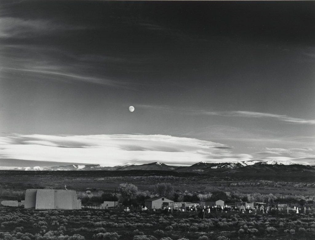
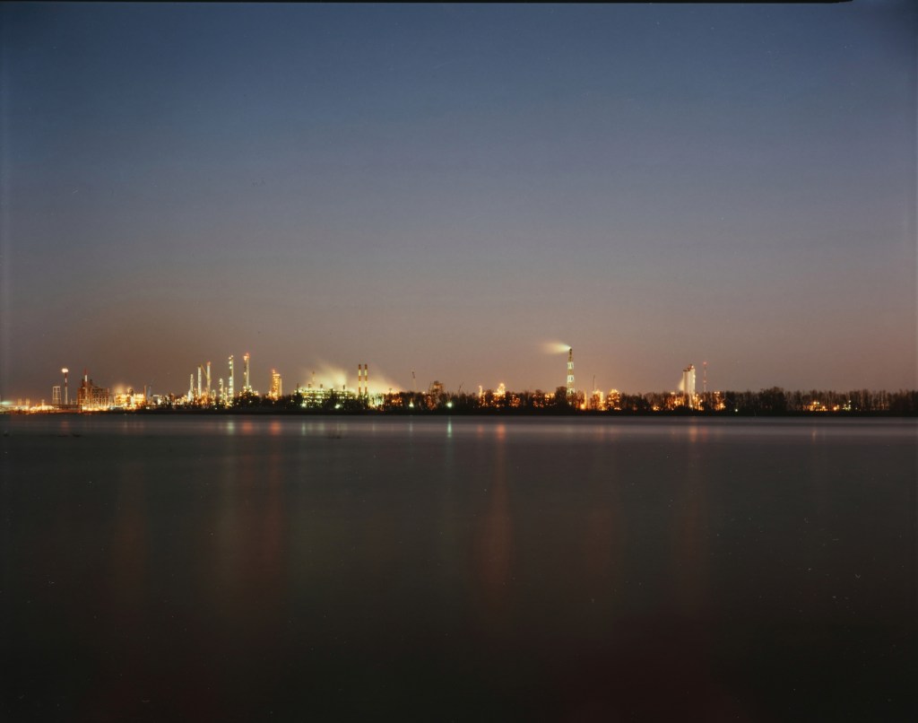
For this exercise, I have chosen two landscape photographs; Moonrise over Hernandez, New Mexico (1941), by Ansel Adams and Bonne Carre Slipway, Norco, Louisiana (1988), by Richard Misrach
[Fig1] Moonrise over Hernandez, New Mexico (1941), Ansel Adams[Fig 2] Bonne Carre Slipway, Norco, Louisiana (1988), by Richard Misrach
These images are visually very similar, both depicting a wide-open landscape with some form of human presence within the frame. They are both shot on large format film with the obvious difference being one is colour and the other is black and white. Moonrise… is perhaps the most famous image by Adams, probably the most recognised landscape photographer in history. This image is famous for the story about how it was made almost as much as the composition. Adams was travelling back from a failed day’s shooting and saw the gibbous moon, lit by the fading sunset. He rushed to set the camera up, couldn’t find his light meter and worked out the exposure from his knowledge of the luminance of the moon. The story reinforced the legend of Adams as a ‘technical’ photographer. Misrach’s image, has no back story, being part of a documentary series about the impact of the petrochemical industry on the environment in ‘cancer alley'[1], a region of Louisiana. Outside of the artistic intensions, the images have other visual differences. Moonrise… is very precise and sharp, exposed carefully for the moon’s luminance, whereas Misrach’s picture is a deliberately long exposure. The fine details of the refinery are lost in the flattened movement of the water and the smoke rising from the buildings. Where Adams captures the natural light impacting on the buildings, Misrach represents the light pollution impacting on the environment; the antithesis of each other. The technical codes used create a sense of wonder in Adams’s picture and his familiar use of scale makes the manmade part less significant in the context of the desert space, where Misrach’s image is depressing. The light pollution creates artificial colour in the sky and is reflected in the water in lines that lead towards the viewer. Misrach’s image relies on colour to create this mood.
I chose these pictures because of the aesthetic similarities and the obvious technical codes that identify each as landscape. They also both contain natural and man-made context in similar compositions. However, it is clear that even without knowing of either artist’s work, they are very different ‘cultural tones’. Where one is rich in detail and natural beauty (then moon, the almost clear sky and the highlights from the sun setting behind the viewer), the other is devoid of the same elements. The composition is simpler but the use of polluting rather than natural light immediately sets this in a environmental/political space. It’s no longer a pure landscape but a documentary protest. With the rest of Misrach’s series, the images serve as a stark warning. Adams’ image isn’t part of a series, but an observation of a moment of natural beauty. Both could be argued to be ‘documents’, but Misrach’s is more of a commentary on man’s destruction of his environment.
“I photographed the landscape, but where it collided with civilization,” he said…
…while Misrach outgrew Adams’ influence, he still reveres the nature photographer. In fact, he has a typewritten letter Adams sent him in 1979 framed on his wall at home. Adams had sent it to Misrach’s first gallery, expressing his admiration for the work…
…“He’s still my hero,” Misrach said.
(Richard Misrach Photographer | All About Photo, s.d.)
For Part 1, I created a Padlet to capture my thoughts and observations and for Part 2, a Padlet for each image analysis. This blog post simply contains reflections on both pieces of work. The Padlets can be found at the following addresses:
The source material draws our attention to what Rose (2001,p25) referred to as the three sites of a visual image; the site of the production, the site of the image and the site where audiences will view it. These aspects form meaning in interpreting an image and are the most debated in terms of the importance placed upon them. The idea that there could be shifting emphasis on the importance of all three reasonably suggests that there are many potential interpretations of what is ‘truth’ in documentary. The rhetoric of an image is dependent on how the photographer has used photographic codes to influence the reading. I was taken by the idea that for every ‘rule’ there is subversion and the clues as to how that makes a photograph believable or otherwise is down to how the image is broken down.
The artists included in the both the notes and the embedded exercise have all taken the idea of documenting using a camera in different directions. The first thing that I noted was the exploratory nature that evolved over time. The early photographers, such as Fox-Talbot were interested in how to capture a significant event visually, e.g. the building of Nelson’s column in Trafalgar Square. Although a fairly simple composition, use of visual codes such as scale and perspective, coupled with the rudimentary equipment and processing used to make the picture, raise questions that change over time. Shafran makes the point that the image has a modern feel to it with only the necessary elements included (e.g. the column’s base but not the statue) and the advertising hoardings in the frame. Was Fox-Talbot establishing photographic composition codes from the outset or have modern analyses of the visual image and structuralist ideas made sense of his work after the fact? The collection of artists impressions in We are Here have the common notion of re-visiting works of lesser known photographers with a post-structuralist eye. Works by Hinde and Charles Jones break down the codes of very simple compositions to give clues as to an area of society that we might not be familiar with. I was drawn to the catalogue photographs of pristine vegetables as if being judged in a horticultural show as shot by Jones. They use technical codes such as light and composition (uncluttered, filling the frame etc) to bring out the natural beauty of the subjects. The subjects, although familiar are shown to have been cared for and made as good as possible for the camera to document, asking the viewer to see how important horticulture is to some people.
As the 20th Century progressed, the subjects and approaches to documenting them became more experimental. Photographers began subverting the ideas of their time, such as Munby’s portraits of dirty women. His idea of humorously substituting the female form into male professions and further subverting the notions of class in Victorian England mirror the work of Julia Margaret Cameron, who was pilloried by the establishment for what was seen to be poor technical skills. Her pictures create a real sense of her subject’s personality as she saw them, rather than majoring on the accurate representation of their features. Towards the 1960s and 70s, we see more voyeristic style of documentary, taking cues from classic and contemporary street photography. Here we saw the visual codes of separation, isolation through focus and highlight as well as the decisive moment, being used by the viewer to create narratives as though they were part of the scene. In the V&A article about South Africa, the cultural evolution of the country with its troubled recent history is documented through an approach that highlights what we may have no experience of. We can see influences of early practitioners such as the FSA group in Jodi Bieber’s Women Who Murder Their Husbands. The horror of the women’s acts is contrasted with their visual aesthetic and being surrounded by their meagre possessions in their cells. We don’t even need the additional context of why they committed their crimes to break down the visual clues in their portraits. The pictures are constructed and don’t tell the subject’s whole story, but Bieber makes us connect with them as if we were actually visiting and asks us to consider gender violence and societal bias when viewing the images. This fabricated reality theme is naturally present in the works of Crewdson, Wall and diCorcia who direct their pictures so that they viewer can create a narrative based on their own experiences and perspectives.
The final artist in the reference material was Richard Misrach, who’s series Destroy this Memory is a documentary of the region of Louisiana that was devastated by Hurricane Katrina. The series focuses on the people of the towns that were worst hit through the graffiti they left behind. This included messages of hope in preparation for the storm, fear of the event and the shock of the aftermath. Messages warning looters and asking people to call their families as well as rages against the state government and insurance companies are curated into a series that explores the human response to crisis. There is some gallows humour in amongst the desperation, which Misrach uses to punctuate the series. The interesting thing about the series is the apparent lack of technical setup in the images. Misrach made the series from his scouting photographs which were taking with a basic digital camera. As a result, the style isn’t cinematic or constructed, but more snapshot as if a tourist (or the viewer) took the pictures. Composition is ‘careful’ but doesn’t have a sense of planning about it. This style brings the viewer closer to the scenes as the photographer saw them. The absence of people creates the eerie sense of emptiness but their wrecked possessions and their need to write something on them is compelling.
It’s clear from the reference material that documentary has evolved from the straight ‘truth’ of presenting something to the camera, through coded composition, rebelling against convention and the subversion of cultural understanding, to the more intimate act of being part of what is happening.
“I guess that is how photographic culture shifts and changes as time passes. We think that everything’s been done, but, of course, there are many things that haven’t. In twenty years’ time we will be shocked by how certain works are perceived, and that’s exciting.”
Martin Parr, 2007
Reflection Part 2
My conclusion from part 2 of this exercise is summarised in the following key points:-
The analysis of an image using semiotics can be applied to any of the genres, even when at first glance, the image contains signifiers that do not have apparent connotations. I chose 4 random images by famous photographers of the 20th century as well as contemporary artists and my choices were purely aesthetic. When looking at the codes that help to identify an image as being part of a genre, we know that the visual aesthetic is one of the most common; a portrait contains a person and little else, a landscape contains a view of some sort etc. When analysing, I could determine the denoting elements and derive some connotations from them with little difficulty between genres.
The connotations are greatly affected by the social and cultural perspective from which the elements are viewed. For example, Ansel Adams shot with black and white film in 1947 because that was the established technology, not because he was looking for an aesthetic. The drama of his landscape is enhanced by its use and the technical approach to highlight and shadow with each element, certainly helped support the narrative that I saw within the image. Similarly with Winogrand’s image, I would argue that it is as shocking in today’s culture where racial prejudice has often been seen to be worse than the 1960s.
The technical codes direct the viewer to not only the elements that are ‘important’ through use of depth of field and framing, but also create a mood through lighting and colour temperature. In Djikstra’s portrait, the tones of the image contriubte to the sterile connotations of the subject against the background, while the low contrast offers a bleak feel to the subject’s experience.
What we bring to the interpretation of an image. In the case of Adams’ image, I saw religious connotations in the snaking river that was lit to reveal its surface texture. Although I’m not particularly religious, the combination of the scale of the mountains and their reaching the dramatic sky, invoked the creationism stories I was taught as a child. Other cultures would not necessarily prioritise the connotations in the way that I did, instead introducing their own meanings allied to their own experiences.
Overall, I found this exercise to be interesting because of the application of the structure of linguistics to a variety of images. It focuses our attention on what is physically present and what each element might mean.
I have recently received tutor feedback on Assignment 2 which raised a number of points that I will address in this post. General feedback about the photographs was positive, but my tutor questioned how effective the joint themes were and whether I had played things too safe by not electing to publish the post (for reasons outlined in the assignment).
Feedback Points
The first point was about the themes. My blending of street photography composition with studio lighting was evident in the series and my tutor indicated that some images were stronger than others. He highlighted One and Four as the strongest, which aligned with my own views on the series. I liked the humour in both and I think they worked best from a lighting and composition perspective. My tutor took issue with the idea of challenging the viewer in terms of how the images were shot. He rightly pointed out that most people viewing them wouldn’t know or even care how they were taken. While I had fooled a few photographers with the use of artificial lighting, this technical distinction wasn’t really a strong theme. I have to agree, which is probably why I wanted to have a creative link as well as a technique one.
At this point, I raised my concerns that the brief steers us towards experimenting with techniques and approaches while the title Vice Versa suggests a specific inversion of them. We agreed that this was my interpretation and accepted that the main reason that I struggled not to merely invert the techniques from a technical perspective was that portraiture is not a genre of photography that I am at all comfortable. When I feel that way about a topic, I tend to revert to type.
The second point of feedback was my strong connection with and management of my models. It was cited as a strength the series and the creative process that I was able to engage openly with my models, who are all friends of mine. It was clear from the final images that the collaboration between photographer and subject was strong, which made for more natural results. This point raised the main critical point about the series. I had elected to not publish it out of respect for two of the models who weren’t comfortable with it being widely circulated. Although my tutor accepted my reasons for censoring the work, he made the great point that this act undoubtedly had an impact on the strength of the series in the context of challenging convention. Other ideas such as challenging gender conventions within the series, e.g. having one of the men dressed as the cheerleader in Four, were discussed. These were good suggestions that I think were perhaps lost by my slightly blinkered view of the brief.
We discussed the conversation that I had with my cohort about how the use of paid models as a way of avoiding the discomfort. The point that I made was that paid models would be easier in that regard but would potentially lack the natural feel of the work that came from my relationships with my subjects. The overall conclusion was for me to look into examples of self-censorship in art and those who genuinely broke boundaries with their work. The artists Pedro Meyer, Richard Avedon and Joel-Peter Witkin were recommended to me, which I will be looking at in parallel with Part 3.
Other feedback was received about my writing style and some of the work within the exercises that raised interesting questions. However, this post is about Assignment 2 so that is not included here.
In conclusion, I cannot disagree with any of the feedback that I received. I was happy with the photographs individually and as a series, however I was aware that the response to the brief was weakened by my use of composition and lighting rather than subject. I felt that the subject-based theme worked well, but take on board the comments about self-censorship.
Consider the work of both Callahan and Germain, then select a subject for a series of five portraits, varying the locations and backgrounds. The one consistent picture element must be the subject you have chosen, who must appear in all five images. Think carefully about where you choose to photograph them, either using a pose that offers a returned gaze to the camera, or simply captures them going about their daily business. The objective once again is to visually link the images together in some way.
You may choose a family member as a subject, like Callahan, or agree to photograph a colleague or friend, or even a willing participant who is either known or previously unknown to you, like Germain’s story about Charles Snelling.
Present your five images as a series and write around 500 words reflecting on the decisions you made. Include both of these in your learning log or blog.
My Idea
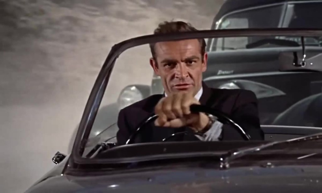
I was looking at my social media feed recently in response to a comment that a friend made about how few pictures there are of me. As most of the pictures I have shared over the years are of my wife, family and friends, I had to agree. When I do appear, it’s usually when we are on holiday or at an event or dinner. I considered how these few photos are a document of key points of my life and when I revisited them, how I had changed since they were taken. During Project 2, I was drawn to how the people in Meadows’ Omnibus project changed but remained recognisable in the 25 years between the shoot and the retrospective [1]. My initial idea was to select pictures from my Facebook feed and shoot current portraits of me wearing the same (or similar) clothes. I have home cinema in my house, so I would use the projector to make the photographs my different backgrounds. I would then position myself in front of the projected image and make the new photograph. I wanted the look of the series to resemble the background overlays used in movie scenes before the advances in CGI (see below)
From the film Dr No (1962)[2]
As we can see in the still from the film Dr No, Sean Connery is shown in a car chase with a clear difference between the actor and the background. In reality, the car was shot on a stage with a back projection of a chasing car behind it.
A Change of Direction
While my initial idea was sound, I was struggling with the execution of it. My problem was that the relationship between me and the background was merely a technical one. I had envisioned invoking some form of memory of the place I had previously visited , but after experimenting with contextual ideas e.g. wearing similar clothes as in the background picture, I realised that the connections were pretty weak. I was then presented with an opportunity while on holiday in one of my favourite parts of the Yorkshire Dales, which was coincidentally was where I shot the first assignment on this degree course, Square Mile. Where my initial idea of putting ‘current me’ into an old ‘background’ was about how I was connected to it but changed, the concept evolved into being about how an environment had changed subtly beyond my control or influence. I decided to make my presence a mere marker, similar to a map pin, on the landscapes that I shot two and half years ago. I decided to present the images as a series of diptychs.
The Photographs
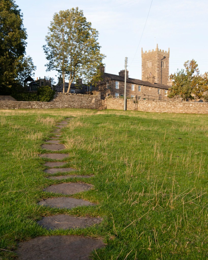
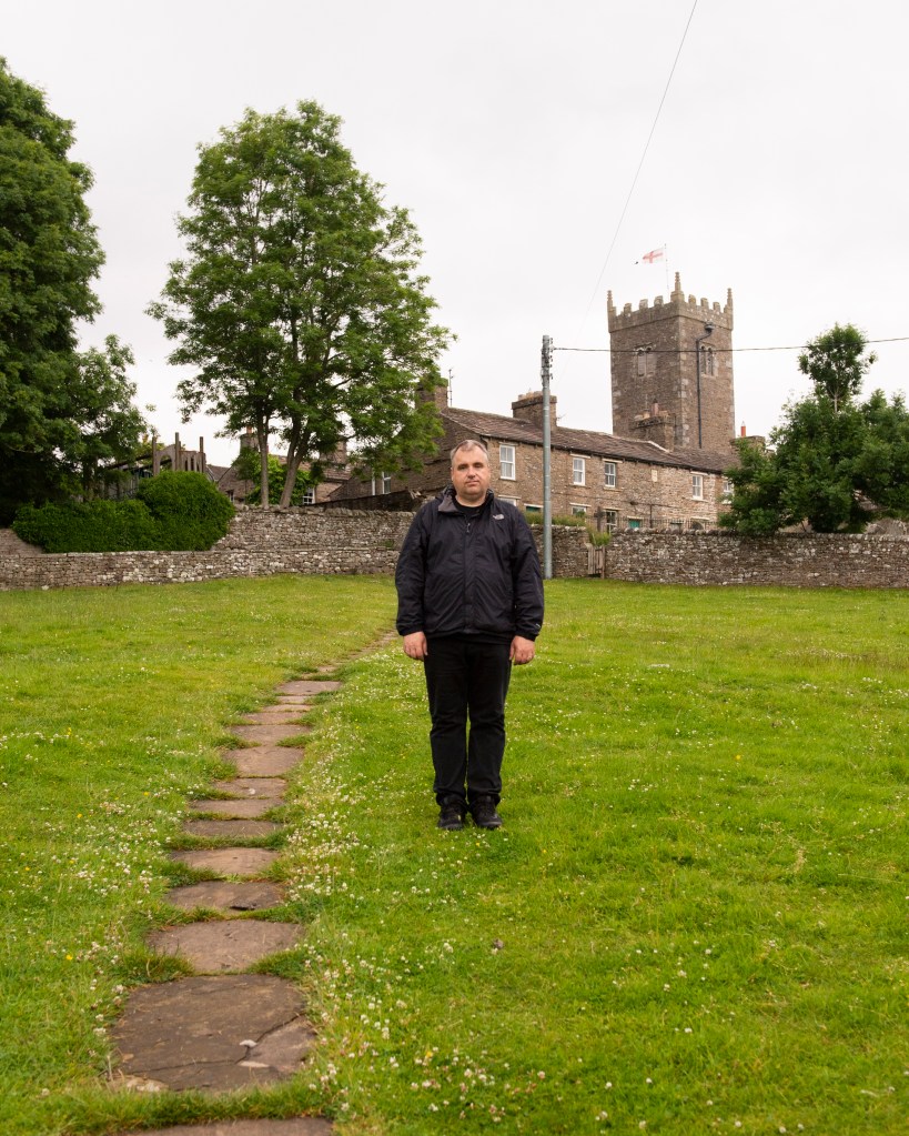
1 – To the Church
One
6 – The Bovine Line
Two
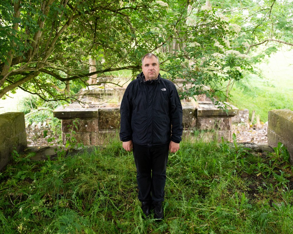
7 – Bridge Out
Three
11 – Le Tour
Four
12 – Cafe Stop
Five
Reflection (500 Words)
This series evolved from an idea where the primary focus was the subject, which was was always intended to be me. I wanted to show how I had changed from the person in the social media memory, but struggled to find a way that was neither really obvious (using props) or merely showed me as an older, fatter version of myself. When the opportunity to shoot in the location of my first assignment came up, I realised that the background could actually be the subject. When we consider the portraits that Callahan took of his wife and daughter in the vast spaces[1], it is the impact of scale that first strikes us and it is the background that we find ourselves looking at. With my series, we see a landscape that is immediately familiar, but when we look more closely the changed that have occurred over time become obvious. Some are significant as in the case of Four, where the original location for the bike model had been replaced with a window as the building underwent renovation. In fact, it was difficult to identify the original aperture and I would most likely have missed it if I didn’t know the area so well. In Five, the cafe had changed hands and been renamed, with the transient detail of the cyclists no longer in the frame. With One, Two and Three we have the most subtle of changes, ranging from the length of the grass (One) and the difference in seasons shown in the tree foliage (Assignment One was shot in September, not July).
The introduction of me as a marker in the scene really only anchors the series together as in each case I am pretty much expressionless. When I reflect on this, I realise that my expression does change naturally from frame to frame. I conclude that this is because we have no true ‘steady state’ expression. What we express depends on what we are doing or thinking about, which in my case was instructing my wife on the composition before shooting. My expressions and stiff stance in the photographs ask questions of why I’m in the scene and what am I thinking about? I asked the same questions of Callahan’s portraits of Eleanor and their daughter.
In conclusion, I think this series works. My seemingly impassive position within the frame looks like a map marker, but there is something slightly different in each expression. The changes in the background range from subtle to obvious, but the scene remains very familiar. The images also have a sense of the nostalgic about them in the sense that growing up, some holiday photographs took on an uncomfortable feeling to them with the photographer more interested in recording the scene than making a good portrait of their family member.
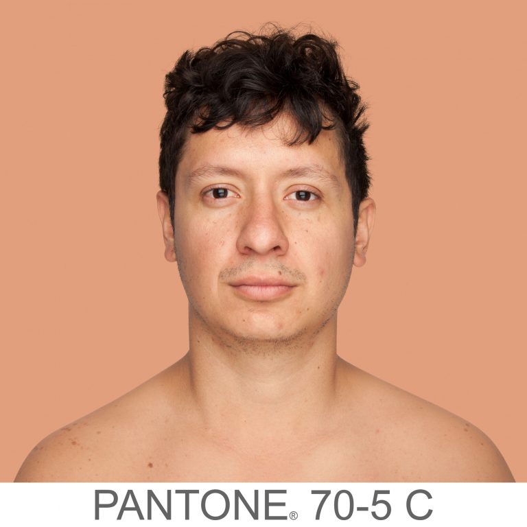
As nursery rhymes are generally created for children to recite as a way of learning, the first reaction to the above rhyme from the US, which is still in existence today, is one of shock. What the rhyme symbolises is the common perception of racial division around the world which describes a simple colour categorisation into which everyone is placed. This simple idea became the root of ‘colourism’, whose origins date back to the days of colonialism and slavery. Black people were considered the underclass, had little in terms of education, were treated inhumanely and enslaved. The people that fitted into the Brown and Yellow categories were treated better respectively, with the White people being the originators of the scheme and as a result, the superior race. Despite the progress over the past 200 years, colourism still exists at a subconscious level in the way that some people view others of different ethnicity. A modern example was the casting of the film Straight Outta Compton (2015) which told the story of the up and coming rap scene in 1980s Los Angeles. The casting team categorised women who were potential extras in the film by grading their skin tone, which drew widespread criticism when it became public[2]. This identification and classification of non-white people exacerbates the tensions around racial equality and civil rights, which today is perhaps most widely epitomised in the media coverage of atrocities such as the murder of George Floyd by a white police officer in Minneapolis.
With her work Humanae, Angelica Dass wanted to show how much variety there was in skin colour across the world. Born into what she describes as a ‘colourful Brazilian family'[1], Dass affectionately refers to the chocolate, cinnamon and bronze tones of the members of her family. Growing up, Dass only really encountered colourism outside of her native Brazil.
Humanae is an unfinished work comprising of many thousands of portraits, all shot in the same way as Dass travelled the world. Her volunteer subjects are shot as head and shoulders only against a plain background, with the photographs cropped as squares. Dass then worked in post production to take a sample of the skin colour from a small region of the subject’s nose to gain their tone. She then used the international Pantone colour grading system[3] to change the background to match the subject’s tone, including the reference code as part of the image. A couple of examples can be seen below.
From the series Humanae, by Angelica Dass [4]From the series Humanae, by Angelica Dass [4]
Here we have two images of very different skin tone. What’s immediately obvious is that neither conform to the conventional Black, Brown, Yellow, White ideas of colourism. By altering the background colour, Dass draws our attention to the subtlety of the skin tones from shot to shot. The inclusion of the Pantone code gives us another anchor of difference but also a sense of the scientific. She is almost suggesting that the classification of colour has been done by a professional body, and that the classification is far from simple when attributing it to how people look. Dass has many thousands of pictures in her collection now and has been experimenting with how to present it to the world. By her own admission, the traditional presentation in a gallery isn’t really something she feels she fits within, allowing the viewers to choose to engage with the work or not. As a woman of colour, Dass connects more with confronting the audience with her work, so one exhibition was as billboards in the streets of major cities. This way, the audience is presented with the photographs as a matter of daily life. The effect of pushing the narrative of the complex differences in our appearances is more powerful when it cannot easy be ignored.
Conclusion
I found out about this work on social media a couple of weeks ago. With the completion of the exercises in Part 2, I was drawn to the use of subject and background as effectively a reinforcement of one another. The large expanse of the same colour as the skin tone makes makes me really notice how subtle the differences are between cultures, but also people within the same.. I really connected with the use of textual context in the shots too, the Pantone codes joining the series together as well as reinforcing the narrative. I can see other opportunities for the application of backgrounds this ways, for example contrasting perspectives on gender and age, social standing and materialism, sexuality, values and principles. It’s something I will explore elsewhere in this unit.
Following on from Exercise 3, we consider the idea of an artificially created background, the kind of which would traditionally be used in a studio environment. Studio can mean many things from a dedicated space in which professional lighting equipment and assistants work to shoot the picture, to a small corner of a room with a plain wall and some form of light source that works with the subject. My own experiences of studios tend towards the latter, with impromptu setups used to complete an assignment or project. I have the lights and equipment to shoot ‘businesslike’ portraits, but this post is about the use of such setups to create a series of pictures that reveal more about the subject than perhaps more clinical work.
Irving Penn – Worlds in a Small Room (1974)
Penn’s series Worlds in a Small Room makes use of a space in a room that has a background dressed for the portraits. The subjects are all shot within a small space with Penn not really trying to hide the fact that it’s a temporary studio. Penn used this temporary arrangement to then travel the world photographing people within his controlled setting. This approach offered Penn, who described himself as an ambulant studio photographer, a space that was both private and a known quantity. Although he used natural light for the portraits, he was able to control the highlights and shadows between shoots. The effect act it had on his subjects was one of neutral territory. Penn described his early engagements with some gypsies during a trip to Spain in 1964:
“The studio became, for each of us, a sort of neutral area. It was not their home, as I had brought this alien enclosure into their lives; it was not my home, as I had obviously come from elsewhere, from far away. But in this limbo there was for us both the possibility of contact that was a revelation to me and often, I could tell, a moving experience for the subjects themselves, who without words—by only their stance and their concentration—were able to say much that spanned the gulf between our different worlds”
Irving Penn[1]
As the shooting progressed, both parties became more comfortable with each other. The resulting portraits reveal the subjects in a way where the background context doesn’t really add anything to distract the viewer.
However, the idea that Penn’s studio was a neutral environment was challenged by scholar Jay Ruby at Temple University in 1977 [2]. He contended that the act of getting the subjects to relax was actually Penn asserting his control over the shoot. The studio, the arrangement of the camera etc were all the domain of the photographer with Jay suggesting:
“Stripped of their defenses these strangers would be free to communicate themselves “with dignity and a seriousness of concentration ” (p. 9). There is a fundamental flaw in Penn’s logic. While he was out of his culture in the sense that he did travel to these various locations, he always rented or constructed a studio to work in. The studio environment is one where Penn is clearly at home and totally in control. As wielder of the technology, Penn was literally calling the shots. The use of the portable studio offers a consistent background to the pictures that, like Evan’s Subway pictures, almost normalises the images in the series so we are no longer looking at it”.
Jay Ruby, 1977 [2]
When we think about this view, it’s the main issue with any kind of studio environment. I recall my own experiences of an art nude course that I did with the Royal Photographic Society in 2014. I had never done anything like it previously and my nervousness was a combination of operating professional lighting, directing a model and, of course her being nude. At the start of the course, my fellow students and I approached the shoot almost as children, asking the model for her help in posing and the tutor in terms of camera settings and lighting positions. With the increased confidence as the day progressed, we started to dictate the direction of the shoot. In my case, I started to break the composition rules that we had been told about regarding classic art nude photography, the two main ones being the model directly looking at the camera and smiling. The shot below is the picture I took that broke these rules, which the model was entertained by, but the tutor less so.
‘Fiona’ by Richard Fletcher (2014)
The point that I am making is that I have sympathy with Ruby’s viewpoint, but at the same time, Penn’s series documents the people of different cultures, some of which have either declined or may even have disappeared over time. Penn was fascinated with capturing and representing these people without any influence or interference. For me, the series works and is a great example of where to place the emphasis in portraiture.
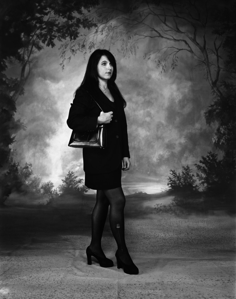
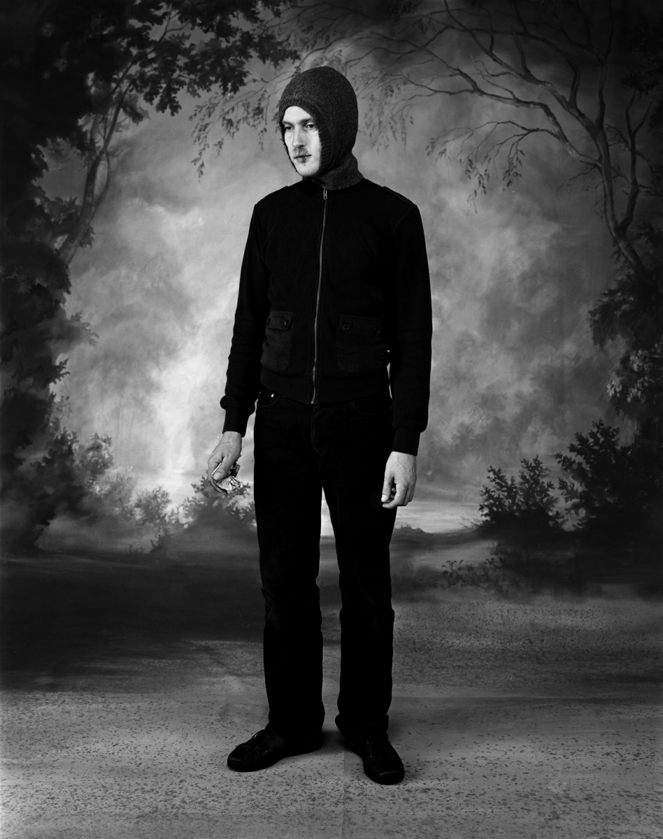
Clare Strand – Gone Astray (2002/3).
With Strand’s series Gone Astray, we have something similar to Penn’s work in the use of a single studio backdrop. In this work, the subjects are young people who look at first glance as if they have been brought into a studio to be photographed ‘as is’ by Strand. When we look closely however, we see that the subjects each have some kind of damage, either to themselves or their clothing that asks us to question how the series hangs together. Is it a series of random people that the artist has coopted to be in the photographs or is it a carefully controlled series of contextual elements that tells a story of the disaffected urban youth? The answer is, of course, that each image is staged as a series of cosplay situations with the props, clothes and poses being carefully stage-managed. Examples from the series can be seen below:
Fromthe series Gone Astray (2002/3) by Clare Strand [3] From the series ‘Gone Astray (2002/3) by Clare Strand [3]
In both shots, the studio is used in the same way with the lighting adjusted between shots. The first picture shows a professional woman posed as if she is walking, perhaps to work or a meeting. Her professional suit is marred by a small tear to her tights, which is the ‘damage context’ for the photograph. For me, the way that Strand poses the model and her expression suggests some form of masquerade where the outer projection of confidence is flawed by the imperfect appearance of her outfit. Her expression though feels crafted by Strand, but this sense is revealed when we look at the images closely and for a time. Her use of context is all about the model, while the contrasting backdrop provides a more obvious thread that runs through the series. The same is seen in the second image, which this time is of a young man in a hoodie top, holding some folded money. This aesthetic is more in keeping with what we associate with inner city youth culture. Societal prejudices and media portrayals of young men dressed this way create a sense of being threatened. The inclusion of the money suggests perhaps some illegal activity where cash-only transactions are commonplace. Perhaps the suggestion is that the man deals drugs, which is a narrative that is supported by the other contextual elements in the scene. When we look closely, we see the flaw which is a cold sore on the man’s lip. Cold sores are a strange viral condition that affects people of all ages and social standings and are exacerbated by lifestyle, hormones and even simply being exposed to excessive sunlight. Here then, Strand is including a contextual element that both supports and contradicts the idea that this man is a mere hooligan. If we relate to the cold sore as a sufferer, we could then see the man out of another contextual situation. Perhaps he’s buying something else with his money. If he was set in a chemist, it would make complete sense that he would be buying medication for his condition.
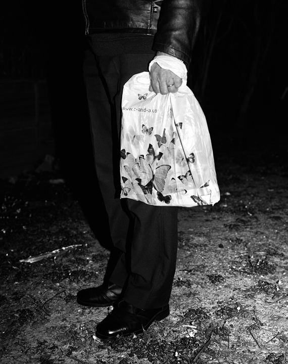
In the same year, Strand completed a second part to the Gone Astray series, called Gone Astray Details. In this series, the duality of inner-city life and rural is much more subtle, with the compositions being much more surreal. An example can be seen below:
From the series Gone Astray Details (2003), by Clare Strand [4]
Here we have a portrait where Strand has dispensed with the studio background and instead shot in a natural environment. The man is standing in what looks like a gravel or well-trodden pathway where the only signs of vegetation are trampled sticks. The hint of the rural is overwhelmed by the smart, city attire of the man which makes him look like he’s not out hiking in the country. The inclusion of a small part of the informal jacket raises questions about who this person is in the context of this composition. Strand further includes a carrier bag decorated with butterflies which adds a contrasting element to the image. The butterflies juxtaposed with the bag, which looks like it’s made of plastic, points to the conflict of the natural world vs. the city. This work and the others in the series mixes the ideas of studio and street photography as the composition has both a sense of being ‘captured’ and lit by artificial light (the flash reflections in the shoes). When paired with Gone Astray Portraits. it’s clear that Strand is not being governed by a particular style and almost challenges us to question what is going on, both aesthetically and from a visual perspective.
Conclusion
I really like the combination of natural and artificial in both of these artists’ work. With Penn, the concept of moving the studio around the world to access a variety of cultures is interesting, achieves a consistent series of images that are anchored by the setup and reveal something of the natural personalities of the subjects. However, I agree with Jay Ruby’s view that the narrative is being controlled to a large extent by the photographer. With this perspective comes the sense that we are viewing different cultures as we might view a museum exhibit. I was reminded of my visit to The Horniman museum on Forest Hill, London [5]. Frederick Horniman’s vision was to collect and exhibit artefacts from around the world to better educate the poor and disadvantaged in Victorian society. The museum is perhaps best known for its extensive taxidermy exhibit which contains many species of animals from all over the world displayed by genus. It’s a fascinating exhibition which invokes feelings of Darwin’s documentary of evolution. However, when I visited I could only see the specimens in the context of their small differences intra-species, that is the way that their are only small changes that took many years to become noticeable. For me, Penn’s series is like this. It feels like the subjects are merely placed in a display cabinet. In contrast, I find Stand’s work more interesting. She places actors in an identical scene and tells a story that is clearly constructed, but also rooted in a perception of inner city life for younger people. Her use of obvious and subtle context to both support and conflict with our prejudicial assumptions about her characters leads me to want to look at the images more and more closely. Her use of the Dick Whittington-esq background is surreal but serves the purpose of anchoring the series as well as suggesting that the countryside is the nirvana that everyone aspires to. Clearly this is not the case for everyone, but again it plays into the hands of the media portrayal of the countryside being somehow better. I think that this sense of conflict and contrast is what I will take into my series for Assignment 2.