Category Archives: Part 1

Exercise 2: Street Photography

The Brief

1) Find a street that particularly interests you – it may be local or further afield.  Shoot 30 colour images and 30 black and white images in a street photography style.

2) In your learning log, comment on the differences between the two formats.

3) What difference does colour make?  Which set do you prefer and why?

Introduction

For this exercise, I chose Tewkesbury High Street which is reasonably local to me.  It interests me because of its history and the fact that my family’s origins can be traced back around 250 years or so.  For the shoot, I decided to use film as the colour and black and white images would be correctly represented, as opposed to performing a conversion in Lightroom.  I shot one roll of Kodak Portra 400 colour and one of Kodak TMax 400 black and white in my Nikon F6 and had them both developed professionally.  After selection, the total images for each type were not quite 30, but I was able to review enough shots to answer the questions set by the brief.

The Colour Images

Throughout my photographic learning, colour has always been the ‘normal’ in pictures.  What I mean by this is that even its most basic in terms of light, composition and interest, colour images represent what we remember how the scene looked when we shot it.  As a child, I randomly shot whatever interested me without any consideration of how the colours balanced or impacted a scene. As I’ve got older, the learning has been around ensuring that colour doesn’t distract from the subject of the photograph.  Finally, with my interest in shooting film in the past few years, I’ve learned that colour can be used to draw attention to a subject, set it within a colour environment that makes it appealing and as a visual frame.  Including elements of colour that complement the subject can help support the story being told just as contrasting colour can distract from it.

For my street photographs in Tewkesbury, I was shooting on a sunny day with intermittent clouds which meant that I also had the colour of the light to work with.

A few examples of my colour images can be seen below:

Ex120200313_12270898_0054-2

In the first shot, I spotted the No Parking sign that had seen better days with two silver cars parked seemingly in violation of the instruction.  My first thought when I took this photograph was that the cars were the same colour (if silver can be considered a colour).  What I didn’t realise until the film was developed was the sense of balance in the frame.  The red brick and the white window frames introduce a symmetry against which the key components contrast.  The signs are both clearly visible but the contrast between their messages is more obvious because of the colour.  A happy accident, but this image works in colour because of the way the frame is filled with a subtle, muted palette.

Ex120200313_12255222_0052-2

The second image was something I noticed as I walked past an old barber’s shop.  The first thing that I saw was their use of tabloid newspapers to screen the windows of the now-empty shop door.  As I looked at the door, I then noticed its bold colour which frames the window.  I think that this image works because of the additional interest introduced by the paper and the door frame.  They create a playful feel to the image, which belies the fact that the door leads into a shop that is now empty.

Ex120200313_12513040_0069-2

The third image selected here is of a bargain basket of Valentine’s Day gifts that I spotted outside a shop.  The Valentine’s theme of pink runs through the whole picture and reinforces the message of the celebration being about love.  The reason I took this photograph was to highlight the sadness of such celebrations, that have become highly commercialised, coming to an end.  I am trying to show the wasteful throw-away culture of our lives with this shot, which I think is enhanced by the impactful colour.

The Black and White Images


Ex120200313_11404149_0002

The first of the black and white images was of a woman walking away from me in some highly colourful trousers.  I was struck by the boldness of this lady’s style and how she confidently down the street.  In order to capture that confidence, I could have shot the picture in colour to highlight the drama of her clothes.  However, I had the black and white film in the camera at this point.  When I look at this photograph, I still see the confidence but I also note the visual clutter of the building works capture in the frame.  The brightly coloured warning foam on the scaffolding and the roadworks sigh would, on reflection, been a clash with the subject.   I think black and white works here because the drama is captured without distraction.

Ex120200313_11582705_0021


The second image is of a scooter rider in the high street.  The weather was turning at the point that I shot this image, with the sun emerging from the clouds. What I think works with this being black and white is the contrast of the tones on the scooter.  Black and white can be very punchy when the light works with the reflectance of the subject and this is a good example of this.  The lower contrast background doesn’t distract or dampen the mood of the image.

Ex120200313_11435365_0006

The third image is of a book shop window.  Tewkesbury has a strong Campaign for Real Ale presence in the town and part of it is a celebration of the history of pubs and brewing. It’s common to see these signs declaring a now-closed pub.  What struck me about this one was sadness at the statement ‘for unknown reasons’.  I shot this in black and white because I wanted to show this feeling of sadness, even though it closed long before I was born and the building still serves the public as a bookshop.  The building itself, typical of Tewkesbury, is from the 1600s and I think the timber frame that is visible in the image is best represented in black and white because it connects with the early photography of this buildings which were all that way.

Conclusion – What are the differences?

If documentary photography is used to tell a story and be used by the photographer to emphasise an element of it, then the differences between colour and black and white can be significant.  In reviewing them, I conclude:

  • Colour can be a distraction. When a scene has many elements, but the story is about one of them, clashing colours can take away from the story.  In my first black and white shot, the subject would have been lost with the addition of colour.
  • Colour can add to the story when it reveals something about subject. My example of the Valentine’s sale has more impact because of the pink theme running through it.
  • In both formats, balance is essential. Too much contrast or colour can distract from the story.  In the examples of No Parking and Scooter, they work because there are no extremes.  The colours are muted and link together in the former and the contrast separates the scooter from the background in the latter.

My personal preference has always been black and white.  When reflecting on why that is, I considered the fact that the images look recognisable but somehow different to how we see the world.  In the days when there was only black and white, we accepted that we couldn’t see the subject as we would if we were looking at it because there was no alternative.  With the advent of colour, the images became more like our observation.  Early pioneers of street photography, such as Meyerowitz and Winogrand saw the progression from black and white to colour as perfectly natural because of that distinction, but they experienced a snobbery from the art world who believed black and white to be higher quality.  For me, I love the way that light can be represented in black and white tones and the punch that can be achieved with it.  However, I also believe that in the hands of a skilled street artist colour can be the differentiator between a good image and one that has impact.  Perhaps it is my own limited experience with the genre that steers me away from it.

Contact Sheets

Project 3 – Reportage

What is Reportage?

In attempting to answer this question, I took the approach that most start with, a Google search.  The answers were particularly puzzling.  Most, including the dictionary definition refer to reporting an event in some form of broadcast media:

reportage

noun [ U ]   formal

UK  /ˌrep.ɔːˈtɑːʒ/ US  /rɪˈpɔːr.t̬ɪdʒ/

the activity of, or style of, reporting events in newspapers or broadcasting them on television or radio

from the Cambridge English Dictionary [1]

The ambiguity in defining the level of objectivity or subjectivity in photography was not really a surprise, given the work so far in Part 1.  The photographer has the power to tell a story that looks like the truth, but from their point of view.  The concept of inside/outside can grant the photographer a form of credibility which they can use to draw attention to the key elements of the story.  This level of manipulation of the viewer, while very clever and often subtle, still needs the elements in the image to make it work.   In the case of the post-event ‘late’ photography the element of time is removed but the juxtaposition of the subject and background, along with the supporting external narrative tells the story.   Intriguingly, the first image in Project 3 is one where an event isn’t occurring at all.   Edgar Martins’ image [2] is of a large empty room, lit from the opposite end to the viewer by French windows.  The only details in the room itself are the elegant architecture, the wooden floor with leaves strewn across it.

05-Conneticut-New-England

A room at 14 Baldwin Farms South, Greenwich Conn., 2009 by Edgar Martins [2]

Why is this image considered to be reportage?  The answer as I see it is that it is a document of the room.  The image shows the elegance of the space that is not in a state of decay but appears to be well looked after. The ‘neglect’ in the image comes from the emptiness and the leaves, suggesting that the room has been abandoned, albeit recently.  The image, for me tells a story in one frame but that story has no supporting context to steer the viewer in any way.  When we consider the series that the image came from, we see a story of the collapse of the American economy following the sub-prime mortgage scandal of 2008.  Power messages of houses in a state of decay or being reclaimed by nature make the series a compelling one.  What was shocking was that the photographs were digitally manipulated by Martins without the knowledge of the commissioning body, The New York Times.  In the image we have, close inspection reveals cloning of the leaves on the floor and of the light switches in the wooden panelling [3].  The outrage caused by Martins’ seemingly distorting the truth about the subject was dismissed by the artist as being a misunderstanding [4]

“It is crucial that both the commissioning entity and the photographer can articulate their goals and parameters clearly. In this specific case there was a clear misunderstanding concerning the values and rights associated with the creative process that led a renowned publication like the New York Times Magazine to commission an artist, such as myself, to depict a very specific view of reality without taking all the necessary measures to ensure that I was fully aware of its journalistic parameters and limits.”

What he was saying was that he didn’t appreciate the newspaper’s intention to limit his creativeness to tell a truthful story.  For me, this lack of expectation management reveals how photography itself can be manipulated to suit a single purpose.

When considering the decisive moment, where the events are unfolding in real time, I see a similarity to modern citizen journalism.  Cartier-Bresson was sensitive to all of the elements in the frame as opposed to the subject matter alone, which allowed him to tell the story through a single moment in time.  Optimal placement of the elements, no matter how subtle can tell a much broader story as with the image in the notes.

Bresson’s Dessau shows a Gestapo spy being shown to the crowd she was trying to hide in.  The elements that make up the frame are compelling as they contain multiple expressions of anger and disgust on the faces of the crowd and the woman who is detaining her.  The prisoner has an expression of shame as the person she is brought before reviews her papers.  It’s little wonder that this image told the tale of the turning tide of the war in a single frame.  The Gestapo were a feared Nazi secret police force who were known for turning citizens into spies and informants within the ranks of ordinary people and resistance fighters alike.  The image of one being captured is about as good a piece of propaganda for the allies as there is, but as with all decisive moment imagery, we interpret what happened immediately before and after the shot by the elements in this single snapshot of time.  Objectivity is not really anywhere to be seen.

References

[1] 2020, Unknown author, ‘Dictionary Definition of Reportage’. Cambridge English Dictionary, https://dictionary.cambridge.org/dictionary/english/reportage

[2] Martins, E, 2008, “This is not a House”, Artist website, http://www.edgarmartins.com/work/this-is-not-a-house/?show=photographs

[3] Various, 2009, “Truthy lies: photographers speak out on Edgar Martins”, Critical Terrain Blog Post, https://criticalterrain.wordpress.com/2009/07/23/truthy-lies-photographers-speak-out-on-edgar-martins/

[4] Beesley, R, 2012, “This is not a House”, Aesthetica Magazine, https://aestheticamagazine.com/this-is-not-a-house/

Documentary and Social Reform


The depression-era  Farm Security Administration (FSA) and it’s approach to documentary is a great example of using photography to bring a national catastrophe to the consciences of people who’s lives were less affected.  Formed in 1935, the FSA sought to use the power of photography to drive socioeconomic change in the period following the Great Depression.   This use of photography was very contrived in the way that the photographers were instructed to look for certain types of images to support the message.  Looking at the story of the FSA, I’m immediately struck by the uneasy conflict of something that undoubtedly was a force for good and the propaganda nature of the imagery itself.   Dorothea Lange complained that the preconception of the photographs meant that they were limited by the photographer’s own preconceptions of the subject.  Pre-vision in photography is a well-known concept with famous artists like Ansel Adams meticulously planning and visualising the photograph he wanted to make.  I’ve always viewed Adams as a hugely skilled technical photographer who’s creativity centred more on emphasising the beauty of the natural world than bringing a message to his photographs.  I guess that is how I became interested in photography as it lent itself to my technical interests more than creative vision.  What’s interesting about the photographs from the FSA era is that it produced what are now considered to be iconic artworks.

Migrant Mother, Dorothea Lange (1936)

Perhaps the most famous is Lange’s Migrant Mother.  When we think about migrants nowadays, we are immediately drawn to the images of people either fleeing persecution in their home country or seeking opportunities somewhere new.  However, migrants in the context of the Great Depression were Americans from the poverty-stricken rural areas of the US.  The first thing I notice when I look at this image is that we are looking at a seemingly Caucasian family, which during the 1930s must have had the desired shock factor when viewed in the context of politics of the time.  This family, comprising a mother and her two children could be anyone’s family.  The clear suffering of the family is told by her distant stare, the way the children look away from the camera and the general poor state of their clothing.  The other element that strikes me is the absence of the father in the image.  Was Lange looking to increase the impact of her suffering by suggesting that it was something she had to do alone?  For me, this missing element also creates a sense of protection and love through the composition that the course notes refer to in the comparison with imagery of the Madonna with Child.

28Lange1-superJumbo

Migrant Mother by Dorothea Lange, 1936 [1]

Further review of the story behind the image reveals a different perspective on the picture.  The mother, Florence Owens Thompson was in fact a Native American Cherokee, which isn’t revealed in photograph itself. When interviewed later many years later [2], Thompson decried the fact that Lange did not talk to her about her situation and even claimed that she promised that the photographs she took would not be published.  Thompson was offered no form of payment or compensation at the time or subsequently when the image became famous, which led to her regretting ever being part of Lange’s document.  Lange took a number of images of Thompson and her children during their brief encounter, and when we look at them we see both carer and sufferer brought out across the series.  Perhaps then, Lange saw this single image being the one that represented both in equal measure.

References

[1] Estrin, J, 2018, ‘Unraveling the Mysteries of Dorothea Lange’s ‘Migrant Mother’, The New York Times, https://wordpress.com/post/richardfletcherphotography.photo.blog/2010

[2] Dotson, B, 1979, “Interview with Florence Owens Thompson, the Mona Lisa of the Dust Bowl, NBC News Broadcast, https://www.nbclearn.com/makeitmemorable/cuecard/1526

Aftermath and Aesthetics

In regard to Campany’s essay ‘Safety in Numbness’

Introduction

Campany’s essay was in response to the post-911 photography project by Joel Meyerowitz, the only photographer given access to the ruins of the World Trade Center towers during the recovery operation.  His assertion is that images shot after an event that capture only traces of what has happened are an aid to memory of it, rather than a document of it.  The stillness created by an image of aftermath is more about the photographer’s skill in creating an aesthetic rather than the impact of the event itself.

My consideration of the essay

When I read this essay, I was already looking at it defensively.  Meyerowitz is arguably my favourite photographer and I initially felt that this was a patronising look at what was a well-intended project to record the tragedy of 911 for the American people.  However as with most challenging material, when we look beyond initial perceptions or even predjudice we can identify with some of the key messages.

I found Campany’s comments about the role of photography with the development of moving picture technology interesting.  In the days before mass print journalism, photography provided the single moment of an event to inform the public of something relating to it.  The lack of real-time information didn’t really matter because there was not alternative at the time.  With the advances in print media, photography became the way of emphasising the impact of an event or series of events, e.g. the great depression of the 1930s.   It was later criticised for being narrow in its perspective when bringing the general hell of war to the people.  However, Campany adds that photography ceased to be used as the primary documentary tool for war zones after Vietnam.  I was a teenager when the first Gulf War took place and hadn’t really appreciated until reading Campany that video and moving imagery were the primary ways for us to understand the conflict.  I remember the first still images (that weren’t freeze frames from video) being after the allies had gone into Kuwait after the Iraqi surrender.  The still nature of those images are, as Campany describes, horrific but numbing.

In terms of he comment on Meyerowitz, I can see the point being made that despite the photographer asserting that the subject ‘told him how to shoot it’, his skill means that the images take on a certain beauty that is almost counter to the idea of documentation. I have the photographs in Meyerowitz’s collected works book ‘Taking my Time’ and they no longer remind me of how tragic 911 was.  Instead, they serve as a collection in the canon of one of my favourite artists.

Project 2: Photojournalism

Considering the three viewpoints, Charity, Compassion Fatigue and Inside/Out

Martha Rosler

Rosler’s assertion that the use of photography by social-conscience photographers increased the gap between social classes is an interesting one.  Her essay ‘The Bowery in two inadequate descriptive systems’ looks at the photographers who documented the Bowery slums during the Depression era.  Her view was that the use of photography to highlight the plight of the poor and the homeless was considered an attempt to bring their world into that of the higher classes to affect change.  While on the surface it looks like a noble effort, Rosler stated that the effect of pointing out that ‘you have much better lives than them’ merely galvanised the class structure.  For me, the criticism of the sentiment is harsh.  As with the work of the FSA, the intention was to effect change by ensuring that the wealthy did not forget the problems of the poorer classes.  In the case of the photographers working for the Farm Security Administration, the scale of the geography involved could only really be reported through photographs as many of the upper classes were not centred in rural America.  Was it pushing a socalist agenda?  Undoubtedly so, but when considering the imagery in a non-photographic review, I admire what they were trying to do.  Where I agree with Rosler is the exploitative nature of the work in the Bowery slums.  Here the photographers were capturing images of people who had little in terms of voice or in some cases, even consciousness.  Alcohol and drug abuse was rife at the time, so many of the subjects would not have even been aware of the context the photographers were looking for.  Some may have not registered that they were being photographed at all.   I immediately saw the connection with Mendel’s Dzhangal, where the people themselves didn’t want to be photographed.  By using their possessions without them being part of the project, Mendel essentially avoids any counter discussion about the lives of the people at the camp.  The other connection I drew was when people photograph wild cats.  Most access to wild cats is via a zoo or rescue centre, where an animal has limited ability to be as it would in the wild.  Like many photographers who have shot these sort of pictures, I have waited for long periods to capture what I think is the behaviour of the cats and what I want the people who view my photographs to see.  In fact, if I really wanted to document a lion or tiger as it should be seen, I’d have to go on a safari.  Here, the constraints of environment are removed which allows the subject to act entirely naturally.  Friends who have shot in these conditions say that there are many more opportunities to observe the animals when not trying to control them. When I read Rosler’s paper, I concluded that the Bowery and the social circumstances were the constraints and the people were effectively being watched for certain patterns of behaviour.  I concluded then that this use of documentary photography is exploitative, even if that wasn’t the original intention.

In terms of its ability to effect change, I believe that photography is a powerful addition to wider perspective, either written or spoken.  The irony of the socially conscious image that seeks to change, is that the only way it becomes well known is for it to be distributed.  Distribution usually involves some form of financial benefit, whether through purchase or enhanced exposure.  With the advances in social media and camera technology, that benefit is more widely acquired, but for me the expectation of some form of altruism in return is a naïve one.  With Lange’s famous image ‘Migrant Mother’, the subject complained that she never benefited from the success of the photograph despite the photographer having done so.  I suppose the thought was that the impact of the work of the FSA would outweigh any royalties, but nevertheless Rosler’s theory that the divide between rich and poor increases, is validated by the apparent lack of support.

Over the decades, we have seen examples of imagery provoking action in people, from Live Aid to Climate Change.  In some cases, the appeal is for help while others seek to shock.  The sheer volume of photographs that are taken of a single subject is, in my view, having a greater impact because of the perception that they statistically support the argument.  For example, the bombardment of the suffering of animals due to habitat loss through climate change, provokes a sensibility in many (particular in the UK, where people are considered animal lovers) that sparks people into action.  This plays somewhat into Sontag’s argument about compassion fatigue, but it’s demonstrably successful with animal charities being among the most supported in the UK.

Susan Sontag

Compassion Fatigue is a feeling that I regularly get when viewing photographs.  Last year, I visited Tate Britain to see Don McCullin’s major exhibition.  The collection contained some 270 photographs spanning McCullin’s time as a war photographer.  The imagery was naturally harrowing but because there was so much of it, I found myself beginning to look at the way the photographs were shot rather than at the subject itself.  I had become disinterested in the horrors of the images and even applied the same disengaged fatigue to his lighter landscape work towards the end of the exhibition. I think the shock value of war photography starts by making the viewer feel like it’s something real to them, but as the number of images increases, the sensation moves to one of normalisation.  With that normalisation comes a sense of ‘it’s not real to me’.  In my experience during the McCullin exhibition, I found that my sense of empathy toward the subjects dulled with the increasing number of photographs, but also my ability to reset my perspective when it came to less harrowing imagery.  McCullin’s landscape photographs of the flood water on the Somerset Levels in late 1990s were bleak in the way they were photographed.   As the majority of the other work was war or conflict, my natural tendency was to see the destruction of the flood water, rather than the dramatic power of nature.  Similar to Mendel’s images of people in flood water, there is both resignation in the expressions of the subjects as well as a sense of comfort in a few of them.  How can we tell the difference in the photographer’s intention?

Abigail Solomon-Godeau

The answer to my last question comes from the essay by Abigail Solomon-Godeau.  The concept of being an insider vs a spectator perhaps offers the explanation of the flood images.  In Mendel’s images, the flood victims have let him into their lives to capture what are very clearly posed photographs. In the case of the photograph of the woman in her hallway that I described at the start of this course, the sense of being inside is even stronger because the photographer lives in the UK and is very much part of the society devastated by the weather of that time.  In the case of his photographs from India, that connection is missing which for me turns him (and us) into the tourists described by Sontag.  For me, then, the difference is around how we relate the image to our own lives or supporting context, in this case what we know about the artist’s body of work.  During Expressing Your Vision, I looked at Nan Goldin’s work “The Ballad of Sexual Dependency” that is referenced by Solomon-Godeau in her essay.  My research took in a number of interviews with Goldin[1] where she talked about her years living in what others called the fringe society in New York.  Her subjects often lived with her and as a consequence, Goldin’s photographs in that piece often show her friends in everyday relationship situations, some good and some bad.  Goldin shows her subjects from a viewpoint of a clear closeness that can only really be achieved by being an insider.  When I visited the Diane Arbus exhibition in London in spring 2019, I was struck by her early work photographing circus performers.  As Sontag postulated, Arbus’ photographs were more of an impassioned look at her subjects and we really get that sense of ‘look at how different this person is?’ when we look a them.  An example from each photographer can be seen below.

2015.136

Female impersonator holding long gloves, Hempstead, L.I. by Diane Arbus, 1959 [2]

HERO_NAN_GOLDIN_THE_OTHER_SIDE_5-1132x620-1573142125

Jimmy Paulette on David’s Bike, NYC,  by Nan Goldin, 1991 [3]

Solomon-Godeau also makes the point that no matter what the intention, there is a risk simply by looking at a photograph that the subject becomes objectified.  In the example of transvestites, whether inside or out the photograph itself merely shows someone’s sexuality or way of life.  Without any other contextual information in the photograph, the interpretation becomes determined by the viewer’s own perspective on sexuality or gender irrespective of the intention.  Goldin stated many times that her and her friends didn’t see themselves as on the fringes of society, but clearly most people viewing her images are not from her world so we can expect interpretations to be different.  Solomon-Godeau’s view of Rosler’s Bowery images was something that interested me.  Removing the people from the photographs creates a sense of representation without turning the people themselves into a spectacle.  It connects neatly back to Mendel’s Dzanghal where lives were described without the people themselves.

In terms of what makes a successful documentary project, I am left with the thought that it very much depends on what the photographer believes to be their viewing audience to be and the nature of the subject itself. I’m currently working on a personal project to document the decline of the high street in my town.  I’m visiting and revisiting the town centre as part of my daily walk and trying, without bias to capture the changes.  When I started the work, I hadn’t begun this course and in terms of reflection I realise that I am both inside and outside.  I am passionate about my home town after living here for 20 years and the fact that I have friends who own businesses here makes me an insider.  However, I’m not a business owner by profession and so don’t fully appreciate or connect with their struggle, which in turn makes me an outsider.  I’m also conscious of the glimmers of optimism that are around the town which I am photographing in equal measure, trying to maintain a balance.  All of my photographs to date have been devoid of people, but trying to capture the essence of the business that was there before. I guess I have been subconsciously trying to work more like Rosler.  The long term nature of the project means that this may evolve as things change around me. In conclusion, I believe that balance of subject, empathy and perspective of the photographer is the compromise to achieving as objective document within a single photograph or series.  I’ll revisit these thoughts are the project progresses.

References

[1] Reeves, E, 2017, “On the Ballad of Sexual Dependency”, MOCA, https://www.youtube.com/watch?v=iDSvD0yhjWQ

[2] O’Regan, K, 2019, “Diane Arbus’ unflinching portraits of outcasts are more impactful now than ever”, Sleek Magazine, https://www.sleek-mag.com/article/diane-arbus-hayward/

[3] Finn, B, 2019, “A new book documenting Nan Goldin’s journey through drag”, HERO magazine,  http://hero-magazine.com/article/159524/a-new-book-documenting-nan-goldins-journey-through-drag/

Case Study 1: Dzanghal – Gideon Mendel

Overview

Gideon Mendel’s exhibition called Dzhangal presented a mixture of photographic and object art as a portrait of the lives of the refugees who lived in the now-closed camp at Calais.  He recovered personal and environmental items from the camp and sought to create a document of the chaos of life as a refugee, by trying to apply some form of order to what he saw.

My analysis

Mendel was interviewed during the installation of his exhibition at the Autograph Gallery in London and described the way his original concept for his work had not been successful.  He had originally put the emphasis on photographing the refugees themselves, placing himself in their world.  He wanted to tell the world about their plight but ran into the seemingly obvious issue of them not wanting to be photographed for reasons of possible identification and the potential consequences thereof.  By shifting his emphasis to the trace elements of their existence, he created an equally powerful picture of life for the people of the camp.  I was particularly drawn to the mix of items in the exhibition.  For a photographer, Mendel’s exhibition contained a relatively small number of photographs compared to the physical items.  My initial conclusion was that Mendel didn’t want to use photography as a pseudo-objective way of telling the story, presumably because of the potential for criticism of bias. With the shifting political mood around the acceptance of immigrants into the UK at the time, the collection could be seen as an anti-policy statement being made by a non-UK artist.  As ridiculous as that might seem, the use of items collected from the camp as part of the exhibition does suggest objectivity.  As well as the curiosity of the items, such as the collection of toothbrushes that had Mendel wondering about the traces of DNA from their owners, the police tear gas canisters were also included.  The latter factually states that there were conflicts between the refugees and the authorities, whether we chose to acknowledge it or not.  It was when I watched the documentary [1] that I realised that even the objects themselves were chosen to emphasise that narrative.  The inclusion of the twisted bicycle pointed to a deliberate destructive act, but it could just have easily been damaged in the clearance of the camp.  Mendel’s own family were refugees that fled the holocaust, so it’s not really a surprise that he wanted to push the hardships suffered by the people of the camp.  When considering that context, the photographs in the collection actually focus more on the everyday life of the people rather than their experiences.  It isn’t lost on me that my perception of the exhibition changed with research, as external context can frequently shift the way we think about what we see, even by a tiny amount.

References

[1] 2017, “Calais Jungle Artist Gideon Mendel: ‘Nigel Farage would despise this exhibition’, Evening Standard Interview, https://www.youtube.com/watch?v=SVrn0XqfnBs


Assignment 1: Two sides of the story

The Brief

Create at least two sets of photographs telling different versions of the same story.  The aim of the assignment is to help you explore the convincing nature of documentary, even thought what the viewer thinks they see may not in fact be true.  Try to make both sets equally convincing so that it is impossible to tell which version of the images is ‘true’

Choose a theme and aim form 5 to 7 images for each set, depending on your idea.

Send your images to your tutor by the method you’ve agreed.  Include an introduction of 300 words outlining what you set out to do and how you went about it.  Also, send the relevant pages of your learning log or your blog url.

Introduction

I started thinking about this assignment shortly after reading through the course notes for the first time.  I had been working on a long-term project which would document the decline, battle for survival and beginnings of rebirth of the high street in my home town of Malvern.  Over the 20 years I have lived here, there have been huge changes to the retail and recreational landscape of this old town, whose roots were established during the Victorian era.  The changes from that time were significant as Malvern was then considered a destination for health and wellbeing.  The Victorians believed that the spring water from its hills was a cure for common ailments, so along with the desire to walk in the countryside that inspired Elgar, people flocked to the town to ‘get well’.   The more recent changes though, have been as a result of the shift from traditional high street footfall to the online shopping model and an age where everything can be purchased in one giant supermarket.  The town had become a place where only national chain cafes, restaurants and charity shops are the only places that could survive; the latter benefitting from vastly reduced rents.  However, there are some signs of revival, with independent specialist shops opening up to serve niche markets.  This evolution is slow and gradual, which meant that my project was probably not going to work for this assignment because of how long it would take to complete.

When I came to actually plan for the assignment, the world had been plunged into a crisis, the like of which hadn’t been seen since the Second World War.  Coronavirus originated in China towards the end of 2019 and by the beginning of March 2020 had taken hold in almost every country on Earth.  Life had changed immeasurably during that period, with most countries introducing strict lockdown measures that restricted the movements of their citizens.  Every way of life has been affected and businesses have had to react quickly to survive.  In my own company, all personnel that can work from home are now doing so, which presents its challenges, anxieties and impacts on family life.   My team of 25 comprises families, single people, those with physical and mental health vulnerabilities. My daily challenge with the team has been navigating the fear and anxiety that the virus has created, focussing on what is important to them while maintaining control over the business.  During our daily calls, we talk about the news coverage, the panic-buying and social distancing that have become everyday life for all of us.  This got me thinking about my how the current situation has more than one side to the story.  For every tale of the speed of the virus spreading and how people are acting irresponsibly, there are numerous stories of positivity, gratitude and solidarity during what is an unprecedented, horrific time.

My Theme

I decided to choose a statement the describes, perhaps controversially my perspective on the experience of the coronavirus lockdown.  My first set would support the statement and the second present the counter argument.  I was inspired by the work of both Gideon Mendel and Paul Seawright as two things resonated with me during the work in Part 1.  The first was Mendel’s use of traces of the event in his work in the immigrant camps [1].  His use of possessions to tell a story about the owners without them actually being present was documentary in the way that we could relate to the objects, but built around a specific context that resonated with the artist.  Seawright’s Sectarian Murders [2] was hugely powerful to me as the context was layered with news reports, themselves steering us towards a particular narrative.  Yes, the blame wasn’t specifically apportioned in the works, but the documentary of the horror without historical context (the causes behind each event) leaves the viewer with their own take on the Northern Ireland conflict.  As Seawright said in an interview, using too few contextual points leaves too much room for narrative and too many leaves the viewer with nowhere to go. For my series then, I would not be using anything that specifically referred to the virus or the lockdown, only imagery that includes the context and space to allow the viewer to create their own narrative.  My take on the brief is that the two sets of photographs will have a sense of duality about them, making it difficult to understand what is happening or determine if the ‘truth’ is being told.

For my theme, the statement is “Coronavirus is changing society for the better”

Ground Rules

I set out with some simple ground rules for the images for this assignment and how they would be presented.  They were as follows:-

  1. There would be no visual references to Coronavirus or COVID-19 in the images.  As with Mendel’s work [1], the contextual details in the image would only suggest that something has happened/is happening.
  2. I would include people, but not exclusively.  As this theme was a take on the changes to society, it would be easy to simply depict people in their new environment.
  3. I would present them as a jumbled collection with no external context applied to begin with.  This is how I viewed Seawright’s work and was startled by how the addition of the simple contextual paragraph changed my perception of them.  I would not give them names or numbers at this point.
  4. I would then add a two word context to each image to split them into their supporting and contradicting stories and review how effective they are as a document of these unusual times.
  5. Each image would be the colour and the same crop.  Since I believed in Exercise 3 that black and white was able to actively assign a mood to the images, I would avoid its use. I naturally tend towards landscape format with an 8×10 crop, probably because of my connection to film.  Making them all the same would avoid any distracting elements that steered the viewer one way or another.

The Unordered Images

Initial thoughts

Since starting this degree course, I’ve noticed a need that I’ve developed for making sure that the elements in a photograph work with each other.  If something is superfluous and doesn’t connect with my vision of how I want the photograph to look, I generally discard and reshoot if possible.  Of the images here, only one of them is staged, while the rest were observations during my government-sanctioned daily walks. I’m happy that the set contains no distractions or jarring compositions to begin with.  As we’ve been blessed with glorious weather during this work, I don’t believe there to be any context created by differences in the light either.

Applying the Context

Here are the images again, presented individually with two word context added in the form of a title.

Now we have some clearer ideas about the intended message behind this photographs.  From this, they can be grouped into their supporting and contradicting sets:

In support of…

Contradicting…

Review – Intent vs. Alternative Meaning

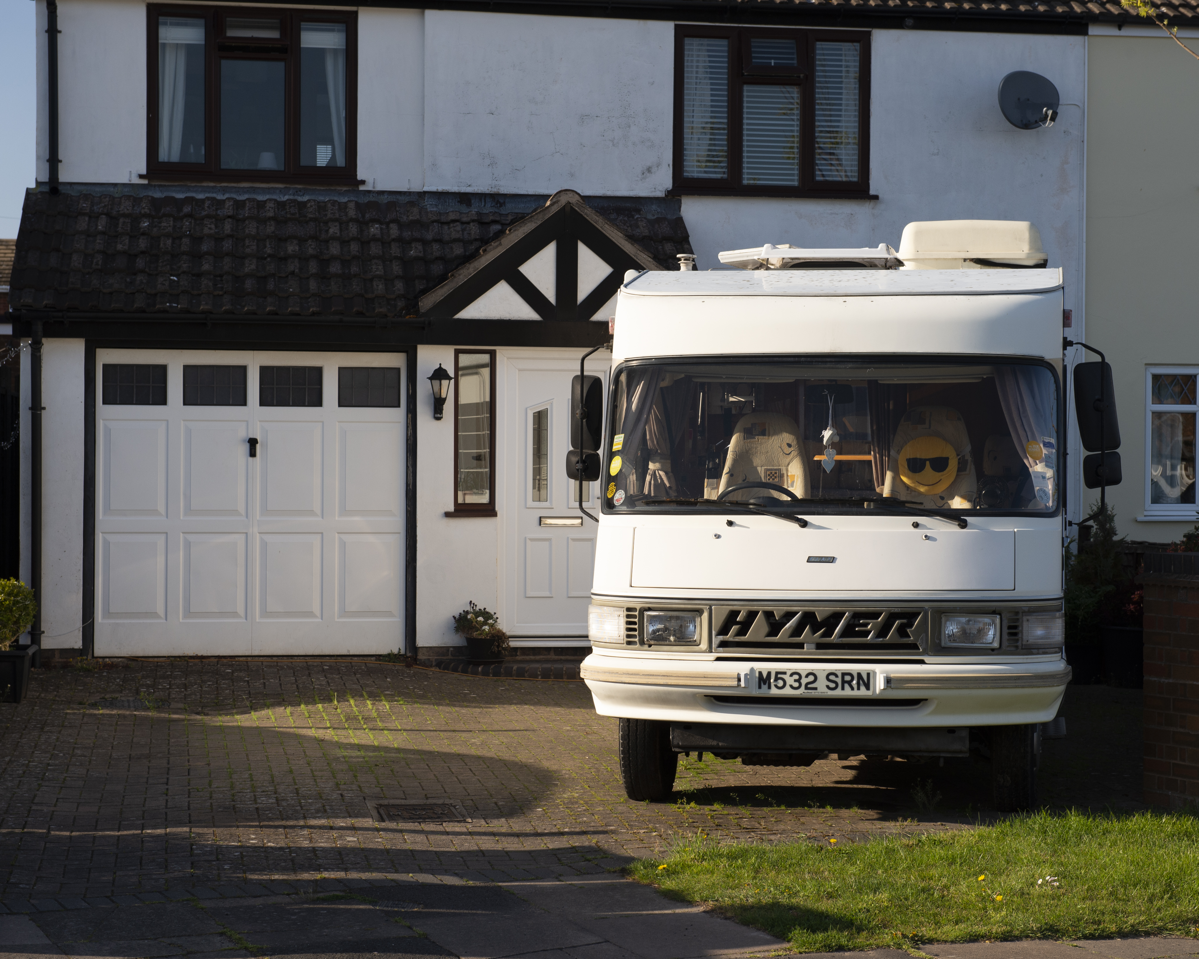
Smile, People – We saw this camper van on the driveway of a house in a less affluent part of the town one evening.  The whole street had put out smilie face and Jolly Roger flags in their gardens to cheer up any passers by.  This simple smile gesture certainly made me smile, even though there is a sadness to the van that is going nowhere while we are in lockdown.

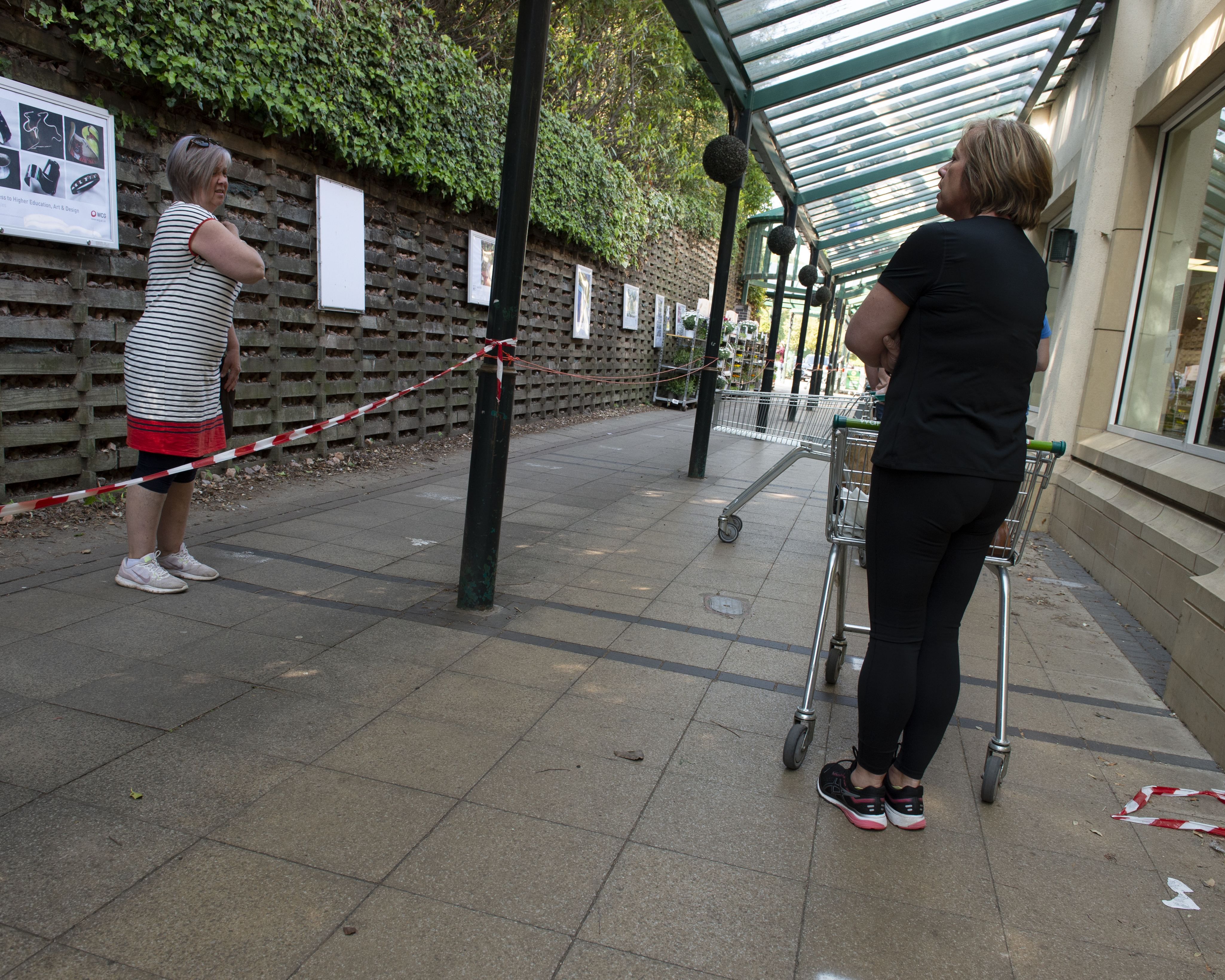
You ok? – One of the many negative things about COVID-19 is the queueing for food, which at the start of the crisis was further characterised by panic buying and stockpiling essential items.  Standing in this orderly queue for the supermarket, the lady in from started a conversation with a friend she hadn’t seen since lockdown.  They had their conversation over the barrier at a safe distance from each other.

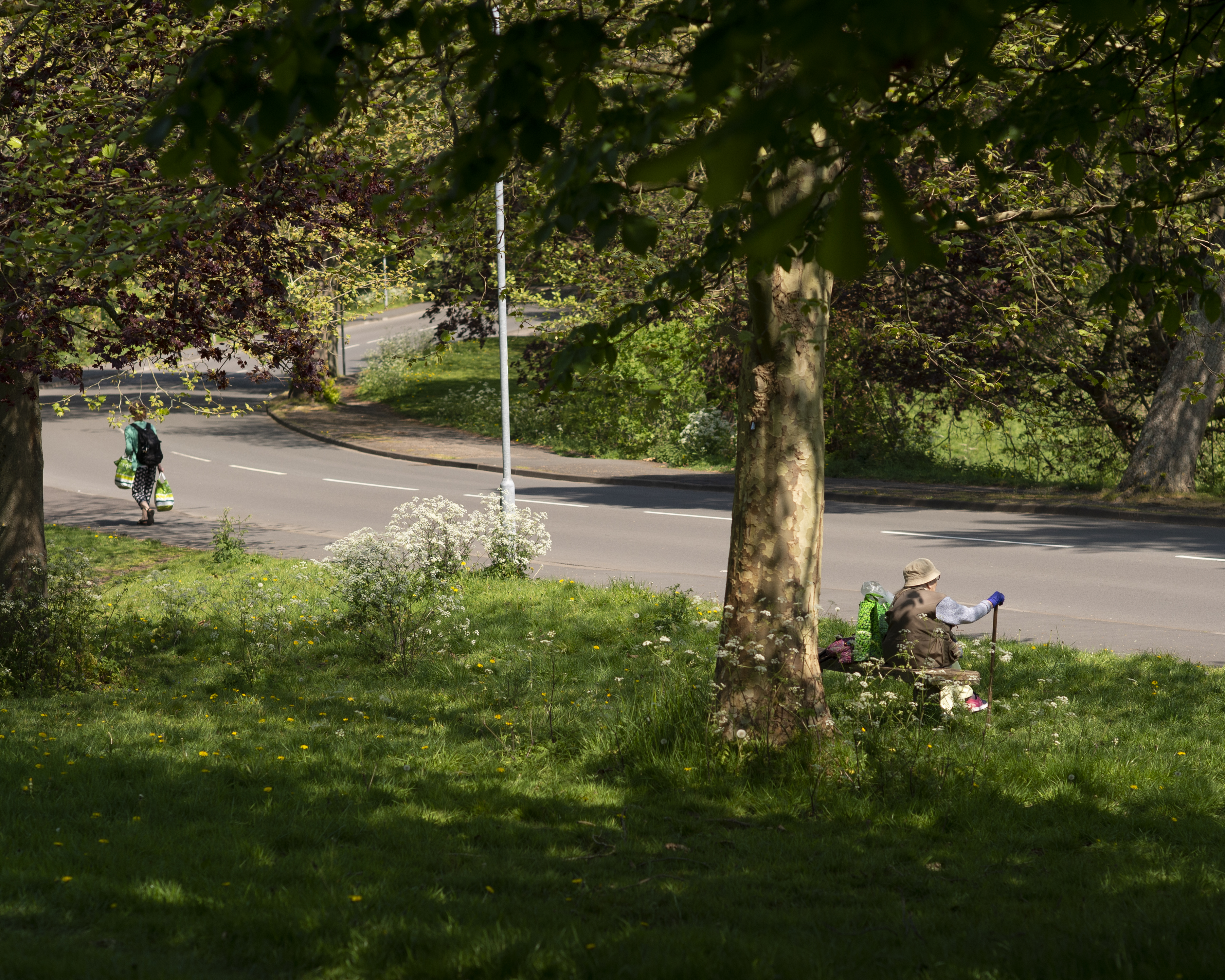
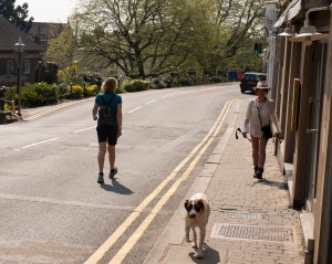
Great Outdoors –  I came across this scene of an elderly and young woman out in the sunshine carrying their shopping home.  One of the positive elements of the lockdown is the encouragement of people to get some daily exercise following the government guidelines.  Here we have two people of very different age groups combining exercise with the necessity of shopping.   This could equally be a statement about isolation and vulnerability with the younger woman not obviously helping out the old lady.

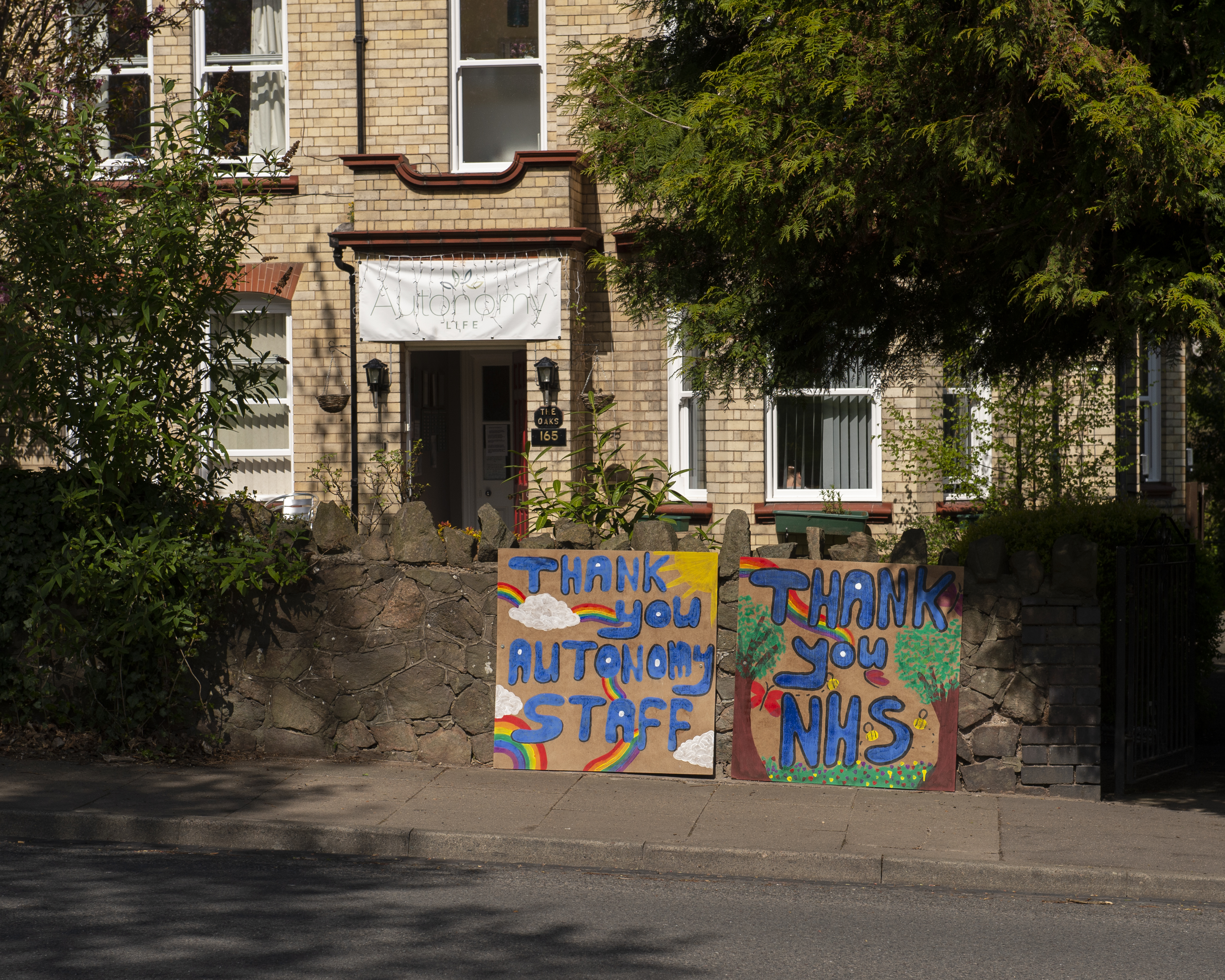
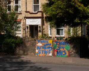
Grateful Patients – Positive messages in support of the NHS have been everywhere, with weekly clapping and painted signs like this one saying thanks to the key workers.  While not limited to the NHS staff, they have been the biggest target of affection.  Here, the patients of a local care home are also thanking their carers.  This could equally have been a comment about being locked down in a care home and just wanting to communicate with the outside world.

Nature Reclaims – With no non-essential work being carried out, Malvern’s own street art is being reclaimed by nature.  Another positive impact of the virus has been the effect on nature, both wildlife and the wider drop in pollution.  This could also have been about a lack of attention to the town; letting it get scruffy through lack of maintenance.

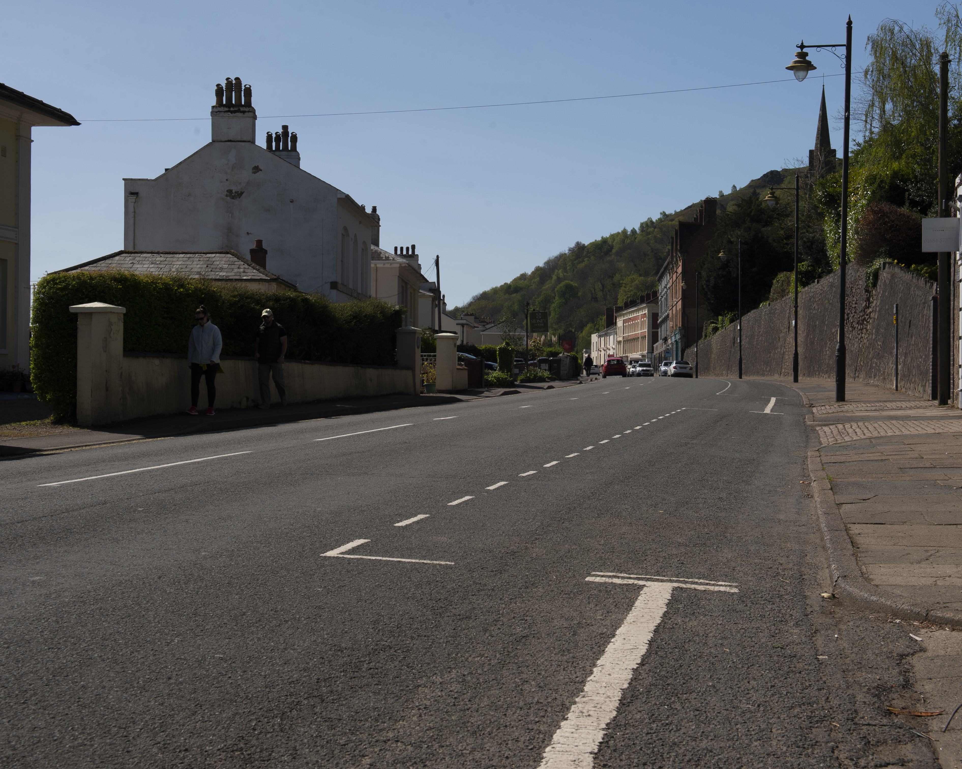
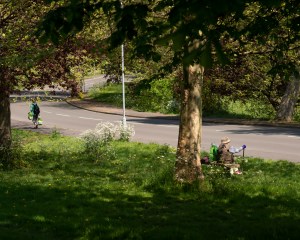
Peaceful Parking –  This stretch of parking spaces is generally never empty.  The effect of less people out in town is that the whole place takes on a peace that is only normally witnessed at night.  It could also have been about the crippling impact of the virus on the local economy.

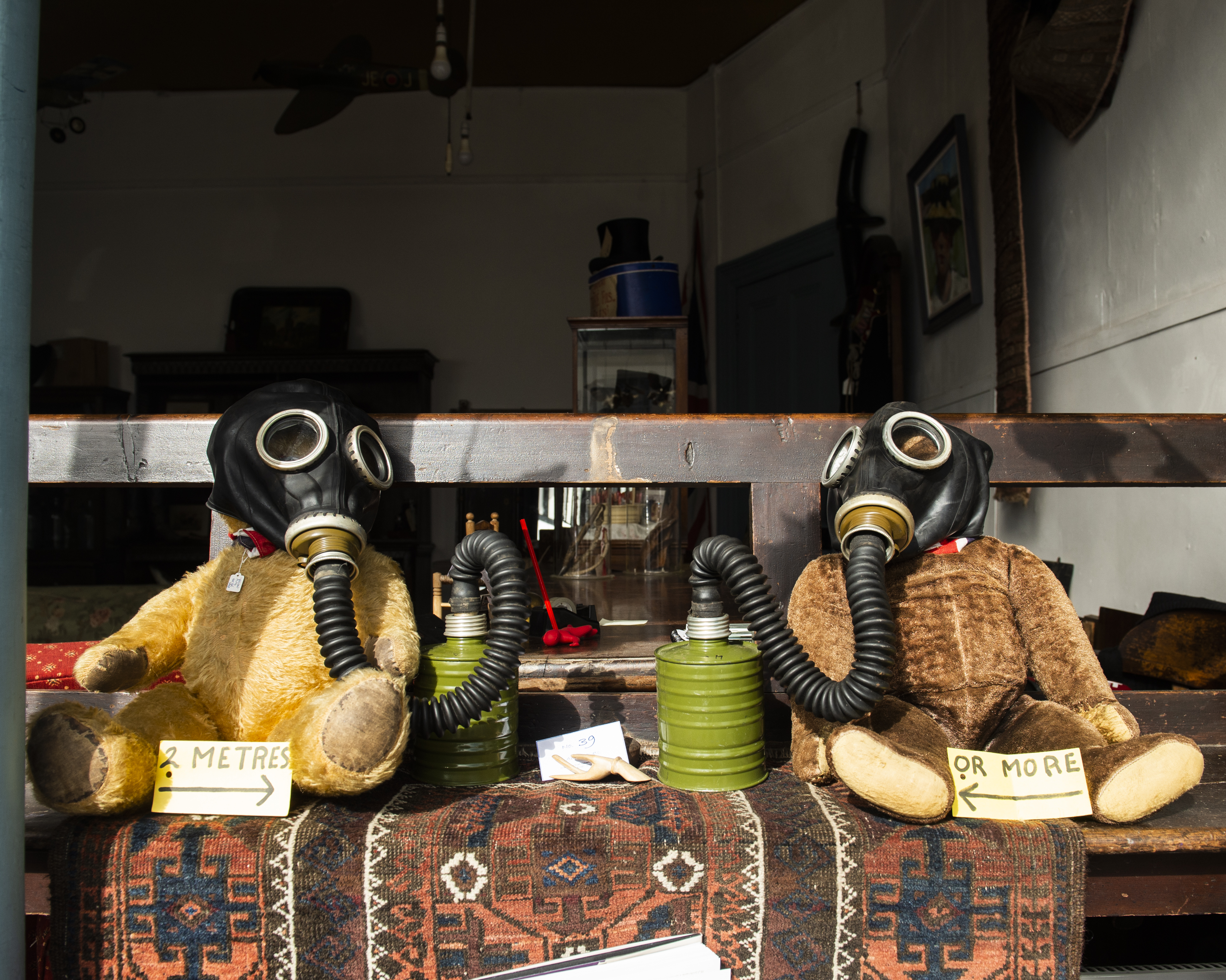
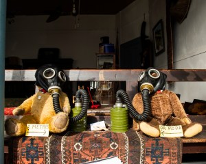
Typically British – One of the town’s many shops showed its sense of humour with the socially distancing bears.  They started out 2 metres apart and then moved closer together with the addition of some fetching wartime gas masks.  The masks themselves have a sinister appearance, which could be interpreted as part of the fear around the virus and the way that it has taken hold.

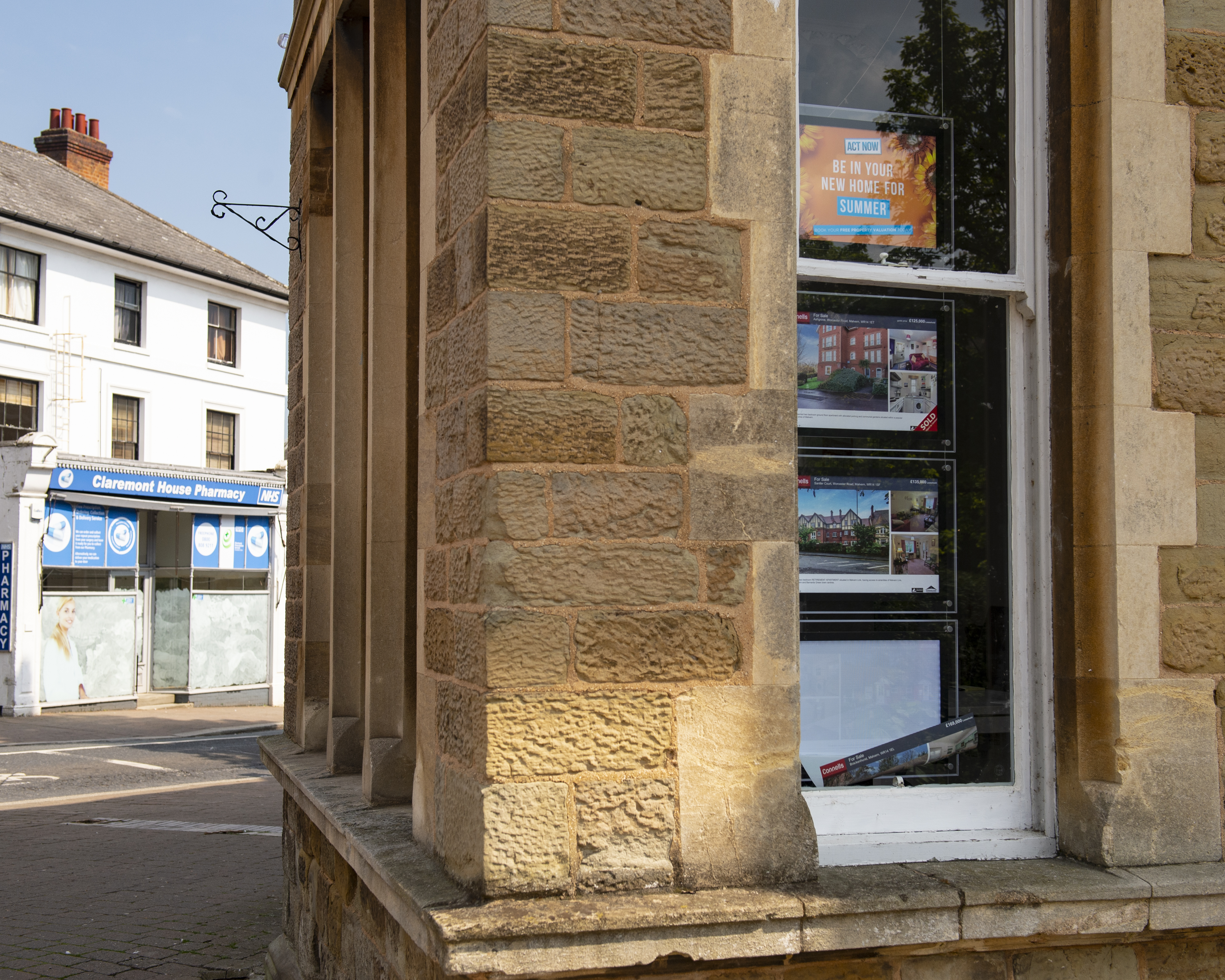
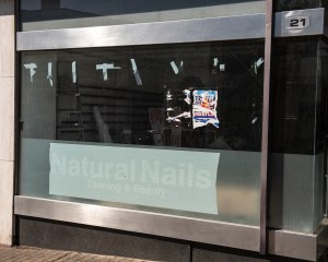
A Promise? – I shot this photograph because I noticed the juxtaposition of the advertisement that has slipped from its mount and the promise of being able to move in the summer.  I wanted to capture the interrupted good intentions of the window display where clearly nobody was at work in the building to fix the broken advert.  The pharmacy in the background actually relocated to another building before COVID-19 struck, but in this image it reinforces the impact of the virus on key businesses.  The duality of this image is that its possible that the advert hadn’t been noticed by the staff and the combination of the good weather and the promise could be read as resilience in the face of the virus instead.

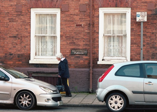
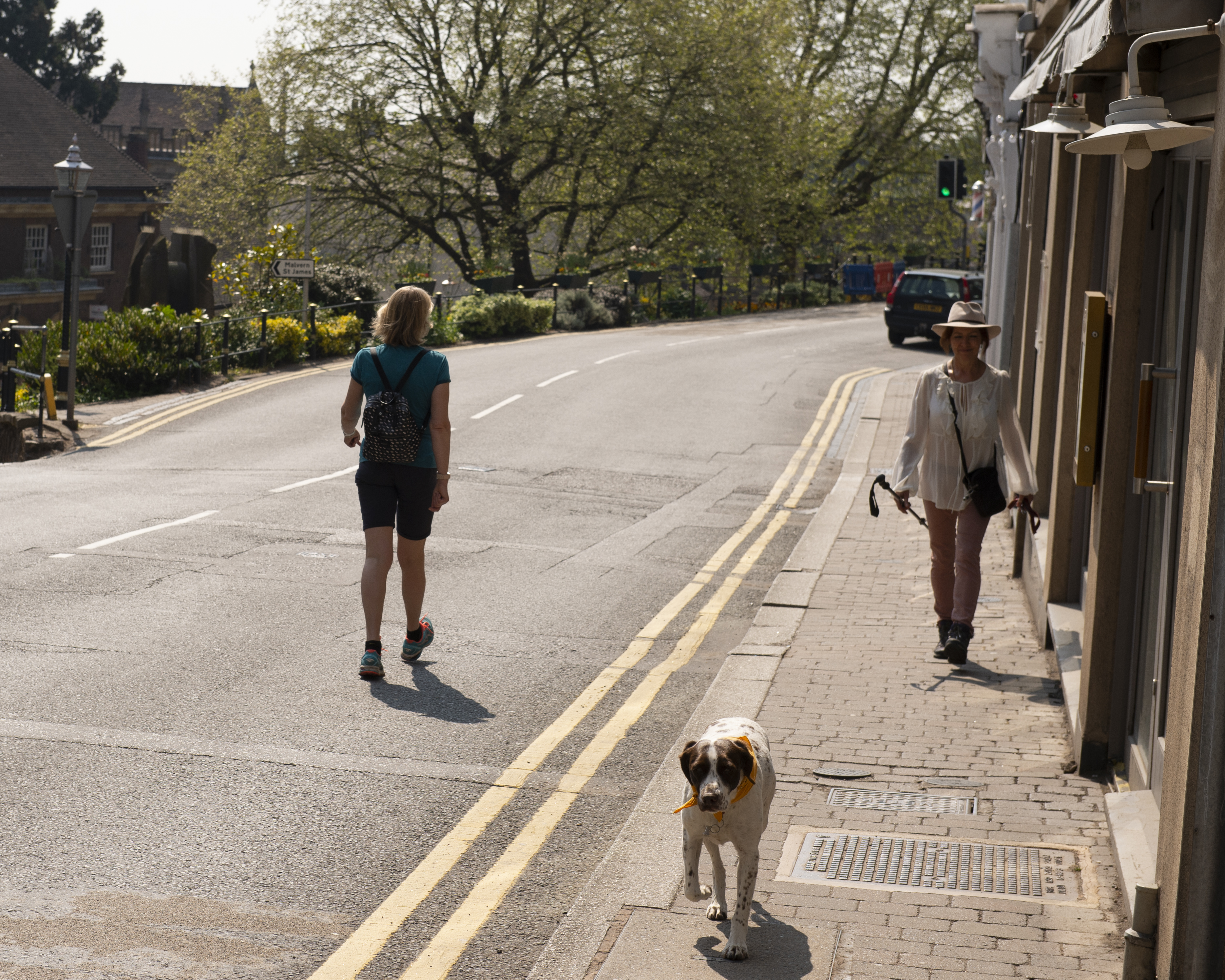
Socially Distant –  On one of our sanctioned exercise slots, I followed my wife with the camera looking to capture the new behaviour of people deliberately distancing themselves from each other.  In this shot, my wife walks into the road to avoid the lady with her dog.  What I wanted to capture here was the matter-of-fact action taken by wife at this moment, almost ignoring the lady altogether.  The message being that despite the context of the sunny day, the excited dog and the smiling lady, the act is one of coldness.  In fact, the opposite is often true.  In this case the smile was appreciation of the gesture and pleasantries exchanged.  This is an example of a decisive moment not describing the sequence of events, but merely an instant where the internal context is the only thing we have to go on.

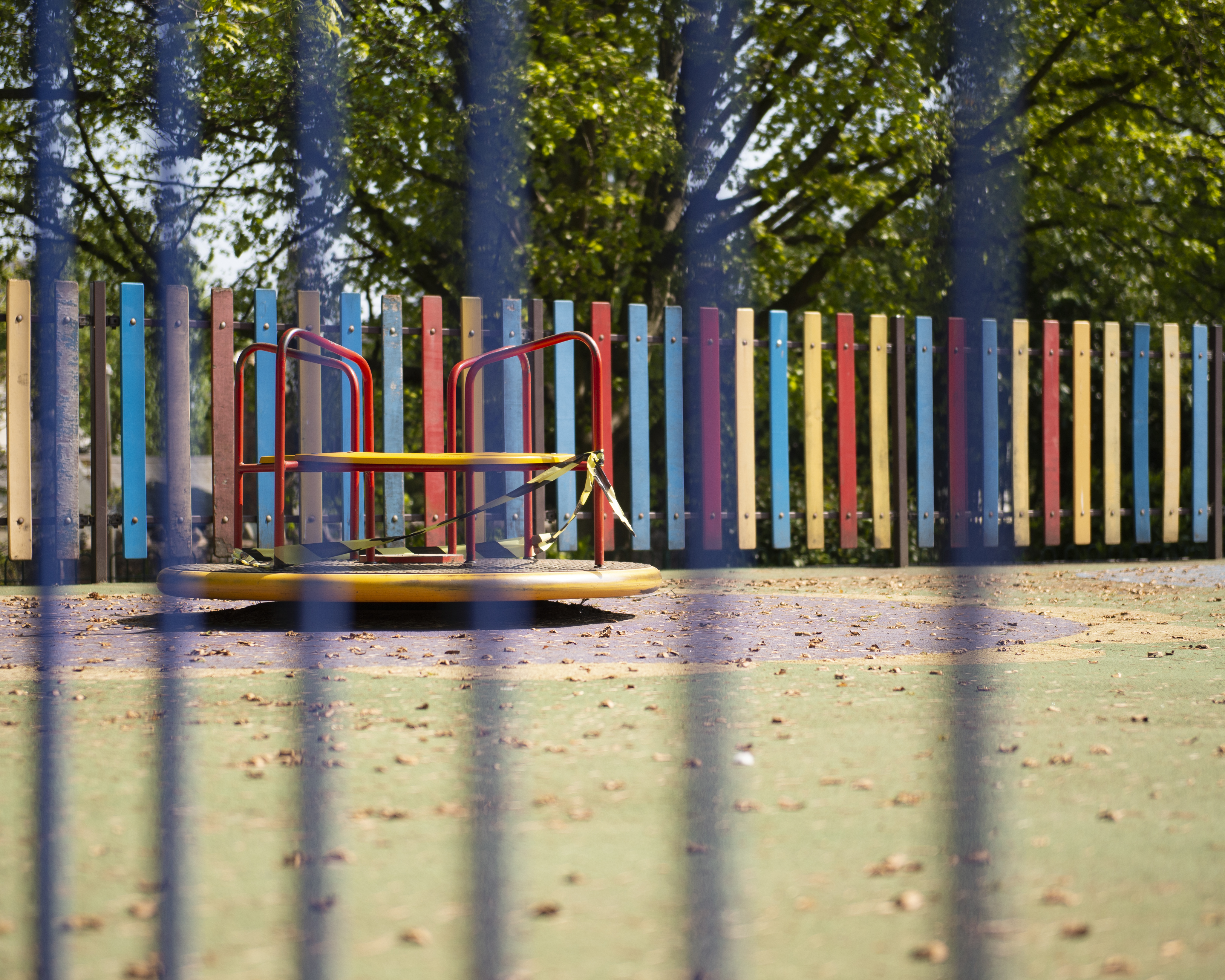
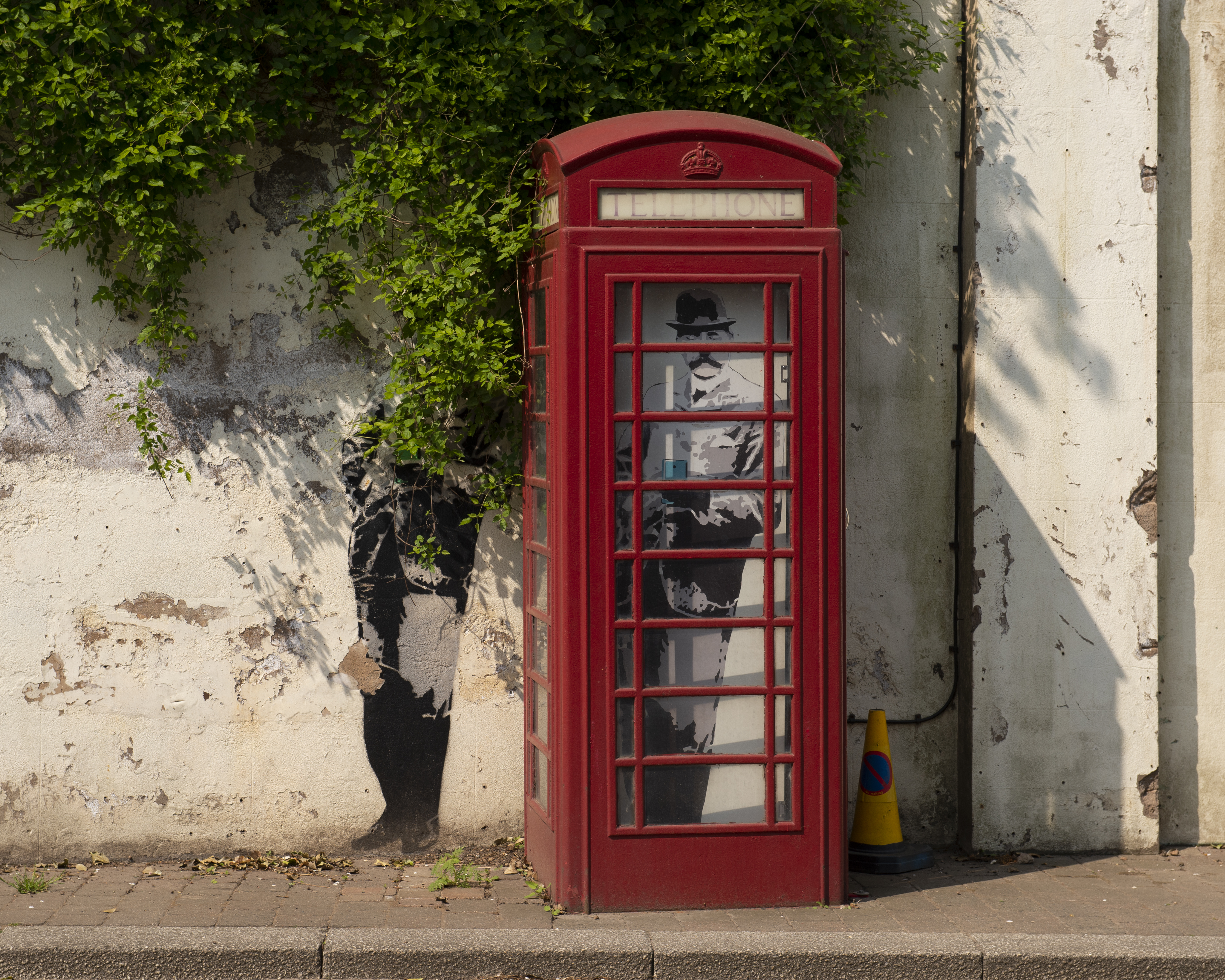
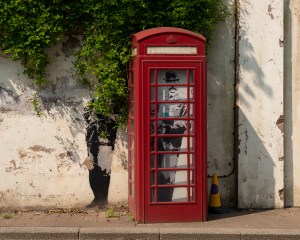
Behind Bars – The children’s playground in the Winter Gardens park was, for a while a place where people gathered defying the lockdown.  Since then, it has been closed with warning signs all around the perimeter fence.  As I had decided not to include specific references to the virus, I looked for a composition with just the sense of being abandoned.  This image of the roundabout with hazard tape around it struck me as sad, with no children around to play on it in the sun.  The railing lends itself to the sense of imprisonment.  The image could have been something less sinister, though with the park being temporarily closed for maintenance ready for the summer weather.

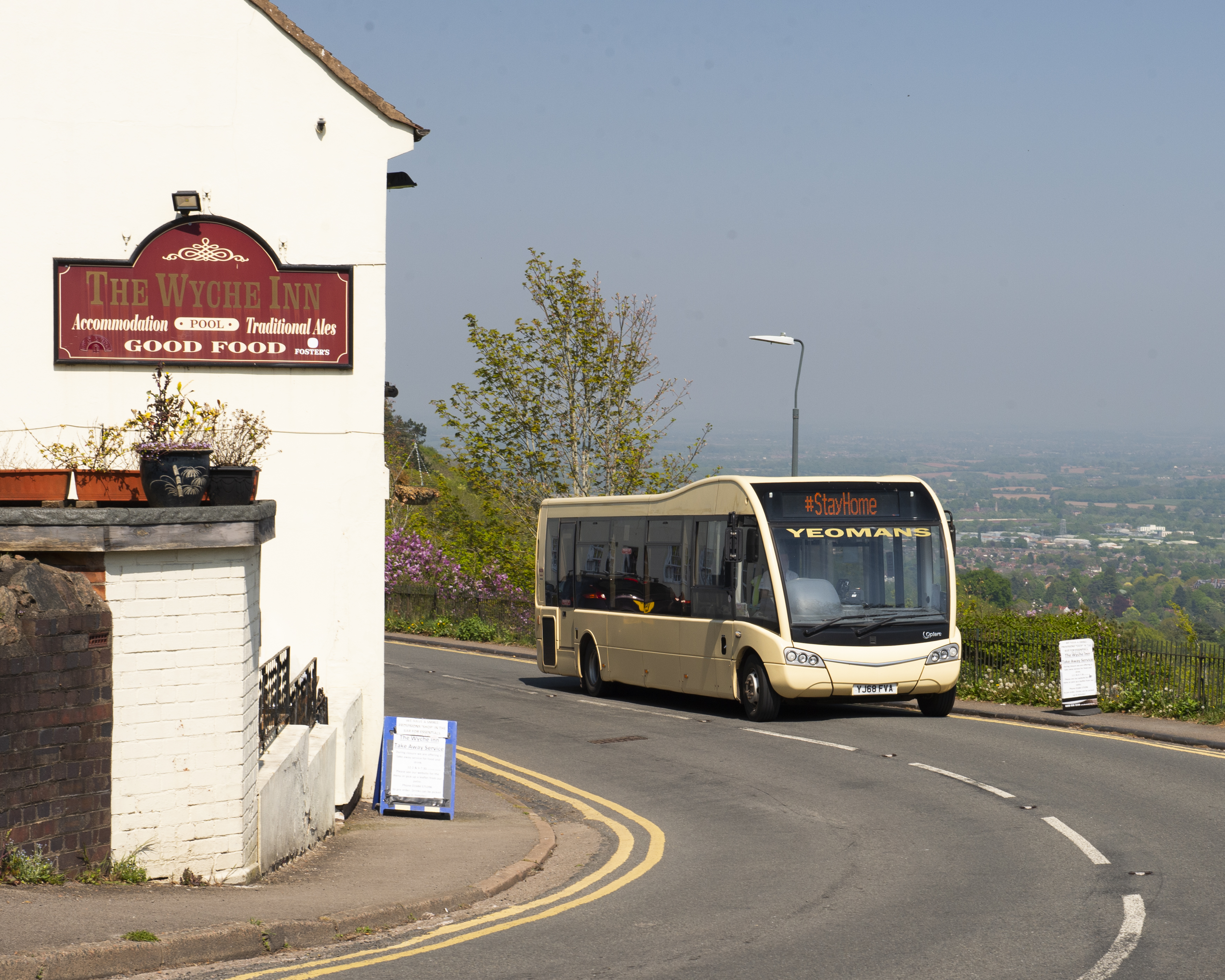
Little Choice – The pubs and cafes are all closed, but public transport is still running for essential journeys to be completed.  The sight of empty buses roaming the streets of the town with the stark ‘Stay Home’ message displayed is becoming all too familiar.  I like the conflict in this image with the pub and view enticing people to gather to enjoy the weather against the fact that we cannot.  With this image, though there is room in the context to create a narrative beyond the virus.   The message could be part of an advertisement instead of a government instruction and because we cannot see into the bus itself, we cannot tell that it is empty.

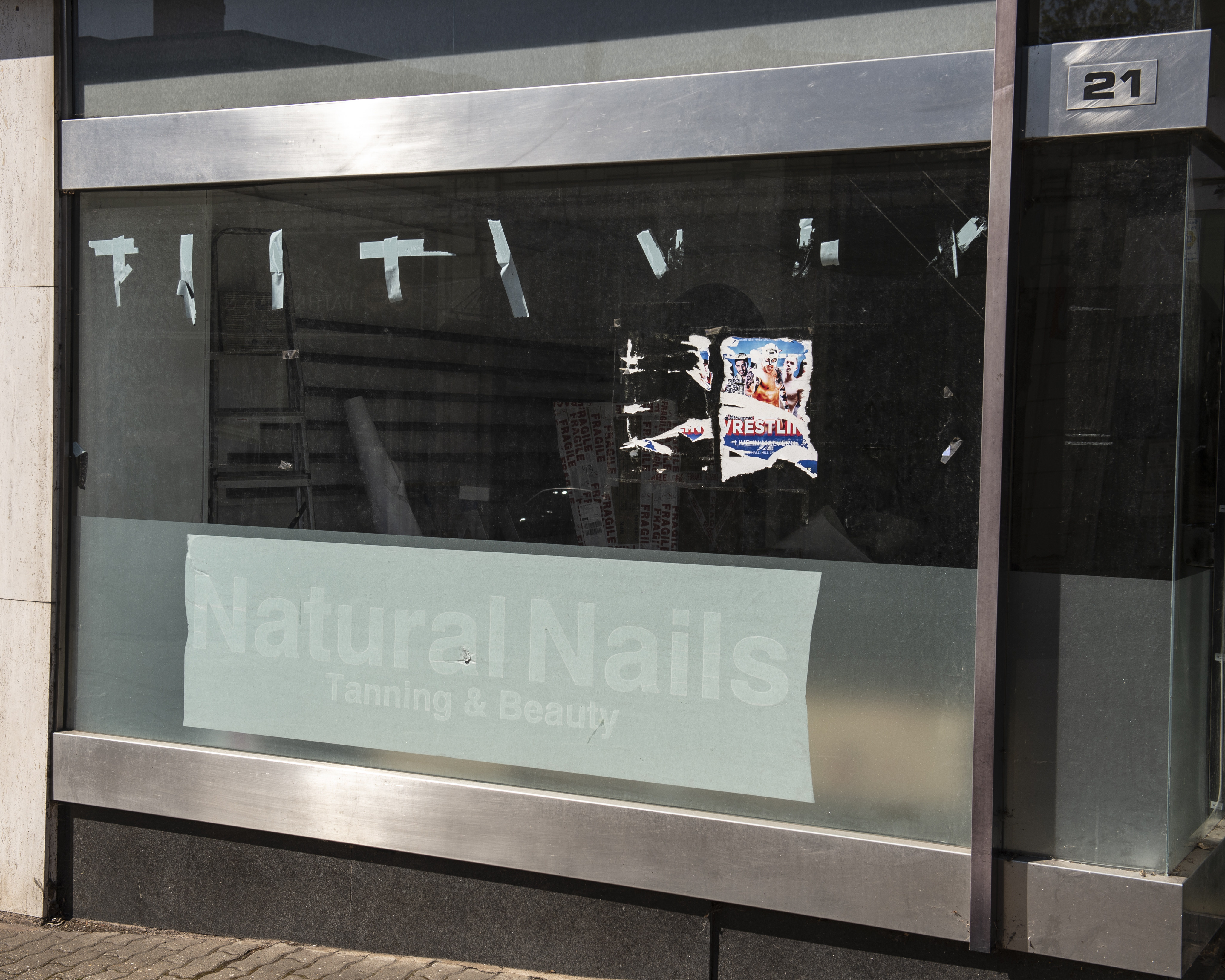
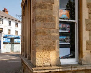
Thwarted Dream – This building is featuring in my series on the decline of the high street, but the shot I took for that was of a run-down, empty shop.  In the weeks before the virus took hold, work started on turning it into the new business.  This image without context could be interpreted as optimistic; the final step being the peeling of the transfer labels on the windows.  If we look closer though, we can see that the works inside have barely begun.  There is nobody working on the premises to get it ready to be opened.  For me, the sadness of the image is that the virus may make the business untenable before it gets going.

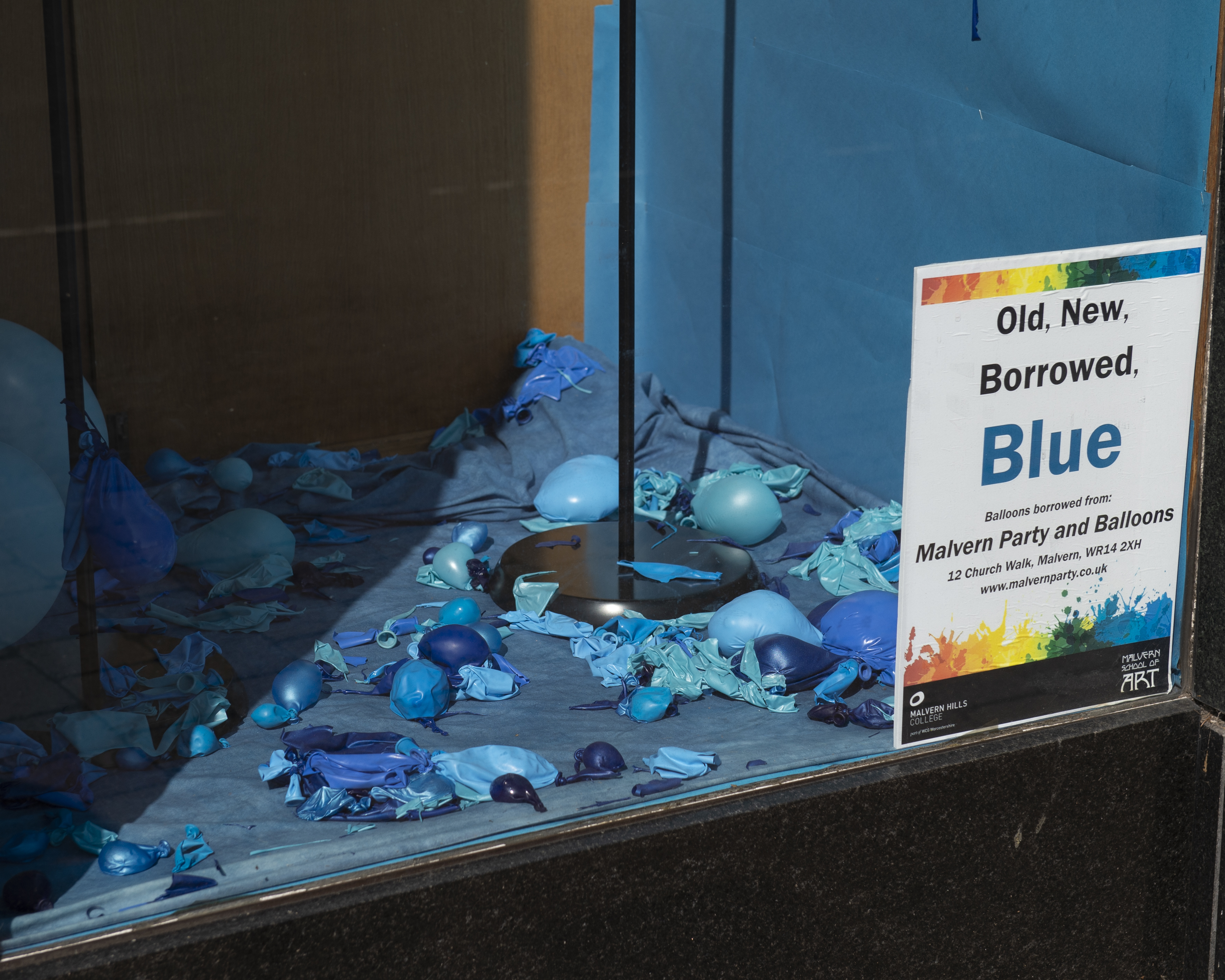
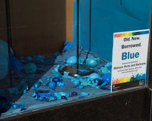
Faded Art – This is an art installation by students of a local college that was created to brighten up the windows of the recently-closed department store in the town.  Each installation has a colour theme and it has really lifted the look of the grand old building as it waits to be converted into new business premises.  Here, we have a balloon display which in itself should be a joyful image.  However, the building is empty and the helium has escaped the balloons.  I wanted to capture the sadness of the way it had been abandoned, unmaintained and how the loaned balloons would not likely to be returned or reused.  The image does contain am humorous inversion of that aspect though, saying ‘who thought that borrowing balloons was a good idea?’

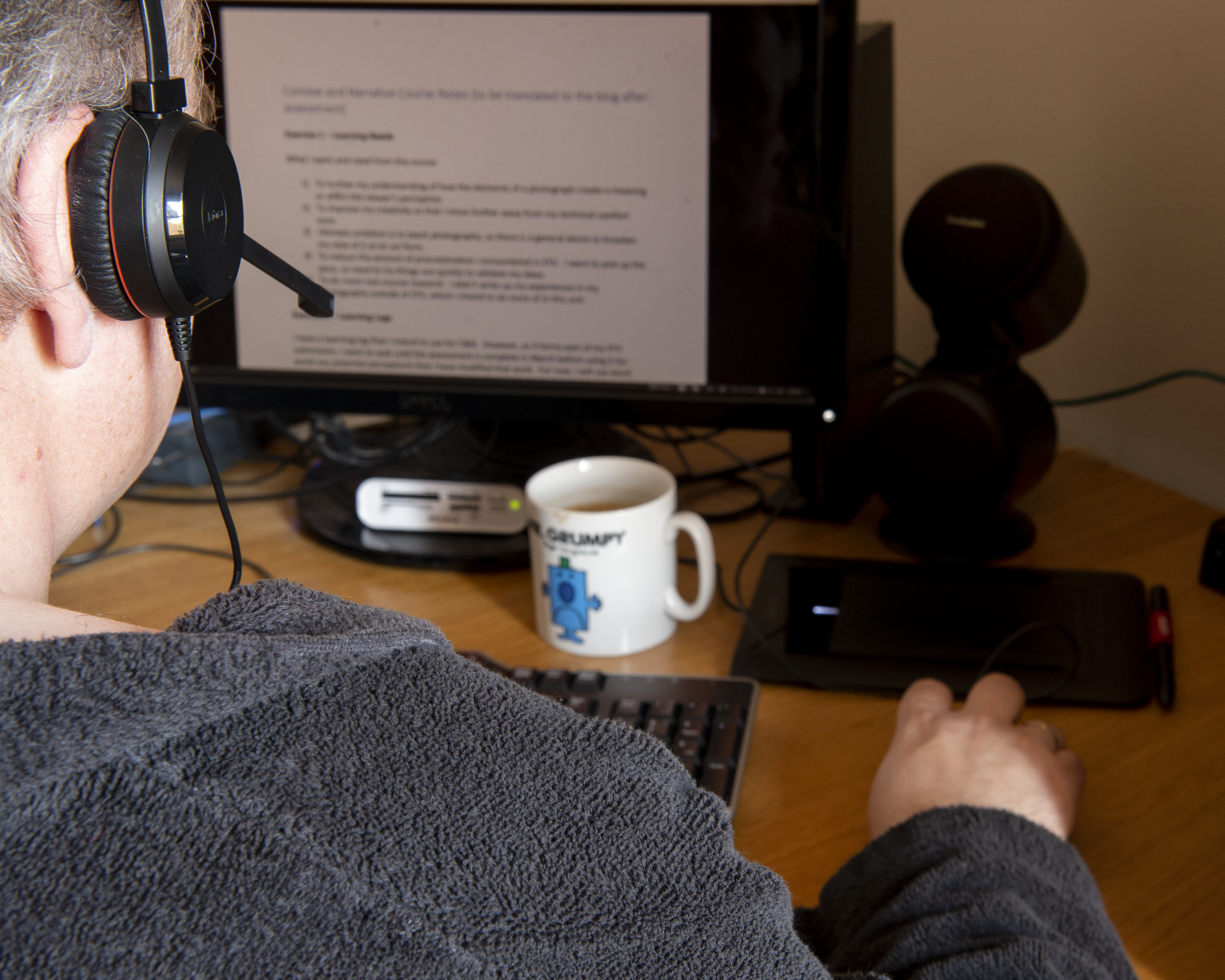
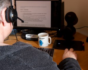
Business Attire –  This image was spotted by my wife one morning as I started work.  Working from home may have saved me a commute but the negative impact on my routine has become apparent.  Here, I’ve not even bothered to get dressed prior to starting my first online meeting of the day.  Although staged with a tripod and remote release, there is an honesty in the elements in the frame.  The negative context is reinforced by the inclusion of the mug and the state of my dress.  It could also be read as a relaxed way of working where there are no expectations other than performing in the job.

Conclusion

I really enjoyed this first assignment.  The question ‘can photography be truthful?’ was one that I had not asked myself before Part 1, but the artists that we looked at offered an insight into its subtle exploitation for documentary or art purposes.   With my collection, I feel like the duality of photography as a document is shown clearly.  The situation we find ourselves in with COVID-19 is unprecedented and for the main, terrifying.  However, one of the earliest realisations that I came to was that forcing people to change their lifestyles and stay away from each other would have a positive impact on society as a whole.  As a photographer, being limited in the places I could visit because of lockdown actually made me look harder for that positivity which resulted in my capturing more of it.  I actually struggled to find compositions that were overtly negative to be the greater challenge.  I am happy that my interpretation of the brief works; there are two sides to the story and part of that is being unable to obviously tell the difference.  By adding the simplicity of two words as a title, the narrative comes quickly.  If anything, even something as simple as that leads the viewer too readily to a narrative.   A change I would make to the series is to make the titles more obscure.

What went well

The strongest image for me is Typically British as I like the clear sense of humour mixed with the gravity of the situation.  Humour in photography has become something that I’m drawn to when times are difficult; a kind of self-medication, I guess.  The sinister side of the photograph is the thought that not even our teddy bears are safe from the virus.  Giving them WW2 gas masks emphasises how dangerous the infection could be.  For a simple composition, I think it tells both sides of the story effectively.

The other strong images for me were Behind Bars and Socially Distant, both of which provoked a negative reaction in me.  In the former it had not occurred to me that this happy space which is very popular with the town’s children would be abandoned.  Seems obvious, but its impact on me was profoundly sad.  I definitely felt like Soloman-Godeau’s outsider trying to capture this scene.  Socially Distant was also a sad image for me as the dog in the photograph came towards me for some attention, but I was distracted by my wife’s exaggerated deviation from the path.  Under normal circumstances, the dog would have been made a fuss of and pleasantries exchanged.  This situation is clearly not normal and that comes out in the photograph. Unlike Behind Bars, I was an insider in this shot.

What could have gone better

The weakest image for me is Business Attire because it is not as candid as the others.  I wanted to use natural light for the shot to ensure that there were no harsh reflections from the shiny surfaces on my desk.  This meant that I needed to use a tripod and tethered remote.   I think the sentiment and duality come out in the image, but for me there is a sense of overt context.  The inclusion of the Mr Grumpy mug, on reflection is too much of a sign-post element in the image.

Also, I would consider re-visiting the titles themselves as even though they are short and seemingly simple, they point very clearly to the intent behind the image.  Before I added them, I showed the collection to my wife.  Her interpretation of the context differed only slightly from my own, which I conclude is because we have been married so long coupled with her sharing my photographic ‘journey’ so far.

Getting Feedback

My intention was to share more widely to see which sides of the story are being ‘told’ and, more importantly, whether people believe my statement that we will be an improved society when the danger of coronavirus passes.  I sent the unallocated images to a small group of my photographer friends with simple numerical titles and asked them to arrange in the supporting and contradicting groups.   I deliberately asked them not to confer or share their thoughts on the meanings of the images with each other and perhaps unsurprisingly, some found the job of grouping them a challenge.  To make things more difficult, I told them that I wasn’t all that interested in their explanation of the narrative created for each image as discussion would have helped them form a view that was influenced by my intentions for the series.  The results were as shown below:

Screenshot 2020-05-02 at 11.44.04

Results of Review of the Unallocated Photographs

What struck me first about the results was the strong agreement with my intention for the images of the playground, the NHS thank you and the unfinished shop front.  These images were strong with elements that steered to a great sense of sadness or extreme happiness.  The ‘negative’ images were almost signposted to contradict my story, so using photography to effectively prove a lie. The next thing that stood out was the balance in some of the responses, i.e. in two minds about what the photographs say to them.  In these photographs, the story about the improvement in society comes through but with an equally opposing feeling created by the knowledge we have about the pandemic.  Socially Distant is a good example of this.  I felt that we were losing personal contact, but three people thought differently.  Perhaps the act of social responsibility caused by the distancing in the image supports that we actually care more for each other with the current restrictions.  The final observation was where the consensus was generally in disagreement with my original intent.  Looking back at the earlier research in Part 1, I was reminded of how our perspectives are built on our personal circumstances, beliefs, biases and the previous events in our lives.  Four of the people asked are living in urban environments where the virus is affecting many people in a confined space.  Their views on the images are naturally going to differ from the other two (and me) who live in a more rural setting.

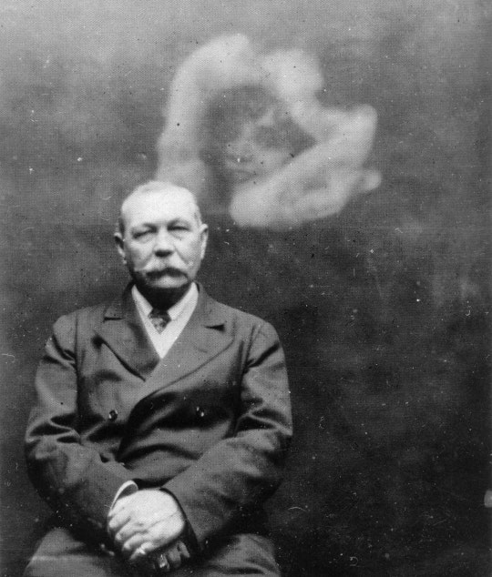
Overall, I am happy with the way this assignment has gone. In Part 1, I’ve learned the difference between being part of the story and an observer, how photographs are used to get a message across that is not always truthful and that there are many different versions of what is the truth.  With the ghost photography of the late 19th Century, the trust in photography as an honest viewer of events was severely tested, with the foremost intellects being conned by photo manipulation.  Where documentary fails though, art becomes the destiny for photography ‘stories’.  Powerful messages about society like those in Dzhangal and Public Order don’t need to rely on facts to have impact. Perhaps objectivity is not all it’s cracked up to be.

References

[1] Mendel, G, 2016, Dzhangal Work, Artist’s Website, http://gideonmendel.com/dzhangal/

[2] Seawright, P, c1970s, ‘Sectarian Murders’, Artist’s Website, http://www.paulseawright.com/sectarian

Exercise 4: Digital Manipulation

The Brief

Use digital software such as Photoshop to create a composite that visually appears to be a documentary photograph but which could never actually be.

My idea

For my composite, I wanted to play with the idea of the human head as a real part of the body and as seen my the medical profession.  This idea actually came about because I remembered someone visiting my house once and remarking that they didn’t like the phrenology head I had on my shelf.  Phrenology heads were part of a popular pseudoscience in the 18th Century that identified the physical shape of regions of the head with corresponding psychology.  By dividing up the regions around the skull into different physiological or behavioural attributes, phrenology could map the shape of the skull and conclude information about the patient.  Phrenology heads were porcelain busts with the regions labelled on the surface as shown in the photograph below.

Phrenology_Head_Bust

Phrenology Heads [1]

It was a head similar to these that my wife and I picked up in a junk shop shortly after we got married and while I like it, clearly others do not.  Using these heads involved taking measurements and comparing the regions on the bust in order to make a ‘medical’ judgement.  My first thought was to create a portrait of me with part of my face removed in Photoshop to reveal the map on the phrenology head beneath it.

I started by shooting two portraits in a carefully set up studio environment.   The first was a portrait of me and the second was of the bust positioned at exactly the same point in space as my head was.  I wanted to make the blending of the two photographs as seamless as possible, so everything including position, angle of incidence and lighting was maintained between the portraits.  The two images can be seen below:

I imported these into Photoshop

My Image

My early attempts to overlay and reveal the phrenology head beneath my skin failed dismally.  As I said, I’m not really a Photoshop guy and struggled to make the image look anything other than obviously fake.  I wanted this image to challenge the viewer perspective rather than be understood at a glance, so I instead decided to try to combine them.  I first converted both to black and white and incorporated them both in one project as layers.  My first job was to try to align the features of the smaller phrenology head with my own features.  I did this by overlaying my image onto the bust and reducing the opacity of the portrait to around 25%.  This meant that I could see the bust beneath my image.  By using the skew and distort transform functions, I was able to align them pretty well using the eyes and mouth as anchor points.  Next, I used a fill layer to provide a base layer background. This would be used to erase any unwanted features in the finished image and ensure that the dark areas of both frames were actually black. The next step was to overlay the images.  I used the pin light overlay on the portrait which forced the two images together.  After some tweaking to reintroduce some of my hair and some raising to shape just the head and remove the shoulders, the image was complete.

Manipulated Portrait2

The Phrenology Man

Review

This photograph turned out better than I could have expected.  When looking at it for the first time, it looks like a human face but something is already wrong before we read the inscriptions.  The completion has stubble but is also glass-like.  The nose looks natural but has a misshapen porcelain shape to it.  The eyes are real but with catchlights that make them also look glass-like.  For me, the face is a document that is only very slightly real and when we see the written inscriptions we wonder how the shape of the face actually relates to the words.

References

[1] Waters, J, ‘Phrenology Head Bust’, Wikipedia Commons

Exercise 1: The impact of Citizen Journalism

Introduction

Before looking at the effect of citizen journalism in terms of ‘the story’, consider the meaning of the word objectivity.  It is given in the Oxford English Dictionary as:  the fact of not being influenced by personal feelings or opinions but considering only facts.  That is, the whole impartial truth and nothing but the truth.   It’s a concept that were all familiar with but that is challenged by the very existence of 24hr news and those who report it.  If our understanding of the news is influenced in any way by how we relate to the subject, how we react to the source of the information or how our loved ones see it, then we cannot claim to be objective.  However, given that a photograph is a moment captured by the camera, surely it stands a good chance of being an objective report of that moment.

Examples of Citizen Journalism

The first example of citizen journalism that came to mind was the 2019 protests in Hong Kong against the planned bill to introduce fugitive deportations to countries where there was no existing agreements to that effect.  The biggest single cause of the protests was that deportations to mainland China would be included in the new legislation which many saw as a potential major impact to the human and civil rights of Hong Kong’s nationals.  People took to the streets in protest of the Hong Kong legislature and indirectly, the Chinese government.  The protests were captured and widely circulated via both mainstream and social media.  An image from the protest can be seen below.

http---com.ft.imagepublish.upp-prod-eu.s3.amazonaws.com-6380bc7a-cc00-11e9-b018-ca4456540ea6

Image of a Hong Kong Protestor [1]

Here we see a protestor dressed in what looks like a makeshift hazard suit with respirator and a shield.  They are about to throw a grenade of some sort towards an unseen attacker outside the right hand side of the frame, separated from the scene by a number of fires.

This image was supplied to the Financial Times by the Associated Press and used in an article describing the protestors having blockaded the city’s airport.

In Support of Objectivity

When we look at this image, it is clearly of an intense protest with a line drawn between the protestors and an unseen party.  The presence of the cannister still releasing tear gas and the protestor’s clothing supports the story of the police reacting heavy handedly to the blockade.  The fire supports the idea in the piece that the protests have escalated to a dangerous level.   The image isn’t staged or posed in any way and for me, the photographer having been able to isolate the protestor from the crowd seems more luck than judgement.  This all points to it being an image based entirely in objective fact, then?

The Counter Argument

If we look at the image again, we can see some elements that don’t lend themselves to objectivity.  The first is the absence of the supposed aggressors, the police.  The image only includes the line between the two sides, so it isn’t completely clear which side is the provocateur in this exchange.  The fact that there is only one protestor appearing to be throwing objects at this point could suggest alternative story where a cannister is being thrown back at the police.  Although makeshift protective clothing suggests being prepared for violence and chemical attack, it could just as easily be that past skirmishes have been that way, that the protection was for defence rather than attack.  The final element is that the image is clearly taken from a protest that wasn’t the main point of the FT’s story, which was about the airport blockade.  The article mentions that the protest follows riots in the financial district, so presumably this is where this image was taken.

In conclusion about this image, the objectivity is certainly questionable because of what is missing from the frame, e.g the opposing side, and the ambiguity of the actions being taken by the main subject.  Images like these that are taken by roving photographers (another can be seen to the left of the frame) are part of a larger set and in many cases, are adjusted in composition through cropping to emphasise the points they are trying to make.  If we had another image of this protestor from a different perspective or wider angle, the message could have been very different.

The image below was a frame-grab from video stream at the Occupy Wall Street demonstrations

A-person-with-an-iPad-tak-008

Occupy Wall Street Demonstration [2]

 Here we see the largely peaceful protest against the imbalance of wealth in the United States, conducted in the heart of its Stock Exchange.  The image of the flag with its reference to the 99%, that is the people who don’t have the majority of the country’s wealth is a powerful one.  The crowd ‘recording’ the demonstration points to the level of support for the protest, while the image seen through the screen of the tablet computer makes it clear that this is a modern crisis.   This example differs slightly from the first in that the image is a still frame from a piece of video.  The newspaper that used it had the choice of which frame to choose and then how to subsequently crop it, but is the fact that it is from video make it any more objective?    This image came from an article in The Guardian [] that discussed Citizen Journalism and how it has folded into conventional reportage.  The piece talks about the use of large quantities of footage shot on the ground in crisis or war zones where conventional journalism is unable to fully reach.  The filmmakers who use these images to reinforce the impact of the events have to go to great lengths to validate them.  Digital technology lends itself to being manipulated or faked on a much larger scale than film media, so the filmmaker must contend with the potential for another agenda to unintentionally influence their own.

In the case of the protest photograph above, different angles, lengths of clips and instances shot will potentially tell a different story depending on how they are stitched together. For example, the more the footage is affected by the jostling of the crowd could suggest something about the mood or size of the crowd without anything being different from the position this shot was taken from.  How can photography be objective when these subtle factors are always at play?

Conclusion

Citizen Journalism is for me modern blessing and a curse.  As a consumer, I find it harder and harder to take an objective view of what I see and read in the media, which leads me to increase the number of sources of news that I access.  The photographic imagery is often the first thing we see in a news article, so how that image is selected and ‘processed’ steers us in the direction of the story that is being told.  What first appears to be a simple document of the event, contains nuances introduced by filmmaker and public alike, sometimes at odds with each other within the same piece.

References

[1]Wong, et al, 2019, ‘ Hong Kong Protestors Blockade City’s Airport, The Financial Times ihttps://www.ft.com/content/84dd7e32-cbe5-11e9-99a4-b5ded7a7fe3f (subscription now needed)

[2] Bulkley, K, 2012, ‘The Rise of Citizen Journalism, The Guardian, https://www.theguardian.com/media/2012/jun/11/rise-of-citizen-journalism


Project 5: The Manipulated Image

Image Manipulation and Me

This project discusses the ongoing debate around manipulation of an image to either emphasise or change its ‘meaning’.  Having rediscovered photography well into the digital era, my relationship with image manipulation has changed almost inversely with the enhancements in technology.   I recall the mantra of ‘include only the elements you want in the frame’ and ‘reduce visual debris to take a good picture’, which I adopted during my early use of Photoshop.  Removing or cloning out elements that I hadn’t spotted at the time within the frame, and now considered to be spoiling it in some way, became something I quickly got used to.  However, as I have learned more about photographic technique, my interest and sometime reliance on software such as Photoshop has declined dramatically, despite the tools evolving in their capabilities.  With my emerging interest in film photography, I am much keener in looking more carefully ay my subject and avoiding the need to remove unwanted content after scanning.   My interest now lies in achieving the result in the camera and only using digital techniques to visually enhance what is already present (contrast, toning, dust removal etc).  I hadn’t considered that manipulating an image might change the meaning or the intended context, though.  I recall an occasion where that deliberate altering of an image for my father was intentionally trying to protest manipulation.  My Dad had taken a good photograph of a crane for a competition he was entering.  The image, while sharp and well exposed lacked any interest in the sky as the day it was taken was completely overcast.  He asked me to add a sky from one of my photographs to his in Photoshop to make it look better.  I was so unhappy with this as an approach, given that it was intended for competition that I planned something amusing to make my point that it wasn’t on.  Once complete, I sent him two photographs back; one with a bright, cloud-filled sky and one with an additional feature.  The latter can be seen below.

15676439_10209965778875542_147648957107519762_o

The Crane and the Enterprise

I spent some time locating an image of the Starship Enterprise that had lighting from a similar angle and even matched the mid-tones to the rest of the image.  The result made my Dad laugh but made my point (it didn’t get entered, of course).  When I look a this image again, though my immediate though is, “is this a still from a film?’  Is the ship crashing to Earth?  It has an almost ridiculous SciFi ‘reality’ to it which is far from my intended joke to my Dad.  With this in mind, consider the much earlier image referred to in the notes.

Hippolyte Bayard – Self Portrait as a Drowned Man.

Hippolyte was an early pioneer of photography, claiming to have invented a direct positive process before Fox-Talbot and Daguerre.  Unlike these two men who went on to become well-known historical figures, Bayard was left unrecognised for his invention.  His image ‘Self Portrait as a Drowned Man’ depicts him as a corpse, having committed suicide.  The print of the image had additional external context written on the back in the form of an announcement of his death, but it is signed by Bayard which points to it being a suicide note.   When we look at the two things together, the immediate thought is that it’s real.  Examining the image, the man does indeed appear to be dead and his face and hands in early stages of decay.   The body is partially wrapped in cloth with his hat the only personal possession present.

In actual fact, the manipulation taking place here is on multiple levels.  The writing on the back of the photograph tells us what is going on in the picture before we have really had a chance to look at it.  The assumption is that the camera captures what is in front of it, so in turn is a teller of truth.  As the image is from the early days of photography as a technical discipline, there is no reason to question it.  As it turns out, though the hat is something that Hippolyte used in a number of his images, so it was included here not as a random act but to add authenticity to the image.  The decaying hands and face that the note refers to were created by the photographic process responding to the darker, sunburned skin that Bayard had from a few days before [1].  The final element of deception was the date the photograph was made, 1840.  This was suspiciously only a single year since Fox-Talbot’s announcement of his invention at the Royal Society.  When we see these elements colluding together, the photograph is clearly a staged piece of ‘fake news’.

Perhaps the more telling of the elements is the belief that ‘the camera doesn’t lie’, which would have had its origins in those early days of photography.  People believed science and photography was predominantly a scientific practice to the uninitiated so it must be the source of truth.

Ghost Photographs

I’ve long had a fascination with the supernatural and one of the things that I’ve observed is the desperation that people have to believe what they see.  Whether it’s ghost sightings on reality television shows or ghosts captured on security cameras, the question ‘could this actually be real?’   I believe that I saw a ghost while on a school trip when I was a child.  It was a figure that appeared at a window of a derelict part of the house we were staying at.  Even now, as a rational adult I cannot be certain of what I saw but I remember the experience vividly.

When I look at the photographs of ghosts ‘taken’ in the Victorian era, they certainly appear convincing upon first inspection. The camera has told the truth, surely.  When we consider what else is in the frame, the discrepancies between the living and ‘dead’ subjects becomes clear.  Knowing that the images are almost always double exposures explains them.  For example:

9022533967_d855ed9599_o

Sir Arthur Conan Doyle and Ghost [2]

In this image, Conan Doyle is seated as if he were having a simple portrait taken.  His expression is that of a man concentrating on staying still, rather than expecting something ethereal to be happening around him.  When we look at the ghost, the face has highlight and shadow contrast around the eyes and left hand side of the face in a similar way to Conan Doyle, without the definition.  Lighting of portraits in 1922 wasn’t particularly sophisticated so it’s not a surprise that the two exposures would have used something similar.  The upper part of the image is also overexposed compared to the lower part, which suggests more light (or twice the exposures) for this region where the ghost happens to be.  Interestingly, Conan Doyle was taken in by this sort of work which resulted in him investigating The Cottingley Fairies.  During his investigation, he worked with Eastman Kodak [] who were regarded as the authority on photography as well as manufacturer of the materials for making negatives and prints.  They concluded that the images of the fairies could be faked with the appropriate level of knowledge of the medium.  Conan Doyle believe that such knowledge was beyond that of any teenage girls, so the photographs must be the truth.

Oscar Gustav Rejlander

Around the same time as Conan Doyle was being fooled by the teenage girls, Oscar Gustav Rejlander was creating deliberate multi-composition artworks that preserved the sense of real, while being entirely fantastical.  His famous Two Ways of Life is an incredible technical achievement with its 30 individual photographs cut and mounted as a collage.  The attention to detail in the individual images with regard to light and shadow mean that the finished tableau works well as a single composition.  Here we have a documentary image that is actually a pure fantast of subjects that could not exist easily in one space.

Conclusion

The advent of photography as a technical medium that offered a truth to most people, also saw its use as a creative tool to introduce alternatives to truth.  The motives for doing so in the early days of photography were undoubtedly different to what we see today.  Where modern image manipulation can be argued as ‘for art’s sake’, the early adopters of the technique used it for exploitative gain.  For a legendarily learned man like Conan Doyle to be utterly taken in by the deceit of a pair of schoolgirls speaks volumes.  Victorian taste for the macabre made it easy to exploit the supposed ghost photographs for profit.   I have never been a true Photoshop guy and am not about to become one.  However, I do see the use of manipulation to create context where there may have not been one previously.  After all, the painters have used manipulation of the real to create art for centuries.

References

[1] Spair, M, 1994, ‘The Impossible Photograph: Hippolyte Bayard’s Self-Portrait as a Drowned Man, John Hopkins University Press, https://muse.jhu.edu/article/20909

[2] Losure, M, 2013, ‘Sir Arthur and the Fairies, The Public Domain Review, https://publicdomainreview.org/essay/sir-arthur-and-the-fairies