Category Archives: Part 1

Identity – Arbus, Mapplethorpe and Evans

Project 2 concludes with the portraiture work of three other photographers, two of which I have researched for previous modules on this course. Arbus was well known for her almost voyeuristic photography of people she found interesting. Mapplethorpe’s work gained controversy because of his exploration of sexual identity through images that were considered explicit. While I looked at their work from the perspectives of street photography and censorship previously, here I will look at their portraiture in the context of Part 1.

Diane Arbus (1923–71)

In 2018 I went to an exhibition of Arbus’ early work called In the Beginning at the Hayward Gallery in London [1]. The works in the exhibition were of a variety of subjects, from her portraits of the wealthy to the circus freaks of New York. What interested me at the time was the connection that she appeared to have with her subjects. Unlike many photographers, Arbus’s style involved engaging directly with her subject. Sounds pretty obvious when we think about portraiture, but Arbus’ photographs were very much brief interludes into the lives of her subjects; they were almost snapshots of people living their daily lives. Yet, like Sander, she was drawn to particular types of people and contexts. In a video documentary by her daughter Doon Arbus, the photographer Lisette Model described her typologies as being “freaks, homosexuals, lesbians, cripples, sick people, dying people and dead people” [2]. She went on to describe the reason for this darkness being the fact that people were not comfortable looking at these types of photograph. Model believed Arbus to have great courage in her depiction of these marginalised people and to show them as being ‘normal’ in every respect of their lives. This was a point that was famously disputed by Susan Sontag in the chapter America, seen through photographs, darkly in her book On Photography (1973)[3]. Sontag responded to similar claims about Arbus made following her tragic suicide in 1971 at the age of 48 and the subsequent retrospective of her work at MoMA. Sontag’s view was that far from being a sympathetic perspective on the marginalised, Arbus’ style of engaging with the subject so that they looked directly at her or her camera was almost voyeuristically exploitative. When viewed alongside the work of Nan Goldin a few years later, which dealt with some of the similar sections of society, I can relate to what Sontag meant. Goldin was shooting her friends and housemates in a way that not only naturally placed her as an insider, but highlighted the love that people had for each other and for their way of life. Arbus, by contrast posed her subjects in a particular way and although there are stories of her trying to blend in with them , for example she photographed naturists on a nudist beach by stripping off and joining them, Arbus was still on the outside looking at what we all consider to be different. Nevertheless, I reflect on the exhibition in London fondly as she definitely revealed something powerful about her subjects, even if there was something forced in the aesthetic.

Robert Mapplethorpe (1946 – 89)

Much has been written about the controversy surrounding Robert Mapplethorpe. His story of joining a youth culture that centred around the famous Chelsea Hotel in New York, which led to artistic and sexual experimentation, is well documented. His progression into what people considered to be obscene photography or pornography became the subject of a criminal prosecution [4]. Although I’ve looked at his work before and some of these problems that still surround it, I was more interested for this project in looking at how he got started. Mapplethorpe shot many different types of subject, but his portraiture has a definite use of typology running through it.

Mapplethorpe started out as an photo artist that produced his work from that of others. The American philosopher Arthur C Danto described Mapplethorpe’s early ‘career’ as being as a photographist [5], which placed him very much in observation of how people were represented by other photographic artists. Danto identified the point at which Mapplethorpe transitioned from photographist to photographer; in 1970, Mapplethorpe purchased a polaroid pack-film camera and began experimenting with it. His early exploration with this camera started with the people and objects that were closest to him, often shooting pictures of his then lover Patti Smith as well as men with whom he would start to explore his sexuality. The resulting photographs started to fall into particular typologies such as self portraiture and his body image. He depicted himself as the rebel or as some kind of sinful creature, as well as exploring how he looked in drag. His interest in his own body became the start of his more explicit work, often depicting his penis as in the famous self-portrait in the mirror [6] and in sado-masochism constume. He started to expand the subject matter to others but still represented his subjects along very specific lines. Some photographs were of his lovers, others of people he picked up of the street, while some explored race and homosexuality and the difference between how bodies look. As Mapplethorpe became more well known and progressed to better equipment, his work continued to follow the representation of cultures and practices that were not regularly discussed or acknowledged by most people. The results were indeed shocking, but for me Mapplethorpe represents originality in what is essentially his documentary of the life he was living and the beauty that he saw around him. Some images are extremely uncomfortable to look at because the sexual act being depicted is not commonplace, but that doesn’t make it any less representative of the world he lived in. His work wasn’t just sexually explicit though, as Mapplethorpe also shot portraits of very famous celebrities of the time. It is here that we see his use of background in a similar way to the previous exercise. Take the example of Debbie Harry, shot in 1978:
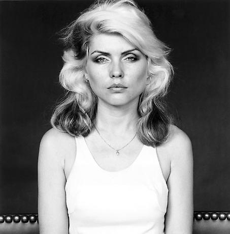
Debbie Harry (1978) by Robert Mapplethorpe, The Mapplethorpe Foundation[7]

Here we see the Blondie singer seated on what looks like a sofa staring straight at the camera. The composition is complete symmetrical about Harry’s strikingly beautiful but angular features. What is interesting here is not so much the subject but the background. Mapplethorpe shot this in his studio with a black backdrop, which creates a lot of contrast with Harry’s skin and hair. The dress was apparently light blue which blends in with the rest of the subject’s luminance. The only other detail is the studded top of the sofa which can be seen either side of her. In this one simple background detail, Mapplethorpe creates a sense of what the model is about. Harry’s rockstar looks are reinforced by the metal studs and seemingly leather covering of the sofa. Even though the background occupies a very small region, the effect of it in the image is very strong.

Jason Evans (1968 -)

The final photographer mentioned in this section is Jason Evans. His work Strictly with Simon Foxton uses typology and background to deliberately tell a different story to what might be immediately present at first glance. Evan’s project was very much in the fashion genre, working with a well known stylist in Foxton and the photographs are indeed centred around the styles of the clothing used. However, the work is intended to challenge how we typically see the typology of traditional fashion. In the series, the models are all young black British men and they are dressed and styled in what we would identify as being fashion poses. However, the clothes they are wearing are the opposite to what we would expect young people would wear. Instead, the selections of outfits invoke a sense of the dandy, a style that is associated with 18th Century extroverts. The culture of the dandy itself is predominantly white, so by dressing black men in these ‘costumes’, the artist is creating a counter-culture. This distortion is made into a more social commentary by Evans’ choice of backgrounds for his work. Each man is posed in an environment that we identify with as middle-class suburbia. In a video interview with Tate, Evans described the environments as what we think of as predominantly white neighbourhoods [8] and although there is nothing explicit in any of the shots to reinforce this, the contrast between the subjects, their clothing and the environment is striking. Evans and Foxton use typologies such as black youth, stylised fashion and suburbia in a way that creates an unexpected narrative.
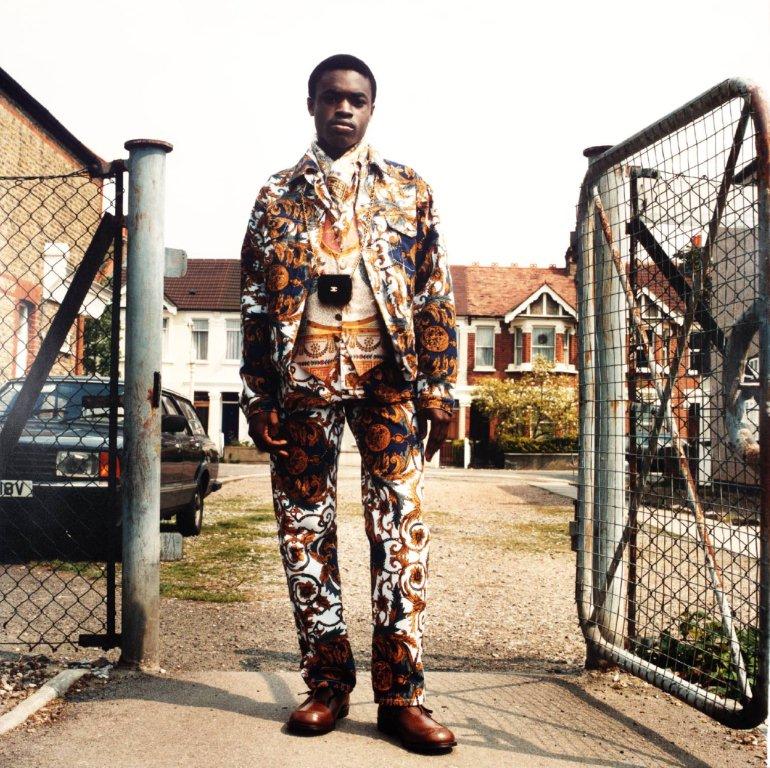
From the series ‘Strictly’ by Jason Evans and Simon Foxton [9]

Here we have a young man dressed in a very striking, but smart three piece suit and polished shoes. He is standing in what looks at first like a comfortable pose that faces the camera. However, his hands look like they are not so comfortable as they are held awkwardly by his side. Their appearance suggests that the man is either not comfortable with the clothes he is wearing or having his portrait taken. In itself, the portrait reveals something about the man and contrasts his clothes with his age and cultural status. It’s when we look at the background that the additional context helps complete the narrative. The scene is a Victorian street in what looks like suburbia and there is relatively contemporary car in the middle distance. The man himself is standing in front of an open gate which suggests at first that he has just walked through it towards the camera. This contradiction between the young black man, his dandy clothes and the fenced off community behind him suggests all manner of prejudices and stereotypes about young black males.

Although the compositions share similarities with Sander’s work with the face-on, natural expressions, the context that is brought by the background is much more aligned with the street photography genre. In the pictures, we see the young men in a pose, but was that the interruption of their routine by the artists? Is the contrast between their clothes and ethnicity really a challenge of stereotypes or is there such a thing as a contemporary dandy? If there is, which ethnicities would we associate with them? When I think about these questions, I’m reminded of Julia Margaret Cameron’s combinations of what we can discern from the subject’s appearance with another story that might not be all that it seems.

Conclusion

The work in this Project and Exercise 2 has demonstrated the use of both typology and background to add context to a portrait. Since we all naturally categorise what we see in some way, typology is a tool that the artist can use to lead the viewer to an assumption about the subject, but also to mislead as to the intended meaning. When confusion is introduced into the portrait, the variety of possible narratives about the subject increases. The work of Cameron in Project 1 was pioneering in her use of photography to tell stories about her subjects, but the work of the typology photographers such as Sander and the Bechers helps to remove the obvious and get the viewer to concentrate more on any context that is available. With Sander and his use of backgrounds and costume, we have someone who went on to inspire the other photographers here; Arbus with her fascination with the freakish underbelly of society that nobody wants to think of, Mapplethorpe with his self exploration and breaking of sexual taboos and Evans with his statement on stereotypes in race and class. I’ve found this project to be revealing in that it has prompted me to think more about the story than I would previously have done so when shooting portraiture.

References

[1] Fletcher R, 2019, “A Tale of Three Photographers”, OCA Blog Post, https://richardfletcherphotography.photo.blog/2019/07/26/a-tale-of-three-photographers/

[2] Jones J, 2014, “1972 Diane Arbus Documentary Interviews – Those who knew the American photographer best”, openculture website, https://www.openculture.com/2012/10/1972_diane_arbus_documentary_interviews_those_who_knew_american_photographer_best.html

[3] Sontag S, 1973, “America, seen through photographs, darkly”, from her book “On Photography”, Farrar, Straus and Giroux, ISBN 0-7963-2699-8

[4] Palmer A, 2015, “When Art Fought the Law and the Art Won”, Smithsonian Magazine, https://www.smithsonianmag.com/history/when-art-fought-law-and-art-won-180956810/

[5] Danto A, 2001, “Instant Gratification: Robert Mapplethorpe’s Polaroids 1970-1976” (republished by Aperture 2015), Aperture Magazine Essay, https://aperture.org/editorial/archive-robert-mapplethorpes-polaroids/

[6] Unknown, “Self Portrait, 1973”, Image Resource, Mutual Art Auctions, https://www.mutualart.com/Artwork/Self-Portrait/148D8D4E23A4738D

[7]Unknown, “Debbie Harry, 1978”, Image Resource, The Robert Mapplethorpe Foundation, http://www.mapplethorpe.org/portfolios/portraits/?i=2

[8] Tate Museum, 2017, “Jason Evans – Culture is Everything We Do – Tate Shots”, Tate Website, https://www.tate.org.uk/art/video/jason-evans

[9]Unknown 2013, “From the Series ‘Strictly, by Jason Evans and Simon Foxton”, Image Resource, A.G.Nauta Couture, https://agnautacouture.files.wordpress.com/2013/01/p11788_9.jpg
1) Project 2: Typologies

Barthes – Mythologies – The Blue Guide (1972)

We were introduced to Roland Barthes in an early module as a philosopher who theorised concepts of structuralism and post-structuralism. His work The Death of the Author in 1962 challenged the notions of originality through the assembly of familiar cultural references. The author, according to Barthes, is a skilled practitioner in the construction of narratives by incorporating that which the reader uses in their own interpretation, the argument being that the reader has a much larger responsibility in the reading of a cultural text than originally considered. In his book Mythologies[1], a collection of essays on specific cultural myths, Barthes writes about The Blue Guide. The Blue Guides had been, at the time, highly respected travel books for around 150 years and Barthes’ essay discussed how they subliminally group key aspects of the culture of the destination in a way that leads the reader to a number of stereotypes. Barthes used as a top level example, the classification of ‘picturesque’ as being anything that was mountainous or interesting through not being flat. When people then see such a landscape, they can relate to the stereotype of the what they see as being ‘worthy of a picture’. The typology makes it easy to recognise and appreciate something like a mountainous or uneven landscape, but is just as powerful in what it excludes. When I think about it, the word is used to describe all sorts of landscapes that might have attributes that are shared with ‘non-picturesque’ views. For example, a railway line running through the Yorkshire Dales can easily be described as picturesque but view of a straight stretch of track across a flat plain or city would not be considered as such. When was the last time an empty, flat desert was described as picturesque, even though with some drifting sand sculpting the landscape, it can eventually be as such. Barthes isn’t saying that it’s wrong to classify things this way, only that typology in assigning labels to types in this way is a myth perpetuated by the middle class. His essay goes on to look more closely at The Blue Guides and in particular its classification of the types of men and their professions within the different regions.

“We find again here this disease of thinking in essences, which is at the bottom of every bourgeois mythology of man (which is why we come across it so often)”

Roland Barthes, Mythologies (1972)[1]

This quotation, used in the notes, is Barthes’ conclusion from The Blue Guide’s myths about the men of Spain which he bemoans as being taken as truth when read repeatedly. He goes on to criticise the Blue Guides for their further categorisation of Spanish culture, as if grouping its people and professions wasn’t bad enough. According to the Blue Guide, and its bourgeois readership, Spain was seen to be a culture derived entirely from Roman Catholic symbolism. The presence of its many churches, Christian sculpture and architecture are used as cultural attributes in the book which, like the attribution of picturesque, disregards any other reason to find Spanish culture interesting. Like the typology used to describe men and their professions, the impact of other religions on the history of Spain are seen less as a reason to visit, according to the guide. At the heart of the essay, Barthes highlights this as being a myth and warns the reader to be mindful of believing the resulting narratives.

Bernd and Hilla Becher

When it comes to the use of typologies in photography, we are introduced to the Bechers’ famous collections of industrial photographs, in particular Water Towers. The Bechers were conceptual photographic artists who explored the typologies in architecture extensively over many years. Their book Water Towers, published in 1988 is a collection of groups of images of water towers, shot with similar composition and technical aspects. On the surface they appear to be straight documentary shots of industrial architecture, but when we look more closely, the similarities and subtle differences become the main subject of interest.

From Water Towers by Bernd and Hilla Becher [2]

In this frame of 9 images we see a series of water towers that are clearly different from one another. When we look past the obvious similarities in composition (each being central with the water container at the top edge of the frame) and the lighting (featureless sky, overcast conditions with no strong highlight and shadow), we can see what the collection is about. Each tower is unique in design, but shares the elaborate lattice steelwork in its structural support. Each has a spherical water container mounted on the top with some from shaft to get the water in and out of it. They are all set in a seemingly uninteresting environment, which emphasises their architectural beauty and the smallest details in their design become more obvious the more we look at them. This is an interest or visual tension in the photographs that builds the longer the viewer spends really studying the details. It’s also a comment on the human endeavour with each tower being similar in concept and construction – the idea of best practice or great minds thinking alike is evident. The frame and the rest of the photographs in the book were also contextually set against the backdrop of the modernisation of their native Germany in the post war years. Although the book was published in 1988, the images were assembled over a period which eventually totalled over 40 years. The scale of the work reflects the concepts we were discussing in Project 1, where historical photographs don’t actually speak to history. The absence of any people in the Bechers’ photographs removes the temptation to say anything about the journey that Germany was on after the Second World War, merely that at certain points in time, this is what the industrial landscape looked like through the attribution of a particular subject.

Michael Wolf: Paris Tree Shadows and Tokyo Compression

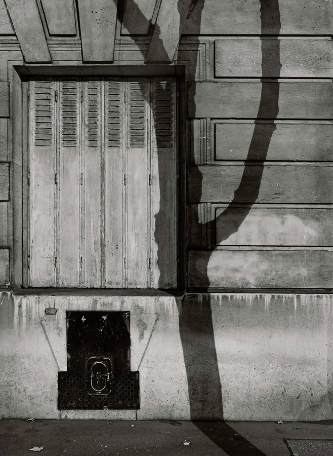
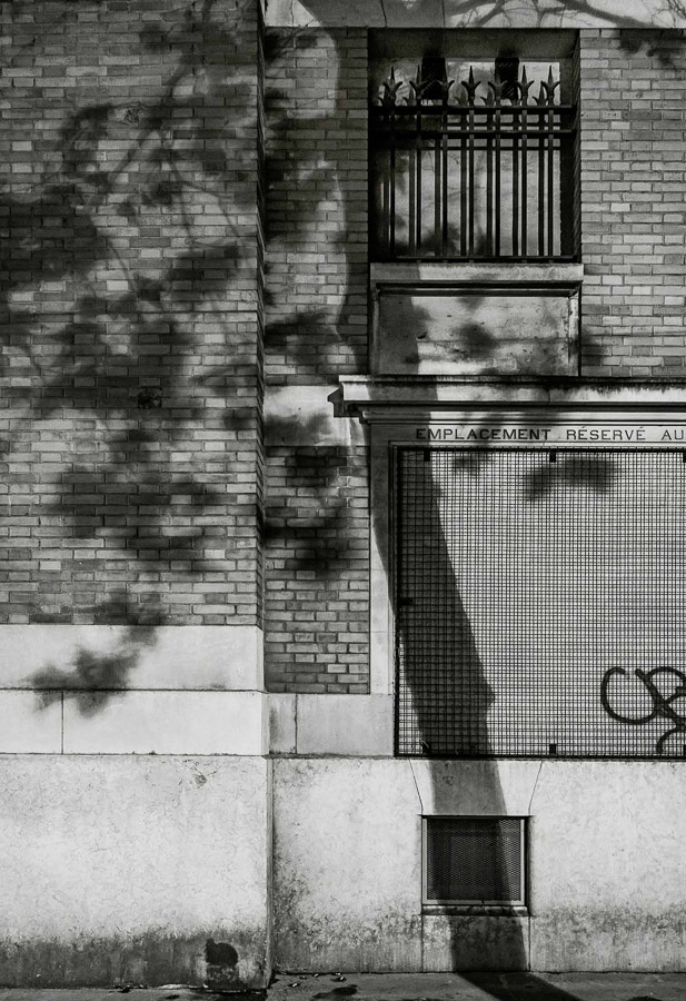
While I was looking into the industrial architecture typologies of the Bechers. I came across Micheal Wolf’s work Paris Tree Shadows. In a similar way to the Bechers, Wolf created a collection of images with the typology of trees casting shadows onto the Paris architecture. What appealed to me with this work was the use of more creative composition. Two of the series can be seen below:

Images 2 and 3 from Michael Wolf’s Paris Tree Shadows [3]

In these photographs we see two portrait compositions of walls that have tree shadows cast onto them. These are part of a collection of 11 photographs that are grouped by a number of typological elements to them. They are all the same format, black and white and shot in bright sunlight to achieve the shadow. Each picture is of a Parisian wall, so they are all cityscapes and each image has texture made up of squares or rectangles; brickwork and stonework feature but so do doorways and windows. The tree shadow runs from the top to bottom of the frame and each is placed almost anchored to a vertical line or feature on the wall behind it. What struck me about the images as a collection was how at first glance they all look very similar as with Water Towers, but after a while the subtle differences between the trees themselves become apparent. Some of the trees are with foliage and some without. Some have multiple branches and some are solitary. This series, like the Bechers’ work, is anchored by multiple references, which make sense but invite more investigation of the subject that is the central player in each picture. We can see a group of tree shadows but we can also see a variety of locations that they are set in. Each Parisian wall is different but has the rigours of the wear of a city on them. Some walls are dirty, some windows need repair and there is evidence of maintenance work being done in one of them. One even has graffiti, which instead of drawing the viewer’s attention from the tree shadow, further emphasises its place in the scene. The images contrast the natural with the manmade in a way that could suggest the former is becoming less impactful on the latter or it could simply be that the organic nature of trees leaves its mark on the precisely uniform aesthetic of a cityscape. Either way, the use of typology in this way gives the viewer a comfort in the familiar by showing them repeated, associated visuals. Like Barthes’s problem with the stereotyping of people and culture in his essay, the typology here is presented to ‘get it out of the way’ so that we can look more carefully at the subjects themselves.

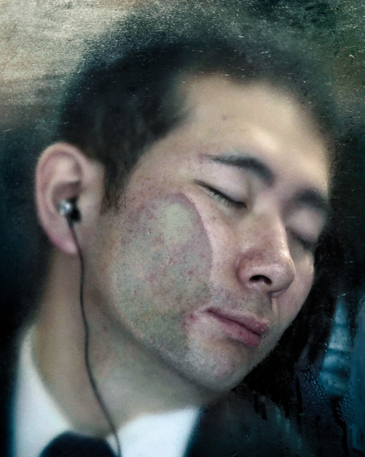
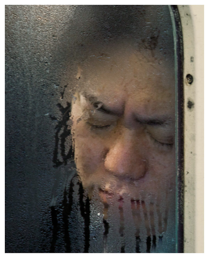
Wolf also worked in portraiture, which we are more interested in here. His series Tokyo Compression was shot in the subways of the Japanese capital after Wolf noticed that on the single line coming into the station, the people were packed into the carriages like sardines. His vantage point meant that he could shoot the commuters through the small windows of the carriages and show them uncomfortably packed into the confined space as they continue their journey. Two of the images from that series can be seen below:

From the series Tokyo Compression by Michael Wolf [4]

Here we see two of the commuters, seemingly asleep during their commute. In a video interview about the series [5], Wolf stated that his subjects looked exhausted and when the train stopped, the ones that were asleep would often wake and be greeted by the sight of him and his camera. Some elected to respond by covering their face or giving a rude gesture at Wolf, while others simply closed their eyes again to block out the intrusion. Whatever their reaction, Wolf’s portraits show the treadmill of life in the megacity that is Tokyo, the people ensuring discomfort in order to get to their destination. The photograph on the left shows the man with his face distorted by being pressed up against the window, but oddly he looks peaceful. How could this be so with what we suspect is an uncomfortable posture? Has he escaped through listening to something through his headphones or is he actually asleep? The photograph on the right shows a similar posture but the expression is one of a frown. Could this man be reacting to Wolf or is his just miserable about his situation. In both images, the view through the misted window emphasises the sense of confinement with others, which is a powerful aesthetic. When I first saw this series, I was struck by the presence of typology but also the many layers of interest in each image, which initially looks like all of the others. Wolf used typology throughout his work with what some would consider mundane subject matter. His ability to reveal powerful stories by gathering photographs that have the same attributes is equally effective in portraiture as it is in landscape.

August Sander (1876–1964)

August Sander was perhaps the most influential of photographers using typologies in his portraiture. His life-long project People of the 20th Century attempted to document the people of the Weimar Republic, which was the German state between the two World Wars. Sander started by photographing his subjects in the environmental context of their profession so that he could then categorise them in those terms. As the project progressed, his portraits became simpler in composition, with the profession being revealed by some contextual elements such as clothing or through use of props. His mammoth project was initially published as the book Face of Our Time. It was Sander’s intention that the book document the people of the state in a structured series of typologies arranged in an almost hierarchical way, trying to describe the rich variety of the culture. Around that time, there was great focus on assigning labels or categories to people based on their physiognomy. Sander fuelled debates about the characteristics of people as described by their physical features and his photographs, with political and academic critics taking their own positions on what is now regarded as pseudo-science[5]. What Sander’s political leanings for the work itself were are unclear, although he was definitely not a right-wing sympathiser. However his desire to ‘catalogue’ the people in terms of their social or cultural position in society played into the hands of those who saw physiognomy in terms of what was high class and what was common. Ultimately as Germany headed for the era of Nazism in the 1930s, Sander’s work was seen as anti-propaganda to the ideal of class and value to society that the right wing pushed. Sander pressed on with his wider project but ultimately the emergence of the Nazis meant the end of publication of his Face of Our Time.

Conclusion

This project has been interesting. When I first saw the Becher works, I couldn’t really see anything other than a group of photographs of the same thing. It almost reminded me of a commercial catalogue where one might be able to buy a water tower, because of the simplicity of the compositions and technical aspects. What I hadn’t realised was that the Becher photographs offer a common view of something that may at first glance seem banal, but actually brings together different regions and environmental elements that describe Germany. The images are as powerful for the subtle differences, almost personalities of the towers as they are for the quality of their production. I was reminded of a painting that I had almost purchased several years ago from a local gallery. It was a modern acrylic painting of a number of cigarette lighters arranged in a grid. Each was depicted in incredible, almost photographic detail and all the same size. The title of the work was 28 Stolen Lighters, which made me laugh as well as think about what was behind this gathering of similar subjects. In what way had they been stolen? Who were the original owners and how did they feel about losing them? When it came to the arrangement, the were all very different in appearance but common in construction. They were disposable lighters with lots of different designs, which told something of the kinds of people they had been ‘stolen’ from. In reality, the artist had borrowed the lighters over many nights out from his friends and neglected to give them back. His intentions were innocent absent-mindedness, but in using their forms as the typology their status as trophies from social encounters took on a different, more sinister meaning. What I’ve seen in the works of the Bechers, Wolf and Sander is an approach that gathers many versions of something apparently banal and tells a story in the variations that asks us to really look closely at the subject. It’s an interesting idea that I had not encountered thusfar.

References

[1] Barthes R, 1957( translated 1972), “Mythologies”, The Noonday Press, New York

[2] Becher B & H, 1988, “Water Towers”, Artist Website, https://www.thebroad.org/art/bernd-and-hilla-becher/water-towers-0

[3] Wolf M, 2014, “Paris Tree Shadows”, Artist Website, https://photomichaelwolf.com/#paris-tree-shadows/1

[4] Wolf M, 2011, “Tokyo Compression”, https://photomichaelwolf.com/#tokyo-compression/1

[5] Brückle W, 2013, “Face-Off in Weimar Culture: The Physiognomic Paradigm, Competing Portrait Anthologies, and August Sander’s Face of Our Time“, Tate Papers No.19”, Tate Website, https://www.tate.org.uk/research/publications/tate-papers/19/face-off-in-weimar-culture-the-physiognomic-paradigm-competing-portrait-anthologies-and-august-sanders-face-of-our-time

1) Exercise 1: Historical Portrait

The Brief

Do some research into historic photographic portraiture.

Select one portrait to really study in depth. Write a maximum of 500 words about this portrait, but don’t merely ‘describe’ what you see. The idea behind this exercise is to encourage you to be more reflective in your written work (see Introduction), which means trying to elaborate upon the feelings and emotions evoked whilst viewing an image, perhaps developing a more imaginative investment for the image.

The portrait can be any of your choice, but try to choose a historic practitioner of note. This will make your research much easier, as the practitioner’s works will have been collected internationally by galleries and museums and written about extensively. Read what has already been written about your chosen practitioner’s archive, paying particular attention to what historians and other academics have highlighted in their texts.

To help with the writing, you might also want to use a model developed by Jo Spence and Rosy Martin in relation to helping dissect the image at a more forensic level, this includes:

The Physical Description:​ Consider the human subject within the photograph, then start with a forensic description, moving towards taking up the position of the sitter. Visualise yourself as the sitter in order to bring out the feelings associated with the photograph.

The Context of Production: C​ onsider the photographs context in terms of when, where, how, by whom and why the photograph was taken.

The Context of Convention: ​Place the photograph into context in terms of the technologies used, aesthetics employed, photographic conventions used.

The Currency:​ Consider the photographs currency within its context of reception, who or what was the photograph made for? Who owns it now and where is it kept? Who saw it then and who sees it now?

Post your thoughts in your learning log or blog.

Introduction

For this exercise, I chose the portrait ‘The Roaring Lion’, by Yousef Karsh in 1941:

The Roaring Lion, by Yousef Karsh (1941)[1]

The portrait is Karsh’s most famous, that of Prime Minister Sir Winston Churchill. He is dressed in a three-pieced suit with his trademark bow-tie and is seated in what appears a formal office setting, with wood panelling in the background. He is lit by a single light that emphasises his face and although some spills onto his hands and the background, there is little definition of the rest of his figure placed in dark shadow. Churchill’s expression is a direct gaze into the camera with a gruff, grumpy appearance.

At the time Churchill was visiting the cabinet chambers of the parliament of Ottawa, as a guest of the Prime Minister [2]. Karsh had been invited to listen to Churchill speaking but in a opportunistic way, set up his camera and lighting in speaker’s chambers the night before he was introduced to him. When Karsh switched on his continuous studio light it took Churchill by surprise as he hadn’t been told about the portrait. However, he duly sat for it. Karsh asked politely that he remove his trademark cigar, which was refused. Karsh then decided to grab the cigar from him.

“By the time I got back the four feet to my camera, he looked at me so beligerently that he could have devoured me. I clicked and this is the picture”

Yousef Karsh, recreating his most famous picture on 60 Minutes with Morley Safer, c1977 [2]

“You can even make a roaring lion stand still for a photograph”

Sir Winston Churchill to Yousef Karsh after the shoot was finished [2].

This image of Churchill is instantly recognisable, most likely because of the many years of documentary about him that has followed. When it was shot, the war was in its relative infancy, which is almost confirmed by the fact that he was across the Atlantic in Canada to begin with. Karsh’s formal setting provides Churchill with the statesman-like presence, but the use of a large format camera, with its higher degree of separation between in and out of focus areas, means that the background is a texture but not a distraction from the subject. The shallow depth of field also means that his hands are also not the first thing we look at as they too are soft. The single key light used on Churchill’s face draw us into his expression which is one that we now associate with his personalty. Karsh admitted that once this shot was done, Churchill invited him to take another portrait. In that one, we see a more relaxed man whose demeanour is staged for the photographer. The first image is the most famous and now hangs in the same speaker’s chambers. In 2017, Karsh’s portrait was immortalised in the public conscience when it was selected for the new polymer 5 pound note [3]. I believe this to be because of the way that Karsh managed to capture the entire essence of Churchill through one provocative act and the subsequent opening of the shutter.

References

[1] Karsh Y, 1941, ‘The Roaring Lion’, Yousef Karsh.org website, https://karsh.org/overview/#0

[2] Karsh Y, c1977, ’60 Minutes with Morley Safer: Churchill’, Yousef Karsh.org website, https://karsh.org/videos/60-minutes-with-morley-safer-churchill/

[3] Unknown, 2017, ‘£5 Note’, The Bank of England, https://www.bankofengland.co.uk/banknotes/5-pound-note

1) Project 1: Historical photographic portraiture

“The portrait is a sign whose purpose is both the description of an individual and an inscription of social identity”

Tagg, J, The Burden of Representation: Essays on Photographies and Histories (1988), Minneapolis: University of Minnesota Press P37.

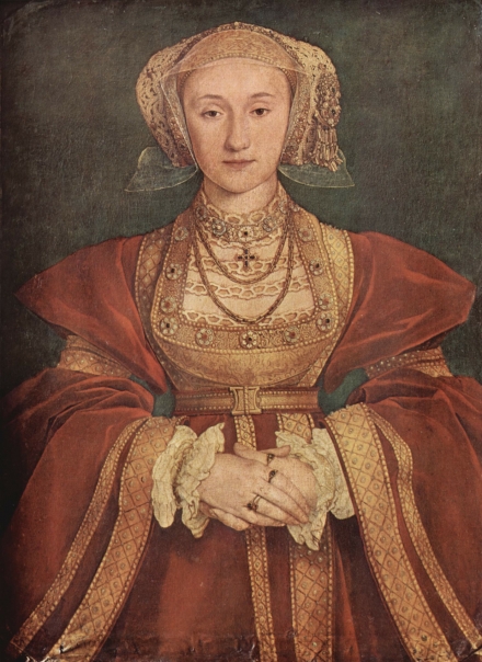
We are presented with this quotation by John Tagg at the start of this project with the question of the difference between ‘description of an individual’ and ‘inscription of social identity’. On the face of it, the difference appears simple enough; a description being a representation of the subject and an inscription being more of a narrative of the age, culture etc. Representation though has been a fluid concept throughout Level 1 of this course. We already know that the artist and the sitter influence what is ‘represented’ in a portrait, which has been true for centuries. Take the example of the famous portrait painter Hans Holbein, who painted English monarchy during the Tudor era. Holbein’s representations of his subjects were often defined by the need for a narrative about the person’s status or social standing during a time where many people in England had never actually seen them. The portraits needed to convey a persona for the public. which was largely based on how they should be seen. His most controversial work was undoubtedly that of Anne of Cleves (below) which was commissioned by King Henry VIII’s minister Thomas Cromwell in 1539. Holbien was to capture Anne’s likeness as part of a petition by Cromwell for Henry to marry her. Holbein duly completed the painting which depicts a pretty young woman in a regal pose.

Holbein, Portrait of Anne of Cleves (c.1539) Parchment mounted on canvas. Louvre, Paris[1]

When Henry actually met Anne, he was said to be less than impressed with her in part because she did not resemble her likeness. The deception is widely believed to be what led to Cromwell falling out of favour with the King and ultimately his execution. Holbein is remembered in history for this glaring error of judgement, although it is unlikely that the painting alone was responsible for the problems with the Queen that followed him painting it. Holbein though is shown to be pushing the boundaries of ‘representation’ with this painting.

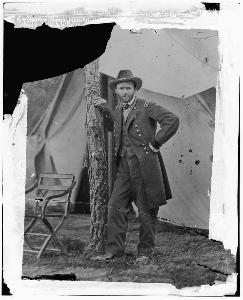
The same representation can be seen in the early photographic portraits, which is not really surprise owing to the staged nature of the medium in its early days [2]. As photography was less time consuming (and presumably less expensive) than painting, subjects could more readily appear in many portraits over a period of time. Take the following examples of early portraits of Ulysses S Grant, who became the 18th President of the United States after leading the Union army to victory in the American Civil War. Grant had portraits made both using traditional painting and with photography and it’s the latter that I found to be most interesting.

Gen. U.S. Grant at his Cold Harbor, Va., headquarters. United States, 1864 by E.G. Fowx

In this photograph, Gen. Grant is shown standing in what looks like a tent, leaning against a tree that forms part of the structure. He is shown in his military uniform, but he is represented as a soldier whose stance gives the impression of a man taking a moment from the battle. As the location for the photograph is Grant’s headquarters at the battle of Cold Harbor, VA, it’s reasonable to assume some accuracy to the way he is being depicted. However, we know the photograph would have required some time to set and shoot, so the scene is very deliberately staged. Grant’s expression and pose suggest a relaxed, confident and solitary commander, with the only other element that is present in the image being a chair presumed to belong to him. The intensity of this image is impressive for the time because of how long the pose would have needed to be held for, while it’s contextual simplicity represents what the American people would have associated with the leaders of the two armies (the opposing leader General Robert E Lee was pictured in similar photographs).

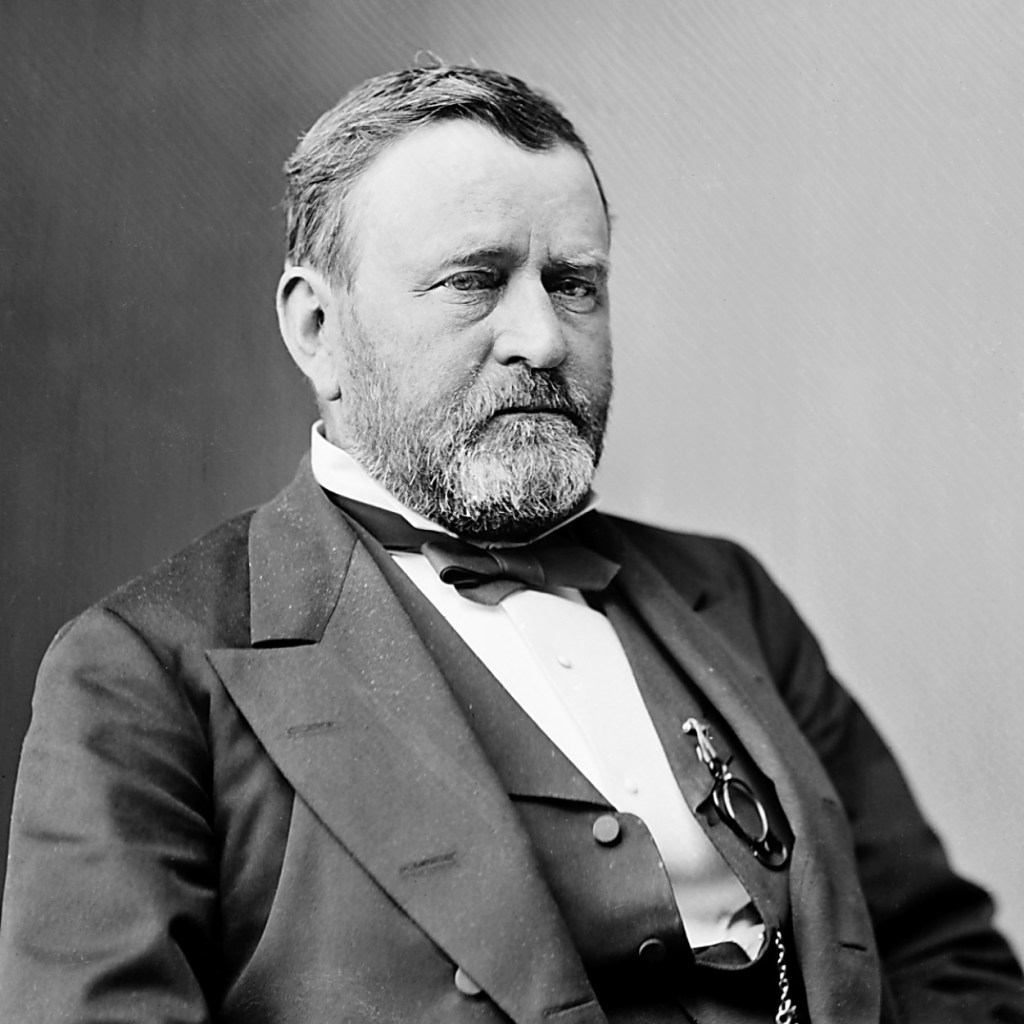
The second image (below) shows Grant as the 18th President, taken some time between 1870 and 1880.

President Grant (circa 1870 to 1880), by Matthew Brady [4]

Here we see a very different man from the previous image that was taken probably only a decade before. Grant is now pictured in a formal suit in a pose that represents him as the leader of the country. Grant’s expression still shows the confident leader as before, but the formality of the image and complete lack of any other context reminds me of the professional profile pictures that are commonplace in the current digital age.

What these two portraits show is the public image of one of the United States’ most celebrated military and political leaders. Although they show very different men despite the short period of time between the dates they were taken, neither picture describes what happened to Grant in that period. The point being made by Jenkins in Re-thinking History (1991) is reinforced by these two images:

“We should distinguish between the two by calling ‘the past’ everything that has happened before and calling ‘historiography’ everything that has been written about the past”

Jenkins K, Re-thinking History (1991) London: Routledge. Pg.7.

The first image was seen as ‘the past’ when the second was taken, but it says nothing about the war, the losses or strategic decisions that the great general made, merely that he was there. Historical texts and reflection by the American people, leading to his election as President, provide the historiography that Jenkins refers to. The photographs support the narratives rather than create them by themselves. With the advent of the automated portrait that was used for formal identification of an individual, portraiture itself took on a different meaning. The images made no reference to social identity, financial status or public persona. Arguably, the creation of formal portraits of a person could, if assembled together, tell the story of someone’s change in appearance throughout their life, but little else would be gained from them beyond that. However, the advent of the selfie in the 21st Century provides much more contextual information about a person than before. Modern portraiture is much more accessible by all parts of society, which for me helps create that sense of identity within and between social groups.

Julia Margaret Cameron (1815 to 79)

One of the most innovative portrait photographers of the 19th Century, Julia Margaret Cameron sought to move away from the formal, scientific approach to portraiture that had been the norm since the medium was invented. Where other photographers made their portraits full or half length pictures of their subjects, including contextual references to represent them in a particular way, Cameron took a different approach. Her portraits were much more close-up in composition and used high contrast between highlight and shadow to increase the drama of her subject’s appearance. She also challenged the convention of sharp focus and long depth of field which made her pictures ethereal in appearance. After receiving significant criticism from the her contemporaries for this, she asked her friend Sir John Herschal:

“What is focus and who has the right to say what focus is the legitimate focus?”

Julia Margaret Cameron

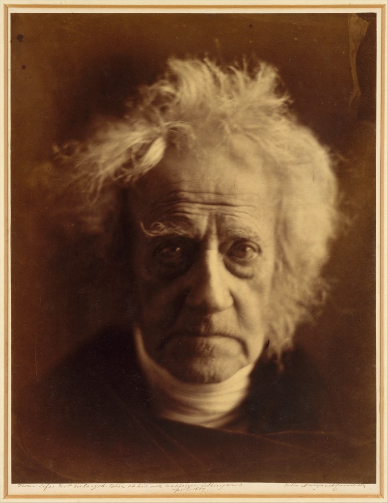
Herschal was a famous astronomer so one would have expected him to have taken a similar view to the photographers who had criticised her. However, Hershal like many of the famous friends that Cameron had photographed, was a fan of what she was trying to do. One of her portraits of him took his profession as an eminent astronomer and portrayed him as how she saw him; as ‘teacher and high priest'[5].


Sir John Herschal by Julia Margaret Cameron (1815 to 1879)[6]

The portrait shows Herschal in extreme close-up with his wild hair lit to create an ethereal corona around his face. His piercing gaze points to his inquisitiveness and intellect. Cameron was using photography, in particular portraiture, to create art rather than scientific record. In her tableaux creations, her female characters often took on the appearance of the angelic, with pale, flawless skin lit in a way to make them almost unreal. Her male characters by contrast were lit in a way that highlighted the lines of their faces, their frowns and expressions that alluded to the learned men, often influenced by priests or prophets.

Tracing Echoes – Nicky Bird (2001)

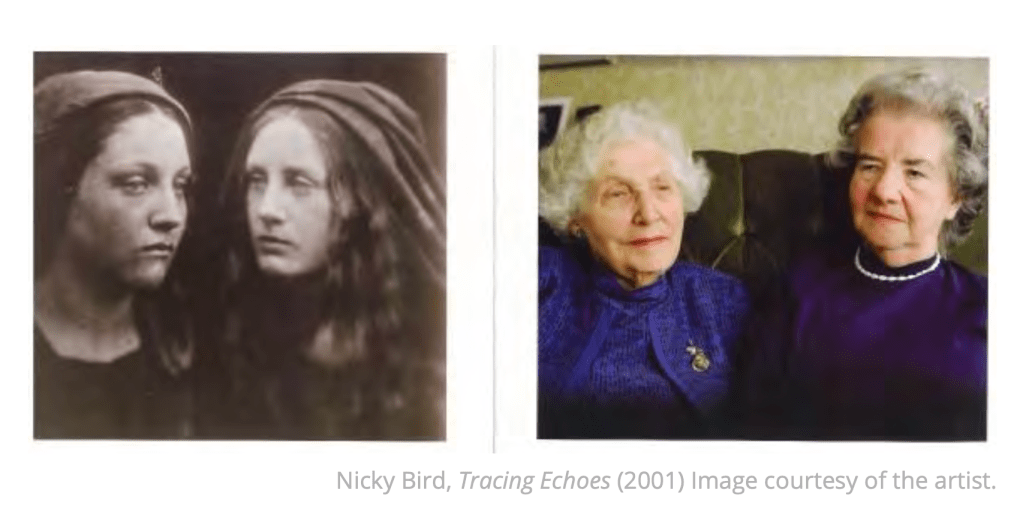
I first came across Nicky Bird’s work during Context and Narrative where the artist had curated a collection of unwanted photographs that she had purchased on eBay [7]. In that work, Bird was creating narratives with the available information from the seller that gave the collected photographs new purpose. The act of creating an archive and her subsequent sale of the photographs highlighted the transient nature of history with their new owners adding to the story by purchasing what was once unwanted. I found Bird’s connections between the past and present fascinating, so when I started looking at Tracing Echoes I could see a similar theme running through the work. Bird’s work in this project isn’t limited to historical portraiture as the basis for it came from Bird’s time as artist in residence at Cameron’s home, Dimbola Lodge. It’s her portraiture that relevant to this course though and in the case of Tracing Echoes, Bird connected the past and present by shooting similar photographs of the descendants of Cameron’s subjects. When I look at these images and the accompanying text, I can see the clear connections between past and present. However, I get more of a sense of mimicry than I was expecting. The photographs that are included in the notes, for example (below) show the the shots by both artists side-by-side.

Clip from the Identity and Place course notes. Nicky Bird’s Tracing Echoes (2001)

Bird has selected a similar ‘facing’ pose for her two women but hasn’t used the same technical approach to the shots (background composition and lighting) as Cameron. Instead, her portraits look more natural than Cameron’s and because of the clear differences in the photographic technology in the intervening 130 years set Bird’s portraits very much in the present. We are presented with two elderly women without any other real context beyond their relationship to Cameron’s original subjects. My issue with Bird’s photograph is that it the passive expressions of her subjects look forced to me. It’s as though in asking her subjects to pose in a similar fashion to Cameron’s photograph, the result is something that doesn’t appear genuine. I really admire Bird’s work in exploring history and as such, Tracing Echoes is an important natural extension to Cameron’s story, which was so tragically cut short after a career of just 11 years [8]. However, as a celebration of Cameron’s innovative style, I don’t think it works – perhaps that wasn’t really Bird’s objective but it’s less impactful as I would have hoped.

Emil Otto Hoppé (1878-1972)

I admit to having never heard of Hoppé’s work until reading about him for this project. The story of what happened to his work underlines the points made by Tagg and Jenkins earlier in the notes with regard to representation and historiography. Although Hoppé was well known during his lifetime, his portraiture was not because of the decision to sell his catalogue to the Mansell Collection, a commercial picture house in London. The Mansell Collection was an early version of what we know now as a commercial picture library such as Shutterstock or Getty Images. In collecting the works of well known photographers, the Mansell Collection ensured that there was a rich variety for potential commercial use, but this was counterproductive in terms of art. The images were archived by subject rather than artist, which had two effects. The first was that the identifying factor for an image was what the subject was. In the case of portraiture, the picture literally represented a specific subject, e.g woman or child etc. rather than any other context included by the artist. It’s possible that the collection applied other references in its archiving decisions, but the effect was that the pictures were pigeonholed into certain categories. The second effect was the more damaging in that by assembling the collection in this way, Hoppé’s work was not curated as a collection in its own right. Therefore, anyone reviewing the available portraits in the Mansell Collection would not know the extent of his work. What made the latter effect worse was that the collection was not available to the public or any critics or historians for many years. To Jenkins’ point, this prevented any historiographical narratives to be created from the work and as such Hoppe’s portraits did not stand as historical documents.

When his portraiture work was eventually discovered, it confirmed his reputation as a master photographer. An example can be seen below:

Tilly Losch by E.O. Hoppé, 1928 [9]

In this shot of Austrian dancer and actress Tilly Losch, we see some similarities with the style that Cameron pioneered many decades before. Losch is pictured in extreme closeup and in soft focus, which creates an almost supernatural feel to the picture. However Hoppé’s use of light and the model’s expression is what leaps out of this image. Strong catchlights in her eyes draw the viewer to look straight into them and because of the tightness to the composition, we cannot help but look from one eye to the other as if in direct contact with her personality. The light picks up her flawless skin and the angle draws attention to her striking features. Perhaps the most interesting aspect of this photograph is what it doesn’t show. While Losch was a dancer, she was famous for her intricate and intense The Hand Dance, created 1930-33. The Hand Dance was obviously performed with Losch’s hands and one surviving film of her performance by Norman Bel Geddes [10] shows how little attention was on Losch’s facial features. Nevertheless, Hoppé’s portrait reveals to us her intense personality without showing her hands at all. For me, Hoppé’s seemingly simple technique achieves a great deal in representing Losch without any obvious nods to her profession as an artist.

Conclusion

This project has introduced the concept of portraiture as representation but not historical documentary without historiography, that is the additional context that history provides. As photography evolved as a technical discipline, the prophecy by Delaroche did not come true as such. Instead photography became a complimentary technique for portraiture with the pioneering work of early artists such as Cameron. Her approach of using photography to create caricatures of her subjects was definitely disruptive, with the technical establishment dismissing her both as a woman in a man’s world and as a practitioner of what they saw as science rather than art. When we look at Cameron’s portraits of famous sitters, we can draw our own conclusions about the representation but we need to consider the historiography in order for the images to say anything about historical context. The way that representation changes can be seen in the work of Hoppé with he unfortunate way that it was kept from the public and academia as well as being fragmented by categorisation. Curating his work affected the way people saw his portraiture and provided the ability to create the all-important social narratives that accompany them.

References

[1] Abrahams S, 2013, “Holbein’s Anne of Cleves (c.1539)”, Image Resource, EPPH website, https://www.everypainterpaintshimself.com/article/holbeins_anne_of_cleves_c.1533

[2] Fletcher R, 2021, “On Delaroche, Analogue and Digital”, OCA Blog Post, https://richardfletcherphotography.photo.blog/2021/02/19/on-delaroche-analogue-and-digital/

[3] Fowx, E. G., photographer. (1864) Gen. U.S. Grant at his Cold Harbor, Va., headquarters. United States, 1864. [June] [Photograph] Retrieved from the Library of Congress, https://www.loc.gov/item/2018667429/.

[4] Brady M, 1870 to 1880, “Ulysses S Grant, 18th President of the United States”, Image Resource, The White House website, https://www.whitehouse.gov/about-the-white-house/presidents/ulysses-s-grant/

[5] Mickich T, 2020, “Online preview of Dimbola’s Julia Margaret Cameron: Close Up exhibition”, Dimbola Lodge Museum, https://onthewight.com/watch-online-preview-of-dimbolas-julia-margaret-cameron-close-up-exhibition/

[6] Daniel, Malcolm. “Julia Margaret Cameron (1815–1879).” In Heilbrunn Timeline of Art History. New York: The Metropolitan Museum of Art, 2000–. http://www.metmuseum.org/toah/hd/camr/hd_camr.htm (October 2004)

[7] Fletcher R, 2020, “Project 2 -The Archive”, OCA Blog Post, https://richardfletcherphotography.photo.blog/2020/12/20/project-2-the-archive/

[8] SFMOMA, 2017, “Pictures from a glass house: Julia Margaret Cameron’s portraits”, San Francisco Museum of Modern Art website, https://www.sfmoma.org/watch/pictures-glass-house-julia-margaret-camerons-portraits/

[9] Unknown, 2011, “Hoppé Portraits: Society, Studio and Street”, Image Resource, The National Portrait Gallery, https://www.npg.org.uk/hoppe/exhibition.html

[10] Bel Geddes N, 1933, “Dance of her Hands, Tilly Losch (1930-1933)”, Youtube, https://www.youtube.com/watch?v=P_dOSfEnKJo

On Delaroche, Analogue and Digital

“From today, painting is dead!”

Paul Delaroche, c1840.

In the introduction to Part 1, we are introduced to the quote that is often attributed to French painter Paul Delaroche sometime in the early 1840s. He had apparently seen an early Daguerreotype image and declared that photography spelled the end for portrait painting from that day forward. Dageurre had invented and developed what is considered the first publicly available photographic process that would preserve the image observed by a camera. While it definitely turned the ancient phenomenon of the camera obscura, which had been around for centuries previously [1] into a practical application, it was certainly not the end of portrait painting as Delaroche predicted. Instead photography continued to evolve along a more scientific route than perhaps Delaroche was aware. The very first photograph was taken in 1826 by Joseph Nicéphore Niépce [2], an inventor whose fascination with the art of lithography led him to experiment with ways of improving his skills in creating these intricate artworks. Realising that he lacked the precision of technique to be any good, Niépce experimented with photosensitive materials and methods for fixing the image onto a pewter plate, some 14 years before Dageurre unveiled his process. Niépce started to work with Dageurre before his death in 1833, undoubtedly inspiring the latter’s eventual development of a stable process and ultimately himself being acknowledged as the inventor of photography. Deguerre himself wasn’t an artist either, but a chemist who like many, was interested in the science behind preserving an image as a recording. During this time, an English inventor called Henry Fox Talbot was also working on preserving the photographic image, but on paper instead of the polished metal used by Dageurre. Fox Talbot’s work was the basis for future evolution of photographic film and papers. In Fox Talbot’s case, he was interested in creating accurate pictures of flora and fauna, but lacked the skill to draw his subjects. He, like Niépce was trying to make up for the lack of artistic skill with the use of science to create faithful reproductions.

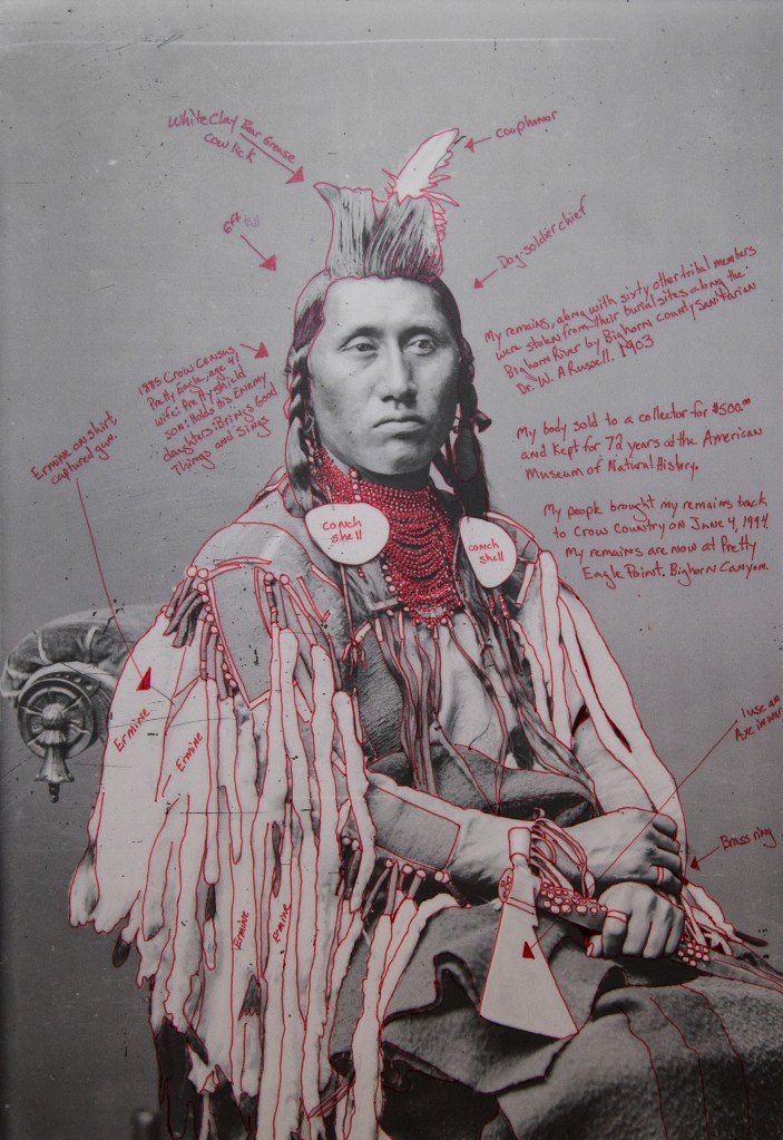
It stands to reason that when Delaroche first saw this new technology used for traditional portraiture, he would have thought it was going to make painting redundant. The early portraits by Dageurre although fairly primitive, must have looked like a more faithful representation than was possible by the portrait painters of the time. As the notes indicate, in actual fact the balance between traditional and new took a while to establish itself and painting as art remained popular way of representing a portraiture subject. When we look at the early portraits made using photography, we see the technique more the focus than the subject. Early photographs required long exposures for the process to work, so subjects needed to sit perfectly still for the picture to be sharp. Any real creativity was limited to the use of costume and background, which was often just whatever was contemporary. These photographs were highly constructed and any suggestion of personality came from the subject rather than the photographer. In Context and Narrative, I looked at the work of Wendy Red Star [3] who incorporated photographs of tribal elders of the indigenous Crow tribe (her ancestors) who were invited to Washington in a farcical summit which resulted in them having their lands taken by the modern American government. The photographs were staged by a famous photographer of the age who had a reputation for taking cold, distant portraits. It was believed that this way of representing the elders would show the people of Washington how alien they were to the emerging culture of the US. What resulted though was a series of images that achieved the opposite. Instead of distant and uninteresting, the elders appear proud, dignified and complex (owing in part to their full traditional dress).

Déaxitchish / Pretty Eagle from the series 1880 Crow Peace Delegation, 2014, by Wendy Red Star

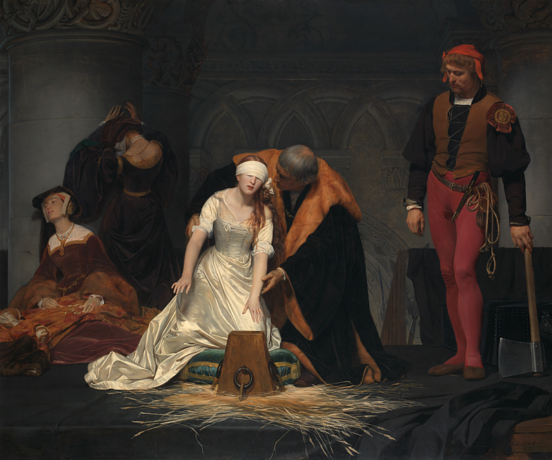
Portraiture using photography differed from traditional painting in that the subject had more control over the finished piece. When we think about what Delaroche was famous for, we can see that painting still had its place in creating art that was flattering, or fantastical. Delaroche’s fascination with depicting the historical executions of key figures in history, his most famous being The Execution of Lady Jane Grey [4], is an example of the fantastical representations that were possible through the imagination and skill of a painter.

Paul Delaroche The Execution of Lady Jane Grey 1833 Oil on canvas, 246 × 297 cm Bequeathed by the Second Lord Cheylesmore, 1902 NG1909 https://www.nationalgallery.org.uk/paintings/NG1909 [4]

This particular tableau painting was derived from the many accounts of the execution but Delaroche placed the scene in an elaborate indoor setting that looks more like a church than a scaffold. In reality, Grey’s execution took place outside in the Tower of London grounds with a small crowd in attendance. With this artistic licence Delaroche is perhaps saying that the tragic killing of a teenage girl, who is now recognised as a manipulated innocent in the political instability of Tudor England, was akin to taking the life of an angel before the judgement of God. Whatever his motivation, Delaroche wasn’t present at the execution so could play with the aesthetics and details as much as he liked. The same couldn’t be said for photography until the subsequent development of the materials, equipments and techniques that allowed for the photographer to be more creative.

A modern equivalent of painting vs. photography can be seen in the advances of digital technology, which is present in every genre including portraiture. The notes refer to how photographers and the general public moved away from traditional film to digital imaging, which is a discussion that is often found in social media groups. As a film shooter, my view is that the advances in digital are not having the same impact as those that Delaroche was worried about. In his case, accurate reproductions created by the camera required a different set of skills that in some ways rivalled the painters of the age. Skills were still needed though, as photography was a complex technical process involving mechanical tools and chemistry. Painting still had the edge in terms of creativity and artistic licence, but developments in cameras, films, lighting and processing techniques addressed some of those shortfalls. With the latest advances, I would argue that the skill has almost been eliminated from portraiture with the rise of the selfie. People can now shoot portraits and rely on electronics and software to be creative to a point. No other photographic skills are required until the shooter wants to take more control. I was discussing this phenomenon with a fellow photographer and teacher who at one point decried the use of mobile phones with onboard processing and is now, because of demand, teaching mobile phone photography as part of his business. This also perhaps explains the resurgence in analogue film , where novel and expired film emulsions are making people who are new to photography want to experiment with different aesthetics. I recently met someone who has discovered film by buying point and shoot film cameras in junk shops and shooting expired film in them. His images take on a totally different meaning because of the way the film reacts to the light, even thought his candid portraits are similar to many other contemporaries.

Conclusion

I was interested in the introductory statement in the course notes so decided to dig a little deeper. I was glad to have done so as the evolution of photography, with all of its perceived truthfulness and accuracy, has not destroyed other art forms as feared by Delaroche, but instead been an enabler for them to be regarded for what they are. For example, the Royal Family still commissions painted portraits regularly as well as photographs. The former continues a traditional portrayal of them that complements historical representations while ‘telling a story’ to tie in with the contemporary view of them. The photographs create a different narrative; one of normality and relatability that also showcases the artist as much as the subject. People still enjoy both forms of portraiture in equal measure. As the talkshow and car enthusiast Jay Leno once said of the evolution of the automobile,

“Back then, horses were the primary means of motive power, pulling heavy carts and carrying people. Sadly, they would drop dead in the streets from sheer exhaustion or abuse. And mounds of manure befouled Chicago, New York and other big cities, spreading nasty diseases like dysentery. Suddenly, the automobile came along and people said, “Oh look, there’s just a little blue smoke! How nice.” Soon, horses were no longer misused as draft animals and the amount of droppings lying around was significantly reduced. Everyone was happy.”

Jay Leno, talking about the evolution of the car

People still enjoy cars and horses but for different reasons, the latter being recreational instead of industrial. My view of the evolution of portrait photography is that it serves a different purpose analogous to painting but it was never going to replace it.

References

[1] Unknown, 2021, “Camera Obscura History – Who Invented the Camera obscura?”, Photography History Facts Website, http://www.photographyhistoryfacts.com/photography-development-history/camera-obscura-history/

[2]Unknown, “The Niepce Heliograph”, Image Resource, Harry Ransom Center, https://www.hrc.utexas.edu/niepce-heliograph/

[3] Fletcher R, 2020, “Post Assignment 4 Feedback”, OCA Blog Post, https://richardfletcherphotography.photo.blog/2020/12/04/post-assignment-4-feedback/

[4] Delaroche P, 1833, “The Execution of Lady Jane Grey 1833 Oil on canvas, 246 × 297 cm Bequeathed by the Second Lord Cheylesmore, 1902 NG1909”, The National Gallery, https://www.nationalgallery.org.uk/paintings/NG1909

Initial Meeting with My Tutor

Introduction

I’ve just had my first video meeting with my tutor for Identity and Place, during which we discussed the usual aspects of studying with OCA.  As this was the third time I had discussed these, the focus of the conversation was more a get-to-know and to establish how we were going to engage throughout this unit.  During the call I raised the fact that I had briefly read some of the course materials and in particular, was interested in the first assignment.  I pointed out that the brief for Assignment 1 filled me with dread as it required shooting portraits of people that are strangers to me.  I recalled being incredibly uncomfortable during Assignment 3 of EYV, for which my approach was to blend street photography with the humour found in Martin Parr’s work.  During the shooting, I became overly sensitive to the idea of pointing my camera at people.  It was made worse because my DSLR was so conspicuous – I likened it to having a Howitzer aimed at oneself.  Eventually I took a break from trying to shoot the assignment and went for a relaxing walk around my town with my wife.  When I stopped thinking about the anxiety, the photographs started to present themselves  and I finished with a collection of images that I was really happy with.

Assignment 1 in this course is calling for us to take 5 portraits of complete strangers. Sounds simple enough, but the portraits need be insightful in some way, so the recommendation in the brief is to spend some time getting to know the subjects before trying to take their portrait.  This immediately raised some questions that I wanted to attempt to answer before beginning the unit and re-visit once I’ve completed the assignment.

Questions raised about photographing strangers

What causes me to be anxious?

The anxiety of approaching someone to take their picture comes, I believe, from the fear of a negative reaction that could range from simple rudeness to aggression.  The worst experience that I’ve had in this regard was while visiting Morocco a few years ago.  I already knew that the people of Marrakesh were divided on the subject of photography and that as a mainly Muslim country, their issue with it was rooted in the belief that the act of capturing their likeness takes part of their soul.  When I arrived in the city on a photography trip, I immediately started to get incredibly negative reactions to my camera even when I wasn’t taking pictures.  The most memorable were an elderly gentleman who was sitting in the main square in the medina.  I was looking around at the sights of the people packing up their market stalls at the end of the day and how beautiful these sights were as the sun started to set.  At that point my camera was slung over my shoulder and clearly not about to be used, but this elderly gent made the effort to catch my eye so that he could utter one of the few insults that he knew the English words for.   It would have appeared that his outrage was at what might happen rather than what was actually happening.  My reaction was equally angry and my fellow photographers had to move us on before I said something potentially regretful to him.  The second incident was in the seaside town of Essaouira and was similar in many ways to the previous.  A line of women sat on the steps in the harbour and each of them flipped me the middle finger almost in unison.  My initial thought was that this would make a great photograph, but the one at the back of the line had attracted the attention of one of the fishermen who was gutting fish on the dock with a very large knife.  His subsequently threatening demeanour was enough to put me off my train of thought.  I believe that these experiences alone would be enough to put me off, but thinking about it on both occasions I did not approach them for a photograph.  Without the deliberate act of asking for the portrait, this does not explain my anxiety about taking pictures of strangers. 

Does starting a conversation help?

I started to consider whether it was my lack of engagement with the people who had reacted so negatively in Morocco was causing my to take a certain view of their behaviour based on my interpretion.  Two other encounters in the city at the time made me think that perhaps the personal connection between photographer and subject was a very important aspect of portraiture, particularly when not specifically planned.  The first encounter was when one of our party took a shot of a man with his son sitting on a moped.  I had shot the same picture moments before when the man was distracted by something and he did not see me.  However, when my friend took the shot his reaction was similar to what I had encountered previously.  He shouted at her, but perhaps my presence dissuaded him from becoming aggressive.  His parting comment as he left interested me – he shouted “We are not animals in a zoo!”.  Perhaps the voyeuristic nature of our presence as tourists was causing a reaction more than simple religious sensitivity.  The people of Marrakesh are generally fairly poor, despite the tourism and recent formation of very affluent districts.  The medina is culturally rich but most people work very hard for a living.  I wondered whether an offer of money might have changed the man’s view of my friend shooting her picture.  Maybe portraiture requires some form of transaction when it comes to working with complete strangers.

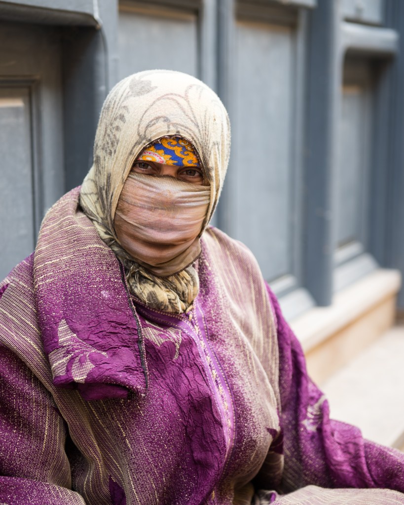
The other experience that I had was when walking through the old Jewish district of the city.  I encountered a homeless woman sitting at the side of the road who was begging for money.  I was struck be the faded state of her clothing and her sad demeanour, so I first gave her the small amount of money in my pocket.  I then gestured to the camera and to my surprise she was more than happy to be photographed.  The shot (below) was my favourite picture from the trip as even though it was a transaction that made it possible, it captures her in a natural way.  At the time, I was happy that I had captured something about the woman’s personality, her current circumstances told through the sadness in her eyes and clothing.  However, I didn’t have any kind of dialogue with her. Our encounter was an ice-breaker but not a conversation.  My experiences to date hadn’t actually explored what would happen if there had been some time spent getting to know my portrait subjects. 

A homeless woman in Morocco who agreed to have her portrait taken in exchange for a small amount of money. Any sadness I had disolved as she posed for this shot. What amazing dignity.

I then remembered that I had asked strangers for portraits while on holiday in Canada the following year.  We were out for the day on a local vineyard and wine tasting tour and I took my camera to document the day.  After the first vineyard and the obligatory shots of vines and bottles, I decided I was more interested in the people involved in the businesses rather than straight documentary.  As each vineyard passed, I asked the person who took the tour if I could shoot their portrait.  The reactions I got ranged from enthusiastic to reluctant, but at no time was there an uncomfortable exchange between us.   I remember one lady, Terry who asked why I wanted to take a picture of ‘this old face’.  The answer was that she had striking blue eyes that lit up her face – her portrait is as interesting to me now as it was when I shot it because of her eyes.  By the end of the day (and having sampled a fair amount of wine), I had gotten into the swing of engaging, chatting and then shooting my subjects.  The whole experience became easier as my confidence grew.

The Portraits

Larry (Quail’s Gate)
Unknown (The Hatch Winery)
Karin (Mt. Boucherie)
Terry (Tantalus)
Grant (Kitsch)
Dave (Wine Guru)

Ideas on how to approach strangers

My concerns had clearly come from having never really tried to shoot portraits of people I didn’t know until the wine tour in Canada.  Knowing that I could overcome my discomfort if I wanted to, I started to consider some ideas for approaching people in Assignment 1.

  • Cameras – Over the past few years, I have been collecting and shooting film cameras of a variety of ages and formats.  This hobby has often led to me being stopped in the street by a passerby who is interested in the camera I am using.  It strikes me that when there is a something of interest, complete strangers will talk to each other about it.  I’ve observed the same with people who own dogs.
  • Please Help with my Project” – perhaps the simplest way to engage with people would be to advertise that I am looking for help with this assignment.   By giving people the option to engage with me on something that might interest them, the discomfort of my starting the conversation would be greatly reduced.  The subsequent conversation would still be natural and the resulting photographs would not be staged with prior knowledge of the subject.
  • Friends of friends – another way of engaging with complete strangers would be to gain the support of friends to facilitate introductions with their friends.  As above, this separates the discomfort of the initial engagement while preserving the separation.  
  • Shop Owners – a number of other students on Identity and Place had approached the assignment by going into shops or businesses and asking for a portrait of the proprieter.   This offers separation as well as lots of visual context and a structure to the shoot.  One of the key learnings from Context and Narrative was to have some consistency in the approach to making work.  In my case, the first time I successfully achieved this was during the self-portraiture assignment, where I had a consistent way of generating the words to be projected on my face and also to the technical shoot itself.

Conclusion

In conclusion, the meeting with my tutor was very helpful in guiding my thoughts on Assignment 1.  Naturally, I have a lot of work to complete in Part 1 before I need to shoot it.  At the time of writing, my thoughts are revolving around my portrait series being about life in the current pandemic.  People are naturally cautious about being close to others and in the current lockdown situation, we are all supposed to be at home with the exception of exercise and vital journeys – this doesn’t fit well with the assignment.  However, by the time I reach that stage in the course, there is some optimism about relaxation of some of the rules we are living under.  I am hoping that because of the way our lives have been restricted that people will actually be more amenable to being approached for a chat – we have all missed human contact.  I will be revisiting this post and its assumptions when I reach that point in the coursework.

Case Study 2: Imperial Courts – Dana Lixenberg

Imperial Courts – Dana Lixenberg

With Lixenberg’s Imperial Courts, we see another subtly different approach to documentary photography.  Here, the photographer spends a long time becoming an insider in the community she is photographing.  Unlike previous examples where images have been shot of subjects either without them knowing or being aware of the implications of being photographed, Lixenberg used a 4×5 camera.  My own experiences of the two cameras that I own are that they take a longer time to set up for a shoot and cannot be used discreetly.  This meant that Lixenberg had to have the cooperation of her subjects.  She shot Polaroid images as part of her workflow, which is a common way of checking composition and exposure with these cameras.  By gifiting them to her subjects, she was able to win their trust.  Most of all, though her photographs are not conceived with any additional drama or sensationalised as the notes put it.  The subjects are shot in simple poses with enough background detail to place them in contextual terms but not in a way that steers the viewer to feel a particular range of emotions.  Lixenberg’s intention was to create a body of work that showed the people in their daily lives.  It wasn’t until she returned later in the project to shoot the environment and social impacts on the people who lived in Imperial Courts, do we see a combination of images that document life.  When I look at the imagery, I see a flow of story-telling centred around how the people in her photographs had changed over the many years of the project.  In the a video interview [1], one of Lixenberg’s subjects talks about three images in sequence in the book.  The first is of her son, who she states was murdered in the neighbourhood.  The second is of her that she describes as ‘breathing but not ok’ and the final image is of the place where her son was shot dead.  In three images we see a young man full of life, a mother holding onto her dignity and the tragic reality of the area. For me, Lixenberg’s skill in the series is as much about the honesty of the photographs and the clear affection she has for the people than the story she is telling.

References

[1] Unknown, 2015, “Deutsche Boerse Photography Foundation Prize 2017: Dana Lixenberg”, MUSEUM MMK FÜR MODERNE KUNST, https://www.youtube.com/watch?v=MUhX56bbkrg

Exercise 3: Public Order

The Brief

Look at some more images from this series on the artist’s website

  • How do Pickering’s images make you feel?
  • Is Public Order an effective use of documentary or misleading?


Sarah Pickering’s series Public Order does something different again to Seawright’s.  This time we are presented with images of a deserted town that could be anywhere.  When I look at them, I am reminded of the run-down areas of industrial West Yorkshire, where my wife is from.  Boarded up businesses and seedy looking night clubs like the one in the notes are commonplace.  While areas of the town are recovering from the socio-economic problems related to the decline of the steel and textile industries, there are areas where those problems are still obvious. The collection moves through the desolate town-scape leaving me with a sense of sadness more than fear because of my relationship with those areas.  I was actually disappointed at the feeling of being deceived as the collection becomes more obviously ‘not real’.  The compositions themselves use leading lines, shapes and textures beautifully, but I couldn’t initially see what the artist was trying to say.    While Flicks Night Club caused me to create a narrative about deserted streets, something very relevant to the current Coronavirus pandemic, the complementary image Behind Flicks Night Club says nothing to me apart from a pleasing matching of shape and colour.   I started to think more about what Pickering was looking for when she shot the series and in a video interview with Aperture [1], she describes the relationship she has with rules and authority.  She talks of her father being very much a fan of rules, so perhaps she was saying that beneath the surface there is a fabrication or fantasy.  The pictures that contain evidence of the ‘riot’ damage caused by the police training that takes place in the town, suggest that it’s ok to rebel authority, real or otherwise.

For me, as an art collection Public Order works well as each image connects with the other sand they are aesthetically pleasing.  However, unlike Seawright’s Sectarian Murder the context is all within the image i.e. without the key information that this is a police training ground, so the narrative is vague for me.  I confess that I don’t personally like the work as much as Seawright’s as the impact is less powerful on me.  Do I think it’s a misleading use of documentary?  I would say that it’s not more misleading that any of the work I’ve looked at so far.  The police do deal with riots and towns like this do exist, even if the details are embellished.

References

[1] Aperture Foundation, 2018, “Sarah Pickering on Public Order & Explosion series Excerpt, https://www.youtube.com/watch?v=oQRAW_cPvfY&list=PLvAytXgNgEllIfZ7aw0pinYQjYVqqPDXq&index=34&t=0s

Project 4: The Gallery Wall – Documentary as Art

Research Task – Paul Seawright’s “Sectarian Murders”

Introduction

When first looking at the series Sectarion Murders, I naturally read the accompanying narratives taken from the press and then looked at the photographs.  Seawright’s use of text taken from news reports of sectarian murders is powerful in its own right.  He removed any reference to which side of the Northern Ireland conflict was being held responsible for the killings, instead leaving just the flat, sadness of the facts.  With each image, the backdrop of the text is then used by the viewer to allow them to create their own narrative.

The first shot in the series has the text:

‘The sixteen year old youth was standing at the corner of Dandy Street talking, when a motorcycle with two youths on it drove by.  The pillion passenger was carrying a Sterling sub-machine gun and opened fire on the group.  The boy fell dying in a hail of bullets’

 The text starts by factually reporting the incident as if it were a police record; the use of the word ‘youth’ and the detailed identification of the weapon used.  Towards the end, the piece introduces the tragedy element with ‘the boy fell dying in a hail of bullets’.  This single sentence introduces the more human element, connecting the age at the start of the piece with the fact that this was a 16 year old child.  The extremely violent nature of his death is further emphasised by the ‘hail of bullets’.  I found the building horror of the text to be interesting even before viewing Seawright’s accompanying picture.

The image itself depicts a street corner, assumed to be the place where the shooting took place.  The bleak environment has a couple of streat signs and a small caravan parked on the corner.  The image is shot with a flash that picks out the stop sign and a reflective stripe on the motorcyclist passing in the background.  When I viewed the image, I was first struck by the emptiness of the frame which created a bleak view.  The large areas of ground and sky have little interest in them beyond being either sunrise or sunset.  The approaching bike is small in the frame and while the context is all about the murder being a drive-by shooting, it creates a sense of unseen and unexpected.  I look at the small caravan and think ‘few witnesses, if any’.  The final element of the bright ‘Stop’ sign is to me a narrative of the horror of the killing of a child, suggesting that this kind of act cannot continue.   All of these narrative elements in my interpretation come from having read the contextual text first. Without it, the scene is an early morning or late evening bike ride at first glance. The context is critical to the narrative.

The Video Interview

In the video [1], Seawright comments on the extremes of having too loose a context and being too prescriptive, citing the former to be having little obvious meaning and the latter being journalistic.  Looking at his series, I understand what he means here.  The images themselves are interesting from a composition and lighting perspective but they only had an impact on me with the accompanying context.  Seawright moves us away from the vague, but does not add so much context to make the image too easy to navigate.  He talks about the viewer creating the narrative rather than him and that in order to do that, they need the space and time to do so.  I was reminded of a previous piece of research that I did for EYV where Nan Goldin was talking to an audience about how she feels about the Instagram generation [2].  She talked about being in a conversation with a social media manager about some paintings that she had done.  When that person looked at them on her phone, she swiped through the collection very quickly.  Goldin challenged her that she hadn’t looked at them, only to be told “I saw them”.  Goldin’s realisation that this is how the world looks at images led her to dislike the platform.   The same is true here.  As Seawright states that a journalistic image needs only the briefest of glances to understand what is going on, art needs space and time for the viewer to appreciate the image as they create the narrative internally.  I agree with this sentiment as I’ve had feedback from people viewing my own photographs where I’ve not tried to be too vague or obvious about the meaning.  In terms of whether we can re-classify documentary as a piece of art with or without changing the meaning, I believe that to be dependent on the image’s internal context.  Looking at Seawright’s collection, there are no internal contexts that point to sectarian murder.  In several of the images in the collection, Seawright draws us into the frame with traditional techniques and  elements that are often playful and seemingly innocuous.  He challenges the seemingly idyllic with the horror of the external context, leaving the viewer re-considering how they originally felt about the picture.  For me, that challenge is very much key to art.

Sarah Pickering – Public Order (from Exercise 3)

Sarah Pickering’s series Public Order does something different again to Seawright’s.  This time we are presented with images of a deserted town that could be anywhere.  When I look at them, I am reminded of the run-down areas of industrial West Yorkshire, where my wife is from.  Boarded up businesses and seedy looking night clubs like the one in the notes are commonplace.  While areas of the town are recovering from the socio-economic problems related to the decline of the steel and textile industries, there are areas where those problems are still obvious. The collection moves through the desolate town-scape leaving me with a sense of sadness more than fear because of my relationship with those areas.  I was actually disappointed at the feeling of being deceived as the collection becomes more obviously ‘not real’.  The compositions themselves use leading lines, shapes and textures beautifully, but I couldn’t initially see what the artist was trying to say.    While Flicks Night Club caused me to create a narrative about deserted streets, something very relevant to the current Coronavirus pandemic, the complementary image Behind Flicks Night Club says nothing to me apart from a pleasing matching of shape and colour.   I started to think more about what Pickering was looking for when she shot the series and in a video interview with Aperture [3], she describes the relationship she has with rules and authority.  She talks of her father being very much a fan of rules, so perhaps she was saying that beneath the surface there is a fabrication or fantasy.  The pictures that contain evidence of the ‘riot’ damage caused by the police training that takes place in the town, suggest that it’s ok to rebel authority, real or otherwise.

For me, as an art collection Public Order works well as each image connects with the other sand they are aesthetically pleasing.  However, unlike Seawright’s Sectarian Murder the context is all within the image i.e. without the key information that this is a police training ground, so the narrative is vague for me.  I confess that I don’t personally like the work as much as Seawright’s as the impact is less powerful on me.  Do I think it’s a misleading use of documentary?  I would say that it’s not more misleading that any of the work I’ve looked at so far.  The police do deal with riots and towns like this do exist, even if the details are embellished.

Assesandra Sanguinetti. The Adventures of Guille and Belinda and The Enigmatic Meaning of Their Dreams

Here we have a series about two young cousins growing up in rural Buenos Aires.  Sanguinetti observed the clear differences in appearance between the two girls, one larger and more mature looking than the other.  When set against the backdrop of their lives, the series could have simply documented their growing up within a particular way of life.  Instead, Sanguinetti adds another layer to her work, by documenting the way the girls play. Their imaginations and depictions of events from dreams moves straight documentary with context, to something more impossible or fantastical.  Consider the example below:

ARGENTINA. Buenos Aires. 2001. Ophelias.


Ophelias, by Alessandra Sanguinetti, 2001[4]

Here we have the classical depiction of Ophelia from Hamlet.  She is the tragic potential wife of Prince Hamlet who descends into madness during the events of the play, ultimately drowning in a river in a suspected suicide.  The fact that the cousins act out this scene is interesting.  Ophelia was described in the play as a great beauty, which the girls could well be aspiring to.  Their physical differences are noticeable, yet hidden by their fine clothing and the way they are posed for this shot.  Sanguinetti uses the famous painting by John Everett Millais as inspiration for the composition, which depicts Ophelia at peace in the water. The girls in turn look peaceful and their appearance has a sense of equality to it.  A darker interpretation of the image could be that they long for any kind of escape from rural Brazil, even if it means death.  By incorporating multiple contexts within the frame, Sanguinetti leaves plenty of room for the narrative to be created.  Other images in the series deal with fantasies of beauty, divinity and death, but at the core of all of them are two little girls spending time with each other.

For me, this sums up the variability of documentary photography and its intent.  It can be both truth-teller and storyteller.  It can describe factual events without actually showing them as well as associating patterns and textures with the mood of the photographer.  Too prescriptive and it can be a brief news item and too vague leaves any interpretation possible.  When I look at this series, I see a story built from many fantastical layers, with the only real ‘fact’ that is documented being two little girls who like dressing up.  It’s a fascinating and compelling art collection.

References

[1] 2014, “Catalyst:Paul Seawright”, https://vimeo.com/76940827

[2] Tattersall, L, 2018, “Nan Goldin in Conversation with Lanka Tattersall”, MOCA, https://www.youtube.com/watch?v=b2XrWPdJIBg

[3] Aperture Foundation, 2018, “Sarah Pickering on Public Order & Explosion series Excerpt, https://www.youtube.com/watch?v=oQRAW_cPvfY&list=PLvAytXgNgEllIfZ7aw0pinYQjYVqqPDXq&index=34&t=0s

[4] Sanguinetti, A, 1999 -2001, “The Adventures of Guille and Belinda and the Enigmatic Meaning of their Dreams”. Magnum Photos Portfolio, https://pro.magnumphotos.com/C.aspx?VP3=SearchResult&ALID=2K7O3RHJ7TOL

Exercise 5: Critical Analysis

The Brief

Read the section entitled ‘The Real and the Digital’. in Wells, L (ed.) (2015) Photography: a critical introduction (Fifth Edition) London [England]; New York, New York, Routledge. pp 92-95.

Does digital photography change how we see photography as the truth?

Consider both sides of the argument and make some notes in your learning log.

The Arguments

The article puts a number of arguments forwards about the rise of digital media and its impact on what is ‘real’.  Broadly speaking, it is argued first that far from being a technical curiosity that seeks to mimic traditional photographic method, the advance of digital techniques will eventually evolve into a medium in its own right; imagery claiming to be real having being created entirely from scratch.  This evolution makes it virtually impossible to seek out the truth in an image.  The argument that truth is found by the connection of the image to the trace of an event (Barthes) is challenged by this ability to create from nothing.  The counter argument is made that perhaps it isn’t necessary for a photograph to be single-handedly based in truth as the evolution of visual media as a whole has transformed how traditional documentary is achieved.  Buadrillard and Campany support the lack of a point to representing the reality of an event when the story is much wider than what is happening.  The latter going on to say that photography has never been self-governing or reliant on technological factors, more how it is used and to what end.  The rise of the ‘citizen journalist’ with their handheld devices places the ‘photographer’ firmly in the action, making it appear a more honest and real report.  This has replaced the level of separation present in traditional documentary photography between subject, editor and the public but achieves a similar goal.  Citizen photographers publish to the world via social media platforms and to some extent, control the audience for their images.  News outlets pick up this media via the same technology and so, the evolution of this style of documentary is argued to be spelling the end of traditional documentary as we know it.

Analysis

The first and possibly most obvious argument about the rise of digital photography techniques is one that I can directly relate to, being relatively inexperienced at using editing and manipulation software.  What I have learned has been entirely self-taught, using online video tutorials on YouTube.  Like many, I started with wanting to know something specific and have experimented in the margins around that particular topic.  What has been clear to me over the years is the rate of change.  Adobe Photoshop used to be a single program, updated every year or two to bring enhanced feature sets to its devoted users.  In recent years however, the software has moved to a subscription platform where now it appears that updates and functions are added much more frequently.  Whenever I use the software now, I’m acutely aware of the distance between its limitations and my own capabilities.  Far from mimicking what could be done in the darkroom with paper, chemicals, toning, tinting, Photoshop allows for the creation of fantastical images with relative ease.  In Exercise **, I created a composite image of my face blended with a phrenology bust and the result was haunting in appearance but had that element of truth that Barthes referred to in his assertion about the trace of an event.  In the photograph, my eyes and hair are very real, but the glassy surface of my new skin with its virtual tattoos of the areas of the head are clearly not.  The alignment of both images is sufficiently accurate to leave the viewer wondering what I am.  Is this the face of a doll or some experiment in robotics that one might find being reported in some science and technology publication?  What digital media has created then is an image that our first instinct is to believe and second is to question.   As Baudrillard stated though, the event itself isn’t the story but the factors that surround it and the sensationalism or enthusiasm at how it is being reported that tells the truth of it.  In the case of my photograph, its not that clear a connection to draw.  However, the Victorian ghost photography that was created with the similar but more primitive technique of double exposure, had a different cultural meaning.  The Victorians were a superstitious and spiritual generation that wanted desperately to believe their loved ones went onto another place after death.  They treated their dead in a way intended to be as normal as possible, including photographing their corpse in a living scene (below) and many of the traditions we have today with regard wakes and funerals trace back to their time.

_89874322_yong-ldy

Two Victorian death photographs.  On the left, the dead woman is posed with her parents and appears sharp during the long exposure compared to the living.  On the right, a more conventional documentary tribute [1]

Imagine the shock and joy of discovering that photography could capture the spirits of the departed.  As photography was a serious technical endeavour, its use (Campany) was never questioned by the unsuspecting public.  If they had done, they would have uncovered the fraud being committed by the photographers who deliberately sold them images that were manufactured in the darkroom.  In this case, the social clamour for photography to be truthful outweighs the event being captured, with manipulation being a method to achieve an intended goal.

The other argument being made is that the evolution of digital media alongside photography has lent truth to stories that we wouldn’t ordinarily believe or want to focus on.  With citizen photography placing the ability to document an event in the hands of everyone with a mobile phone, the news is captured and made accessible every minute of every day.  This bombardment of news via social media and through the online presences of traditional news outlets, makes it difficult to see what is real and what is not.  Now we have Barthes’ traces of the event, combined with the availability of high resolution video in the hands of the masses and also the socio-political temperature stoked by social media and 24hr news.  The phrase ‘truth and consequences’ perhaps more than ever, has a relevance in modern documentary.  An example of this happened in my region in 2016.  A photograph was shared on social media of a man sitting in a pub garden, wearing a very offensive t-shirt that mocked the deaths of the 96 victims of the Hillsborough tragedy in 1989.  The edited image is shown below:

Hillsborough-t-shirt-pixelated

This image of the man first appeared on social media.  The text was pixellated by the news outlet reporting that he’d been charged with a public order offence [2]

The image was shared as a statement of the horrific poor taste of the t-shirt that the wearer claimed was ‘banter’ at the time of the incident.  However, the strength of feeling in the UK about the Hillsborough tragedy meant that it was circulated widely and quickly at the same time that the police were investigating the man for a public order offence.  The impact of this viral explosion was that the man was quickly identified by people who were present at the pub and soon after that, he was tracked down via social media and made the target of hate campaign.  When the case came to court, the man was fined for the offence but he stated in court that the incident had cost him his job, home, relationship and friends.  He spoke of his remorse for what he had seen as fairly harmless and accepted that the punishments fitted the ‘crime’.    In the context of the crime committed, it is difficult to see its severity but in the context of society and the pain caused by Hillsborough that is still felt 30 years later, the incident was hugely offensive to a great many people.   What interested me about the coverage when I was looking for the photograph for this essay was that the mainstream media outlets all elected to pixellate the text on the t-shirt so as to not cause further offence.  However, some online news sources were not so accommodating.  For me, this plays to the traditional model of the editorial defining how the story is told, despite being of the modern era.

The final point made in the source material was that traditional magazine photojournalism has been in decline for many years because of the way that events are recorded using mixed media.  This makes sense as many magazines have had to move their focus online as this is how many people consume their content.  The need for high-quality, carefully photographed subjects is still there when it comes to lifestyle, travel and the review of art.  However, there is a move towards the authentic experience particularly in travel, which is becoming increasingly satisfied by travelogs and Instagram rather than the traditional glossy publication.  I am reminded of a training course that I taught at work where we explored entrepreneurship in the 21st Century. I would tell the story of having to flick through glossy travel brochures where the hotels were shot sympathetically to emphasise their scale or in some cases hide building works.  The imagery was always oversaturated, shot in ideal weather and generally made to look like somewhere we would want to visit.  Now, of course with the invention of the travel review sites like Trip Advisor in the early part of the century, we want to know what people really think.  The power to make or break a holiday offering now sits with the people as part of the media revolution we’ve all had to adapt to.

Conclusion and Reflection on Part 1

In conclusion, the argument that photography can be used to create a false truth is something that I accept both as an engineer and as someone trying to develop their own creativity.  However, I strongly believe that people make their own mind up what is real and what isn’t.  The photograph needs to have a trace element to something believable as Barthes asserted, but that trace can be miniscule.  The contextual elements in a photograph on their own might lead the viewer to reach the ‘truth’ of the image, but it is more likely that their personal experiences and what is happening around them influence the conclusion that they reach.  The rise of digital and social media mean that people associate truth with the ‘herd’ mentality.  To that end, digital media has changed the way we see the truth in photography.  With the Gulf War example that Baudrillard controversially stated ‘didn’t happen’, our perception of the politics that took a previously supported dictator in Saddam Hussein into an invasion of a neighbouring country, shaped the way we saw the news of the conflict untold.  Instead of describing something that backed up our assumed knowledge, we should think of what truth there is in Baudrillard’s comment about the conflict rather than dismissing it.

At the start of this unit, I assumed documentary photography to be a straight capturing of the event at hand.  In a similar way that at first glance, the decisive moment is seen as an accurate slice of time, I believed that documentary was the no-frills view of what is happening.  However, we know that the decisive moment says little about the pattern of life, the events leading up to and immediately following the snapshot, so why is it such a departure to question the truthfulness of documentary?  Documentary for me is a perspective on an event that we are encouraged to believe, e.g. the FSA images of American migrants.   It blends the reportage of showing only what is needed and seeks to tell the story in either a single frame or series (Cartier Bresson, Lixenburg).  The concepts of being part of the story and being an observer were new to me.  When comparing the works of Arbus and Goldin, I could clearly see how their differing  viewpoints of trans-sexual people provoked different emotions in me.  While Arbus’ observations appeared to focus on the strangeness and unrecognisable, Goldin’s work is warm and affectionate towards the people who were her dearest friends.  Lixenburg achieved the same sense of belonging by becoming part of the community that she was photographing, while still not entirely relating to their plight.

I also learned that when the frame or series contains space for interpretation, we start to move into the realms of documentary art (Seawright, Pickering).  Too little context and the viewer creates their own fantastical narrative.  Too much and the viewer is signposted to the point of the image.  Seawright’s Sectarian Murders collection struck a chord with me as each image takes on greater meaning with the external text as context. Overall, I would say that my understanding of documentary has shifted significantly in Part One with a focus on challenging my interpretation of the image, while not getting hung up on the truth.

References

[1]  Bell, B, 2016, “Taken from life: The unsettling art of death photography, BBC News Article, https://www.bbc.co.uk/news/uk-england-36389581

[2] Stewart, G, 2016. “Man charged over offensive Hillsborough T-shirt”, The Liverpool Echo, https://www.liverpoolecho.co.uk/news/liverpool-news/man-charged-over-offensive-hillsborough-11403422