Category Archives: Learning Log

Practicing What I Have Learned

Introduction

With the end of Expressing Your Vision in sight, I was fortunate to travel to New York to celebrate my birthday.  As with almost everywhere I go, I took a camera with me but instead of simply taking holiday photographs as souvenirs of the visit, I decided to practice the whole concept of EYV.   Prior to this course, I had prepared for a holiday by assembling my camera gear from my large collection which was driven by a whole host of potential ideas of what I might shoot while there.  What I’d learned by Assignment 5 of the course was that the equipment is actually not all that important unless there is a specific project or genre that we have in mind.  My desire to use as much of my collection of cameras as possible on a trip was both tiresome from a carriage point of view and wasteful as much of it went unused.   For this trip, I decided to take a single, simple camera system that I could easily carry around the city and by limiting the equipment choices I could make while there, I was able to start thinking about what I wanted to practice photographing instead.   In the end, I took my Nikon D300 with a 35mm prime and a pair of zoom lenses (one tele and one wide angle).

Once in the city, I started to think about how I felt about the place.  This was the fourth time I would be visiting New York, so the usual tourist stuff had already been more than covered.  For this trip, I wanted to explore the way of life and create photographs that reflected how I see New Yorkers in their environment.  I also wanted to take conventional scenes that ‘everyone shoots’ and seek an alternative way of looking at them.

The first experience when we landed was the traditional New York winter weather, very cold and for one day only, snow.  We took a walk up to Times Square from our hotel in lower Manhattan and I took my camera with the 35mm lens attached.  I shot the following images.

DSC_2153

Photo 1

DSC_2141

Photo 2

In Photo 1, I saw the blizzard of sleet ahead of us with Times Square emerging from the gloom and what struck me was the way that New Yorkers take this weather in their stride. We were tourists so we had to go out exploring, but these people were just going about their business and were prepared for the conditions.  It contrasted with my own experiences of similar weather in the UK, where the place almost shuts down at the first sight of snow.   What made this image for me was it being set against the bustling Times Square, which was a destination for these people in midtown Manhattan.

Photo 2 was a scene we came across in the street as we approached Times Square.  The see-saws were a permanent fixture in the pedestrian zone and I guess popular during the rest of the year.  The weather wasn’t stopping these girls from enjoying them and the contrast of the struggling man carrying the sign against the snow, with the spectators set this image off for me.   In both photographs, I was practicing looking and seeing, which is something I wasn’t really actively doing before I started EYV. 

The next day, the snow had disappeared completely and we woke to the weather we would have for the rest of the trip; very cold but sunny with clear skies.  The danger here would be that I could fall back into shooting ‘nice’ exposures of interesting subjects, rather than creating something different.  I decided to simplify my shooting workflow by using just the 35mm lens with the camera set to 400 ISO, and to leave the lens at its widest aperture, which was f/1.8.  This meant that I was setting boundaries for the camera (and for me) where I could only achieve a perfect exposure if the camera could adequately control the shutter speed.  Given the brightness of the day, it could easily be the case that the shutter wouldn’t go fast enough and overexpose.  I was curious to see what the photographs would look like if that happened as well as how my own intervention with the shutter speed might impact the final image.  I had been used to shooting manually, but this could be interesting.  To make things more so, I switched off the automatic preview display on the back of the camera so I couldn’t ‘chimp’; an expression for pawing at the screen to see what you’ve shot.  Now, my DSLR would behave more like my older mechanical film cameras.

The next sequence of shots show the result of taking this approach.

DSC_2482

Photo 3

DSC_2509

Photo 4

DSC_2619

Photo 5

DSC_2646

Photo 6

Photo 3 was shot quickly in the subway station after I saw the guy framed alone in the train window.  His impassive expression as he looks at his phone, sums up what taking an underground train means to me.  People are isolated from each other, even though they all share the same tiny space.

Photo 4 was a pagoda in Central Park.  I was struck by the symmetry of the composition and the harshness of the light as it streamed through the gaps in the structure.  The camera overexposed this image which made it even more dramatic.

Photo 5 was as the sun went down in the late afternoon.  I saw the gentleman walking slowly ahead of me and the two women approaching, seemingly engaged in conversation but with one distracted by her phone.  The complete disconnect between the characters in this photograph appealed to me in that it reinforced how disconnected city life is.   The whole scene is framed by the scaffolding of the building which reminded me of Lorca DiCorcia’s work when shooting Heads.

Photo 6 was in the evening on the way back to the hotel.  The city comes alive in artificial light at this time, so I wanted to emphasise the clinical use of  it to light the roads.  It reminded me of my Assignment 4 submission, which had the theme of revealing dark corners.  I manually opened up the shutter for this image which created the movement and brightness contrasted against the blue sky of the early evening.

I had certainly moved away from what I was used to with this series of shots.  I quickly got into the rhythm of trying to say something as I saw a composition and then trying to make the message have impact.  My wife was recently describing the shooting of Assignment 5 to a friend of ours and she said that once I had the idea for an image, I could then fall back on my technical knowledge to make the picture look how I wanted.   The main challenge was to understand what I wanted to create rather than how to create it.  The next series of images show how my thinking has changed over the course of EYV.

DSC_2659

Photo 7

DSC_2675

Photo 8

DSC_2781

Photo 9

DSC_2384

Photo 10

DSC_2391

Photo 11

DSC_2724

Photo 12

Photo 7 was a piece of graffiti that made me smile when I saw it.  It’s a humorous take on ‘Post No Bills’ that is often painted on walls of building sites in New York in an effort to stop posters or advertising.  When I looked at the area around the writing, I saw that some bills certainly needed paying.  The complimentary colours of the wall and the rust also made the image pleasing on the eye.

Photo 8 was one of a number of shots I took when I saw this attractive young couple emerging from the shadows.  I had first noticed the high contrast between light and shadow and hoped that I could achieve the symmetry when cropping square.  This was the moment that worked as they are slowly being revealed by the sun.

Photo 9 was another scene that could be described as ‘only in New York’.  The two dogs riding the skateboard seemed like the most natural thing in the world, but the other people on the sidewalk were amused by the sight.  I didn’t have a composition that included them, but I noted the comedic slogan on the backpack of the dog-walker which created the impression of humour that I was looking for.

Photos 10 and 11 were shot in the iconic Grand Central Terminus.   I’ve seen thousands of pictures of the main hall, so I thought about how I could shoot it differently.  I’ve seen the room many times and it always has a cathedral feel to me.  The huge windows that Berenice Abbott famously photographed in the 1930s, stream light into the space, supplemented by the artificial lighting.  Oddly, the beautiful ceiling is often left dark when the whole room is photographed, which I’ve always felt was a shame.  This magnificent building is to me then, a cathedral for the traveller.  My photographs show the movement of people through the terminus as they pass through an almost divine light.

Photo 12 was taken when we went to see the iconic Flatiron Building which again has been photographed many times.  Disappointingly, the building was undergoing a huge amount of renovation work, which meant that it was entirely covered in scaffolding.  I decided that a conventional image of the building would look boring or worse still, not easily identifiable as being of the beautiful wedge shape.  I elected to shoot into the sun and capture it in starburst as it edges past the building’s knife-like prow.  This composition reminded me of Brassaï’s shots of Paris where light was used to envelope the subject rather than simply light it.  I was particularly happy to capture the birds in flight, which contrasted with the aircraft vapour trail.

Conclusion

In seeking to shoot differently on this trip, I rediscovered my love of photography that had been dented slightly during Assignment 5.  I feel as though I’m getting better at letting go of my preconceived ideas of what photography is and what photographs mean to me.  Although I appreciate that I’ve only really just begun to develop as an artist and that there is a great deal more of this degree ahead of me, I’ve had a lot of feedback from friends and family.  The majority of it centres on how I’ve started to chose different subjects in a less obvious way, adding visual tension as well as humour when able.  It’s clear to me that the influence of the artists researched and the feedback from my tutor has begun to shape who I want to be as a photographer.


‘Die’ by Faith Ringgold – A Visit to MoMA

I was treated to a trip to New York to celebrate my birthday in January, which would include visiting the museums that I had virtually been to during research on this course. My intention was visit the Museum of Modern Art (MoMA), The Guggenheim (which has been closed during my previous three visits to the city and the Metropolitan Museum (The Met), which I visiting during a business trip in 2019.  Alas, all three were disappointing experiences for someone looking to see photographic art.  MoMA’s photography room was closed for a new exhibition to be added, The Guggenheim had just completed their Mapplethorpe exhibition and had nothing else in the genre to look at.  The Met was also preparing their space for a new exhibition, leaving a few works by Brassaï and Abbott on display.  I concluded that January is not a good time for this kind of visit.  However, I did encounter a work of art in MoMA that resonated with me.

‘Die’ by Faith Ringgold, 1967

cri_000000425123

Die, 1967, by Faith Ringgold [1]

The piece is a huge canvas measuring some 12 feet across and it depicts a scene of huge violence between a number of people.  The painting style is bold and brightly coloured with an al most cartoon feel to it, but the first thing we notice is that the fight is between black and white people and the horror of the injuries they are inflicting on each other.  What I liked about this particular piece, though was that the audio tour was narrated by the artist herself.  Now 89 years old, Ringgold described how she came to paint this work.  She grew up in Harlem during a period where racial tension spilled into many New York neighbourhoods and I think what initially drew me to this work was the synergy with how things are today.  However, at the time of painting Ringgold felt that nobody was brave enough to portray the brutality of the tension between black and white people as well as how it permeated through every class of society.

In the painting, we see a chaotic scene with men and women of different races engaged in a bloody fight.  Weapons are used as well as physical contact and there appears to be injury of equal measure on both sides.  Ringgold described how she wanted the people to be middle class, so dressed them in elegant business clothing.  The women in particular echo the fashion of the period with elegant short dresses synonymous with the 1960s.  On the left of the painting is a confusing scene with a woman seemingly handing her child to an unseen person out of the frame.  When I first looked at this, I thought she was showing her child to the black figure in front of her, as if to say “look what you have done!”.  Ringgold’s explanation, though is one of protection of her child and the act of handing the little girl to someone for safety.  Children are used again in the painting, this time with a white boy and black girl handing on to each other with looks of sheer terror on their faces.  Ringgold explains that very young children of conflicts such as these don’t identify with sides and in this case, her depiction is of them protecting each other from the nightmare around them.   It’s true that as we get older we are introduced to the ideas of prejudice and hatred as we learn what we like and don’t like.  The children here then are shown to be completely innocent in their outlook.  When I first noticed them, I was immediately saddened by their innocence being their only form of defence as they huddle together.   The final element that Ringgold pointed out was the use of the sidewalk as the backdrop.  The simple slab pattern symbolises the way that this scene could be any city or town, not just New York and for me was a powerful element that really set off the picture.

This painting, and Ringgold commentary was the highlight of the visit which had threatened to be a disappointment.  I was drawn into the scene not because of its graphic nature, but more because of the elements that created a multi-layered narrative around race, fear, protection and innocence.

Reference

[1] Monahan, A, 2018, “Faith Ringgold – Die”, Gallery Guide, Museum of Modern Art, New York

Approaching Printing

Introduction

Long before I started this course, I attended some classes in London to improve my fundamental understanding of how to take a photograph.  Like many at the time, I had recently acquired a sophisticated new DSLR (a 40th Birthday present), the indomitable Nikon D4.   This was the flagship Nikon professional camera at the time and ironically had fewer automatic functions than its lower specification consumer siblings.  I already knew how to use the semi-automatic modes Aperture and Shutter Priority, but the courses I took in 2013 taught me much more about achieving accurate exposure.  At the end of the introductory course, the tutor asked if any of us ever printed our work.  It was one of those moments where you could hear a pin drop as it turned out that everyone in the room simply kept the work on their computers or mobile devices.  When asked how people could access their work, most of the attendees cited social media as their primary way of getting it out there.  The avid Flikr users had to admit that even their professional-looking platform was still a virtual way of getting seen.  Nigel, the tutor recommended that we find a good printing service and get our work mounted, framed and hung on our walls, stating that there was no better way to view photographs than in print.  What followed was a few encounters with print services which left me surprised at how costly the operation would be once taking into account the mounting and framing as well.  I started to look at professional inkjet printers and the cost of home printing which resulted in the purchase of an Epson 3880 A2 size printer.

Printing is easy, right?

The first thing I realised once I’d made my purchase was the number of variables involved in getting a print that resembles anything like the image as shown on a computer screen.  The first and most important difference was the computer screen backlights the image in a similar way to a positive slide in the film days.  The brightness and the temperature of the source light made a huge difference to how the image looked on the screen to begin with.  Once I started to modify the image in Adobe Lightroom, to adjust contrast, saturation, white balance etc, these changes would be made to an image with a reference point dependent on the computer.  First thing to address was the calibration of the computer screen, which in simple terms adjusts both the luminance of the monitor (the Gamma) and how white is represented (the White Point) which is done by adjusting the color temperature with respect to the monitor’s native value.   Thankfully, there are devices to profile monitors properly (I use a Spyder Pro) which achieve the correct setting by measuring both the screen output and the ambient light falling onto it from within the room.  The software then programs the computer hardware to work with the display to achieve the correct visual.  I learned quickly that I needed to keep this calibration up-to-date.  Once this is achieved however, we are still left with the fact that the image is backlit.  A print is, of course lit by light being reflected off its surface so it stands to reason that we need to still need to adjust the image to achieve the look we are after once it’s on paper.   The other variables in the process are related to how the printer works with the paper being used.  In most cases, the manufacturer of the paper can provide special software profiles (ICC profiles) that tell the printer how to work with the paper.  For the completely obsessed, some paper manufacturers provide a custom profiling service for tuning out inaccuracy in the printer caused during its manufacture.  Although I could have this done, I’m not that fussy, preferring instead to use proof printing to judge the photographs by eye.

Proof Printing

I covered proof printing and the virtual digital equivalent in a previous learning log post [1], where I describe the need to do some form of review of an image to determine its quality or potential for selection.  I use Lightroom to select my images from digital  contact sheets (albums with attribute tools) for both my DLSR and film photographs because I don’t print using traditional wet chemistry.  The principle is essentially the same with only the need to get the digital image onto paper being the key difference from making a contact print.  Both techniques have variables that work in the same way; the contact print is subject to the type of paper, developing chemicals, temperature etc in a similar way to digital printing.

My approach to proofing is to use the ‘Proof Copy’ function in Lightroom to mimic the behaviour fo the selected ICC profile for a given paper and make a contact sheet.  As described in the course notes for Assignment 3, where printing is first introduced, it’s good to look at the contact prints under various lighting conditions to be happy that the image has the look we are after for the likely viewing environment.  The point here is that we are not looking for perfect exposure, but one that matches the intent of the original image.  For me, this is the creative part of printing that isn’t dependent on the technical aspects of the process, but rather the judgement of the photographer.

In Preparation for Assessment

In this section of this post, I am going to describe the process of printing Assignment 4 (The Languages of Light) as this one was predominantly shot at night with artificial light and therefore presented the greatest challenges to perfect.   Firstly, a note on my working environment, which can be seen below.

IMG_1196

My office at home, showing the final print of Assignment 2 being produced

The challenge with my office is that it faces the front of the house which points broadly South East.  The window of the room looks out alongside the main wall of the house so the sunlight that comes through it is predominantly diffuse or indirect; when the sun shines, only half the room is brightly lit and when overcast, the wall that my desk faces is illuminated as it appears in the above photograph.

After checking the calibration of the monitor and selecting the paper that I wanted to use for assessment, I loaded the ICC profile into Lightroom.  I used a 270 gsm pearl lustre paper called Oyster 271 made by Permajet as its cool tone looks great when printing in both colour and black and white.   It’s also a paper that I’ve used many times before, so I’m confident I how it prints on my Epson with its OEM ink set.

With regard to Assignment 4, I had previously created an album for the selecting process before submitting it back in July.  The images can be seen in their original state in the picture below.

Screenshot 2020-01-03 at 16.06.15

When viewed on a screen all of the images contain the details I was trying to capture when I shot them.  First step was to create a contact sheet from the images was done using Lightoom’s ‘Print Tool’Screenshot 2020-01-03 at 18.37.03

Printing 4 on a page with the paper ICC profile selected, the print was made as ‘Perceptual’, a printer setting that uses to ensure that it can print all of the colours in the image.  It does this by converting any colours that fall outside of its gamut or printable colour space  to something close that falls within it.  The other setting that I could have used is called ‘Relative’, which effectively ignores any colours that the printer that fall outside of the gamut.  Honestly, I leave this set to the default which is ‘Perceptual’ and maintain it consistently from print to print, which has resulted in my not really noticing any problems with my printed works.

I printed blocks of 4 images from the assignment and pinned them to various surfaces in my office that were in natural light and then left them, periodically returning to review at different times of day and under differing lighting conditions.  I then made notes on the paper next to each image with the types of adjustment that I wanted to make.  Then, back in Lightroom, I created the virtual proofs to make the adjustments.  This effectively leaves the original alone and produces a virtual version that can be printed from.  For example, Photo 2 needed a small increase in brightness without making the highlights from the fairy lights too bright.  The original and the proof image can be seen below.

Screenshot 2020-01-03 at 18.55.32

The left picture is the original image and the right has very slight adjustments to make the area around the window brighter

With the adjustments made, another set of proofs of just this image were made and displays alongside the rest of the set.  The same procedure of looking at the images was repeated for each one that needed adjustment until I was happy with the result.  In the end, several proof images were needed for the set, denoted in the image below by the folded left corners on the thumbnails.

Screenshot 2020-01-03 at 16.10.26

Some Examples from Printing the Assignments

A few examples of proofing adjustments made to the assignments can be seen below with a description of what the intent was behind each.

Assignment 1

DSC_6510

Here we see the main changes that I wanted to make were around colour temperature and saturation.  This was the first assignment on the course and we were not expected to make any significant adjustments for its submission.  However, as the course progressed the importance of colour temperature became more apparent to me.  For that reason, I wanted to make adjustments to Assignment 1 to ensure that the photographs would look as good as they could be.  Although two are shown as being correct above, I actually made further adjustments to the image of the bridge across the ford to ensure that the green saturation matched the overcast lighting conditions for that day.  The only image I didn’t adjust was the fish and chip van as the evening sky already had the look and feel that I intended when I shot it.   The updates were made and a second proof was done which can be seen below.

DSC_6509

This time, the effects of warming and contrast can be seen.  The images that were subsequently rejected are shown crossed-out.

Assignment 2

Assignment 2 was a series of emotions shown through the eye area and involving three models in a studio setup.   The lighting remained exactly the same for each photograph, but obviously the models had different skin tones from each other.  I had deliberately wanted the images to be raw so there was no make-up involved as there perhaps would be in a conventional studio shoot.  After some thought, I decided to globally adjust the colour temperature to be close to my studio lights, leaving a small margin to create the slightly flushed tone to each image.  To adjust each one would, for me take away from the natural groups of expressions that are in the photographs, particularly as the series was being presented as a grid of 9, rather than in sequence.   The proof sheet can be seen below, along with the size that I settled on in order to make the large, multi-aperture print for the series.

DSC_6506

Assignment 3

For the third assignment, similar adjustments were called for, but I also had to consider the impact of the images in the series.  When I originally reflected on the series and feedback, one of my conclusions was that my discomfort with photographing people on the street meant that I often shot from further away than ideal.  To increase the impact of the series, I re-cropped two of the images.  One of them is shown in the proof print below; the other having been done in a previous print.

DSC_6505.jpg

Assignment 4

As discussed previously, the fourth assignment was shot at night with artificial light being illuminating dark corners as its theme.  The adjustments I made to this series were predominantly to the exposure, highlights and contrast because colour temperature was addressed within the assignment.  I was reviewing the images on the back of the camera to check for the latter and used the histogram to review the exposure detail, but only when seen on a larger computer screen was it possible to see what needed adjusting further.   The proofs below show the thought processes and a final version of two of the darker images (the lighting for the shot of the proof actually reveals more than would be seen under natural light).

dsc_6511.jpg

DSC_6513.jpg

Assignment 5

For the final assignment, the main adjustment was contrast.  After the feedback, it was clear that I needed to consider re-shooting some of the photographs to strengthen the series.  This became the main purpose of proofing as I used the prints to try new photographs and see if I could live with them over time.  The proof print below shows the final selection of the first image.  I shot 3 (two of them are shown on the left of the picture) that were contenders and after a couple of reviews with them placed over the shot that was originally submitted, I settled on the best one to bring impact to the series.


DSC_6515.jpg

Summary

Printing is an important part of both the technical and artistic processes that we use in creating our work and this approach is the one that I’ve taken for a number of years now.  There is no substitute for experimenting with ‘lighting’ adjustments and paper types in the same way as the photographers who printed in the darkroom.  The only drawback that I have found is that the convenience of being able to rapidly produce an inkjet print makes it possible to use a great deal of paper and printer ink; something that I encountered during the preparation of these 41 prints for assessment.  In my opinion, it’s worth it to drive quality into the work, which I hope I’ve achieved with my EYV submission.

[1] Fletcher, R, 2019, “The Process of Selection”, OCA Blog, https://richardfletcherphotography.photo.blog/2019/07/05/the-process-of-selection/


Looking at Contemporary Portrait Artists

Introduction

The feedback from my tutor on Assignment 5 pointed out that I had limited my research to a small number of photographers that I admired and that I only included a single contextual reference, ‘Mirror and Windows’ by Szarkowski.  I seek to address the depth of my research in this post by looking at a selection of the recommended photographers and artists from the feedback.   The list of artists was as follows:

For the photographers Francesca Woodman, Robert Maplethorpe, Nan Goldin, Eikoe Hosoe, Sophie Calle, Sally Mann, Lu Guang and Yosuke Yajima.  For the painters/sculptors, Warhol, Giocemetti, Munch, Bacon and Freud.  I wanted to look at different ages, periods and nationalities in my selection to better understand the variation in attitudes as well as their creative style.  As the need was to explore contemporary art, I was also interested to see how their style changed over their working lives.  I selected Woodman, Hosoe and Goldin for the photographers and Munch and Giacometti for the painting and sculpture.

Francesca Woodman 1958 to 1981

I had heard of Francesca Woodman prior to the course but, like many the only real detail I knew was of her tragically short life that ended with her suicide in Manhattan when she was just 27 years old.  She suffered from depression, like many people including myself and indeed many artists do.  It would be easy then to make connections with other famous photographers who suffered in the same way, such as Diane Arbus or Bob Carlos Clarke.  When we first look at her photographs, with her life as context, we see a woman who shot almost exclusively in black and white, used herself as one of the subjects of her images and was often in a pose of resignation or dark mood.

However, when we examine her photographic style we can see a number of themes that don’t always lend themselves to seeing her through that lens.  Her self portraits predominantly feature Woodman and few other physical details.  In many cases, her environment is rustic or run-down.  In some, she appears with a prop such as mirror or a curtain.  In many of her images, she appears nude and almost ghost-like through her use of long exposures and natural light creating movement and blur.    Consider her two images Space 2, 1976 [1] and Self-Deceit #1, 1978 [2].

379920

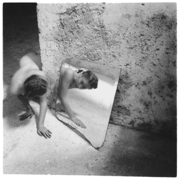
Self-deceit #1, 1978 by Francesca Woodman [1]

In this first photograph, we see Woodman prowling around the corner of a wall and catching her reflection in a mirror in a way not dissimilar to how a cat would.  Her nakedness creates the impression of a pure creature with the only hint of her humanity being the styling of her hair.  Her body blurs with the movement as she rounds the corner but we see the detail of her face reflected in the mirror that suggests her stopping to look at herself.   What is interesting to me about this picture is the fact that although Woodman is the subject of a self-portrait, she isn’t the dominant element in the frame.  The textured background and the contrastingly smooth mirror take up the majority of the frame, yet both draw the viewer to Woodman’s reflection and her expression of surprise, almost disappointment at what she sees.  I struggled at first to understand the title of this photograph – what exactly is the deceit she refers to?  On reflection, the context in the image points to our internal impression of how we appear and that, like a startled animal that catches themselves in a mirror, we realise how little our self image matches our actual image.  In this case, Woodman is clearly young, but moving through a space that is old.  Perhaps she had convinced herself that she was an old soul and the mirror is the reminder she needs ,that on the outside at least the opposite is the truth.

francesca-woodman

Space 2, 1976 by Francesca Woodman [2]

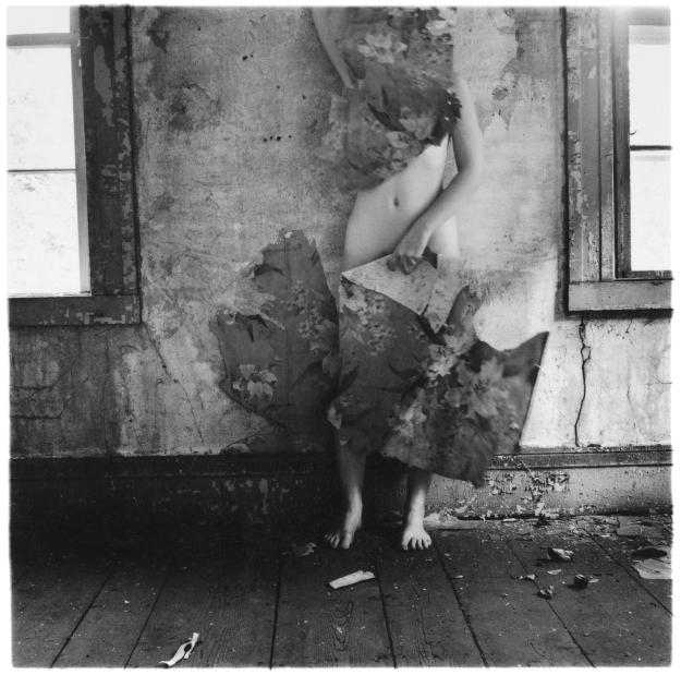
In the second photograph, we see at the same kind of decaying space where hints at its former elegance remain in the detailing of the skirting boards and windows.  Woodman appears nude but mostly obscured by the scraps of wallpaper that the is holding.  When I look at this picture, the immediate impression is of a young woman wanting to hide. I asked myself how much of this was owing to what we know about what happened to her.  An interview with her parents [3] in the run up to Zigzag, a collection of her work on angles and lines being shown in London, reveals a different side of her personality to the assumed norm.

“Their memory of Francesca is that she wasn’t a “deeply serious intellectual”; she was witty, amusing. “She had a good time,” says Betty. “Her life wasn’t a series of miseries. She was fun to be with. It’s a basic fallacy that her death is what she was all about, and people read that into the photographs. They psychoanalyse them” –  Betty Woodman in an interview with The Guardian [3]

With this new information, I see Space 2 differently from before.  Now I see the beauty of the contrast between her plaster-like skin against the decaying plasterwork and the suggestion that this somehow brings the space alive again.  Her use of the wallpaper takes the focus away from her as a woman, while playfully showing just enough of her form; the whole image taking on more of a game of hide and seek.   Whatever the intent behind Woodman’s self-portraits, the enigmatic style in her compositions differs considerably from the photographers that I’ve previously researched.

Eikoh Hosoe 1933 to present day

The second of the photographers is Eikoh Hosoe, an influential Japanese artist known for his experimental art using photography and motion picture film.   Although a prolific curator of photo-books, his most famous work was during the 1960s, when he collaborated with an emerging form of interpretive dance called Butoh. This form of dance rebelled against convention in that its slow, almost tortured movements created imagery that could be considered macabre, evil or taboo.   Even today, Butoh is considered a dance that cannot easily be qualified or categorised, but at that time it was considered to be a form of subversion.  Hosoe began working with the founders of Butoh, Tatsumi Hijikata and Kazuo Ohno.   Hosoe believed that photography didn’t have to be expressed simply by taking pictures of a subject, instead he wanted to create a counter-realism in his work.  He described his desire to create, rather than document in a video interview with The Art Gallery of New South Wales in 2011 [4], saying that photographers of the time believed his use of the camera to not be photography.   His work with Hijikata produced a series called Kamaitachi (the weasel’s slash), an ancient Japanese legend about a demonic creature that attacked people with blade-like limbs, metering out some form of evil recompense on those who sinned.  The legend encompassed everyone, from children to adults and was most feared in the rural prefectures of Japan throughout its history.  In his work, Hosoe combined the imagery of Hijikata’s birth village with his dance to create an aesthetic of historical consistency (the legend) against a backdrop of a rapidly-changing Japan.  A photograph from the series can be seen below.

hosoe-eikoh-kamaitachi-11-400x253

From Kamaitachi, 1969 by Eikoh Hosoe [5]

Here we have Hijikata mid-leap in front of a small group of children, set against a barn-like building in what is quite clearly rural Japan.  The composition itself is fairly conventional with the dancer on the righthand third of the frame and the children in the central lower third.  What is interesting about this picture is the way the natural reactions of the children support the external context of the collection.  Their surprise at the feat of flight and fear of where he might land, lend themselves to the legend of the flying demon who may swoop down on any one of them.  A little girl puts her hand on her friend’s head as if to protect her from the demon who’s outstretched arms resemble the claws of the creature and flowing clothing its wings.  Even without the external context information, the image is disturbing because of our in-built belief that it’s not right to frighten children.  Hosoe creates the imagery in an environment that would be considered safe to the children; their way of life captured in a semi-documentary fashion.  When looking at the Kamaitachi series, Hosoe’s use of convention to create rather than capture is very clear. Kamaitachi is unconventional portraiture in the same way as Woodman’s work with the subject being the focus but not the only element that needs to be viewed.  Hosoe also shot portraiture as it’s more widely known, most notably his early series Ordeal by Roses, in 1961, featuring a well known writer called Yukio Mishima.  In this series, Mishima appears in high contrast black and white in surreal poses, often nude but erotic rather than overtly sexual.  The rose is portrayed as both beautiful in its foliage but with the hidden dark side of its thorns which is both striking as a visual aesthetic but also gives an impression of how the photographer had grown to see Mishima.  Consider the photograph below from this series.

2794

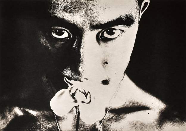
Ordeal by Roses #32, 1961 by Eikoh Hosoe [6]

Here we see a direct portrait of Mishima staring straight into the camera.  The lighting is harsh and the contrast has the effect of emphasising the intensity of his stare.  It also reduces the detail of the rose in his mouth to just enough to preserve its beauty.  When I look at this image, I see the conflict in Mishimi’s face.  His expression is almost seductive because of the rose, but we can also interpret a level of pain or sadness in his eyes.  Perhaps the thorns of the rose are physically painful and that its placement is almost silencing this famous writer (Mishimi was later a right-wing nationalist who led an unsuccessful coup to restore power to the Japanese Emperor).  It could be instead that the sadness is of desperation and that the rose represents the need to be loved.   It’s a powerful image that, when included in the rest of the series, highlights the experimental nature of Hosoe.  When I look at this image, I see something more akin to a painting than a photograph, because of Hosoe using his camera to create rather than document.

Nan Goldin 1953 to present day

Nan Goldin is a photographer than I was well aware of before I started this course and I must confess to not being a fan of hers.  Most of the images that I had seen at that point just didn’t interest me as my aim was to improve my understanding of photography as a technical discipline.  Goldin’s work by contrast appeared to contradict my understanding of a good photograph, with the heavy use of flash, soft focus and unconventional composition.   Reflecting on my progression throughout this course, I chose Goldin as the third photographer to research as part of this post to see if anything had changed.

The starting point for my examination of Goldin began with the documentary that I referred to in my response to my tutor’s feedback on Assignment 5 [7].  During the conversation, she referred to the way that people look at things now vs. before social media.  In her work, the first thing that strikes me is the way she has seen the moment or the connection she wanted to capture in her pictures.  During her time living in the transsexual community in New York in the 1970s, Goldin photographed the people that she spent time with and often lived with.  By photographing the people that she formed strong friendships with, Goldin was able to capture them affectionately, in private and social situations where they were simply being themselves.   Her intent to photograph only who she loves was discussed in an interview with Tate [8] where Goldin says that she could never photograph people who were ugly or disturbing to her and never out of anger; her photography was born out of love for her subjects.  In her early work in the 1970s, Goldin celebrates her friends at a time where transgender people faced discrimination and prejudice in their daily lives, but continued to chronicle their struggle as the AIDS epidemic terrifyingly spread through their community.  Her photographs eventually became a book called The Other Side, which was published 20 years later, which has been interpreted as a reminder of the impact of the disease on what was considered a minority society.  However Goldin contests this in her intent behind the work The Ballad of Sexual Dependency, perhaps her most famous work that began as a slide show and was then turned into a book.  Goldin described the stories of people in their relationships across genders, stating that her circle of friends simply didn’t care about what other people considered normal [8].  Her pictures captured their lives as they unfolded, seeking to tell their story honestly, as opposed to some creative revisionism after the fact.  In addition to her friends, Goldin included a documentary of her own troubled love-life where she was subjected to domestic violence.

Nan one month after being battered 1984 by Nan Goldin born 1953

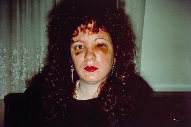
Nan one month after being battered 1984 by Nan Goldin [9]

In the above self-portrait, Goldin appears heavily bruised by an act of great violence as a long-term and volatile relationship had broken down.  Of the image, she wrote

‘I took this picture so that I would never go back to him.’ [9]

Goldin’s photograph is starkly lit to emphasise the damage done and composed against an ordinary, almost dull background.  The onboard flash rolls off in a vignette which creates a sense of loneliness and sadness, but the brightness of her lipstick points to someone who has just recognised that she has to move on.  The injury was so severe that she nearly lost the sight in her left eye, which can be read on her expression in this image.  I am left wondering if she thought that blindness was inevitable now that she had effectively opened her eyes to her situation.   In almost every case, Goldin’s pictures have an ‘instant’ quality about them, which is not really a surprise when her first camera was a Polaroid that she was given in the late 60s.   She later stated that she used whatever camera came into her possession [8], taking no interest in the gear, but rather the subject.   Her compositions too suggest little in terms of preparation, capturing fleeting moments of every emotion, good and bad often using harsh flash lighting (she claimed to not understand the effect of light on colour until the late 1980s).  For me. this belies the skill in creating the image, each one containing everything needed to create a narrative in the viewer, some that engender warmth and some disgust or horror.

In her more recent work, Goldin has focused more on children than adults but remains personally connected with her subjects.  While her style hasn’t deviated much from her original work, Goldin’s fascination with the creative freedom and undefined beauty of children comes through in softer, more varied images than before.   She states that by paying attention to the way children interact with the world, she began to believe that they were from a different planet.   A shot from her collection Eden and After can be seen below:

9780714865775-lk-13

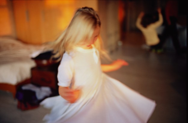
Ava twirling, NYC, 2007, by Nan Goldin [10]

Here we see a young girl in a flowing dance with another child in the background who appears to be doing something similar.  Goldin has captured the movement of the little girl as she twirls her dress.  The joy in her expression suggests that making shapes with her clothing is something of a new experience and she enjoys showing off her new-found  form of play.  What strikes me about the composition apart from the movement is the softness of the light.  Although likely to be artificial, this image departs from the stark on-axis flash look and suggests calm, relaxation.  The background details of the bedroom create a cosy, family environment where children can be themselves.  Goldin’s book seeks to be a tribute to children but also something that belongs to them [10] as opposed to the adults that they will ultimately become.   In the interview with Tate, Goldin talks about how the children she photographed decided upon their movement, costume etc without any direction from her.  This lack of adult ‘interference’ creates an aesthetic of playful freedom throughout the work, which Goldin captures beautifully.

Watching her interviews and reading her perspectives on life and art, I’ve moved away from my initial impressions of Goldin.  Her approach to art through the medium of photography is refreshing.  Unlike me, her interest has only ever been how she expresses her view of the world and creates an honest narrative of her life and that of her friends.  Her style is unquestionably experimental and to be honest, many of her photographs leave me cold because of how they are shot.  However, even those give a sense of ‘that’s ok, just look at what I’m looking at, feel what I am feeling’.

Edvard Munch 1863 to 1944

The first of the portrait painters I looked at was Edvard Munch.  The Norwegian painter is, of course famous for his iconic painting The Scream, which he produced in 1893 and which depicts a figure in anguish at sunset by a stretch of water.  When researching The Scream, a number of little known elements point to other parts of Munch’s artistic style and personality so my interested started with that painting.

800px-Edvard_Munch,_1893,_The_Scream,_oil,_tempera_and_pastel_on_cardboard,_91_x_73_cm,_National_Gallery_of_Norway

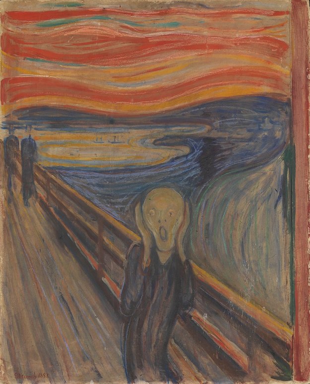
The Scream, 1893 version by Edvard Munch [11]

Munch described the circumstances that inspired this painting as a walk with friends at sunset.  As he turned to look at his friends, the sky turned a blood red, which engulfed the scene.  He commented

“I paused, feeling exhausted, and leaned on the fence – there was blood and tongues of fire above the blue-black fjord and the city – my friends walked on, and I stood there trembling with anxiety – and I sensed an infinite scream passing through nature” [12]

So intense was that feeling of anxiety, contrasted with the apparent dismissal by his companions, Munch painted the figure in distress at the scream of nature.  He further strenghens the horror of the moment by making the figure largely featureless but androgynous, resembling our modern representations of the extra-terrestrial.  Munch was a painter the worked with his memory or feeling about a situation rather than a specific subject.  While we know that painted portraits lend themselves to large degrees of artistic licence, Munch’s work (including the scream) dispenses with precise detail and deals almost exclusively with his own emotions, that could be completely unrelated to the subject he is working with.

Munch’s life was undobutedly tragic, losing both his mother and older sister to tuberculosis, his own health issues including a descent into alcoholism and having a highly destructive relationship that we could judge as abusive by today’s standards.  It seems fair, then that Munch had a great deal of torturous feeling that drove his work.  He said

“My fear of life is necessary to me, as is my illness.  Without anxiety and illness, I am a ship without a rudder….My sufferings are part of my self and my art. They are indistinguishable from me, and their destruction would destroy my art.” [13]

Munch’s relationship with Tulla Larsen, which he found himself pressured into, created many works in which he painted himself as a sufferer.  His paintings ‘capture’ a mood rather than document an event. In some cases, he painted classical stories and put himself and Larsen in them. For example The Death of Marat, 1907 in which the French Revolution general Marat is assassinated by Charlotte Corday [13]  Much casts himself as the victim and Larsen as the killer, emphasising her seductiveness by making her a nude figure.  In another self-portrait during a seemingly ‘settled’ period in their relationship, Munch paints himself and Larsen in a pose that is far from a traditional love story.  After their relationship broke down, Munch sawed the painting in half to spite Larsen; the effect being similar to a modern-day break up where people are torn out of photographs.

download_2

Edvard Munch, “Self-Portrait with Tulla Larsen,” ca. 1905 [14]

When we look at this painting, we see an angry Munch glaring at a dispassionate Larsen while a figure looks on in the background.  Munch’s use of contrasting colours of red and green brings the couple out of their situation and puts their argument front and centre for the viewer.   The character behind them has an equally stern expression as if in disapproval of their behaviour.   Or perhaps the reds mean something else and Munch’s expression is more of passionate love than anger.  The figure behind could equally be another admirer who is unable to get close in the way that Munch does.  The flame haired Larsen appears distant or disengaged, which could be because of Munch’s reluctance to marry her, something she hounded him for during their relationship.  Theirs was certainly a firey match that ended in Munch losing part of a thumb in an incident with a pistol.

I greatly admire the way that Munch created imagery of pure feeling rather than of events or the reality of what he saw.  It’s no surprise that The Scream provokes such a reaction when viewed as it creates a mood of fear and shock that we can relate to in the modern world.

Alberto Giacometti  1901 to 1966

The final artist I looked at for this post was the sculptor Alberto Giacometti, who I only really learned about recently during the BBC’s Fake or Fortune television programme.  A work alleged to be by him was being examined for authenticity and was eventually proven to be genuine through establishing providence.  What I first noticed about his work was the surreal nature of his sculpture, in particular when he created pieces of ‘portraiture’.    In my research into Giacometti, I discovered that although he was known as a sculptor, like many artists he also painted and sketched.  What’s more interesting is that his work in each of these media, the recurring technique of how he represented people can be seen,  Consider one of his early sculptures Woman with her Throat Cut, 1932 [15]

76.2553.131_ph_web-1

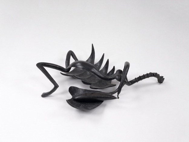
Woman with Her Throat Cut, 1932 by Alberto Giacometti [15]

Here we have a surreal representation of a violent rape and murder of a woman.  At first glance, the figure looks like an insect that has been squashed, but when we look closely, we see the long elegant torso of a woman with large breasts and long limbs.  Giacometti has posed the figure with legs splayed, suggesting sexual activity and twisted the arms to suggest a collapsed figure.  The elements of the sculpture that point to death and violence are those that are emphasised by Giacometti out of proportion and not in the least bit anatomically accurately.  Her open rib cage sits attached to her right leg and an pelvis-like object pins down her left arm.  Her right arm is weighed down by a phallic shape, which when combined with the other elements and the pose, suggest rape.  The woman’s neck has been extruded into a long arterial object which clearly has a cut across it and her head is incredible small.  In drawing attention to some areas more than others, Giacometti tells the story without the subject being seen as a human being.  In the same way that Woodman and Hosoe used their subjects to create a narrative without worrying about realism, Giacometti’s sculpture is very unsettling, once the viewer sees the elements being brought to their attention.

The way that he expresses people is evident in his other sculpture, with women being portrayed as tall, elegant creatures with long necks.  They are posed in an almost fragile way with the recurring theme of heads being much smaller than their bodies.  Perhaps Giacometti is describing the beauty of the female form without worrying about the features of the faces, which are characteristically devoid of any real detail.  What I didn’t realise about Giacometti was his ‘process’ of creating art and how these forms took their peculiar shapes.  In the Artists Muse sale of works by Christies in 2015, a video [16] was made to tell the tale of how Giacometti painted his famous portrait of James Lord.  Lord was a well known author and biographer who wrote his own book about the painting that took nearly 3 weeks to ‘complete’.  I say ‘complete’, because the painting is seen as nearly finished as can be seen below.

d5946125x

Portrait of James Lord, 1964 by Alberto Giacometti [16]

The video describes the sitting in Lord’s own words.  Giacometti started by creating a figure with an elongated head.  His emphasis of the head with its long neck was a surprise to Lord as it lacked any real structure with respect to the vague body it sat on.  The background started out as pretty much a blank area with only a few details to define space around the subject.  As the shoot went on, Lord observed Giacometti’s continued doubt about how the work was progressing, stating at every stage that he wanted to start again from scratch.  He didn’t, of course but Giacometti was not using any preconception of what Lord should look like, nor was he mentally relying on what he had painted previously.  This preparedness for scrapping the painting at any time and beginning again, kept Giacometti’s creativity working.  Lord also observed the artist’s melancholic self-doubt that the painting would ever be any good and the fact that at times, Giacometti would abandon the painting and the sitting at no notice to go to his favourite bars in Paris.  Every time he came back to the painting, Lord observed that it improved dramatically with the final image being the best it could be.

In Conclusion

I conducted this further research in response to the feedback on Assignment 5, which I felt was a justifiable observation that I only looked at photographers or artists that I already had an admiration for.  The artists that I have looked at here are all very different, but they have one thing in common.  Each has a central reason for being an artist, whether it is to express how they feel, rail against conventional realism or to document something they care about deeply.   I was taken with Woodman’s introduction of movement and the use of her body as something different from a conventional naked woman.  I admired the fun but dark subjects that she shot and have realised that some contextual influences, such as her tragic suicide can steer us to a single analysis of her work.  The same can be said of Goldin’s very candid portraiture of her friends, many of which have died through AIDS or addiction.  I was never really a fan of Goldin’s work because of the initial impression of a snapshot rather than a considered capture of an important moment.  I now see her work as an affectionate presentation of her life and the ups and downs of her relationships with the people she loved.  I find her work with children to be uplifting in a way that we don’t see in the modern world.  Goldin herself said that the believe the world was a horrible, but that she saw light in children.

The photographer that I have developed an admiration most of all is Eikoh Hosoe.  His decision to protest against the realism of photography while preserving the culture of his native Japan was fascinating to me.  His desire to use photography to create something surreal was echoed in the work of Munch, who only painted what he recalled or felt about a subject.  He shared similar anxiety and self doubt that Giacometti suffered from, which comes though in the work of both artists.    What I have taken from this piece of work is some ideas of how to free my creativity from the overwhelming desire to produce technically good photographs.  Developing my own voice doesn’t have to depend on being strange or surreal, but it does need to be about what is important to me and it does need the viewer to really look at what I might be trying to say.

References

[1] Wrigley, T, 2018, “How Photographer Francesca Woodman Came Into Her Own in Italy”, AnOther.com,  https://www.anothermag.com/art-photography/11170/how-photographer-francesca-woodman-came-into-her-own-in-italy

[2] McWilliams, J, 2017, “Ideas and a New Hat”, Paris Review, https://www.theparisreview.org/blog/2017/01/19/ideas-and-a-new-hat/

[3] Cooke R, 2014, “Searching for the real Francesca Woodman”, The Guardian, https://www.theguardian.com/artanddesign/2014/aug/31/searching-for-the-real-francesca-woodman

[4] Art Gallery of NSW, 2011, “Photographer Eikoh Hosoe on his work and inspirations”, YouTube Video, https://www.youtube.com/watch?v=Xgk98N8N9Ro

[5] Hosoe, E, 1969,”Kamaitachi, Photographs by Eikoh Hosoe”

[6] From “Ordeal by Roses”, Image Resource, http://www.michaelhoppengallery.com, https://www.michaelhoppengallery.com/artists/89-eikoh-hosoe/overview/#/artworks/11361

[7] Fletcher, R, 2019, “Feedback on Assignment 5”, blog post

[8] Reeves, E, 2017, “On the Ballad of Sexual Dependency”, MOCA, https://www.youtube.com/watch?v=iDSvD0yhjWQ

[9], Goldin, N, 1986, “The Ballad of Sexual Dependency”, Aperture

[10], Tateshots, 2014, “Nan Goldin – My Work Comes from Empathy and Love”, https://www.youtube.com/watch?v=r_rVyt-ojpY

[11] Image Resource, “The Scream,”, Wikipedia, https://en.wikipedia.org/wiki/The_Scream

[12] Phaidon, 2012, “Edvard Munch’s The Scream: a few facts and theories”, https://uk.phaidon.com/agenda/art/articles/2012/may/02/edvard-munchs-the-scream-a-few-facts-and-theories/

[13] Lubow, A, 2006, “Edvard Munch – Beyond The Scream” The Smithsonian Magazine, https://www.smithsonianmag.com/arts-culture/edvard-munch-beyond-the-scream-111810150/

[14] Solly, M, 2019, “British Museum Reunites Portrait That Edvard Munch Sawed in Half to Avenge His Fiancée”, The Smithsonian Magazine, https://www.smithsonianmag.com/smart-news/british-museum-reunites-portrait-edvard-munch-sawed-in-half-avenge-fiancee-180971936/

[15] Flint, L, 2018, “Woman with her Throat Cut”. The Guggenheim Museum, https://www.guggenheim.org/artwork/1424

[16] Christies, 2015, “Alberto Giacometti’s Portrait of James Lord”, Video Article, https://www.christies.com/features/Alberto-Giacomettis-Portrait-of-James-Lord-6658-3.aspx


Reflecting on Expressing Your Vision

Introduction

Having completed Expressing Your Vision, it was time to reflect on how this course has gone and more importantly what had I learned from it? I’ve said throughout that my comfort zone in photography has always been the technical aspects. When I started this course, I mistakenly thought that there would be more of the technical aspects of taking photographs. My first impression of the coursework was one that I would take through the whole course; one of finding a way to convey meaning in not just one image, but through a series. This was a concept that I was completely unfamiliar with. When I received the feedback on Assignment 5, one of the comments made was about what I would be doing with my photography if I wasn’t doing this course. At the time, I was at a pretty low ebb, considering not continuing with the study because I have a very busy life generally. The suggestions behind the comment was that learning how to make a photograph is one thing, but progressing with it as an art form was something entirely different. The first thing I learned from EYV was that becoming a photographic artist is hard. In my case, with 30 years of engineering behind me and a strong interest in collecting and using film cameras, this was reinforced throughout the year that EYV took to complete.

The course started with the introductory assignment ‘Square Mile’, which I found to be a great introduction to the idea of a collection of photographs that tell as story. Oddly, I didn’t find the task of coming up with a theme all that difficult because I was staying in the beautiful Yorkshire Dales. The beautiful scenery offered a huge variety of subjects concentrated in a small area and because I’ve spent many summers there, it was a square mile that I had a great familiarity with. When I had the feedback from my tutor on the assignment, I was struck by how my imagination had gone a little crazy, the main point being that I could have had multiple themes from my original idea. The concept of less is more is something I have been aware of in my photography before, but only in making a single image, e.g. a landscape with a point of interest in the foreground but without distracting elements in the rest of the frame. Keeping the ‘message’ of the series simple was a new experience for me. Square Mile taught me to think about the subject but also to be wary of diluting the impact of the series by over complicating the theme. I see this pattern of overall restraint in most of the photographers that I’ve studied during EYV.

I progressed to Assignment 2 which presented a new challenge; making the series challenge the viewer to see the connection that unified the photographs and to make them work as a set. My subject was inspired by seeing a film where a particular lighting technique drew attention to the eye area. It wasn’t the light itself that my idea developed from, but the attention to the eyes. I started to research the idea that people can get a sense of someone’s emotions through looking at the eyes rather than the whole face. I found the subject fascinating and ended up with a series that I was very happy with. The feedback on the assignment suggested looking at how actors were lit during the film noire era of cinema, which I duly did. What was a more important comment, though was the need for me to test my images on other people. I had freely admitted that I wasn’t really interested in the EYV email group that I was subscribed to as I didn’t really observe the feedback as all that constructive. However, I started to share my images with a number of people that I trusted to give me an honest appraisal of my work. It could be argued that this was a safe idea for me; that my chosen reviewers knew something about my photography already. I refute this, though as I’m someone who gains benefit from being able to challenge perspectives; I didn’t get the sense that I could readily do this with the EYV group. The feedback was very interesting with it being clear that people saw the obvious and less obvious emotions in the eyes of my subjects. One person found the collection disturbing as I had presented it in its entirety as a 3 x 3 panel of images rather than sequentially. She could see the merits of the collection, but found herself not wanting to study them closely. I was later reminded of this by the comment Nan Goldin made about how we look at things in the social media era; a fleeting glance at Instagram on a mobile phone not being an appreciation of art. I learned from this the value of a variety of viewpoints and, more importantly that it doesn’t matter to me that people like the photographs, just that they react to them.

On to the most challenging assignment of the course, The (in)decisive Moment I found this really difficult as the whole idea of looking and shooting in support of Cartier-Bresson’s iconic concept terrified me. I could have broadened my perspective on it at this point, but it was still fairly early in the course and I hadn’t yet fully appreciated the importance of that. I chose to shoot in support of the decisive moment because it made me uncomfortable and got my inspiration from Martin Parr, a photographer that I greatly admire for his often humourous perspectives on divisive or controversial subjects. I looked for moments where I would wait for some humourous form of partial obscuration before taking the photograph. Suffice to say I made things very difficult for myself as not only do I not feel confident with street-style photography, I had to look for something particular to shoot. The more I looked actively looked for the moment, the more elusive they became. I reached a point where I had 3 images when I needed between 6 and 10 for the submission and all inspiration had abandoned me. My wife took me out for lunch to take my mind off the frustration and I took my camera with me as usual. It was only when I stopped thinking about it, did I start to see moments happening in front of me. I shot another 3 images and submitted them, which was essentially the minimum that I needed. The feedback that I got pretty much echoed that and I elected to respond by continuing to look for subjects whenever I was out with my camera, resulting in 2 more shots added to the collection months later. What I learned here is that the mind works much more effectively when not being put under pressure to perform with frustration preventing any form of creativity in me at least. In conjunction with this, I also learned that a series can always be improved upon even after we think it’s finished. Although OCA made this clear in the guidance about responding to tutor feedback, I didn’t learn this lesson until I saw it for myself. I think I now have 8 really strong images for Assignment 3 which resulted from me walking away and then re-visiting it much later.

Assignment 4 was much more in my comfort zone as it was an exercise more in the technical appreciation of light. I used the opportunity to try to combine both the quality of the image and a theme of revealing details in dark spaces with artificial light. At this point in the course, I realised that all of my work to this point revolved around a theme of ‘revelation’ which I decided to continue with. My images were shot around my home town of Malvern at night and in the main I was happy with them. There weren’t any significant lessons learned as result of this assignment other than the feedback that I needed to flex my creativity muscles when it came to the final assignment of the course, Assignment 5.

Assignment 5 was the completely open-ended brief “Photography is Simple”. Unlike the previous assignments, I settled on portraiture as the theme for my series fairly quickly. It developed further when I combined portraiture with another aspect that I really don’t feel comfortable with, self portraiture. I intensely dislike being photographed and am inherently a very private man so the challenge of making a series about me with revelation as the theme was going to be very difficult.  The feedback from my tutor was that the series was an accomplished from a technical perspective, but fell back on what I was clearly most comfortable with.  He also said that my research was limited to a small number of photographers that I admired, some of whom worked over 50 years ago.   The feedback was fair and I sought to address it with more research into the suggested artists [1] and by re-shooting 3 of the series [2].  The key learning from this assignment was that I should look for inspiration across a genre, not just with artists I like or admire.  It’s as useful to understand why a piece of work provokes a negative response when viewing as that might work well in a different scenario or combined with other elements.  The result of mixing styles can produce a higher level of creativity.  I believe I achieved that with the revised photograph One in Assignment 5.  I mixed the visuals of Hosoe and Woodman to create something that my wife referred to as perhaps the most creative photograph I’d shot to date. I also learned from Assignment 5 something that I’d experienced throughout the course, that it was good to move away from what is comfortable.  Until this assignment, the piece of work I had found most difficult had been Assignment 3 because of my belief that I was somehow intruding when taking photographs of people.  Overall, I was happy with that re-worked collection and delighted with how Assignment 5 turned out.   I’ve changed as a photographer over the duration of Expressing Your Vision and am excited to see where my study takes me next.

References

[1] Fletcher, R, 2019, “Looking at Contemporary Portrait Artists”, blog post, https://wordpress.com/post/richardfletcherphotography.photo.blog/1420

[2] Fletcher, R, 2019, “Re-working Assignment 5”, blog post, https://wordpress.com/post/richardfletcherphotography.photo.blog/1491

Exercise 5.2 (Part 2) Some Examples of Homage

Introduction

After completing Exercise 5.2, I reviewed some of the photographs from my archive that were taken as an homage to another image.  In considering the context, I have been able to relate to why I chose the shots and how they work as an homage

The images

DSC02549

Shopping Centre shot inspired by Cartier-Bresson’s Hyères, 1932

I found myself waiting on the upper floor of a shopping centre for a short while.  The first thing I noticed was the people moving in and out of an area define by lines created by shadow and structures.  I recalled Cartier-Bresson waiting patiently for people to enter his frame and shot this image in the same style.

DSC02754

Jazz Man, San Francisco 2019 inspired by Joel Meyerowitz

I’ve described previously how Meyerowitz has inspired me over the past few years and whenever I look at what is before me in the street, I think of his pioneering work in colour street photography.  Previously colour was thought of as a distraction but it can be a way of connecting subjects in the frame while not being the main point of the image.  I shot this picture of the busker at a San Francisco Giants baseball game which has orange as part of its uniform.  The busker and the procession of his ‘audience’ are connected in this picture by the colour they share.  I shot Woman Crossing the Street (below) in the same style, observing the balance of the frame and the colours of the roof connecting with the woman’s clothing.

DSC_4604.jpg

Woman Crossing the Street, San Francisco 2019

DSC02756

San Francisco Light 1, 2019

DSC02757

San Francisco Light 2, 2019

Both photographs San Francisco Light 1 and 2 were shot in homage to Berenice Abbott.  She was famous for her high contrast black and white images of New York, but her observation of light and shadow make her work instantly recognisable.  While walking around San Francisco, it was difficult to miss the beauty of the light as it streamed through the buildings.  Abbott’s use of clean lines to achieve balance in her architectural shots emphasise the scale of the buildings, which was the inspiration for 2.

The Creativity of Children

A Different Experience

I’ve made no secret among friends and colleagues that my long term plan is to move away from engineering and to teach photography.  I made this decision shortly before starting this course, after realising that the most enjoyable thing about my job was mentoring and coaching people at the start of their careers.  Combining what I’ve learned about photography over the past 10 years with trying to inspire people with my passion for the medium, is what I plan to do for the remainder of my working life.

This has been well received by all those I’ve discussed it with, so it was a wonderful moment when a member of my work team approached me with a proposition last month.  The primary school that her son attends has an ‘Aspirational Week’ every year, where a number of guests are invited to talk to the children about their careers and interests in an effort to inspire them.  I don’t recall anything like this when I was at school; careers were encouraged by pushing the children to quickly make their minds up toward the end of their secondary school education.  I thought this was a wonderful idea and was very excited when she asked me if I would be interested in talking to the children about photography.   A conversation with the teacher resulted in a plan for me to talk to around 60 children between the ages of 8 and 10 in two presentation slots.  I planned a brief talk about how I got into photography and the showing of a couple of the more interesting cameras from my collection.  My props included some prints of photographs made by each one, a strip of negatives with images on them and a 4×5 colour slide for them to look through.  The star of the show was my Graflex Crown Graphic, which was set with the lens open so that they could see each other upside-down in the ground glass. After my talk, they would get to practice some basic composition techniques (rule of thirds, uncluttered backgrounds, framing etc) using the school’s iPads as cameras.  Each session went as planned and as they enthusiastically started shooting pictures, I started to think about creativity and how it evolves.

One of the children had asked me what I took pictures of and my answer was “whatever interests me or whatever I like”.  I realised that this is probably the starting point for all photographers.  I certainly remember pointing my first camera at anything and everything, without caring much about what was in the frame or whether it was in focus.   When we completed the iPad exercise, I was staggered at the quality of their images.   Being a primary school, the building we were in was brightly coloured with examples of the childrens’ work on the walls.  Almost every child in the room used their environment to make their pictures more interesting. They were utilising my very brief lesson on composition, but were seeing patterns and colours as well as related subjects when framing their shots.  To the casual observer, they were randomly running around, but their ability to see things and shoot was quite remarkable.

The stand-out image was shot by a lad who was fascinated by the Graflex earlier.  His shot, which I don’t have for obvious safeguarding reasons, was very similar to one of my pictures from Assignment 5 (see below) where I shot a self portrait through the ground glass.

DSC_3871

Eight, from Assignment 5 showing me inverted in the ground glass of my Graflex

What surprised me about the picture was how quickly he had seen the potential for combining both the inverted subject in the ground glass and as seen past the camera in the far field.  He placed the Graflex in the far left of the frame in order to fit it all in.  The resulting image was his friend inverted (in focus) and him as ‘normal’ with a small amount of bokeh in the background.  The shot was exposed properly, which was to be expected owing to the technology in the iPad camera.   However, what stood out for me was the fact that when I shot the above photograph, it came from an idea that took several hours to mature and perfect as part of my theme for Assignment 5 and here was a young boy shooting something very similar and of excellent quality in a matter of minutes.  How could this be?  I asked myself “what happens to our creativity as we get older?”

Was it a one off?

In an effort to understand what happens to our creativity, I first wanted to make sure that it wasn’t an isolated event; this boy and this class weren’t just the result of a great school (it has an excellent reputation in the area).  I thought back to the last time I spent time with children and cameras, which was back in 2015.  I was on a photography holiday in Marrakech with a group of other keen amateurs and our tutor.   We were staying at a retreat on the outskirts of the city that was owned by two former UN workers from the United States.  Their retreat was specifically for holidaymakers, but the owners also ran a community project called Project Soar.  The project was aimed at educating and inspiring the young girls of the local area; part of the progressive movement in the rural communities of Morocco.  During our trip their ‘activity’ was photography, which involved us ‘students’ handing over our expensive DSLRs for the girls to shoot with (on Auto).  The resulting images would then be printed for the girls to keep.  As the session progressed, I began to notice that the children were moving quickly around the retreat, shooting their friends against a variety of backgrounds and with a selection of teenage poses that they had picked up from the culture of their US teachers.  They were not dwelling on a place or composition, but shooting and moving on to the next location.  As with the children at the school, they were taking many photographs and because of the automatic capabilities of the camera, were getting successful exposures most of the time.  I contrasted this with my own experience as a child where the sophisticated electronics of modern DSLRs did not exist; my ‘hit rate’ was far lower and much more disappointing when the film had been developed.   The photographs that the girls of Marrakech had taken were similar in their quality to those at the school but there was also the same attention to the relationships between elements within the frame, related colours and textures and in some cases even the way the light fell on the subject.  Their unrestrained enthusiasm for creating an image outweighed any technical or artistic knowledge and, like the children at the school, it really didn’t matter.

DSC_1727

One of the shots from Marrakech taken by the one of the students

With these two similar experiences with groups of children of similar age groups and completely different backgrounds, I concluded that what I had seen was no lucky accident.  I started to think about what might be behind my observations.

A Theory

When we are very young, we have no rules.  Our parents begin our upbringing by prescribing standards, i.e. what is acceptable or unacceptable, what is right or wrong.  For example, my parents instilled in me that I was responsible for my younger brother’s behaviour when we were out playing.  My brother was always a more lively child than me and wanted to explore and take risks that were not my first instinct.  When we inevitably got into trouble because of that, it was me that was ‘held responsible’.   Years later, I understood why my parents wanted that to get this message across, but as we were only two years apart in age, it was never going to be realistic proposition.  It follows then that we begin to apply those rules to daily situations and test their effectiveness.  This learned behaviour tunes and increases our sense of ‘the rules’ and influences our behaviour.

The same can be said of how we try out things that we might be interested in.  We have not real clue how things should be done, but we have a go and see what the result is.  In my case, I loved the understanding of how my first camera (below) worked and the act of pointing at a subject but I had no idea how the image would turn out.  I certainly wasn’t seeing what was in the frame and the happy accidents of good composition were rare.  However, the hiatus between my early attempts and photography and my first DSLR included many opportunities to learn about my process of learning.  By the time I had taken a serious interest in photography, I knew that I needed to understand the technique and to look at what makes ‘a good picture’.   That became the basis for my taking photographs, rather than what I was trying to capture or say about the subject. For me, it is that which separates adults from children and sets boundaries to both our learning and our ‘creativity’.

DSC02814 copy

The Voigtländer Vitoret 110 – This was the first model camera I used as a child

In the case of the children, they saw what they liked or had an interested in and pointed the camera at it, without fearing disappointment in the result or believing that they had made a mistake; there was no mechanism that would hinder them.   With the digital cameras, they could quickly review and discard if necessary.  The key difference being that they had no investment in that particular image so if it didn’t work, they moved on.  At the end of both sessions, the school children were asked to show their two best pictures and every child quickly decided upon their favourites.  This could be because they weren’t concentrating on why they had taken the picture in the first place, so were re-discovering it or that they were filtering or mentally censoring  the images as they were shooting them.  Either way, they were not overthinking the process, the result or what the image meant to them because they had not had the experience of building rules or barriers to learning.

On a recent training course that I attended, I was introduced to the concept of ‘limiting beliefs’ [1]; the idea that we create barriers to doing certain things because we believe we will fail at them.  Experience and education both have the ability to create these barriers because the fear of failure is common in almost everyone, resulting in us trying everything possible to avoid it.   With no real experience or teaching in photography beyond exposure to the technology, the children didn’t fear failure but instead just wanted to enjoy the activity.  Further research for this essay led me to a TED presentation by Dr George Land [2], who discussed a study carried out by NASA on creativity.  Of a sample of 1600 children aged 4 to 5 years old, 98% of them met the study’s criteria for ‘genius’.  When they tested the same group of children 5 years later, the number fell to 30% and on to 12% when they reached the age of 15 years old.   By the time the sample were 30, the number was a mere 2%.  Land’s explanation wasn’t that they had somehow lost intellect, but that their thinking had moved from Divergent, that is idea-generating, inventive, to Convergent which is more problem-solving.  Education was what taught the children to combine both ways of thinking and their experience of growing up meant that they built internal rules, criticism and censorship of the creative part of their minds.  It would appear then, that my observations during the school visit are validated to some extent and that the children were unlikely to be mentally censoring their images during the exercise.

Conclusion

My visit to the school was a learning experience for the children and for me.  Most of them had never seen a film camera before (although one told me that their dad had a shelf collection of cameras he never used).  They had never held a positive slide or strip of negatives up to the light to see an image.  I had explained to them that when I first experienced these things, I believed photography to be magic, something that they all were quick to agree with.  The children had also never seen how a simple camera obscura could produce a picture, with most of them not believing it was a camera to begin with.   However, what I learned was important also.  Children are completely free to think divergently and do not fear making mistakes or not achieving what they set out to do.  By contrast, I realise that my photography has become very controlled by rules and generally accepted wisdom, which has often been at the detriment of the original idea or inspiration.  Surely this much change somehow in order for me to improve artistically.

“To stimulate creativity, one must develop the childlike inclination for play and the childlike desire for recognition” – Albert Einstein

What Einstein was saying is similar to Land’s conclusion in his TED talk [2], that we can access the area of our brains that works creatively, but in order to do so we need to become more like children in our outlook.  I’ve made many references to my engineering background and the challenges of letting that go to become an artist.  For me, I feel that I’ve learned a great deal about photography both before and during this course, but I need to find a way of looking at my art as a young boy before I apply that learning. .  If ever there was a perfectly timed trigger for this realisation, my school visit must have been it. 

References

[1] Burnford, J, 2019, “Limiting Beliefs:What are they and how can we overcome them?”, https://www.forbes.com/sites/joyburnford/2019/01/30/limiting-beliefs-what-are-they-and-how-can-you-overcome-them/#3fe8a9386303

[2] Skillicorn, N, 2016, “Evidence that children become less creative over time (and how to fix it)”, https://www.ideatovalue.com/crea/nickskillicorn/2016/08/evidence-children-become-less-creative-time-fix/


A Tale of Three Photographers

Introduction

After a few hectic weeks at work and with some creative block regarding Assignment 3, I decided to take advantage of the fact that my wife was away and go to London for a few days.  My plan was to practice some street photography with my Leica M film cameras, to catch up with some friends and see some exhibitions that I’d been hoping to catch at some point.   The three exhibitions were:-

Diane Arbus – In the Beginning at the Hayward Gallery, Southbank.

Don McCullin at Tate Britain

Martin Parr – Only Human at the National Portrait Gallery

These are three well known photographers whose styles and subjects are very different from each other, so I was interested to examine the works being exhibited to gain more of an understanding of their approaches to their craft.  Here, I describe what I saw and what I have learned from seeing these collections.

Diane Arbus – In the Beginning

The first exhibition was Diane Arbus, who’s portrait work I was already familiar with and whose tragic end at the age of 48 is well documented.  This collection of photographs was curated by the Metropolitan Museum of Art in New York and adapted for the Hayward Gallery.  The importance of these photographs in the context of Arbus’ work is that they are from the very early years of her career between 1956 to 62, many of which have never been seen in the UK before.

The way the exhibition was set up was interesting to begin with.  The usual introduction abstract on the wall describes the photographs as not being a formal collection that must be seen in sequence.   Each photograph was declared to be a ‘beginning’ in its own right. In fact, the area of the Hayward is formed of a number of square pillars arranged in a grid with photographs hanging on opposite faces of each, which lends itself to not walking through the collection like a zombie conga line. The second interesting point was the complete absence of any context within Arbus’s life.  These were the beginnings of her career, not the events that led to her suicide, so unlike many retrospectives of late photographers, this exhibition stuck to Arbus working in an informative point in her photography.

Walking around the room, the first thing that struck me was the skill applied to the images.  Although early in her career, they could have easily been the result of many years experience.  Arbus’ subject matter varied almost as much as the techniques used to shoot them and I was struck by her desire to capture the moment, even if it was at the expense of good exposure, focus or outside the limits of the film she was using.  Several images have huge grain in them, which works aesthetically but belies the hard work in developing and printing that must have taken place.   In his review of the exhibition [1], Adrian Searle states that ‘Arbus seemed to arrive almost fully formed as a photographer’, a sentiment that I would echo from the impressive quality of the work over a relatively short period of 8 years.  The second thing that struck me was the use of very descriptive titles for the photographs.  Arbus was almost saying “here is exactly what this photograph is”, while inviting interpretation and development of a narrative based on everything else going on in the picture.

I found her choice of subjects compelling.  She photographed circus performers and drag artists getting ready to perform in an almost business-like fashion, showing the potential for any job to be routine.  Her street photographs capture the daily life, but also the surprise at being discovered by the camera.  Boy stepping off the curb, NYC, 1957-58 sums up Arbus’ approach to street photography.  Here we have a boy turning in surprise, but not stopping in his journey to cross the street.  Arbus captures his face and expression perfectly in highlight and the movement of his body.  The scene must have also surprised Arbus as the image isn’t really sharp anywhere in the frame.  The aesthetic of the image doesn’t need it to be, however.  When I look at this image I see the surprise, but also distraction from what is a dangerous job of crossing a New York street.  The boy is more interested in the viewer than his surroundings.

getimage.aspx.jpeg

Boy stepping off the curb, NYC, 1957-58, Diane Arbus

The intimacy of her street work is explored by Jeff L Rosenheim in his essay at the back of the exhibition guide.   He contrasts the classical street photographers of 20th Century: Walker Evans, Garry Winogrand, Lee Friedlander etc, with Arbus’ style.  Where they hid from their subject, preferring to observe, Arbus looked for ‘the poignancy of a direct encounter’ with her subjects.

“For me, the subject of the picture is always more important than the picture.  And more complicated”, Diane Arbus

By interacting in the slightest way with the subject, as with the photograph above, Arbus shows us something about them that we could miss by simple observation.

Arbus also tackled the subject of death and dying in her early work, which is what set the tone for me throughout.  Arbus’ own tragic death at the age of 48 following a history of mental illness, makes her observations about the subject of death interesting but sad.  A series of photographs of the elderly connect back to the origins of the American way of life, e.g Uncle Sam leaning on a cot at home, NYC, 1960 where an elderly gentlemen dressed as the iconic character, waves a flag in a fairly depressing room.  The image contrasts the American ideal with the reality of 1960s New York.  In another image, Arbus shoots an elderly lady in the shower (Lady in the Shower, Coney Island, N.Y 1959).  This image in contrast to Arbus’s other portraiture is taken without the subject’s knowledge.   We get a sense of the way age takes hold of the body physically as well as a feeling of loneliness as she showers in a large, empty changing room at Coney Island.  The effect of ageing is more dramatically demonstrated by Old Woman in a Hospital Bed, NYC. 1958 where a clearly frail and sick old woman is lying unconscious in a bed on a ward.  The photograph is shot with very low contrast, which creates an almost angelic effect.  The old lady, it would seem is close to death.

When she tackled death itself, Arbus’s work takes an almost documentary style.  A couple of images show a corpse during autopsy and a disinterred saint.  The pictures themselves feel unremarkable as the subjects are striking.  It’s not to say that Arbus found only darkness in this subject.  In one image, Headstone for “Killer” at Bide a Wee Cemetery, Wantagh, NY, 1960 we have a picture of a gravestone marking the resting place of someone or something called Killer.  With this image, Arbus tells the viewer that Killer is a pet by referring to the name of the cemetery in the title.  However, there is a dark humour to the image.  Killer appears to have lived a short life, but surely its not a nickname for a child.  Even if it was, it’s unlikely that any family would use if for a headstone.  The word headstone itself has different connotations, depending on what part of the world we are in; it’s a common word for a gravestone in the US.  When I looked at this image, with the word ‘headstone’ in the title, my mind wandered around all of these possibilities and I admit to a small grin when I realised how I’d been duped.

In conclusion, I really enjoyed this exhibition as it provided an insight to the early thoughts of someone who became a very famous photographer.  It was good to formally separate the work from the tragic course of her life, but that knowledge is always there when connecting with her photographs.  I had a sense of someone who recognised and empathised with the mundane and the darkness of her subjects, but also someone who was fascinated by the life going on around her.  Her interactions with her subjects add a sense of revelation, something that I am beginning to see in my own thought process.

Don McCullin

The second exhibition was Don McCullin at Tate Britain.  I had read reviews of this exhibition as perhaps the definitive collection of his work over many years as a photographer and photojournalist.    Th exhibition comprised nearly 270 prints, ranging from McCullin’s early work in the deprived areas of London through to more recent landscapes and ancient architectures.

McCullin is best known as a press photographer who worked in the worst war zones of the second half of the 20th Century.  He famously hates the title ‘War Photographer’, likening it to being an abattoir worker [1].  While other famous photographers we fans of his work, McCullin insists to this day that his war photographs take an insignificant role in the horror scenes in front of him and that he wanted to record them as a human, rather than a professional.  This modest approach is something I admire, although like many I wonder if the effects of what he saw have created this response in order to protect him emotionally.  I recall watching Sebastião Salgado’s TED talk The Silent Drama of Photography in which he talks about photographing the genocide in Rwanda[2].  When he started to suffer with severe physical health issues, his doctor told him that witnessing  so much death was effectively killing him.  McCullin photographed similar attrocities over a greater length of time, so perhaps it’s not surprising that he build coping strategies in order to protect himself, despite always debunking the notion that he suffers from PTSD. As a side note to visiting this exhibition, I was discussing McCullin with a friend of ours who spent a large part of his career as a press photographer for a major newspaper. He showed me a portrait of McCullin that he shot for a piece many years ago. The setting was his garden and he was holding one of his cats. The portrait, which I sadly don’t have for this article, depicts the photographer at rest which is not how we think of him when viewing most of his exhibition. When my friend attended the launch of the exhibition, he presented McCullin with a print of his photograph which although he didn’t remember the shoot, appreciated nonetheless.

There were many interesting elements to the exhibition, but the first thing that I noticed was the beauty in how the images were shot.  Beauty may seem like a strange word to use when the subject is a corpse of a man with half his face missing, but looking at the images from a straight composition and light perspective, McCullin uses highlight and shadow to draw the viewer’s attention to the detail of the subject.  Choice of exposure can make or break a photograph and in McCullin’s case, I couldn’t see a single image that didn’t please from the more technical point of view.

Martin Parr

The final exhibition was (mercifully) Martin Parr’s Only Human at the National Portrait Gallery. This was a far cry from McCullin’s work as it takes a light-hearted look at society in stark contrast to the war and deprivation I’d just been looking at. Parr has always been a favourite of mine since I first encountered the chapter on him in the BBC documentary “The Genius of Photography”. Parr’s almost haphazard approach to photography came out in that programme, where he’s seen wandering around a supermarket with a camera and on-board flash gun. His subjects were just members of the public going about their business and I was startled by the fact that few of them seemed bothered by his intrusion. As a consequence of his use of hash direct flash, Parr’s style is one that almost looks like the sort of photographs that everyone took during the film era. Brightly exposed with lots of saturated colours, his famous series “The Last Resort” takes a candid view at the now-declining British seaside holiday through a series of fun images. However, when looking more closely at the photographs, we can see the darker side to human behaviour when people let their hair down. The famous images of the scramble for the buffet suspends any notion of British reserve or politeness and could almost be shot on an African plain around a pride of hungry lions. Under the fun, almost amateurish looking compositions are cleverly worked subjects that I personally find exciting. Perhaps the best examples from Only Human of Parr’s commentary on British identity were those that were set against the backdrop of Brexit. A few of my favourites can be seen below.

NN11520294

Crisp ’N’ Fry, Spring Bank, Hull, England (2017) by Martin Parr

stack-it-high

Stack It High, Hessle Road, Hull, England (2017) by Martin Parr

17Parr1-articleLarge

Henleaze Lake. Bristol, England (2018) by Martin Parr

In the first, we see two Muslim girls behind the counter of a fish and chip shop. I found this image to be starling because here is a setting that every British person would recognise with the simple framing of two young women working. When we look at their fairly passive but welcoming expressions, we then jusxtapose with their traditional dress. For me, the sight of these women working is a fish and chip shop isn’t particularly interesting, but my second reaction is framed by the racial disharmony in Britain and picturing how some areas of society would view the image. I found this to be a depressing experience, when the initial feeling was that it was a pleasing and very British scene.

The second image is of the front of a cash and carry-style shop. The huge sign declares that they ‘Stack it High and Sell it Cheap’. A woman leaves with a trolley of goods but not even making a dent in the stack in front of the shop. This image was organised in the section of the exhibition about Brexit, which is known to stoke fear and uncertainty about what happens to our services, NHS etc. It was therefore easy for me to take the perspective that Parr is trying to say that Britain will be poorer and somehow cheapened by leaving Europe. However, I liked this image because of the observational humour of it. The lady leaving the shop is oblivious to the scale of the ‘stacking it high’ and is on her phone. Perhaps she’s telling her friends about it as though she had just discovered that such shops exist. For me, this image is a great example of a photograph that works with our own feelings about a subject to create multiple narratives.

The final image actually made me laugh during the exhibition when I saw it for the first time. Here we have a line of swimmers lining up on a jetty to jump into a frozen lake. They all look nervous and it’s as though they wanted to be anywhere but here. Again, this image was shown as part of Brexit Britain which for me comically described the feeling of uncertainty; lemmings jumping into the unknown. However, the image also had a personal connection to me as I’m also an open-water swimmer and know only too well the horror of preparing to jump into cold water.

Conclusion

This was a great visit to London as I was able to take in three very different exhibitions by very different photographers. From Arbus I learned the importance of strong connections with the subjects, which for me sets her apart from many people who have worked in street photography. Her use of movement and slower exposures in her early work created a warm and ghostly feel to her pictures, which is something I’ve not really explored to date. My images tend to be sharp and with as little grain or noise as possible, but I see the benefit of letting the subject and light speak for itself, regardless of any notions of technical perfection now that I’ve looked at Arbus’ work.

With McCullin I learned that we need to really look at what is going on when documenting something as stark or challenging as war or deprivation. McCullin’s work is factual, but sympathetic to the subjects and leaves the viewer with little doubt as to what is going on. I also learned that it’s really easy to pigeon-hole photographers because of the subjects they photograph. I hadn’t appreciated that McCullin had shot landscapes and to me they were beautiful. However, it took some effort to lift my viewpoint from the impression of McCullin as a documenter of the darker side of humanity. Finally, Parr taught me that humour in photography is something we can employ without it looking contrived or faked. I get the feeling that his work polarises people because of his use of colour and flash, but I think his use of many layers to his work is original and it inspires me to have more fun with my subject matter.

References

[1] 2015, “The Dark Landscapes of Don McCullin, Aperture Magazine, Flashback, https://aperture.org/blog/dark-landscapes-don-mccullin/

[2] 2013, “The Silent Drama of Photography”, TED video, https://www.ted.com/talks/sebastiao_salgado_the_silent_drama_of_photography?language=en


The Process of Selection

I started writing this after completing Assignment 2 and having my tutor feedback during our video call. Among the subjects being discussed, I raised the section that followed Exercise 3.1 – Freeze. In this section, it was suggested that a good way of making selections of photographs for a series or collection would be to produce contact sheets. Contact sheets have been used by photographers for many years and were particularly useful during the film era, when positive prints from negatives were printed in ‘contact’ with photographic paper.

In the days of film, these contact prints could be examined carefully using a magnifying glass, annotated with any changes or crops to be applied later and ultimately selected or rejected.  However, in the modern era there are tools to manage digital images in a similar way without the need to print everything. I use Adobe Lightroom, which both manages the my library of photographs and also provides editing and printing capabilities. During the conversation with my tutor, I questioned the merit of printing and reviewing contact sheets when the same could be achieved electronically.  In this essay, I look at my workflow and how I use it to select and edit photographs.

Lightroom vs Contact Sheets

I first started using Lightroom about 5 years ago when there were only a few software programs that could manage and edit photographs. Like many photographers, I am fairly lazy when it comes to editing in-camera and often end up importing many images into the computer before narrowing them down to the best shots. I frequently shoot sports events because my wife is a keen triathlete. By the time I’ve finished shooting, I’ve invariably shot 1500 photos, which I import as a complete set into Lightroom. Over the years, I’ve developed a workflow for editing and selecting the images I want to go forward into post-processing with. For 1500 images, I can mostly down-select in around an hour. Once in Lightroom, I make my edits to the photographs and then use the print functionality to produce a print that is optimised for my printer and paper. All sounds good.

However, in reviewing modern editing tools like Lightroom over contact prints, I wanted to understand how effective the paper print is and how it might influence how I shoot in future.

As well as shooting a DSLR, I also have a large collection of film cameras from the past 85 years. What this has taught me is the need to take care in what I am photographing as a roll of film is not only an expense, but is limited to a number of frames in one go. For 35mm, there are 24 or 36 exposures which is pretty comfortable for a walk or family party. However, when I shoot medium format, I am limited to 12 exposures per roll of 120 film. As opposed to my digital life, film photography pushes me to not waste my film or money by recklessly shooting anything in view.  It has also taught me about post selection once I’ve had my film developed (or in many cases, I’ve developed myself). I have been scanning the images and importing them into Lightroom, which still bypasses the contact print process. In the review of the images, I will tend to look harder at the quality of each shot rather than dismiss any with minor issue on the basis that I might have something better. I still crop, adjust contrast and remove dust (I live in a Victorian house) so the workflow is the same.

If I had been working prior to the digital era, I would have to review the negative for sharpness as I do now, but also the shadow and highlight areas to determine how much dodging and burning I would have to carry out in the print. Dodging and burning are techniques whereby the paper is exposed more or less in the shadow and highlight regions to balance the image. It can be as crude as waving a hand in front of the darkroom enlarger when the paper is being exposed. As they contact print is also the first time the image is seen as a positive (in the case of negative film), the balance of the composition can be reviewed also. Any visual debris in the frame can potentially be marked for cropping or painting out in the final print. A great example of contact printing and adjusting the decision-making that follows it is from Elliott Erwitt’s Dogs series, below:

Contact Sheet from Elliott Erwitt's Dogs

Contact Sheet from Elliott Erwitt’s Dogs Series []

This contact sheet shows the 12 frames from a roll of medium format film from the series.  Erwitt has marked two photographs that he wanted to work with and in the case of number 3 has drawn the approximate crop to get the best composition from the negative.   The first thing to note is how tightly he crops the frame to the dog and the lady’s feet.  The depth of field of the photograph clearly picks out the dog as the subject of the image, but the photographer was too far away to fill the frame with the subject.  The whole negative contains much more of the dog’s owner, which perhaps Erwitt believed would add to the picture.  In the end, however, he crops to make the composition simpler.  Shooting with medium format, which has much more emulsion area than 35mm, he can afford to throw away more of the negative without compromising the quality of the final print.  The final cropped print can be seen below.  The main difference now is the paper used, which has a cooler, higher contrast look to the paper in the contact print.  The contact sheet would have been retained by the photographer in order to duplicate the workflow for subsequent prints.

-101/XX

Finished print of Frame 3 (from Elliott Erwitt’s Dogs []

Lightroom actually works in a very similar way to the old technique.  The software imports an original image and then keeps records of every change made to it within the catalog.  In it’s simplest form, the workflow is:

  1. Original image imported from the camera’s memory card and stored in a specific location on the computer’s hard drive.
  2. The image is now present in the Lightroom catalog and can be edited using tools that are similar to analogue processing (exposure, contrast etc).  Lightroom doesn’t change the original image at any point in the process.
  3. When editing is complete, the photograph can be printed directly from Lightroom or exported as a final electronic version e.g. as a jpeg.  Lightroom applies the changes to a virtual copy of the original image and creates a new file when exporting.

The process of selection is done using Collections, ‘picking/rejecting’ and ratings.  Collections are simply virtual albums which are similar to a film photographer gathering all of the developed negatives on contact sheets.  Picking and Rejecting are functions that do just that, in a similar way to drawing a border around the frame of interest (as above) or striking through with a pen.  Ratings offer a scale of 1 to 5 stars that can be used to identify favourites.

As Lightroom can make crop edits and undo them at any time, experiments with composition can be done more freely.  However should the photographer wish to compare crops, the software can create virtual copies of an image and display them next to each other with the option to discard again once the image is finalised.

Example of My Process of Selection (Updated Post Exercise 3.2: Trace)

For Exercise 3.2, I had a shot in mind using a macro lens to capture the visible motion of a guitar’s E string when picked.  The shot was illuminated using a continuous LED light source, which took some experimentation to get the placement right.  As a result, I shot 49 images with the intention of picking a single frame.

Step 1 was to add the images to their own collection.  I called this ‘Guitar’.  The virtual contact sheet of all images can be seen below as a screen grab from the Library window in Lightroom.

Screenshot 2019-07-05 at 11.09.12.png

During the shoot, I experimented with the composition, lighting and point of focus on the string.  I also needed to test the shot by picking the string and making sure that the vibrations were captured by the slow shutter speed.  As long macro lenses are notoriously difficult to focus accurately with their very shallow depth of field, some of the shots weren’t all that sharp.  Using the ‘Reject’ function, I effectively ruled out the first 40 images because although they described my thought process, they weren’t going to be the final shot.  Lightroom greys out the images that are rejected as below:-

Screenshot 2019-07-05 at 11.16.22.png

With 9 shots left, it was a case of settling on the composition.  The first 3 were shallow angle with just the bridge and strings but little of the fret board.  The last 6 images were the composition I was looking for.  The best of them was found to be 49. I picked 49 as my target image using the ‘Pick’ function (white flag) shown below:-

Screenshot 2019-07-05 at 11.22.46.png

Now I could make the edits.  I liked the lighting of this shot, but there is no real colour.  I decided to convert to black and white and emphasise the strings using contrast adjustments. However, at this point I was still uncertain about the composition.  The E String was in the left third but I felt that there may be too much to distract from it with the other strings to the right hand side.  To review further, I created a virtual copy of 49 and started experimenting with crops.  N.B. I accidentally edited the original rather than the copy, but the point is that by duplicating we can see the comparison during editing; something that would have required multiple contact sheets in the days of film.

Screenshot 2019-07-05 at 11.33.31.png

I preferred the square crop of the right hand image in terms of the number of strings but now I felt that I’d made the composition imbalanced by making it a square as the bridge is in the centre of the frame which I wasn’t happy with.  Further edits of the duplicate image led to the final version shown below which goes back to landscape but limits the distractions in the frame.

The E String

For Printing

Printing is a more complex evolution of this workflow as an image on paper never looks like an image on the screen. The main reason for this is that the screen is backlit, which means like an old transparency we are viewing the photograph with incident backlight through the image.  We can see the details, highlights and shadows with a level of precision and make adjustments for the ideal photograph; only if it were a slide in the first place.  With a print, the image is lit by incident light but instead we see what is reflected from the surface of the paper.   Now we are dependent on the properties of the paper, the light source and of the printing itself in determining how the photograph looks to the viewer.

Lightroom does a great job of predicting what the photograph will look like for a given paper and use profiles for the digital photo printer being used.  Some photo paper manufacturers like Permajet even offer a printer calibration service where they will provide a custom profile for a given printer using a given paper; eliminating any manufacturing variances in the machine.   While technically impressive, the only real way of telling how well a print is going to turn out is to make a number of versions of the photograph and place them in different positions on a wall to see them under real conditions.  A few years ago, I entered the Taylor Wessing Portrait Competition with a shot of my friend Vikki, who had recently become World Champion in her age group for endurance Duathlon (below)

DSC_3466.jpg

I am focus by Richard Fletcher, 2015

For this image I printed 8 different versions on 3 different papers with adjustments of contrast and white balance.  I hung them in my office for a couple of days and revisited them regularly to see which image had the look that I had in mind for the competition.  It was important to take time over this process, something that I also found in Assignment 2 where I considered making the shots black and white.  In that case, the conclusion was that the rawness of the make-up free skin was lost in the conversion, which meant that some of the emotions were also lost.  The look I was going for was more of an honest visual than a movie poster, which is how I saw the impact of the conversion.

Conclusion

The conversation that started this piece was centred around the need for contact sheets in modern photography and how relevant it was to this course in particular if the work was predominantly digital.  It was useful to examine my workflow in more detail as with some subjects that I routinely shoot, the number of images is generally large and the process of selection has become automatic.  I’ve had to be efficient with selection, simply because of the time available.  I conclude from this that tools such as Lightroom have made the process more efficient, but the core needs of selection remain the same; methodical review, proposed edits to make the image, and maintaining the history so that another print can be made in the future.  Does focusing on the selection process change my photography?  I believe my approach has evolved through the subjects that I shoot as well as my interest in film.  The technologies may differ, but they are analogous in the intention behind the approaches.  The irony though, is that where we have to contend with hard drive storage, the contact sheets made by famous film photographers are tangible and in some cases extremely valuable.  Perhaps not all that is digital is an improvement after all.

References

[1] Image resource, “Chihuahua, New York City, 1946. © Elliot Erwitt / Magnum Photos”. https://www.featureshoot.com/2015/11/get-lost-in-the-contact-sheets-of-magnum-photographers-elliot-erwitt-martin-parr-eve-arnold-and-more/, accessed July 2019

[2] Image resource “Elliott Erwitt: Dogs”, Huxley-Parlour, https://huxleyparlour.com/elliott-erwitt-dogs/


Light Meters

Introduction

Part 4 of Expressing Your Vision looks in detail at light both natural and artificial, and how it is the most obvious, yet vitally important element in photography.  Before understanding how light in the scene impacts how we see the subject or creates our aesthetic vision of what is before us, we need to understand how the camera sees light and how it differs hugely from the human eye.   This research post looks at my learning about light measurement prior to starting the course and the pitfalls I’ve encountered in achieving an exposure that represents my intent.  I’ve mentioned previously that I have a large collection of film cameras and was encouraged to shoot the medium in order to better understand how photography works at a technical level.  Most of my cameras are over 40 years old and as a consequence of their age, have no electronic light meters built in.   When presented with what is essentially a mechanical shutter and aperture that is only slightly more sophisticated than a camera obscura, the need to understand light meters becomes a priority.  The need to meter for film is further emphasised by the fact that every shot costs money, which nobody looks to waste.

The Eye vs Machine

The first thing to consider is the miracle that is the human eye and its processor, better known as the brain.  The eye itself is made up of the sorts of components we are familiar with in photograph; a lens, aperture (pupil) and a light sensor (retina).  The retina is actually an extension of the brain itself [1] which creates a high-speed communication channel from the eye to its control system.  The arrangement of muscles in the eye structure allow the lens to dynamically adjust focus and the pupil to open and close quickly when the light level changes.  The retina has a cone and rod structure [2] that react to differing wavelengths of light, the former sending messages to the brain that are interpreted as colour.

While the eye is incredible, it is the speed of this dynamic adjustment that is the most remarkable of its abilities.  If we look at a scene that is both bright and dark, i.e. containing highlight and shadow, the brain makes many adjustments to the pupil in an indistinguishably short timescale that the we don’t even notice.  If the eye moves around the scene, the continual adjustment means that we see a perfectly ‘exposed’ scene in its entirety, all of the time.

Now consider the camera.  It has an aperture that is either under our control or, in the case of automatic modes, its electronic system.  Either way, the aperture is set for a single light level and must be altered by us every time the light level changes.  If the scene has a strong mixture of light and dark regions, the aperture will only be ‘appropriate’ for one of them.  Modern evaluative meters are able to average the light in scene, but the result is still the same; a single aperture setting.  For a given aperture and light sensitivity, the camera can determine the corresponding time for the aperture to be open (the shutter speed) for that setting.  However, if the light changes or the camera changes viewpoint, resulting in a different range of light levels, the settings are no longer valid and potentially render an over or underexposed photograph.   The final drawback of the camera’s measurement of light is the fact that it is doing this electronically.  As the course notes explain, the camera measures reflected light from the subject, which it must refer to a calibration reflectance of mid-grey (18% grey as defined by the Eastman Kodak company).

Reflective Light Metering

All cameras with built-in meters measure reflected light, that is the light reflected towards the camera from the subject, much like the eye/brain combination.  The amount of light that is reflected from the subject is dependent on the amount of light falling on it and the reflectance of its surface.  If we consider a polished mirror with light falling on it, the reflectance of the surface is very high which means that a large amount of light is reflected.  This subject is said to have high luminance.  However, if we think of a black cloth, the amount of light reflected is much lower due to its poor reflectance so we have a subject of low luminance.  Colours, textures and surface finishes all affect the reflectance of the subject, which means that the camera would need intelligence (as the brain has) about the subject to meter it correctly this way.  As the camera’s meter has no intelligence about the subject, it must make a measurement assuming a reflective reference of mid-grey.  When it does this, a high reflectance subject becomes darker and a low reflectance subject becomes lighter.   For example, if we photograph (in auto or semi-auto mode) a snow scene using our DSLR’s reflective meter, the snow appears grey in the image.  This is because the camera measures the high reflectance snow against its reference of mid grey and underexposes.  Similarly, if we meter someone’s dark jumper with little else in the scene, the result is an overexposed dark grey jumper.   The extent of the under and overexposure is then determined by the amount of light falling on the subject in the first instance.

Placing the Tones

If a reflective meter always measures against the mid-tone reference, where do we need to be metering?  A scene or subject won’t necessarily contain an obvious mid-grey to take the measurement from and it’s not always possible to place a ‘grey card’ in the scene to make things easier.  Most cameras have an evaluative metering mode, which takes the average across the frame and selects what the camera believes to be the optimum reading for the photograph.  An average reading for the whole range of reflectances in the scene is essentially a pseudo mid-tone so, as far as the meter is concerned the measurement is straightforward.  However, if we shoot a landscape scene where the lower third of the image is land and the upper two thirds are sky, the evaluative meter is averaging a frame that is dominated by hightlight.  In order to correct for this, the camera automatically reduces the exposure for the sky region, which in turn underexposes the land in the lower third.    If we move position and make the scene dominated by the land and only have a small regiod of sky, the camera will compensate for the darker region.  The effect would be an overexposure of the sky.  In short, the evaluative meter is great for scenes without extremes in reflected light, but struggles when presented with a high dynamic-range, complex scenes.  An example of this can be seen below.

The two photographs were taken with the camera set to evaluative metering, where the whole scene is averaged.  Photo 1 has the rooftops making up most of the image with only a small band of sky a the top of the frame.  The result is a well exposed image with the rooftops and trees in balance and a small amount of detail in the sky.  However, when point the camera upwards so the sky dominates the frame, the result is very different.  This time, the camera has exposed for the sky, which to the eye did have a great amount of cloud detail.  The shutter speed in Photo 2 has been increased to 1/640th which is a reduction of approximately 1.5 stops as the camera compensates for the bright sky.

Fortunately, there is a way of placing the tones where we want them to be and it evolved from work by Ansel Adams and Fred Archer in 1940.  The Zone System was a practical way of ensuring that regions of highlight and shadow were represented accurately when the film was exposed.  The concept was that the dynamic range of light ran from pitch black (Zone 0) to brilliant white (Zone X), with discrete tones in between.  Each zone represents a single ‘stop’ of exposure, that is a doubling or halving of light hitting the film or sensor.  A graphical representation of the zones can be seen below.

zone_system

The Zone System (A Adams and F Archer, 1940)

Adams asserted that the relationship between the mid-grey reference used in metering and its corresponding tone in a finished print on ‘normal’ contrast paper, meant that the zone system could be used to both place highlight and shadow in zones as well as see there they naturally fall.

“Since this relationship between the indicated exposure and resulting print value is known and predictable, we use it do define the midpoint of the image-value scale:  a middle-gray print value that matches 18 percent reflectance gray card is designated Value V”.   Ansel Adams, from his book The Negative

Film development was well understood at this point and the zone system was particularly useful in determining how much control was needed during processing.  Development time could now be used to expand or compress the dynamic range of the scene to match the film or paper being used.

Although there is naturally no chemical development in digital photography, the concept of placing metered luminance into zones still applies.  We can meter a dark shadow and place it in a zone lower than V by underexposing by the corresponding number of stops, e.g, Zone V to Zone III is two stops under-exposure for the reading.   To move from Zone V to Zone VII would be two stops over-exposure.

Incident Light Metering

The other type of light meter is an indecent meter.  This time, instead of measuring the reflected light from the subject the meter is placed in the scene itself and measures light falling onto the subject directly.   With these measurements, the light that gets back to the camera is still reflected by the subject in the same way as before, this time the camera is set to receive the amount of light illuminating the subject.   Favoured by wedding photographers, an incident light reading from a bride in white will result in the true representation of the reflected light from her dress in the camera as opposed to an adjusted exposure in reference to light grey.  The main drawbacks of using incident metering is the need to meter within the scene and the position of the meter on the subject to measure the light correctly; place the meter in dark shadow and you’re not getting the light falling on the subject.  In addition, it’s not always possible to enter the scene to meter incident light.

When I bought my first film camera, I also had to invest in a light meter.  I find that most of the time, I will meter in the same way as my DSLR with a small ‘spot’ measuring reflected light.  Whenever I am photographing people, I try to use incident metering to get a more accurate reading for their skin, with all of the shadows and low reflectance areas proportionately in place.

The Exercise

The course notes include a simple exercise to demonstrate how metering in a camera works in auto and semi-auto modes.  Step one is to photograph a predominately dark tone filling the frame.  Then, repeat with a mid-grey tone and finally a light tone.  Compare all three histograms.

For this exercise, I used two pieces of cardboard, one white and one black.  I also had a Sekonic mid-grey target which I’ve used for portrait photography previously.   I shot all three with an ISO of 800, aperture f/11 in Aperture Priority mode.

It can be seen from the histograms that the camera does its best to put the exposure in the centre of the camera’s dynamic range, no matter what the reflectance of the material being used.  We can tell that the cards are not perfect in their reflectivity as each contains clear colour and shape in the images and their corresponding histograms.

When the camera was presented with the white card, it chose a shutter speed of 1/1600th of a second to set the exposure to mid-grey.   The black card caused a change in shutter speed corresponding to 4 stops over-exposure.  The grey card resulted in a shutter speed of 1/250th which is in the middle of the two extremes.

The second part of the exercise was to repeat but with the camera on manual and adjusting for an exposure that places the dark and light regions in the correct areas of the histogram, that is toward the left and right respectively.    Instead of shooting the same cards, I chose more complex scenes.

DSC_2082

Photo 3

DSC_2084

Photo 4

DSC_2090

Photo 5

The Images

Photo 3

For this image, I noted the couple on the bench in an area being subtly highlighted by the sun.  The weather at the time was fast moving cloud that meant that the light level in the frame fluctuated over a a timeframe of a few 10s of seconds.  I chose to photograph the scene to demonstrate how useful the Zone System can be, but also how it’s not the answer to every situation.   The couple were only sitting on the bench for a few minutes, long enough to take some selfies as in this shot, so I had to quickly determine a metering setting that would work for when the time and light were right.  For this shot, I set the camera to manual, with spot metering.  I then metered a region not greatly affected by the changing light, which was the area in shadow under the tree on the left.   This put the shadow in Zone 5, so I reduced the exposure by 2 stops and waited for the couple to take their selfie.  The resulting image is ‘stable’ as the shadow should always be in its corresponding zone, so everything else in the image is in theory in balance.   We can see by the image that the faces and the woman’s hat are perfectly exposed.  However, the overall light dynamic range of the scene means that the rest of the frame is a little dark in comparison, even though the shadow under the tree is anchored to Zone 3.  For this image, I am happy that the subject stands out but if I wanted to make the image more about the rest of the frame, I would need to add some exposure.   What this shows, though is a way of mitigating fluctuating light levels by planning ahead, something that was very important when shooting film.

Photo 4

While in the same park, I noted the highlight and cloud in this image.  In the same way, I wanted to preserve the balance of the image, i.e the highlight on the building without losing the cloud detail.  This is a scene that matrix metering would struggle with.   I metered on the building highlight and increased by 1 stop to Zone 6 to preserve its impact without overexposing.  The result is a shot where the subject stands out without losing the other detail.

Photo 3

This final image of the same building was shot in high contrast light.  In this case, I wanted to highlight the ornate stonework around the windows and wasn’t particularly interested in the rest of the frame.  I metered the shadow on the detailing above the window and reduced exposure by 1 stop to Zone 4.  The result is an image where the extreme highlight is brought under control by the shadow placement.  The conversion to black and white gives the photograph an infrared feel, which I wasn’t intending but I believe it works.

Conclusion

The electronics in our cameras do what they can to represent the light reflected from the subjects in the frame.  The calibration to mid-grey will render an image faithfully if the subject and light are fairly flat.  However, with a complex scene comprising highlight and shadow, the camera is unable cope automatically.  By using simple placement of the light and dark regions with spot metering , the camera can produce a more faithful image or be used more creatively because of the extra level of control available.  I’ve been shooting film for a number of years now, so these principles were already known to me.  However, the main lesson here is that metering and exposing will only be as good as the effort put in to getting it right.

References

[1] HealthEngineBlog, 2007, “Vision and the Eye’s Anatomy”, https://healthengine.com.au/info/the-eye-and-vision, accessed May 2019

[2] The Physics Classroom, “Visible Light and the Eye’s Response”, https://www.physicsclassroom.com/class/light/Lesson-2/Visible-Light-and-the-Eye-s-Response, accessed May 2019