During our most recent Identity and Place cohort meeting, we conducted our usual review of each member’s recent work collectively. I shared my images from Part 2, Exercises 1 and 2 for discussion, during which we spent some time on the following photograph.
The photograph, from Exercise 1, is of my friends’ son Jamie in the place where he is at peace. We debated the concept of peace and tranquility because at first glance, this doesn’t look like something peaceful. Of course, the object of the exercise was to talk to our subjects to identify a place that they relate to in some way. As my series was about places where people feel at peace, this was the natural place for him to select. We all freely admitted that we weren’t able to relate because unlike the subject, we are not 17 years old. When we looked at this picture more closely, we started to discuss about the detail in the ‘place’ where I had shot him. I had elected not to ‘dress’ the setting because this wasn’t the point of the exercise. While I directed the subject’s pose and set the image up technically, I left the details of what Jamie described as “a typical teenager’s bedroom” as they were. When looking around this image, we see the mixture of teenager interests (the Star Wars models, the cluttered bookshelf etc), but we also see hints of his growing up (the stuffed toy and picture on the wall by his younger sister). The element that attracted my attention at the time was the fork in his pen holder. When I showed the picture to his mum, she laughed and said it was because he liked his “sneaky, late-night chips”.
When we discussed this as a cohort, I got to thinking about the tableau images we learned about in Context and Narrative where every detail of the image was stage-managed to tell a particular story. My photograph from Assignment 5 was an example of this (below).
The difference as I saw it was that the image of Jamie was something that I saw as a more factual representation of him, while Assignment 5 was telling a story that was partly fictional. In both cases, it struck me that I could represent Jamie without him actually being there, in a similar way to Nigel Safran’s ‘in absentia’ portraiture in C&N.
Ashley Gilbertson – Bedrooms of the Fallen (2014)
After the call, one of the students forwarded me a link to Ashley Gilbertson’s work Bedrooms of the Fallen (2014). This very poignant work documents the rooms of soldiers from all over the world who have died during the recent wars in Afghanistan and Iraq. Gilbertson, a photographer who was on assignment in the Middle East, conceived the project as an alternative way to tell the stories of the soldiers who were lost. Over a period of 7 years, he researched the soldiers, contacted their families and photographed the bedrooms of their family homes. He made the conscious decision to shoot only those that had been left untouched or had little in the way of changes made to them so that the viewer can get the sense of the space being left behind.
Army Cpl. Matthew J. Emerson, 20, was killed when his vehicle rolled over on Sep. 18, 2007 in Mosul, Iraq. He was from Grandview, Washington. His bedroom was photographed in February 2010.
From the book “Bedrooms of the Fallen”, by Ashley Gilbertson (2014)[1]
In the example above, we see a bedroom that looks like it’s just been cleaned. This effect of looking like the occupant might be back at any time is core throughout the series. Each picture serves as a snapshot of the soldier’s life frozen at the time they last left home for war. It’s very difficult to age the scene as most of the features are fairly contemporary. When we look closely we see a mixture of contextual elements that we can seek meaning from. The stuffed toy on his pillow contrasts with the photographs of what we assume to be his regiment on the wall behind the bed. The shelf with his trophies is also juxtaposed with photographs and ornaments. The big shelf speakers that form part of his hifi system have the style of someone young, with one positioned next to a statue of Donald Duck. The whole room reminds me in many ways of Jamie’s in my photograph. The room is kept as it was by the soldier’s parents, but there is nothing that is constructed or staged about it. We can almost imagine what the young man was like who lived here, without actually being able to see him. Unlike Safran’s ‘in absentia’ portraits, there is no pattern of life being revealed here as such but some pointers as to the subject’s personality.
Conclusion
I found this series both interesting and moving. What interested me was the natural sense of identity contained within a place, where the photographer was really only responsible for arranging a composition and lighting that highlighted the details so that the viewer could explore the context. When I photographed Jamie for Exercise 1, I experimented with the direction of my flash so that there was a soft, even light across him and his space. Naturally the key thing was to reveal the computer game, which drove the decisions around exposure and fill light. Like Gilbertson I didn’t interfere with the ‘place’, but in my case I had to arrange my subject in a way that didn’t clash with his environment. With Bedrooms of the Fallen, we have a powerful narrative about war and loss, but also an emotional insight into the young men that war consumes. We know that young people fight wars – it’s been a common trait of the forces for centuries. That preconception is really supported by the details of the space when we look at what the soldiers left behind. It’s as if a ghost of their personality still lives there and even though we don’t know the subjects personally, we can derive an empathy towards them through their stuff. Another layer of the narrative is, of course the impact on their families. They had elected to keep the rooms as either a sort of shrine or perhaps just somewhere they don’t want to be but similarly cannot bear to part with. This extra layer to the photographs really anchors the whole series together.
Project 2 concludes with the portraiture work of three other photographers, two of which I have researched for previous modules on this course. Arbus was well known for her almost voyeuristic photography of people she found interesting. Mapplethorpe’s work gained controversy because of his exploration of sexual identity through images that were considered explicit. While I looked at their work from the perspectives of street photography and censorship previously, here I will look at their portraiture in the context of Part 1.
Diane Arbus (1923–71)
In 2018 I went to an exhibition of Arbus’ early work called In the Beginning at the Hayward Gallery in London [1]. The works in the exhibition were of a variety of subjects, from her portraits of the wealthy to the circus freaks of New York. What interested me at the time was the connection that she appeared to have with her subjects. Unlike many photographers, Arbus’s style involved engaging directly with her subject. Sounds pretty obvious when we think about portraiture, but Arbus’ photographs were very much brief interludes into the lives of her subjects; they were almost snapshots of people living their daily lives. Yet, like Sander, she was drawn to particular types of people and contexts. In a video documentary by her daughter Doon Arbus, the photographer Lisette Model described her typologies as being “freaks, homosexuals, lesbians, cripples, sick people, dying people and dead people” [2]. She went on to describe the reason for this darkness being the fact that people were not comfortable looking at these types of photograph. Model believed Arbus to have great courage in her depiction of these marginalised people and to show them as being ‘normal’ in every respect of their lives. This was a point that was famously disputed by Susan Sontag in the chapter America, seen through photographs, darkly in her book On Photography (1973)[3]. Sontag responded to similar claims about Arbus made following her tragic suicide in 1971 at the age of 48 and the subsequent retrospective of her work at MoMA. Sontag’s view was that far from being a sympathetic perspective on the marginalised, Arbus’ style of engaging with the subject so that they looked directly at her or her camera was almost voyeuristically exploitative. When viewed alongside the work of Nan Goldin a few years later, which dealt with some of the similar sections of society, I can relate to what Sontag meant. Goldin was shooting her friends and housemates in a way that not only naturally placed her as an insider, but highlighted the love that people had for each other and for their way of life. Arbus, by contrast posed her subjects in a particular way and although there are stories of her trying to blend in with them , for example she photographed naturists on a nudist beach by stripping off and joining them, Arbus was still on the outside looking at what we all consider to be different. Nevertheless, I reflect on the exhibition in London fondly as she definitely revealed something powerful about her subjects, even if there was something forced in the aesthetic.
Robert Mapplethorpe (1946 – 89)
Much has been written about the controversy surrounding Robert Mapplethorpe. His story of joining a youth culture that centred around the famous Chelsea Hotel in New York, which led to artistic and sexual experimentation, is well documented. His progression into what people considered to be obscene photography or pornography became the subject of a criminal prosecution [4]. Although I’ve looked at his work before and some of these problems that still surround it, I was more interested for this project in looking at how he got started. Mapplethorpe shot many different types of subject, but his portraiture has a definite use of typology running through it.
Mapplethorpe started out as an photo artist that produced his work from that of others. The American philosopher Arthur C Danto described Mapplethorpe’s early ‘career’ as being as a photographist [5], which placed him very much in observation of how people were represented by other photographic artists. Danto identified the point at which Mapplethorpe transitioned from photographist to photographer; in 1970, Mapplethorpe purchased a polaroid pack-film camera and began experimenting with it. His early exploration with this camera started with the people and objects that were closest to him, often shooting pictures of his then lover Patti Smith as well as men with whom he would start to explore his sexuality. The resulting photographs started to fall into particular typologies such as self portraiture and his body image. He depicted himself as the rebel or as some kind of sinful creature, as well as exploring how he looked in drag. His interest in his own body became the start of his more explicit work, often depicting his penis as in the famous self-portrait in the mirror [6] and in sado-masochism constume. He started to expand the subject matter to others but still represented his subjects along very specific lines. Some photographs were of his lovers, others of people he picked up of the street, while some explored race and homosexuality and the difference between how bodies look. As Mapplethorpe became more well known and progressed to better equipment, his work continued to follow the representation of cultures and practices that were not regularly discussed or acknowledged by most people. The results were indeed shocking, but for me Mapplethorpe represents originality in what is essentially his documentary of the life he was living and the beauty that he saw around him. Some images are extremely uncomfortable to look at because the sexual act being depicted is not commonplace, but that doesn’t make it any less representative of the world he lived in. His work wasn’t just sexually explicit though, as Mapplethorpe also shot portraits of very famous celebrities of the time. It is here that we see his use of background in a similar way to the previous exercise. Take the example of Debbie Harry, shot in 1978:
Debbie Harry (1978) by Robert Mapplethorpe, The Mapplethorpe Foundation[7]
Here we see the Blondie singer seated on what looks like a sofa staring straight at the camera. The composition is complete symmetrical about Harry’s strikingly beautiful but angular features. What is interesting here is not so much the subject but the background. Mapplethorpe shot this in his studio with a black backdrop, which creates a lot of contrast with Harry’s skin and hair. The dress was apparently light blue which blends in with the rest of the subject’s luminance. The only other detail is the studded top of the sofa which can be seen either side of her. In this one simple background detail, Mapplethorpe creates a sense of what the model is about. Harry’s rockstar looks are reinforced by the metal studs and seemingly leather covering of the sofa. Even though the background occupies a very small region, the effect of it in the image is very strong.
Jason Evans (1968 -)
The final photographer mentioned in this section is Jason Evans. His work Strictly with Simon Foxton uses typology and background to deliberately tell a different story to what might be immediately present at first glance. Evan’s project was very much in the fashion genre, working with a well known stylist in Foxton and the photographs are indeed centred around the styles of the clothing used. However, the work is intended to challenge how we typically see the typology of traditional fashion. In the series, the models are all young black British men and they are dressed and styled in what we would identify as being fashion poses. However, the clothes they are wearing are the opposite to what we would expect young people would wear. Instead, the selections of outfits invoke a sense of the dandy, a style that is associated with 18th Century extroverts. The culture of the dandy itself is predominantly white, so by dressing black men in these ‘costumes’, the artist is creating a counter-culture. This distortion is made into a more social commentary by Evans’ choice of backgrounds for his work. Each man is posed in an environment that we identify with as middle-class suburbia. In a video interview with Tate, Evans described the environments as what we think of as predominantly white neighbourhoods [8] and although there is nothing explicit in any of the shots to reinforce this, the contrast between the subjects, their clothing and the environment is striking. Evans and Foxton use typologies such as black youth, stylised fashion and suburbia in a way that creates an unexpected narrative.
From the series ‘Strictly’ by Jason Evans and Simon Foxton [9]
Here we have a young man dressed in a very striking, but smart three piece suit and polished shoes. He is standing in what looks at first like a comfortable pose that faces the camera. However, his hands look like they are not so comfortable as they are held awkwardly by his side. Their appearance suggests that the man is either not comfortable with the clothes he is wearing or having his portrait taken. In itself, the portrait reveals something about the man and contrasts his clothes with his age and cultural status. It’s when we look at the background that the additional context helps complete the narrative. The scene is a Victorian street in what looks like suburbia and there is relatively contemporary car in the middle distance. The man himself is standing in front of an open gate which suggests at first that he has just walked through it towards the camera. This contradiction between the young black man, his dandy clothes and the fenced off community behind him suggests all manner of prejudices and stereotypes about young black males.
Although the compositions share similarities with Sander’s work with the face-on, natural expressions, the context that is brought by the background is much more aligned with the street photography genre. In the pictures, we see the young men in a pose, but was that the interruption of their routine by the artists? Is the contrast between their clothes and ethnicity really a challenge of stereotypes or is there such a thing as a contemporary dandy? If there is, which ethnicities would we associate with them? When I think about these questions, I’m reminded of Julia Margaret Cameron’s combinations of what we can discern from the subject’s appearance with another story that might not be all that it seems.
Conclusion
The work in this Project and Exercise 2 has demonstrated the use of both typology and background to add context to a portrait. Since we all naturally categorise what we see in some way, typology is a tool that the artist can use to lead the viewer to an assumption about the subject, but also to mislead as to the intended meaning. When confusion is introduced into the portrait, the variety of possible narratives about the subject increases. The work of Cameron in Project 1 was pioneering in her use of photography to tell stories about her subjects, but the work of the typology photographers such as Sander and the Bechers helps to remove the obvious and get the viewer to concentrate more on any context that is available. With Sander and his use of backgrounds and costume, we have someone who went on to inspire the other photographers here; Arbus with her fascination with the freakish underbelly of society that nobody wants to think of, Mapplethorpe with his self exploration and breaking of sexual taboos and Evans with his statement on stereotypes in race and class. I’ve found this project to be revealing in that it has prompted me to think more about the story than I would previously have done so when shooting portraiture.
In the introduction to Part 1, we are introduced to the quote that is often attributed to French painter Paul Delaroche sometime in the early 1840s. He had apparently seen an early Daguerreotype image and declared that photography spelled the end for portrait painting from that day forward. Dageurre had invented and developed what is considered the first publicly available photographic process that would preserve the image observed by a camera. While it definitely turned the ancient phenomenon of the camera obscura, which had been around for centuries previously [1] into a practical application, it was certainly not the end of portrait painting as Delaroche predicted. Instead photography continued to evolve along a more scientific route than perhaps Delaroche was aware. The very first photograph was taken in 1826 by Joseph Nicéphore Niépce [2], an inventor whose fascination with the art of lithography led him to experiment with ways of improving his skills in creating these intricate artworks. Realising that he lacked the precision of technique to be any good, Niépce experimented with photosensitive materials and methods for fixing the image onto a pewter plate, some 14 years before Dageurre unveiled his process. Niépce started to work with Dageurre before his death in 1833, undoubtedly inspiring the latter’s eventual development of a stable process and ultimately himself being acknowledged as the inventor of photography. Deguerre himself wasn’t an artist either, but a chemist who like many, was interested in the science behind preserving an image as a recording. During this time, an English inventor called Henry Fox Talbot was also working on preserving the photographic image, but on paper instead of the polished metal used by Dageurre. Fox Talbot’s work was the basis for future evolution of photographic film and papers. In Fox Talbot’s case, he was interested in creating accurate pictures of flora and fauna, but lacked the skill to draw his subjects. He, like Niépce was trying to make up for the lack of artistic skill with the use of science to create faithful reproductions.
It stands to reason that when Delaroche first saw this new technology used for traditional portraiture, he would have thought it was going to make painting redundant. The early portraits by Dageurre although fairly primitive, must have looked like a more faithful representation than was possible by the portrait painters of the time. As the notes indicate, in actual fact the balance between traditional and new took a while to establish itself and painting as art remained popular way of representing a portraiture subject. When we look at the early portraits made using photography, we see the technique more the focus than the subject. Early photographs required long exposures for the process to work, so subjects needed to sit perfectly still for the picture to be sharp. Any real creativity was limited to the use of costume and background, which was often just whatever was contemporary. These photographs were highly constructed and any suggestion of personality came from the subject rather than the photographer. In Context and Narrative, I looked at the work of Wendy Red Star [3] who incorporated photographs of tribal elders of the indigenous Crow tribe (her ancestors) who were invited to Washington in a farcical summit which resulted in them having their lands taken by the modern American government. The photographs were staged by a famous photographer of the age who had a reputation for taking cold, distant portraits. It was believed that this way of representing the elders would show the people of Washington how alien they were to the emerging culture of the US. What resulted though was a series of images that achieved the opposite. Instead of distant and uninteresting, the elders appear proud, dignified and complex (owing in part to their full traditional dress).
Déaxitchish / Pretty Eagle from the series 1880 Crow Peace Delegation, 2014, by Wendy Red Star
Portraiture using photography differed from traditional painting in that the subject had more control over the finished piece. When we think about what Delaroche was famous for, we can see that painting still had its place in creating art that was flattering, or fantastical. Delaroche’s fascination with depicting the historical executions of key figures in history, his most famous being The Execution of Lady Jane Grey [4], is an example of the fantastical representations that were possible through the imagination and skill of a painter.
This particular tableau painting was derived from the many accounts of the execution but Delaroche placed the scene in an elaborate indoor setting that looks more like a church than a scaffold. In reality, Grey’s execution took place outside in the Tower of London grounds with a small crowd in attendance. With this artistic licence Delaroche is perhaps saying that the tragic killing of a teenage girl, who is now recognised as a manipulated innocent in the political instability of Tudor England, was akin to taking the life of an angel before the judgement of God. Whatever his motivation, Delaroche wasn’t present at the execution so could play with the aesthetics and details as much as he liked. The same couldn’t be said for photography until the subsequent development of the materials, equipments and techniques that allowed for the photographer to be more creative.
A modern equivalent of painting vs. photography can be seen in the advances of digital technology, which is present in every genre including portraiture. The notes refer to how photographers and the general public moved away from traditional film to digital imaging, which is a discussion that is often found in social media groups. As a film shooter, my view is that the advances in digital are not having the same impact as those that Delaroche was worried about. In his case, accurate reproductions created by the camera required a different set of skills that in some ways rivalled the painters of the age. Skills were still needed though, as photography was a complex technical process involving mechanical tools and chemistry. Painting still had the edge in terms of creativity and artistic licence, but developments in cameras, films, lighting and processing techniques addressed some of those shortfalls. With the latest advances, I would argue that the skill has almost been eliminated from portraiture with the rise of the selfie. People can now shoot portraits and rely on electronics and software to be creative to a point. No other photographic skills are required until the shooter wants to take more control. I was discussing this phenomenon with a fellow photographer and teacher who at one point decried the use of mobile phones with onboard processing and is now, because of demand, teaching mobile phone photography as part of his business. This also perhaps explains the resurgence in analogue film , where novel and expired film emulsions are making people who are new to photography want to experiment with different aesthetics. I recently met someone who has discovered film by buying point and shoot film cameras in junk shops and shooting expired film in them. His images take on a totally different meaning because of the way the film reacts to the light, even thought his candid portraits are similar to many other contemporaries.
Conclusion
I was interested in the introductory statement in the course notes so decided to dig a little deeper. I was glad to have done so as the evolution of photography, with all of its perceived truthfulness and accuracy, has not destroyed other art forms as feared by Delaroche, but instead been an enabler for them to be regarded for what they are. For example, the Royal Family still commissions painted portraits regularly as well as photographs. The former continues a traditional portrayal of them that complements historical representations while ‘telling a story’ to tie in with the contemporary view of them. The photographs create a different narrative; one of normality and relatability that also showcases the artist as much as the subject. People still enjoy both forms of portraiture in equal measure. As the talkshow and car enthusiast Jay Leno once said of the evolution of the automobile,
“Back then, horses were the primary means of motive power, pulling heavy carts and carrying people. Sadly, they would drop dead in the streets from sheer exhaustion or abuse. And mounds of manure befouled Chicago, New York and other big cities, spreading nasty diseases like dysentery. Suddenly, the automobile came along and people said, “Oh look, there’s just a little blue smoke! How nice.” Soon, horses were no longer misused as draft animals and the amount of droppings lying around was significantly reduced. Everyone was happy.”
Jay Leno, talking about the evolution of the car
People still enjoy cars and horses but for different reasons, the latter being recreational instead of industrial. My view of the evolution of portrait photography is that it serves a different purpose analogous to painting but it was never going to replace it.
[4] Delaroche P, 1833, “The Execution of Lady Jane Grey 1833 Oil on canvas, 246 × 297 cm Bequeathed by the Second Lord Cheylesmore, 1902 NG1909”, The National Gallery, https://www.nationalgallery.org.uk/paintings/NG1909
With the completion of Context and Narrative, it was time to reflect on what I had learned, how the coursework and assignments had challenged me and how the learning outcomes had changed my approach to photography. The Conclusion section of the course notes highlighted the following questions that I endeavoured to answer in this essay.
Out of all the topics covered in this course, which felt the most comfortable to you and why?
Did you discover anything completely new to you and what was it?
Which area enabled you to come closest to finding your personal voice?
Which area seemed the furthest away from who you want to be as a photographer and why?
What were the main things that you learnt? Were there any epiphany moments?
Will you return to any of the assignments from this course at a later date? Did you feel like you were on the cusp of anything?
My Reflection
Out of all the topics covered in this course, which felt the most comfortable to you and why?
I would say that the most comfortable I felt was during Assignment 5, for a variety of reasons. The first was that I had shifted my perspective of photography throughout this course from the simple, literal aesthetic to the telling of stories through metaphor and symbolism. By the time I had reached Assignment 5, my thought processes were much more about “what might this mean to the viewer?” and “how does this best represent my intent without signposting the narrative?”. The tools and techniques learned in Part 4 gave me the ability to almost reverse-engineer the interpretation of my idea before actually committing to the context that I was considering for the final image. While this could be interpreted as ‘creativity by numbers’, it actually just gave me some loose structure within which I could create the story of my wife and her ancestors. This structure coupled with the technical aspects of setting up and ‘directing’ the shot, made me feel a sense of comfort throughout the assignment. Of the creative assignments, this was the one that took the shortest amount of procrastination (which I’m known for) in development and experimentation. I believe the outcome was the most powerful photograph that I’ve taken since starting this course, which was borne out by the feedback from my selection of viewers and my tutor.
Did you discover anything completely new to you and what was it?
I think the biggest revelations to me were around the use of self-portraiture to tell stories where the artist isn’t the explicit subject of the photograph. Part 3 was enlightening for a number of reasons, firstly because self-portraiture is a genre of photography that I have avoided to date because it makes me uncomfortable. I’ve never been comfortable in front of the camera because of issues with self image and confidence. When I researched the work of artists like Trish Morrissey and Nikki S Lee, I realised that by placing oneself in an image as part of the context, it’s possible to tell a variety of stories with a much more personal connection to the subject matter. Lee’s series of ‘projects’ where she literally became part of the scene or culture, interested me because she was both present and clearly ‘absent’ as a contextual element in the photographs. She invites the viewer to appreciate the scene from her point of view by almost being a narrator within it. The other work of this kind that I was fascinated by was Morrissey’s Front and Seven Years series where the artist placed herself in other people’s lives and her own family history. The cuckoo nature of Front highlighted the sense of discomfort in disturbing or viewing the personal lives of complete strangers with Morrissey subtly asserting her personality where it didn’t really belong. In seven years, she becomes a chameleon acting a number of parts in her family history with her sister. What struck me about Morrissey’s work was the way that she was not making a statement about herself, which is what I had always previously associated the genre of self-portraiture with. Later in Part 3 we discovered how artists could use other people to say something about themselves and also create a portrait without anyone present at all, e.g. Nigel Shafran’s photographs of his washing up. Instead of explicitly revealing himself, he created his life through the inanimate and seemingly mundane. With these artists and their wildly different work, I gained the confidence to shoot Assignment 3 as a series of self-portraits using my face as a canvass, inspired by Morrissey’s The Failed Realist. This was the most rewarding piece of creative work for me in Context and Narrative as it really pushed me outside of my comfort zone.
Which area enabled you to come closest to finding your personal voice?
I would say that Parts 3 and 4 were those that helped me understand how to speak through photography. Following the very positive feedback on Assignment 3, I started to think about how connections are made between artistic intent and the viewer. In Part 4, we learned the tools that help analyse a photograph, which appealed to the logical, engineering part of my personality. By understanding the way an image could be deconstructed, I was able to think more clearly about how to increase the impact of my own work. For my Asssignment 4, I chose a photograph by Phillip-lorca diCorcia that on the surface contained few obvious contextual elements and had an element of humour within it. Following my analysis I began to appreciate the more sinister suggestions the photograph was making and learned how important it was to include just enough information for the viewer to make up their own mind. When it came to Assignment 5, my idea for the fabricated reality around a very real story, developed quickly. I knew what I wanted to say, so focused on how the viewer might read the image. I think that by putting myself in the place of the viewer, I created a powerful image that has since resonated with everyone who has seen it. This is the closest I have felt to being able to say something and be understood.
Which area seemed the furthest away from who you want to be as a photographer and why?
Ironically, the area of photography that I most related to when I started Context and Narrative is the one that I am least interested in on completing the course. This was the genre of documentary photography. I had always believed that photography was an objective process of representing a subject truthfully before considering the medium as a way of telling a story. The early work in Part 1 described how the use of photography has evolved in the media to tell the story from the perspective of a section of society, religion or political belief. Lange’s famous Migrant Mother for example was from a documentary series being created to highlight the plight of rural people migrating across America following the Great Depression. The publication was telling the story to urban society in a way to get them to relate to the struggle, but this was a very specific narrative being created by the editors. Lange and her colleagues were given a list of subjects and scenarios to shoot for the piece, which I was fairly shocked by. Instead of being an objective medium, we learned that photography was subjective and largely represented the facts that the photographer or their employer wanted. Until that point in the course, I enjoyed going out with my cameras and trying to capture events or natural beauty as I saw them, believing that this was a faithful representation. However, now I’m far less interested in that approach and more keen to use photography to tell a story from my point of view. Perhaps it’s that acceptance of photography as subjective that led me to concentrate more on creating interesting art than documenting what I see around me or perhaps my perspective has been broadened by this course. Either way, I see the possibilities for creativity as far more diverse than when I started Context and Narrative.
What were the main things that you learnt? Were there any epiphany moments?
There have been many learning points during this course, from taking my time to work through an idea to being prepared to take a step back and make significant changes to it. The importance of engaging with people about ideas and getting feedback started with Assignment 2, where I combined descriptions of people’s traumatic experiences with a physical space. After that assignment I had feedback about honing the idea and keeping the relationships between visual and textual context simple, as well as having a structured approach to the practical aspects of shooting a series. Looking for the spaces to fit with the text had been a stressful experience because I had not planned how to conduct the search. Instead, I found myself wandering around my home town (due to COVID restrictions) hoping to be inspired. When I looked at Geolocations by Larson and Shindelman, I could see the structure used for the creative process to take place within. The artists resolved to visit the coordinates of the tweets they had found and once there could create their work; this same process of visiting a specific location, whatever it may contain was something that would have made Assignment 2 much easier for me. I took that idea of a loose structure or plan into Assignment 3, where I had a clear idea from the outset about contrasting emotion and language with the cold, impersonal way that a machine treats words. I had a plan to use the projector, the similar composition from shot to shot and coloured gels on my studio strobes to achieve the background colour. The shoot, although complex in its execution, resulted in a piece of work that I’m very proud of.
The biggest single learning though, came in Assignment 5. I had a clear idea of what I wanted to do, but couldn’t articulate it verbally to my tutor on our call (a technology failure also prevented me from sharing my storyboard). When the feedback was that it was difficult to see how the idea would work in a single image, I had serious doubts about whether I was going in the right direction with my idea. What I learned from this experience was to be prepared to accept feedback that may affect the direction of my ideas, but to have the courage to press on with experimenting to see if they work. The worst that could happen was that something about the image didn’t ultimately work as well as hoped, but as the artist I was likely to recognise this happening and change direction if needed. My final submission was well received and it largely followed my original concept, so I was happy that I’d persevered.
Will you return to any of the assignments from this course at a later date? Did you feel like you were on the cusp of anything?
I will definitely be revisiting Assignments 3 and 5 as there are potentially more powerful series to come from those original ideas. In the case of assignment 3, I am interested in revisiting the way that our lives are lived through our faces. My reluctance to appear in front of the camera is vastly reduced following my original series for that assignment, so I’m excited to explore it further. With the experiences of the pandemic in the past year, I believe there to be many ways of telling stories of how our lives have changed through portraiture. By using self-portraiture, I can put a very personal perspective on those experiences. With Assignment 5, I found the creation and direction of a single image to be hugely rewarding. By taking more of a director role in creating the image, I was able to broaden my perspective on the use of props, light and contrasting juxtaposition. I have just been made redundant from my job and have elected to focus on my studies for this degree, allowing myself to also devote time to personal projects. One of these is to pursue the Associate Member of The Royal Photographic Society (ARPS), something that I’ve always wanted to attempt but had never had time to. The Contemporary genre of that standard is about telling stories through photographs, so I plan to use my work on Assignment 5 as the basis for a panel submission.
Conclusion
Context and Narrative has been a very rewarding course during a year of great uncertainty caused by the global pandemic. At each stage, I have pushed myself further out of my comfort zone with a variety of contexts, including using myself as a subject. I’ve sought feedback from people and taken it on board in order to validate, but also improve the quality of my creative work. I’ve also conducted additional research when pointed towards other artists working in a particular genre, from which I’ve benefitted greatly. I’m looking forward to progressing to the next part of this degree as I feel that I am now beginning to hit my stride.
As I write this post, it is Christmas 2020 which is the culmination of a tumultuous year for sure. I’ve just submitted Assignment 5 of Context and Narrative to my tutor for review and am now getting on with tidying my coursework ahead of assessment in March. It is during this final phase of the course unit that I find myself reflecting on my OCA experience so far, having nearly completed the first two units of Level 1. How has this course, and EYV before it, changed me as both a person and as a photographer?
The first thing I have noticed is how my perspective on creativity has changed. Prior to enrolling on the course, I would say that I had always had a vivid imagination. My earliest memories of childhood involved imagining stories based on whatever was happening around me. The outlet for these stories was of course school and in particular the creative writing part of our English lessons. As I grew older though, I developed much more of an interest in understanding how things worked, which usually meant taking them apart and not always being able to put them back together. My interest became studies in Engineering and a career followed for the next 30 years. When I started studying with the OCA, my engineering brain was completely confused by the concepts in the first unit. It was hard to switch off wanting to understand how a photograph was made and instead focusing on the ‘why’ – I struggled with some of the exercises where we had to practice thinking about what we wanted to say with our photographs. I initially focused much more on the technique and composition than developing my voice, but as the unit progressed I found myself thinking about what I wanted to say and worrying less if I had ‘got it right’ in the eyes of my tutors. My final assignment in EYV [1] was a very personal story of my recovery from depression, which was not only challenging because of the subject matter, but also because the initial assessment of the work by my tutor highlighted some key concerns about my reliance on the technical aspects of photograph. I learned at that point that this wasn’t a failure, but an opportunity to revisit the series and make it stronger. The re-shoot of 3 of the 10 images certainly achieved this, which made the series something I am immensely proud of.
In C&N, the concept of storytelling was where I started to find my creative side winning the battle against my logical side. Using photography to tell linear and non-linear stories was new to me, but I found the way the artists developed their ideas to be fascinating. I particularly connected with the artists who used theirselves either as a canvass for the story or as an observer or commentator on a social or cultural issue. The works of Morrissey, Brotherus and Lee were all instigators of perhaps my biggest departure from my comfort zone; to use myself as the subject of my series for Assignment 3[2]. As the unit progressed, I started to learn about the artists who had told a story through creating something fictitious that appeared to be real. Wall, diCorcia and Crewdson’s influence on my Assignment 5[3] submissions is obvious – with these approaches to storytelling, I was able to reconnect with that imagination I once had as a child.
The second thing I noticed about my progress through EYV and C&N was the way that my passion for photography had changed. Prior to study, I would regularly go looking for beautiful landscapes to photograph and stand in a field for hours trying to get a technically perfect representation of them. This meant looking for the best times of day to shoot, the best weather conditions etc and it often meant driving for long periods of time to be there when these elements coincided. If I happened to be using on my my vast collection of film cameras, the experience included preparation and processing (which I do myself) to add to the experience that I really enjoyed. Now, I find myself less interested in that type of photography. I have since learned that perfect exposure, perfect sharpness and classical rule-following composition don’t necessarily make a good photograph. If they are present but there is no artistic voice or story being told, the image is simply a document of what was in front of the camera. I’ve learned in C&N how even the seemingly simple act of documentary photography has a voice or bias associated with it; photography is in fact subjective rather than objective and in some cases dishonest. More than this, my interest in traditional landscape had diminished along with the idea of just shooting things. For C&N Assignment 2, I shot a series of images of disused and open spaces to represent the emotions of someone reacting to trauma. The series was said to be good but with lots of room for improvement, which got me thinking about documenting how these landscapes change with time as well as events in society or culture. Like David Hockney’s paintings of the same Yorkshire scenes throughout the seasons, I started to find myself walking the same routes with a camera and looking at how shops, buildings, green spaces changed over time. In some cases during 2020 that has been something enforced rather than by choice as the COVID-19 pandemic took hold of the country; government-sanctioned exercise periods restricted where I could travel with my camera. However I the limitations also introduced me to artists like Michelle Sank [4] who had adapted to the pandemic lockdown by incorporating it into her work. As someone at higher risk from COVID-19, she had to isolate from people so her series Portraits from a Distance told the story of others in a similar position to her. The images were paired as diptychs with the subject and their environment to add context to their situation, which I found interesting and very moving. With regard to shooting things for the sake of it, I discovered that I had lost interest in wildlife photography, something that I have practiced before only in an effort to get better at the technical aspects. A group of my friends are keen wildlife photographers and we have unsuccessfully attempted to meet up in 2020 to shoot wildlife at a number of nature reserves. It became clear to me as the year progressed, that I wanted to spend time with them much more than I wanted to shoot the animals. While still enjoyable, it marked a major shift in my passion for photography. Instead I am thinking about series of work around stories and life events that surround me. How can I make images that tell the story without it being so severely signposted to a meaning that the viewer loses interest? How might I use myself to convey the observer of play a part in something that might be affecting me in some way? How can I document something in a way that is more Robert Frank than my albums of holiday snaps?
The Future
At the time of writing, I am preparing for my engineering career to come to an end following being made redundant because of the pandemic. I made the decision to leave and focus on my studies because the opportunity to learn more about being an artist excites me. My longer term plan is to teach photography, first as a technical discipline for people just starting out with a camera and later as an art form once my OCA studies are complete. One of the things that I want to achieve to progress to the first goal is Associate of the Royal Photographic Society or ARPS. When I looked at the requirements for this accreditation level, I was surprised to see that storytelling through a series of images was at the heart of the assessment criteria for one of its genres [5]. I intend to take what I’ve learned in Context and Narrative and try to apply it to a panel for ARPS. This level of confidence and lack of fear of failure is all to do with studying Photography 1 as prior to this past 2 years, I would have been reluctant to try without being sure of ‘getting the right answer’.
Onwards to Identity & Place, which is the final part of Level 1 of the degree. Having read the sample from the OCA website, I’m confident that it will be every bit as challenging and interesting as what I’ve completed so far.
Do you think there is more to this work than aesthetic beauty?
Do you think Crewdson succeeds in making this work ‘psychological’? What does this mean?
What is your main goal in making pictures? Do you think there is anything wrong with making beauty your main goal? Why or why not?
Introduction
I first encountered the work of Gregory Crewdson in 2013 when I watched the BBC documentary series The Genius of Photography[1]. Crewdson was one of the artists who featured in the series, specifically highlighting his large scale shoots and meticulous attention to detail in creating his images. The picture that was being shot was Untitled(Brief Encounter), one of the series of Beneath the Roses(2003 to 2007), featuring an American street scene during a snowy winter. The main theme of the documentary was the way that Crewdson worked. He created a huge set by closing off an entire street so that the snow could accumulate undisturbed and placed very specific details, actors and lighting in the composition. Crewdson’s attention to detail became clear in the film when he notices someone entering the set and disturbing the snow. After evicting them, machines were brought in to resurface the area where they were walking. Other details such as the traffic lights being under his control for the duration of the shoot pointed to someone leaving as little to chance as possible. The end result was an large format 8×10 film negative that could be blown up to the massive prints that show off Crewdson’s elaborate tableaux. For this research task, I focused on Cathedral of the Pines (2013 to 2014), which was series prompted by Crewdson’s relocation to rural Massachusetts following his divorce in 2011. Inspired by a walking trail that he discovered in the area of his new home, Cathedral of the Pines is considered be the point at which Crewdson altered the approach to his art, favouring a more intimate, small scale production to the large, cinematic style of Beneath the Roses. In choosing this series instead, I wanted to examine the work with regard to the questions being posed in the brief.
Do you think there is more to this work than aesthetic beauty?
Consider the photograph below from Crewdson’s series Cathedral of the Pines (2013 2014).
Father and Son (2013) by Gregory Crewdson[2]
Here we have a scene of a man lying in bed in a pose that suggests that he is either dying or has recently passed away. A soft, ethereal light streams through the open window at the head of the bed and illuminates the man’s pale skin with very little contrast between highlight and shadow. We see a reflection of a boy sitting by the man’s bedside in the mirror but cannot physically see him as he is obscured by a partial wall on the left of the frame. The expression on the boy’s face is one of sadness akin to that of a visitor to a hospital bedside or a mourner. This image is a classic Crewdson tableau with a mixture of natural and artificial light and a carefully constructed set. Every detail within the space is lit in a way that draws the eye around the composition looking for meanings. For example, Why is the dresser drawer partially open? Why is there no physical connection between the two subjects? Is the man posed as if lying in state, i.e. has he already died and is this the calm aftermath we are witnessing. There is no escaping the emotional feel of the photograph.
Do you think Crewdson succeeds in making this work ‘psychological’? What does this mean?
However, there is also a psychological element to the picture. The way the boy is hidden creates a feeling of the supernatural, with us only being able to see his reflection in the mirror. As with Hannah Starkey’s use of reflections, there is something unreal about the boy’s appearance in the photograph. He is lit in a similar, soft way as his father, which creates the physical connection between them. Perhaps the man has passed away and his son is greeting him from the other side having died previously? The way the boy is not looking at his father points to his being present to support, but he is not willing the man to recover or wake up. When I looked at this photograph, I was reminded of the immediate aftermath of my mother’s death, where everything took on a stillness once the immediate release of emotions had passed. We were sitting with what remained of her but what made her our mum had already left and that felt ok. The final element that supports this almost supernatural feeling is the relationship between outside and inside, something that Crewdson made a central theme to the series. The beauty of the pine trees outside of the bedroom window and the small painting of a pine landscape on the wall suggest a peaceful place in which to die. The way the light comes through the window is similar to the way that we are shown souls transcending to heaven in modern visual art. The shaft of light only really picks up the man’s body and the boy rather than flooding the whole room. For me, this suggestion that all is well, that the man has passed into the afterlife with his boy to help him is a deeply psychological meaning that we all hope is waiting at the end of our lives. Crewdson said in an interview[3] that his pictures were derived from his personal psychological anxieties, fears and desires. He went on to make that point that he, like many photographers, feel disconnected from the world, his work being a way of seeking connection with the people and places while at the same time being a remote observer of the same emotions in them. For me, the psychological meanings of the works in Cathedral of the Pines come through clearly. Crewdson depicts lovers in terms of affection and total absence of it, young people at play or in lonely isolation within their environment and older people struggling with the realisation that they are late in life. Yet he does this without the pictures having a sinister aesthetic; each incorporates light in a subtle but revealing way as if highlighted by some supernatural entity.
What is your main goal in making pictures? Do you think there is anything wrong with making beauty your main goal? Why or why not?
Prior to starting this degree, my goal was to make photographs that ‘looked good’, which essentially meant getting the technical aspects right. As I learned my technique, naturally I developed more of an understanding of composition, but it was still largely focused on making images that were pleasing to look at. I guess that pictorial beauty then extended into the subjects that I chose to shoot, which were primarily landscapes and architecture that used light to show them at their best. Since joining OCA, my ambitions for my pictures have grown beyond my original interest in photography. The main goal of my work now is to create something that challenges the viewer into asking what the picture is about. My work in Assignment 3[4] was the first time that I’d asked the viewer to make up their own mind about meaning. Combining the projected words and the extracts from my diary offered some insight into my life, while the use of my skin as a canvass and the lighting behind gave some idea of how I felt during each day of the series. When I showed the work to my friends, I had to stop myself from explaining it – this was a difficult thing to achieve because previously I had planned every element of my ‘static’ pictures in a way that an explanation came naturally to me. Now I was stepping back from the pictures and letting them speak for themselves, or not as the case may be. What the portraits are not is classically beautiful, so I had subconsciously moved away from this as an idea.
However, as with everything I have a tendency to explore the boundaries of ideas before settling on what makes me interested or happy. In the case of my work, I actually see no problem with making beauty a central theme to my photographs. Crewdson and diCorcia in particular have demonstrated the ability to combine beauty with deeper meaning such as fear, sadness and corruption through their use of light, contrast and saturation. diCorcia worked for many years for a fashion magazine, whose primary goal was to interest the readers in the latest fashion. By definition, the work needed to showcase the fashion items in the most beautiful way possible in the context of whatever the story might be behind it. It’s the subtle layering of the contextual elements that now appeals to me more than the aesthetic beauty which is why I’ve found the work of the artists in this section fascinating. The impact of their work doesn’t for me reside in the beauty of the image and even in a subject that is clearly beautiful, it’s in the use of light and very deliberate composition of the elements that helps create the ‘feel’ of the photograph. Part of the enticement of Crewdson’s work and the way the images draw us in is that they are very easy to look at. The huge negatives he produces with his 8×10 camera capture the tiniest details that the artist has placed in the scene and the production aesthetics mean that it’s easy for the viewer to spend time fully engaging with the photograph. So, while beauty is one of the elements that is at our disposal, consideration must be given to the wider context of the artwork when we make it a theme.
Since being introduced to the works of Jeff Wall in Part 4, the most striking thing about his work is actually highlighted in Part 5. Wall’s attention to the tiniest detail of composition is similar to the way that a cinematographer and director create the look of a movie film. The notes refer to his image After ‘Invisible Man’ Ralph Ellison, the Prologue(1999-2001) which is interesting because it takes its inspiration from literature as opposed to an experience that the artist is trying to tell us about. The novel (not to be confused by H.G. Wells’ classic tale of scientific experimentation gone wrong) is the story of a black man subjected to persecution by white society and his subsequent involvement in the growing racial war in New York. The story starts with the central character, also the narrator, reflecting on the physical and metaphorical invisibility of his life, represented by him living in a derelict basement lit by many bare light bulbs. Wall’s picture looks as if it could be a still frame from a movie adaptation of the book because it faithfully reproduces the scene being described by the narrator. However, as we know the visual representation is ‘directed’ by the storyteller, in this case the photographer. We also know that a movie has time to introduce contextual elements to help the viewer build a narrative around the action[1]. In a still photograph, we know that the artist must include all of the elements that help the narrative and in this case, the viewer is not expected to really appreciate the literary inspiration, in this case the novel[1]. Wall’s picture shows a black man sitting in a chaotic space that is littered with elements that tell us about his life. Clothing hanging up to dry and discarded washing up show a man who is making do with his environment but doesn’t care about its neatness. The space is littered with papers and notes, as if the man is trying to either order his life or document it in some way. The main focus of the picture however is the huge collection of light bulbs hanging from the ceiling. This direct connection with the novel also emphasises the desperation of the man in the image. Wall’s attention to detail that includes the amateurish way the lights are rigged up to the electrical supply (the character in the book is stealing the power from a nearby station), which shows the care that went into the picture. The viewer has enough elements to create their own understanding of what the man is going through and if they have read Ellison’s novel, the picture serves as a visual representation of what is a powerful prologue to the story. Until now, I’d considered these tableau works to be generally inspired by the artist’s experience, whether something that happened in their life of just something that they had seen. The idea of work being inspired by a different art form is interesting and we are introduced to a number of artists that adopt similar approach.
Hannah Starkey (1971 – )
With Hannah Starkey’s exhibition in 2010 at the Maureen Paley gallery, the artist drew her inspiration from Tennyson’s The Lady of Shallott, which is about a cursed maiden who can only view the world through reflections in a mirror in her room. When she seduced into looking at the real world directly, she breaks the mirror and dies. The poem, which is long and complex in its story-telling offers a number of potential narratives about personal connection, taking risks and the blurring of reality and fantasy. Starkey’s images for her untitled exhibition use women, reflections and distorted reality as their central theme, but each uses the same approach of including just enough contextual elements to aid the creation of a narrative.
Untitled, November 2009 by Hannah Starkey[2]
In this photograph we see a woman having a cigarette break outside what looks like a corporate building. She looks at her own reflection in the glass of the building, which immediately begs the question “what is she thinking about regarding her own image?” She may be judging her appearance in some way or even regretting the habit she is indulging. What we see from the viewer perspective is more of her expression in the glass than when we look at her directly. The idea of the reflection being an alternative reality is emphasised here. When we look further, we see that the scene is actually a woman sheltering from the rain; the evidence is shown by the contrast of the tone of the dry patch of ground she is standing on to the wet pavement. The left hand side of the frame reveals the wet ground reflected in the same glass building that the woman is looking at. For me, this is a very strong connection with Tennyson’s poem. The lady in the scene can only see the reflection of herself and her environment in the glass rather than turning to look out into the world. While perhaps not as obvious as Wall’s Invisible Man, the image asks the same questions around how and why the woman finds herself gazing on her own reflection. The notes refer to the false sense of intimacy of reflected self-portraiture and I believe this image makes that point. We can relate to the woman on her break and we can see her whole face in the glass but not when we look directly at her. There is almost a sense of connection but detachment in the way the subject is arranged with relation to her reflection. The image also contrasts light and dark in the larger reflection of the street, which for me points to a further detachment of the woman from the rest of the world. Starkey has clearly taken inspiration from literature in a similar way to Wall, but instead of creating a visual for the text that comes through as the main narrative for the image, she makes her work much more metaphorical. In her later work, Starkey declared that she wanted to represent women honestly and without judgement, citing ““I really think that visual culture is the last battleground for women’s equality and freedom” [3]. When we read these words, they starkly contrast the situation that The Lady of Shallott found herself in, unable to connect with or appreciated the world without temptation from the opposite sex. That temptation ultimately led to her destruction. Starkey’s work appears to suggest that while these constraints are clearly not real, they are often the perception of others.
Tom Hunter (1965 – )
In Tom Hunter’s work Living in Hell and Other Stories the use of art and documentary is even more clear than in that of Wall and Starkey. Where Wall took Invisible Man as his literary inspiration and created his own visual, and Starkey combined poetry with her perspective on the struggles of women, Hunter took both newspapers and classical paintings for his tableau. According to the artist[4], newspapers have long sought the macabre fascination and horror in a society story in order to sell copy. In particular he draws on the Hackney Gazette, his local tabloid newspaper, and its obsession with painting Hackney as being degenerate and full of the dregs of society. With the news stories themselves as his inspiration, he created the visual to ‘accompany’ them in the style of a classical painting. Johaness Vermeer, perhaps most famous for his portrait Girl with a Pearl Earring, is the artist whose style can be seen throughout the series with Hunter taking many technical cues in terms of lighting and composition. In an interview with Adorama[5], Hunter talks about wanting to debunk the ideas of his neighbours and friends being ‘scum’ and to portray them with a sense of dignity. He likened this to the struggle that Vermeer had during his working life where the people of Holland were being oppressed by the Spanish who occupied their land. The Dutch fight for independence comes through in Vermeer’s paintings and Hunter capitalises on that style to make similar points in his photographs. The two images below are representative of Hunter’s approach to his work.
The image on the left is called Girl Reading a Letter at an Open Window, painted in 1659 by Johannes Vermeer[6] and on the right is Tom Hunter’s Woman Reading a Repossession Order (1998)[7]. When we look at these two side-by-side, the similarities are immediately striking. Both portray women in front of a window reading a letter with a bed or table in the foreground. The image by Vermeer depicts a young woman anxiously reading a letter which we assume is from a loved one. The open window suggests that she is awaiting some piece of news in whatever form possible, even listening out for a sign. The girl has a hint of a smile, which suggests that the letter is a welcome one and the point is further emphasised by the use of fruit, in particular the sectioned peach. The peach is believed by art historians to symbolise the presence of an extramarital relationship[7], so the girl appears to be reading a letter from her lover. By contrast, Hunter’s photograph has a completely different tone to it before we consider the title. The woman’s expression is one of sadness and instead of the fruit, we have a baby in lying on the bed in the foreground. Hunter tells us that the letter is a possession order that is demanding the mother and child leave the place they are living in. In his photograph, Hunter uses Vermeer’s technical approach and composition to create a similar look to his photograph, but in doing so is portraying the woman in a similar way despite the obvious difference in circumstances. The young mother is celebrated as being a human being put in an extraordinary position and having to consider her young child. Both pictures have the drama of being embroiled in something that is seemingly beyond their control. The series that Hunter’s image is taken from is called Persons Unknown, a reference to the way that the authorities and landlords of the Hackney slums referred to Hunter and his friends who were squatting in the buildings [5]. The inspiration that Hunter draws from Vermeer and other artists of the era and how he contrasts it with the lives of his subjects is another powerful use of tableau to tell a story.
Taryn Simon (1975 -)
The third artist in this section of the Part 5 is Taryn Simon, whose series The Innocents (2002) depicts men who were wrongly convicted of horrific crimes in a setting that was part of the story of their arrest. This is an extraordinary work in concept alone and when I first viewed it, I was reminded of Chloe Matthews’ Shot at Dawn from Part 1[8]. Like Simon, Matthews used the actual execution sites where deserters were shot in The Great War, paired with the name, date and time of the event as the title. The effect was a sense of what had passed and the trace of the human element that is often lost in historical records. That work struck a chord with me because of the powerful unseen element (the victim) and the meticulous way that the scene was captured by the artist. In a similar way, but using tableau, Simon uses the location and adds the key elements to create the sense of what occurred. As a result her subjects are part actor, part narrator. The underlying theme of the stories is not captured in the photographs but indirectly referred to throughout the series; the unreliability of photography as a truthful representation. Since all of the men in the series were cases of mistaken identity through eyewitness recall and photofit likenesses, what Simon achieves with her work is an ‘is it or isn’t it real?’ feel as with Wall’s work.
From the series The Innocents (2002) by Taryn Simon [9]. Frederick Daye. Alibi location, American Legion Post 310 San Diego, California, where 13 witnesses placed Daye at the time of the crime Served 10 years of a Life sentence for Rape, Kidnapping and Vehicle Theft
In the picture above we have see a black man sitting alone in a room that has the aesthetic of an American dive bar. The lighting is very subdued with the subject, Frederick Daye lit by a key light. His expression is one of resentment as he stares straight at the camera, which suggests that this man is frustrated by the intrusion in some way. When we read the accompanying text, we see that this was where he was witnessed drinking at the time of the crime he was eventually convicted of. He served 10 years for a crime that he couldn’t have committed because of the disregard of witness testimony. When I look at this image, I see an isolated man, which speaks to the police’s unwillingness to consider that he was witnessed by others. The lack of other people in the frame further emphasises that there were ‘no witnesses’. Daye’s pose with a single beer in front of him suggests a man just enjoying a simple pleasure by himself. His expression, which first looked like intrusion now looks like a frustrated ‘I am here, can’t you see me here?”, a direct protest of not being believed at the time. The image is powerful in that it combines real life elements with an artificially crafted set. This really did happen to Frederick Daye and we can see that it didn’t take much in the way of acting to portray his anger and frustration. The set is so well created that the initial thought is that this is happening in real time. What I think Simon achieves with this photograph is a sense of the injustice and the impact of mistaken identity, while challenging the viewer to believe of disbelieve the reality of the composition. The other images in the series vary in terms of the relevance of the scene to the crime and the way that the victim is represented, but they all have the challenge of whether the images are real or not.
Philip-lorca diCorcia (1951 – )
The final artist introduced in this section was Philip-lorca diCorcia, who was the subject of my Assignment 4 submission[10][11]. I have long been a fan of the carefully crafted realities of his work, starting with his career as a fashion magazine photographer. His series Hustlers (2013) has a similar feel to Simon’s series discussed previously. In Hustlers, diCorcia sought to represent the male prostitutes in a scene that we might expect when thinking about their profession. In crafting an artificial scene rather than just shooting them in their usual environment, diCorcia challenges our stereotype views of these young men. He described them as essentially actors of their client’s fantasies, so the scenes he put them in gave them a platform to act on. However, what was diCorcia was also doing with Hustlers was challenging the idea that the outward appearance of a person and our preconceptions are not necessarily the same as that person’s internal self. By adding the name, location and their price he almost suggests that each encounter was a genuine experience rather than a fabricated reality. Like the other photographers here, diCorcia’s skill is in giving just the right amount of context for the viewer to tell their own story, while ensuring that that context was realistic in appearance.
Conclusion
All of the artists here are exceptional examples of the fabricated reality taking inspiration from documentary or literature. They all have a slightly different approach and their relationships with their subjects differ, but they use a common approach to only include only what is believable. What I hadn’t realised before looking into their work was the vast freedom an artist has when they are ‘making it up’. In drawing and painting, the act of changing how something is represented is under the control of the brush as well as the placement of the subjects in the composition. I’m reminded of J M W Turner’s The Fighting Temeraire (1838), which depicted the grand old warship being towed to its final destination to be scrapped. Although Turner witnessed some of the event, it’s well known that he embellished his painting with additional details such as a dark, cloudy sky, where in reality the day was bright and sunny. He did this to add the patriotic drama of the passing of the great ship, the clouds symbolising the darkness descending on the mighty vessel that had been so crucial during the Napoleonic wars. With photography, the only control the artist has is the way the scene is constructed. Clever use of sets, props, lighting and actors create the sense of reality normally only found in cinema. The layers of complexity of the narrative are steered by the inclusion of some elements and the exclusion of others. The level of artist control and licence to play with what is real, was the key learning from the previous section though. In this section we have learned how inspiration can be drawn from other art, literature and documentary. For me, this offers a good starting point for the creative process which could lead to a tableau rather than relying on a memory, observation or political statement. ‘How to start’ has been something I’ve found challenging throughout this course.
This paper is in response to the work on Derrida and deconstruction, where a cultural text can be essentially broken down into multiple contextual elements with supporting and contradictory narratives that can be drawn from them. Derrida considered language to be a flawed way of communicating, asserting that as language was a human creation it was no surprise that it would include inherent biases and perspectives that steer the reader or viewer to a particular conclusion. With the idea that the visual arts can also be treated as a language, we are reintroduced to Barthes and his work on semiotics. Semiotics are the signs within language that can be used to make up meaning. When I first looked at the supporting notes for Semiotics, I was immediately struck by the ‘logical’ nature of the expressions which in the cases of Signs, Signifier and Signified look more like equations than anything to do with art. Of course, the labels that Barthes is applying to contextual elements and meanings are, in a way trying to apply some sense of reasoning to the critique of a photograph.
The Semiotics
We are given the simple descriptions of the semiotic terms that Barthes postulated in the notes[1], which are:
Sign: the overall effect of the phtograph
Signifier: the actual picture in terms of its formal and conceptual elements
Signified: what we think when we look at the picture
The Sign is expressed as the sum of the other two, which esesstially combines the formal visual with the viewer’s reaction to the image. This makes sense as the sign is the impact of the image not the viewer.
Denotation: the objective translation of the image – what does it contain?
Connotation: the interpretation of the elements, which can be widely variable depending on how we see them.
We use these expressions in the English language regularly when we are trying to describe the purpose of meaning of something, e.g. “this symbol denotes the status of the equipment” and “that decision has multiple connotations”. As a former engineer turned manager, I observe these expressions in common use respectively as the former works more in absolutes than the latter.
Studium: the general status quo of the image. The undying cultural, political or social meaning which is derived from most of its contextual elements.
Punctum: an element that disrupts or contradicts the Studium.
These two are driven more by the viewer’s own perception of culture, their political leanings and is shaped by there personality. While the contradiction of the elements might be visually obvious, my initial thoughts on how they are interpreted by the viewer will be more or less impacted by how strongly they feel about them.
Intertextuality: the final factor in viewing photographs being what the viewer brings to it. Like Studium and Punctum, the life experiences of the viewer will affect how they read the image. For me, this fits neatly with the ideas from Death of the Author [2] where Barthes incites the viewer or reader to take a bigger part in the narrative of the image or text, rather than trying to seek out what the artist intended. Intertextuality then, is the core of the our reaction to something we see that distinguishes our feelings or opinions from those of others.
Practical Example of Semiotics
In looking at each of the semiotics and how they are found in an image, I elected to choose a photograph to examine. The photograph is by one of my favourite photographers Joel Meyerowitz, whom I’ve discussed previously on this course. Meyerowitz was one of the early pioneers of using colour film for street photography, arguing that colour is more representative of how we see the world as well as suggesting that instead of a distraction, it could be used to add to the subject. The image I chose is shown below.
Untitled, by Joel Meyerowitz, from his selected works ’35mm Color Street Photography’ [3]
Starting with the signifiers, the image is of a street with buildings, people and cars at either dawn or dusk. Two people dressed in large shoe costumes are walking way from the camera, while a woman on crutches is walking toward them,. She has her clearly injured leg raised, pointed at one of the shoes and a smile on her face. Another man is see heading in the same direction as the shoes.
The signified for me is the humorous way the woman is pointing her foot at one of the large shoes. The reaction on her face suggests that she finds the encounter with the costumed people to be funny, presenting her injury for them to look at in an almost absurd way.
The sign for me is an absurd encounter with some people wearing large shoe costumes with a humorous play on the contrast between the characters.
In terms of denotation, the objective meaning of the image is fairly simple. Here are two people either going to a party or taking part in some form of advertising, walking down a city street. Their encounter with an injured woman causes an interaction which is observed from Meyerowitz’ perspective. We cannot see the face of the ‘shoe’ she is interacting with, but given the smile on her face it is reasonable to assume that it’s a cheerful one. The exaggeration of her walking style looks to be fun or with some level of mimicry which could be the reason for the jovial expression on her face. The other actors in the scene (the cars and the other pedestrian) are heading in the same direction as the shoes.
It’s when we consider the connotations of the elements described above that we start to deconstruct the image. The ‘shoes’, pedestrian and cars are all facing the same way toward the light at the end of the street. The use of leading lines in the composition suggests that the journey these actors are on is a long one. The scale of the shoes could be interpreted as everyone’s shoes and the way that they positioned could mean that everyone is heading down the street. The woman is the only element in the frame that is heading in the opposite direction, which could be interpreted as rebellion or some form of struggle against the tide; her injury gives weight to the latter. The humour that was signified in the first viewing of the image could be irony, with the smile being more sarcastic than genuine. The shoes take up a lot of the sidewalk, so perhaps the showing of her injury is an ironically angry gesture to get out of the way. What we cannot see in the image is the faces of the people wearing the shoes, which could be somehow dismissive of her presence. When we consider that there are no other faces in the other than the woman’s, we could interpret that as being that seemingly nobody caring about her or her predicament.
Now considering the studium, we see a city street in what looks like Manhattan in New York City. The connotations above when considered with the fact that Manhattan is considered to be an crowded place, create another narrative about the flow of people all heading in the same direction. The punctum is of course the woman who is defying the status quo by walking the other way. Her appearance and apparent disability offer a more sinister view of the big city and the struggles that some people have to fit into that society and culture. The photograph was shot in the 1970s, which has a naturally very different political feel to modern times.
The breakdown of the photograph offers multiple meanings which is what deconstruction and post-structuralism is all about. However, in terms of my interpretation, it is the intertextuality the largely defines how I react when I look at this picture. As I said, I am a fan of Meyerowitz and know that in terms of this picture he saw the amusement in the events unfolding in front of him. I’m also a huge fan of New York and it happens to be one of my favourite places to visit. Having these two personal connections means that I can only ever see this as a funny scene. New York is a place where anything or anyone out of the ordinary isn’t noticed or prejudiced against by the majority of the residents, so seeing two people wearing giant shoes wouldn’t have caused a stir. The woman’s reaction and her exaggerated walk is a celebration of that uniqueness for me and Meyerowitz’ perspective on street photography further strengthens my feelings when I see this picture:
“A lot of what I am looking for is a moment of astonishment,” he says. “Those moments of pure consciousness when you involuntarily inhale and say ‘Wow!’
Joel Meyerowitz
The Rhetoric of the Image – Panzani Advertisement
In his paper The Rhetoric of the Image [4], Barthes analysed an example of an image used in commercial advertising, specifically a printed advertisement for Panzani food products. In his treatment of this image, Barthes uncovered multiple signs (the overall meaning) and many signifieds within the frame that support them. His systematic breaking down of the image into it’s many potential meanings explains how we as viewers we are led to a conclusion based on ours or our culture’s visual references.
Panzani advertisement used by Barthes in The Rhetoric of the Image [4]
Barthes starts by pointing out the seemingly obvious element that we see when we look at the poster, the text both on the labels and in the caption. The use of the French language in the caption Barthes argues, is a coded sign about the way the product is Italian. This plays directly into our perception of other cultures in using a European language, the stereotypical idea of what being Italian is is emphasised and then further built by the labels on the food. The Panzani name drives home the message that these are Italian products for making Italian dishes.
In terms of the visual, Barthes discusses three further individual signs or meanings that the picture creates. The first is the way that the shopping bag is dropped on the table as if returning from a market or small shop. Barthes refers to the widespread cultural belief of shopping for groceries in this way being more natural than the alternative bulk buying context. The notion of naturally fresh comes with the way the produce is allowed to fall out of the bag, in contrast to the modern packed and refrigerated reality that most experience. The second sign that Barthes identifies is the use of the colours in the scene. The red, green and white themes in the image contour up the Italian flag, even though the products and colour pantones are all different. They are not even arranged as a flag, but the visual pointers along with the names on the labels drive home the sense of the food being Italian. A further sign is signified by the number of labels in the picture giving the impression that Panzani is a ‘one stop shop’ for Italian food. The final sign is the way the image speaks to still life, the signifier being the arrangement of the products and the way they are lit. This sign is more about not sending any cryptic messages about what the products are, merely that here they are for purchase. It’s no surprise that this sign is present as the picture is after all an advertisement. The more interesting point is that it’s probably not the first and most obvious of the signs. We instinctively know what an advertisement is, so only when looking at the image closely can we see the signifier that points to the classical still life paintings we are familiar with.
I found The Rhetoric of the Image an interesting paper to read. In breaking down the picture into the semiotic elements, Barthes changed the way that I looked at this seemingly uninteresting advertisement. The extract that I used for this post[] only dealt with signs, signifiers and signifieds, but Barthes goes on to consider the what the elements denote and connote and how our cultural viewpoints affect the reading of the image. I associate Italy and things Italian with the classical tourist impression of the country and its people. Flamboyant, brightly coloured fashions, exotic sports cars and glamour, as well as healthy food are all cultural references for me, so when I looked at the Panzani picture, I didn’t need the French caption to lead me to the conclusion that this weree good products. The thing that is interesting is that I have no evidence that beyond the tomatoes in the picture, the rest of the food is healthy or indeed any good. The visual signifiers and signifieds create those impressions in such as way as to my not wanting to question them. In his paper then, Barthes seeks to explain rather than contradict. His message lends itself to Derrida’s deconstruction idea that, that every element potentially has multiple meanings and traces of its opposite. In this case, the product looks Italian because the signs suggest so, but we also have the knowledge that we don’t know where Panzani products are manufactured. That and the many other distinctions leads us to challenge what we think we see in a photograph.
As an addendum to this, I recently revisited and completed Exercise 3 from Part 3 on Childhood Memories [5]. When I finished the work, I showed it to my wife and mother-in-law. I noticed something that I had not appreciated previously, that is the need to try to explain my photographs. I managed to stop myself from completely explaining the meaning of the image and instead observed their reaction to it. This is a key learning for me – whatever my intentions for a picture, how other people read it is dependent on my use of contextual elements and what they bring to the viewing.
References
[1] 2020, ‘Photography One – Context and Narrative Part 4, page 123, OCA Course Notes
[2] Barthes R, 1967, ‘The Death of the Author’, essay
I’ve just received the feedback on my submission for Assignment 3 on Self Portraiture. As with all of these video sessions, I find the constructive criticism really helpful and it often points me in the direction of photographers that I might be interested in. They may be artists that work in a similar or contrasting way to what I was trying to achieve in the assignment and they might inspire me to improve the series before submission. Whatever the connection, I find that I am looking at artists that I would not necessarily found through my own research.
The feedback was very positive about the originality of my idea, technical execution and how the images connected back to my diary. There were some good recommendations, such as re-visiting the cropping to more emphasise my face and reduce the dominance of the background colour. When I looked at the example my tutor shared, I could see how it would improve the shots by making a portrait crop. Other ideas included experimenting with the background, not just in terms of colours but also whether the setting could add to the narrative. Key among the comments were the recommended artists to look at.
Zhang Huan (1965 -)
In his series Family Tree[1], Chinese artist Zhang Huan challenges the viewer by gradually covering his face in text until his skin is entirely obscured. He asked three calligraphers to write the text, which comprises Chinese folklore and commentaries on culture and the impact on family life, on his skin. The effect is a powerful one, with the ornate script that would be recognisable by someone who can read the language, slowly descending into a continuous covering. By the end of the series, the only features of Huan’s face that are recognisable are his eyes and lips. Like Morrissey’s work [2] that inspired my assignment, his expression is blank which becomes increasingly uncomfortable to look at as the series progresses. As suggested by my tutor in our feedback session, there is something disturbing about modification of the human face. The example of tattoos reinforces this sense. While they have become increasingly popular and widely accepted as body art during this century, there is still a stigma associated with them on the face. There a many stories of people struggling to get or hold onto a job because of tattoos on their faces as some people find it uncomfortable or somehow unacceptable to modify what is the main focus of communication between human beings. In his series, Huan was telling the story of culture and cultural change becoming so overwhelming that it almost smothers our sense of identity. His compositions suggest this overwhelming feeling but the ever present eyes and lips articulate his view that it can never take away our individuality that we have from birth. Huan’s series is very multi-layered when we look at how it came about. His fear of a serious health issue was the starting point for the series, which as a contextual element helps us understand Huan’s expression in the images – one of desperation or panic. The gradual build up of black ink on his face both gives us a sense of being smothered, but also shows us a gradual darkening of his normally pale skin. Huan himself indicates that this darkening is the passage of time from being born to old age or the way that a day turns into night. This is echoed in the way the background light gradually fades. The point made in my feedback about experimenting with backgrounds is made here. Huan uses a simple outdoor setting in natural light where the changes are noticeable as the series progresses. My series had consistent studio lighting that was effective but uniform from frame to frame. Perhaps I could have added the context of mood by including a more natural background with the colours represented in objects or textures that were more naturally occurring. The last of Huan’s frames is also slightly blurred, either by being deliberately out of focus or just as a result the dying light. Either way, the last frame suggests that Huan is still identifiable despite his environment. It reminded me of the Dylan Thomas poem that I used in an earlier exercise [3] – the idea of raging against the dying of the light.
Family Tree, by Zhang Huan (2000) [1]
When I look at the images, I recognise the similarities to Morrissey with her face painting. The storytelling is superb and the layers really emphasise the artist’s discomfort with modern life and his sense of mortality. The multi-layered story, like Morrissey reveals small details the more we look at the photographs. During our call, I mentioned that my impression of Morrissey and her relationship with her daughter was at the centre of the series. However, while we agreed that the references to child development and expression were very clear, I said that my initial reaction was that this was a little girl with an extremely cool mum. Who wouldn’t want a parent that lets them paint their face while all the time calling it ‘work’? This was something we both found amusing.
The main differences between Huan, Morrissey and what I had done in Assignment 3 was that they had actually modified themselves whereas I had added something in the way my face was lit by using the projector. While there was nothing wrong with my approach (indeed it was felt to be an interesting take on the brief), it was clear to me that the impact of the physical modification was higher than mine.
Hew Locke (1959 -)
Another artist mentioned in the feedback was Hew Locke. Locke is known as a sculptor rather than a photographer. He used both media to create his series ‘How do you want me?’, which portrays the many aspects of his Guyanan culture layered with the impact of history. Locke plays the central character in each photograph, although his features are almost entirely obscured by the props and elements he uses. An example can be seen below:
‘Tyger Tyger’ from the series ‘How do you want me?'{2007), by Hew Locke[4]
In ‘Tyger Tyger’, Locke presents himself in a solider stance, brandishing a decorative staff. His appearance is almost regal with what looks like a traditional head dress and lots of jewel-like decorations. The photograph is very busy with lots of props and potential contextual elements. When we look closer at the figure, it becomes clear that Locke is wearing a British Red Coat uniform that is synonymous with the colonial military that featured in many African conflicts in the 19th Century. The uniform is adorned with symbols of wealth such as pearls and ornate chains as well as contrasting symbols of African culture (exotic fruits and what looks like tribal heads). The whole scene is a mashup of cultures and eras that come together in what Locke calls “messed-up beauty”. When we first look at this image, it’s unclear as to whether this is a person or a statue. It’s only when we look more closely that the parts of Locke’s body that are not covered can be seen. Locke’s hands tie in with the rest of the composition through his skin colour, but the eyes are present but somehow missing. What we see is a pair of empty peep-holes that Locke is looking out through. It’s a very unsettling visual effect as we can relate to the weight of culture and cultural clashes in the piece, but we cannot see how Locke is reacting to it. Is he suffering under the physical and symbolic weight of the props and costume or is he revelling it it? What I see when I look at this image and others in the series is something closer to absentia than self portraiture. Locke uses himself as a canvass as I did, but his presence appears little more than a mannequin. With the similar discomfort, there is a great deal to look at with the series. Locke’s canvass works in a similar way to the others, but the sense of him is implied through his ancestry as opposed to the more obvious presence in the work of the other artists.
W M Hunt – The Unseen Eye
The final artist mentioned in the feedback discussion isn’t actually a photographer, but more a curator. W M Hunt has published a number of books of curated photographs on themes and the one that was raised was The Unseen Eye. This book is a large collection of photographs where the subjects either have their eyes obscured in some way or are deliberately not making eye contact with the viewer. The images are further examples of how unsettling it is when the face is modified in some way. The act of covering or averting the eyes makes us feel uncomfortable because it deprives us of our primary source of communication and our ability to read emotions. An example of one of the photographs from the book is seen below.
Execution of Ruth Snyder (1928) by Tom Howard; The Unseen Eye, W M Hunt [5}
This image of murderer Ruth Snyder being executed in the electric chair is in itself disturbing. Howard smuggled a tiny plate camera into the prison strapped to his ankle. He shot this image at the point Snyder was electrocuted and the result courted controversy across America regarding the cruel and unusual nature of the electric chair. However, it is included in the collection by Hunt because of the disturbing way that Snyder’s face is covered by the mask. She has no facial identity in this photograph, just the effect of the electricity on her body being observed by a slow shuttered camera. I find the ghoulish nature of this image interesting as a piece of the history of capital punishment in the USA. However, I have to force myself to look at Snyder’s face area because of the way the mask dehumanises her. Deserved or not, Snyder is experiencing her final moments and is pretty much invisible during that time. Looking at the image for a period of time conjures sadness as well as disgust.
Conclusion
In conclusion, the approach that I took with the use of my face as a canvass for my words was a sound one. Projecting the words onto my bare skin and using colour to reflect and evoke mood was thought to be a strong narrative. However, in looking at these three artists I realise how my series could have been made even more impactful through making it more personal. What I mean by that is the actual contact with or act of modifying me. Huan used ink in a similar way to Morrissey, but told a story of the passage of time with the ink coverage increasing to the point where he was almost lost in the image. The work of Locke also used the canvass approach but to much greater effect, almost asking us to question whether the subject was a real person or just a representation of a culture with all of its riches and threats. In the collection by Hunt, the subjects are almost dehumanised by their lack of engagement with the viewer or obscuration of their faces. Dehumanising is almost the way that all three work, but at the same time they are putting themselves in the picture, which is of course the topic of Part 3 of Context and Narrative. I found this research and reflection to be enlightening. My tutor asked me if I would feature in my work in such a personal way in the future. Despite not being comfortable in front of the camera, I can see from these three artists, in addition to the others in Part 3, that there is much more scope for experimenting with self-portraiture to tell a story.
We are presented with the part of the conversation between Hurn and Jay[1] on what makes a photographer different from a person who takes photographs. Some interesting points came out of this text:
1) the concept of what a bad photograph is. I have always thought int dreams of the traditional interpretation of bad photographs as being those with cluttered scenes, no obvious subjects that the viewer can look at and a lack of technical skill. Here, the authors make the point that a bad photograph is more where the viewer isn’t interested in looking at the picture for long enough to see any meaning. For me, the idea of dwelling on the image was established in the previous course, with the idea that the image needs to hold the attention of the viewer in some way. Only where there is time to digest what is happening, can the photograph be considered ‘successful’. The parallel drawn with Graham Greene’s comment that the hardest parts of a written work to write are the bits that link the action is interesting. Some photographic series that I’ve looked at so far have some clearly weaker images from my point of view. Their value in the series though is to keep my attention as i move through my created narrative. I’m not sure I’ve ever approached photography in this way before.
2) the need for good design. This is presented not as the photographer establishing clever links or patterns within a series, but the notion of designing the revelation of the subject. The authors describe the act of producing connected images through technique or patterns of similar subject material as being fairly boring. I would agree and add that I actually find that process of connecting a series of photographs, even when not trying to overtly tell a story, exhausting and not particularly conducive to creativity. Design in this case, then is more about looking at the subject and trying different ways of revealing the thing we saw in the first place. Reference is made to taking a number of shots of the subject to see if there are stronger ways of getting to the meaning of the image through small variations in the approach.
3) Linked with 2, the idea that good design is what separates the powerful photographers from those that are less competent. This is more important that technical prowess or knowledge of photography as some sort of process.
4) The concept of a beautiful photograph of a social issue distracting away from the subject and being more about the photographer. This is disputed by the authors who instead favour the idea that a photograph is only good if it reveals the subject. The role of the photographer is to do this in the most elegant way, not simply to create a beautiful image.
In trying to think about the subject of Exercise 3 and Assignment 2, I realise from Hurn and Jay’s conversation [1] that my starting point needs to be a subject that I am interested in or passionate about and starting to think about the design of how that will be revealed in my series. Exercise 3 is about interpreting a poem through a series of images. The emphasis is on how to interpret the poem as opposed to describing the poem. So, I am going to need to select a poem that resonates with me in a way that makes me care about how it is interpreted through imagery.


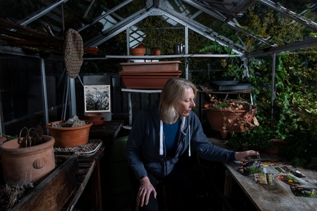
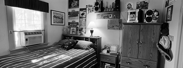
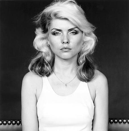
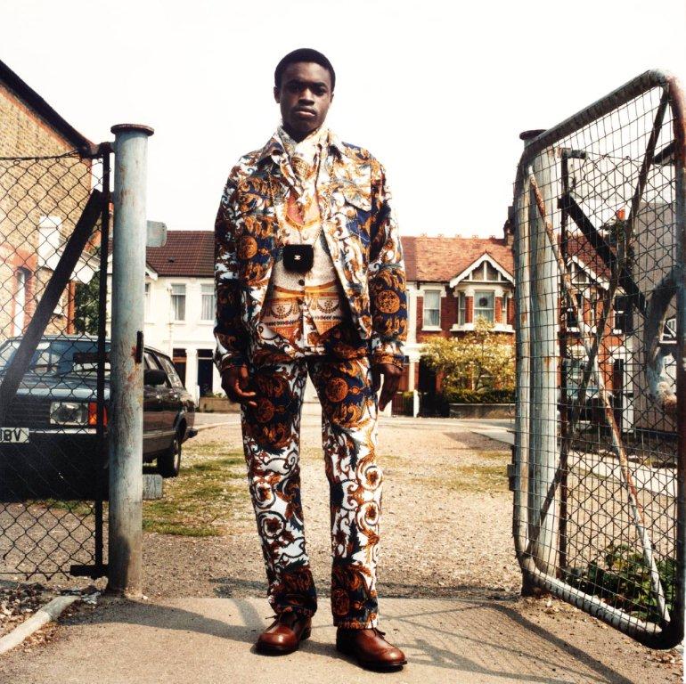
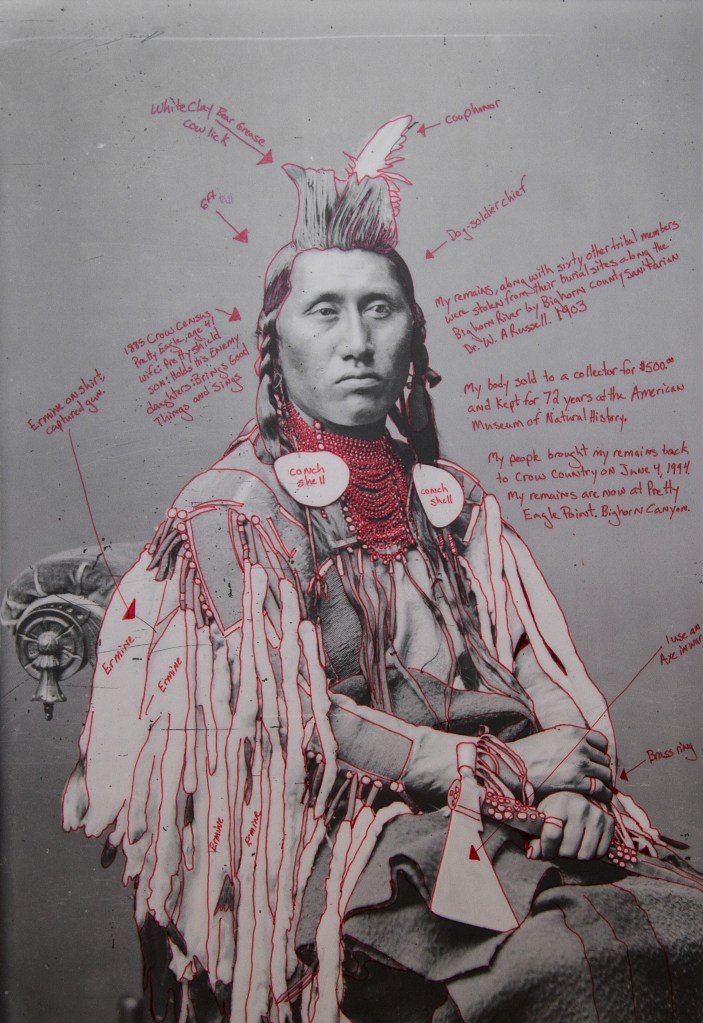
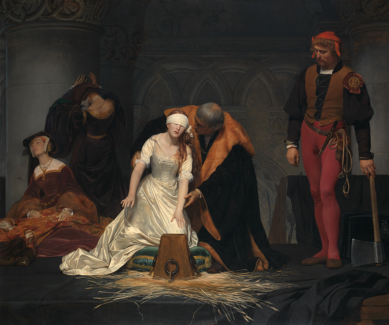
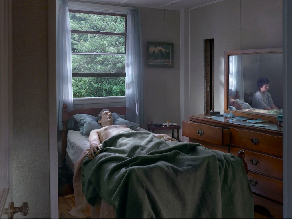
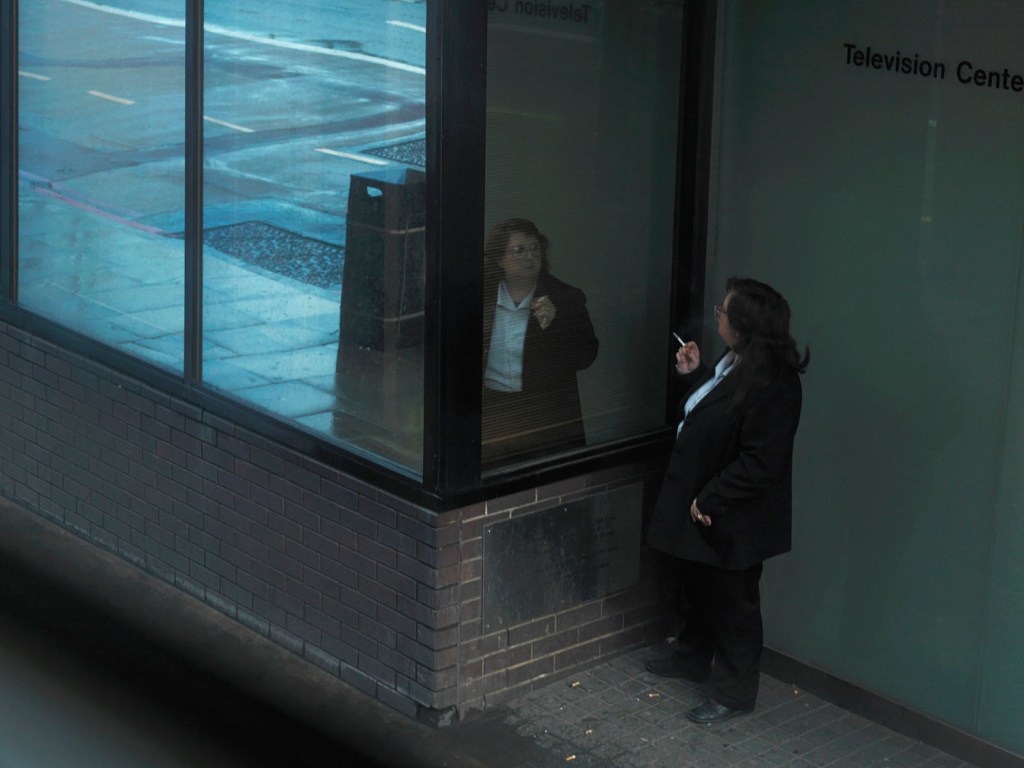

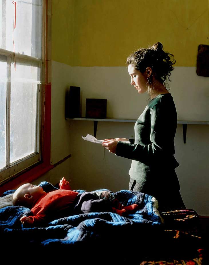
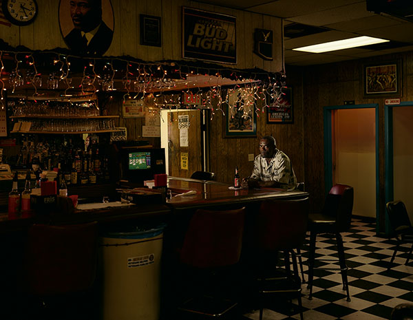
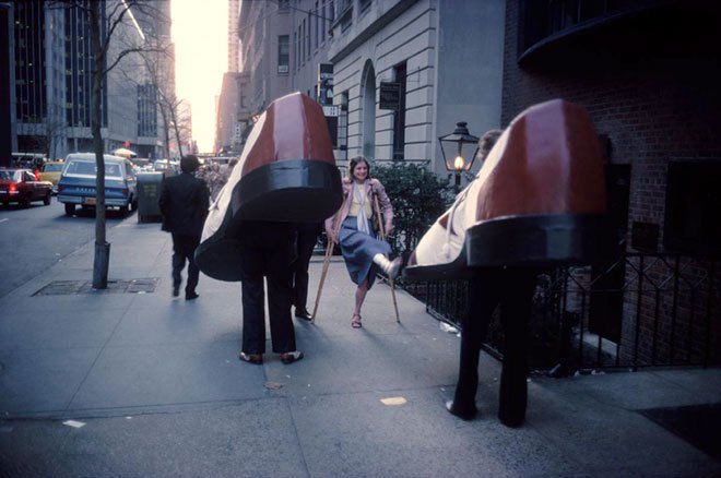
