How do you currently understand photography ethics? Reflecting on Chrystal’s quote about ‘digging into your discomfort’, can you identify any areas in your experience as a photographer where you felt unsure or unclear about what you were doing in your photographic role? How might you revisit that time now, what might you do differently? Post your thoughts to your learning log. You might also like to share your reflection on the Ethics and Representation Forum.
My Understanding of Photography Ethics
Cambridge Dictionary definition of Ethics:
“the study of what is morally right and what is not:”
(ethics, 2023)[1]
Simply put, ethics is a determination of whether something is appropriate to a level of moral standard, or contravenes that standard in some way. As human beings, our standards of morality vary between people, are shaped by culture and experience, and define an internal barometer for our behaviour. When applied to photography and photographers, the ethical considerations apply to the decision to make work that represents people or events that impact their lives. How a subject is represented is a hugely complex space, which covers everything from ethnicity and sexuality, to behaviour and personal circumstance. In the interview with Chrystal Ding[2], I recognised the discomfort that she talks about in some of my own work where I’ve photographed people in a certain context. The first example was a trip that I went on in 2015 to Morocco. I’d already been told how its people didn’t like to be photographed, because in the Muslim religion, the creation of a person’s image is said to be taking part of their soul. At the time, my view was that it was an organised photographic trip, so that in some way entitled me to take photographs while on excursion. Like any tourist, I was 100% observer, having no experience, connection or relationship with my potential subjects. What happened was that we, as a group, encountered a great deal of hostility because we were photographing when consent was clearly not given. I recall the first evening’s call to prayer in Marrakesh, when an elderly man got his mat out in the street, knelt on it, then looked up at me with extreme anger in his eyes. I had my camera around my neck, but was not holding it in a way that suggested I was about to photograph him. He gave me the middle finger and shouted to me to “fuck off”, which was possibly the only English words he knew. Clearly, his assumption was that I would not respect his sacred moment of prayer, perhaps driven by the behaviour of other tourists in the city, and that his gesture would somehow put me off taking a picture of him. The irony is that the middle finger would have produced an image that reflected the mood perfectly. If I had shot and disseminated such a photograph, I would have further conveyed the stereotype that the people of Morocco don’t like tourists, particularly photographers. In actual fact, there were a few instances where a brief conversation with the subject, and a monetary transaction, secured an image. What I take from this now, with the benefit of Ding’s interview, was my lack of preparation or research into how to represent my trip in a culturally respectful manner. Even though I’d acted appropriately at the time, it was likely driven by fear for my safety than the moral judgement that it wasn’t appropriate to photograph him. I would not repeat this experience as I didn’t really connect with the country or the city. However if presented with photographing the people of another country, I would certainly carry out more research into its people, how they want to be viewed (if at all) and which part of their culture or daily lives I would want to represent. Only then could I make the decisions need in preparation for shooting the work.
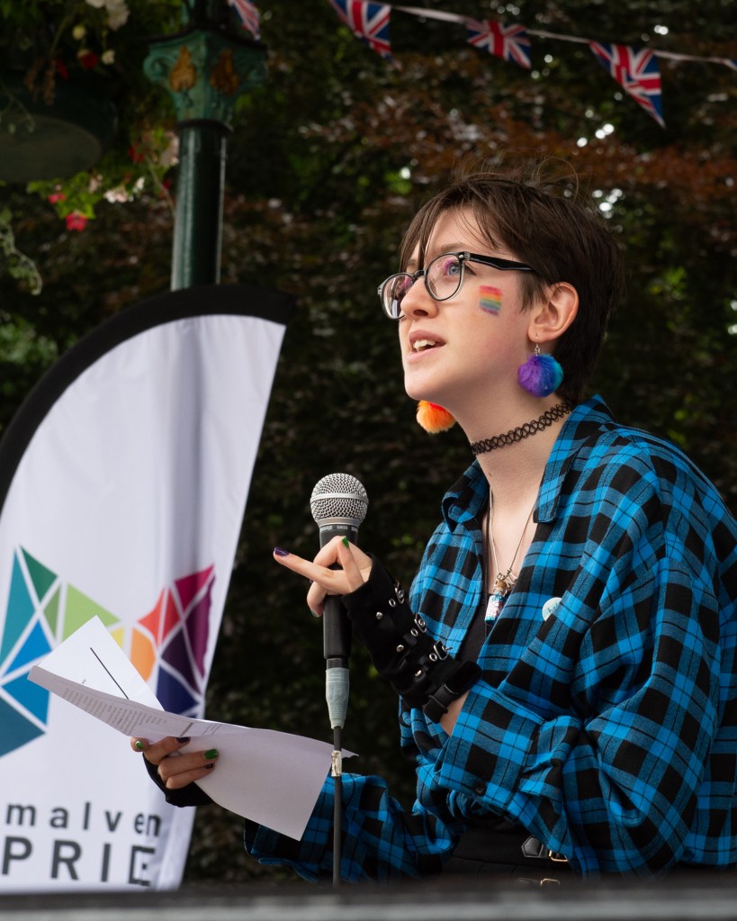
The second example plays more to Ding’s comments about observer vs. participant, which is also highlighted in the interview with Savannah Dodd [3]. Last year, I was engaged to photograph the Malvern Pride event by a friend of mine who was on the committee. I was happy to volunteer to do this as I had wanted to engage with more local civic activities after living in Malvern for over 20 years. The brief was simple: to document the day in its entirety. Although apparently simple, there were many aspects I needed to consider before shooting. Firstly the idea of approaching people to ask for a picture (consent) and to capture the ‘unaware’ documentary images of the event itself. Most of the people I talked to on the day were happy to be photographed but some were not. Our conversations were generally around whether or not they were having a good time, whether they enjoyed the acts etc. However, on a couple of occasions, I was confronted with “oh, I’m not gay…why would you want to photograph me?” At the time, I diffused their discomfort by point out that I wasn’t gay either, but on reflection I believe their discomfort was related to somehow being fraudulently represented in an event that they were simply attending because it was in a public park. My pithy reaction was a way of assuaging my own discomfort at being a straight man photographing an LGBT event. Aside from this, the other ethical concern that I now have when reflecting on the event was “am I representing the event appropriately?” I had been told by the organisers that this was a party, a celebration of the LGBT community that was new for our little Victorian town. However, the local council had rejected the committee’s request for a march through the town, which is actually the core purpose of pride. The marches show the world that the community is proud of who they are and is, by definition, a protest against prejudice and discrimination aimed at their community. Without the marching, the mood of the event was indeed a party, but my responsibility as a photographer should have been to represent the whole purpose of the event, rather than the convenient part, which positively demonstrated the LGBT community as being inclusive in the context of the Malvern residents. There was one image from the event that I feel represented the protest context of Pride, shown below:
From Malvern Pride 2022, but Richard Fletcher
In this image, a speaker is reading out her protest poetry about the treatment of young trans people by the elements of society that don’t recognise their gender. This image is the only one in the series of 90 images where the subject isn’t smiling or enjoying themselves. I took the picture because I suddenly became aware of the need to photograph the counter-aesthetic, but on reflection I should have made that part of my practice on the day.
Conclusion
In conclusion, what photographic ethics means to me is the application of a continually evolving set of questions about the subject and my relationship with it. Do I have the right in some related context, to photograph this situation, and if I do then how does that affect my judgement in representing it? The strength of that relationship defines how uncomfortable I am in taking photographs. Rather than finding a connection that justifies the work, I have a need to establish it before that discomfort abates. I agree with Chrystal Ding’s comments about digging into what makes us uncomfortable as this is the sub-conscious ethical standards we all have that are speaking to us. I’m not sure that I would go to the lengths of prior research that she does before photographing, though. This may be because I recognise an impatience in myself that would prevent me from focusing on a single objective for that long without some form of visual experimentation taking place. However, she and Savannah both make the point that considering ethics is a dynamic activity that evolves with our continued development as photographers. The point that we will always have gaps in our knowledge or research, that we will still make decisions we may eventually regret, and should embrace them, really resonated with me.
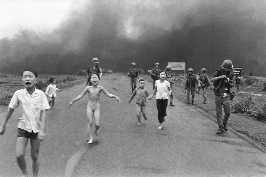
Nick Ut (Huỳnh Công Út) The Terror of War, children in flight from a napalm bombing during the Vietnam War, 1973: in Batchen et al (2012) Nick Ut, Accidental Napalm Attack (1972) Pg 146
Before we dive into this course, take a few minutes to write a short 200-word response to the ethics of this photograph in your learning log. Would you have taken this photograph? Would you have published it? Why or why not?
Response
This image has always made me uncomfortable from a non-photographic perspective, because of the clear horror of the situation. The press photographer had the responsibility to capture the moment, and we know that immediately after this shot was taken, he helped quickly get Phuc, who was naked because her clothes had burned off her body, to a hospital [1]. Like Capa before him, the line between observer and participant was a fine one. Personally, I would have struggled with shooting this emergency over wanting to help. The result though is a powerful reminder of the impact of war, so its publication was important in educating the world. However, I question the impact on Phuc herself. She is known to dislike the image, not because of the event, but her nakedness, which she saw as shameful [2]. The photograph is a permanent reminder of her suffering to this day, which seems at face value to be less important than the messaging about the war. For me, the ethical issues relate to the photographer’s decision to shoot at that moment, capturing a terrified naked child over another the others fleeing the scene, but also the editorial decision to publish. The narrative that the Associated Press were after took no account of the representation of the child and the infamy that would haunt her for another 50 years.
Add these terms and definitions to your Glossary – you may wish to do your own further and independent research and reading to enhance your understanding of these terms.
Response
I completed this research task in the form of a Padlet that can be found at this address:
I have now completed the coursework and assignments for Identity and Place, which also concludes Level 1 of the degree course. This post is a reflection on the key learnings from this unit and how it has changed me as a photographer.
Reflection
I suppose the first real learning point for me in Identity and Place was that the very definitions of these two words are not a obvious as they first appear. Identity is not limited to the facsimile of our faces and Place is not necessarily a physical location. An identity can be represented by the place that a person occupies and a place can represent the identities of the people who live there or are part of the culture. In many cases, a person doesn’t need to be physically present in order to represent them or their identity. Similarly, props and backgrounds in a portrait can speak volumes about the place that someone occupies in society.
We looked at the origins of photographic portraiture and the way that a picture represents a person as a collaboration between artist and sitter. The idea that portraiture tells a story about the person at some point in their life but nothing about the history leading to that point was something I hadn’t occurred to me before. While the photograph can more readily capture the differences in a person’s face at intervals, say separated by years, any interpretation of what has happened to them in the intervening period is created by the viewer using the visual cues included by the photographer. In the first project of Part 1[1], I looked at two very different portraits of General Ulysses S Grant, later President Grant, taken when he was a serving army officer and one in office. The pictures were clearly of the same person, but the years and events had changed the way he both looked and carried himself. In both cases, the photographers were representing Grant’s status as a man of action, but with different environmental influences. The same research looked at the works of Julia Margaret Cameron, who was one of the pioneers of the photographer deliberately presenting their subject as they saw them. Her images were deliberately blurred with motion, harshly lit or slightly out-of-focus as a way of revealing their character. This learning was another element that reinforced the fact that photography as a technical process is secondary to the idea that is being presented. If the technical perfection is subverted to tell us something about the subject, that’s fine. It’s important for me to remember this point, given my technical background.
The other artists that struck chords with me were Walker Evans and August Sander. The former is someone I was aware of from his book American Photographs(1938). His work in this unit was uses to explore the idea of subjects that are unaware of being photographed. The Subway series revealed the lives of the people on the train with Evans in a way that was entirely natural. Their interactions with each other and the occasional suspicious glances towards Evans and his hidden camera, made me ask questions about life in 1930s New York, which tied in with the later work on Postmemory. In that piece of work [2] we learned that postmemory isn’t just limited to our own experiences, but includes that of our ancestors and our culture. In the case of Evans, I am a huge fan of New York and have travelled on the same subway many times. My reading of Evans’ series was naturally influenced by my own experiences as well as the traditional images of the city from history. With Sander, we have another revelation of identity whose origins were in a sinister cataloguing of German society between the world wars. Sander’s subjects are pictured in the clothing that they would wear for their profession but there are also tools, props and the background, all of which help ‘place’ the person and identify their category.. The intention for the work may have been a flawed pseudo-science, but the resulting series speaks of the individuals as well as society at what was a fragile time. Sander’s work heavily influenced my submission for Assignment Two in which I used inappropriate dress for particular activities [3]. For me, Sander’s work continued my fascination with constructed tableaux. His portraits reveal a great deal about the subject and their ‘place’ despite looking at first glance like a practical document. Tableaux has featured in my all of my assignment submissions since Assignment Two, with the only departure being a more documentary approach in Assignment Four Even in that assignment, I was carefully including contextual elements in a semi-constructed manner and specifically excluding others, for example people. The research into in absentia portraiture followed on from what we learned in Context and Narrative with further emphasis on the traces of human activity. I was particularly struck by the artists Alec Soth and Martina Lindqvist, who asked questions of the viewer with their images of recent events within a specific culture. The latter’s seemingly simple compositions of buildings in a snowy landscape contain many subtle layers of meaning, inviting the viewer to ask questions about the people who live there and how their lives are affected by their environment. Soth’s series about Mississippi revealed wide ranging aspects of live in the region, some which are stereotypical and influenced by media perception and some that are testimony to the uniqueness of the culture. Where one aspect ends and the other begins isn’t always clear, which adds to the intrigue of the artist’s intent. This style of work has had an impact on how I approach a series, asking myself what I am really trying to say with my own work. When it came to Assignment One: The Unfamiliar, Sander shaped how I approached what was a challenging piece of work. Like many students, I found approaching strangers and asking them for a portrait very uncomfortable. In my series, I was trying to reveal what the local park meant to people who visited it and, though conversation something about their lives. Sander’s setting a subject into a specific context and Coburn’s comments about the establishment of a relationship with them made this assignment less of an issue than I thought it would be. Sander continued to influence my thinking when it came to Assignment Two, where I subverted the expected style of dress in certain social or cultural situations. In this assignment, I allowed my sense of humour to feature in the work which is something I’ve learned to do throughout Level 1 of the degree course. I learned a valuable lesson about my integrity as an artist at the end of Assignment Two with the criticism I received for self-censorship. What was an intended protection of my subjects (who are my friends), actually said more about my idea of what is acceptable and what is not. My image of the school teacher dressed as a saloon girl was the one that stood out as the model didn’t care who saw it. My own sensibilities wanted to avoid any form of online backlash given her position on the school board of governors. I learned about committing to an idea and being confident to share the outcomes, wherever they might lead. This self-awareness continued into AssignmentThree [4] where I told the story of vinyl’s decline and resurgence through photographs of my own life growing up. The work was inspired by Trish Morrissey and Hans Eijkelboom[5] who physically placed themselves in the portraits of others. Both artists manage to blend in and stand out from the subjects around them in a way that makes the viewer question what they are looking at. In my series, my very personal family photographs took the form of album covers and were placed in the setting of a vinyl record shop. I enjoyed the opportunity to play with tableaux construction in that assignment, which gave me increased confidence in the rest of the unit. Assignment Four[6] took its inspiration from Barthes’ paper Rhetoric of the Image, which discussed the use of relay text as complimentary context for the iconic and symbolic messages in a photograph. The pairing of scenes with quotations from the Government COVID-19 briefings was a powerful combination that received positive feedback from everyone who has seen the series. I think that this assignment taught me how to really observe a scene and think about how it fitted a narrative that I had already. The idea stemmed from an idea I had considered for an ebook which, thanks to Assignment Four, is something I am now pursuing outside of this course. The most significant learning from the unit came in the final part. Until that point, my work had been rooted in factual stories or situations, whether viewed from my perspective or deliberately subverted in some way. In Part 5, I was inspired by Michael Colvin’s Rubber Flapper[7] series to explore something fictional. His story of an eccentric woman living in a self-cleaning house, whose private life was a mystery being investigated by the artist, was so apparently real that I found myself instinctively Googling the story. Colvin constructed the character around his own experiences of privacy and acceptance of his sexuality, based it on some real events in the early 20th Century and cleverly used modern props to help the narrative through the series. I took Colvin’s work as inspiration for Assignment Five[8]. This departure from representing real people, events or cultures was like a release of my imagination. My series explored modern society’s reliance on communication technology through the re-telling of The Vanishing Hitchhiker, a ghost story that has become an urban legend. I really enjoyed the creative process of framing the story, choosing the costumes, props and lighting and the curation of the series in a way that I hadn’t really experienced since Assignment 5 of Context and Narrative[9]. I also worked with models, something that I have really learned to embrace in this unit as it gives me the opportunity to build those relationships to the extent where everyone involved is bought into the intended narrative. My models (also my close friends) contributed ideas for their characters throughout the shoot which I felt made the series more impactful; this was an experience I had in Assignment Two.
The experience of taking something that interested me (the ghost story) and relating it to the struggles of modern life prompted me to start carrying a small ‘ideas’ notebook around with me. When a similar idea comes to me, I write down the key details to be expanded later. Identity and Place has taught me to be more observant, look for meanings in images and not be afraid to let my imagination take over when I feel like it. It has changed my perspective on photography as an art form, which is most noticeable when I look at aesthetically beautiful pictures. If the image doesn’t tell me something about the place, it’s identity or that of the people who inhabit it, I get bored fairly quickly. In conclusion, the unit has continued to push me from taking such aesthetically pleasing photographs to creating work where a story is being told, asking the viewer to look carefully at the contextual elements in order to create narratives.
Read Chapter 4, ‘Something and Nothing’ in Cotton, C. (2014) The Photograph as Contemporary Art (3rd edition) London: Thames & Hudson. You will find this on the student website.
To what extent do you think the strategy of using objects or environments as metaphor is a useful tool in photography?
When might it fall down?
Write some reflective notes on these points in your learning log.
Introduction
The chapter ‘Something and Nothing’ deals with the variety of approaches taken by artists to photographing the everyday things that we are not necessarily looking for. The Nothing is described as the missed item and the act of photographing it shifts its meaning to Something, even thought quite what that may be is defined but the artistic intent. When I read this chapter, I was a little overwhelmed by the sheer number of artists it contains. Some of them I am already familiar with through my studies thus far, but others are completely new to me. Each has demonstrated a different way of ‘seeing’ the apparently banal and representing it visually using photography. Some, like Jason Fulford [1] incorporate texture of manmade and natural objects with the accidental humour that might otherwise go unnoticed. His shot Atlanta, GA, 2017 shows a window in a brick wall surrounded by bushes and grasses. The window contains a translucent sign advertising photocopying, which is something fairly ordinary in itself. However, the bright sunlight casts an image of the sign on the sun blinds behind it. The word ‘Copies’ is effectively ‘copied’ which conjurs the idea of mans insignificance in the face of the natural world. The ordered arrangement of the brick wall and graphic design is upstaged by nature, both in terms of the foliage in the foreground and the sunlight. Other artists like Wolfgang Tillmans [2] document what remains from human activity. In his image Suit, we see a seemingly discarded. We are left wondering about its ‘placement’, who wore it and why it might have been left this way.
To what extent do you think the strategy of using objects or environments as metaphor is a useful tool in photography?
Both examples above demonstrate the use of metaphor, described as:
“An expression, often found in literature that describes a person or object by referring to something that is considered to have similar characteristics to that person or object.”
Cambridge Dictionary Definition [3]
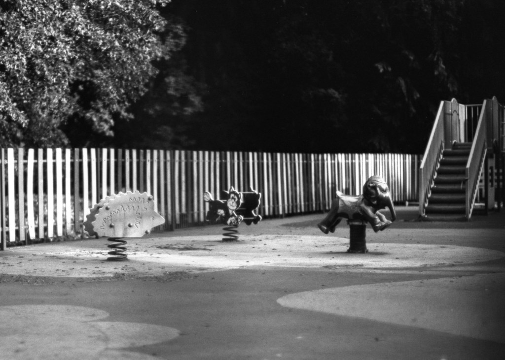
Metaphors are for me a clever way of using what is a literal tool or process in a more creative way. We have learned throughout Level 1 that there is a tendency to believe the literal interpretation of what is contained within a photograph; that the medium is objectively truthful. What metaphorical images achieve is a suspension of reading what the photograph contains in terms of objects and try to understand why they are represented in the context of the rest of the frame. Metaphors encourage a more detailed review of the picture to uncover some sense of what its about, which we learned way back in EYV. The idea of an image having sufficient technical ‘visual tension’ to make us stop and really look, coupled with the layers of meaning we uncovered when linguistically analysing a photograph enriches the viewer’s experience. In each example covered in chapter, empty scenes, strangely juxtaposed objects and the results of human behaviour are presented to the viewer as observed by the photographer. Once the viewer has got past the literal, the possible meanings begin to emerge, influenced by the not only the artist but also the culture, experience and opinions of the viewer. I was reminded of this recently when I showed my Assignment 4 to some members of my family. Our connection to each other is naturally very personal and strong, so when presented with the images of my town during COVID, they tended towards the literal interpretations. They saw blank, but recognisable spaces and picked up on the mood introduced by the use of black and white film. In the case of my mother-in-law, she instantly recognised her daughter in one of the shots which while factually correct was not the intent for her inclusion in the image. Once they had all had time to dwell on the text and the image, the metaphors presented themselves. In particular with the image below:
“His mother and siblings are showing symptoms of the virus, and they were unable to say their final goodbyes at his funeral. In their despair, the loving, dignified tributes from Ismail’s parents are truly haunting.”
Michael Gove, Chancellor of the Duchy of Lancaster, April 2020
This image was intended to use the hedgehog rocker as a metaphor for children when paired with the quotation about one of the first child casualties of COVID-19. The endangered status of real hedgehogs was intended to ask the question “are our children next with this disease?”. The image and text really resonated with the people that saw this series as it sums up the fears of the time, while actually being of an empty playground (as a side note, the whole playground has been demolished to make way for a new one – something I will consider for extending that series).
When might it fall down?
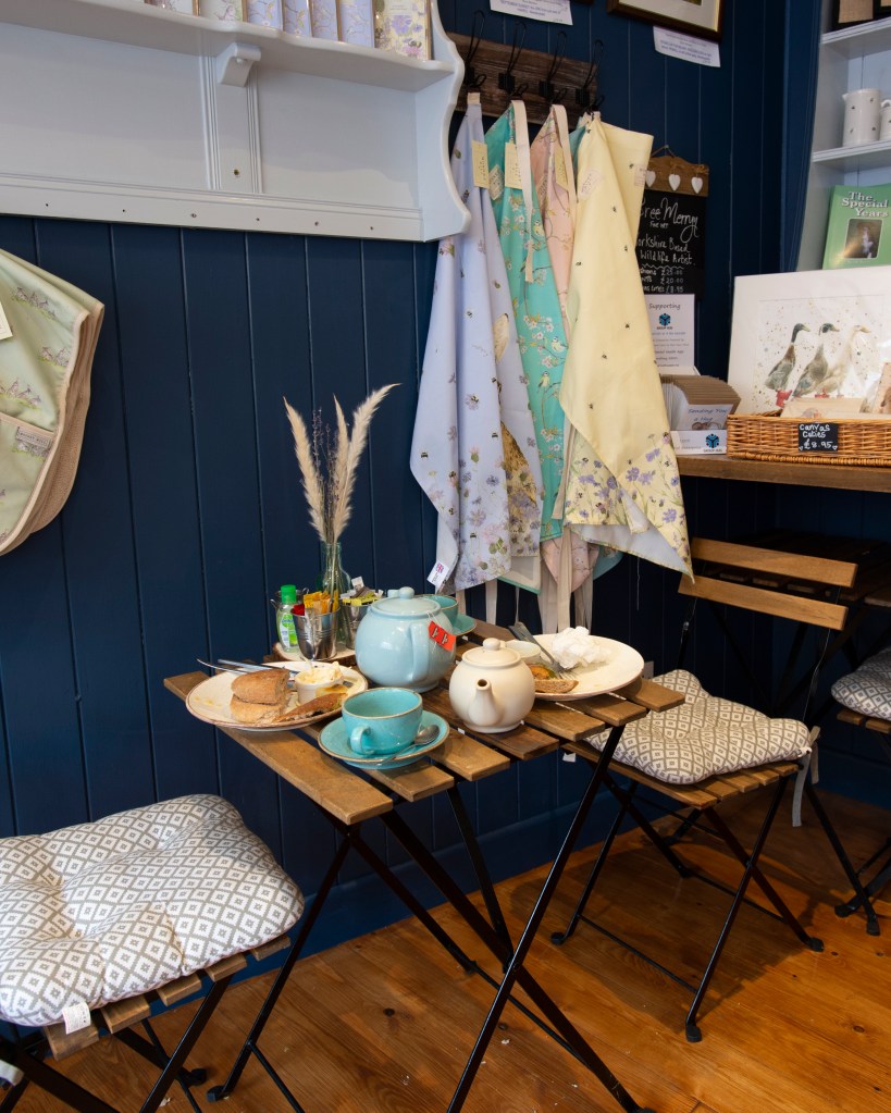
For me, overuse of metaphor runs the risk of confusing the viewer. In order to grasp some meaning to the image, the viewer brings their life experiences and perspectives to their interpretation. If the metaphor is very specific to a culture or section within society, those from outside it will see something very different. For example, I recently started a small series on the careless traces of people while on holiday in Yorkshire. When people intentionally discard something without thinking about its impact on others, it really irritates me, because of the way I was brought up. My series is intended to highlight how my sensibilities are challenged by the sometimes sinister acts of others and the acceptance that I must exhibit in most social contexts. It’s also a commentary on how I believe I can handle confrontation but generally avoid it, choosing to ‘quietly seethe’. The image below was one of the first images I shot for the series.
Untitled (2021) by Richard Fletcher.
This photograph intended to use the discarded food as a metaphor for the disrespect of a way of life, in this case that of Yorkshire. The people of Yorkshire are, in my experience extremely generous with their hospitality, so the idea of someone having most of their food in a cafe irritated me. The visual context in this shot is pretty clear, the cafe being typical of the small community ones that cater for tourists as well as the locals. The small Yorkshire Tea bag sets the location further, however my idea of the discarded food as a metaphor for an insult is pretty thin. I was present when the people (who were tourists). got up and left without finishing their food, but there is nothing in the image that suggests that is what I have just witnessed. The viewer can ask questions about the people but the connection with my intent is not particularly strong. I think like many styles in art, something that is used inappropriately can leave the viewer cold. As artists, we need to be able to explore ideas that need more explanation with more literal references, leaving the use of metaphor to layers that complement the main story.
References
[1] Cotton C, 2004, “The Photograph as Comtemporary Art”, Page 127
[2] Cotton C, 2004, “The Photograph as Contemporary Art”, Page 137
As you’ve seen, there are many examples of photography that avoid the use of the human figure in order to communicate truths and stories about humanity. Do your own research into areas you’ve been inspired by in this project; delve deeper into the areas that interest you. Continue to think about how this might inform your own practice.
Introduction
Within the second half of Project 1, we are introduced to the genre of still life. During the previous units, my research has led me to look a the practice of traditional painters, most of whom worked in still life at some point in their career. Famous painters such as Cezanne, Van Es and Gaugin painted still life with one thing specifically in common, their paintings had a quality of ‘the ordinary’ paired with the trace of someone having been present to influence the scene before it was painted. In some cases, such as the one below, the image could represent a moment for pause with an activity about to proceed when the person has returned.
Untitled by Pieter Claesz c.1640[1]
In this classical scene, we see what looks like a dining table with a part-consumed meal on it. The image could be read a number of ways, the first being a document of the structures of natural and ‘made’ food; the cross-sectioned pie and grapefruit. The second reading could be that this meal has had to be halted for some reason while the person leaves the room momentarily. With the former reading, we can also see the use of light and shadow in the composition, which is subtle enough to draw our attention first to the fruit and then to the bread and pie. The second reading uses the light to create a sense of evening with its muted tones. Whatever the reading, there is both technical revelation and the pausing of human life contained within what looks like a banal scene.
Sam Taylor-Wood (1967 -)
With her short film Still Life (2001), Sam Taylor-Wood takes a classic scene of some fruit as painted by one of the master painters and films a time-lapse of it decaying from fresh to pulp. The resulting film reveals a number of ideas that we might not consider until presented with what is a long-term activity, in real-time. The first is the passing of time itself. As the film advances, the light in the scene changes subtly which literally describes the passing of time for the fruit. The second, more obvious one is the actual decaying of the fruit which gradually develops discolouration as the flesh rots. During this process, the emergence of fungus becomes obvious which feeds on the decaying fruit. The film concludes with the ‘death’ of the fungus also and the appearance of flies that feed on what remains. The film is powerful because it suggests a documentary of something happening as with Claesz’ picture but also a continuation of life in the scene. The fruit decays, leading to new life in the fungus with that too dying eventually. After a time what is left further attracts other life to consume it. The element that isn’t included but is also palpable, is the sense of neglect on the part of the owner. Someone has left this here to rot for a long time, which begs the question ‘why?’ That in turn provokes different reactions depending on how we see waste or laziness and in itself could be a metaphor for the human condition and its behaviour toward the neglect of the natural world.
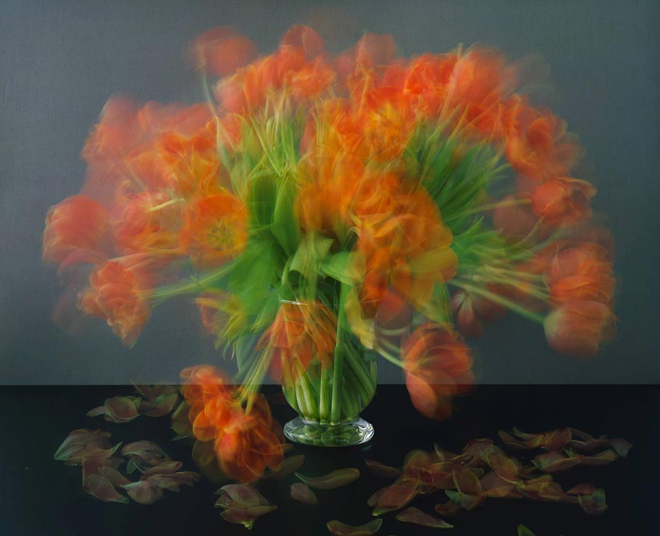
When I first saw the film, I was reminded of Michael Wesley’s Still Lives (2003) which depicts vases of flowers decaying over time.
Still Lives, 2003 by Michael Wesley[2]
The images were made using very long exposures on film which result in the movement of the flowers as they decay being visible in the single frame. Again, this series has the metaphorical sense of abandonment and carelessness. The flowers have been cut from their natural habitat, used in a display for a person who then promptly lets them decay. The person isn’t present but their actions most definitely are.
Jeff Wall (1946 -) and Laura Letinsky (1962 -)
With these two artists, the idea of still life is taken a step further with the images tending to be created more for their aesthetic than any iconic or symbolic messages. Special attention is paid to elevating the banality of the objects in their photographs by careful composition of form, tone and colour so that the viewer is left with the immediate impact of a visual before trying to understand the meaning of the image. The aesthetic is, as the notes suggest, pushing the viewer to try to appreciate the visual rather than the subject specifically, i.e. to ask whether it is ‘art’ or not.
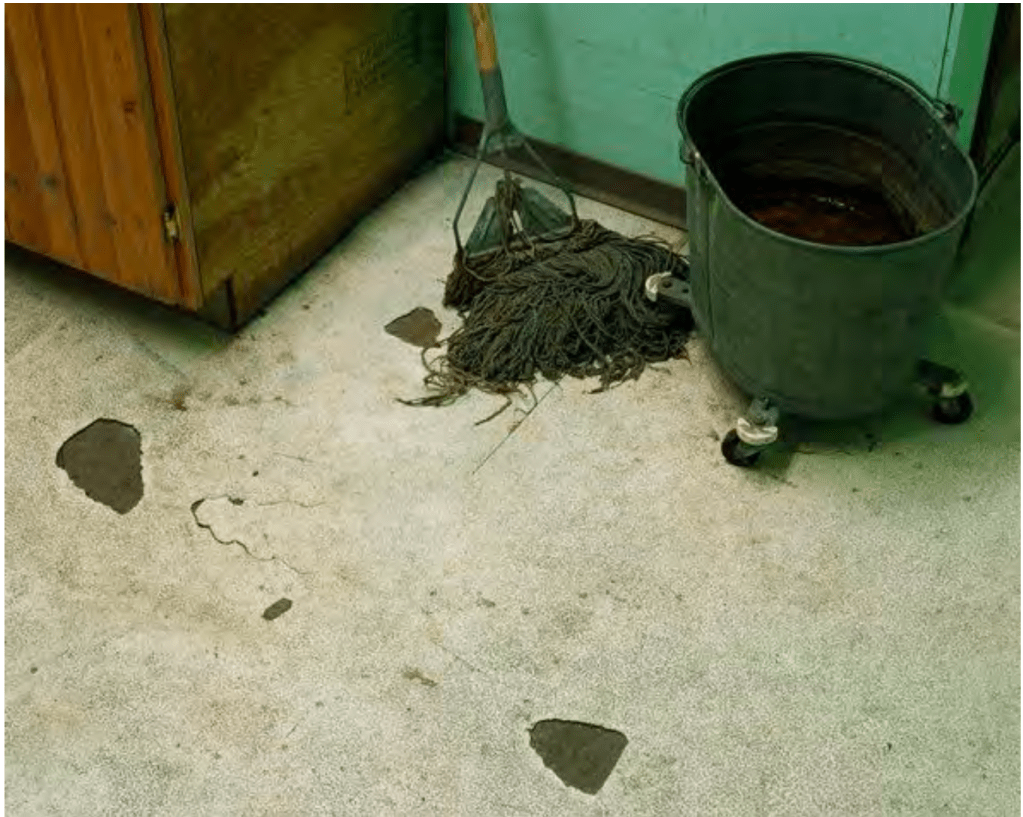
Diagonal Composition No.3 (2000), by Jeff Wall – taken from the course notes
In the photograph above, Wall uses diagonal ‘lines’ in the frame and in the subjects to create a geometric composition. Everything from the lines of the wall and cupboard, to the arrangement of the wheels on the bucket point to order, while the floor and cupboard have contrasting rough textures and dirty appearances to them. The final layer is the tone and colour, which work together in the subjects and their backgrounds. Wall is making something with atheistic ‘appeal’ that also has the foundations of still life with traces of human contact. Something has been removed from the floor which has left the bare patches. The mop looks like it has been left there temporarily rather than being put away in the cupboard. The work asks questions about behaviour but also about the coincidence that the objects appear in balance. We suspect it’s deliberate but we cannot be sure.
With Laura Letinsky’s work, we see a similar approach to making the still life ‘look’ like the works of the classic painters. Her work takes the banal subjects that we have seen with other artists and places them in a stylised environment, dominated by pastel shades and soft tones. In an interview for Aperture[3], Letinsky speaks of her initial interest as being the characterisations of the subjects (mainly fruit in her case) as being somehow unimportant; their appearance having strong lines to femininity (the way she lights her still life accentuates this idea). Finallly, there is the layer of domesticity that we’ve seen before; food preparation that is paused midway through as if life has somehow gotten in the way. Letinsky went on to discuss the duality of photographic representation, which I found interesting.
“Alongside its ability to provoke sensations, photography has a way of homogenizing experience. A piece of schmutz and a Tiffany diamond become the same thing once they’re photographed—they become photographs. I have a love/hate relationship with this power of the camera to flatten difference”
Laura Letinsky
What she is saying here is that photographs simultaneously provoke emotional reactions in the viewe while the camera doesn’t naturally emphasise the beautiful over the bland in a single image. If we consider this in the context of how we look at things around us, the concepts of beauty and ugliness (or blandness) are created by our personalities. The image then invokes a subconscious response (emotional or post-memory) while the visual is something we can decide to consider as beauty or not. As the notes point out, Letinsky’s later work includes representations of still life subjects instead of the actual object, which for me is taking a strong influence from Magritte and his assertion that a representation is not ‘the object’; this is not a pipe.
Nigel Shafran (1964 -) and Sarah Lynch
We encountered Nigel Shafran’s work Washing Up(2000) during Context and Narrative[4] and I was drawn to his use of ‘post-event’ contextual elements in his pictures. At the time, we were considering the work as absenteeism portraiture because the items in the compositions told us a story about the people who lived in the environment. The subtle and careful placement of the pots and pans, empty wine bottles etc set the images in a particular time of day as we start to imagine what the preceding meal was like. Some of the items suggest a convivial situation while others a potentially tense one, but that is up the viewer’s own recognition of the scene to conclude. Of the artists in Context and Narrative, Shafran (along with Wall and diCorcia) influenced my view of story-telling more than the others.
Sarah Lynch’s work is unlike the other artists here although the origins are clearly still life. Lynch makes a small number of objects the focus of her photographs, with little in terms of background or additional contextual elements. Her subjects are typically everyday and instantly recognisable to most people, but here they are represented in the composition in a way that makes the viewer consider them carefully. In one (Circles No.5)[5], a single circle of electrical wire sits in an empty space. The circle is perpendicular to the viewer, so that the shape is clearly seen. The wire is looped a few times and secured by a small thread that is the same colour as the plain background. The image is lit so that the bold copper colour of the wire contrasts with the otherwise pastel background, resulting in the viewer only looking at the one subject. At first glance, it’s not clear why this picture deserves any real attention. When I looked at it, I was struck by how the wire appears under tension, restrained by the thin thread that barely looks strong enough to hold it. I’m immediately struck by what would happen if the thread snapped. Would the wire spring out and lose its shape? Would that movement topple the wire so that the circle it envelopes also collapses? Is the wire a metaphor for the fragility of life?
“I would like to think that my work does show importance and beauty in everything, be it objects, space or time. I hope it is a reminder for us to appreciate life so as not waste our short time being angry or hurtful. I think being reminded of our fragile states, both in the sense of our own mortality and the transient nature of our being, helps put our small selves into perspective. We should be marvelling at the constant movement of energy that we are part of; we shouldn’t be trying to divide, package and control it all”
Sarah Lynch in conversation with Sharon Boothroyd[6]
This quotation from her interview with Sharon Boothroyd suggests that my reaction is similar to her intent for the work. Here then, we have traces of human interaction because the wire was put into a circle deliberately and restrained by the use of the thread. The human input has a transformative quality to the wire, which now takes a shape it’s not supposed to be in. Having said that, wire is normally formed on a reel, so it could be argued that the act of winding it in this way is a pseudo-natural manipulation in an almost passive-aggressive fashion. The person who did it is no longer there in terms of the picture but their impact is still felt. The wire though, could break free at any moment, either by accident or intentionally. The potential for moving from one state to another is very much a metaphor for life and death. The triviality of the wire and its surroundings is for me a metaphor for our own insignificance in the context of the universe.
Susan Lipper and Penny Klepuszewska
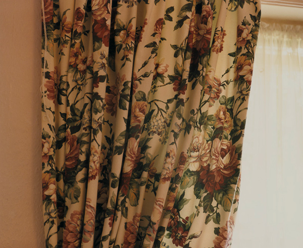
The final two artists in this project play heavily on stereotypes in their still life work. Lipper made a series called Bed and Breakfast (1998) which uses a mixture of still life and candid ‘holiday snap’ photographs to create a sense of the English holiday. What’s interesting is that the stereotype is being interpreted by an American. Even so, she takes the most familiar parts of the British holiday experience that people of that culture instantly recognise. The work exploits the minor, apparently unimportant details of the traditional British holiday in a way that invokes memory. As the notes suggest, the memories that the images provoke are not limited to the visual. Those of a certain age would associate the image of the curtains (below) with an old, slightly musty smell that tell of a room needing some modernisation. That sense works with the visual aspect, which is more obvious in the same way. The tone of the image and the peach-colour of the wall suggest a quaintness that is often associated with small, British hotels and B&Bs. To look further, the cheerful pattern of the curtains themselves belie the mood of the rest of the series which has a tired, clichéd feel to it.
Untitled, from the series ‘Bed & Breakfast'(1998), by Susan Lipper[7]
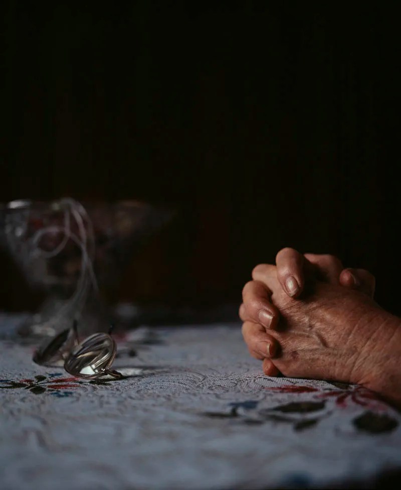
A similar set of emotions are invoked when we look at the work of Penny Klepuszewska. Her series Living Arrangements (2001) uses still life to represent familiar items in a nursing home. The series is shot as ‘low-key’, which adds immediately adds a sense of gentle discovery as if the scene is being illuminated from the darkness by torchlight. The artist uses the small amount of light to pick out the edges of some structures, while placing others in shadow which, when I viewed it, made me feel like I was moving through the ‘scene’, gaining mere glimpses of the items. Like Lipper, Klepuszewska does include people in her scenes but instead of the emphasis being about them, they are almost ‘models’ for the other elements in the frame. In the picture below, for example, Klepuszewska uses the old lady’s hands to model ideas about the lace tablecloth and the glasses.
Living Arrangements No.5 (2001) by Penny Klepuszewska[8]
This image struck me as we have a blending of still-live with portraiture that creates a strong sense of someone’s life without being to see much of them. We don’t know anything beyond the age of the hands and that they look feminine. The arrangement of the hands is as if in prayer which sets this image out from the rest of the series in that it suggests both comfort and loneliness in the same picture. The rest of the series appears almost documentary in nature with the selection of items that a nursing home would have within it. This image reminded me of Bryony Campbell’s Dad Project, studied in Context & Narrative[9]. Campbell included photographs of her Dad’s physical decline without showing his face or any emotions that he may have been experiencing. The final picture in that series, of Campbell holding his hand after his death, was for me the most powerful in terms of a metaphor fro the passing of time and our physical forms acting as a vessel. In the picture above, we have the old hands pausing for prayer at a table, which creates a sense of someone’s faith that they are not alone. The use of light suggests the prayer is before bed, which is a strong, recognisable idea in people who are deeply religious and traditional about their faith. The inclusion of the glasses that have been neatly folded and placed, further emphasises the sense of the day ‘being over’. The who image could be read as a metaphor for old age and impending death, or indeed the gratitude for each day despite the surroundings the person finds themselves in. There is a layer of joy in the image, which fits very neatly into the rest of the series.
Conclusion
I’ve found this project very interesting because of the different ways that absenteeism and still life can be used to tell relatable human stories. Each artist has used the genre slightly differently, from Wall’s discovered beauty in banality to Letinsky’s metaphors for the grace and fragility of the physical. Shafran’s Washing Up always appealed to me as it was the first time I really looked at an image for signs of life. The life is definitely there in the subtle inclusion of everyday objects, but the questions that it raises are so vast that the imagination of the viewer can run wild. The series by Klepuszewska struck me as sensitive and caring, perhaps because I can relate to the messages about the final phases of life. We can see a nursing home as being a terrible idea for our loved ones or we can see them as a safe haven for the elderly to continue with their customs or traditions. Whatever the viewer brings to the viewing influences how the series makes them feel.
In terms of how this work (and the rest of Project 1) will influence my work, I am planning to incorporate some form of still life tableau into my story for Assignment 5. The challenge for me will be not including too much detail that restricts the viewer in understanding the picture itself and how it fits into the rest of the series.
Where does that leave the photographer? As storyteller or history writer?
Do you tend towards fact or fiction?
How could you blend your approach?
Where is your departure from wanting/needing to depict reality
Make some notes on these questions in your learning log.
Introduction
We are introduced to the work of William Eggleston [1], who photographed scenes and objects that were connected with the presence of people rather than making them the subject. By excluding the people from the picture, the viewer must use their imagination to interpret what they are looking at. The notes make the point that imagination plays a key role in building a story, which in the case of Eggleston’s pictures has to do so with the must subtle of contextual signifiers. The point is also made that when children play with a generic doll, their imagination takes the basic construct and builds a personality and story for it in their play. Back in Expressing Your Vision, I wrote about a piece of research carried out by NASA[2] that involved a creativity experiment with a test group of young children. The study covered their growth and development over some 15 years or so charting their creativity as they got older. The basic premise was that as we grow and learn about the ideas, constructs and rules in the world, we become more reasoned and methodical which results in our creativity being diminished. The percentage of ‘genius’ level children dropped exponentially within the first couple of years of the experiment, becoming next to zero before the group reached their teen years. My experiences at the time of writing that paper were that the only way I could regain some idea of creativity as to revert to a childlike state in the way I see the world. When I look at the artists who use traces of people within a space or related to an object or scenario, I have that same feeling of wondering about the possibilities for meaning in the work. In my submission for Assignment 4[3], I deliberately left real people out of the images because I wanted the impact on the town to be the more obvious narrative than the suffering of its inhabitants. Facsimiles of people appear in a few of the shots, which created a sense of ‘being there but not being there’. I see the same feelings around the absenteeism of the works in Project 1.
Where does that leave the photographer? As storyteller or history writer?
With this concept, the photographer transitions from being someone who observes events unfolding and documents reality, to someone who imagines what the scene might relate to. As we have learned previously, photography has always been a powerful way of documenting as the idea the majority of people still believe that the camera merely copies what is presented to it. We know from the documentary artists of the early 20th Century that this isn’t the case. Their attention to particular subjects, the editing and often censoring of images to suit a narrative, means that they could be seen as both honest and deceitful in equal measure. If a photographer chooses to shoot something where what is missing from the frame isn’t factually important, I see that as a move to conceptual art. We’ve seen plenty of conceptual artists who use photography as their medium, e.g. Duane Michals, but their work still revolves around a real subject. The difference here is that the narrative directed or controlled with the same precision. Any idea of story or documentary is largely the responsibility of the viewer, whose idea may be vastly different from the original intent of the artist. The notes point out the difference between knowing something about the subject (having been to Memphis) or being shown a version of it (Eggleston’s view). I think that this is another power that this style of photography has; to tease a real place or situation, while creating a reality that is entirely their perspective on it. This is more powerful when there are no real actors in the scene.
Do you tend towards fact or fiction?
When I review the work I’ve done so far, I tend towards fact. Again, I think that this is more about photography, in particular the camera, being a recorder of either something real or something I’ve observed about something real. In this module, I have learned about guiding a particular narrative by using portraiture and environment. In my approaches to the assignments, I’ve tended to look for a story behind someone’s life or to reveal something real about their personality. In Assignment 1, I got to know complete strangers (some of whom I still talk to on my morning walks), while in Assignment 2 it was more about revealing something about eccentricity. Assignment 3 was a personal reflection on my life in the context of music technology. In Assignment 4 I was trying represent the contrast in mood between the experiences of my community and government rhetoric. In each case, I was looking for facts to exploit.
How could you blend your approach?
At the end of Assignment 3, I felt that it was time to consider how to blend styles. My idea for Assignment 4 is inspired by the work of former OCA student Michael Colvin’s series Rubber Flapper. I was struck by how he had been inspired by something real in both history and his own life. Instead of digging deeper into the story of the lady who lived in the self-cleaning house, he elected to make up his own story. The anchoring of some of the plot of his story in actual events, e.g. the relationship between Alice Austen and Gertrude Tate) and his views of the acceptance of people’s sexuality from a gay man’s perspective, really add weight to the series. I was particularly drawn to how realistic the series was, with an entirely believable narrative that I found myself Googling to see if any of it was real. I think that my own idea for Assignment 4 will pick up on some of Colvin’s approach, blending real and imaginary in a way where it’s hard to tell the difference. This is probably where I am with my photography than more abstract conceptual art.
Where is your departure from wanting/needing to depict reality
My idea for Assignment 5 is to retell a classic ghost story that has become an urban legend[4]. The original story (or at least one of the many versions) involves a man picking up a female hitchhiker late at night and driving her home. During the drive, the man gives her his coat to keep her warm. Only when he drives away from dropping her off does he realise that she still has his coat on. He drives back to the house that he dropped her off at the following morning only to learn from the grieving owner that the girl was her deceased daughter. She tells the man where the girl is buried and when he visits her grave, he finds his coat neatly folded on the gravestone. I’ve loved this story for most of my life as I remember my friends telling each other when we were young, swearing an oath that it was completely true. My series is going to retell the story in a contemporary setting and will blend the fiction of the narrative taking real-world experiences as cues for the shots.
In taking this approach for the final assignment of this unit, I am looking to push myself away from my default position of representing reality. The reason is simply to try something different.
References
[1] OCA, Unknown Date, “Part Five:Removing the Figure”, page 110, Identity and Place Course Notes.
Read ‘Rhetoric of the Image’ (Barthes, 1964) and write a reflection in your learninglog.
How does Barthes define anchorage and relay?
What is the difference between them?
Can you come up with some examples of each?
How might this help your own creative approaches to working with text and image?
The Essay
This isn’t the first time we’ve seen this essay by French philosopher Roland Barthes, published in 1964. The ideas of signifiers and signified, denotation and connotation were introduced when we were reading images in Context and Narrative [1]. Barthes sought to ‘spectrally analyse’ an image using the same structuralism ideas reserved for language. Barthes begins by writing about how linguists tend not to recognise ‘languages’ that don’t follow the structures originally theorised by Sausurre in the early 20th Century, citing the way that animals such as bees communicate with each other. Barthes wanted to see if images, also considered by some to hold little in terms of expression in language, could be read using the same principles of linguistics. As an example, he chose an advertisement for a French brand of ‘Italian’ food products called Panzani; this was what we looked at in our introduction to semiotics in Context and Narrative. Within the advertisement, Barthes identifies three messages; the linguistic which takes the form of the textual elements and captioning, the coded-iconic which is that which we visually read within the constructs of culture, and the non-coded; the elements in that are left. He treats the former separate from the latter two, arguing that the separation of them would serve no purpose. It is when he looks at the linguistic message, the idea of anchorage and relay are discussed.
Anchorage is the name given to text that seeks to answer the question ‘what is it?’ as Barthes explains, to limit or contain the element of uncertainty that the image creates. Although not explicitly used to describe what is in the picture, an anchor should be clear enough to restrict the creation of multiple narratives about either the whole image or parts of it. The anchor doesn’t only refer to the denoted elements that the image contains, but also the connoted which means that interpretation is also restricted. In his essay, Barthes uses an example of an advertisement or D’Arcy Preserves where some scattered fruit is included in the image alongside the caption “As if from your garden”. This anchors the viewer to a particular item (the fruit) but also the idea that the preserve is made from good things (the reference to the garden). When I read this part of the essay, I was reminded of the Lurpak advertisement that I looked at in Exercise 1 [2]. In that case, the caption read ‘Empires were never built on muesli bars’, which doesn’t refer to any single element within the accompanying image, but stops us from believing that the food being represented was the stereotype of a ‘health food’. This text anchors in the same way as Barthes’ example. He goes on to say that the use of anchorage to promote but also reject a particular part of the image or a narrative resulting from it, is the most common use of text with imagery.
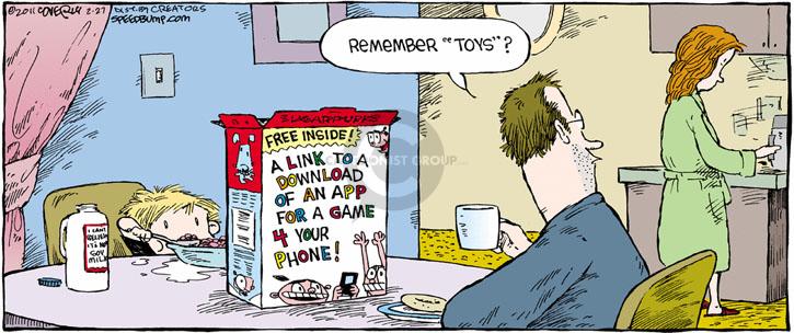
The relay is introduced as a less frequently used application of text to an image. Relay text is used to complement the elements in the image in a way that doesn’t describe them specifically but works with them to carry a narrative. The most common use of relay is in film where it supports the sequential building of a story by adding something about the subject that the viewer is watching. Barthes refers to comic strips as being good example of relay in action. Each comic frame contains as picture of characters set in the context of some action. The relay text guides the viewer to the story either by setting the scene or by being the dialogue between characters. Barthes points out that when relay is used effectively, the image becomes almost secondary in the reading of the story. See the example below:-
Speed Bump [3]
In this example, the text on the cereal box sets the scene of the frame. The speech bubble tells the story and the image shows a weary couple with a young child having breakfast. The image takes very little time to consume as a viewer as we are guided by the inclusion of the linguistic message (relay) and therefore don’t need to dwell on the iconic meaning of the image. Barthes makes the point that the idea behind a comic is that they are intended for people to consume quickly and rely heavily on the viewer bringing their own knowledge, both in terms of a code (language) to interpret the text, and in this example, about the current status of technology in our lives. Relay is not constant, as Barthes points out, it’s impact is felt differently depending on a number of social factors. With his Panzani example, the idea of Italianicity created by the text would only really be relatable to someone who wasn’t Italian. The use of the French language naturally puts the advert in the context of a French tourist who has some perception of Italian culture; they would have a different reaction to the linguistic message. In the example above, people of my generation would see the humour in the words spoken by the man, where children may not.
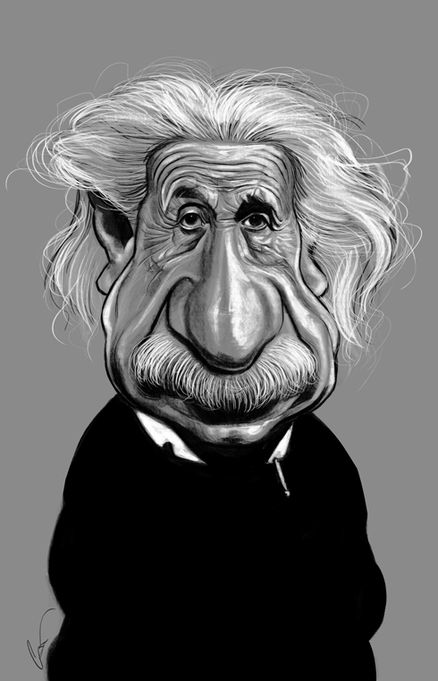
Barthes continues to explain that while images can be read using linguistic tools, photographs differ from drawings or paintings in that they contain uncoded iconic messages. What he means by this is that when a drawing is created, the representation of the subject is coded by the artist’s perception and knowledge, which is then read by the viewer. The representation doesn’t contain all information to signify the subject, but neither does the viewer necessarily need that to interpret it. In the most extreme case of caricature, the artist leaves some aspects out and exaggerates others, but we still know who the portrait subject is. Take this example.
Caricature of Albert Einstein, Unknown Artist [4]
We instantly recognise this as being Albert Einstein even though his famously wild hair, nose and moustache have been greatly exaggerated. The image is a likeness but not an accurate facsimile of the person it’s supposed to represent. Barthes argued that any image created by an artist has a code and in most cases, photography is the same. However, it is possible for photography to produce an image that is non-coded, i.e a straight copy of what is in front of the camera. The point Barthes was making was the even a non-coded image has information contained within, so if an extraterrestrial was presented with a photograph of what we know to be a tomato, they would not know a tomato but still see a shape and perhaps a difference in tone or colour. If we believe we can have an image with no code, the idea that a photograph is pure and truthful becomes believable. Barthes argues that the combination (and opposition) of both the non-coded and the coded cultural message, give a photograph its ability to relate to human history. As we have learned earlier in the unit, the idea of a point in history brought forward into the present via a variety of contemporary interpretations is a power that photography has that perhaps painting does not.
Barthes concludes his essay with the topic of the Rhetoric of the Image, linking back to its title. This deals with the interpretation of the symbolic message, influenced by culture. Barthes argues that the linguistic and denoted messages can be analysed as if a language, but the connoted messages are more difficult as they vary from culture to culture and are influence heavily by our attitudes and ideals around the signs in an image. In his analysis of the Panzani advert he identified four connoted signs but argues that there are most likely to be many more that depend on different areas of knowledge. He then goes on to conclude that the symbolic message within the image naturalises or balances the relationship between what is systematic denotation (what each element physically represents) and what is connoted (i.e. the potential meanings shaped by the environmental aspects mentioned previously). The rhetoric being referred to is how an image can be used to persuade the viewer in terms of what the image is about by using the structured meanings of the elements in the frame, but also by playing on their own psychological reactions to them.
Conclusion
Like many, I find Barthes difficult to read primarily because of his use of language and its translation from French to English. That said, there are some key messages from this particular essay in understanding how images can be used to structure meaning to a specific audience and how any use of text being either explanatory or suggestive depending on its relationship with the symbolic messages. Anchorage and Relay are shown to be used singularly, depending on the type of image. Anchorage as we have seen, signposts the viewer to the meaning of the image without leaving any room for interpretation and is used most frequently in journalism. However, I found Barthes’ explanation of Relay interesting because the text offers significant clues to what the image is about while letting the viewer build their own interpretation of the iconic message. Its use in comic strips was for me the revelation as relay hides in plain sight. If we consider a comic, we can understand the plot pretty much from just reading the text in each frame which at first suggests the medium is somehow ‘dumbed down’. The sophistication of comics is revealed in the way the text directs us to really look at the image and it is at this point that we realise that the symbolic messages in comic strips create many layered narratives. I now understand why when a successful comic strip character is represented in another media such as cinema, there is always significant debate over whether the characters and story arcs are faithful to the original ‘text’, perhaps more so than with traditional literature. Each individual reading of the comic will differ because of the social, environmental and cultural influences that Barthes refers to, but the relay text helps tell the story that the writers intended in the beginning.
In terms of how I might use anchors and relays in my future work, I think the main consideration is who am I creating for? Art is the expression of the artist, but I think I need to focus more on who I am trying to reach with my photography. With Assignment 3, I incorporated relay text in my album covers but the intent was only to support my story of the revival of vinyl without much consideration of how people might relate to it. The subsequent feedback suggested that the strength of reaction to the work was driven by the viewer’s own relationship with vinyl. The images were interesting, but I feel on reflection that the impact of the text wasn’t really strong enough to tell my story. I will endeavour to consider the audience more when thinking about including text in the series.
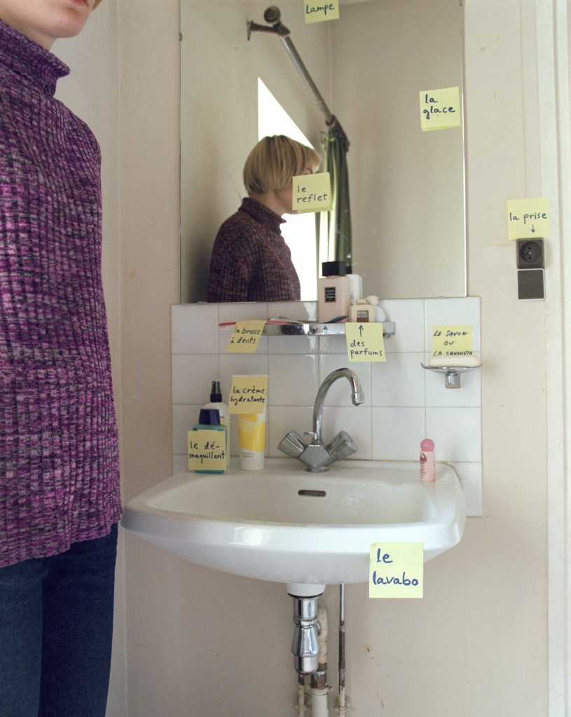
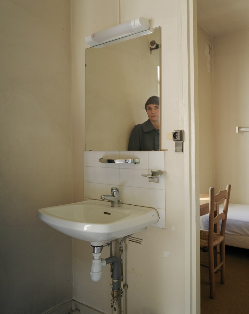
This video highlighted a couple of points for me around how Brotherus, an artist we first encountered in Context and Narrative, approaches her portraiture work. We know from the course notes that her series Suites Française was a documentary about her arriving in France without being able to speak the language and that her chosen process was to use Post-It notes as a learning aid. What I hadn’t realised was the use of film photography introduce the element of ‘random success’ when it came to Brotherus’s placement of herself in the image. For example, she highlights in the video that the placement of the post-it with Le Reflet (mirror) written on it was more luck than judgement. The way that the note covers her face is perhaps the strongest element in the image, even though the composition was intentionally representing the sense of isolation from the artist’s environment and language. Brotherus uses herself as the alien figure in the photograph and blends that emotion with the stark reality of the bathroom. The reason this was significant was that Brotherus made the point that she believed it to be better to work than overthink the idea. She suggested that the curation of a piece of work can be better achieved in review when the photographs are being selected and edited. Indeed, the Suites Française work was revisited many years later and culminated in the series 12 Ans Apres. As the title suggests, the series was revisited 12 years later when Brotherus returned to the location of her artist residency in France. The updated series now reflects on how different Brotherus’ life is in the same context as before. The labels have either been replaced by lengthy narratives in French or completely removed as in the case below.
Le Reflet, 1999 [1]
La Chambre 10 (le reflet), 2012 [1]
In the later version of Le Reflet, we see the same bathroom from a different perspective that shows a small area of the bedroom beyond the doorway. The sink is almost identical with the exception of the plumbing and taps and Brotherus is leaning against the same wall but this time looking at her reflection in the mirror. While there are many interpretations of these two images, Brotherus mentioned that she saw this work as a reflection of where she is now as a person against how she was when the original series. She went on to read one of the new Post-It notes that now contained what she calls a ‘position statement’. The statement reflected on how her life has turned out, both in terms of expectations that she met and things that didn’t go as expected. From what we know about Brotherus’ intervening work about her problems trying to have a family and her health issues that followed, this was a poignant statement that she made. Including it in the series as text further emphasises the mirror of her experiences. Later in the Q&A, she talked about using herself in landscape and the way that she wanted to invite the viewer to join her in appreciating the space. That shared experience is another example of the use of ‘mirror’ rather than a simple representation of what is present in the scene.
Conclusion
I enjoyed the video as it revealed these points that I had not really appreciated until recently. The act of shooting around an idea and being concerned with the way the series comes together afterwards is perhaps at odds with what we would expect. The idea of writing a position statement to establish what life is like in the present moment could be a useful tool when working on a series about myself. Assignment 3 may be a mirror so I will be looking into using it there. I’ve admired Brotherus’ work since we were introduced to her in the previous course, so listening to her talk about her creative process and using herself in the photographs is inspiring me to consider mirror as my answer to the brief for the next assignment.
As nursery rhymes are generally created for children to recite as a way of learning, the first reaction to the above rhyme from the US, which is still in existence today, is one of shock. What the rhyme symbolises is the common perception of racial division around the world which describes a simple colour categorisation into which everyone is placed. This simple idea became the root of ‘colourism’, whose origins date back to the days of colonialism and slavery. Black people were considered the underclass, had little in terms of education, were treated inhumanely and enslaved. The people that fitted into the Brown and Yellow categories were treated better respectively, with the White people being the originators of the scheme and as a result, the superior race. Despite the progress over the past 200 years, colourism still exists at a subconscious level in the way that some people view others of different ethnicity. A modern example was the casting of the film Straight Outta Compton (2015) which told the story of the up and coming rap scene in 1980s Los Angeles. The casting team categorised women who were potential extras in the film by grading their skin tone, which drew widespread criticism when it became public[2]. This identification and classification of non-white people exacerbates the tensions around racial equality and civil rights, which today is perhaps most widely epitomised in the media coverage of atrocities such as the murder of George Floyd by a white police officer in Minneapolis.
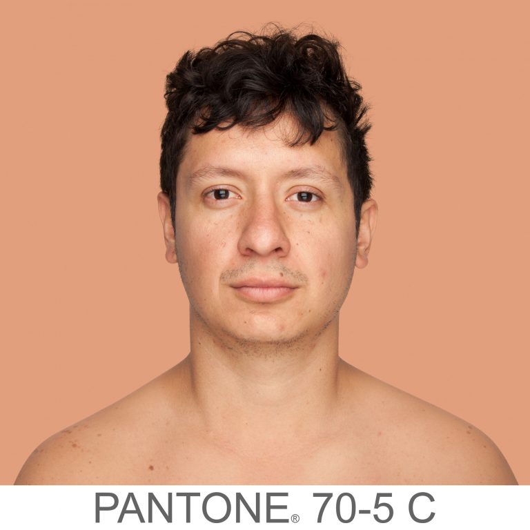
With her work Humanae, Angelica Dass wanted to show how much variety there was in skin colour across the world. Born into what she describes as a ‘colourful Brazilian family'[1], Dass affectionately refers to the chocolate, cinnamon and bronze tones of the members of her family. Growing up, Dass only really encountered colourism outside of her native Brazil.
Humanae is an unfinished work comprising of many thousands of portraits, all shot in the same way as Dass travelled the world. Her volunteer subjects are shot as head and shoulders only against a plain background, with the photographs cropped as squares. Dass then worked in post production to take a sample of the skin colour from a small region of the subject’s nose to gain their tone. She then used the international Pantone colour grading system[3] to change the background to match the subject’s tone, including the reference code as part of the image. A couple of examples can be seen below.
From the series Humanae, by Angelica Dass [4]From the series Humanae, by Angelica Dass [4]
Here we have two images of very different skin tone. What’s immediately obvious is that neither conform to the conventional Black, Brown, Yellow, White ideas of colourism. By altering the background colour, Dass draws our attention to the subtlety of the skin tones from shot to shot. The inclusion of the Pantone code gives us another anchor of difference but also a sense of the scientific. She is almost suggesting that the classification of colour has been done by a professional body, and that the classification is far from simple when attributing it to how people look. Dass has many thousands of pictures in her collection now and has been experimenting with how to present it to the world. By her own admission, the traditional presentation in a gallery isn’t really something she feels she fits within, allowing the viewers to choose to engage with the work or not. As a woman of colour, Dass connects more with confronting the audience with her work, so one exhibition was as billboards in the streets of major cities. This way, the audience is presented with the photographs as a matter of daily life. The effect of pushing the narrative of the complex differences in our appearances is more powerful when it cannot easy be ignored.
Conclusion
I found out about this work on social media a couple of weeks ago. With the completion of the exercises in Part 2, I was drawn to the use of subject and background as effectively a reinforcement of one another. The large expanse of the same colour as the skin tone makes makes me really notice how subtle the differences are between cultures, but also people within the same.. I really connected with the use of textual context in the shots too, the Pantone codes joining the series together as well as reinforcing the narrative. I can see other opportunities for the application of backgrounds this ways, for example contrasting perspectives on gender and age, social standing and materialism, sexuality, values and principles. It’s something I will explore elsewhere in this unit.