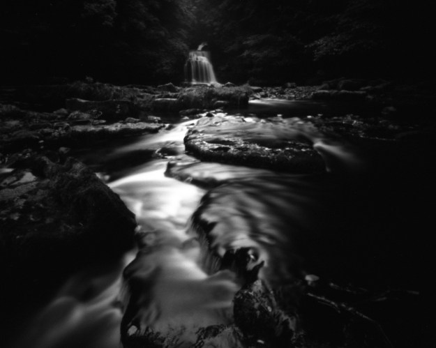
Category Archives: EYV Coursework

4) Project 1 – ‘Layered, complex and mysterious’


Let there be Light

The introduction to this project provided in the course notes, calls out our experiences where our images don’t match our expectations.  “Why did that photograph end up under-exposed? Is there something wrong with my camera?”.  While this happens to everybody from time to time, my earliest recollection of the phenomenon was a defeating experience.   My first camera was 110 Voightländer Vitoret that my father loaned me while I saved for my own.  This was a typically simple camera, with zone focusing and autoexposure.   I recall shooting my first few cartridges of 110 film with that camera and getting the results back from the local chemist.  Some of the frames were ok, but most had the dreaded sticker applied to the print, informing me of what I got wrong.  Under or over-exposed was the most commonly suggested by the developer, although a small boy would also get his thumb in front of the lens.   Forty years later and with lots of other photographic experiences behind me, the natural conclusion would be that I knew nothing about light, or how the camera would attempt to represent it on the film.  Light for me was just a judgement in determining the selection of film speed for my camera.

In beginning research for this project, I wanted to understand the different ways light had been manipulated by photographers; strong and diffuse, natural and artificial, highlight and shadow.  In the earliest period of modern photography, light was used to create images for contrast, where a subject’s obscuring of light against the blankness of the paper was the effect being sought.  William Henry Fox Talbot, who is credited with the invention of the photographic paper process created a number of photogenic drawings by placing leaves on photo paper and exposing them to sunlight (below).  The resulting negative prints show the detail of the leaf structure captured as the light is passed, obscured and partially obscured as it travels to the paper.  These early prints were subsequently used by botanists in their research of plant structures.  However, in the photographic sense, light was merely the tool to create a drawing [1]; something that Fox Talbot admitted to being poor at.

whft066.jpg

Photogenic Drawing of a Leaf by William Henry Fox Talbot, c 1839

The technique naturally became the method for making contact prints by placing negatives onto photographic paper to create a positive, but artists continued to create surreal pieces using the original idea, e.g the film strip images by Man Ray [2].

The evolution of the use of light to simply get an exposure continued through the Victorian era with the light being created by exploding magnesium powder.  This use of artificially-created light might seem at first glance, but the quality of the exposure could be surprisingly good with its ethereal tones [3].  Victorian photographers experimented with multiple lights, double exposures that led to the infamous paranormal photography craze and was ultimately succeeded by the precision flash tubes of the early 20th Century.

Representation vs Capture

The etymology of the word photography can be traced back to the mid 19th Century coined by Hercule Florence in 1833 [4].  Florence was a draftsman working  in a team of sketch artists in Brazil with a botany expedition.   Fox Talbot contacted Florence’s employer to pitch his idea of using photogenics for examining the structures of plant life (the image above).  He didn’t realise that Florence had already worked out his own method for capturing ‘drawings’ using photosensitive materials, coinciding with both Fox Talbot’s work with silver-salt negatives and Louis Deguerre’s wet ‘tin type’ method.  Unlike his more famous European peers in the field, Florence is credited with the first use of the term photographie, literally translated as light drawing in his native French. Although drawing with light was the principle of faithfully reproducing what would have been a sketch of a subject as opposed to art, photography offered some ability to be creative in the early days.  However, it would some years until the idea of visualising light and representing it would be part of photography in stark contrast to the painters and sketch artists from history.   Their genre required carefully looking at the light on their subject and determining the most impactful way of representing it in the picture.   Two renowned painters famous for their mastery of visualising light and representing it on canvass were J.M.W. Turner and Rembrandt Harmenszoon van Rijn.

Turner was known for his dramatic landscapes depicting dramatic scenes set against the backdrop of turbulent weather and the violence of the natural world.  To create impact, he was known to experiment with colourisation elements of his paintings, creating a sense of the surreal while maintaining enough realism to the subject.  He famous work Rain, Steam and Speed – The Great Western Railway, 1844 demonstrates Turner’s manipulation of light to suit the drama of a scene.

Turner_-_Rain,_Steam_and_Speed_-_National_Gallery_file

Rain, Steam and Speed – The Great Western Railway, J.M.W. Turner, 1844

The scene depicts a steam train racing over a viaduct on a stormy day.  In this image, Turner take what would have been largely defuse light experienced in heavy rain and cloud and creates a complex luminance to the scene.  When I first saw this painting many years ago, I asked myself “Where is the light coming from?”.  At first glance is is not the obvious but the light under the main and left viaduct suggests the light is coming from the right of the painting.  The shadows on the viaduct support also support this assertion.  However, the lighting and contrast of the train itself suggests some artist licence to give a sense of thundering movement toward the viewer.  Turner’s use of ambiguous colour for both the landscape and cloud suggests chaos in the weather and while there is not clarity in the rain itself, the mood of the sky and blurring of the foreground detail points to a train battling through very bad weather.   This painting clearly could not have been painted in real-time, but Turner was able to place the dramatic subject in his equally dramatic landscape and create the impact by manipulating light and colour to great effect.

By contrast, Rembrandt was known predominantly as a portrait painter whose fascination with studying people either singularly or as part of a scene comprising multiple subjects.  Rather than create an impressionist aesthetic, Rembrandt wanted to best convey the natural complexity of the subject’s face and expression to allow the viewer to draw conclusions about what is happening for the subject.   Rembrandt painted many self-portraits over his later life, documenting the changes in his own physical form.

“Life etches itself onto our faces as we grow older, showing our violence, excesses or kindnesses.”  Rembrandt van Rijn

In his famous painting The Anatomy Lesson of Dr Nicolaes Tulp, we see a human dissection taking place in front of a group of students.  This painting, regarded as one of Rembrandt’s early masterpieces as it was a commission when Rembrandt was just 26 years old.  As well as being a technically detailed work with a realistic representation of the dissection and the expressions of onlookers, it is a great example of Rembrandt’s use of light.  The scene is tightly lit from the left of the painting but some unseen source, but presented in a way that reflects the needs of the work being done in the scene.  The light rolls away from the centre of the painting so that there are few distractions at the edges of the scene and while the corpse is the brightest element, its face is partially obscured by shadow so as to avoid distracting from Tulp working on the arm.  What’s most interesting, though is the lighting of the faces of Tulp’s students.  This is an example of Rembrandt’s technique that inspired the well-known Rembrandt Lighting that is used in modern portrait photography.
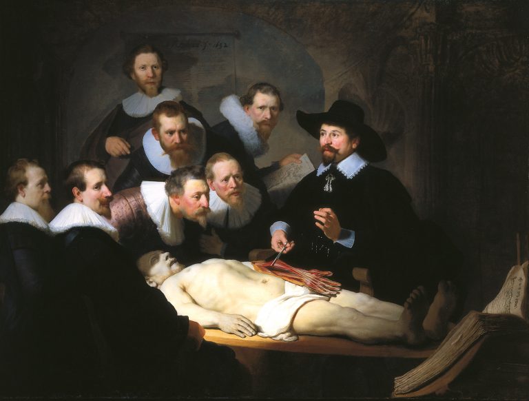
 

The close-up view shows two of the students with similar lighting on their faces.  The left side of the face is lit brightly, but the nose casts a shadow onto the right side of the face which results in a partial eclipse effect, apart from a small triangle of light that folds around the bridge of the nose.  This effect was used in many of Rembrandt’s paintings to accentuate the details of the face and its expression.  It is used as a staple setup in modern studio portrait photography as shown in the photograph below.

For me, Rembrandt was someone who observed the light play on his subjects in almost micro-detail, and as a result his work has an almost photorealistic quality to it.  The skill applying natural light in oil paint is essentially hidden from the viewer as they are left to study the subject without distraction.  In The Anatomy Lesson of Dr Nicolaes, the first thing that strikes me is the highlighting of the procedure taking place, which points to the importance of the relatively new science of anatomy.  The students themselves are not traditional youth, but scholarly middle-aged gentlemen who themselves are already presumably of well regard.  When attention is drawn to the dissection itself, the ‘reality’ of the painting comes back into focus.  The arm with its musculature and vessels prompts the question “How is this level of detail possible?”.  The answer, according a medical paper by the University Medical Center Groningen in the Netherlands [5], is takes us back to the idea of representation rather than capture.  

A public anatomic lesson in the 17th century usu- ally started with dissecting the perishable organs of the abdomen and thorax; the extremities were the last to be dissected.1–3 In Rembrandt’s painting, how- ever, the forearm already has been dissected whereas the rest of the body still is intact. This is another reason to believe that Rembrandt’s painting does not record the real situation of Dr. Tulp’s dissection but rather represents a symbolic interpretation.

The Anatomy Lesson of Dr. Nicolaes Tulp by Rembrandt (1632): A Comparison of the Painting With a Dissected Left Forearm of a Dutch Male Cadaver

The paper asserts that the anatomical realism created by Rembrandt is so inaccurate that the artist couldn’t have been in the room, even to sketch the scene.


A portrait painter’s success depended heavily on his skills to produce an acceptable likeness of his sitters following existing visual conventions,37 but did Rembrandt record an exact representation of the public anatomic lesson held on January 31, 1632? None of the anatomy paintings of the Amsterdam Guild of Surgeons display an exact representation of an anatomic lesson  They are all group portraits and commemorate the tenure of a Praelector Anatomiae or membership of the Amsterdam Guild of Surgeons.  Rembrandt seems to have painted a realistic reproduction of an anatomy lesson.

Middelkoop N, Noble P, Wadum J, Broos B. Rembrandt under the scalpel. The Anatomy Lesson of Dr Nicolaes Tulp dissected

What is clear is that Rembrandt created his masterpiece using some unconfirmed prior medical knowledge or research and painted and idealistic representation of the marvel of modern medicine; a propaganda piece for Dr Tulp.  His command of light and its natural ‘behaviour’ allows him to draw the viewer to the action whilst maintaining a sense of gravitas in the subjects themselves.  The painting’s accuracy and artistic merit have been debated for over 350 years, which points to the impact of the work.Rembrandt’s lesser known work confirms his abilities with representing natural light.  In The Rich Fool, 1632 (below), Rembrandt’s single light source is a candle directly in front of the subject’s face.

Rembrandt_-_The_Parable_of_the_Rich_Fool

The Rich Fool, Rembrandt van Rijn, 1632


When we examine the painting, the first thing we notice is the softness of the candlelight as it rolls off in luminance. We cannot see the flame as the subject’s hand is shielding it, but the light is spread across the the area of the desk and gloomily reveals some detail in the room behind.  Shadows are where we would expect them to be on the books and the subject’s face.  The artist reveals only the details that support the meaning of the image; the parable of the rich fool from the Bible.   The story of the man whose selfish amassing of possession to guarantee his future is shown represented by what the light falls on; the vast ledgers and legal documents, the coins and man’s fine clothes coupled with his pained but determined expression are what Rembrandt uses to press home the need to not be selfish.

The Photographers

The course notes point to three very different photographers in Sally Mann, Michael Schmidt and Eugene Atget.   The work of each demonstrates the observing and capturing of light in a way that best enhances their subject.

In the interview “The Touch of an Angel” [6], Mann refers to the translucency and fragility of light, in particular the way that it is affected by location; drawing a distinction between the light in the North and South of the US.   As photographers, we all observe the difference is in spring/summer vs. autumn/winter light quality and the variations throughout the day.  The more interesting thing about her work in ‘Southern Landcapes’ though, is how Mann uses light to convey a sense of feeling in her photographs.  The emphasis of the series of pictures isn’t the interest in the subject matter or the precision of composition and focus.  Instead, she uses light and shadow to describe the environment she is in.  We can get a sense of the weather, the season and even the temperature from what is essentially a series of monochrome images.  She admits in the interview that light is softer owing to the lack of coating on the lens, which enhances the dreamy feel of her pictures.  I’ve discovered over the past few years that the age of the lens, coupled with the type of film emulsion used, can create a photograph that has an antique look to it.  By making her images more about her observation of the luminance in the scene rather than the technicality of exposure, Mann creates a series that could have been shot 100 years before.

Using what at first looks like boring, flat light, Michael Schmidt’s series Waffenruhe has a ‘what you see is what you get’ feel to them.  Simple compositions with the eye drawn to the subjects using depth of focus etc… all things we have learned here already.

‘The viewer must allow the objects portrayed in the photograph to take their effect upon him without being distracted by shadow or other mood effects’ – Michael Schmidt

Waffenruhe-by-Michael-Schmidt-Tipibookshop-15-450x450

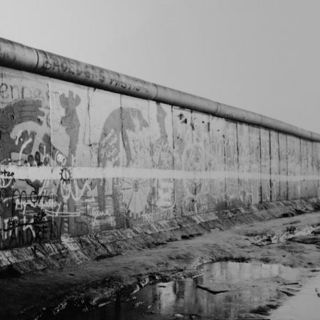
Waffenruhe, Michael Schmidt, 1987


In the photograph from he series, the Berlin Wall can be seen leading away from left to right.  The first thing we see is the walls set against a plain sky, which suggests a dull, overcast day where the light is flat.  The subject itself has little shadow which reveals the details of the graffiti along its length.  The one area of shadowsw and highlight in the photograph is the wasteland area in front of the wall, but there is little to distract from the main subject as described by Schmidt in his quote.  In a video documentary [7], Gabriele Franziska Götz, who was involved in printing Schmidt’s book Berlin-Wedding, described printing ‘as grey as possible’, likening the overall effect to being that of a photocopy.   By his admission [8], black and white photography also “guarantees the viewer a maximum amount of neutrality within the limits of the medium. It reduces and neutralizes the coloured world to a finely nuanced range of greys, thus precluding an individual way of seeing (personal colour tastes) by the viewer”.

This flatness of exposure can be seen in Eugene Atget’s Documents pour Artistes, the factual, documentary photographs that Atget made his living creating [9].   As he didn’t see himself as an artist in his early years, nor did he care much about the conditions of the light.  The film he was using was not particularly sensitive to the blue region of the spectrum, so the skies in many of his photographs were plain white, with no cloud detail.  Little is known about his workflow, but at some point he must have realised that the softness and even angular quality of light varies during different parts of the day.  Two of Atget’s contrasting works can be seen below.

The first is an image of the Paris Atget was trying to preserve in his documents.  Shot with minimal variation in lighting, apart from the rooftops of the buildings.  The image is precise in how it reveals the architecture of the city but there is little to describe what it was like to live there.  The second image by contrast is from his Parc de Sceaux series and it is immediately clear what the differences are.  This photograph uses highlight and shadow to create an ethereal view; the biblical stature looking into the distance where the contrast fades with the luminance of the horizon.  This image as a factual document is not as useful as the first in that only the details that create the mood can are revealed by Atget.

Perhaps the best way to see how Atget developed his approach, without knowing a great deal about the man, is to look at the work of his mentee and champion of his work, Berenice Abbott.  Abbott was hugely influenced by Atget, so it isn’t a surprise that when documenting the urban development of New York City that she uses light in a dramatic way.  The photograph below shows one of Abbott’s New York scenes; Grand Central Terminus.

Bernice+Abbott

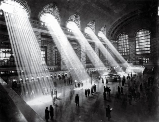
Portrait of New York 5, Berenice Abbott, 1929

Conclusion

This project interested me as someone who, like many was taught to use light in a composition without the emphasis being on really observing its behaviour.  For me, light has just been a tool for the medium, much like the Fox-Talbot photogenics where it is used to reveal something else.  Reviewing Sally Mann’s work and how she uses the light’s own subtle beauty to create a mood, made me realise that looking at a scene was far more than just how to focus, compose and what shutter speed to use.  Her emotive landscapes as well as her more controversial portraits of her family, share the use of light to draw more attention from the viewer.   Looking at Rembrandt’s mastery of imagining and representing light led me down a different way of thinking, more akin to artificial light and deliberately controlling the aesthetic.  In stark contrast to both Mann and Rembrandt, the notion of simply documenting the scene without using light and shadow is also intriguing, particularly as most photographers are taught effectively not to do this.  Schmidt’s approach forces us to appreciate the flatly lit detail of each scene, to appreciate the interest in the subject chosen as opposed to any mood it might create.   One thing is certain, light whether observed, captured or represented is a complex element to photography and its many uses offer huge diversity in photography.

References

[1] Fleury P, 2015, Salt and Silver, Tate Britain Exhibition, MACK Books

[2] Radnitzky E, 1923, Rayograph, Museum of Modern Art (MOMA), https://www.moma.org/collection/works/46483?artist_id=3716&locale=en&page=1&sov_referrer=artist, accessed May 2019

[3] Cangemi M, 2017, My/AP Workshop Ep4 – Magnesium Flash Photography video, https://www.youtube.com/watch?v=zbAcOL4oR7M, accessed May 2019

[4] Brizuela N, 2014, Light Writing in the Tropics, The Story of Hercule Florence, Aperture. https://aperture.org/blog/light-writing-tropics/, accessed May 2019

[5] Frank F et al, 2006, The Anatomy Lesson of Dr. Nicolaes Tulp by Rembrandt (1632): A Comparison of the Painting With a Dissected Left Forearm of a Dutch Male Cadaver, https://web.archive.org/web/20070926154457/http://www.handsurg.eu/resources/rembrandt_en.pdf. Accessed May 2019

[6] Rong J, 2010, An Exclusive Interview with Sally Mann – “The Touch of an Angel” (2010), https://www.americansuburbx.com/2013/01/interview-sally-mann-the-touch-of-an-angel-2010.html.  Accessed May 2019

[7] Langfeld A & Paulsen S, 2016, Werkstatt für Photographie: 1976-1986. Micheal Schmidt. Teil 4, https://www.youtube.com/watch?v=4m4Fc1UPUd8. Accessed May 2019

[8] Schmidt M, 1979, “Thoughts About My Way of Working” (1979), https://www.americansuburbx.com/2010/10/michael-schmidt-thoughts-about-my-way-of-working-1979.html.  Accessed May 2019

[9] Dupêcher N, 2017, Eugene Atget, French 1857-1927 – Museum of Modern Art (MOMA), https://www.moma.org/artists/229, accessed May 2019


Exercise 3.3 – What Matters is to Look

The Brief

Find a good viewpoint, perhaps fairly high up (an upstairs window might do) where you can see a wide view or panorama. Start by looking at the things closest to you in the foreground.  Then pay attention to the details in the middle distance and the things towards the horizon.  Not try to see the whole view together, from the foreground to the horizon (you can move your eyes).  Include the sky in your observation and try to see the whole visual field together, all in movement.  When you’ve got it, raise your camera and release the shutter. Add the picture and describe the process to your learning log.

My Approach

This exercise reminded me of how I view landscape paintings.  I had read somewhere many years ago that painters incorporated focal points in the scene that they want the eye to look for, in a similar way to photographers using point of focus.  Once this is located, the viewer effectively pulls their ‘vision’ back to see the other elements on the painting reveal themselves.  Over the years I’ve tended to view paintings this way, most recently during a visit to the Metropolitan Museum in New York.  The famous painting  ‘Washington Crossing the Delaware’, by Emanuel Leutze hangs in this museum and its huge scale (6.5 x 3.8 metres) makes it an impressive sight to begin with.

Washington_Crossing_the_Delaware_by_Emanuel_Leutze,_MMA-NYC,_1851

Washington Crossing the Delaware, 1851, Emanuel Leutze (credit: Metropolitan Museum, NY)

The focal point of George Washington standing proudly at the bow of a row boat is clearly what the artist wanted to bring out.  Only when pulling back from Washington, do we see the crew battling with the river, the floating ice ‘growlers’ and the further line of boats stretching to the horizon.  Finally we see the time of day that this is all taking place in.   Although the painting is full of artistic licence and factual inaccuracy, the impact of the painting is still felt in schools and colleges across America owing to the heroism of the founding father and his army.
For this exercise, the inverse has to happen.  We can’t take liberties that Leutze did, but we can carefully observe and wait for the whole scene to present itself.

Location, Viewpoint & Set-Up

For my viewpoint, I chose the top of Church Street in Malvern which has a view down the hill and also toward the other side of the valley created by The Malvern Hills.   I positioned myself with a clear view of the street, but not being in the way of other people as I didn’t know how long I would be standing there.

In order to meet the brief, it was important to ensure that the camera was set up beforehand, so that I could raise and shoot at the right time.   The lens used was a 35mm f/1.4 set to f16 to ensure sharpness throughout the image.   As there was a strong mix of light and dark, I wanted to be able to expose for a middle tone shadow so I set the ISO to 400 to allow for extra ‘speed’ when doing this.   I then spot-metered the scene with the camera in Aperture Priority to get the corresponding shutter speed and finally set the camera to Manual.  I was now able to expose without worrying about the image being underexposed or the camera changing settings, as long as the light didn’t change in the meantime.

My Image

DSC_1996

Church Street, Malvern

In this scene, I started by looking at the foreground lighting, which occupies the lower quarter of the frame.  The junction and map of the town were the entry points into the composition.  When I looked into the frame, I noticed the man in red stretching his leg outside Boots on the left side of the street.  He was doing this for a fair while, so I thought he could be an anchor in the middle of the photograph.  Looking beyond that, I noticed the light is predominantly on the left side of the street, drawing down to where the road curves out of sight.  Beyond the buildings in the far field, we can see the valley out towards the distant hills at Bredon and the blue sky with only a few clouds.

I maintained this view for around a minute and looked around the scene for activities in the foreground, middle ground and horizon.  I shot this moment because I could see the man entering the frame with the pram on the right.

When I looked at the image again on the computer, the man in red and the pram were present as expected.  I had been aware of the couple crossing the street, but the car in the middle of the scene was something I didn’t see.  The driver is looking for a parking space, which is very difficult in this town, particularly on Church Street.  The other element that I didn’t ‘see’ when looking around the scene was the telephone wire running from left to right in the foreground.

Conclusion

This exercise has taught me that although photography cannot play with the factual realism of a scene in the way that landscape painters like Leutze could, it can pull the seen and unseen elements of an image together starting with the focal points in a similar fashion.  On reflection, my image has the depth afforded by the leading line of Church Street and the uninterrupted view to the hills across the valley.  As a composition, it doesn’t really obey any other rules such as ‘thirds’ or ‘symmetry’, but in my view that isn’t important.  What is important is that by waiting and looking throughout the scene, I was able to reveal some details of a Friday afternoon in a small countryside town.  If I had looked more closely, I would have perhaps seen the elements that I missed but I conclude that this is a balance of timing; seeing the general movements but capturing a specific set.


Exercise 3.2: Trace

The Brief

Start doing your own research into some of the artists discussed above.  Then, using slow shutter speeds, ,multiple exposure function, or another technique inspired by the examples above, try to record the trace of movement within the frame.  You can be as experimental as you like.  Add a selection of shots together with relevant shooting data and description of process (how you captured the shots) to your learning log.

My inspiration

Prior to starting part 3, I had already become familiar with the use of shutter speed to record or freeze time.  Over the past few years, my two most common types of photography have been shooting sporting events and landscape.  In the former, the freezing of time is generally used to show the action, where a technique commonly used in the latter incorporates capturing movement of clouds, water etc through the use of slow shutter speeds.  What I learned in part 3 was that the movement within the frame is the third dimension to the image, whether it is time between events or simply relative movement between the camera or the subject.  The impression of speed of the subject can be created by using a slow speed to capture motion blur, while the same effect can be used to express chaos and panic by capturing the camera movement.  In an artistic sense, it doesn’t matter which tool is used to create the effect as long as the photograph works.  My research into the decisive moment (Project 3) led me to examine the works of highly creative artists such as Aïm Deüelle Lüski, who uses both long and multiple exposures combined to produce ethereal, semi-realistic images with the camera as part of the scene.  As a film shooter, I was also aware of the classic technique of multiple short exposure of single frames of film to create the effect of a long exposure, the motivation being to retain texture and avoid issues with reciprocity failure of slow films.

Last year, I purchases a long focal length macro lens for my D4.  At 200mm, it offers both the very short focus distance and telephoto magnification, which has allowed me to capture very small subjects such as bees with high precision.  I’ve grown to love the details this lens reveals, so my starting point for this exercise was small movement in the frame.

The images

The E String (3s at f/40, ISO 800)

This first image was inspired by my renewed interest in the guitar and the memory of a late friend once trying to teach me, to no avail.  I borrowed an electric 6 string guitar from a colleague so that I could capture the tiny movements in a string when it is plucked; in this case, the E string.  My first attempt at this shot was ruined by my being too heavy-handed with the string.  The vibrations induced into the rest of the guitar made all of the strings move.  Eventually, my plucking of the string was gentle enough to keep everything else still.   I used a continuous LED light from the left of the frame to light the strings and pickup.

Vinyl Queen (composite of  6 frames all 1/400th at f4.8, ISO6400)

This image was inspired by my recent rediscovery of vinyl records and of the band Queen, following the recent film biopic Bohemian Rhapsody.  I started listening to vinyl again because of the tactile nature of the medium, which has been lost in the digital era. For this image, I shot the record label with the camera on a tripod and the shutter release set to High Speed Continuous.  With the same LED light at 45 degrees from the lens, I shot 6 frames as the turntable rotated.  In Photoshop, I combined the images as layers with increasing opacity up to the final frame.  This is essentially the equivalent to shooting multiple exposures of a single frame as one would in film, the key difference being that there is always only one photograph in that medium.  As I’ve progressed as a photographer, I’ve moved away from using digital manipulation in Photoshop and Lightroom.  However, the effect is what I was looking for and as the man said:

“The negative is the score, and the print is the performance.” – Ansel Adams

View from the Deck (GoPro at 30fps, combined in Photoshop)

For my final shot, I was inspired by the works of Lüski   I placed a GoPro camera on the turntable of my record player, facing outwards.  With the camera set to 30pfs burst photo mode, I rotated the turntable and shot a 360 degree panorama of the room.  I used the same process of layering different opacity frames in Photoshop to create one image.

Reflection

I enjoyed shooting for this exercise as I was able to try three different techniques to capture movement within the frame.  The first image showcases macro photography and in particular how it reveals detail that the eye struggles to see.  The use of traditional slow shutter speed captures the difference between the strings well and the composition is clearly of a guitar pickup and fret board.  The second image is more technical, post-processing than photography, but it is a variation of a classical approach to slow speed film photography.  I like the way that the text is still legible this way, as with simple long exposure the effect is not as easily achieved.   The final image was my tribute to Lüski.  I loved the concept of the camera being part of the image rather than a tool for capturing what’s in front of it.  In this image, we can see all of the elements that make up the scene, from the record player’s tonearm and bright green cartridge to the ceiling cornicing, sofas and even my camera on its tripod.  The camera appears twice as it is also reflected from the inside of the record-player’s perspex lid.   I love the way that the only stationary element is the turntable mat in front of the camera and the way that the finished image is lo-fi, in a similar way to Lüski’s pinhole shots.

3) Project 3 – ‘What Matters is to Look’

Henri Cartier-Bresson and Le Moment Décisif

Anyone who has the remotest interest in the history of photography has heard of Henri Cartier-Bresson.  Legendary French photographer, co-founder of Magnum Photo and the man who coined The Decisive Moment, Cartier-Bresson’s images from the early 20th Century are well known.  He was known for shooting 35mm cameras with 50mm lenses and using high speed film for capturing fleeting moments in on film.  Although he was highly skilled with a camera, his most iconic photographs didn’t rely on rich tonal range or sharpness to carry the subject; often the image has an almost lo-fi feel to it.

It is, of course his idea of The Decisive Moment that interests most photographers and has been taught and copied for the past 80 years.  But, what exactly is it?  Simply put, the decisive moment is a fleeting moment in time where the relationship between the subjects, background and with the photographer coalesce in a way that establishes the photograph.  Each element in image must have balance in terms of composition and while the ‘rules’ don’t need to be followed rigidly, the image should have visual tension between subjects.  Such a photograph requires a great deal of skill in observing the scene, being instinctive with the camera and pressing the button at precisely the right moment.

The iconic example of Cartier-Bresson’s viewpoint, “Behind the Gare Saint-Lazaire”, shows the decisive moment in action.

Henri Cartier-Bresson's Behind the Gare Saint Lazare, 1932.

Henri Cartier-Bresson’s Behind the Gare Saint Lazare, 1932.

Cartier-Bresson was shooting a rangefinder Leica at the time, which requires the photographer to look through a viewfinder that is offset from the axis of the lens.  Cameras of this type are a little more tricky to compose and focus (I have two of them and the experience is quite different from using an SLR), so when Cartier-Bresson was composing this shot, it is difficult to know what he was trying to shoot.  By his admission in the documentary interview [2], he poked the lens through the railings to get a view of the train yard and didn’t see the figure leaping the large puddle in the foreground.  Perhaps the image he had in mind was more about the reflections of the buildings in the water and the debris that is partially submerged.  The photograph comes alive because of the leaping man.  He is about to hit the water despite having left the relative dryness of the timber and Cartier-Bresson has captured both the moment and the motion of the action.

Cartier-Bresson’s admission that the picture was an accident means that luck and lack of intent are equally as valid as careful planning and execution of a photograph.  I’m reminded of the image ‘Hyères, France 1932’ [1], where a man cycles through the composition.  In this photograph, Cartier-Bresson composed the shot and waited for a subject to enter the frame at the right time and position to make the image work.  The planning ensured that the leading lines of the staircase and its railings were as he wanted and when the cyclist appeared in the top left of the frame, the photograph could be made.

Really Looking

These examples of his work definitely achieve ‘le moment décisif’ but with different approaches.  What they do have in common, though is the skill of really looking at what is going on.    In the interview ‘L’amour de court'[2], Cartier-Bresson asserts that the decisive moment cannot be willed into being, that a photographer cannot force the photograph, but must instead look intensely at the emerging action in the scene.  The skill of looking is closely coupled with the need to be ready to shoot, which means that being skilled in using the camera is also an important element to this style of photography.  What is interesting about Cartier-Bresson’s practice of looking is that it completely consumed him while he was working as a photographer.  When he took up drawing and painting in later life, he saw it as a way of returning to normality.  I concluded that this is because a decisive moment doesn’t really exist in that genre of art; the painter can create them at will and take as long as they like in doing so.  Cartier-Bresson was looking for peace when he transitioned to drawing.

The Impact and Legacy of The Decisive Moment

Like all innovators, Cartier-Bresson’s concept has been interpreted and re-interpreted over the many years since he first postulated it.  For many years, the idea of the decisive moment was used to describe real life in documentary terms.  The normality of routine in the case of street photography and the hell of war as shot by the famous correspondents of the time.  It has resulted in many derivative art works too, which while flattering to history have led to it being considered to be cliched.  A parallel example for me occurred a few years ago in London.  I was attending a photographic course where an interesting technique was introduced for night photography called ‘zoom burst’.  The idea was that with the camera mounted securely on a tripod with a zoom lens fitted, a long exposure would be taken, during which the lens was extended slowly over its range of focal lengths.   The resulting image would have a ‘hyperspace’ feel to it and was particularly effective if the subject was recognisable to begin with.  An example of one of my zoom burst photographs of the recognisable Tower Bridge can be seen below. The tutor for the course said that once his students had discovered this technique, they would latch onto it for the rest of the session, describing it as the ‘crack cocaine of the night shoot’.

Example of a zoom burst, Tower Bridge, London, 2017

The Decisive Moment has suffered the same kind of issue.  Capturing a perfectly balanced slice of time and declaring it to be a moment in life is now considered somewhat narrow.   As Liz Wells’ article suggests, these tiny fragments do not really tell as story or give an insight into some bigger meaning by themselves.  So, in the case of documentary photography, the viewer insinuates the bigger picture, largely owing to their knowledge or experiences.  In the case of the famous war photographers, the sentiment that war is hell is re-enforced not informed by the images themselves.

The further criticism that the decisive moment does not lead the viewer to some conclusion or photographic climax, but simply captures a potentially contextless moment in time was demonstrated by Paul Graham in his book The Present[3] Here, the photographer captures two or three moments, one immediately after the other using a similar composition.  Between shots, he makes small adjustments to position, viewpoint and point of focus to create what at first glance, look like the same frame duplicated. However, the effect of doing this is to show the real dynamic of the subjects in the frame.  In some cases, their gestures and interactions with each other have changed in a variety of ways and in some, they have left the frame altogether.   An example of this can be seen below.

Delancy Street by Paul Graham from his book The Present[4]

In these photographs, the recognisable elements such as the crossing, buildings etc. are still there, but the framing is subtly different and the fast pace of time means that none of the vehicles remain in the picture from one to the other.  What stands out when looking carefully is the presence of more pedestrians and the clear change to the background with the obscuring of the Empire State Building by the truck.  What Graham was doing here was to achieve the opposite of Cartier-Bresson’s decisive moment; to show the significance of more than one moment in revealing the ‘flux of life’ [4].  However, the result is less ‘spot the difference’ and more a lingering visual tension to reveal what is in front of us.

A more extreme approach to the antithesis of the decisive moment is the work of Aïm Deüelle Lüski [5][6], a photographer who wanted to re-examine the roles of the photographer and the camera in capturing real life. Lüski rallied against the simple capturing of a moment in front of the camera being directed by the photographer’s eye.  His idea was to remove the influence of the photographer altogether, placing the camera within the scene rather than simply observing.   As part of his work, Lüski built his own multi-aperture cameras, often with formal and random fields-of-view to create images that capture what is within and outside of the viewer’s perspective.  The resulting photographs have an aesthetic feel that maintain a level of ‘realism’; an example of which can be seen below.

Lüski’s NSEW camera shown above is essentially a box with pinhole apertures in each side panel.  The apertures are arranged in the four compass bearings that give it its name and the negative mounted internally alone the diagonal.  Light enters from each pinhole and exposes the emulsion face and through the film sheet, creating a blend of each viewpoint in a single image.  What Lüski was trying to do was to let the camera participate in the scene and capture an image that describes life at that moment.  The single slice of time is obviously common to both Lüski’s work and the concept of a single decisive moment, but he, like Paul Graham expressed life through more than one view of that moment.   It can clearly be seen, though that Lüski’s work is not of a documentary style, but of an aesthetic quality.   Breaking the hegemonic or dominant trend in photography shows us how there are many different ways of capturing what is presented to us in life.  I find both Graham’s and Lüski’s work fascinating and challenging because they break the conventions.

Of the viewpoints on the decisive moment raised in the course notes, Zouhair Ghazzal’s is of most interest to me [7].  Far from taking a stance that dismisses the concept like Graham and Lüski, Ghazzal points to the significance of the way a photograph is composed and what is both said and unsaid by the image.

In other words, the decisive moment works best when the sudden cut in time and space that the photograph operates through the release of the shutter is meaningful, as it narrates to us in a single frame the before and after; while other photographs of the decisive type remain anecdotal, with no precise meaning, or with no meaning at all, relying instead on the juxtaposition of bodily gestures with symmetries created by light and space. Hence that sudden urge, when confronted with a Cartier-Bresson image, to narrate it—even though the photographer himself would feel indifferent to such a task. An image does not narrate: it rather creates an unbridgeable abyss between itself-as-frame and the rest of the unframed world—comparable to Sartre’s “existential hole,” which is only conscious of the absurdity of its own existence, or, more commonly, to a one-night-stand, as something that is given, but with no connection to anything else—in time and space, which pushes a hapless and confused imagination for a narrative – Zouhair Ghazzal – The indecisiveness of the decisive moment [7].

This quotation resonated with me as in looking for the decisive moment in photographs as part of this study.  I recently read a very caustic comment on Joel Meyerowitz’ Instagram page in response to a picture he had shared from a recent trip to London.  The image was a street scene with a number of people going about their business, not interacting with each other in any apparent way.  The person making the comment could see no merit in the photograph, claiming that Meyerowitz could effectively get away with anything by being a famous photographer.  My reaction to the photograph was the opposite.  I looked carefully at what was going on with the people in the photograph and found myself narrating the story that was unfolding before me.  The people were all avoiding colliding with each other and the one static element, a lamppost in the centre of the composition.  They were doing this instinctively, without looking around them as many do in modern society with the advent of the smartphone.  While I am certain that the photographer had seen this playing out before him, my imaginative narrative is my own and overlooks the actual moment that has been captured in search of its context in time and space.   What I am also certain of, is that my ability to really look at what is going on around me would have most likely missed this moment.

In Ghazzal’s appraisal that the contemporary urban landscape is too monotonous and dull for the decisive moment, I find that I completely disagree.  I believe the urban environment to have continuously evolved both as a result of its inhabitants and in conjunction with shaping the fashions and attitudes of them too.  The same observation could have been made during the early days of street photography, by Cartier-Bresson or by those who followed such as Evans, Winnogrand and Meyerowitz.   I am reminded of a recent conversation with a colleague who had returned from a diving holiday in Israel.  During her visit, she stayed in a hotel called ‘The Walled Off Hotel’, in Bethlehem, built by the graffiti artist Banksy.  Its amusing play on words from the famous Waldorf Hotel is contrasted with it’s location next to the huge security wall separating Israel from Palestine.  Her review of the hotel was interesting enough but it was her assessment of how things had changed in the region with the introduction of the wall and the people’s reaction to it that fascinated me.  Such a hotel would not have been possible when the wall was originally built, so how had the environment and the populous adapted over time?   Such changes, no matter how significant or obscure are rich in decisive moments.

Conclusion

I’m led to believe that many students on this course struggle with The Decisive Moment and its importance and relevance to photography today.  I am no exception.  For me, Cartier-Bresson was saying that the decisive moment was a harmonisation of the elements in the composition and their relationship to each other.  On the other hand, he said that luck was a factor, in particular with his famous work examine earlier.  So, if luck can determine the outcome, we should just snap everything on the off chance?  Moving away from that way of working was, for me the motivation for learning and improving in photography, so that cannot be the case.  What I believe he was saying was the we need to really look at what is in front of us.  If we see something that we determine is a moment we want to capture, luck in the composition can help make the picture, but it cannot be the only aspect.  Cartier-Bresson’s Behind the Gare Saint Lazaire would have been a good composition without the man leaping, but it’s the lucky element that brings out the moment that will never be repeated.  Listening to Cartier-Bresson talk about looking in the video [2], what interested me was the idea that looking is a state of mind that photographers need to enter; in his case something that he recognised once he stopped doing it.  My issue with street photography is that I lack the confidence to photograph people at fairly close range (my camera of choice is not unlike Cartier-Bresson’s; a Leica M with 50mm lens) for fear of intrusion or reaction.  However, my biggest issue is actually more that I try hard to make a photograph happen, consequently missing the moment when something does actually happen.  Cartier-Bresson made it clear in his interview that the photographer can only observe and capture, not force the image to come to life.   In a video interview with Joel Meyerowitz [8], he discusses what we choose to include in the frame and what we choose to leave out.  Rather than just a comment on composition, Meyerowitz states that it is important not to overlook the things that are continuing to unfold outside of our frame.  To that end, the decisive moment for me is not simply what is happening in front of the lens, but the photographer’s decision to include it in a single moment, committed to a photograph.  That decision to press the button is as much decisive as the moment itself.

The reaction and treatment of the decisive moment in the context of modern photography is interesting.  Of the photographers and commentators researched as part of this project, I tend to agree with Ghazzal’s supposition that there doesn’t necessarily have to be a decisive moment that reveals what is going on in the frame.  The observation of the subject is vital to the success of the image.  The viewer draws their own conclusion about what’s there and what it might mean, which for me is the enduring appeal of capturing a fleeting moment that will never be seen again.

Reviewing some of my own work, I found a good example of a decisive moment that I would probably not previously have considered as such.  I was shooting at a long distance triathlon event that my wife was competing in a couple of years ago.  Among the competitors were a number of friends of ours, one of which had been through a serious illness the year before.  She entered the race to prove to herself that she had recovered from treatment and could once again take part in the sport that she was keen on before she became ill.   I was standing at the finish line when she came into view.  One of our friends said to me “this is gonna be emotional, Rich” as she crossed the line to be met by her husband who had finished earlier.  I shot this photograph of them at the moment they embraced and although the scene evolved over several seconds, this was the point at which all that emotion was revealed in both of them.   Luck played its part with the heads-up I’d been given, but the reaction to this photograph from all who have seen it has been greater than any other image I’ve shot in recent years.

Jan & Bill

Finish Line, by Richard Fletcher, 2017


References

[1] Tate Britain Exhibition Catalogue, https://www.tate.org.uk/art/artworks/cartier-bresson-hyeres-france-p13112 (accessed March 2019)

[2] L’amour de Court,  2001, https://vimeo.com/106009378 (accessed March 2019)

[3] Pantall, Colin, 2012 – The Present, https://www.photoeye.com/magazine/reviews/2012/05_17_The_Present.cfm?

[4] Jobey, Liz, 2012 – Paul Graham: ‘The Present’ https://www.ft.com/content/f97e3a3a-5206-11e1-a30c-00144feabdc0 (accessed March 2019)

[5] Van Gilder, Hilda, 2012, ‘Still Searching:  Photography and Humanity’, https://www.fotomuseum.ch/en/explore/still-searching/articles/26928_photography_and_humanity (accessed March 2019)

[6] Azoulay, Ariella, 2014, ‘Aïm Deüelle Lüski: Horizontal Photography’, http://moby.org.il/en/exhibition/aim-deuelle-luski/ (accessed March 2019)

[7] Ghazzal, Zouhair, 2004, ‘The Indecisiveness of The Decisive Moment”, http://zouhairghazzal.com/photos/aleppo/cartier-bresson (accessed March 2019)

[8] Phaidon, 2012, “Joel Meyerowitz – What You Put in the Frame Determines the Photograph”, https://www.youtube.com/watch?v=Xumo7_JUeMo (accessed March 2019)


3) Project 2 – A Durational Space

Introduction – what we know so far

With the completion of The Frozen Moment, it’s clear that photography gives us the ability to reveal what the human eye is not able to isolate or retain.  The work of Muybridge, Worthington and Edgerton further reveals the beauty in nature that is happening all around us but is largely invisible.  During our recent video conference, Rob Bloomfield challenged us to look for the key elements in the first of the assessment criteria for this course in Edgerton’s Milk Drop Coronet, 1957 (below).

Milk Drop Coronet, 1957 by Harold Edgerton

Milk Drop Coronet, 1957 by Harold Edgerton

The criterion in question was as follows:

  1. Demonstration of Technical and Visual Skills, which breaks down into
    • Materials – this could cover any element brought into making the photograph, such as light, equipment, props etc.
    • Techniques – what was used to make the image?
    • Observational skills – seeing the elements that make up the photograph as it evolves
    • Awareness – similar to observational skills, but more being aware of the context, the moments leading up to the decision to make the photograph
    • Design and compositional skills – how the photograph was executed.

When we were discussing this, my initial thought was that one would be unlikely to look at every image with these criteria in mind as thusfar, I’ve been considering the impact an image has on me personally and how that might work creatively.  However, I’ve come to realise that this gives our consideration of a photograph a simple structure to challenge the way we might think about the image.  Practicing using these simple titles may help understand the quality of a photograph.

With regard to Milk Drop Coronet, the obvious materials include milk, strobes and dye, but the technique was the ground-breaking use of strobes combined with the fastest shutter cameras available.  When we consider awareness and observation, it is here that the creative connection is made.  Edgerton was an engineer who began photographing the everyday.  His knowledge that the surface tension of the milk; the effect of the connection of the molecules at the boundary between the milk and air above it, would be disturbed by the falling droplet.  What he wanted to observe was how the energy from the drop dispersed as it impacted the surface.  What he revealed was the beauty of this natural physics in action.   His compositional skill with this image is in the cleanness of the the background and placing of the next falling drop above the coronet.   It is a stunning image, both technically and aesthetically.

For the Durational Space

In this Project, we see photography used to reveal time instead of stopping it.  Although my early photographs as a child exhibited motion blur for all the wrong reasons, the concept of using long exposure to capture the passing of time through a moving subject is something I am more than familiar with.

Capa’s photographs from Omaha beach are, as we know a combination of a number of elements that occurred deliberately and accidentally [1].  Capa set out to show the hell that is war by observing the emotion in a situation rather than trying to be a part of it.

“You cannot photograph war, because it is largely an emotion. He [Capa] did photograph that emotion by shooting beside it. He could show the horror of a whole people in the face of a child” – John Steinbeck

Capa’s creative vision in being an observer to war’s emotion is complimented in the Omaha beach photographs by other factors.  The film was botched during development which vastly reduced the number of usable negatives from the roll as well as increasing the drama of each through larger grain and blurring.  The solider in the image that has come to be called ‘The Face in the Surf” was later identified and tracked down.  Almost immediately after the photograph was taken, the soldier was injured and Capa found himself helping him onto the beach so that he could be treated.  In a way, Face in the Surf was a slice of time captured when the soldier was advancing on the enemy with the steely, committed expression on his face.  That slice of time, however was longer than the works examined in Project 1, starting with Capa’s observational awareness and ending with the soldier being shot.

Face in the Surf, 1944 – © Robert Capa

For me, the use of movement in an image describes something that can only be appreciated during more than a passing glance.  What is clear in Capa’s famous image is that the blurred subjects in the foreground and background make one linger on the image long enough to observe the hell of war that Capa was witnessing.

With Hiroshi Sugimoto’s work Theatres, photographer uses time to completely remove traces of activity from the images.  Opening the shutter when the film starts and leaving until the final credits, the screen is completely blank; all traces of the movie failing to register on the photographic film.  In Sugimoto sought to use the static subjects in the image to frame the void of empty space, which reveals the beauty of the old theatre buildings themselves.   The effect of the movie providing slow, soft light and the absence of any people in the image leads the eye around the detail of Sugimoto’s framed emptiness.

Carpenter Center, 1993 by Hiroshi Sugimoto [2]

In the documentary film Contacts, Sugimoto states that his approach to photography is built on deciding on the vision before deciding how to shoot it.  For example, his architectural series intends to show the conceptual shape of the buildings rather than the photograph being a source of precise detail.  To remove that distraction, Sugimoto deliberately made every image out of focus.  While it’s alien to thing that an out of focus image can be appealing, each photograph convey’s the vision perfectly.  The longer we look at one of these images, the more acclimatised we become to the absence of sharpness and are left with a pleasing view.  The shot below shows the twin towers of the World Trade Center dominating the skyline around them.  When we think of the scale of those buildings, this is exactly what the visualisation of the architecture is as opposed to the detail of the buildings themselves.

World Trade Center, 1997 by Hiroshi Sugimoto [2]

Michael Wesley took long exposure to greater extremes by capturing the passage of many months of time in a single frame.   For his series of images of the rebuilding of the Museum of Modern Art in New York, Wesley set cameras around the perimeter of the museum site and opened the shutter for nearly 3 years [].  During this huge duration, the camera captures the slow progression of the reconstruction works gradually layering up on the film as well as the tracks of the sun and moon across the sky as each day passes.  There resulting image is complex, hard to navigate but clearly shows the evolving of the work and the photograph as an observation.

MoMA, 2001 to 2003 by Michael Wesley

For me though, his more interesting work is far less grand.  His shot of a vase of flowers dying slowly over time from the series Still Lives, shows the power of this technique [].  Here, the viewer can clearly see the flowers in their prime gradually moving downwards as they decay and drop petals on the table.  This image evokes a sadness related to the loss of the flowers but also how time can be compressed into a single, seemingly fleeting frame that is itself only looked at briefly.

Still Lives, 2013 by Michael Wesley

My Own Work on Durational Space

As I stated previously, I am no stranger to the use of long exposure or the addition of accidental technique to achieve motion or drama in an image.  However, unlike Sugimoto, I’ve not previously envisioned the subject and then decided how to shoot it to achieve the aesthetic that I want.  Perhaps the most common of subjects for me have been photographing triathlon events and waterfalls, both needing movement to be revealed in order to make them interesting.  I have included two examples here.

On Your Right, 2016 by Richard Fletcher

The first is a shot I took at a race in 2016.  My friend is about to pass a cyclist much to his surprise and probably frustration.  I’d been practicing panning the camera with a slow shutter speed to include the movement in cycling as without that, the result can be very static.  The sense of speed of both sets of wheels in this shot is emphasised by the indecipherable writing on the rims of the red bike.  Her expression of pure focus on the job in hand is offset by the guy looking back at her which suggests that he is unsettled.  The background and foreground detail is largely lost, even though the spectators can be seen clearly enough.

West Burton Falls, 2017. by Richard Fletcher

The second photograph is one that I shot with a pinhole camera, which I’d not used before.  I was at shooting West Burton Falls in North Yorkshire with my DSLR and the technique was all about capturing the movement of the water over the falls themselves.  When it came to this camera, the extremely small aperture of f132 and no control other than choice of film ISO and shutter ‘speed’, a long exposure with this camera would be all I could really achieve.  What I failed to appreciate was that film has a non-linearity of sensitivity decay called Reciprocity Failure.  This is the way that the film gradually loses its light sensitivity over the duration that it is exposed, which is not a problem at typical speeds such as 1/30th.  In fact, when the exposure slows to over 1s the reciprocity failure value for that film stock means an even longer exposure to get the same amount on the film, e.g. 1s might instead be 2 or even 4 seconds to get the same equivalent exposure.  I had not taken this into account with my 15 second exposure in this photograph.  The resulting happy accident was an underexposed shot of the whole distance to the falls from my position, which in reality was only about 50m away.  Pinhole cameras tend to have substantial light roll-off from all but the centre region of the image so what shouldn’t have worked at all, ended up being a softly lit, glass-like waterfall with almost no sharp details to distract from it.

In concluding the study for this Project, I recently visited London for a short break.  On the overland train back to our hotel, I noticed the way that perspective of the lit skyline changed as the train moved past.  In a similar way to Maarten Vanvolsem [4], I turned to my smartphone that has an app that creates a pseudo slow shutter speed.  It achieves long speeds by taking multiple shorter speed shots of say 1/2 second and overlays them.  For the two images below I pressed the phone to the train window to reduce internal reflections from the glass and shot the skyline with exposures of 3 to 5 seconds.

From a Train, 2019 by Richard Fletcher

IMG_0690

From a Train 2, 2019 by Richard Fletcher


The first shot of the Brixton skyline on the way into the station shows the effect of layering, which for some reason the phone did not stitch the three images together properly.  The second shows the skyline crossing the river, with the motion of the train, its motion and the window glass distorting the cranes on the horizon.

In conclusion, the durational space takes us away from the stationary.  The viewer looks at the image for more than simple sharpness and lack of blur or noise and instead embraces the feeling of time passing.  This passage of time is much like the ‘moment’ that we achieve with fast shutter speeds, but instead of revealing what we don’t see, it reveals what we might not have noticed.  In the case of Capa, it emphasises the emotion and terror or the war. In Sugimoto’s work, we are directly to consider the unnoticed and the idea behind the subject and its place in the composition.  I mean, when was the last time we noticed the interior of a cinema during a showing of a film?  Wesley’s work draws our attention to progression over time, from the simple act of a plant dying to the major renovation of a museum building.  Finally, the brain’s ability to see the movement in a still image means too that the way the photograph was shot could also be abstract as with Vanvolsem’s Contraction of Movement image [4].

References

[1]. Wiess, H, 2018, Visual Culture article, https://www.artsy.net/article/artsy-editorial-photographer-robert-capa-risked-capture-d-day-images-lost, accessed February 2019

[2] Sugimoto, M, https://www.sugimotohiroshi.com, accessed February 2019

[3] Gramovich, M, 2015, Time Shows, Ultra-long exposures in the work of Michael Wesley, https://birdinflight.com/inspiration/experience/time-shows-ultra-long-exposure-in-works-of-michael-wesely.html, accessed February 2019

[4] OCA, 2018, Photography 1 – Expressing your Vision Course Notes


Exercise 3.1: Freeze

The Brief

Start by doing some of your own research into the photographers discussed.  Then, using fast shutter speeds, try to isolate a frozen moment of time in a moving subject.  Depending on the available light you may have to select a high ISO to avoid visible blur in the photograph.  Add a selection of shots, together with relevant shooting data and a description of process (how you captured the images), to your learning log.

Preparation

For this exercise, I wanted to shoot something that reminded me of the research in the Project ‘The Frozen Moment”.  The pioneers who used photography to investigate the physics of the natural world interested me because of my engineering past.  The almost accidental beauty of the images they produced offer both that instant slice of time, but also a close and personal view of phenomena that had previously been postulated rather than observed.  For my Freeze shot, I wanted to do something similar.

My idea

To capture the falling grains of sand in an hourglass and suspend them in time.  This idea came to me when thinking about the time element to the work in the project.  Hourglasses are a classical tool for measuring time, dating back to 350 BC in ancient Rome and are still used today for fairly mundane tasks such as boiling an egg for the correct duration.  The grains inside an hourglass fall in a column under the influence of gravity and move rapidly, so to freeze their motion with a fast shutter speed would be a good example of what Szarkowski was talking about [1].

The setup

My first plan was to shoot the hourglass closeup with a continuous LED light source and fast shutter speed.  I selected my 200mm f/4 macro lens which is capable of focusing down to 50cm and a Manfrotto LED.  This lamp provides an even beam of light at 3 different power levels and I’ve used it many times to illuminate small areas.  My abstract images in Exercise 1.3 used this light, with different gels applied.   The layout is shown below.

Screenshot 2019-02-15 at 09.04.23


Pretty early on, I realised that there was insufficient light to allow for a high shutter speed (> 1/2000th of second was what I was aiming for).  Increasing the ISO obviously started to degrade the image quality and although the Nikon D4 is capable of ISO 204,800 through clever use of it’s electronics, I wanted the images to be usable.  So, I turned to the work of AM Worthington, who started using electrical sparks as lighting sources; an idea taken forward by Harold Edgerton.  Both men saw that if you strobed the light source, the shutter could be a lot slower, something which they had no real choice of doing in the early days of automatic shutter design.   The durations of some of their flashes were as short as 1/1,000,000th second.   As long as the flash edge is short, any motion in the subject is frozen, a technique used today by fashion photographers in the studio.

I have used flash sources previously so decided to start with my speedlight flashgun.   I connected the flash to the camera via a cable so that it could positioned relative to the subject instead of mounted in the hot shoe.  With flash sources, the common misconception is that the higher the power, the more intense the light.  In actual fact, the unit simply extends the duration of the flash to get the intense light coverage.  For this shot, I wanted to have the shortest possible flash time, so I set the power to its minimum; 1/128th of its range.

I had purchased an hourglass with black sand grains, which against a white background would give a good level of contrast.  For the background, I used a piece of semi-gloss photo paper.

The Photograph

f=200mm at f22, 1/250th second, ISO1600

Reflection

My early attempts with the flash were much better technically than those taken with the LED light source, mainly due to getting a good amount of light on the grains of sand to give contrast to the background.   At ISO1600, the noise performance of the D4 is not perceptively degrading the image quality.  This left the composition itself.  My original intention was to freeze he falling grains as they exit the upper part of the hourglass, effectively creating a column in the lower section.  After several attempts to capture the brief moment when that occurs, I had a frame that didn’t really work.  The composition above has balance in the upper and lower sections of the hourglass in each corner of the square-cropped frame.   I am happy with the simplicity of the composition and the choice of converting to Black & White to remove any colour present in the light fringing within the glass.  There was enough light to pick out the grains of sand and a short enough pulse to freeze the movement.  What puzzled me for a while was how some of the grains are very sharp and some are not, depending on their position in the ‘column’.   Even with a shallow depth of focus, they are more apparently random than I had expected.  I then realised, that I was viewing them through a curved glass whose imperfections are most likely to be the cause.  The effect of mixing sharpness with softness really works for me, though.  From a compositional perspective, it is the presence of the grains in the top section that have yet to fall that makes the hourglass stand out.  While the image I was trying to shoot was ‘clever’, it didn’t work as a photograph for me.  I’ve included the rejected image below.

The Rejected Image

dsc_1707.jpg

3) Project 1 – The Frozen Moment

Initial Thoughts and Research

Anyone of middle age can remember their early encounters with photography in the film age.  Most cameras accessible to young boys like me in the 1970s had limited control; there was basic automatic exposure and if one was lucky, a couple of fixes shutter speeds.  Like many children of my age, I didn’t understand shutter speed, so automatic was my ‘mode’ of choice.  In not understanding the part that time plays in photography, my early efforts often had motion blur, caused either by the subject moving or a shaky hand.  These accidents were met instantly with a sulk, disposal and the immediate need to find more film to put in my camera.

My first real introduction to the importance of time, or shutter speed was when I was an apprentice engineer.  We used oscilloscope machines to measure waveforms in our electronic circuits, which were displayed on a cathode ray tube screen; an old television essentially.   The line scan of the ‘scope was rapidly repeated in the screen so that the trace remain visible to the eye, but in fact each trace was a fragment of time during which the signal being measured was changing.  If the signal changed in a repeatable way, as in a sinusoidal wave (Photo 1), the trace would look like it was standing still on the screen.

Photo 1 – Sinusoidal waveform on an old analogue oscilloscope (image from EDN.com)

Nevertheless, the only way the user could preserve that image indefinitely was to take a photograph.    In those days, the system of choice was a polaroid pack film camera which would take a single instant picture at a fixed focal length determined by the end of its hood (Photo 2).

Photo 2 – Polaroid Oscilloscope Camera (source: Rabinal on Flickr)

The film had a very high ISO of 3000 so that the dimly lit screen could be exposed properly.  What I came to learn though was the single, fixed shutter speed of the camera was still fairly slow (of order 1/30th second), so the trace needed to be stable to get a ‘sharp’ image.  If the circuit being tested changed the trace in any way during the time the shutter was open, the image would have a ghost trace superimposed on it.  Being exuberant teenagers, my colleagues and I used the camera for shooting other subjects in the camera’s focal plane and while mercifully none of these prints survive, I recall us shooting posed portraits, where everything was held as still as possible and more candid shots with movement and anything else that could be captured in the small frame.

“There is a pleasure and beauty in this fragmenting of time that had little to do with what was happening.  It had to do, rather, with seeing the momentary pattern of lines and shapes that had been previously concealed within the flux of movement” – Szarkowski, The Photographer’s Eye, 2018 (reprint)

When I read this quote in Szarkowski’s book[1], I immediately appreciated what he was saying.  Photography was initially a clinical capturing of a subject or scene, which was very different from classical painting where the artist had to represent their interpretation of something witnessed.  The struggle for photography to establish itself in its infancy as an art form is for me, vindicated by the fact that selecting a slice of real time is possible because of the technical capability that was initially rejected by the art world.  In reviewing Duchamp’s famous painting “Nude Descending a Staircase No 2” [2], we could be forgiven that this cubist depiction of a nude figure represented in a time-lapse style was an influence for photographers of the time.

Nude Descending a Staircase No2., Marcel Duchamp, 1912 [*]

However, it was painted in 1912, some 25 years after Eadweard Mubridge’s experiments with early camera shutters which resulted in his famous time series photographs [2].  While they cannot really be compared directly owing to the former being a single image and the latter, multiple images, they do both convey what we believe to be fluidity of movement over time.  Muybridge’s most famous image series ‘Horse in Motion’ from 1872 [3] settled a long-time theory that all four hooves of a horse leave the ground during a gallop, and the movement captured highlighted the fact that very small fragments of time are indistinguishable from the sequence they are part of.   Muybridge is subsequently acknowledged as a forefather of the modern motion picture film [3].

Horse in Motion, Eadweard Muybridge, 1872

In the late 1920s, A.M. Worthington FRS built upon Muybridge’s work by using the ever advancing shutter technology to capture images of splashes and droplets in his study of fluid-dynamics.  Worthington still found that shutters were too slow and so, turned to a combination of very high sensitivity photographic plates and a short duration ‘spark’ timed to illuminate the subject at the point of impact.   The subsequent images are very grainy and inconsistently lit, but of little consequence as Worthington’s work was more about the practical understanding of the effect of collision and dispersal of energy[4] than creating anything artistic.

The Splash of a Droplow Fall (no.13), A.M. Worthington from his book “A Study of Splashes”, 1908

However, his application of the technical advancements of cameras led others to capture beauty in the laws of physics.   In seeking the beauty that Szarkowski refers to, we start by looking at the work of Harold Edgerton.  During a scientific career, Edgerton pioneered the use of reliable, high speed strobe lights to act as the ultra-fast shutter (of order 1/1,000,000th second[5].  Now photographic detail and quality of reproduction could capture microsecond slices of time and reveal the beauty of the seemingly ordinary.

Dye Drop Into Milk, Harold Edgerton, 1960. Reproduced from Huxley-Parlour’s catalogue of works

The image above shows one of Edgerton’s photographs similar to Worthington’s work.  The use of colour enhances the subtle mixing of the dye drop as it impacts the milk and captures the beauty of the physics of nature.

These three photographers are famous for their work in advancing technical understanding rather than art, but their photographs taken on an artistic appeal because of their connection with the natural world, usually missed in real-time.

My Conclusions

In researching this topic, I’ve quickly come to realise the ability to extract a small unit of time from the natural course of events is something that photography can exclusively claim for itself.  The work of Muybridge, Worthington and Edgerton appeals to the engineer in me as with those early days in my career with that ‘scope camera, my intent was to capture something that I knew to be fleeting but was being made static be the oscilloscope itself.  Those repeated fleeting moments that I was trying to capture had the same properties as the subjects they were trying to capture, only their efforts required grabbing the moment as a one off.  As I’ve progressed as a photographer, I’ve naturally understood shutter speed, its place in achieving an exposure and how to use it to capture  instantaneous and evolving slices of time.  However, I hadn’t appreciated until now the use of it in an artistic sense.   Taking DiCorcia’s work as an example, the fleeting moments captured in heads are all different, yet the same.  The beauty for me is the story of which these moments are a part; ‘Where are they going?’, ‘What are they experiencing on their journey?’.  The subjects were all walking through Times Square, going about their lives in a variety of different ways, yet all having the fact that they were ‘trapped’ in the same way in common.  When I saw an exhibition of ‘Heads’ at the Hepworth Gallery, Wakefield in 2014, I was struck by how powerful the private nature of these moments were and how DiCorcia had arranged the lighting to isolate the subject from the environment as if they were experiencing life by themselves.   I’m not surprised that DiCorcia got into legal trouble about the series as we believe our daily lives are our own property.  By capturing a slice of that property without discussion or permission, we  breach that concept of ownership and privacy.

With the ‘pattern of life’ quality of DiCorcia’s work, I concluded that freezing a slice of time isn’t simply a mechanism used to be clever or scientific.  In terms of art, the traction of a moment further adds to the mystery of the story.  With this in mind, I went back to Szarkowski’s book [1] and looked through the collection of photographs to underline my point.  The one that struck me because of its subtle movement was an untitled picture by Garry Winogrand.  The image is of an elephant being fed by hand.

‘Untitled’, Garry Winogrand, 1963 (from The Photographer’s Eye)

The apparent movement is not obvious, but this is the point following the offer of food and before the elephant feeds.  This photograph is made more intriguing by the exclusion of most of both subjects from the frame. Who is the person feeding the elephant?  Could be a zoo-keeper, but his jacket looks more sixties fashion than uniform. Was he even supposed to be feeding the animals?   This photograph explains much but also leaves the viewer with questions, made possible by the frozen moment and interesting composition used together.

References

[1] Szarkowski, J, “The Photographer’s Eye”, MomA reprint 2018

[2] Chadwick, S, “Introduction to Dada (page 2)”, https://www.khanacademy.org/humanities/art-1010/wwi-dada/dada1/a/marcel-duchamp-nude-descending-a-staircase-no-2, accessed January 2019

[3] Herbert, Alan, “Exhibition Notes”, University of Texas, https://www.hrc.utexas.edu/exhibitions/permanent/windows/southeast/eadweard_muybridge.html, accessed January 2019

[4] Worthington, A.M, “A Study of Splashes”, 1908

[5] Editorial, Harold Edgerton, Encyclopedia Britannica, https://www.britannica.com/biography/Harold-Edgerton, accessed January 2019


Exercise 2.3 – Focus

The Brief

Find a location with good light for a portrait shot.  Place your subject some distance in. front of a simple background and select a wide aperture together with a moderately long focal length such as 100mm on a. 35mm full-frame camera (about 65mm on a cropped-frame camera).  Take a viewpoint about one and a half metres from your subject, allowing you to compose a headshot comfortably within the frame.  Focus on the eyes and take the shot.

My Image

dsc_1261

Jayne

Reflection

I shot this photograph in overcast light against the backdrop of a large laurel hedge.  The focal length was 105mm and aperture f2.8 with an ISO of 400.  By getting Jayne to turn her head and look at the camera, only her ‘leading eye’ was in focus.  This is a fairly common practice in portraiture and in this case I wanted to get across how the depth of focus rolls off over a short distance.  The viewer’s eye is drawn into her gaze with the soft detail of her face completing the knowledge that we are looking at her face.  By the time we get past the hair and into the background, the main feature is the deep green of her coat and the background becoming just a texture.

I’ve not taken many portraits, but the ones I have shot have benefitted from reducing the number of distractions in the frame.  Large apertures and flattering focal lengths (anything over 50mm) help focus on the detail and reduce any lens distortion.

2) Project 2 – Lens Work

Depth of Field and the Realism of Photography

When I first started taking photographs as a child, my keenness to operate the camera correctly far outweighed my concentration on what I was pointing it at.  If a photograph was, albeit it accidentally, exposed correctly then the result would be straight representation of what I was looking at.  Needing no skill beyond pressing a button and waiting for the film to be processed, this child-like documentary vision was easy to achieve and its importance as a piece of work, fairly trivial.  I was listening to a podcast recently where one of the hosts talked about ‘found film’; that is film left in cameras that he had purchased in a thrift store or flea market.  He was routinely processing these rolls and in many cases finding photographs that were like my early efforts.  What was interesting was that many of these fairly uninteresting photographs were shot over 50 years ago.  The fact that they were straight documentary wasn’t interesting but the clear view of how the world and subjects had changed over that time, elevated the images to art.

“Deep focus gives the eye autonomy to roam over the picture space so that the viewer is at least given the opportunity to edit the scene himself, to select the aspects of it to which he will attend” (Bazin, 1948).

The Bazin quote rings true in the above case because as the eye wanders the frame, the passing of the time since the photograph provokes either a feeling of unknown (if the viewer has no memory of the time) or the familiar in the case of the older generation.

Ansel Adams is one of my favourite landscape photographers but although I’ve marvelled at his famous works like most others, his main influence has been technical.  Through his collection of books: The Camera, The Negative and The Print, I’ve sought to improve my technical skills in both film and digital photography.

In his early years as a photographer, he used technical skill to enhance or emphasise beauty in an image, to move away from the mechanical representation of the subject.  The more pictorial style [4] was still very evident in photography during the early 20th Century, so it was a natural reaction to want to embellish the image to stand out from the crowd.  When Adams encountered Edward Weston and Dorothea Lange and went on to form the f64 group, his view had changed dramatically to using photography to reveal what is already there, concluding that there was beauty to be found in the subject already and that it was the job of the photographer to bring it out.  Small apertures were the way to achieve this.  Weston said his own work “Such prints retain most of the original negative quality. Subterfuge becomes impossible. Every defect is exposed, all weakness equally with strength. I want the sharp beauty a lens can so exactly render,” [1] 

Adams went on to demonstrate the power of this approach to landscape photography to influence the politics around nature, wilderness and the environment; most notably in putting the case for the Kings Canyon National Part in Sierra Nevada.  The staggering detail and beauty of his work proved persuasive in the argument being put to the National Park Service.[1]

What I find interesting about this approach is that the need for strong composition, light and being able to see the moment are even more important if the photographer wants to convey beauty than if lens distortion is being used to focus awareness on a particular element in the scene.   In the case of the photograph in the course notes by Fay Godwin (below), the subjects and their relationships to each other already have the potential to tell their story.  Careful composition and large depth of field avoid tricking the eye with perspective and exaggerated depth or space.

FG6916-3-13

Fay Godwin, Night Guard, Stonehenge

In this image, the large rock anchors the sense of space and points to natural history, while the ancient monument of Stonehenge invites the eye into the frame.  The difference in size of the structures asks questions about whether the large rock is a natural occurrence and whether it is dominating the impact of man.  The final element in the frame is the closing off of the subject.  The fence and its clear guard measures deliberately prevent the viewer from investigating the subject further.   This photograph holds attention because everything is sharp and while wide angle, the perspective doesn’t create a sense of unreality.

By stark contrast, the work of Gianluca-cosci adopts extreme shallow depth of field to lead the viewer to the obscure but recognisable.  In his collection ‘Panem et Circenses’, he   often uses the camera on the ground to create a large textured out-of-focus region to exaggerate the perspective.  Interestingly, not all of the sharp subjects are actually sharp which is as if the photographer wants the view to decide as opposed to automatically seeking out that point.  The lessons from the Woodpecker exercise are evident here, with the view appreciating the soft, texture and colour of the bokeh without it being a distraction.  For me, the choice of subjects for the collection don’t work on a personal level in the same way as with Mona Kuhn, the other photographer mentioned in the course notes as while I appreciate their aesthetic qualities I find it difficult to connect with what they mean as an intimate collection.

Mona Kuhn’s collection ‘Evidence’ takes the very familiar subject of the naked body and creates a strikingly intimate aesthetic.  The achievement through her approach is to reveal beauty, ask questions using what isn’t in the frame and keep the viewer’s attention  through the interest in the out-of-focus regions.  A good example from that collection can be seen below.

aa353899b6b69412b226c08a10e8defb

Fatale, Mona Kuhn, from the series ‘Evidence’

What we see here is a beautiful woman sitting on the end of a bed that has another girl on it. The point of focus is the eyes which are looking out of the frame at something unknown. The fact that both subjects are nude suggests an intimate moment, but steers away from the overtly sexual.  The demeanour of both women is ambiguous and more thoughtful than passionate, so what is going on here?  Are they lovers who have had a disagreement or are they sharing a daydream moment together?  The title of the photograph suggests danger or seduction, so why the separation.  I really like this photograph because it doesn’t conform to the rules of composition and majors on an aesthetic that could only really work with a shallow depth of field; the impact and mystery would have been reduced if any of the other detail in the frame was embellished in any way.

The conclusion of the exercises in Part 2 refers back to how photographers have forged their own way in expressing their vision.  Looking at my own historical work, I’m honestly unaware of any conscious decision to use depth of focus in the ways described here.  However, when I moved on from the style, or lack thereof, I had when I was a child, I have tried to keep composition simple and used both perspective and depth of field to steer the viewer to the heart of the photograph.  Of the works that I’ve looked at in this project, it’s Mona Kuhn’s collection that is most powerful to me, which isn’t a surprise when shallow depth of field has been a tool I’ve used many times in my photographs.  What is different here is it’s use to create an aesthetic.

My image

dsc_7258

Confidence, R Fletcher, 2017

I shot this photograph of my friend Clive about to take part in a long distance triathlon a couple of years ago.  The first discipline in the race is an open water swim, which well known to be the least enjoyable event for him.  Using a long telephoto lens at f2.8, I wanted to isolate Clive from the rest of the swim pack and with the early morning sunlight, I really liked this image.   I’ve called it ‘Confidence’ as with the Kuhn photo above, there is not obvious story here.  In actual fact, he is looking at the lady in front of him who is his wife.  They frequently take part in events together and when I look at this image, his expression points to looking for a sign that the race will be ok.

References

[1] Robert Turnage, The Living Wilderness, reprinted by The Ansel Adams Gallery

[2] Gianluca-cosci, Panem Et Circense, http://www.gianluca-cosci.com

[3] Mona Kuhn, ‘Artworks’, accessed via http://www.mona-kuhn.com

[4]. The Art Story, ‘Pictoralism Movement’, https://www.theartstory.org/movement-pictorialism.htm


Exercise 2.4 – Woodpecker

The Brief

Find a subject in front of a background with depth.  Take a very close viewpoint and zoom in; you’ll need to be aware of the minimum focusing distance of your lens.  Focus on the subject and take a single shot.  Then, without changing the focal length or framing, set your focus to infinity and tone a second shot.

Without moving the camera, select a very small aperture and find a point of

 My Approach

Using the same camera setup as the previous exercise, I found an old wrought iron gate at the end of a pathway to shoot.


My first attempt at this exercise wasn’t all that successful as I made a simple error that is common with modern zoom lenses such as my 70 to 200mm.  The lens has a manual override of the auto-focus function which means that if a subject is locked in focus, the photographer can manual adjust the focus to something different simply by grabbing the focus ring.  I always shoot with a single, central focusing point because of my enthusiasm for old film cameras which often don’t have a fancy autofocus system.  When I reviewed these images, it was clear that I must have momentarily let go of the shutter release button between frames which allowed the camera to do the focussing for me.  In Photo 2, the sign is sharp but beyond that point the effect of using f8 is seen with the railing and dust losing sharpness.  I concluded from this that the camera was not focused at infinity.

Second Attempt

This time, I shot through the railings of the bandstand in the Winter Gardens park.  In these two photographs, the focus was achieved as directed in the brief.


Reviewing the Images

The effect of leading the eye to the area or subject that is sharp is clear in all 4 photographs.  This effect was first highlighted to me long before starting this course, however.  During some previous learning it was suggested that I watch a drama programme on television and pay attention to scenes where multiple characters in dialogue with each other.  When the subjects are in the frame together, i.e not in individual close-up shots, the camera operator shifts focus between the characters when they speak.  The connection between the dialogue (sound) and the action (vision) is made by exploiting the left hemisphere of the brain’s need to look at the subject that is sharp.  Throughout the scene, the viewer is aware of the other characters and their surroundings, but don’t consciously look at them until the camera focus changes.  This is what this exercise reminds me of and indeed was the most significant shift in my early photography away from simply documenting what I see as ‘photorealistic’.  Looking at Photo 3, the detail in the railing really stands out because it is sharp and the shapes lead the eye around the detail of the ironwork.  However, the depth of the image is something that the viewer is aware of;  there is clearly a path leading off into the distance and some kind of staircase in the distance. The sign on the right only becomes clear when the focus shifts, though.  In Photo 1, the viewer can see the detail of the wrought iron and if looking carefully, the tiny lights that are around it.  However, the effect of shifting focus in the composition in Photo 2 creates the bokeh effect on one of the lights, which now becomes something the viewer is aware of, even though the subject that is sharp is the sign in the background.


For the third image, I had to return to the subject some time after the original shots. I set the camera to 200mm and selected the smallest aperture possible, which was f22. In order to get a decent exposure, I had to increase the ISO to 3200 to accommodate the low, overcast light. Photo 4 was shot with the foreground in sharp focus, but the background can be resolved easily when looking around the frame. Photo 5 shows the inverse with the focus set to infinity and the detail in the close-up subject being easy to see despite not being the point of focus.