Category Archives: EYV Coursework

Exercise 5.3: Looking at Photography

The Brief

“When somebody sees something and experiences it – that’s when art happens” – Hans-Peter Feldman

If photography is an event then looking at photography should also be an event.   Look again at Henri Cartier-Bresson’s photograph Behind Gare Saint Lazare in Part Three. Is there a single element in the image that you could say is the pivotal point to which the eye returns again and again? What information does this point contain? Remember that a point is not a shape.  It may be a place or an discontinuity – a gap.  The most important thing is to try not to guess the ‘right answer’ but to make a creative response, to articulate your ‘personal voice’.

Include a short response to Behind Gare Saint-Lazare in your learning log.  You can be as imaginative as you like. In order to contextualise your discussion, you might want to include one or two of you own shots and you may wish to refer to Rinko Kawauchi’s photograph mentioned previously or the Theatres series by Hiroshi Sugimoto discussed in Part Three.  Write about 300 words.

The Photograph

Henri Cartier-Bresson's Behind the Gare Saint Lazare, 1932.

Henri Cartier-Bresson’s Behind the Gare Saint Lazare, 1932.

Response

Cartier-Bresson’s Behind Gare Saint-Lazare is the image that he is perhaps most famous for.  His concept of Decisive Moment is rightly described and appreciated through this photograph, where by his own admission he had not observed the leaping man.

When we examine the elements in the image, there are several that give us information about the scene, in stark contrast to the Kauwauchi’s frog photograph that I discussed in Project 2 [1].  The scene has some symmetry in the way the features of the railway yard are reflected in the perfectly still water.  There is a man looking further into the depth of the image through another set of railings in a similar way to Cartier-Bresson himself.  Intriguingly we do not know what he is looking at, in a similar way to Manuel Àveres Bravo’s Daughter of the Dancers, 1933.  The whole setting is untidy, almost run-down but functional with the detritus in the foreground and the battered poster attached to the railing. When we look closely at the poster, there is an image of a circus performer called Railowsky in similar pose to the leaping man.

When I look at the image, the element that I continue to return to is the closeness of the man to the water that he is trying to jump over.  I keep coming back to that point beneath his foot as I continue to question why he left the relative safety of the ladder to jump and whether he had realised that he would ultimately end up getting wet anyway.   It would be easy to consider the decisive moment here as the ‘pivotal point’ in the picture.  After all, Cartier-Bresson’s timing is perfect and the image’s impact is more about that than the fact that it was accidental.  My conclusion is that the pivotal point of the image is actually the ‘passing the point of no return’.  As suggested by Berger [2], the next frame of the story would likely have us witnessing a man cursing his own stupidity.  Or perhaps he had some kind of emergency that made him leap or maybe he was just inspired by the poster in the background.  We have no way of knowing that made the man commit to the leap, only that he did and that there was no going back.

References

[1] Fletcher, R, 2019, “5) Project 2 – Improbable Images”, Expressing your Vision blog post

[2] Berger, J, 1972, ‘Ways of Seeing”, Penguin Books.


5) Project 1 – The Distance Between Us

Introduction

During a recent call with my tutor, we discussed how my attitude to photography has changed over the first four parts of Expressing Your Vision.  I had already identified a theme running through my assignment work around ‘revelation’; starting with the history of a Yorkshire village, through human emotions and the humour in some decisive moments and on to the illumination of dark places.  My concern during the conversation was around whether my natural tendancy to ‘reveal’ was a genuine photographic voice or whether I was just being technically ‘clever’ in some way.  My question was “am I on the right track with this?” .  The conversation with my tutor was very helpful in establishing where I was in my photographic development.  Being an engineer meant that I could quickly grasp the technical aspects of photography and once I have the subject, represent it in the way the I intended.  However, my artistic voice was less prominent, but increasing in confidence throughout the course.  My tutor challenged me to think about how my experience differs from that of other professions and how easy or hard it might be for one person to do another’s job and vice versa.  If an artist could find engineering a steep learning curve, is it a surprise for the reverse to be the case?   In the final exercise of Part 4, I started to let photography be influenced by other life experience and observation, rather than ‘I think that would make an interesting photograph’.

In considering Part 5, I find myself presented with the camera as an instrument as we discussed in Part 1.  However, this time the camera captures an encounter between photographer and subject, not just as a window on a scene but a connection between the two parties.  When thinking about Alexia Clorinda’s quotation about measurement:

“I don’t pretend that I can describe the ‘other’.  The camera for me is more a meter the measures the distance between myself and the other.  It’s about the encounter between myself and the other; it’s not about the other” – Alexia Clorinda

I can relate to this in a way that I probably couldn’t before this course.  Clorinda is saying that she isn’t using the camera to describe or capture the subject, more to ‘measure’ the encounter between her and the subject.  Naturally, the use of words like ‘measure’ and ‘distance’ suggest the physical property that we can define using focus or depth of field, but the meaning here is about the relationship.  I’m reminded of the research in What Matters is to Look [1], where Aim Deulle Lu​ski was placing multi-aperture cameras in the centre of the scene he wanted to photograph.  He was trying to describe life in a unique way, by making the camera part of the scene rather than a passive viewer.  However, what wasn’t strong in his work was the connection between the artist and the scene.   I then realised that the personal connection that Clorinda refers to is often created by simply viewing.  Her work Morocco from Below [2] describes the political aftermath of the so-called Arab Spring, a period of uprising in the Middle East.  The ruling family in Morocco promised change, which was interpreted by some as a campaign to convince the rest of the world rather than help the people.  The mixture of uprising and consensus among the people was the basis for the series, which Clorinda observed by walking the streets of the major cities.  Clorinda herself describes the work as reportage, but when we look at the images, the personal connection is clearer than any narrative.  In most of the shots, there is eye contact between Clorinda and at least one of her subjects, which is a tricky prospect when taking photographs in a muslim country.  My own experiences in Morocco were that many people get angry when being photographed by a tourist as there is the belief that the image is removing their soul.  When I look at the people in Clorinda’s work, I feel the connection between them first and then gather information on context from the rest of the frame.

My initial conclusion is that photographs can describe more than what is in the frame by drawing attention to the subject in the context of the frame.  The camera is the instrument that describes the why, rather than the what in a way that is visualised by the photographer.  If you have no camera, the experience or connection remains memory which can evolve over time or change when described by the possessor.  I experienced something recently that lends itself to this theory.   While walking into town with my wife, we saw a pigeon chick walking along the pathway in front of us.  It had clearly fallen a long way from a nest above the road, but was developed enough to land on the pavement without being injured.  It walked slowly along the pavement alongside the wall that retained the hillside, clearly lost.  As it encountered each drainage hole in the wall, it peered into it to see if there was a way back to the nest.  During its walk, it repeatedly called out for help.  We watched for a couple of minutes as it made it’s lonely procession along the pathway and it was one of the saddest things I’ve ever seen.  For many years, I’ve had a powerful fear of loss so the scene playing out before me made a strong connection.  On this occasion, my instinct was to rescue the bird which is what we did; returning it to the area in the trees close to where it’s nest was. While I had a camera with me, I didn’t use it to measure the distance between us.  The memory, which is still very strong in its sadness now only exists in my wife and I and trying to describe it to others is very difficult.  The expression “you had to be there” takes on its true meaning.  Had I photographed the bird in a way that revealed our connection, that image could have provoked a response in other viewers.

My reaction to this event and Clorinda’s work prompted me to look into the role of the photographer, something that Azoulay discusses.  In her essay Unlearning Imperial Rights to Take (Photographs) [3], Azoulay describes how the initial promulgation of photography meant that parts of the world that had never encountered the medium were suddenly the subject of a photographers work.  She describes this as being akin to cheap labour.  The publications of the time were clamouring for images, regardless of the subject, context or any emotional narrative that might be at play.  The relationship between photographer and subject changed as the medium became more popular and the challenges of taking pictures that had perceived value became harder.  The photographer now found themselves as a broker or middle-man between the world and the media.  With the recent advances in social media and availability of cameras, everyone who addresses others through photographs can now become what Azoulay describes as a citizen of photography[3].  For me, the photographer has the same thoughts, feelings and emotions as their subjects so the connections made in a composition are more dynamic and frequent now than they have ever been.  Collectively, they make an image that provokes relatable and contradictory emotions in the viewer in the same way that other artists capture the imagination.  As uncomfortable as it may seem, the camera can both connect and disconnect, attract or repel the subject and viewer which is likely unnoticed when taking a selfie, but is much more important when trying to draw attention to what is an important message.

References

[1], Fletcher, R, 2019, “What Matters is to Look”, Expressing Your Vision Blog Post.

[2] Clorinda, A, 2013, “Morocco from Below”, alexia clorinda morocco from below

[3] Azoulay, A, 2018, Unlearning Imperial Rights to Take (Photographs), https://www.fotomuseum.ch/en/explore/still-searching/articles/155338_unlearning_imperial_rights_to_take_photographs

5) Project 2 – Improbable Images

How does a photograph contain information?

In starting this project, my first concern was what appeared to be a generalisation that photographs are all somehow informative.  The quotation by Flusser further suggests a quest to inform through ‘improbable’ images that offer something new.  My instinctive reaction to the quotation when I first read it was “Do I do that?”  When we consider the meaning of the words ‘information’ and ‘improbable’, the quotation makes more sense.

noun:information.   
facts provided or learned about something or someone.
“a vital piece of information”
adjective: improbable.  
not likely to be true or to happen.
“this account of events was seen by the jury as most improbable”

It would appear then that Flusser was referring to the creative process of ‘informing’ the viewer about the subject, but in a way that isn’t quite real or believable.  We have learned already how the context of an image can change the perceived meaning, but when we consider the internal context, that is what is present in the image, we have the ability to shape the meaning further through information or even disinformation.   In the course notes [1], the statement that a well exposed photograph contains more information than one that is under or over exposed is certainly true when considering an image as a technical achievement.  The way that light is represented on the ‘sensor’, whether film or electronic is the something that we strive to do with camera skill, but this achievement has little to do with the information that the photographer is trying to impart in the photograph.  The amount of information about the subject is completely under the control of the photographer, but whether or not that is what the viewer chooses to ‘consume’ is something that is again a potential contradiction.  In their blog article on information [2], the Oxford English Dictionary describe themselves as a vast source of information made more readily available by the internet age.  With all of this information to hand, their top searches for word meanings always include the word ‘fuck’; perhaps then, people’s interest in titivating swearwords means that they are more likely to consume that than what else is on offer.  The article also quotes President Obama as saying ‘information is a distraction’, which points to the way that the message cam be lost in amongst other information.  When we consider the technical use of depth of focus in photography, we can use a large aperture coupled with a long focal length to pick out the subject from the background.  It follows then that photographers can use their technical skill to control the risk of information distraction or overload.   I have found in my photography that landscapes are the biggest challenge to me, because I am striving to describe the beauty of something that I am seeing within the vista in front of me.  However, the usual convention for landscape photography is to include as much detail about every element as possible.  An example of this can be seen below.

DSC_6104

Santa Barbara Beach 2019 by R Fletcher

This photograph was shot during my recent holiday in California.  It’s pretty conventional in terms of composition with leading lines, rule of thirds etc.  It was also shot at a fairly small aperture at f/11 to preserve detail throughout the depth of the image.  However, what I wanted to convey was the hazy California light and how the mountainous regions are almost always blanketed in a fine mist (or just plain fog).  The challenge is emphasising that without losing the rest of the detail of what is a typical paradise beach on that coastline.  There is nothing about the image that is unreal or improbable, it is just factual.

Less is More

When we look at Kawauchi’s work in her book Illuminance, we are presented with what at first glance looks like minimal information about the subject.  Overexposure and colour saturation create the improbability, but when we look closer, the information that is needed to create that sense is there but just concentrated.   The shot below from her book is my favourite image from the book.

82a42507-cc2f-4d90-a4b7-f891d7f2d1d1

Untitled, by Rinko Kawauchi, from her book Illuminance [3]

Here we have a very small frog sitting on a hand.  The image is made surreal by the use of shallow depth of field and overexposure to remove the details from the hand and the background   The information, though is the scale and detail of the frog which creates the sense that this tiny creature is lost in its surroundings.  What we know is that it has clearly been picked up by a human hand, but where did it take place?  Without any external context, my initial interpretation is a slightly uncomfortable sensation that the frog has been held for the ubiquitous ‘holiday snap’ in the wild.  The hand, while gently providing a platform for the frog to sit on is that of a much larger and more powerful creature. In my interpretation the image is impactful, sad and almost unreal, but the context could equally be that the frog is an exotic pet that the owner clearly cares about.  The key point is that the information doesn’t have to be vast and detailed to create the context and provoke a reaction.

In Flusser’s Towards a Philosophy of Photography, he discusses the difference between the way we read text and how we look at photographs, the suggestion being that the former is linear and the latter, more of an ‘orbit’.  This theory reminded me of when, as a teenager, I read the original version of Mary Shelley’s Frankenstein.  Published in 1818, it was beautiful crafted, certainly using language and sentence structure that I wasn’t familiar with at the time.  Shelley also used embedded narrative to structure the story, where a number of characters and the writer herself assume the role of narrator.  The book unfolds with these viewpoints layered and interconnected, which requires ‘care’ when reading.   What I mean by ‘care’ is that important information can easily be missed if the reader is not concentrating.  My experience was that I would have to re-read some passages and even sentences to ensure that I was following the plot this, perhaps the most original horror story ever written.   Surely this is at odds with Flusser’s assertion that we don’t re-read?  In fact, it supports his notion that we consume the words linearly enough to understand what they are saying, where his comment about re-visiting photographic information is very different.   In this case, the viewer returns to the information either to gain further understanding or simply because it is what provokes the biggest reaction.   It could be that the information is not understood or that it is somehow unbelievable or improbable; the continued re-visiting being some way of trying to make sense of it.

As I’ve mentioned previously, my favourite street photograph is Joel Meyerowitz’s Paris France, 1967 because it has always appealed to me.

Paris France, 1967 by Joel Meyerowitz (from Taking My Time, Phaidon)

Looking at the photograph again, the context that I interpret comes from the information in the image.  The man lying on the ground with the hammer-carrying man standing over him and the public looking on.  The scene is clearly of the 1960s time period which presents as familiar but somehow different to someone like me who is in their mid-forties.   When I view this photograph, I keep coming back to the expression on the face of ‘hammer man’.  Is it shock at an unfortunate fall?  Or concern? Or is it the anger of an aggressor?  Meyerowitz considers this to be his greatest photograph and has been reluctant to give any information that supports any contexts.  For me, this certainly preserves the mystery of the photograph and means that I never tire of looking at it every morning (I have a print on my bedroom wall).

We can use this photograph to support the idea that John Berger discussed [4].  In his book, Berger describes the painting as presenting everything in a single moment to the viewer and it being their attention to each element that allows them to draw some form of conclusion.  He contrasts the single frame to a moving picture film where the instant now has time added to it.  The next image on the film strip will have different information that the viewer needs to consume quickly in and in sequence, in the same way as the written word.  For a single image, then this return to the photographs for new information has an almost a cumulative effect on our interpretation of the subject.  When it comes to the improbable, this can be an instant reaction as it was when I first saw Paris France, 1967.   Surely the man could not attack someone in broad daylight.  What happened in the instant after the event?  Did the man help the other up because it was a mere tumble in the street or was he arrested?  What part did Meyerowitz himself play in the scene that followed?  If it had been a movie, we would simply have to wait for the answer.  Like Berger’s comment that ‘paintings are often reproduced with words around them’, the photographer can choose to do the same or provide nothing to support or contradict the perceived context.  What they have is a toolkit to make the believable unbelievable with a single 2-dimensional view of the world.

References

[1] University of the Creative Arts, Expressing Your Vision Course Notes page 108.

[2] Proffitt, M, 2012, “Information”, Oxford English Dictionary Blog, https://public.oed.com/blog/word-stories-information/#, accessed November 2019
[3] Image Source, Lens Culture, https://www.lensculture.com/articles/rinko-kawauchi-illuminance#slideshow, accessed November 2019
[4] Berger, J, 1972, ‘Ways of Seeing”, Penguin Books.


Exercise 5.2: Homage

The Brief

Select an image by any photographer of your choice and take a photograph in response to it.  You can respond in any way you like to the whole image or part of it, but you must be explicit in your notes what it is that you’re responding to.  Is it a stylistic device such as John Davies’ high viewpoint or Chris Steele Perkins’ juxtapositions?  Is it an idea such as the decisive moment?  Is it an approach, such as intention – creating a fully authored image rather than discovering the world through the viewfinder?

Add the original photograph together with your response to your learning log.  Which of the three types of information discussed by Barrett provides the context in this case?  Take your time writing your response because you’ll submit the relevant part of your learning log as part of Assignment Five.

Introduction

I began considering the concept of context as the ideas for Assignment 5 started to form, effectively working this exercise concurrently.  Reading Barrett’s article begins to make sense of the other side of our response to a photograph from the initial emotional reaction.  In all forms of learning about what is presented to us, we naturally consider any supporting information that might explain it, so it should be no surprise that we do the same analysis of context when we look at a picture.   We are brought up believing that ‘a picture tells a thousand words’, without considering how those words became the truth in the first place.  

When looking at the example of Dosineau’s ‘At the Cafe’, it is clear to see how the different contexts arose for the image.  In terms of internal context, we have the couple seated at the bar with a number of wine glasses in front of them.  There is an obvious age difference and the way they are related to each other in the frame points to a conversation being led by the man; the woman’s expression is fairly impassive but she appears to be listening.  If we ignore the external context, leaving that to the simple MoMA title of ‘Robert Doisneau At the Café, Chez Fraysse, Rue de Seine, Paris 1958′, the original context is a portrait image with the focal point being the woman.  She is both in focus and positioned in the upper left third intersection in the frame.  The man is slightly out of focus, making him secondary to her in terms of what we should look at.    When I first looked at this image, I found it difficult to see the cafe culture as the only element  that pointed toward it was the inclusion of the wine glasses and the way she was touching them.  I didn’t see the temperance context either, as neither appears to be suffering as a result of alcohol despite the presence of the glasses.  The context I noted was the newspaper’s topic of prostitution, primarily because of he being clearly older and her being apparently disinterested.  Interestingly, I showed the image to my wife while writing and without having read Barrett, she instantly concluded that the man was trying to pick up the woman and that she was not interested.  She was going on internal context alone, in the absence of the other two interpretations.

My Selection 

My selected image was the untitled self-portrait by Vivian Maier (below), a photographer that I first became aware of in 2012 during a visit to the Chicago History Museum.  The story of how she was discovered through her belongings being purchased at a storage sale, is well documented.  However, when I first saw this image set in New York it was while watching the documentary film ‘Finding Vivian Maier’, by John Maloof who is the current owner of her estate.

375010

Untitled Self Portrait, by Vivian Maier [1]

My Response

Hassie 002

‘Nine’  from Assignment 5

My Response

My idea for Assignment 5 was in support of my thread of ‘revelation’ that has run through Expressing Your Vision from the beginning, a series of self portraits.  The series would reveal the more intimate aspects of who I am as opposed to a simple documentary style.  One of the photographers that epitomised self discovery in an ironic way, was Vivian Maier.  I chose her self portrait not only because of what is contained in the frame but how she has been ‘presented’ as a person since the accidental discovery of her work.  Considering the internal context of the image to begin with, we have a subject who is reflected in the glass of a shop window but is not looking at herself.  Her old Rolleiflex camera has a chimney viewfinder, that is one where the photographer looks down into it, so the absence of any connection with the camera or herself in the shot fascinated me.  The rest of the frame contains the bustle of New York City going about its business around Maier as she stands impassively before the window.   The square format of a 6×6 camera like the Rolleiflex is notoriously difficult to use when composing an image as using the ‘rules’ that have evolved with photography, means that the space around the subject can be more limited than the 35mm format.  Maier has made the photograph about her but managed to include enough background elements to set the scene.   When considering the external context of the image, Maier is presented in almost every narrative as being a loner; a quiet and observational woman who took many photographs that remained either private or completely unseen for decades.  The fact that picture is called ‘Untitled’ further emphasises the point that we know nothing about her intent with the image and therefore the mystery of her photography.   My interpretation of the image is of a woman who is trying to announce her presence in the world but not being entirely successful.  The lack of engagement with the viewer and ghostly appearance caused by the reflection were the things I first noticed about the image.  When considering the original context,  the image is a straight-forward reflection of the photographer with some additional elements that describe her environment.  Of the three pieces of information, this is actually the one that inspired me to make my picture.

My image is part of a series of ten shot for Assignment 5 and it was the connection between the subject (me) and the setting (the record shop) that was my intention when I made the photograph.  I was trying to bring my love of photography, in particular using film, and my love of music together in one picture.  The series explores me and my often serious or thoughtful outlook from different aspects of my life, so Maier’s impassive expression in her image was a perfect mirror of my own feelings.  I’ve never been comfortable being centre of attention, which meant that the intent of this photograph was to join the dots of the elements for the series, while being its distant architect.  My response to Maier then, is a combination of the external context surrounding the photographer and how she placed herself in the picture (the internal context).  Although I own a Rolleiflex similar to hers, I used a more modern medium format camera from my collection to preserve the contemporary setting.  The other notable differences with my image are that I am looking into the scene as if looking through the shop window and use of a deeper depth of focus to preserve the details of the shop itself.

Conclusion

The introduction of context and the way we interpret photographs has significantly changed the way I look at photographs.  During this course, we have explored the emotional response to an image, asked questions about the what is in the frame, captured slices of time and created narratives for them and also noticed elements that were not part of the original inspiration for the shot.  The fact that a photograph can be appropriated for different purposes by changing context is both powerful in deriving meaning but also inspiring other photographs.  More than simple plagiarism, I’ve realised that the homage is more of a tribute to the meaning of the image.  In the case of this Maier shot, I sought to use my interpretation of the artist to tell my own story with my shot.  I believe I achieved that not only with Nine, but with the whole series for Assignment 5.

References

[1] Image source: https://www.anothermag.com/art-photography/10721/lost-photographs-documenting-new-yorks-streets-in-the-1950s

Exercise 5.1: The Distance Between Us

The Brief

Use your camera as a measuring device.  This doesn’t refer to the distance scale on the focus ring.  Rather, find a subject that you have an empathy with and take a sequence of shots to ‘explore the distance between you’.  Add the sequence to your learning log, indicating which is your ‘select’ – your best shot.

When you review the set to decide upon a ‘select’, don’t evaluate the shots just according to the idea you had when you took the photographs; instead evaluate it by what you discover within the frame (you’ve already done this in Exercise 1.4).  In other words, be open to the unexpected.  In conversation with the author, the photographer Alexia Clorinda expressed the idea in the following way:

Look critically at the work you did by including what you didn’t mean to do.  Include the mistake, your unconscious, or whatever you want to call it, and analyse it not from the point of view of your intention, but because it is there.

The Idea

My idea for this exercise started with something that I have an emotional connection with, the slow demise of the ‘High Street’ in my town.  Over the past few years, only the charity shops have thrived owing to heavily subsided rents.  While nobody has a problem with these shops, other independent shops and buisnesses have struggled to cope with the financial demands of the local council.  I have always felt like an observer in this story without any way of affecting it; in a similar way to Alexia Clorinda when shooting the protests in her series Morocco from Below.  For this exercise I looked at how this slow-burning problem affects me and to use my camera to reflect where I am relative to it.

The Images

DSC_6288

Photo 1

DSC_6296

Photo 2

DSC_6299

Photo 3

DSC_6301

Photo 4

DSC_6305

Photo 5

DSC_6321

Photo 6

DSC02812

Photo 7

Review

This was an interesting exercise because I set out to use the camera to observe from a perspective; distant view of the demise of the high street and up close with the way that life carries on despite what is happening.  What I learned, though is that I tend to look for the subject detail around which I can then compose my photographs and I don’t always then make best use of the connection with the viewer as I intended.  Photo 3 is a good example of this.  I knew of the recent opening of Malvern Radio through a mutual friend of the owner, but the element in the picture that I first noticed was the torn poster on the side of the telecom box.  The poster was protesting the Conservative influence over the town; Malvern has a strong liberal community and its juxtaposition with the new business was my intended show of defiance.  In the image, though this conflict isn’t all that strong, primarily as I couldn’t get close enough to the subject without being run over in the road.

The second learning, though was very much in line with Clorinda’s comment used in the brief.  I had intentions for Photo 3 but didn’t notice the pharmacy sign reflected in the window of the building.  As well as defiance, then the symbol of the healing of a new business adds to this picture.  The same occurred in Photos 1 and 2.  The former has the intended vision of the defunct estate agent being represented as a Let by itself, but what I did not notice was the way that the white car in the foreground was muddy.  Its less than pristine appearance matches the messy way the window has been painted, common when a business closes.    In Photo 2, I saw the sign advertising the building for rent and the last few items of the hairdresser’s behind the glass.  However, I hadn’t notice the way the mannequin is facing away from the viewer, nor the use of the word ‘Any’ in the advertisement.  In both examples, the impact of the images is enhanced by the accidents with the observational viewpoint of the camera stands out.

The Best Shot

Looking at the images individually and critically, I believe the best one is Photo 2, because of the elements that I didn’t see.  The hairdresser that occupied this building had been there for 100 years and its large neon sign has been part of the town’s landscape for aa many years (see below).  With Photo 2, the sadness of the largely empty window display and the way that the mannequin is looking away, perhaps in anger further adds to the sadness.  The desperate tone of “Any Enquiries” speaks to a landlord that has not had to advertise for a long time.  Photo 2 places the camera as very close observer and for me establishes contact with the subject.

DSC_1889

Burley’s Hairdresser, with its neon sign (from Exercise 1.4)

Exercise 4.4: Personal Voice

The Brief

Make a Google Images search for ‘landscape’, ‘portrait’ or any ordinary subject such as an ‘apple’ or ‘sunset’.  Add a screen grab of a representative page to your learning log and not down the similarities you find between the images.

Now take a number of your own photographs of the same subject, paying special attention to the ‘Creativity’ criteria at the end of Part One.  You might like the subject to appear ‘incidental’, for instance by using focus or framing.  Or you might begin with the observation of Ernst Haas , or the camera vision of Bill Brandt.  Or if you are feeling bold, you might forget about your camera completely and think of the tricky question of originality in a different way – http://penelopeumbrico.net/index.php/project/suns

Add a final image to your learning log, together with a selection of preparatory shots.  In your notes describe how your photograph or representation differs from your Google Image search of images of the same subject.

Introduction

In starting this exercise, I thought about what I had just been working on in Ex 4.3.  My subject was a small shell that I found on a beach.  Like Haas’ apple[1], I looked at the shell for a very long time, noticing the shape, colour and texture of the inner and outer surfaces.   I had seen many shells before, but I looked at the details of this one like it was the first one I’d really looked at.  I guess the difference between my reaction and Haas’ was that I wasn’t trying to describe the shell.  Instead, I was creating a narrative based upon what I saw and how those elements reminded me of completely different subjects.  Both mine and Haas’s reactions were emotional, but our creative viewpoint differed slightly.  When reading the notes leading up to this exercise, there was reference to the conflicting viewpoints of celebrated photographers appearing confusing at this stage in our studies.  For me, it’s not confusing but their combined effort in seeking originality.  As the very first page of this course showed us, the world has been completely photographed already, so our personal voice is how we bring originality to something that has most likely already gone before.

For this exercise, I chose to search for ‘church’ in Google Images, not because I have some connection with religion, but because I’ve always seen them as a part of the British landscape.   Living in a rural area, there are plenty of potential subjects and I already knew they were all different from each other in some way; size, layout, how elaborate or simple.   However, how would the photographers online see a church in their images?

The Search “Church”

Screenshot 2019-08-09 at 09.45.49.png

Reviewing the page from Google Images, the first thing I noted was the mix of external vs. internal shots.  Of the 32 images in the search window, there are 18 external and 14 internal shots which is pretty evenly balanced.  When we look closer at the perspectives of the photographs, we see that the external shots largely follow a pattern of traditional composition.  The viewpoints include the gable end of the building, predominantly where the spire or tower is.  The photographers compose so that the church is the dominant subject and often use the rule of thirds or centering to emphasise the traditional shape of the building.  For example:-

46076-old-church.630w.tn

From http://www.christianity.com article about Presbytarians

This image shows the church from the spire end and positioned slightly off the left third line, leaving a large blank area to the right.  The photographer looks to emphasise the abandoned feeling by placing the church against natural emptiness with just the trees and hedges surrounding it.  The use of high contrast and structure to the finished image further emphasises this.

Another representation of a church exterior shows the structure in symmetry.  Here, the emphasis is on the architecture itself with the clear, unfussy plasterwork contrasted against a bright blue sky.

AmmansvilleTexasPaintedChurch301.jpg

From http://www.texasescapes.com, St John the Baptist Church

Most of the other images in the search follow this style and the same can be seen even more clearly in the interior shots.  Here, the perspective of most photographers is to capture scale and symmetry.  Most of the shots are wide angle views down the aisle with the huge structures that make up the walls and roof on show in complete balance within the composition.  For example:-

winchester-20180430180356520_web

From http://www.churchtimes.co.uk, St Mary’s Church, Southampton

The second detail of the Google search was that the images are from churches all over the world.  The two exteriors shown above are both US, but there are also churches from the UK (as above), Australia and an interior shot from India.  It would appear, then that the global perspective of churches is about their lofty designs, scale and level of grandeur and that it’s almost unconnected to the denomination or culture.

The final detail I noticed from the search was about Google itself.  As a regular user, I’d seen the feature at the top of the window where the search engine groups popular searches together, but hadn’t recognised its significance.  In the context of this exercise, what the groups tell us is how people relate to the term ‘church’, particularly where iconography and photography are concerned.  With this search we see groups around religions (Catholic and Baptist), symbols such as crosses and alters and the connection with people (youth, family, weddings etc).  With this exercise, our voice is informed by what we’ve seen before as well as the subject’s historical relevance or connection to us.  This ties in with Burgin:

There can never be any question of ‘just looking’: vision is structured in such a way that the look will always-already entrain a history of the subject. (Burgin, 1982, p 88)

Of the photographers mentioned in the notes, Burgin who is more of a conceptual artist and writer than photographer, interested me the most.  I tend to agree with his appraisal that photography is manipulation; the image is constructed to either tell a story or connect with a viewer emotionally.  The idea that one cannot look at a subject without some form of idea about it in mind, or a story to tell resonates with me.  In his essay Art, Common Sense and Photography, Burgin states that “Photography wouldn’t exist without manipulation”, referring to its use in influencing socio-political points of view.

Developing my own Personal Voice

When I think of churches, I’m reminded of memories of my earliest encounters with them.  As a child, I was encouraged to attend Sunday school and the subsequent church service.  For some time, this was a given, but as I got older I began to value the weekend time away from school and it soon became a chore more than an enjoyment.  As a growing boy, I started to resent the idea of church and my engagement with it.  What I saw was an institution where people did what they were told, from kneeling to reciting the Lord’s Prayer out loud, something I refuse to do to this day.   Naturally, I progressed my understanding of the importance of church in the community, particularly in the rural areas where I have lived.  To Burgin’s point, my history with the church changed.  When I first looked at the Google Images search, I related to the grand buildings, vast interiors and orderly gatherings of people receiving the lesson.  This is how I started to see the church, more of a symbol than a building and an institution that I have had more contact with as an adult.  Now in my mid-forties, I’ve attended many weddings (including my own), christenings and an alarmingly increasing number of funerals in church.  Each of these has shaped how I see the physical manifestation of such a building.

For this exercise though, I wanted to create a viewpoint from my childhood.

The Images

The exercise called for a single image, but I elected to select a few that represented my vision.

DSC_3462-2

Photo 1

DSC_3470-2

Photo 2

DSC_3479-2

Photo 3

DSC_3486-2

Photo 4

DSC_3484-2

Photo 5

Review

Photo 1 

I saw this image whilst paying for my ticket in the car park opposite Tewkesbury Abbey.  The building can be seen from pretty much any position in the town, such is its imposing  size.  Here, the damaged car park sign declaring “No Exit” reminded me of the long slog through the services I attended as a child.  I made the Abbey the subject without being the point of focus.

Photo 2

Another view approaching the abbey was inspired by the idea of these buildings being large and important.  From the perspective of a child, the huge building partially hidden by the trees is an intimidating prospect and while my own memories are more of a quaint village church, the place still seemed vast to me.  The stormy weather adds to the sense of foreboding

Photo 3

This sign reminded me more of my earliest memories of churches for other purposes, in this case pointing to where you might end up if you don’t have a safe journey.  The first funeral that I attended that wasn’t an elderly family member was following the death of a friend of mine when we were 17.  Sadly, it was the beginning of something more regular in life as I got older.  I can’t help seeing the humour in this composition, though.

Photo 4

As with Photo 3, I’ve recently started to notice the impacts and often humour of signs and how they are juxtaposed with another subject.  I’m nearing completion of a series of photographs called Mixed Messages and while this isn’t really in keeping with its theme, I noticed the humour of a church being some kind of spiritual construction site.  It was certainly an expectation that I would attend church, even though I had no choice in the matter.  It was a while before I understood the religion that I was born into and the traditions of Christian worship.  Wanted to also emphasise scale in this image against the small construction sign.

Photo 5

This image captures the essence of what I was trying to create in this exercise.  The entrance to the Sunday school has what I have always thought as a statue of bored children.  While I doubt it’s what the artist intended when they sculpted it, the fact that it is overlooked by the huge bell tower of the abbey made this image fairly easy to visualise.  The bonus here was the mother and son who sat on the bench as I was setting up my photograph.  Shifting emphasis onto them, I was grateful for their naturally bored expressions, particularly the boy.  It reminded me of those Sunday school sessions that led to the long church service.

How do these differ from Google?

In conclusion, the obvious differences are that my photographs are about the abbey without actually being about the abbey itself.  I’ve tried to represent what the building and its purpose means to the child version of me and that is one of presence and purpose.  I chose the abbey because it is a typical building that has been photographed many times over the years.  A quick Google Image search of ‘Tewkesbury Abbey” yields the following.

Screenshot 2019-08-09 at 14.01.41.png

The pattern is the same as before.  Classical views of the structure both internal and external but unlike before, the grouping of the images is much more about the detail of the abbey itself, without the traditional religious iconography.   I look at these photographs and think back to Burgin and the idea that it’s easy to fall back on memory and subsequently easy to relate to everyone’s memories of a particular subject.  Breaking away from that requires either looking for something new in the subject, or connecting to something from the past.   I was reminded also of a photograph that I took a few years ago during some major flooding around the abbey.  What I saw was a proud building standing above the water with its reflection clear and sharp below.  I’ve included it here.

DSC_5693.jpg

The Flood, by Richard Fletcher

References

[1] Haas, E, ‘Ernst Haas, Colour Correction’, Visura Magazine, http://www.visuramagazine.com/ernst-haas

Exercise 4.3: Egg or Stone

The Brief

Use a combination of quality, contrast, direction and colour to light an object in oder to reveal its form.  For this exercise, we recommend a natural or organic object such as an egg or stone rather than a man-made object.  Man-made or cultural artefacts can be fascinating to light but they’re already authored to some degree, which requires interpretation by the photographer:  this exercise is just about controlling the light to reveal form.

Introduction

The further instructions for this exercise discuss how a simple, organic subject can be photographed with an equally simple ‘studio’ arrangement and selection of light source.  Over the years, I have enjoyed shooting in a studio environment and am still in the process of building my own at home.  The idea of being able to completely control the environment and concentrating what I see in the subject has always appealed to me, even though I have enjoyed spending long periods of time outside, shooting nature in uncontrollable natural light.  I believe the appeal stems from me not being a patient person; waiting for the perfect conditions to present themselves often causes me some challenges.  Studio work offers the ability to adapt quickly to something in the subject frees the photographer from the environmental elements.  Knowing that I have lots of studio equipment that could be used for this exercise, and the space to set some form of studio up, was reassuring.    However, the idea of keeping everything really simple made this exercise more interesting and in the end more rewarding.

The Subject

A recent weekend in Weymouth training for an upcoming swimming event, offered me plenty of interesting objects to chose from; a variety of textured pebbles, pieces of driftwood and shells.  After collecting a number of samples, I settled on the one shown below.


The shell has interesting textures but little in terms of colour variation, which I thought would make revealing it’s details more of a challenge both from a technical and artistic perspective.

The Setup

The first thing I wanted to decide upon was the type of shot I wanted to take for this series.  The options included high key, which traditionally uses a strong key light on the subject and a lit white background and low key, where the background is either black or a dark texture that doesn’t reflect light.  An example of both that I shot during an art nude workshop can be seen below.

Silk Angel

Example of high key lighting where the background and the model are lit

Standing Nude 3

Example of low key lighting where the model is lit against a dark background.

The simpler of the two setups is low key, being achieved with with minimal lighting.  I elected to use a piece of cardboard in an ‘infinity curve’ as described in the notes.  By curving the cardboard from the vertical to horizontal plane, there is no perceived join in the between the planes, making the background appear continuous.  If depth of field is set correctly and the light is at a level where it rolls off just behind the subje
ct, the card appears to be completely black.  My simple rig is shown below.

DSC02650

Infinity curve achieved by black card on a chair.  The height of the chair allowed complete freedom to move the light around the shell

For light, I turned to my continuous LED light by Manfrotto.  This small light array can be adjusted to three levels, is very lightweight for hand-holding and has a tripod socket.   The illumination is at a colour temperature of 5600K, which is somewhere between natural daylight and overcast sky.  I fitted the LED to a lighting stand to keep the illumination consistent for this shoot.   Other equipment included another small LED torch, my mobile phone,  tripod for the camera and a cable shutter release.

The brief was to take different photographs of the subject by varying either the light or perspective.  As my subject was quite small, I wanted to the shots to be close enough to reveal the details of the shell fully in the frame.  For this reason, I selected my 200mm f/4 macro lens, which creates a surreal look that I’ve used elsewhere on this course.

The Shoot

With the setup complete, I thought about all of the things that I found interesting about the shell.  The creature that had lived in it had shaped the interior with a strange texture in amongst the smoothness of the surface.  The outside of the shell was fairly featureless and polished smoothly by the sea and its time on the beach.  Opposite the main opening, there was a large hole or split that offered another view into the structure, while the shell thickness varied across its surface.  When I held it up to the sky, it was clear that the shell wasn’t completely opaque.

The shell was placed on the card and the composition set so that the shell was in the centre of the frame.  The extremely shallow depth of focus of the macro lens meant that I would be changing both the light position and the point of focus to create my images.

The Images

DSC_3151

Shell 1 (3s at f/32, ISO100)

Shell 1 – The light was set to the right of the subject at a similar height.  For this image, I  was inspired by the 50th anniversary of the lunar landing, which was the previous day.  The smooth external face of the shell and its twisted shape against the deep black background reminded me of a celestial body like an asteroid.


DSC_3156

Shell 2 (5s at f/40, ISO100)

For Shell 2, I put two strips of black tape across the front of the light to create a slot for the light to pass through.  Making the light more directional meant that I could control the way it rolls off the subject as there was now a hard edge to the source.  Studios and film sets often use ‘barn doors’ on lights; panels that can be moved in and out to effectively steer the way the light is projected.  My simple arrangement had a similar effect.  With this image I was trying to emphasis the space in the shell where the creature once lived.  The darkness of the back wall reminded me of an entrance to a cave.

DSC_3164

Shell 3 (20s at f/40, ISO100)

Shell 3 was the same composition, but this time I was interested in the detail on the far wall of the shell.  The hole to the right offered a way of illuminating the wall without lighting the rest of the shell.  The light was moved to the right and further away from the subject so that it’s intensity was reduced.  Experimenting with the exact position and angle, revealed the details I was after.  To me, the back wall looks like a cave painting of a woman running.

DSC_3171

Shell 4 (20s at f/40, ISO100)

Shell 4 was the result of looking at the jagged edge of the shell.  This was presumably where the other half of the shell would have been attached.  I was drawn to the jagged edge along the top, which reminded me of crooked teeth.  I refocussed to pick out the top edge and positioned the light to the left of the subject.  As the setup was on a chair, I was able to lift the light from below the subject to the point where it just caught the top of the feature.  I was surprised at how subtly the light rolls off onto the rest of the subject, which emphasised the thought I’d had when I looked at the jagged edge.  This picture looks like to me like a huge fish mouth coming out of the darkness.

DSC_3180

Shell 5 (20s at f/40, ISO 100)

For Shell 5, I wanted to exploit the thickness of the wall of the shell.  This time, I positioned my mobile phone underneath the shell to light through it.  The phone torch doesn’t have any control over it but the source is quite small.  I first punched a hole in the cardboard to eliminate stray light, but unfortunately wasn’t able to prevent spillage from underneath as the shell wasn’t perfectly flat.  I solved the problem by using a small square of cloth, with a hold punched through it, between the cardboard and the shell.  I could now push the folds of the cloth into the spaces where the light was spilling out.  I adjusted the angle of the shell to the camera slightly so that the warm glow of the source could be seen.   This photograph gives the impression of a cave, with its wall painting as in Shell 3 and a fire burning inside.  To remind the viewer that it was still the original shell, I lit the outer surface with the LED torch, which was a much weaker light to the phone.  The long exposure meant that the position or stillness of the handheld torch had little impact on the overall image.

Conclusion

This exercise was very rewarding as it pointed to the simplicity of photography that I often overlook.  The shell was a beautiful object to use as it had shape, texture and mystery about it.  The lighting setup was incredibly simple, but by experimenting with the position, intensity and some level of modification I am happy that the five images are very different from one another.

I’ve recently had feedback from my tutor that I needed to look for another level of connection with my work that just the technical.  My engineering background makes it very easy for me to consider the cleverness of an image and I’ve always looked at the technical challenge before the artistic.  This exercise has taught me the key skill of just looking closely at a subject and looking for an aesthetic that relates to something outside of photographic craft.   In order to get a different perspective, I asked some of my friends what they saw.

“An asteroid hurtling through space” (Shell 1)

“Ice Cream”  (Shell 1)

“Bird head skull” (Shell 2)

“A finger wrapped around a glowing orb”  (Shell 5)

“Warm and Cosy”  (Shell 5)


It proves how an image can provoke different feelings and perspectives in the viewer, even when the subject is completely different.

Exercise 4.2: Artificial Light

The Brief

Capture ‘the beauty of  artificial light’ in a short sequence of shots (‘beauty’ is, of course, a subjective term). The correct white balance setting will be important; this can get tricky -but interesting – if there are mixed light sources of different colour temperatures in the same shot.  You can shoot indoors or outside and the light can be ambient or a handheld flash.

Add the sequence to your learning log.  In your notes try to describe the difference in quality of the light from the daylight shots in Exercise 4.1

Introduction

In preparing for this exercise, I started by considering the variety of light sources that are now available to us as a result of developments in technology.  In my early career, I used low power Light Emitting Diodes (LEDs) regularly in my electronics, but they were not able to produce high light levels at that time.  With advances in car headlight technology over the years, high power LEDs are now available for multiple uses, including as continuous lighting for photographers.  The unit that I commonly use by Manfrotto emits a bright white light that has a colour temperature of 5600K, which is considered a cool white.   I’ve used it many times to light still life and macro photographs, some of which are included here in EYV.   These lights, along with their colour modifiers can produce even illumination, which for me has a quality its own right as simple and uncomplicated.  How the light interacts with the subject and the photographer is up for grabs, but starting I was interested in exploring the purity of this kind of light in simple scenes.

The Images

DSC_2931

Photo 1 (1/500th at f/4.5, ISO800.  Colour Temp 3600K)

DSC_2932

Photo 2 (1/400th at F2.8, ISO1000.  Colour Temp 3750K)

DSC_3021-2

Photo 3 (2s at f/8, ISO100. Colour Temp 4750K)

Review

Photo 1 

This image was shot in a cafe whilst I was waiting for my wife.  I notices the huge vaulted ceiling of the building and this long panel of LED lighting that ran around in a square.  The box section that contained the light ensured that the light was directed down into the room.  However, at each corner a section of the reflector was removed, allowing some of the light to flood upwards onto the roof beam.  I was struck by the evenness of the light coming toward me and the way that the intensity along the beam rolled off as away from its source.

Photo 2

In a darker area of the same cafe, I noticed this emergency exit sign with a small LED on the casing, presumably indicating that the sign had power supplied to it.  The way the green light spread down the white brickwork had a similar appeal to the light in Photo 1 only this time, the spread is more tightly contained with the LED effectively producing a pinpoint of light.  The scene itself was fairly dark, which itself enhances the distance the light reaches before it rolls off completely.  The pattern of the brick work introduces a similar texture effect to Photo 1.

Photo 3

A couple of years ago, my wife and I found a shop that sold low power neon lamps.  Traditionally used in the second half of the last century in advertising, neons produce light by discharging current between two electrodes in a tube of neon gas, in a similar way to fluorescent tubes.  The lamps we bought varied in design an colour but each is often used as subdued lighting in dark corners of rooms in the house.  I noticed the uniformity of the light and the softness with which it lights the area around it.  In setting up this photograph, I positioned the neon on a fabric covered chair against a plain wall.   The uniformity of the red was so intense that the separation between the wall, the lamp and the chair were lost in my early images.  To introduce separation, I added my white Manfrotto LED under the chair, pointed upwards.  The result now is the two light sources blending together and the red glow of the lamp rolling off with distance from the course. I metered for the base of the map and increased by half a stop to get glow to be more even below the lamp, which resulted in the beautiful red colouring.  To preserve warmth, I set the colour temperature to 4750K. This was just at the point where the white light from the LED remained cool in appearance.  The lamp itself was burning much more brightly so takes on a yellow-orange glow.

Conclusion

This short sequence of shots appeals to me as the light in each the light interacts with the rest of the frame in different ways, while preserving the simplicity of a simple uniform light.  I’ve shot the light sources themselves rather than a subject that is lit by them because I tend like most, to look at how the subject looks under different conditions.  This is most obvious when shooting with natural light, over which we have little control other than how much of it enters the camera.  In each of these images, there were no filters used, light modification or adjustment of temperature in post-processing, merely observing the light for what it was.  There are great examples of capturing the beauty of natural light in its own right; I have mentioned Meyerowitz’s Cape Light series before, where the compositions are often beautifully simple, but this exercise has shown me that quality of light isn’t limited to that occurring in nature.   The exercise has also given me a theme for Assignment 4.

4) Project 2: The Beauty of Artificial Light

Introduction

The natural world provides us with a huge and complex light source that varies with the time of day, the weather and the season.  It interacts with our subject in an even broader range of ways, which we can manipulate to achieve the photographs we want.  However, the visual impact of light we create artificially goes somewhat unnoticed by many.  This kind of light is created to draw attention to a subject such as an advertising poster or to allow us to see where there is no natural illumination.  As with the early days of photography and the evolution of flash light sources, artificial light was a tool to be used to capture the image on film rather than be something that could independently considered beautiful.

Creative Control

The first idea we are introduced to in this project is the use of light in motion picture film, the example being In the Mood for Love by Wong Kar-Wai.   This movie depicts a love story between two people who’ve discovered that their partners are being unfaithful with each other and how their own fantasy affair develops.  The film is shot predominantly at night and the lighting used creates the sense of clandestine activity in between the highlights and shadows.  The dismal nature of their environment is contrasted by the lighting of the female character, Su’s colourful clothing and throughout the film, the angles used by the cameraman further emphasise the voyeristic aesthetic that the street lamps and lightbulbs reveal to the viewer.    When I saw this film, I was struck by the simple way that fluorescent lights used cast colour on the character’s skin that one would expect to be harsh in its unrealistic luminance.  However, the way that the faces of the characters are picked out draws attention to their mood in a way that almost makes the colour cast unnoticeable.  One frame from the film is discussed by Ian Bryce Jones on his blog:

screen-shot-2015-06-09-at-12-11-18-pm.png

From ‘In the Mood for Love”, Wong Kai-War [1]

Everything about this shot is utterly stunning. The light on Su’s face is perhaps the most dramatic in the entire film: bright, sharp, highlighting the shadows under her cheekbones and her winged eyeliner, and also very artificially coloured, almost golden, making her lipstick look brighter and her features more defined. Chow is behind her, in a different depth of field; still, we can tell that his gaze is on her, and the resultant tension is incredible.  – Ian Bryce Jones, 2015 [1]

What interested me about this shot was the control used by the cinematographer, Christopher Doyle.  The whole film was shot on Kodak Vision 500T and 800T colour negative film [2] which is about as good as it gets for truly representing colours in artificial light (T is for tungsten balanced)  It’s most common use is for indoor shots where fluorescent lighting would normally create a colour cast like the one in the photograph above.  Therefore in order to create this effect on Su’s face, Doyle had to use a light that would overcome the effect of the tungsten balance reaction of the film emulsion.  As Ian Bryce Jones states, the use of this golden light emphasises not only the expression of her face in terms of highlight and shadow, but the cast brings out the boldness of her lipstick.  The male character behind her is lit by the spill from the key lighting, which when coupled with his being out of focus, offers minimal information beyond the fact that he is looking intently at her.  It is a remarkable frame from an impressive film.

Colour balance in modern terms

As mentioned, the film stock used in that film is biased towards rendering natural colours from artificial light.  It is designed to represent colours in light of a certain colour temperature and cannot be physically changed outside of using additional filters on the camera.  Colour temperature refers to a measurement of the electromagnetic radiation that makes up the visible light region and varies depending one the light source.  The scale of colour temperature (in degrees Kelvin) runs broadly as follows:

colour-temperature

With digital cameras, balancing for colour temperature (referred to as white balance), is something we have control over as opposed to choosing a film to cope with one scenario. If the camera is set to automatically assess the light in the scene, it will correct for the dominant colour temperature.  Many photographers will work this way and correct in post processing, which is most effective when shooting in the RAW format.  As we can see from the frame from the movie though, careful selection of colour balance is important in creating the aesthetic using artificial light.  If, for example we import the image into photoshop and autocorrect for the dominant light source, we get the image below.  The skin may be more ‘representative, but the whole feel of the image is now changed and in my view, worse for it.

screen-shot-2015-06-09-at-12-11-18-pm

Colour corrected version of the previous image.

The Photographers

The three photographers mentioned in the course notes all use the impact of artificial light that is present at night on the streets.  Shintaro’s work in the bright metropolis of Tokyo, deals with the varied and impactful way that light is used to get the attention of the people, whether it be informational or as advertising.  The landscapes are dominated by strong lighting but with contrasting colours that spill into the shadow regions and reveal hidden textures.  Shintaro’s images are largely free of people, which the artist ensures by using long exposures.  When people walked into his frame, he would temporarily cover the lens and wait for them to move on, which meant that although the exposure was a total of 30 seconds, a single shot might take 30 minutes to produce.

“I wanted to show the thing itself. If people show up in the frame, the viewer sees people. Just the signs, just light, just colors, just the thing itself. And the rhythm these things were making.” – Sato Shintaro, 2009 [3]

Shintaro’s photographs empty the scene of distractions, yet the subjects still point to a pattern or even struggle of life.

shintaro-sato-shinkoiwayukiebi-900x576

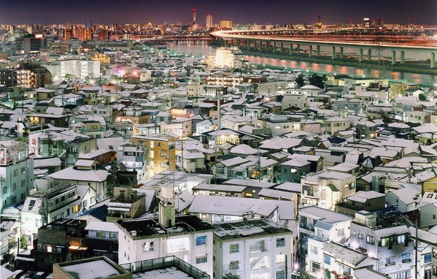
Tokyo Twilight Zone, 2008, Sato Shintaro [4]

In the photograph above, from his series Twilight Zone we have a mix of the light pollution from the city at the horizon with the light from the houses in the foreground.  The combination powerfully shows thousands of people living their lives without a single person being in the image.  The statement of Tokyo confronting the night with lots of its own light is enough to be an interesting subject, but the beauty of the light graduating from cool tones of the foreground to the warmer skyline makes it a photograph to linger on.

A consequence of long exposure that makes Shintaro’s work so powerful is what cannot be seen by the human eye or appreciated by the bran in real time, something I have experienced during night photography shoots.  As I’ve mentioned previously [5], the human eye and brain are continuously adjusting ‘exposure’ so that we have consistency of vision.  Where there is a high dynamic range of light, we often miss the subtlety of the low lit areas of a scene because of the way we process what the eye sees.  In the case of a slow changing scene with very low light dynamic range, we can see things that we would ordinarily miss; consider the mariners who see iridescent algae when at sea when there is little light pollution from other sources.  With long exposures, we can see reflections and subdues shadow tones that our brains tune out in the presence of a dominant light source.  Take the image below for example:

DSC_4294

St Paul’s Cathedral, 2017, by Richard Fletcher

This shot was taken on a rooftop in London on a very stormy night.  When I set the shot up originally I had observed the way St Paul’s was reflected in the water, but I hadn’t spotted the lighting of the cloud above the dome.  By exposing for longer, this effect became more obvious.

London-A-Modern-Project-1995-Rut-Blees-Luxemburg

London – A Modern Project, Rut Blees, 1995

With Rut Blees Luxemburg’s’ famous image used on the cover of The Street’s debut album, we have a similar feel to Shintaro.  This time, the gloomy London sky is punctuated by yellow street and building lights.  What is interesting here is her observation of light that is similar being altered by the people producing it.  The building has a mixture of different curtains and window coverings that alter the intensity and colour, drawing the eye around the subject and revealing textures that would ordinarily be missed.   By using a long exposure, the dynamics of the lives of the people who live there are also captured via the lights from their apartments.  As with Kar-Wai’s film, the general darkness of the frame and the incandescent lighting create the urban effect that appealed to the musicians that used the image.  The image was originally part of the collection London – A Modern Project, 1995 where the theme uses the same lighting ideas throughout.

I think the sculptural quality of the block is what makes the picture work. The lights break up the grid, but at the same time they are little illuminations, which tell us about the people who live there. While the camera shutter was open, people came home and turned their lights on or off. The brightest rooms either had their lights on for the longest, or they had stronger lights. And in some, you can see people watching television. In that sense, the picture is a living sculpture.  – Rut Blees, talking to The Guardian in 2009 [6]

The final photographer mentioned in the course notes was Brassaï, who worked in the early part of the 20th Century.  His work in Paris in the early 1930s observed the way that simple street lighting interacting with the environment and weather to create surreal views of the famous city.  What differs with Brassaï’s work from the others researched here is the more traditional approach of showing people in their environment.  He used high contrast imagery to reveal the contrast of Paris itself, ranging from the glitz and glamour of the Eiffel Tower to the depression of homelessness in the deprived areas of the city.   He worked in black and white film, which was the only practical medium available to him, resulting in a large grain effect under low light conditions, further enhancing the gritty nature of his images.

“The surreal effect of my pictures was nothing more than reality made fantastic through a particular vision. All I wanted to express was reality, for nothing is more surreal” – Brassai, on the publishing of Paris de Nuit, 1933

In his interview with Tony Ray-Jones in 1970, Brassaï discusses the origins of his work which drew on his early days as a painter and were inspired by, among others Georges de la Tour, a 17th Century French painter.  La Tour’s paintings of subjects lit simply by candlelight, were not unlike other painters of the time.  However, like Rembrandt, who was 13 years his junior, La Tour carefully used the single candlelight source to draw the eye to the main subject and let the viewer explore the the areas where highlight descends into shadow.  One can see the influence of the painters in some of Brassaï’s ‘portraiture’ that makes up his collection Paris de Nuit.  An example can be seen below.  The primary light source reveals the vendor and just enough of the setting around him for the viewer to see his profession.  His expression is one of concentration but not awareness of his surroundings or the fact that he is being photographed.   It is also a good example of Brassaï’s honesty in his photographs, where the image retains large areas of dark shadow that many would have considered cropping out. Brassaï believed that photographs should have order and that the composition should represent the subject faithfully, particularly when photographing people [7].

1802-5077.original

Kiosque à Journaux, Paris 1930-32 by Brassaï

Conclusions

This project has led me to re-evaluate artificial light, which until now has mainly been the use of strobes in portraiture.  While I’ve always appreciated how this kind of light affects the subject and its setting, particularly when combined with long exposure techniques, I have yet to explore the quality of the light itself.  Of the creative uses of artificial light examined here, the most interesting to me from an aesthetic point of view is the cinematography on the film “In the Mood for Love”.  Here, seemingly ordinary tungsten lighting creates a beautiful, secretive, but painful mood throughout the film.  It has made me see all sources of light from a different perspective.

References

[1] Bryce-Jones, I, 2015, “Silhouettes, Shadows & Smoke: Lighting in In the Mood for Love”, https://intermittentmechanism.blog/2015/06/10/silhouettes-shadows-smoke-lighting-in-in-the-mood-for-love, accessed June 2019

[2] Unknown Author,  2012 -2019, “In the Mood for Love (2000) Technical Specifications, https://shotonwhat.com/in-the-mood-for-love-2000

[3] Kurt, 2009, “Interview with Sato Shintaro”, http://www.japanexposures.com/2009/08/25/interview-with-shintaro-sato/

[4] Dirk, 2008, “Sato Shintaro – Twilight Zone”, http://www.japanexposures.com/2008/09/24/sato-shintaro-twilight-zone/

[5] Fletcher, R, 2019, “Light Meters” https://wordpress.com/post/richardfletcherphotography.photo.blog/876

[6] Benedictus, L, 2009, “Photographer Rut Blees Luxemburg’s Best Shot”, https://www.theguardian.com/artanddesign/2009/apr/23/rut-blees-luxemburg-best-shot-photography

[7] Ray-Jones, T, 1970, “Tony Ray-Jones Interviews Brassaï, http://www.americansuburbx.com/2011/08/interview-brassai-with-tony-ray-jones.html


Exercise 4.1: Daylight

The Brief

Taking the photography of Mann, Atget or Schmidt or a photographer of your own choosing as a starting point, shoot a number of photographs exploring the quality of natural light.  The exercise should be done in manual mode and the important thing is to observe the light, not just photograph it.  In your learning log and using the descriptions above as a starting point, try to describe the quality of the light in your photographs in own words

My Approach

From my research in Project 1, my inspiration for this exercise is Sally Mann, but not in particular her use of light in her Southern Landscape series, but her more intimate family portraits as her children were growing up.  These images continue to cause controversy in the US because they predominately include nudity, but running throughout is how Mann uses light.  Always shot in black and white, Mann’s photographs have the main subject picked out by soft, but bright light while the rest of the image is subdued by the contrasting shadow.  An example of this can be seen below.

From Family Pictures, by Sally Mann [1]

In this image, we see Mann’s daughter lit by an almost ethereal light while the rest of the frame rolls off into vignette.  Mann puts some of this down to her old large format film camera and its uncoated lens, but the effect is a constant in this body of work.

In my previous landscape photographs, I’ve tried to achieve a similar effect of picking out the subject with a ‘highlight’ against a contrasting background, so my first task was to review what I had done before.   An example from my previous work can be seen below:

Tallybont Reservoir, 2016 by Richard Fletcher

This photograph was made using a 6 stop ND (neutral density) filter to achieve long exposure with the spot metering done from the grey cloud overhead.  The weather was sunshine and cloud so it was a matter of waiting for the light to pick up the tower structure.  Apart from the colour correction needed when using this type of filter (mine has a blue cast), the image has only had some contrast adjustment and a crop.

With this effect in mind, I looked for subjects and conditions to shoot.  Since the images didn’t need to be a collection for this exercise, I took opportunities to shoot whenever I saw a subject under these conditions.

The Images

Leica 100519006

Skate Park, London 2019

DSC_2779

Scooters, Pontevedra 2019

DSC_2780

Waiter, Pontevedra 2019

DSC_2749

Palms, Pontevedra 2019

Review

Skate Park, London 2019 (Kodak Ekachrome 100, shot in a Leica M6, 50mm, 1/60th at f/2.8).

I was hoping to shoot the skaters that gather in this underpass on the embankment in London.  It was a cold day, so I guess they had better things to do.  However, as I looked a the graffiti which has become part of the vibe of this area, I noticed the message at the top of the pillar.   I metered the scene, which was always going to be a challenge using slow slide film like Ektachrome, but was surprised to find the meter reading 1/125th at f/2.8 on the pillar itself.    I decided to lift the exposure on the pillar to make the light more impactful and in an effort to get more detail in the shadowed graffiti in the background.  1 stop more exposure was given in shutter speed.

Scooters, Pontevedra 2019 (ISO100, f=45mm, 1/125th at f/2.8, black and white conversion)

My wife and I were in Spain for her multi-sport competition and visited the beautiful old town area of Pontevedra.  I saw this scene in front of my and my intention was to pick out the sign on the cafe canopy.  For this shot, I metered the shadows rather than the highlights as before.  Adjusting down by 2 stops, I then noticed the boys entering the scene.  They were not highlighted in the same way because of the shadow cast by the building to the left of the frame, but I like the way they are subtly lit.  A happy accident.

Waiter, Pontevedra 2019 (ISO100, f=24, 1/640th at f/2.8, circular polarising filter)

The light was very bright when we entered this square.  Using the polariser to reduce the harshness of the light reflected from the canopies and darken the sky, I decided to shoot wide open at f2/8.  I then metered the shadow under the canopies where I could see the waiter serving.  I reduced the exposure by 1 stop to 1/640th and waited for the waiter to emerge from the shadow.  I like this photograph but believe that I was a split second too eager in taking it.  The waiter is indeed picked out, but the impact could have been higher if I had waited.  I included anyway, because I think it is a good example of reading the light, getting the camera ready and waiting for the action.

Palms, Pontevedra 2019 (ISO100, f=48, 1/25th at f2.8)

Walking along the river in Pontevedra, I spotted the light coming through the branches of the palm trees and casting the pattern on the pavement in front of us.  Not strictly the same approach as before, but in this photograph I metered for the shadow on the floor and lowered by 1 stop to make them dark enough to have impact.  The highlights above the bridge were a little brighter than I wanted, but they are not washed out so I left the exposure as is.

Conclusion

This exercise has been useful in two respects, metering for the light or shadow and placing it within the exposure to suit the intent and taking time to observe the light in the scene.   The former is something I was already familiar with from working with film, but the latter requires more thought.  Moving from shooting a photograph with reliance on one of the semi-automatic modes that all modern cameras have is a daunting prospect.  Moving away from matrix metering brings with it another aspect that most are not used to.  This greater control over how we want to the photograph to look is more akin to the representation of light that painters have been doing for centuries.  The alteration of the light in Skate Park, London for example made the pillar more dramatic.  To someone looking at that scene quickly the contrast between highlight and shadow would probably not be as obvious. I had time to view the light in the scene, so could make a decision as to what the photograph should look like.  When this is achieved, we see how beautifully natural light plays on subjects, folding around surfaces and being reflected and filtered as it reaches our eye.  My images here were not shot at different times of the day, something obvious from the challenges around Waiter.  However, the variation of light is something I have observed in my earlier photography and in the research for Project 1 [2].

My main conclusion from this exercise is that we don’t always have time to shoot manually or to take time to evaluate light, but we should consider how any image should work in natural highlight and shadow.

References

[1] Image source, Sally Mann Selected Works, www.sallymann.com

[2] Part 4, Project 1 – “Layered, complex and mysterious”, https://wordpress.com/post/richardfletcherphotography.photo.blog/898