Look carefully at Erwitt’s image (below) and write some notes about how the subject matter is placed in the frame.
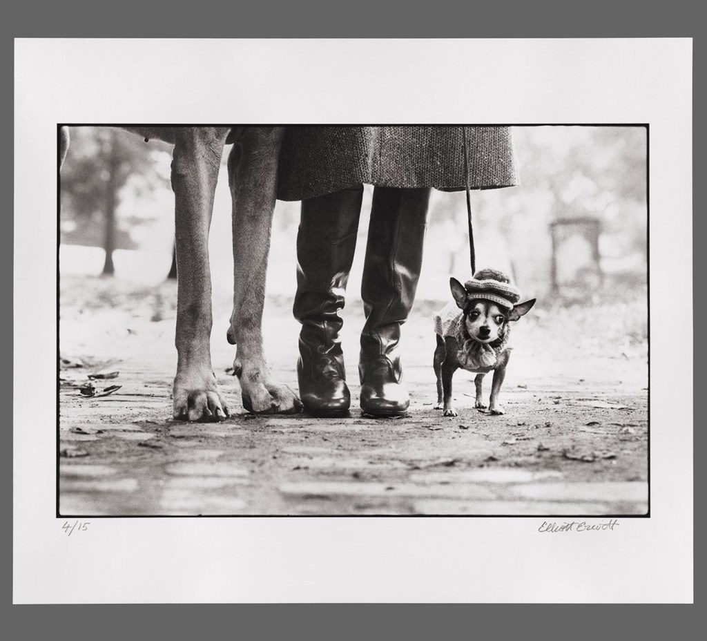
Dog Legs (1974) by Elliott Erwitt from Magnum Photos [1]
How has Erwitt structured the image?
What do you think the image is ‘saying’?
How does the structure contribute to this meaning?
Did you spot that the image is framed in stages of three?
How has Erwitt structured the image?
When I first saw this shot, I immediately noticed the shallow depth of field that throws the background completely out of focus. Erwitt wants attention to be on the three subjects in the foreground of the image. The next structural element that I noticed was the placing of the subjects. The feet sit on the lower third line in the frame and if we were to draw a centre line through the subjects, they sit on the left vertical third, the centre and the right vertical third lines. The obvious difference in scale of the subjects is emphasised by the way the larger pairs of legs extend out of the top of the frame, leaving the small dog as the only ‘complete’ subject. The image looks as though it is severely cropped, which I’ve seen in other pictures of chihuahuas in Elliott’s series – I used them in my blog article about my selection and editing workflow in EYV[2]
2. What do you think the image is saying?
When I look at this image, I see a humorous take on the attitude of small dogs. The obvious scale is emphasised with the owner’s legs, but we we see the humour in the other pair of legs belonging to a huge dog, this initial reaction is questioned. As the notes suggest, this funny combination of subjects could prompt the viewer to move on from the shot. However, for me as a so called ‘dog person’, I want to continue to look at the chihuahua. The little dog has the natural stance for the breed, which has an almost confrontational feel to it, particularly compared to the big dog’s straight-legged gait. The addition of the hat makes the chihuahua almost anthropomorphised, saying ‘here is a small but mighty dog’ with a human-like personality. When I look around the frame I further get the sense that the small dog is being restrained by its owner through the use of a tight leash. The image now makes me think of a commentary about the little guy being held back by the bigger one.
3. How does the structure contribute to this meaning?
The image structure emphasises the small dog and its expression as the only whole subject in the frame. The difference in scale is emphasised by the way the large dog and the owner cannot be seen beyond just their legs. Using the top of the frame as a hard limit for the perspective forces the viewer to continue to look at the lower parts of the frame. Composition ‘rules’ tend to suggest that using the edge of the frame to cut off part of a subject can distract the viewer from the main subject. However, Erwitt uses it to create enough of an impression of what might be outside of the frame without reducing the impact of the main subject. Even the inclusion of a small part of the larger dog’s belly and back leg are not sufficiently distracting, instead making it clear who the second pair of legs belong to.
4. As I mentioned in 1, the composition in threes was one of the first things I noticed about the image. The use of threes (the thirds lines, the three subjects etc) gives the picture balance.
Further questions raised from the analysis of this image were:
Does he like to help the underdog?
Does he prefer dogs to humans?
Is he making a statement about giving everyone a voice?
Or is he just making a joke?
The notes state quite reasonably that we cannot answer the questions from one single image, particularly when it is part of a body of work about dogs. The point about the context of the image as part of the series is naturally what we have been studying throughout Context and Narrative, so it comes as no surprise. My conclusion about the image as described previously tends towards the support of the underdog and the equality of voice raised in the above questions. However, when I look at the other images in the series that conclusion is challenged. For example:
Poodle, Birmingham, England (1991), by Elliott Erwitt – from Magnum Photos [3]
In this shot we see a poodle standing on its hind legs at what looks like a dog show. The pose of the dog and the way it looks at the same unseen subjects that the people around it are, again anthropomorphises the animal. In this image, I don’t create the same underdog narrative as in the previous shot; instead there is humour and beauty and a suggestion that our dogs take on our personalities. Along with every other shot in the series, Erwitt’s affection for dogs is very evident. Humour is a clear contextual element in the photographs, so our interpretations of the images have common themes. The differences come from our own experiences and interests. As the notes suggest, an alternative interpretation of the photograph could revolve around its location, perhaps of more interest to people of the UK than Erwitt’s native US with it having been shot in Birmingham.
Conclusion
This exercise has been interesting from the perspective of how we consume all of the parallel information in a photograph and draw our own interpretation based on our personal interests and experiences. There is a danger of overthinking the meaning behind each and the acceptance that where a viewer takes their narrative is beyond the control of the photographer are both important learning points. One can describe an image in such a factual way as to reveal the contextual elements included by the photographer, but when putting ourselves in the picture and interpreting meaning, the variances can be significant. What isn’t clear to me at this point is how a photograph can be a language for consistent communication. I guess that will become clear as Part 4 progresses.
Cut out some pictures from a newspaper and write your own captions.
How do the words you put next to the image contextualise/re-contextualise it?
How many meanings can you give to the same picture?
Try the same exercise for both anchoring and relaying. Blog about it.
The Pictures
I cut these three photographs out of the The Times newspaper and removed the text that went with them. They were taken from different sections of the newspaper that cover different types of story.
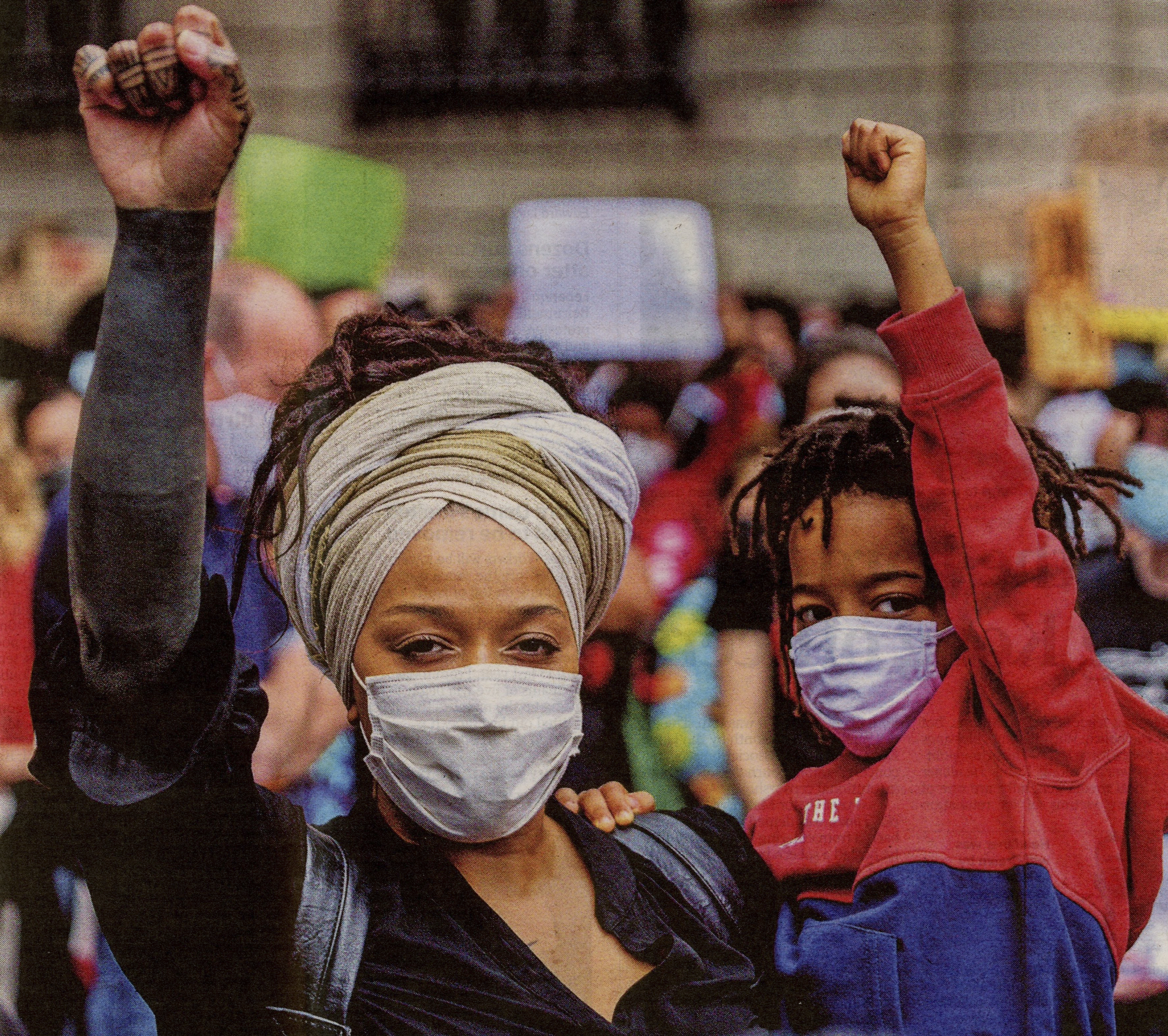
We are brave
I chose this photograph for its powerful imagery but also for the lack of any textual messages within it. I wanted there to be no distractions from the visual messages in the picture, that is the woman and what is assumed to be her child in a classical protest pose. I added the words ‘We are brave’ to contextualise the image as a rally against struggle. The image is actually taken from a recent protest at the senseless killing of George Floyd in the US, which has vastly increased the racial tension across the country. When I consider my caption, it is firstly a much shorter and ambiguous text to accompany a news item. It suggests a brave struggle against something, but not what specifically isn’t made clear. The subjects both appear to be of African descent, but with part of their faces obscured by the medical masks, it is difficult to be sure. The raised arms speak to the Black Power movement of the 1960s, which famously had John Carlos using this gesture at the 1968 Olympics to protest the treatment of black people across the world, in particular in his home country of the United States. The actual photograph caption was:
Hundreds of people lined a rally in Barcelona in support of protests in the United States where activists have called for the abolition of the police departments
Now we have the specific context in the form of an anchor. We now know that this is a rally in solidarity with the US, rather than a protest itself. We know that it is in Barcelona rather than the US and the extra information about the demand to abolish police departments sets the political backdrop to the image. If the viewer has similar or contrary political opinions about the police, the photograph is intended to put only one side of the argument through its anchoring caption. By contrast, my caption could be referring to COVID-19, which is the currently the dominant news story in the world. It finds its way into this photograph because of the medical masks, so this image could have other meanings through my caption. It could be interpreted as a defiance of lockdown rules, families determined to conquer the virus or a show of unity with the rest crowd that can be seen in the background. The general narratives are similar, though, but my caption doesn’t seek to constrain the viewer in the same way as the newspaper.
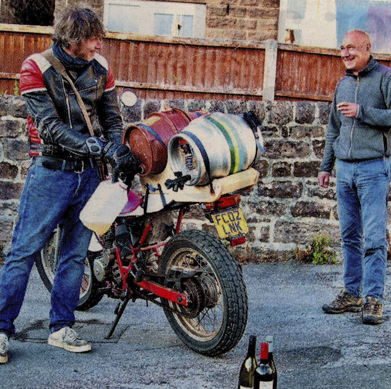
The biker bar that delivers
I chose this image because there is something obvious about it, but without the caption that the newspaper used, it could be interpreted in different ways. For my caption, I wanted to be more descriptive in explaining the scene than in the previous photograph. Here we see a man with a heavily modified motorcycle that holds kegs of beer and he is serving a very happy looking customer. In the foreground there is further evidence of the delivery being made by the biker with the wine adding something different to the beer being poured. This photograph is actually of a landlord who’s novel way of staying in business during COVID-19 is shown in the newspaper as testimony to the resilience of the British people in times of crisis. The original caption was:
Rob Galvin, landlord of The Feather Star in Wirksworth, Derbyshire, serves a happy customer
Now we have lots of information about the picture that we didn’t have before. The caption is similar to mine, in that it is a mobile bar but where there are no real pointers to where the picture was taken added by my caption, now we know that it is a place in Derbyshire. If the viewer knows about Derbyshire, they may know that Wirksworth is a very small market town in the Derbyshire Dales National Park, so this is a service to a remote part of the country. The use of the landlord’s name is almost a tribute to him, where my caption keeps the anonymity of the principle subject.
We can interpret this image in a number of ways ranging from the intended show of inventiveness during COVID-19 to a crackpot inventor’s money-making scheme. What is clear, though is that the messages within the image are positive ones. The expressions of both men and the implied transaction point to this being part of a ‘feel good’ piece.
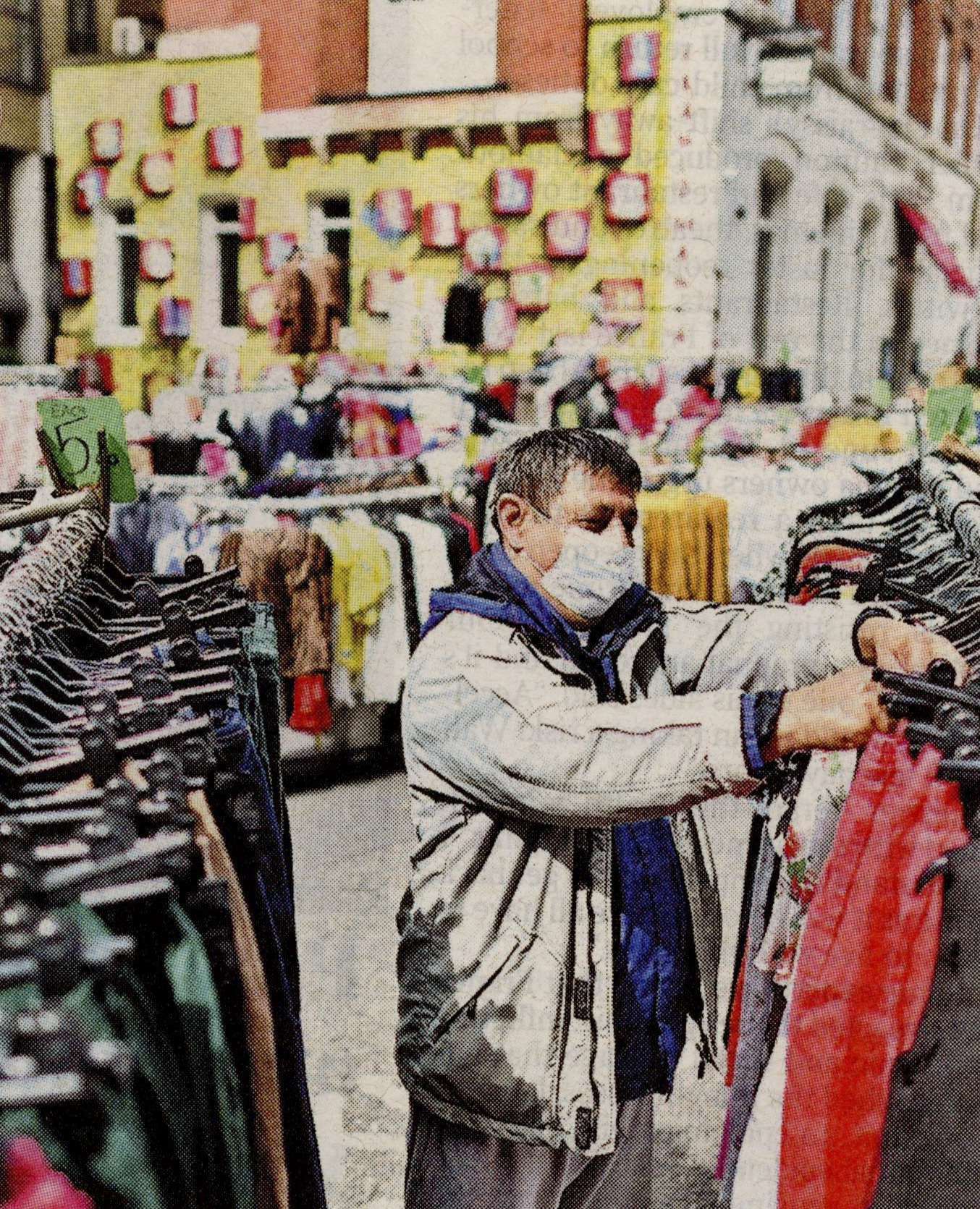
Looking for the right size
This photograph was taken from another story but is aesthetically similar to the previous shot. This time, I wanted to lead the viewer away from the story by adding an unrelated caption. Here we see a man sorting through the clothes on the rack whilst wearing a medical mask. The caption suggests that this is a shopper, although the clothes appear to be very different from what the man is wearing. Perhaps he is shopping for someone else, or perhaps he’s the proprietor. The visual signs are of an outside street market illustrated by the bright light, the building exterior and the price tag on the rack that has the appearance of being handmade as opposed to a professional ticket. The inclusion of the face mask points to the story of the moment, COVID-19. The recent announcement that some business can reopen with protective measures in place. The caption that accompanied this photograph was:
A seller takes stock at Petticoat Lane market in London
Now we have confirmation that the man is the seller of the clothing and we know his location. My interpretation of the image now shifts away from buyer to someone trying to overcome the effect of COVID-19 on his business. The inclusion of the location could almost be and advertisement for the market or simply an indication of the vulnerability of open-air markets in a normally bustling city such as London.
Research Task: Relay
We’ve had the concept of relay introduced through the writings of Barthes, but this task is to explore it further using examples in contemporary photography.
Sophie Calle – ‘Take Care of Yourself’
Calle’s work begins with a letter from her boyfriend informing her that their relationship was over. This letter, which has been translated from her native French into English, is to begin with an anchor that directs the reader to a state of confused, negative emotions. The sender begins with his own self-pity, explaining to Calle that he’s throughout his recent malaise, he has acted honourably. The references to ‘the others’ suggests that he had more relationships than just Calle’s during their time together. His noble gestures of not having seen them, but instead to do the right thing by her are interpreted by me as a warm up to blaming her for the break-up. The letter goes on to suggest that Calle had precluded any notion of them remaining friends which effectively made the break up and the need for the formality of writing, her fault.
Little wonder then, that the letter left Calle in a state of shock. Her reaction, that she states was an idea that came within days of receiving the email [1], was to create an artwork that addressed the sender through the eyes of women. She asked 107 women to read the letter and respond in some way, which Calle captured using mixed media. The reactions ranged from the letter being reimagined as a crossword puzzle to the more extreme shooting of a copy by a professional sports markswoman. Each woman brought their own perspective through the context of their professional lives as well as their emotional response to the words. The result is a curation of many cultural narratives, with no guidance through them by the artist with the exception the initial text of the letter itself. The viewer joins the narratives together by bringing their own feelings toward the events and the players. As the subject matter is something we all encounter at some point in our lives, the effect of parallel experiences further enhance the meaning of the works. For me, it aligns with the post-modern narrative that Barthes was referring to in Death of the Author. On the surface, it appears as lazy, almost getting other people to create the piece for her. However, the use of the mixed media to draw attention to and enhance the reactions of her women, make it an impressive piece of work.
Sophy Rickett- Objects in the Field (2012)
Rickett’s work is different but similar to Calle’s. Here we have an artist telling the story of her encounter with a renowned astrophysicist and the way she purloined his photographic documents of celestial bodies for her art. The project seeks to explore the relationship between what is created and what is appropriated [2], namely Rickett’s use of Dr Wilstrop’s old negatives to create her story. The collection is brought together by a written essay that walks the viewer through Rickett’s relationship with Wilstrop. For me, perhaps the most compelling use of media to support Rickett’s work is her video [3]. The video is a loop of Wilstrop polishing the optics for the telescope that he pioneered in a small workshop at his observatory. The audio track that is dubbed over the video is of Wilstrop reading Rickett’s essay account of their meeting and subsequent ‘collaboration’. When we are first presented with the video, it is difficult to understand how the words align with what we are seeing. As it becomes clearer, the impact of Wilstrop speaking the artist’s words is evident. His belief that his negatives taken through his telescope had no intrinsic value outside of his scientific field is contradicted by what he is saying. At no point does the video show his images or how Rickett worked them through her own use of photographic process, but it does in its own right offer a big contextual point to the narrative. Like Calle, this additional information in video and text doesn’t support the image series but works equally to tell the story. In the case of Rickett, her decision to use someone else’s photographs rather than her own may appear controversial, but the piece is as original as the previous examples of non-sequential story telling we have encountered so far.
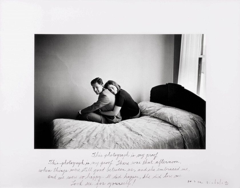
Duane Michals – This photograph is my proof (1974)
This image is a further example of how the additional information can have an equal standing to the image, but in this case the wider interpretation of the photograph leads us to something almost unrelated to the subject.
‘This photograph is my proof (1974)’, by Duane Michals [4]
Michals presents us with a photograph of a couple in embrace, sat on bed and obviously posing for the camera. This then is a self-portrait similar to the sort that we see everywhere with the advent of ‘the selfie’. There is clear affection in the way the couple are connected in the image, but the accompanying text seeks to steer us to a situation; the affection that was once there but no longer. In this sense, the text has a feeling of ‘anchor’ about it; directing the viewer to a certain conclusion. However, the text also offers something more broad than the instant conclusion that we may have already reached:
“This photograph is my proof. There was that afternoon, when things were still good between us, and she embraced me, and we were so happy. It did happen, she did love me. Look and see for yourself.”
The text starts with a suggestion of dishonesty. The photograph is ‘my’ proof, as if it has been suggested that the claim was false. It then proceeds to describe a point in time when things were good between the couple, clearly not the current situation. The relationship could have ended for a number of reasons, but I naturally find myself assuming an acrimonious split. The element of disbelief continues with the claim that it was real; it DID happen. The last sentence invites the viewer to see for themselves. This is perhaps the most interesting element of the text, because it now asserts that the photograph must be telling the truth. We already know that the truth of an image is entirely subjective as opposed to objective, so what the photographer is saying here is that this proof cannot be challenged by the viewer. It could almost be seen as the evidence in a court case, perhaps even a divorce proceeding. What I see when I put the image and the text together is someone daring me to disagree. As the photograph was taken in 1967, the additional context of the time that has passed suggests to me that perhaps this is a take on ambivalence in a relationship, a taking for granted of the people we love. Perhaps this is supposed to be a warning to me and my generation that love is something that evolves in a way that we don’t necessarily expect, the longer we have it in our lives. I guess that depending on our own life experiences, each viewer is going to be inclined to either agree or disagree with Michals’ version of events.
In a similar vein, I was drawn to the other work in the course notes but Sharon Boothroyd. The series Disrupted Vision tells a story of clashing perspectives through a series of instant photographs. Boothroyd asks her subjects for their perspective on the picture that she has just shot of them, which in itself is a major advantage of using instant film. The immediate reaction of the subject is more often than not contrary to the intentions of the photographer. There were three images from that series that I wanted to discuss here. Unfortunately, I am unable to find the series on Boothroyd’s website (or anywhere else online) to include here.
The first is of a man standing in front of a fairground stall, holding his bag of chips. His reaction, written a on the bottom of the photograph is his commentary on his appearance rather than anything to do with the setting of the photograph. It’s undoubtedly not what Boothroyd had in mind with the selection of subject, background and his relaxed pose for the portrait. However, like the other examples of Relay, the inclusion of the text gives alternative meaning to the image. The subject has a voice with regard to his appearance in the shot that he agreed to and we are going to hear it.
The second image is of a man standing in front of a leafy background, holding some flowers. Again, the pose is simple enough and again the subject offers their opinion on the image but this time its about how to improve the picture. His reaction that it would have been better without his coat suggests that there was something more interesting in his clothing underneath or that the picture is fairly dark already; his coat doesn’t really contrast with the scene. The viewer can decide for themselves whether they agree with the sentiment which leaves plenty of ‘space’ for the narrative to be created.
The final image is of a man seated on a park bench. This time, the text is a very pointed question of the artist’s photographic skills and knowledge. His reaction is potentially based in some knowledge of the medium and rather than being a passive voice in the final result, is vocal is what appears to be disagreement. When the text is used with the picture, instead of a clash of meanings we have something that is almost in agreement. The subject’s expression is uncomfortable, his agreement to be photographed looks like it was more of an inconvenience than the other two shots and the whole demeanour of the image lends itself nicely to the text. The ironic inclusion of the criticism of the lack of the use of the rule of thirds is contrasted with the use of a Polaroid camera, which in itself is more artistic than of technical photography.
Conclusion
This exercise has been very interesting. We have the contrasting use of additional media that supports or contrasts with the seemingly obvious interpretations. We have the very specific Anchor text that leads us straight to the predetermined meaning, such as the traditional addition of photographs to written journalism. We then have the interesting takes on how media can be used and where it can be sourced from. I liked the way that Rickett had the subject of her work read her description of their encounter and subsequent collaboration over footage of him at work. That video highlighted the difference in their perspectives on his scientific work, while showing her clear respect of his achievements. The series of reproduced photographs are uplifted from their original context to be part of Rickett’s narrative. It’s a fascinating piece of work. I also loved the way that Boothroyd included the perspectives of her subjects to challenge the obvious imagery in her Polaroid photographs. I’m reminded of the reactions of some people to my use of film in my photography, which on occaision poses the question “why would you use that? It’s not as ‘good’ as digital”. The ‘goodness’ being referred to is their perspective on what makes a good photograph rather than what the artistic message may be. Boothroyd’s subject who challenges her for not following the rule of thirds is a powerful statement on photographer vs. subject vs. viewer and it’s my favourite of the series.
Use digital software such as Photoshop to create a composite that visually appears to be a documentary photograph but which could never actually be.
My idea
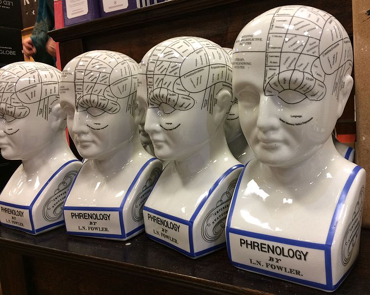
For my composite, I wanted to play with the idea of the human head as a real part of the body and as seen my the medical profession. This idea actually came about because I remembered someone visiting my house once and remarking that they didn’t like the phrenology head I had on my shelf. Phrenology heads were part of a popular pseudoscience in the 18th Century that identified the physical shape of regions of the head with corresponding psychology. By dividing up the regions around the skull into different physiological or behavioural attributes, phrenology could map the shape of the skull and conclude information about the patient. Phrenology heads were porcelain busts with the regions labelled on the surface as shown in the photograph below.
Phrenology Heads [1]
It was a head similar to these that my wife and I picked up in a junk shop shortly after we got married and while I like it, clearly others do not. Using these heads involved taking measurements and comparing the regions on the bust in order to make a ‘medical’ judgement. My first thought was to create a portrait of me with part of my face removed in Photoshop to reveal the map on the phrenology head beneath it.
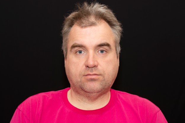
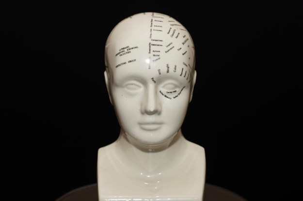
I started by shooting two portraits in a carefully set up studio environment. The first was a portrait of me and the second was of the bust positioned at exactly the same point in space as my head was. I wanted to make the blending of the two photographs as seamless as possible, so everything including position, angle of incidence and lighting was maintained between the portraits. The two images can be seen below:
I imported these into Photoshop
My Image
My early attempts to overlay and reveal the phrenology head beneath my skin failed dismally. As I said, I’m not really a Photoshop guy and struggled to make the image look anything other than obviously fake. I wanted this image to challenge the viewer perspective rather than be understood at a glance, so I instead decided to try to combine them. I first converted both to black and white and incorporated them both in one project as layers. My first job was to try to align the features of the smaller phrenology head with my own features. I did this by overlaying my image onto the bust and reducing the opacity of the portrait to around 25%. This meant that I could see the bust beneath my image. By using the skew and distort transform functions, I was able to align them pretty well using the eyes and mouth as anchor points. Next, I used a fill layer to provide a base layer background. This would be used to erase any unwanted features in the finished image and ensure that the dark areas of both frames were actually black. The next step was to overlay the images. I used the pin light overlay on the portrait which forced the two images together. After some tweaking to reintroduce some of my hair and some raising to shape just the head and remove the shoulders, the image was complete.
The Phrenology Man
Review
This photograph turned out better than I could have expected. When looking at it for the first time, it looks like a human face but something is already wrong before we read the inscriptions. The completion has stubble but is also glass-like. The nose looks natural but has a misshapen porcelain shape to it. The eyes are real but with catchlights that make them also look glass-like. For me, the face is a document that is only very slightly real and when we see the written inscriptions we wonder how the shape of the face actually relates to the words.
References
[1] Waters, J, ‘Phrenology Head Bust’, Wikipedia Commons
Before looking at the effect of citizen journalism in terms of ‘the story’, consider the meaning of the word objectivity. It is given in the Oxford English Dictionary as: the fact of not being influenced by personal feelings or opinions but considering only facts. That is, the whole impartial truth and nothing but the truth. It’s a concept that were all familiar with but that is challenged by the very existence of 24hr news and those who report it. If our understanding of the news is influenced in any way by how we relate to the subject, how we react to the source of the information or how our loved ones see it, then we cannot claim to be objective. However, given that a photograph is a moment captured by the camera, surely it stands a good chance of being an objective report of that moment.
Examples of Citizen Journalism
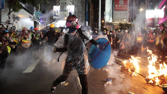
The first example of citizen journalism that came to mind was the 2019 protests in Hong Kong against the planned bill to introduce fugitive deportations to countries where there was no existing agreements to that effect. The biggest single cause of the protests was that deportations to mainland China would be included in the new legislation which many saw as a potential major impact to the human and civil rights of Hong Kong’s nationals. People took to the streets in protest of the Hong Kong legislature and indirectly, the Chinese government. The protests were captured and widely circulated via both mainstream and social media. An image from the protest can be seen below.
Image of a Hong Kong Protestor [1]
Here we see a protestor dressed in what looks like a makeshift hazard suit with respirator and a shield. They are about to throw a grenade of some sort towards an unseen attacker outside the right hand side of the frame, separated from the scene by a number of fires.
This image was supplied to the Financial Times by the Associated Press and used in an article describing the protestors having blockaded the city’s airport.
In Support of Objectivity
When we look at this image, it is clearly of an intense protest with a line drawn between the protestors and an unseen party. The presence of the cannister still releasing tear gas and the protestor’s clothing supports the story of the police reacting heavy handedly to the blockade. The fire supports the idea in the piece that the protests have escalated to a dangerous level. The image isn’t staged or posed in any way and for me, the photographer having been able to isolate the protestor from the crowd seems more luck than judgement. This all points to it being an image based entirely in objective fact, then?
The Counter Argument
If we look at the image again, we can see some elements that don’t lend themselves to objectivity. The first is the absence of the supposed aggressors, the police. The image only includes the line between the two sides, so it isn’t completely clear which side is the provocateur in this exchange. The fact that there is only one protestor appearing to be throwing objects at this point could suggest alternative story where a cannister is being thrown back at the police. Although makeshift protective clothing suggests being prepared for violence and chemical attack, it could just as easily be that past skirmishes have been that way, that the protection was for defence rather than attack. The final element is that the image is clearly taken from a protest that wasn’t the main point of the FT’s story, which was about the airport blockade. The article mentions that the protest follows riots in the financial district, so presumably this is where this image was taken.
In conclusion about this image, the objectivity is certainly questionable because of what is missing from the frame, e.g the opposing side, and the ambiguity of the actions being taken by the main subject. Images like these that are taken by roving photographers (another can be seen to the left of the frame) are part of a larger set and in many cases, are adjusted in composition through cropping to emphasise the points they are trying to make. If we had another image of this protestor from a different perspective or wider angle, the message could have been very different.
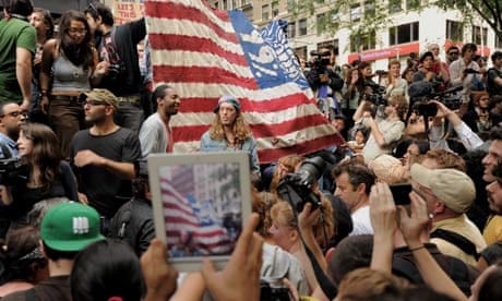
The image below was a frame-grab from video stream at the Occupy Wall Street demonstrations
Occupy Wall Street Demonstration [2]
Here we see the largely peaceful protest against the imbalance of wealth in the United States, conducted in the heart of its Stock Exchange. The image of the flag with its reference to the 99%, that is the people who don’t have the majority of the country’s wealth is a powerful one. The crowd ‘recording’ the demonstration points to the level of support for the protest, while the image seen through the screen of the tablet computer makes it clear that this is a modern crisis. This example differs slightly from the first in that the image is a still frame from a piece of video. The newspaper that used it had the choice of which frame to choose and then how to subsequently crop it, but is the fact that it is from video make it any more objective? This image came from an article in The Guardian [] that discussed Citizen Journalism and how it has folded into conventional reportage. The piece talks about the use of large quantities of footage shot on the ground in crisis or war zones where conventional journalism is unable to fully reach. The filmmakers who use these images to reinforce the impact of the events have to go to great lengths to validate them. Digital technology lends itself to being manipulated or faked on a much larger scale than film media, so the filmmaker must contend with the potential for another agenda to unintentionally influence their own.
In the case of the protest photograph above, different angles, lengths of clips and instances shot will potentially tell a different story depending on how they are stitched together. For example, the more the footage is affected by the jostling of the crowd could suggest something about the mood or size of the crowd without anything being different from the position this shot was taken from. How can photography be objective when these subtle factors are always at play?
Conclusion
Citizen Journalism is for me modern blessing and a curse. As a consumer, I find it harder and harder to take an objective view of what I see and read in the media, which leads me to increase the number of sources of news that I access. The photographic imagery is often the first thing we see in a news article, so how that image is selected and ‘processed’ steers us in the direction of the story that is being told. What first appears to be a simple document of the event, contains nuances introduced by filmmaker and public alike, sometimes at odds with each other within the same piece.
References
[1]Wong, et al, 2019, ‘ Hong Kong Protestors Blockade City’s Airport, The Financial Times ihttps://www.ft.com/content/84dd7e32-cbe5-11e9-99a4-b5ded7a7fe3f (subscription now needed)
[2] Bulkley, K, 2012, ‘The Rise of Citizen Journalism, The Guardian, https://www.theguardian.com/media/2012/jun/11/rise-of-citizen-journalism
Write a short paragraph or around 5 bullet points identifying what you want and what you might need from this course unit.
What I want and need from this course
To further my understanding of how the elements of a photograph create a meaning or affect the viewer’s perception
To improve my creativity so that I move further away from my technical comfort zone.
Ultimate ambition is to teach photography, so there is a general desire to broaden my view of it as an art form.
To reduce the amount of procrastination I encountered in EYV. I want to pick up the pace, so need to try things out quickly to validate my ideas.
To do more non-course research. I didn’t write up my experiences in my photography outside of EYV, which I intend to do more of in this unit.
Exercise 2) Setting up your learning log
I have a learning log that I intend to use for C&N. However, as it forms part of my EYV submission, I want to wait until the assessment is complete in March before using it (to avoid any potential perceptions that I have modified that work. For now, I will use word documents that are saved in the OCA cloud and will transfer them across to the blog at the end of March.
Exercise 3) Analysing and Reflecting
Choose one of the names from the list of creative practitioners given:
Elina Brotherus
Gideon Mendel
Hannah Starkey
Nigel Shafran
Choose one of their images and write about the elements in the image. Then write a short piece about how I relate to the image. Create a blog post for it.
Introduction
The image I selected is from Gideon Mendel’s series called Submerged Portraits.
Description
It shows a woman dressed in water waders, waist deep in flood water in her hallway. She is looking straight at the camera with a bewildered and angry expression while the rest of the scene has everyday items you’d expect in a British home. The calm water is almost glass.
What this image means to me
I relate to it firstly because of the topical subject of flooding, but secondly because to the contradictions within. The glass-like water looks harmless but suggests complete devastation of the woman’s home. Her expression is one of anger and “why me?” but distress is balanced by her being prepared for standing there.