Category Archives: Exercises

2) Exercise 2: ​Covert

Approach this exercise with care and a diligent awareness of health and safety both for yourself and others.

Closely consider the work of the practitioners discussed above, then try to shoot a series of five portraits of subjects who are unaware of the fact they are being photographed. As you’ve seen, there are many ways in which you can go about this, but we can’t stress enough that the objective here is not to offend your subjects or deliberately invade anyone’s privacy. If you don’t have permission to shoot in a privately-owned space, then you should only attempt this work in a public space, where permission to shoot is not necessarily required.

This is a very interesting challenge, which some students will find incredibly difficult. Remember that the creative outcome of the practitioners discussed above has come about through a sustained approach, which is then heavily edited for presentation. You’ll need to shoot many images in order to be able to present five final images that work together as a set.

Think everything through carefully before attempting this exercise as the responsibility for the outcome of the portraits rests entirely with you. If during the course of this exercise you are challenged in any way, be prepared to delete what you have shot. If you can see that you are annoying someone, or making them feel uncomfortable, stop shooting immediately. You’ll be required to operate with a degree of common sense here and not take unnecessary risks. There are ways of completing this exercise without incurring risk, such as shooting the work at a party you’ve been invited to, where all the guests have been invited for a particular celebration.

The reflection about your methodology (your approach to how you have achieved the images in relation to why you chose what you have chosen), will be as important as the final five images, so be prepared to write about how you found the experience (around 500 words) and present your findings via your learning log or blog.

Introduction

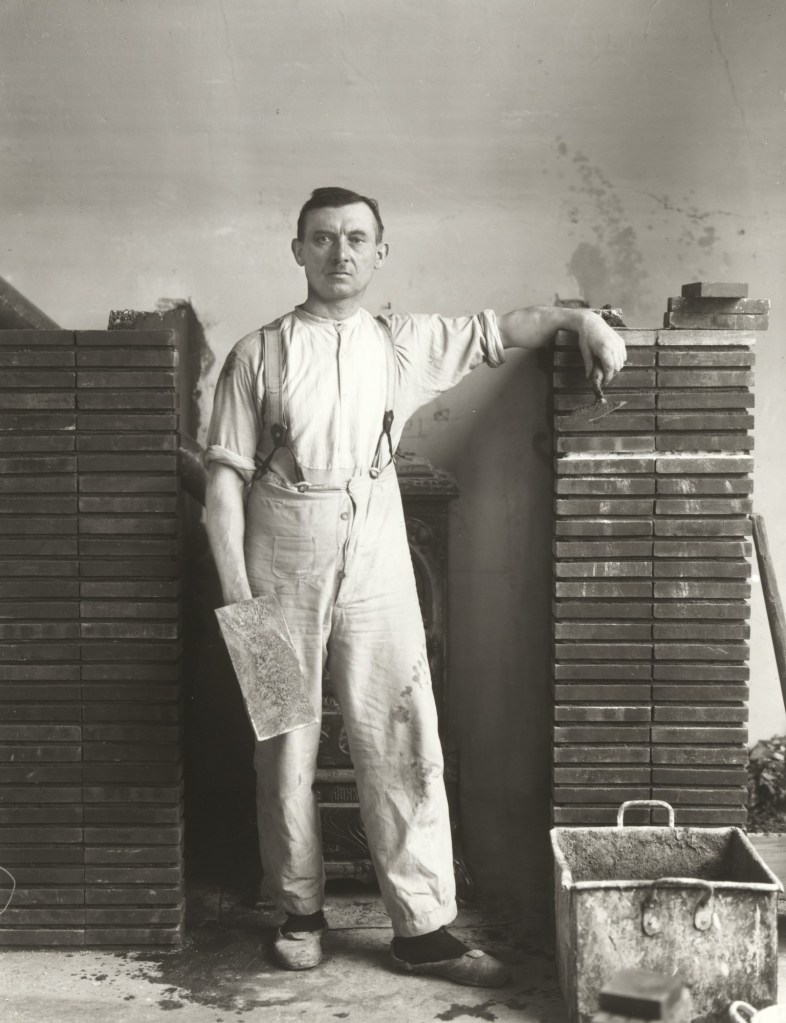
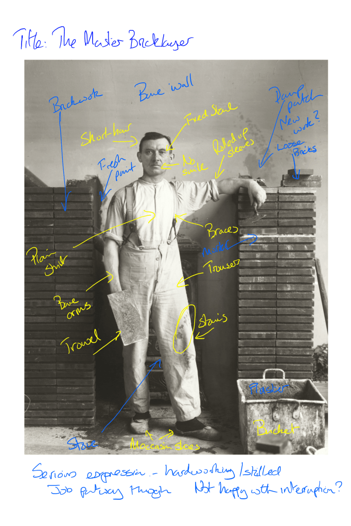
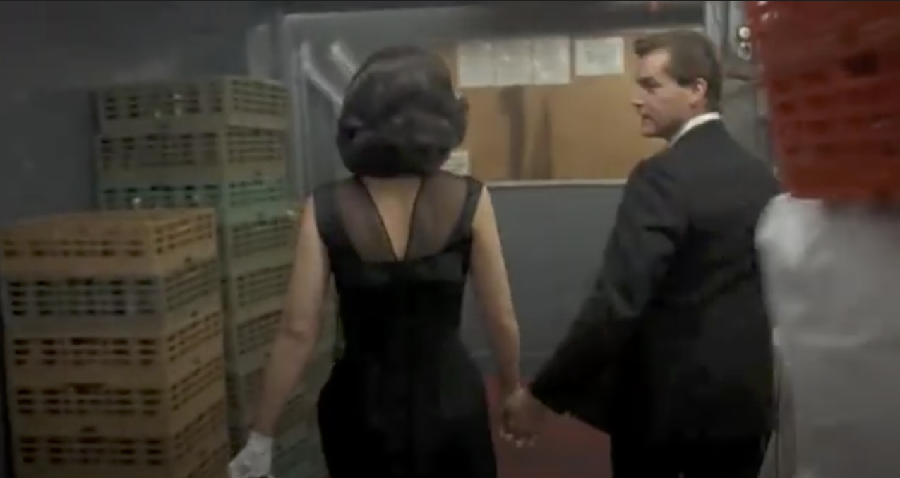
I started thinking about this exercise shortly after researching Walker Evans’ series Subways. His work was pioneering in capturing people off guard, but for me the way that it really works is the fact that they are completely unaware of the photographer working. What sets him out from the other practitioners in Part 2 is this stealthy approach. With Parr’s similar series, I suspect that his subjects were not entirely unaware they were being photographed in some cases. As discussed in Project 1 [1], I base this suspicion on the way that Parr shoots, close-up with flash. If the subjects were asleep, they would not be aware, but they could similarly be defensively trying to hide their faces. Japanese culture is one of deferential privacy, particularly on public transport which led me to conclude that some would just be hiding their gaze from Parr. diCorcia’s Heads series has the aesthetic of people being caught unaware through his use of a camera trap. However, diCorcia freely admits that he made himself visible throughout shooting and that people could see what he was doing[2]. They were certainly aware of being photographed as soon as the flash went off. With Tom Wood’s series Looking for Love, again the subjects were aware of his prescence but had gotten so used to him that he effectively became invisible. When Meyerowitz walked the streets of New York with his Leica, he shot people from very close up and in their sightline. Meyerowitz stated that people just didn’t believe that he was interested in them [3]. For me, the only practitioner that achieved complete anonymity was Evans, although people clearly found his attention to be suspicious – they weren’t aware of what he was actually doing.

For this exercise, I was inspired by Evans’ hidden camera. Instead of looking at people, I decided to shoot people who were behind me and outside of my sightline. I wanted to capture people moving behind me, queueing for something or just going about their business completely unaware of my presence. For me, this would be shooting the very unaware, with the added complexity of my also being unaware of the exact composition as the pictures were being made.

The Setup

I thought about which camera to use from my collection and actually determined that my phone would be most suited because of its high resolution, wide angle lens and silent shutter. It also had a sophisticated automatic focus and exposure system that would avoid the need to pre-setting as Evans had do in the 1930s. The phone also had a remote shutter release in the form of its cable headphones, which meant that I could very discreetly take the picture through the seemingly unconnected gesture of adjusting the volume control. The next consideration was how to get the camera to face backwards, which I solved by installing my phone in a modified backpack. Although tricky to fabricate, I managed to get an aperture that the phone camera could view though and disguised in a way that it was hidden from my subjects. The completed rig is shown below:

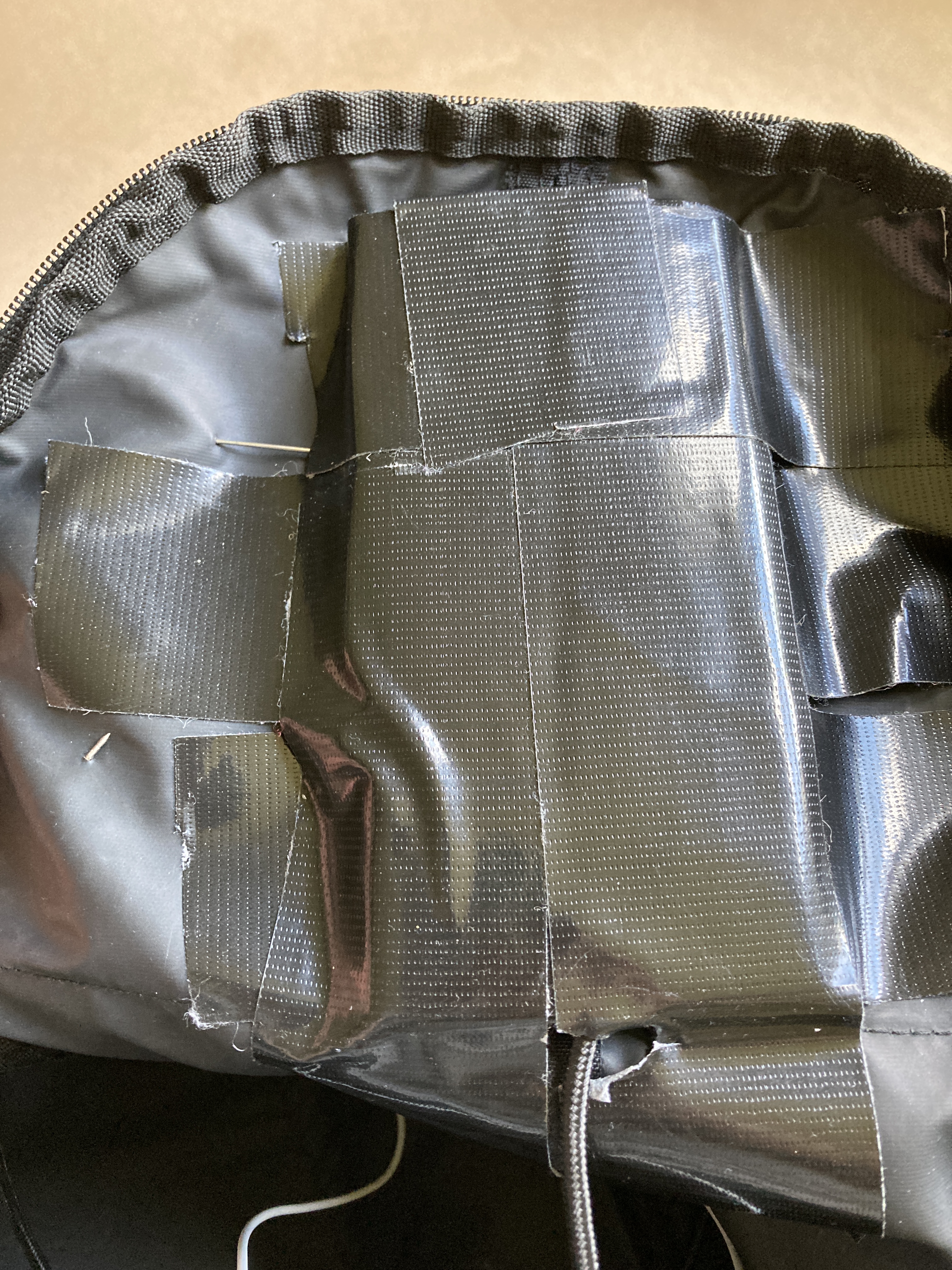
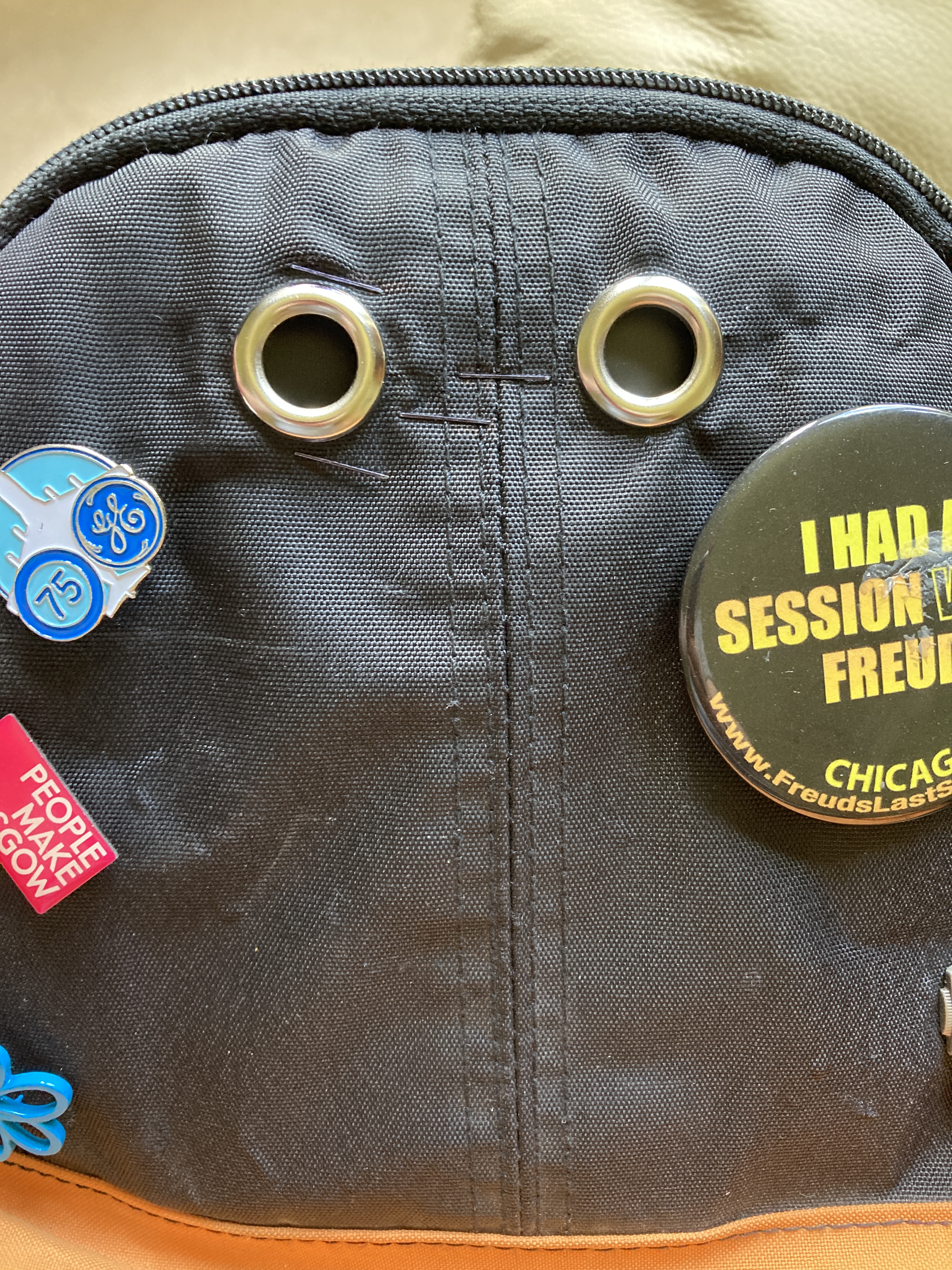
The images show the makeshift phone holder, remote extension cable for the headphones to connect to and the apertures at the back of the backpack. The left hand aperture was aligned with the camera and the right hand one was a dummy. The badges were added to distract from the apertures themselves.

The rig was challenging to use because of the fact that I could position myself in what felt right relative to the subject but there was always the risk of it being completely off in terms of composition. Even if I was aligned properly, the angle of the backpack to the subject made for some interesting horizons. I also had problems with the phone itself – the cable kept coming out of the socket on the bottom, which meant that I missed many shots that I thought had worked.

The Images

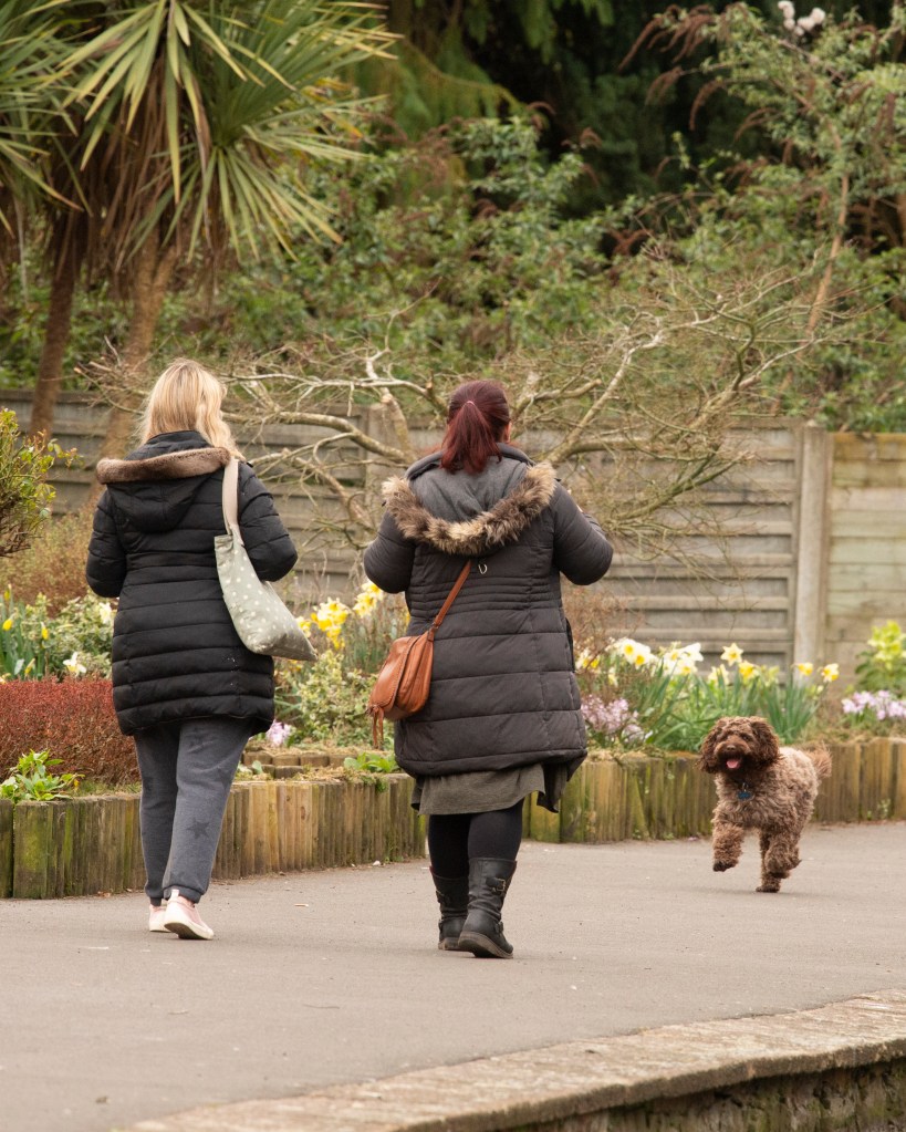
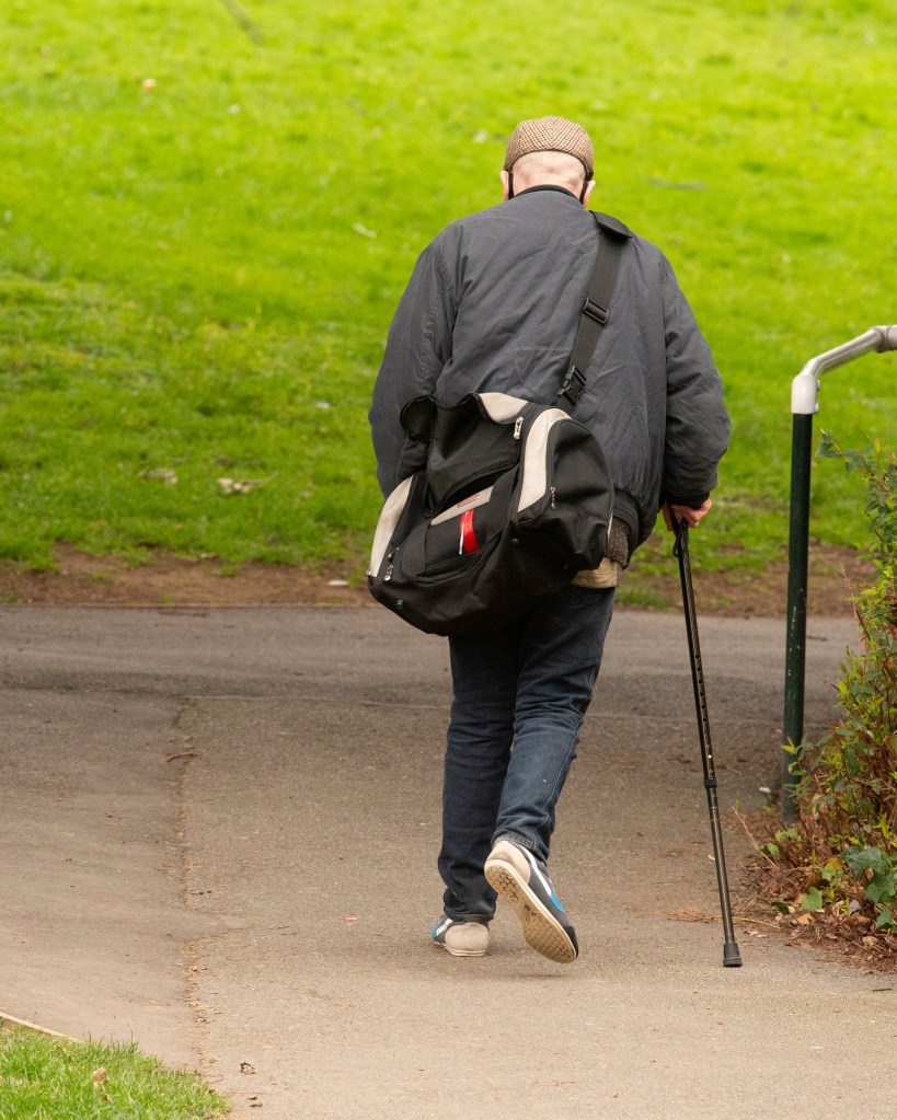
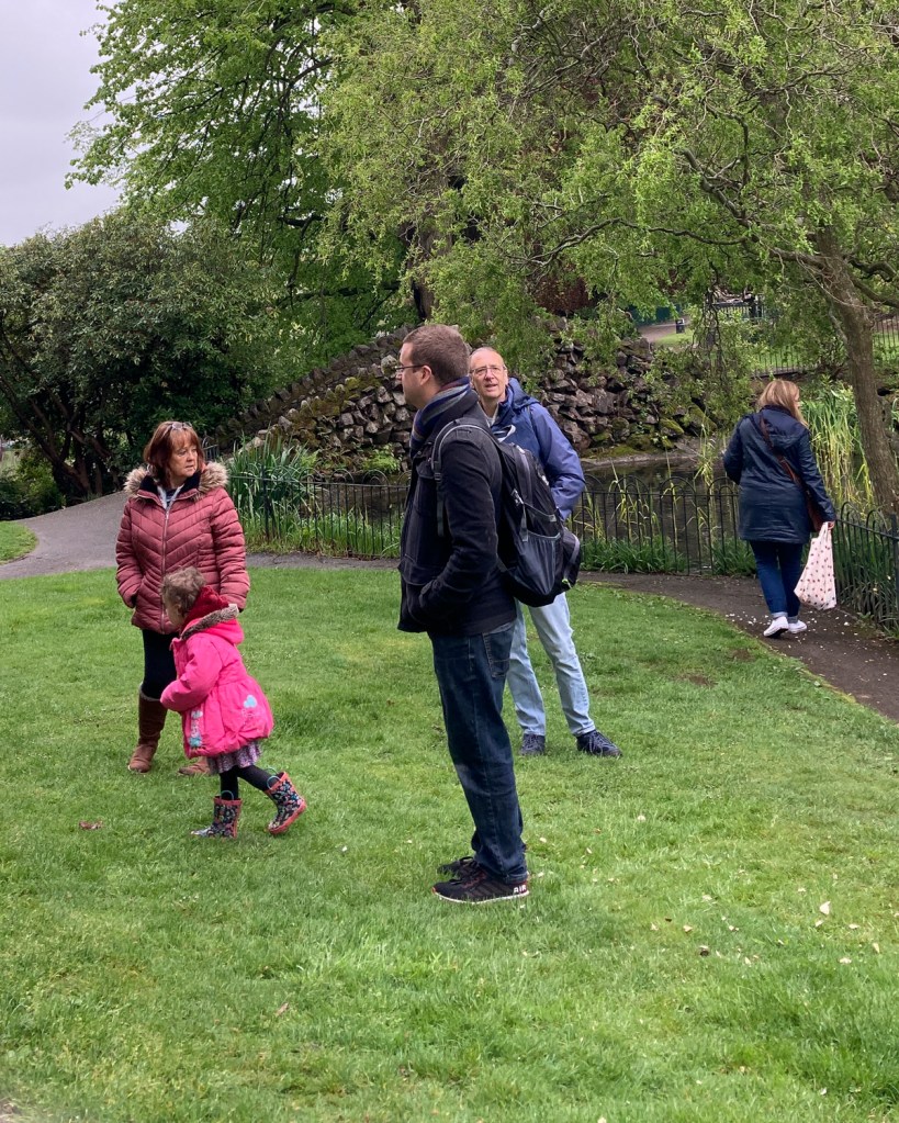
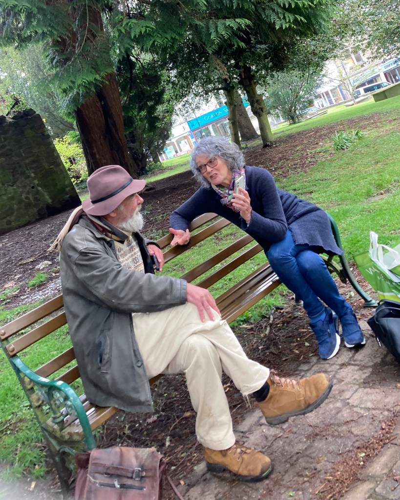
When I reviewed the images that I did get, I was interested to observe how people interact with their environment and each other when they are not obviously observed. To add to my deception, I carried one of my old film cameras (without any film) so that I could pretend to be photographing in the opposite direction to the backpack. In shot One, one of the subjects can be seen looking in my direction – I assume it was the sight of the old camera that drew his attention. It was this sneaky look, coupled with my own subterfuge that led me to make the series about being ‘going unnoticed’

One
Two
Three
Four
Five

Reflection

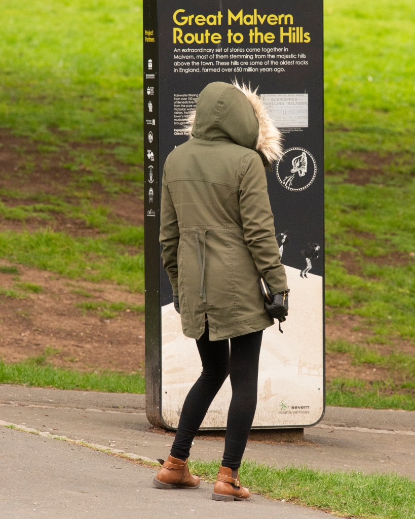
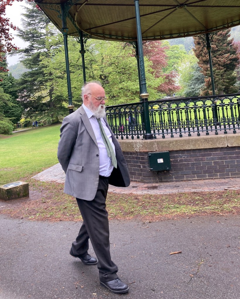
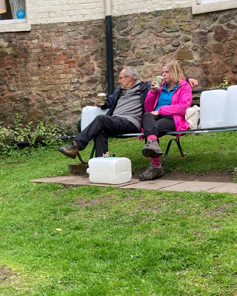
In this series, we have a mix of subjects with some single, some couples and a group shot. One each photograph, the subjects are going about their lives completely naturally without any idea that they are being photographed. To that extent, I think the photographs work in terms of The Unaware. As a series, the only anchor is the fact that they are all shot outside in my home town. Unlike Evans’ different subjects in a common environment, my series uses this anchor as well as the fact that they are all unobserved. With Evans’ series, the viewer is challenged to question what the subjects are talking or thinking about. In my series, the questions are more broad, e.g. in Two, the gentleman appears to be strolling through he park with a thoughtful expression on his face, where in Three there is a lively conversation taking place. What is the lone man thinking about as he walks and what are the two people talking about that creates such a lively expression through their gestures? I showed the series to a friend of mine when complete and he immediately pointed out that “he’d seen that person or those people before”. When I reflect on the series, I too see people that I recognise, not because I know them, but because of how familiar their activities are. The family walking through the park is typical of most families I encounter when I spend time there, often with 3 generations out enjoying each other’s company. The climate protestor is a regular sight in town as she sits motionless and disengaged from the people around her. Her demeanour clearly shows her determination to speak for the planet, not its people. Most of Malvern’s residents just walk past her and at first, I wanted to represent her apparent invisibility. However, where she now sits makes it easy to completely avoid walking past her, so there were no opportunities to capture this. Instead, we are left with the idea that she is a lone voice that nobody is seemingly paying attention to. The couple surrounded by plastic containers are part of a familiar group who drink the spring water from the well at the centre of town. As a Spa town, the consuming of the waters has been a fixture for over a century. These people are clearly taking it seriously judging by the number of containers. I loved the irony of their drinking takeaway coffee in preparation for collecting their water.

Overall, I am glad that I took the decision to try something similar to Evans but with that unseeing perspective. It had the same ‘hit or miss’ element to Evans in that I couldn’t guarantee what would be in the frame, but because I wasn’t actually watching my subject I feel there is a complete detachment between us. Yet, the impression that I have of the people of my town is reflected in the images when collected as a series. The main challenges with the exercise were technical, but I guess also my reluctance to put myself in a difficult position also drove me down this path. No doubt I could have shot better photographs technically with one of my proper cameras, but I am pleased with how the mobile phone performed here.

References

[1] Fletcher R, 2021, “2) Project 1 – The Unaware”, OCA Blog Post, https://richardfletcherphotography.photo.blog/2021/05/24/2-project-1-the-unaware/

[2] CIACART, 2018, “Interview. Philip-lorca diCorcia”, Youtube, https://www.youtube.com/watch?v=67U-0_wExLA

[3] BBC, 2007, “The Genius of Photography”, Television Documentary, BBC

2) Exercise 1: ​Individual spaces

The Brief

In this exercise, you’ll build on your ‘Background as context’ exercise in Part One by taking the relationship between your subject and their surroundings a step further. The objective here is to try to create a link between the two components of your image, i.e. the subject and their surroundings.Make three different portraits using three different subjects. Prior to shooting your portraits, engage with your subjects and agree three different specific locations which have some relevance or significance to them individually. You’ve already tried to give a particular context to a portrait by considering how the background might link to the subject positioned in the foreground, but now you must go one step further and negotiate a specific physical location where you’ll photograph your subject. This can either be inside or on location, but the key to this portrait is the interaction you’ve had with your subject in identifying a place that has specific meaning for them.

Each portrait should be accompanied by a very short piece of text explaining the choice of location or venue. Don’t be tempted to create a work of complete fiction here; it might make life easier for you, but you’d be missing an opportunity to really engage with your subject and collaborate with them in the image-making process.You have complete freedom to work this out as you feel appropriate; for example, you may choose to theme the narrative behind all three portraits. Think carefully about how these images could work together as a set. For instance, if you plan to shoot outside, try to make sure the lighting conditions/ time of day/weather conditions all work coherently.

Present all three images together as a series​ and reflect upon how successful this exercise was in your learning log or blog. Write around 500 words.

This is my Church

For this exercise, one of the first things that occurred to me was that of comfort or peace. The past year or so has been tough on most people, with the restrictions on social contact and the constant anxiety of potentially catching the virus. When I think about my own situation, I know where I am most at peace. This past few months since leaving my job, I have found this place to be my morning visits to the local park. That realisation led to the series that I shot for Assignment 1 [1], where I sought to reveal something about why people specially visit the place and how it makes them feel. For this series, I decided to continue that theme and ask my subjects to take me to a place where they felt most at peace, for whatever reason. This wasn’t about being able to sleep or relax, but somewhere where they felt calm and balanced. It might be a room in a house, an outdoor space like a garden or somewhere that distracts them from what worries or stresses them. It could be more a state of mind than a physical space, which would potentially present a challenge in representation. The idea of This is My Church was to place the subject in their peaceful place and use the background context to tell the story. This exercise called for the use of a small amount of text to explain the location, which is something I had adopted for Assignment 1. In my feedback, it was suggested that care needed to be taken not to make the text more meaningful than the photograph that it accompanied. I managed that successfully before, but would need to be mindful of it here.

This is My Church

Hazel

Hazel is at peace in in her literal church. She’s both worshiper and warden, so her connection to the space is both spiritual and functional. Giving something to the community, whilst being in a sacred place gives her a great sense of peace.

Peter

Peter is a yoga teacher who has been working from his home studio during the pandemic. When he is not teaching, he is able to achieve peace through creating and practicing new routines for his classes.

Jamie

Jamie is a 6th form student who uses video gaming to achieve his peace. Games offer a sense of escape, for him, his headphones shutting out any distractions that may invade his space.

Reflection

My original intention for the series was to let the subject define the circumstances in which they achieve peace and how their environment helps create that sense. On each occasion I was struck by how powerful this sense of place was for my subjects. The first image of my mother-in-law was shot when her church was empty. She is a key-holder so this wasn’t a problem. I noticed during our time there that she still went about some of the activities that she would normally do as part of her warden role. In this pose, she is holding a large candle that she told me was actually a fake holder for mini tea light candles because they were more cost effective for the parish. I loved the way this contrasts to the opulence of the alter decoration and the silverware in the photograph. The other element that I think works well is the contrast of Hazel’s petite stature against the large alter which almost belies how crucial she is to the running of the church. In the second shot, Peter’s space is uncluttered simplicity which one would expect for a yoga studio. However, the space is used to broadcast his classes so not shown is the lighting setup he uses. What I like about this shot is that he looks as though he is working but his pose is a typical yoga stretch. This contrast is set off by the natural light that is flooding through the window to the right. With the final image, Jamie described his environment as a ‘typical teenager’s bedroom’, which is clear from the elements in his desk area. Unlike the other shots, I deliberately didn’t suggest stage-management of the background as I wanted it to speak directly to Jamie’s personality. His room is full of references to his growing up, with the added inclusion of his student card hanging on his monitor. I liked the inclusion of the fork along with his pens and pencils, suggesting he likes to snack in his room. Jamie’s pose with the game raging on his computer screen suggest someone for whom escapism is important. When I asked him about when he plays, he replied that it was he wanted to be at his best which sometimes meant playing after a good day but also after a bad one. I like this sense of balance, which I think comes through in the photograph itself.

Overall, the learning from this exercise was how a portrait can evolve from the conversation between photographer and subject. In each case the subject contributed to the inclusion or exclusion of elements that supported their idea of what makes them feel peace. Only in the last shot did I left the placement of the contextual elements as they were because I felt that they were more representative of the subject’s personality than we could probably manufacture between us. I’m really happy with how all three images turned out.

References

[1] Fletcher R, 2021, “Assignment 1 – The non-familiar”, OCA Blog Post, https://richardfletcherphotography.photo.blog/2021/04/11/assignment-one-%E2%80%8Bthe-non-familiar/

1) Exercise 4: Archival Intervention

“Memories evoked by a photograph do not simply spring out of the image itself, but are generated in a network, an intertext, of discourses that shift between past and present, spectator and image, and between all these and cultural contexts, historical moments”

Kuhn, A.​ Family Secrets: Acts of Memory and Imagination​ (2002) London: Verso. Pg 09.

Look through your own family archive and try to discover a series of portraits (four or five) that have existed within this archive, but have never been placed together before. The portraits can contain individuals or even couples; they may span generations, or just be of the same person throughout the years (chronotype). Whichever way you wish to tackle this exercise, there must be a reason or justification for your choices. What message are you trying to get across about these portraits?

Through doing this exercise, you are physically bringing together portraits that have never been viewed as a series prior to your intervention. Therefore, you need to think really clearly about what your choices are and who you decide to select.

You can either make physical copies of the originals and work with these in your learning log, or re-photograph them digitally (or scan) and post them on your blog. Either way, your thoughts about these portraits will be the key to this exercise. Try to articulate what is happening when you bring these images together for the first time. Apart from the obvious – the subject, perhaps – is there anything else that links the imagery together? The location? Dates? Activities?

Alan Fletcher (2018), OCA Image Library

Moving back to Annette Kuhn again here, think about any inscriptions that might be made on the imagery, detailing whom these inscriptions might have been for, in terms of perhaps owning the memory evoked by the image. In relation to one of her own family portraits, Kuhn describes a caption written by her mother, stating:

“This power-play was an attempt by her mother to force other memories into line with her own. Her mother was pinning the moment the photograph was taken of her daughter to an event that had happened in her own life. Her mother thus literally ‘writes’ herself into the picture (although not being present in it literally), by trying to claim the right to define the memories evoked by it, she is thus attempting to dictate the memory to the viewer.”

Kuhn, A.​ Family Secrets: Acts of Memory and Imagination​ (2002) London: Verso. Pg 17-18.

 Write 500–800 words reflecting on this exercise and include it in your learning log or blog.

Initial Thougths

My collection of images naturally fell into two types of portraiture; those that were posed and those that were ‘opportunist’. Within these were the sub groups of ‘photographs of one subject’ and ‘group shots’. I was interested in the latter as they revealed a great deal about the interplay between the subjects. In each group shot, there was a clear sense of love, generosity and support that I associate with my family. It goes beyond the simple idea that families are loving environments, instead more to generations providing protection as well as support.

Central Themes

From the initial idea that my family means ‘support, protection and love’ to me, the following central themes started to emerge. The first was that there was usually a subject more important than the others who acted a the focal point for the others in the image. This theme applied to the posed portraits, but also to the more natural shots, where an obvious sign of affection was being seen without interruption. The second theme was more about the common signs of affection in the family. In some cases, the support being given was physical and in others more a small gesture where the obvious size and age differences created the context that supported this particular narrative. The final theme was the familiarity between shots. In the much older photographs taken before I was born, I obviously could have no memory of the events. However, the physical similarities in facial features etc that are strong in my family invoke memories of similar events that I was around for.

The Selection

The Photographs

1

This photograph shows my family gathers in the 1960s for a celebration of my great grandparents, possibly a wedding anniversary. I chose this photograph because of its composition with the couple seated at a table, surrounded by circles of extended family members. The other connections that stand out personally for me are my grandmother (the only one dressed in light clothing), who was one of the most important people in my life growing up, and my Dad who is the tallest person in the room. When I look at pictures of my Dad when he was younger, I see myself.

2

Fast forward to the early 1990s when this family portrait was taken. Here we see my mum sitting surrounded by her family. The family resemblance between the men in the picture is obvious, but for me link is stronger with Dad and I through 1). The supportive theme is strong in this image (my mum died only a few years after this was taken) with the family and the our dog all forming a bubble around my mother.

3

This shot is was taken a couple of years before 2. It’s B&W because by this time my Dad had become a professional photographer and was shooting, developing and printing at home. When I look at this photograph, I first see a happy representation of my mum and sister. However when I look closer, I notice the gestures of both. My sister’s hug is both affectionate and strong, while my mum’s hand is reassuringly placed around back. I know that this shot was taken on a hill walk where everyone was enjoying the outdoors, but when placed out of its original context and into this series, I believe the picture supports the protection narrative.

4

This photograph is deliberately unlike the rest of the series in that it only has one subject. I wanted to include it here because when in the context of the series, it supports the narrative. The photo is of my grandfather Charles who, like my grandmother was a huge influence over me growing up. To my generation they were particularly generous with their time and what money they had, always providing a wonderful environment for us whenever we visited. This shot though was taken well before I was born and shows my grandad in the kitchen preparing what looks like Christmas dinner. He was a very funny man with a wicked sense of humour, which doesn’t come through in this picture, perhaps because he had not long been part of his new family (he was my step-grandad), or maybe as a result of his continuing troubles with what he saw during his war service.

5

The final image is again one of my sister, taken on her 40th birthday last year, holding her son Charlie. What struck me about this photograph was the similarities between the way that he is holding on to her and the shot of his mum in 3.

Reflection

As with many exercises in this degree course, taking the time to observe and make connections between images is the key learning for me. My family archive is a mess, it’s too big and has no structure. However, looking through the shots with a theme in mind and recognising the contextual elements that lend themselves to that theme is an interesting and emotional experience.

1) Exercise 3: Portraiture Typology

The Brief

In response to the work of the artists you’ve read about so far, try to create a photographic portraiture typology which attempts to bring together a collection of types. Think carefully about how you wish to classify these images; don’t make the series too literal and obvious.

Once complete, post these portraits on your blog or in your learning log, with a written statement contextualising the work.

Introduction

The brief asks us to consider the artists we have studied so far and their approach to portraiture. The two artists that I was most inspired by in this part were August Sander and Michael Wolf. Sander’s portraits are deceptively simple in their composition, yet they reveal a great deal about the subject through their expression and use of background. In Wolf’s case, his portraits of commuters on the Tokyo subway capture people who are united in their journeys to and from their places or work. Both artists used typology to connect together their portraits in both obvious and subtle ways. Sander was attempting to categorise professions of the people of Germany just as the Nazi party was rising to power. His typologies were factual, but they told a great deal about the social standing of differing professions within society which lent themselves to the fascination with the pseudo-science of physiognomy in the country at the time. While I learned to appreciate how the different elements work together in Sander and Wolf’s portraiture, I didn’t want to simply reproduce the ideas of these two artists for this exercise.

Initial thoughts

Over the past few weeks I have been visiting my local park with my camera with the intent to photograph an elusive kingfisher that visits the lake there. Although that remains a challenge with the bird not putting in an appearance when I am present, I have been noticing a number of other things about the park, its wildlife and the people who visit. The first was that the wildlife has become accustomed to being fed and while not particular tame, the animals are are more readily available to see and photograph. The second was that the same people visit the park every day and how familiar we had become with each other’s presence. In some cases, we engage in conversation and others, a quiet nod to acknowledge each other. I started to think about Assignement 1 at the end of this section, which calls for portraits of people that are unknown to us. These people in the park were indeed unknown to me, but that situation was slowly beginning to change over time. I started to think about the connection between the photographer and the portrait subject. In Sander’s work, the engagement was clear, the subject posing for the shot and looking straight at the photographer. In Wolf’s portraits, the people were being shot often without their knowledge and on occasion, in the cases when they realised they reacted badly. In both, the task of ‘revealing’ the subject was mostly down to the photographer, whether there was a specific typology or not. In the case of Vivian Maier, her street portraiture was shot with little awareness on the part of the subject that a picture was being made. Maier’s use of a TLR camera made this discrete way of shooting invisible to the subject; they simply engaged with the seemingly odd woman standing before them[1]. An example of this can be seen below:

May 1953. New York, NY, by Vivian Maier (VM1953W03398-08-MC)[2]

My Typologies

I decided to make my portraits of the people of my local park, but as strangers and from a distance. The intended typology was the fact that they were all interacting with a common space (the park) but were unknown to me or each other. I shot them with the 300mm lens that I was using for the wildlife to create the sense of observation and waited until they were specifically facing away from me to maintain the ‘anonymity’ and ‘stranger’ theme.

The Photographs

One
Two
Three
Four
Five

Reflection

With these images I wanted to show the common location of the park through the use of the colour green in the frame. Each has a visual reference to this place, but some people are pausing to interact and some are transient, moving through the space. The park is central to a number of walking routes through the town, so I am happy that images Three, Four and Five reveal this about people moving through the space. It’s also hugely popular with dog walkers, so it was important to include the dog in Three to represent this. Finally, like me people stop to interact with nature so to capture the context of feeding the ducks (Two) and the man with the robin (One) was also important.

I feel that the central typology of ‘strangers in the park’ is clear but not necessarily obvious as there are many other potential typologies for the collection, namely the park itself and recreational activity within it. Overall, I’m happy that the set meets the brief.

References

[1] Maloof J & Siskel C, 2013, “Finding Vivian Maier”, Ravine Pictures

[2] Maier V, 1953, “May 1953. New York, NY, by Vivian Maier (VM1953W03398-08-MC)”, Image Resource, vivianmaier.com, http://www.vivianmaier.com/gallery/street-1/#slide-19

1) Exercise 2: Background as Context

The Brief

Study Sander’s portraits in very close detail, making notes as you go.

Look at how his subjects are positioned in relation to each other or their environment. Are they facing the camera or looking away? What, if any, props does Sander use? Do these props seem relevant or are they strange? What physical stance does the subject adopt?

August Sander,​ Pharmacist, Linz​ (1931) Image courtesy of MoMA Gallery.[1]

At this point it might be useful to employ the ‘five element model’ as described by David Bate, which includes:

The Face:​ This can be used to illustrate the feelings of the sitter, given that facial expression can signify a repertoire of different states and moods including happiness, sadness, anger or frustration. It should be noted however that the expressions worn by the face are not necessarily indicative of a fixed state of being.

The Pose: ​Can be described as a visual argument in itself, or a form of rhetoric. The various body language conveyed by a sitter can be read in combination and can connote all kinds of perceived characteristics. Just as the expression of the face is the rhetoric of mood, so the pose contributes to the signification of character, attitude and social position.

The Clothing:​ Can be used to indicate a great deal about a sitter’s social identity and how they relate to that identity in their pose. Uniform’s for instance can not only differentiate a factory worker from a police officer, but can also specifically identify rank and the different regiments within the armed services.

The Prop:​ Can significantly alter the meaning given to the identity of the portrayed figure.

Detail was extremely important to August Sander and the background in his portraits was never left to chance.

Study the backgrounds of Sander’s portraits very closely and reflect upon what you see. Where does the subject sit in relation to the background? If location-based, does the head sit above or below the horizon? Has the background been deliberately blurred through the use of a wider aperture and therefore shorter depth of field? Does the background offer any meaning or context to the portrait?

Make a portrait of someone you know, paying very close attention to what is happening in the background of the shot. Be very particular about how you pose the subject and what you choose to include in the photograph. Ideally, the background should tell the viewer something about the subject being photographed. Reflect upon how successful this project was in your learning log or blog, discussing specifically what your intentions were in terms of the background you chose in your image.

Introduction

For my critique of Sander’s portraits, I have selected the following 3 from his wider project People of the Twentieth Century, shown below:

Part one of this exercise is to closely examine the portraits for the details contained within the composition. I started by looking at each image in turn and annotating what is immediately apparent, using the five element model as a guide. The yellow annotations are my observations about the man, his clothes and his props and the blue annotations refer to the background and setting.

Photograph 1 ‘The Master Bricklayer’, 1932

The Master Bricklayer (1932) by August Sander – annotated with notes from my review [2]

Here we have a man pictured at his place of work. The title refers to him being a master bricklayer but it is also obvious from his surroundings that this is his profession. He is standing in front of a stove between the partially completed fireplace structures that he is clearly building. Both side walls of bricks rise up to shoulder height and the man is leaning on one of them as if emphasising that he had created it. The fresh mortar between the bricks is visible, while the background wall and floor show signs of building work taking place with splashes of what we assume to be water. The man is dressed in plain, functional clothes that bear the signs of a physical trade (creased and with the sleeves rolled up). He is holding a brick laying trowel in one hand and a plasterer’s trowel in the other and in front of him is a large square bucket that looks like it has clearly been used for some from of brickwork or plastering in the past. The man’s stance is one of pride but his expression is of someone who looks annoyed at being disturbed. There is a fixed stare and no smile evident on his face. When I look at this picture I see a man who is clearly a skilled craftsman, standing in amongst the fruits of his labours. The way he is posed in front of his work, leaning with a fairly nonchalant stance on one of the brick pillars shows a pride in what he is doing, but his expression is blank, almost as if he is being interrupted. There is an eagerness to return to what he was doing before posing for the photograph. The main puzzle for me is that he is holding two trowels. The one in his left hand is what would be traditionally associated with mortaring bricks while the one on his right hand is more like a plaster’s smoothing trowel. From this, it appears that the man is more generally a builder but that is not the title that Sander gave him. Perhaps when it came to his typologies, Sander wanted to be more specific than general builder as a profession or perhaps the setting for the portrait presented itself before the subject, i.e. he came upon the man laying bricks. Either way it both classifies and unclassified the man’s profession which makes the image more intriguing as an artwork.

Photograph 2 ‘Circus Artist’ 1921

Circus Artist (1921) by August Sander – annotated with notes from my review [2]

Here we have a woman standing in front of a waggon. The wheel and steps leading into the waggon can be seen in the background, along with two side windows and bodywork that appears to be two different colours. The woman is dressed in loose trousers, an open robe with elaborate under garments and lots of beaded jewellery. Her shoes are smart sandals that look like ballet or dance shoes. Her stance is a relaxed pose, leaning against the side of the waggon with her left hand by her side and her right holding the beads that hang from around her waist. Her expression is one of engagement, as if she wants the photographer to see her in a seductive way. Her slight smile and the way she is standing with her robe open suggests her wanting to invite the photographer into her life in some way. The interesting thing about this image is that we can immediately tell that she is either a gyspy or circus performer of some sort because of her clothes and the waggon in the background. Her specific profession is not that clear, although her outfit, which is provocative for the era, suggests some form of dancer. If we assume that she is a dancer, then her expression makes more sense. As a dancer, she would engage with her audience by facial expression as well as movement so this photograph gives us an insight into her life and therefore her personality. With this photograph though, Sander catagorises her in more general terms than the previous one. As this preceded the previous image by around 11 years, it’s possible that Sander was evolving his project and the nature of his typologies as he was working.

Photograph 3 Lackarbeiter (Varnisher) 1930

The Lackarbeiter (Varnisher)[2]

Here we have another tradesman posing with the tools of his trade. We are told by the title that he is a varnisher, which again shows Sander’s interest in specific typologies as well as more generalised ones. The skill here is distinguished from that of a carpenter or joiner and the what is contained within the image reflects that. The man is standing in front of an open doorway of a building. The interior of the building is in very dark shadow with no detail visible, but the photographed is framed by the surrounding woodwork and area of outdoor ground that the man is standing on. The man is wearing dirty clothing and an apron that covers most of his torso. His clothes point to a man whose profession involves getting dirty and never really being able to keep anything clean long term. As with the first image, the man’s shirt is functional and has the sleeves rolled up in order, we assume to prevent him getting dirtier than necessary. His long dark trousers are almost entirely obscured but what we can see looks functional as one would expect from someone in the building trade. His shoes are interesting, being wooden clogs with no laces. This type of footwear may have been what was worn on a building site of that era, although curiously the bricklayer was wearing less robust shoes in his photograph just two years later. Perhaps then, this skill was less valuable and therefore the people employed in it were poorer than the builders and bricklayers. This detail challenges us to think about the position of the man in society, which was very much what the German fascination with physiognomy and class was about in the 1930s. The man is holding a single prop, which looks like a paint kettle (presumably filled with varnish). The only other details I noted when looking at this photograph were his relaxed stance and expression, which tells of a man who enjoys his work, as well as the condition of the wooden frame of the doorway. The man’s stare is intense but unlike the bricklayer, he is grinning as if the idea of being photographed amuses him in some way. Perhaps he wasn’t used to the attention in his given profession. Whatever the reason, Sander has captured someone who is engaging the camera in a friendly manner as with the circus artist. The detail in the woodwork reinforces the idea that this man works in decoration as the timber looks as though it needs attention. This minor element for me is part of Sander’s creative use of background to create the context for the photographs without the really obvious use of props. His prop use itself is subtle, but the background for me is what makes his images stand out. When we look at the original image in the brief of the pharmacist, the background is a combination of foliage and plain wall. We could interpret the foliage part to be about the man working with nature, which could connote biology just as easily. When combined with the plain wall, the background takes on a level of beauty, suggesting that the portrait has been shot in a classy area. When we combine the background with the subject himself, we see an older, distinguished-looking gentleman dressed in middle-class attire, which suggests a learned or scholarly professional. If I had seen this image without its title, I would have thought ‘doctor’ or ‘surgeon’ from his dress. The subtle use of background and absence of props means that the role of pharmacist is entirely believable.

Part 2 – My Portrait

Concept

Owing to the current restrictions caused by the COVID pandemic, I decided to shoot a portrait of my wife. This would mean that I didn’t need to work with someone outside of my household during a delicate phase where restrictions were planned to be lifted. The other reason I chose my wife is purely because she has an interesting passion. She is a triathlete who has competed in multiple distances and for the GB age group teams in European and World championships. I planned to use the observations of Sander’s work in this exercise to shoot a typographical portrait of her.

The Photograph

Reflection

The idea for how to shoot this photograph came at an opportune time as Jayne had been asked to provide a picture for a local news article on triathletes who had competed for Team GB. The kind of portrait that the newspaper as after was a simple shot of her in her triathlon suit, smiling at the camera or doing something related to the sport. For my portrait, I wanted to create something that represents her as a triathlete with the background context that would suggest someone who is serious about what is essentially a hobby. I decided to shoot my portrait in a similar style to Sander’s, with her placed almost centrally in the frame and as full-length. As triathlon is a sport consisting of three disciplines with a variety of equipment needed, I was concerned that including too many elements that describe it would be too obvious. Instead, I focused on cycling and wanted to emphasise the competitive side of her personality. Her triathlon suit clearly indicates Team GB and the inclusion of the high-performance bike suggests serious competition. However, the inclusion of the helmet with unrelated race sticker suggests that she competes elsewhere too. I asked Jayne to pose with her ‘race face’ on rather than having some impassive or smiling expression. I selected the location in order to emphasise the ‘racing’ theme; the winding road resembling a track of some sort. The presence of the trees counter this idea but neatly tied in with the weather conditions at the time. We were experiencing very windy weather that had brought down debris from the trees over the past few days. When we shot this photograph, the wind kept blowing her hair across her face. I selected this version of the picture because that effect works with the other elements in the composition to sat that she means business.

On reflection I am happy with the way that the portrait came out. If I take the fact that I know the subject well out of my assessment of the image, I note how she is represented as someone who belongs in the category of ‘athlete’. In this case, the background elements support this notion in a similar way to the circus performer by Sander. My portrait doesn’t show Jayne interacting in any way with her surroundings or the props that are included in the composition. Nevertheless, I think the balance of costume, props and background work well together.

Conclusion

I found this exercise interesting as I hadn’t previously considered how a portrait could use the composition, and in particular, the background to reveal a narrative about a subject. Sander’s work showed that the combining a simple composition with a few contextual elements in the background can result in a powerful ‘representation’ of the subject. His work trying to categorise the German people by professions and social class introduced ideas of how we recognise certain types; the portraits themselves tell what appears at first glance as being the obvious story, but in reality they offer the viewer more to look at. In the case of his master bricklayer, we get a sense of the pride the subject has through both his expression and the inclusion of his work in the background. Both of these elements also suggest that the man is a skilled tradesman, more than the other example included her, the varnisher. In the latter image, the man is far more engaging with the camera but the overall composition gives a sense that this is a less skilled member of society. Both pictures are very similar in composition, but their meanings derived from looking at them are very different.
When it came to shooting my own portrait, I was happy that the result took cues from Sander’s work. I portrayed my wife in a way that doesn’t reveal much about her beyond her passion for competing as an athlete, which was the intention.

References

[1] Unknown, “Identity and Place – Part One: Origins of Photographic Portraiture”, Image Resource, OCA Course Notes.

[2]Koetzle H-M, 2012, “August Sander: A Profile of the People 2002”, Image Resource, American Suburban X Magazine, https://americansuburbx.com/2012/04/theory-august-sander-profile-of-people.html

1) Exercise 1: Historical Portrait

The Brief

Do some research into historic photographic portraiture.

Select one portrait to really study in depth. Write a maximum of 500 words about this portrait, but don’t merely ‘describe’ what you see. The idea behind this exercise is to encourage you to be more reflective in your written work (see Introduction), which means trying to elaborate upon the feelings and emotions evoked whilst viewing an image, perhaps developing a more imaginative investment for the image.

The portrait can be any of your choice, but try to choose a historic practitioner of note. This will make your research much easier, as the practitioner’s works will have been collected internationally by galleries and museums and written about extensively. Read what has already been written about your chosen practitioner’s archive, paying particular attention to what historians and other academics have highlighted in their texts.

To help with the writing, you might also want to use a model developed by Jo Spence and Rosy Martin in relation to helping dissect the image at a more forensic level, this includes:

The Physical Description:​ Consider the human subject within the photograph, then start with a forensic description, moving towards taking up the position of the sitter. Visualise yourself as the sitter in order to bring out the feelings associated with the photograph.

The Context of Production: C​ onsider the photographs context in terms of when, where, how, by whom and why the photograph was taken.

The Context of Convention: ​Place the photograph into context in terms of the technologies used, aesthetics employed, photographic conventions used.

The Currency:​ Consider the photographs currency within its context of reception, who or what was the photograph made for? Who owns it now and where is it kept? Who saw it then and who sees it now?

Post your thoughts in your learning log or blog.

Introduction

For this exercise, I chose the portrait ‘The Roaring Lion’, by Yousef Karsh in 1941:

The Roaring Lion, by Yousef Karsh (1941)[1]

The portrait is Karsh’s most famous, that of Prime Minister Sir Winston Churchill. He is dressed in a three-pieced suit with his trademark bow-tie and is seated in what appears a formal office setting, with wood panelling in the background. He is lit by a single light that emphasises his face and although some spills onto his hands and the background, there is little definition of the rest of his figure placed in dark shadow. Churchill’s expression is a direct gaze into the camera with a gruff, grumpy appearance.

At the time Churchill was visiting the cabinet chambers of the parliament of Ottawa, as a guest of the Prime Minister [2]. Karsh had been invited to listen to Churchill speaking but in a opportunistic way, set up his camera and lighting in speaker’s chambers the night before he was introduced to him. When Karsh switched on his continuous studio light it took Churchill by surprise as he hadn’t been told about the portrait. However, he duly sat for it. Karsh asked politely that he remove his trademark cigar, which was refused. Karsh then decided to grab the cigar from him.

“By the time I got back the four feet to my camera, he looked at me so beligerently that he could have devoured me. I clicked and this is the picture”

Yousef Karsh, recreating his most famous picture on 60 Minutes with Morley Safer, c1977 [2]

“You can even make a roaring lion stand still for a photograph”

Sir Winston Churchill to Yousef Karsh after the shoot was finished [2].

This image of Churchill is instantly recognisable, most likely because of the many years of documentary about him that has followed. When it was shot, the war was in its relative infancy, which is almost confirmed by the fact that he was across the Atlantic in Canada to begin with. Karsh’s formal setting provides Churchill with the statesman-like presence, but the use of a large format camera, with its higher degree of separation between in and out of focus areas, means that the background is a texture but not a distraction from the subject. The shallow depth of field also means that his hands are also not the first thing we look at as they too are soft. The single key light used on Churchill’s face draw us into his expression which is one that we now associate with his personalty. Karsh admitted that once this shot was done, Churchill invited him to take another portrait. In that one, we see a more relaxed man whose demeanour is staged for the photographer. The first image is the most famous and now hangs in the same speaker’s chambers. In 2017, Karsh’s portrait was immortalised in the public conscience when it was selected for the new polymer 5 pound note [3]. I believe this to be because of the way that Karsh managed to capture the entire essence of Churchill through one provocative act and the subsequent opening of the shutter.

References

[1] Karsh Y, 1941, ‘The Roaring Lion’, Yousef Karsh.org website, https://karsh.org/overview/#0

[2] Karsh Y, c1977, ’60 Minutes with Morley Safer: Churchill’, Yousef Karsh.org website, https://karsh.org/videos/60-minutes-with-morley-safer-churchill/

[3] Unknown, 2017, ‘£5 Note’, The Bank of England, https://www.bankofengland.co.uk/banknotes/5-pound-note

5) Exercise 2: Re-situated Art

The Brief

Question for the Seller re-situates images in a different context and in doing so allows for a new dialogue to take place.

Reflect on the following in your learning log:

  1. Does their presence on a gallery wall give these images an elevated status?
  2. Where does their meaning derive from?
  3. When they are sold (again on eBay, via auction direct from the gallery) is their value increased by the fact that they are now ‘art’?

Look online at the Zoe Leonard and Cheryl Dunye series The Fae Richards Photo Archive (1996). You might be forgiven for assuming the images to be remnants from an old family album documenting the life of the beautiful actress Fae Richards. The images appear to chart Richards’ life from her birth in the 1920s through her glamorous career in the 40s up to her involvement in the civil rights movement of the 50s. Fae Richards is an entirely fictional character, however. Leonard and Dunye drew upon historical records and, noting the distinct lack of information about African-American women, they invented one. The purpose of this fictional archive is to question the truthfulness of the archive and how history is recorded. Who gets included in our written histories and why? More importantly, who is left out? And who is in control of this information?

Do you have any archives that you could have access to? Might you be able to use it for the beginnings of a project?

Blog about some ideas that you could come back to some day

Questions for the Seller

Does their presence on a gallery wall give these images an elevated status?

The idea that something can be elevated in status by calling it art is something that has been hotly debated for many years. As I was growing up, I had an inherent cynicism about ‘art for art’s sake’, with the most notable examples being what is considered to be ‘modern art’. Whenever I visited a gallery or museum, I was often left with a greater appreciation of the building architecture than the pieces contained within it; Tate Modern in London and Hamburger Bahnhoff in Berlin being good examples. However in researching what makes something art, it’s clear that the main attribute is what it is being said by the the artist. One philosopher who sought to define art in objective terms was Martin Heidegger. His hugely complex essay The Origin of the Work of Art published in 1950 discusses the relationship between what we understand of an object being represented as art and how that understanding is built. In a review of the concept of art[1] Jon-Paul Stonard states:

At the outset Heidegger says that it is the work of art that ‘gives credit to the master’, enabling them to emerge as an artist. The work of art and the artist exist in a circular relationship, depending on a third, mysterious thing – art itself. You get the sense that he is talking not about the moment of creation, but rather about what happens when works of art emerge into the world – when they are seen and thought about.

Jon-Paul Stonard (2018)[1]

What Stonard suggests is that art is about the artist and what they are trying to achieve with it. It doesn’t become art though, until it is seen and interpreted by others in a way that connects with the artist’s intent. We have learned in this unit that context and contextual elements are key to the viewer being able to form their own narrative. Perhaps what Heidegger and Stonard are saying is that the artist themselves, being the enabler and curator of their work, is also a contextual element. In the case of Bird’s work, the photographs themselves are not her original work. Arguably the only tangible thing that she has done is to add the text and arrange them pictures in a particular way. Of course, this is what emerges as the art. The people going to see the work at Belfast Exposed responded to her treatment of the images; creating a sympathetic archive where none existed previously. The act of displaying them in a gallery with the artist’s intent being on display, does elevate them for me. We should also not underestimate the role of the gallery in the creation of art. Most displays contain some background information on the artist, which can often be the first introduction to the person and their work. The setting and arrangement of the pieces reminds us that we are there to try to derive some kind of meaning from the work, even if the act itself is subconscious.

Where does the meaning derive from?

I would say that the meaning comes from two places. The first is from the context that the artist places with the groups of images. They were bought in lots, so there is a natural grouping by seller. However, the backstory that Bird includes with the series sheds some light in some cases on the lives of the subjects. Bird contrasts the very human stories with the fact that these images were essentially being discarded by their owner. In the interview she did with Boothroyd [2], Bird traced this contrast back to an experience she had in the US prior to this series:

I was in a picture archive in the US. On another table was a contact sheet of Elvis Presley in the 1950s, at a formal dinner table surrounded by immaculately dressed women. There was a picture editor’s pencil mark around his head – indicating the part of the photo they wanted to use. This cropping revealed in an instant the value of the picture and how they weren’t interested in the unidentified group of women.

Nicky Bird talking to Sharon Boothroyd[2]

This idea that archives somehow exist at the behest of their owner and as such only tell the viewer what the archivist wants them to, is a similar experience to Broomberg and Chanarin. In Bird’s case, the pictures were not wanted at all which the artist uses to highlight the fragility of our place in the world and in history.

The second place that their meaning comes from is how we see them out of the context of their time. We tend to linger on an image when presented with it in a gallery setting, which offers us time to write our own narrative that may support or contradict that of Bird. That narrative may simply our reading of what’s in the picture or a very personal connection with what is familiar to us about the image. What elevates the image is perhaps the challenge of ‘this is what I think, what do you think?’ For me, art must be a challenge to the viewer set by the artist that fuels the circular relationship that Heidegger referred to in his paper[1].

When they are sold (again on eBay, via auction direct from the gallery) is their value increased by the fact that they are now ‘art’?

This is an interesting question. In the first instance there is evidence that the individual photographs had an increased monetary value as a result of being in Bird’s series. The video clip on the artist’s website [3] shows a picture with its accompanying ‘title’ selling for £12, which we assume is considerably more than the bare minimum that it was originally purchased for. Being introduced to the public as an artwork and gaining more exposure than it had ever had in the lifetime of the owner [3], the interest in the photograph had grown many times over. That value is more interesting than the financial for me. In seeing the photographs together at a gallery, the viewer is being presented with them as art that has been created by an artist as I mentioned previously. The value may have something to do with that simple fact and Bird’s reputation as an artist and photographer, but for me there is more to it than that. When we see these images, we see the lost history that interested Bird in the first place and because everyone has imagery of some sort that documents their own lives, we emotionally relate to that. The fact that Bird came to the rescue of these uniquely personal documents, saving them from destruction appeals to our own sense of place in the world. The sentimental connection with the past and the narratives that we write for the pictures as we see them, creates value to the piece. The mastery of the work is in the way that it started and ended with an auction, the re-situated archive that Bird created becoming transient [4]. For me, it serves as both an artwork and social reminder that our lives are so brief in the context of history, that some things are worth preserving in some way for the next person to appreciate. The irony of the sale is that not only is the archive transient, but it also becomes disbanded with the images going to a whole variety of new owners.

Leonard and Dunye: The Fae Richards Photo Archive (1996)

The first thing I noted when looking at The Fae Richards Photo Archive was the huge amount of effort that went into creating this fabricated reality. Leonard collaborated with Dunye for a film that the latter was making in which a young black film director was looking for as much as she could find about a Black film star of the early days of modern cinema. The central character in the film essentially investigates the mysterious Fae Richards and narrates her story towards the end of Dunye’s film. In a review discussion of the work [5], it is revealed that the photo archive was created to such a convincing standard that they even employed a number of techniques in the darkroom to age the prints to the appropriate time period. Each photograph was meticulously planned to tell the story of Richard’s struggle as a Black lesbian actress trying to be taken seriously in Hollywood. The story itself is almost a biography in its own right, discussing moves that Richards made in her career and her personal life as well as leaving some elements unsaid. The ‘narrator’ in the film tries to piece together the ‘what happened next’ elements from what she ‘knew’ of Richard’s life.

This is all very clever, but the most interesting point here is the impact the archive has. We are introduced to the central character of Richards and the people who feature in her life and the thread of the story follows a pattern that is familiar to us. A young Black woman who is also lesbian, trying to be taken seriously against a backdrop of the institutional racism of 20th century America. Her beginnings, which tell of being given parts as ‘the Black maid’ or ‘the Black cook’ all fall into what we know as a wretched time in the history of prejudice. Her failed romances with women also point to the difficulties of same sex relationships with the prejudices of the time. However, Richards is a fighter who leaves Hollywood for an independent film studio where she rises to greater roles until eventually retiring from acting. She becomes part of the movement for equal rights and campaigns as an activist in her later life. The problem I have with this is that as a single story, it is a total Hollywood cliché. What we don’t see are the more mundane parts of Richard’s life; the things she admires or the things that she avoids, the accidental snapshots of her just living her life. We don’t see any real evidence of domesticity or how her life changes with her success. The archive very deliberately leaves out any of the things that we would want to know about someone or a situation. When we consider the size and complexity of the curated archive for The Troubles that we encountered previously[4], we see precious little real detail in the fabricated archive about Fae Richards. The feat of creativity and technical attention to detail in Leonard’s work is remarkable, but for me it drives home that photography can be exploited as a pseudo-factual document that convinces the viewer of a version of reality. The director and artist both want to steer the viewer to seeing this incredible life of their character as one might expect in a Hollywood movie. The archive is carefully controlled to steer the viewer through the plot, but leave enough room to create their own impression of the central character. When we think about it, the director is now the archivist which begs the question as to whether any archive is really a historical record of events or merely a version of events. Taking the example of Richards, there we clearly many people in history who fought prejudice against their colour, sexuality or simply their way of life. However, not all of them led lives of signposted narratives and not all were able to change the perceptions of themselves. The Richards archive is a pastiche of all the things we hope that people did when facing the extremes of that period in history. As the notes suggest, this was the intention of the archive that was used in the film. When the work was displayed in its own right, i.e. without the accompanying film, Leonard deliberately included the cast list of each image, to make sure that everyone viewing it knew that it was a fiction[5]. I admire the way that the artist tells a story that is veiled in truth, exercising the control of the context while allowing some freedom for the viewer to fill in the gaps as they see it. The archive, it would appear is a good way of lending credibility to the creation which we want to engage with as if real. I’m reminded of the first time I saw Insomnia by Jeff Wall, when I spent a few moments wondering if this was real or fictional. The longer I looked at the picture, the more I began to notice the way that it was constructed. It didn’t actually matter that I then knew it was a fiction as I could relate the sense of dread, the depressing harshness of not being able to sleep etc with my own experience. The way the picture’s constructed reality merely lent my own narrative some credibility; the same is true for when I look at the Richards archive.

Do you have any archives that you could have access to? Might you be able to use it for the beginnings of a project?

As I started to work on this exercise, I immediately thought about the thousands of slide photographs that I was given by my father a few years ago. My dad was an amateur photographer throughout my childhood and became a professional towards the end of my teenage years. He shot many formats, but slides were the traditional way of showing photographs in those days using projection. I had asked him about photographs of the family which he duly said he had sorted out for me. When it came to being given them, the collection was actually all of his slides with subjects ranging from family holidays to his professional portfolio work. They weren’t really all that organised and not all of them had annotations but some did – they don’t really exist as an archive although I’ve always intended to create one when I have the time. An idea for a project came to mind as I worked this exercise. My childhood was a very happy time in the sense that we were loved and always provided for. My dad had a great job and my mother was a wonderful homemaker, which left me feeling like we were somehow blessed with amazing good fortune. However, at an early age I started to be dogged with the anxiety which would eventually lead to my struggle with depression in my thirties. When my mother became ill and died shortly afterwards, any notion I had of our family being fortunate died with her. The photographs in the collection show the happy side of growing up, but perhaps that could be coupled in some way with the darker side of life in a way that seems real but isn’t. I could either insert altered reality in the form of slides (I shoot positive film fairly regularly) taking inspiration from the artists studied here or simply add some textual context and unrelated imagery from the boarder set of slides. This is an idea that I may explore with time as the raw material is certainly available. The problem that I see currently is that I don’t have the time to devote to it, which rules it out as an idea for Assignment 5.

Conclusions

In conclusion, I’ve found this exercise very interesting. The idea of an archive being used to elevate seemingly disconnected items to a work that has new meaning, is something I hadn’t appreciated before. The artists are challenging the idea of an archive as an accurate depiction or record of real events, but still using our interpretation of them being factual to increase the impact. In the case of Bird, she acts as a temporary landlord for other people’s photographic records of someone else’s history. In her elevation of the photographs, Bird re-energises the interest in these long lost people and incites the viewer to take their ownership of the story. She has this concept of filling in the narrative in common with Leonard and Dunye, but in their case what is provided to the viewer is done so by their design. Like the tableaux photographers, the careful construction of the key messages are left for us to fill in the blanks. The archive in both cases serves as a referee for what is real or believable.

References

[1] Sonard J-P, 2018, “Opinion: When does art become art?”, Tate Etc, https://www.tate.org.uk/tate-etc/issue-44-autumn-2018/opinion-john-paul-stonard-art-makes-artists

[2] Boothroyd S, 2013, “Nicky Bird by Sharon Boothroyd”, Photoparley website, https://photoparley.wordpress.com/2013/05/09/nicky-bird/#comments

[3] Bird N, 2007, “Questions for the Seller: Closing Live Auction Event, Belfast Exposed”, Vimeo accessed via the artist’s website, https://www.nickybird.com/projects/question-for-seller/

[4] Fletcher R, 2020, “5) Project 2: The Archive”, OCA blog post, https://richardfletcherphotography.photo.blog/2020/12/20/project-2-the-archive/

[5] MOCA, 2019,”The Fae Richards Archive, A Panel with Garrett Bradley, Huey Copeland, Lanka Tattersall, and Rebecca Matalon”, Youtube, https://www.youtube.com/watch?v=0-5gf2qqPB4

5) Exercise 3: Constructing Photography

The Brief

Record a real conversation with a friend. (It’s up to you whether you ask permission or not!). Before listening to the recording, write you account of both sides of the conversation.

Then listen to the recording and make a note of the discrepancies. Perhaps there are unfinished sentences, stammers, pauses, miscommunications etc.

Reflect upon the believability of re-enacted narratives and how this can be applied to constructed photography. What do you learn from the conversation process and how can you transfer what you learned into making pictures?

The Conversation

For this exercise I decided to record a conversation between my wife and I about a goal I plan to set for 2021. I asked her permission to record the conversation beforehand, but asked her to put aside this fact in order to keep the discussion as natural as possible. The conversation was something that I had considered over the Christmas period, following a difficult December which resulted in my being made redundant and electing not to get another job in the short term. As well as focusing on my studies and building my experience as a photographer, I wanted to focus on a goal that I had set myself before COVID-19 took hold last year. As a keen open-water swimmer I wanted to complete the longest single lake swim in the UK, an 11 mile endurance race in Lake Windermere that prospective Channel swimmers use for practice. My wife, who is an accomplished athlete was the first person I needed to discuss training with.

I started by laying out what I needed from her in terms of advice on preparation, specifically the program of getting back in the swimming pool after being away from it for most of 2020. We talked about the potential distances that I would need to cover to get to a level of stamina that would accelerate my first lake swims, due to start in May. We talked about having structure to my day once I had finished my full-time job in January, part of which would include my daily exercise. Jayne talked about the quieter times that were available at the pool for swimming and how I could balance this training with my rowing machine, cycling and walking. We also discussed working on elements of my swimming other than just the stamina. Instead of just racking up the miles, Jayne talked about strength and speed sessions in the pool for the obvious benefits as well as keeping it interesting.

Listening to the Playback

The first noticeable detail in the recording was the relaxed manner in which it took place. This shouldn’t be a surprise, given that it was a discussion between husband and wife about a shared interest; my training for a big challenge. However, I noticed that the volume and tempo of the conversation didn’t change throughout the recording. It was clear from the dialogue that this was a subject that both parties had knowledge about, so while the conversation was essentially me asking Jayne for advice, the tone was one of agreement rather than ‘challenge’. Each point that was made was met with agreement from the other party in the form of ‘yeah’ or ‘uh huh’ which is different from a written discourse. Another observation about conversational communication was that the answers to questions or points were constructed in real time, which led to both of us starting a sentence and then starting it again, for example “It would be nice to…er..it would be nice to…”. This ‘live’ narration is something that we only see in verbal communication to the extent that when we are presented with a consummate public speaker (using a prepared autocue), it is noticeably absent. I was reminded of this recently when viewing the last of President Obama’s speeches at the White House Press Corps dinner in 2016 [1]. Obama’s impeccable delivery was aided by the fact that the speech was in front of him, but reading lines has the same pitfalls as talking off-the-cuff. His skill as an orator was more about taking his time, judging the reactions to his many jokes and not filling the silences that most people would naturally insert into such dialogue.

Other observations about our conversation were how different messages were delivered through the tone and pitch of our voices, as well as the use of interruption to pick up on a point and re-emphasise or contradict. An example of the former was when Jayne was talking about mixing the training schedule up with swimming drills rather than just focusing on distance. Her voice changed pitch at this suggestion as if drawing my attention to a specific piece of information in her advice. Also, when the conversation drew to a close, the ‘conclusion’ that I described about how I would train tailed off in terms of pitch, as if introducing a finality to the discussion.

The believability of re-enacted narratives in constructed photographs

My initial thoughts after listening to the recording of our conversation were that it generally reflected I had believed it to have gone from memory. The discussion was helpful in gathering thoughts about my training program and I got what I needed from my wife’s experiences as an athlete. The main difference was that I had a great deal of contextual information before and during the conversation. When I listened to the recording, the inflections, hesitations and two way dialogue was different from my memory. As with the visual, the audible response is open to interpretation of only what is presented (think our emotional reaction to music). In that case, if the discrepancies in communication are detected audibly, the same can be said for the elements included in an image. If our conversation was represented visually, the picture might convey a polite, loving relationship with nobody taking the role of teacher or student, so how would the viewer know what the conversation was actually about? If the inflections were represented by strong visuals over other weaker ones, how would that affect how the viewer reads the picture? If the viewer is responsible for the narrative (Barthes)[2], does the artist have any accountability for the ‘meaning’ of the photograph?

For me, the artist creates the image with just enough context to help the forming of a narrative in the viewer, that will differ from person to person. If the picture is intended to recreate an emotional sensation or invoke a memory, the more the artist includes to make it more real for them, the less likely the viewer is to read the meaning. For example, Paul Seawright stated that he had been criticised for creating work that was impenetrable because of the lack of contextual elements; the viewer struggling to create a narrative from what was presented. The work may have been important to Seawright, but if the image didn’t get the message across in a way that the viewer could understand, its impact is diminished. I think the ‘believability’ of an image comes from the way that the elements are treated as a language, such that there is a clear story distinguished by the contrast between the signs, studium and punctum. If the artist wants to draw attention to the mood of a particular element, it is their responsibility to ensure that the viewer sees if as they prepare their internal narrative. For example, in Wall’s image Insomnia, the passage of time is represented by the setting being at night and the trace evidence of there having been a clock on the wall. If the artist wanted to signpost the meaning, he could have left the clock in place. In choosing to leave just the mark on the wall where the clock used to be, he introduces the question of just how long the subject has been in the kitchen. When coupled with the clear nighttime feel incorporating the blacked out window, the artist suggests that time is dragging or has even possibly stopped completely for the sufferer. There is no uncertainty or debate about the hopelessness of suffering from insomnia and the imprisonment it creates, no gentle debate between the artist and viewer but instead the relationship of clear communication.

Conclusion

In preparing the submission for Assignment 5, I am considering the learning from looking at Wall, Crewdson and diCorcia, all of whom created fabricated realities through very careful placement of elements in the scene. If any component introduced confusion in the viewer, it was left out or re-imagined to be more impactful. It has been interesting to contrast my understanding of a conversation vs. the actual verbal dialogue that took place. It is little wonder that we encounter misunderstanding in our daily communications, particularly non-verbal. My conclusion from this exercise is that clarity of the written word, with its intentions or unintended consequences is more akin to the way that fabricated images appeal to the viewer. Viewers should have room to explore the work and create their narrative, but the intent, whether atmosphere, political statement or emotion should be clear enough for that process to be able to begin.

References

[1] Global News, 2016, “Obama Out: President Barack Obama’s hilarious final White House Correspondents Dinner Speech”. Global News Youtube, https://www.youtube.com/watch?v=NxFkEj7KPC0&t=184s

[2] Barthes R, 1967, ‘The Death of the Author’, essay

[3] 2014, “Catalyst:Paul Seawright”, https://vimeo.com/76940827

5) Exercise 1: Martin Scorsese Critique

The Brief

Watch this famous scene ‘The Long Take’ from Goodfellas directed by Martin Scorsese in 1990: www.youtube.com/watch?v=OJEEVtqXdK8

Don’t read on until you’ve answered the following questions:

  1. What does this scene tell you about the main character?
  2. How does it do this? List the ‘clues’

Make some notes in your learning log.

What does this scene tell you about the main character?

From the first frame of this scene, we see a generous man. The initial shot is of a hand passing a money tip to another hand with what we initially assume to be the main character thanking the other person. It transpires from the dialogue that this man is going to look after his car with him citing that it was quicker than fighting through the crowds at the end of the night.

The shot essentially follows the man and his companion from a close distance behind them as they walk through the back door of the club, down stairs, through the kitchen and eventually into the main space. The whole scene is set to the song Then he Kissed Me by The Crystals (1963), which is a description of a romantic encounter told from the perspective of the woman. The song tells a story of a man taking control of the encounter that leads to a relationship and eventually marriage. Although a love song, it’s difficult to get away from the ‘he did this, he did that…and then he kissed me’ theme of male ‘confidence’. The lyrics to the song and ‘the tip’ are the first clue that this man is of some importance with some power associated with it.

How does it do this?

As the shot progresses, the next clue is that at each internal doorway on their journey, the couple are greeted by doormen, who each receive a tip from the man. He also refers to each by their first name, which suggests that his presence is somehow regular and revered. This theme continues as the shot progresses with each person they come into contact being greeted jovially by the man, but not the woman – she is largely anonymous in the scene. The way the shot is created, the woman’s face is never seen in any detail for any length of time, contrasted against the man, who regularly looks either way and even back toward the camera. This effect makes the viewer almost forget that she is there.

As the action moves through the kitchen, everyone that they pass acknowledges them in some way, either directly or just with a look. Then another clue to his importance, or rather the viewer’s lack of importance is seen. A chef carrying a large red box of ingredients enters the frame from the left and passes between the camera and the couple. He moves away to the right hand side of the frame continuing his journey.

This use of space between the camera and subject both enhances the natural perspective of the sequence as the couple make their way through the kitchen, as well as putting a division between the viewer and the subject. The chef doesn’t walk in front of the man, but doesn’t hesitate in walking between us and him, thus setting the tone of our relative importance to one another.

When the couple make their way into the club, they are greeted by groups of men who are arranged in a way that suggests they are part of some organisation or gang. The manager instinctively signals to some waiters who bring table and proceed to set it up in a space in the busy dining room. This whole scene is observed by everyone present and we hear the manager rebuking someone who protests because they were also waiting for a table. This build-up of clues makes the man go from merely a generous patron who may know the staff, to someone with much greater significance. His treatment by the manager and staff isn’t asked for at any point in the scene, it just happens.

More people are introduced to the man but not the woman, further emphasising his importance. The scene draws to a close with a bottle of wine being brought over with compliments of a man called Mr Tony who we see when the camera pans left. He is surrounded by men who we assume to be bodyguards or associates. The final sequence shows a stand-up comic beginning his act. The act begins almost immediately after the couple sit down and the woman asks the man what he does for a living, another sign that things wait for the man. She asks in a way that suggests that they don’t really know each other and with an air of surprise at the deference shown by everyone they encounter on their way into the club.

Scorsese shoots this scene in a very particular way, with each element being relevant to the meaning he is trying to create. The long following shot itself suggests a man who leads the way, his girl by his side being directed in her every move by his hand. The shot moves through he areas of the club that wouldn’t normally be seen, the back-of-house areas like the kitchen. His walking through this space with confidence and the staff reactions to him elevate the main character in our minds to someone of great importance, both in terms of power and also in their lives. The club is lit with very subdued lighting, which coupled with the groups of men gathered at tables suggests an establishment where all is not all it seems. Goodfellas is a gangster movie, so by dressing the men in business suits with some wearing sunglasses (inexplicably), Scorsese creates a sense of underworld. The deep red colour of the club suggests that this is perhaps Hell where monsters live, which all plays into the aesthetic of the underworld. It’s a very cleverly shot sequence that keeps us looking at this important man without any changes in perspective or field of view, which builds his character from being a generous patron to someone of great significance in the space of a few minutes.

Tableaux Photography

We’ve already been introduced to Jeff Wall through his photograph Insomnia (2008), which is an example of a carefully crafted scene. The photograph contains only the elements that help add context to the subject and in turn build the narrative in within the viewer. In his exhibition at Tate Modern in 2005, Wall was interviewed about his work in an article by the museum called Beyond the Threshold[1] in which he describes his approach to working. The picture that the interview focuses on is View from an Apartment (2004-5). Form this image, Wall rented an apartment that up until then had been occupied by a young couple. He wanted to create something that was inherently interior while also containing some exterior as most his photographs of living spaces tended to rely heavily on the former. His choice of apartment had a view across one of the harbour areas of Vancouver and would make a good set for his image. In a way similar to the directors and the mise en scene, the art of tableaux photography builds a set, dresses and lights it and finally adds the subjects or actors. In this case, Wall dressed the apartment with items he had collected from other photographs as well as things one would normally find in a living space.

A View from an Apartment (2004-5) by Jeff Wall[1]

The actors were a woman that Wall hired specifically and her friend. Choosing two actors creates more of a sense of daily life in the scene, even though it’s not clear that these women are partners in any way. The apartment is littered with evidence of their lives while the ironing board and laundry suggest some action that might be thing place. The woman who isn’t ironing is completely disengaged from the rest of the room and all that is going on around her, preferring instead to read her magazine. What is interesting about this shot is the fact that everything in the apartment was put there by Wall in an almost cinematic way – when the interviewer went to see this set, she was asked to be careful not to touch anything in the scene[1].

Wall’s approach to meticulous planning and executing of his images stems from his not wanting to photograph something that is happening in a documentary or snapshot style, but to recreate a memory of something that interested him[2]. When I think about this approach to photography, I am drawn to the fact that Wall is remembering a story, in the same way as someone telling us or watching a movie. He makes a mental note of the details of the story and then tries to recreate them in his photography. I wondered if that act of reflection and recreation actually makes it easier for Wall to tell a story as our minds have the ability to add of fill in any details we may have forgotten. Wall states in an interview [2] that his photographs are what is left of a story when the words that describe them are stripped away, that is taking away any context or intent and letting the story tell itself. I was fascinated by this idea that as well as creating something that is a representation of an event, Wall is also invoking the emotion of the memory of the event, adding his perspective on the image through the way it is constructed. Like diCorcia he isn’t trying to dictate the narrative as he sees that as the responsibility of the viewer, but his feelings visibly run through the work. The previous example of Insomnia is a powerful telling of the horror of not being able to sleep and its effect on the human emotional state – this ties in with the general tenor of his work as director and screenwriter for his own dramas.

Conclusion

I found this exercise interesting because it does highlight the similarities and differences between moving pictures and stills when it comes to telling a story. Scorsese’s scene builds the story as it rolls through, leading eventually to the realisation that the character is powerful, mysterious and living a comfortable but dangerous life. By contrast, Wall’s narrative has to be derived from a single visualisation of the story, meaning that the photograph has one chance to get the information across. Wall achieves his work by the act of not photographing initially, but observing the scene and remembering not just the details, but what interested him in it to begin with. The act of recreation tells Wall’s story with the artist controlling how we consume the information in the frame by careful use of the elements of mise en scene. This is definitely something to consider throughout Part 5.

References

[1] Wagstaff S, 2005, “Beyond the Threshold: Jeff Wall”, Tate Modern, https://www.tate.org.uk/tate-etc/issue-4-summer-2005/beyond-threshold

[2] S.F.M.M.A., 2010, “Jeff Wall: I begin by not photographing”, Interview, https://www.youtube.com/watch?v=2yG2k4C4zrU

4) Exercise 2: Deconstruction Task

The Brief

Rip out an advertising image from a newspaper supplement and circle and write on as many parts of the image as you can. Comment on what it is, what it says about the product and why you think it’s there. You could use this as the basis for your assignment if you feel it’s taking you somewhere interesting. Of you could adopt this method for your assignment preparation.

Come back to this exercise when you’ve reached the end of Part Four and see if you can add anything to your analysis.

The Advert

Advertisement from Waitrose Magazine

Here we have an advertisement for sliced ham. I have annotated the photograph in the advert with what I see as the contextual elements.

Deconstructing the Advert – what is there in the scene?

The first element that we notice when looking at this advert is the filled sandwich. It is an appealing looking roll that is arranged so that the contents are on display. The filling is made up from four distinct items, ham, cheese, some form of salad leaves and onions. The arrangement of these is such that the ham occupies the most space in the roll. Remnants of the filling are scattered around the roll on a wooden chopping board that the sandwich is arranged on. The other elements in the frame are the cloth to the left of the sandwich, the dark background that has no discernible detail detail and the light which is coming in from the right hand side. The elements that are not part of the subject, but are included in the frame are the ‘packet of ham’ graphic and the text. The text elements are divided into those that describe the product and those that inform as to the producer. One of the textual elements is contained within a speech or thought bubble that is pointing toward the roll.

Why might the elements be there?

The roll is oriented towards the viewer so that the filling is the first thing we are drawn to. It’s the vehicle for showing us the product but at this stage, it’s not clear what the ad is for. The filling is arranged so that the ham is the most visible element in comparison with the other foods. This points to the advert being about ham. The point is further emphasised by the use of contrasting colours of the other ingredients and the way that bits of them are scattered around the scene. The ham itself if arranged so that it is clear that it is sliced, suggesting that this is the type of product being advertised. The roll acts as a frame for the product, so that is what we are immediately drawn to. The blurred and contrasting background highlights the product as the anchoring point of the photograph.

The roll is placed on a wooden chopping board, which suggests that the sandwich has been naturally made. Combined with the cloth at the left of the frame, the impression created is one of the roll being specially made. The soft lighting highlights the subject in a soft way so that colour and texture are made clear without being jarring.

When considering the text separately, the first thing I noticed was the slogan. The slogan is a play on the phrase “the best thing since sliced bread”, a phrase that is recognisable by most British people. The substitution of ham for bread reveals that this is indeed and advert for sliced ham. The next noticeable text item is the speech bubble that declares the sandwich as being ‘free from nitrites’. This points to the product being healthy. The final text elements are the details of how to buy it. The matter-of-fact statements about it being available and the details of the company are there to inform the curious buyer. As a reminder of what they might be buying, we have a small graphic of a packet of sliced ham to reinforce the point.

What do the elements possibly mean?

Starting with the main subject, the roll itself and its filling are all intended to give the impression of good, nutritious food. The roll is rustic looking and it is arranged so that its contents are bursting out from it. The main ham filling is arranged so that it is honest about the nature of the product (sliced), but the supporting fillings of cheese, salad are not cooked or processed, suggesting a healthier combination. The use of contrasting colours makes us look at each individually and their arrangement, along with the scattered remnants and the rustic roll, suggests something home-made as opposed to mass produced. The wooden chopping board that the roll is sitting on suggests a kitchen rather than a factory and the cloth, although obscured by the main text, further emphasises that suggestion. The photograph used for the advert is enhanced by the use of text placement and language. The speech bubble that contains the phrase “made without nitrates” is an interesting one. The first observation is that the bubble doesn’t point to the ham, but the whole sandwich. The use of ‘made’ therefore seems to be aimed at the completed food, not just the product itself. The way that these two elements create this idea is subtle in getting the message across that the ham is a healthy product without simply coming out and saying that. In fact, nowhere in the advertisement does the manufacture make this claim directly. Instead, the viewer is led to the conclusion that it is because of the appetising-looking sandwich that can be created with the ham. The message is further emphasised by what is missing from the sandwich, the ‘nitrites’. Most of the general public is unlikely to know what nitrates are, but their use here suggests something bad. By stating that the sandwich contains no nitrites, the advert is saying that the public should be grateful that they have avoided this unhealthy thing. The use of fear of accidentally eating something unhealthy is very much in line with Derrida’s idea that a trace of what is missing is always present. The advertisement pushes health but also refers to the implications of not taking health seriously. In fact, nitrites are harmful. In processed meat, they are used to boost colour In this advertisement, there is no explanation other than that they are bad and the buyer doesn’t need to worry about it.

The other text in the advertisement tackles the ‘goodness’ of the product in slightly different ways. The main banner that announces ‘the best thing since slice ham’ pushes the message in a humorous way that this is an invention that is good for us. The play on words of the phrase ‘the best thing since sliced bread’ is intended to invoke the same idea. When bread was cut by hand in the old days, it was seen as a bit of a chore as well as being potentially wasteful depending on the person doing the cutting. The invention of sliced bread allowed for more convenience and less waste, a message that the ham manufacturer is making in this advertisement. They are making no secret that it is pre-processed and sliced (with the addition of the picture of a packed of ham), but making the point of ease of use in addition to the message about it not containing the traditional chemical additions (the nitrates) of other products. This is another point along the lines of Derrida’s trace of alternative meanings; the ham is better for you because you don’t have to do any work to use it. While this sounds odd, there are many people whose busy lives create a need, whether real or not, for time-saving food that lacks any additional hassle. The final element is the name of the product/manufacturer. The ideas that the word ‘naked’ creates lend themselves to the other messages about health and simplicity that the advertisement has pushed so far.


Naked (adjective)

being without clothing or covering; nude: naked children swimming in the lake.

without adequate clothing: a naked little beggar.

bare of any covering, overlying matter, vegetation, foliage, or the like: naked fields.

bare, stripped, or destitute (usually followed by of): The trees were suddenly naked of leaves.

without the customary covering, container, or protection: a naked sword; a naked flame.without carpets, hangings, or furnishings, as rooms or walls.

Dictionary Definition of Naked [3]

This is a product that is stripped back to its basic form, is not covered or has nothing to hide. The idea that the use of this word creates is one of openness that suggests it is a product unlike the others. Again, the advertisement seeks to separate itself from the rest.

Conclusion

This was an interesting exercise. The advertisement that I chose was just one at random, i.e. I didn’t chose it because of a connection with the product or the imagery, merely selected something from the magazine that I had in front of me. In deconstructing the imagery, I found that there were many subtle meanings and distinctions from other potential ideas. The ham was being touted as healthy and natural because of the way the photography was arranged with supporting text and language. The interesting realisation for me was that although all of these elements work to create that narrative, my perspective was unchanged – I don’t believe for a minute that processed ham is healthy. This is because I bring to the image my own understanding and experience to the analysis. My wife and I eat healthily for the most part and avoid things like processed meats. I know instinctively that the messages in the advert are wrong, but there are many who do not. The target population for the advertisement is the busy person or family member who doesn’t have time to buy fresh ham. There could also be the need for convenience or lower cost or simply wanting to make food last longer between shopping trips. Whatever the motivation, the buyers that are taken in by adverts like these, are not necessarily taking part in creating the narrative as described by Barthes. Instead, the advertisers simply have to signpost the meanings through what the buyer gets (goodness) and avoids (badness) through the use of imagery and text.

I found the multiple layering of this image fascinating. The brief suggests returning to this after Assignment 4, which I will consider doing.

References

[1] Unknown, “Definition of Naked”, Dictionary.com, https://www.dictionary.com/browse/naked