The Brief
Over the space of a few weeks gather newspapers that you can cut up, preferably including a mixture of different political points of view. Have a look through and cut out some images without their captions. You could choose advertising images or news. For each image, write three or four different captions that enable you to bend the image to different and conflicting points of view.
- What does this tell you about the power of text and image combinations?
Now write some text that re-contextualises these images and opens them up toalternative interpretations.
Write some notes in your learning log about this exercise.
● How might you use what you’ve learnt to add a new dimension to your own work?
Introduction
In Exercise 1 [1], we looked at the power of deliberately using text to create a particular. narrative about what is going on in an advertising image. The advertisement was interesting because it was specifically designed to invoke the sense of masculinity and strength using iconic references to ‘good, homemade food’ and textual elements that played to the product’s Scandinavian history, Vikings etc. For this exercise, I was interested in the use of text to create alternative narratives to stock imagery. The brief refers to photographs that are included in press reporting or newspaper advertising, but when I started to gather some pictures together, I noticed that in everyday, non-sensationalist stories, the news outlets tend to go with any image that vaguely refers to something in the story. Only when the story is specifically about a person or an event that they want the public to really engage with, do newspapers use specific photographs. I chose 3 for this exercise with varying degrees of specificity to explore how easy it would be to change the narrative of each story.
The ‘Raw’ Images
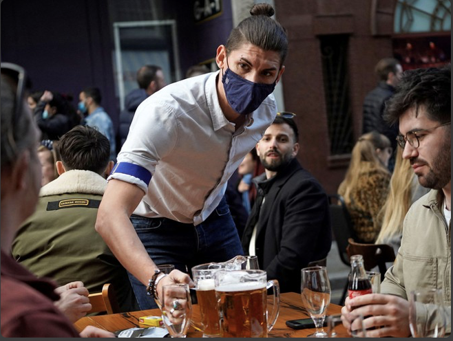


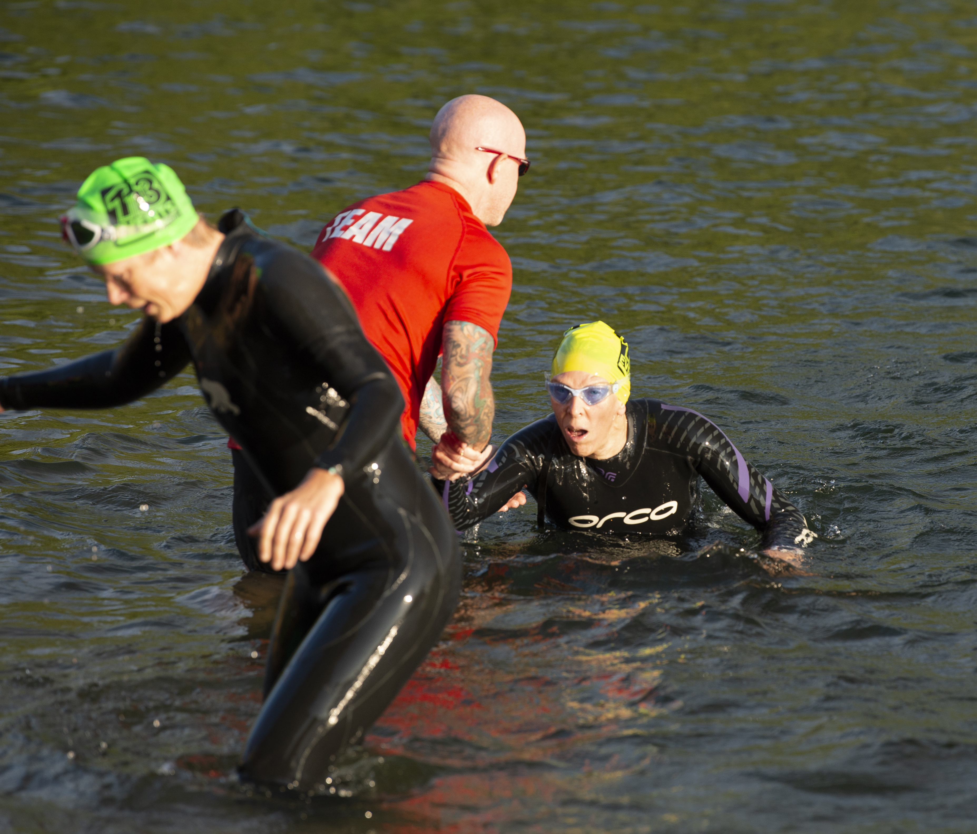
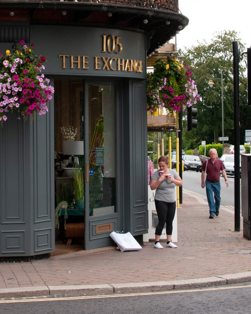
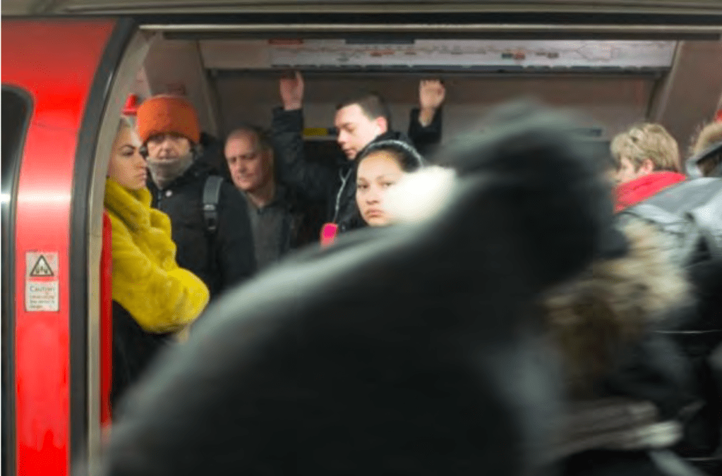
One

“Pubs and bars are still hotbeds for COVID-19”
“Bars feeling the pressure of post-pandemic staff shortages”
“Grant temporary visas to European workers, Government told“
Here we have three different captions for the image which tell different stories, two about the pandemic and one we assume about Brexit. The text connects strongly because of the gathering in the bar and the use/not use of face masks, which emphasise that this as a contemporary image. The actual caption is:
“Put down the pinot: benefits of a single glass of wine debunked”
With this image, the signs are about having a good time, signified by the gathering of people, the alcohol and the waiter. Although there is no wine in the image, this sign is sufficient to suggest that drinking is generally bad for us. WIth my captions, the text works with different elements in the picture, namely the fact that not everyone is wearing a mask but the man serving the drinks is. Given the current situation, we assume he is a waiter rather than one of their friends. The man behind him, trying to get his attention, could be read as an expectant customer which makes links with the caption about temporary visas and staff shortages. The inconsistent wearing of masks throughout the image serves as a warning in the first caption, suggesting that gatherings of this nature are still dangerous without the right precautions.
Two
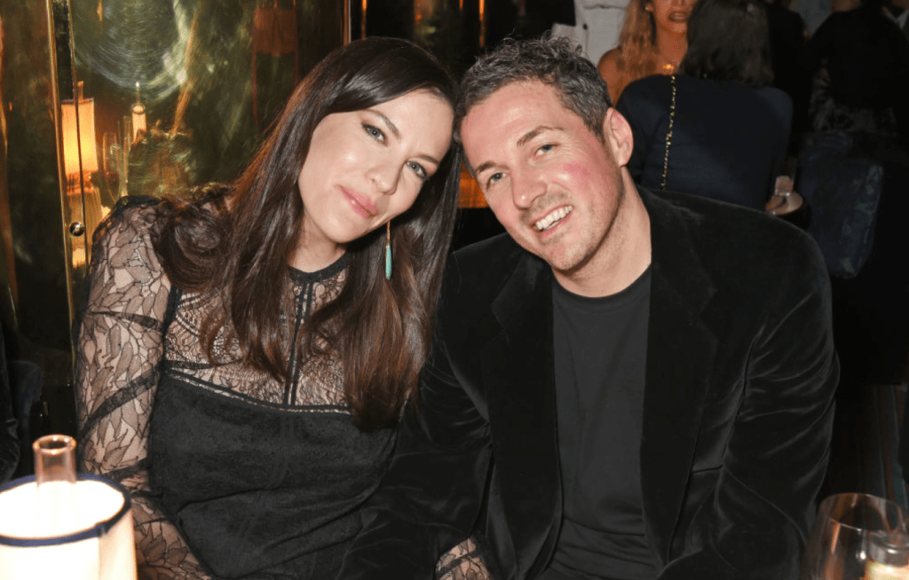
“Liv Tyler and fiance spotted in Soho hotspot”
“Liv Tyler on struggling with her father’s fame and leading a normal life”
“Liv Tyler and Dave Gardner have confirmed that they are dating”
This is an example of a completely innocuous image that can be manipulated almost indefinitely. Shots like this, which are often taken by friends or fans, really only depict a mood. In this case, Liv Tyler and her partner look happy, so the natural assumption for a caption might reflect that. In fact the real caption is:
“Liv Tyler ‘splits from fiancé Dave Gardner’ after 7 years”.
Now we have the inverse of the mood with the image pointing to happier times. The caption itself which contains a quote within a quote, suggests a finality to the message – ‘They were once a happy couple but now it is most definitely over’. The one caption of mine which works slightly differently is the second one. It relies on the viewer bringing the knowledge that Liv Tyler is the daughter of famous rockstar Steve Tyler of Aerosmith. Without that, the picture and text don’t really work because the text doesn’t connect with the iconic messages in the image, only getting the viewer to ask “who is that?”
Three
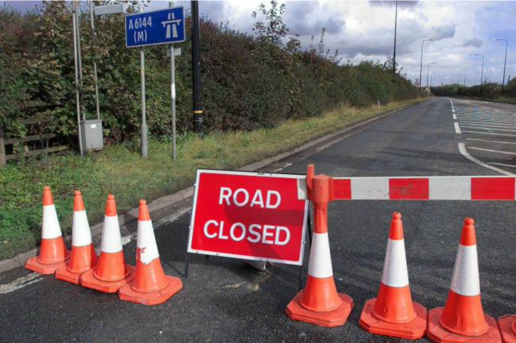
“Severe delays expected as works begin”
“Terrorist threats to UK infrastrcuture”
“Road network crumbling, say ministers”
In this case, the image is very generic as would be found in an image library. This photograph appeared in my local paper, which is well known for gathering pictures from stock or from the public (they have used plenty of mine in the past). The three captions tie into different elements in the picture. The road closure itself works with the construction themes of the two of the captions, while its use refers to keeping people out or keeping the public safe when considered with the terrorist headline. In such news stories, there are few images that can be anchored with text as actual footage of an attack is usually video and tightly controlled. When faced with this, newspapers tend to use generic, often bland imagery and create the story in the caption. In this case, the ‘infrastructure’ under attach is suggested as being the motorway network somewhere out of sight with the sentiment ‘keep out and be safe from what you cannot see’. In fact the caption was:
“Two teenagers die after car crashes into tree”
This caption refers to what is not in the image. There isn’t a tree as such and there are no cars visible. The absence of these and the warning to not proceed any further suggests that this horrible accident is somewhere up the road. The aftermath of the road being closed adds both importance to the event and also a sadness at its impact on everyday life, which carries on.
Conclusion
In all three images, the ‘stock’ nature of the signs and signifiers means that a wide range of narratives can be created by carefully using captions. I conclude that where the reading of the advertisement in Exercise 1 was relatively straightforward as one might expect, there are more questions raised when there are fewer directly-related contextual elements in the image. In the case of the Liv Tyler image, there is nothing to say that is her (without us knowing that to begin with) and the happy image could literally be interpreted any way we want. The caption is what creates the sense of happy or sad with the picture. In further conclusion, the addition of text in these circumstances is vital to any narrative that might be created. The text effectively becomes part of the image. I’m reminded of Michal’s “This photograph is my proof” from Context and Narrative [2] where the image contains precious little in terms of signs but the text tells a complete story that the image then emphasises. This is something I intend to consider in Assignment 4.
References
[1]Fletcher R, 2021, “4) Exercise 1 – Looking at Advertisements”, OCA Blog Post, https://richardfletcherphotography.photo.blog/2021/09/16/4-exercise-1-looking-at-advertisments/
[2]Fletcher R, 2020, “2) Exercise 2: Newspaper Analysis”, OCA Blog Post (Context and Narrative), https://richardfletcherphotography.photo.blog/2020/06/12/2-exercise-2-newspaper-analysis/