Category Archives: Exercises

Project 3: Exercise 3 – Review and Update your glossary

Brief

The glossary you started to build in Project 1 will most likely exist as a list of terms which help you to construct, define and classify. However, these terms can also be considered as the beginning of marking out a territory for any work.Your glossary can help you as you start to build a map, or diagram, which includes the broad theme you are investigating, noting some of the key terms, theories and practitioners whose work may overlap or have strands of practice which sit in different territories.

Response

Following Exercise 2[1], the following terms are added to my glossary.

Reformism – the approach of documentary photographers to drive some form of social change through their work. Covers the revealing of something kept hidden or disregarded by society – bringing to light a subject that is uncomfortable or disturbing to shock people into changing the status quo.

Concerned – the concerned photographer who is personally bought into the issue that they are revealing, e.g. Salgado and his documenting of the fragility of his immediate environment as well as the planet[2].

Compassion Fatigue – the saturation of a message through imagery where the senses are overwhelmed. Example of my own experience at the Don McCullin exhibition [2].

Advocacy – linked to reformism, but more about the photographer trying to act on behalf of the subject. Example – Lewis Hine accessing the textile mills under an assumed identity to photograph the child workers. Hine was giving voice to the children who were an accepted and forgotten element of textile production at the time[2].

Mass Observation – large scale documentary projects aimed at social anthropology. Voyerisitic observation of people, their places in society and the context of their surroundings. Grandiose ideas similar to Sander’s portraits of Germans and their professions, but more emphasis on ‘the camera sees’

Self – the concept of one’s identity as actively portrayed through photography. The pursuit of the perfect representation of how we see ourselves. The ideas that we can portray ourselves in terms of our ambitions or alignment with cultural expectation. Example – ‘Come to Dubai’ and ‘Sober for..’ [3]. Transformational identities where artists become someone else to challenge assumptions about gender, race or sexuality. Examples: Jo Spence and Rosy Martin [3].

Theatre of Self – presenting an aspect of our identity and it affects our lives. Peter Mansell’s series’ about his disability[2] which don’t tell the complete story of his identity, but give an insight to those who are not familiar to the struggles of it.

Voyeurism – Martin Parr admitted to being voyeuristic in his approach to photography and highlighted the way that other photographers tend to avoid the term. His work is a blend of very carefully observed and composed images with the aesthetic of a family snapshot. It’s become a visual code in its own right.

Links to Padlets

[1] richardfletcherphotographyblog (2022) Project 3: Exercise 2: Reviewing your broad themes. At: https://richardfletcherphotography.photo.blog/2022/06/26/project-3-exercise-2-reviewing-your-broad-themes/ (Accessed 09/07/2022).

[2] https://oca.padlet.org/richard5198861/j8sxcdq8ybngzxl3

[3] https://oca.padlet.org/richard5198861/ca380ho1gq6cgndc

Project 3: Exercise 2: Reviewing your broad themes

Begin by browsing the Source Texts and Case Studies and make notes of at least 5 broad themes you can identify that interest you. Identify at least 2 source texts or case studies that you can work through to help develop your own practice and have these ready to support your Project 4 work. List other possible broad themes that you think could have potential for yourself, your peers or other practitioners that interest you. 

Make notes in your learning log. 

You can also share ideas with peers in the Mapping Territories Forum.

Response

My idea of exploring communication as a broad theme (Exercise 1 [1]) led me to consider the further themes that overlap the idea. My starting point was the way that communication has evolved in recent years, with the advent of mobile phones, messaging platforms and social media. This led to the first broad theme of ‘Technology’. In moving to a more digital interaction, I was interested in the way that we communicate with each other and how that had changed. Personal engagements are influenced by who we are, where we fit into a social or familial hierarchy. This led into the broad themes of ‘Identity’, ‘Family’ and ‘Relationships’. I realised also that we are surrounded by information that instructs and prohibits our behaviour, most of which are technology agnostic, that is they require no expert knowledge beyond our way of reading (visually, braille or audible) in order to be effective. Our engagement though, is ultimately driven by our willingness to consume. My final theme is around ‘Rebellion’.

Reading the Source Texts and Case Studies, I selected “Look at Me! The Representation of Self” and “Documentary Depictions and Dilemmas” because they cover the central aspects of what I am interested in. The former deals with representation of personality both as the artist sees it, but also the ideas of projecting a persona, something that is highly relevant to the online world of imagery. The latter deals with the historical shift from straight representation of a scene or event with a view to revelation or social change, to the photographer guiding the narrative according to their perspective. I thought this to be particularly relevant as my ideas communication and its impact on our seeing the world around us, also beg the questions “Does it matter?” and “If there is no noticeable harm, does it matter?” I want to pursue this later in my SDP.

Reviewing the Source Texts

I used Padlet to map the key learnings and messages from the two source texts. They can be found at:

“Look at Me! – The Representation of Self” https://oca.padlet.org/richard5198861/ca380ho1gq6cgndc

and

“Documentary Depictions and Dilemmas. “https://oca.padlet.org/richard5198861/j8sxcdq8ybngzxl3

Conclusion

The first conclusion from this exercise was that my broad theme of Communication does indeed span the 5 other themes that identified. There is a strong theme of change in how we engage with each other and the wider population, which is contiguous with the attitudes of the photographers who pioneered documentary. Their intentions evolved from straight reporting and furthering the idea of the camera being a tool, to growing a conscience and becoming both reporter and advocate. The photographers who wanted to reveal poor living conditions or human rights violations, broke the conventions. It’s no surprise that these photographers were unaffectionately known as ‘muckrakers’ owing to their deliberate attempts to let the viewer into an aspect of humanity to be ashamed of. The emergence of the mass observation and curated stories of the 1930s could be argued to mirror the broadening collective of modern media outlets that push specific narratives across the internet, furthering a confusion over what is truth. The ‘truth’ of the photographic representation in the mid-20th Century became less important than the tactic to present or shock the audience. In a parallel with the idea presented in “Look at me…” that Big Brother created an apathy in the audience with regard to the ‘reality’ of reality television, the full context of stories such as the migrant sharecroppers or the people of the Bowery in New York, was no longer important – just as long as the editorial was ‘broadcast’ Similarly with Cindy Sherman, Jo Spence and Rosy Martin, we had serious assumptions about contemporary and generational female identities challenged by the artists acting as other people. With both genres, external context such as our preconceived ideas of a culture or gender, our memories of how things used to be and our recognition of ‘progress’ are increasingly introduced into our reading of an image when stories are being told instead of relayed.

For my theme, I will need to consider how to home in on the core messages I want to convey. This exercise has allowed me to gather my thoughts about the various aspects of communication as a theme and, most importantly, how I react to them.

Project 2: Exercise 2 – Comparative Analysis

For this exercise, I have chosen two landscape photographs; Moonrise over Hernandez, New Mexico (1941), by Ansel Adams and Bonne Carre Slipway, Norco, Louisiana (1988), by Richard Misrach

[Fig1] Moonrise over Hernandez, New Mexico (1941), Ansel Adams
[Fig 2] Bonne Carre Slipway, Norco, Louisiana (1988), by Richard Misrach

These images are visually very similar, both depicting a wide-open landscape with some form of human presence within the frame. They are both shot on large format film with the obvious difference being one is colour and the other is black and white. Moonrise… is perhaps the most famous image by Adams, probably the most recognised landscape photographer in history. This image is famous for the story about how it was made almost as much as the composition. Adams was travelling back from a failed day’s shooting and saw the gibbous moon, lit by the fading sunset. He rushed to set the camera up, couldn’t find his light meter and worked out the exposure from his knowledge of the luminance of the moon. The story reinforced the legend of Adams as a ‘technical’ photographer. Misrach’s image, has no back story, being part of a documentary series about the impact of the petrochemical industry on the environment in ‘cancer alley'[1], a region of Louisiana. Outside of the artistic intensions, the images have other visual differences. Moonrise… is very precise and sharp, exposed carefully for the moon’s luminance, whereas Misrach’s picture is a deliberately long exposure. The fine details of the refinery are lost in the flattened movement of the water and the smoke rising from the buildings. Where Adams captures the natural light impacting on the buildings, Misrach represents the light pollution impacting on the environment; the antithesis of each other. The technical codes used create a sense of wonder in Adams’s picture and his familiar use of scale makes the manmade part less significant in the context of the desert space, where Misrach’s image is depressing. The light pollution creates artificial colour in the sky and is reflected in the water in lines that lead towards the viewer. Misrach’s image relies on colour to create this mood.

I chose these pictures because of the aesthetic similarities and the obvious technical codes that identify each as landscape.  They also both contain natural and man-made context in similar compositions. However, it is clear that even without knowing of either artist’s work, they are very different ‘cultural tones’.  Where one is rich in detail and natural beauty (then moon, the almost clear sky and the highlights from the sun setting behind the viewer), the other is devoid of the same elements.  The composition is simpler but the use of polluting rather than natural light immediately sets this in a environmental/political space.  It’s no longer a pure landscape but a documentary protest.  With the rest of Misrach’s series, the images serve as a stark warning.  Adams’ image isn’t part of a series, but an observation of a moment of natural beauty.  Both could be argued to be ‘documents’, but Misrach’s is more of a commentary on man’s destruction of his environment.  

“I photographed the landscape, but where it collided with civilization,” he said…

…while Misrach outgrew Adams’ influence, he still reveres the nature photographer. In fact, he has a typewritten letter Adams sent him in 1979 framed on his wall at home. Adams had sent it to Misrach’s first gallery, expressing his admiration for the work…

…“He’s still my hero,” Misrach said.

(Richard Misrach Photographer | All About Photo, s.d.)

References

[Fig 1] Unearthing the Enigma of Moonrise Hernandez Murals – AAG (2020) At: https://www.anseladams.com/a-halloween-story-moonrise-hernandez/ (Accessed 07/05/2022).

[Fig 2] Petrochemical America by Richard Misrach (210PH) — Atlas of Places (s.d.) At: https://atlasofplaces.com/photography/petrochemical-america/ (Accessed 07/05/2022).

Bibliography

[1]Petrochemical America by Richard Misrach (210PH) — Atlas of Places (s.d.) At: https://atlasofplaces.com/photography/petrochemical-america/ (Accessed 07/05/20

[2] Richard Misrach Photographer | All About Photo (s.d.) At: https://www.all-about-photo.com/photographers/photographer/61/richard-misrach (Accessed 07/05/2022).

Project 2: Exercise 1: Denotation and Connotation

Introduction

For Part 1, I created a Padlet to capture my thoughts and observations and for Part 2, a Padlet for each image analysis. This blog post simply contains reflections on both pieces of work. The Padlets can be found at the following addresses:

Part 1: https://oca.padlet.org/richard5198861/jofu35hc1njbw93r

Part 2: https://oca.padlet.org/richard5198861/b7v6mxqna7lg2bsr

Reflections Part 1

The source material draws our attention to what Rose (2001,p25) referred to as the three sites of a visual image; the site of the production, the site of the image and the site where audiences will view it. These aspects form meaning in interpreting an image and are the most debated in terms of the importance placed upon them. The idea that there could be shifting emphasis on the importance of all three reasonably suggests that there are many potential interpretations of what is ‘truth’ in documentary. The rhetoric of an image is dependent on how the photographer has used photographic codes to influence the reading. I was taken by the idea that for every ‘rule’ there is subversion and the clues as to how that makes a photograph believable or otherwise is down to how the image is broken down.

The artists included in the both the notes and the embedded exercise have all taken the idea of documenting using a camera in different directions. The first thing that I noted was the exploratory nature that evolved over time. The early photographers, such as Fox-Talbot were interested in how to capture a significant event visually, e.g. the building of Nelson’s column in Trafalgar Square. Although a fairly simple composition, use of visual codes such as scale and perspective, coupled with the rudimentary equipment and processing used to make the picture, raise questions that change over time. Shafran makes the point that the image has a modern feel to it with only the necessary elements included (e.g. the column’s base but not the statue) and the advertising hoardings in the frame. Was Fox-Talbot establishing photographic composition codes from the outset or have modern analyses of the visual image and structuralist ideas made sense of his work after the fact? The collection of artists impressions in We are Here have the common notion of re-visiting works of lesser known photographers with a post-structuralist eye. Works by Hinde and Charles Jones break down the codes of very simple compositions to give clues as to an area of society that we might not be familiar with. I was drawn to the catalogue photographs of pristine vegetables as if being judged in a horticultural show as shot by Jones. They use technical codes such as light and composition (uncluttered, filling the frame etc) to bring out the natural beauty of the subjects. The subjects, although familiar are shown to have been cared for and made as good as possible for the camera to document, asking the viewer to see how important horticulture is to some people.

As the 20th Century progressed, the subjects and approaches to documenting them became more experimental. Photographers began subverting the ideas of their time, such as Munby’s portraits of dirty women. His idea of humorously substituting the female form into male professions and further subverting the notions of class in Victorian England mirror the work of Julia Margaret Cameron, who was pilloried by the establishment for what was seen to be poor technical skills. Her pictures create a real sense of her subject’s personality as she saw them, rather than majoring on the accurate representation of their features. Towards the 1960s and 70s, we see more voyeristic style of documentary, taking cues from classic and contemporary street photography. Here we saw the visual codes of separation, isolation through focus and highlight as well as the decisive moment, being used by the viewer to create narratives as though they were part of the scene. In the V&A article about South Africa, the cultural evolution of the country with its troubled recent history is documented through an approach that highlights what we may have no experience of. We can see influences of early practitioners such as the FSA group in Jodi Bieber’s Women Who Murder Their Husbands. The horror of the women’s acts is contrasted with their visual aesthetic and being surrounded by their meagre possessions in their cells. We don’t even need the additional context of why they committed their crimes to break down the visual clues in their portraits. The pictures are constructed and don’t tell the subject’s whole story, but Bieber makes us connect with them as if we were actually visiting and asks us to consider gender violence and societal bias when viewing the images. This fabricated reality theme is naturally present in the works of Crewdson, Wall and diCorcia who direct their pictures so that they viewer can create a narrative based on their own experiences and perspectives.

The final artist in the reference material was Richard Misrach, who’s series Destroy this Memory is a documentary of the region of Louisiana that was devastated by Hurricane Katrina. The series focuses on the people of the towns that were worst hit through the graffiti they left behind. This included messages of hope in preparation for the storm, fear of the event and the shock of the aftermath. Messages warning looters and asking people to call their families as well as rages against the state government and insurance companies are curated into a series that explores the human response to crisis. There is some gallows humour in amongst the desperation, which Misrach uses to punctuate the series. The interesting thing about the series is the apparent lack of technical setup in the images. Misrach made the series from his scouting photographs which were taking with a basic digital camera. As a result, the style isn’t cinematic or constructed, but more snapshot as if a tourist (or the viewer) took the pictures. Composition is ‘careful’ but doesn’t have a sense of planning about it. This style brings the viewer closer to the scenes as the photographer saw them. The absence of people creates the eerie sense of emptiness but their wrecked possessions and their need to write something on them is compelling.

It’s clear from the reference material that documentary has evolved from the straight ‘truth’ of presenting something to the camera, through coded composition, rebelling against convention and the subversion of cultural understanding, to the more intimate act of being part of what is happening.

“I guess that is how photographic culture shifts and changes as time passes. We think that everything’s been done, but, of course, there are many things that haven’t. In twenty years’ time we will be shocked by how certain works are perceived, and that’s exciting.”

Martin Parr, 2007

Reflection Part 2

My conclusion from part 2 of this exercise is summarised in the following key points:-

  • The analysis of an image using semiotics can be applied to any of the genres, even when at first glance, the image contains signifiers that do not have apparent connotations. I chose 4 random images by famous photographers of the 20th century as well as contemporary artists and my choices were purely aesthetic. When looking at the codes that help to identify an image as being part of a genre, we know that the visual aesthetic is one of the most common; a portrait contains a person and little else, a landscape contains a view of some sort etc. When analysing, I could determine the denoting elements and derive some connotations from them with little difficulty between genres.
  • The connotations are greatly affected by the social and cultural perspective from which the elements are viewed. For example, Ansel Adams shot with black and white film in 1947 because that was the established technology, not because he was looking for an aesthetic. The drama of his landscape is enhanced by its use and the technical approach to highlight and shadow with each element, certainly helped support the narrative that I saw within the image. Similarly with Winogrand’s image, I would argue that it is as shocking in today’s culture where racial prejudice has often been seen to be worse than the 1960s.
  • The technical codes direct the viewer to not only the elements that are ‘important’ through use of depth of field and framing, but also create a mood through lighting and colour temperature. In Djikstra’s portrait, the tones of the image contriubte to the sterile connotations of the subject against the background, while the low contrast offers a bleak feel to the subject’s experience.
  • What we bring to the interpretation of an image. In the case of Adams’ image, I saw religious connotations in the snaking river that was lit to reveal its surface texture. Although I’m not particularly religious, the combination of the scale of the mountains and their reaching the dramatic sky, invoked the creationism stories I was taught as a child. Other cultures would not necessarily prioritise the connotations in the way that I did, instead introducing their own meanings allied to their own experiences.

Overall, I found this exercise to be interesting because of the application of the structure of linguistics to a variety of images. It focuses our attention on what is physically present and what each element might mean.

Bibliography

Please see the Padlets linked previously

Research Task: Terms and Definitions

Read Chapter 2: Photography Theory in David Bate, Photography: The Key Concepts(2009) Bloomsbury.

Make notes about: 

  • Structuralism.
  • Semiotics.
  • Photography codes.
  • Rhetoric.
  • Denotation and connotation.
  • Reality and realism.
  • Poststructuralism.

Add these terms and definitions to your Glossary – you may wish to do your own further and independent research and reading to enhance your understanding of these terms.

Response

I completed this research task in the form of a Padlet that can be found at this address:

https://oca.padlet.org/richard5198861/77jby60olpbg8t94

This isn’t available to the public (outside of the OCA) without a request to share it. Please comment below if you wish to have permission to view.

Project 1 – Exercise 2: Recreate

  • Recreate a well-known image in any of the 4 genres you have explored. Consider the conventions, styles and themes specific to the genre and how the image you choose to re-create speaks to those. You are free to interpret ‘re-creation’ as imaginatively as you like, subverting conventions or adhering to them.
  • Using the Challenging Genres Forum share your work, including; your image, the image that inspired it and a short paragraph explaining your process.
  • Write up the activity on your learning log. After sharing the image and receiving some feedback, reflect on the experience in a short post on your learning log.

Introduction

“What all portraits have in common , in their overlapping and different ways is the central point that the portrait is a means employed to establish the identity of the sitters, regardless of whether they are viewed as a social problem or as human beings with positive features”.

David Bate, Photography: The Key Concepts, p 89.[1]

When I read Chapter 4 of Bate’s Photography: The Key Concepts, I was struck by this quotation. It followed an explanation of the evolution of the portraiture genre from early 19th Century societal pictures that demonstrated wealth and influence, through the working class use of it to establish identity or true likeness whether on one side of the law or the other, and onto the portrayal of someone’s personality. The quote essentially says that the establishment of identity of the sitter is common to all uses of portraiture to some extent.

For this exercise, I decided to look at a non-human portrait with the quotation in mind and read the image in terms of the 5 elements of portraiture that Bate describes. In doing so, I wanted to test whether the same conventions used with portraits of people apply with images of, say dogs.

The Image

USA. New York City. 1946.[2]

This is one of the most famous images from Elliott Erwitt’s book Dogs (1998) and it shows a chihuahua standing on a sidewalk on New York City. The first question to consider is whether it is a portrait or documentary photograph because although there is a clear subject in the frame, Erwitt was a respected street photographer (a sub-genre of documentary). The image was also a severe crop from a much larger 6×6 frame – the crop is shown below:

Contact Sheet Print: Chihuahua New York [3]

When we look at the rest of the images from the roll, we can see the variety of angles and the natural movement of the owners being captured as if in a street photography style; only when the dog is isolated by the crop does the meaning change. I hope to demonstrate that it is a portrait by discussing the elements as laid out by Bate and how my process of recreating further established it for me.

Bate considers the 5 elements of a portrait as face, pose, clothing, location and props which all have an impact in this image. When we look at the dog’s face, we see the lively expression of a content animal. Our cultural understanding and appreciation of dogs as pets tells us that the panting expression means exercise, thirst or excitement. When I read the dog’s expression, my tendency is to see the latter, particularly given his gaze at the photographer. His pose tells us more about his character. Chihuahuas are small dogs, which is further borne out by his location and the scale of his owner’s feet. His pose, however connotes confidence with his wide, head-on stance. Combined with his face, he looks like a dog squaring up to something or someone, as if he doesn’t fear them. Now the face takes on the potential meaning that he is mid-bark, which further emphasises that he’s a confident dog. The clothing is a simple coat (black and white robs us of knowing if it was brightly coloured or not), but when considered with his surroundings and the seemingly elaborate shoes for dog-walking, the coat may connote a privileged class pet. The location of the image is clearly an American city sidewalk and we are informed of its actual location by the title. The location and what we know of NYC’s skyline plays a further part in emphasising the dog’s diminutive stature. The position of the dog with respect to his owner’s feet and legs completes the idea of his size belying his large personality. The props in the image for me are the shoes his owner is wearing. While they don’t really add impact, I think they work with the setting to connote their social standing.

My Image

Chihuahua, Great Malvern (2022)

My approach to this image was to take a portrait of the dog (called Togo), with the same or similar conventions from the original image. The first difference is that I shot this picture while lying the ground and attempting to frame them in the same way. Togo is taller than original chihuahua but shares the relative scale that the breed is known for. His direct gaze, alert expression and stance are all similar with the exception of the panting – this image is defintely all about him. His coat when considered with the glamorous shoes suggests a cherished pet as in the original. The location is a street similar but much smaller than the original, so the scale isn’t as clear. To shift the establishment of location I included the context of the Stars and Stripes details on the shoes. Finally, the high heels and below-the-knee skirt emphasises Togo’s size in a similar way to the original image. However, it’s clear that the dog in Erwitt’s picture is smaller and stood a little behind his owner, which makes that difference much more impactful. I made the image black and white because I didn’t feel that including colour (dominated by the shoes) really added to the aesthetic and made it further from a recreation of the original picture.

Peer Group Feedback

I’ve now received some feedback from my peers. The image was generally seen as being a good recreation of the original. As I didn’t directly copy the picture (I wasn’t in the right city, didn’t have exactly the same dog, shoes etc), my interpretation of the picture from a portraiture perspective appears to worked within the conventions. When viewing the picture, the reaction is one of humour, both at the stature and personality of the dog and the choice of shoes as a prop. Moving the location of the picture from the background context to the prop in this way has added to the sense of fun in the overall image.

Reflection

In reflection, my objective was to take a non-human portrait and demonstrate that it does work with the conventions of portraiture. What Erwitt saw in the dog’s face and posture combined with his relative size to the surroundings, takes into account the conventions of portraiture as postulated by Bate. How these conventions balance is very important in terms of how the picture will be read. The viewer brings the vital interpretation of each element and the importance placed on each will determine the overall reading of the image. For example, an American might see the shoes as something patriotic in terms of the dog and owner’s identity rather than a signifier of the location. This actually happened when an American follower of mine on Instagram saw the picture – his first reaction was to express his being impressed by the shoes. In my recreation, there is a visual element that I removed in post processing in order to make it look more like the original. In my version Togo was on a short lead and a small piece of it was visible in the unedited version. I elected to remove this digitally to match the dog in the original who wasn’t being restrained. If I’d left it in the picture, the context of the dog’s pose changes, as well as his interaction with his location. An alternative reading of the image is now likely – some might see the dog as being less confident in some way. Either way, the elements that are being read are present. In cropping his image the way he did, Erwitt draws our attention to them rather than any other distractions such as the woman’s hands in the full frame.

Bibliography

[1] Bate, David (s.d.) Photography: The Key Concepts. (s.l.): (s.n.).

[2] Chinese Year of the Dog • Elliott Erwitt • Magnum Photos Magnum Photos (s.d.) At: https://www.magnumphotos.com/arts-culture/art/elliott-erwitt-dog-dogs/ (Accessed 13/03/2022).

[3] Contact Sheet Print: Chihuahua New York (s.d.) At: https://www.magnumphotos.com/shop/collections/contact-sheet-prints/contact-sheet-print-chihuahua-new-york/ (Accessed 13/03/2022).

5) Exercise 1: Still Life

● Create a set of still-life pictures showing traces of life without using people.

You could do this with your camera phone to reflect the vernacular and transient nature of these moments or you could choose to use high-quality imagery to give these moments gravitas, like Nigel Shafran.

● Your technical decisions should back up your ideas, so write a short reflective commentary detailing these decisions and the reasons for them.

Introduction

For my series, I chose the theme of the aftermath of activities related to Christmas, but not in the context of the joy of the season. I love Christmas, but am increasingly bothered by how much work goes into preparing for a single day. I get to a point with certain jobs where I am either distracted by something more enjoyable or just walk away in frustration. This series is intended to use still life to evoke a sense of how I feel at those points.

The Series – Christmas Passed

One
Two
Three
Four
Five

Review

I deliberately shot each of these still life photographs in a different style, mainly because each situation has a different mood to invoke from the others. In One, the elements point to a need to relax and do something enjoyable. The person watching the film has a fancy drink to enjoy and a candle to provide muted lighting. The film frame is from a James Bond Skyfall, showing the character dressed in a dinner suit, which furthers the sense of luxury or indulgence. The lighting also highlights a packet of tablets on the table. Perhaps this person has overindulged as many do at Christmas, which means the image could take on one of exhaustion which is something I tend to feel once the day’s festivities are done.

Two is a take on the tradition of leaving a drink and mince pie out for Father Christmas, but instead there is evidence of a cocktail with the thin slice of orange peel used. I love the Old Fashioned cocktail but am always disappointed at how wasteful the use of the orange peel is. The other elements in the frame are the well-stocked drinks cabinet, which suggests the the person isn’t a stranger to drinking, the bourbon bottle and the drink itself. The inclusion of the ‘cigar’ is a nod to how times have changed in celebrations at Christmas through my life. I remember every adult in my family smoking when we got together, so this inclusion (which is actually a cinnamon stick) is about how it’s no longer acceptable. Most people don’t have ashtrays anymore, so I made one of the mince pie trays into a makeshift ashtray for the consumer of this Christmas treat.

Three is something that I think everyone experiences at this time; the wrapping of Christmas presents. In this frame, the tape has run out and the person has presumably got to find some more. I always end up with odd scraps of badly cut paper as well as running the gauntlet with how much I can get done with the remaining tape. This image is intended to express the sense of the unwanted pause in proceedings and was inspired, along with Two, by the classical still life paintings of half-eaten food[2]. These ask the viewer to imagine what might be going on for the consumer before and up to the point the image was captured.

Four is a intended to be a humorous representation of the aftermath of the Christmas feast, where most of the food has gone save the leftovers. In our house, leftover meat ends up in a curry, so this picture shows the slim pickings left for that meal. There is always some beer and wine left over, so this was included to jokingly suggest that there is some sort of complete meal to be had.

Five came about because of a real experience I had last year with some Christmas lights that got tangled to the extent that it would take hours to untangle them. I am too tight to throw them out and get some new ones, so I promised myself this year that I would put the time in to sort them out. I didn’t, of course which leaves the fallback position of cutting them with the scissors.

Conclusion

I really enjoyed this exercise because it was both creatively and technically challenging. The removal of the person from the image leaves the potential for creating broad narratives that tell the story of them in absentia. I used my own experiences to guide the creation of the series and each idea came with a technical challenge to represent the different moods. Lighting Is key to this, with a mix of flash, hot lights and sources that naturally occur in the environment. For example, using the light from the projector in One as the key light, left me with filling in the edges of the glass and bottle with an LED panel. Conversely, the fill light in Five was provided by the illuminated Christmas lights (the frustrating thing being that they still work, despite being tangled) and I used a further key light for the scissors. What I’ve learned builds on the tableaux work from last year, with particular attention to putting just enough context in the frame to create the mood. Using props like the cigar and the fridge evokes memories of the smell of cigar smoke and the cold storage of food, which is stimulating senses other than our sight. During this shoot, I was reminded of David Favrod’s use of phonics in some of his images in the series Hikari[2]. Still Life is something I intend to continue exploring.

References

[1] Fletcher R, 2021, “Research Task: Still Life”, OCA Blog Post, https://richardfletcherphotography.photo.blog/2021/12/03/research-task-still-life/

[2]Fletcher R, 2021, “4) Project 2: Memories and Speech, OCA Blog Post, https://richardfletcherphotography.photo.blog/2021/11/05/4-project-2-memories-and-speech/

5) Exercise 3: Your Journey

Your journey may not involve travelling the world or an excursion across Russia, but you might see your journey to the post office every Monday as particularly relevant – or the journey from your bed to the kitchen in the morning.

●  Note the journeys you go on regularly and reflect upon them.

●  Now photograph them.Remember to aim for consistency in your pictures. If you choose to photograph all the charity shops you’ve visited in a week, try to photograph them all using the same camera, lens, standing position, lighting, etc. This will help keep your project honed to the subject matter rather than you, the photographer

My Journey

Every weekday since leaving my job, I make the same journey into town to my favourite café, where I work on my laptop amongst other people. Since COVID kept us all in our homes and my subsequent redundancy reduced my daily contact with friends and colleagues dramatically, I have felt the need to make this small pilgrimage to give me a sense of belonging in a crowd. I rarely engage with anyone else barring my friend who sometimes does something similar, and the staff in the café who now recognise me as a regular. The walk takes the same route every day and I spend most of the journey listening to music or an audiobook and walking on ‘auto-pilot’. For this series of photographs, I wanted to represent the journey as a physical route from my home (about a mile away) to the café. I decided to take a single camera/lens combination and use the same settings throughout (f/4 in Aperture Priority Mode, ISO 800). I did the walk out of context, i.e. not going specifically for a coffee and making use of a different time of day to my usual morning stroll. From a composition perspective I wanted to keep it simple. Each image would have a road or path leading to a vanishing point in the image, would contain some form or sign to place the location either in the context of geography or the town demographic and contain a representation of people going about their business. The latter was decided because I have photographed parts of the route many times before as empty space – something I didn’t want to repeat. I wanted the series to be about the town as observed through a camera while walking.

The Images

One
Two
Three
Four
Five
Six
Seven
Eight
Nine
Ten

Review

With these images, I wanted to set my journey in the context of the environment without any strong perspectives on it from me. This is naturally very difficult as I’ve lived here for over 20 years and seen many changes to the fabric of the town. That said, its Victorian Spa roots are very much part of its history which attracts visitors all year round. To that end, a lot of the aesthetic quality doesn’t change that much. With this particular walk, I found myself being much more observant of things that gave a sense of the town. Many people retire here and the telltale traces of that are seen in some of the photographs, principally Two and Three. The history of the town can be seen in references to the Museum and the black and white imagery of the sign in Nine. The town’s identity as being on the hills that bear the same name can be seen in Two, but its ideas of how it sees itself are evident in Five and Eight; there are no “Superstores” in the context of a big town and the evolution of the children’s playground is seen somehow as progress. The playground that featured in Assignment 4 is the one being replaced here, which makes me a little sad. I guess that my feelings on the topic of Malvern still come through in the series, despite the effort to not make it all about me.

Conclusion

I found this exercise interesting as it called for observation of a slightly different nature to previous work. I wanted the series to ‘describe’ my journey from the perspective of a walker who is perhaps discovering the environment for the first time. The key elements that are seemingly dull or uninteresting at first glance, but when combined allow the viewer to draw some conclusion about this lovely little town. While I was shooting the pictures, I considered the idea at the start of the unit that was explained by John Szarkowski with respect to William Eggleston’s tricycle[1]. Those who have not walked the same path will gain a sense of Malvern from the series, but unless they actually have experience of it, that sense could be way off. Like all of the series in this unit, I’ve tried to leave plenty of room for multiple interpretations and physical anchors for the pictures, e.g. the Worcester City logo on the side of the bus in Five. It’s not until Six that we get the actual location confirmed by the signpost to the Malvern Museum – I consciously limited the recognisable landmarks to a single shot of the hills. This series was derived from a group of 44 shots taken on the walk, which meant that I had to carefully edit so to avoid the pictures being too prescriptive, which is a similar process to before. It’s the change of emphasis in observation that is the main learning point for me as some of the pictures are structured around subjects that I hadn’t seen before, event with my familiarity with the area. As Richard Wentworth said in the documentary about his work in London [1], it is the responsibility of the artist to observe. This exercise challenged me to do just that.

References

[1] OCA, 2021, “Identity and Place Part Five – Removing the Figure”, OCA Course Notes, Page 111.

[2] Phaidon, 2015, “Akademie X:Richard Wentworth”, Youtube, https://www.youtube.com/watch?v=0jsivEAXRwg

5) Exercise 2: Georges Perec

The French writer Georges Perec wrote a book called An Attempt at Exhausting a Place in Paris (​ 1975) in which he wrote down everything he could see from a certain viewpoint. You may like to read it.

A further work by Perec is entitled ‘​Species of Spaces and Other Pieces, the first chapter of which attempts an interesting classification of spaces, ranging from the page itself to world and space outside. Again, this might help in relation to the following exercise.

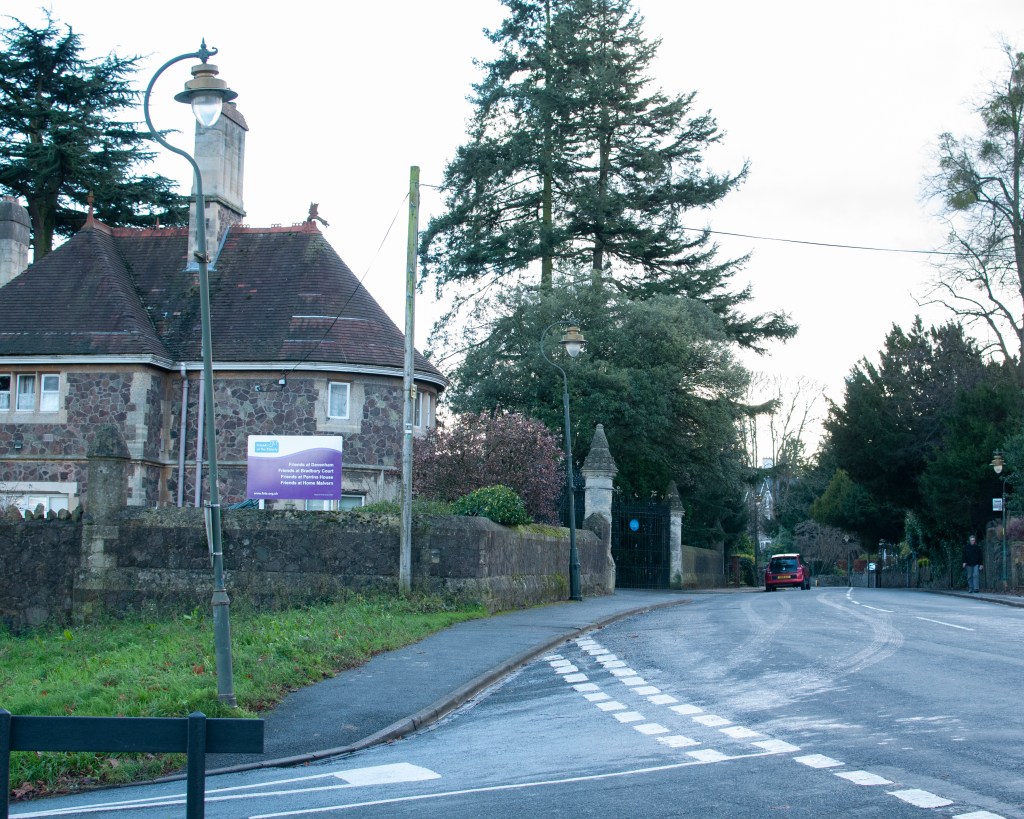
Choose a viewpoint, perhaps looking out of your window or from a café in the central square, and write down everything you can see. No matter how boring it seems or how detailed, just write it down. Spend at least an hour on this exercise.

Here are some areas to consider:

  • Can you transform this into a photography version?
  •  Would you stay in the same place or get in close to the things you listed?
  • Would you choose to use your camera phone in order to be discreet or would you
  • get your tripod out?
  • Would it be better in black and white or colour?
  • Would you include your list with the final images?

You may choose to turn this into a photography project if it interests you.

The Setting

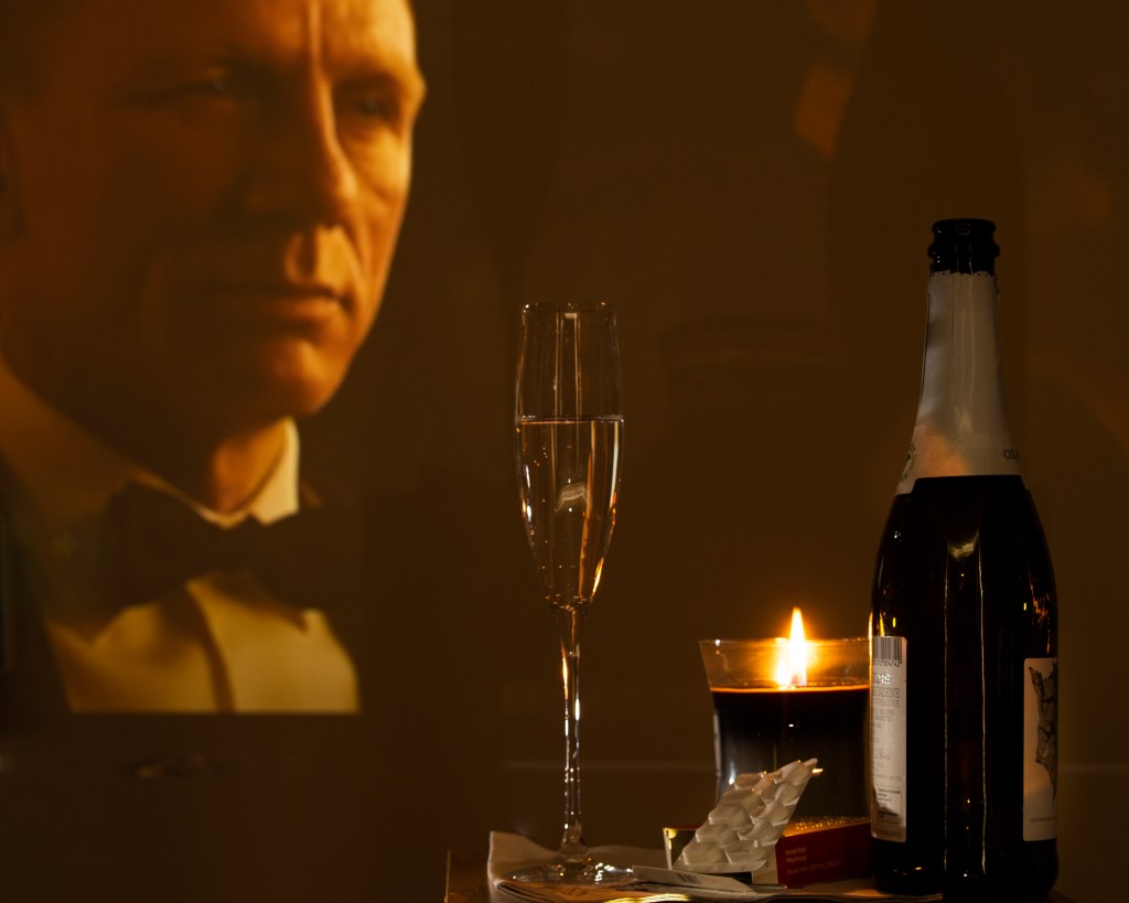
Sitting at the back of a large café, furthest from the door. From my vantage point, I can see all fo the other customers, the counter and the staff. There is nothing behind me, so I don’t need to change my position or turn my head to see.

What’s going on.

  • Wood panelling needing attention
  • Canvas photographs of people presumably from Italian culture on the walls.
  • Large litter bin with LITTER written on it. Almost overflowing
  • Couple sit down with coffee and cake. She is dressed in a glamorous coat, he in his scruffs
  • Man reading the Daily Mail with his reading glasses on. Ignoring his phone.
  • Woman scrolling through social media by herself.
  • Man finishing his coffee and putting on his coat
  • He gets up and leaves.
  • Family with small children sit down. Proud grandparents, new parents, all of the items associated with having a new baby.
  • Granddad chases his granddaughter around the café to try to keep her under control.
  • Friend of mine enters, still recognisable despite wearing a mask. Orders a coffee and uses the loyalty app. Finds a seat, not near me. He hasn’t seen me.
  • More children enter. Parents struggling to keep them under control.
  • Pensioners sit down and loudly chatting. Perhaps they are deaf.
  • Windows have misted up because of the stormy weather outside. Door being held open for someone to enter slowly. Temperature is dropping because of the wind outside.
  • Smell of toast burning at the counter.
  • Lady joins one who is waiting, they get up and leave quickly. Didn’t have coffee.
  • Staff buzzing around clearing tables.
  • Lady walks past me to go to the loo. Uses the disabled toilet instead of the main one for women.
  • Proud granddad helping young father with baby. Grandad wearing a papoose.
  • Friend gets up and walks the counter to talk to the staff. He is given a small pot of milk
  • Man with the paper now doing the crossword
  • Bright red umbrella seen passing by the steamed up windows
  • Woman next to me checking the weather forecast app.
  • The floor is wet from the recent visitors.
  • Staff member hading over a takeaway bag to a customer. He is wearing a ‘staff in training’ T-shirt which is different from the other staff members.
  • Scruffy man and glamourous lady arguing about something. Getting animated.
  • Man enters with a very serious-looking medical mask.
  • Little girl drags grandma to the front door because she wants to look outside at the rain. Grandad sits down looking exhausted. Still wearing his papoose.
  • Woman checks her loyalty card to see if she has a free coffee.
  • Laughter from the pensioners table at the other end of the cafe.
  • Woman takes off her coat 10 mins after arriving. Must have dried out. Wearing an elegant dress under it.
  • Woman tries the disabled toilet door but the previous lady still in there.
  • Man finishes the crossword and is heading out. He is wearing a colour coordinated mask and coat with bizarre camouflage pattern.
  • Grandma persuades the little girl to return to her seat while she heads for the occupied toilet.
  • Woman chuckles loudly at something on her phone.
  • Couple’s argument appears to be over. All quiet.
  • Queue forming at the loo.
  • Sound of coffee grinder over the rest of the noise.
  • Couple enter, shaking their umbrella and searching for their masks
  • Staff member ambling aimlessly around the café
  • Little girl crawling on the floor. Trying to lift the one-way arrow up.

Review

This view of cafe life could be turned into a photography project with a number of themes. The first is about family and friends, with the three generations of one family being the most consistently active in the scene. This theme could challenge the traditional roles of family, where the grandfather was carrying the baby in a papoose, something that is traditionally worn by a parent. The second would be about the way the café is used for many different purposes; I was there working while there were people doing the crossword etc. The final one would be something about the contrast of social/antisocial where some people are in groups and some sit alone looking at their mobile phones.

It would be easy to use a hidden camera technique similar to Walker Evans [1] to document the movements and interactions between people. Moving around the cafe with this technique would introduce an element of risk to composition, as I discovered in the Covert exercise[2]. While not an issue, the random nature of this style of shooting removes some of the planning that I think such a series would benefit from. Instead, I would consider discussing the use of the space for the series with the café owner and create a more metaphorical series using tableaux. I’ve found two elements in story-telling very useful during this past year or so, the first being summoning the courage to ask for help with an image or series. e.g. the lorry picture in Assignment 4 of EYV[3] where I asked the removals people if I could shoot with them (admittedly blurred out) in the frame and in this unit with the strangers in Assignment 1 [4]. The second has been the use of carefully constructed images to create a multi-layered narrative as opposed to being literal. This has been my preferred way of helping the viewer see many different potential meanings to a work and it’s been useful in most of my assignments and exercises in this unit. For this case, I would split the action and inaction into individual images, principally because there are not perceivable interactions between the groups of people beyond that of staff/customer. By breaking the scene into individual tableaux, I think the multiplicity nature of the café in our culture could be emphasised by individual stories that have no apparent connection; almost challenging the idea of a café being a social place.

In answer to the questions of representation (black and white or colour, text or no text), I look back at Perec’s document of Paris. He describes the sights and sounds, movements and behaviours as they are presented to his eyes. Part of this vision is colour, which he documents when he notices something about it. For me, this visual distinction is important to a photographic project, so I cannot see the benefit of using black and white. In terms of using text, Perec uses it to make a physical note of what he sees. In a photographic project, I would use the tableaux to steer the narrative rather than include text. Perhaps the title of the image or series could be used to set the basis for it as with Boothroyd’s If you get remarried, will you still love me?

Conclusion

I found this exercise interesting as Perec’s assertion that we only really notice the sensational resonated with me. We are surrounded by 24hr news, most of which is dramatic and frightening in nature. We are almost desensitised to the information and take no part understanding what is being asked or told.

“The daily papers talk of everything but the daily. The papers annoy me, they teach me nothing. What they recount doesn’t concern me, doesn’t ask me questions and doesn’t answer the questions I ask, or would like to ask”

Georges Perec, from Approaches to What? (1973)[5]

The result of this bombardment is the notion that our individual lives, society and culture are defined by the big things that happen around us (and often to other people). Perec noticed that our lives are actually defined by habit and routine, some of which describe what we like and some which show us coping with the unseen aspects of daily life. His contemplative work Attempting at Exhausting a Place in Paris (1975) produced a document of precisely what he observed over 3 days in a particular place in the city. What struck me wasn’t just the observation, but the descriptions of things he didn’t really understand or could be certain of. One great example is when he believes he is being photographed from a bus by a Japanese tourist. Instead of applying his interpretation of who the tourist was or why they might be taking his picture, he simply documented what he thought was happening in a factual way. Perec almost takes Barthes’ reading of visual images (in this case what he sees in front of him) at its face value, without conscious bias or cultural interpretation. My conclusion from this exercise centres around the need to really look at the what before getting into the why. The work by Perec could act as a catalyst for creating a story because it focuses on the everyday experience rather that the media-driven narrative about the state of the world.

References

[1]Fletcher R, 2021, “2) Project 1: The Unaware”, OCA Blog Post, https://richardfletcherphotography.photo.blog/2021/05/24/2-project-1-the-unaware/

[2] Fletcher R, 2021, “2) Exercise 2: Covert”, OCA Blog Post, https://richardfletcherphotography.photo.blog/2021/05/24/exercise-2-%E2%80%8Bcovert/

[3] Fletcher R, 2019 “Assignment 4: The Languages of Light”, OCA Blog Post, https://richardfletcherphotography.photo.blog/2019/06/30/assignment-4-the-languages-of-light/

[4] Fletcher R, 2021, “Assignment 1: The non-familiar”, OCA Blog Post, https://richardfletcherphotography.photo.blog/2021/04/11/assignment-one-%E2%80%8Bthe-non-familiar/

[5] Perec G, 1974, “Approaches to What? (!973)” from Species of Spaces and other Pieces (1974), published by Penguin Books

4) Exercise 5: Image and Text

Find words that have been written or spoken by someone else. You can gather these words from a variety of means – interviews, journals, archives, eavesdropping. Your subject may be a friend, stranger, alive or dead. Select your five favourite examples and create five images that do justice to the essence of those words.

You may choose to present your images with or without the original words. Either way, make sure that the images are working hard to tell a story. If you decide to include the words, ensure that they add to the meaning rather than describing the image or shutting it down. Try to keep your image-and-text combinations consistent – perhaps they are all overheard conversations on a bus or all come from an old newspaper report. Keep them part of a story.

Consider different ways of presenting the words. Audio or video might lend itself well to this kind of work, or a projection of images using voice-over. Experiment.

Inspiration

The inspiration for this series came from having recently seen the official video for a song that I’d heard playing in a cafe. The song is called ‘Let it Happen’, by an Australian band called Tame Impala. The song is about how some things just have to be accepted when there is no point in resisting anymore and it resonated with me because of the challenges of leaving work earlier in the year. We’ve already seen how art is open to interpretation, but the same is also true of music. Everything from the use of language to the singer’s inflections help set the mood and tell a story. How we interact with the story is up to us. I was surprised when I saw the video for the track, which depicts a stressed businessman running for a plane. On arriving in the airport, he collapses with what appears to a heart attack and is attended to by someone from the airline. However, he finds himself moving from one place to another, eventually ending up on a plane where all of the other passengers appear to be asleep. He hallucinates for a short while before the plane loses cabin pressure and his seat is sucked out into the sky. We then begin to see that he’s actually still in the airport with the staff desperately trying to revive him and it soon becomes clear that he’s died and the plane, falling chair etc is all part of moving into the afterlife. With the video and lyrics together, the song takes on a more sinister meaning that death we must accept, we must ‘let it happen’.

I wanted to play around with this song and its video by taking some of the lyrics, the corresponding frames from the video and putting them with my own photographs to try to tell the story. My images would be very different but contain enough contextual elements to be able to be read as a series with the stills from the video. The text would connect both together.

The Video

The full video for the track can be seen at this address:

https://youtu.be/pFptt7Cargc

The Images & Text

“It’s always around me, all this noise”
“Not nearly as loud as the voice saying “Let it Happen”[1]
“A notion growing inside”[1]
“All the others seem shallow”
“I can hear an alarm”
“Must be morning”[1]
“Something’s trying to get out”[1]
“and it’s never been closer”

<instrumental>
“I was ready, all along”[1]

Reflection

With this exercise, I tried to tell one story with two very different sets of images, distinguished by their different aspect ratios. The frame grabs from the official music video are in a cinematic 16:9 format, where my images are 8×10. In order to understand whether my images worked as part of the combined series, I deliberately mixed up the sequence so that it didn’t look in any way linear. Does it work?

My images were shot around the area of Birstall, near where my wife grew up. The town has been consumed into the wider Kirklees district over the years and suffers from the same sort of socioeconomic hardship that is common in the former textile area of West Yorkshire. That’s not to say that there aren’t businesses or people thriving here, though. The town has a unique identity with some interesting aspects to it. I wanted to combine the sense of preconception about the area with the fantastical idea of the final flight to the afterlife in the music video. I used the lyrics from the song as relay text for my photographs and as ‘time markers’ for the frame grabs, i.e. what’s being sung when that frame appears. My photographs include metaphors for the sentiments in the lyrics, e,g. the tiny advert for Birstall in Bloom being dwarfed by the supermarket livery. There are also more obvious connections such as the angel wings in the ice-cream parlour window. In answer to my question, I think the images do work when complemented by the text because without the lyrics, the series makes no sense. I believe that if I wanted to expand a series just about Birstall, I would definitely benefit from some relay text to help put them into context. The learning from this exercise, and indeed Part 4, is that we can create a series of images without the addition of relay text, e.g Robert Frank’s The Americans[2], which uses the arrangement of iconic messages to establish the ‘story’ (Frank did use anchor text for each image title in the book). However, text is a very powerful way of either raising more questions about a work or helping the viewer create their own narrative within a bounded space. What interested me about this exercise is that the last frame grab from the video happened to be at the moment where one visual faded to another. This is something that video has as part of its construction in order to transition smoothly between shots. I was wondering how a collage of still images would work with the right relay text. This is something I may well explore in the future.

[1] Parker K, 2015, “Tame Impala – Let it Happen (Official Video)”, Image Resource, via YouTube, https://www.youtube.com/watch?v=pFptt7Cargc

[2] Casper J, 2019, “The Americans – Photographs by Robert Frank”, Book Review, LensCulture, https://www.lensculture.com/articles/robert-frank-the-americans