Category Archives: C&N Coursework

Post Assignment 4 Feedback

Introduction

I’ve recently received feedback on my submission for Assignment 4: A Picture Tells a Thousand Words [1] from my tutor. The assignment was an essay critiquing a photograph of my choice, which followed on from the work on semiotics in Part 4. I had chosen Philip-lorca diCorcia’s The Hamptons (2008) from his series East of Eden, which depicts a pair of dogs apparently watching pornography on TV in a living room.

The feedback was very positive with regard to both the written essay and the research that I had done in preparation for it. There were a couple of recommendations for additional research that came from the feedback report, which I will address in this post.

Annotating the Photograph

“I also really like the way you’ve pointed us to your ideas by writing on your chosen image, using red and blue markers to point to your working methods (these reminded on Wendy Red Star’s wonderful recent works where she made her own annotations onto archival photographs onto portraits of her American Indian ancestry (see here: https://aperture.org/interviews/people-of-the-earth-wendy-red-star/ )”

First observation from my feedback report on Assignment 4

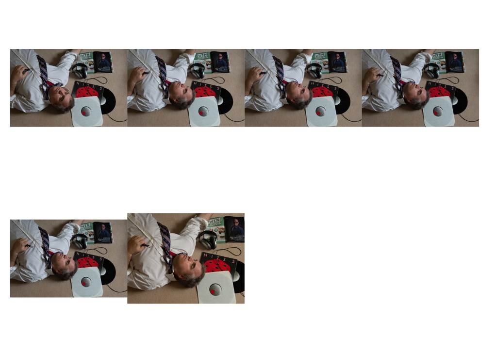
What I love about this course is the way that seemingly innocuous connections often lead to my discovering a completely new artist. I had realised during the assignment preparation that I could import a photograph into an application on my iPad and then annotate with the device’s graphics pen. It meant that I could carry out my analysis of the signifiers and connotations and write them on the picture itself rather than in a set of accompanying notes. As well as reacting positively to this technique, my tutor pointed me at the artist Wendy Red Star, who incorporates similar annotations in her mixed media art.

Wendy Red Star (1981 -)

Wendy Red Star is a Native American artist who grew up as a member of the Crow tribe in their territory in Montana. Her work to rediscover, explore and publicise her people started as an undergraduate in Montana when she erected teepees in the grounds of her school[2]. She had recently learned that the school was in Crow territory and that all traces of her people living there had essentially been wiped away. This early act that was perceived as a political statement set Red Star on the course of creating work that highlighted the Crow against the backdrop of American colonialism. By its very nature, it is considered to be a political statement, something that Red Star denies is her intention. However, the work has found new importance within the context of the current climate of interracial tension in the US.

The work that my tutor made me aware of was Red Star’s series of photographs called 1880 Crow Peace Delegation. The photographs were taking 140 years ago when a delegation of Crow chiefs were invited to Washington by the President to ‘discuss’ the building of a railway link that would run through their lands. The discussion was essentially a way of colonial America to tell the Crow people that it was happening and that there was little they could do about it. In an interview with SmartHistory.org [3], Red Star tells of how the tactic being used was to invite the Crow half way across the country (taking many days) to the nation’s capital where they would be intimidated by the technological and military might of the white man. What the Americans didn’t realise was that the Crow chiefs were well aware of this and to counter the sense of intimidation, turned up to the negotiations in full tribal dress. The photographer, Charles Milton Bell, took a series of portraits of the chiefs in the traditional seated poses that were fashionable in the early days of photography. Bell’s images are cold and distant, as if there was little or no connection between photographer and subject – this was something he was well known for. When Red Star looked at the images, she saw the intricate details of what the chiefs were wearing. She went on to discover more about the men in the photographs, even getting in touch with their direct descendent to gain more of an understanding of their history. Red Star added written contextual elements to the original photographs, tracing around the edges of the details to help the viewer identify with their meanings. An example can be seen below:

Déaxitchish / Pretty Eagle from the series 1880 Crow Peace Delegation, 2014, by Wendy Red Star[4]

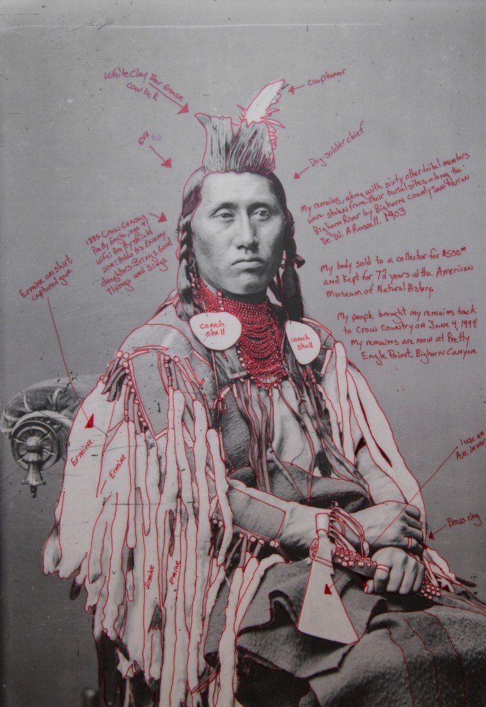
In this photograph we see Pretty Eagle, seated on a western-style chair wearing his traditional Crow clothing, holding an axe. His gaze is beyond the photographer and his expression fairly static. Typically the subjects of these early photographs had to sit very still as the exposure times were long even with the primitive magnesium flash of the time. Even taking this into account, his proud expression comes through in the composition, which ironically may not have been Bell’s intention, given the political circumstances that led to the chief being in Washington. What makes this image is of course how Red Star has annotated it with bright red ink. Her additions highlight the different elements that she thinks need attention drawing to them, e.g the ermine skins that hang from his right shoulder, awarded when an enemy weapon is captured. Other context is about the man’s life, with commentary on his wife and family in the top left of the frame as well as the story of his remains after his death on the right hand side. Red Star seeks to introduce the man behind the attempted propaganda of the original photograph, the result being an education to those who need it. Like the discussions about photography needing some visual tension that we encountered in EYV, this picture and the others in the series are difficult to ignore. The act of writing on the photographs makes the viewer stop, take time to read and then consider the meanings. In the same way that we have seen context used in this course, the viewer creates their own narrative of Pretty Eagle when looking at this image, which has its roots in historical fact. The added text essentially helps build a narrative about the character of these hugely misunderstood people. Red Star isn’t trying to be political here, merely giving a face to her people with the hope that the historical prejudices about their ‘savage’ way of life or their ‘red skin’ are debunked. The importance of her work clearly increases when we consider the extreme prejudice and fear in modern America. However, when I look at these images, I find myself focussing on the man’s face which has no annotation. The sense of ‘this is who I actually am’ is emphasised by the text but for me it really comes down to the way that the photograph was originally captured. The context here seems obvious, but the story still has space within which to develop because the central subject is captured in such a matter-of-fact way.

My tutor was relating these photographs to my use of annotation in the preparation for Assignment 4, where I identified contextual elements and potential meanings by writing on the original photograph. The thought was how Red Star’s work might influence my own, which is something I’ve been thinking about since our call. The key difference that I see here is that the original images were appropriated rather than created; the text seeking to challenge the seemingly obvious narrative about a Crow being exploited. For Assignment 5, we are required to ‘make up’ an image, so the text could be used to either help the viewer or distract them away from the obvious. As I have an easy way of trying this out on my photographs, I am intending to do so. Mixed media (as with Red Star’s work) isn’t something I even considered when deciding to study photography, so I feel that this is expanding the constraints of what I consider my creativity.

Censorship in Photography – when is art really pornography?

The second observation in my tutor’s feedback was that although I had touched on the way that artists have been misinterpreted as immoral or purveyors of what people believe to be pornography, I could perhaps explore how this has evolved over the years. We know that art is subjective within some established constructs, but how have our sensibilities changed with regard to works that we find cross the line between decent and immoral?

Pornography

booksmagazinesfilms, etc. with no artistic value that describe or show sexual actsor naked people in a way that is intended to be sexually exciting:

Dictionary definition of pornography, Cambridge Dictionary[5]

At face value, the definition of pornography above makes complete sense. An item of media that has no artistic value containing content meant to be sexually exciting. I was quite surprised at how clear this definition is, however. If it’s true, how is it that we are surrounded by ‘racy’ material in classical literature or fashionable clothing that leaves little to the imagination? Is that pornographic? The key clue here is the idea of nakedness, combined with sexuality. Where these literal or metaphorical elements are combined visually or in our imaginations, the morality of the work is questioned. Take, for example D H Lawrence’s Lady Chatterley’s Lover, which tells the tale of a wealthy woman who engages in a passionate affair with her gardener at the behest of her disabled husband. The story contains very graphic depictions of the couple’s sexual relationship and leaves the reader in no illusions of its physicality. The book caused outrage in 1930s society when it was published and in fact was banned in the UK until as late as 1960. The words, then create such a sexual reaction in the reader that unless they have no imagination, cannot help but get them sexually ‘excited’. This was the basic argument for its banning as pornographic. This too makes sense in a way as what is being depicted is sexual conduct between people, however to say that a piece of writing has ‘no artistic value’ is stretching the narrative to suit the ultimate outcome. This is where censorship has its origins – the protection of the people from that which subverts them in some way. In the case of Lawrence, it was fine for people to have sex but another thing entirely for them to read about it. The natural argument about protection of junior readers and the vulnerable is, of course a good one. It does seem like an extremely dictatorial process to ban the book in its entirety, though.

In the case of the visual arts, the arguments for censorship are even more clear. Now we have the actual representation of sex or sexuality presented to us to see for ourselves. Or do we? I mentioned two photographers in the preparation research for Assignment 4[6], Robert Mapplethorpe and Sally Mann, both of which have been either banned or criticised for the potentially corrupting nature of their work.

Robert Mapplethorpe (1946-1989)

Mapplethorpe was a photographic artist who came to prominence in New York in the 1960s and 70s. His work spanned many genres including still life and traditional portraiture, but it is for his images of nudity and homoeroticism that he is perhaps best known, both for their quality and controversy. His images of male genitalia and homosexual acts appeared to some as straight pornography, i.e. with no artistic merit beyond the simple excitement or repulsion of the viewer. However, Mapplethorpe was fascinated with sin and its conflict with what he saw as beauty. As he started to explore his own homosexuality, Mapplethorpe’s work addressed the male experience of sex and eroticism; it was controversial at the time and even more so after Mapplethorpe’s death in 1989. In 1990 a retrospective exhibition of his entire catalogue of work in Cincinnati resulted in an obscenity trial which centred on two groups of images in the collection. The first, Mapplethorpe’s collection of nudes and BDSM photographs were considered obscene for obvious reason. The second, a pair of nude images of children were seen as incredibly disturbing, drawing the conclusion in the eyes of the law that this was child pornography. The case against the organisers grew in strength with some politicians demanding that funding for the arts be withdrawn. The trial went down in history as a direct challenge of what is considered art, ultimately concluding that if a piece of work has artistic merit, it cannot be considered to be pornography. What the trial actually did was cement Mapplethorpe’s entire work into history and the allure of the artist remains to this day. What interests me about this attempt to censor the arts is that it completely overshadows Mapplethorpe’s talent for photography. His brother Edward, who worked in his studio at the height of his fame described him as not at all interested in the technical aspects of the craft [7]. Mapplethorpe instead saw the beauty in the subject and the way is should look when represented on film. His brother’s classical training in technique would bring the ideas to life more reliably than perhaps he could achieve on his own. When we look at his still life and less explicit nudes, we see a delicate respect for natural beauty that we don’t necessarily think of when we hear the artist’s name.

Patti Smith (1976) by Robert Mapplethorpe [8]

This photography of his then girlfriend, the singer Patti Smith is an example of one of Mapplethorpe’s nudes that creates a sense of vulnerability and beauty rather than being overtly sexual. The use of the natural light of the window and contrasting lines in the composition emphasise the natural beauty of Smith’s form which is curled in a sitting foetal position. I love this image because despite being simple in the way it’s constructed, it asks so many questions about what is going on for the model – what is she thinking and what happens next?

The other important aspect of the censorship of Mapplethorpe’s work is the suggestion by the trial that the artist had created child pornography. While the ultimate outcome of the trial was to dismiss this notion, the mere thought that it might be considered as such is deeply disturbing. The abhorrent nature of any form of child exploitation is never more greatly emphasised than by pornography, so much so that while reading about the obscenity trial, I decided immediately not to look at the works concerned and most definitely not to include them here in my blog. The thought made me physically sick despite the fact that they were ultimately considered to be art rather than porn. Naturally, what separates art from pornography is the idea of artistic merit which can come from multiple cultural and contextual elements in the photograph, for example a series like Nan Goldin’s Eden and After, which depicts children being children in many different ways is considered a loving tribute to them, in particular to those in her life (she has none of her own). Despite some of the images being of children bathing etc, and along with Goldin’s reputation for more adult material, the book is artistically a celebration of children that Goldin wanted them to take ownership of. There were no doubt some raised eyebrows however, but no gathering of crowds with pitchforks. How then, does the public decide? Why has Sally Mann being singled out for criticism of her similar images of children?

Sally Mann (1951 -)

We encountered the work of Sally Mann during the early exercises on light in EYV. A traditional large format photographer, Mann rose to fame with her portraits of her young family, which also drew criticism for its depiction of her young daughters as nymph-like beings. Some read these intimate portraits as sexualising underage girls, which led to similar accusations of pornographic imagery. Similarly, in Mann’s case the accusations involved children with the very real threat of Mann being arrested and charged. After being called out on her work by a preacher in Minnesota[9], Mann volunteered to talk to the FBI ahead of publishing her book Immediate Family. The conclusion was that the controversial pictures didn’t constitute child pornography by the FBI’s behavioural sciences. He went on to make the remark that while some people would potentially be sexually aroused by them, he had met people who had the same reaction to inanimate objects. There are many other anecdotes about Mann and the motivation behind her photographs of her children, but I was more interested in why people reacted the way that they did. Like Mapplethorpe and his shocking of the ‘decent, moral heterosexual’ people of American society, Mann’s pictures make people uncomfortable. In her book Pictures of Innocence: The History and Crisis of Ideal Childhood, art historian Anne Higonnet states that “No subject is as publicly dangerous now as the subject of the child’s body”. Rather than consider a mother wanting to document her children growing up through exploring their play, interactions as siblings and how they are within their environment, we instead focus on the fact that the hot summers of Virginia lead the children to often be nude. We believe that Mann is somehow exploring her own complex childhood and freely liberal attitudes through the exploitation of her kids, despite hearing from the artist that her children desperately wanted to be part of their mother’s work. The point on exploitation is further emphasised when we learn from her son that they were paid a few cents per negative[10], which in every other circumstance would be considered giving pocket money to a child. Most of all, the criticism of Mann as a ‘pornographer’ comes as much from the way that she is written about. In 1992, The New York Times published an article that explored many aspects of Mann’s life and work, including her controversial photographs of her children[10]. They gave the article the title The Disturbing Work of Sally Mann, which when reading the accompanying text, only accounts for a small part of the article. Perhaps then, we feel the need to assign some label to artists and work that makes us feel uncomfortable. The in-built discomfort means that we might acknowledge their existence but not wish to go further in understanding the context of what is bothering us. As with Mapplethorpe, my own limitations (and I consider them to be so), make me not want to include reproductions of Mann’s work in this post, despite my seeing nothing remotely sexual in the photographs. I guess we all have these limits to some extent.

Conclusions

This post covers two very different aspects of feedback from Assignment 4. I enjoyed learning about Wendy Red Star’s reclamation of her Crow heritage through annotating historical documents. For me, the pictures come alive with her additions and create a sense of who the subjects were, despite them being dead for over 100 years. In considering my own work, I can see some merits in using physical annotation to create mixed media art, but I think it’s probably a step too far at present. It has taken the past 2 years to think of myself as a photographic artist rather than an amateur ‘shot-taker’ and the conflict between my engineering brain and this new-found purpose is well documented in this blog. I will definitely be looking at other examples of mixed media in later courses as it is offers an original perspective.

The second part of this post deals with a subject that people don’t generally want to talk about publicly. Visual arts that include sex and sexuality do indeed provoke a response in the viewer, but is that pornography? Mapplethorpe’s work lifts the lid on a way of life and sexual practice that most are not aware of or wish to acknowledge, but where does the argument for ‘no artistic merit’ begin? What I realised from researching his work more deeply is that he was a great advocate of the beauty and danger of the human body, mixing perception of sin with the most natural resource we all have, our physical selves. I find some of his pictures shocking, but can appreciate the way they are shot and even deriving a narrative from them. What makes me sad is that his appreciation of his subject and talent for light and composition are completely overshadowed by the controversy and the way that his life was cut short so tragically by AIDS. The same goes for Mann. I find myself asking how any mother could create sexualising images of the children that she clearly loves very much. I know that such people exist in the world, but that vile underbelly of society doesn’t go about creating a carefully constructed documentary with a large format camera. We almost want to believe that someone is ‘not right’ when they photograph their children playing in the garden without any clothes. I think that says more about society than it does about Mann. The remaining sadness in her case is that her young children are now all grown adults and as such Mann’s work has since moved on. When we do a search of her work, though we are not directed at her intimate documentary about her husband’s debilitating illness or her beautiful landscapes. We don’t see her work about the effects of decay on the human body, we just see references to the controversy of her earlier work with her children. I come back to the original definition of pornography as being something that deliberately invokes sexual arousal, is graphically depicting sex and has not artistic merit. None of these apply to Mann or Mapplethorpe.

References

[1] Fletcher R, 2020, “Assignment 4: A Picture Tells a Thousand Words”, OCA Blog Post, https://richardfletcherphotography.photo.blog/2020/11/13/assignment-4-a-picture-tells-a-thousand-words/

[2] Griffiths M, Unknown Date, “Wendy Red Star”, Hundred Heroine website, https://hundredheroines.org/featured/wendy-red-star/

[3] Red Star W et al, Unknown Date, “Wendy Red Star, 1880 Crow Peace Delegation, Smart History, https://smarthistory.org/wendy-red-star-1880-crow-peace-delegation-2/

[4] Unknown., 2018, “1880 Crow Peace Delegation”, Image Resource, Birmingham Museum of Art, https://www.artsbma.org/1880-crow-peace-delegation/

[5] Unknown, “Dictionary Definition of Pornography”, Cambridge Dictionary Online, https://dictionary.cambridge.org/dictionary/english/pornography

[6] Fletcher R, 2020, “Preparation for Assignment 4”, OCA Blog Post, https://richardfletcherphotography.photo.blog/2020/11/13/preparation-and-research-for-assignment-4/

[7] Lee Ball A, 2016, “The Other Mapplethorpe”, The New York Times online, https://www.nytimes.com/2016/04/17/fashion/edward-mapplethorpe-robert-babies-brother.html

[8] McAteer S, 2013, “Patti Smith; Robert Mapplethorpe 1976”, Image Resource, Tate Online, https://www.tate.org.uk/art/artworks/robert-patti-smith-ar00186

[9] Gross T, 2015, “Making Art out of Bodies: Sally Mann Reflects on Life and Photography, npr online, https://www.npr.org/transcripts/405937803?t=1606894062435

[10]Woodward R, 1992, “The Disturbing Photography of Sally Mann”, The New York Times, https://www.nytimes.com/1992/09/27/magazine/the-disturbing-photography-of-sally-mann.html

5) Exercise 1: Martin Scorsese Critique

The Brief

Watch this famous scene ‘The Long Take’ from Goodfellas directed by Martin Scorsese in 1990: www.youtube.com/watch?v=OJEEVtqXdK8

Don’t read on until you’ve answered the following questions:

  1. What does this scene tell you about the main character?
  2. How does it do this? List the ‘clues’

Make some notes in your learning log.

What does this scene tell you about the main character?

From the first frame of this scene, we see a generous man. The initial shot is of a hand passing a money tip to another hand with what we initially assume to be the main character thanking the other person. It transpires from the dialogue that this man is going to look after his car with him citing that it was quicker than fighting through the crowds at the end of the night.

The shot essentially follows the man and his companion from a close distance behind them as they walk through the back door of the club, down stairs, through the kitchen and eventually into the main space. The whole scene is set to the song Then he Kissed Me by The Crystals (1963), which is a description of a romantic encounter told from the perspective of the woman. The song tells a story of a man taking control of the encounter that leads to a relationship and eventually marriage. Although a love song, it’s difficult to get away from the ‘he did this, he did that…and then he kissed me’ theme of male ‘confidence’. The lyrics to the song and ‘the tip’ are the first clue that this man is of some importance with some power associated with it.

How does it do this?

As the shot progresses, the next clue is that at each internal doorway on their journey, the couple are greeted by doormen, who each receive a tip from the man. He also refers to each by their first name, which suggests that his presence is somehow regular and revered. This theme continues as the shot progresses with each person they come into contact being greeted jovially by the man, but not the woman – she is largely anonymous in the scene. The way the shot is created, the woman’s face is never seen in any detail for any length of time, contrasted against the man, who regularly looks either way and even back toward the camera. This effect makes the viewer almost forget that she is there.

As the action moves through the kitchen, everyone that they pass acknowledges them in some way, either directly or just with a look. Then another clue to his importance, or rather the viewer’s lack of importance is seen. A chef carrying a large red box of ingredients enters the frame from the left and passes between the camera and the couple. He moves away to the right hand side of the frame continuing his journey.

This use of space between the camera and subject both enhances the natural perspective of the sequence as the couple make their way through the kitchen, as well as putting a division between the viewer and the subject. The chef doesn’t walk in front of the man, but doesn’t hesitate in walking between us and him, thus setting the tone of our relative importance to one another.

When the couple make their way into the club, they are greeted by groups of men who are arranged in a way that suggests they are part of some organisation or gang. The manager instinctively signals to some waiters who bring table and proceed to set it up in a space in the busy dining room. This whole scene is observed by everyone present and we hear the manager rebuking someone who protests because they were also waiting for a table. This build-up of clues makes the man go from merely a generous patron who may know the staff, to someone with much greater significance. His treatment by the manager and staff isn’t asked for at any point in the scene, it just happens.

More people are introduced to the man but not the woman, further emphasising his importance. The scene draws to a close with a bottle of wine being brought over with compliments of a man called Mr Tony who we see when the camera pans left. He is surrounded by men who we assume to be bodyguards or associates. The final sequence shows a stand-up comic beginning his act. The act begins almost immediately after the couple sit down and the woman asks the man what he does for a living, another sign that things wait for the man. She asks in a way that suggests that they don’t really know each other and with an air of surprise at the deference shown by everyone they encounter on their way into the club.

Scorsese shoots this scene in a very particular way, with each element being relevant to the meaning he is trying to create. The long following shot itself suggests a man who leads the way, his girl by his side being directed in her every move by his hand. The shot moves through he areas of the club that wouldn’t normally be seen, the back-of-house areas like the kitchen. His walking through this space with confidence and the staff reactions to him elevate the main character in our minds to someone of great importance, both in terms of power and also in their lives. The club is lit with very subdued lighting, which coupled with the groups of men gathered at tables suggests an establishment where all is not all it seems. Goodfellas is a gangster movie, so by dressing the men in business suits with some wearing sunglasses (inexplicably), Scorsese creates a sense of underworld. The deep red colour of the club suggests that this is perhaps Hell where monsters live, which all plays into the aesthetic of the underworld. It’s a very cleverly shot sequence that keeps us looking at this important man without any changes in perspective or field of view, which builds his character from being a generous patron to someone of great significance in the space of a few minutes.

Tableaux Photography

We’ve already been introduced to Jeff Wall through his photograph Insomnia (2008), which is an example of a carefully crafted scene. The photograph contains only the elements that help add context to the subject and in turn build the narrative in within the viewer. In his exhibition at Tate Modern in 2005, Wall was interviewed about his work in an article by the museum called Beyond the Threshold[1] in which he describes his approach to working. The picture that the interview focuses on is View from an Apartment (2004-5). Form this image, Wall rented an apartment that up until then had been occupied by a young couple. He wanted to create something that was inherently interior while also containing some exterior as most his photographs of living spaces tended to rely heavily on the former. His choice of apartment had a view across one of the harbour areas of Vancouver and would make a good set for his image. In a way similar to the directors and the mise en scene, the art of tableaux photography builds a set, dresses and lights it and finally adds the subjects or actors. In this case, Wall dressed the apartment with items he had collected from other photographs as well as things one would normally find in a living space.

A View from an Apartment (2004-5) by Jeff Wall[1]

The actors were a woman that Wall hired specifically and her friend. Choosing two actors creates more of a sense of daily life in the scene, even though it’s not clear that these women are partners in any way. The apartment is littered with evidence of their lives while the ironing board and laundry suggest some action that might be thing place. The woman who isn’t ironing is completely disengaged from the rest of the room and all that is going on around her, preferring instead to read her magazine. What is interesting about this shot is the fact that everything in the apartment was put there by Wall in an almost cinematic way – when the interviewer went to see this set, she was asked to be careful not to touch anything in the scene[1].

Wall’s approach to meticulous planning and executing of his images stems from his not wanting to photograph something that is happening in a documentary or snapshot style, but to recreate a memory of something that interested him[2]. When I think about this approach to photography, I am drawn to the fact that Wall is remembering a story, in the same way as someone telling us or watching a movie. He makes a mental note of the details of the story and then tries to recreate them in his photography. I wondered if that act of reflection and recreation actually makes it easier for Wall to tell a story as our minds have the ability to add of fill in any details we may have forgotten. Wall states in an interview [2] that his photographs are what is left of a story when the words that describe them are stripped away, that is taking away any context or intent and letting the story tell itself. I was fascinated by this idea that as well as creating something that is a representation of an event, Wall is also invoking the emotion of the memory of the event, adding his perspective on the image through the way it is constructed. Like diCorcia he isn’t trying to dictate the narrative as he sees that as the responsibility of the viewer, but his feelings visibly run through the work. The previous example of Insomnia is a powerful telling of the horror of not being able to sleep and its effect on the human emotional state – this ties in with the general tenor of his work as director and screenwriter for his own dramas.

Conclusion

I found this exercise interesting because it does highlight the similarities and differences between moving pictures and stills when it comes to telling a story. Scorsese’s scene builds the story as it rolls through, leading eventually to the realisation that the character is powerful, mysterious and living a comfortable but dangerous life. By contrast, Wall’s narrative has to be derived from a single visualisation of the story, meaning that the photograph has one chance to get the information across. Wall achieves his work by the act of not photographing initially, but observing the scene and remembering not just the details, but what interested him in it to begin with. The act of recreation tells Wall’s story with the artist controlling how we consume the information in the frame by careful use of the elements of mise en scene. This is definitely something to consider throughout Part 5.

References

[1] Wagstaff S, 2005, “Beyond the Threshold: Jeff Wall”, Tate Modern, https://www.tate.org.uk/tate-etc/issue-4-summer-2005/beyond-threshold

[2] S.F.M.M.A., 2010, “Jeff Wall: I begin by not photographing”, Interview, https://www.youtube.com/watch?v=2yG2k4C4zrU

5) Project 1: Setting the Scene

Mise en scène, pronounced meez-ahn-sen, is a term used to describe the setting of a scene in a play or a film. It refers to everything placed on the stage or in front of the camera—including people. In other words, mise en scène is a catch-all for everything that contributes to the visual presentation and overall “look” of a production. When translated from French, it means “placing on stage.”

Definition of mise en scène in film [1]

We are introduced to this expression a the beginning of Part 5, which for me ties in with neatly with the photographer that I studied for Assignment 4, Philip-lorca diCorcia – his series Hustlers is covered in this section of the course notes. Along with Jeff Wall and Gregory Crewdson, diCorcia is a photographer who carefully creates a scene with characters, lighting and props to tell a story. A quick search for a description of mise en scène brought me to the Masterclass website, a company that sells courses in a variety of creative subjects from cookery to screenwriting led by famous people in those fields. Along with the definition cited, there were some elements of mise en scène to consider, some obvious and some not so. The obvious ones included choice of actors, location, set design, lighting etc which we have seen in the works of the photographers in Part 4. However the not so obvious ones to me were camera placement (shot blocking), depth of space and film stock, which I found interesting.

Shot Blocking is the positioning and relative movements of the actors to each other and the camera and includes the position of the camera itself. In a way, this could be considered ‘perspective’, but it goes further in describing how the actors and viewer relate to each other. When working on Assignment 4, one of the elements used by diCorcia was the cinematic style [2], referring to how the viewer is looking on the scene ‘square on’. The idea is that the viewer is watching the action from an orthogonal perspective that allows them to explore the whole scene and feel like they could step into it. The contrasting viewpoint would be one determined by the forcing the viewer into a particular space with a more contrived perspective, restricting both the way they see the action and their building of a narrative. In his placement of the subjects relative to the camera in this style, diCorcia creates an almost voyeristic feel for his photographs, particularly ones involving intimate perspectives on somebody’s life. In terms of the way that actors interact with each other, the key difference between moving pictures and photographs is that the former has more time to build the narrative with the viewer as the film progresses; the stills photographer having to include everything in a single frame. The movement between actors is real in film, so careful thought is put in to how the movements look as the scene builds.

Depth of Space is something else that resonated with me and reminded me that it had come up in a conversation with my tutor on the previous unit, EYV. He had a career in television and talked about the creation of depth in a scene being important in suggesting the temp or mood of the work. If, for example a sense of scale is needed in a battle scene, the cinematographer wouldn’t make a shot that highlighted only a handful of soldiers, they would incorporate large, wide views of the whole scene to let the viewer know this was a large battle. Similarly, if a sense of imprisonment was needed, a smaller scene would be more impactful, e.g a wide angle shot of a cramped cell with actors close together. In Jeff Walls’ Insomnia[3], the scene is constricted by the use of a wide angle lens in a narrow space and further enhanced by the inclusion of the large table in the middle of the scene. The person in the picture is almost dwarfed by his surroundings, creating a sense of being imprisoned. I was further reminded again of the power of creating a depth of space in cinema recently when I saw the Stanley Kubrick film The Shining (1980). The film is famed for creating shots that closely follow the actors through large spaces from their perspective. Take for example, the scenes where the young boy Danny is riding his tricycle around the hotel’s vast corridors (below). The camera follows Danny from just behind him but at his eye level.

Danny Torrance on his tricycle, The Shining (1980) [4]

As he races around the hotel, we see what Danny sees but in a third person view, similar to many modern video games. At this early point in the movie, we already know that there is something very wrong with the hotel, so the long corridors create a sense of scale relative to the little boy that is intimidating. As he turns each corner into the next corridor, the camera follows him and builds the suspense; we have no idea what horrors are waiting for him around the next blind turn. Kubrick further increases the tension through use of sound. As Danny moves from carpet to hard floor and back again, the noise made by his wheels sounds almost like a sinister breathing as if the hotel is actively pursuing him. It’s the space and scape that makes this seemingly innocent scene of a little boy on his trike utterly terrifying.

Other elements that resonated with me were lighting and costume. The former may appear fairly obvious, but we have already seen the impact the creative use of light in a ‘staged’ image. The cold, fluorescent-style lighting in Insomnia creates a different effect to natural light, so if this were indeed an actual kitchen shot in daylight the sense of desperation and dread would be completely lost. With the costumes, though the choice of wardrobe can be a central theme to a film’s narrative. For example, in The Untouchables (1987), the job of dressing the cast was given to famous fashion designer Giorgio Armani. His reputation for stylish, expensive fashion was already established but in this film his creations were very carefully designed to support the film’s narrative. The main cast is the classic good vs. evil, with Eliot Ness and his Untouchables on one side and Al Capone and his gang on the other. For the lawmen, Armani created a feeling of hardworking, strength while fitting in with the idea that everyone wore smart suits and ties in the 1930s. For the Capone gang, though he created the opposite sense of rich opulence to support the idea that these people were living off the ill-gotten gains of exploiting the people of Chicago. The images below show the contrast between the two aesthetics.

Eliot Ness and team from The Untouchables (1987) [5]
The Capone Gang, from The Untouchables (1987) [6]

Conclusion

The phrase mise en scène seems fairly self-explanatory, but as with most of this course the importance of setting the scene is subtle. The use of carefully placed visual elements and composition is similar in still and motion picture photography alike, but the freedom and pace at which a narrative can be realised differs between the two. Where a photographer has a single frame in which to include everything, a filmmaker has more time to build these subtle ‘background’ references in parallel with the more obvious acting that is occurring in the ‘foreground’. In the case of Kubrick, his directional style of shooting the same scene over and over to achieve both his vision and to drive (almost bully) the actors to be more naturally in the moment, is well documented (the famous baseball bat scene in The Shining was shot 127 times)[6]. That obsession with getting the most out of the cast and how they interact is often the thing we connect with, but in fact the cinematography, set design, costumes and lighting play a major part in how the viewer creates their narrative. In the case of diCorcia and Wall, their work uses the same techniques to lead the viewer around the frame but only have that one chance to give them what they need. As I move toward Assignment 5, the final one in this unit, the need to appreciate these elements is made clear by the simple idea of setting the scene.

References

[1] Masterclass, 2020, “What is Mise en scène in Film?”, Masterclass website, https://www.masterclass.com/articles/what-is-mise-en-scene-in-film#what-is-mise-en-scne

[2] Fletcher R, 2020, “Preparation for Assignment 4”, OCA Blog Post, https://richardfletcherphotography.photo.blog/2020/11/13/preparation-and-research-for-assignment-4/

[3] Fletcher R, 2020, “Research Task: Insomnia”, OCA Blog Post, https://richardfletcherphotography.photo.blog/2020/11/13/research-task-insomnia/

[4] Lightman H, 2019, “Photographing Stanley Kubrick’s The Shining”, The American Society of Cinematography website, https://ascmag.com/articles/flashback-the-shining

[5] Cochrane L, 2015, “From Scorsese to De Palma: how Armani dressed the movies”, Image Resource, The Guardian, https://www.theguardian.com/fashion/gallery/2015/oct/13/from-scorsese-to-de-palma-how-armani-dressed-the-movies, https://www.furiouscinema.com/crimewatch-the-untouchables/

[6] Green A, 2016, “Flashback: Shelley Duvall Battles Kubrick over ‘The Shining’, Rolling Stone Magazine, https://www.rollingstone.com/movies/movie-news/shelley-duvall-and-stanley-kubrick-battle-the-shining-188549/

Preparation and Research for Assignment 4

Introduction

Assignment 4 is slightly different from the others in this unit in that it is a written essay rather than a photography project. The brief is for a critical analysis of a photograph either by a famous photographer or one of our own. The essay is intended to break down the image into its context and meanings as we have learned in Part 4. This post is the preparation and research for that essay.

The Image

The Hamptons (2008) by Philip-Lorca DiCorcia [1]

This image is from Philip-Lorca diCorcia from his series East of Eden and depicts two dogs ‘watching’ a pornographic film in a very modern-looking room. I chose this image because my initial reaction was a one of humour at the slightly shocking contrast of the subjects. I am also as a fan of diCorcia’s work, having first seen an exhibition of his work, including East of Eden at the Hepworth Gallery in Wakefield in 2014. I was drawn to the way that his images seem relatively simple in their composition, yet are interesting; containing many layers of complexity that are revealed the longer we look at them.

Contextual Research: diCorcia and East of Eden

Philip-Lorca diCorcia started his career in fashion photography, working on assignment for W magazine with the same creative director for over a decade [2]. With his work in that industry he developed a style of creating a scene that was not naturally observed, by using models, flash strobes, props and of course the element of fashion that was the subject of the ‘story’. When he started to develop his ideas for his own work, he took this sense of fantasy and unreality into his art. His brother died of AIDS in the 1980s, which diCorcia used as the inspiration for his famous series Hustler, a collection of photographs of male prostitutes in the major cities in the USA. At the time, the government rhetoric about AIDS was one of moral denia (it only affected the ‘degenerate’ homosexual community) and disconnection from the way that it was wiping out a whole swathe of the population. With Hustler, diCorcia wasn’t trying to document the struggles of the lives of the young men, but instead drawing attention to their existence as people and actors in their way of life. diCorcia has stated that he didn’t know or get to know them in any way, he just set up the composition he wanted and then hired them to be part of it. What diCorcia was interested in was revealing how the outward personality of his subjects differed from what they were really like. Since he didn’t know them personally, he left any conclusions about that they were actually like to the viewer to narrate.

“A person’s interiority is very different than their exterior appearance and to some degree, life is a performance”.

Philip-lorca diCorcia, talking to The Hepworth Gallery, Wakefield[3]

In a presentation made to The Modern in Fort Worth [4], diCorcia mentions that prostitutes are essentially actors for hire and that the variety of fantasy roles that males play is much bigger than their female counterparts. In the same presentation, he answers a question about how he creates narrative in his pictures.

“I’m supposed to give you just enough information, in my mind, as you need to be intrigued, not enough to finish your experience”

Philip-lorca diCorcia on his approach to narrative [4]

What he meant by this lends itself to the theories of post-structuralism where the artist is not drawing on cultural references to tell a story, but shifting the responsibility onto the viewer. In the case of Derrida’s idea that a trace of what isn’t there is also present in a story or image, diCorcia is showing us perhaps the obvious outward impressions of what male prostitutes are, but also leaving an idea that all is not what it seems. These young men had a story of how they ended up with this lifestyle, perhaps the lack of family support or struggles with their mental health. The elements that suggest this are often implied but not actually present. His use of unreality, i.e a contrived setting for these young men to be placed within, he adds to the mystery of what the image means. We see examples of this in his fashion work:

W, September 2000 #6, by Philip-Lorca DiCorcia [1]

Here we have three people enjoying lunch in a restaurant that is immediately recognisable as the Windows on the World at the top of the World Trade Center towers. The shot was taken in 2000, the year before the towers were destroyed in the 911 attacks, but the location’s use was merely an accident; the artist knowing someone involved in the running of the restaurant. The main contextual elements in the image are the two middle-aged ladies having lunch with a much younger man. diCorcia states that the series was a fashion story about the ‘boy toys’ of women of a particular social class and age group[4]. The fashion elements that are layered into the photograph are what the series is supposed to be revealing, but when we look closer at the picture we see that nothing is at all natural about the shot, from the bright lighting to the almost over-the-top acting of the subjects. One of the women appears to be enjoying the presence and attention of the young man, while the other looks embarrassed, glaring at the camera as if she’s been found out in some way. In this image, there is both total abandonment with the mature women being entertained by the young man, as well as the acknowledgement that it’s not perhaps the done thing in society. The elegant setting adds weight to that impression, the twin towers being a symbol of prosperous America. In discussing this image, diCorcia confirmed that in fact, the women were professional models but the young man was actually a hustler in the same way as his previous series. This blending of the perceptively real and unreal, which traces of their opposites is to me, very indicative of most of diCorcia’s work; the added context making it even more intriguing.

In various interviews[4][5], diCorcia has discussed his desire to create art that is separated from his perspective, almost always making it clear that he is not part of the story but merely using a camera to observe. In the case of Heads, he elected to add a lack of control over the subjects by photographing them from a considerable distance. His lights were set up within the scaffolding of building works and his camera pre-focussed. When a person walked through the region of focus, he triggered the camera. What resulted was a series of images captured by chance more than design, in some cases the subject would be too tall or too short for the picture to work but in others, the sense of people going about their daily lives comes through strongly. The series got diCorcia in trouble as one of the subjects sued him for using his image[6], but in the main the reaction when the subjects realised they had been photographed ranged from happiness to ambivalence.

With East of Eden, diCorcia set out to create a sense of the loss of innocence. The work began in 2008 around the time that America was transitioning from the Republican era of George W Bush to the Barack Obama’s first Democrat administration. diCorcia, who described himself as ‘not Republican’ combines the contextual references of contemporary American society with religious themes throughout East of Eden. References to Adam and Eve, Cain and Abel etc give the sense of the damage done by the political culture on modern America through diCorcia’s alternative realities. The works are subtle, though as in the case of the photograph Cain and Abel.

Cain and Abel (2013) from the series East of Eden by Philip-Lorca diCorcia [1]

In the bible story from the book of Genesis, Cain and Abel were brothers and the children of Adam and Eve. The story tells of Cain murdering his brother after his offering to God was seen as of lesser value than Abel’s. His action resulted in his banishment from Eden to ‘the land of Nod’, located to the East. East of Eden is the direct reference to the story and the descent of Cain and his descendants into moral corruption following his destroying of the righteous[7]. It has been retold throughout history and in the case of Steinbeck’s novel also called East of Eden, set brought into the context of modern society[8]. In diCorcia’s Cain and Abel, we are presented with two men in embrace. The nature of their relationship is unclear but the presence of the bed suggests a homosexual couple. The men are wearing the colours of the two main political parties in the US, so the viewer is immediately asked if the embrace is one of affection or rather that they are fighting. In the doorway a naked woman watches the two men. She is pregnant, which creates the sense of motherhood. In fact, diCorcia intended the woman to be Eve, the mother of Cain and Abel – he admitted to having photoshopped her naval form the image to give her the impression of being the original human female[4]. The multiple layers of context that this photograph contains is typical of the series. Themes such as separation and division, with the chance of reconciliation are matched by the reaction to the men being a gay couple, something that conservative America still regards as a sin. The disapproval or disappointment of the Eve figure could further reinforce that sense and her pregnancy while signposting her status as mother, could also be seen as continuation – a sense of ‘we’ve started as we mean to go on’; the age of innocence lost. It could equally be read as sadness that the general narrative about homosexuality as being ‘wrong’ is still evident today, despite significant progress in acceptance and rejection of prejudice.

When we think about it, loss of innocence can have many meanings such as the loss of childhood to adulthood portrayed in literary works like William Golding’s Lord of the Flies where the extreme circumstances cause the children to have to fight for survival and, almost inevitably power. Visual artists have represented this same theme in a variety of genres, for example Costa Rican artist John Paul Fauvres’s series The Loss of Innocence which was inspired by his observations about his son growing up [9]. Fauvres challenges the associated we have with the things we enjoyed as a child by altering them in an adult, often sinister way. One such image of Mickey Mouse blended into Marilyn Monroe suggests a shift away from the pure to the superficially pure in an almost nightmarish way created by the act of seeing it through adult eyes [9]. Perhaps this explains then, some of the criticism levelled at renowned Sally Mann who photographed her children innocently playing and frequently nude. Our application of an adult perspective immediately associates the nudity of children as observed by their parents as being sinister or abusive, serving to erode innocence where it is clearly evident – I was quite shocked by this when studying the artist as part of EYV.

However ‘loss of innocence’ could also be a term associated with the veil lifting on a preconception. diCorcia believed that America had changed during the Bush administration with the financial crash brought about by the ‘immoral’ behaviour of the banking industry and the ‘terror’ and the subsequent war on terror that revolved around the 9/11 attacks. This series explores the notion that perhaps the age of innocence had been lost without anyone noticing and that it was more about the way we see the world that had changed.

East of Eden then is a series that is full of metaphor, alternative narratives and multi-layered meaning, which is why I chose a photograph from it.

Deconstructing ‘The Hamptons’

I approached this in a similar way to Exercise 2[10], where I analysed an advertisement for sliced ham. I started with the formal, factual elements in the frame and then moved on to some of the potential connotations of them. The annotated photograph can be seen below.

The elements that are labeled in red are the signifiers, or factual elements present in the composition. We see here the space containing furniture and equipment that denote a living room. The presence of the television, fireplace, hi-fi equipment and coffee table all point to a space with a very specific purpose. The space is painted and carpeted with neutral colours, which combined with the style of the coffee table connote a modern living room. Indeed the style of the room architecturally suggests modern with its central block containing the fireplace, hi-fi and log store. We cannot see what is beyond, but what we can see denotes open-space living. The audio and video equipment are large and expensive-looking, which connotes a space owned by someone with money. These elements come together to result the photograph’s first sign, which is that this is an expensive living space. This sign is further emphasised by the title of the photograph, The Hamptons. The Hamptons is a very wealthy area of upstate New York, which fits with this first sign.

The next noticeable elements are the two dogs and the pornographic film being shown on the television. The dogs are clearly of the same breed, which has a clean, lightly coloured coat. One is sitting upright and the other is laying down, but both are looking in the direction of the wall with the television on it. For me, the two dogs dennote the occupants of the space as they are the only living beings in the photograph. Their postures connote different emotional responses to whatever they are looking at. The one sitting suggests interest or tension while the other connotes relaxation and perhaps comfort. The former has their posture further emphasised by their reflection in the coffee table which only reveals the dog’s hind legs. The connotation here is that the dog is alert and ready to move if necessary, which further adds to the sense of attention being paid to what the dog is looking at. The television on the wall is what we assume the dogs are looking at and on it is a pornographic film. If the modern, expensive, perfectly neat and tidy sign of the living room is the studium when considered with the picture’s title, the porn film is the punctum. It’s stark contrast to the rest of the picture is evident from first examination and when combined with the fire offer the completely opposite sign. Here we have the perfect space and perfect occupants in the presence of something that doesn’t obviously belong. When I observed this punctum, I also noticed the increased significance in the way the scene is lit, by a uniform soft light from the right hand side of the frame. diCorcia is well known for using artificial light in his compositions because of his fashion work, so it is no coincidence or accident that the light in this image is pure. It is, of course part of the signs relating to the modern, expensive living space, but I noticed it when presented with the contrasting element, i.e. the porn film.

Exploring the possible cultural themes

With the studium and punctum of the image beginning to present themselves to me, I wanted to explore the cultural themes relating to them. The first is the culture of wealth and the way that it affects our perception of the people who have it. As mentioned previously, The Hamptons is a region of upstate New York which has some of the highest house prices in the US, some properties reaching over $100m. The fascination with that kind of wealth can be found throughout modern media, ranging from reality television stars such as the Kardashians to the billionaire businessmen and women such as Jeff Bezos (Amazon) and Alice Walton (Walmart) whose lifestyles are coveted by many. We associate money with power and indeed some of the people with money also wield power over our lives. However, where does the association with higher class and standing come from when it comes to money? Since the modern US culture and the UK share a common history, we can consider the attitudes to wealth and class that span the past few hundred years. In the Tudor era, the wealthy were born of privilege and as a result expected to be responsible for the lower classes in their regions or estates. Such responsibility was associated with respect for standing and the resources to give jobs to working men and women of the lower class. The respect was engendered, even if the ‘master’ was just a fortunate benefactor to family wealth that he hadn’t earned. These notions continued into Victorian England where the social classes were shaken up by the Industrial Revolution [11]. Now wealthy people were both revered and reviled for being ‘the betters’ of the common man, a sentiment that we see in literature such as Dickens’ Oliver Twist. In his novel, Dickens uses the theme of class divide as a battleground where the poor and morally bankrupt rob the rich as part of a criminal enterprise. The principal character, born to poverty eventually ascends to wealth by being adopted by a ‘gentleman’ and ultimately turning out to be a member of his family through his mother’s line. The story tells us that the rich are special and the poor must fight, but it is possible to cross the divide. At the time of writing, Dickens’ readers would have been acutely aware of gulf between classes, so the notions being put to them by the Dickens would have appeared unreal[12]. Dickens answer was to make Oliver a pure figure, beyond reproach whose destiny to achieve wealth and standing was ‘because he was one of them’. However, we know now that while the legacy impression of wealth symbolises higher standing or ‘being better’, we know from our more recent history that this simply isn’t the case. Highly publicised scandals and the private lives of the rich and famous and even royalty have made us cynical about what goes on behind the perfect facade of the image of wealth and success. The continued morally questionable behaviour of President Trump presents us with almost a confession that you don’t have to be good to have money. Perhaps then diCorcia’s loss of the age of innocence starts with the notion that wealthy means goodly and then contradicts it with both obvious and subtle narratives.

The second are of cultural context I wanted to explore was our relationship with pornography. Pornography has long been a devise subject that most prefer not to discuss. It’s association with historical illegality and the seedy side of life have driven it’s existence underground or behind closed doors. However it is more prevalent than ever, being regularly recorded as the most accessed material on the internet [13]. The effect of pornography on society prompted a House of Lords report in 2015 [13] in which concerns about the accessibility to children, it’s effect on their sexual development and implication in violent acts committed on women were offset by the lack of real understanding of who watches it. Their own statistics didn’t capture the volume of material being watched and which sexes, social groups and classes were the main audience for it. Arguments have been made that it is an industry like any other and that the boundaries between art and pornography are blurred at best. Take the work of Fauvres discussed earlier for example. Some of those paintings take childlike constructs and overtly sexualise them. Robert Mapplethorpe’s extreme portraits often portraying homosexual ‘acts’ and male nudity are considered art, yet despite there not being anything illegal about them, were considered pornographic when they were first published. That response was driven mainly by heterosexual sensibilities that considered being gay to be unnatural. Porn then, is something unnatural that we should be ashamed of. Despite this, many women watch pornography as well as many couples with strong, loving relationships. Like societal beliefs in wealth and morality, pornography is something best kept hidden – almost the opposite side of the same cultural coin.

Reading ‘The Hamptons’

When I read The Hamptons (2008) by Philip Lorca-diCorcia, I first see the signs that I identified in the deconstruction. This is a wealthy living space where everything is seemingly pure, but in fact there is a contrasting activity taking place. The two dogs symbolise two types of people that have a common appearance to the outside world. The pornographic film symbolises the replacement for the innocence lost, in this case the contrasting aesthetic to the purity of the room and its occupants. The inclusion of the fire that seemingly serves to provide heat to the space now looks like an almost religious signpost that whatever is happening has some form of damnation associated with it. The reactions of the two dogs to the film are different, one appearing to be ambivalent to the loss and the other being acutely aware of it. There are no other beings in the space which suggests that the occurrence and their reactions are all private; the notion of ‘not knowing what goes on behind closed doors’ could be literal when considering the dogs and the film, but my reading is that it is a metaphor for our lives – some things are neat and controlled like the room (with its almost clinical tones) and others are beyond our control (the dogs wouldn’t chose to watch a porn film by themselves). The struggle between the image of good and the struggle with the evil is not a simple one. In this photograph, the evil is already there but the dogs are merely accepting of it or intrigued by it. As with the banking scandal that served as diCorcia’s inspiration, the behaviour was going on but nobody really paid attention to it until it was too late. Like our ability to recognise the slow degradation of innocence causes by such events, our reaction to them depends on our point of view. As with the other photograph Cain and Abel, diCorcia weaves layers of potential messaging with only a handful of props and environmental conditions.

Conclusion and Preparation for the Essay

In conclusion, I am glad I selected one of diCorcia’s photographs for this assignment. As with the previous exercises, the methodical approach of looking first at what is present in the frame and what it might mean is a good way of structuring the photograph before reacting to it in some way. My reading of the studium and punctum led me to looking at how my own experiences and perspectives affect the meaning of the overall image to me. Having visited the US several times now and stayed in places where the rich are truly rich, I recognise the setting that diCorcia presented this subject within. My own views people’s morality is not driven by social media personas or public faces. Neither is it judged in any way by them looking at pornography, which I feel to be a complex subject that shouldn’t be reduced to a tool by which people are assessed. The use of dogs instead of people further reduces the temptation to judge by appearances, instead the potential narrative that the inclusion creates is all the more interesting because of the metaphor. What I loved about this photograph when I first saw it was that it made me smile. The humour introduced by the silly way the dogs are watching the film belied the sadness and almost sinister way my reading of the image evolved. It’s that complexity that makes this image resonate with me.

In preparation for writing the essay, I am intending to use a structure defined in a recent training course that I completed for work, referred to previously [14]. The structure aligns with:

  1. Setting the scene with context and what the speech is about
  2. Summarising the key points of the information being imparted
  3. Personal experience and connection with the subject
  4. A final point connects the conclusion back to the original intent in 2.

By following this structure, I will be able to prioritise the key points while remaining within the word count.

References

[1] Image Resource, “Philip-Lorca DiCorcia, David Zwirner Gallery, https://www.davidzwirner.com/exhibitions/philip-lorca-dicorcia-paris#/explore

[2] Helmore E, 2011, ‘Still Life: Philip-Lorca DiCorcia’s breathtaking and outlandish fashion photography, Independent Newspaper website, https://www.independent.co.uk/arts-entertainment/art/features/still-life-philip-lorca-dicorcias-breathtaking-and-outlandish-fashion-photography-for-w-magazine-2229656.html

[3] HepworthWakefield 2014, “Philip-lorca diCorcia: Photographs 1975 – 2012, Youtube, https://www.youtube.com/watch?v=So_FK4qnz5Q

[4] Unknown, 2015, “Tuesday Evenings at the Modern – Philip-Lorca DiCorcia, Youtube, https://www.youtube.com/watch?v=zs8z9DCVrYA

[5] Unknown 2018, “Interview – Philip-Lorca diCorcia, CICART video, https://www.youtube.com/watch?v=67U-0_wExLA

[6] Gefter P, 2006, “Street Photography: A right or invasion?”, The New York Times, https://www.nytimes.com/2006/03/17/arts/street-photography-a-right-or-invasion.html

[7] Multiple Authors, 2020, ‘Cain and Abel- Bible Story’, Bible Study Tools post, https://www.biblestudytools.com/bible-stories/cain-and-abel.html

[8] Unknown author and date, “East of Eden – Plot Synopsis”, St Jose State University website, https://sits.sjsu.edu/curriculum-resources/east-of-eden/plot-synopsis/index.html

[9] Carter F, 2017, “John Paul Fauves Loses His Innocence”, Forbes Magazine, https://www.forbes.com/sites/felicitycarter/2017/07/10/john-paul-fauves-loses-his-innocence/?sh=6ab5ede91367

[10] Fletcher R, 2020, “4) Exercise 2 – Deconstruction Task”, OCA Blog Post, https://richardfletcherphotography.photo.blog/2020/10/30/4-exercise-2-deconstruction-task/

[11] UKEssays 2018. “Social Class During The Victorian England”, [online], https://www.ukessays.com/essays/history/a-persons-social-class-during-victorian-england-history-essay.php?vref=1

[12] LitCharts, Unknown Date, “Oliver Twist by Charles Dickens, https://www.litcharts.com/lit/oliver-twist/summary

[13] Santo M, 2015, “Impact of Pornography on Society”, House of Lords Library (linked download), https://lordslibrary.parliament.uk/research-briefings/lln-2015-0041/

[14] Fletcher R, 2020, “Research Task – Insomnia”, OCA Blog Post, https://richardfletcherphotography.photo.blog/2020/11/13/research-task-insomnia/

Research Task: Insomnia

The Brief

Using the weareoca website, you need to search ‘Beneath the Surface’ to give you access to Jeff Wall’s (1994) Insomnia, interpreted using some of the tools discussed here.

Read and reflect on the chapter about Diane Arbus in Singular Images: Essays on Remarkable Photographs by Sophie Howarth (2005). This is out of print but you may be able to find it in your local university library: some of the chapters are available as pdfs online. You’ll find the Arbus chapter on the student website. If you haven’t read any of Judith Williamson’s (2014) ‘Advertising’ articles (see introduction to Context and Narrative), now would be a good time to do so.

Beneath the Surface (2012)

In order to further my understanding of how to read a photograph, I am going to split this critique into two parts; the first being the blog post called Beneath the Surface by Sharon Boothroyd[1], and the second being my own reading of Jeff Wall’s Insomnia.

When I first read the Boothroyd’s post, I was immediately struck by the structure of the piece. She begins by setting the scene with a description of what the post is setting out to achieve and the tools she will use in doing so. The specific semiotics that she is referring are denotation and connotation as examined previously. The former is the objective description of what is there and the latter, the interpretation of them. The photograph is then introduced with both the top-level denotation and connotations which lead into the author’s personal reading of the image. The personal perspective, shaped by her own memories and experience is a small part of the essay, with contextual references and facts about the piece and references to interviews with the artist about his intent. This structure is similar to a theory that I was taught in my working career about verbally presenting material in a speech or talk. The speech is broken into a number of key stages

  1. Setting the scene with context and what the speech is about
  2. Summarising the key points of the information being imparted
  3. Personal experience and connection with the subject
  4. A final point connects the conclusion back to the original intent in 2.

This blog appears to follow this structure, which is encouraging as that is how I will be approaching Assignment 4. My problem with the blog post is that it is too short. Although the author was clearly limiting the post to around 500 words, my view of it is that it doesn’t really tell me anything about the picture. The introduction and personal reading are pull out a couple of connotations and reference is made to other signs and signifiers without any further detail. The personal engagement informs us of the author’s reaction to the picture, but there is little to offer any alternative perspectives on the subject. There are references to other artists and to Hall’s writings but no details about how they relate to the train of thought in the writing. It’s almost as if the author wants us to go search for the relationship ourselves, which strikes me as a little lazy. The closing statements about the work and the artist’s intent when creating the photograph are interesting but brief. All told, I was really disappointed when I read the post; the only thing I learned was how to potential structure my own essay.

My Reading of Insomnia by Jeff Hall (1994)

Insomnia by Jeff Wall (1994) [2]

While I had issues with Boothroyd’s blog post itself, her approach of starting with the formal elements I found to be a good place to start. These denotations give us the basis upon all of the other semiotics are drawn once we add our own experiences and emotions to the mix. The formal elements of this picture is that it is of a kitchen, given the recognisable items that we associate with a kitchen. We have cupboard units, a sink, a cooker, furniture and a refrigerator which all denote the kitchen. We also have an arrangement of other smaller items that on examination are also denotations, such as the tea towel hanging over the back of the chair. There is a man lying on the floor who is clothed and awake. The scene is partially lit by bright, harsh artificial light with a large shadow area in the foreground. The kitchen cupboards are a pale green colour and some of the doors are slightly ajar. On the wall above the cooker is a circle of what looks like dirt where something used to be. All of these elements are factual and as such denoting a brightly lit kitchen with a man lying on the floor. As Boothroyd observed as her example, when we think of the word ‘home’, we think of a building of some sort with recognisable physical attributes. These are denotations. Boothroyd then goes on to say that the word ‘home’ connotes something quite different in a place of warmth, love, safety etc. The specific denoting elements create the connotations that we associate with a subject. In this case, the harsh lighting and black window connotes that the image is late at night. The light green cupboards are of an old fashioned design and colour that was fashionable in the 1960s and 70s, which connotes a kitchen that is out of style and unloved. Other elements connote the same impressions; the appliances and furniture are old-fashioned in appearance. The first ‘sign’ that can be drawn from the formal elements of the image is one of uninviting and neglected. The kitchen doesn’t invoke the sensations that we associate with kitchens being the central hub of the home; this one has a sinister and unwelcoming feel to it. The second sign for me is drawn from the man, the cupboards and the circle on the wall above the stove. The man’s position, his dishevelled appearance and facial expression all connote a sense of desperation. Whatever is happening to him has resulted in him being this way. The cupboards are ajar, which connotes a sense of looking for something in a hurry; leaving each cupboard open while looking in the next one. The circle on the wall connotes something missing. In this case it could be a clock, which would in turn connotes the absence of time. All of these connotations together create the second sign of total desperation. The final element that supports this sign for me is the title of the image. With this simple title, the artist is giving us the biggest indication of what the photograph is about. However, I believe that the artist is not asking us to see an insomniac, rather to relate to the experience of it. The absence of the clock is the opposite to what most of us experience when we have insomnia; a constant feeling that we must know what time it is. In this case, there is not ability to do that. The arrangement of the table over the man suggests the desire for safety and protection that the kitchen is not offering for the reasons contained within the first sign. There is almost a ‘duck and cover’ feeling to its placement. When I consider the table, I’m not sure it naturally belongs in the scene because of it’s size and position. If we were to remove the other denotations from the scene, the table doesn’t make the kitchen a natural looking workspace, so what is it’s purpose?

The overall meaning of this photograph for me is one of loneliness and isolation from the world. Insomnia makes us feel like the only person in the world who cannot sleep, which in turn suggests that the world doesn’t care. The man in his dated, cold-looking kitchen has been looking for some solution in the cupboards but presumably without success. The only solace now is to hide beneath the table and wait for the morning.

The interesting thing about reading photographs like Insomnia is related to Barthes’ statements about the author not being in control of the narrative and the reader or viewer owning how the interpretation develops. In interviews [3][4], Wall talks about his method and how the common conception that he controls every element is a myth. He discusses the elements he puts into his compositions and how he works to make them balance but essentially leaves the whole narrative to the viewer. His other comment was that his artistic process begins without any photography in mind. He looks for subjects or scenes that resonate with him and then creates a photograph that invokes the memory of that scene. Perhaps then, the powerful associations with my own experiences of insomnia are expertly created by a handful of elements that connote the sheer hell of the condition.

Singular Images: Diane Arbus

In the chapter called Diane Arbus: A young Brooklyn family going for a Sunday outing, NYC 1966[5], Liz Jobey reads one of Arbus’s portraits and challenges the fictions that we create for ourselves when presented by a photograph. The image is of a young family of 4 going for a walk and it was taken as a portrait when Arbus encountered them on the street in New York. As with much of Arbus’s work, the thing that separated her from other street photographers of the time was that she engaged with her subjects. We are told that she would walk the streets looking for people about whom she saw something that interested her and would approach them for a picture. Jobey reads the formal elements and the subsequent connotations that suggest an awkward family relationship with a kind of unhappiness between the couple. The critique of the photograph made sense to me, but Jobey goes further in her questioning of the overall feeling it evokes. When Arbus submitted the picture to a magazine, we are told that she said:

“They live in the Bronx. I think he was a garage mechanic. Their first child was born when she was sixteen…they were undeniably close in a painful sort of way”

Diane Arbus, from a letter to Sunday Times (c1968)[5]

This contextual element forms the basis of Jobey’s challenge of the interpretation of the photograph. The very signifiers that we see in the image are somehow balanced by Arbus’s damning assessment of the couple’s relationship. The pain that she referred to isn’t readily accessible in the photograph; Jobey’s reading of it suggests tension, anxiety and embarrassment between the couple and the photographer but not pain as such. Jobey reflects on Arbus’s own life and her privileged, almost vanilla upbringing that created a sadness and loneliness in the artist. Her early work saw Arbus photographing what she referred to as ‘freaks’, which are photographs I saw a year or so ago in an exhibition in London [6]. Here Arbus used her camera to capture was was so very alien to her not just in an historical sense, but also an emotional one. Her approach of interacting with her subjects to get the photograph also revealed their reaction to the attention. Jobey asserts that her appraisal of what interested her about her subjects was countered by the way they posed for her. These were not weak or somehow in pain, but fronting up to a photographer who most likely felt that way about herself. Such was the impact of the words in the quote above that the deputy editor of the magazine changed the printed version to say “…undeniably close in a painful, heartfelt sort of way” which Jobey argues shifts the emphasis of pain more onto the artist.

In an interview with The Guardian in 2005[7], the feminist Germaine Greer describes what it was like to be photographed by Arbus in 1971, just weeks before her suicide. Greer paints a picture of someone who lacked empathy with her subject, citing that a lot of nonsense had been written about Arbus and her interactions with her subjects. She then describes the awkwardness of the shoot during which Arbus barely spoke or made eye contact with Greer. Greer was clearly not a fan nor a fan of the people that held up Arbus as original and that doesn’t really interest me; I am not a fan of Greer’s writing either. The thing that she did say in that interview that resonated with me was:

“Arbus is not an artist who makes us see the world anew; she embeds us in our own limitations, our lack of empathy, our kneejerk reactions, our incuriosity and lack of concern. Hers is a world without horizons where there is no escape from self”

Germaine Greer talking to The Guardian [7]

This statement almost sums up Jobey’s critique of Arbus for me. The only exception being that her own limitations made her see people and their lives in a remote, detached way and created her photographs with strong suggestions that we should see them in the same way. When I look at the Brooklyn family I see something akin to a paparazzi shot, where the intrusion of the approach puts the subjects ill at ease. Perhaps my own discomfort at being photographed empathises with the couple in a way that Arbus didn’t. This is the classic representation of intertextuality at work.

References

[1]Boothroyd S, 2012, “Beneath the Surface”, OCA blog post, https://www.oca.ac.uk/weareoca/photography/beneath-the-surface/

[2] Image Resource, “Jeff Wall, Room Guide”, Tate Exhibition ‘Jeff Wall Photographs (1978 to 2004), https://www.tate.org.uk/whats-on/tate-modern/exhibition/jeff-wall/jeff-wall-room-guide/jeff-wall-room-guide-room-8

[3] ARTtube, 2014, “Jeff Wall: Tableaux Pictures Photographs 1996-2013, Youtube, https://wordpress.com/post/richardfletcherphotography.photo.blog/3258

[4] SFMA, 2010, “Jeff Wall: I begin by not photographing”, Youtube, https://www.youtube.com/watch?v=2yG2k4C4zrU

[5] Howarth S, 2005, “Singular Images: Essays on Remarkable Photographs – Diane Arbus: A Young Brooklyn Family going for a Sunday Outing, NYC 1966, but Liz Jobey, chapter extract, OCA Student Website, https://www.oca-student.com/sites/default/files/oca-content/key-resources/res-files/ph4can_singular_images.pdf

[6] Fletcher R, 2019, “A Tale of Three Photographers”, OCA Blog Post, https://richardfletcherphotography.photo.blog/2019/07/26/a-tale-of-three-photographers/

[7] Greer G, 2005, “Wrestling with Diane Arbus”, The Guardian, https://www.theguardian.com/artanddesign/2005/oct/08/photography

4) Exercise 2: Deconstruction Task

The Brief

Rip out an advertising image from a newspaper supplement and circle and write on as many parts of the image as you can. Comment on what it is, what it says about the product and why you think it’s there. You could use this as the basis for your assignment if you feel it’s taking you somewhere interesting. Of you could adopt this method for your assignment preparation.

Come back to this exercise when you’ve reached the end of Part Four and see if you can add anything to your analysis.

The Advert

Advertisement from Waitrose Magazine

Here we have an advertisement for sliced ham. I have annotated the photograph in the advert with what I see as the contextual elements.

Deconstructing the Advert – what is there in the scene?

The first element that we notice when looking at this advert is the filled sandwich. It is an appealing looking roll that is arranged so that the contents are on display. The filling is made up from four distinct items, ham, cheese, some form of salad leaves and onions. The arrangement of these is such that the ham occupies the most space in the roll. Remnants of the filling are scattered around the roll on a wooden chopping board that the sandwich is arranged on. The other elements in the frame are the cloth to the left of the sandwich, the dark background that has no discernible detail detail and the light which is coming in from the right hand side. The elements that are not part of the subject, but are included in the frame are the ‘packet of ham’ graphic and the text. The text elements are divided into those that describe the product and those that inform as to the producer. One of the textual elements is contained within a speech or thought bubble that is pointing toward the roll.

Why might the elements be there?

The roll is oriented towards the viewer so that the filling is the first thing we are drawn to. It’s the vehicle for showing us the product but at this stage, it’s not clear what the ad is for. The filling is arranged so that the ham is the most visible element in comparison with the other foods. This points to the advert being about ham. The point is further emphasised by the use of contrasting colours of the other ingredients and the way that bits of them are scattered around the scene. The ham itself if arranged so that it is clear that it is sliced, suggesting that this is the type of product being advertised. The roll acts as a frame for the product, so that is what we are immediately drawn to. The blurred and contrasting background highlights the product as the anchoring point of the photograph.

The roll is placed on a wooden chopping board, which suggests that the sandwich has been naturally made. Combined with the cloth at the left of the frame, the impression created is one of the roll being specially made. The soft lighting highlights the subject in a soft way so that colour and texture are made clear without being jarring.

When considering the text separately, the first thing I noticed was the slogan. The slogan is a play on the phrase “the best thing since sliced bread”, a phrase that is recognisable by most British people. The substitution of ham for bread reveals that this is indeed and advert for sliced ham. The next noticeable text item is the speech bubble that declares the sandwich as being ‘free from nitrites’. This points to the product being healthy. The final text elements are the details of how to buy it. The matter-of-fact statements about it being available and the details of the company are there to inform the curious buyer. As a reminder of what they might be buying, we have a small graphic of a packet of sliced ham to reinforce the point.

What do the elements possibly mean?

Starting with the main subject, the roll itself and its filling are all intended to give the impression of good, nutritious food. The roll is rustic looking and it is arranged so that its contents are bursting out from it. The main ham filling is arranged so that it is honest about the nature of the product (sliced), but the supporting fillings of cheese, salad are not cooked or processed, suggesting a healthier combination. The use of contrasting colours makes us look at each individually and their arrangement, along with the scattered remnants and the rustic roll, suggests something home-made as opposed to mass produced. The wooden chopping board that the roll is sitting on suggests a kitchen rather than a factory and the cloth, although obscured by the main text, further emphasises that suggestion. The photograph used for the advert is enhanced by the use of text placement and language. The speech bubble that contains the phrase “made without nitrates” is an interesting one. The first observation is that the bubble doesn’t point to the ham, but the whole sandwich. The use of ‘made’ therefore seems to be aimed at the completed food, not just the product itself. The way that these two elements create this idea is subtle in getting the message across that the ham is a healthy product without simply coming out and saying that. In fact, nowhere in the advertisement does the manufacture make this claim directly. Instead, the viewer is led to the conclusion that it is because of the appetising-looking sandwich that can be created with the ham. The message is further emphasised by what is missing from the sandwich, the ‘nitrites’. Most of the general public is unlikely to know what nitrates are, but their use here suggests something bad. By stating that the sandwich contains no nitrites, the advert is saying that the public should be grateful that they have avoided this unhealthy thing. The use of fear of accidentally eating something unhealthy is very much in line with Derrida’s idea that a trace of what is missing is always present. The advertisement pushes health but also refers to the implications of not taking health seriously. In fact, nitrites are harmful. In processed meat, they are used to boost colour In this advertisement, there is no explanation other than that they are bad and the buyer doesn’t need to worry about it.

The other text in the advertisement tackles the ‘goodness’ of the product in slightly different ways. The main banner that announces ‘the best thing since slice ham’ pushes the message in a humorous way that this is an invention that is good for us. The play on words of the phrase ‘the best thing since sliced bread’ is intended to invoke the same idea. When bread was cut by hand in the old days, it was seen as a bit of a chore as well as being potentially wasteful depending on the person doing the cutting. The invention of sliced bread allowed for more convenience and less waste, a message that the ham manufacturer is making in this advertisement. They are making no secret that it is pre-processed and sliced (with the addition of the picture of a packed of ham), but making the point of ease of use in addition to the message about it not containing the traditional chemical additions (the nitrates) of other products. This is another point along the lines of Derrida’s trace of alternative meanings; the ham is better for you because you don’t have to do any work to use it. While this sounds odd, there are many people whose busy lives create a need, whether real or not, for time-saving food that lacks any additional hassle. The final element is the name of the product/manufacturer. The ideas that the word ‘naked’ creates lend themselves to the other messages about health and simplicity that the advertisement has pushed so far.


Naked (adjective)

being without clothing or covering; nude: naked children swimming in the lake.

without adequate clothing: a naked little beggar.

bare of any covering, overlying matter, vegetation, foliage, or the like: naked fields.

bare, stripped, or destitute (usually followed by of): The trees were suddenly naked of leaves.

without the customary covering, container, or protection: a naked sword; a naked flame.without carpets, hangings, or furnishings, as rooms or walls.

Dictionary Definition of Naked [3]

This is a product that is stripped back to its basic form, is not covered or has nothing to hide. The idea that the use of this word creates is one of openness that suggests it is a product unlike the others. Again, the advertisement seeks to separate itself from the rest.

Conclusion

This was an interesting exercise. The advertisement that I chose was just one at random, i.e. I didn’t chose it because of a connection with the product or the imagery, merely selected something from the magazine that I had in front of me. In deconstructing the imagery, I found that there were many subtle meanings and distinctions from other potential ideas. The ham was being touted as healthy and natural because of the way the photography was arranged with supporting text and language. The interesting realisation for me was that although all of these elements work to create that narrative, my perspective was unchanged – I don’t believe for a minute that processed ham is healthy. This is because I bring to the image my own understanding and experience to the analysis. My wife and I eat healthily for the most part and avoid things like processed meats. I know instinctively that the messages in the advert are wrong, but there are many who do not. The target population for the advertisement is the busy person or family member who doesn’t have time to buy fresh ham. There could also be the need for convenience or lower cost or simply wanting to make food last longer between shopping trips. Whatever the motivation, the buyers that are taken in by adverts like these, are not necessarily taking part in creating the narrative as described by Barthes. Instead, the advertisers simply have to signpost the meanings through what the buyer gets (goodness) and avoids (badness) through the use of imagery and text.

I found the multiple layering of this image fascinating. The brief suggests returning to this after Assignment 4, which I will consider doing.

References

[1] Unknown, “Definition of Naked”, Dictionary.com, https://www.dictionary.com/browse/naked

On Barthes – Tools for Deconstruction

Introduction

This paper is in response to the work on Derrida and deconstruction, where a cultural text can be essentially broken down into multiple contextual elements with supporting and contradictory narratives that can be drawn from them. Derrida considered language to be a flawed way of communicating, asserting that as language was a human creation it was no surprise that it would include inherent biases and perspectives that steer the reader or viewer to a particular conclusion. With the idea that the visual arts can also be treated as a language, we are reintroduced to Barthes and his work on semiotics. Semiotics are the signs within language that can be used to make up meaning. When I first looked at the supporting notes for Semiotics, I was immediately struck by the ‘logical’ nature of the expressions which in the cases of Signs, Signifier and Signified look more like equations than anything to do with art. Of course, the labels that Barthes is applying to contextual elements and meanings are, in a way trying to apply some sense of reasoning to the critique of a photograph.

The Semiotics

We are given the simple descriptions of the semiotic terms that Barthes postulated in the notes[1], which are:

Sign: the overall effect of the phtograph

Signifier: the actual picture in terms of its formal and conceptual elements

Signified: what we think when we look at the picture

The Sign is expressed as the sum of the other two, which esesstially combines the formal visual with the viewer’s reaction to the image. This makes sense as the sign is the impact of the image not the viewer.

Denotation: the objective translation of the image – what does it contain?

Connotation: the interpretation of the elements, which can be widely variable depending on how we see them.

We use these expressions in the English language regularly when we are trying to describe the purpose of meaning of something, e.g. “this symbol denotes the status of the equipment” and “that decision has multiple connotations”. As a former engineer turned manager, I observe these expressions in common use respectively as the former works more in absolutes than the latter.

Studium: the general status quo of the image. The undying cultural, political or social meaning which is derived from most of its contextual elements.

Punctum: an element that disrupts or contradicts the Studium.

These two are driven more by the viewer’s own perception of culture, their political leanings and is shaped by there personality. While the contradiction of the elements might be visually obvious, my initial thoughts on how they are interpreted by the viewer will be more or less impacted by how strongly they feel about them.

Intertextuality: the final factor in viewing photographs being what the viewer brings to it. Like Studium and Punctum, the life experiences of the viewer will affect how they read the image. For me, this fits neatly with the ideas from Death of the Author [2] where Barthes incites the viewer or reader to take a bigger part in the narrative of the image or text, rather than trying to seek out what the artist intended. Intertextuality then, is the core of the our reaction to something we see that distinguishes our feelings or opinions from those of others.

Practical Example of Semiotics

In looking at each of the semiotics and how they are found in an image, I elected to choose a photograph to examine. The photograph is by one of my favourite photographers Joel Meyerowitz, whom I’ve discussed previously on this course. Meyerowitz was one of the early pioneers of using colour film for street photography, arguing that colour is more representative of how we see the world as well as suggesting that instead of a distraction, it could be used to add to the subject. The image I chose is shown below.

Untitled, by Joel Meyerowitz, from his selected works ’35mm Color Street Photography’ [3]

Starting with the signifiers, the image is of a street with buildings, people and cars at either dawn or dusk. Two people dressed in large shoe costumes are walking way from the camera, while a woman on crutches is walking toward them,. She has her clearly injured leg raised, pointed at one of the shoes and a smile on her face. Another man is see heading in the same direction as the shoes.

The signified for me is the humorous way the woman is pointing her foot at one of the large shoes. The reaction on her face suggests that she finds the encounter with the costumed people to be funny, presenting her injury for them to look at in an almost absurd way.

The sign for me is an absurd encounter with some people wearing large shoe costumes with a humorous play on the contrast between the characters.

In terms of denotation, the objective meaning of the image is fairly simple. Here are two people either going to a party or taking part in some form of advertising, walking down a city street. Their encounter with an injured woman causes an interaction which is observed from Meyerowitz’ perspective. We cannot see the face of the ‘shoe’ she is interacting with, but given the smile on her face it is reasonable to assume that it’s a cheerful one. The exaggeration of her walking style looks to be fun or with some level of mimicry which could be the reason for the jovial expression on her face. The other actors in the scene (the cars and the other pedestrian) are heading in the same direction as the shoes.

It’s when we consider the connotations of the elements described above that we start to deconstruct the image. The ‘shoes’, pedestrian and cars are all facing the same way toward the light at the end of the street. The use of leading lines in the composition suggests that the journey these actors are on is a long one. The scale of the shoes could be interpreted as everyone’s shoes and the way that they positioned could mean that everyone is heading down the street. The woman is the only element in the frame that is heading in the opposite direction, which could be interpreted as rebellion or some form of struggle against the tide; her injury gives weight to the latter. The humour that was signified in the first viewing of the image could be irony, with the smile being more sarcastic than genuine. The shoes take up a lot of the sidewalk, so perhaps the showing of her injury is an ironically angry gesture to get out of the way. What we cannot see in the image is the faces of the people wearing the shoes, which could be somehow dismissive of her presence. When we consider that there are no other faces in the other than the woman’s, we could interpret that as being that seemingly nobody caring about her or her predicament.

Now considering the studium, we see a city street in what looks like Manhattan in New York City. The connotations above when considered with the fact that Manhattan is considered to be an crowded place, create another narrative about the flow of people all heading in the same direction. The punctum is of course the woman who is defying the status quo by walking the other way. Her appearance and apparent disability offer a more sinister view of the big city and the struggles that some people have to fit into that society and culture. The photograph was shot in the 1970s, which has a naturally very different political feel to modern times.

The breakdown of the photograph offers multiple meanings which is what deconstruction and post-structuralism is all about. However, in terms of my interpretation, it is the intertextuality the largely defines how I react when I look at this picture. As I said, I am a fan of Meyerowitz and know that in terms of this picture he saw the amusement in the events unfolding in front of him. I’m also a huge fan of New York and it happens to be one of my favourite places to visit. Having these two personal connections means that I can only ever see this as a funny scene. New York is a place where anything or anyone out of the ordinary isn’t noticed or prejudiced against by the majority of the residents, so seeing two people wearing giant shoes wouldn’t have caused a stir. The woman’s reaction and her exaggerated walk is a celebration of that uniqueness for me and Meyerowitz’ perspective on street photography further strengthens my feelings when I see this picture:

“A lot of what I am looking for is a moment of astonishment,” he says. “Those moments of pure consciousness when you involuntarily inhale and say ‘Wow!’

Joel Meyerowitz

The Rhetoric of the Image – Panzani Advertisement

In his paper The Rhetoric of the Image [4], Barthes analysed an example of an image used in commercial advertising, specifically a printed advertisement for Panzani food products. In his treatment of this image, Barthes uncovered multiple signs (the overall meaning) and many signifieds within the frame that support them. His systematic breaking down of the image into it’s many potential meanings explains how we as viewers we are led to a conclusion based on ours or our culture’s visual references.

Panzani advertisement used by Barthes in The Rhetoric of the Image [4]

Barthes starts by pointing out the seemingly obvious element that we see when we look at the poster, the text both on the labels and in the caption. The use of the French language in the caption Barthes argues, is a coded sign about the way the product is Italian. This plays directly into our perception of other cultures in using a European language, the stereotypical idea of what being Italian is is emphasised and then further built by the labels on the food. The Panzani name drives home the message that these are Italian products for making Italian dishes.

In terms of the visual, Barthes discusses three further individual signs or meanings that the picture creates. The first is the way that the shopping bag is dropped on the table as if returning from a market or small shop. Barthes refers to the widespread cultural belief of shopping for groceries in this way being more natural than the alternative bulk buying context. The notion of naturally fresh comes with the way the produce is allowed to fall out of the bag, in contrast to the modern packed and refrigerated reality that most experience. The second sign that Barthes identifies is the use of the colours in the scene. The red, green and white themes in the image contour up the Italian flag, even though the products and colour pantones are all different. They are not even arranged as a flag, but the visual pointers along with the names on the labels drive home the sense of the food being Italian. A further sign is signified by the number of labels in the picture giving the impression that Panzani is a ‘one stop shop’ for Italian food. The final sign is the way the image speaks to still life, the signifier being the arrangement of the products and the way they are lit. This sign is more about not sending any cryptic messages about what the products are, merely that here they are for purchase. It’s no surprise that this sign is present as the picture is after all an advertisement. The more interesting point is that it’s probably not the first and most obvious of the signs. We instinctively know what an advertisement is, so only when looking at the image closely can we see the signifier that points to the classical still life paintings we are familiar with.

I found The Rhetoric of the Image an interesting paper to read. In breaking down the picture into the semiotic elements, Barthes changed the way that I looked at this seemingly uninteresting advertisement. The extract that I used for this post[] only dealt with signs, signifiers and signifieds, but Barthes goes on to consider the what the elements denote and connote and how our cultural viewpoints affect the reading of the image. I associate Italy and things Italian with the classical tourist impression of the country and its people. Flamboyant, brightly coloured fashions, exotic sports cars and glamour, as well as healthy food are all cultural references for me, so when I looked at the Panzani picture, I didn’t need the French caption to lead me to the conclusion that this weree good products. The thing that is interesting is that I have no evidence that beyond the tomatoes in the picture, the rest of the food is healthy or indeed any good. The visual signifiers and signifieds create those impressions in such as way as to my not wanting to question them. In his paper then, Barthes seeks to explain rather than contradict. His message lends itself to Derrida’s deconstruction idea that, that every element potentially has multiple meanings and traces of its opposite. In this case, the product looks Italian because the signs suggest so, but we also have the knowledge that we don’t know where Panzani products are manufactured. That and the many other distinctions leads us to challenge what we think we see in a photograph.

As an addendum to this, I recently revisited and completed Exercise 3 from Part 3 on Childhood Memories [5]. When I finished the work, I showed it to my wife and mother-in-law. I noticed something that I had not appreciated previously, that is the need to try to explain my photographs. I managed to stop myself from completely explaining the meaning of the image and instead observed their reaction to it. This is a key learning for me – whatever my intentions for a picture, how other people read it is dependent on my use of contextual elements and what they bring to the viewing.

References

[1] 2020, ‘Photography One – Context and Narrative Part 4, page 123, OCA Course Notes

[2] Barthes R, 1967, ‘The Death of the Author’, essay

[3] Meyerowitz J, ’35mm Color Street Photography’, Artist’s Website, https://www.joelmeyerowitz.com/street-photography

[4] Frieze C, ‘Excerpt from Rhetoric of the Image, Carnegie Mellon University Course, https://www.cs.cmu.edu/~cfrieze/courses/Barthes.pdf

[5] Fletcher R, 2020, ‘3) Exercise 3: Childhood Memories’, OCA Blog Post, https://richardfletcherphotography.photo.blog/2020/10/18/3-exercise-3-childhood-memories/

3) Exercise 3: Childhood Memories

The Brief

Recreate a childhood memory in a photograph.  Think carefully about the memory you choose and how you’ll recreate it. You’re free to approach this task in any way you wish.

  1. Does the memory involve you directly or is it something you witnessed?
  2. Will you include your adult self in the image (for example to stand in for your childhood self) or will you ask a model to represent you?  Or will you be absent from the image altogether?  (You’ll look at the work of some other artists who have chosen to depict some aspect of their life without including themselves in the image for the next project).
  3. Will you try to recreate the memory literally or will you represent it in a more metaphorical way, as you did in Part Two?
  4. Will you accompany your image with some text?
  5. In you learning log, reflect on the outcome.  How does the photograph resemble your memory?  It is different from what you expected?  What does it communicate to the viewer?  How?

It might be interesting to show your photograph to friends or family members – perhaps someone who was there at the time and someone who wasn’t – and see what the image conveys to them.

The Memory

I’m not sure how, but I immediately settle upon a memory from my childhood when reading the brief for this exercise. I had a wonderful childhood as part of a family of 4 and then later with the arrival of my little sister.  Although I was a very anxious child, I remember thinking throughout the early 1980s that we were a lucky family.  My parents were good to us, Dad had a good job and we lived in a beautiful Cotswold town.  The memory that I guess shattered this illusion was when my parents decided that I needed fairly major dental work to straighten my crooked teeth.  I may have been given a choice but I was 12 years old in 1985, so probably didn’t know what was going to happen to me.  I was taken to the dentist and was determined to have too many teeth overall.  I had 4 removed and a removable retainer fitted to straighten the rest out.  My overwhelming memory on returning home was total hopelessness.  I couldn’t speak with the ‘brace’ in and eating was a challenge as removing it was initially painful because of the initial pressure it put on my teeth.  I lay on my bedroom floor listening to records and retreating into my own thoughts; the isolation and escapism that music offers when I am stressed remains with me to this day.  I still vividly remember the hopelessness of this new normal that I was expected to get used to for the next 2 years. Eventually I did get used to it of course and the brace became something I only really noticed when it was periodically tightened up.  I have been grateful to my parents in later life for having them sorted out when I was young, as more recently my wife has gone through similar as an adult, which is apparently even more difficult. 

First Idea

My first thought was to try to represent the change in my personality as a result of this traumatic event.  I remembered the transformations of the television series’ of my childhood, most notable Bill Bixby into Lou Ferrigno in the 1970s The Incredible Hulk.

Bruce Banner (Bill Bixby) transforms in frames into The Hulk (Lou Ferrigno) [1]

I had transformed into a relatively ordinary boy with anxiety problems to someone who never really sees the world optimistically; could I represent that in a single image? I started by shooting a number of simple self portraits with a view to manipulating them into a single frame in Photoshop later.

Although I was able to create different expressions and subsequently an impression of the transformation in each portrait, I struggled to see how I would incorporate them in a blended image.  I am not proficient in Photoshop as it isn’t a tool that interests me all that much.  My fairly recent move to back to film photography has led me to try to reduce the amount of post processing that I do, so Lightroom adjustments are the limit to my knowledge.  I experimented with Photoshop for an earlier exercise[2], but the time it took to learn the basics took away from the creative side of the exercise for me.

Second Idea

Once I had rejected the first idea, I paused this exercise to return to later. I was keen to progress to the Assignment 3 which was about Self Portraiture[3]. With hindsight, the learning that I did in the interim made returning to this exercise more rewarding. I had learned about how some artists play a part in their work rather than simply appearing as a traditional portrait subject and that in some cases, traces of context are used to help create narrative without being too obvious. With the completion of Assignment 3, I was also now much more comfortable in front of the camera than previously.

The second idea was to compose a scene that used props to suggest the nature of the event as seen through my now adult eyes. I wanted to include factual references about the evening after the dental work and the implied feelings that I experienced during that lonely first night. I would be play the part of the younger me in the composition.

The Image

Intent and Reflection

Here we have the final image of me lying on the floor surrounded by my stuff. What I intended here was to play the part of the younger me, so the school shirt and tie is arranged to suggest a schoolboy. The pose is intended to represent the sheer shock of the event, which left me pretty numb that first night. The arrangement of the tie and my blank ‘eyes open’ expression suggests the severity of this experience for me; as though my enthusiasm has been choked out of me. I’m holding the pliers to symbolise the way that I had a choice in the matter and the blood on my face is perhaps the most obvious contextual element in the frame; something having happened to cause injury. The rest of the frame is arranged with some key things that describe my environment. The vinyl album isn’t actually the one that I listened on repeat that evening, but is from the same compilation series that I was into as a young boy. I chose this one for the bright red die on the front cover as I felt it would work better with the blood on my face. The arrangement of the album is exposed and disorganised, which again refers to my feelings of confusion and anxiety. The headphones serve as the anchor for losing myself in music to escape the situation, while the magazine was a fortunate addition. One of the biggest issues with the brace was eating as mentioned previously. The combination of the advert for a straw opposite the famous chef was intended to represent the changes I would have to make with my new ‘disability’. On the whole, I wanted to include the colour red, not only to symbolise the harm that had been done but also because the whole situation made me angry and hurt. I had used colours in my submission for Assignment 3 to represent the same emotion.

When I look at this image, I am happy with the way that it brings together the things that I remember from the experience of having my teeth fixed. One of the things that I learned during this exercise was the way that leaving an idea and returning to it later can be really helpful. My first thought for the picture was rejected when I realised that I wasn’t proficient enough in the post-processing software. When I returned to the exercise after Assignment 3, I had a new confidence in both using my self to express how I feel and also simply being in front of the camera. I arranged the elements in the frame carefully and I think they work. When I showed the image to my wife, she looked carefully around the frame at all of the contextual elements. After she had done so, I explained what my intention was with the image and the feedback was positive. During the feedback for Assignment 3, my tutor asked if I would feature in more of my work. I believe that rather than just being an uncomfortable experience that I have historically tried to avoid, using myself in a photograph can be a powerful way of telling a story.

Contact Sheets

References

[1] Image Resource, ‘About The Incredible Hulk TV Show…’, Click Americana Website, https://clickamericana.com/media/television-shows/the-incredible-hulk-tv-show-intro-1978-1982

[2] Fletcher R, 2020, ‘The Manipulated Image’, OCA Blog Post, https://richardfletcherphotography.photo.blog/2020/04/17/project-5-the-manipulated-image/

[3] Fletcher R, 2020, ‘Assignment 3: Self Portraiture’, OCA Blog Post, https://richardfletcherphotography.photo.blog/2020/09/19/assignment-3-self-portraiture/

4) Project 2: Reading Pictures

In Understanding Deconstruction

We are introduced to the concept of deconstruction as the idea of language being inherently flawed in its articulation of the true meaning of a communication. The theory seeks to further challenge the notion of interpreting cultural texts (written word, cinema, visual arts etc) within a preconceived structure of meanings and relationships within language. These ideas formed the basis of structuralism which relied heavily on language being an infallible method of human communication. What followed was the challenge that language itself was a human idea, therefore it’s infallibility in communicating a message was open to interpretation and potential misunderstanding. This formed the basis of post-structuralism; a theory beyond the original understanding which deconstruction plays a major part in. In his excellent video about post-structuralism[1], academic Tom Nicholas cites the example of a reaction to a message or voicemail that was intended to mean one thing and was interpreted by the receiver as something completely different. The language is constant and well understood, but the meaning behind the use of each word and the assembled message can be misinterpreted. In trying to placate the reaction, we find ourselves trying to be more specific about what we mean – the only way we can do that is to continue to explain using the same language. The many possible interpretations of writing can exist at the same time, restrained by the core use of words, i.e. the core of the subject is understood. As with Barthes’s Death of the Author where he argues that the true intent of the author cannot every be truly understood, post structuralism challenges the viewer to become part of the creation of the meaning.

Nicholas’ treatment of deconstruction is interesting as it points to events and visual references that I had not considered until now. One of the examples was the deconstruction of the narrative around Apartheid and how the word itself was steeped in the European way of viewing racism in South Africa. Far from being an accurate way of separating the European ideals from the horrors of what was going on ‘over there’, the suggestion by deconstruction was the inherent presence of racism in that ideal. By pinning a label on racism, the very people using it could alternatively be revealing their own racial prejudices that stemmed back to the days of colonialism. I started to think about more recent examples where deconstruction of an event could yield an alternative interpretation. One thing that came to mind was an event that occurred at the start of the global COVID-19 pandemic that caused outrage among many people via social media platforms. A small group of famous Hollywood actors led by Gal Gadot, produced a video of them singing John Lennon’s Imagine [2]. The reaction to the video was brutal, with people immediately accusing the actors of turning the spotlight onto themselves and being detatched from the reality of the pandemic, which at the time meant millions of people across the world being locked down. When I watched the video, I found it to be achingly embarrassing. None of them could really sing, the video was recorded using mobile phones and as a result looked to me like many other pointless social media posts. My structural assessment of the video was not unlike other people’s and I recognised a solidarity in its derision in the media. In deconstructing it though, we consider the fact that like many, the actors were confined to their homes also. We have a perception of them as being somehow attention-seeking because of what they do as a profession, yet don’t necessarily consider that their profession is entertainment. The use of Imagine, perhaps Lennon’s most famous solo record and regarded as having a socialist theme and messages of human unity was clearly intended to be galvanising. Yet the opposite seemed to be the case, with many citing the terrible singing and production as sacrilegious. Whatever the motives behind the video, it can be interpreted as trying to make people feel better (Gadot was self-isolating with symptoms at the time), engendering unity and strength (even famous people aren’t safe). Like the racism discussion, perhaps the general interpretation is more about our having made these people famous and the resentment of what we perceive to be their world that is so different from our own. Deconstruction suggest that we should challenge what we think we know. In this case, we think we know celebrities because we are responsible for their creation, but in actual fact we cannot really know how they feel under the same set of circumstances that we are experiencing.

The 21st century technology and availability of information through 24/7 news coverage and social media has meant that we are presented with multiple cultural texts about the same subject. Does this help support the idea of post-structuralism or is it simply making more structures by which our interpretation of a subject is informed? Personally, I believe that the amount of information doesn’t absolve us from challenging what we see or read, but instead makes it even more important to take the time to do so.

References

[1] Nicholas T, 2019, ‘Poststructurualism: WTF Derrida, Deconstruction and Poststructuralist Theory Explained’, Youtube, https://www.youtube.com/watch?v=P2eb52fUgTk

[2]Gadot G, 2020, Instagram Post, https://www.instagram.com/tv/B95M4kNhbzz/?hl=en

[3] Caramanica J, 2020, ‘This ‘Imagine’ Cover is No Heaven, The New York Times, https://www.nytimes.com/2020/03/20/arts/music/coronavirus-gal-gadot-imagine.html

Part 4: Exercise 1 – Erwitt Analysis

The Brief

Look carefully at Erwitt’s image (below) and write some notes about how the subject matter is placed in the frame.

Dog Legs (1974) by Elliott Erwitt from Magnum Photos [1]
  • How has Erwitt structured the image?
  • What do you think the image is ‘saying’?
  • How does the structure contribute to this meaning?
  • Did you spot that the image is framed in stages of three?
  1. How has Erwitt structured the image?

When I first saw this shot, I immediately noticed the shallow depth of field that throws the background completely out of focus. Erwitt wants attention to be on the three subjects in the foreground of the image. The next structural element that I noticed was the placing of the subjects. The feet sit on the lower third line in the frame and if we were to draw a centre line through the subjects, they sit on the left vertical third, the centre and the right vertical third lines. The obvious difference in scale of the subjects is emphasised by the way the larger pairs of legs extend out of the top of the frame, leaving the small dog as the only ‘complete’ subject. The image looks as though it is severely cropped, which I’ve seen in other pictures of chihuahuas in Elliott’s series – I used them in my blog article about my selection and editing workflow in EYV[2]

2. What do you think the image is saying?

When I look at this image, I see a humorous take on the attitude of small dogs. The obvious scale is emphasised with the owner’s legs, but we we see the humour in the other pair of legs belonging to a huge dog, this initial reaction is questioned. As the notes suggest, this funny combination of subjects could prompt the viewer to move on from the shot. However, for me as a so called ‘dog person’, I want to continue to look at the chihuahua. The little dog has the natural stance for the breed, which has an almost confrontational feel to it, particularly compared to the big dog’s straight-legged gait. The addition of the hat makes the chihuahua almost anthropomorphised, saying ‘here is a small but mighty dog’ with a human-like personality. When I look around the frame I further get the sense that the small dog is being restrained by its owner through the use of a tight leash. The image now makes me think of a commentary about the little guy being held back by the bigger one.

3. How does the structure contribute to this meaning?

The image structure emphasises the small dog and its expression as the only whole subject in the frame. The difference in scale is emphasised by the way the large dog and the owner cannot be seen beyond just their legs. Using the top of the frame as a hard limit for the perspective forces the viewer to continue to look at the lower parts of the frame. Composition ‘rules’ tend to suggest that using the edge of the frame to cut off part of a subject can distract the viewer from the main subject. However, Erwitt uses it to create enough of an impression of what might be outside of the frame without reducing the impact of the main subject. Even the inclusion of a small part of the larger dog’s belly and back leg are not sufficiently distracting, instead making it clear who the second pair of legs belong to.

4. As I mentioned in 1, the composition in threes was one of the first things I noticed about the image. The use of threes (the thirds lines, the three subjects etc) gives the picture balance.

Further questions raised from the analysis of this image were:

  • Does he like to help the underdog?
  • Does he prefer dogs to humans?
  • Is he making a statement about giving everyone a voice?
  • Or is he just making a joke?

The notes state quite reasonably that we cannot answer the questions from one single image, particularly when it is part of a body of work about dogs. The point about the context of the image as part of the series is naturally what we have been studying throughout Context and Narrative, so it comes as no surprise. My conclusion about the image as described previously tends towards the support of the underdog and the equality of voice raised in the above questions. However, when I look at the other images in the series that conclusion is challenged. For example:

Poodle, Birmingham, England (1991), by Elliott Erwitt – from Magnum Photos [3]

In this shot we see a poodle standing on its hind legs at what looks like a dog show. The pose of the dog and the way it looks at the same unseen subjects that the people around it are, again anthropomorphises the animal. In this image, I don’t create the same underdog narrative as in the previous shot; instead there is humour and beauty and a suggestion that our dogs take on our personalities. Along with every other shot in the series, Erwitt’s affection for dogs is very evident. Humour is a clear contextual element in the photographs, so our interpretations of the images have common themes. The differences come from our own experiences and interests. As the notes suggest, an alternative interpretation of the photograph could revolve around its location, perhaps of more interest to people of the UK than Erwitt’s native US with it having been shot in Birmingham.

Conclusion

This exercise has been interesting from the perspective of how we consume all of the parallel information in a photograph and draw our own interpretation based on our personal interests and experiences. There is a danger of overthinking the meaning behind each and the acceptance that where a viewer takes their narrative is beyond the control of the photographer are both important learning points. One can describe an image in such a factual way as to reveal the contextual elements included by the photographer, but when putting ourselves in the picture and interpreting meaning, the variances can be significant. What isn’t clear to me at this point is how a photograph can be a language for consistent communication. I guess that will become clear as Part 4 progresses.

References

[1] Image resource, Magnum Photos Fine Art Collection, https://www.magnumphotos.com/shop/collections/fine-prints/18-new-york-city-1974-dog-legs/

[2] Fletcher R, 2019, “The Process of Selection”, OCA Blog Post, https://richardfletcherphotography.photo.blog/2019/07/05/the-process-of-selection/

[3] Image Resource, “The Year of the Dog Dogs”, Magnum Photos, https://www.magnumphotos.com/arts-culture/art/elliott-erwitt-dog-dogs/