The Brief
Choose between the following two assignments:
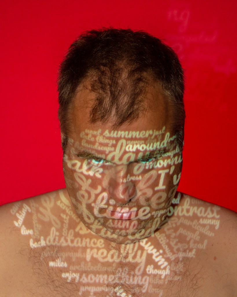
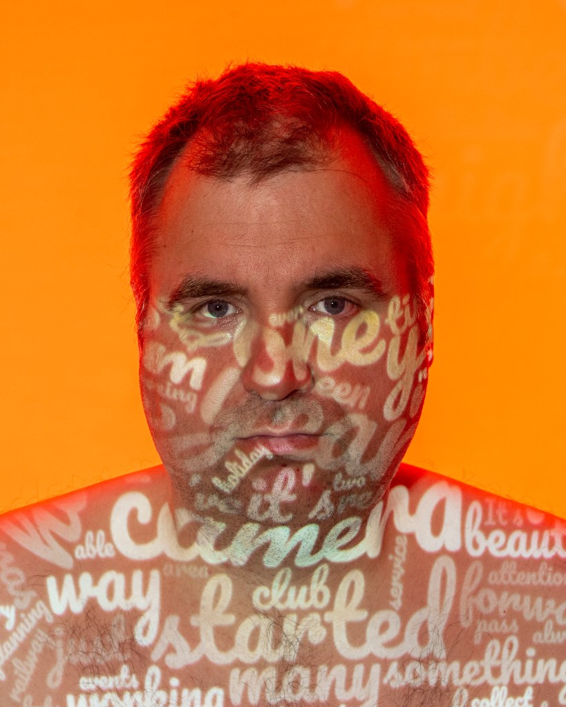
Photographing the Unseen
Start by doing some reflecting in your learning log. What kinds of subjects might be seen as unphotographable? How might you go about portraying them using photography? List a few examples of things you’re experiencing now or have been recently thinking about. This doesn’t have to be too in-depth or revealing, but can be if you want. Equally, it might be something as apparently trivial as you are going to fit everything into your busy day. At first you may come up with literal examples, but the more you think about them the more those ideas will develop into specific and more original ones. Make a list of at least seven ideas. Trust to keep to things you have a personal interest in or curiosity about.
Implement one of your ideas. Aim for a tightly edited and visually consistent series of 7-10 photographs.
Using Props
This option is about photographing an object to suggest a narrative.
Choose between a white shirt and a hankerchief for your subject. Once you’ve decided, make a series of 7-10 photographs which tell a story about or including you object.
You can make your photographic style anything you like. You may wish to include the prop in all of your series or just some of the images, depending on the narrative. Bear in mind that the story is being alluded to through the use of the prop and its location – and characters should you choose to include them.
Draw a storyboard before you start to help you consider the progression of the plot and how you’ll use the shots.
Now implement one of your ideas. Aim for a tightly edited and visually consistent series of 7-10 images.
Initial Thoughts
In this assignment, we were presented with two different takes on narrative; one that explores what isn’t obviously visual and one using a visual prop around which a narrative is created. When I first looked at the two topics, I was immediately drawn to thinking about something that isn’t a subject that is traditionally photographed or represented through visual media. The reason was largely found in the feedback that I received for Assignment 1. That work was aimed at describing something with more than one interpretation, where the viewer drew conclusions from the contextual elements in the individual images as to the meaning. I really enjoyed the challenge of this duality and when working through Part 2, considered photographing the unseen as an interesting challenge.
In my consideration of the Props topic, I started to think about storytelling in the more traditional sense. Written stories are created in a fairly linear fashion, resulting in a defined ‘beginning’, ‘middle’ and ‘end’. As Barthes mentioned [1], the author of a story takes familiar or established cultural texts and stitches them together in a way that leads the reader through the narrative. The nuances of the story, internal visuals and intents are created by the reader with the author as the guide; the point being that the reader never really understands the real intention of the author. We know that this linearity is not always present in photographic stories, but the for me the idea of ‘storyboarding’ links back to that more traditional storytelling approach. While the individual images can be created out of sequence, a storyboard brings back that sense of linear timeline when the collection is assembled, e.g. when a movie is shot, the takes are done out of sequence because of environmental factors, availability of the set etc. and it only truly becomes a story when assembled in edit. As my natural tendency is to the literal (something I’m trying to break away from here), I felt the Props topic would be dangerously close to what I am comfortable with. For this reason, I decided to choose ‘Photographing the Unseen’ as my assignment topic.
Ideas
I first started to think about the unseen in general terms. What does it actually mean? As sight is just one of the senses, the unseen could anything related to the other four. I started to recall the recent lockdown challenge that I took part in with some photographer friends where we started with the obvious subjects. These included The Decisive Moment, leading lines, macro etc., but we then moved to more obscure subjects, one of which was ‘the senses’.
The five senses
Taking a photograph that evokes the sense of a smell turned out to be a challenge with some creating images with broad ideas of the theme while others went for something more specific. In the case of the former, flowers can be said to have a scent, but the viewer may not necessarily know the specifics of it, whereas in the case of the latter, a cup of steaming coffee is a smell familiar to almost everybody. I then considered the other senses and how they might ‘be photographed’. For all of them, there were subjects that could convey what we understand to be the senses, however my initial thinking about what I would shoot felt to be too literal. An idea for working with the senses would be to contrast the obvious scent with an anchoring reference that completely contradicts it. For example, there have been intelligence tests for pattern recognition that use the names of colours but using a different coloured font. For example, RED might be written in a blue font. When presented with this, the viewer has to quickly say what the colour is. Many people react to the word before the colour, so will get the answer wrong. The same thing could be done here with the other senses. While this was an interesting idea for a project, the brief (and feedback so far) pointed towards something I had a personal connection or interest with. I didn’t feel at this point that I wanted to use this for the assignment.
Depression and its many effects
Over many years I have suffered with my mental health for a variety of reasons, most of which relate to the loss of my mother when I was in my early twenties. The struggle to keep this condition at bay continues to this day, so would work as a project or series of separate ideas. Within depression there is an innate sense of loneliness (even when not alone), coupled with a constant anxiety around the speed of recovery and, in fact whether recovery will ever happen. There is also the damage done to the people around the sufferer and in some cases (not mine) addiction to alcohol or medication that makes the whole situation worse. There is a very unhelpful expression that people use with depression sufferers that talks of the illness as being less obvious to others than a broken leg, which is something I’ve had said to me over the past 20 years. This got me thinking that the condition and the secondary effects are indeed unseen, so this could make a good subject for the assignment. What prevented me from pursing this further was twofold. Firstly, my last assignment in Expressing Your Vision was about my struggles with depression, so it felt too soon to be looking at this subject again even though the two objectives for the work were different. Secondly, while it’s very personal to me I have learned not to dwell on my experiences too much. Rather than be a catharsis, the subject doesn’t really interest me that much and I’ve never really seen my photography as an expression of that pain; quite the opposite, it serves as an escape from it.
Ageing
Something that became more obvious to me during lockdown is the way that people’s quality of life varies with their age. We have been surrounded by commentary about the effect of self-imposed isolation on the elderly in terms of their struggles to get food, loneliness and often concerns about how the virus may be more lethal to them than the younger generation. This suffering, similar to my thoughts above is largely unseen. Ageing itself has obvious physical effects that we can all see, but the decline in confidence and acceptance that physical ability are not what they once were, are largely unseen. My idea here was to contrast images of youth with the thoughts of the elderly. This idea was my favourite so far and would have been the subject for Assignment 2 if I had not connected it with an event that occurred during my time reflecting ahead of starting the work.
Evolution of the Idea
My previous ideas broke down into the following themes:
- Sensory – the senses that are not specifically sight
- Suffering – Depression and the long road out of it
- Anxiety – that things won’t get better, linked to depression, but also the heightened focus on trivial issues during the current pandemic
- Loss – related to control when suffering from mental illness, but also the loss of faculties with ageing
- Loneliness – the isolation of suffering in general
- Ageing – the change in outlook and many challenges that come with ageing
- Acceptance – also related to ageing, the slow process that many go through of accepting that they are old.
Yes, the brief talks about 7 ideas but it became apparent that these were all related to each other in some way and, unfortunately most having largely negative connotations. While these things were of interest, I wanted to explore something that wasn’t just another documentary of something bad happening. I thought back to Campbell’s Dad Project, which was a sad but heartwarming story of the evolving relationship between father and daughter. It’s underlying theme of coming to terms with his terminal illness was offset by the sense of warmth and love within the family, The supporting context which included her father’s views added his personality to the images. This was something I wanted to bring into this series; something unseen but a contrast of an experience with a situation. One of these could be positive or humorous and the other something sad or contemplative.
It was at this point that the 25th anniversary of the death of my mother occurred. It’s naturally always been a sad and contemplative day, but always with a ‘happy’ remembrance of a very special member of our family. This year had a particular poignancy for me as I am now the same age as she was when she died. One of the experiences I always have on this day is a replaying of her final moments in my mind – I had never seen death happen in front of me before. One thing that struck me about the immediate aftermath was a random, bizarre thought that I had as I left the hospital. My world had just seemingly collapsed and as I waited to pull out into the traffic, I asked out loud “Where are all these people going right now?” Of course, bereavement is personal and naturally the commuters going home from work weren’t aware of or part of the recent events. It was the randomness of the thought that gave me the idea for this assignment. I began asking around and realised that these thoughts occur with pretty much any serious trauma, from bereavement and loss to illness and injury. The situations themselves were serious, but the thoughts were often fairly banal. My idea formed around contrasting the randomness of the thought with something that metaphorically represents the sadness or negativity of the event.
Planning
The first task in planning was to seek random thoughts. I polled my friends and connections on social media to see if they would be prepared to share some thoughts with me. This would be a challenge in terms of asking people to re-visit traumatic events in their lives, but I assured them that the thoughts would be used, but not the detailed context (in fact, I stated that they didn’t need to share the context with me at all). The use of the thoughts would take the form of a single sentence and would be completely anonymous. Using a single sentence would be an open enough contextual element to create a narrative without the photograph, e.g. my thought “where are all these people going right now?” could relate to anything from being stuck in traffic to being at the scene of a major terror incident. The reader can build their own narrative from a sentence that is not too prescriptive.
I then considered what would sum up the types of trauma that would be experienced. People suffer serious problems every day that can be considered traumatic. What I wanted to do here was to focus on the type of problems that people are most familiar. As I was going to ask people for their random thoughts, I similarly didn’t want to predict or limit the range of traumas. However, I started to work on the assumptions that they would fall into categories of loss, bereavement, serious illness, the breakdown of a relationship or some shock that provokes a negative emotion such as fear or disgust.
The next area I focused on was the theme for the photographs. I started with the idea that people with obviously contrasting expressions or facial features could be the focus of the images. I quickly dismissed this when re-visiting the works of the photographers in Parts 1 and 2. For example, Public Order[2] features the real but fake scenes from a police training facility which, while telling the seemingly believable story of the environment during the photographer’s early life, is contrasted with the emerging knowledge that the scenes themselves are an interpretation of that environment. The contrast is subtle rather than literal; by using people as the centre of my series, I was in danger of falling into old habits. I started instead to think about how trauma makes us feel. For me personally, the overwhelming sense of isolation and the temporary broken patterns of normal life are the key feelings. Although I’m no psychologist, I believe the randomness of our thoughts when we suffer something serious is our brains connecting to what we recognise as normal life. In my case, wondering where everyone was going when my world had collapsed was simply a question prompted by the sight of life going on as normal. I considered what represents isolation to me and concluded that large, open, derelict or abandoned spaces sum up those sensations of being alone and also fairly unimportant to the rest of the world. By presenting an object or even a single person in the space, I could use the commonality of empty spaces with a connection to the words that wasn’t too obvious to the viewer.
The Words
After asking my social media friends and some of my family for their help, I received the following random thoughts. I was really happy with the variety of the thoughts and the circumstances during which they occurred. I combined them with my own thought which was the basis of this idea.
- “Where are all these people going?”
- “I hope the paramedics don’t traipse dog mess through the house”
- “I’ll have to make my own dinner tonight”
- “How am I going to teach them what I know?”
- “I won’t know anyone there”
- “Tell them I may be late to teach the class tonight”
- “Did I eat too many of the wrong foods”
- “Must remember the right way out”
- “Are we the only entry in the phone book now?”
- “I’m glad my parents aren’t alive to see this”
- “I hope my cat hasn’t got into any fights”
- “I could murder one of those chocolate biscuits”
The challenge was to now represent these unseen thoughts in photographs of spaces and objects that metaphorically represent them with the trauma. The variety of the thoughts I received led me to call the series ‘Random Access Memories”, a reference to the ordered but unstructured way that information is retrieved in computer hardware.
But wait…
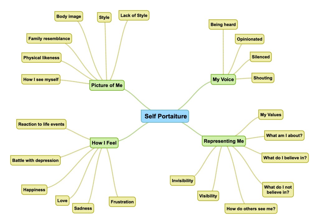
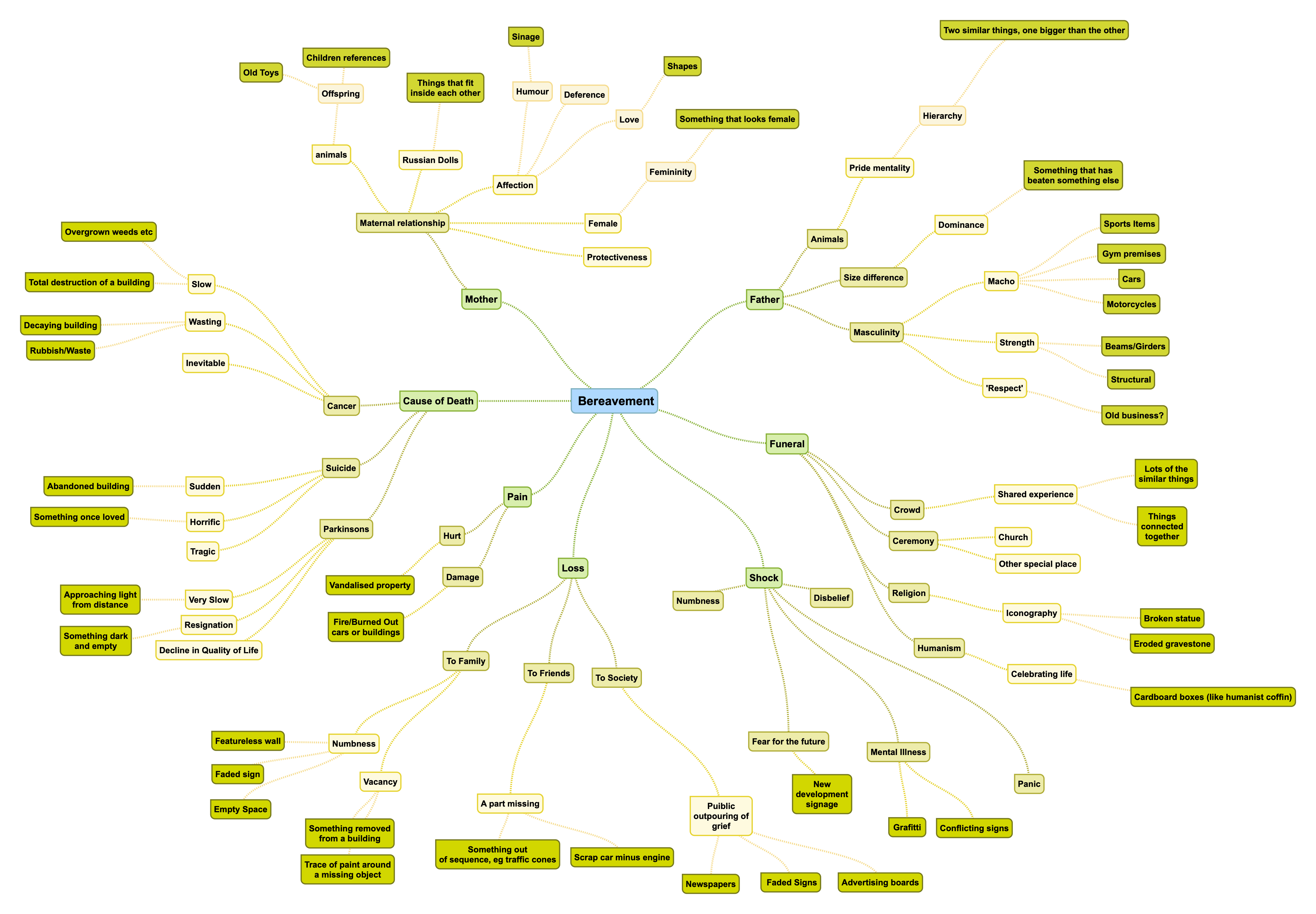
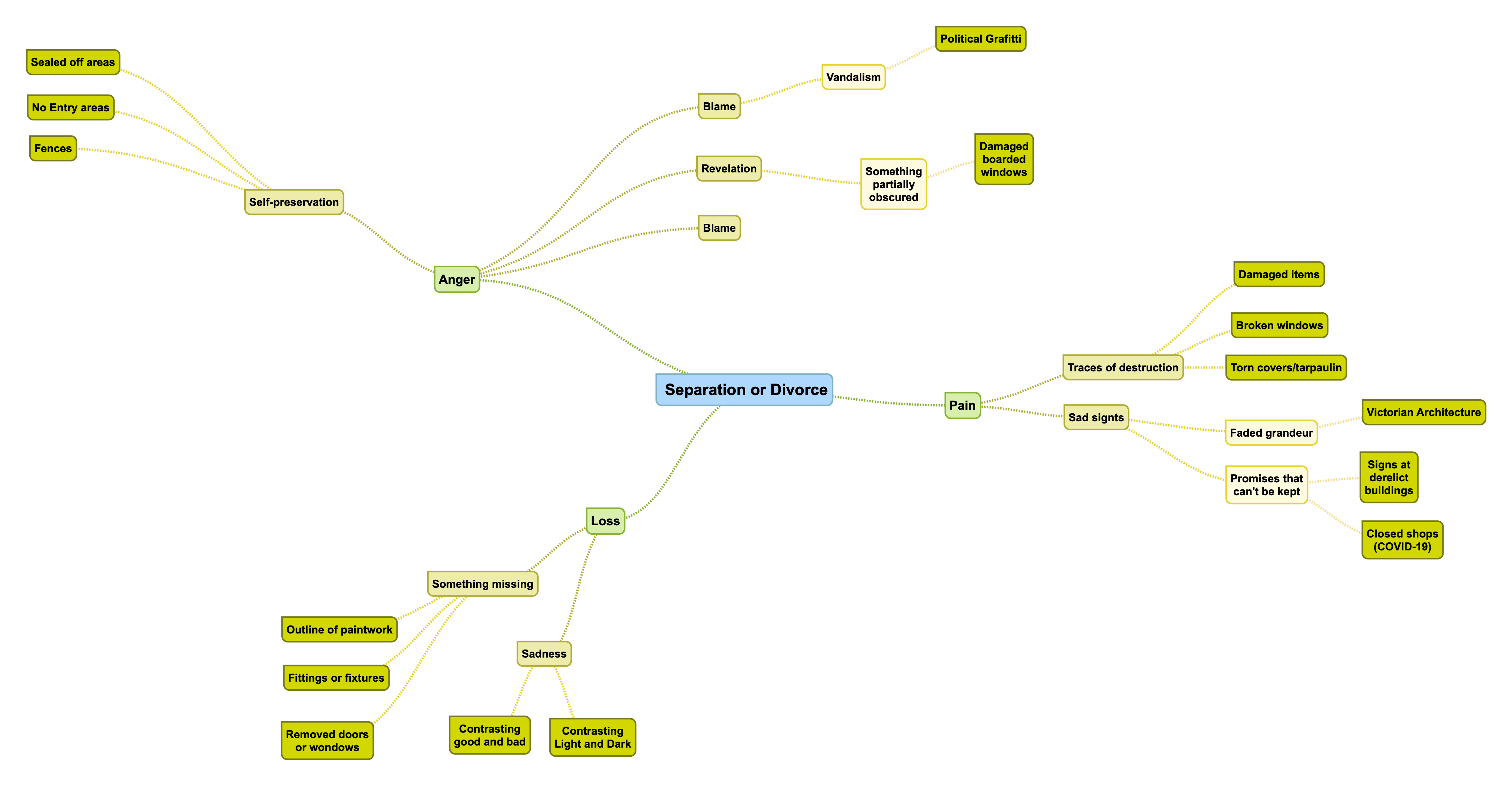
I started to consider how I would photograph subjects that documented the thoughts of the people I had spoken to. It was at this point that I realised that I had lost sight of what the unseen element in this story is. Indeed the thoughts were random and unseen, probably not ever discussed with anyone before I had asked for them. However, they were a response to something terrible happening in the lives of the people concerned. It is actually the trauma and the response that make up the unseen that I needed to document. This was a serious turning point for me during this assignment for reasons that I will discuss later. For now, I had to find subjects that suggested the trauma being experienced and marry the words to the photographs to help support the narrative. This required returning to the beginning and thinking carefully about metaphors for trauma. I created the mind-maps below to help steer the project, which I found to be useful in what was becoming an increasingly difficult challenge. Based on the types of traumas that my friends suffered, I created maps for Bereavement, Illness/Injury and Separation/Divorce to cover them all. The maps show my thought processes and ideas for subjects to shoot as metaphors for aspects of the trauma rather than just describing the event itself. These were ideas that I took forward into shooting.
-
-
Bereavement Mind Map
-

-
Illness or Injury Mind Map
-
-
Separation or Divorce Mind Map
As I mentioned previously, I don’t find metaphor easy to deal with partly because I’ve never considered myself particularly creative. The act of ‘engineering’ the ideas into potential subjects was falling back on what I’ve known throughout my career. What I wasn’t prepared for was the challenge of seeing those subjects and photographing them.
Shooting
I had settled on the idea of trauma being isolating and lonely on a personal level; even a shared event impacting people differently and in a way that makes them feel like they are the only people involved. I looked for subjects that contained visual elements that suggested but didn’t point to the trauma being experienced, taking the cue to leave as much room in the image for the viewer to make up their own mind. To this end, I also elected to leave out the idea of a single person in the frame, which felt a little too obvious to me. Unlike Sank’s lockdown story [3], which was about the people she met on her walks and their outlook on life during COVID-19, my story was about the speaker of the words. I felt that adding people into the photographs would distract from the anonymity of the speakers that had shared their thoughts with me.
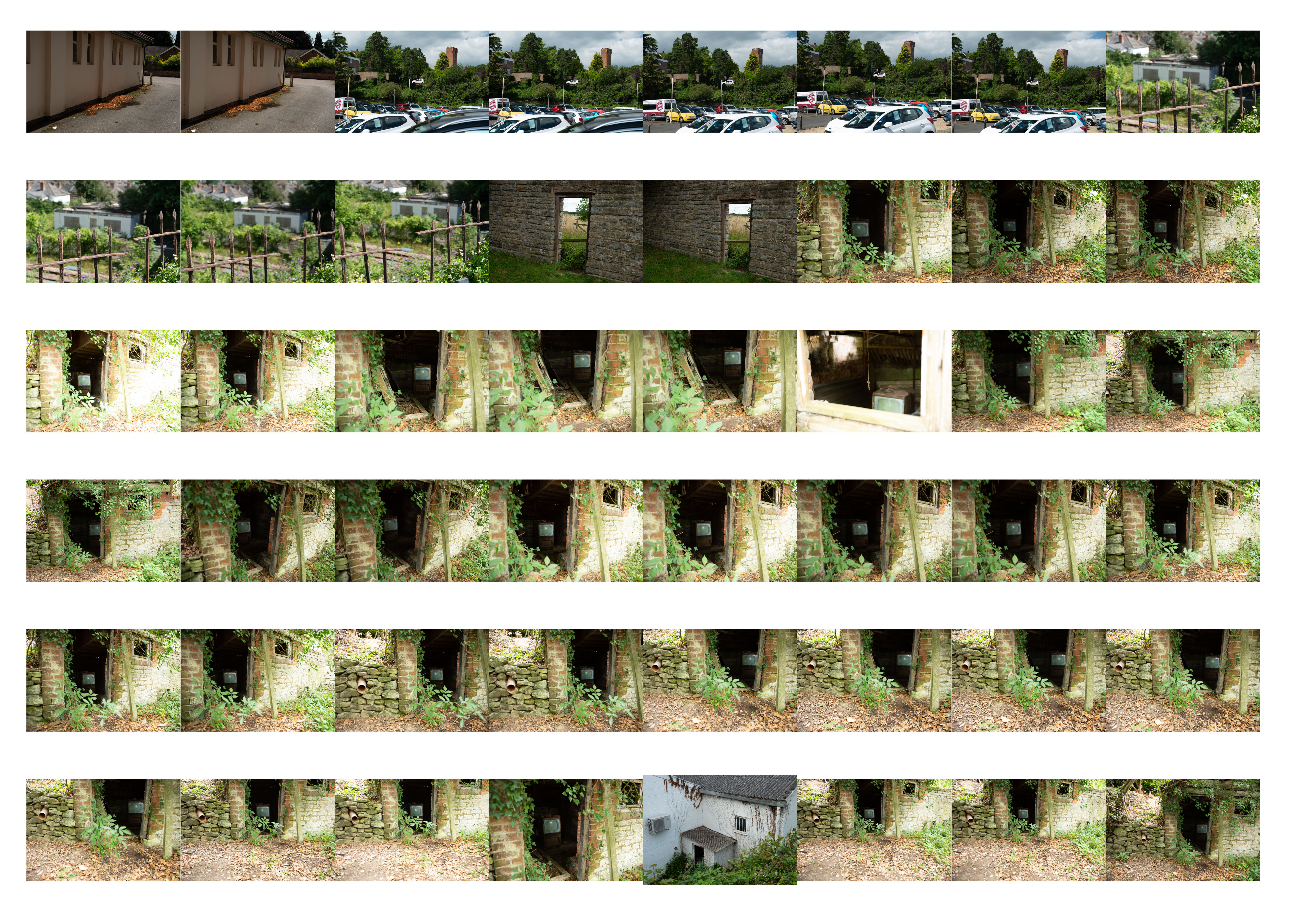
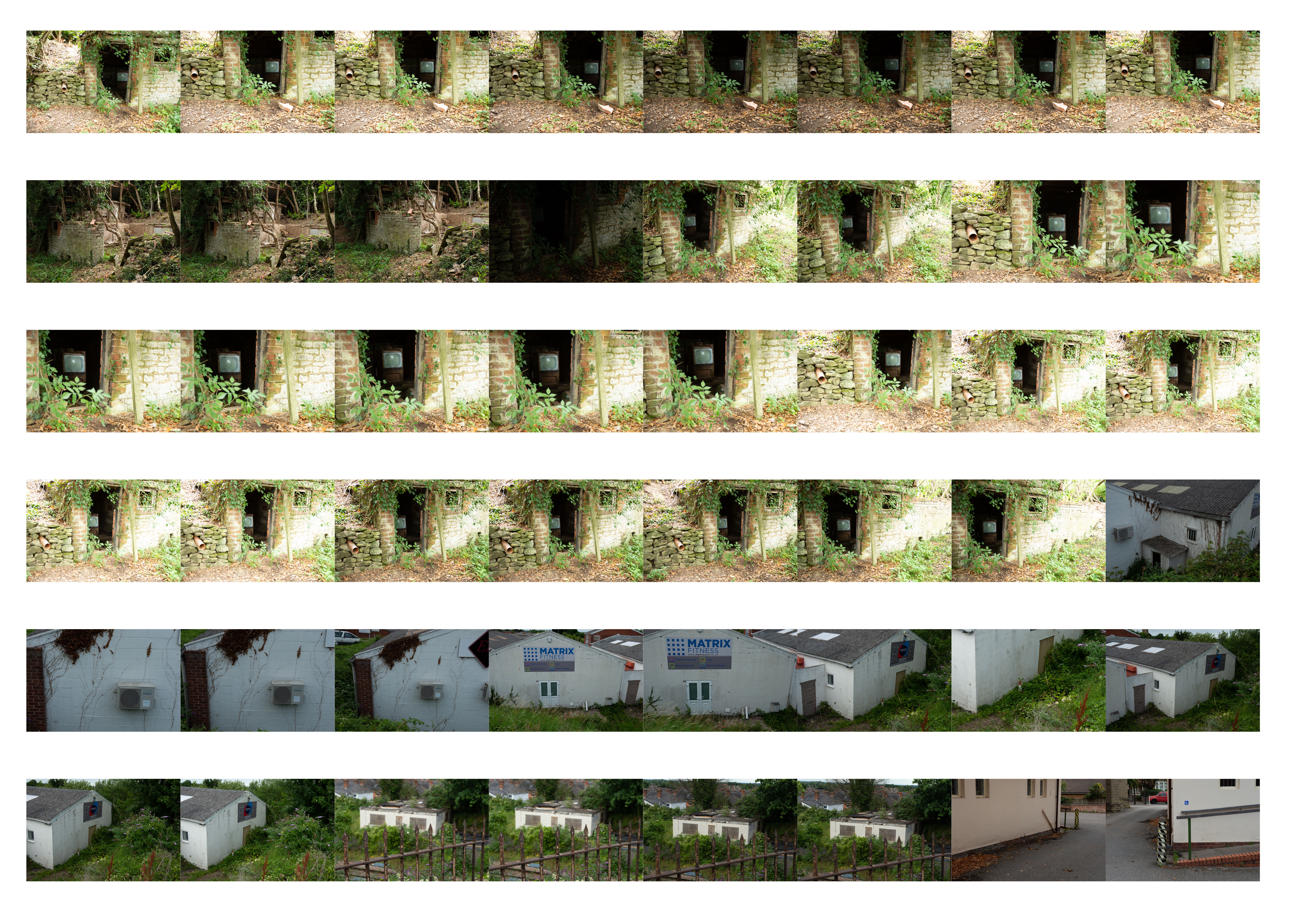
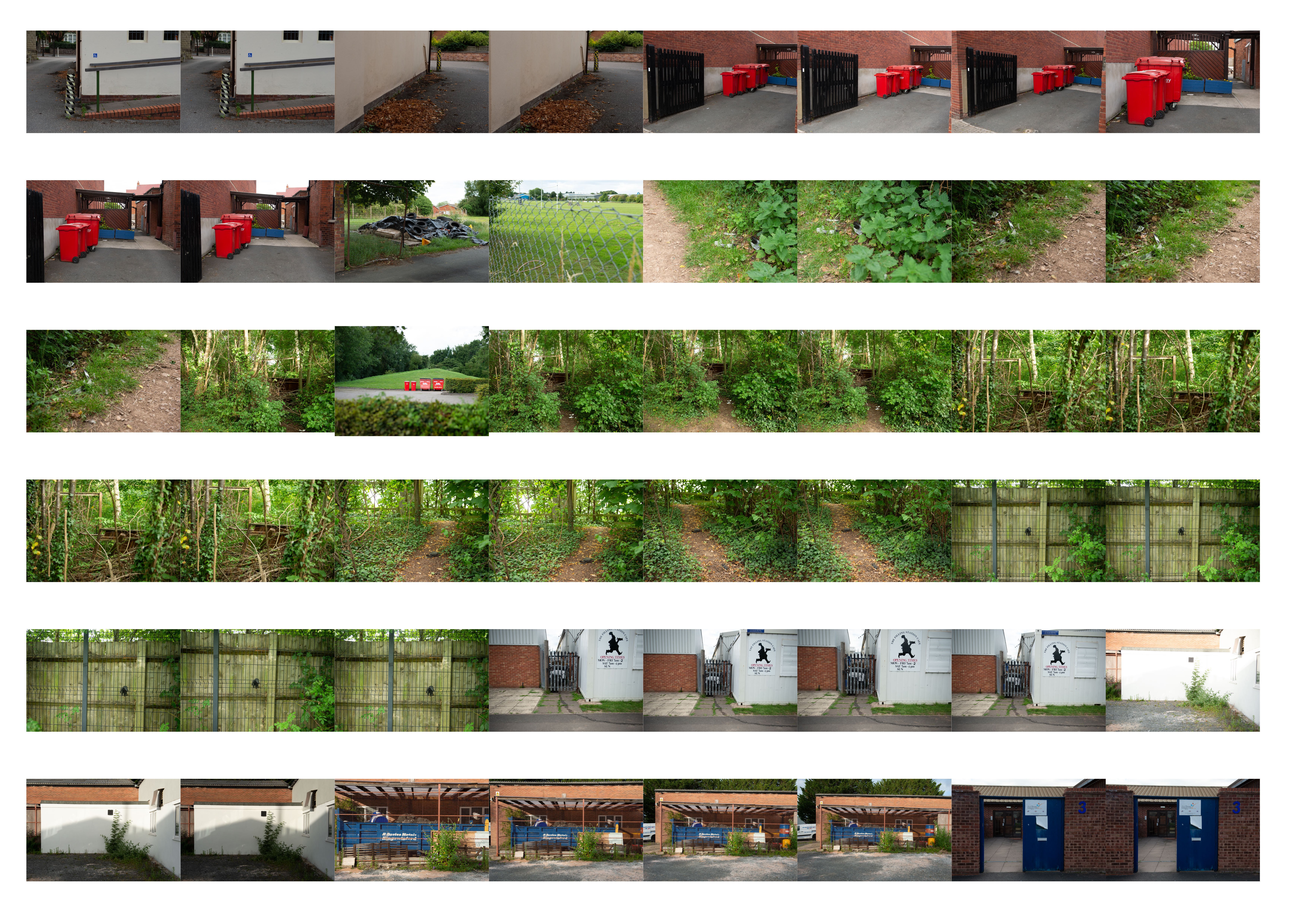
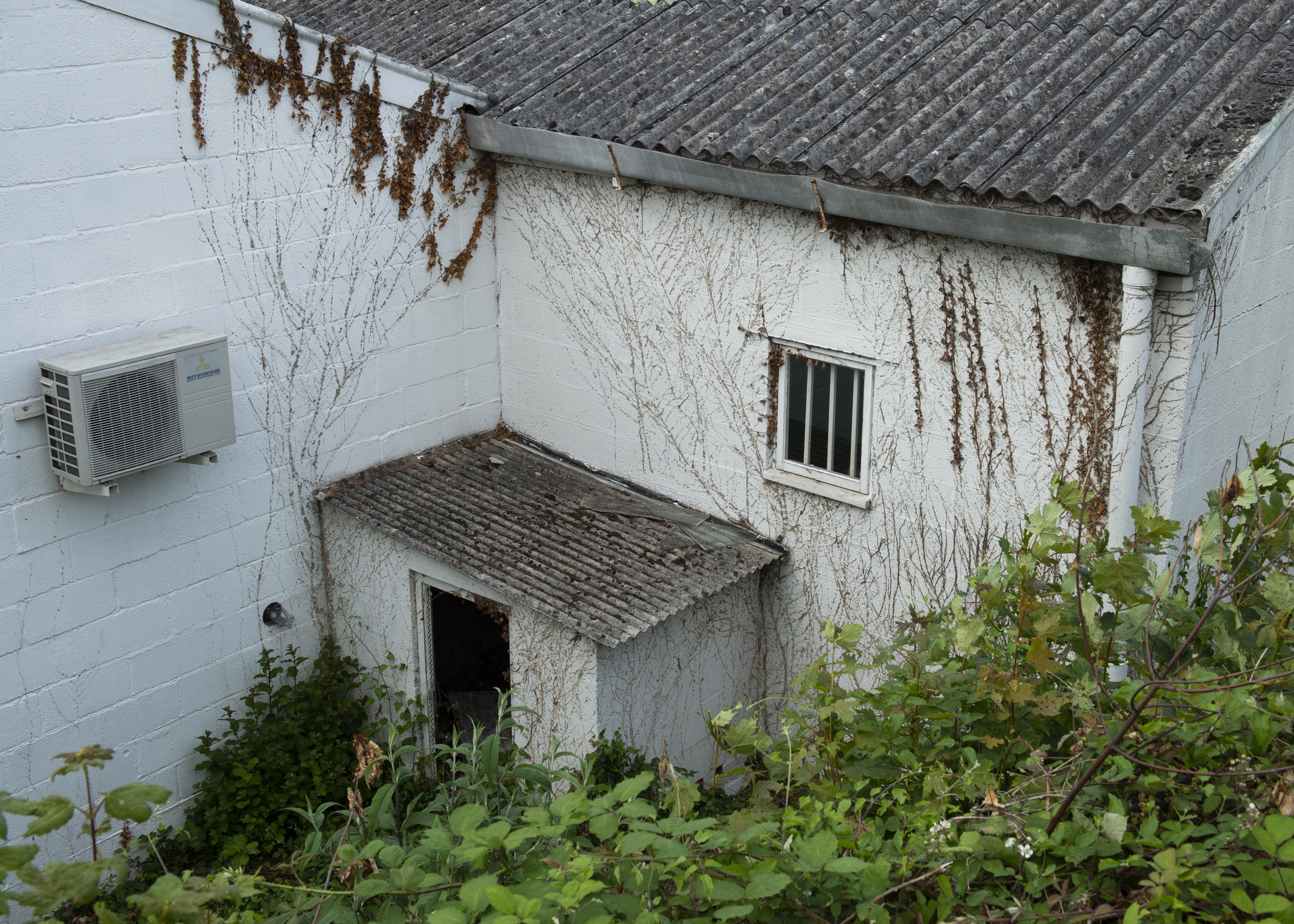
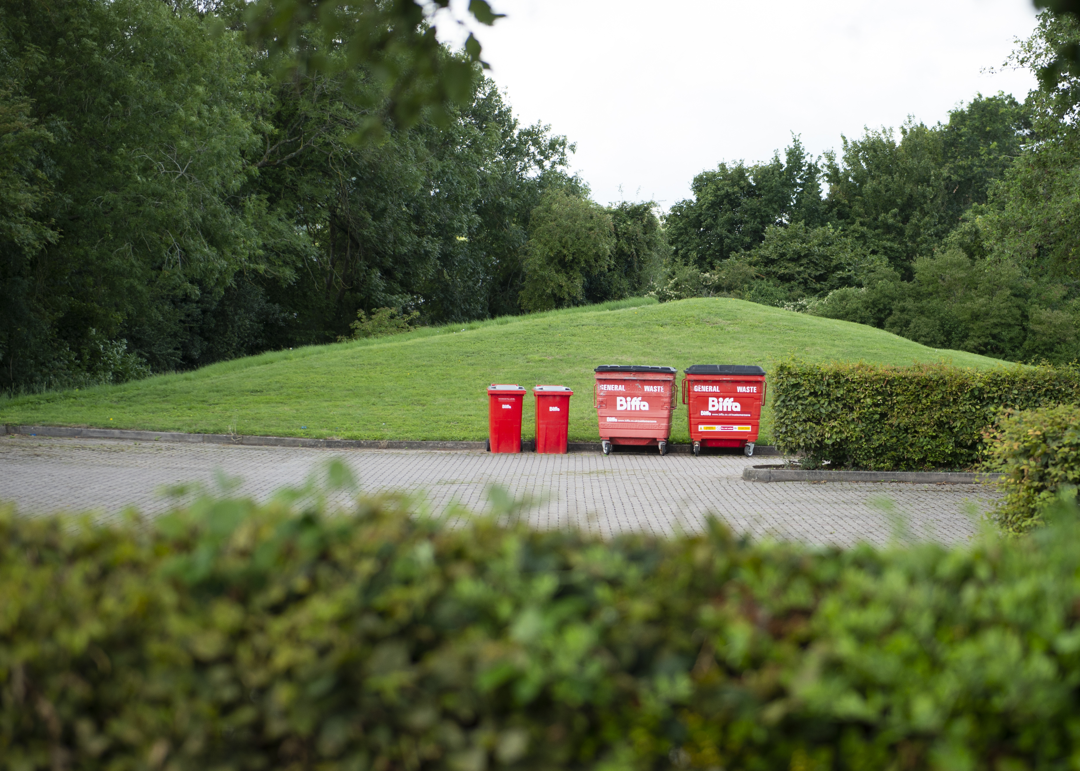
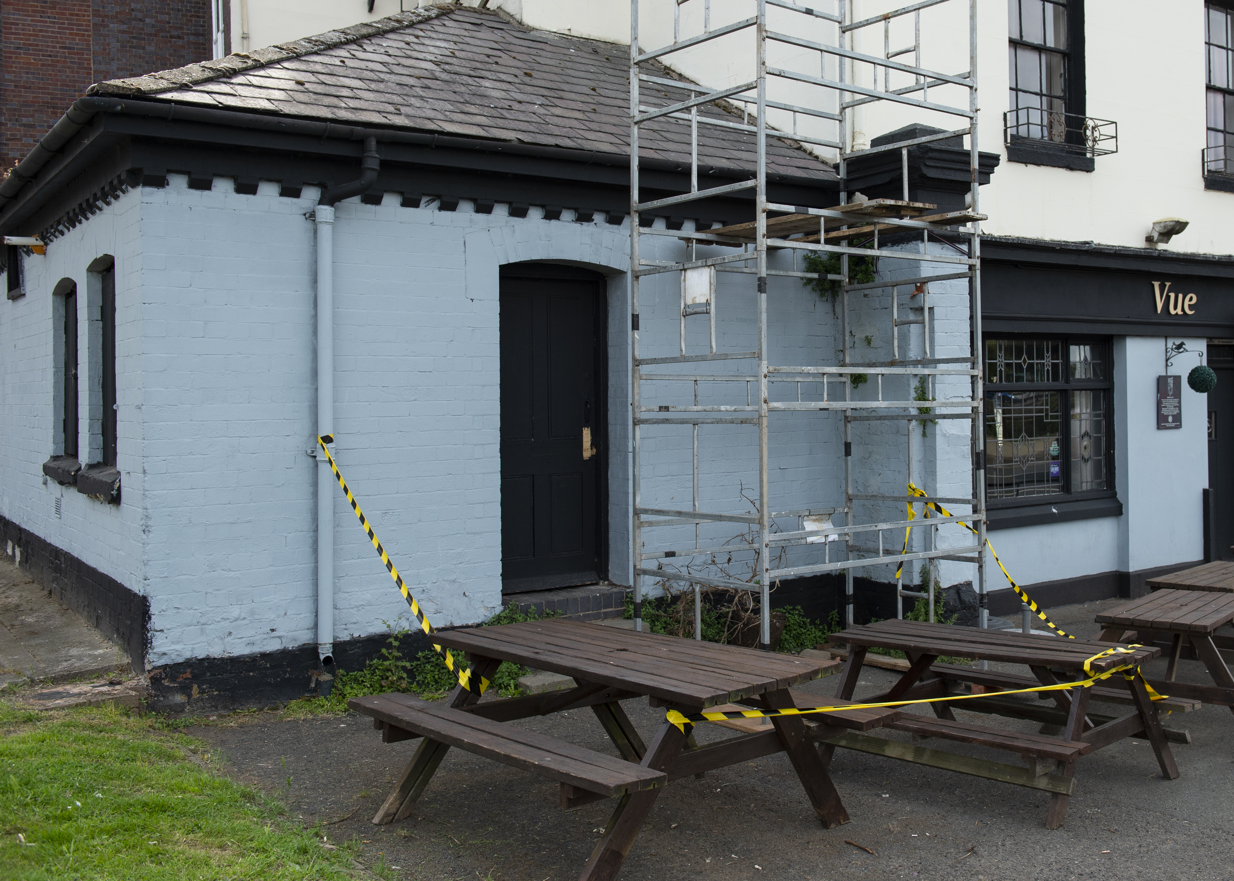
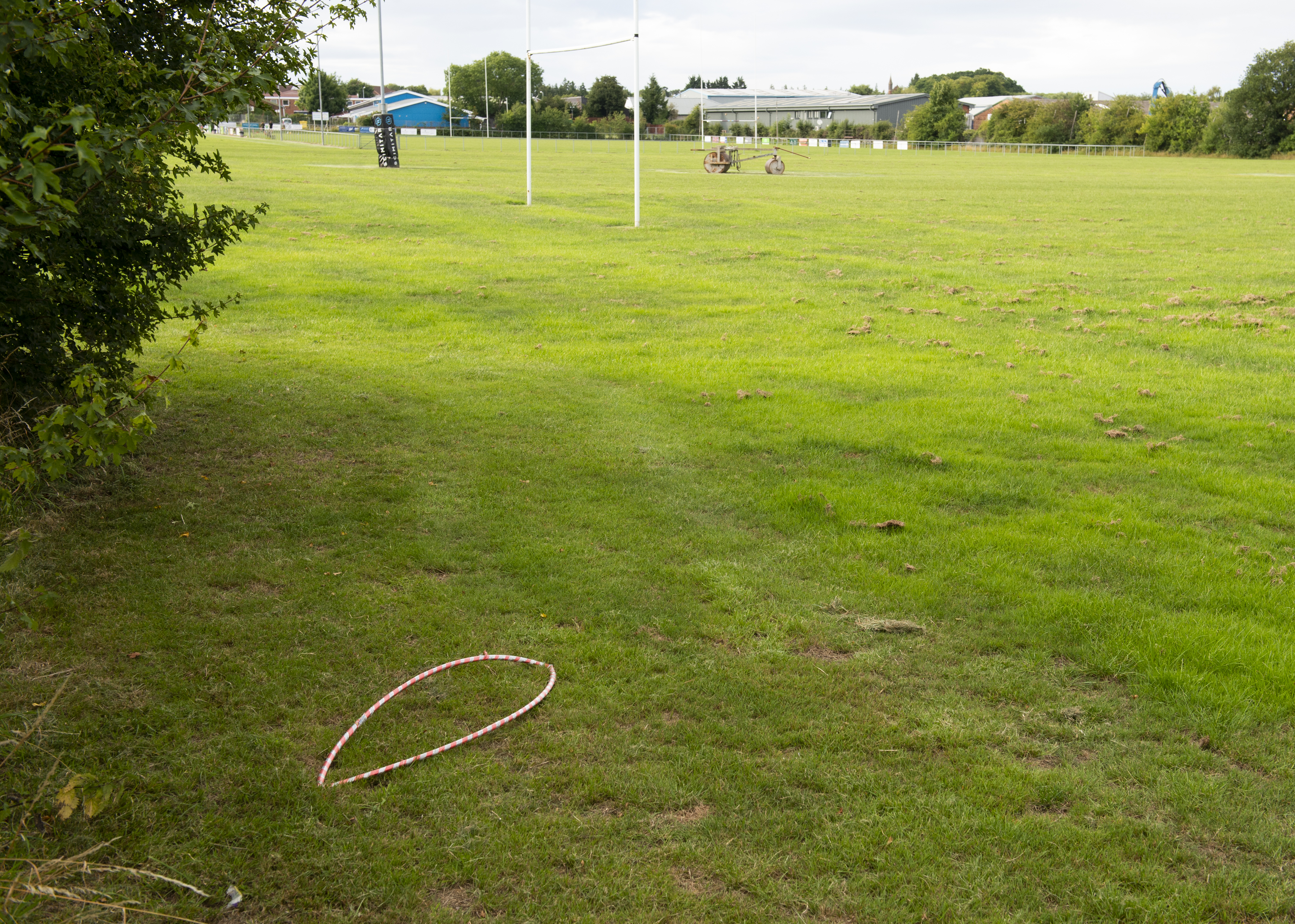
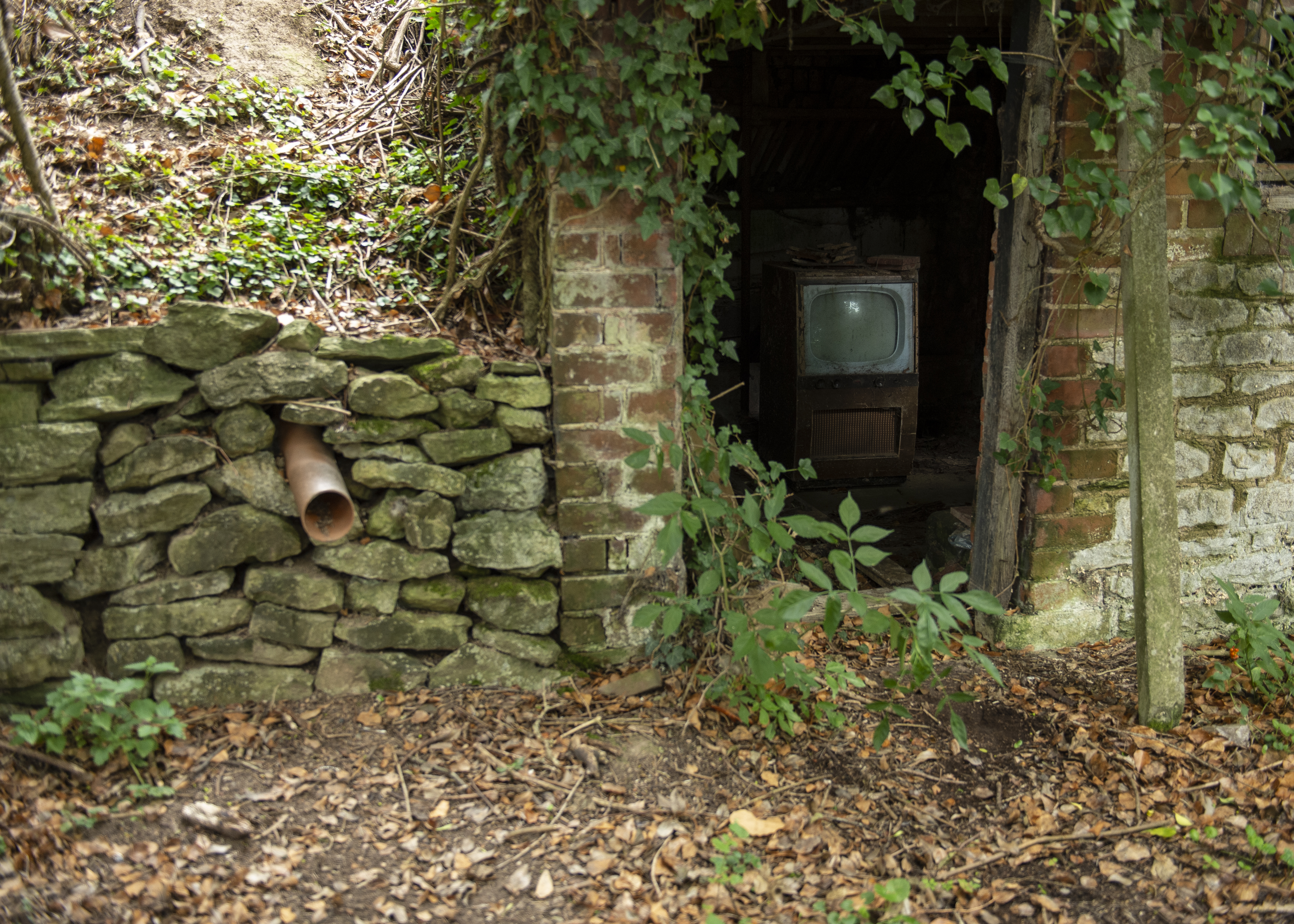
What I found really difficult with my project was to look for the metaphorical, despite having the mind-maps to help me. I took my camera everywhere I walked and changed routes to take in industrial areas and secret footpaths through them. However, I found myself shooting anything and everything that may support my story. This was a departure from what I’d believed to be the way these photo stories were created. I’ve strived to be more clinical in my approach to shooting, tending towards fewer images of my subject than taking lots of pictures. For this assignment, the editing process was much more pronounced than it had been previously. From a total collection of 288 photographs, I created the collection of 10 photographs that I then matched to a selection of texts.
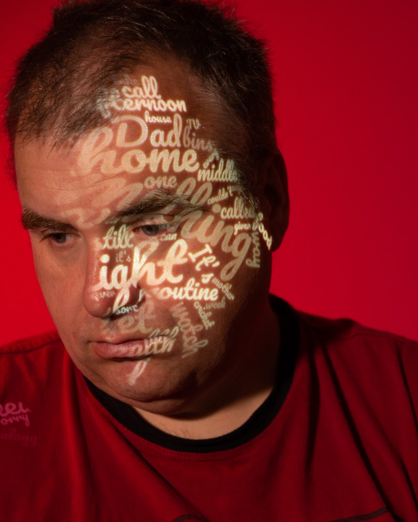
Random Access Memories
“Did I eat too many of the wrong foods?”
“I could murder one of those chocolate biscuits”
“I’ll have to make my own dinner tonight”
“Tell them I may be late to teach the class tonight”
“I hope the paramedics don’t traipse dog mess through the house”
“I’m glad my parents aren’t alive to see this”
“Where are all these people going?”
“Must remember the right way out”
“Are we the only entry in the phone book now?”
“How am I going to teach them what I know?”
Reflection: Photographing the Unseen
In keeping with the anonymity and not wanting to steer the narrative, I elected to not describe in detail my intentions for each image in this section. Instead, I’ve included the themes and how intended the images to work together in the series.
As described previously, my theme was trauma which takes many forms. The series starts with ill health and injury, which can be debilitating, frustrating and of course life-threatening. The reactions of the people here were focused primarily on the disturbance to their routines or daily lives, but also including self-doubt. The questions around whether the situation could have been avoided were powerful. Similarly the denial in the fourth photograph was something most people could relate to as we never really want to have a change of circumstances forced upon us.
The series then moves to loss, both in terms of a relationships and death. Here we have people having to cope with trauma that is happening to them almost indirectly. I was fascinated by the randomness of thoughts had by the people who had just lost something or someone dear to them.
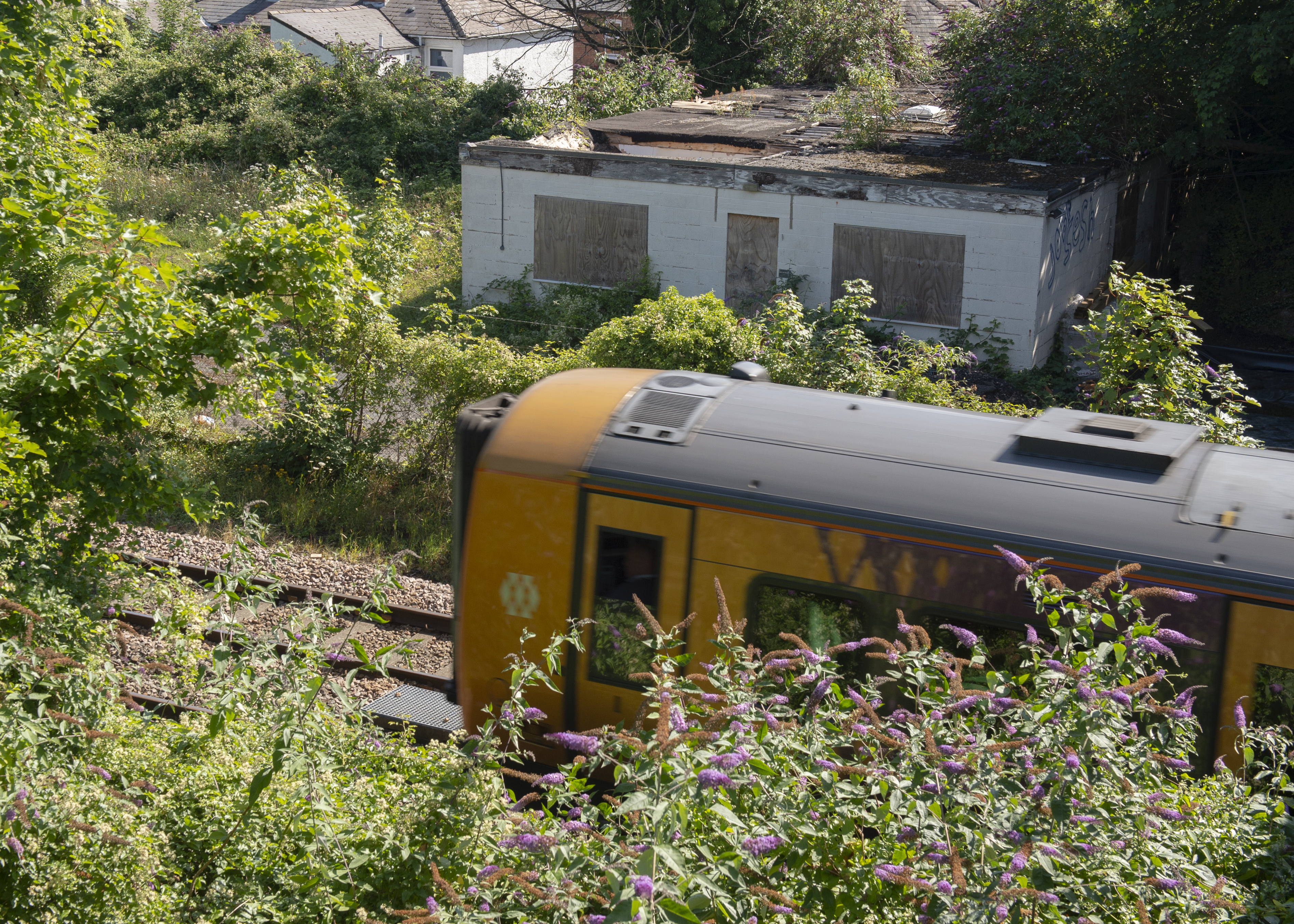
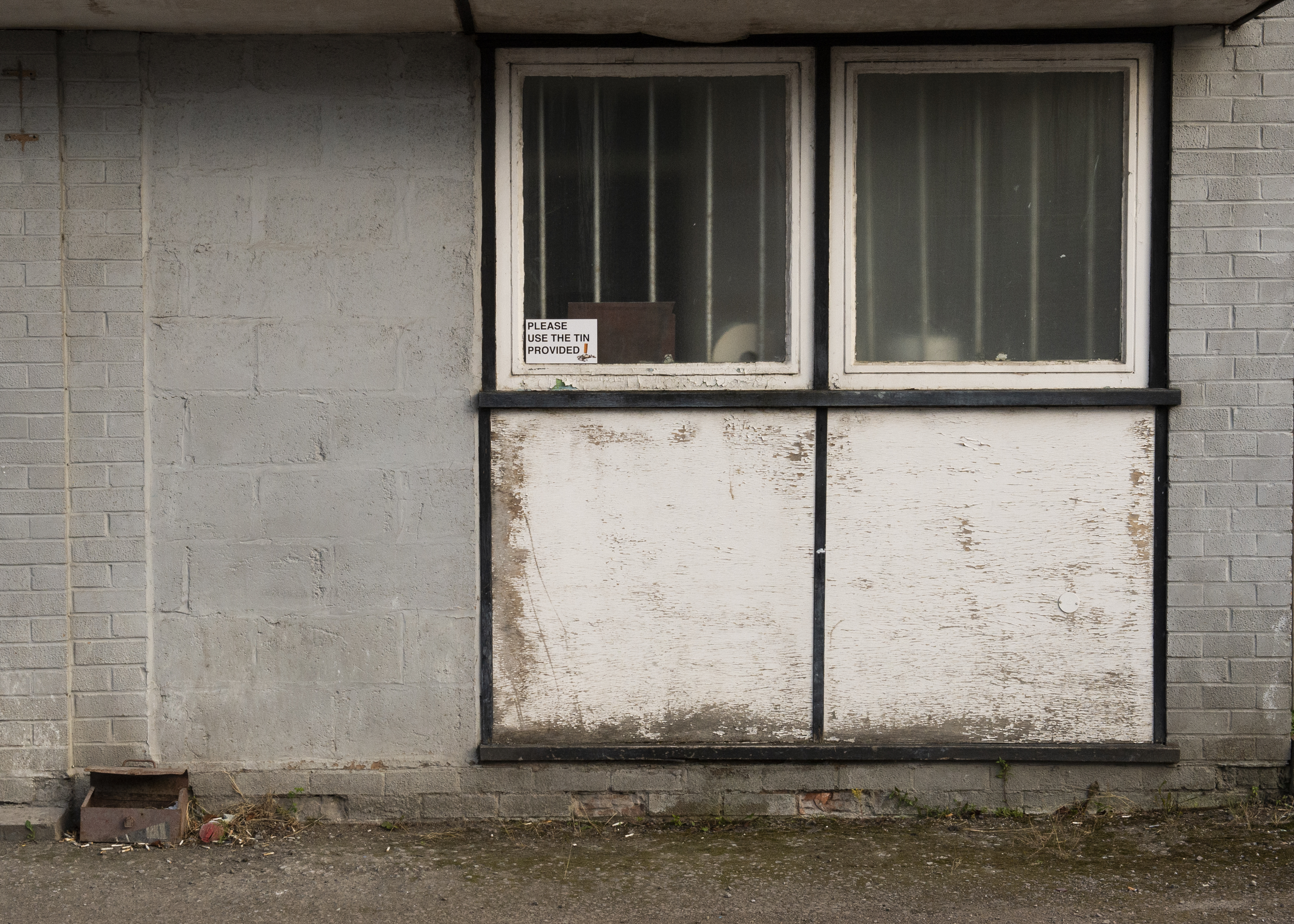
For me, the strongest image is the last one. My friend had that thought upon learning of the suicide of a family member and went into automatic pilot; one responsibility was to hand over her work to her colleagues. Such a simple statement contrasting with the horror of the event needed a simple composition with the evidence of the bleakness of the trauma clearly represented. For me, the dull grey walls and barred windows give the sense of a world less colourful; the simple instruction to use the dilapidated tin and the discarded cigarettes suggested a lack of understanding of how awful suicide is to those affected by it.
For me, the weakest image is number 7, which is actually the trauma that I experienced. I found it extremely difficult to express the pain of losing my mother through a photograph, irrespective of where it sat in a series. Throughout this assignment, I struggled significantly with metaphor and inspiration. I’m not surprised that my own experience would be the biggest challenge and I believe this to by why I don’t like this image as much as the others. What I ended up with was a representation of my world collapsing while people went about their business. However, the composition and lighting aren’t what I wanted for the series; harsh direct sunlight that I toned down with a filter, but still leaving the highlights a little jarring.
Overall, I believe that this series meets the brief. The unseen elements are represented metaphorically and the words add context to the images in changing the way the viewer interprets them.
Against the Assessment Criteria
Demonstration of Technical and Visual Skills
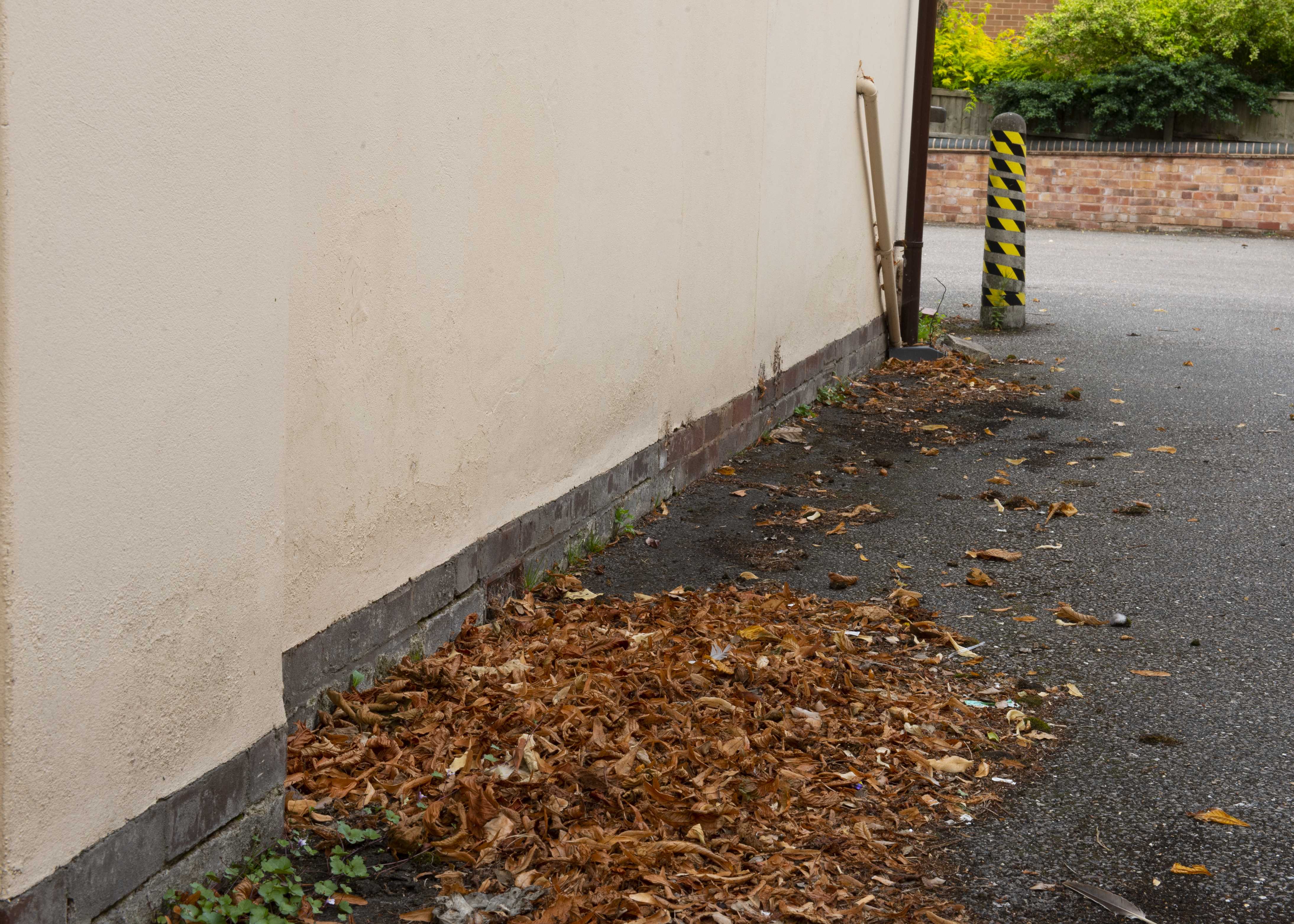
My intention was to shoot the images in a way that connected them together, but without relying on a simple visual to link them. The compositions largely follow conventional techniques but I’ve used focal length, depth of focus and leading lines to draw attention to the key elements in each photograph. An example would be number 5, where the short focal length and wide aperture allow for metering on the point of focus (the TV screen) as well as keeping everything relatively sharp around it. What this achieves is the viewer seeing the TV before exploring the rest of the composition to see the other key elements (the pipe, the disturbed earth in front of the building and its general state of decay. I’ve also tried to use colour to draw out key features, such as the hazard tape and dead leaves in number 9. Overall, the photographs work as a series without any significant clashes in colour, light or composition.
Quality of Outcome
As described above, I believe the images to be technically good quality. In terms of the use of elements within the images, I believe there to be enough to raise questions in the viewer’s mind as to what the series is about. At the heart of the story, is the contrast between the effect of trauma and our less obvious reaction to it. I feel that I’ve taken on board my tutor’s comments about the strength of words when added to the pictures. The texts here add information that supports the narrative (relay) rather than being a direct route to a meaning (anchor).
Demonstration of Creativity
This assignment has pushed me to be much more creative than any of my previous work on the course. I believe that I have successfully fought my natural instinct to be literal and achieved a series that has enough scope for variety in its interpretation. Using almost empty space and derelict buildings to represent the trauma and contrasting with the random memories was inspired by Fox’s work, with nods to Botha’s Ring Road. What I set out to achieve was to work on a subject that really interests me and that I have my own relationship with and perspective on. It has been a significant challenge but I am happy with the resulting demonstration of my creativity.
Context
In the context of the learning, I’ve demonstrated that I understand how stories can be non-linear and that photography can be used to visually represent an idea, feeling or unseen element without having a subject that links directly to it. This has been a tough part of this unit, but I believe that I have demonstrated my understanding and, hopefully my new interest in this genre of photography.
References
[1] Nicholas, T, 2019, “The Death of the Author: WTF? Roland Barthes’ Death of the Author Explained, Youtube, https://www.youtube.com/watch?v=B9iMgtfp484
[2] Pickering S, “Public Order”, artist website, https://www.sarahpickering.co.uk/works/public-order/
[3] Sank M, 2020, “Portraits from a Distance”, Wellcome Collection, https://wellcomecollection.org/articles/Xsd98hAAACIAhct_
[4] Botha D, 2013, “Ring Road”, Artist Website, https://www.dewaldbotha.net/ring-road.html
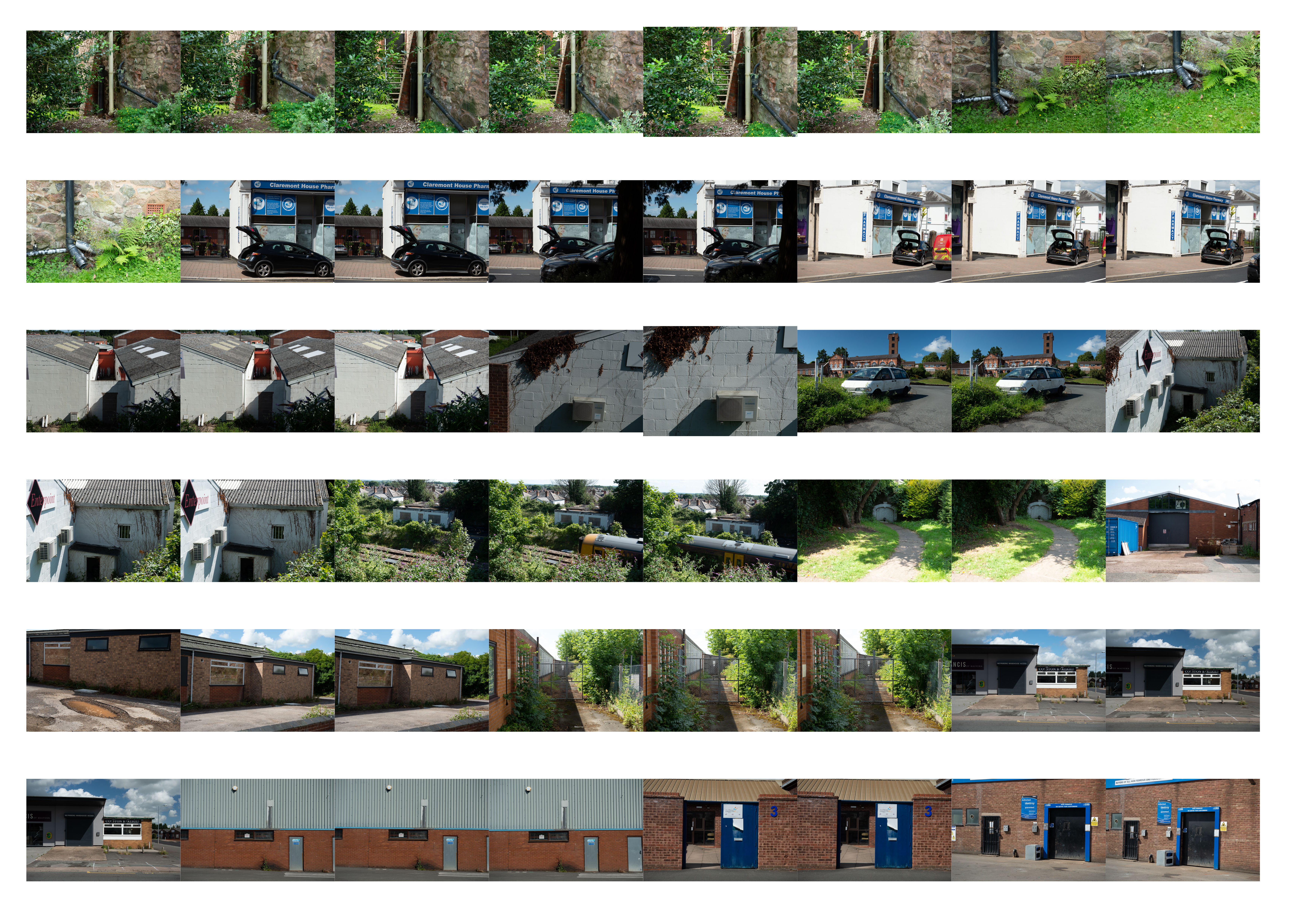
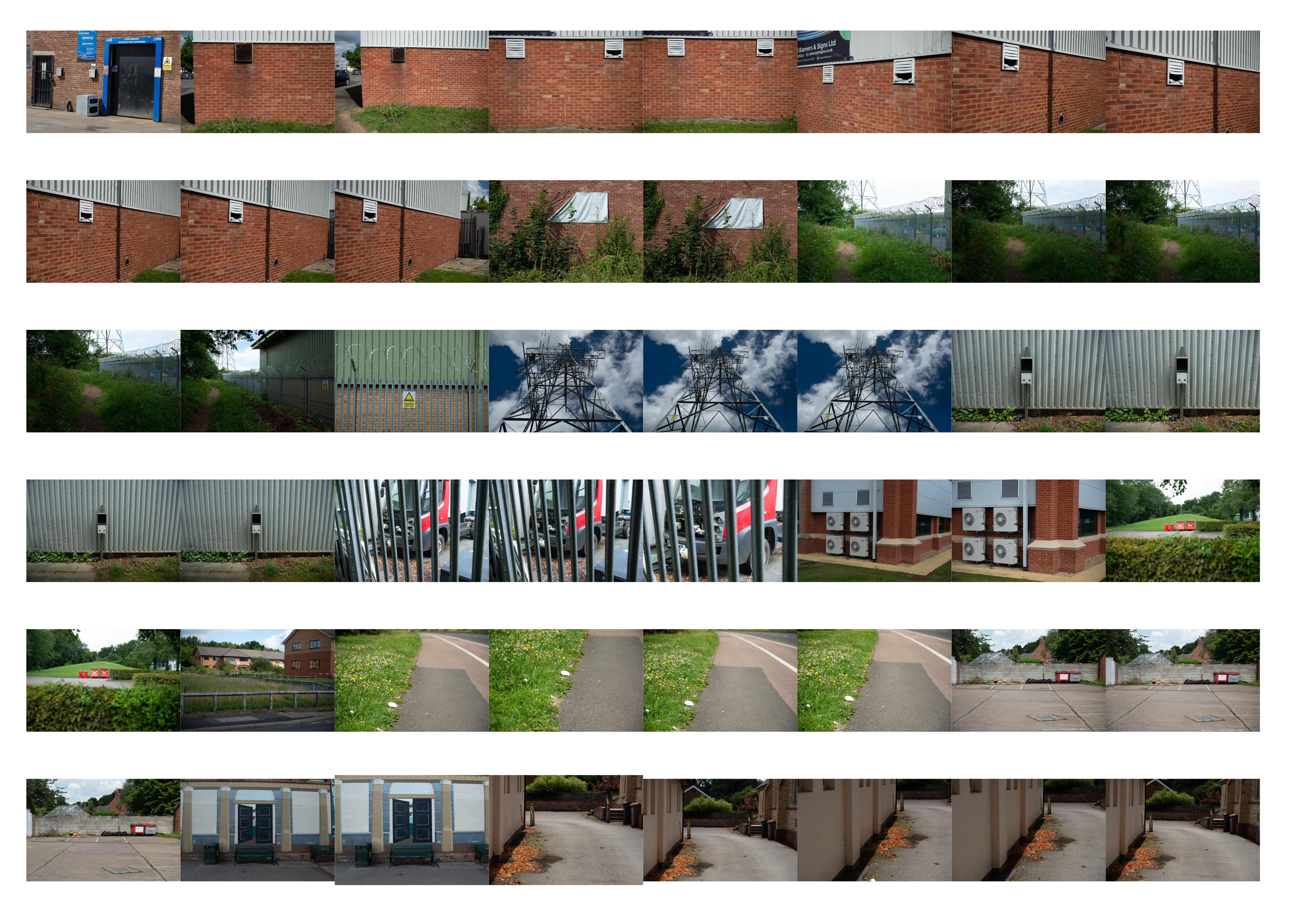
Contact Sheets