Create a series of 4-8 images exploring family, drawing from the writing and contemporary practitioners discussed in this project.
Family as defined here is not limited to any traditional sense of the word and you are encouraged to define ‘family’ on your own terms in your written reflection.
Please remember to gain written consent from family members if they feature in the work. You may wish to refer back to the terms of engagement in collaborative practices discussed in Project 2. You may choose to share these photographs in the unit forum or privately with your tutor (asynchronously).
Write a reflection in your learning log (around 500 words). Use this as an opportunity to reflect on the activity. Describe the context, your approach, your ethics, any challenges you faced, and how your family members feel about the images that you have produced.
Introduction
The concept and preparatory work for this assignment can be seen in the sketchbook:
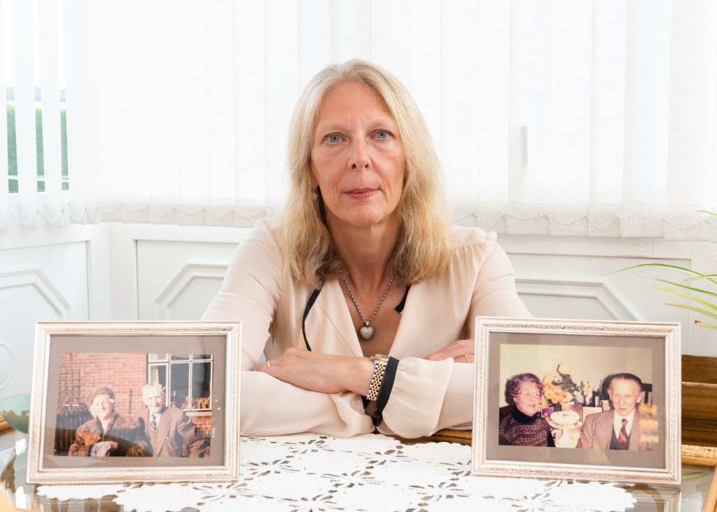
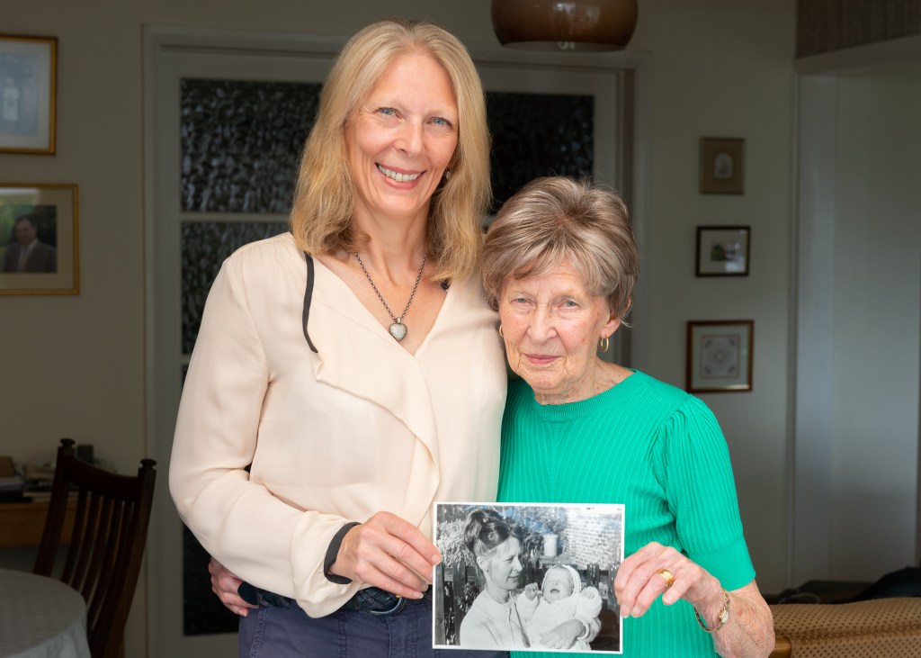
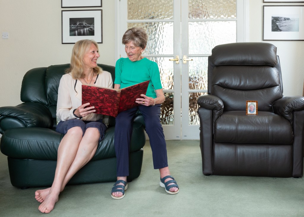
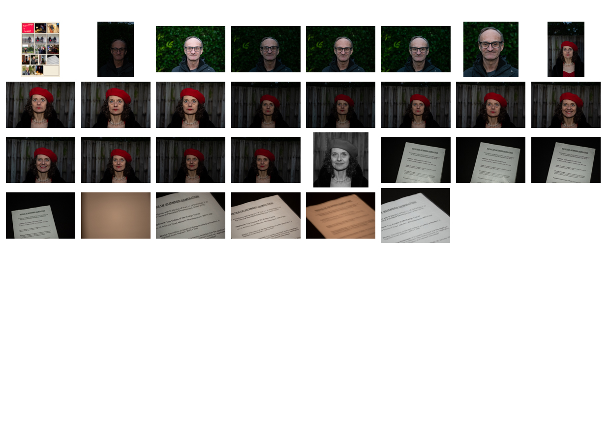
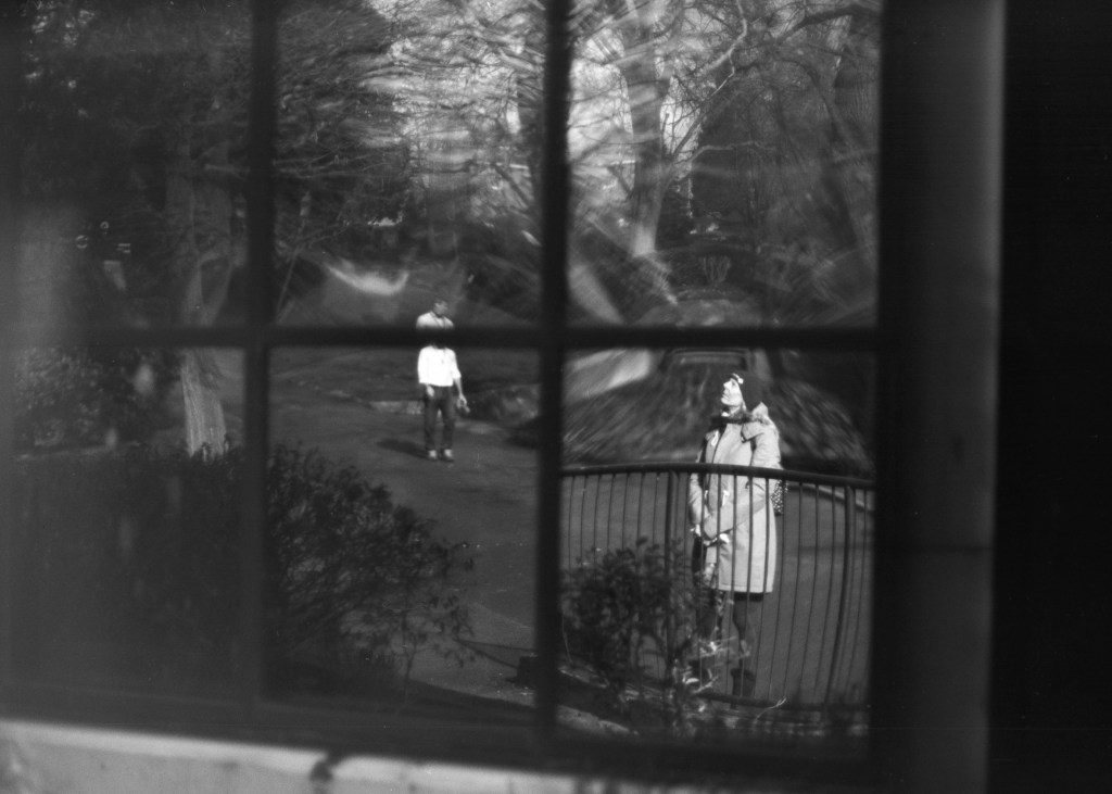
I chose my wife Jayne’s family as my subject because when we met, there were just three close relatives, her parents and uncle. The family is now just Jayne, her mum Hazel and me. The audio interviews recorded by my father-in-law with his parents started me thinking about familial relationships and visual similarities that photographs document over time.
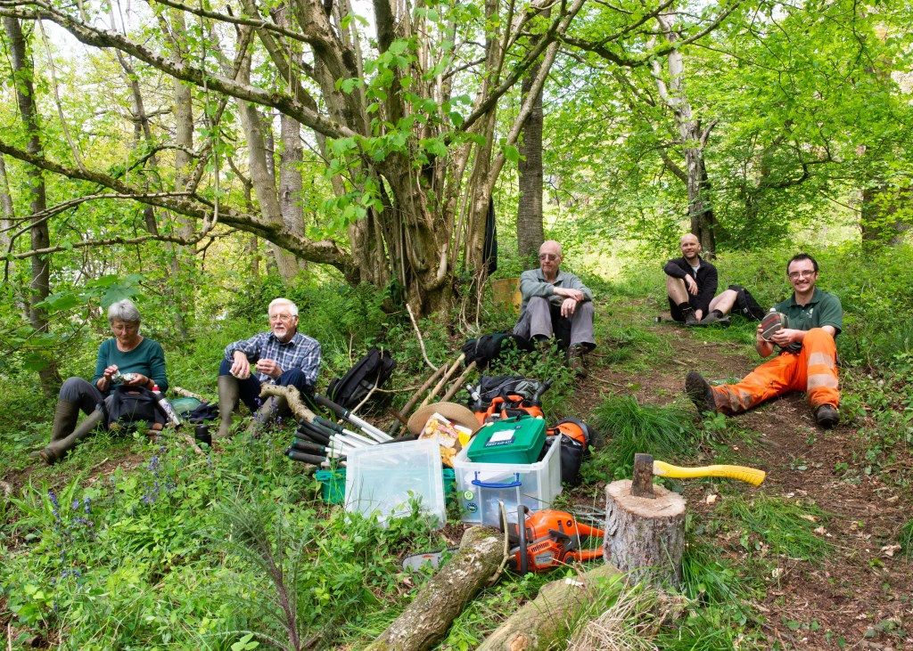
My approach was to talk through my idea with Jayne and Hazel ahead of a visit in August. I suggested spending an afternoon looking through the family albums to find pictures that could be incorporated in the compositions ,and then shooting the following day. The images weren’t a collaboration in the same way as in part 3, as we had a relatively short period of time for the work. Seeing the old photographs invoked emotional reactions in them, which led to them being distracted. This needed to be carefully managed. They had both volunteered to support me with this, which led to my not pushing for any decisions or answers on a particular idea, choosing instead to let that first afternoon flow. When it came to the shoot, the first challenge was their preference to be directed. I found that I had to just throw out ideas as alternative to instruction, as I wanted their poses and interactions to be as natural as possible. Secondly, Hazel wasn’t feeling all that well, and it was obvious at the start that she only had limited patience for the shoot, being in discomfort. I understood the need to keep the shoot moving along so that she could rest in between compositions.
Overall, the shoot was successful as I believe the images represent what I set out to reveal. The working dynamic was interesting, as both women are used my camera. Although this made consent easy to acquire, Jayne pointed out a nervousness of committing to it formally. Perhaps that highlights the difference between perceptions of the role of family member and photographer. There was definite trust that was brought to the session, firstly that the images would be aesthetically respectful, and secondly that I would discuss any deviation in the intent for the work. For example, I didn’t want to represent Hazel as a stereotypical widow but to make the point that Bryan was no longer with us. The last two images involved open discussion about that intent. Interestingly, I have yet to share the work beyond the OCA group, my reluctance being about inviting the public into my family circle. As a private person, balancing the role of documentarist and proxy subject was definitely a challenge.
The work in part 4 has influenced the way I’m thinking about my SDP, in particular Mitchells’ subject interviews and the idea of dynamic ‘agency’; the review and re-work process that needs a strong connection between photographer and subject to be successful. My SDP has already built fledgling relationships with my portraiture subjects, which are yielding a greater understanding of what the LGBTQ+ community struggles with every day.
Think about the images that you made for the Assignment of Project 2 and redesign your approach as a collaborative project. How could you re-photograph that community, but collaboratively?
Write out a 2 page project description and, using the headings outlined in the ‘Terms of Engagement in Collaborative Practice’ section as a guide, design a plan to approach this collaborative project.
Include consideration for the ethical questions raised in this section.
Spend some time reading how others have adapted projects to be collaborative.
Introduction and Overview
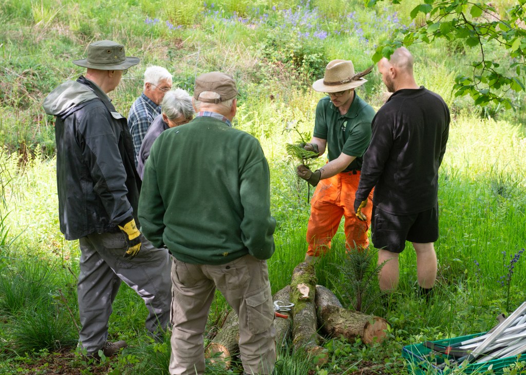
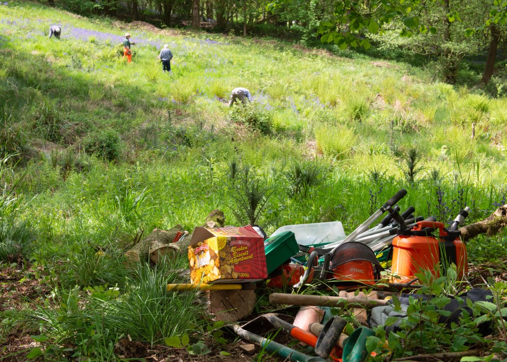
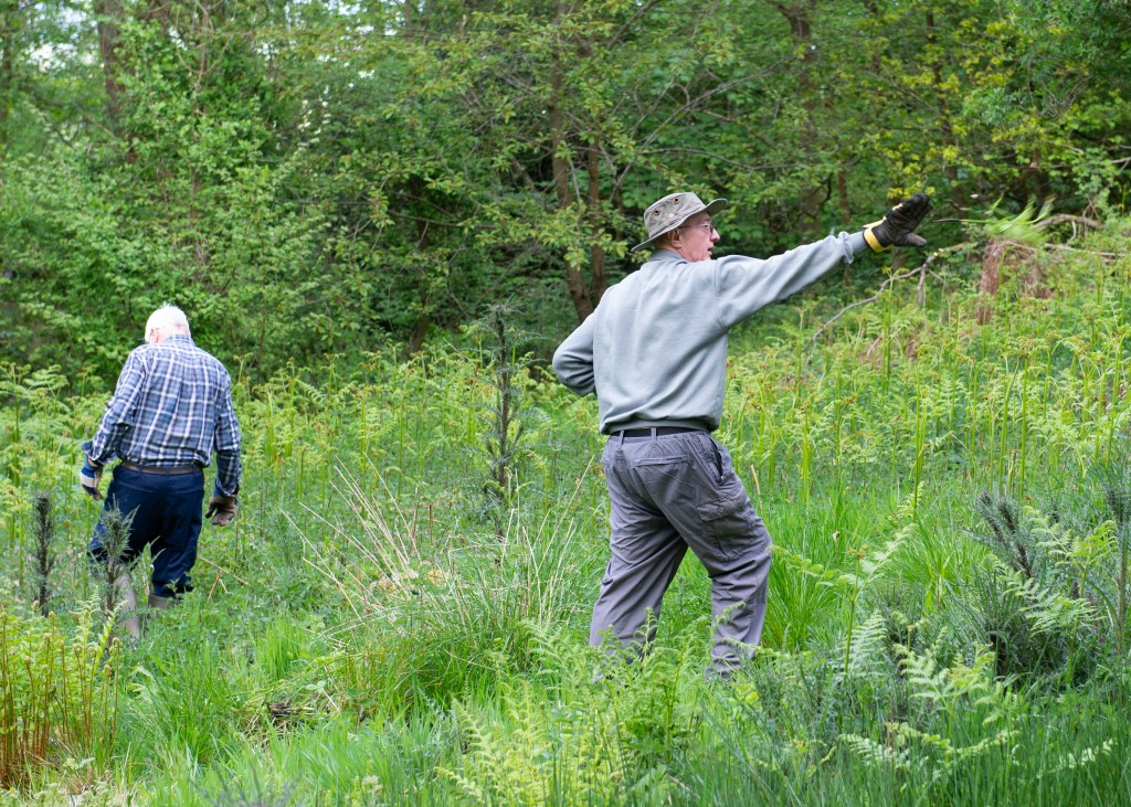
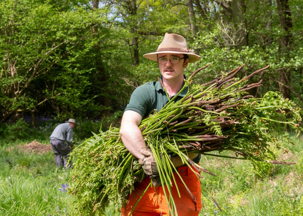
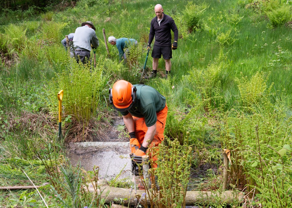
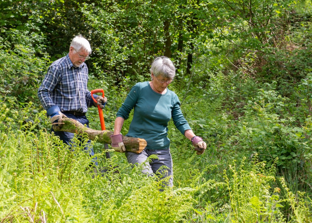
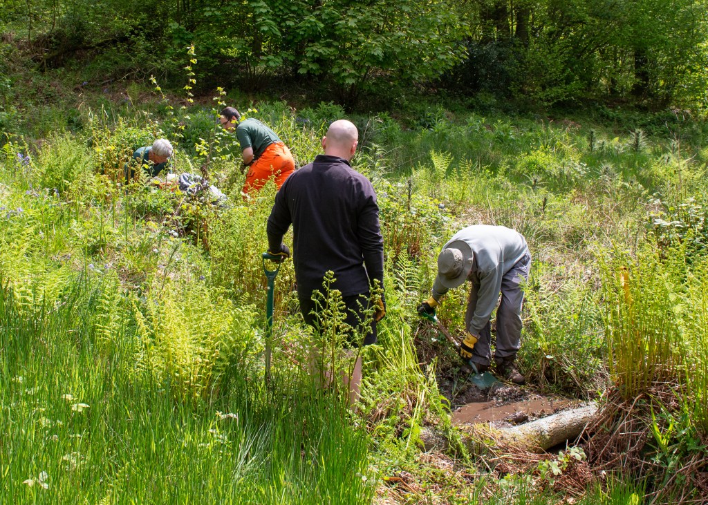
For.Assignment 2, I photographed a community of volunteers that carry out landscape maintenance for the Malvern Hills Trust, whose aim is to preserve the natural beauty and wildlife habitats within the area. The volunteers generally meet every week, depending on the nature of the work that needs doing. The attendees vary both in number and attendance, depending on their availability. I attended a session of bracken clearing and dam building during early summer.
I concluded at the end of Project 3 that the shoot was not at all participatory in nature, beyond gaining consent. The resulting series was aesthetically ‘observational’, in a street photography style. The subjects were aware of my presence, but didn’t engage with me the camera at all. It was my intention to document the work that they collectively did, rather than tell individual stories, so perhaps it isn’t a surprise that their level of input to the work was limited to simply ‘being my subjects’. I spent time briefing them about my intention to document the work of the Trust and ensured that they were comfortable with my shooting the project, and I spent time chatting with each of them during the shoot. These conversations were aimed at making them more comfortable and gaining an understanding of what motivated them to volunteer.
Intention and Benefit
In collaborating, the intention would first have to evolve to be more about the contributors and their motivations for volunteering for the Trust. All of the artists in Project 3 spent long periods of time with their participants, building trust and getting them interested in telling their stories. The first change to my project would be to attend multiple sessions talking to them and listening for the details that may be the basis of the project. Unlike the work of artists like Luvera, Houston, Lixenburg etc, I would not be representing a part of society that is mis-represented or persecuted in some way. They are underrepresented though, with most Malvernians not being aware or appreciating the contribution that they make. I would focus the benefits on the celebration of the volunteers themselves, as well as publicity to attract more volunteers to their cause.
Equipment
I’m drawn to Luvera’s use of a mixture of disposable cameras and loaned equipment with the participants in their projects. As the group only generally comes together for the volunteer days, the use of the former or a similar technology could be limited to that timeframe and wouldn’t include much context beyond, in contrast with Luvera. I would consider getting them to wear high resolution video cameras (if they could be borrowed), to film their work in a ‘found footage’ style. The series would also benefit from particpatory portraits, which could be shot during breaks in the work. Success would depend on the level of co-operation.
Agency and Co-operation
The subjects didn’t see themselves as being the subject represented, instead being part of the story of the Trust volunteers. To include the participatory element, the conversations would need to focus on the individual and their place in the group. They all shared the love of being outdoors, so this would be the starting point of discussing representation. They were mostly retired people, so we would address the stereotyping of retired people within our culture; holidaying, playing bowls, spending time with family. I would establish whether or not they wanted to challenge these ideas through their very physical volunteer work. As Houston and Luvera did, some form of review at the end of each shoot would help steer the direction of the pictures.
Ownership and Consent
Consent was covered well in the work for Assignment 2, but I believe a longer term project gives the participants more time to consider their position on consent. During our discussions, they all wanted to know what specifically I was gaining from the shoot. In this context, ownership would need be reconsidered particularly if participatory portraits are created. My consent form calls for the subjects to waive their rights over the images, which would clearly have to be updated.
Co-authorship and Credit
Similar to the topic of ownership, the shared credit for the series would also change. If I’d published the previous work outside of of the context of my studies, I would have credited the Malvern Hills Trust as the organisation I was working with. However, participatory work could introduce the contributions of the volunteers as co-authors, requiring an update to my consent form.
Outcomes and Audience
I think the outcomes for the work change in step with the stories being told. For example, a counter to the traditional ideas of retirement would incorporate the physicality of the work, while a ‘recruitment drive’ for the volunteers would major on the sense of achievement and the visual signs of familiar geography, landscape genre and the natural world. What I would definitely consider is the audience. The original intent was to highlight the work of the volunteers, so exhibiting the work as posters around the town, or a published article in a local magazine (Cotswold Life, Worcestershire Life etc) might be more appropriate than a formal exhibition. These formats would support my initial ideas of how to represent the team and the individuals.
Aesthetics
As with Luvera’s work with the homeless, I would include multiple formats for the images to include more formal portaiture and landscape styles. I would still work in a street style because I think it lends itself to representing activity. I would also combine quotations from our conversations with the images, to add further identity context. I probably wouldn’t pursue multimodal research as with Luvera and the Calais project, because of where I would present the finished work.
Reflection
The key takeaways from Project 3 are the emphasis on balancing the power of the camera with the power of the subject, and to invest the time with the subject(s) before a single image is made, to better understand what their story or representation might be. Photographers bring their own preconceptions to a project, which in straight documentary terms, shapes the narratives within a social, political, or cultural context. However, here we are bringing the subjects into positions of creative power, to help challenge misrepresentation and offer alternative narratives. Photographers such as Anthony Luvera and Scott Houston make the point that the work put into research, gaining feedback, and building trust is as important as the resulting images. This is a long way from merely asking someone if they consent to being photographed by a third party, who has some ideas of their own what the story might be or how it should be told. For this assignment, I had many ideas about how it could be more collaborative, but the main element that was missing was time. I would need many sessions with the community from Assignment 2 to adopt such an approach. Luvera and Houston approached their subjects as social and cultural outsiders respectively but put the work into validating their initial assumptions with the direct help from their subjects. Luvera’s approach of encouraging them to make pictures with him, first teaching them photographic skills, shows a non-judgemental of his homeless subjects, which brings them into the work. Houston’s editing sessions at the end of each shooting day, where the people of the community help edit and guide the sequencing, shares the sense of ownership with them, again gaining high levels of trust. Both approaches build on the community photography movements of the 1970s, which sought to represent under or misrepresented communities within the mass media. I’m already adopting the ideas of actively listening, developing ideas, sharing and accepting feedback in my SDP, and have already run into issues that make a collaborative approach vital to its success. A member of the community group that I’m interested in has deliberately warned off other members, because she fears my intentions for the project. That fear has caused reluctance to even engage in the initial discussions of how we might collaborate. How I approach the engagement will be crucial in moving forward, so Project 3 has come at a fortuitous time.
Create a series of 6-8 images of individuals from one particular community that you are not connected to or part of.
Keep in mind that “community” can be interpreted in a variety of ways, for this assignment the community you choose to photograph should reflect an experience and/or perspective that is different to yours. For example, they may be shop owners in a particular neighbourhood, or members of a particular club, or a group of individuals that work in the same trade or organisation. You may also decide to photograph people who belong to a different ethnic group or religious tradition from yourself.
Don’t forget to implement your model release or consent form, and gain written consent from the individuals featured in the work. You may choose to share these photographs in the Ethics and Representation Forum or privately (e.g. via a private learning log link) with your tutor.
Think carefully about the visual language of your photographs – how you compose your images should reflect something about the individual and the community they are part of. What might your position be? What might you need to be aware of going into a community to which you are an ‘outsider’? How did you approach these exercises and what did you learn from them? Would you make any changes to your process for any future work?
Supporting Padlet
For more details on how I approached this assignment, please see the below Padlet:
On reflection, my choice of community suited this assignment. I approached the group in advance, explaining my intentions, the idea of informed consent etc and gained agreement from the leadership to proceed. On the day, I used a personal experience of not being asked for consent to give context to the discussion and gain their trust. During the session, I talked to them about their individual reasons for volunteering, concluding that the series shouldn’t be about them as individuals, but as a team. This informed how I curated the final series, majoring on the collaborative nature of their work, while including visual references to their reasons for being there. I struggled with the consent form, because when I first met them, we were outside getting ready for their work. If I’d sent it in advance, the initial conversation we had would have been circumvented by formality. I sent the form after the fact, which was good for them as I followed up on my ‘promises’. However, it wasn’t helpful in my ability to use the images if, say, I’d been on paid assignment. I conclude that securing informed consent to shoot is easy if you build a rapport, but closing the second loop, the use of images, is more ethically challenging in terms of when the form is produced. Ethically, my concern was being respectful, documenting the work but not photographing people stumbling or wearing expressions that could embarrass them. As the series was an outside perspective, built purely on my observation of something I wasn’t part of, it didn’t feel like a transaction that needed the legal formality of the form. I suspect this is more an assumption of needing to protect from a threat, which I didn’t see during this shoot. I didn’t have to work that hard to gain their trust. I think the form works well for more formal photography, perhaps more transactional than this event. However, I will explore this further as I consider my SDP, which will contain both ‘street’ style observations and formal portraiture.
Make a small series or piece of work that responds to your theme, supported by the activities, reading and research you are doing into different genres.
You should experiment with producing different sets of images to explore your idea(s). You will need to add evidence of your work to your blog.
You should show your process, investigations, and your thinking through a combination of contact sheets, reflections, exploring the presentation of different combinations of images and reflecting on these different outcomes.
You should evidence your reflections on reading and research as well evidencing your engagement with the suggested course materials which will support your study.
You might explore ways of combining your genres – to find overlaps and ways of merging the genres together into something different and new. You might also develop work that challenges a particular genre convention and produce work that plays with the audience’s expectations.
You may decide to produce a set of images for each genre and then put a selection of the images together to explore the narrative that may be created across genres in combination.
Introduction
During the previous projects I identified a broad theme that has many potential projects that could be developed from it. My interest in communication, how it has changed and how people respond to it, resulted in my shooting a number of experimental photographs. These images were not centred on a single narrative, instead covering a number of areas. Nor were they rooted in a single genre. In parts 3 and 4, I deliberately selected source texts that covered the genres that are particular to my general theme, but have concluded that the active use of multiple genres within a body of work can be both powerful in shaping the narrative, but also more provocative in how the viewer interprets them. For example, the use of portraiture to can be used to challenge a cultural stereotype, even thought the series may be about a landscape, whether literal or geo-political. Landscape or still life images create the sense of place, but the portraiture invites the viewer to understand that place as seen through the eyes of its people. They are stitched together using the photographer’s observations either as part of the subject, or as an observer and it is this that can drive the way the genres are used to tell the story.
Approach
In my experiments, my perceptions of the changes in communication were driven by a middle-aged perspective, but one that worked in engineering and technology for many years. I have mixed feelings of embracing technology. It has to relevant to me and I need to understand. I tend to reject areas that are aimed more squarely at people younger than me. I also have elderly family members, for which communication technology is like a completely foreign language, which gives me an empathy with those who cannot work with it. The other area of my personality that was revealed by thinking about this theme, was my sense of compliance and order. I was brought up to follow the rules and to an extent that makes me compliant. It’s when I know that something doesn’t makes sense, that I rebel against what I consider to be ‘petty authority’. I acknowledge that this is why I’m drawn to artists like Martin Parr, Nan Goldin, Garry Winogrand and Robert Mapplethorpe, all of whom pushed back about strict ideas about expectation, fun, love, relationships and towing the line.
For this assignment, my approach was to take the narrower themes of ‘rebellion’ and ‘subliminal communication’ and curate two brief series from my experiments.
The starting point, an unedited collection of experimental images can be found in this Padlet:
In these series, the images work across the documentary, landscape and still life genres. We can say that because the obvious visual conventions come through in the images. The documentary images say something about the people and place, through observation of behaviour or previously established norms. For example, the small boy defying the traditional autumnal weather conditions at the seaside in My Way, speaks to the British attitude to their climate – if it isn’t thunderstorm or freezing cold, why not run around in your swimming costumes? The visual elements of that image firmly establish where it was taken, how bad the weather was and the contrasting attitudes of young and old. When it comes to the landscape images, such as the mown pathway in Why Not?, we have traditional ideas of foreground, mid-ground and background. There is land and sky, as well as a path leading through them. With the still life images, the elements suggest meaning through their placement, such as the discarded flyer shot in My Way. These conventions are apparent in my work here, but they do not define the way the images work as a series. Indeed, I didn’t set out to shoot within a particular genre, but instead wanted to explore a theme that speaks to our adoption of technology within the culture that I am part or, how we take cues from what we see and, sometimes, disregard what we are being told. When looking at this single-sentence description, it’s not easy to see a single genre that covers how it should be represented. We are left with considering how impactful a genre might be in creating a narrative. For this, it’s easier to see how I curated the both series from my experiments.
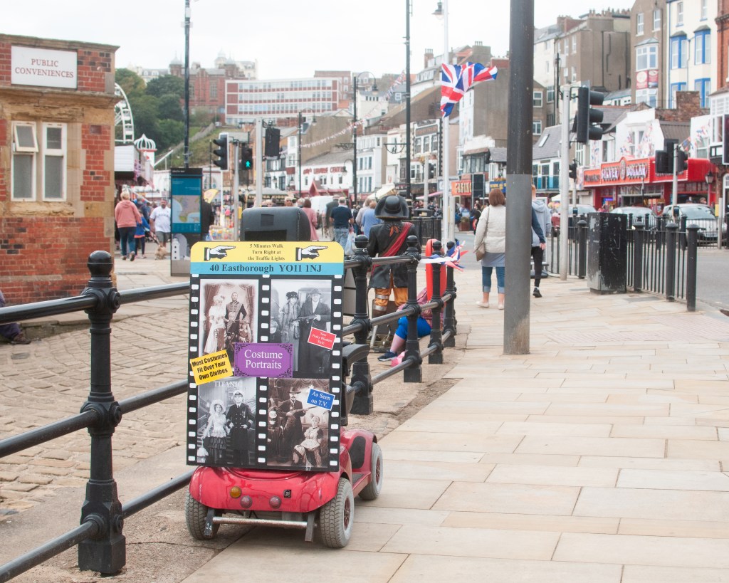
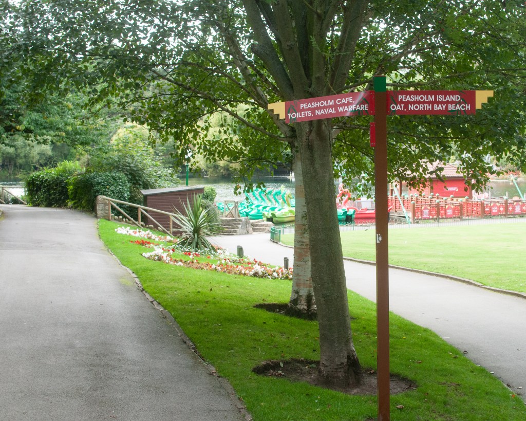
For example, Image 4 in Why Not? is a landscape with a sign pointing towards two paths. There are indications of the presence of people having been in the place (the garden, the damage to one of the signs etc), but there are no people in the frame. The image is highlighting the assumption that the viewer understands that there isn’t actually some ‘naval warfare’ going on, that the sign didn’t have enough space for the word museum or memorial. As a stand alone image, it suggests something that we can’t really place in the context of the town and its people, because there are few identifiers or ways to connect with it. However, when we add it to Image 3, which adds a documentary element to what is also essentially a landscape, we have much more information to help create the narrative. Now we see the disabled buggy, the old-style public toilets, the flag etc. We get the sense of a classical British town as a concept, as well as the ‘that’ll do’ element of its people (the use of the buggy as an advertising billboard). Perhaps the buggy goes around the town as a mobile advertising board. On its own, landscape part has impact, but when combined with the conventions of documentary, it’s increased. I had inadvertently crossed two genres with these two images. The series also include still life in some of their compositions.
When considering artists and works that fit within a single genre, I see a more tightly focused idea being explored than mere observation of a response to communication. For example, Trish Morrissey’s recreation of her family archive in her series Seven Years [1] transports the artist to a time in her family history. She plays the part of her parents and others in the fashions of the period, alongside her elder sister. The series not only crosses history, but also revisits the situational tensions of the original images through their adoption of body language and the micro-expressions contained within any family portrait. Morrissey doesn’t venture outside traditional portraiture because the source material for her exploration doesn’t. The genre unifies the concept behind the family portrait – it’s a picture of a person or people, everything else is the underlying narrative about the situation. We learn about the characters through her acting, in a similar way to Rosy Martin’s performance as her mother in Getting Changed [2]. While both artists’ work sit largely within the portraiture genre, they directly challenge some the traditional concepts that the genre is associated with, namely the faithful representation of a real person. As with other artists such as Cindy Sherman and Francesca Woodman who used themselves as performance ‘canvasses’, both Morrissey and Martin use their pictures to comment on generational differences, personal experiences in their growing up and the memories invoked by life events. All of these are a far cry from the use of portraiture to identify (passport) or classify (August Sander).
The works of Martin Parr, Anna Fox and Chris Coekin heavily influenced the curation of my own series above. These artists use different genres to highlight or ‘zoom into and out from’ a cultural idea or setting in a way that punctuates the wider series. Parr’s From The Pope to a Flat White (1979 to 2019) [3] mixes staged portraiture with street photography (a sub-genre of documentary) and the occasional still life under the banner of documentary to show how much the country has changed over many years. Similarly, Fox’s Work Stations (1986 to 88) [4] mixes the conventions of portraiture, street photography and urban landscape to create a mock news article about corporate finance. The series invokes the memories of 1980s Britain and the post-memory associated with the cultural and political landscape of the time and, more importantly, how it ultimately led to failure. Coekin’s series Knock Three Times takes a similar approach to working class culture in the face of political turbulence (studied in Exercise 1 [5]. All three spent time within the environment as observers and represented their experiences both past and present, using whichever visual style suited at the time. In my experiments, I was looking for example of my theme in action but it was in the curation that I selected which images had the biggest impact. Like these artists, I used crossing genres to make a point if the visual impact of the series was enhanced in some way.
Conclusion
This assignment is the culmination of the research from Parts 3 and 4 of the course, which started with identifying a broad theme, developing some more focused ideas from it and mapping them onto the concepts of genre and the artists who have worked with similar ideas. When it came to Part 4, the research was focused on how landscape has evolved from the traditional picturesque to the ideas of power, ownership and the symbiotic relationship between man and the natural world. Artists working in this area were creating landscape as we know it, but using the visual codes of the other genres to make their point about the subject. At this point, I struggled to recognise landscape as a pure genre. If Sibusiso Behka’s night-time images of his district of Joburg were landscapes, how come they contained people living their lives as principle subjects in the compositions? When it came to the other source text that I examined, Backwards and Forwards in Time, the works were blended by including images that were recognisable as having the visual codes of all the genres. The meaning of the works themselves came across, but not in a way that favoured any one of them. After reviewing and curating my own experiments into two mini series, I realised that genre wasn’t what I was particularly cognisant of when shooting; like some kind of automatic pilot. What was important was to create the context and narratives for the theme with whatever got the point across with most impact. I observed the artists that I had been researching as having drawn attention to a detail of their story or setting a scene/establishing a location for the work, by crossing into still life and landscape, but all the time maintaining the conventions of documentary for the whole series. I conclude from this that genres, while a way of classifying an image or series, actually don’t define them in terms of meaning or relevance to wider context. We don’t look at the works of Ansel Adams as excellent examples of a genre, more that they capture and represent the beauty of the natural world. We could equally represent that same beauty through an image of a flower or some wildlife, but the common thread through both works would be our intention, rather than the genre that we used. I recently read Stephen King’s latest novel Fairy Tale (2022) [6] whose plot explores the tropes of traditional ‘fairy tale’ folklore. We recognise the genre as being fantastical stories told to children in schools and before bed, but we associate King with the genre of horror fiction. Of course, we know that the origins of many fairy tales are in classical stories by the likes of the Grimm brothers and H. P. Lovecraft, whose writings were more akin to horror than children’s fiction. What King recognised in his latest work was the connection between the two and, more importantly, the common themes that can be represented by both, such as the repercussions of trusting the wrong person or making a bad decision, the dangers of avarice and ill-treatment of others etc. With photography, we can represent ideas like ‘delusion of grandeur’ by creating a mise-en-scéne composition, shoot a self-portrait as someone else (Sherman’s Centrefold) or capture a still life that invokes some form of post-memory (Martin’s Too Close to Home). For me, how we use genres beyond being comfortable with the the ability to identify visual codes, is pretty irrelevant to creating art.
My conclusion isn’t firm, however. I still have questions about how we decide what makes us comfortable. In Colin Pantall’s presentation The Way We See, How We Look and What We Show [7], he refers to the image below as a landscape.
Périphérique. (Mohamed Bourouissa, s.d.)[8]
While there is a landscape element to it and, while we know from the rest of the series that this is a place which is contested in terms of cultural ownership and racial dominance, I didn’t seen that when looking at this image in isolation. I saw it more as documentary (despite it being a staged photograph), so what is it what leads some to see one genre when others see another? I will be using this as the question to answer in Part 5.
LO1: Compare the theoretical features, characteristics and histories of different photographic genres.
Completed research into landscape and documentary within Exercise 1.
LO2: Deconstruct a given genres’ conventions and create visual material informed by that knowledge.
Reviewed and updated experimental images from Part 3.
LO3: Produce new visual work informed by your research.
Created two stand-alone series derived from my broad theme of Communication; one about how people rebel against communication that is forced upon them and the other about subliminal messaging that we acknowledge but don’t think about or recognise as having an impact on us.
LO4: Analyse the wider global contexts surrounding contemporary image making.
Examined how genres are crossed by contemporary artists who use the visual codes from each to create blended narratives. Discuss my thoughts on whether genre is useful for anything other than labelling what we recognise.
Create a visual working map or diagram of the theme you are exploring. This is to help you visualise the shifting boundaries, the connections, the overlaps and historical territories. You will map how contemporary practitioners are expanding or shifting the boundaries and consider sub categories within genre classifications.
Introduction
Continuing with my broad theme of communication, the work carried out for this assignment is contained in the following Padlet:-
The work is supported first by Exercise 1- Select a Broad Theme [1], where I attempted to break down communication into sub-categories and identify the genres and practitioners whose work connects with my understanding. It’s further supported by Exercise 2 – Review your Broad Themes [2], where I selected Documentary and Portraiture as the two genres I believed the idea to spanned in terms of territory. Finally, I created a Padlet for my ‘experiments’, which are photographs I shot throughout Part 3 that helped me explore Communication as a theme which I plan to take into my Self-Directed Project later in the course. This Padlet can be found here:-
This assignment was a challenge for a number of reasons. The first was that my broad theme was precisely that. Communication and the ways in which it affects us, is a vast subject that is inextricably linked with our identities (real or created), our age group and familiarity with technology, as well as our willingness to engage with the world around us. I had feedback on my very first assignment in Expressing Your Vision that warned of the dangers of a theme for a series being too broad, which is something I’ve taken forward throughout my studies. The work in this assignment has helped my understanding of how my theme is/could be represented by one or more genres and how it relates to the work of practitioners who have worked across them. In addition, it has helped me identify the areas of the theme that interest me with regard to the later Self-Directed Project.
The biggest learning point here was that the boundaries between formal photographic genres are not rigid. With the exception of Documentary, the key genres have evolved from classical art which neatly categorised the visual and technical approaches so that we recognise them. This would be ok if the meaning of the image was solely driven by the genre of the work. For example, Alec Soth’s Sleeping By The Mississippi, all of the traditional genres are utilised to describe the region, its ecology and its people. Portraiture sits alongside Landscape and Still Life that lend context to identity. Some images use the codes of mise-en-scène, the constructed image, while others appear more natural. What Soth is trying to say with the series is something about the culture of the region and how it’s largely incongruous with the public image of the Unites States. The hardships and economic decline of the region forces the people to adapt, which in turn influences their identity. For me, Soth’s main aim is to narrate his observations as observer, with the genres as mere tools to achieve this.
“I believe that photography is essentially non-narrative. That, while it aches to tell stories, it doesn’t really tell stories that have a beginning, middle and end. This has constantly frustrated me about the medium, and I’ve been constantly battling it. What I’ve come up with, is that when I’m looking at a photographer’s work, I’m looking as much at that person’s experience as a photographer in the world, almost as if they are a first-person narrator, as I’m looking at the subjects of the photographs.”
(Alec Soth, Sleeping By The Mississippi, s.d.)
Thinking about how to recognise genre codes and manipulate them, led me experiment with shooting images related to my theme. I then analysed them to see how effectively they supported a narrative and also how they use multiple codes. I also incorporated an image from my family archive in one of the comparative analyses to identify how it crossed genre boundaries. I concluded that I had become more aware of the photographic codes available to me and how to blend them to represent the ideas I have about a topic.
The map that I created is the start of a further analysis of my theme, but still only scratches the surface. I used the Documentary and Portraiture source material as the basis of the work in this part and the resulting overlay of the theme does show the crossing of the boundaries of these genres. That isn’t to say that Still Life and Landscape don’t have a part in the map, more that they don’t appear to be as relevant at this stage. This may well change as the unit progresses.
With regard to taking my theme further, I have identified the following ideas that interest me:
What happens when we reject the real world information in favour of the cyber world? Is our obsession with technology creating a virtual reality where our aspirations are social media followers and our voices are from behind a keyboard? I could explore this either from a position of ‘Devil’s Advocate’ or from my own perspective of having computer technology until my teens.
How are people consciously rejecting the connected world? The narrative could be driven by fear, lack of understanding or simply protest.
Protesting the idea of the ‘Nanny State’. There has been a lot of recent discussion in politics about the ‘regulation’ of the country, which plays into my initial thoughts about the number of directional or mandating signage we encounter day-to-day. As with 1, it could be straight reportage (drawing people’s attention to it) or from my own perspective and experience.
At this stage, I am keen to pursue one of these smaller ideas as my Self-Directed Project.
Against the Learning Objectives
LO1: Compare the theoretical features, characteristics and histories of different photographic genres.
The exercises in Part 3 explore documentary, portraiture and how my theme spans them. I have included historical terms and definitions from that work into my glossary.
LO2: Deconstruct a given genres’ conventions and create visual material informed by that knowledge.
Retrospectively analysed an image from my family archive using Barrett’s CRIT process. Determined that there are mixed codes from the documentary and portraiture genres.
LO3: Produce new visual work informed by your research.
Created experimental work along the ideas of my broad theme and analysed them to verify that they contain the visual codes of the genres and compare their potential narratives with contrasting images shot the same way.
LO4: Analyse the wider global contexts surrounding contemporary image making.
Looked at Alec Soth’s Sleeping by the Mississippi as an example of a cross-genre contemporary series.
Make reflective notes on your reading and the comparisons that are being drawn in this chapter – add these to your learning log.
Choose an image from Art History which you will visually respond to and reflect on your choice on your learning log (you might initially choose several before narrowing it down, and you can write about the choices and ideas you are considering).
Developing your work from Project 1, make your own photographic image, or set of images that explores, challenges, or pays homage to the conventions and visual codes of the original image.
Reflection on Photography and the Art of the Past (Kingsley, 2012)
The essay begins by defining historicism as photography’s use of traditions from art history in terms of inspiration rather than straight reproduction or homage to the genres. I was struck by the popularity of art history conventions in modern photography with the examples given, although there is a definite sense that it is less so than the Victorian era when the ‘new medium’ of photography was in its infancy. The emergence of photography as a way of recording classical painting shouldn’t be a surprise, given the mechanical/physical processes it uses. What interested me was the move towards creating work that looked like them, not just in the visual aesthetic, but also the subject matter. Julia Margeret Cameron’s portrait Light and Love (1865) has the hallmarks of a Victorian portrait (black and white, the soft focus of old lens technology etc), but Cameron dresses her mother figure in a similar scarf to that used in The Holy Family with Child, by Bartolomeo Schedoni (c1613). Cameron was portraying the love of a mother for a child to the Madonna using a nest-like setting for the infant to belie the period the picture was taken. This idea of using the visual codes and signifiers that typically represent the Holy birth as the basis for what Cameron saw as every mother’s love for their child is compelling. This was the example in the essay that resonated with me, because although my modern reading of Cameron’s image is based upon the knowledge that photographers take inspiration from paintings, she was actually merely trying to produce a more accessible version of them using photography. Her contemporaries were similarly using the medium to effectively copy similar works. In doing so, they were able to recognise the style and techniques used in order to create their own original work. In the case of some artists, the paintings themselves feature in new photographic work. The essay discusses Jorma Puranen’s Shadows and Reflections (after Goya) 2011 which connects photography with the past through deliberately revealing the techniques used to make Goya’s famous portrait of The Duke of Wellington. The structures of the canvas and brush strokes, coupled with Wellington’s gaze from the portrait give a sense of intrusion into the making of the famous image, the sitter almost being exposed by the new perspective on the original process.
The main conclusion. from this essay is that modern artists are still inspired by the ideas and techniques employed in traditional painting, with some seeking to use the technical codes and some the iconography that was popular throughout art history.
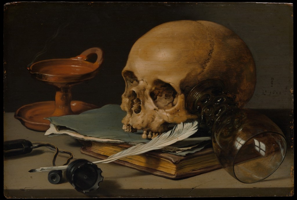
Example for Analysis
I have chosen a still life by Dutch painter Pieter Claesz (1597 to 1660 called Still Life with a Skull and Writing Quill (1628). The image is from the sub-genre of Still Life called Vanitas, defined as:
“A still life artwork which includes various symbolic objects designed to remind the viewer of their mortality and of the worthlessness of worldly goods and pleasures”
(Tate, s.d.)
Fig 1. (Pieter Claesz | Still Life with a Skull and a Writing Quill, s.d.)
Vanitas images deal specifically with mortality, with the reminder of the fragility of a life in balance. They almost always contain signifiers of the end of things, with skulls, writings, candles and empty vessels such as wine glasses to connote the impending. In this image, the dominant element is the skull, which faces the light. It’s condition with its lower mandible and some teeth missing, signifies age which ties in with our rational perspective on death – old people die. The empty candle holder is clean, which suggests it’s either never been used or has been tidied after death. This could connote regret for things not done or started during life or what remains of the flame once long extinguished. The skull rests against an upturned wine glass which is empty. This empty vessel points to previous pleasures, something that many Vanitas images have in common. Others contain musical instruments, food etc, all of which connote better times. The final elements in the image are the quill, the journals and the upturned inkwell. All of these signify labour and their aged appearance connotes something that has been done for a long time. The quill’s repose is such that the writer may be back at any time, or could have left for good. All of the elements are placed on a worn stone table or platter, which connotes the slow passage of time, but presents something familiar about the composition; the artist not simply presented disconnected items to the viewer.
Visually, the image contains elements that are all similar on colour and tone; there are not dramatic contrasts. This is reflected in the lighting, which owing to the lack of a candle is assumed to be natural. These images are deeply rooted in religious iconography so the choice of lighting could connote the ascension to the afterlife or the antithesis of the end of the day/end of the life.
This painting and the others of the same sub-genre appealed to me because they use still life in a way that I had not considered. Other artists were painting images of bountiful life, with exotic fruits, wines and flowers being the most popular themes. Vanitas serves as a reminder that things don’t last for ever and while often extreme in their execution, their style lends itself to story-telling.
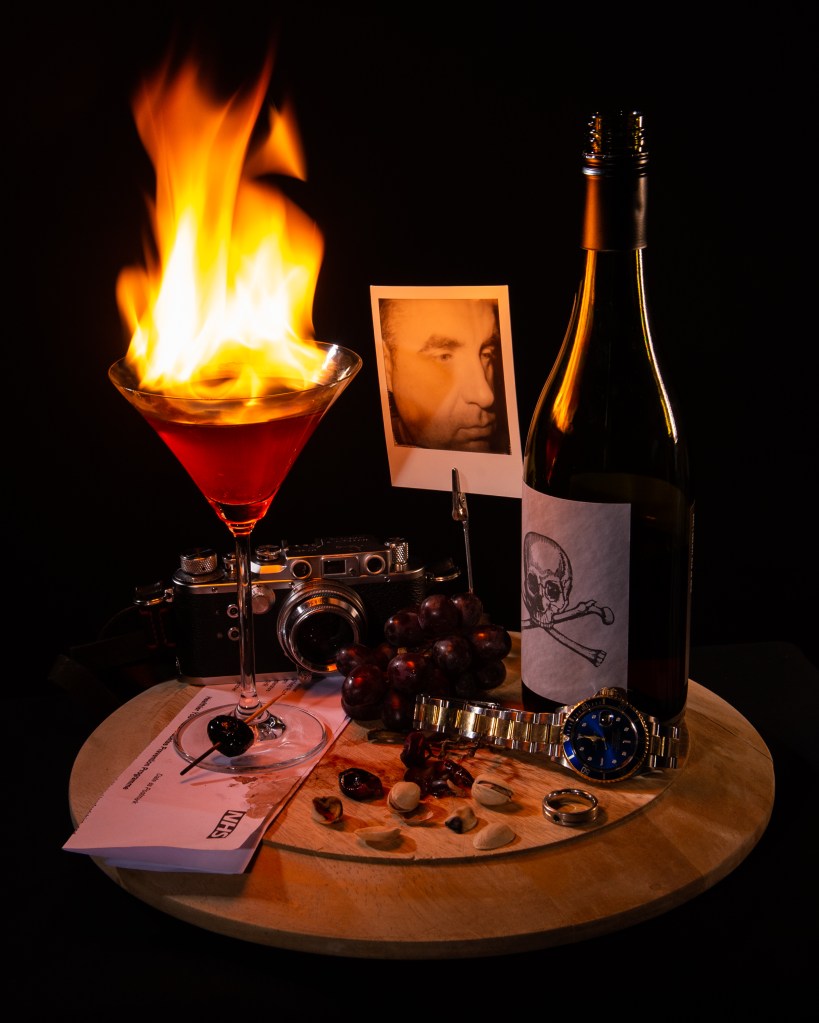
My Image
Vanitas still life resonated with me because of the transitional messaging within the image. The ideas of being reminded of mortality while simultaneously celebrating the good things in life connected with a recent change in my own life. I recently gave up alcohol, not because of some problem, diagnosis or epiphany but more because of the way it, in small measure, become part of routine. Lockdown and changes in my working life meant that it was easy to indulge in the weekend treat more regularly than before. My decision to stop has had a huge impact on my wellbeing and made me reflective about the health issues caused by alcohol, some of which are very serious. I wanted to explore this with a Vanitas-style image.
Key elements to reproduce:
Sense of warning represented in the paintings by a skull.
Direction of light – ethereal and from above as if suggesting divine light.
Enjoyment of life’s pleasures – hobbies, food etc.
The sense of timing – being warned about the future, but also the present moment.
My Image
Temperance, after Claesz (2022) by Richard Fletcher
Analysis
For an analysis of my image using Barrett’s tools for critique, please see Padlet below:
The combination of analysing Claesz and making my own still life that uses similar codes and ideas has given me a new perspective on the genre. More than the classical fruit scenes, the Vanitas still life paintings were multi-layered in their connotations, using signs that provoke a sense of dread in the viewer. They combined the artist’s skill in representing light with an understanding of form and luminance that draw the attention of the viewer to the powerful iconography. With my image, I tried to assemble a collection of items that paid homage to Claesz’s image, as well as recreating the directional lighting and matched tones. Once I’d included the camera as representation of ‘enjoyable pursuits’, I realised that there was going to be some diversion from the tonal qualities by introducing harsh highlights. When I realised this, I included my watch to add balance to the spatial composition. One element in classical still life that intrigued me was the use of candle light. For me, this was where the differences in the skills of the classical painters varied considerably. Some master practitioners, such as Rembrandt, really gave a sense of the scene being lit by this natural source, while others used artistic licence with the brightness of the flame and its fluid movement. That inspired my lighthearted criticism in including the flaming cocktail. I wanted the scene to appear to be lit by the flame alone and for it to look completely natural. For this, I used a slow shutter speed rather than a fast one to freeze the flame. The scene is fill-lit by a two strobes and a further LED with a warm colour temperature, which when combined with the key light gives a natural feel. The most important part of this assignment for me was the post-production analysis using the ideas of Terry Barrett, with which I was able to re-evaluate what I had intended to achieve with the picture.
“Thus, all photographs, even straightforward, direct and realistic-looking ones, need to be interpreted. They are not innocent, free of insinuations and devoid of prejudices, nor are they simple mirror images. They are made, taken, and constructed by skillful artists and deserve to be read, explained, analyzed and deconstructed”
(Barrett, 2006)
This assertion by Barrett resonated with me in Exercise 1[2], where I made the selection of the images from each genre randomly. At first glance, the Ansel Adams landscape is a beautiful representation, but by analysing using semiotics, a number of meanings could be derived from the elements and and what they connote. Barrett’s approach simplifies the reading of an image in my opinion, which makes it more intuitive to use.
In conclusion to this assignment, I am happy with my still life. I’ve received feedback from my peers about both the connotations of some elements and the relationship between my composition and that of Claesz. These observations lead me to think about how close to the original image my photograph is and whether that is important. Other feedback questioned how it fits with contemporary Vanitas works. I had partly been inspired to look at the still life genre after analysing Paulette Tavormina’s Banquet (2017) in Exercise [2]. Her use of including movement with the birds in flight, but in a staged fashion, led me to question the movement of candles in other paintings. By incorporating ‘real’ movement into still life, does it still fit with the codes of that genre? Is it truly ‘still’? Looking at Ori Gersht’s Exploding Flowers [3], where the movement from the dispersing petals is clearly there but frozen by a fast shutter speed, I would argue that it’s a difference in detail definition. My flame is clearly identifiable, yet the movement is more life-like owing to the longer exposure. Therefore in terms of being an homage to still life, and in particular Vanitas, I am happy that my image meets the original intent.
Against the Learning Objectives
LO1: Compare the theoretical features, characteristics and histories of different photographic genres.
The features of Still Life were studied in Exercise 1 and brought into this assignment.
LO2: Deconstruct a given genres’ conventions and create visual material informed by that knowledge.
Visual codes such as composition, lighting etc for Still Life were recreated in my image. I took the idea of Vanitas, a sub-genre of Still Life and made it about the warnings of health impact from alcohol instead of mortality. I used similar internal contextual elements as laid out in my post analysis in the Padlet
LO3: Produce new visual work informed by your research.
I produced an image that pays homage to Claesz’s work but isn’t a replication of it. The contextual elements are similar but the overall meanings that can be connoted from them lend themselves to my story.
LO4: Analyse the wider global contexts surrounding contemporary image making.
I was inspired by Paulette Tavormina’s Banquet (2017) which took the classical ideas of a feast in still life and incorporated a flock of birds descending to eat the food. The ambiguity of their presence (see Exercise 1) added a layer of narrative to the image, which in every other regard looked like a painting.
Create a Padlet that presents a critical and reflective summary of the conventions, expectations and meanings of a genre of your choosing.
For this assignment you will use Padlet to present a summary of your understanding of the key concepts (conventions, expectations, meanings) of a chosen genre from the materials you have engaged with. The readings, research and activities will have enabled you to think about genre in a variety of ways and you can reflect on this in your assignment.
Within Padlet you can use image, video, text and sound as ways to summarise and critically reflect on what you have discovered so far. It will be useful to go back over your learning log and think about the ideas that have sparked your interest.
You may wish to write freely in a journal style extended reflection to give yourself room to explore and think through your ideas about genre so far. This could be presented on your learning log and then summarised or tightened into a shorter version for the Padlet presentation. Alternatively, you could format this as a PDF and upload to your padlet.
This assignment will be built upon throughout the rest of the course, so although you may choose one genre for focus now, by the end of the course you will have explored and created work across Landscape, Documentary, Portraiture and Still Life.
Suggested 750 words/annotation, or 6 minute presentation.
Ensure you correctly credit and reference any images/quotes used throughout the course.
You may find it useful to compare and explore areas of similarity or difference across Landscape, Documentary, Portraiture, and Still Life. Consider theoretical features, characteristics, histories, and techniques. How has this project enabled you to think differently or expand your understanding of particular elements of the genre you have studied?
Introduction
The genre I have chosen is Documentary, owing to its close relationship and maturity to the social sciences, principally sociology. While it is clearly not the only genre to focus on the exploration of human society, it is a genre where the ideas of objectivity and creativity are blurred. The idea of documentary suggests ‘truth’, which drives both the academic exploration of culture and is believed implicit in documentary photography. However, as we have learned in previous units, the concept of the camera faithfully documenting what it sees is a flawed foundation upon which to build an understanding.
During the reading around Documentary, I have created a Padlet to show how the various ideas and relationships between the academic and the artistic approaches are connected. It can be found at this address:
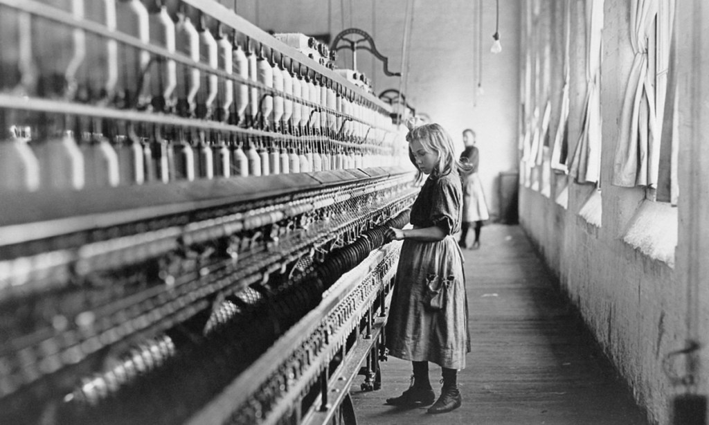
The immediate conclusion from reading Becker[1] might be that the relationship between sociology and documentary photography is a strong one. However, while they have the same fundamental objective of the exploration of social and culture, they go about it in almost opposing ways. Sociology bases itself in the science of gathering observed data or testimony, its analysis and logical conclusions. Photography creates a visual document of what the camera, and more importantly the photographer sees. They both need to be immersed in the ‘subject’ but sociologists view their technical approach as less prone to creative intervention. They believe the camera to be an objective instrument, but not in the hands of a creative photographer. In The Currency of the Photograph, Tagg[2] describes a presentation by Berenice Abbott where she describes realism being defined by the artist. This seems like a strange claim until we think about how we define reality. It’s almost as much about how it’s perceived, culturally and historically as it is about something being recorded. Documentary photography then follows the photographer’s physical process (lens selection, aperture, shutter speed etc) and incorporates their observation of the scene or event as a complimentary creative process. The viewing audience brings their own context in the reading of the elements that asserts whatever realism the image represents. In reality, both photography and the social sciences are constrained by the editorial practice. With the former, the results of analysis might not be shared widely of the message is potentially catastrophic (consider the impact of commercial logging on the climate being aimed more at the consumer rather than the communities who depend solely upon it). The famous ‘killing’ of negatives by FSA editor Roy Strkyer demonstrated this censorship. That series, like many others of the time sought to ‘document’ the plight of one area of society to another who was oblivious. The rise of the magazine editorial revealed topics such as child exploitation as in Lewis Hine’s photographs from Child Labors of the Carolinas[3], a collaborative paper with investigative journalist A J McKelway in 1909. The work was intended to both educate and shock the higher classes of American society from their apathy when it came to textiles. It is within works like Hine and The FSA that we see where the documentary genre borrows from others. For example, consider the image below:
No. 22.–LANCASTER S. C. Spinner. A type of many in the mill. If they are children of widows or of disabled fathers, they may legally work until nine p. m., while other children must legally quit at eight pm [Fig. 1]
The image is documentary because it records an example of a young child working in an dangerous environment. Here we have a strong connection with sociology, with girl’s details contained in the caption. The composition emphasises the scale by revealing the seemingly endless loom reaching out into the distance in a way similar to the leading lines of a landscape photograph. The exposure’s sublime aesthetic is also borrowed from the landscape genre to further emphasise the child’s tough life. When we look closely at the image, we see little movement in the girl. At this point in photography, film speed and artificial lighting was still fairly primitive, so its unsurprising that some level of staging in order to get the sharp picture that we see here. When we consider her expression, small stature and the context of the background worker, we can surmise that the image borrows from the portraiture genre.
Conclusion
In conclusion, the documentary covers many aspects of the human condition, whether about cultural development, behaviour or events that impact people and their environment. Documentary photography strives to faithfully reveal the subject and tell the story of it, but its direction is driven by what the photographer sees and their reaction to it. The criticism of photography from the sciences is that this creative ‘direction’ is more akin to art than evidence-based analysis. In reality there is always some direction taken by the audience for the work in both fields. As the genre covers some many areas of life from the everyday to the landmark events, documentary borrows from the other conventions such as portraiture and landscape, using them to emphasise the story behind the image or series. I’m interested in this genre because above all else, there is the common misconception that the camera tells the truth. How this idea can be used to subvert documentary is something I want to pursue in this unit.
Against the Learning Objectives
LO1: Compare the theoretical features, characteristics and histories of different photographic genres.
Read across the genre and its place within wider documentary. Reviewed the theoretical approach and incorporated areas that are borrowed from landscape and portraiture with examples. Reviewed the work of a number of practitioners who have worked in different areas of the genre
LO2: Deconstruct a given genres’ conventions and create visual material informed by that knowledge.
Deconstructed the visual ideas and approach to documentary. No creative work in the assignment aligned with this LO.
LO3: Produce new visual work informed by your research.
Not applicable for this assignment
LO4: Analyse the wider global contexts surrounding contemporary image making.
Not applicable for this assignment – the work focuses on the history of the genre.
[1] Becker, H. S. (1974) ‘Photography and Sociology’ In: Studies in the Anthropology of Visual Communication 1 (1) pp.3–26.
[2]Tagg, J. (2002) The burden of representation: essays on photographies and histories. (Transferred to digital print) Basingstoke: Palgrave Macmillan.
[3] A. J. McKelway (Alexander Jeffrey), 1866-1918. Child Labor in the Carolinas: [A]ccount of Investigations Made in the Cotton Mills of North and South Carolina, by Rev. A. E. Seddon, A. H. Ulm and Lewis W. Hine, under the Direction of the Southern Office of the National Child Labor Committee (s.d.) At: https://docsouth.unc.edu/nc/childlabor/childlabor.html(Accessed 03/04/2022).
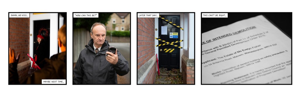
I have now received feedback from my tutor on my submission for Assignment Five: Your Inspiration. On the whole, the feedback was positive, with the view that my idea of re-telling the ghost story in the context of the modern digital life came through in the series. A number of suggestions were made as to how to improve the series impact and visual, which are described below. This post addresses the points made and any actions taken prior to submitting for assessment.
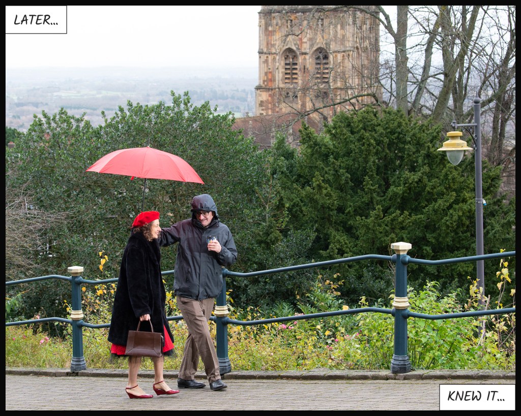
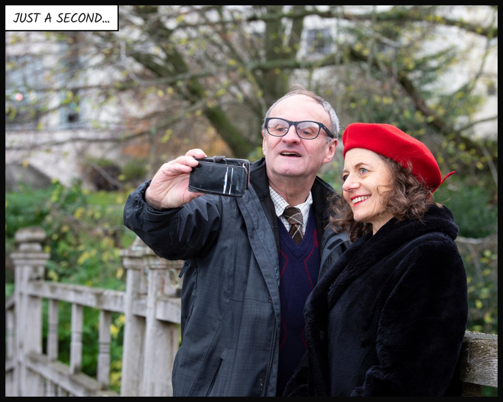
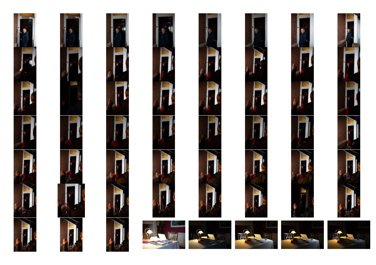
The triptych of photographs (Three, Four and Five), that tell of the first meeting between the characters, was thought to be one image too many. The impact of the sequence and Eve’s sudden appearance was thought to be represented adequately by Three and Five.
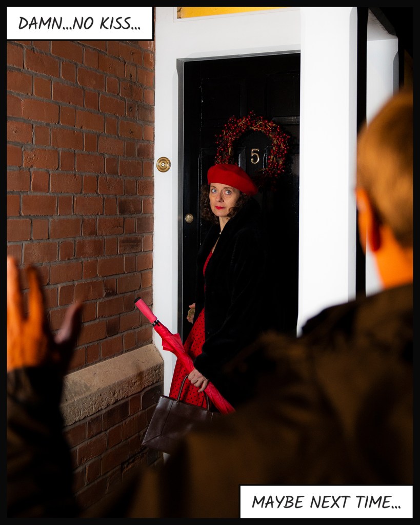
Eleven was thought to confuse the continuity of the sequence in that it doesn’t contain any indication of from whose viewpoint the door is being ‘seen’. This was in contrast to Nine which shows the man saying goodnight to the Eve at her front door.
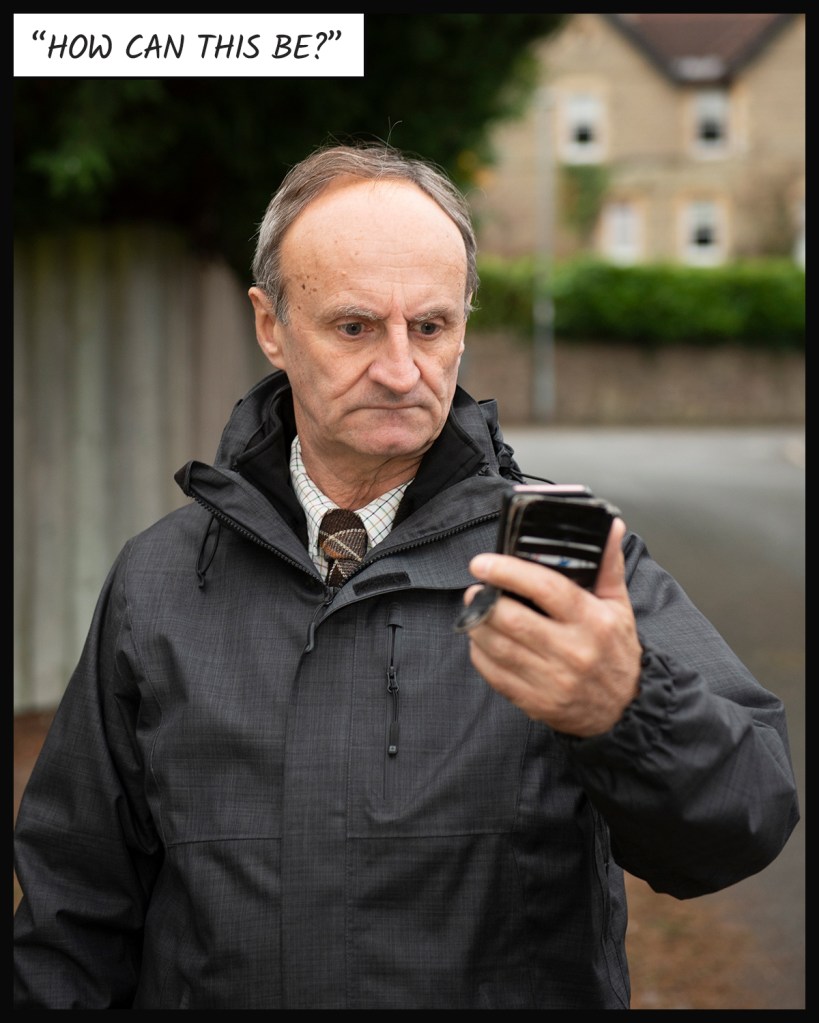
The man alternates from one hand to the other when holding his phone. Although this was felt to be a very subtle disruption in the continuity, it was noticed by my tutor.
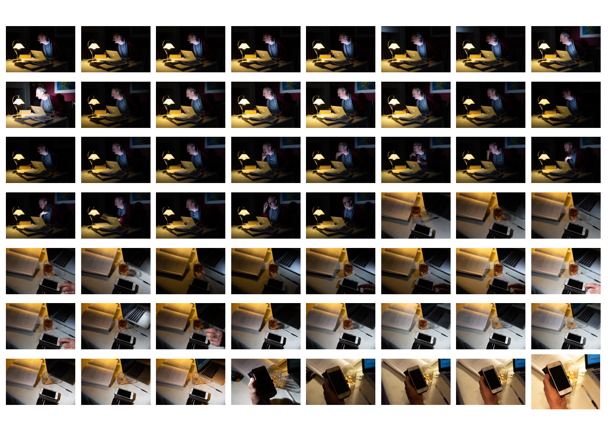
The final image reveals Eve to be something supernatural with the lingering doubt around whether she was a figment of the man’s imagination. In the picture she was felt to be too solid to maintain this mystery.
The comic strip aesthetic could have been more impactful with a page layout rather than the traditional newspaper look that I had chosen. It was suggested that I look at the layouts of graphic novels as an inspiration for how to present my work here.
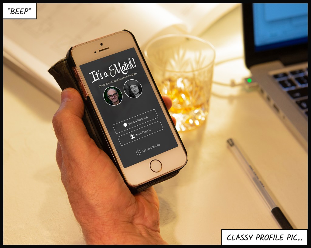
Some of the captions were thought not to add to the image on the way that I intended. The example given was the use of *sigh* in Four. The man’s expression made the word redundant in terms of supporting the picture, in contrast to the use of *beep* in Two which signals the notification from the dating app.
Response
The feedback was interesting and matched some that I had received from members of my I&P cohort. My response to the feedback and rationale for making/not making changes is shown below:
Point 1
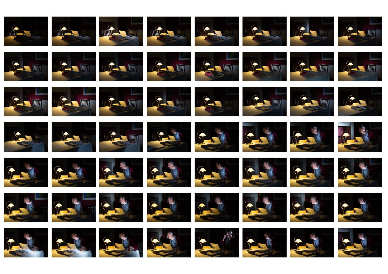
I understand the sentiment about Four and the idea that Eve’s appearance without any leading into the frame does suggest that she has materialised. I originally had the idea of a diptych for this part of the series during shooting and actually decided to include the third image to add another question to the sequence. The story has a continuous thread of modern technology, and our dependence on it, running throughout. One of the ideas being portrayed is the way that the mobile phone keeps our attention when lots of other things are happening around us. The original inclusion of this frame was intended to show the man not noticing Eve when she appears, either because he hasn’t noticed her materialisation or that he is transfixed by his phone. During our call, my tutor and I discussed 5) Exercise 2: Georges Perec, where we had to look at a scene in front of us and note what we had observed. One of things I noted during the exercise was the number of people sitting alone with their phones, almost existing within their own bubble. The other activity in the cafe scene had some interesting aspects, the grandfather carrying a baby in a papoose for example, which the phone users completely missed. When I reflect on this, I am guilty of the same thing whenever I’m by myself in a public place. In terms of this assignment, I am not inclined to remove the image because I believe that without it, this ambiguous situation and the question it raises about his awareness of her presence is missing.
Point 2
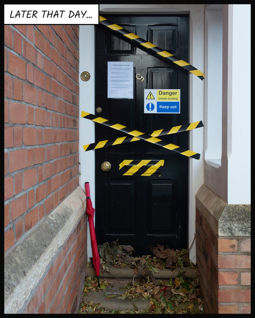
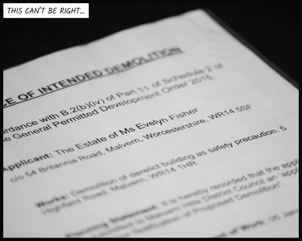
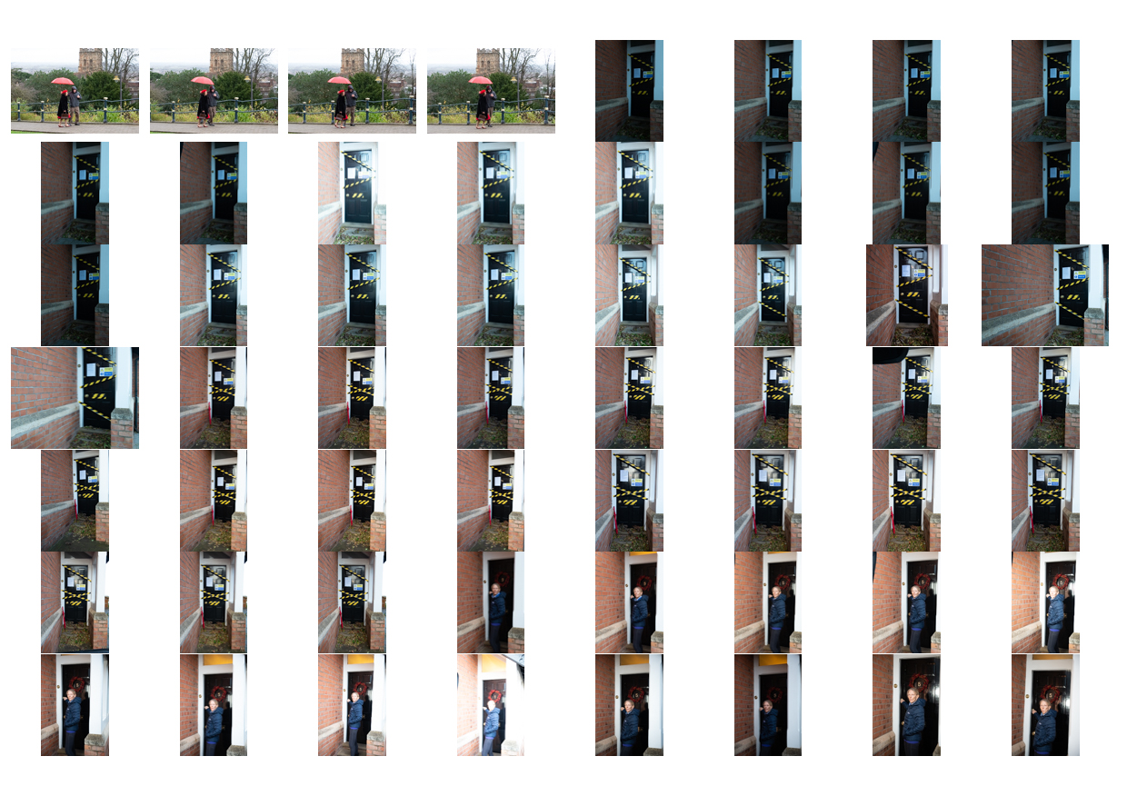
This was very valuable feedback as it is a subtlety of visual storytelling, particularly the mise-en-scène approach to cinematography. I hadn’t considered the jump between the man realising that there was something wrong (observed by the viewer) and the visual of the derelict front door. I decided to re-shoot this image as I still had access to the model and the props (the front door being my own). The new frame can be seen below:
Point 3
This was something I hadn’t noticed during shooting and post-production, but it was another good observation in the same context as Point 2. As it was accidental, there was no way of using any of the other photographs from the contact sheets to correct it. The result was that I had to leave the error in the series. As a side note, I discussed it with the model who stated that he naturally swaps hands with his phone, depending on the light and the function that he is using. It doesn’t distract from the point that I hadn’t spotted the disruption in continuity; something to watch for in future.
Point 4
This point was more of a comment on the creative decision that I’d made to have Eve standing over the man with an ethereal glow. My tutor felt that I could have placed her as a reflection in the painting on the back wall in a translucent visual, or with a different composition where she appears as his desktop image. My initial response to this point was to consider how I could make Eve less solid in Photoshop, but I quickly realised that my decision to light her with a different colour temperature to the man made it difficult to see a way achieving this. Even if I could make her less solid, the fact that she emits light in the form of a glow on the background, means that the result would not work technically. The other issue was that the lighting setup used in the shoot meant that I didn’t shoot other images with her missing from the frame that could be combined to achieve the effect. As I no longer had access to the both models and costumes, I elected not to re-shoot the picture. The idea of having her as a desktop or screensaver was something I had originally considered when preparing for the shoot, but I didn’t want to include more than one composite image using Photoshop (I already had created the fake dating app profile and layered it onto the phone screen in Two). On reflection, I didn’t agree with my tutor on this point as in following the original ghost story idea, Eve needed to be as real and believable as possible throughout, rather than follow the stereotypical notion of being transparent.
Point 5
This was perhaps the most difficult feedback because my intent for the series was not to present it as if it were a classic graphic novel. I wanted to include the textual elements as a nod to Barthes and the idea that they could support the main narrative, while leaving the images to reveal the other layers. The genre of graphic novels wasn’t the point, but by presenting this way I have received this feedback from more than one person. In response, I looked at modern examples of comic and graphic novel layouts with a view to arranging this series in a a more tabular form. As the feedback suggested, by laying out the panels together, the viewer is presented with the story in one instant. The viewer gets a sense of the action without linearly progressing through the panels. I could see the benefit in laying out my series in the same way. Unfortunately when it came to arranging my images, I realised that the comic panels generally followed a format where one of the dimension of each box was consistent with the others. The tessellation of the panels depends on the variation on the other dimension of the panels which, in terms of my series, presented a problem. I had shot each picture with the frame filled to the extent where I could then crop to my preferred 4×5 format. This meant that selecting another crop that would suit a comic book layout would potentially remove details that I had included in order to support the narrative. I concluded that in order to have made a traditional comic, I would have needed to have shot the pictures with that in mind.
Point 6
The final point made was related to the inclusion of some of the captions. My intent was to use text as a relay to the images, describing the main ghost story but not sighposting the more subtle elements of images themselves. The point was made that some of the images didn’t need their caption to increase their impact. Following this feedback, I removed the example that was given and re-reviewed the captions for the whole series.
Changes made to the series
In addressing the feedback, I made the following changes to the series:
The most significant change was to the arrangement of the comic strip. I had struggled with the arrangement of the panels to fit a page, without making major changes to cropping of some of the photographs. As each image was a mini tableaux, I didn’t want to lose important symbolic messages within the frames by cropping just to make them fit. After careful consideration, images Seven, Eight and Twelve were changed from landscape to portrait without any loss of elements, which meant that I could make a 4 page comic. As most of the comics and graphic novels that I had looked at were in portrait format, the arrangement followed this style. To make each page more visually interesting, I made three images, where there is ‘close-up’ action taking place, stand out by rotating them slightly in their position on the page. This is frequently done in comics and graphic novels and has the effect of breaking up the static format of the panels.
The final image where Eve is revealed is now a single page on its own. This decision suited both the layout of book and also the drama in that picture. In my previous layout, the image was somewhat lost because it was a portrait composition which reduced its size on the page. The picture now serves as the climax of the story and is large enough for all of the details to be seen clearly.
I made some further changes to captions and sizes, removing those that didn’t contribute to the narrative and adjustments to make the size consistent when the panel sizes varied. The most notable removal of caption is the selfie picture where the activity is both obvious and also brought to the reader’s attention by the use of rotation mentioned previously. Some captions were adjusted to make the new sizes fit within the frame of the images, mostly on the first page where the landscape panels are smaller than pages 2 and 3.
Conclusion
In general, I was happy that the series achieved what I intended for it. The feedback from my tutor, family and friends, as well as my fellow cohort members, was constructive. I found that my initial reaction was to focus on what I agreed with them on and be less interested in anything that I thought was a misunderstanding of what I had intended for the series. However, I realised that the opposing views were still intended to help improve the series, so gave them more thought. The changes I made to series involved significant edits to the photographs, captions and the layout, all of which result in what I believe is a stronger series. The final presentation of this assignment can be seen in the original post Assignment Five: Your Inspiration linked here:
Look back at the themes we’ve examined relating to place and our presence within it. What areas inspired you most? The culmination of this course is a self-directed assignment where you have free rein to choose a subject that relates to any of the material discussed in the course. You may have gathered skills and insights through the projects that you want to revisit or you may have been inspired by other ideas.
The only stipulation is that the final outcome must represent a notion of identity and place that you are personally inspired by. Make sure that your work is visually consistent, relevant to the subject matter you choose and holds together well as a set, both visually and conceptually. Think carefully about your editing decisions.
Which images need to be there?
Which ones repeat other images?
Are you holding on to a favourite that is no longer required?
Do you need to re-shoot anything?
Aim for a coherent set of no more than 15 pictures, accompanied by a reflective commentary of no more than 500 words.
Reflection
Before you send your work to your tutor, check it against the assessment criteria listed in the introduction to this course guide and make sure that it meets all the criteria. Make your evaluation available to your tutor.
Reworking your assignment
Following feedback from your tutor, you may wish to rework some of your assignment, especially if you plan to submit your work for formal assessment. If you do this, make sure you reflect on what you’ve done, and why, in your learning log.
Introduction
Reflecting on Identity & Place, I consider the key learning to be about how I relate to personal stories and the context within which they are placed. At the beginning of the unit, we looked at portraiture as a way of representing a person or something about their personality. We looked at how artists incorporate elements like props and backgrounds, include text to describe and to steer a narrative and remove items, sometimes including the subject themselves. My reading of the course ‘intent’ was it being about placing a character, whether real or fictional, within an environment or context (the place) where a story could be told. The representation of a real person could be driven by either the artist or the subject (or in some cases both), while a fictional character could be entirely constructed by the artist from post memory or cultural influences with almost limitless creativity. Throughout the course, I have strived to say something about real people, from the complete strangers of Assignment 1 to the collective experiences of my town in Assignment 4. I decided towards the end of Research Task: Personal Reflection[1] that this assignment would instead be fictional, drawing on real-life references and questions about ourselves and technology. The story would take the urban legend of The Vanishing Hitchhiker as its inspiration.
The Vanishing Hitchhiker & Other Urban Ghost Stories
The telling of an urban legend is one that I think everyone in the western world experiences at some point in their lives. Someone confidently telling a story that happened to a ‘friend of a friend’ or distant family member, that they ‘swear is true’. In some cases the desire to believe is overwhelming, while in others the ‘truth’ is debunked easily enough. I first heard this story when I was around 10 years old. A man, driving alone at night picks up a beautiful female hitchhiker who shivers with cold on their journey to her home. The man gives her his coat and she inadvertently gets out of the car while still wearing it. Later realising his coat is missing, the man goes back to the house that he dropped her off at the following morning, only to find a distraught family member who tells him the girl has been dead for years. Uncertain of what to believe, he goes to her grave in the local cemetery only to discover his coat neatly folded on her gravestone. The story of the vanishing hitchhiker takes many forms and has varying degrees of believability folded into it. While researching for this assignment, I found out about a ghost called The Metheringham Lass[2], who is reputed to haunt the road where she had been involved in a motorcycle accident with her fiancé while stationed at a nearby airbase during the Second World War. ‘The Lass’ as she is known, flags down motorists for help her fiancé, gets in the car and promptly vanishes before the driver’s eyes. Sounds plausible, until we discover that the alleged facts about the girl cannot be verified in any electoral roll or airforce records. Still, there are many people who claim to have seen her on the stretch of road. We don’t know why urban legends, and ghost stories in particular, hold such fascination, but my theory is pretty simple. We want to believe there is something beyond death; the traditional notion of the afterlife but where people can still interact with the living. In addition, we want to imagine what the experience was like for the unfortunate driver (in the case of the Metheringham Lass), whether we ourselves would be utterly terrified by it or somehow sad that the person turned out not to be real. Some accounts of The Lass are truly harrowing (empty sockets for eyes, stench of rotting flesh etc) while some are desperately sad in their telling. Whatever the reason for the story’s continued existence in folklore, the vanishing hitchhiker struck me as a story that could somehow be retold in the context of modern society, social anxiety and mental stress.
My Inspiration
Aside from the initial interest in the ghost story, my inspiration for this assignment came from a couple of recent conversations with friends. We were talking about the longevity of relationships and how we’d met our wives of many years (in my case 20). We talked about the huge business of dating agencies that operate through phone apps, e.g. Tinder, where the customer base could be looking for anything from casual hookup to long-term relationship. As neither of us had any experience of this sort of thing, we questioned how accurately people portray themselves as well as the chances of these apps/sites leading to a long and happy marriage. This made me think about how we are surrounded by digital imagery of what is considered perfect or beautiful and how that affects our mental health. There have been many studies about the impact of body shaming, for example, and its effect on teenage girls with many documented cases of depression and in the worst case, suicide. I started to think about how the classical urban legend could be updated to tell a story about modern life in the digital age.
I was greatly inspired by the series Rubber Flapper by former OCA student Michael Colvin[3]as well as the tableaux works of artists like diCorcia[4] and Wall[5], studied previously. Colvin’s work intrigued me as his use of carefully created props were so convincing that I found myself wanting to ‘Google’ his fictional character to learn more about her. With my series, I wanted to maintain the thread of the ghost story so wouldn’t follow Colvin’s that closely. However, I would create my own props and sets in which to shoot. Another inspiration came from the 1999 film The Sixth Sense[6], where the lead character is counsellor to a child who can see and interact with ghosts, only to be revealed as one himself at the end of the film. The child character takes on the role of counseller from the lead, which for me was one of the biggest plot twists that I had seen in film. I wanted to create a sense of the ordinary and then extraordinary with my series, taking cues from that film to help shape the narrative without being too literal.
My final inspiration came from reading Barthes’ The Rhetoric of the Image[7] which discussed, amongst other things, the way that comic strips use text as a relay to the action in a way that can create a sense of the story on its own. When paired with the images, the story becomes whole but still leaves plenty of room for interpretation by the reader. I decided early on that I wanted to present my series as a comic or graphic novel.
The Series “Send a Message or Keep Playing?”
The individual comic strip panels can be seen in sequence below. The complete arrangement of panels can be seen also. For assessment, I intend to present as an ebook in a configuration similar to a comic strip.
Comic Strip Layout
Reflection (500 words)
This series has its origins in the classic urban legend ghost stories that have been told and retold for many years by people who ‘swear that this is true’. These stories are able to suspend our disbelief because in every telling, there is something that we recognise as part of the human condition. With this series, I wanted to bring the particular story of The Vanishing Hitchhiker up to date, choosing instead to have phantom girl appear in the cyberspace world of online dating. In doing so, I wanted to comment on how our modern-day dependence on technology for everything from shopping to finding love has resulted in a great deal of ‘taking things at face value’. I think the series successfully tells the story of a lonely man who is matched via a dating app, meets her and experiences the pleasure and then disappointment of things not turning out to be as they first appeared. We have indications of a rational, logical man who has no reason to disbelieve his good fortune at meeting the girl, who herself has contextual elements that suggest she is somehow ‘out of her time’. The ‘reveal’ in the last panels is intended to lead the viewer, but still leaves sufficient ambiguity as to the fate of both characters.
I drew significantly on the Rubber Flapper series by Michael Colvin as it encouraged me to explore the fictional that is linked to reality, but not established as such. In this series, the core story is pretty clear, but the more subtle symbolic messages leave us with questions about our sanity, how hard modern life is and how even with technology, it’s not easy to really meet people in the real world when we are awkward about such things. I was fascinated by Barthes’ discussion of comic strips and their use of relay text, which led me to work this series in that style. The text establishes a timeline and some of the man’s thoughts, but it’s not sufficient to distract from the need to study the pictures, something I’ve been careful about throughout this unit.
For me, the strongest images are the first and last, in which the man’s character is established and Eve is ‘revealed’. I took inspiration from the Rembrandt portraits of scholars by warm candlelight, electing to light Eve with a different colour temperature. Putting her slightly out of focus further emphasises her apparently ‘unrealness’. I cannot easily identify ‘weak’ images as previously, because even simple shots like man’s reaction to his phone are deliberately included to anchor the series. Overall, I believe the text in the series links the story together without being too prescriptive, which was the main goal.
The people that have seen the series in development have commented on how they feel drawn to the less obvious elements in the images, while understanding what the central storyline is. This feedback supports my intention for the series.
My thanks to my wonderful models, Vikki and Ron, whose contribution towards the shaping of this series cannot be understated.
Post Assignment Five Feedback Updates (edited January 2022)
Following the feedback session with my tutor, I made a number of changes to this assignment as detailed in the reflection document Post Assignment Five Feedback which can be found here:
Reflecting on the feedback and the changes made in the above document, I now believe the series to be much stronger. The new crops to Seven, Eight and Twelve from landscape to portrait makes the tessellation of the photographs as comic panels more effective. The rotations applied to Seven, Twelve and Thirteen not only makes the images fit the pages but take their cues from graphic novel design. With the story presented by page, I now understand my tutor’s point about being presented with the story all at once. We still read the panels sequentially as we would a book, but we can see the action unfold further ahead, which builds anticipation in the reader. I hadn’t appreciated this as a strength of graphic novels and this learning has sparked a new interest in how they are created.
The key learnings from updating my series are as follows:
When more than one person gives the same piece of feedback, it’s worth putting aside the original artistic intent to consider how it might improve the work. I went from the phase of trying to push back against this feedback, highlighting that I didn’t think they understood what I was trying to achieve, to seeing a way of making the impact of my work more powerful.
In addition to the above, the work should be worth taking the time to reconsider. What I mean by this is that the series it was a lot of work to create the initial series, which meant that I had the overwhelming feeling of wanting it to be as good as it could be. That is why I made these significant changes to series and how it’s presented. If the work is personally important, why wouldn’t an artist consider all feedback as an opportunity to make it more meaningful?
I had the idea of using a comic or graphic novel as the presentation for my series, but didn’t start out by shooting this way. The result was a challenge to achieve that wouldn’t have been a problem had I included it in my planning. I’ve learned that the final presentation should feature in the original development of an idea rather than being a consideration at the end.
My final presentation of this assignment can be found here:
Overall, I am happy with the final outcome and grateful to my tutor, my family and fellow I&P cohort members for their help and support throughout the updates.
Against the Assessment Criteria
Demonstration of Technical Skills
This assignment combined both studio setups and outdoor compositions, which introduced some challenging lighting requirements. For the outside shots, fill light was provided by a remote speedlight flash and for the indoors a combination of studio strobes and hot lights were used. The second image required the use of Photoshop to place the dating app onto the actor’s mobile phone in a shot that was taken during the studio shoot. The shot of the demolition notice was taken with a macro lens to carefully highlight the text ‘subject’ while not being distracted by the rest of the frame. The split-lighting of the last frame was achieved using hot lights to light the man and strobe & snoot to light Eve. Overall, I think the application of technical skills was vital to the impact of the images, both invidually and as a series.
Quality of Outcome
All of the images in the series work together to tell the story. There are 14 in total but the selection was made from a much larger collections shots that included different poses and facial expressions for each character. I believe the images to all have their own strengths, with those that tie the story together being of the same level of quality to those that clearly tell the story of the characters.
Demonstration of Creativity
This work marks a departure from factual storytelling in that I’ve taken a fictional idea and included a thread of reality throughout. The man is someone who’s awkwardness we can identify with, particularly when meeting someone new. We have no clue as to how the girl connected with online dating beyond the fact that the man believed her to be real. We don’t know if his mental state, dependency on technology of just his will to believe what he sees prompts him to go on the date. The disappointment of things not being as they seem can be related to the convincing nature of the false information that surrounds us but masquerades as truth. The series combines my fascination with ghost stories and our eagerness to believe them, while complementing the everyday hardships of modern life; something I’d not really considered for an assignment previously.
Context
The series works in establishing a relatable character’s identity and an insight into his world, while his place in this context is more virtual than real. The two lives are connected by Eve but cannot exist together, which leaves questions about what ‘contemporary’ people are really about.
Create a series of work (aim for 7–10 images) which in some way reflects upon the ideas surrounding identity and place that you’ve looked at so far in this course. Use the written word to play a part in its creation.
You may be inspired by a poem, song or a novel or decide to write your own fictive piece. You may draw upon other people’s words via eavesdropping or another source or use extracts from journals. You might find interesting textual accounts in archives in libraries that could inform this assignment. Allow your creativity to be spurred on by spending time with these words and reflecting on them.
Be wary of illustrating your text with pictures and vice versa. Allow for the viewers’ interpretation to be opened up rather than shut down by the pairings. You may decide not to include the actual words in the final production; that’s fine, as long as they have in some way informed the research and development of the concepts and have pushed the imagery further as a result.
Write a short reflective commentary (around 500 words) describing how your chosen ‘words’ have informed your series of images and make this available to your tutor alongside your images.
Introduction
The ideas of using text and images to create challenging narratives had quite an effect on my from the latter stages of Context and Narrative, and on into Identity and Place in early this year. When I started this unit, I had recently left my job as part of a redundancy programme and the country was in its third national lockdown. Although not as restrictive as the previous two lockdowns, which were aimed at preventing a second spike in infections throughout the UK, there was a general feeling of “is this going to ever improve?” and “will we ever return to a normal life?”. A number of vaccines were being given to those who wanted them, but I was struck by how different the sense of feeling was in my town compared to the rhetoric from the government. I had the idea to explore these contrasting experiences at some point, either as part of this course or as a photo book project. However, the ‘project’ was put on hold during the Spring and Summer as I struggled to mentally adjust to my being out of work.
When I read ahead to this assignment during Part 4, I saw a way of revisiting my embryonic idea and see if I could create a series of images with text to explore the theme of ‘similar but different’; the similarity of message from our country’s leadership over time with against what I observed to be the mood in our little town. I started shooting as the course progressed, completing the set during this assignment. I decided to use quotations from the Government daily briefings over a specific period to act as the relay text for my contemporary images. When I started to read the briefing transcripts I soon recognised patterns in the messages, particularly in the very first 3 months of the first lockdown. Among the core messages to “stay safe” and “protect the NHS”, there were real stories of the impact of the virus and optimism for the future. My series would pair quotations with images to tell the story of the first three months through the lens of the past three.
The Photographs
I decided early on that I wanted a visual aesthetic that suited the time. I’ve been a film photographer for several years and was interested in using this medium to create a visual mood through its ‘imperfection’. I settled on a recently re-introduced film stock made by Ferrania called P30. Ferrania P30 had a difficult re-birth with hurdles put in their way by everything from outdated machinery to the Italian Government demanding that the factory pay to re-route a local river as part of the planning deal. Their story of conquering adversity immediately stood out for me. Better still, the film is a slow speed black and while emulsion that has a 1930s film noir feel to it (this is what Ferrania were originally famous for). To add to this visual, I wanted the whole series to have a dreamlike feel to them to reflect the time they were shot; it felt like we were living in a nightmare. I achieved this by using a special lens for my Leica M6 that has an f/0.95 maximum aperture which I shot for many of the photographs as wide open as possible.
Inspiration for the Series
There are many artists covered in Part 4 that inspired me when creating this series. David Favrod’s Hikari [1] made me think about how a simple conversation can resonate with the viewer and invoke not just direct memories, but also the mood and emotion of point in history. Favrod’s annotations varied from being added to the picture as a graphic to the use of titles, all the time helping the viewer create a narrative. I was conscious of how immediate assumptions that I made about the series were affected by the method used for including text. With the example of Baoummm, the image has a feeling of desolation without being able to understand the Japanese text is that is added to it. When we realise the title is actually a phonetical representation of the explosion, we get a sense of shock. That shock then ties in with the feelings of rejection that Favrod is exploring regarding his attempts to gain dual citizenship. The series leaves more questions than answers, an approach which is further exploited in Sharon Boothroyd’s series [1]. Now we have a conversation that isn’t directly quoted apart from in the series’ title. The title sets a baseline by which the series is observed and her careful use of tableaux allows the viewer to put themselves in the place of both central characters; the child and the father. Michals and Deveney were also influential in his use of direct quotations forming part of the image presentation. The inclusion of the ‘spoken’ words helped narrate without actually referring to any specific element in the photograph, as in Michals’ The Enchanted Bee. The final inspiration for this series was the essay by Barthes. His analysis of the symbolic messages within an image and the use of relay text to ‘control’ but not describe the narrative is the core intent within my series. I was intrigued by his example of the comic strip being driven by the incorporated text for expediency but working in partnership with the image to tell the story. Anna Fox achieved this with My Mother’s Cupboards… with the quotation being part of the image that is almost read first and separate from the partnering photograph. I would take a similar approach to my series.
The Series – Next Slide Please…
“Coronavirus is a powerful enemy, but I believe the power of human ingenuity is stronger. Every day the science gets better and we gather more information, we understand more about how to defeat this virus.”
Matthew Hancock, Secretary of State for Health and Social Care, April 2020“Last night, Her Majesty the Queen reflected on the national spirit of unity and resolve that we are seeing in our country, as well as the collective effort we need to tackle the disease. From our heroic doctors, nurses and careworkers, through to those manning the tills at supermarkets and pharmacies, those driving the lorries and the buses. They are all worthy of our applause, they are all worthy of our admiration.”
Dominic Raab, Foreign Secretary, April 2020“His mother and siblings are showing symptoms of the virus, and they were unable to say their final goodbyes at his funeral. In their despair, the loving, dignified tributes from Ismail’s parents are truly haunting.”
Michael Gove, Chancellor of the Duchy of Lancaster, April 2020“So I want to say this to anyone who has been finding it hard. These are tough times. It is OK to be not OK. And it is normal to feel low, anxious, or unhappy sometimes.”
Matthew Hancock, Secretary of State for Health and Social Care, May 2020“We can all play our part in the national effort, getting R down and keeping R down, and controlling the virus so we can restore more of the things that make life worth living.”
Matthew Hancock, Secretary of State for Health and Social Care, May 2020“We’re absolutely determined to defeat coronavirus, and also to defeat those trying to exploit the situation for their own nefarious ends.”
Boris Johnson, Prime Minister, May 2020“In spite of the tireless effort of our scientists, it is possible that we may never find a successful coronavirus vaccine.”
Alok Sharma, Secretary of State for Business, Energy and Industrial Strategy, May 2020“Across the country, office lights will be turned on and windows thrown open. Work clothes and school uniforms will be pulled out of the wardrobe. Shops and factories will start to hum with activity. As we enter this new phase, things will change.”
Rishi Sunak, Chancellor of the Exchequer, May 2020“And I want to stress one final point which may be relevant today as the weather threatens I think to take a turn for the worse. Some of you may be tempted to move the gatherings you’ve been enjoying outdoors, indoors, out of the rain. I really urge you – don’t do that”
Boris Johnson, Prime Minister, June 2020“Critically, we can make a change to the guidance on two metres, which kept us safe while transmission of the virus was high but which can now be modified.”
Boris Johnson, Prime Minister, June 2020
Note: This isn’t how the series is to be presented for assessment, but it is shown this way because of limitations in WordPress. The final presentation of this series is as an ebook, which can be found at this address:
My intention for this series was to use quotations from the Government COVID-19 briefings as relay captions for photographs with metaphorical iconic messages. Reflecting on the series, I think the questions that each pairing raises and the possible narratives that they create, make it work well overall. The overall aesthetic of black and white ties in with how I was feeling at the time, which I perceived to be a similar experience to others in my home town. The sequence of the series also leaves the impression of déja vu with the text being from nearly a year before the photographs were shot. We learned previously that photographs do not describe the passage of time specifically but highlight the impact of its passing [3]. In this series, the captions clearly anchor the time of the statements being made and the images show how little actually changed during the intervening year. In the selection of shots for the series from the 70 or so taken, I deliberately avoided using straight images of people, instead choosing to use space as the metaphors for the people of the town and only including traces of them where they are seen (Four, Five, Seven and Ten). With a nod to the reading of an image as proposed by Barthes, the text included in the images themselves is kept to a minimum and in those cases, the words do not describe the rest of the photograph. Only in Seven does the word ‘Pharmacy’ actually refer to the decal of the woman in the abandoned building window. In review, I don’t find that where these signs exist, the impact of the images are strengthened over the photographs where they are not present. For example, in Two, the Queen’s comments about the nation pulling together is paired with an image of a bowling green with a union flag in the corner. When I saw this composition originally, I thought about the precise criss-cross pattern of the mown grass and how it reminding me of an order of people gathering, much like a regiment of soldiers standing before the flag. When paired with the text, that narrative was strong enough without needed any other signage relating to the bowling green being included.
The most impactful images for me are Three and Four, with the former having the desperately sad announcement of one of the first child deaths from COVID-19. The photograph came from seeing the empty playground which was naturally closed at the time and the rockers which featured a hedgehog as the point of focus. It resonated with me because I’ve been an active carer and campaigner for the plight of hedgehogs for the past few years and the fear that they might be extinct within a decade is of obvious concern. I like the way the text works to reinforce the narrative that nobody, including our children, is safe from the virus. In Four I saw the distorted reflection and the way that it cut the man entering the frame in half to be a metaphor for the effect lockdown was having on our mental health. In this case, the words offer reassurance that it is not unusual, but is ok to react this way, For me, this contrasting pairing makes the photograph work.
The two images that I think could have been a little stronger are Six and Seven, for the main reason that I couldn’t get a better position to shoot from. In Six, I wanted to emphasise the Orwellian conspiracy poster while still giving the impression of a small, vintage shop. The resulting composition was a compromise between making the former element bold enough that it could be read with including the other elements of the shop front. The same issue occurred with Seven, trading the smaller words ‘pharmacy’ and ‘drugs’ with the decal and the rest of the window detail. That said, I think there are still enough contextual elements to support narratives when combined with their captions, which shockingly refer to people criminally exploiting the impact of COVID and the admission that there may never be an effective vaccine. Both issues from 2020 didn’t really exist when we entered 2021 so I like the way they work with the contemporary images.
My main conclusion from this assignment is that I can see how far I’ve come in terms of telling stories with my photographs. The fact that I was looking for metaphors in the context of a project about lockdown and its impact on my community before I started thinking about the assignment, shows to me that my ‘process’ has changed. As Elina Brotherus said in her Q&A with the students of OCA[4], the curation of a project from themed photographs is where her creation of art happens. I feel that with this series, I took a strong set of photographs and turned them into a commentary on the different experiences of a shared crisis like COVID, by using rhetoric being broadcast at the time. When I reflect on the series, it invokes a cultural post-memory of the radio broadcasts that were put out by Pathé and the BBC during the Second World War. The experiences of the people listening were far different from the perspective of the country’s leadership and some of the general ideas of giving reassurance, encouragement and ‘stiff-upper-lippedness’ still resonate us today.
Against the Assessment Criteria
Demonstration of Technical and Visual Skills
The photographs were shot with a view to creating a visual aesthetic that reflected my mood during the more recent restrictions caused by the pandemic. I deliberately used a high contrast film stock previously used in early black and white cinema, and a lens that creates a dreamlike visual to further emphasise how unreal the experience has been. All of the images are composed to emphasise the contextual elements that support narrative creation, while reducing unnecessary clutter. The exposures are all as shot with the only post-processing being slight contrast enhancement to compensate for the scans, cropping and dust removal.
Quality of Outcome
I believe the images are of good quality and are visually pleasing. This course has taught me to let go of my reliance on seeking traditional ‘technical excellence’ at the expense of what the photographs are trying to say. For example, these shots are not razor sharp because the lens doesn’t allow for that when shot wide open – this was intentional to create the visual. When paired with the text, a variety of narratives can be created from the pictures, but within a construct as indicated by Barthes’ treatment of the symbolic message.
Demonstration of Creativity
I have had feedback from those who have seen this series to that they needed to study the pictures carefully and for a significant time to get their own sense of meaning. They agreed with the mood that the images have though, which I take to meaning that the series meets my intent for answering the brief. My choice to experiment with chronology within the series by using quotations from the previous year helps to reveal that ‘not much has really changed since the pandemic began’. As indicated in my Reflection, the series invokes post-memory of the broadcasts from the leadership and Royal family during the war, which contrasted in many cases to the experiences of the people living with the day-to-day impact. I feel that this series represents my most creative work to date in both the photography but also the curation of the images with the challenging captions that go with them.
Context
I was inspired by the duality of Favrod’s work where the images are often obscure, stark in the way they are shot and could have a wide variety of interpretations without the accompanying captions and annotations. When they are included, the series really does relate his grandparents verbal commentary with his own personal struggle with identity. In my series, I only included traces of people, for example graphical representation (the decal), in in reflection (Four) or Shadow (Ten) rather than making this a portrait series. I was inspired to do this by Favrod’s fantastical representation of people in his images, e.g. with the watermelon helmet. I believe this series takes its inspiration from the work of most of the artist in Part 4.