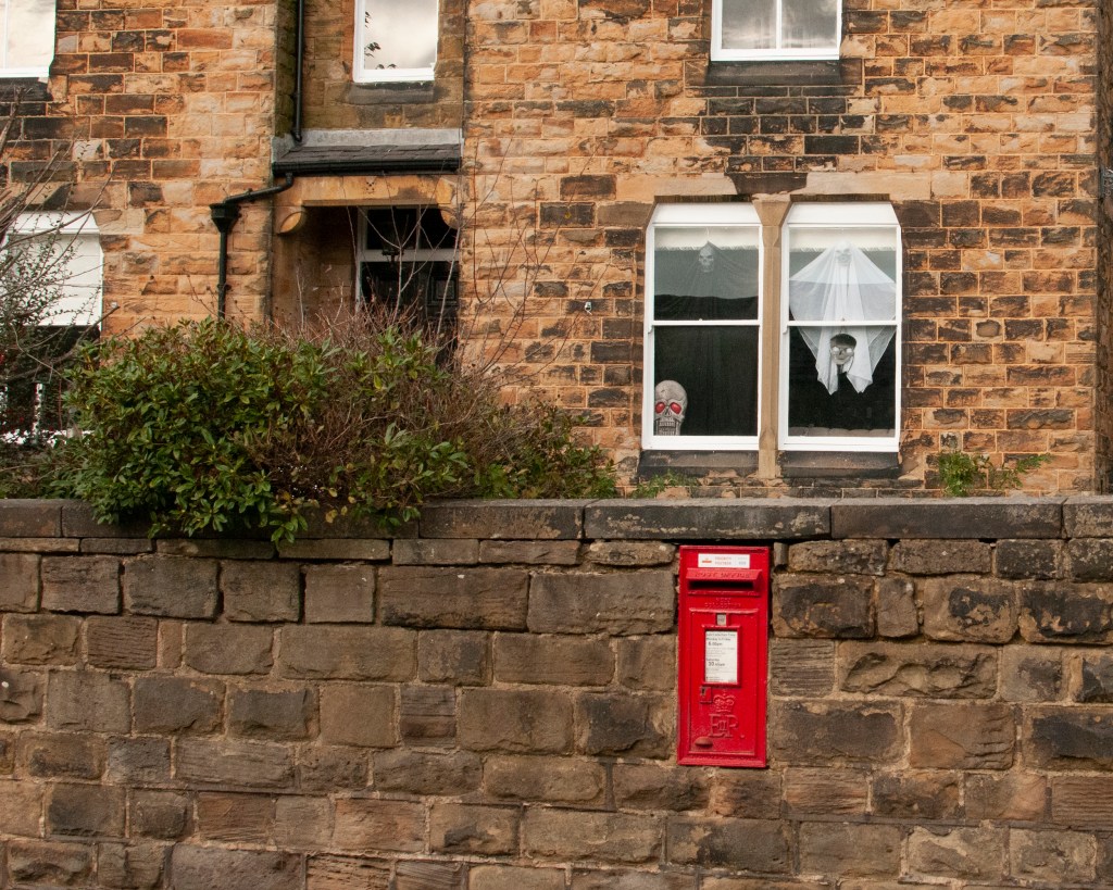
Monthly Archives: Nov 2021

5) Project 1: Absence and signs of life

Introduction

We are introduced to a number of artists who have elected to take the ‘bring your imagination’ to their work. Where the previous artists had represented their subject’s identities in the context of daily life, their real or imaginary environment, the next idea being investigated is when the subject is absent. In the first Research Task [1] we consider how removing the subject affects the photographer’s role as documenter or storyteller, as well as thinking about our own thoughts on how it might affect our work going forward. In this post, I will be looking at the artists themselves.

William Eggleston (1939 -)

William Eggleston is a photographer that divides opinion. His work is considered pioneering and overrated, seemingly in equal measure, but one thing that anyone would struggle to do is ignore it. The notes refer to the duality of his shooting a particular place that we may or may not be familiar with and representing it in a way that the viewer has to decide how real or not that may be. Perhaps his most talked about photograph (below) is a great example of this.

Memphis, 1969 by William Eggleston [2]

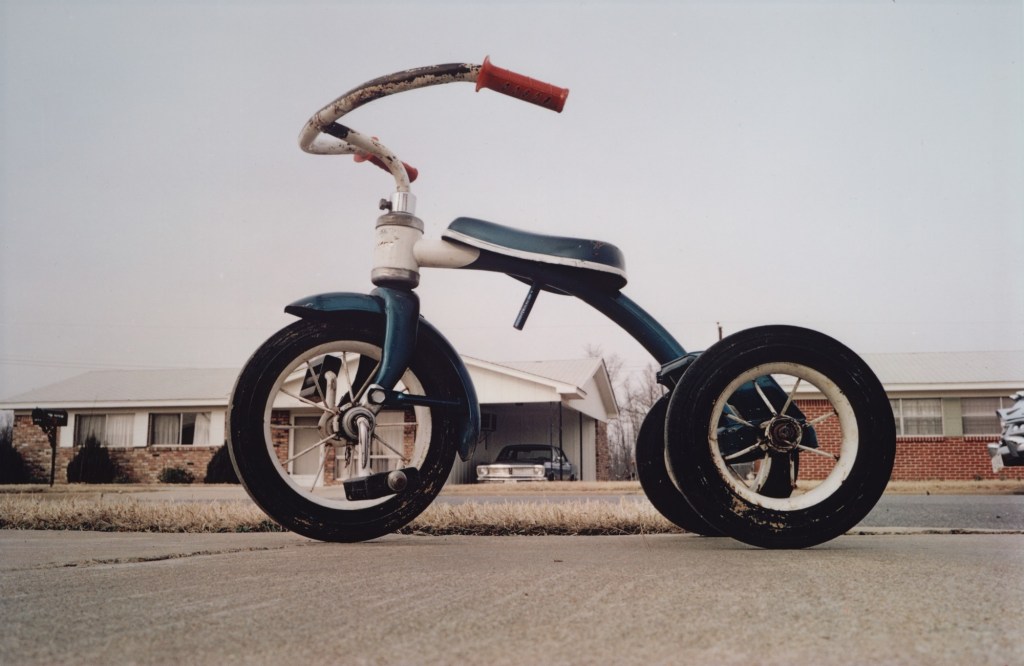
Here, the child’s tricycle looks like it has seen better days and is apparently abandoned at the side of an ordinary-looking street. In an interview with the Whitney Museum [3], Eggleston refers to his walking around an ordinary neighbourhood in Memphis without any particular purpose. While sitting on the curb, he noticed the tricycle close by. His photograph puts the viewer at the same level as his subject and it dominates the frame. We cannot help but look at the tricycle as if from a child’s perspective. Why was it left there? What happened to the owner? More importantly, the viewer is encouraged to look beyond the dominant subject at the background. The street looks fairly featureless, but the questions about the neighbourhood are instant. What is the place like? Do people litter the streets with stray children’s toys? We know nothing really about the street or its inhabitants, but Eggleston creates his own version of it through an image of an everyday object in the context of its environment. It’s condition and the fact that it is left out on a pavement lets us draw our own conclusions about it, based on our experiences, prejudices and cultural view of the South US. Eggleston claims that he just likes taking pictures of what he sees, but in looking at his work, there is a great deal more to it than that. In his book Election Eve (1977), he shoots a series of pictures that refer to traces of the subject alluded to by the title, but in reality it’s more about small town American life away from the hysteria of the election. In most cases the images show only traces of the people in the town, with those where we can see them are composed in a way that doesn’t distract the viewer to the other elements in the frame.

Untitled from the book Election Eve (1977) by William Eggleston [3]

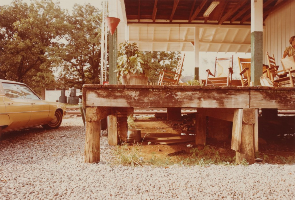
In this image, Eggleston creates a sense of rural America through his use of colour and tone. The use of colour is something that Eggleston is famous for as one of the pioneers of its use when high art was still firmly in black and white. Here, the rich brown tones of the porch and the car are made vivid by the film and the light in the scene. The mood that Eggleston creates is a clash with the urban aesthetic that we would naturally associate with Washington, where the presidential election was taking place. The image, and indeed the series, suggest a ‘meanwhile, away from the noise’ response to the events. Eggleston includes traces of people in this frame (the car, the deckchairs on the porch etc) and also someone on the very edge of the frame. By leaving the woman half in the composition, Eggleston gives the sense that the people of this rural area are somehow unimportant.

“On the eve of the election, when nothing had yet been decided, when everything–whatever that everything was–hung in the balance, Eggleston made an elegy…a statement of perfect calm. To say, however, that these photographs are romantic, sorrowful and quiet is not to imply that they are easy or in any sense comforting. They are richer and more sensual in some ways than Eggleston’s other work, but they are not less penetrating or unsettling. In them Eggleston seems bent, as always, on recording those unremarked units of spatial perception by which the everyday world is unconsciously ordered”

Lloyd Fonvielle writing in the introduction to Election Eve (1976)[4]

Richard Wentworth (1947 -)

In his book Making Do and Getting By (1984), Wentworth presents everyday banality in the same way as Eggleston, only here we have traces of people doing the best they can with whatever is available to them. In a humerous way, Wentworth’s series looks like a collection of badly executed DIY repairs, ranging from the hoarding around the base of the lamp post shown in the notes to the use of the hammer to lift a door off the ground. There are a number of layers of narrative in these works, staring with the obvious poking fun at the ineptitude of what cases of ‘making do’ with botched repairs. However, we also see situations created by people who have little choice as in the image below.

From the book ‘Making Do and Getting By’ (1984) by Richard Wentworth[5]

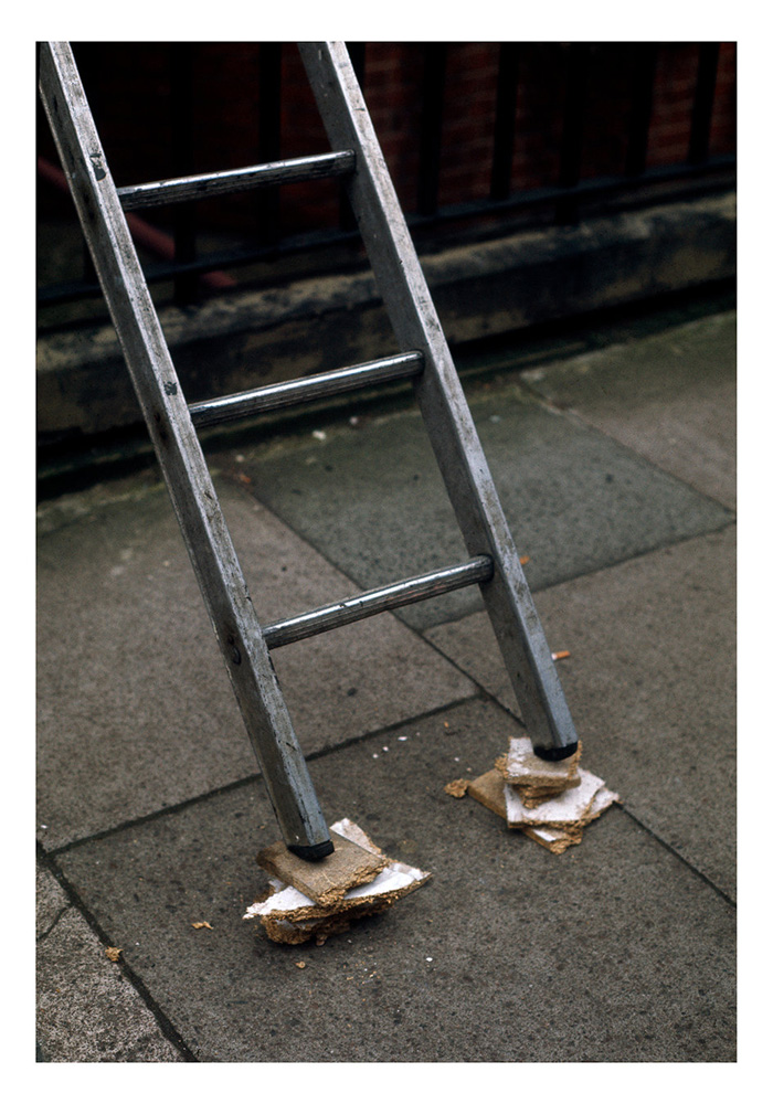
In this picture we see a ladder precariously balanced on blocks of chipboard. Aside from the perceived stupidity of the arrangement which looks dangerous, we also wonder how the operator concluded that this was the right way to go. Did they have no other alternative or is this the reality of working in the city vs. the countryside? We cannot see the operator and don’t know if they used this setup or not. The picture asks questions of us as a resourceful species, the societal aspects of what is acceptable risk and of the person taking that risk, despite there being nobody in the photograph. In addition to these interpretations, the image is a 2D representation of what could be a modern art sculpture. In the banality of the composition, Wentworth creates a simple but challenging narrative that combines the serious with the satirical. Like Eggleston, Wentworth takes his time to observer, citing the artist’s responsibility is to be vigilant [6]. In looking for the things that we might not notice in the chaos of daily life, both artists create a commentary on an aspect of society that we are all familiar with, even if we are not within it.

Elliott Wilcox (1987 -)

In Wilcox’s work we have much more abstract traces of human life. Both series are shot with tight fields of view which result in shots that ask questions about the subject itself. In Courts his shots of a Real Tennis court, a game popularised in the Tudor era, offer the viewer a perspective on a space that has a vintage feel to it.

From the series ‘Courts’ (2008), by Elliott Wilcox[7]

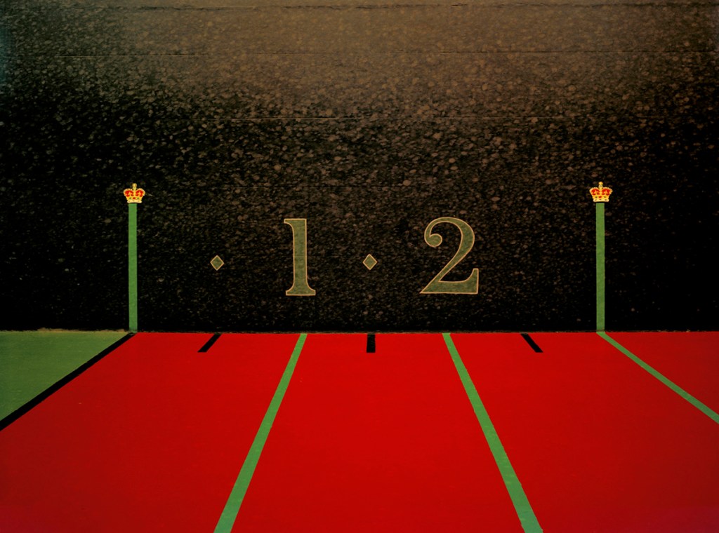
The inclusion of crowns painted on the walls suggest that something important or upper class takes place on the court, which in turn sets the space into a societal context. When we look more closely, we see the marks left by the tennis balls striking the once-pristine paintwork. In other images, there are cracks in the surface which future emphasis the sense of intensity in the sport. This points to the passage of time and the vast number of people who have competed in this space. We get sense of the activity and the people taking part without them needed to be there. The notes refer to his other work ‘Walls’, which takes the same approach with a variety of climbing walls. the tight compositions accentuate the minute traces of people left on the walls, but the subjects themselves are often obscure to the point of becoming abstract.

Sarah Pickering (1972 – )

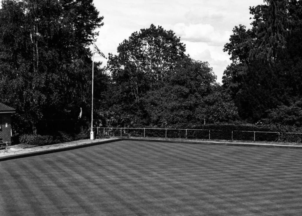
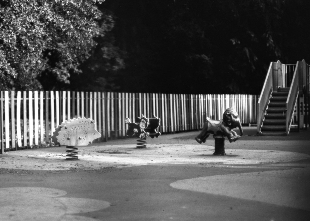
We’ve encountered Sarah Pieckering’s Public Order series in a previous unit[8]. Her bleak architectural landscape shots of a fake town that is used to train police officers in public disorder management are strange but familiar. At the time, I associated the work with the familiar aesthetic of the area where my wife grew up in industrial West Yorkshire. I was considering Pickering’s use of the space, texture and implied dereliction of an urban area, but when I think about it now, I re-evaluate what I brought to that original interpretation. If I were to walk around the area that I am familiar with, I would see the features of the environment in the context of the people who live there, which would in fact tell a story about everyday life. That everyday life would include not only the physical decline, but also the changes in cultural influence. I would be able to see positives and negatives within that area’s identity. When I look at Pickering’s work, however, there is no reference to actual people. We are presented with a visual where we create our own population that might inhabit it. That creation is based in ‘fact’, i.e. what we bring to the reading of the image, but also has a fantastical element to it.

With her other work Incident (2008), I am instantly reminded of the work of mid-20th Century crime photographer Weegee, who for many years turned to crime scenes with his large format press camera to shoot the immediate aftermath of a heinous crime. In those images, the scene was often ‘managed’ in some way by the police presence, which leaves the viewer wondering with many questions about what had just occurred.

Untitled by Weegee (1941)[9]

In this image, we see a police officer and another man looking at a covered body on what looks like a pier. The actual story is of a stampede that killed the woman lying on the ground and we see on further inspection that the wasn’t the only one. However, without the knowledge of the story, we are left with questions about the victims, whether they were linked to each other in any way as well as the obvious ‘what happened here?’ Weegee included enough to suggest documentary, but left enough room for the viewer to make up their own story that fitted the elements in the frame.

From the series ‘Incident (2008)’, but Sarah Pickering[9]

With this image we see a collection of burnt out white goods. At first the damage points to our inner fear of a fire breaking out in our homes, but on closer inspection the items don’t appear to be severely damaged. The soot that covers their surface came from another part of the building, which leaves us wondering about what happened. The domestic nature of the image suggests, but doesn’t specifically include people as with the other artists here. We recognise the machines as part of our daily lives which are now in some way unavailable to the owner. As well as the big questions of whether the people managed to survive the fire, we are also wondering how their lives will need to be rebuilt, starting with these appliances that they/we depend on daily. Of course, the series isn’t about any real people, instead being a training exercise for firefighters. By including familiar objects and linking them with our primeval fear of fire, Pickering creates an anxiety where we hope that our imaginary occupants made it out alive.

Conclusion

The artists in this project have succeeded in making work about people, whether real or imaginary, without any being present in the images. By using subjects that point to some event or activity that people might participate in, the viewer is given a sense of who the absent person might be. However, in leaving the space to create our own impressions the artists make the work more about how we imagine life to be rather than limiting the reading to our own experiences. As Szarkowski pointed out in his introduction to Eggleston’s work, the idea of the picture being more than just an assumed reflection on real life means that there is a great deal more to connect with when we view it. When this happens, the apparent banality of the subject is in fact the art, rather than a statement of fact. For me, the suggestion of identity though the use of traces gives a freedom to the work for which there is no right or wrong interpretation.

References

[1] Fletcher R, 2021, “5) Exercise 1: Personal Reflection”, OCA Blog Post, https://richardfletcherphotography.photo.blog/2021/11/16/5-research-task-personal-reflection/

[2] Eggleston W, 1969, “Memphis”, Image Resource, MoMA, https://www.moma.org/collection/works/51630

[3] Sothebys, 2021, “Election Eve: 50 Masterworks to celebrate 50 Years of Sotheby’s Photographs”, Image Resource, https://www.sothebys.com/en/buy/auction/2021/50-masterworks-to-celebrate-50-years-of-sothebys-photographs-2/election-eve

[4] Editorial, 2010, “William Eggleston: Preface from Election Eve (1977)”, American Suburb X, https://americansuburbx.com/2010/09/william-eggleston-preface-from-election.html

[5] Unknown, 2019, “Richard Wentworth”, Exhibition Catalogue, XIBIT Magazine, https://www.xibtmagazine.com/en/events/richard-wentworth/

[6] Phaidon, 2015, “Akademie X:Richard Wentworth”, Youtube, https://www.youtube.com/watch?v=0jsivEAXRwg

[7]Unknown, 2021, “Elliott Wilcox – Crane Kalman Brighton, Gallery Brochure, https://cranekalmanbrighton.com/artists/elliott-wilcox-biography/

[8] Fletcher R, 2020, “Exercise 3: Public Order”. OCA Blog Post, https://richardfletcherphotography.photo.blog/2020/05/12/exercise-3-public-order/

[9] Unknown, 2012, “Shot Dead: Weegee’s murder photographs go on show – in pictures”, The Guardian. https://www.theguardian.com/artanddesign/gallery/2012/jan/19/weegee-murder-photographs-pictures-new-york

[10] Pickering S, 2008, “Incident”, Image Resource, Artist Website, https://www.sarahpickering.co.uk/works/incident/

5) Research Task: Personal Reflection

  • Where does that leave the photographer? As storyteller or history writer?
  • Do you tend towards fact or fiction?
  • How could you blend your approach?
  • Where is your departure from wanting/needing to depict reality

Make some notes on these questions in your learning log.

Introduction

We are introduced to the work of William Eggleston [1], who photographed scenes and objects that were connected with the presence of people rather than making them the subject. By excluding the people from the picture, the viewer must use their imagination to interpret what they are looking at. The notes make the point that imagination plays a key role in building a story, which in the case of Eggleston’s pictures has to do so with the must subtle of contextual signifiers. The point is also made that when children play with a generic doll, their imagination takes the basic construct and builds a personality and story for it in their play. Back in Expressing Your Vision, I wrote about a piece of research carried out by NASA[2] that involved a creativity experiment with a test group of young children. The study covered their growth and development over some 15 years or so charting their creativity as they got older. The basic premise was that as we grow and learn about the ideas, constructs and rules in the world, we become more reasoned and methodical which results in our creativity being diminished. The percentage of ‘genius’ level children dropped exponentially within the first couple of years of the experiment, becoming next to zero before the group reached their teen years. My experiences at the time of writing that paper were that the only way I could regain some idea of creativity as to revert to a childlike state in the way I see the world. When I look at the artists who use traces of people within a space or related to an object or scenario, I have that same feeling of wondering about the possibilities for meaning in the work. In my submission for Assignment 4[3], I deliberately left real people out of the images because I wanted the impact on the town to be the more obvious narrative than the suffering of its inhabitants. Facsimiles of people appear in a few of the shots, which created a sense of ‘being there but not being there’. I see the same feelings around the absenteeism of the works in Project 1.

Where does that leave the photographer? As storyteller or history writer?

With this concept, the photographer transitions from being someone who observes events unfolding and documents reality, to someone who imagines what the scene might relate to. As we have learned previously, photography has always been a powerful way of documenting as the idea the majority of people still believe that the camera merely copies what is presented to it. We know from the documentary artists of the early 20th Century that this isn’t the case. Their attention to particular subjects, the editing and often censoring of images to suit a narrative, means that they could be seen as both honest and deceitful in equal measure. If a photographer chooses to shoot something where what is missing from the frame isn’t factually important, I see that as a move to conceptual art. We’ve seen plenty of conceptual artists who use photography as their medium, e.g. Duane Michals, but their work still revolves around a real subject. The difference here is that the narrative directed or controlled with the same precision. Any idea of story or documentary is largely the responsibility of the viewer, whose idea may be vastly different from the original intent of the artist. The notes point out the difference between knowing something about the subject (having been to Memphis) or being shown a version of it (Eggleston’s view). I think that this is another power that this style of photography has; to tease a real place or situation, while creating a reality that is entirely their perspective on it. This is more powerful when there are no real actors in the scene.

Do you tend towards fact or fiction?

When I review the work I’ve done so far, I tend towards fact. Again, I think that this is more about photography, in particular the camera, being a recorder of either something real or something I’ve observed about something real. In this module, I have learned about guiding a particular narrative by using portraiture and environment. In my approaches to the assignments, I’ve tended to look for a story behind someone’s life or to reveal something real about their personality. In Assignment 1, I got to know complete strangers (some of whom I still talk to on my morning walks), while in Assignment 2 it was more about revealing something about eccentricity. Assignment 3 was a personal reflection on my life in the context of music technology. In Assignment 4 I was trying represent the contrast in mood between the experiences of my community and government rhetoric. In each case, I was looking for facts to exploit.

How could you blend your approach?

At the end of Assignment 3, I felt that it was time to consider how to blend styles. My idea for Assignment 4 is inspired by the work of former OCA student Michael Colvin’s series Rubber Flapper. I was struck by how he had been inspired by something real in both history and his own life. Instead of digging deeper into the story of the lady who lived in the self-cleaning house, he elected to make up his own story. The anchoring of some of the plot of his story in actual events, e.g. the relationship between Alice Austen and Gertrude Tate) and his views of the acceptance of people’s sexuality from a gay man’s perspective, really add weight to the series. I was particularly drawn to how realistic the series was, with an entirely believable narrative that I found myself Googling to see if any of it was real. I think that my own idea for Assignment 4 will pick up on some of Colvin’s approach, blending real and imaginary in a way where it’s hard to tell the difference. This is probably where I am with my photography than more abstract conceptual art.

Where is your departure from wanting/needing to depict reality

My idea for Assignment 5 is to retell a classic ghost story that has become an urban legend[4]. The original story (or at least one of the many versions) involves a man picking up a female hitchhiker late at night and driving her home. During the drive, the man gives her his coat to keep her warm. Only when he drives away from dropping her off does he realise that she still has his coat on. He drives back to the house that he dropped her off at the following morning only to learn from the grieving owner that the girl was her deceased daughter. She tells the man where the girl is buried and when he visits her grave, he finds his coat neatly folded on the gravestone. I’ve loved this story for most of my life as I remember my friends telling each other when we were young, swearing an oath that it was completely true. My series is going to retell the story in a contemporary setting and will blend the fiction of the narrative taking real-world experiences as cues for the shots.

In taking this approach for the final assignment of this unit, I am looking to push myself away from my default position of representing reality. The reason is simply to try something different.

References

[1] OCA, Unknown Date, “Part Five:Removing the Figure”, page 110, Identity and Place Course Notes.

[2] Fletcher R, 2019, “The Creativity of Children”, OCA Blog Post, https://richardfletcherphotography.photo.blog/2019/11/01/the-creativity-of-children/

[3] Fletcher R, 2021, “Assignment 4: Image and Text”, OCA Blog Post, https://richardfletcherphotography.photo.blog/2021/11/06/__trashed/

[4] D’Costa K, 2013, “Why is American Folklore Overrun with Phantom Hitchhikers?, Blog Post, Scientific America, https://blogs.scientificamerican.com/anthropology-in-practice/why-is-american-folklore-overrun-with-phantom-hitchhikers/

4) Exercise 5: Image and Text

Find words that have been written or spoken by someone else. You can gather these words from a variety of means – interviews, journals, archives, eavesdropping. Your subject may be a friend, stranger, alive or dead. Select your five favourite examples and create five images that do justice to the essence of those words.

You may choose to present your images with or without the original words. Either way, make sure that the images are working hard to tell a story. If you decide to include the words, ensure that they add to the meaning rather than describing the image or shutting it down. Try to keep your image-and-text combinations consistent – perhaps they are all overheard conversations on a bus or all come from an old newspaper report. Keep them part of a story.

Consider different ways of presenting the words. Audio or video might lend itself well to this kind of work, or a projection of images using voice-over. Experiment.

Inspiration

The inspiration for this series came from having recently seen the official video for a song that I’d heard playing in a cafe. The song is called ‘Let it Happen’, by an Australian band called Tame Impala. The song is about how some things just have to be accepted when there is no point in resisting anymore and it resonated with me because of the challenges of leaving work earlier in the year. We’ve already seen how art is open to interpretation, but the same is also true of music. Everything from the use of language to the singer’s inflections help set the mood and tell a story. How we interact with the story is up to us. I was surprised when I saw the video for the track, which depicts a stressed businessman running for a plane. On arriving in the airport, he collapses with what appears to a heart attack and is attended to by someone from the airline. However, he finds himself moving from one place to another, eventually ending up on a plane where all of the other passengers appear to be asleep. He hallucinates for a short while before the plane loses cabin pressure and his seat is sucked out into the sky. We then begin to see that he’s actually still in the airport with the staff desperately trying to revive him and it soon becomes clear that he’s died and the plane, falling chair etc is all part of moving into the afterlife. With the video and lyrics together, the song takes on a more sinister meaning that death we must accept, we must ‘let it happen’.

I wanted to play around with this song and its video by taking some of the lyrics, the corresponding frames from the video and putting them with my own photographs to try to tell the story. My images would be very different but contain enough contextual elements to be able to be read as a series with the stills from the video. The text would connect both together.

The Video

The full video for the track can be seen at this address:

https://youtu.be/pFptt7Cargc

The Images & Text

“It’s always around me, all this noise”
“Not nearly as loud as the voice saying “Let it Happen”[1]
“A notion growing inside”[1]
“All the others seem shallow”
“I can hear an alarm”
“Must be morning”[1]
“Something’s trying to get out”[1]
“and it’s never been closer”

<instrumental>
“I was ready, all along”[1]

Reflection

With this exercise, I tried to tell one story with two very different sets of images, distinguished by their different aspect ratios. The frame grabs from the official music video are in a cinematic 16:9 format, where my images are 8×10. In order to understand whether my images worked as part of the combined series, I deliberately mixed up the sequence so that it didn’t look in any way linear. Does it work?

My images were shot around the area of Birstall, near where my wife grew up. The town has been consumed into the wider Kirklees district over the years and suffers from the same sort of socioeconomic hardship that is common in the former textile area of West Yorkshire. That’s not to say that there aren’t businesses or people thriving here, though. The town has a unique identity with some interesting aspects to it. I wanted to combine the sense of preconception about the area with the fantastical idea of the final flight to the afterlife in the music video. I used the lyrics from the song as relay text for my photographs and as ‘time markers’ for the frame grabs, i.e. what’s being sung when that frame appears. My photographs include metaphors for the sentiments in the lyrics, e,g. the tiny advert for Birstall in Bloom being dwarfed by the supermarket livery. There are also more obvious connections such as the angel wings in the ice-cream parlour window. In answer to my question, I think the images do work when complemented by the text because without the lyrics, the series makes no sense. I believe that if I wanted to expand a series just about Birstall, I would definitely benefit from some relay text to help put them into context. The learning from this exercise, and indeed Part 4, is that we can create a series of images without the addition of relay text, e.g Robert Frank’s The Americans[2], which uses the arrangement of iconic messages to establish the ‘story’ (Frank did use anchor text for each image title in the book). However, text is a very powerful way of either raising more questions about a work or helping the viewer create their own narrative within a bounded space. What interested me about this exercise is that the last frame grab from the video happened to be at the moment where one visual faded to another. This is something that video has as part of its construction in order to transition smoothly between shots. I was wondering how a collage of still images would work with the right relay text. This is something I may well explore in the future.

[1] Parker K, 2015, “Tame Impala – Let it Happen (Official Video)”, Image Resource, via YouTube, https://www.youtube.com/watch?v=pFptt7Cargc

[2] Casper J, 2019, “The Americans – Photographs by Robert Frank”, Book Review, LensCulture, https://www.lensculture.com/articles/robert-frank-the-americans

Assignment Four: Image and Text

  • Create a series of work (aim for 7–10 images) which in some way reflects upon the ideas surrounding identity and place that you’ve looked at so far in this course. Use the written word to play a part in its creation.

You may be inspired by a poem, song or a novel or decide to write your own fictive piece. You may draw upon other people’s words via eavesdropping or another source or use extracts from journals. You might find interesting textual accounts in archives in libraries that could inform this assignment. Allow your creativity to be spurred on by spending time with these words and reflecting on them.

Be wary of illustrating your text with pictures and vice versa. Allow for the viewers’ interpretation to be opened up rather than shut down by the pairings. You may decide not to include the actual words in the final production; that’s fine, as long as they have in some way informed the research and development of the concepts and have pushed the imagery further as a result.

  • Write a short reflective commentary (around 500 words) describing how your chosen ‘​words​’ have informed your series of images and make this available to your tutor alongside your images.

Introduction

The ideas of using text and images to create challenging narratives had quite an effect on my from the latter stages of Context and Narrative, and on into Identity and Place in early this year. When I started this unit, I had recently left my job as part of a redundancy programme and the country was in its third national lockdown. Although not as restrictive as the previous two lockdowns, which were aimed at preventing a second spike in infections throughout the UK, there was a general feeling of “is this going to ever improve?” and “will we ever return to a normal life?”. A number of vaccines were being given to those who wanted them, but I was struck by how different the sense of feeling was in my town compared to the rhetoric from the government. I had the idea to explore these contrasting experiences at some point, either as part of this course or as a photo book project. However, the ‘project’ was put on hold during the Spring and Summer as I struggled to mentally adjust to my being out of work.

When I read ahead to this assignment during Part 4, I saw a way of revisiting my embryonic idea and see if I could create a series of images with text to explore the theme of ‘similar but different’; the similarity of message from our country’s leadership over time with against what I observed to be the mood in our little town. I started shooting as the course progressed, completing the set during this assignment. I decided to use quotations from the Government daily briefings over a specific period to act as the relay text for my contemporary images. When I started to read the briefing transcripts I soon recognised patterns in the messages, particularly in the very first 3 months of the first lockdown. Among the core messages to “stay safe” and “protect the NHS”, there were real stories of the impact of the virus and optimism for the future. My series would pair quotations with images to tell the story of the first three months through the lens of the past three.

The Photographs

I decided early on that I wanted a visual aesthetic that suited the time. I’ve been a film photographer for several years and was interested in using this medium to create a visual mood through its ‘imperfection’. I settled on a recently re-introduced film stock made by Ferrania called P30. Ferrania P30 had a difficult re-birth with hurdles put in their way by everything from outdated machinery to the Italian Government demanding that the factory pay to re-route a local river as part of the planning deal. Their story of conquering adversity immediately stood out for me. Better still, the film is a slow speed black and while emulsion that has a 1930s film noir feel to it (this is what Ferrania were originally famous for). To add to this visual, I wanted the whole series to have a dreamlike feel to them to reflect the time they were shot; it felt like we were living in a nightmare. I achieved this by using a special lens for my Leica M6 that has an f/0.95 maximum aperture which I shot for many of the photographs as wide open as possible.

Inspiration for the Series

There are many artists covered in Part 4 that inspired me when creating this series. David Favrod’s Hikari [1] made me think about how a simple conversation can resonate with the viewer and invoke not just direct memories, but also the mood and emotion of point in history. Favrod’s annotations varied from being added to the picture as a graphic to the use of titles, all the time helping the viewer create a narrative. I was conscious of how immediate assumptions that I made about the series were affected by the method used for including text. With the example of Baoummm, the image has a feeling of desolation without being able to understand the Japanese text is that is added to it. When we realise the title is actually a phonetical representation of the explosion, we get a sense of shock. That shock then ties in with the feelings of rejection that Favrod is exploring regarding his attempts to gain dual citizenship. The series leaves more questions than answers, an approach which is further exploited in Sharon Boothroyd’s series [1]. Now we have a conversation that isn’t directly quoted apart from in the series’ title. The title sets a baseline by which the series is observed and her careful use of tableaux allows the viewer to put themselves in the place of both central characters; the child and the father. Michals and Deveney were also influential in his use of direct quotations forming part of the image presentation. The inclusion of the ‘spoken’ words helped narrate without actually referring to any specific element in the photograph, as in Michals’ The Enchanted Bee. The final inspiration for this series was the essay by Barthes. His analysis of the symbolic messages within an image and the use of relay text to ‘control’ but not describe the narrative is the core intent within my series. I was intrigued by his example of the comic strip being driven by the incorporated text for expediency but working in partnership with the image to tell the story. Anna Fox achieved this with My Mother’s Cupboards… with the quotation being part of the image that is almost read first and separate from the partnering photograph. I would take a similar approach to my series.

The Series – Next Slide Please…

“Coronavirus is a powerful enemy, but I believe the power of human ingenuity is stronger. Every day the science gets better and we gather more information, we understand more about how to defeat this virus.”

Matthew Hancock, Secretary of State for Health and Social Care, April 2020

“Last night, Her Majesty the Queen reflected on the national spirit of unity and resolve that we are seeing in our country, as well as the collective effort we need to tackle the disease. From our heroic doctors, nurses and careworkers, through to those manning the tills at supermarkets and pharmacies, those driving the lorries and the buses. They are all worthy of our applause, they are all worthy of our admiration.”

Dominic Raab, Foreign Secretary, April 2020

“His mother and siblings are showing symptoms of the virus, and they were unable to say their final goodbyes at his funeral. In their despair, the loving, dignified tributes from Ismail’s parents are truly haunting.”

Michael Gove, Chancellor of the Duchy of Lancaster, April 2020

“So I want to say this to anyone who has been finding it hard. These are tough times. It is OK to be not OK. And it is normal to feel low, anxious, or unhappy sometimes.”

Matthew Hancock, Secretary of State for Health and Social Care, May 2020

“We can all play our part in the national effort, getting R down and keeping R down, and controlling the virus so we can restore more of the things that make life worth living.”

Matthew Hancock, Secretary of State for Health and Social Care, May 2020

“We’re absolutely determined to defeat coronavirus, and also to defeat those trying to exploit the situation for their own nefarious ends.”

Boris Johnson, Prime Minister, May 2020

“In spite of the tireless effort of our scientists, it is possible that we may never find a successful coronavirus vaccine.”

Alok Sharma, Secretary of State for Business, Energy and Industrial Strategy, May 2020

“Across the country, office lights will be turned on and windows thrown open. Work clothes and school uniforms will be pulled out of the wardrobe.
Shops and factories will start to hum with activity.
As we enter this new phase, things will change.”

Rishi Sunak, Chancellor of the Exchequer, May 2020

“And I want to stress one final point which may be relevant today as the weather threatens I think to take a turn for the worse. Some of you may be tempted to move the gatherings you’ve been enjoying outdoors, indoors, out of the rain.
I really urge you – don’t do that”

Boris Johnson, Prime Minister, June 2020

“Critically, we can make a change to the guidance on two metres, which kept us safe while transmission of the virus was high but which can now be modified.”

Boris Johnson, Prime Minister, June 2020

Note: This isn’t how the series is to be presented for assessment, but it is shown this way because of limitations in WordPress. The final presentation of this series is as an ebook, which can be found at this address:

https://heyzine.com/flip-book/619b102eaf.html

Reflection

My intention for this series was to use quotations from the Government COVID-19 briefings as relay captions for photographs with metaphorical iconic messages. Reflecting on the series, I think the questions that each pairing raises and the possible narratives that they create, make it work well overall. The overall aesthetic of black and white ties in with how I was feeling at the time, which I perceived to be a similar experience to others in my home town. The sequence of the series also leaves the impression of déja vu with the text being from nearly a year before the photographs were shot. We learned previously that photographs do not describe the passage of time specifically but highlight the impact of its passing [3]. In this series, the captions clearly anchor the time of the statements being made and the images show how little actually changed during the intervening year. In the selection of shots for the series from the 70 or so taken, I deliberately avoided using straight images of people, instead choosing to use space as the metaphors for the people of the town and only including traces of them where they are seen (Four, Five, Seven and Ten). With a nod to the reading of an image as proposed by Barthes, the text included in the images themselves is kept to a minimum and in those cases, the words do not describe the rest of the photograph. Only in Seven does the word ‘Pharmacy’ actually refer to the decal of the woman in the abandoned building window. In review, I don’t find that where these signs exist, the impact of the images are strengthened over the photographs where they are not present. For example, in Two, the Queen’s comments about the nation pulling together is paired with an image of a bowling green with a union flag in the corner. When I saw this composition originally, I thought about the precise criss-cross pattern of the mown grass and how it reminding me of an order of people gathering, much like a regiment of soldiers standing before the flag. When paired with the text, that narrative was strong enough without needed any other signage relating to the bowling green being included.

The most impactful images for me are Three and Four, with the former having the desperately sad announcement of one of the first child deaths from COVID-19. The photograph came from seeing the empty playground which was naturally closed at the time and the rockers which featured a hedgehog as the point of focus. It resonated with me because I’ve been an active carer and campaigner for the plight of hedgehogs for the past few years and the fear that they might be extinct within a decade is of obvious concern. I like the way the text works to reinforce the narrative that nobody, including our children, is safe from the virus. In Four I saw the distorted reflection and the way that it cut the man entering the frame in half to be a metaphor for the effect lockdown was having on our mental health. In this case, the words offer reassurance that it is not unusual, but is ok to react this way, For me, this contrasting pairing makes the photograph work.

The two images that I think could have been a little stronger are Six and Seven, for the main reason that I couldn’t get a better position to shoot from. In Six, I wanted to emphasise the Orwellian conspiracy poster while still giving the impression of a small, vintage shop. The resulting composition was a compromise between making the former element bold enough that it could be read with including the other elements of the shop front. The same issue occurred with Seven, trading the smaller words ‘pharmacy’ and ‘drugs’ with the decal and the rest of the window detail. That said, I think there are still enough contextual elements to support narratives when combined with their captions, which shockingly refer to people criminally exploiting the impact of COVID and the admission that there may never be an effective vaccine. Both issues from 2020 didn’t really exist when we entered 2021 so I like the way they work with the contemporary images.

My main conclusion from this assignment is that I can see how far I’ve come in terms of telling stories with my photographs. The fact that I was looking for metaphors in the context of a project about lockdown and its impact on my community before I started thinking about the assignment, shows to me that my ‘process’ has changed. As Elina Brotherus said in her Q&A with the students of OCA[4], the curation of a project from themed photographs is where her creation of art happens. I feel that with this series, I took a strong set of photographs and turned them into a commentary on the different experiences of a shared crisis like COVID, by using rhetoric being broadcast at the time. When I reflect on the series, it invokes a cultural post-memory of the radio broadcasts that were put out by Pathé and the BBC during the Second World War. The experiences of the people listening were far different from the perspective of the country’s leadership and some of the general ideas of giving reassurance, encouragement and ‘stiff-upper-lippedness’ still resonate us today.

Against the Assessment Criteria

Demonstration of Technical and Visual Skills

The photographs were shot with a view to creating a visual aesthetic that reflected my mood during the more recent restrictions caused by the pandemic. I deliberately used a high contrast film stock previously used in early black and white cinema, and a lens that creates a dreamlike visual to further emphasise how unreal the experience has been. All of the images are composed to emphasise the contextual elements that support narrative creation, while reducing unnecessary clutter. The exposures are all as shot with the only post-processing being slight contrast enhancement to compensate for the scans, cropping and dust removal.

Quality of Outcome

I believe the images are of good quality and are visually pleasing. This course has taught me to let go of my reliance on seeking traditional ‘technical excellence’ at the expense of what the photographs are trying to say. For example, these shots are not razor sharp because the lens doesn’t allow for that when shot wide open – this was intentional to create the visual. When paired with the text, a variety of narratives can be created from the pictures, but within a construct as indicated by Barthes’ treatment of the symbolic message.

Demonstration of Creativity

I have had feedback from those who have seen this series to that they needed to study the pictures carefully and for a significant time to get their own sense of meaning. They agreed with the mood that the images have though, which I take to meaning that the series meets my intent for answering the brief. My choice to experiment with chronology within the series by using quotations from the previous year helps to reveal that ‘not much has really changed since the pandemic began’. As indicated in my Reflection, the series invokes post-memory of the broadcasts from the leadership and Royal family during the war, which contrasted in many cases to the experiences of the people living with the day-to-day impact. I feel that this series represents my most creative work to date in both the photography but also the curation of the images with the challenging captions that go with them.

Context

I was inspired by the duality of Favrod’s work where the images are often obscure, stark in the way they are shot and could have a wide variety of interpretations without the accompanying captions and annotations. When they are included, the series really does relate his grandparents verbal commentary with his own personal struggle with identity. In my series, I only included traces of people, for example graphical representation (the decal), in in reflection (Four) or Shadow (Ten) rather than making this a portrait series. I was inspired to do this by Favrod’s fantastical representation of people in his images, e.g. with the watermelon helmet. I believe this series takes its inspiration from the work of most of the artist in Part 4.

References

[1] Favrod D, Unknown Date, “Hikari – Photographs and Text by David Favrod”, LensCulture Magazine, https://www.lensculture.com/articles/david-favrod-hikari

[2]Monarchi C, 2012, “Will You Still Love Me? Interview with Sharon Boothroyd, Photomonitor, https://photomonitor.co.uk/interview/interview-with-sharon-boothroyd/

[3]Fletcher R, 2021, 1) “Project 1:Historical Photographic Portraiture”, OCA Blog Post, https://richardfletcherphotography.photo.blog/2021/02/23/1-project-1-historical-photographic-portraiture/

[4] WeareOCA, 2015, “Elina Brotherus Student Talk”, The Open College of the Arts, https://www.oca.ac.uk/weareoca/photography/elina-brotherus-student-talk/

4) Project 2: Memories and Speech

Introduction

We are introduced to a number of artists who have used conversations or discussions to describe or invoke memories. As we learned in Part 3, memories can take the form of our own past experiences, those passed down through generations or even those that are created by a major cultural event such as The Holocaust or the assassination of JFK. The phrase “Do you remember where you were when…?” evokes memories that may not be our own but are our acknowledgement of what happened and the cultural circumstances that gave rise to it.

David Favrod (1982 -)

In his work Hikari (2014), Favrod addresses a single conversation that he had with his grandparents about the events and aftermath of World War 2 in Japan, which included the dropping of the atomic bomb on Hiroshima in 1945. Favrod remembered this conversation that was never revisited or discussed subsequently and as he described in an article for LensCulture[1], he had borrowed their memories and used them for his own testimony. In doing so, he used an increasingly fading direct memory (as survivors of the war are dying out) to highlight his own coming to terms being half-Japanese and not being able to gain duel citizenship. The series combines different styles, ranging from straight documentary, through fictional and conceptual images. In each case, Favrod leaves a large amount of ‘space’ for the viewer to bring their own experiences to the interpretation. Some images are stark but conventional compositions, while others contain graphical annotations or text. Most notable is the shot below:

Baoummm (2012) by David Favrod[2]

What is interesting about this photograph is not so much the desolate aesthetic, with the bright sun and rising smoke from what we presume is a fire. Instead the Japanese text that has been added is the representation of Baoummm, the sound that conjours the explosion of a bomb. As we look at the image, anyone who does not understand the inscription has the title to go by, which when spoken out loud phonetically describes an explosion. The rest of the image immediately suggests total destruction, which two cities in Japan suffered when the atomic bomb was used. The image now suggests that perhaps this landscape looked different before a catastrophic event with the remnants being the bright light of a fire and smoke on the horizon. The added aural information connects directly with the memory of Favrod’s grandparents and is constructed in a way that the noise could still be felt in the present. When we look at this image in the series, the duality of the narratives becomes more apparent. Knowing that Favrod tried and failed to become part of the culture that half his family were from, this shot takes on an empty, almost pointless feeling to it. The news would have been devastating, so the combination of the wasteland and the shock of the sound connect with his experience as well as that of his grandparents.

Another image that stood out for me was the one below:

Le Bunker, by David Favrod (2012)[2]

Here we have a shadow puppet being cast onto a concrete wall and a title that suggests that it’s the wall of a bunker. In the interview with Sharon Boothroyd [2], Favrod describes the fact that in his home country of Switzerland there is a law stating that houses must have some form of underground shelter in case of nuclear accident. Knowing just this one piece of information through its title, we can read the image as being about freedom because of the symbolism of the bird ‘sculpture’ being made with the hands. When we add the context of Favrod’s duel citizenship issue, the image could take a more political meaning where the artist is being actively excluded from part of his ancestral heritage. However, we also have the anecdotal information about how the atomic bomb blasts scorched patterns of living things into walls and other structures owing to the intense heat. Now the image has a sense of duality about it that is influenced by the spoken word and historical memory more than the title. We’ve all been to a gallery or museum where an exhibition has a brief introduction to the artist or an audio clip where they introduce the series. These quotations or spoken words set the scene for the series before the viewer looks at the pictures and serves to provide a small amount of detail, the expectation being that viewer bring their own interpretation to the work. In the case of Hikari, the viewer doesn’t need to be experienced in Japanese culture in order to read the images. They could simply bring their idea of Japan in a similar way to the concept of ‘Italianicity’ in Barthes’s paper[3].

Sharon Boothroyd (1982 -)

In her series ‘If you get married again, will you still love me?’, Boothroyd attempts to show us the unspoken emotions experienced by children when their father is absent from their lives. Instead of straight documentary of a particular situation or reaction to it, Boothroyd takes a more constructed approach. In an interview with LensCulture, Boothroyd described how her discussions with separated fathers and their children, while revealing, didn’t uncover the truth about the pain caused by the situation. She decided to take the anecdotes from her interviews and create a series of tableaux to reflect her interpretation of the feelings the children were experiencing. Boothroyd tried to get inside the child’s experience and represent that in her photographs. The series doesn’t contain any additional context beyond the main title and it is up to the viewer to interpret the images in conjunction with it. Although many people don’t experience the loss of a father figure through divorce or separation, what is powerful in this series is that everyone has dark moments where they are isolated or anxious. For example:

From the series “If you get married again, will you still love me?”, by Sharon Boothroyd (2012)[4]

In this picture, a girl and (we presume) her father are sitting in a cafe sharing a portion of chips. The immediate thing that we notice is the physical distance between the two and their total lack of engagement. Without knowing that the series is about absenteeism, it could be interpreted as a teenage daughter behaving like a teenager. However on close inspection there is a real difference visible in the expressions of the two; the girls anger and the father’s sadness. Now the image can be read as a drifting apart that a portion of chips isn’t sufficient to bridge. We can interpret the offering of food as a way of breaking the ice or diffusing tension, but also as a poor way of making an unhappy person feel better. Perhaps the gesture itself is what has made the girl angry. In my interpretation, I am conscious of my own experiences as a teenager which don’t necessarily reflect that of other viewers; this is the point of the series. The viewer brings their own empathy, intolerance or feelings of love, anger and sadness to their interpretation of the image with only the title of the series to go on. The learning point here is that we don’t have to include text to create an open narrative, but some small gesture of context-setting helps guide the viewer in their understanding of the work.

Kaylynn Deveney and Duane Michals

The next two artists we are introduced to have both made use of annotation in their works. Kaylynn Deveney’s series “The Day-to-Day Life of Albert Hastings” is just that. The artist got to know her subject, an elderly gentleman that lived in the same area of South Wales, and photographed him going about his day. While we have encountered a number of artists who have done this sort of thing, what is interesting about Deveney series is that it is annotated by the subject. In her introduction to the series, Deveney describes how she wanted to explore Albert’s experience of being photographed and how it differed from how she perceived him as a subject. When we look at the annotations that he added, we get an insight into his personality that supports the image. Some are banal, which is how Deveney describes the particular event being photographed, for example:

P.Jays Drying, by Kaylynn Deveney (2001) [5]

In this image, we have an interesting composition, with the subject framed by his pyjamas, yet he simply states the fact that they are drying. I find the brevity of the annotation interesting because when we look more closely, Albert is doing something else in his laundry. Although not entirely clear, he looks as though he is ironing some other clothes. This raises questions about how he saw this domestic activity and why when he looked at the print, his attention was focussed on his pyjamas. Elsewhere in the series, we learn that his pyjamas are a source of physical comfort to him, so perhaps this image can be read as him acknowledging his priorities rather than simply doing his chores.

Other annotations in the series are more humorous, with for example Albert joking about opening his veil-like curtains as opposed to talking to a ghost. Others go further into his philosophical side with notable example being a close-up portrait with the caption:

“Could this be a presumptive picture of my futuristic soul regarding a past world and friends?”

With the variation of commentary provided by Albert, we get an insight not only into his day-to-day life of chores and pleasures, but also his outlook and mood over time. Deveney states that she photographed him living in a number of flats over a couple of years and as she got to know him better, he started to open up about the past life he refers to above, providing the artist with family photographs, drawings and poems that he had written. All of these appear in the series, which further emphasises the sense of Albert’s identity without merely telling his story.

We discussed Michals’ use of text on a photograph in Context and Narrative[6], with the image This Photograph is my Proof (1967). That image showed a couple sitting on a bed in an affectionate embrace. The accompanying text stated that the moment captured was proof that the relationship was good at one point, which created a different narrative within the image. Now, instead of the joy read in the iconic message in the image, we have a reflection on a memory that is sad and regretful. The narrator is challenging the notion that their relationship had always been bad by pointing out something that visually proves it to not be the case. As well as invoking a sense of ‘I told you so”, the image also highlights our inherent belief that what we see in a photograph is the truth. Whatever the real truth of the situation being described, the image is presented as evidence even though the poses, expressions etc could be manufactured or exaggerated in some way. Michals uses text to help tell stories that are wrapped up in the journey of life towards death and his annotated series’ deal with related topics like reincarnation (The Bewitched Bee, 1986)[7]. In this example, Michals’ use of relay text invokes the emotions of feeling lost, found and then lost again, with the subject being transformed by a bee sting into a majestic antlered creature. When I first saw this series, I wasn’t immediately taken by the aesthetic quality of the photographs but by the way each picture built an emotional response throughout the sequence. Michals’ himself stated:

“I’m not interested in what something looks like, I want to know what it feels like.”

Duane Michals [7]

In my reading of The Bewitched Bee, I am bringing some of my own past experiences of establishing identity which in turn invoke memory and provoke emotion.

The Spoken Word

While each of these artists have exploited the written word in creating their narratives, the one that differs slightly from the others is Sharon Boothroyd. In her series, she used conversations with separated fathers to gather some questions that were asked by their children, which used as the background for her series. Only the title explicitly quoted the question, but the anecdotal spoken work comes through strongly in the images that make up the series. The common theme through the works of all of the artists is the power of the subject’s perspective, whether it is the interpretation of the memory of a conversation as with Favrod, or the actual writings from the subject as with Deveney. When an artist includes the subject to provide a commentary to the work, the resulting narratives can take on a wider meaning, as with the first example in the notes, Sophie Calle’s Take Care of Yourself. We first encountered this work in Context and Narrative where we explored Calle’s approach of seeking the views of multiple viewers to help establish the narrative. When we consider it in terms of the spoken word, however we can read more than just the opinions of individuals. Calle had asked a large number of women to read the break-up email from her partner and respond in some way. What she got back was a broad interpretation of the email’s contents, emotional reactions to the sentiments of its writer and suggestions about how to deal with it. The work’s title, which highlights a patronising platitude who’s use is somehow meant to placate the reader, suggested to me that the narrative was about anger and resentment at Calle’s treatment. However, now I read something else about our culture. The response are essentially putting the viewer in Calle’s place, asking how they would react if they’d received the email. The breadth of female solidarity comes through but the for me the more impactful element is how that is expressed. Modern society is much more expressive with the advances in communication technology, so people are almost less restrained when it comes to putting their view across. This is my experience, which when I bring to the viewing means that Calle’s work now takes on a sense of “is it just me or…?”, as if she is seeking some form of approval of her own reaction to the email.

With Anna Fox’s My Mother’s Cupboards and My Father’s Words, the artist combines direct quotations from her father with the ordered, banal and almost claustrophobic spaces that her mother kept. Fox’s father was gravely ill and would verbally lash out at her mother and her regularly. The brutality of the rants and in many cases, threats of violence contrast with the domestic bleakness of the images.

From My Mother’s Cupboards and My Father’s Words, by Anna Fox [8]

What is most powerful here is the insight it gives us into a fragile relationship without either participant being seen. Where the other artists covered in this Project have used reflections on conversations and the real viewpoints of their subjects in their work, Fox creates a window for the viewer to see ‘what was really said’ by one spouse to another. Through that window we get a sense of the tension in the household, with domestic life continuing as normal as possible. We are left with questions about many aspects of the work that don’t appear as iconic context in the photographs. Was her father’s aggression wholly caused by his illness or was it endemic in their relationship? What was her mother’s response to the abuse? What kind of person was she and how did that affect Fox’s outlook on life?

Conclusion

In reflecting on the use of text either as part of or in conjunction with images, I can’t help but focus on the relative impact of words in invoking memory. Whether invoking educational memory, such as Lurpak’s clever use of strength and masculinity to create a sense of Viking or the Orwellian aesthetic of Kruger’s social commentary on gender equality, artists significanly increase the emotional connection with their work through words. This increases further when the text is derived from a living memory or sense of identity or empathy that the artist is still experiencing. Boothroyd’s approach of listening to the testimony of absent fathers and children allowed her to put herself in place of them both when creating her very precise tableaux. Deveney’s deeply moving documentary of the life of an elderly man is made more powerful when his perspectives on the images are annotated on them. In this case, the directly quoted words become part of the image itself, offering some insight into how Albert felt and what he thought about this project. In Michals’ work, his quest to understand how something feels overrides any sense of direct quotation, its loose narrative being relatable in many different ways without necessarily understanding the artist’s intent. Calle takes the broader reactions to her experience and presents them to the viewer as if to ask if they can empathise and even agree. With Fox’s series, the fantastical threats of violence collide with the banality of the images, with each entirely dependent on the other to have impact. What I’ve learned from this project is that the numerous ways we can pick up fragments or whole texts leaves plenty of room for us to bring our own experiences, but all the time there is a sense of legitimacy because someone else has spoken or written them. The originator is sometimes the artist and sometimes not. Either way, the inclusion of such text or speech connects us more with those people in a way that documentary captioning cannot.

References

[1] Unknown author and date, “Hikari – Photographs and Text by David Favrod”, Article, LensCulture magazine, https://www.lensculture.com/articles/david-favrod-hikari

[2] Boothroyd S, 2014, “David Favrod”, Blog Interview, Photoparley, https://photoparley.wordpress.com/2014/09/23/david-favrod/

[3] Fletcher R, 2021, “Research Task: The Rhetoric of the Image”, OCA Blog Post, https://richardfletcherphotography.photo.blog/2021/11/05/research-task-rhetoric-of-the-image/

[4] Smithson A, 2012,”Sharon Boothroyd: If you get married again, will you still love me?”, Lenscratch Magazine, https://www.scienceandmediamuseum.org.uk/what-was-on/joan-fontcuberta-stranger-fiction

[5] Deveney K, 2001, “The Day to Day Life of Albert Hastings”, Artist Website, https://kaylynndeveney.com/the-day-to-day-life-of-albert-hastings

[6] Fletcher R, 2020, “2) Exercise 2: Newspaper Analysis”, OCA Blog Post, https://richardfletcherphotography.photo.blog/2020/06/12/2-exercise-2-newspaper-analysis/

[7] Bunyan M, 2015,”Storyteller: The Photographs of Duane Michals, Art Blart Magazine, https://artblart.com/tag/storyteller-the-photographs-of-duane-michals/

[8] Unknown author and date, “My Mother’s Cupboards and My Father’s Words”, Hyman Collection, British Photography.org, http://www.britishphotography.org/artists/15795/10316/anna-fox-my-mothers-cupboards-and-my-fathers-words-06?r=artists/15795/e/1916/anna-fox-anna-fox-my-mothers-cupboards-and-my-fathers-words-1999

4) Project 3: Fictional Texts

Introduction

So far in Part 4, we’ve looked at the use of text or the spoken word to tell factual stories about a subject that we can relate to as real. From the examples of remembering a brief conversation (Favrod), the experiences of domestic abuse (Fox) to the simple yet powerful emotions of a child wanting to establish their relationship with an absent father (Boothroyd), they are all narratives about real life. The photographs aren’t in themselves about real life, though. In Boothroyd’s series [1], the images are carefully constructed tableaux that, as we know, need not be about real events. Instead they need to provide the viewer with enough signifieds that help build a narrative that broadly aligns with the artist’s intent. Our imaginations and specific experiences fill in the blanks in the narratives, for example my own experiences of feeling isolated as a teenager and subsequent mental illness related to the death of my mother, made Boothroyd’s series resonate with me in a way that every tableau made sense to me. This is what we have learned about reading photographs; there is an artist intent that revolves around a personal interest, experience or story that they want to tell. What we realise though is that the story doesn’t have to be factual in nature – the photographer has an imagination as well. So what happens when the imagery and text are freed from being firmly anchored in reality?

Michael Colvin – Rubber Flapper (2015)

This narrative series by Colvin is the subject of an interview that he gave with OCA, where he describes how his ideas for narratives came about. The basis for the series comes from the refusal of Staten Island Officials in New York to acknowledge the sexuality and relationship of 19th Century photographer Alice Austen. Austen and Gertrude Tate lived together as ‘companions’ and partners in the tea room they ran in Clear Comfort, NY. The extent of their relationship was both hidden from and denied by the women’s families to the extent that their final wishes to be buried together was ignored. Colvin related to the denial of gay sexuality and used the further historical control of Austen’s estate, principally the refusal to allow research of her archive of work at the time of his assignment, to create a fictional documentary of a secretive woman who lived in a self-cleaning house. The narrative that the series creates a sense of observing the bizarre, sympathetically trying to uncover the ‘truth’ of the character’s life and a sense of unwanted intrusion when he makes progress with this quest. We have a combination of words and text that make the character come to life as Colvin places himself in the role of investigator. Colvin’s use of text is interesting here because he combines a related event with complete works of fiction. In the example below, we see what looks like a real newspaper cutting about an mysterious woman and her new husband living in a self-cleaning house. It’s based on Colvin’s discovery that someone did build such a house and lived in it for many years, but the cutting is a prop created by the artist. He includes it as a sort of scrapbook image with a more readable transcript telling some of the Flapper’s story to the viewer.

Newspaper cutting from Rubber Flapper by Michael Colvin (2015)[2]

Another textual element comes in the form of a letter from the legal representative in charge of the character’s estate who withdraw’s consent to use material from her archive when the artist uncovers her sexuality. This connection to Austen, while fictional, tells a story about cultural attitudes towards lesbianism both historically and in the contemporary sense. Colvin’s series is shot to look archival and is so convincing that it’s difficult to tell real from imaginary. I find Colvin’s attention to detail astonishing, from the carefully constructed props to the post-processing and collage work that create the scrapbook aesthetic. What the combination of constructed text achieves here is the storytelling pointers that provide the context needed to interpret the series. By making the text the actual image as in the above, the series is completely plausible. Without the inclusion of these self-contained iconic messages, the series remains fantastical but lacks the glue to holds the narrative together.

Christian Patterson – Redheaded Peckerwood (2011)

With Patterson’s series, the key difference is that while Colvin was creating a fictional story that had some element of believable ‘truth’ to it, Redheaded Peckerwood is based on an actual event. The killing spree of two Wyoming teenagers in the 1950s was a notorious enough story to the extent that it had been used as the inspiration for a film called Badlands. In an interview with Jörg Colberg[3], Patterson said that he was surprised at how the real story of the murders was stranger and more tragic than the fictional portrayal in the film and he went on to think about how to tell that story through his own imagery. Patterson followed the route taken by the killers, investigated a variety of aspects of the case and used a mixture of real imagery (forensic photographs, news reports) alongside his own recreated tableaux photographs. He mixed composition style, colour vs. black and white and in some cased fabricated an image in terms of its place in the timeline, all to tell the story from his perspective and point of interest.

“I often say that Redheaded Peckerwood is a body of photographs, documents and objects that utilizes a true crime story as a spine. The story continually served as a source of inspiration and ideas, but what really excited me about my work was the expansion of my own artistic practice”

Christian Patterson[3]

Perhaps the most unusual images in the series are the constructed pseudo-quotations like the one below:

Shit from Shinola, from the series Redheaded Peckerwood, by Christian Patterson (2011)[4]

The phrase “you don’t know shit from Shinola” has been part of the US lexicon for many years, even after Shinola, a well known brand of shoe polish, went out of production. It’s a term that means ‘ignorant’ through the suggestion that someone cannot tell one thing from another. The image itself shows the product spilling over a surface and revealing a texture which isn’t obvious. Perhaps its addition in the series suggests that all is not what it seems in the story of the two killers. Aesthetically the image could be straight out of a 1950s advertisement, which matches most of the photography in the rest of the series. This is what the series has in common with Colvin’s. The fantastical meanings are there to be seen, but the photography and use of fiction makes us question the almost-default idea of the medium being truthful of documentary. We don’t know what is real and what is imaginary in either case, but both tell a couples story.

“Ultimately, I wanted the work to act as a more complex, enigmatic visual crime dossier — a mixed collection of cryptic clues, random facts and fictions that the viewer had to deal with on their own, to some extent.”

Christian Patterson[3]

Joan Fontcuberta – ​Stranger Than Fiction​ 

The last of the artist mentioned in this Project is Joan Fontcuberta who takes the confusion with what is real and what isn’t to a whole other level. His series Stranger Than Fiction shows us fantastical ‘evidence’ of creatures, plants, people etc. that are so outragrous as to lead us to question what we know. When I first saw them I was reminded of the spoof journalism of the tabloids with their photographic proof of things like ‘a double decker bus found on the moon’ that were so ridiculous that they couldn’t possibly be real. Such lunacy doesn’t bring our faith in journalism or photography evidence of the truth into question, but there is something about Fontcuberta’s work that makes us wonder. Take the example below from the sub-narrative set called Sirens.

Hydropitecus of Tanaron 2, from the series Sirens (2001) by Joan Fontcuberta[5]

This photograph depicts the remains of a mythical creature call the Hydropitecus which clearly has the tail of a fish and humanoid skeleton, making it a siren or mermaid. The creature is fossilised in rock, lending credence to its age. We are told by the story that accompanies the series that the creature was discovered by a priest called Jean Fontana and is detailed in published scientific journals. The whole thing looks convincing enough that we need to apply our knowledge of history, folklore and mythology to review the narrative, after which we realise that it is totally fake. Then we notice the similarities between the artist’s name and the priest in the story, which sets our minds at ease – we were not fooled after all. The rest of Fontcuberta’s work in the series messes with what we believe to be true, with millipedes sporting full limbs, monkeys with turtle heads etc an in each case some legitimacy added by text or supporting documents.

“The idea that photography lies is based on a complete misunderstanding of what photography actually is or does.  Photographs, by themselves, don’t do anything. They’re just photographs. But they can be made to tell a story or tall tale or outright lie when they are being placed in context, when they’re used to tell a story that might or might not be true”.

Jörg Colberg discussing the work of Joan Fontcuberta[6]

Open vs. Closed Narratives

The final part of this section of the course notes deals with the difference between open and closed narratives. Open narratives are those where the viewer or reader is invited to bring their own interpretation to the work through the text that is included in some way. The artists we have covered in Part 4 use primarily open narratives because it gives the work more depth; the text acts as relay in guiding them to a conclusion about what the work means. When we incorporate text that informs more than invites, i.e. anchors the story, we leave little room for the viewer to create their own. Examples of literature and cinema could be considered more closed than open. The notes highlight the importance of the difference between closed narratives and ‘closure’, the latter being inviting the viewer to draw their own conclusion from the many narrative paths to achieve some understanding. Closure does not mean that the narrative lacks the space for the viewer to bring their own ideas, more that it helps with the decision being made. The notes conclude with ways of thinking about narratives and how to use both fiction and non-fiction to enhance the visuals in our artwork.

Conclusion

The main learning from this project is that we as artists have the flexibility to completely fabricate our own truths with our work. This shouldn’t come as a surprise, but it does. The truth of photography as a medium is that people still see it as a factual representation that must real in some way. The artists here have used photography as a tool to challenge both our understanding of the medium but also so tell a story a particular way. Colvin explores the politics of sexuality and the denial or shame that society still struggles with when being honest about how they feel. We find ourselves wanting to know more about his character while all the time being taken in by the apparent authenticity of the documentary. Patterson combines the real story with his own research and perspective on the horrific crimes. The series mixes aesthetics but still manages to leave us confused about what is historical fact and the views of a contemporary artist. Finally, Fontcuberto messes with our belief system by making us look closely at the often jarringly obvious fabrications, as if asking “can you be sure, though?”. One consistency though is the impact of words in the form of text, supporting notes or as visuals themselves. Without the words, each artwork remains interesting but will little cohesion. Whether or not we choose to be inspired to be real or imaginary is really down to personal choice.

References

[1] Fletcher R, 2021, 4) Project 2: Memories and Speech”, OCA Blog Post, https://richardfletcherphotography.photo.blog/2021/11/05/4-project-2-memories-and-speech/

[2] Colvin M, 2015, “Assignment 2 – Rubber Flapper”, A Partial Moment Blog, http://apartialmoment.blogspot.com/2015/01/assignment-2-rubber-flapper.html

[3] Colberg J, 2012, “A Conversation with Christan Patterson”, Conscientious Extended Magazine, http://jmcolberg.com/weblog/extended/archives/a_conversation_with_christian_patterson/

[4] Patterson C, Unknown Date, “Redheaded Peckerwood – Photographs and Text by Christian Patterson, Image Resource, LensCulture, https://www.lensculture.com/articles/christian-patterson-redheaded-peckerwood#slideshow

[5] Science and Media Museum, 2015, “Joan Fontcuberta: Stranger Than Fiction”, Image Resource, Exhibition Website, https://www.scienceandmediamuseum.org.uk/what-was-on/joan-fontcuberta-stranger-fiction

[6] Colberg J, 2014, “The Photography of Nature and The Nature of Photography”, Conscientious Photography Magazine, https://www.scienceandmediamuseum.org.uk/what-was-on/joan-fontcuberta-stranger-fiction

4) Exercise 4: Alternative Interpretations

The Brief

Over the space of a few weeks gather newspapers that you can cut up, preferably including a mixture of different political points of view. Have a look through and cut out some images without their captions. You could choose advertising images or news. For each image, write three or four different captions that enable you to bend the image to different and conflicting points of view.

  • What does this tell you about the power of text and image combinations?

Now write some text that re-contextualises these images and opens them up toalternative interpretations.

Write some notes in your learning log about this exercise.

● How might you use what you’ve learnt to add a new dimension to your own work?

Introduction

In Exercise 1 [1], we looked at the power of deliberately using text to create a particular. narrative about what is going on in an advertising image. The advertisement was interesting because it was specifically designed to invoke the sense of masculinity and strength using iconic references to ‘good, homemade food’ and textual elements that played to the product’s Scandinavian history, Vikings etc. For this exercise, I was interested in the use of text to create alternative narratives to stock imagery. The brief refers to photographs that are included in press reporting or newspaper advertising, but when I started to gather some pictures together, I noticed that in everyday, non-sensationalist stories, the news outlets tend to go with any image that vaguely refers to something in the story. Only when the story is specifically about a person or an event that they want the public to really engage with, do newspapers use specific photographs. I chose 3 for this exercise with varying degrees of specificity to explore how easy it would be to change the narrative of each story.

The ‘Raw’ Images

One

“Pubs and bars are still hotbeds for COVID-19”

“Bars feeling the pressure of post-pandemic staff shortages”

“Grant temporary visas to European workers, Government told

Here we have three different captions for the image which tell different stories, two about the pandemic and one we assume about Brexit. The text connects strongly because of the gathering in the bar and the use/not use of face masks, which emphasise that this as a contemporary image. The actual caption is:

“Put down the pinot: benefits of a single glass of wine debunked”

With this image, the signs are about having a good time, signified by the gathering of people, the alcohol and the waiter. Although there is no wine in the image, this sign is sufficient to suggest that drinking is generally bad for us. WIth my captions, the text works with different elements in the picture, namely the fact that not everyone is wearing a mask but the man serving the drinks is. Given the current situation, we assume he is a waiter rather than one of their friends. The man behind him, trying to get his attention, could be read as an expectant customer which makes links with the caption about temporary visas and staff shortages. The inconsistent wearing of masks throughout the image serves as a warning in the first caption, suggesting that gatherings of this nature are still dangerous without the right precautions.

Two

“Liv Tyler and fiance spotted in Soho hotspot”

“Liv Tyler on struggling with her father’s fame and leading a normal life”

“Liv Tyler and Dave Gardner have confirmed that they are dating”

This is an example of a completely innocuous image that can be manipulated almost indefinitely. Shots like this, which are often taken by friends or fans, really only depict a mood. In this case, Liv Tyler and her partner look happy, so the natural assumption for a caption might reflect that. In fact the real caption is:

“Liv Tyler ‘splits from fiancé Dave Gardner’ after 7 years”.

Now we have the inverse of the mood with the image pointing to happier times. The caption itself which contains a quote within a quote, suggests a finality to the message – ‘They were once a happy couple but now it is most definitely over’. The one caption of mine which works slightly differently is the second one. It relies on the viewer bringing the knowledge that Liv Tyler is the daughter of famous rockstar Steve Tyler of Aerosmith. Without that, the picture and text don’t really work because the text doesn’t connect with the iconic messages in the image, only getting the viewer to ask “who is that?”

Three

“Severe delays expected as works begin”

“Terrorist threats to UK infrastrcuture”

“Road network crumbling, say ministers”

In this case, the image is very generic as would be found in an image library. This photograph appeared in my local paper, which is well known for gathering pictures from stock or from the public (they have used plenty of mine in the past). The three captions tie into different elements in the picture. The road closure itself works with the construction themes of the two of the captions, while its use refers to keeping people out or keeping the public safe when considered with the terrorist headline. In such news stories, there are few images that can be anchored with text as actual footage of an attack is usually video and tightly controlled. When faced with this, newspapers tend to use generic, often bland imagery and create the story in the caption. In this case, the ‘infrastructure’ under attach is suggested as being the motorway network somewhere out of sight with the sentiment ‘keep out and be safe from what you cannot see’. In fact the caption was:

“Two teenagers die after car crashes into tree”

This caption refers to what is not in the image. There isn’t a tree as such and there are no cars visible. The absence of these and the warning to not proceed any further suggests that this horrible accident is somewhere up the road. The aftermath of the road being closed adds both importance to the event and also a sadness at its impact on everyday life, which carries on.

Conclusion

In all three images, the ‘stock’ nature of the signs and signifiers means that a wide range of narratives can be created by carefully using captions. I conclude that where the reading of the advertisement in Exercise 1 was relatively straightforward as one might expect, there are more questions raised when there are fewer directly-related contextual elements in the image. In the case of the Liv Tyler image, there is nothing to say that is her (without us knowing that to begin with) and the happy image could literally be interpreted any way we want. The caption is what creates the sense of happy or sad with the picture. In further conclusion, the addition of text in these circumstances is vital to any narrative that might be created. The text effectively becomes part of the image. I’m reminded of Michal’s “This photograph is my proof” from Context and Narrative [2] where the image contains precious little in terms of signs but the text tells a complete story that the image then emphasises. This is something I intend to consider in Assignment 4.

References

[1]Fletcher R, 2021, “4) Exercise 1 – Looking at Advertisements”, OCA Blog Post, https://richardfletcherphotography.photo.blog/2021/09/16/4-exercise-1-looking-at-advertisments/

[2]Fletcher R, 2020, “2) Exercise 2: Newspaper Analysis”, OCA Blog Post (Context and Narrative), https://richardfletcherphotography.photo.blog/2020/06/12/2-exercise-2-newspaper-analysis/

4) Exercise 3: Storyboard


Create a storyboard where the image does not depend on the text and the text adds something new to the narrative.

This exercise is a light-hearted look at the role of image and text.

  •  Aim for it to be around 10 frames long.
  • Draw the picture storyboard first and then add the text.Note how the story is affected when the text is added.

Introduction

I approached this exercise by first thinking of a storyline of seemingly mundane activities and then sketching them out. I am a fairly poor sketch artist so the drawings are crude and I stopped at 8 frames. However, it is clear from the frames what the series of events is.

Storyboard

Without any captions or text, the series shows the progression of someone’s day, starting with them being in bed the night before and ending with them going back to sleep at the end of the day. The events in between are familiar with work, exercise, dinner and relaxation featuring as the day progresses. I deliberately didn’t add much in the way of additional context, apart from the sun, moon and crucifixes, primarily because of my lack of skill at drawing.

Adding Text

Review

When I drew the frames, I intended a cartoon that highlighted a typical day that might be experienced during the current pandemic. Like many people, lockdown presented a structured imprisonment of online meetings, trying to find something interesting to liven up the everyday experiences such as cooking, my government-sanctioned exercise and on numerous occasions excessive alcohol. We were trying to make the best of the situation and to a certain extent it worked. In the frames without text, the story is pretty clear from the way the elements denote meaning (e.g. the moon denotes night time etc). Each frame contains symbolic messages that we recognise owing to our experiences of the pandemic, but also connote aspects of a stressful life with the idea of ‘work hard, play hard’ which is driven by social and cultural references.

I realised that another side of the pandemic was the forced isolation at home that in some cases put people’s relationships under unprecedented strain. Although evidence of increases in the number of separations during 2020 are largely anecdotal, it makes sense that the relatively trivial behavioural traits that might annoy us, could be amplified by having to spend significantly more time together in a confined space. Thankfully this was not my experience but thought it would be interesting to imagine an underlying tension as a layered narrative to the cartoon. When the text was added, the images immediately offer alternative interpretations. The relay text supports a connoted message within the image but makes no reference to any literal element within the frame. Now we have the relationship issues being played out by a narrator who could be the man in the story. The religious iconography that supports some keeping faith that everything will be alright could be seen previously, but the symbolic message is potentially different with faith in ’emerging from the pandemic’ being replaced by ‘overcoming problems’. The underlying story remains the same with a day passing linearly though the 8 frames. However, now the text makes us question the causes and engage with the misery of the character.

Conclusion

The use of relay in the comic strip as described by Barthes was the idea that appealed to me the most. When we pick up a comic, the text directs the reader through the core story but supports, and is supported by, the imagery. The fascination with comics and graphic novels is where the connection between the text and imagery leaves more than enough room to create the narrative. In this case, the crudely simple series of sketches take on a different, more emotionally demanding set of meanings by the inclusion of the text. Both stories are engaging, but for me one has more impact through the structural application of the text than the other.

Research Task: Rhetoric of the Image


The Brief

Read ‘​Rhetoric of the Image’​ (Barthes, 1964) and write a reflection in your learninglog.

  • How does Barthes define anchorage and relay?
  • What is the difference between them?
  • Can you come up with some examples of each?
  • How might this help your own creative approaches to working with text and image?

The Essay

This isn’t the first time we’ve seen this essay by French philosopher Roland Barthes, published in 1964. The ideas of signifiers and signified, denotation and connotation were introduced when we were reading images in Context and Narrative [1]. Barthes sought to ‘spectrally analyse’ an image using the same structuralism ideas reserved for language. Barthes begins by writing about how linguists tend not to recognise ‘languages’ that don’t follow the structures originally theorised by Sausurre in the early 20th Century, citing the way that animals such as bees communicate with each other. Barthes wanted to see if images, also considered by some to hold little in terms of expression in language, could be read using the same principles of linguistics. As an example, he chose an advertisement for a French brand of ‘Italian’ food products called Panzani; this was what we looked at in our introduction to semiotics in Context and Narrative. Within the advertisement, Barthes identifies three messages; the linguistic which takes the form of the textual elements and captioning, the coded-iconic which is that which we visually read within the constructs of culture, and the non-coded; the elements in that are left. He treats the former separate from the latter two, arguing that the separation of them would serve no purpose. It is when he looks at the linguistic message, the idea of anchorage and relay are discussed.

Anchorage is the name given to text that seeks to answer the question ‘what is it?’ as Barthes explains, to limit or contain the element of uncertainty that the image creates. Although not explicitly used to describe what is in the picture, an anchor should be clear enough to restrict the creation of multiple narratives about either the whole image or parts of it. The anchor doesn’t only refer to the denoted elements that the image contains, but also the connoted which means that interpretation is also restricted. In his essay, Barthes uses an example of an advertisement or D’Arcy Preserves where some scattered fruit is included in the image alongside the caption “As if from your garden”. This anchors the viewer to a particular item (the fruit) but also the idea that the preserve is made from good things (the reference to the garden). When I read this part of the essay, I was reminded of the Lurpak advertisement that I looked at in Exercise 1 [2]. In that case, the caption read ‘Empires were never built on muesli bars’, which doesn’t refer to any single element within the accompanying image, but stops us from believing that the food being represented was the stereotype of a ‘health food’. This text anchors in the same way as Barthes’ example. He goes on to say that the use of anchorage to promote but also reject a particular part of the image or a narrative resulting from it, is the most common use of text with imagery.

The relay is introduced as a less frequently used application of text to an image. Relay text is used to complement the elements in the image in a way that doesn’t describe them specifically but works with them to carry a narrative. The most common use of relay is in film where it supports the sequential building of a story by adding something about the subject that the viewer is watching. Barthes refers to comic strips as being good example of relay in action. Each comic frame contains as picture of characters set in the context of some action. The relay text guides the viewer to the story either by setting the scene or by being the dialogue between characters. Barthes points out that when relay is used effectively, the image becomes almost secondary in the reading of the story. See the example below:-

Speed Bump [3]

In this example, the text on the cereal box sets the scene of the frame. The speech bubble tells the story and the image shows a weary couple with a young child having breakfast. The image takes very little time to consume as a viewer as we are guided by the inclusion of the linguistic message (relay) and therefore don’t need to dwell on the iconic meaning of the image. Barthes makes the point that the idea behind a comic is that they are intended for people to consume quickly and rely heavily on the viewer bringing their own knowledge, both in terms of a code (language) to interpret the text, and in this example, about the current status of technology in our lives. Relay is not constant, as Barthes points out, it’s impact is felt differently depending on a number of social factors. With his Panzani example, the idea of Italianicity created by the text would only really be relatable to someone who wasn’t Italian. The use of the French language naturally puts the advert in the context of a French tourist who has some perception of Italian culture; they would have a different reaction to the linguistic message. In the example above, people of my generation would see the humour in the words spoken by the man, where children may not.

Barthes continues to explain that while images can be read using linguistic tools, photographs differ from drawings or paintings in that they contain uncoded iconic messages. What he means by this is that when a drawing is created, the representation of the subject is coded by the artist’s perception and knowledge, which is then read by the viewer. The representation doesn’t contain all information to signify the subject, but neither does the viewer necessarily need that to interpret it. In the most extreme case of caricature, the artist leaves some aspects out and exaggerates others, but we still know who the portrait subject is. Take this example.

Caricature of Albert Einstein, Unknown Artist [4]

We instantly recognise this as being Albert Einstein even though his famously wild hair, nose and moustache have been greatly exaggerated. The image is a likeness but not an accurate facsimile of the person it’s supposed to represent. Barthes argued that any image created by an artist has a code and in most cases, photography is the same. However, it is possible for photography to produce an image that is non-coded, i.e a straight copy of what is in front of the camera. The point Barthes was making was the even a non-coded image has information contained within, so if an extraterrestrial was presented with a photograph of what we know to be a tomato, they would not know a tomato but still see a shape and perhaps a difference in tone or colour. If we believe we can have an image with no code, the idea that a photograph is pure and truthful becomes believable. Barthes argues that the combination (and opposition) of both the non-coded and the coded cultural message, give a photograph its ability to relate to human history. As we have learned earlier in the unit, the idea of a point in history brought forward into the present via a variety of contemporary interpretations is a power that photography has that perhaps painting does not.

Barthes concludes his essay with the topic of the Rhetoric of the Image, linking back to its title. This deals with the interpretation of the symbolic message, influenced by culture. Barthes argues that the linguistic and denoted messages can be analysed as if a language, but the connoted messages are more difficult as they vary from culture to culture and are influence heavily by our attitudes and ideals around the signs in an image. In his analysis of the Panzani advert he identified four connoted signs but argues that there are most likely to be many more that depend on different areas of knowledge. He then goes on to conclude that the symbolic message within the image naturalises or balances the relationship between what is systematic denotation (what each element physically represents) and what is connoted (i.e. the potential meanings shaped by the environmental aspects mentioned previously). The rhetoric being referred to is how an image can be used to persuade the viewer in terms of what the image is about by using the structured meanings of the elements in the frame, but also by playing on their own psychological reactions to them.

Conclusion

Like many, I find Barthes difficult to read primarily because of his use of language and its translation from French to English. That said, there are some key messages from this particular essay in understanding how images can be used to structure meaning to a specific audience and how any use of text being either explanatory or suggestive depending on its relationship with the symbolic messages. Anchorage and Relay are shown to be used singularly, depending on the type of image. Anchorage as we have seen, signposts the viewer to the meaning of the image without leaving any room for interpretation and is used most frequently in journalism. However, I found Barthes’ explanation of Relay interesting because the text offers significant clues to what the image is about while letting the viewer build their own interpretation of the iconic message. Its use in comic strips was for me the revelation as relay hides in plain sight. If we consider a comic, we can understand the plot pretty much from just reading the text in each frame which at first suggests the medium is somehow ‘dumbed down’. The sophistication of comics is revealed in the way the text directs us to really look at the image and it is at this point that we realise that the symbolic messages in comic strips create many layered narratives. I now understand why when a successful comic strip character is represented in another media such as cinema, there is always significant debate over whether the characters and story arcs are faithful to the original ‘text’, perhaps more so than with traditional literature. Each individual reading of the comic will differ because of the social, environmental and cultural influences that Barthes refers to, but the relay text helps tell the story that the writers intended in the beginning.

In terms of how I might use anchors and relays in my future work, I think the main consideration is who am I creating for? Art is the expression of the artist, but I think I need to focus more on who I am trying to reach with my photography. With Assignment 3, I incorporated relay text in my album covers but the intent was only to support my story of the revival of vinyl without much consideration of how people might relate to it. The subsequent feedback suggested that the strength of reaction to the work was driven by the viewer’s own relationship with vinyl. The images were interesting, but I feel on reflection that the impact of the text wasn’t really strong enough to tell my story. I will endeavour to consider the audience more when thinking about including text in the series.

References

[1] Fletcher R, 2020, “On Barthes – Tools for Deconstruction”, OCA Blog Post, https://richardfletcherphotography.photo.blog/2020/10/25/on-barthes-tools-for-deconstruction/

[2] Fletcher R, 2021, “4) Exercise 1 – Looking at Advertisements”, OCA Blog Post, https://richardfletcherphotography.photo.blog/2021/09/16/4-exercise-1-looking-at-advertisments/

[3] Unknown Artist, 2011, “Speed Bump”, Image Resource, The Cartoonist Group Website, https://www.cartoonistgroup.com/cartoon/Speed+Bump/2011-02-27/57901

[4] Unknown, 2015, “Doing Film History, Albert Einstein Famous Caricature”, Image Resource, Exeter University Blog, https://blogs.exeter.ac.uk/doingfilmhistory/albert-einstein-famous-caricature/