Choose a day that you can spend out and about looking with no particular agenda. Be conscious of how images and texts are presented to you in the real world – on billboards, in magazines and newspapers, and online, for example. Make notes in your learning log on some specific examples and reflect upon what impact the text has on how you read the overall message.
Consider the following:
Does the text close the image down (i.e. inform or direct your reading) or open it up (i.e. allow for your personal interpretation to play a part in creating the final meaning)?
What do you think was the intention of the creator in each instance?
Response
My days usually involve a walk from my house into the centre of Malvern, about a mile away. I generally use the opportunity to pick up any food that we need, shoot photographs for my current book project and spend time in the park looking at (and photographing) the wildlife. When I completed Project 1[1], I had feedback from a painter friend of mine that he routinely used the caption and title devices described in his work, but until then hadn’t considered how their combination might affect the narratives and impact of his paintings. I had the same experience when I went on my recent walk and paid specific attention to imagery and its presentation. I’ve chosen a couple of examples of images that I hadn’t notice before this work.
Coffee Advertising
On my regular coffee stop, I noticed a poster advertising a special blend that was being offered for a limited time in the cafe. The poster features a plan view of an espresso coffee with two captions. One reads “Coffee of the Season” and the other “Limited Edition Guatemalan Blend”. As with Kruger’s work, the first thing I noticed was the former as it was in a larger font and on an blank background so that it stood out. This idea of a coffee of the season is orientational, that is it sets the scene of the poster without being too specific. There is no mention of the season, but we assume it’s the current one. The imagery itself shows an intense coffee, set against some representations of biscuits that are all autumnal colours. The secondary text informs us that the coffee isn’t around for ever in a directional style. The overall effect is to intrigue the viewer with something they may not have tried before, ideal for autumn (although at the time of writing it’s 25 degrees C), and only around for a short time. The success of the advert hinges on grabbing our attention, offering a recognisable object in the form of dark coffee and then setting using our ideas of what autumn in the UK is like to seal the deal. The two captions do most of the work with the image being the proof of the message. What I mean by this is that the text could say things like “you want this to keep you warm, don’t you?” without the picture, but when we see it we create our own mental picture of the coffee doing its job. With advertising, the captions are always part of the image as it would make no sense to present the viewer with the title of the work. When we show someone our photographs, we mostly don’t include captions that are part of the picture, instead using a title as they do in media stories. I learned in Assignment 5 of C&N[2] that a simple title for a photograph can support a narrative without being directional. I called the photograph ‘Sanctum’, which invokes thoughts of peace, isolation and calm reflection. When I showed the photograph to people, they all saw variations on those themes. I now see the title as being orientational in that it supports what we can immediately see in the frame. Perhaps I will consider the use of complementary titles in my next assignment.
Estate Agents
Another image I had not noticed before was in the window of a local estate agents. The picture was almost entirely dominated by a caption over the front of it that read “Make your move this summer!”. The image behind the caption shows a row of brand new houses that all look the same, set against a bright, sunny background. Another example of an orientational caption, what interested me was the way that the image was almost lost behind it. The image itself connotes summer, the idea of brand new etc, so I wondered why it wasn’t the main point to the poster. It then occurred to me that the narrative has to be finely balanced because many people don’t like modern houses (myself included). The main idea behind the picture is to encourage people to make the change with the agent during the summer period. The element of newness in the image of the house needed to be there, but if it was too strong it might lead the viewer to think that a new house was all they were offering. This is an advertisement that doesn’t show the actual item for sale, but signifies the type of product they sell. In itself this isn’t uncommon, but for an estate agent the selection of an image that covers the breadth of properties on offer is a challenge. I think the intention was to hint at but not distract from the key messages; summer is a fine season and an even better one in which to move house. This example of text dominating the image is again similar to Kruger’s work in that it grabs attention first and then lets you explore the rest of the frame afterwards.
Conclusion
There is perhaps an unexplained conclusion that I reach at the end of this exercise and that is about how much imagery we are surrounded by when we walk down the street. Advertising is relentless, even down to the playbills that are stuck to objects such as lamp posts and electrical boxes in the street. The approaches to using captions is consistent, but when we look closely we can see the subtle decision-making that goes into the layout. Some adverts are directional, like the “30% off these beans” type that we see in a supermarket window. Others suggest what the product might be in the context of the business and others offer a life-enrichment that we might not immediately recognise, such as the autumnal coffee special. Most advertising plays on the lack of time that we have to fully digest the message, so the text is often more important than the imagery that accompanies it. Like Magritte’s assertion that we create mental images of how we see real things in the world, we take the images at face value. A house is a house, but a new house is an updated reference. If we have an aversion to new houses, our logic might stop us looking at the poster. Making the season one that we recognise (certainly in the UK) as one where we feel good, helps us make more positive associations.
Overall, like the friend I mentioned at the beginning, I am now looking at image and text differently. Perhaps in the spirit of post-structuralism I will break some of those associations in future.
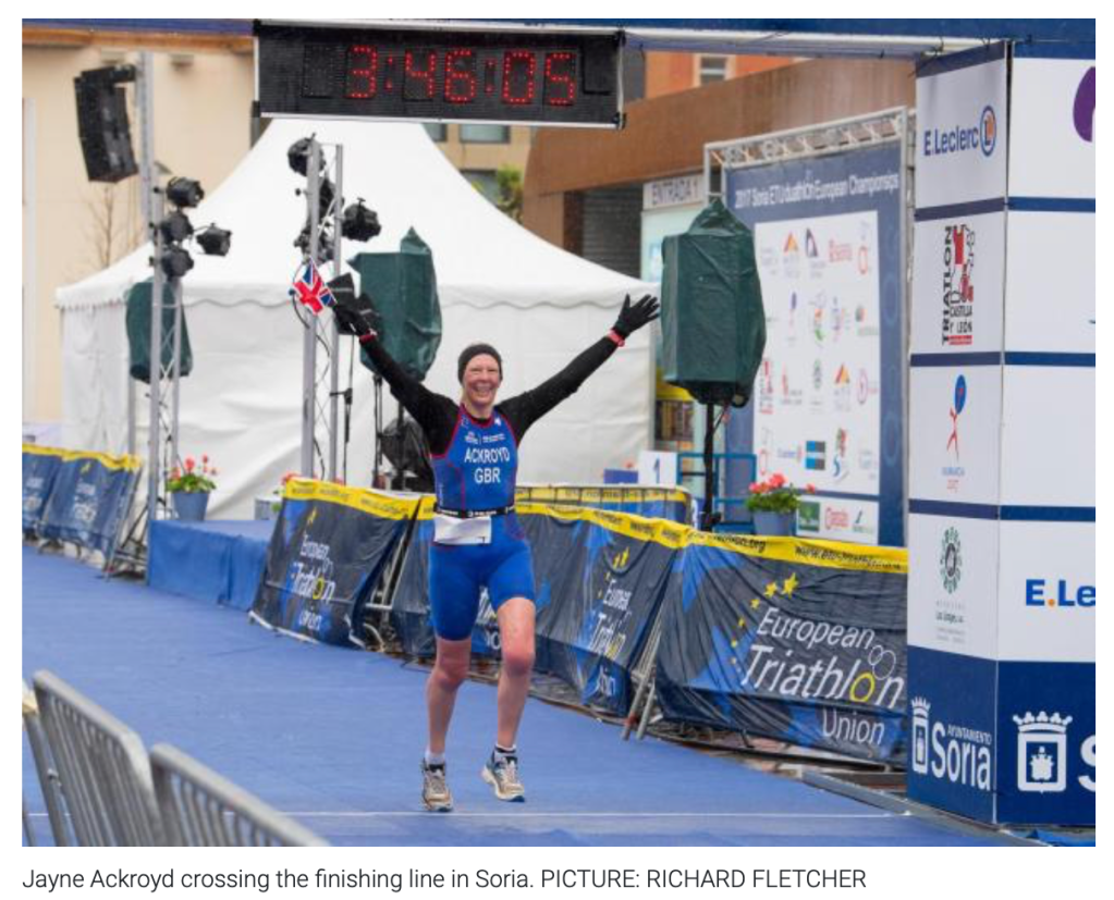
In this project, we are introduced to three different types of captions that are commonly used in conjunction with published photographs. All three have different meanings and impacts on the photograph that they accompany, ranging from pure documentary ‘explanation’ to the proposal of a meaning, whether factual or fictional. For this project I will look at the three types, directional, orientational and complementary when applied to a single photograph. The picture I have chosen is one that I shot of my wife competing in her first international multi-sport event as part of Team GB. It was published in our local newspaper at the time, with a caption that fits within the directional category.
Here we have the photograph as published. It states that her name is Ackroyd, she is in Soria and she is crossing the finishing line. When we look at the picture, there are clear elements that the caption describes, e.g the location and my wife’s surname on her suit. The caption directs us to the meaning of the picture without us needing to view it for long. When we consider journalism, the basis for our consuming of news is that it should be presented rather than mined. This has had significant implications in the modern social media world because we apply that same ‘instant consumption’ to any news item put before us, whether truthful or not. The idea that someone would try to convince us of an untruth doesn’t naturally occur in most people, so on highly important subjects such as COVID-19, North Korea or Black Lives Matter, the potential for being misled is increased.
Battling the Elements
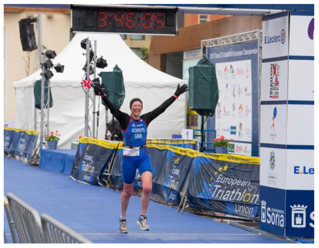
If we change the caption to one that fits within the orientation category, the image now requires more thought to understand the meaning. The contextual elements in the image are no longer directly referenced as we can’t really see the ‘elements’ being ‘battled’. What we do see, though is a celebration of completing something that has clearly taken a long time to accomplish. The geographical references are still there, so we know it’s a European triathlon. We know that Jayne is part of Team GB, which is an achievement in its own right. Perhaps the narrative now is something about a difficult journey against odds, such as bad weather, that leads us to this successful conclusion. What is clear is that we cannot just consume the picture as with the directional caption. The caption now adds part of the story, that is it sets the visual elements in the picture and helps support the creation of a narrative.
Never leave that till tomorrow which you can do today
With the caption changed to one that is complementary, the picture becomes different again. Now, the text doesn’t refer to the activity at all, instead being an idiom often attributed to US founding father Benjamin Franklin [1]. The quote naturally links with the picture but not in a factual way. The questions raised by the combination could be related to overcoming adversity, procrastination or ignoring our passions until later life. The image becomes a metaphor for many aspects of life and its meaning could be taken as motivational or as a symbol of pride, but that decision lies firmly with the viewer.
What I take from this experiment is the importance of considering the caption for a photograph. During EYV I was given the feedback that the titles that I’d chosen for my photographs in one of the assignments were too prescriptive [2]. The comment was that as a viewer, it was difficult to draw any conclusions or form any narratives because the captions described what was going on. An example can be seen below.
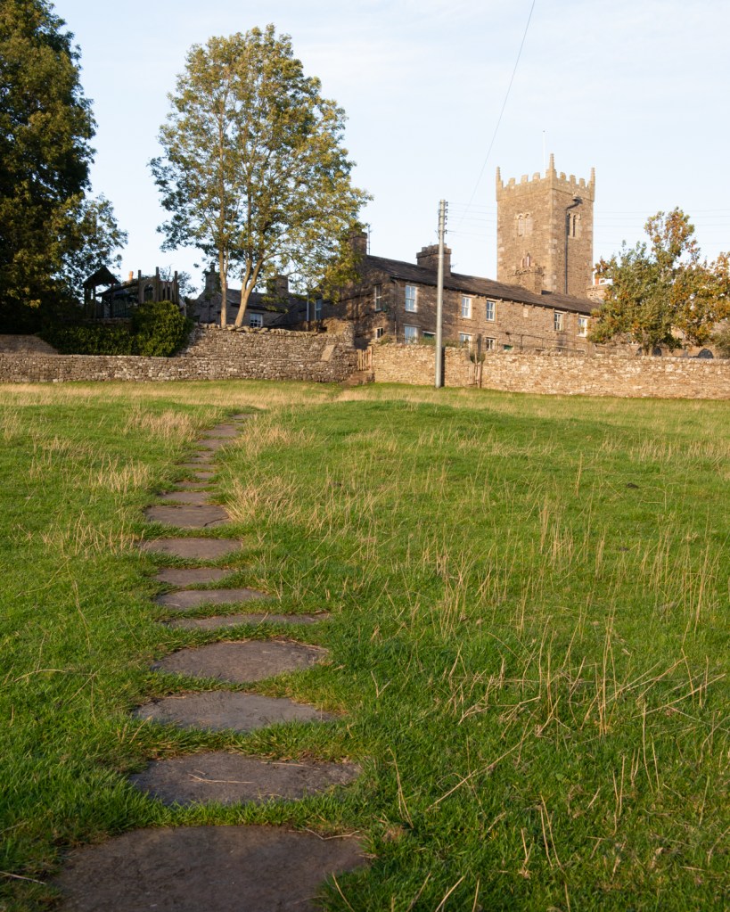
Walk to the Church (42mm, 1/100th at f11, ISO1250)
This caption clearly describes what this picture is about. Any thoughts about narratives around the church or the journey through the field are ended by the literal meaning of the caption. This use of the directional is not helpful in this case.
Rene Magritte (1898 to 1967)
We are introduced to the famous painting The Treachery of Images by René Magritte, which depicts a detailed rendering of a pipe, under which are the words “Ceci n’est pas une pipe” which translates to “This is not a pipe”. The story goes that the Magritte was tired of the idea that the written word, in particular works of poetry and philosophy were granted some superiority when it came to challenging our beliefs of what is real and what is imaginary. He set out to use painting to challenge our ideas of association and recognition with a series of works that included this one. As we know, Magritte stated that the image was not a pipe as it was impossible to fill and smoke it. It was instead a representation of a pipe that could occur on many levels. In his short film featuring this painting [3], Sergio Toporek takes the interpretation further. The original painting is actually a layer of paint on canvas, but if viewed as a print it’s a layer of dyes arranged in dots and on a screen, a sequence of RGB pixels etc…etc. What Magritte does is to challenge us to not simply dismiss the picture as being ‘a pipe’, because visual language tells us that’s what it is. Instead, he profers that the image is one thing and the text another. In another film about The Treachery of Images [4], the theory is that written descriptions of objects tend to connect with our visual understanding of an object in a way that actually transcends to being connected with the real thing. Hence, people see the representation of the pipe and automatically know what the real object is. These connections of names with objects was challenged by the philosophers, in particular Saussure [5], who postulated that the connection between descriptors and objects was in fact completely arbitrary outside of our societal associations using language. Magritte would almost have made as much sense to our application of these signifiers with his caption if he had said “This is a man” or “This is a double-decker bus”. Instead, his direct assertion that it was not a pipe challenges the viewer to decide what he means, with the obvious conclusion that it’s a representation of a pipe. However, there is also nothing to connect the text with the subject of the painting; they just appear on the same canvas. The word ‘this’ doesn’t have to refer to the image above it, it could equally refer to the blank space or the canvass itself. We now have a seemingly simple painting with many complex narratives associated with it – all through the combination of image and text in a complementary way.
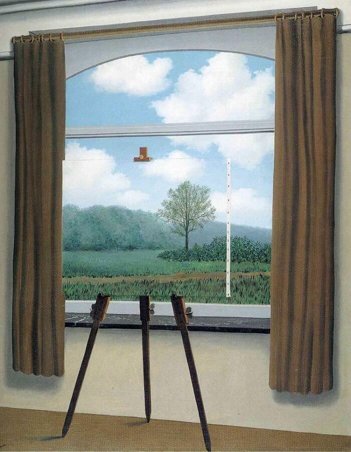
I researched another example of Magritte’s work that demonstrates his use of title with image, but doesn’t include both within the frame. The painting The Human Condition (1933) shows a window view of a hillside landscape with a tree in the ‘foreground’. We soon realise that the centre of the painting is in fact another painting on an easel.
The Human Condition (1933), by Rene Magritte [6]
The painting is optically challenging because of this composition, but it’s when the title is added to it that we start to understand the narrative. Magritte was asked about this painting during an interview with writer Hyatt Carter in 1967[7]. Magritte said that the image challenges how we as humans assume we know something without really having the knowledge to back it up. The painting on the easel fits almost perfectly into the main image and with the alignment of the path, hedgerows and trees connecting them together, we naturally assume that what we see in the painting is actually the view beyond it. We don’t stop to ask what is really behind the easel, just convince ourselves that whoever painted it did so for the purpose of representation. Magritte further adds that this logical assumption is how we live our lives. We associate things with labels, interpret perspective even when it is obscured by something, as with this painting, and create our own world in our heads. None of this exists without the title of the work being complementary, not in a sense supporting the contents of the painting, but adding a sense of doubt about our preconceptions. It differs from the actual title of The Treachery of Images, which is itself orientational. For me, the two paintings demonstrate Magritte’s ability to combine image and text sending the narratives and assumptions created by the viewer into confusion, leading them to thing differently about what they see.
Barbara Kruger (1945 – )
We are introduced to Kruger’s very distinctive style of adding bold text using only a black and white font with red bordering. Kruger is a commentator, choosing to challenge assumptions about events, roles, politics etc through the kinds of imagery that we are familiar with in advertising media.
“I never really thought I could be an artist in the ‘art world’ sense of it. (…) But my job as a designer pretty quickly morphed into my work as an artist.”
Barbara Kruger, speaking with Naomi Martin, Artworld (2019)[8]
Kruger explains in the accompanying video [9] that she worked as an editorial designer after she left school and realised that during her editing process she was placing anchoring text over the photographs she was editing in preparation for the Copy Editors to add the real captions once they had finished writing the article. Her realisation that the text had the power to give the picture meaning and could literally be anything at all, gave rise to her creating art in her particular style. Kruger’s images are bold and unambiguous with lots of orientational and complementary text that is included in a way that makes it unavoidable. The text doesn’t lead the viewer to the meaning in the same way as a documentary-style caption, but suggests enough to provide a sense of what Kruger is trying to say. Her work differs from Magritte’s in that it doesn’t subvert, but is similar in the way that our vision of the world, driven by language, makes strong arguments about the subject of the picture.
(Untitled) Your body is a battleground (1990) by Barbara Kruger [9]
In this picture, we see Kruger’s poster-like style with her use of bold text on a solid red background. The image of a woman’s face split down the centre with one half positive and one negative, could suggest yin/yang or symbolise the way that we are all more than one person depending what mood we are in. However when the text is added, the tone changes to one of conflict. The image was made in response to the slow erosion of the precedent set for a woman’s right to choose an abortion in the landmark Roe vs. Wade case in 1973. The poster is now a rallying cry for women to defend their rights to a say in what happens to their bodies. The expression on the woman’s face, with its steely gaze and impassive lips works with the text to suggest that the fight may actually be futile. Stylistically, the image invokes a sense of Orwell’s 1984 where free will is eradicated in a dystopian future. Most of Kruger’s work has this striking contrast of text and background inviting the viewer to react before even looking at the image that is included with it. She highlights and challenges the stereotypes of everyday life in an often brutally sensationalist way.
“I’m very interested in the everyday. I love the everyday and its repetitions, its conference. It’s the events that make me nuts. I like the moments between events”
Barbara Kruger [9]
Conclusions
We looked at text with pictures in Context and Narrative and I feel that this project has delved deeper into the impact that captions and titles can have on an image. Magritte’s work has an aesthetic that we associate with the surrealists such as Dali, Escher etc, but when he includes text as an image in its own right as in The Treachery of Images, the possible meanings grow to the extent of our imagination. I felt that the comment that a representation could be seen right down to the level of the paint strokes, ink dots or pixels, created a sense of a seemingly endless rabbit hole of possible interpretations. Even taking the literal idea that the pipe is not a pipe because it isn’t the real object, challenges the viewer to think about how we have evolved to use language to create a vision of the world around us. I think this best demonstrated by the assumptions and logic that automatically try to influence our viewing of works like The Human Condition. Magritte’s idea that what we see around us is a mental creation of a vision that is influenced by our experience is an interesting one. This can be seen in daily life when people who’ve travelled extensively and experienced many different cultures try to discuss something visually related with someone who hasn’t. A seemingly ordinary challenge shows clear signs of what Magritte was talking about in his conversation with Hyatt Carter [7]. With Kruger’s work, I feel that the use of complementary text in the image creates a strong connection with the viewer as if to grab their attention before the whole picture can be taken in. While both artists achieve similar impact on the viewer using this style of captioning, the subsequent reactions are very different. I’ve also realised the importance of directional and orientational text in imagery, because like all tools or constructs there is an appropriate context in which to use them. If every newspaper’s imagery used Magritte or Kruger’s style, we would either never understand the news or have a very limited perspective on it. I’m looking forward to experimenting further with all three types in future projects.
OCA tutor Dawn Woolley wrote a regular blog on the weareoca website called ‘Looking at Adverts’. Read one of Dawn’s articles and write a blog post or make a comment on the site in response.
Introduction
The first thing to note with this exercise is that the blogs by Dawn Woolley no longer contain any images or video media. I’m not sure what the reason behind this is, but can’t help to be amused at the irony of looking at advertisements without actually being able to see them. In order to make this exercise meaningful, I decided to look at the series of blogs, try to identify an advert from the description and then find the missing image from the internet. I settled on the advert for Lurpak butter in Looking at Adverts 3
Response
I chose this advert because I vividly remember my reaction to the television campaigns by Lurpak that featured the strong textual and spoken work elements. The missing images from Dawn’s blog are shown below[1]:
Wooley begins by addressing the way that a company that produces a product that has negative connotations, being high in saturated fat, highly calorific etc, had elected to counter with a narrative of all-natural and homely. They adopted an approach that appeals to our sense of nostalgia, with the historical image of butter being central to our diets for centuries. She points to the clever use of national identity as well, shunning the potentially divisive view of modern Denmark within the Eurosceptic demographic for the historical image of the Viking. When I recall the TV campaign, I remember it using the legendary Dutch actor Rutger Hauer, whose physical appearance and voice immediately conjour the idea of big, strong men. Although a different nationality, Hauer’s spoken word conjured an image that somehow aligned with that idea. When we look at the first image we see these elements connoting the same sense of masculinity. The oversized egg surrounded by the buttered toast has particular connotations in the UK where the latter are referred to as soldiers. The suggestion with the scale of the objects in the picture implies the butter only actually plays a small part in something much bigger, emphasised by the use of empire. This ties in with the idea that mosts things, even unhealthy foods are ok in moderation. The use of big/small also comes through in the other images. The huge scale of the meal being removed from what we are told is an oven suggests that big food that feeds our families is a good thing, with the added text pointing to masculine strength again. The idea of big, strong men is clear here but tempered by the idea of providing for family, which somehow seems like a positive idea despite the blatant sexism that goes with it. In the third image, the use of scale is more simple. The composition makes the cupcakes so big as to not allow any other distractions. The text takes the idea of wholesome further by suggesting that the food is a treat made possible by the butter within it. When I look at all three pictures, I can see the themes that we covered in Context & Narrative [2]. In one of the exercises, we deconstructed an image from a magazine or newspaper for the elements that clearly signify a meaning, such as food but also connote something based on what our knowledge and experience bring to it. When I look at these images, I am immediately nostalgic about my own experiences of natural food growing up and my fascination with the Vikings as a child. It would appear that Lurpak have pitched the advertising perfectly at me because I no longer see an unhealthy food-stuff or even an overly masculine ideal, but instead a sense of comfort and fondness through postmemory.
The second part of Wooley’s critique of this photograph deals with the difference, that is ‘what this product is’ against ‘what it is definitely not’. The former is used to belittle the latter a way that Wooley refers to as rhetorical figure in the field of advertising. The first image’s idea of the powerful empire not being built on something as insignificant as a museli bar is clear, but it’s a supplemental element to the picture. Without the text, the photograph can be interpreted as being of wholesome food, with the juxtaposition of the egg and buttered toast suggesting something that makes us feel good. However, when the rhetorical figure is added, it strengthens the idea that ‘this is what you want, not that other rubbish’. In the other images, the same use of this technique can be seen more subtly. The idea of an oven being where you make food seems straightforward enough, but the statement suggests what the alternative might be (in this case a microwave meal) without actually naming it. The same attitude towards the pre-packaged is seen in the third image. Wooley’s conclusions about the campaign suggesting a complete disregard for food fads, favouring the enjoyment, comfort and fuelling that food gives us instead, are relatable. Lurpak has managed to create a campaign that both conforms to stereotypes (sexism, imperialism etc) and challenges them, suggesting that tradition isn’t always a bad thing if we don’t overthink our food. All of this in order to sell butter, which is the one element that need not actually be included as a contextual element in the photograph.
Conclusion
I realise as I write this that I am doing what Wooley herself said that she could easily continue doing, which is to further investigate the meanings within this advertising campaign. The complex narratives and clever way that the company has manipulated our postmemories and brought their emotions into the present is palpable. I was reminded during this exercise of the milk campaign of the early 1980s [2]. The advert featured two young football fans entering a kitchen for a drink, we assume after playing the game. Straight away, we are presented with the rhetorical figure of milk (which the first boy drinks) and lemonade (which the second asks for). The latter’s revulsion soon gives way when the former states that their footballing hero said that if he didn’t drink it, he would only be able to play for a small team. When the second boy hasn’t heard of them, this makes the point of the importance of drinking milk. The final written text in the advert states that “there are times when only milk will do”, an idea that it somehow makes your dreams come true. Until reading Wooley’s series on advertising, I had simply seen this advert as amusing, but now it is clear how clever the use of context in the form of written and spoken word can be. It connects a visual with an idea or desire in a way that it cannot easily achieve in its own, which could be seen as manipulation or merely capturing our imagination. Either way, these advertisements increase product sales.
Choose a community that you’re already a part of. It could be your child’s nursery or your regular gym class, but it should be something that takes up a substantial amount of your interest and time.
Create a photographic response to how this group informs who you are as a person.
● What aspects of this group or community reflect on you?
● What do you share?
● How does it function as a mirror reflection of who you are?
b. ‘Window’
Use this opportunity to find out about a community that you don’t know much about and tell their story. Get to know them and talk to them; learn by listening and understanding.Your aim here is to become an insider. You’re beginning as an outsider so it is important to choose a group that you can spend a lot of time with. Negotiation skills and respect are intrinsic to working well with your subjects and are invaluable skills for your development as a photographer.Be clear about your intentions and involve your subjects in the process in order to obtain the best results.
What window into this world can you access through your role as a photographer?
In either case you can create as many pictures as you like but, in your reflective commentary, explain how you arrived at the final edit. The set should be concise and not include repetitive or unnecessary images. Be attentive to this aspect of production. Spend some time researching how other photographers seem to edit series of works. There’s helpful advice on editing and sequencing in Maria Short, Context and Narrative (2011) Lausanne: AVA Publishing.
Some questions to consider are:
● What order should the images be shown in?
● Are there too many repetitive images?
● Do you need to let go of earlier images because the project has changed?
● Are you too close to some of your favourite pictures and they don’t fit thesequence?
● Do you need to re-shoot any for technical reasons?
● Are there any gaps that need to be filled?
Send your final series of images to your tutor together with your reflective commentary (500 words) on this assignment.
Introduction
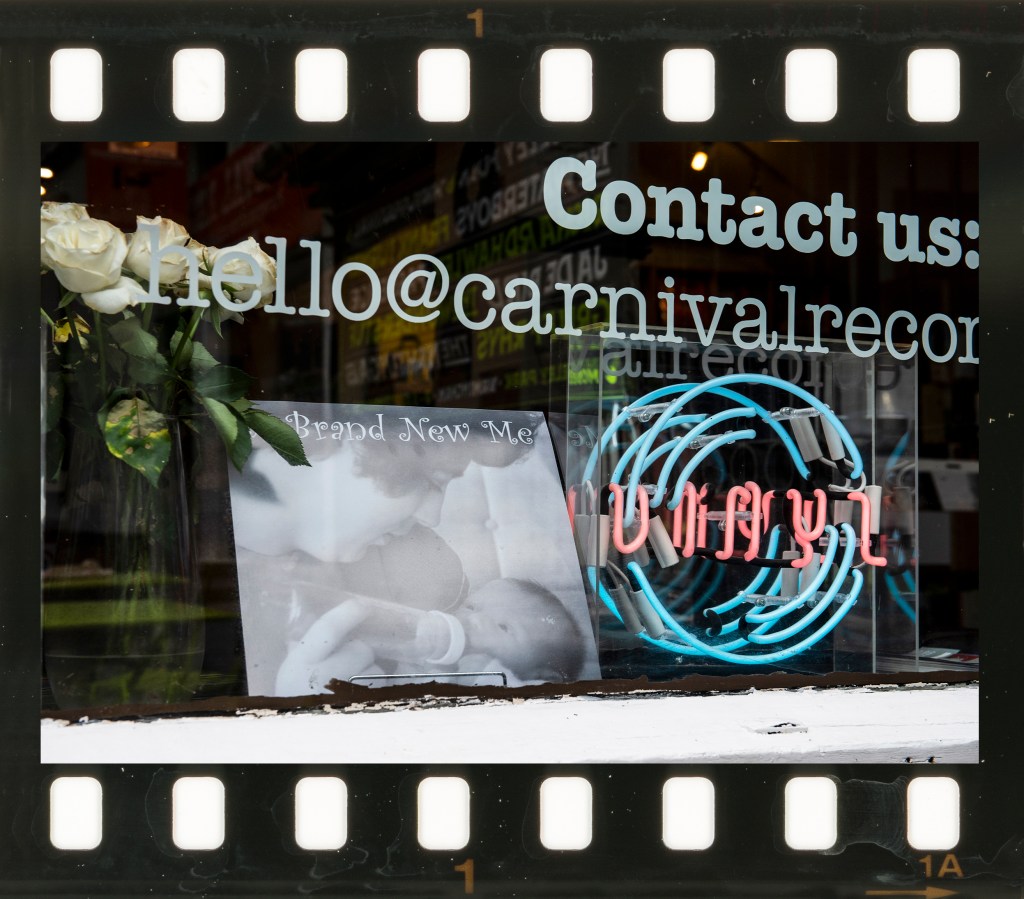
For this assignment, I chose the concept of the mirror as I was inspired by a coincidental conversation that occurred while working on Part 3. For as long as I can remember, I’ve been passionate about music and in the past few years have joined the many people who have rediscovered vinyl records. I’m fortunate to live in a town that has its own independent record shop that is owned by a friend of mine and it was during a conversation with him that this idea came about. I was having a tough time and was digging through records as a way of relieving my stress. My friend suggested that if I ever needed to just escape, I could just sit on the shop’s sofa and listen to what was playing at the time. He offered this because “you’re part of our community”, a quote that immediately resonated with me. We went on to discuss the idea of the vinyl community over the next few visits and concluded that while music was mainstream, the people that choose to listen to it on this particular medium are somewhat on the fringes of society. Their idea of relaxation is to look through thousands of records for something they might like, rather than quickly surfing the internet for their music. They like nothing more than to talk to other like-minded people about new releases, gigs they went to in the past and even the gear that they play their vinyl on. I started to think about how this conversation affected me. Being a child of the 1970s, I grew up with vinyl and cassette tapes as being the two ways to listen to music. I would spend hours listening to pop music on my hand-me-down record players which were only given to me as an alternative to throwing them out. At the weekend, I would go to the nearest town and spend my time looking through records in the same was as I do now. While CDs and digital music essentially killed off vinyl for 30 years, its revival makes me feel as though I’ve come full circle.
My Idea
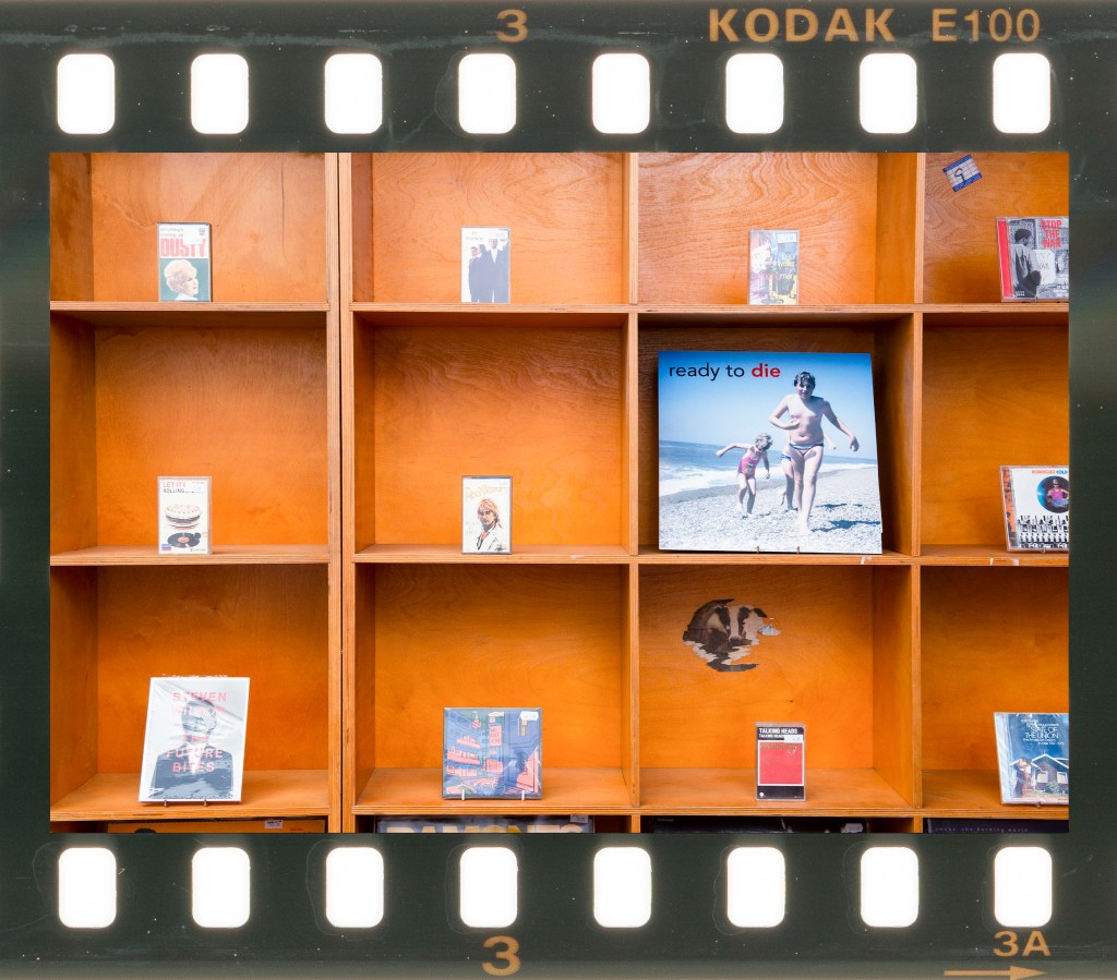
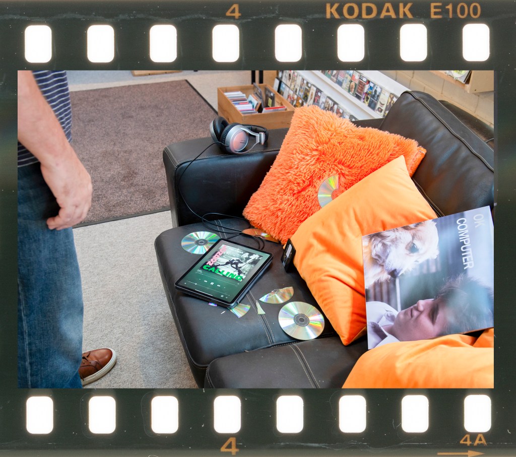
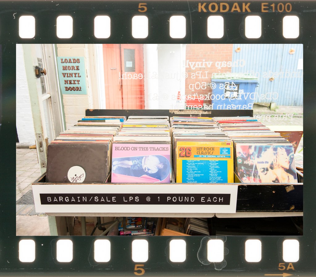
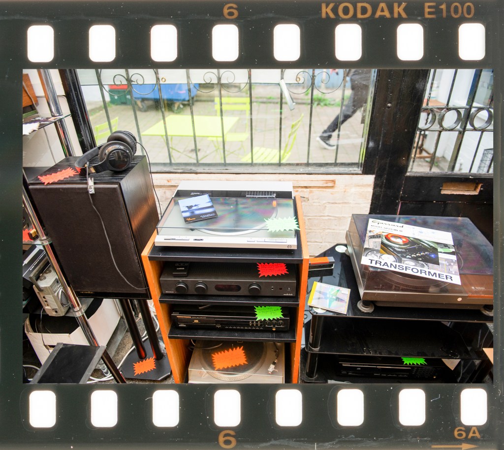
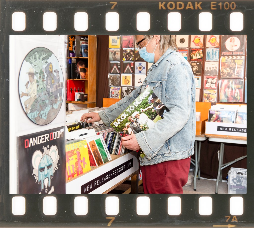
I wanted to explore the prevalence, decline and revival of vinyl and how it tied in with the passage of my own life. I would use family archive photographs of me growing up to establish a form of timeline and combine with text to suggest how both vinyl and I changed over that period. I realised that the intention here was not to suggest key moments in my life aligned directly with the vinyl story but to reveal something about me as it played out. After considering how to incorporate images with the background, I took inspiration from Hans Eijkelboom [1] and Trish Morrissey [2] and looked for a way of substituting myself into the frame. Both artists replaced a person in their pictures which asked the viewer to look closely at their likeness and potential meanings for the fabricated image. I found both of their projects fascinating as they contained an implied self rather than being overtly about the artist’s image. For my series, I decided to make my own vinyl album covers with my photographs as the artworks. Over many years, musicians used artists and photographers to create the image for their albums to draw attention to their style, the album’s themes or just to stand out from the rest. The result was a broad spectrum of ideas and designs, which meant that I could include myself in a similar chameleon-like way to Eijkelboom and Morrissey but stand out enough to invite questions. To help support the narrative, I decided to give each album cover the name of a real album by a well-known artist. Including text would add another layer of context and further enhance the narrative about the vinyl story while further physically connecting my image to it.
Approach
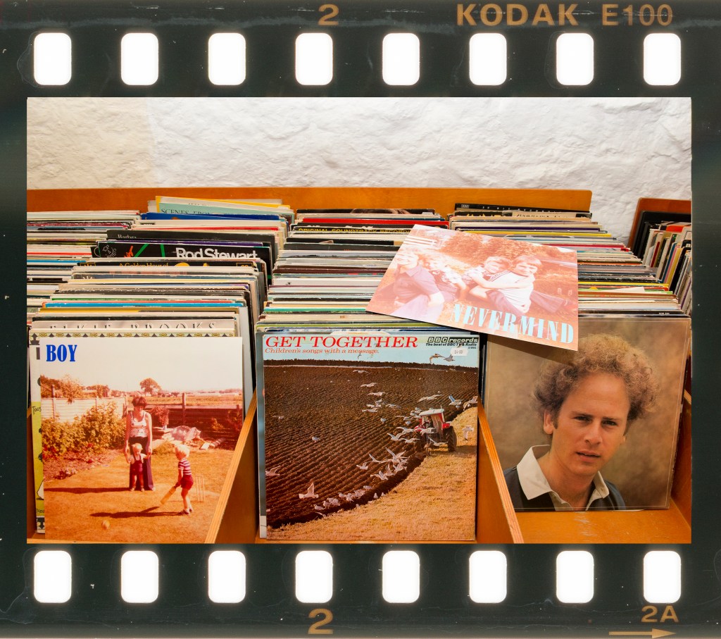
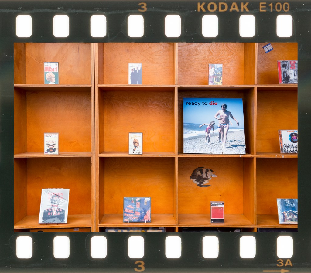
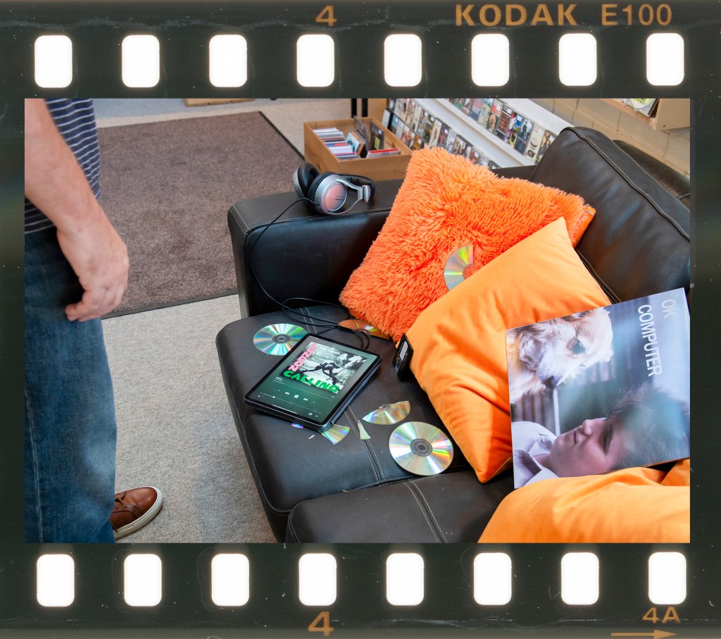
I started by reviewing my family archive. As a shy child, I was always reluctant to be photographed, so of the 2000 or so pictures I have of the family, there are probably only 100 with me in them. I selected 6 photographs that showed me at different ages from a baby to late teens with the only criteria being that I was the main subject in the image (most included other members of my family). I then included them with two shots of me as an adult, one taken on my wedding day and the other a self-portrait taken specifically for this assignment. I wanted to keep the chronology of my portraits but didn’t want to be limited in the same way in the use of album titles as I saw those as supporting the narrative rather than obviously leading it. This meant that I selected album titles from across the decades that suited my photographs without a timeline that linked them together. I made the album covers using actual cardboard sleeve blanks and for each shot on location, put a record inside to make it look like a real album.
I shot each photograph with a single speedlight flash and kept them as landscape format for consistency. While thinking about this work, I was reminded of another revival in photography that echoed vinyl. Film has undergone a resurgence in the past few years and a specific example is Kodak Ektachrome E100, which was discontinued in 2018 only to be reintroduced 5 years later. Like vinyl, film is an analogue and often imperfect medium so I decided to present my series as a set of Ektachrome film frames. The scans of the film strips show the imperfections such as water marks, dust and minor scratches, which I felt added to the nostalgia of the images even though they were shot digitally.
The Series
Individual Images
One
Two
Three
Four
Five
Six
Seven
Eight
Reflection
My intention for this series was to tell the story of the heyday, decline and revival of vinyl in a contemporary setting, using images from my childhood to provide my perspective. I chose to present them as individual pieces of film to further tie in the narrative of rediscovery as well as the imperfect nature of classical analogue media
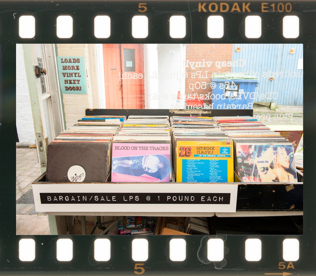
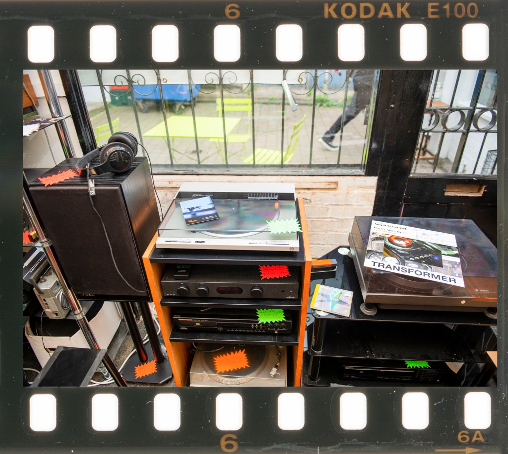
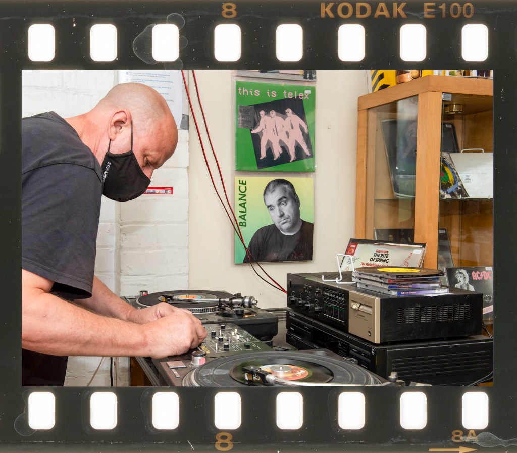
When reflecting on the series, I am happy that the general themes of abundance, loss, alternative ideas and rediscovery come through in the photographs. One and Two speak to a time early in my life where vinyl was abundant and the most available medium to listen to music on. My memories of those early years were my family and friends enjoying music together, sharing our thoughts on new releases and rushing out to buy them from our local, community record shops. Three invokes the takeover of cassettes and CDs as I reached my early teenage years and how, within a short space of time the vinyl records became less popular. By the time we reach Four, even the seemingly modern CD has succumbed to downloads and computers, with vinyl about as far removed as it could be. The revival then begins around Five, where most people couldn’t believe it or understand why. In Six I’d reached a point where I needed a record player, something I’d not had for nearly 30 years, and electing to rebuild my family’s old system. Seven and Eight complete the full circle nature of this revival, with new records being released and shops like this one stocking music on more than one format.
I believe that the series flows well with 8 images and cannot really identify any gaps that would be filled by including more. I’ve deliberately tried to avoid repetitive images, which is one reason why I mixed shots of the shop and its products with the people who run it. The inclusion of people was intended to provide some context rather than be the dominant subject, which is why they are ‘cropped’ by at least one edge of the frame. I think that the album covers work well with their titles as in some cases they seem incongruous with the image. The connections between the images of me and the chronology of the story are clear, but each picture has enough context for the viewer to decide what it’s about without being led.
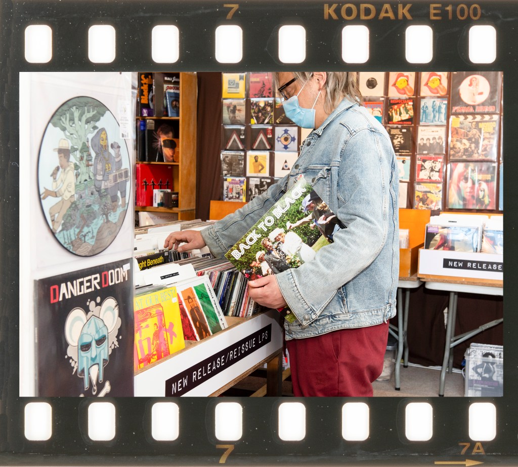
The strongest image for me is 3 as it shows my perception of the choking of the format, contrasted with the happy scene on the beach by including a dark album title. When I saw this photograph, I was struck by the similarity of being chased by my smaller siblings and the looming advance of cassettes and CDs on the older format. The weakest image is 6, as the album cover doesn’t tell the story of my rediscovery of hifi equipment as strongly as the other image narratives. My decision to restore the system was an emotional one as my earliest memories are of my mother playing it when I was a child. I struggled to find a way of expressing this emotion so placed the image more as a factual signpost. While it’s not as strong, I still believe it fits well enough in the series without reshooting.
Against the Assessment Criteria
Demonstration of Technical and Visual Skills
All of the images are well exposed and sharp with use of aperture to reduce any impact of distracting elements not related to the subject. I deliberately composed in landscape in order to present the photographs as film frames and incorporated people only as supporting contextual elements instead of being the dominant subject. I believe these tableaux compositions meet my original intent in incorporating many different connotations in a each frame.
Quality of Outcome
This series was intended to be a mirror with the images revealing something about me within the narrative. I believe that this series meets the brief in this regard. Each photograph features a representation of me at an age that aligns with the key theme and the often contrasting album titles both ground the fake album covers in reality and help tell the overall story. Feedback received so far indicates that this clever combination of real and imaginary strengthens the connections both within each frame but also the series as a whole. I believe it meets the brief.
Demonstration of Creativity
My approach to the brief differs from traditional self-portraiture because I’ve included archive photographs of myself in the contemporary setting of the record shop rather than posing for the photographs. The arrangement of the compositions is such that a sense of events that happened in the past have been brought into the present. The photographs present a mix of the straight chronology of my life with the events around vinyl’s decline and rediscovery with the familiar, yet out of time album titles. The contrasting imagery of the album covers and their titles asks questions about my past life and how I view it from a nostalgic perspective. It could be argued that contrasting, for example putting Amy Winehouse’s album title ‘Back to Black’ on a photograph of my wedding day, suggests a dark view of a joyous time. The true meaning of course is that we are back on vinyl which is black in colour, but I don’t make that clear with the rest of the composition. The inclusion of the model and his mask could also be interpreted as a commentary on the current pandemic crisis – I leave that to the viewer to decide. For me, the series comprises of 8 images that work together without any obvious gaps and each image has a number of layers of potential narrative to keep the viewer’s attention.
Context
Within the context of Part 3, I was heavily inspired by Eijkelboom and his substituted family photographs. By inserting himself into a stranger’s family for a picture, Eijkelboom challenges the viewer to tell the difference between what is real and what is not. His perspective on the traditional family unit and how that blueprint is so recognisable in our culture is done with a humorous angle. What I intended with my series was to ask the viewer to relate to the ‘full circle’ narrative around vinyl, but also the linearity of my life moving through the story. It is a mirror because it reflects my experiences without being too literal, but it could also be considered a window into the sub-culture of vinyl listeners. The shop has a very indie aesthetic, with everything designed around making the music accessible rather than being pretty. To the uninitiated, the series could simply act as a document of how things are now within this community.
Durden, M. & Grant, K. Double Take: Portraits from The Keith Medley Archive (2013) Liverpool: LJMU Archives. Pg 15.
This exercise gives you the opportunity to explore the image as a window with which to trigger memory.
● The objective here is to produce a series of five portraits that use some of the types of gaze defined above.
The specifics of how you achieve this are down to you; you choose which types of gaze you wish to address and who your subject might be in relation to this decision. What you’re trying to achieve through these portraits is a sense of implied narrative, which you can explain through a short supporting statement. Don’t try and be too literal here; the viewer must be able to interact with the portraits and begin to make their own connection to the work, aided by the type of gaze you’ve employed.
● Write down any thoughts or reflections you might have regarding this exercise and include this in your learning log or blog.
Approach to this Exercise
I elected to choose some images from my library that support the emotions of triathlon. I’ve supported many triathlons and even competed in some over the past few years and I’m always struck by the difference between being involved and being a spectator. In this series, I use the gaze to draw the viewer into the relationships between competitors and spectators set against the challenges of the event.
The Images
One
Two
Three
Four
Five
Reflection
Of the list of gazes postulated in the notes, the ones that interested me the most were averted and internal, where the subject isn’t looking at the photographer or engaging directly with the viewer. I think this comes more from historically seeing the direct gaze, where the subject looks through the camera at the viewer, as being traditional portraiture. There’s certainly a sense of ‘watch the birdie’ about them in their simplest form, even though as I mentioned in Project 2, the connection between the viewer and subject can be very powerful. For this exercise, I wanted to explore situations where the subject or subjects are engaging with something else in the frame, visible to the viewer or ‘off camera’
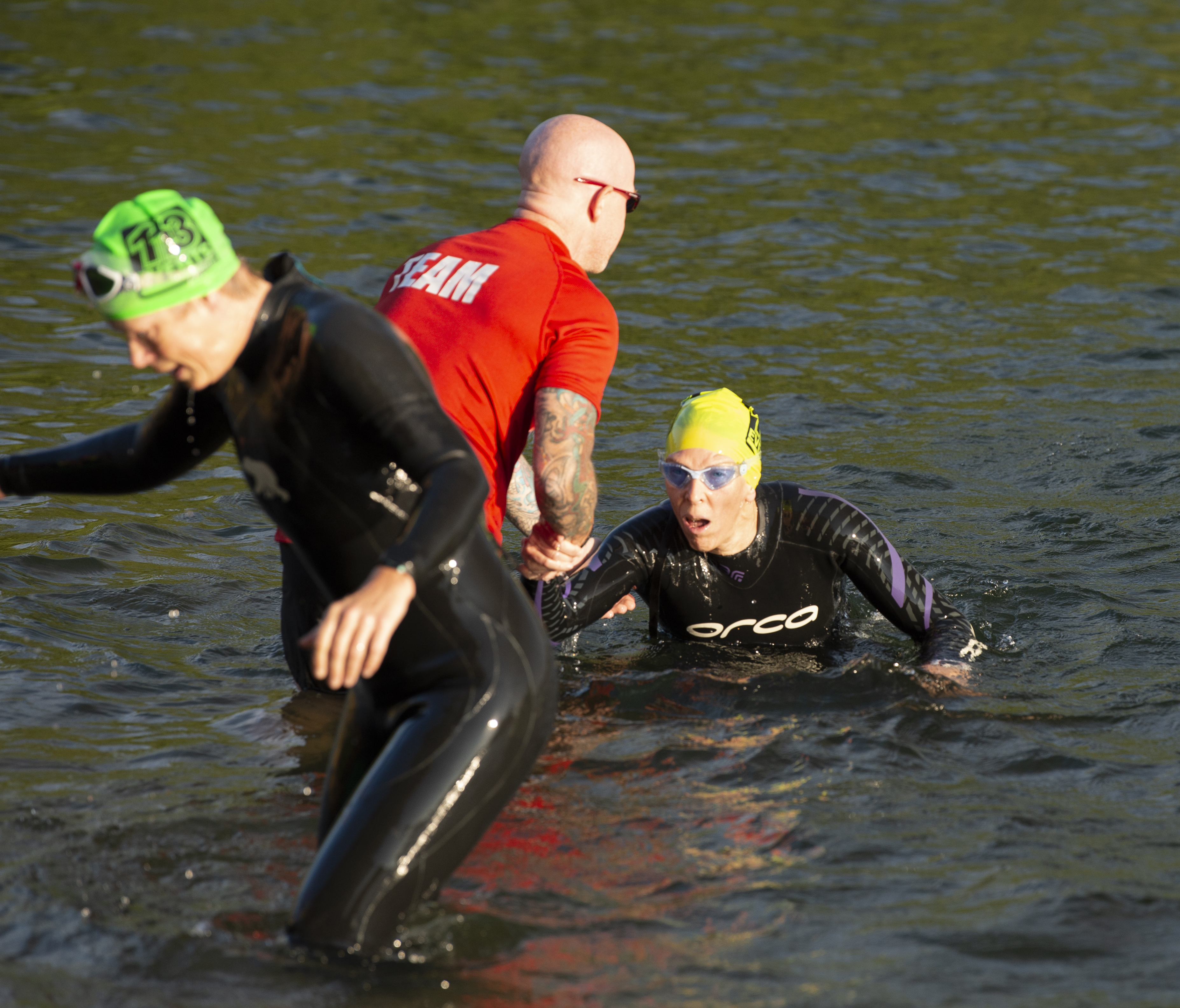
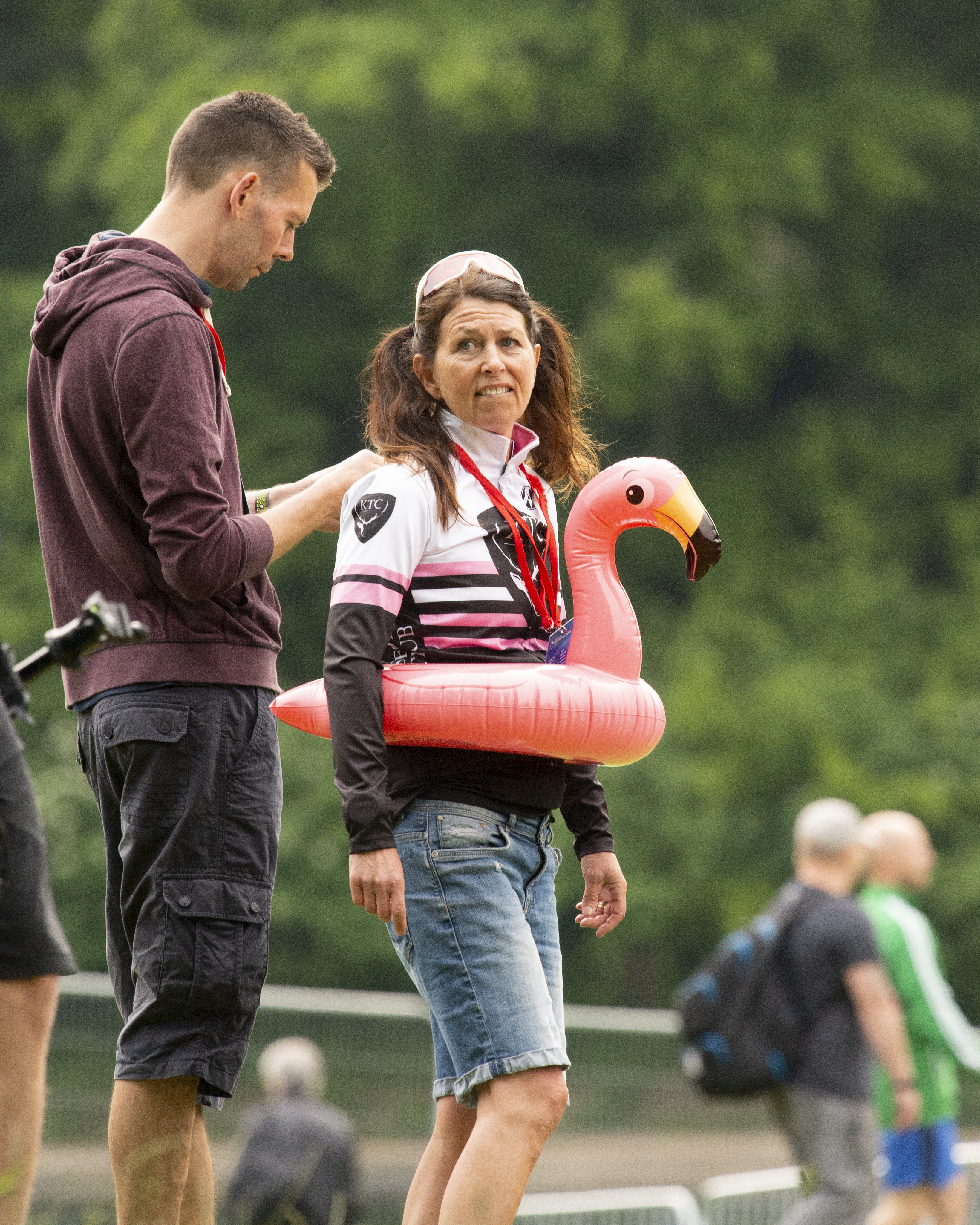
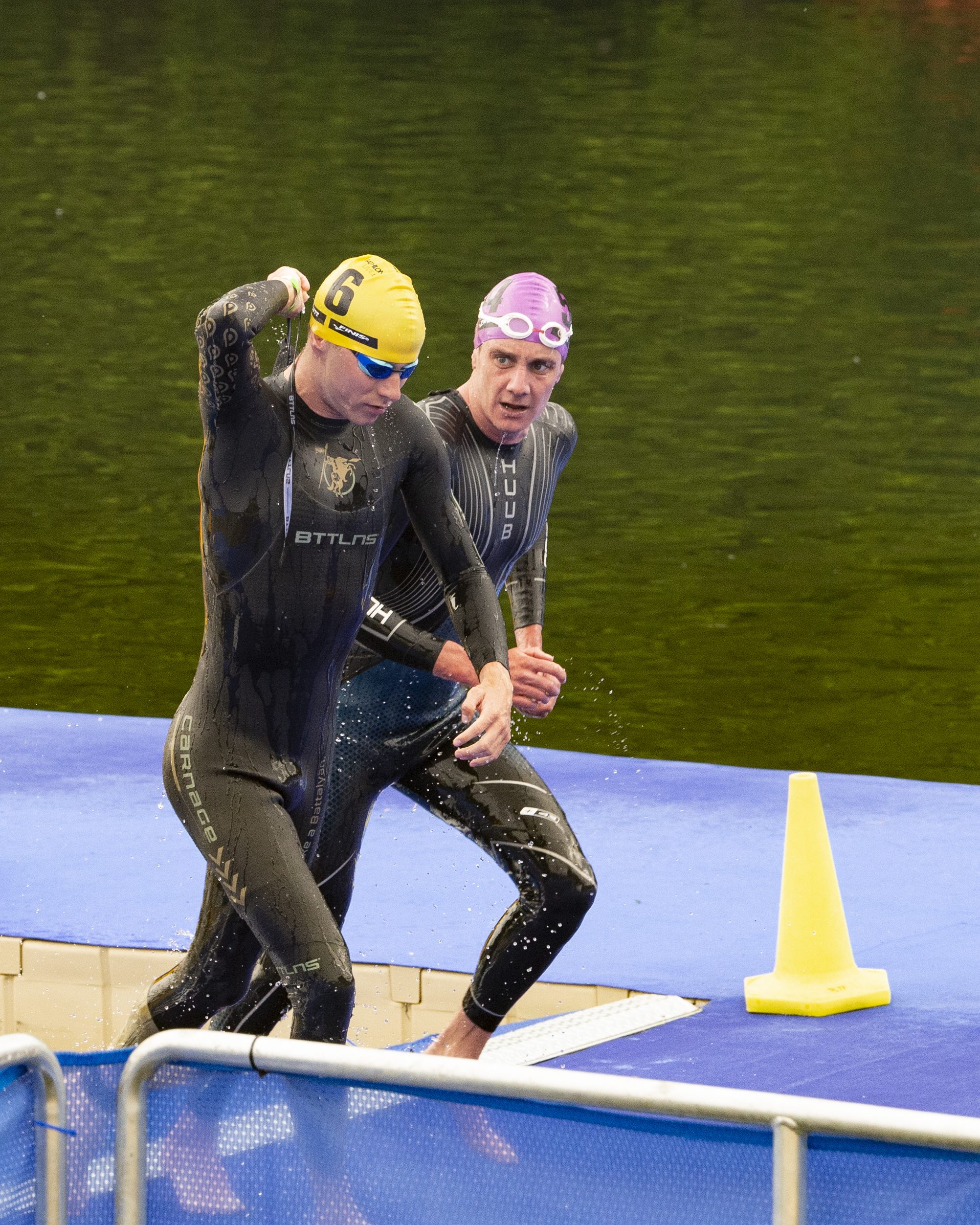
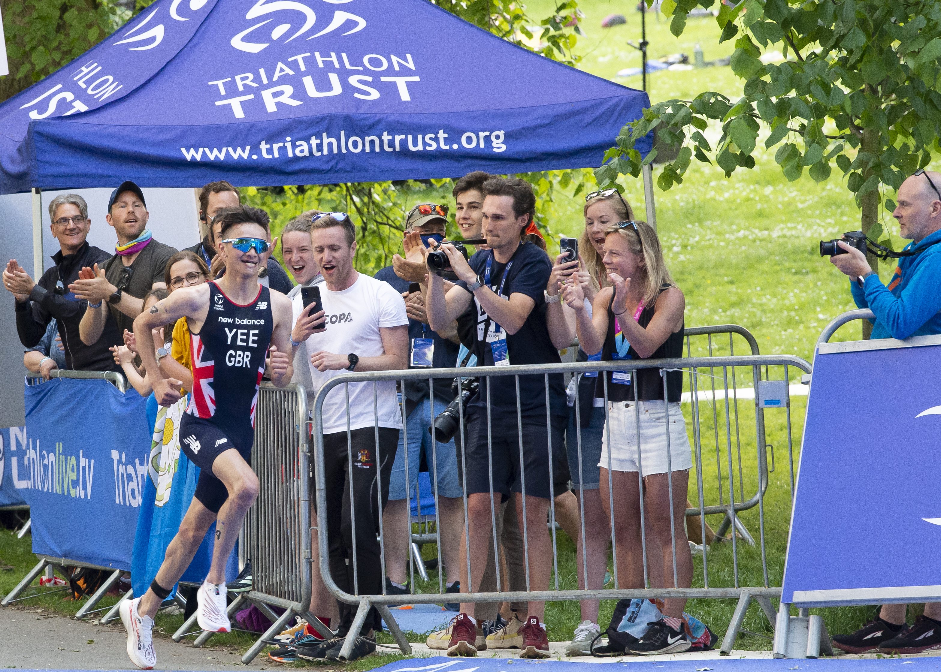
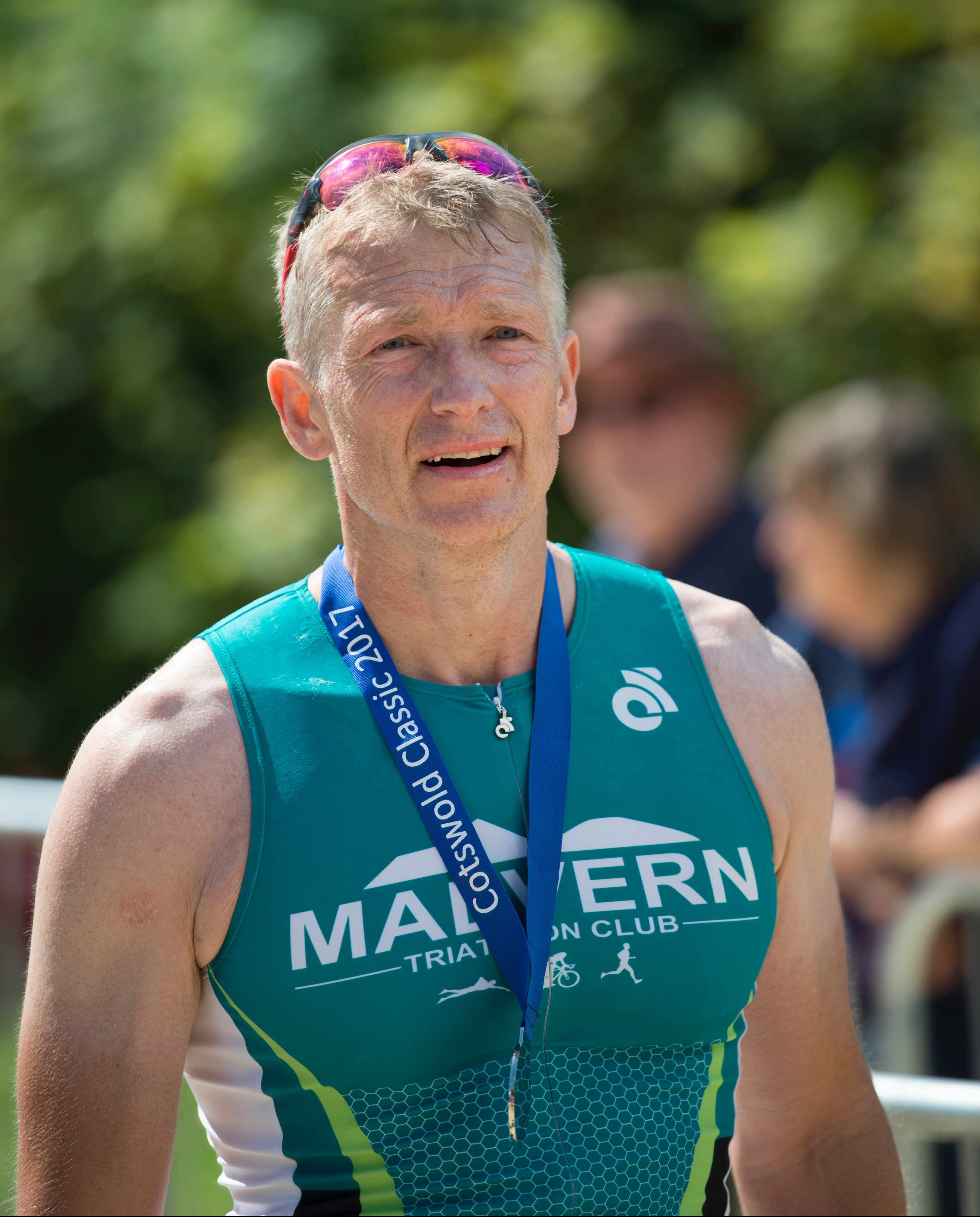
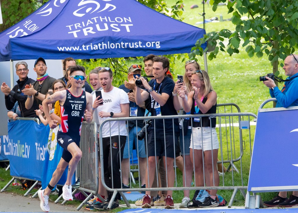
With this series of images, each subject is unaware of my presence, but connected with someone else. One is a shot of my wife completing the swim leg of a race, being helped out of the water. I chose this shot because of the subtlety of the communication between the two subjects in the frame. My wife is looking towards where she has to exit the water and the assistant is looking for the next swimmer he needs to help. Although their gazes are averted from the camera and each other, their communication is clear as he helps her find her feet after the long swim. Two is of a spectator I spotted at a recent event. Her peculiar outfit garnered a lot of attention but she was completely oblivious to it. Her averted gaze towards her husband seems to seek some form of engagement but he is ignoring her. Was he embarrassed or just distracted by something else more interesting than a woman wearing an inflatable? Three was shot during the recent Leeds triathlon and shows a competitor angrily addressing another athlete. It followed an incident where the former (Alistair Brownlee) allegedly impeded the other swimmer and was subsequently disqualified. The gaze in this image has a very clear emotion attached to it, but is made stronger by the way that the other athlete ignores the abuse, electing to focus on his own race instead. Four was the complete contrast to Three, where the winner of the men’s race (Alex Yee) was being cheered on as he turned toward the finish. In this image we have the joy of spectating a major event in the gazes of the supporters, but Yee isn’t looking at them. His focus remains on the race, even though he’s clearly ecstatic about his impending win. The image combines joy in the whole scene. I chose Five because of its closeness to being a direct gaze. It shows a local athlete after he’s finished a race and while his gaze might look as though it’s locked onto my presence as the photographer, the reality is that he’s not really looking at anything. This ‘thousand yard stare’ is fairly common when someone crosses the finish line and is usually replaced quickly by wanting to find their supporters or fellow competitors to discuss how the race went. For me, this shot allows the viewer to relate to that moment of vacated thought whilst asking the obvious questions about how he feels.
Conclusion
I chose the averted and internal gazes as the basis for this exercise because of the potential for observing a drama playing out. They follow the idea of the photograph as a memory in me because I was there and took the pictures. They further trigger memories of the many hours I have spent spectating at events, the considerable time that passes when waiting for my wife to pass the spot where I am standing (Two). They also remind me of the unfettered pride of cheering her on (Four). They further invoke memories of my own competitions as a swimmer, with the what goes well (One) and what goes badly (Three). The general sense of emptiness after crossing the line is fleeting but very powerful and the memories that Five triggers, include the sense of exhaustion but happiness at achieving the goal that many other athletes and sports people feel. My main conclusion from the exercise is that the careful selection of an image with a particular gaze strengthens the narrative of a small series like this one. The images don’t cover one event, nor do they cover every aspect of triathlon. However we get a sense of the atmosphere of competitors and supporters from the way that people interact with each other in the pictures (internal gaze). In this case, the viewer and photographer are observers but the memories of self-achievement, overcoming challenges and pride come through the series without any direct experience of triathlon being required. The increased exposure of this sport only serves to help the viewer appreciate what both groups of people go through in a similar way to our restorative nostalgia around the conflict in Afghanistan or the American migrants nearly 100 years ago. This tells me that the subject’s gaze does indeed increase or decrease the way we are affected by the postmemory and that it’s a potentially useful tool when photographing people.
We are first introduced to the theories of art critic John Berger and academic Marianne Hirsch about the effect of photography creating instances where time appears to have stopped and how these moments grant us access to ‘memory’, whether direct or through our cultural experiences. In his book Ways of Seeing, Berger refers to photography as establishing the idea that a visual image is inherently connected with our concept of the passing of time, both at the point it was captured and from that moment onwards. He said:
“The camera isolated momentary appearances and in so doing destroyed the idea that images were timeless. Or, toput it another way, the camera showed that the notion of time passing was inseparable from the experience of the visual (except in paintings). What you saw depended upon where you were whn. What you saw was relative to your positon in time and space. It was no longer possible to imagine everything converging on the human eye as on the vanishing point of infinity”
John Berger, Ways of Seeing [1]
I interpreted this to mean that when a picture is taken, there are contextual and cultural references that are anchored at that particular moment which, if we were present during that period, we would recognise as contemporary. As time progresses, our interpretation of those elements within the picture change with our age, experience and environmental context that we bring to our viewing. Time continues to pass for the viewer but not the image, though the meaning of the image evolves with us. In considering this idea, I looked at this photograph from my family archive.
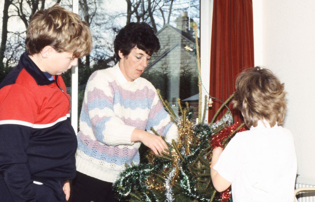
The image shows my late mother, my little sister and I putting up the Christmas tree in 1986. If I deliberately separate my knowledge of how it was taken, when I look this photograph I see the family collaboration, the dated clothing, my youthful (and characteristically grumpy) demeanour and my mum who has been gone for over 25 years now. Looking at this photograph through my adult eyes invokes many memories that I could attribute to this particular day, but in reality I cannot remember that actual event. In this case, then my recall is more about my memories of that time in my life rather than a detailed memory of the event itself. Hirsch takes the idea of memory further with her concept of ‘postmemory’. In an interview with Columbia University Press, she said
“As I see it, the connection to the past that I define as postmemory is mediated not by recall but by imaginative investment, projection, and creation. To grow up with overwhelming inherited memories, to be dominated by narratives that preceded one’s birth or one’s consciousness, is to risk having one’s own life stories displaced, even evacuated, by our ancestors”
Marianne Hirsch in conversation with Columbia University Press, 2012 [2]
Hirsch’s book on the subject deals with Postmemory of traumatic events, in particularly the Holocaust, where the imagery and historical context create powerful memories that are not necessarily from our own personal experience. She argues that the viewer ‘invests’ in what they are seeing in the image, creating a memory that is almost fantastical given the lack of direct connection with the moment that has was captured. In addition, she points out that the more we create these inherited memories through imagery, the higher the risk that we remain dominated by them in the present. With something as traumatic as the Holocaust, it’s easy to see how that is possible, even with the right intentions around preserving the memory of its impact on the world.
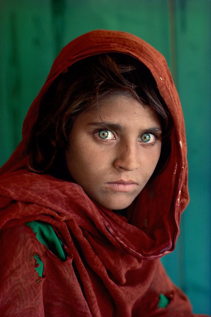
With my image above, we have no eye contact with the photographer (my father), so little connection with the subject beyond his gaze on a family scene. It invokes memories in me because I am one of the subjects, but when I show it to someone who wasn’t there, e.g. my wife, she will only recognise her husband and sister-in-law as she never knew my mother. Any postmemory from the picture would be formed on her imagining what my mum was like using what I have told her over the past 20 years as context. In considering the other gazes introduced in the notes, the averted and direct gazes are perhaps the ones where I have experienced powerful reactions. For example, in Dorothea Lange’s famous Migrant Mother, the subject is looking past the photographer as if not noticing their presence. Her children are facing away so that their faces are obscured, which adds to the intensity of our reaction to her situation. We know that Lange was part of a group of photographers that were specifically hired to depict the impact of the Depression on rural people migrating to the more populated towns and cities, so the images are deliberately trying to tell that story of struggle. However, in this image I find myself asking more questions about how Lange felt when shooting this picture. I attribute this sensation to the lack of eye contact with between subject and photographer, creating a sense of ‘being observed’ or ‘attempted understanding’. When the gaze is direct, as in Steve McCurrry’s famous Afghan Girl (below), the connection between subject and viewer is direct, almost bypassing the photographer.
Afghan Girl (1984), by Steve McCurry[3]
It’s so intense that the viewer feels directly connected with the unhappiness and distrust that her expression appears to convey. The gaze is emphasised by the girl’s intense green eyes which immediate create a sense of pride and defiance toward her situation and when considered in terms of the importance of the colour green in Islam [4], the image has many narrative layers. For me, the main difference is the seemingly absent sense of the photographer’s gaze in the image when compared with Migrant Mother. The observed element of the picture is missing because the direct gaze between subject and viewer is so vivid.
Keith Roberts – There Then, Here Now (n,d)
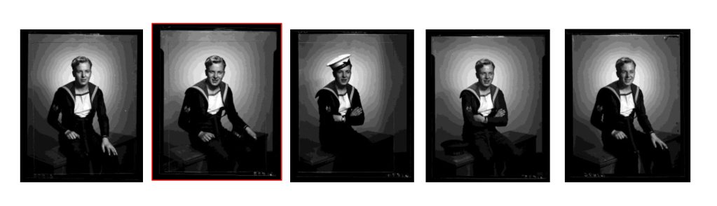
In his paper about a project he undertook with Edward Chambré Hardman’s archive of portraits that we have already discussed, Keith Roberts discusses the Hirsch’s concept of Postmemory alongside Svetlana Boym’s ‘The Future of Nostalgia”, first published in 2001. Boym takes the idea of nostalgia and breaks it into two forms, restorative and reflective. The former is related to a memory either real or passed down via a direct connection. For example I have a reflective memory of my late mother in the context of events such as decorating the Christmas tree in the photograph above, even though I cannot remember that precise occasion. A restorative memory would be more about the lives of my family during that period and the time that has passed since, with details contextualised in everything from the Western notion of ‘family’ to the Christian celebration of Christmas and all the traditions that go with it. For Robert’s project, he was using the groups of portraits of WW2 servicemen and women in Hardmans’ archive to explore the creation of Postmemory and the two forms of nostalgia within an exhibition of carefully selected images. The paper introduces the project but doesn’t discuss the outcomes beyond an interesting case study that emphasises the use of ‘gaze’. In his study of 5 images of a naval serviceman called Billy Walker, Roberts was able to first identify the image that Hardman had selected that best represented Billy (shown below with the red border). Secondly, he considered that image within the complete set.
From the paper There Then, Here Now, by Keith Roberts [5]
Here we see Billy Walker shot in a number of different poses in his uniform. One of the shots has him wearing his naval hat, but the rest do not. He is smiling in each shot but only in the one that Hardman selected is he looking at the camera. When I look at this shot I consider my own family history with that period and in particular my awareness that so many servicemen were very young as Billy appears to be (he was 27 when he was killed a year after these portraits were taken). His happy looking demeanour contrasts with my own restorative nostalgia in postmemory regarding that period and his direct gaze makes my ‘investment’ in creating that memory more powerful than with the images where his gaze is diverted. Perhaps this was why Hardman, who was obviously experiencing the horror of the war at that time, thought this image was the best likeness of Billy and selected it for him and his family to own. Roberts contacted a direct descendent of Billy’s to explore whether his reflective memory, handed down through the family matched the restorative memory of selected photograph and to understand how it might differ. The copy of the paper the I have doesn’t reveal the answer, but the question is definitely interesting in the context of this project.
Conclusion
What has been interesting about this project is the idea that our memories can be an assimilation of stories and personal anecdotes passed on and developed over time, as well as formed through cultural context and classical documentary. The viewer connects with the subject in the portrait in some way and subconsciously uses this assimilation to ‘invest’ in the narrative. I think ‘invest’ is the perfect word for this process as it ties in with Barthes’ position on the effort the reader has to put into the narrative creation of what is essentially an assembly of cultural texts; see ‘Death of the Author’. The idea of reflective and restorative nostalgia for me emphasises the theories on post-structuralism where postmemory can be attained by a seemingly random set of ‘other people’s memories’ or cultural assertions. The intensities of these memories is heavily influenced by the gaze or gazes within a portrait as demonstrated by the comparison of Migrant Mother and Afghan Girl. Both are powerful, but in my case the direct connection with the eyes in the latter almost suspends my acceptance of it being a photograph. When I consider my response to it, I think there is both reflective and restorative nostalgia at play owing to the fact that conflicts in Afghanistan have been happening throughout my lifetime and still continue today. The connection to the gaze reminds me how young and vulnerable this girl looks at first glance, despite her probably not wanting to be represented that way. For me, this ‘memory’ invokes a reflective nostalgia both from news coverage and from my own childhood. In the photographs that have been studied here, gaze could almost be considered the volume control for the level of engagement with the subject and the subsequent postmemory that results from it.
References
[1]. Berger J et al, 1972, “Ways of Seeing”, quoted p18, para 1, Penguin Modern Classics
[5] Roberts K, Date Unknown, “There Then, Here Now – Photographic Archival Intervention within the Edward Chambre Hardman Portraiture Collection (1923-63), Academic Paper courtesy of Academia.edu, Subscription Download