Protected: Assignment Two: Vice versa
Enter your password to view comments.

“If you’re Black, stand back;
If you’re Brown, stick around;
If you’re Yellow, you are mellow,
If you’re White, you’re alright”
American Nursery Rhyme, author unknown [1]
As nursery rhymes are generally created for children to recite as a way of learning, the first reaction to the above rhyme from the US, which is still in existence today, is one of shock. What the rhyme symbolises is the common perception of racial division around the world which describes a simple colour categorisation into which everyone is placed. This simple idea became the root of ‘colourism’, whose origins date back to the days of colonialism and slavery. Black people were considered the underclass, had little in terms of education, were treated inhumanely and enslaved. The people that fitted into the Brown and Yellow categories were treated better respectively, with the White people being the originators of the scheme and as a result, the superior race. Despite the progress over the past 200 years, colourism still exists at a subconscious level in the way that some people view others of different ethnicity. A modern example was the casting of the film Straight Outta Compton (2015) which told the story of the up and coming rap scene in 1980s Los Angeles. The casting team categorised women who were potential extras in the film by grading their skin tone, which drew widespread criticism when it became public[2]. This identification and classification of non-white people exacerbates the tensions around racial equality and civil rights, which today is perhaps most widely epitomised in the media coverage of atrocities such as the murder of George Floyd by a white police officer in Minneapolis.
With her work Humanae, Angelica Dass wanted to show how much variety there was in skin colour across the world. Born into what she describes as a ‘colourful Brazilian family'[1], Dass affectionately refers to the chocolate, cinnamon and bronze tones of the members of her family. Growing up, Dass only really encountered colourism outside of her native Brazil.
Humanae is an unfinished work comprising of many thousands of portraits, all shot in the same way as Dass travelled the world. Her volunteer subjects are shot as head and shoulders only against a plain background, with the photographs cropped as squares. Dass then worked in post production to take a sample of the skin colour from a small region of the subject’s nose to gain their tone. She then used the international Pantone colour grading system[3] to change the background to match the subject’s tone, including the reference code as part of the image. A couple of examples can be seen below.

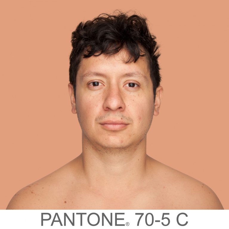
Here we have two images of very different skin tone. What’s immediately obvious is that neither conform to the conventional Black, Brown, Yellow, White ideas of colourism. By altering the background colour, Dass draws our attention to the subtlety of the skin tones from shot to shot. The inclusion of the Pantone code gives us another anchor of difference but also a sense of the scientific. She is almost suggesting that the classification of colour has been done by a professional body, and that the classification is far from simple when attributing it to how people look. Dass has many thousands of pictures in her collection now and has been experimenting with how to present it to the world. By her own admission, the traditional presentation in a gallery isn’t really something she feels she fits within, allowing the viewers to choose to engage with the work or not. As a woman of colour, Dass connects more with confronting the audience with her work, so one exhibition was as billboards in the streets of major cities. This way, the audience is presented with the photographs as a matter of daily life. The effect of pushing the narrative of the complex differences in our appearances is more powerful when it cannot easy be ignored.
I found out about this work on social media a couple of weeks ago. With the completion of the exercises in Part 2, I was drawn to the use of subject and background as effectively a reinforcement of one another. The large expanse of the same colour as the skin tone makes makes me really notice how subtle the differences are between cultures, but also people within the same.. I really connected with the use of textual context in the shots too, the Pantone codes joining the series together as well as reinforcing the narrative. I can see other opportunities for the application of backgrounds this ways, for example contrasting perspectives on gender and age, social standing and materialism, sexuality, values and principles. It’s something I will explore elsewhere in this unit.
[1] Unfinished Community, 2020, “Angélica Dass’ Humanae Project”, Youtube, https://www.youtube.com/watch?v=d1ro85RwLiE
[2] Bagalini A, 2020, “Colourism: How skin-tone bias affects racial equality at work”, Weforum Post, https://www.weforum.org/agenda/2020/08/racial-equality-skin-tone-bias-colourism/
[3] Unknown, 2021, “What are Pantone Colour Systems”, Pantone.com website, https://www.pantone.com/uk/en/colour-systems/pantone-colour-systems-explained
[4] Dass, A, 2012, “Humane”, Image Resource, Artist Website, https://angelicadass.com/photography/humanae/
Following on from Exercise 3, we consider the idea of an artificially created background, the kind of which would traditionally be used in a studio environment. Studio can mean many things from a dedicated space in which professional lighting equipment and assistants work to shoot the picture, to a small corner of a room with a plain wall and some form of light source that works with the subject. My own experiences of studios tend towards the latter, with impromptu setups used to complete an assignment or project. I have the lights and equipment to shoot ‘businesslike’ portraits, but this post is about the use of such setups to create a series of pictures that reveal more about the subject than perhaps more clinical work.
Penn’s series Worlds in a Small Room makes use of a space in a room that has a background dressed for the portraits. The subjects are all shot within a small space with Penn not really trying to hide the fact that it’s a temporary studio. Penn used this temporary arrangement to then travel the world photographing people within his controlled setting. This approach offered Penn, who described himself as an ambulant studio photographer, a space that was both private and a known quantity. Although he used natural light for the portraits, he was able to control the highlights and shadows between shoots. The effect act it had on his subjects was one of neutral territory. Penn described his early engagements with some gypsies during a trip to Spain in 1964:
“The studio became, for each of us, a sort of neutral area. It was not their home, as I had brought this alien enclosure into their lives; it was not my home, as I had obviously come from elsewhere, from far away. But in this limbo there was for us both the possibility of contact that was a revelation to me and often, I could tell, a moving experience for the subjects themselves, who without words—by only their stance and their concentration—were able to say much that spanned the gulf between our different worlds”
Irving Penn[1]
As the shooting progressed, both parties became more comfortable with each other. The resulting portraits reveal the subjects in a way where the background context doesn’t really add anything to distract the viewer.
However, the idea that Penn’s studio was a neutral environment was challenged by scholar Jay Ruby at Temple University in 1977 [2]. He contended that the act of getting the subjects to relax was actually Penn asserting his control over the shoot. The studio, the arrangement of the camera etc were all the domain of the photographer with Jay suggesting:
“Stripped of their defenses these strangers would be free to communicate themselves “with dignity and a seriousness of concentration ” (p. 9). There is a fundamental flaw in Penn’s logic. While he was out of his culture in the sense that he did travel to these various locations, he always rented or constructed a studio to work in. The studio environment is one where Penn is clearly at home and totally in control. As wielder of the technology, Penn was literally calling the shots. The use of the portable studio offers a consistent background to the pictures that, like Evan’s Subway pictures, almost normalises the images in the series so we are no longer looking at it”.
Jay Ruby, 1977 [2]
When we think about this view, it’s the main issue with any kind of studio environment. I recall my own experiences of an art nude course that I did with the Royal Photographic Society in 2014. I had never done anything like it previously and my nervousness was a combination of operating professional lighting, directing a model and, of course her being nude. At the start of the course, my fellow students and I approached the shoot almost as children, asking the model for her help in posing and the tutor in terms of camera settings and lighting positions. With the increased confidence as the day progressed, we started to dictate the direction of the shoot. In my case, I started to break the composition rules that we had been told about regarding classic art nude photography, the two main ones being the model directly looking at the camera and smiling. The shot below is the picture I took that broke these rules, which the model was entertained by, but the tutor less so.

The point that I am making is that I have sympathy with Ruby’s viewpoint, but at the same time, Penn’s series documents the people of different cultures, some of which have either declined or may even have disappeared over time. Penn was fascinated with capturing and representing these people without any influence or interference. For me, the series works and is a great example of where to place the emphasis in portraiture.
With Strand’s series Gone Astray, we have something similar to Penn’s work in the use of a single studio backdrop. In this work, the subjects are young people who look at first glance as if they have been brought into a studio to be photographed ‘as is’ by Strand. When we look closely however, we see that the subjects each have some kind of damage, either to themselves or their clothing that asks us to question how the series hangs together. Is it a series of random people that the artist has coopted to be in the photographs or is it a carefully controlled series of contextual elements that tells a story of the disaffected urban youth? The answer is, of course, that each image is staged as a series of cosplay situations with the props, clothes and poses being carefully stage-managed. Examples from the series can be seen below:
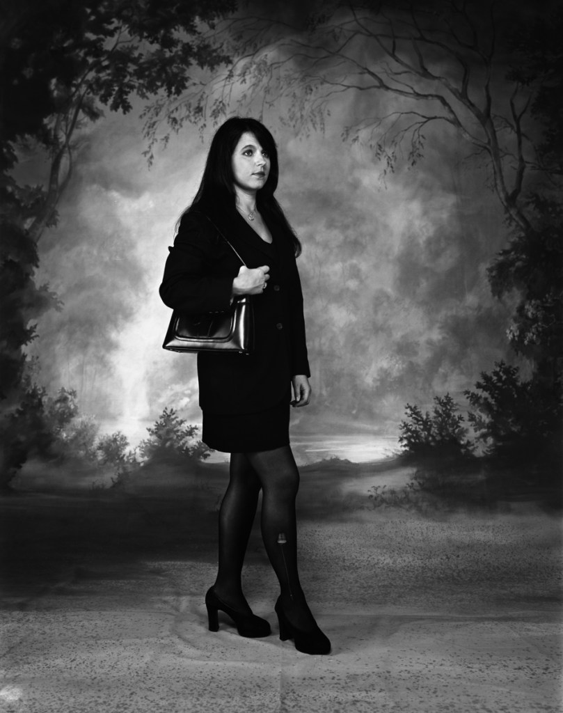
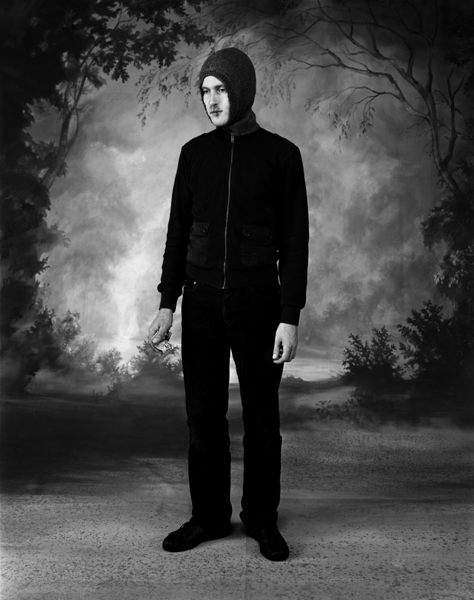
In both shots, the studio is used in the same way with the lighting adjusted between shots. The first picture shows a professional woman posed as if she is walking, perhaps to work or a meeting. Her professional suit is marred by a small tear to her tights, which is the ‘damage context’ for the photograph. For me, the way that Strand poses the model and her expression suggests some form of masquerade where the outer projection of confidence is flawed by the imperfect appearance of her outfit. Her expression though feels crafted by Strand, but this sense is revealed when we look at the images closely and for a time. Her use of context is all about the model, while the contrasting backdrop provides a more obvious thread that runs through the series. The same is seen in the second image, which this time is of a young man in a hoodie top, holding some folded money. This aesthetic is more in keeping with what we associate with inner city youth culture. Societal prejudices and media portrayals of young men dressed this way create a sense of being threatened. The inclusion of the money suggests perhaps some illegal activity where cash-only transactions are commonplace. Perhaps the suggestion is that the man deals drugs, which is a narrative that is supported by the other contextual elements in the scene. When we look closely, we see the flaw which is a cold sore on the man’s lip. Cold sores are a strange viral condition that affects people of all ages and social standings and are exacerbated by lifestyle, hormones and even simply being exposed to excessive sunlight. Here then, Strand is including a contextual element that both supports and contradicts the idea that this man is a mere hooligan. If we relate to the cold sore as a sufferer, we could then see the man out of another contextual situation. Perhaps he’s buying something else with his money. If he was set in a chemist, it would make complete sense that he would be buying medication for his condition.
In the same year, Strand completed a second part to the Gone Astray series, called Gone Astray Details. In this series, the duality of inner-city life and rural is much more subtle, with the compositions being much more surreal. An example can be seen below:
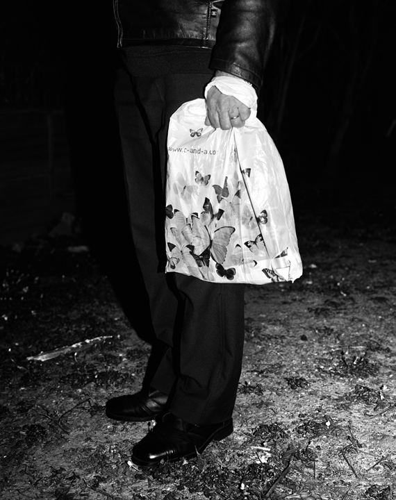
Here we have a portrait where Strand has dispensed with the studio background and instead shot in a natural environment. The man is standing in what looks like a gravel or well-trodden pathway where the only signs of vegetation are trampled sticks. The hint of the rural is overwhelmed by the smart, city attire of the man which makes him look like he’s not out hiking in the country. The inclusion of a small part of the informal jacket raises questions about who this person is in the context of this composition. Strand further includes a carrier bag decorated with butterflies which adds a contrasting element to the image. The butterflies juxtaposed with the bag, which looks like it’s made of plastic, points to the conflict of the natural world vs. the city. This work and the others in the series mixes the ideas of studio and street photography as the composition has both a sense of being ‘captured’ and lit by artificial light (the flash reflections in the shoes). When paired with Gone Astray Portraits. it’s clear that Strand is not being governed by a particular style and almost challenges us to question what is going on, both aesthetically and from a visual perspective.
I really like the combination of natural and artificial in both of these artists’ work. With Penn, the concept of moving the studio around the world to access a variety of cultures is interesting, achieves a consistent series of images that are anchored by the setup and reveal something of the natural personalities of the subjects. However, I agree with Jay Ruby’s view that the narrative is being controlled to a large extent by the photographer. With this perspective comes the sense that we are viewing different cultures as we might view a museum exhibit. I was reminded of my visit to The Horniman museum on Forest Hill, London [5]. Frederick Horniman’s vision was to collect and exhibit artefacts from around the world to better educate the poor and disadvantaged in Victorian society. The museum is perhaps best known for its extensive taxidermy exhibit which contains many species of animals from all over the world displayed by genus. It’s a fascinating exhibition which invokes feelings of Darwin’s documentary of evolution. However, when I visited I could only see the specimens in the context of their small differences intra-species, that is the way that their are only small changes that took many years to become noticeable. For me, Penn’s series is like this. It feels like the subjects are merely placed in a display cabinet. In contrast, I find Stand’s work more interesting. She places actors in an identical scene and tells a story that is clearly constructed, but also rooted in a perception of inner city life for younger people. Her use of obvious and subtle context to both support and conflict with our prejudicial assumptions about her characters leads me to want to look at the images more and more closely. Her use of the Dick Whittington-esq background is surreal but serves the purpose of anchoring the series as well as suggesting that the countryside is the nirvana that everyone aspires to. Clearly this is not the case for everyone, but again it plays into the hands of the media portrayal of the countryside being somehow better. I think that this sense of conflict and contrast is what I will take into my series for Assignment 2.
[1] McLaughlin T, 2015, “Classic – Worlds In a Small Room”, Image On Paper, https://imageonpaper.com/2013/07/21/review-worlds-in-a-small-room/comment-page-1
[2] Ruby J, 1977, “Penn: Worlds in a Small Room”, Temple University Paper, https://repository.upenn.edu/cgi/viewcontent.cgi?article=1048&context=svc
[3] Strand C, 2003, “Gone Astray Portraits”, Artist Website, https://www.clarestrand.co.uk/works/?id=100
[4] Strand C, 2003, “Gone Astray Details”, Artist Website, https://www.clarestrand.co.uk/works/?id=101
[5] Unknown, 2021, “Our History”, The Horniman Museum website, https://www.horniman.ac.uk/our-history/
Project 2 deals with a more complicit relationship between subject and photographer, placing the emphasis firmly on collaboration between the two.
From the course notes, page 10
Harry Callahan was a hugely influential photographer who’s work spanned some 50 years and crossed many genres. He is well known for his often abstract architectural photographs, his early use of colour slide film technology, and his portraits of his wife and daughter. The course notes refer to his large format portraits of his wife and their daughter Barbara set in huge, open landscapes which I’ll look at first. However, Callahan was an experimental photographer who essentially shot a particular subject type with a particular camera until he got bored and moved on to a different combination of both. In a television interview in 1981[1], Callahan said:
“What I’m trying to say is that when I got tired of one thing and, I wasn’t functioning properly, I would move to something else. If I had photographed nature, I would go to the city and after a while, when I felt that I was dead in the city…I would go to photograph people”
Harry Callahan speaking in 1981[1]
Callahan saw his photography as being development of experience but not a linear path where he constantly ‘improved’. He felt that he could look at his earlier work alongside his most recent and see them as different but equal. I found this interesting because as well as his large landscape images of Eleanor, he shot some double exposure nudes of her where subject and background are combined. These shots combine identity and place in a contrasting way to the other series. I’ll look at these ideas of identity and place secondly.
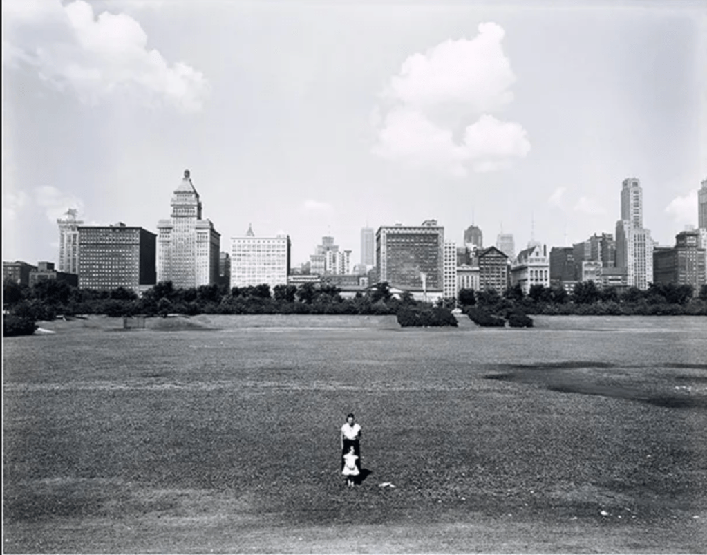
In this photograph we see Callahan’s wife and daughter standing in the foreground of a wide cityscape. They are posed centrally, facing the camera, with Barbara standing directly in front of her mother. The skyline of Chicago is on the horizon, a considerable distance behind the subjects and it is noticeable that there aren’t really any other features in the frame between the foreground and background. When I look a this image and the others in the series, the first thing I notice is the lack of detail in Eleanor and Barbara themselves. The perspective that Callahan used renders them small and almost without detail, while the scale of the overall image is emphasised by his use of a large format camera to make the shot. Chicago appears as a looming presence with the implication of bustling and overcrowded life going on there. The vast space that the subjects are standing in gives a real sense of isolation from the crowded city. What is not immediately obvious is anything about the expressions of Eleanor and Barbara. This is where the questions around narrative arise. What are they thinking about? How do they feel about their surroundings or the act of being photographed, which they are more than aware of? The distance between photographer and subject and then background makes the series ask questions about the subjects’ places within the space while looking more like a documentary about Callahan’s family. Most people take these sort of staged portraits when they are enjoying a family day out or a holiday but in this series, Callahan teases the viewer with what the pictures are about. The inclusion of these contextual points e.g. the two small figures and the vastness and relative emptiness of the background, anchors the series together but also leaves plenty of space for the narrative to form.

In this shot, we see Callahan blending portraiture with background in a different way. The double exposure of Eleanor in this shot serves as a canvas for the background detail, in this case a shrub or tree. Elements from both exposures interact with each other which leaves us with a sense of not really knowing what the picture is about beyond being a nude of his wife. The combination of Eleanor’s natural female shape and the natural arrangement of the branches in the environment point to Callahan’s observation of the beauty of both. It’s known that his nude photographs are mainly of his wife because as he stated [1]
“I didn’t feel that way about anybody else and she was good at it in the sense that she cooperated”.
For me, both types of portraits are constructed for different reasons and achieve different narratives. The former highlights the almost transient nature of people and in Callahan’s case, family as the move through landscapes that they have little apparent impact on, where the latter highlight the ways that natural beauty can be found in both. With the latter photographs, Callahan blends the two ideas of indoors and outdoors by using double exposure. While he’s not the first or only photographer to join these two senses of place together, his photographs are certainly thought-provoking.
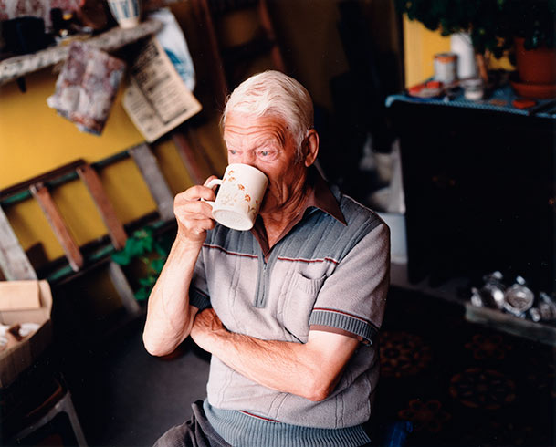
With his work For Every Minute You are Angry You Lose Sixty Seconds of Happiness, Germain was inspired by the simple, yet content life of an elderly widower called Charles Snelling. Germain became interested in his subject because of the way that Snelling made his home brightly coloured and cheerful as well as going about his daily life with a very positive outlook. Germain described Snelling’s way of life as ‘an antidote to modern living'[3] because of the way that he found happiness in things that were often of little or no cost. This idea of happiness being disconnected from wealth, status or the pursuit of ‘achievement’ is something that I find interesting as someone who has struggled with their mental health. Life is dominated by pressure to ‘get on’, to earn as much money as possible and acquire a commensurate amount of stuff to go with it. None of that personally makes me happy and when I think about it, the happiest people I know are not bogged down with these goals. As well as being a powerful theme to the project, Germain entered Snelling’s life and spent lots of time getting to know him and his routine. In the three photographs below, we see the mix of styles that Germain used to reveal Snelling’s attitude to life.
From the series For Every Minute You are Angry You Lose Sixty Seconds of Happiness, by Julian Germain, 2005[3]
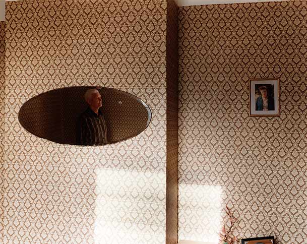
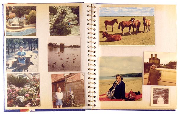
In the first image, we see Snelling drinking a cup of tea or coffee in what looks like his garage. He is lit by what could be either a studio light or by a large window, the light picking him from the background. His body language and expression appears entirely natural and the fact that he is not looking at the camera reinforces the sense that he is deep in thought. He looks contemplative and relaxed which, when included in the rest of these series, supports the narrative suggested by the title. The second image is very different. Now we have a change in location, with Snelling’s vintage decorated living room. He is shown as a reflection in a large mirror with the only other physical context in the frame being a portrait of what we assume to be his wife. This abstract composition suggests reflections on the present and the past, with Snelling’s expression again being completative. The theme is about being happy, but in both of these images he is not smiling or forcing a positive outlook. The sense of well-being is created by the sunlight that is streaming onto the wall through an unseen window. Germain’s presence doesn’t seem to affect his demeanour which suggests that he is comfortable being posed or captured candidly. We cannot be sure about how these two photographs were created, but the aesthetic certainly supports the idea of the photographer being part of the subject’s life. The final image is more of a mix of media for the series, which is repeated throughout. Instead of Snelling being the specific subject of the photographs, his life is documented instead. In this case, a page from one of his photo albums is shown which includes pictures of him but are mostly of his wife. The inclusion of this particular photograph supports the narrative of his life without his wife, but also for his love for her. While this unit of the course has been focused on portraiture and situation, this photograph reminded me that it’s important to include other context in the series if it supports the narrative.
I really like this series because Germain’s style adapts to elements of his subject’s life which strongly suggests that he really got to know him. The series sympathetically tells his story while never becoming kitsch or stereotypical. Snelling is a widower who clearly misses his wife, but at the same time is living his life as he sees fit. The message that we should take the time to notice the elderly also resonated with me.
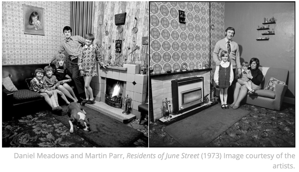
We are introduced to a series created by Daniel Meadows and his friend, Martin Parr called June Street which was shot in 1973. The theme for the series was documenting the homes and lives of the residents of June Street, which was designated as a slum and scheduled for imminent demolition. The artists sought to reveal the lives of the residents as they were before being relocated to modern flats elsewhere in the Manchester area. The images in the series are of different residents and families, composed in a very similar way, in a corner of the main living room of the house. They all have similar key visual elements, namely a sofa or seating, a fireplace or chimney breast and the residents are standing or seated, looking directly at the camera. While they have a familiarity about them, there is no effort to hide what distinguishes the people of June Street. The decor and furnishing of the rooms depends on the age of the occupants, some being contemporary early 1970s and some much earlier. The subjects reflect this by being dressed in fashion for the period that they identify with. In his documentary video about the series[4], Meadows highlights how the details that appear consistently throughout the series resonated with people because they recognised them from their own childhood. He cited the gas fires in the shots as an a example as these were fairly common at the time and the variety of models that appeared in the series meant that people often saw one familiar to them. The series is anchored by the composition, which is always facing the corner of the room. As each house shared similar layouts and features, the photographs take on that connection between them even when the composition is of a different corner of the living room. The subjects themselves are posed formally but relaxed and are engaging directly with the photographers. This gives the sense that not only are they aware, they are invested in the photographs. Perhaps this is because they are about to leave their homes and wanted to see them documented for posterity. Perhaps they wanted to be seen instead of considered a statistic in the regeneration of housing in the area. Meadows goes on to state in the video [4] that they all had anxieties about the relocation ranging from whether they could take their pets to whether they would be allowed to decorate their new flats as before. The photographs in the series not only document the physical appearance of their homes, but when set against their stories we can get an insight into their lives at the time and how much they feared what was coming next. Later, the local BBC News used Meadows and Parr’s photographs as part of a video item about June Street which incorporated audio recordings of interviews with the residents. For me, the result was an article that removed any mystery to the shots, instead creating a straight documentary.
Meadows went on to start a community project called the Free Photographic Omnibus. He bought an old double decker bus, fitted it out to be his home, studio and darkroom and then travelled around the country taking photographs of people he met. Meadows’ idea was to document the cities and towns of the UK, offering to give prints of his pictures to the subjects if they returned to where he was parked the following day. Meadows admitted that he wasn’t interested in taking the details of his sitters, which at the time wasn’t a problem, but became an issue when he reviewed the work retrospectively. In an effort to find some of his subjects, the photographs were published in local newspapers in the areas where they were shot. The response was very positive with people coming forward over 25 years after they were photographed. Meadows then shot the subjects again, effectively evolving the project in a similar way to Edward Chambre Hardman’s portraits[5]. An example of this can be seen below:-
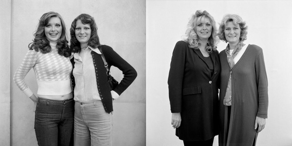
As we learned in Part 1, the pictures don’t serve as a representation of history, merely two points in the lives of the subjects. Here we see the two sisters in similar pose to the original shot. They have aged, but their features haven’t changed significantly and the way they engage with the camera is also very similar. The main difference that anchors the photographs as being from very different time periods is the fashion.
What I love about Meadows’s work in both cases is the what is not included in the pictures; a concept of the extraordinary or celebrity. In both series, Meadows (with Parr) are documenting the lives of ordinary people because they find them interesting. Meadows stated that he wasn’t interested in celebrity as the most interesting lives were the ones that surround us. Both Meadows and Parr have gone on to create work that reveals something about their subjects that most people might miss, while Parr in particular has used the seemingly ordinary people as cast members in his narrative works. For example, his perhaps most famous work The Last Resort is a commentary on the culture of British package holiday in a less than flattering way. Parr uses the people in those photographs as actors who play the part of memories of holidays for people of a certain generation. In doing so, he reveals the idiosyncrasies of the British people that we recognise in other society contexts.
I found this Project inserting from the point of view of the subjects being aware of the photographer but not necessarily posed in a traditional portrait style. Callahan used his wife and daughter in contrast to their surroundings and in the case of the double exposure nudes of Eleanor, his wife was part of the canvass. In both cases, Callahan reveals something about the physical attributes of the composition, whether one of scale contrast or simply the beauty in shape and contour. Germain’s photographs of Snelling are intimate and revealing without feeling like they are staged. Most of the series is deliberately set up by the photographer but at no time does the subject force an expression or look uncomfortable with the photographer’s presence. This is testimony to how well the photographer got to know his subject and the time he must have invested to get so close to him. I loved the use of contextual photographs of furniture and photograph albums to tell the story of Snelling’s love for his wife and the life they had together. This could have been done by photographing him, but was much better served by using context setting images instead. Meadows and Parr’s series about June Street is powerful because it documents a way of life that is about to come to an end. There is no trace of the houses today and we don’t know how the residents’ lives turned out after the shoot was completed. For me, their natural poses and ‘different but similar’ backgrounds make the photographs work together as a series. Meadows’ further work with the Omnibus seeks to reveal the interesting among the ordinary, which is further emphasised in the retrospective view that took place 25 years later. In this last set of images, the background is plain and featureless and it’s all about the subjects themselves. The background context is provided by the premise of shooting from a mobile photographic studio travelling around the country. Each artist approaches their subject differently, but they all place the same emphasis on their personality in a particular setting, whether a chance encounter or being part of their lives.
[1] Unknown, 1981, “Visions and Images: American Photographers on Photography”, Television Interview, Youtube, https://www.youtube.com/watch?v=_LhYs5eq5nw
[2] Image Resource, “Explore the Collections: Harry Callahan”, V&A Museum Website, https://collections.vam.ac.uk/item/O137846/eleanor-and-barbara-chicago-1953-photograph-callahan-harry/
[3] Germain J, 2005, “For Every Minute You are Angry, You Lose Sixty Seconds of Happiness, Artist Website, http://www.juliangermain.com/projects/foreveryminute.php
[4] Meadows D, Date Unknown, “June Street Salford by Daniel Meadows and Martin Parr, Vimeo video, https://vimeo.com/57256051
[5] Chambre Hardman E, 1923 to 63, “Intermission 01”, Image Resource, curated by National Trust, https://hardmanportrait.format.com/2318776-intermissions-01#12
[6] Meadows D, 2003, “The Bus by Daniel Meadows. My photography stories #6”, Video, Photobus Website, https://www.photobus.co.uk/picture-stories/the-bus
[7] Tsatsas L, 2019, “25 Years Later: Portraits of a Generation”, Image Resource, Fisheye Magazine Online, https://www.fisheyemagazine.fr/en/scheduled/curiosities/25-ans-apres-portraits-dune-generation/
This exercise is essentially the same as the previous one, but instead of taking photographs of the same person, here you must make portraits of three different subjects, but keep the background to the image consistent (see Irving Penn and Clare Strand, above). There are many ways of exploring this exercise. You could either select an interesting backdrop to use inside (studio) or perhaps select an interesting backdrop on location (street). Whichever you choose, try to be as creative as you can and be prepared to justify your decisions through your supporting notes.
Again, present all three images together as a series and, in around 500 words, reflect upon how successful this exercise was in your learning log or blog.
Simon Chirgwin, Untitled (n.d) OCA Image Library.
You’ve looked at portraits taken of subjects who are either ‘aware’ or ‘unaware’ of the photographer’s interest. You should by now have thoroughly researched both areas and perhaps found some further examples of your own. Many of the practitioners highlighted here don’t necessarily work exclusively in one of these fields, but move between the two, depending upon what they’re trying to achieve through their imagery. There needs to be a reason for employing a particular method of working and it has been the intention of Part Two to provoke thought regarding what these reasons might be. The next assignment should test this reasoning to the full.
My wife recently competed in the World Triathlon Series event in Leeds, near her home town. This was the first event that we’d attended in over 18 months, so there was a feeling of ‘newness’ about the preparations and procedures that normally accompany these events. My series was shot at the lakeside where the swim leg of the event was being staged.
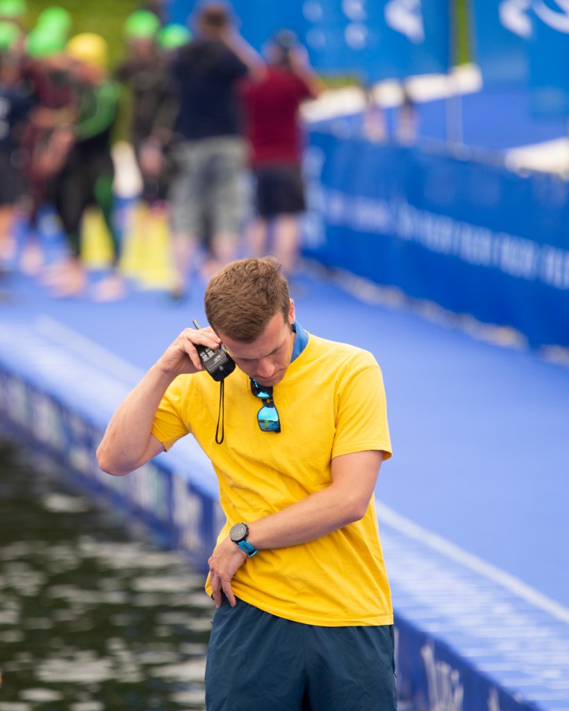
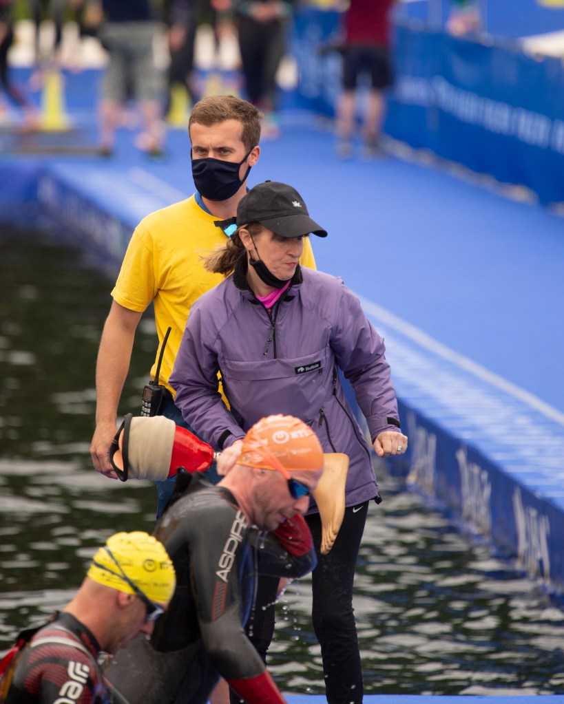
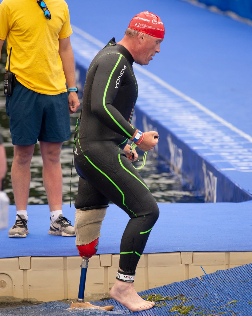
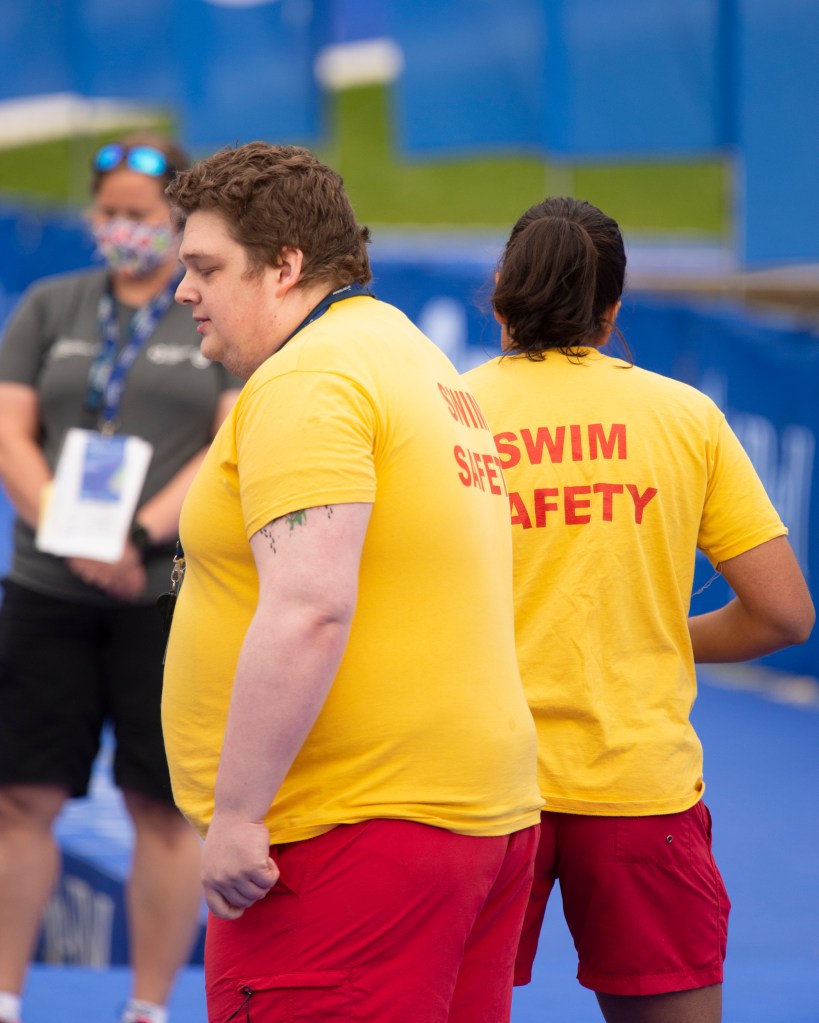
I had the idea for this series because it had been so long since we’d attended an event that I had forgotten how well they are organised. Watching the staff working to get the competitors safely out of the water, I also remembered that the World Tri Series is also a Paralympic qualifying event. I shot these three pictures to reveal how much care goes into the event, whether able-bodied or para-athlete. In the first, we see one of the Swim Safety staff discussing a detail of the event on his radio. I found myself wondering what the discussion was about – was he giving or receiving orders? was he preparing for something to happen at the start or someone to arrive at his station? With this photograph, I was intending that these questions be answered in someway by the end of the series. In the second we see another member of staff helping swimmers out of the water. The original subject from the first is shown in the background, linking this image to the first. The subject of the second is dressed differently to the other staff members and while it’s not clear in the series, she is actually one of the event officials. The questions that this image raise are around why she is standing there. When we look closely, we see that she is holding an artificial leg. The final image shows the owner of the leg who now having refitted it, is heading out of the water for the long run to the transition area. Three brings the series back to the start, with the suggestion that the Swim Safety official was preparing for the para athlete to arrive and to get his prosthetic ready in a way that he doesn’t waste too much time moving to the next stage of the race.
I think this series works because although the background varies from shot to shot, it’s sufficiently similar to anchor the subjects together. I interpreted the brief as the background proving an anchoring reference for the subjects in a way that reveals the connections between them, rather than being a distraction. In Strand’s Gone Astray, the subjects are connected together with their urban appearance and the effect of their perceived lifestyles showing. The background contrasts with an almost ‘Dick Whittington country lane’ feel to it. At the heart of the series, we are still being challenged to look at the subjects, the background underlines a narrative that they are placed within. In my series, the background is not the same in each picture; a few elements change to describe what is going on, but it nothing distracts from the story in the three subjects. The background provides the consistent context as with Strand and Penn’s work, but I have taken a slightly different perspective on its use.
I extended this series with two more images that I thought would further enhance this story. These are shown below in the updated series.

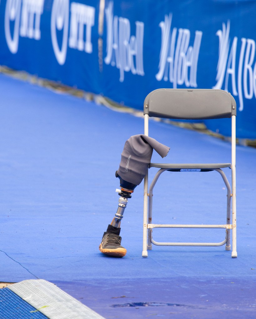
Now we have more in terms of scene setting with the first image, while the final shot links back to the start. The intent was to suggest that this is a continual cycle of preparation and support to all competitors.