
Barthes – Mythologies – The Blue Guide (1972)
We were introduced to Roland Barthes in an early module as a philosopher who theorised concepts of structuralism and post-structuralism. His work The Death of the Author in 1962 challenged the notions of originality through the assembly of familiar cultural references. The author, according to Barthes, is a skilled practitioner in the construction of narratives by incorporating that which the reader uses in their own interpretation, the argument being that the reader has a much larger responsibility in the reading of a cultural text than originally considered. In his book Mythologies[1], a collection of essays on specific cultural myths, Barthes writes about The Blue Guide. The Blue Guides had been, at the time, highly respected travel books for around 150 years and Barthes’ essay discussed how they subliminally group key aspects of the culture of the destination in a way that leads the reader to a number of stereotypes. Barthes used as a top level example, the classification of ‘picturesque’ as being anything that was mountainous or interesting through not being flat. When people then see such a landscape, they can relate to the stereotype of the what they see as being ‘worthy of a picture’. The typology makes it easy to recognise and appreciate something like a mountainous or uneven landscape, but is just as powerful in what it excludes. When I think about it, the word is used to describe all sorts of landscapes that might have attributes that are shared with ‘non-picturesque’ views. For example, a railway line running through the Yorkshire Dales can easily be described as picturesque but view of a straight stretch of track across a flat plain or city would not be considered as such. When was the last time an empty, flat desert was described as picturesque, even though with some drifting sand sculpting the landscape, it can eventually be as such. Barthes isn’t saying that it’s wrong to classify things this way, only that typology in assigning labels to types in this way is a myth perpetuated by the middle class. His essay goes on to look more closely at The Blue Guides and in particular its classification of the types of men and their professions within the different regions.
“We find again here this disease of thinking in essences, which is at the bottom of every bourgeois mythology of man (which is why we come across it so often)”
Roland Barthes, Mythologies (1972)[1]
This quotation, used in the notes, is Barthes’ conclusion from The Blue Guide’s myths about the men of Spain which he bemoans as being taken as truth when read repeatedly. He goes on to criticise the Blue Guides for their further categorisation of Spanish culture, as if grouping its people and professions wasn’t bad enough. According to the Blue Guide, and its bourgeois readership, Spain was seen to be a culture derived entirely from Roman Catholic symbolism. The presence of its many churches, Christian sculpture and architecture are used as cultural attributes in the book which, like the attribution of picturesque, disregards any other reason to find Spanish culture interesting. Like the typology used to describe men and their professions, the impact of other religions on the history of Spain are seen less as a reason to visit, according to the guide. At the heart of the essay, Barthes highlights this as being a myth and warns the reader to be mindful of believing the resulting narratives.
Bernd and Hilla Becher
When it comes to the use of typologies in photography, we are introduced to the Bechers’ famous collections of industrial photographs, in particular Water Towers. The Bechers were conceptual photographic artists who explored the typologies in architecture extensively over many years. Their book Water Towers, published in 1988 is a collection of groups of images of water towers, shot with similar composition and technical aspects. On the surface they appear to be straight documentary shots of industrial architecture, but when we look more closely, the similarities and subtle differences become the main subject of interest.

In this frame of 9 images we see a series of water towers that are clearly different from one another. When we look past the obvious similarities in composition (each being central with the water container at the top edge of the frame) and the lighting (featureless sky, overcast conditions with no strong highlight and shadow), we can see what the collection is about. Each tower is unique in design, but shares the elaborate lattice steelwork in its structural support. Each has a spherical water container mounted on the top with some from shaft to get the water in and out of it. They are all set in a seemingly uninteresting environment, which emphasises their architectural beauty and the smallest details in their design become more obvious the more we look at them. This is an interest or visual tension in the photographs that builds the longer the viewer spends really studying the details. It’s also a comment on the human endeavour with each tower being similar in concept and construction – the idea of best practice or great minds thinking alike is evident. The frame and the rest of the photographs in the book were also contextually set against the backdrop of the modernisation of their native Germany in the post war years. Although the book was published in 1988, the images were assembled over a period which eventually totalled over 40 years. The scale of the work reflects the concepts we were discussing in Project 1, where historical photographs don’t actually speak to history. The absence of any people in the Bechers’ photographs removes the temptation to say anything about the journey that Germany was on after the Second World War, merely that at certain points in time, this is what the industrial landscape looked like through the attribution of a particular subject.
Michael Wolf: Paris Tree Shadows and Tokyo Compression
While I was looking into the industrial architecture typologies of the Bechers. I came across Micheal Wolf’s work Paris Tree Shadows. In a similar way to the Bechers, Wolf created a collection of images with the typology of trees casting shadows onto the Paris architecture. What appealed to me with this work was the use of more creative composition. Two of the series can be seen below:
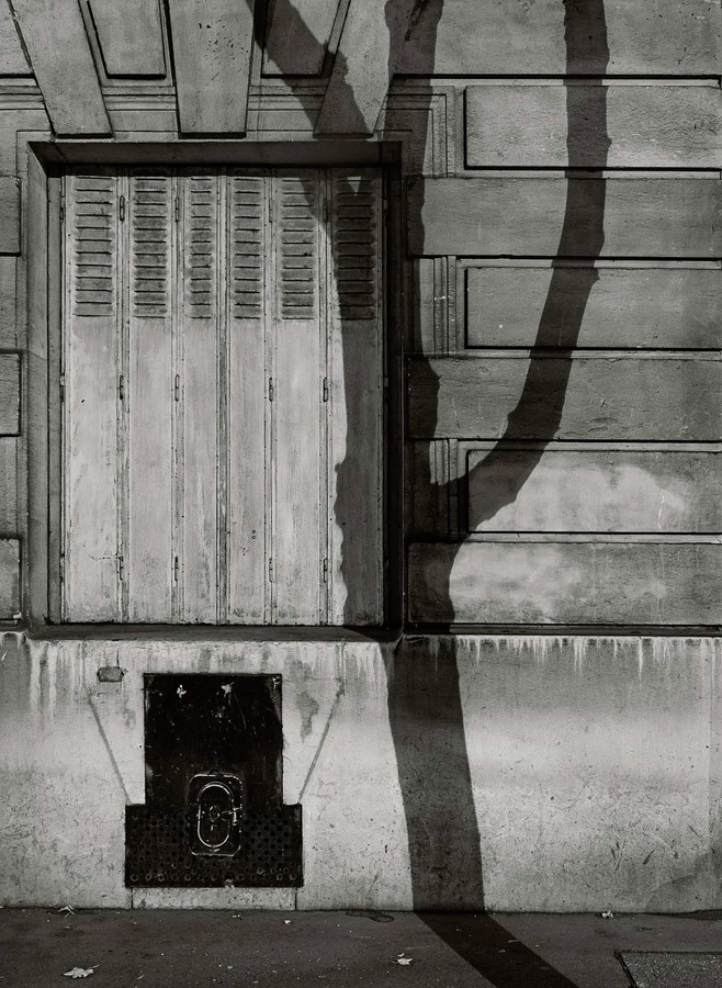
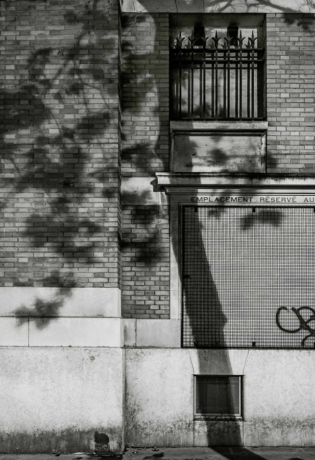
Images 2 and 3 from Michael Wolf’s Paris Tree Shadows [3]
In these photographs we see two portrait compositions of walls that have tree shadows cast onto them. These are part of a collection of 11 photographs that are grouped by a number of typological elements to them. They are all the same format, black and white and shot in bright sunlight to achieve the shadow. Each picture is of a Parisian wall, so they are all cityscapes and each image has texture made up of squares or rectangles; brickwork and stonework feature but so do doorways and windows. The tree shadow runs from the top to bottom of the frame and each is placed almost anchored to a vertical line or feature on the wall behind it. What struck me about the images as a collection was how at first glance they all look very similar as with Water Towers, but after a while the subtle differences between the trees themselves become apparent. Some of the trees are with foliage and some without. Some have multiple branches and some are solitary. This series, like the Bechers’ work, is anchored by multiple references, which make sense but invite more investigation of the subject that is the central player in each picture. We can see a group of tree shadows but we can also see a variety of locations that they are set in. Each Parisian wall is different but has the rigours of the wear of a city on them. Some walls are dirty, some windows need repair and there is evidence of maintenance work being done in one of them. One even has graffiti, which instead of drawing the viewer’s attention from the tree shadow, further emphasises its place in the scene. The images contrast the natural with the manmade in a way that could suggest the former is becoming less impactful on the latter or it could simply be that the organic nature of trees leaves its mark on the precisely uniform aesthetic of a cityscape. Either way, the use of typology in this way gives the viewer a comfort in the familiar by showing them repeated, associated visuals. Like Barthes’s problem with the stereotyping of people and culture in his essay, the typology here is presented to ‘get it out of the way’ so that we can look more carefully at the subjects themselves.
Wolf also worked in portraiture, which we are more interested in here. His series Tokyo Compression was shot in the subways of the Japanese capital after Wolf noticed that on the single line coming into the station, the people were packed into the carriages like sardines. His vantage point meant that he could shoot the commuters through the small windows of the carriages and show them uncomfortably packed into the confined space as they continue their journey. Two of the images from that series can be seen below:
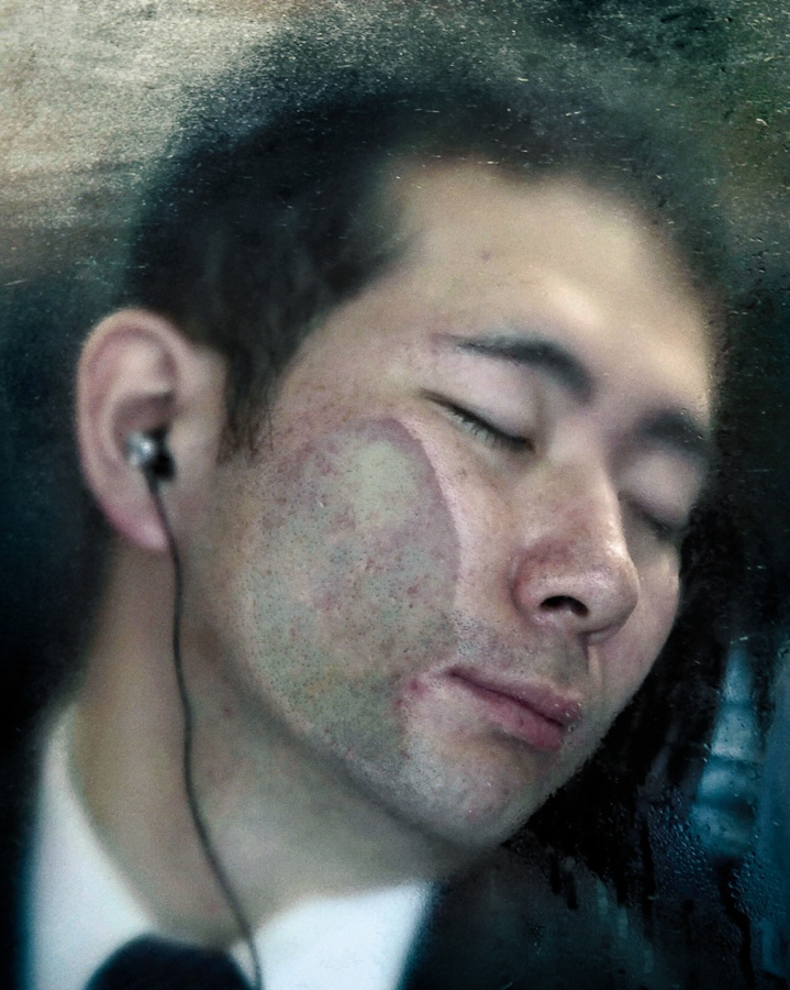
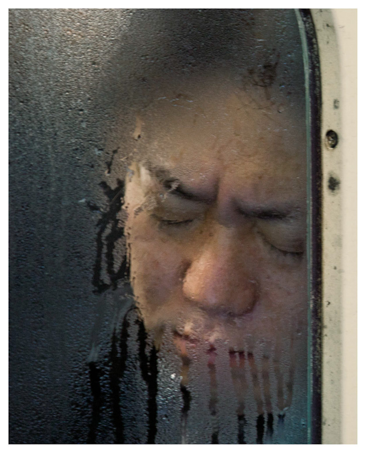
From the series Tokyo Compression by Michael Wolf [4]
Here we see two of the commuters, seemingly asleep during their commute. In a video interview about the series [5], Wolf stated that his subjects looked exhausted and when the train stopped, the ones that were asleep would often wake and be greeted by the sight of him and his camera. Some elected to respond by covering their face or giving a rude gesture at Wolf, while others simply closed their eyes again to block out the intrusion. Whatever their reaction, Wolf’s portraits show the treadmill of life in the megacity that is Tokyo, the people ensuring discomfort in order to get to their destination. The photograph on the left shows the man with his face distorted by being pressed up against the window, but oddly he looks peaceful. How could this be so with what we suspect is an uncomfortable posture? Has he escaped through listening to something through his headphones or is he actually asleep? The photograph on the right shows a similar posture but the expression is one of a frown. Could this man be reacting to Wolf or is his just miserable about his situation. In both images, the view through the misted window emphasises the sense of confinement with others, which is a powerful aesthetic. When I first saw this series, I was struck by the presence of typology but also the many layers of interest in each image, which initially looks like all of the others. Wolf used typology throughout his work with what some would consider mundane subject matter. His ability to reveal powerful stories by gathering photographs that have the same attributes is equally effective in portraiture as it is in landscape.
August Sander (1876–1964)
August Sander was perhaps the most influential of photographers using typologies in his portraiture. His life-long project People of the 20th Century attempted to document the people of the Weimar Republic, which was the German state between the two World Wars. Sander started by photographing his subjects in the environmental context of their profession so that he could then categorise them in those terms. As the project progressed, his portraits became simpler in composition, with the profession being revealed by some contextual elements such as clothing or through use of props. His mammoth project was initially published as the book Face of Our Time. It was Sander’s intention that the book document the people of the state in a structured series of typologies arranged in an almost hierarchical way, trying to describe the rich variety of the culture. Around that time, there was great focus on assigning labels or categories to people based on their physiognomy. Sander fuelled debates about the characteristics of people as described by their physical features and his photographs, with political and academic critics taking their own positions on what is now regarded as pseudo-science[5]. What Sander’s political leanings for the work itself were are unclear, although he was definitely not a right-wing sympathiser. However his desire to ‘catalogue’ the people in terms of their social or cultural position in society played into the hands of those who saw physiognomy in terms of what was high class and what was common. Ultimately as Germany headed for the era of Nazism in the 1930s, Sander’s work was seen as anti-propaganda to the ideal of class and value to society that the right wing pushed. Sander pressed on with his wider project but ultimately the emergence of the Nazis meant the end of publication of his Face of Our Time.
Conclusion
This project has been interesting. When I first saw the Becher works, I couldn’t really see anything other than a group of photographs of the same thing. It almost reminded me of a commercial catalogue where one might be able to buy a water tower, because of the simplicity of the compositions and technical aspects. What I hadn’t realised was that the Becher photographs offer a common view of something that may at first glance seem banal, but actually brings together different regions and environmental elements that describe Germany. The images are as powerful for the subtle differences, almost personalities of the towers as they are for the quality of their production. I was reminded of a painting that I had almost purchased several years ago from a local gallery. It was a modern acrylic painting of a number of cigarette lighters arranged in a grid. Each was depicted in incredible, almost photographic detail and all the same size. The title of the work was 28 Stolen Lighters, which made me laugh as well as think about what was behind this gathering of similar subjects. In what way had they been stolen? Who were the original owners and how did they feel about losing them? When it came to the arrangement, the were all very different in appearance but common in construction. They were disposable lighters with lots of different designs, which told something of the kinds of people they had been ‘stolen’ from. In reality, the artist had borrowed the lighters over many nights out from his friends and neglected to give them back. His intentions were innocent absent-mindedness, but in using their forms as the typology their status as trophies from social encounters took on a different, more sinister meaning. What I’ve seen in the works of the Bechers, Wolf and Sander is an approach that gathers many versions of something apparently banal and tells a story in the variations that asks us to really look closely at the subject. It’s an interesting idea that I had not encountered thusfar.
References
[1] Barthes R, 1957( translated 1972), “Mythologies”, The Noonday Press, New York
[2] Becher B & H, 1988, “Water Towers”, Artist Website, https://www.thebroad.org/art/bernd-and-hilla-becher/water-towers-0
[3] Wolf M, 2014, “Paris Tree Shadows”, Artist Website, https://photomichaelwolf.com/#paris-tree-shadows/1
[4] Wolf M, 2011, “Tokyo Compression”, https://photomichaelwolf.com/#tokyo-compression/1
[5] Brückle W, 2013, “Face-Off in Weimar Culture: The Physiognomic Paradigm, Competing Portrait Anthologies, and August Sander’s Face of Our Time“, Tate Papers No.19”, Tate Website, https://www.tate.org.uk/research/publications/tate-papers/19/face-off-in-weimar-culture-the-physiognomic-paradigm-competing-portrait-anthologies-and-august-sanders-face-of-our-time

Pingback: 2) Project 1: The Unaware | Richard Fletcher OCA Photography Blog
Pingback: 5) Project 2: Places and Spaces | Richard Fletcher OCA Photography Blog