In response to the work of the artists you’ve read about so far, try to create a photographic portraiture typology which attempts to bring together a collection of types. Think carefully about how you wish to classify these images; don’t make the series too literal and obvious.
Once complete, post these portraits on your blog or in your learning log, with a written statement contextualising the work.
Introduction
The brief asks us to consider the artists we have studied so far and their approach to portraiture. The two artists that I was most inspired by in this part were August Sander and Michael Wolf. Sander’s portraits are deceptively simple in their composition, yet they reveal a great deal about the subject through their expression and use of background. In Wolf’s case, his portraits of commuters on the Tokyo subway capture people who are united in their journeys to and from their places or work. Both artists used typology to connect together their portraits in both obvious and subtle ways. Sander was attempting to categorise professions of the people of Germany just as the Nazi party was rising to power. His typologies were factual, but they told a great deal about the social standing of differing professions within society which lent themselves to the fascination with the pseudo-science of physiognomy in the country at the time. While I learned to appreciate how the different elements work together in Sander and Wolf’s portraiture, I didn’t want to simply reproduce the ideas of these two artists for this exercise.
Initial thoughts
Over the past few weeks I have been visiting my local park with my camera with the intent to photograph an elusive kingfisher that visits the lake there. Although that remains a challenge with the bird not putting in an appearance when I am present, I have been noticing a number of other things about the park, its wildlife and the people who visit. The first was that the wildlife has become accustomed to being fed and while not particular tame, the animals are are more readily available to see and photograph. The second was that the same people visit the park every day and how familiar we had become with each other’s presence. In some cases, we engage in conversation and others, a quiet nod to acknowledge each other. I started to think about Assignement 1 at the end of this section, which calls for portraits of people that are unknown to us. These people in the park were indeed unknown to me, but that situation was slowly beginning to change over time. I started to think about the connection between the photographer and the portrait subject. In Sander’s work, the engagement was clear, the subject posing for the shot and looking straight at the photographer. In Wolf’s portraits, the people were being shot often without their knowledge and on occasion, in the cases when they realised they reacted badly. In both, the task of ‘revealing’ the subject was mostly down to the photographer, whether there was a specific typology or not. In the case of Vivian Maier, her street portraiture was shot with little awareness on the part of the subject that a picture was being made. Maier’s use of a TLR camera made this discrete way of shooting invisible to the subject; they simply engaged with the seemingly odd woman standing before them[1]. An example of this can be seen below:
May 1953. New York, NY, by Vivian Maier (VM1953W03398-08-MC)[2]
My Typologies
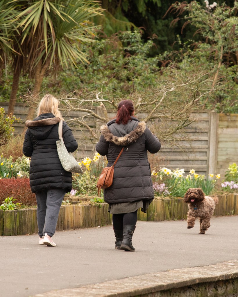
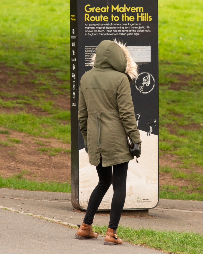
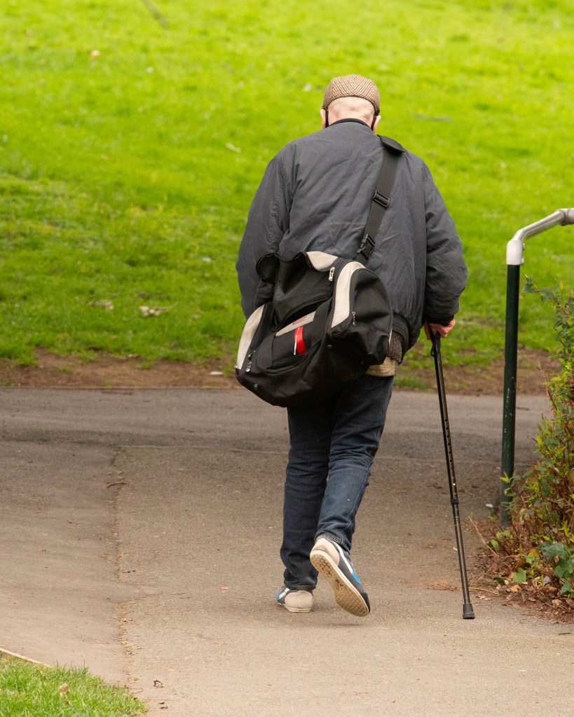
I decided to make my portraits of the people of my local park, but as strangers and from a distance. The intended typology was the fact that they were all interacting with a common space (the park) but were unknown to me or each other. I shot them with the 300mm lens that I was using for the wildlife to create the sense of observation and waited until they were specifically facing away from me to maintain the ‘anonymity’ and ‘stranger’ theme.
The Photographs
One
TwoThreeFourFive
Reflection
With these images I wanted to show the common location of the park through the use of the colour green in the frame. Each has a visual reference to this place, but some people are pausing to interact and some are transient, moving through the space. The park is central to a number of walking routes through the town, so I am happy that images Three, Four and Five reveal this about people moving through the space. It’s also hugely popular with dog walkers, so it was important to include the dog in Three to represent this. Finally, like me people stop to interact with nature so to capture the context of feeding the ducks (Two) and the man with the robin (One) was also important.
I feel that the central typology of ‘strangers in the park’ is clear but not necessarily obvious as there are many other potential typologies for the collection, namely the park itself and recreational activity within it. Overall, I’m happy that the set meets the brief.
Study Sander’s portraits in very close detail, making notes as you go.
Look at how his subjects are positioned in relation to each other or their environment. Are they facing the camera or looking away? What, if any, props does Sander use? Do these props seem relevant or are they strange? What physical stance does the subject adopt?
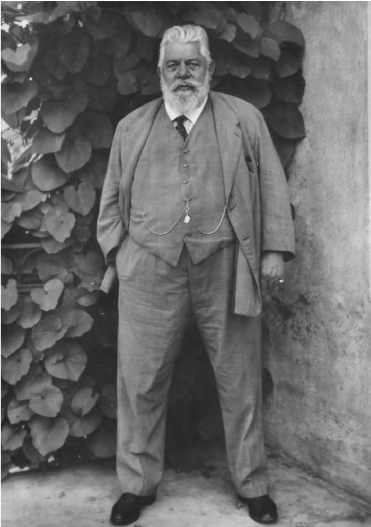
August Sander, Pharmacist, Linz (1931) Image courtesy of MoMA Gallery.[1]
At this point it might be useful to employ the ‘five element model’ as described by David Bate, which includes:
The Face: This can be used to illustrate the feelings of the sitter, given that facial expression can signify a repertoire of different states and moods including happiness, sadness, anger or frustration. It should be noted however that the expressions worn by the face are not necessarily indicative of a fixed state of being.
The Pose: Can be described as a visual argument in itself, or a form of rhetoric. The various body language conveyed by a sitter can be read in combination and can connote all kinds of perceived characteristics. Just as the expression of the face is the rhetoric of mood, so the pose contributes to the signification of character, attitude and social position.
The Clothing: Can be used to indicate a great deal about a sitter’s social identity and how they relate to that identity in their pose. Uniform’s for instance can not only differentiate a factory worker from a police officer, but can also specifically identify rank and the different regiments within the armed services.
The Prop: Can significantly alter the meaning given to the identity of the portrayed figure.
Detail was extremely important to August Sander and the background in his portraits was never left to chance.
Study the backgrounds of Sander’s portraits very closely and reflect upon what you see. Where does the subject sit in relation to the background? If location-based, does the head sit above or below the horizon? Has the background been deliberately blurred through the use of a wider aperture and therefore shorter depth of field? Does the background offer any meaning or context to the portrait?
Make a portrait of someone you know, paying very close attention to what is happening in the background of the shot. Be very particular about how you pose the subject and what you choose to include in the photograph. Ideally, the background should tell the viewer something about the subject being photographed. Reflect upon how successful this project was in your learning log or blog, discussing specifically what your intentions were in terms of the background you chose in your image.
Introduction
For my critique of Sander’s portraits, I have selected the following 3 from his wider project People of the Twentieth Century, shown below:
Part one of this exercise is to closely examine the portraits for the details contained within the composition. I started by looking at each image in turn and annotating what is immediately apparent, using the five element model as a guide. The yellow annotations are my observations about the man, his clothes and his props and the blue annotations refer to the background and setting.
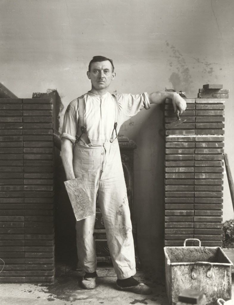
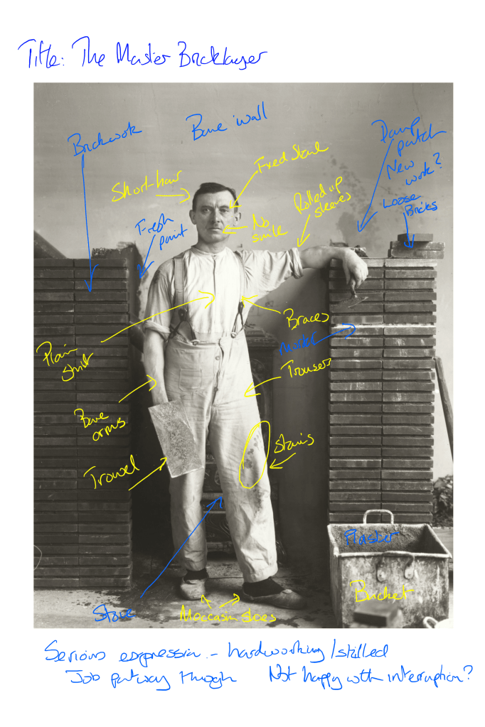
Photograph 1 ‘The Master Bricklayer’, 1932
The Master Bricklayer (1932) by August Sander – annotated with notes from my review [2]
Here we have a man pictured at his place of work. The title refers to him being a master bricklayer but it is also obvious from his surroundings that this is his profession. He is standing in front of a stove between the partially completed fireplace structures that he is clearly building. Both side walls of bricks rise up to shoulder height and the man is leaning on one of them as if emphasising that he had created it. The fresh mortar between the bricks is visible, while the background wall and floor show signs of building work taking place with splashes of what we assume to be water. The man is dressed in plain, functional clothes that bear the signs of a physical trade (creased and with the sleeves rolled up). He is holding a brick laying trowel in one hand and a plasterer’s trowel in the other and in front of him is a large square bucket that looks like it has clearly been used for some from of brickwork or plastering in the past. The man’s stance is one of pride but his expression is of someone who looks annoyed at being disturbed. There is a fixed stare and no smile evident on his face. When I look at this picture I see a man who is clearly a skilled craftsman, standing in amongst the fruits of his labours. The way he is posed in front of his work, leaning with a fairly nonchalant stance on one of the brick pillars shows a pride in what he is doing, but his expression is blank, almost as if he is being interrupted. There is an eagerness to return to what he was doing before posing for the photograph. The main puzzle for me is that he is holding two trowels. The one in his left hand is what would be traditionally associated with mortaring bricks while the one on his right hand is more like a plaster’s smoothing trowel. From this, it appears that the man is more generally a builder but that is not the title that Sander gave him. Perhaps when it came to his typologies, Sander wanted to be more specific than general builder as a profession or perhaps the setting for the portrait presented itself before the subject, i.e. he came upon the man laying bricks. Either way it both classifies and unclassified the man’s profession which makes the image more intriguing as an artwork.
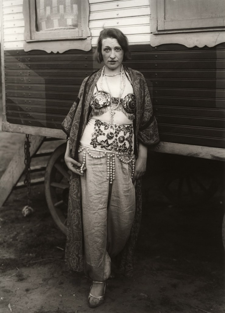
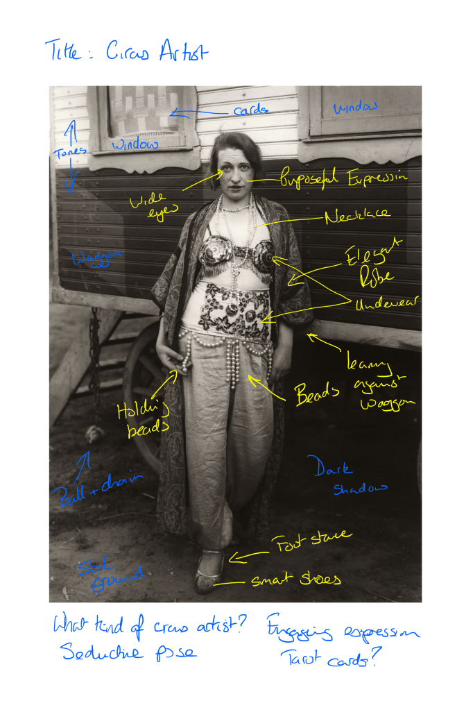
Photograph 2 ‘Circus Artist’ 1921
Circus Artist (1921) by August Sander – annotated with notes from my review [2]
Here we have a woman standing in front of a waggon. The wheel and steps leading into the waggon can be seen in the background, along with two side windows and bodywork that appears to be two different colours. The woman is dressed in loose trousers, an open robe with elaborate under garments and lots of beaded jewellery. Her shoes are smart sandals that look like ballet or dance shoes. Her stance is a relaxed pose, leaning against the side of the waggon with her left hand by her side and her right holding the beads that hang from around her waist. Her expression is one of engagement, as if she wants the photographer to see her in a seductive way. Her slight smile and the way she is standing with her robe open suggests her wanting to invite the photographer into her life in some way. The interesting thing about this image is that we can immediately tell that she is either a gyspy or circus performer of some sort because of her clothes and the waggon in the background. Her specific profession is not that clear, although her outfit, which is provocative for the era, suggests some form of dancer. If we assume that she is a dancer, then her expression makes more sense. As a dancer, she would engage with her audience by facial expression as well as movement so this photograph gives us an insight into her life and therefore her personality. With this photograph though, Sander catagorises her in more general terms than the previous one. As this preceded the previous image by around 11 years, it’s possible that Sander was evolving his project and the nature of his typologies as he was working.
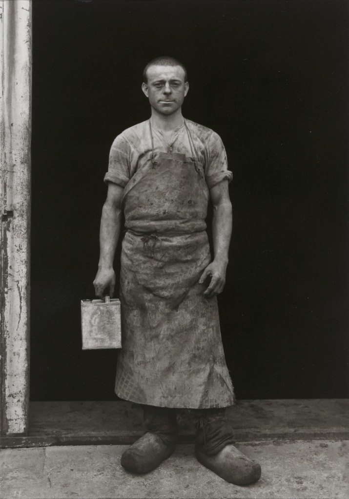
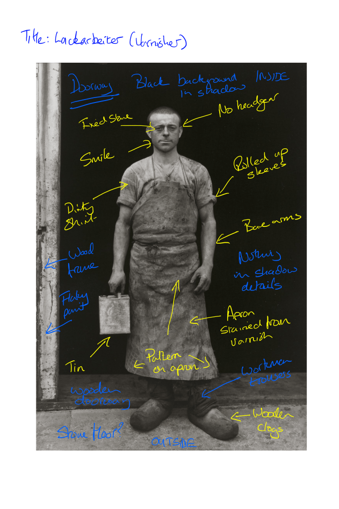
Photograph 3 Lackarbeiter (Varnisher) 1930
The Lackarbeiter (Varnisher)[2]
Here we have another tradesman posing with the tools of his trade. We are told by the title that he is a varnisher, which again shows Sander’s interest in specific typologies as well as more generalised ones. The skill here is distinguished from that of a carpenter or joiner and the what is contained within the image reflects that. The man is standing in front of an open doorway of a building. The interior of the building is in very dark shadow with no detail visible, but the photographed is framed by the surrounding woodwork and area of outdoor ground that the man is standing on. The man is wearing dirty clothing and an apron that covers most of his torso. His clothes point to a man whose profession involves getting dirty and never really being able to keep anything clean long term. As with the first image, the man’s shirt is functional and has the sleeves rolled up in order, we assume to prevent him getting dirtier than necessary. His long dark trousers are almost entirely obscured but what we can see looks functional as one would expect from someone in the building trade. His shoes are interesting, being wooden clogs with no laces. This type of footwear may have been what was worn on a building site of that era, although curiously the bricklayer was wearing less robust shoes in his photograph just two years later. Perhaps then, this skill was less valuable and therefore the people employed in it were poorer than the builders and bricklayers. This detail challenges us to think about the position of the man in society, which was very much what the German fascination with physiognomy and class was about in the 1930s. The man is holding a single prop, which looks like a paint kettle (presumably filled with varnish). The only other details I noted when looking at this photograph were his relaxed stance and expression, which tells of a man who enjoys his work, as well as the condition of the wooden frame of the doorway. The man’s stare is intense but unlike the bricklayer, he is grinning as if the idea of being photographed amuses him in some way. Perhaps he wasn’t used to the attention in his given profession. Whatever the reason, Sander has captured someone who is engaging the camera in a friendly manner as with the circus artist. The detail in the woodwork reinforces the idea that this man works in decoration as the timber looks as though it needs attention. This minor element for me is part of Sander’s creative use of background to create the context for the photographs without the really obvious use of props. His prop use itself is subtle, but the background for me is what makes his images stand out. When we look at the original image in the brief of the pharmacist, the background is a combination of foliage and plain wall. We could interpret the foliage part to be about the man working with nature, which could connote biology just as easily. When combined with the plain wall, the background takes on a level of beauty, suggesting that the portrait has been shot in a classy area. When we combine the background with the subject himself, we see an older, distinguished-looking gentleman dressed in middle-class attire, which suggests a learned or scholarly professional. If I had seen this image without its title, I would have thought ‘doctor’ or ‘surgeon’ from his dress. The subtle use of background and absence of props means that the role of pharmacist is entirely believable.
Part 2 – My Portrait
Concept
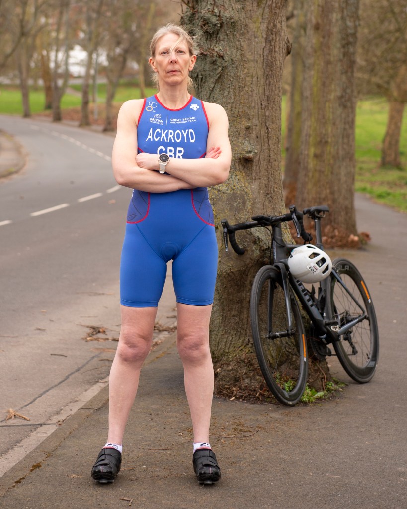
Owing to the current restrictions caused by the COVID pandemic, I decided to shoot a portrait of my wife. This would mean that I didn’t need to work with someone outside of my household during a delicate phase where restrictions were planned to be lifted. The other reason I chose my wife is purely because she has an interesting passion. She is a triathlete who has competed in multiple distances and for the GB age group teams in European and World championships. I planned to use the observations of Sander’s work in this exercise to shoot a typographical portrait of her.
The Photograph
Reflection
The idea for how to shoot this photograph came at an opportune time as Jayne had been asked to provide a picture for a local news article on triathletes who had competed for Team GB. The kind of portrait that the newspaper as after was a simple shot of her in her triathlon suit, smiling at the camera or doing something related to the sport. For my portrait, I wanted to create something that represents her as a triathlete with the background context that would suggest someone who is serious about what is essentially a hobby. I decided to shoot my portrait in a similar style to Sander’s, with her placed almost centrally in the frame and as full-length. As triathlon is a sport consisting of three disciplines with a variety of equipment needed, I was concerned that including too many elements that describe it would be too obvious. Instead, I focused on cycling and wanted to emphasise the competitive side of her personality. Her triathlon suit clearly indicates Team GB and the inclusion of the high-performance bike suggests serious competition. However, the inclusion of the helmet with unrelated race sticker suggests that she competes elsewhere too. I asked Jayne to pose with her ‘race face’ on rather than having some impassive or smiling expression. I selected the location in order to emphasise the ‘racing’ theme; the winding road resembling a track of some sort. The presence of the trees counter this idea but neatly tied in with the weather conditions at the time. We were experiencing very windy weather that had brought down debris from the trees over the past few days. When we shot this photograph, the wind kept blowing her hair across her face. I selected this version of the picture because that effect works with the other elements in the composition to sat that she means business.
On reflection I am happy with the way that the portrait came out. If I take the fact that I know the subject well out of my assessment of the image, I note how she is represented as someone who belongs in the category of ‘athlete’. In this case, the background elements support this notion in a similar way to the circus performer by Sander. My portrait doesn’t show Jayne interacting in any way with her surroundings or the props that are included in the composition. Nevertheless, I think the balance of costume, props and background work well together.
Conclusion
I found this exercise interesting as I hadn’t previously considered how a portrait could use the composition, and in particular, the background to reveal a narrative about a subject. Sander’s work showed that the combining a simple composition with a few contextual elements in the background can result in a powerful ‘representation’ of the subject. His work trying to categorise the German people by professions and social class introduced ideas of how we recognise certain types; the portraits themselves tell what appears at first glance as being the obvious story, but in reality they offer the viewer more to look at. In the case of his master bricklayer, we get a sense of the pride the subject has through both his expression and the inclusion of his work in the background. Both of these elements also suggest that the man is a skilled tradesman, more than the other example included her, the varnisher. In the latter image, the man is far more engaging with the camera but the overall composition gives a sense that this is a less skilled member of society. Both pictures are very similar in composition, but their meanings derived from looking at them are very different. When it came to shooting my own portrait, I was happy that the result took cues from Sander’s work. I portrayed my wife in a way that doesn’t reveal much about her beyond her passion for competing as an athlete, which was the intention.
References
[1] Unknown, “Identity and Place – Part One: Origins of Photographic Portraiture”, Image Resource, OCA Course Notes.
Project 2 concludes with the portraiture work of three other photographers, two of which I have researched for previous modules on this course. Arbus was well known for her almost voyeuristic photography of people she found interesting. Mapplethorpe’s work gained controversy because of his exploration of sexual identity through images that were considered explicit. While I looked at their work from the perspectives of street photography and censorship previously, here I will look at their portraiture in the context of Part 1.
Diane Arbus (1923–71)
In 2018 I went to an exhibition of Arbus’ early work called In the Beginning at the Hayward Gallery in London [1]. The works in the exhibition were of a variety of subjects, from her portraits of the wealthy to the circus freaks of New York. What interested me at the time was the connection that she appeared to have with her subjects. Unlike many photographers, Arbus’s style involved engaging directly with her subject. Sounds pretty obvious when we think about portraiture, but Arbus’ photographs were very much brief interludes into the lives of her subjects; they were almost snapshots of people living their daily lives. Yet, like Sander, she was drawn to particular types of people and contexts. In a video documentary by her daughter Doon Arbus, the photographer Lisette Model described her typologies as being “freaks, homosexuals, lesbians, cripples, sick people, dying people and dead people” [2]. She went on to describe the reason for this darkness being the fact that people were not comfortable looking at these types of photograph. Model believed Arbus to have great courage in her depiction of these marginalised people and to show them as being ‘normal’ in every respect of their lives. This was a point that was famously disputed by Susan Sontag in the chapter America, seen through photographs, darkly in her book On Photography (1973)[3]. Sontag responded to similar claims about Arbus made following her tragic suicide in 1971 at the age of 48 and the subsequent retrospective of her work at MoMA. Sontag’s view was that far from being a sympathetic perspective on the marginalised, Arbus’ style of engaging with the subject so that they looked directly at her or her camera was almost voyeuristically exploitative. When viewed alongside the work of Nan Goldin a few years later, which dealt with some of the similar sections of society, I can relate to what Sontag meant. Goldin was shooting her friends and housemates in a way that not only naturally placed her as an insider, but highlighted the love that people had for each other and for their way of life. Arbus, by contrast posed her subjects in a particular way and although there are stories of her trying to blend in with them , for example she photographed naturists on a nudist beach by stripping off and joining them, Arbus was still on the outside looking at what we all consider to be different. Nevertheless, I reflect on the exhibition in London fondly as she definitely revealed something powerful about her subjects, even if there was something forced in the aesthetic.
Robert Mapplethorpe (1946 – 89)
Much has been written about the controversy surrounding Robert Mapplethorpe. His story of joining a youth culture that centred around the famous Chelsea Hotel in New York, which led to artistic and sexual experimentation, is well documented. His progression into what people considered to be obscene photography or pornography became the subject of a criminal prosecution [4]. Although I’ve looked at his work before and some of these problems that still surround it, I was more interested for this project in looking at how he got started. Mapplethorpe shot many different types of subject, but his portraiture has a definite use of typology running through it.
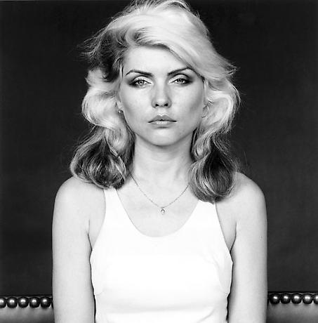
Mapplethorpe started out as an photo artist that produced his work from that of others. The American philosopher Arthur C Danto described Mapplethorpe’s early ‘career’ as being as a photographist [5], which placed him very much in observation of how people were represented by other photographic artists. Danto identified the point at which Mapplethorpe transitioned from photographist to photographer; in 1970, Mapplethorpe purchased a polaroid pack-film camera and began experimenting with it. His early exploration with this camera started with the people and objects that were closest to him, often shooting pictures of his then lover Patti Smith as well as men with whom he would start to explore his sexuality. The resulting photographs started to fall into particular typologies such as self portraiture and his body image. He depicted himself as the rebel or as some kind of sinful creature, as well as exploring how he looked in drag. His interest in his own body became the start of his more explicit work, often depicting his penis as in the famous self-portrait in the mirror [6] and in sado-masochism constume. He started to expand the subject matter to others but still represented his subjects along very specific lines. Some photographs were of his lovers, others of people he picked up of the street, while some explored race and homosexuality and the difference between how bodies look. As Mapplethorpe became more well known and progressed to better equipment, his work continued to follow the representation of cultures and practices that were not regularly discussed or acknowledged by most people. The results were indeed shocking, but for me Mapplethorpe represents originality in what is essentially his documentary of the life he was living and the beauty that he saw around him. Some images are extremely uncomfortable to look at because the sexual act being depicted is not commonplace, but that doesn’t make it any less representative of the world he lived in. His work wasn’t just sexually explicit though, as Mapplethorpe also shot portraits of very famous celebrities of the time. It is here that we see his use of background in a similar way to the previous exercise. Take the example of Debbie Harry, shot in 1978:
Debbie Harry (1978) by Robert Mapplethorpe, The Mapplethorpe Foundation[7]
Here we see the Blondie singer seated on what looks like a sofa staring straight at the camera. The composition is complete symmetrical about Harry’s strikingly beautiful but angular features. What is interesting here is not so much the subject but the background. Mapplethorpe shot this in his studio with a black backdrop, which creates a lot of contrast with Harry’s skin and hair. The dress was apparently light blue which blends in with the rest of the subject’s luminance. The only other detail is the studded top of the sofa which can be seen either side of her. In this one simple background detail, Mapplethorpe creates a sense of what the model is about. Harry’s rockstar looks are reinforced by the metal studs and seemingly leather covering of the sofa. Even though the background occupies a very small region, the effect of it in the image is very strong.
Jason Evans (1968 -)
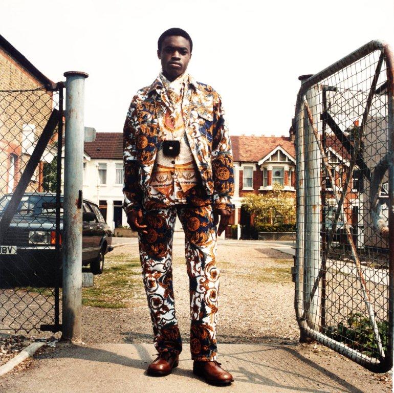
The final photographer mentioned in this section is Jason Evans. His work Strictly with Simon Foxton uses typology and background to deliberately tell a different story to what might be immediately present at first glance. Evan’s project was very much in the fashion genre, working with a well known stylist in Foxton and the photographs are indeed centred around the styles of the clothing used. However, the work is intended to challenge how we typically see the typology of traditional fashion. In the series, the models are all young black British men and they are dressed and styled in what we would identify as being fashion poses. However, the clothes they are wearing are the opposite to what we would expect young people would wear. Instead, the selections of outfits invoke a sense of the dandy, a style that is associated with 18th Century extroverts. The culture of the dandy itself is predominantly white, so by dressing black men in these ‘costumes’, the artist is creating a counter-culture. This distortion is made into a more social commentary by Evans’ choice of backgrounds for his work. Each man is posed in an environment that we identify with as middle-class suburbia. In a video interview with Tate, Evans described the environments as what we think of as predominantly white neighbourhoods [8] and although there is nothing explicit in any of the shots to reinforce this, the contrast between the subjects, their clothing and the environment is striking. Evans and Foxton use typologies such as black youth, stylised fashion and suburbia in a way that creates an unexpected narrative.
From the series ‘Strictly’ by Jason Evans and Simon Foxton [9]
Here we have a young man dressed in a very striking, but smart three piece suit and polished shoes. He is standing in what looks at first like a comfortable pose that faces the camera. However, his hands look like they are not so comfortable as they are held awkwardly by his side. Their appearance suggests that the man is either not comfortable with the clothes he is wearing or having his portrait taken. In itself, the portrait reveals something about the man and contrasts his clothes with his age and cultural status. It’s when we look at the background that the additional context helps complete the narrative. The scene is a Victorian street in what looks like suburbia and there is relatively contemporary car in the middle distance. The man himself is standing in front of an open gate which suggests at first that he has just walked through it towards the camera. This contradiction between the young black man, his dandy clothes and the fenced off community behind him suggests all manner of prejudices and stereotypes about young black males.
Although the compositions share similarities with Sander’s work with the face-on, natural expressions, the context that is brought by the background is much more aligned with the street photography genre. In the pictures, we see the young men in a pose, but was that the interruption of their routine by the artists? Is the contrast between their clothes and ethnicity really a challenge of stereotypes or is there such a thing as a contemporary dandy? If there is, which ethnicities would we associate with them? When I think about these questions, I’m reminded of Julia Margaret Cameron’s combinations of what we can discern from the subject’s appearance with another story that might not be all that it seems.
Conclusion
The work in this Project and Exercise 2 has demonstrated the use of both typology and background to add context to a portrait. Since we all naturally categorise what we see in some way, typology is a tool that the artist can use to lead the viewer to an assumption about the subject, but also to mislead as to the intended meaning. When confusion is introduced into the portrait, the variety of possible narratives about the subject increases. The work of Cameron in Project 1 was pioneering in her use of photography to tell stories about her subjects, but the work of the typology photographers such as Sander and the Bechers helps to remove the obvious and get the viewer to concentrate more on any context that is available. With Sander and his use of backgrounds and costume, we have someone who went on to inspire the other photographers here; Arbus with her fascination with the freakish underbelly of society that nobody wants to think of, Mapplethorpe with his self exploration and breaking of sexual taboos and Evans with his statement on stereotypes in race and class. I’ve found this project to be revealing in that it has prompted me to think more about the story than I would previously have done so when shooting portraiture.
We were introduced to Roland Barthes in an early module as a philosopher who theorised concepts of structuralism and post-structuralism. His work The Death of the Author in 1962 challenged the notions of originality through the assembly of familiar cultural references. The author, according to Barthes, is a skilled practitioner in the construction of narratives by incorporating that which the reader uses in their own interpretation, the argument being that the reader has a much larger responsibility in the reading of a cultural text than originally considered. In his book Mythologies[1], a collection of essays on specific cultural myths, Barthes writes about The Blue Guide. The Blue Guides had been, at the time, highly respected travel books for around 150 years and Barthes’ essay discussed how they subliminally group key aspects of the culture of the destination in a way that leads the reader to a number of stereotypes. Barthes used as a top level example, the classification of ‘picturesque’ as being anything that was mountainous or interesting through not being flat. When people then see such a landscape, they can relate to the stereotype of the what they see as being ‘worthy of a picture’. The typology makes it easy to recognise and appreciate something like a mountainous or uneven landscape, but is just as powerful in what it excludes. When I think about it, the word is used to describe all sorts of landscapes that might have attributes that are shared with ‘non-picturesque’ views. For example, a railway line running through the Yorkshire Dales can easily be described as picturesque but view of a straight stretch of track across a flat plain or city would not be considered as such. When was the last time an empty, flat desert was described as picturesque, even though with some drifting sand sculpting the landscape, it can eventually be as such. Barthes isn’t saying that it’s wrong to classify things this way, only that typology in assigning labels to types in this way is a myth perpetuated by the middle class. His essay goes on to look more closely at The Blue Guides and in particular its classification of the types of men and their professions within the different regions.
“We find again here this disease of thinking in essences, which is at the bottom of every bourgeois mythology of man (which is why we come across it so often)”
Roland Barthes, Mythologies (1972)[1]
This quotation, used in the notes, is Barthes’ conclusion from The Blue Guide’s myths about the men of Spain which he bemoans as being taken as truth when read repeatedly. He goes on to criticise the Blue Guides for their further categorisation of Spanish culture, as if grouping its people and professions wasn’t bad enough. According to the Blue Guide, and its bourgeois readership, Spain was seen to be a culture derived entirely from Roman Catholic symbolism. The presence of its many churches, Christian sculpture and architecture are used as cultural attributes in the book which, like the attribution of picturesque, disregards any other reason to find Spanish culture interesting. Like the typology used to describe men and their professions, the impact of other religions on the history of Spain are seen less as a reason to visit, according to the guide. At the heart of the essay, Barthes highlights this as being a myth and warns the reader to be mindful of believing the resulting narratives.
Bernd and Hilla Becher
When it comes to the use of typologies in photography, we are introduced to the Bechers’ famous collections of industrial photographs, in particular Water Towers. The Bechers were conceptual photographic artists who explored the typologies in architecture extensively over many years. Their book Water Towers, published in 1988 is a collection of groups of images of water towers, shot with similar composition and technical aspects. On the surface they appear to be straight documentary shots of industrial architecture, but when we look more closely, the similarities and subtle differences become the main subject of interest.
From Water Towers by Bernd and Hilla Becher [2]
In this frame of 9 images we see a series of water towers that are clearly different from one another. When we look past the obvious similarities in composition (each being central with the water container at the top edge of the frame) and the lighting (featureless sky, overcast conditions with no strong highlight and shadow), we can see what the collection is about. Each tower is unique in design, but shares the elaborate lattice steelwork in its structural support. Each has a spherical water container mounted on the top with some from shaft to get the water in and out of it. They are all set in a seemingly uninteresting environment, which emphasises their architectural beauty and the smallest details in their design become more obvious the more we look at them. This is an interest or visual tension in the photographs that builds the longer the viewer spends really studying the details. It’s also a comment on the human endeavour with each tower being similar in concept and construction – the idea of best practice or great minds thinking alike is evident. The frame and the rest of the photographs in the book were also contextually set against the backdrop of the modernisation of their native Germany in the post war years. Although the book was published in 1988, the images were assembled over a period which eventually totalled over 40 years. The scale of the work reflects the concepts we were discussing in Project 1, where historical photographs don’t actually speak to history. The absence of any people in the Bechers’ photographs removes the temptation to say anything about the journey that Germany was on after the Second World War, merely that at certain points in time, this is what the industrial landscape looked like through the attribution of a particular subject.
Michael Wolf: Paris Tree Shadows and Tokyo Compression
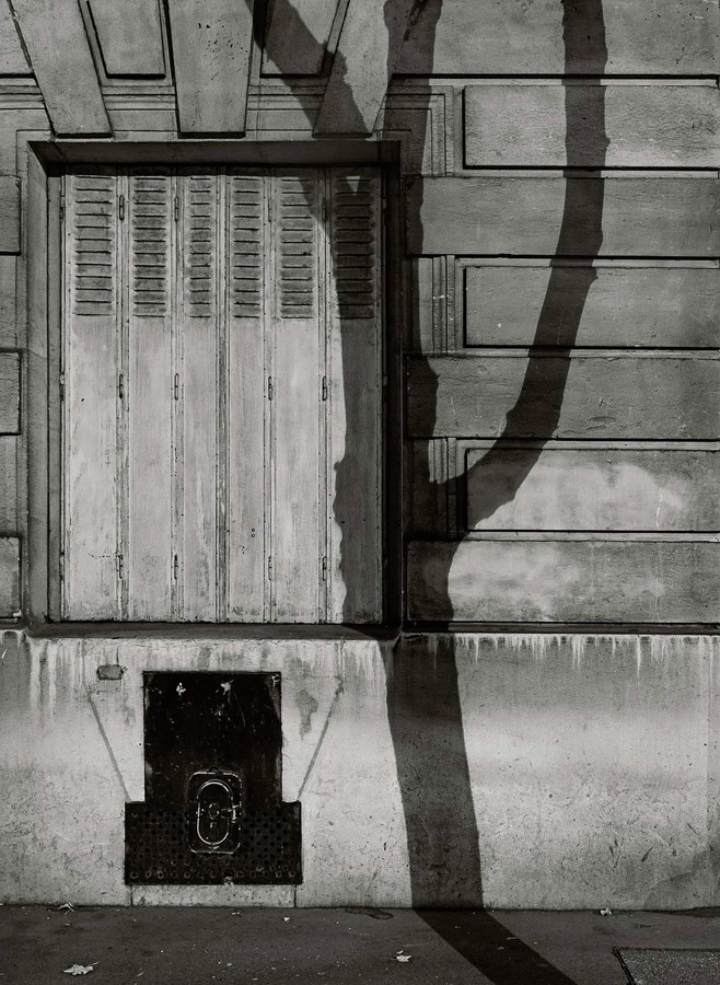
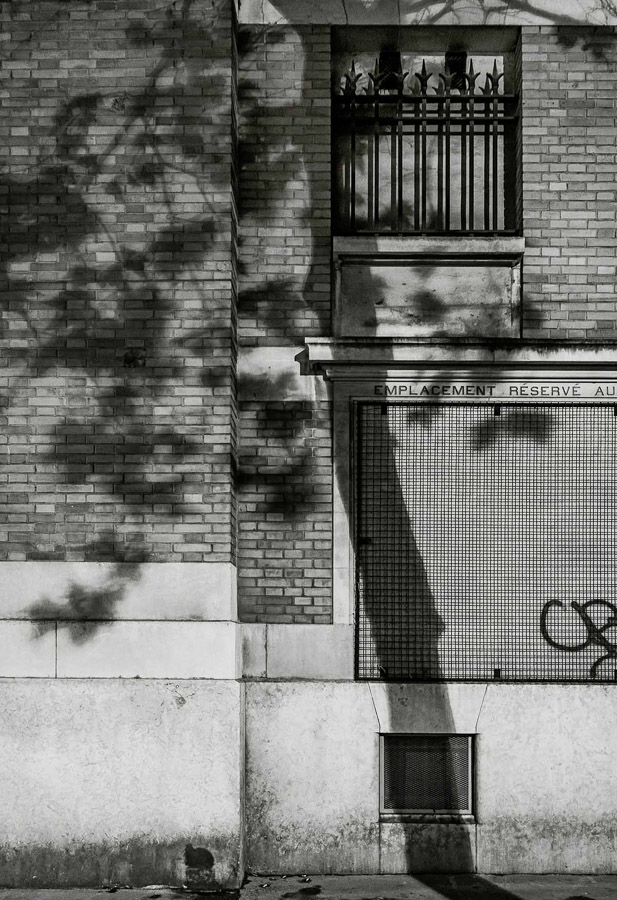
While I was looking into the industrial architecture typologies of the Bechers. I came across Micheal Wolf’s work Paris Tree Shadows. In a similar way to the Bechers, Wolf created a collection of images with the typology of trees casting shadows onto the Paris architecture. What appealed to me with this work was the use of more creative composition. Two of the series can be seen below:
Images 2 and 3 from Michael Wolf’s Paris Tree Shadows [3]
In these photographs we see two portrait compositions of walls that have tree shadows cast onto them. These are part of a collection of 11 photographs that are grouped by a number of typological elements to them. They are all the same format, black and white and shot in bright sunlight to achieve the shadow. Each picture is of a Parisian wall, so they are all cityscapes and each image has texture made up of squares or rectangles; brickwork and stonework feature but so do doorways and windows. The tree shadow runs from the top to bottom of the frame and each is placed almost anchored to a vertical line or feature on the wall behind it. What struck me about the images as a collection was how at first glance they all look very similar as with Water Towers, but after a while the subtle differences between the trees themselves become apparent. Some of the trees are with foliage and some without. Some have multiple branches and some are solitary. This series, like the Bechers’ work, is anchored by multiple references, which make sense but invite more investigation of the subject that is the central player in each picture. We can see a group of tree shadows but we can also see a variety of locations that they are set in. Each Parisian wall is different but has the rigours of the wear of a city on them. Some walls are dirty, some windows need repair and there is evidence of maintenance work being done in one of them. One even has graffiti, which instead of drawing the viewer’s attention from the tree shadow, further emphasises its place in the scene. The images contrast the natural with the manmade in a way that could suggest the former is becoming less impactful on the latter or it could simply be that the organic nature of trees leaves its mark on the precisely uniform aesthetic of a cityscape. Either way, the use of typology in this way gives the viewer a comfort in the familiar by showing them repeated, associated visuals. Like Barthes’s problem with the stereotyping of people and culture in his essay, the typology here is presented to ‘get it out of the way’ so that we can look more carefully at the subjects themselves.
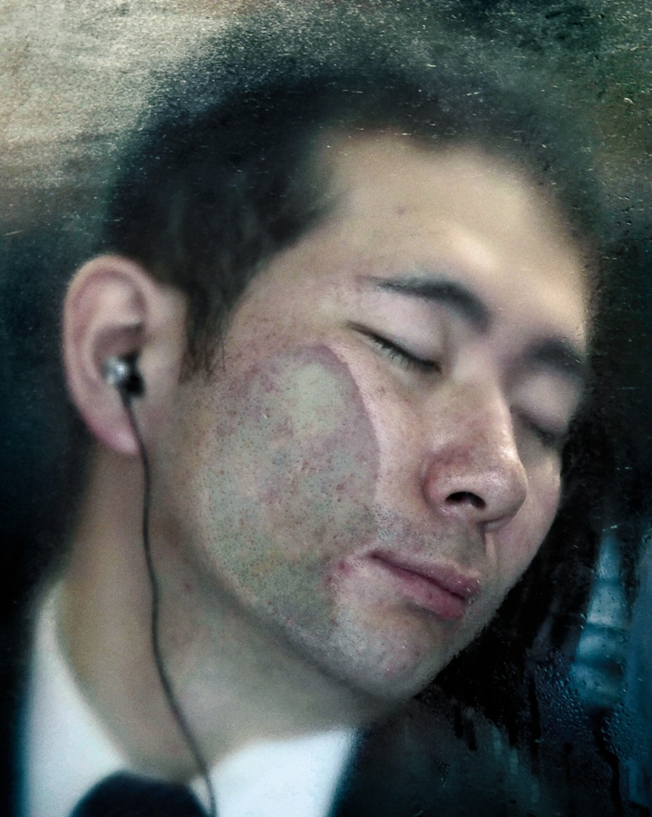
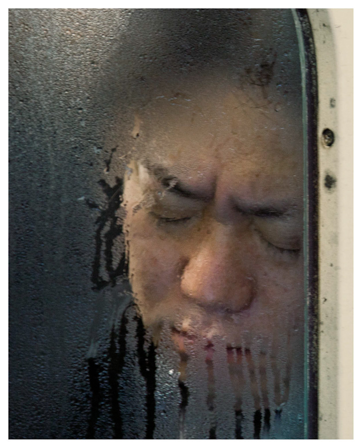
Wolf also worked in portraiture, which we are more interested in here. His series Tokyo Compression was shot in the subways of the Japanese capital after Wolf noticed that on the single line coming into the station, the people were packed into the carriages like sardines. His vantage point meant that he could shoot the commuters through the small windows of the carriages and show them uncomfortably packed into the confined space as they continue their journey. Two of the images from that series can be seen below:
From the series Tokyo Compression by Michael Wolf [4]
Here we see two of the commuters, seemingly asleep during their commute. In a video interview about the series [5], Wolf stated that his subjects looked exhausted and when the train stopped, the ones that were asleep would often wake and be greeted by the sight of him and his camera. Some elected to respond by covering their face or giving a rude gesture at Wolf, while others simply closed their eyes again to block out the intrusion. Whatever their reaction, Wolf’s portraits show the treadmill of life in the megacity that is Tokyo, the people ensuring discomfort in order to get to their destination. The photograph on the left shows the man with his face distorted by being pressed up against the window, but oddly he looks peaceful. How could this be so with what we suspect is an uncomfortable posture? Has he escaped through listening to something through his headphones or is he actually asleep? The photograph on the right shows a similar posture but the expression is one of a frown. Could this man be reacting to Wolf or is his just miserable about his situation. In both images, the view through the misted window emphasises the sense of confinement with others, which is a powerful aesthetic. When I first saw this series, I was struck by the presence of typology but also the many layers of interest in each image, which initially looks like all of the others. Wolf used typology throughout his work with what some would consider mundane subject matter. His ability to reveal powerful stories by gathering photographs that have the same attributes is equally effective in portraiture as it is in landscape.
August Sander (1876–1964)
August Sander was perhaps the most influential of photographers using typologies in his portraiture. His life-long project People of the 20th Century attempted to document the people of the Weimar Republic, which was the German state between the two World Wars. Sander started by photographing his subjects in the environmental context of their profession so that he could then categorise them in those terms. As the project progressed, his portraits became simpler in composition, with the profession being revealed by some contextual elements such as clothing or through use of props. His mammoth project was initially published as the book Face of Our Time. It was Sander’s intention that the book document the people of the state in a structured series of typologies arranged in an almost hierarchical way, trying to describe the rich variety of the culture. Around that time, there was great focus on assigning labels or categories to people based on their physiognomy. Sander fuelled debates about the characteristics of people as described by their physical features and his photographs, with political and academic critics taking their own positions on what is now regarded as pseudo-science[5]. What Sander’s political leanings for the work itself were are unclear, although he was definitely not a right-wing sympathiser. However his desire to ‘catalogue’ the people in terms of their social or cultural position in society played into the hands of those who saw physiognomy in terms of what was high class and what was common. Ultimately as Germany headed for the era of Nazism in the 1930s, Sander’s work was seen as anti-propaganda to the ideal of class and value to society that the right wing pushed. Sander pressed on with his wider project but ultimately the emergence of the Nazis meant the end of publication of his Face of Our Time.
Conclusion
This project has been interesting. When I first saw the Becher works, I couldn’t really see anything other than a group of photographs of the same thing. It almost reminded me of a commercial catalogue where one might be able to buy a water tower, because of the simplicity of the compositions and technical aspects. What I hadn’t realised was that the Becher photographs offer a common view of something that may at first glance seem banal, but actually brings together different regions and environmental elements that describe Germany. The images are as powerful for the subtle differences, almost personalities of the towers as they are for the quality of their production. I was reminded of a painting that I had almost purchased several years ago from a local gallery. It was a modern acrylic painting of a number of cigarette lighters arranged in a grid. Each was depicted in incredible, almost photographic detail and all the same size. The title of the work was 28 Stolen Lighters, which made me laugh as well as think about what was behind this gathering of similar subjects. In what way had they been stolen? Who were the original owners and how did they feel about losing them? When it came to the arrangement, the were all very different in appearance but common in construction. They were disposable lighters with lots of different designs, which told something of the kinds of people they had been ‘stolen’ from. In reality, the artist had borrowed the lighters over many nights out from his friends and neglected to give them back. His intentions were innocent absent-mindedness, but in using their forms as the typology their status as trophies from social encounters took on a different, more sinister meaning. What I’ve seen in the works of the Bechers, Wolf and Sander is an approach that gathers many versions of something apparently banal and tells a story in the variations that asks us to really look closely at the subject. It’s an interesting idea that I had not encountered thusfar.
References
[1] Barthes R, 1957( translated 1972), “Mythologies”, The Noonday Press, New York


