Don’t read on until you’ve answered the following questions:
What does this scene tell you about the main character?
How does it do this? List the ‘clues’
Make some notes in your learning log.
What does this scene tell you about the main character?
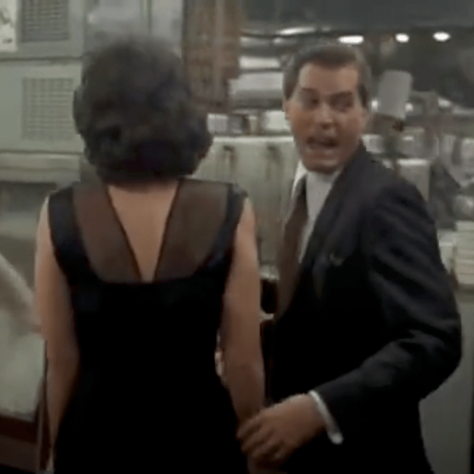
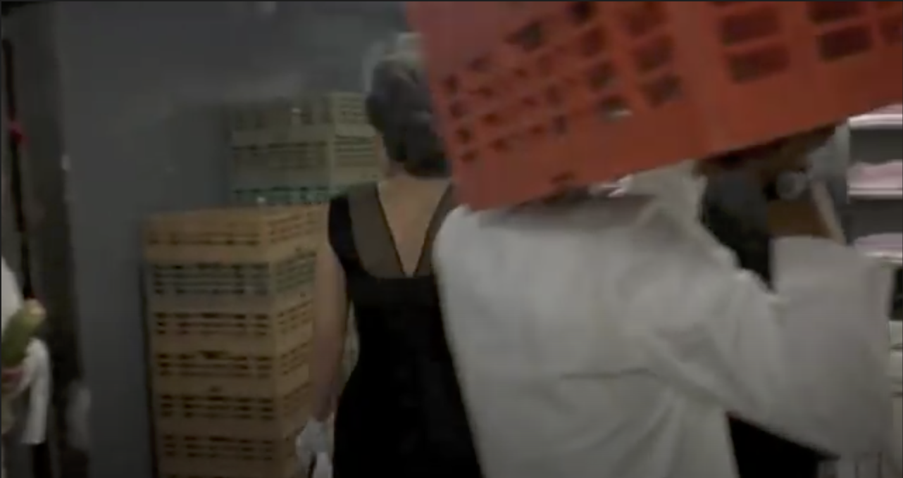
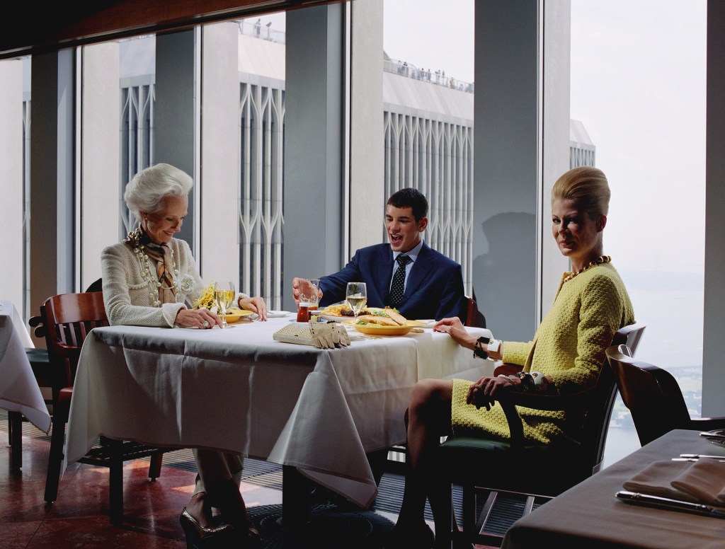
From the first frame of this scene, we see a generous man. The initial shot is of a hand passing a money tip to another hand with what we initially assume to be the main character thanking the other person. It transpires from the dialogue that this man is going to look after his car with him citing that it was quicker than fighting through the crowds at the end of the night.
The shot essentially follows the man and his companion from a close distance behind them as they walk through the back door of the club, down stairs, through the kitchen and eventually into the main space. The whole scene is set to the song Then he Kissed Me by The Crystals (1963), which is a description of a romantic encounter told from the perspective of the woman. The song tells a story of a man taking control of the encounter that leads to a relationship and eventually marriage. Although a love song, it’s difficult to get away from the ‘he did this, he did that…and then he kissed me’ theme of male ‘confidence’. The lyrics to the song and ‘the tip’ are the first clue that this man is of some importance with some power associated with it.
How does it do this?
As the shot progresses, the next clue is that at each internal doorway on their journey, the couple are greeted by doormen, who each receive a tip from the man. He also refers to each by their first name, which suggests that his presence is somehow regular and revered. This theme continues as the shot progresses with each person they come into contact being greeted jovially by the man, but not the woman – she is largely anonymous in the scene. The way the shot is created, the woman’s face is never seen in any detail for any length of time, contrasted against the man, who regularly looks either way and even back toward the camera. This effect makes the viewer almost forget that she is there.
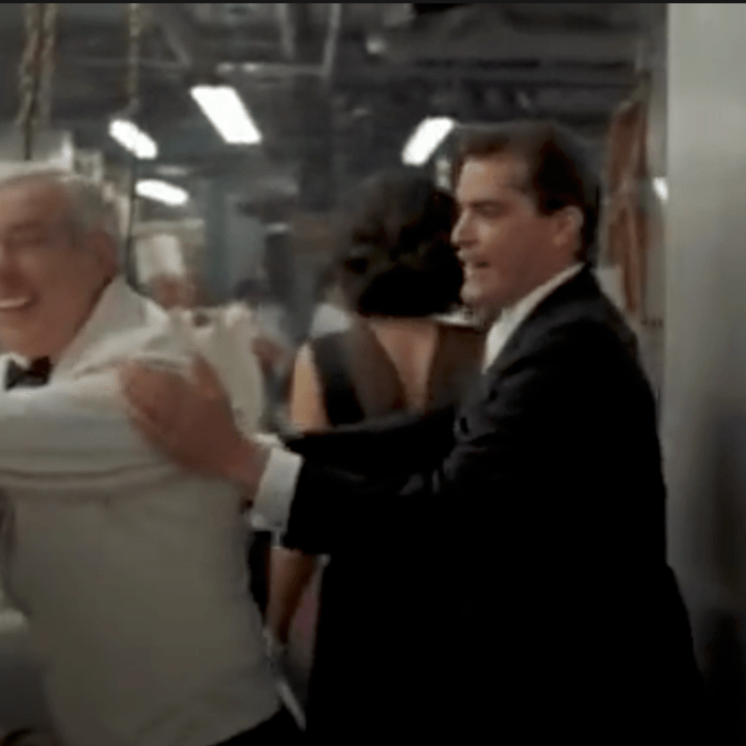
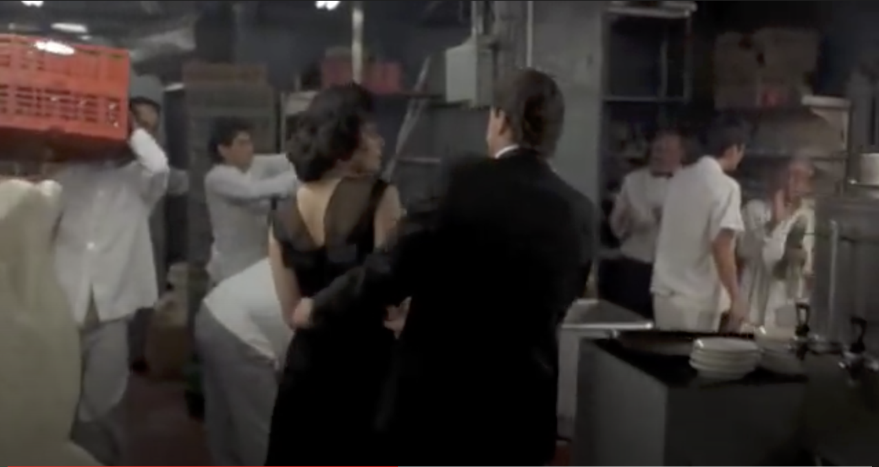
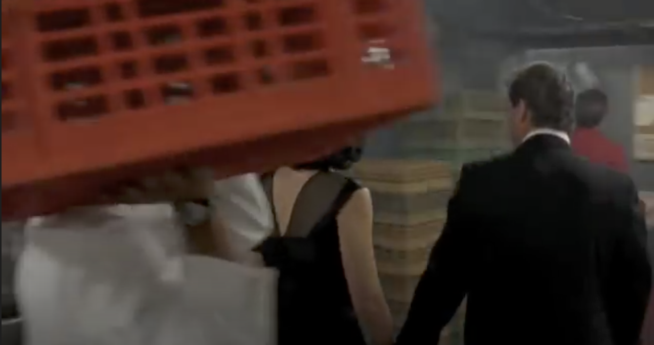
As the action moves through the kitchen, everyone that they pass acknowledges them in some way, either directly or just with a look. Then another clue to his importance, or rather the viewer’s lack of importance is seen. A chef carrying a large red box of ingredients enters the frame from the left and passes between the camera and the couple. He moves away to the right hand side of the frame continuing his journey.
This use of space between the camera and subject both enhances the natural perspective of the sequence as the couple make their way through the kitchen, as well as putting a division between the viewer and the subject. The chef doesn’t walk in front of the man, but doesn’t hesitate in walking between us and him, thus setting the tone of our relative importance to one another.
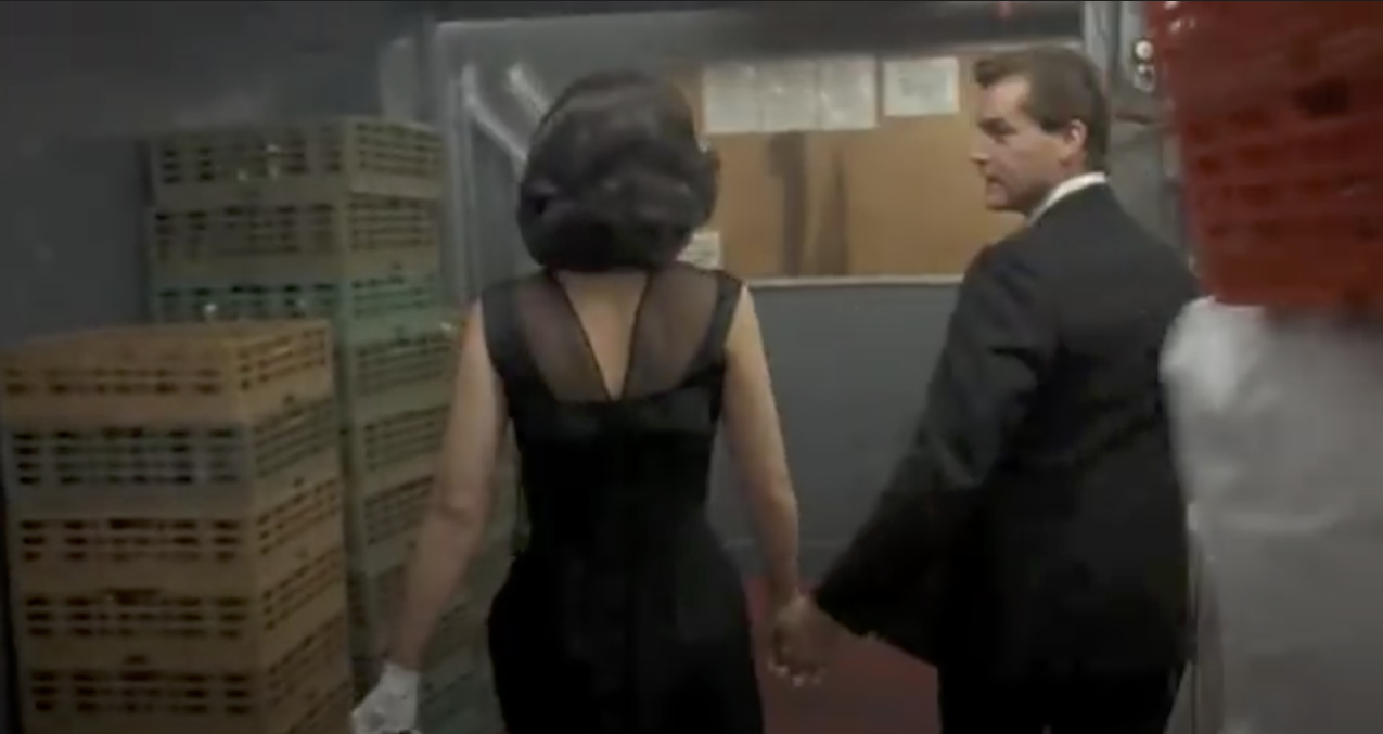
When the couple make their way into the club, they are greeted by groups of men who are arranged in a way that suggests they are part of some organisation or gang. The manager instinctively signals to some waiters who bring table and proceed to set it up in a space in the busy dining room. This whole scene is observed by everyone present and we hear the manager rebuking someone who protests because they were also waiting for a table. This build-up of clues makes the man go from merely a generous patron who may know the staff, to someone with much greater significance. His treatment by the manager and staff isn’t asked for at any point in the scene, it just happens.
More people are introduced to the man but not the woman, further emphasising his importance. The scene draws to a close with a bottle of wine being brought over with compliments of a man called Mr Tony who we see when the camera pans left. He is surrounded by men who we assume to be bodyguards or associates. The final sequence shows a stand-up comic beginning his act. The act begins almost immediately after the couple sit down and the woman asks the man what he does for a living, another sign that things wait for the man. She asks in a way that suggests that they don’t really know each other and with an air of surprise at the deference shown by everyone they encounter on their way into the club.
Scorsese shoots this scene in a very particular way, with each element being relevant to the meaning he is trying to create. The long following shot itself suggests a man who leads the way, his girl by his side being directed in her every move by his hand. The shot moves through he areas of the club that wouldn’t normally be seen, the back-of-house areas like the kitchen. His walking through this space with confidence and the staff reactions to him elevate the main character in our minds to someone of great importance, both in terms of power and also in their lives. The club is lit with very subdued lighting, which coupled with the groups of men gathered at tables suggests an establishment where all is not all it seems. Goodfellas is a gangster movie, so by dressing the men in business suits with some wearing sunglasses (inexplicably), Scorsese creates a sense of underworld. The deep red colour of the club suggests that this is perhaps Hell where monsters live, which all plays into the aesthetic of the underworld. It’s a very cleverly shot sequence that keeps us looking at this important man without any changes in perspective or field of view, which builds his character from being a generous patron to someone of great significance in the space of a few minutes.
Tableaux Photography
We’ve already been introduced to Jeff Wall through his photograph Insomnia (2008), which is an example of a carefully crafted scene. The photograph contains only the elements that help add context to the subject and in turn build the narrative in within the viewer. In his exhibition at Tate Modern in 2005, Wall was interviewed about his work in an article by the museum called Beyond the Threshold[1] in which he describes his approach to working. The picture that the interview focuses on is View from an Apartment (2004-5). Form this image, Wall rented an apartment that up until then had been occupied by a young couple. He wanted to create something that was inherently interior while also containing some exterior as most his photographs of living spaces tended to rely heavily on the former. His choice of apartment had a view across one of the harbour areas of Vancouver and would make a good set for his image. In a way similar to the directors and the mise en scene, the art of tableaux photography builds a set, dresses and lights it and finally adds the subjects or actors. In this case, Wall dressed the apartment with items he had collected from other photographs as well as things one would normally find in a living space.
A View from an Apartment (2004-5) by Jeff Wall[1]
The actors were a woman that Wall hired specifically and her friend. Choosing two actors creates more of a sense of daily life in the scene, even though it’s not clear that these women are partners in any way. The apartment is littered with evidence of their lives while the ironing board and laundry suggest some action that might be thing place. The woman who isn’t ironing is completely disengaged from the rest of the room and all that is going on around her, preferring instead to read her magazine. What is interesting about this shot is the fact that everything in the apartment was put there by Wall in an almost cinematic way – when the interviewer went to see this set, she was asked to be careful not to touch anything in the scene[1].
Wall’s approach to meticulous planning and executing of his images stems from his not wanting to photograph something that is happening in a documentary or snapshot style, but to recreate a memory of something that interested him[2]. When I think about this approach to photography, I am drawn to the fact that Wall is remembering a story, in the same way as someone telling us or watching a movie. He makes a mental note of the details of the story and then tries to recreate them in his photography. I wondered if that act of reflection and recreation actually makes it easier for Wall to tell a story as our minds have the ability to add of fill in any details we may have forgotten. Wall states in an interview [2] that his photographs are what is left of a story when the words that describe them are stripped away, that is taking away any context or intent and letting the story tell itself. I was fascinated by this idea that as well as creating something that is a representation of an event, Wall is also invoking the emotion of the memory of the event, adding his perspective on the image through the way it is constructed. Like diCorcia he isn’t trying to dictate the narrative as he sees that as the responsibility of the viewer, but his feelings visibly run through the work. The previous example of Insomnia is a powerful telling of the horror of not being able to sleep and its effect on the human emotional state – this ties in with the general tenor of his work as director and screenwriter for his own dramas.
Conclusion
I found this exercise interesting because it does highlight the similarities and differences between moving pictures and stills when it comes to telling a story. Scorsese’s scene builds the story as it rolls through, leading eventually to the realisation that the character is powerful, mysterious and living a comfortable but dangerous life. By contrast, Wall’s narrative has to be derived from a single visualisation of the story, meaning that the photograph has one chance to get the information across. Wall achieves his work by the act of not photographing initially, but observing the scene and remembering not just the details, but what interested him in it to begin with. The act of recreation tells Wall’s story with the artist controlling how we consume the information in the frame by careful use of the elements of mise en scene. This is definitely something to consider throughout Part 5.
Mise en scène, pronounced meez-ahn-sen, is a term used to describe the setting of a scene in a play or a film. It refers to everything placed on the stage or in front of the camera—including people. In other words, mise en scène is a catch-all for everything that contributes to the visual presentation and overall “look” of a production. When translated from French, it means “placing on stage.”
Definition of mise en scène in film [1]
We are introduced to this expression a the beginning of Part 5, which for me ties in with neatly with the photographer that I studied for Assignment 4, Philip-lorca diCorcia – his series Hustlers is covered in this section of the course notes. Along with Jeff Wall and Gregory Crewdson, diCorcia is a photographer who carefully creates a scene with characters, lighting and props to tell a story. A quick search for a description of mise en scène brought me to the Masterclass website, a company that sells courses in a variety of creative subjects from cookery to screenwriting led by famous people in those fields. Along with the definition cited, there were some elements of mise en scène to consider, some obvious and some not so. The obvious ones included choice of actors, location, set design, lighting etc which we have seen in the works of the photographers in Part 4. However the not so obvious ones to me were camera placement (shot blocking), depth of space and film stock, which I found interesting.
Shot Blocking is the positioning and relative movements of the actors to each other and the camera and includes the position of the camera itself. In a way, this could be considered ‘perspective’, but it goes further in describing how the actors and viewer relate to each other. When working on Assignment 4, one of the elements used by diCorcia was the cinematic style [2], referring to how the viewer is looking on the scene ‘square on’. The idea is that the viewer is watching the action from an orthogonal perspective that allows them to explore the whole scene and feel like they could step into it. The contrasting viewpoint would be one determined by the forcing the viewer into a particular space with a more contrived perspective, restricting both the way they see the action and their building of a narrative. In his placement of the subjects relative to the camera in this style, diCorcia creates an almost voyeristic feel for his photographs, particularly ones involving intimate perspectives on somebody’s life. In terms of the way that actors interact with each other, the key difference between moving pictures and photographs is that the former has more time to build the narrative with the viewer as the film progresses; the stills photographer having to include everything in a single frame. The movement between actors is real in film, so careful thought is put in to how the movements look as the scene builds.
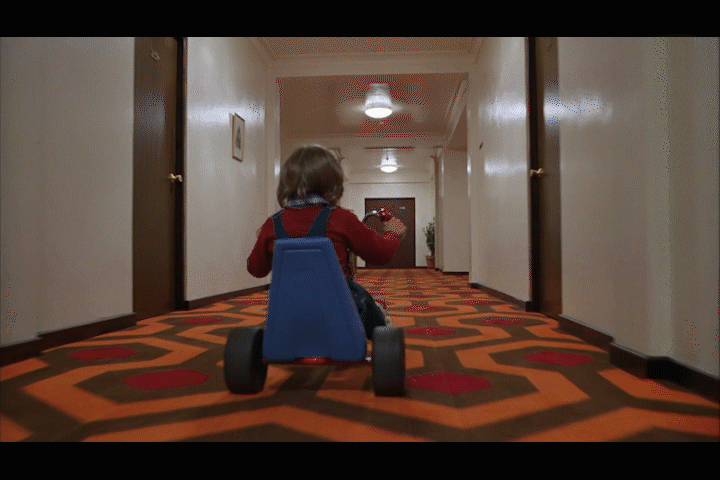
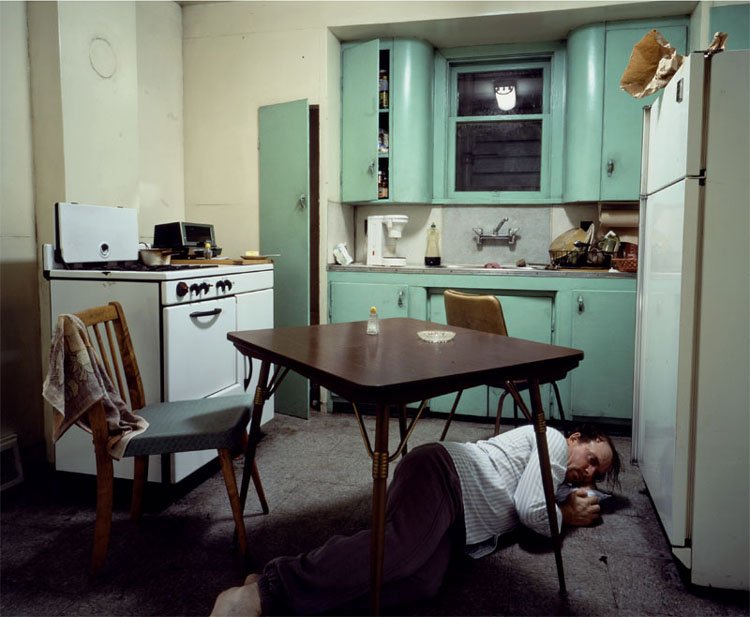
Depth of Space is something else that resonated with me and reminded me that it had come up in a conversation with my tutor on the previous unit, EYV. He had a career in television and talked about the creation of depth in a scene being important in suggesting the temp or mood of the work. If, for example a sense of scale is needed in a battle scene, the cinematographer wouldn’t make a shot that highlighted only a handful of soldiers, they would incorporate large, wide views of the whole scene to let the viewer know this was a large battle. Similarly, if a sense of imprisonment was needed, a smaller scene would be more impactful, e.g a wide angle shot of a cramped cell with actors close together. In Jeff Walls’ Insomnia[3], the scene is constricted by the use of a wide angle lens in a narrow space and further enhanced by the inclusion of the large table in the middle of the scene. The person in the picture is almost dwarfed by his surroundings, creating a sense of being imprisoned. I was further reminded again of the power of creating a depth of space in cinema recently when I saw the Stanley Kubrick film The Shining (1980). The film is famed for creating shots that closely follow the actors through large spaces from their perspective. Take for example, the scenes where the young boy Danny is riding his tricycle around the hotel’s vast corridors (below). The camera follows Danny from just behind him but at his eye level.
Danny Torrance on his tricycle, The Shining (1980) [4]
As he races around the hotel, we see what Danny sees but in a third person view, similar to many modern video games. At this early point in the movie, we already know that there is something very wrong with the hotel, so the long corridors create a sense of scale relative to the little boy that is intimidating. As he turns each corner into the next corridor, the camera follows him and builds the suspense; we have no idea what horrors are waiting for him around the next blind turn. Kubrick further increases the tension through use of sound. As Danny moves from carpet to hard floor and back again, the noise made by his wheels sounds almost like a sinister breathing as if the hotel is actively pursuing him. It’s the space and scape that makes this seemingly innocent scene of a little boy on his trike utterly terrifying.
Other elements that resonated with me were lighting and costume. The former may appear fairly obvious, but we have already seen the impact the creative use of light in a ‘staged’ image. The cold, fluorescent-style lighting in Insomnia creates a different effect to natural light, so if this were indeed an actual kitchen shot in daylight the sense of desperation and dread would be completely lost. With the costumes, though the choice of wardrobe can be a central theme to a film’s narrative. For example, in The Untouchables (1987), the job of dressing the cast was given to famous fashion designer Giorgio Armani. His reputation for stylish, expensive fashion was already established but in this film his creations were very carefully designed to support the film’s narrative. The main cast is the classic good vs. evil, with Eliot Ness and his Untouchables on one side and Al Capone and his gang on the other. For the lawmen, Armani created a feeling of hardworking, strength while fitting in with the idea that everyone wore smart suits and ties in the 1930s. For the Capone gang, though he created the opposite sense of rich opulence to support the idea that these people were living off the ill-gotten gains of exploiting the people of Chicago. The images below show the contrast between the two aesthetics.
Eliot Ness and team from The Untouchables (1987) [5]The Capone Gang, from The Untouchables (1987) [6]
Conclusion
The phrase mise en scène seems fairly self-explanatory, but as with most of this course the importance of setting the scene is subtle. The use of carefully placed visual elements and composition is similar in still and motion picture photography alike, but the freedom and pace at which a narrative can be realised differs between the two. Where a photographer has a single frame in which to include everything, a filmmaker has more time to build these subtle ‘background’ references in parallel with the more obvious acting that is occurring in the ‘foreground’. In the case of Kubrick, his directional style of shooting the same scene over and over to achieve both his vision and to drive (almost bully) the actors to be more naturally in the moment, is well documented (the famous baseball bat scene in The Shining was shot 127 times)[6]. That obsession with getting the most out of the cast and how they interact is often the thing we connect with, but in fact the cinematography, set design, costumes and lighting play a major part in how the viewer creates their narrative. In the case of diCorcia and Wall, their work uses the same techniques to lead the viewer around the frame but only have that one chance to give them what they need. As I move toward Assignment 5, the final one in this unit, the need to appreciate these elements is made clear by the simple idea of setting the scene.
Write an essay of 1,000 words on an image of your choice
The image can be anything you like, from a famous art photograph to a family snapshot, but please make sure that your chosen image has scope for you to make a rigorous and critical analysis.
Introduction
For this assignment, I chose a photograph from the series East of Eden, by Philip-Lorca diCorcia. The theme of the series is described by diCorcia as America’s ‘loss of innocence’ experienced towards the end of George W Bush’s presidency in 2008[1]. The title refers to the ongoing struggle between good and evil that is referred to in the Book of Genesis[1], Cain becoming the symbol of ‘evil’ through murdering his ‘good’ brother Abel in a jealous rage. diCorcia invokes this struggle by relating it to the immoral banking practices that led to the financial crash towards the end of the Bush era. The photograph that I selected is called The Hamptons (2008), shown below. In this essay I read the photograph using the techniques learned in part four and describe my interpretation of it.
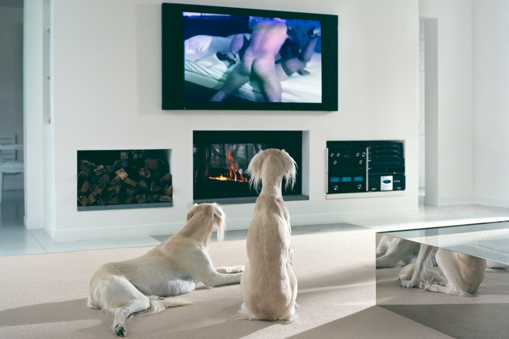
The Hamptons (2008), by Philip-Lorca diCorcia [2]
I chose this photograph because of the obvious, slightly shocking humour of the subject; two dogs watching a pornographic film. The photograph follows diCorcia’s consistent style of work that developed while a fashion photographer with W magazine in the 1990s. The composition is devoid of any distracting clutter and arranged with a ‘cinematic’ feel; diCorcia describes his subjects being square on to the camera and shot from a neutral position, i.e not from the photographer’s perspective. The result allows the viewer to ‘step into’ the frame in a similar way to modern cinema.
My Reading of The Hamptons (2008)
I started by deconstructing the elements within and looking for possible meanings using semiotics[3]. In the version below, the formal elements of the photograph are labelled in red. The potential meanings of those elements are labelled in blue.
Annotated version of The Hamptons showing the formal elements and what they might mean
The red items are signifiers which are identifiable to most viewers. The room’s plain, light coloured decorative elements: the coffee table, fireplace and audio-visual equipment, are all formal elements that create the impression a living space. Although lacking sofas or chairs, the signifiers are strong enough to signify a living room. We also have a restricted view into the next room, which gives the impression that of a large space; an apartment or house. The furniture and the audio-visual equipment could signify the room part of an expensive home; the size of the television and appearance of the other items signify something that has been carefully designed and executed. The first sign then is that this is a room belonging to someone with money. This is further supported by the photograph’s title, The Hamptons, referring to a region of upstate New York that has among the highest property values in the US, some homes costing over $100m. The other formal elements are the dogs and the pornographic film. There are two light coloured dogs of the same breed facing away from the camera in the direction of the television. One is lying down and the other is sitting upright. The latter’s hind quarters are reflected in the mirrored side of the coffee table. The film itself is mildly explicit, shows a man taking control of the sex through the position being used. The TV and the surrounding elements provide the only colour contrast to the muted tones of the scene. In terms of what the dogs and the film signify, the first impression is of entertainment being viewed by a viewer. The way that the photograph asks a viewer to look at someone (in this case something) viewing something else aligns neatly with diCorcia’s cinematic perspective described previously. The sign here is one of voyeurism, with we the viewers being the voyeurs on the scene.
In terms of what the elements mean, the way the room appears to connote a highly ordered purity, with a lack of clutter or signs of life within. The dogs share the same ‘pure’ appearance, but their reactions to what they are looking at are different. These poses could connote how what looks the same isn’t necessarily the case. For me, the dogs represent people in this image – perhaps the owners of the house who are absent from it. People may be similar but we are all different. The presence of the porn film connotes the ‘impure’ that is invading the space and perhaps points to corruption of innocence. The impressions of wealthy, class-led society being somehow better are rich in western culture, referenced many times through the years in the writings of authors like Dickens. Victorian society liked to think that people with wealth are of a higher moral standing as illustrated in his novel Oliver Twist and the idea that they might not be, makes us uncomfortable. In the case of Dickens, he had to make street urchin Oliver’s character almost angelic so that his readers could more readily accept his transcending from working to upper class[3]. When considering these connotations the studium of wealth and implication of class or being better than everyone else is, for me, being revealed or debunked by the punctum of the pornography. Our relationship with pornography is one of secrecy and sub-culture, a thing should be hidden or not spoken of with exceptions of highlighting how it corrupts society[3]. The idea of the pure dogs, in their pure environment being corrupted and the implication of damnation suggested by the fire, helps create the narrative around good vs. evil; the theme of the series the photograph comes from.
Conclusion
Introducing this photograph, I described my initial reaction as one of seeing a slightly edgy humour at it’s clear contrasts. However, after analysing the elements, their potential meanings and the context within the series, I can now appreciate the many layers of narrative that this image allows for. With my reading, the more sinister ideas about clean becoming dirty, pure becoming corrupted and how the evil is not limited to class or standing, becomes evident in the representation of the dogs in their living room. Far from being a little edgy or shocking, the image takes on a sad feeling that through our own indolence or blind trust in ‘our betters’, we somehow let evil in, a good metaphor within the original intent of diCorcia’s series.
Assignment 4 is slightly different from the others in this unit in that it is a written essay rather than a photography project. The brief is for a critical analysis of a photograph either by a famous photographer or one of our own. The essay is intended to break down the image into its context and meanings as we have learned in Part 4. This post is the preparation and research for that essay.
The Image
The Hamptons (2008) by Philip-Lorca DiCorcia [1]
This image is from Philip-Lorca diCorcia from his series East of Eden and depicts two dogs ‘watching’ a pornographic film in a very modern-looking room. I chose this image because my initial reaction was a one of humour at the slightly shocking contrast of the subjects. I am also as a fan of diCorcia’s work, having first seen an exhibition of his work, including East of Eden at the Hepworth Gallery in Wakefield in 2014. I was drawn to the way that his images seem relatively simple in their composition, yet are interesting; containing many layers of complexity that are revealed the longer we look at them.
Contextual Research: diCorcia and East of Eden
Philip-Lorca diCorcia started his career in fashion photography, working on assignment for W magazine with the same creative director for over a decade [2]. With his work in that industry he developed a style of creating a scene that was not naturally observed, by using models, flash strobes, props and of course the element of fashion that was the subject of the ‘story’. When he started to develop his ideas for his own work, he took this sense of fantasy and unreality into his art. His brother died of AIDS in the 1980s, which diCorcia used as the inspiration for his famous series Hustler, a collection of photographs of male prostitutes in the major cities in the USA. At the time, the government rhetoric about AIDS was one of moral denia (it only affected the ‘degenerate’ homosexual community) and disconnection from the way that it was wiping out a whole swathe of the population. With Hustler, diCorcia wasn’t trying to document the struggles of the lives of the young men, but instead drawing attention to their existence as people and actors in their way of life. diCorcia has stated that he didn’t know or get to know them in any way, he just set up the composition he wanted and then hired them to be part of it. What diCorcia was interested in was revealing how the outward personality of his subjects differed from what they were really like. Since he didn’t know them personally, he left any conclusions about that they were actually like to the viewer to narrate.
“A person’s interiority is very different than their exterior appearance and to some degree, life is a performance”.
Philip-lorca diCorcia, talking to The Hepworth Gallery, Wakefield[3]
In a presentation made to The Modern in Fort Worth [4], diCorcia mentions that prostitutes are essentially actors for hire and that the variety of fantasy roles that males play is much bigger than their female counterparts. In the same presentation, he answers a question about how he creates narrative in his pictures.
“I’m supposed to give you just enough information, in my mind, as you need to be intrigued, not enough to finish your experience”
Philip-lorca diCorcia on his approach to narrative [4]
What he meant by this lends itself to the theories of post-structuralism where the artist is not drawing on cultural references to tell a story, but shifting the responsibility onto the viewer. In the case of Derrida’s idea that a trace of what isn’t there is also present in a story or image, diCorcia is showing us perhaps the obvious outward impressions of what male prostitutes are, but also leaving an idea that all is not what it seems. These young men had a story of how they ended up with this lifestyle, perhaps the lack of family support or struggles with their mental health. The elements that suggest this are often implied but not actually present. His use of unreality, i.e a contrived setting for these young men to be placed within, he adds to the mystery of what the image means. We see examples of this in his fashion work:
W, September 2000 #6, by Philip-Lorca DiCorcia [1]
Here we have three people enjoying lunch in a restaurant that is immediately recognisable as the Windows on the World at the top of the World Trade Center towers. The shot was taken in 2000, the year before the towers were destroyed in the 911 attacks, but the location’s use was merely an accident; the artist knowing someone involved in the running of the restaurant. The main contextual elements in the image are the two middle-aged ladies having lunch with a much younger man. diCorcia states that the series was a fashion story about the ‘boy toys’ of women of a particular social class and age group[4]. The fashion elements that are layered into the photograph are what the series is supposed to be revealing, but when we look closer at the picture we see that nothing is at all natural about the shot, from the bright lighting to the almost over-the-top acting of the subjects. One of the women appears to be enjoying the presence and attention of the young man, while the other looks embarrassed, glaring at the camera as if she’s been found out in some way. In this image, there is both total abandonment with the mature women being entertained by the young man, as well as the acknowledgement that it’s not perhaps the done thing in society. The elegant setting adds weight to that impression, the twin towers being a symbol of prosperous America. In discussing this image, diCorcia confirmed that in fact, the women were professional models but the young man was actually a hustler in the same way as his previous series. This blending of the perceptively real and unreal, which traces of their opposites is to me, very indicative of most of diCorcia’s work; the added context making it even more intriguing.
In various interviews[4][5], diCorcia has discussed his desire to create art that is separated from his perspective, almost always making it clear that he is not part of the story but merely using a camera to observe. In the case of Heads, he elected to add a lack of control over the subjects by photographing them from a considerable distance. His lights were set up within the scaffolding of building works and his camera pre-focussed. When a person walked through the region of focus, he triggered the camera. What resulted was a series of images captured by chance more than design, in some cases the subject would be too tall or too short for the picture to work but in others, the sense of people going about their daily lives comes through strongly. The series got diCorcia in trouble as one of the subjects sued him for using his image[6], but in the main the reaction when the subjects realised they had been photographed ranged from happiness to ambivalence.
With East of Eden, diCorcia set out to create a sense of the loss of innocence. The work began in 2008 around the time that America was transitioning from the Republican era of George W Bush to the Barack Obama’s first Democrat administration. diCorcia, who described himself as ‘not Republican’ combines the contextual references of contemporary American society with religious themes throughout East of Eden. References to Adam and Eve, Cain and Abel etc give the sense of the damage done by the political culture on modern America through diCorcia’s alternative realities. The works are subtle, though as in the case of the photograph Cain and Abel.
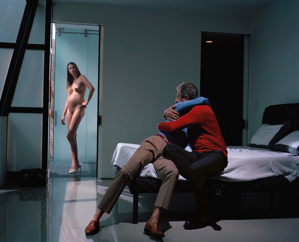
Cain and Abel (2013) from the series East of Eden by Philip-Lorca diCorcia [1]
In the bible story from the book of Genesis, Cain and Abel were brothers and the children of Adam and Eve. The story tells of Cain murdering his brother after his offering to God was seen as of lesser value than Abel’s. His action resulted in his banishment from Eden to ‘the land of Nod’, located to the East. East of Eden is the direct reference to the story and the descent of Cain and his descendants into moral corruption following his destroying of the righteous[7]. It has been retold throughout history and in the case of Steinbeck’s novel also called East of Eden, set brought into the context of modern society[8]. In diCorcia’s Cain and Abel, we are presented with two men in embrace. The nature of their relationship is unclear but the presence of the bed suggests a homosexual couple. The men are wearing the colours of the two main political parties in the US, so the viewer is immediately asked if the embrace is one of affection or rather that they are fighting. In the doorway a naked woman watches the two men. She is pregnant, which creates the sense of motherhood. In fact, diCorcia intended the woman to be Eve, the mother of Cain and Abel – he admitted to having photoshopped her naval form the image to give her the impression of being the original human female[4]. The multiple layers of context that this photograph contains is typical of the series. Themes such as separation and division, with the chance of reconciliation are matched by the reaction to the men being a gay couple, something that conservative America still regards as a sin. The disapproval or disappointment of the Eve figure could further reinforce that sense and her pregnancy while signposting her status as mother, could also be seen as continuation – a sense of ‘we’ve started as we mean to go on’; the age of innocence lost. It could equally be read as sadness that the general narrative about homosexuality as being ‘wrong’ is still evident today, despite significant progress in acceptance and rejection of prejudice.
When we think about it, loss of innocence can have many meanings such as the loss of childhood to adulthood portrayed in literary works like William Golding’s Lord of the Flies where the extreme circumstances cause the children to have to fight for survival and, almost inevitably power. Visual artists have represented this same theme in a variety of genres, for example Costa Rican artist John Paul Fauvres’s series The Loss of Innocence which was inspired by his observations about his son growing up [9]. Fauvres challenges the associated we have with the things we enjoyed as a child by altering them in an adult, often sinister way. One such image of Mickey Mouse blended into Marilyn Monroe suggests a shift away from the pure to the superficially pure in an almost nightmarish way created by the act of seeing it through adult eyes [9]. Perhaps this explains then, some of the criticism levelled at renowned Sally Mann who photographed her children innocently playing and frequently nude. Our application of an adult perspective immediately associates the nudity of children as observed by their parents as being sinister or abusive, serving to erode innocence where it is clearly evident – I was quite shocked by this when studying the artist as part of EYV.
However ‘loss of innocence’ could also be a term associated with the veil lifting on a preconception. diCorcia believed that America had changed during the Bush administration with the financial crash brought about by the ‘immoral’ behaviour of the banking industry and the ‘terror’ and the subsequent war on terror that revolved around the 9/11 attacks. This series explores the notion that perhaps the age of innocence had been lost without anyone noticing and that it was more about the way we see the world that had changed.
East of Eden then is a series that is full of metaphor, alternative narratives and multi-layered meaning, which is why I chose a photograph from it.
Deconstructing ‘The Hamptons’
I approached this in a similar way to Exercise 2[10], where I analysed an advertisement for sliced ham. I started with the formal, factual elements in the frame and then moved on to some of the potential connotations of them. The annotated photograph can be seen below.
The elements that are labeled in red are the signifiers, or factual elements present in the composition. We see here the space containing furniture and equipment that denote a living room. The presence of the television, fireplace, hi-fi equipment and coffee table all point to a space with a very specific purpose. The space is painted and carpeted with neutral colours, which combined with the style of the coffee table connote a modern living room. Indeed the style of the room architecturally suggests modern with its central block containing the fireplace, hi-fi and log store. We cannot see what is beyond, but what we can see denotes open-space living. The audio and video equipment are large and expensive-looking, which connotes a space owned by someone with money. These elements come together to result the photograph’s first sign, which is that this is an expensive living space. This sign is further emphasised by the title of the photograph, The Hamptons. The Hamptons is a very wealthy area of upstate New York, which fits with this first sign.
The next noticeable elements are the two dogs and the pornographic film being shown on the television. The dogs are clearly of the same breed, which has a clean, lightly coloured coat. One is sitting upright and the other is laying down, but both are looking in the direction of the wall with the television on it. For me, the two dogs dennote the occupants of the space as they are the only living beings in the photograph. Their postures connote different emotional responses to whatever they are looking at. The one sitting suggests interest or tension while the other connotes relaxation and perhaps comfort. The former has their posture further emphasised by their reflection in the coffee table which only reveals the dog’s hind legs. The connotation here is that the dog is alert and ready to move if necessary, which further adds to the sense of attention being paid to what the dog is looking at. The television on the wall is what we assume the dogs are looking at and on it is a pornographic film. If the modern, expensive, perfectly neat and tidy sign of the living room is the studium when considered with the picture’s title, the porn film is the punctum. It’s stark contrast to the rest of the picture is evident from first examination and when combined with the fire offer the completely opposite sign. Here we have the perfect space and perfect occupants in the presence of something that doesn’t obviously belong. When I observed this punctum, I also noticed the increased significance in the way the scene is lit, by a uniform soft light from the right hand side of the frame. diCorcia is well known for using artificial light in his compositions because of his fashion work, so it is no coincidence or accident that the light in this image is pure. It is, of course part of the signs relating to the modern, expensive living space, but I noticed it when presented with the contrasting element, i.e. the porn film.
Exploring the possible cultural themes
With the studium and punctum of the image beginning to present themselves to me, I wanted to explore the cultural themes relating to them. The first is the culture of wealth and the way that it affects our perception of the people who have it. As mentioned previously, The Hamptons is a region of upstate New York which has some of the highest house prices in the US, some properties reaching over $100m. The fascination with that kind of wealth can be found throughout modern media, ranging from reality television stars such as the Kardashians to the billionaire businessmen and women such as Jeff Bezos (Amazon) and Alice Walton (Walmart) whose lifestyles are coveted by many. We associate money with power and indeed some of the people with money also wield power over our lives. However, where does the association with higher class and standing come from when it comes to money? Since the modern US culture and the UK share a common history, we can consider the attitudes to wealth and class that span the past few hundred years. In the Tudor era, the wealthy were born of privilege and as a result expected to be responsible for the lower classes in their regions or estates. Such responsibility was associated with respect for standing and the resources to give jobs to working men and women of the lower class. The respect was engendered, even if the ‘master’ was just a fortunate benefactor to family wealth that he hadn’t earned. These notions continued into Victorian England where the social classes were shaken up by the Industrial Revolution [11]. Now wealthy people were both revered and reviled for being ‘the betters’ of the common man, a sentiment that we see in literature such as Dickens’ Oliver Twist. In his novel, Dickens uses the theme of class divide as a battleground where the poor and morally bankrupt rob the rich as part of a criminal enterprise. The principal character, born to poverty eventually ascends to wealth by being adopted by a ‘gentleman’ and ultimately turning out to be a member of his family through his mother’s line. The story tells us that the rich are special and the poor must fight, but it is possible to cross the divide. At the time of writing, Dickens’ readers would have been acutely aware of gulf between classes, so the notions being put to them by the Dickens would have appeared unreal[12]. Dickens answer was to make Oliver a pure figure, beyond reproach whose destiny to achieve wealth and standing was ‘because he was one of them’. However, we know now that while the legacy impression of wealth symbolises higher standing or ‘being better’, we know from our more recent history that this simply isn’t the case. Highly publicised scandals and the private lives of the rich and famous and even royalty have made us cynical about what goes on behind the perfect facade of the image of wealth and success. The continued morally questionable behaviour of President Trump presents us with almost a confession that you don’t have to be good to have money. Perhaps then diCorcia’s loss of the age of innocence starts with the notion that wealthy means goodly and then contradicts it with both obvious and subtle narratives.
The second are of cultural context I wanted to explore was our relationship with pornography. Pornography has long been a devise subject that most prefer not to discuss. It’s association with historical illegality and the seedy side of life have driven it’s existence underground or behind closed doors. However it is more prevalent than ever, being regularly recorded as the most accessed material on the internet [13]. The effect of pornography on society prompted a House of Lords report in 2015 [13] in which concerns about the accessibility to children, it’s effect on their sexual development and implication in violent acts committed on women were offset by the lack of real understanding of who watches it. Their own statistics didn’t capture the volume of material being watched and which sexes, social groups and classes were the main audience for it. Arguments have been made that it is an industry like any other and that the boundaries between art and pornography are blurred at best. Take the work of Fauvres discussed earlier for example. Some of those paintings take childlike constructs and overtly sexualise them. Robert Mapplethorpe’s extreme portraits often portraying homosexual ‘acts’ and male nudity are considered art, yet despite there not being anything illegal about them, were considered pornographic when they were first published. That response was driven mainly by heterosexual sensibilities that considered being gay to be unnatural. Porn then, is something unnatural that we should be ashamed of. Despite this, many women watch pornography as well as many couples with strong, loving relationships. Like societal beliefs in wealth and morality, pornography is something best kept hidden – almost the opposite side of the same cultural coin.
Reading ‘The Hamptons’
When I read The Hamptons (2008) by Philip Lorca-diCorcia, I first see the signs that I identified in the deconstruction. This is a wealthy living space where everything is seemingly pure, but in fact there is a contrasting activity taking place. The two dogs symbolise two types of people that have a common appearance to the outside world. The pornographic film symbolises the replacement for the innocence lost, in this case the contrasting aesthetic to the purity of the room and its occupants. The inclusion of the fire that seemingly serves to provide heat to the space now looks like an almost religious signpost that whatever is happening has some form of damnation associated with it. The reactions of the two dogs to the film are different, one appearing to be ambivalent to the loss and the other being acutely aware of it. There are no other beings in the space which suggests that the occurrence and their reactions are all private; the notion of ‘not knowing what goes on behind closed doors’ could be literal when considering the dogs and the film, but my reading is that it is a metaphor for our lives – some things are neat and controlled like the room (with its almost clinical tones) and others are beyond our control (the dogs wouldn’t chose to watch a porn film by themselves). The struggle between the image of good and the struggle with the evil is not a simple one. In this photograph, the evil is already there but the dogs are merely accepting of it or intrigued by it. As with the banking scandal that served as diCorcia’s inspiration, the behaviour was going on but nobody really paid attention to it until it was too late. Like our ability to recognise the slow degradation of innocence causes by such events, our reaction to them depends on our point of view. As with the other photograph Cain and Abel, diCorcia weaves layers of potential messaging with only a handful of props and environmental conditions.
Conclusion and Preparation for the Essay
In conclusion, I am glad I selected one of diCorcia’s photographs for this assignment. As with the previous exercises, the methodical approach of looking first at what is present in the frame and what it might mean is a good way of structuring the photograph before reacting to it in some way. My reading of the studium and punctum led me to looking at how my own experiences and perspectives affect the meaning of the overall image to me. Having visited the US several times now and stayed in places where the rich are truly rich, I recognise the setting that diCorcia presented this subject within. My own views people’s morality is not driven by social media personas or public faces. Neither is it judged in any way by them looking at pornography, which I feel to be a complex subject that shouldn’t be reduced to a tool by which people are assessed. The use of dogs instead of people further reduces the temptation to judge by appearances, instead the potential narrative that the inclusion creates is all the more interesting because of the metaphor. What I loved about this photograph when I first saw it was that it made me smile. The humour introduced by the silly way the dogs are watching the film belied the sadness and almost sinister way my reading of the image evolved. It’s that complexity that makes this image resonate with me.
In preparation for writing the essay, I am intending to use a structure defined in a recent training course that I completed for work, referred to previously [14]. The structure aligns with:
Setting the scene with context and what the speech is about
Summarising the key points of the information being imparted
Personal experience and connection with the subject
A final point connects the conclusion back to the original intent in 2.
By following this structure, I will be able to prioritise the key points while remaining within the word count.
Using the weareoca website, you need to search ‘Beneath the Surface’ to give you access to Jeff Wall’s (1994) Insomnia, interpreted using some of the tools discussed here.
Read and reflect on the chapter about Diane Arbus in Singular Images: Essays on Remarkable Photographs by Sophie Howarth (2005). This is out of print but you may be able to find it in your local university library: some of the chapters are available as pdfs online. You’ll find the Arbus chapter on the student website. If you haven’t read any of Judith Williamson’s (2014) ‘Advertising’ articles (see introduction to Context and Narrative), now would be a good time to do so.
Beneath the Surface (2012)
In order to further my understanding of how to read a photograph, I am going to split this critique into two parts; the first being the blog post called Beneath the Surface by Sharon Boothroyd[1], and the second being my own reading of Jeff Wall’s Insomnia.
When I first read the Boothroyd’s post, I was immediately struck by the structure of the piece. She begins by setting the scene with a description of what the post is setting out to achieve and the tools she will use in doing so. The specific semiotics that she is referring are denotation and connotation as examined previously. The former is the objective description of what is there and the latter, the interpretation of them. The photograph is then introduced with both the top-level denotation and connotations which lead into the author’s personal reading of the image. The personal perspective, shaped by her own memories and experience is a small part of the essay, with contextual references and facts about the piece and references to interviews with the artist about his intent. This structure is similar to a theory that I was taught in my working career about verbally presenting material in a speech or talk. The speech is broken into a number of key stages
Setting the scene with context and what the speech is about
Summarising the key points of the information being imparted
Personal experience and connection with the subject
A final point connects the conclusion back to the original intent in 2.
This blog appears to follow this structure, which is encouraging as that is how I will be approaching Assignment 4. My problem with the blog post is that it is too short. Although the author was clearly limiting the post to around 500 words, my view of it is that it doesn’t really tell me anything about the picture. The introduction and personal reading are pull out a couple of connotations and reference is made to other signs and signifiers without any further detail. The personal engagement informs us of the author’s reaction to the picture, but there is little to offer any alternative perspectives on the subject. There are references to other artists and to Hall’s writings but no details about how they relate to the train of thought in the writing. It’s almost as if the author wants us to go search for the relationship ourselves, which strikes me as a little lazy. The closing statements about the work and the artist’s intent when creating the photograph are interesting but brief. All told, I was really disappointed when I read the post; the only thing I learned was how to potential structure my own essay.
My Reading of Insomnia by Jeff Hall (1994)
Insomnia by Jeff Wall (1994) [2]
While I had issues with Boothroyd’s blog post itself, her approach of starting with the formal elements I found to be a good place to start. These denotations give us the basis upon all of the other semiotics are drawn once we add our own experiences and emotions to the mix. The formal elements of this picture is that it is of a kitchen, given the recognisable items that we associate with a kitchen. We have cupboard units, a sink, a cooker, furniture and a refrigerator which all denote the kitchen. We also have an arrangement of other smaller items that on examination are also denotations, such as the tea towel hanging over the back of the chair. There is a man lying on the floor who is clothed and awake. The scene is partially lit by bright, harsh artificial light with a large shadow area in the foreground. The kitchen cupboards are a pale green colour and some of the doors are slightly ajar. On the wall above the cooker is a circle of what looks like dirt where something used to be. All of these elements are factual and as such denoting a brightly lit kitchen with a man lying on the floor. As Boothroyd observed as her example, when we think of the word ‘home’, we think of a building of some sort with recognisable physical attributes. These are denotations. Boothroyd then goes on to say that the word ‘home’ connotes something quite different in a place of warmth, love, safety etc. The specific denoting elements create the connotations that we associate with a subject. In this case, the harsh lighting and black window connotes that the image is late at night. The light green cupboards are of an old fashioned design and colour that was fashionable in the 1960s and 70s, which connotes a kitchen that is out of style and unloved. Other elements connote the same impressions; the appliances and furniture are old-fashioned in appearance. The first ‘sign’ that can be drawn from the formal elements of the image is one of uninviting and neglected. The kitchen doesn’t invoke the sensations that we associate with kitchens being the central hub of the home; this one has a sinister and unwelcoming feel to it. The second sign for me is drawn from the man, the cupboards and the circle on the wall above the stove. The man’s position, his dishevelled appearance and facial expression all connote a sense of desperation. Whatever is happening to him has resulted in him being this way. The cupboards are ajar, which connotes a sense of looking for something in a hurry; leaving each cupboard open while looking in the next one. The circle on the wall connotes something missing. In this case it could be a clock, which would in turn connotes the absence of time. All of these connotations together create the second sign of total desperation. The final element that supports this sign for me is the title of the image. With this simple title, the artist is giving us the biggest indication of what the photograph is about. However, I believe that the artist is not asking us to see an insomniac, rather to relate to the experience of it. The absence of the clock is the opposite to what most of us experience when we have insomnia; a constant feeling that we must know what time it is. In this case, there is not ability to do that. The arrangement of the table over the man suggests the desire for safety and protection that the kitchen is not offering for the reasons contained within the first sign. There is almost a ‘duck and cover’ feeling to its placement. When I consider the table, I’m not sure it naturally belongs in the scene because of it’s size and position. If we were to remove the other denotations from the scene, the table doesn’t make the kitchen a natural looking workspace, so what is it’s purpose?
The overall meaning of this photograph for me is one of loneliness and isolation from the world. Insomnia makes us feel like the only person in the world who cannot sleep, which in turn suggests that the world doesn’t care. The man in his dated, cold-looking kitchen has been looking for some solution in the cupboards but presumably without success. The only solace now is to hide beneath the table and wait for the morning.
The interesting thing about reading photographs like Insomnia is related to Barthes’ statements about the author not being in control of the narrative and the reader or viewer owning how the interpretation develops. In interviews [3][4], Wall talks about his method and how the common conception that he controls every element is a myth. He discusses the elements he puts into his compositions and how he works to make them balance but essentially leaves the whole narrative to the viewer. His other comment was that his artistic process begins without any photography in mind. He looks for subjects or scenes that resonate with him and then creates a photograph that invokes the memory of that scene. Perhaps then, the powerful associations with my own experiences of insomnia are expertly created by a handful of elements that connote the sheer hell of the condition.
Singular Images: Diane Arbus
In the chapter called Diane Arbus: A young Brooklyn family going for a Sunday outing, NYC 1966[5], Liz Jobey reads one of Arbus’s portraits and challenges the fictions that we create for ourselves when presented by a photograph. The image is of a young family of 4 going for a walk and it was taken as a portrait when Arbus encountered them on the street in New York. As with much of Arbus’s work, the thing that separated her from other street photographers of the time was that she engaged with her subjects. We are told that she would walk the streets looking for people about whom she saw something that interested her and would approach them for a picture. Jobey reads the formal elements and the subsequent connotations that suggest an awkward family relationship with a kind of unhappiness between the couple. The critique of the photograph made sense to me, but Jobey goes further in her questioning of the overall feeling it evokes. When Arbus submitted the picture to a magazine, we are told that she said:
“They live in the Bronx. I think he was a garage mechanic. Their first child was born when she was sixteen…they were undeniably close in a painful sort of way”
Diane Arbus, from a letter to Sunday Times (c1968)[5]
This contextual element forms the basis of Jobey’s challenge of the interpretation of the photograph. The very signifiers that we see in the image are somehow balanced by Arbus’s damning assessment of the couple’s relationship. The pain that she referred to isn’t readily accessible in the photograph; Jobey’s reading of it suggests tension, anxiety and embarrassment between the couple and the photographer but not pain as such. Jobey reflects on Arbus’s own life and her privileged, almost vanilla upbringing that created a sadness and loneliness in the artist. Her early work saw Arbus photographing what she referred to as ‘freaks’, which are photographs I saw a year or so ago in an exhibition in London [6]. Here Arbus used her camera to capture was was so very alien to her not just in an historical sense, but also an emotional one. Her approach of interacting with her subjects to get the photograph also revealed their reaction to the attention. Jobey asserts that her appraisal of what interested her about her subjects was countered by the way they posed for her. These were not weak or somehow in pain, but fronting up to a photographer who most likely felt that way about herself. Such was the impact of the words in the quote above that the deputy editor of the magazine changed the printed version to say “…undeniably close in a painful, heartfelt sort of way” which Jobey argues shifts the emphasis of pain more onto the artist.
In an interview with The Guardian in 2005[7], the feminist Germaine Greer describes what it was like to be photographed by Arbus in 1971, just weeks before her suicide. Greer paints a picture of someone who lacked empathy with her subject, citing that a lot of nonsense had been written about Arbus and her interactions with her subjects. She then describes the awkwardness of the shoot during which Arbus barely spoke or made eye contact with Greer. Greer was clearly not a fan nor a fan of the people that held up Arbus as original and that doesn’t really interest me; I am not a fan of Greer’s writing either. The thing that she did say in that interview that resonated with me was:
“Arbus is not an artist who makes us see the world anew; she embeds us in our own limitations, our lack of empathy, our kneejerk reactions, our incuriosity and lack of concern. Hers is a world without horizons where there is no escape from self”
Germaine Greer talking to The Guardian [7]
This statement almost sums up Jobey’s critique of Arbus for me. The only exception being that her own limitations made her see people and their lives in a remote, detached way and created her photographs with strong suggestions that we should see them in the same way. When I look at the Brooklyn family I see something akin to a paparazzi shot, where the intrusion of the approach puts the subjects ill at ease. Perhaps my own discomfort at being photographed empathises with the couple in a way that Arbus didn’t. This is the classic representation of intertextuality at work.