
The Brief
1) Find a street that particularly interests you – it may be local or further afield. Shoot 30 colour images and 30 black and white images in a street photography style.
2) In your learning log, comment on the differences between the two formats.
3) What difference does colour make? Which set do you prefer and why?
Introduction
For this exercise, I chose Tewkesbury High Street which is reasonably local to me. It interests me because of its history and the fact that my family’s origins can be traced back around 250 years or so. For the shoot, I decided to use film as the colour and black and white images would be correctly represented, as opposed to performing a conversion in Lightroom. I shot one roll of Kodak Portra 400 colour and one of Kodak TMax 400 black and white in my Nikon F6 and had them both developed professionally. After selection, the total images for each type were not quite 30, but I was able to review enough shots to answer the questions set by the brief.
The Colour Images
Throughout my photographic learning, colour has always been the ‘normal’ in pictures. What I mean by this is that even its most basic in terms of light, composition and interest, colour images represent what we remember how the scene looked when we shot it. As a child, I randomly shot whatever interested me without any consideration of how the colours balanced or impacted a scene. As I’ve got older, the learning has been around ensuring that colour doesn’t distract from the subject of the photograph. Finally, with my interest in shooting film in the past few years, I’ve learned that colour can be used to draw attention to a subject, set it within a colour environment that makes it appealing and as a visual frame. Including elements of colour that complement the subject can help support the story being told just as contrasting colour can distract from it.
For my street photographs in Tewkesbury, I was shooting on a sunny day with intermittent clouds which meant that I also had the colour of the light to work with.
A few examples of my colour images can be seen below:
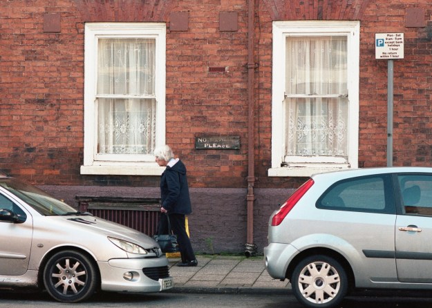
In the first shot, I spotted the No Parking sign that had seen better days with two silver cars parked seemingly in violation of the instruction. My first thought when I took this photograph was that the cars were the same colour (if silver can be considered a colour). What I didn’t realise until the film was developed was the sense of balance in the frame. The red brick and the white window frames introduce a symmetry against which the key components contrast. The signs are both clearly visible but the contrast between their messages is more obvious because of the colour. A happy accident, but this image works in colour because of the way the frame is filled with a subtle, muted palette.
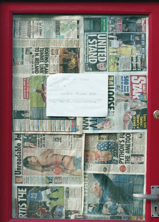
The second image was something I noticed as I walked past an old barber’s shop. The first thing that I saw was their use of tabloid newspapers to screen the windows of the now-empty shop door. As I looked at the door, I then noticed its bold colour which frames the window. I think that this image works because of the additional interest introduced by the paper and the door frame. They create a playful feel to the image, which belies the fact that the door leads into a shop that is now empty.
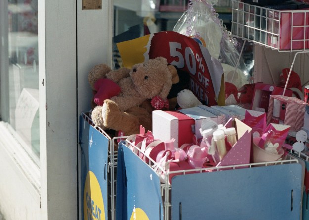
The third image selected here is of a bargain basket of Valentine’s Day gifts that I spotted outside a shop. The Valentine’s theme of pink runs through the whole picture and reinforces the message of the celebration being about love. The reason I took this photograph was to highlight the sadness of such celebrations, that have become highly commercialised, coming to an end. I am trying to show the wasteful throw-away culture of our lives with this shot, which I think is enhanced by the impactful colour.
The Black and White Images
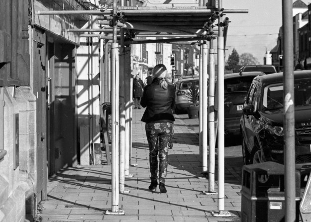
The first of the black and white images was of a woman walking away from me in some highly colourful trousers. I was struck by the boldness of this lady’s style and how she confidently down the street. In order to capture that confidence, I could have shot the picture in colour to highlight the drama of her clothes. However, I had the black and white film in the camera at this point. When I look at this photograph, I still see the confidence but I also note the visual clutter of the building works capture in the frame. The brightly coloured warning foam on the scaffolding and the roadworks sigh would, on reflection, been a clash with the subject. I think black and white works here because the drama is captured without distraction.
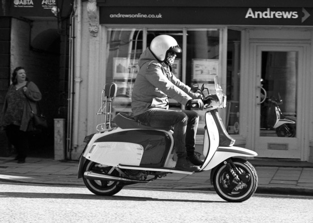
The second image is of a scooter rider in the high street. The weather was turning at the point that I shot this image, with the sun emerging from the clouds. What I think works with this being black and white is the contrast of the tones on the scooter. Black and white can be very punchy when the light works with the reflectance of the subject and this is a good example of this. The lower contrast background doesn’t distract or dampen the mood of the image.

The third image is of a book shop window. Tewkesbury has a strong Campaign for Real Ale presence in the town and part of it is a celebration of the history of pubs and brewing. It’s common to see these signs declaring a now-closed pub. What struck me about this one was sadness at the statement ‘for unknown reasons’. I shot this in black and white because I wanted to show this feeling of sadness, even though it closed long before I was born and the building still serves the public as a bookshop. The building itself, typical of Tewkesbury, is from the 1600s and I think the timber frame that is visible in the image is best represented in black and white because it connects with the early photography of this buildings which were all that way.
Conclusion – What are the differences?
If documentary photography is used to tell a story and be used by the photographer to emphasise an element of it, then the differences between colour and black and white can be significant. In reviewing them, I conclude:
- Colour can be a distraction. When a scene has many elements, but the story is about one of them, clashing colours can take away from the story. In my first black and white shot, the subject would have been lost with the addition of colour.
- Colour can add to the story when it reveals something about subject. My example of the Valentine’s sale has more impact because of the pink theme running through it.
- In both formats, balance is essential. Too much contrast or colour can distract from the story. In the examples of No Parking and Scooter, they work because there are no extremes. The colours are muted and link together in the former and the contrast separates the scooter from the background in the latter.
My personal preference has always been black and white. When reflecting on why that is, I considered the fact that the images look recognisable but somehow different to how we see the world. In the days when there was only black and white, we accepted that we couldn’t see the subject as we would if we were looking at it because there was no alternative. With the advent of colour, the images became more like our observation. Early pioneers of street photography, such as Meyerowitz and Winogrand saw the progression from black and white to colour as perfectly natural because of that distinction, but they experienced a snobbery from the art world who believed black and white to be higher quality. For me, I love the way that light can be represented in black and white tones and the punch that can be achieved with it. However, I also believe that in the hands of a skilled street artist colour can be the differentiator between a good image and one that has impact. Perhaps it is my own limited experience with the genre that steers me away from it.
Contact Sheets


