Monthly Archives: May 2020

Exercise 2.1: The Dad Project

The Brief

  1. How does Bryony Campbell’s The Dad Project compare to Country Doctor
  2. What do you think she means by ‘an ending without an ending’


In Project 1 I discussed the two photographic essays Country Doctor and The Dad Project [1].  This exercise reviews the differences between them.

Similar But Different

I think the first fundamental difference in the two series’ is how they came about in the first place.  In the case of Country Doctor, we have an assignment for LIFE magazine and although we cannot be sure how the subject was chosen or how much of it was Smith’s natural observation, there is an element of editorial motive in the series.  The story being told is a remote perspective of life in a rural community and the hard work of the local physician.  The documentary style of the story is clearly aimed at informing an audience that is not all that familiar with the subject with a feel-good element of knowing that such heroic people exist in the country.  The audience then is perhaps akin to a collection of movie-goers who bring to it little or no predetermined knowledge of the story before it is told.  The series is powerful and it is shot as if a window on the doctor’s working life, but Smith put himself in the environment to such an extent that he was a silent participant in the events that make up the story.  It is clear from the photographs that he would have reacted to the situations both as the photographer and as the audience.  From a narrative perspective, Smith builds complex layers in the sequence by including elements that are obvious to the viewer and those that need more thought.  In the shots where the doctor is not the central focal point of the composition, the viewer has to reach their own conclusion as to what is going on, e.g. the doctor treating the little girl’s broken arm [1].

In Campbell’s essay, we have a much more intimate story being told.  This time, Campbell includes herself in the story, both as daughter and photographer.  The story is about her saying goodbye to her dad, which meant that she had to capture the relationship as if she wasn’t the photographer.  This ‘insider’ perspective is the first difference between the two stories.  The second is that her father actively participated in the story.  Some of the shots in the series had his direct engagement, something that wasn’t present at any time in Smith’s work.  The accompanying video to the series further emphasises this point and perhaps a very obvious difference in the use of mixed media.  Technology allowed Campbell’s father to describe what the project would mean to him in a contextual way that was not available to Smith in 1948.   Campbell’s use of subjects other than her father is similar to Smith’s in making the viewer look for the meaning rather than being signposted to it. She also uses compositions of seemingly unconnected subjects, such as the spilled milkshake alongside more obvious imagery.  In the case of the milkshake, Campbell’s father had dropped it on the floor in a minor accident caused by his declining strength.  Alone the shot doesn’t tell us much, but woven into the sequence, it gently points us to the shift in what is normal.  Campbell describes the series as gentle and quiet, which comes through strongly as the the story progresses.  Contrasting with Smith’s often dramatic images of surgery and the doctor’s exhausting work, Campbell’s work doesn’t set out to make us feel a particular way.  Instead it relies on the viewer knowing enough about the pain of losing someone to cancer as a backdrop.  With the current pressures of daily life with COVID-19 and my own personal experience of losing my mother to cancer, I procrastinated about completing this research work and writing because it was just too hard.  While Smith’s work won acclaim for its clever storytelling, Campbell’s has been praised for offering comfort to people who are experiencing similar losses.

An Ending without an Ending

The second part of this exercise asks about the statement made by Campbell in The Dad Project.  My thoughts on what she meant by this centre around the way that the narrative doesn’t end with the photographs themselves.  This series walks the viewer through the final months of her Dad’s life from the perspective of him fading away, but also the struggle of his family to adapt to the dynamic nature of his decline.  Campbell states that it was a way of saying goodbye to him with the help of her camera, but his death in many ways was the start of the project.  What I mean by this is in the same way that a death begins the process of mourning, it is also in this case the beginning of the response to the work.  In her appraisal of the project Campbell writes as a retrospective some 3 months after his death.  The ending without an ending for me is the ongoing story of Campbell coming to terms with her loss through reflecting on both the work and the way people respond to it.  As Campbell states in her writing, the effect of the project of spreading her grief out means that it takes on different meaning with the passing of time.  In the short term, the story would be raw and painful but with the gathering interest in the work it would become more of a celebration of her father. She writes that she wishes he could read the letters she had received in response to the project’s publication, because it would have given him a sense of pride.

When compared to Country Doctor, which documented a slice of the life of someone fairly anonymous to the photographer, The Dad Project is clearly acting as a catharsis for Campbell many years after it notionally ended.

References

[1] Fletcher, R, 2020, “Project 1: Telling a Story”, C&N Blog Post, https://richardfletcherphotography.photo.blog/2020/05/29/project-1-telling-a-story/


Project 1: Telling a Story

Introduction

We are introduced to W. Eugene Smith’s 1948 photo essay called Country Doctor, which was published by LIFE magazine.  It is a series of photographs of a rural physician called Dr Ernest Ceriani, who allowed Smith to follow him around his daily life treating his patients.  The course notes refer to Smith having shot without film in his camera in the early stages while Ceriani became comfortable with his presence.   There are many stories of photographers using such techniques to relax their subjects; I am reminded of the story of Tony Vacarro, another photographer who worked for LIFE at the same time as Smith, who outsmarted Picasso during a shoot [1].  Picasso had a tendency to pose for photographers that  Vacarro didn’t want in his images.  In order to catch him off-guard, Vacarro pretended not be working, instead relaxing with Picasso as friends would.  Once he saw his subject off-guard, he shot his portrait.  What I see when I look at Smith’s Country Doctor is a man who is completely undistracted by the presence of the photographer and his camera.  In every shot, Ceriani is pictured focusing on the job at hand, which his patients more interested in the attention from the doctor than the photographer documenting their treatment.

The Series

I’ve picked out a few of the images that stood out for me in Country Doctor and describe here why they had an impact on my from a story-telling perspective.  These are part of the linear sequence as published by LIFE Magazine.

w-eugene-smith-country-doctor-10-1024x848

Two friends transported Dr. Ceriani to Gore Canyon so he could enjoy a few hours of recreational fishing, a rare treat for the hard-working physician. [2]

05538633.TIF

Dr. Ceriani fly-fished on the Colorado River. [2]

w-eugene-smith-country-doctor-12-1024x748

Thirty minutes into his fishing excursion, Dr. Ceriani was called to an emergency: A young girl has been kicked in the head by a horse and was badly injured. [2]

w-eugene-smith-country-doctor-13-1024x726

The child’s worried parents looked on as Dr. Ceriani, surrounded by nurses, examined their two-year-old daughter. [2]

Analysis

In this sequence, which is shown in its chronological order as published, we see Dr Ceriani heading along a railway track with two people and fishing equipment.  The caption informs us that this is a rare and well-earned break for the doctor, which fits with the photographs of him working hard that precede it in the series.  The caption adds some context to the photograph.  The next shot is of the doctor enjoying his fishing trip in a simple composition by the Colorado river.  The next photograph is of the doctor back at the rail car, this time with a policeman in attendance.  The caption tells us that there has been an accident where an little girl has been badly injured.  The doctor is being interrupted from his trip to attend to the little girl.  The final image shows the doctor tending the girl’s injuries as the anxious parents look on.

What struck me about this sequence was the way that there are sufficient elements within the frame to tell the story without the captions being added.  The inclusion of the details such as the fishing rods in the first photograph and the policeman in the third suggest recreation that is being disturbed for some serious reason.  The shift from a man enjoying his break to the professional working on his patient is made more obvious by the way that Smith makes him a non-essential part of the final frame (in fact we can barely see him).  The drama first introduced by the policeman in number 3 is increased with the worried expressions on the faces of the girl’s parents and the activity going on at the right hand side of the frame.  The layers of the sequence build with the increasing number of elements included in the compositions.  The emphasis moves away from the doctor as the main subject and the addition of the text narrative in order to tell the story, which has the little girl treated successfully in the subsequent frames.  However, this is only a small part of the essay that Smith created.  He shot the doctor making house calls for minor ailments, building relationships with this patients and moving on to facing increasingly challenging situations with more serious illnesses.  The story that LIFE published, highlighted through Smith’s essay the challenges of living in rural America and the dedication of the care services that are at the heart of the community.  However, Smith regularly had disagreements with the way that LIFE presented his work because he had carefully crafted the linear sequence, which they regularly ignored [3]. In Cosgrove’s article [2]  there are a number of photographs that depict the doctor in a less dramatic situations, such as delivering a baby, that were not published by LIFE at the time.  While Smith would have undoubtedly wanted to portray Dr Ceriani’s more routine activities, perhaps LIFE felt that it diluted the impact of the story.  With editorial control, they would have published what they thought would be more impactful to their readers.

Smith’s series is considered a landmark in photojournalism and it easy to see why.  The contextual elements in the pictures and the layered stories that play out in the sequence make it a powerful collection that is still relatable nearly 70 years later.

Bryony Campbells’s The Dad Project (2009)

The second photo essay we were introduced to was Bryony Campbell’s ‘The Dad Project”, which told the story of the final months of her father’s life suffering with cancer.  I found this photo essay particularly difficult to look at as it mirrors my own experience of the death of my mother 25 years ago.  I think the reason it was so difficult is the way that Campbell approached the project.  In the video that accompanies the work [4], we first see an interview with her dad in which he describes the thought processes and emotions surrounding the original request to shoot the project.  Campbell’s father talks about the opportunity the project offered for him to learn more about what his illness meant for his daughter and in a way understand her more.  He also wrestled with the idea of not being the main source of care and support to his family as he saw his health decline.  The project would be something for the family to collectively focus on instead of the awful nature of his illness.

The series itself tells a number of stories through the use of a different subjects.  The first layer is obviously pictures of her father.  He appears as one would expect, to decline in health as the series progresses with the obvious physical effects coming out in the images.  The next layer is his family.  Campbell uses images of her family and self portraits to describe the more mundane acts of looking after her father as well as the intense emotional reactions to his condition.  One of my favourite shots from from the accompanying video is a shot of her parents in conversation (below).

Screenshot 2020-05-29 at 10.48.43

Screenshot of The Dad Project by Bryony Campbell [4]

Campbells father is talking but the point of interest in the photograph is her mother who has a distant, almost vacant stare.  The expression on her face reinforces some of the earlier imagery and the video in which the positivity of Campbell’s dad comes through.  My own experience echoed this narrative as my mother was optimistic and practical throughout, while her family around her struggled to keep it together.  The final layer for me is the use of the inanimate but related objects.  There are photographs of the sun shining through trees, empty glasses and milk bottles that emphasise the normality surrounding the family while the story plays out.

What struck me about Campbell’s description of how she went about the project [5] was her initial reluctance and discomfort about whether to tackle her father’s illness using photography.  Like most people she continued to doubt her decision to start the project as it progressed and only when it became an established part of her family’s experience did she start to appreciate the part that her photography was taking in her coping with the situation.  One telling moment in the text is after her dad had passed away when her mother asked if she had enough photographs.  Perhaps the most powerful image in the series was taken after his death (below)

BrionyCampbell_0238-1000x666

Me and Dad, 2009 by Bryony Campbell [5]

Here we have Campbell holding her dad’s lifeless hand, which shows the dramatic change in appearance when a body is no longer living.  I love this photograph because of the stark contrast and obvious statement that here is a man who has gone, but also because it serves as a loving close of the series, with the comforting way Campbell cradles her dad’s hand.

Overall, this project has looked at two very similar but different photographic essays, both in subject matter but also approach.   Exercise 2.1 explores The Dad Project further in relation to Smith’s Country Doctor.

References

[1] Kasfikis, P, 2016, “The life of Tony Vaccaro: A Lens into Modern History, Medium Magazine, https://medium.com/vantage/the-life-of-tony-vaccaro-a-lens-into-modern-history-4d0e422b73eb

[2] Cosgrove, B, 2012 “W. Eugene Smith’s Country Doctor: Revisiting a Landmark Photo Essay”, LIFE Magazine, https://www.life.com/history/w-eugene-smiths-landmark-photo-essay-country-doctor/

[3] Abel-Hirsh, H, 2017, “Social Issues – Country Doctor”, Magnum Photos, https://wordpress.com/post/richardfletcherphotography.photo.blog/2126

[4] Campbell, B, 2011, “The Dad Project – Video”, The Guardian, https://vimeo.com/12600297

[5] Campbell, B, 2011, “The Dad Project, Artist Website, http://www.brionycampbell.com/wp-content/uploads/2013/03/The_Dad_Project_Briony_Campbell.pdf


Case Study 2: Imperial Courts – Dana Lixenberg

Imperial Courts – Dana Lixenberg

With Lixenberg’s Imperial Courts, we see another subtly different approach to documentary photography.  Here, the photographer spends a long time becoming an insider in the community she is photographing.  Unlike previous examples where images have been shot of subjects either without them knowing or being aware of the implications of being photographed, Lixenberg used a 4×5 camera.  My own experiences of the two cameras that I own are that they take a longer time to set up for a shoot and cannot be used discreetly.  This meant that Lixenberg had to have the cooperation of her subjects.  She shot Polaroid images as part of her workflow, which is a common way of checking composition and exposure with these cameras.  By gifiting them to her subjects, she was able to win their trust.  Most of all, though her photographs are not conceived with any additional drama or sensationalised as the notes put it.  The subjects are shot in simple poses with enough background detail to place them in contextual terms but not in a way that steers the viewer to feel a particular range of emotions.  Lixenberg’s intention was to create a body of work that showed the people in their daily lives.  It wasn’t until she returned later in the project to shoot the environment and social impacts on the people who lived in Imperial Courts, do we see a combination of images that document life.  When I look at the imagery, I see a flow of story-telling centred around how the people in her photographs had changed over the many years of the project.  In the a video interview [1], one of Lixenberg’s subjects talks about three images in sequence in the book.  The first is of her son, who she states was murdered in the neighbourhood.  The second is of her that she describes as ‘breathing but not ok’ and the final image is of the place where her son was shot dead.  In three images we see a young man full of life, a mother holding onto her dignity and the tragic reality of the area. For me, Lixenberg’s skill in the series is as much about the honesty of the photographs and the clear affection she has for the people than the story she is telling.

References

[1] Unknown, 2015, “Deutsche Boerse Photography Foundation Prize 2017: Dana Lixenberg”, MUSEUM MMK FÜR MODERNE KUNST, https://www.youtube.com/watch?v=MUhX56bbkrg

Exercise 3: Public Order

The Brief

Look at some more images from this series on the artist’s website

  • How do Pickering’s images make you feel?
  • Is Public Order an effective use of documentary or misleading?


Sarah Pickering’s series Public Order does something different again to Seawright’s.  This time we are presented with images of a deserted town that could be anywhere.  When I look at them, I am reminded of the run-down areas of industrial West Yorkshire, where my wife is from.  Boarded up businesses and seedy looking night clubs like the one in the notes are commonplace.  While areas of the town are recovering from the socio-economic problems related to the decline of the steel and textile industries, there are areas where those problems are still obvious. The collection moves through the desolate town-scape leaving me with a sense of sadness more than fear because of my relationship with those areas.  I was actually disappointed at the feeling of being deceived as the collection becomes more obviously ‘not real’.  The compositions themselves use leading lines, shapes and textures beautifully, but I couldn’t initially see what the artist was trying to say.    While Flicks Night Club caused me to create a narrative about deserted streets, something very relevant to the current Coronavirus pandemic, the complementary image Behind Flicks Night Club says nothing to me apart from a pleasing matching of shape and colour.   I started to think more about what Pickering was looking for when she shot the series and in a video interview with Aperture [1], she describes the relationship she has with rules and authority.  She talks of her father being very much a fan of rules, so perhaps she was saying that beneath the surface there is a fabrication or fantasy.  The pictures that contain evidence of the ‘riot’ damage caused by the police training that takes place in the town, suggest that it’s ok to rebel authority, real or otherwise.

For me, as an art collection Public Order works well as each image connects with the other sand they are aesthetically pleasing.  However, unlike Seawright’s Sectarian Murder the context is all within the image i.e. without the key information that this is a police training ground, so the narrative is vague for me.  I confess that I don’t personally like the work as much as Seawright’s as the impact is less powerful on me.  Do I think it’s a misleading use of documentary?  I would say that it’s not more misleading that any of the work I’ve looked at so far.  The police do deal with riots and towns like this do exist, even if the details are embellished.

References

[1] Aperture Foundation, 2018, “Sarah Pickering on Public Order & Explosion series Excerpt, https://www.youtube.com/watch?v=oQRAW_cPvfY&list=PLvAytXgNgEllIfZ7aw0pinYQjYVqqPDXq&index=34&t=0s

Project 4: The Gallery Wall – Documentary as Art

Research Task – Paul Seawright’s “Sectarian Murders”

Introduction

When first looking at the series Sectarion Murders, I naturally read the accompanying narratives taken from the press and then looked at the photographs.  Seawright’s use of text taken from news reports of sectarian murders is powerful in its own right.  He removed any reference to which side of the Northern Ireland conflict was being held responsible for the killings, instead leaving just the flat, sadness of the facts.  With each image, the backdrop of the text is then used by the viewer to allow them to create their own narrative.

The first shot in the series has the text:

‘The sixteen year old youth was standing at the corner of Dandy Street talking, when a motorcycle with two youths on it drove by.  The pillion passenger was carrying a Sterling sub-machine gun and opened fire on the group.  The boy fell dying in a hail of bullets’

 The text starts by factually reporting the incident as if it were a police record; the use of the word ‘youth’ and the detailed identification of the weapon used.  Towards the end, the piece introduces the tragedy element with ‘the boy fell dying in a hail of bullets’.  This single sentence introduces the more human element, connecting the age at the start of the piece with the fact that this was a 16 year old child.  The extremely violent nature of his death is further emphasised by the ‘hail of bullets’.  I found the building horror of the text to be interesting even before viewing Seawright’s accompanying picture.

The image itself depicts a street corner, assumed to be the place where the shooting took place.  The bleak environment has a couple of streat signs and a small caravan parked on the corner.  The image is shot with a flash that picks out the stop sign and a reflective stripe on the motorcyclist passing in the background.  When I viewed the image, I was first struck by the emptiness of the frame which created a bleak view.  The large areas of ground and sky have little interest in them beyond being either sunrise or sunset.  The approaching bike is small in the frame and while the context is all about the murder being a drive-by shooting, it creates a sense of unseen and unexpected.  I look at the small caravan and think ‘few witnesses, if any’.  The final element of the bright ‘Stop’ sign is to me a narrative of the horror of the killing of a child, suggesting that this kind of act cannot continue.   All of these narrative elements in my interpretation come from having read the contextual text first. Without it, the scene is an early morning or late evening bike ride at first glance. The context is critical to the narrative.

The Video Interview

In the video [1], Seawright comments on the extremes of having too loose a context and being too prescriptive, citing the former to be having little obvious meaning and the latter being journalistic.  Looking at his series, I understand what he means here.  The images themselves are interesting from a composition and lighting perspective but they only had an impact on me with the accompanying context.  Seawright moves us away from the vague, but does not add so much context to make the image too easy to navigate.  He talks about the viewer creating the narrative rather than him and that in order to do that, they need the space and time to do so.  I was reminded of a previous piece of research that I did for EYV where Nan Goldin was talking to an audience about how she feels about the Instagram generation [2].  She talked about being in a conversation with a social media manager about some paintings that she had done.  When that person looked at them on her phone, she swiped through the collection very quickly.  Goldin challenged her that she hadn’t looked at them, only to be told “I saw them”.  Goldin’s realisation that this is how the world looks at images led her to dislike the platform.   The same is true here.  As Seawright states that a journalistic image needs only the briefest of glances to understand what is going on, art needs space and time for the viewer to appreciate the image as they create the narrative internally.  I agree with this sentiment as I’ve had feedback from people viewing my own photographs where I’ve not tried to be too vague or obvious about the meaning.  In terms of whether we can re-classify documentary as a piece of art with or without changing the meaning, I believe that to be dependent on the image’s internal context.  Looking at Seawright’s collection, there are no internal contexts that point to sectarian murder.  In several of the images in the collection, Seawright draws us into the frame with traditional techniques and  elements that are often playful and seemingly innocuous.  He challenges the seemingly idyllic with the horror of the external context, leaving the viewer re-considering how they originally felt about the picture.  For me, that challenge is very much key to art.

Sarah Pickering – Public Order (from Exercise 3)

Sarah Pickering’s series Public Order does something different again to Seawright’s.  This time we are presented with images of a deserted town that could be anywhere.  When I look at them, I am reminded of the run-down areas of industrial West Yorkshire, where my wife is from.  Boarded up businesses and seedy looking night clubs like the one in the notes are commonplace.  While areas of the town are recovering from the socio-economic problems related to the decline of the steel and textile industries, there are areas where those problems are still obvious. The collection moves through the desolate town-scape leaving me with a sense of sadness more than fear because of my relationship with those areas.  I was actually disappointed at the feeling of being deceived as the collection becomes more obviously ‘not real’.  The compositions themselves use leading lines, shapes and textures beautifully, but I couldn’t initially see what the artist was trying to say.    While Flicks Night Club caused me to create a narrative about deserted streets, something very relevant to the current Coronavirus pandemic, the complementary image Behind Flicks Night Club says nothing to me apart from a pleasing matching of shape and colour.   I started to think more about what Pickering was looking for when she shot the series and in a video interview with Aperture [3], she describes the relationship she has with rules and authority.  She talks of her father being very much a fan of rules, so perhaps she was saying that beneath the surface there is a fabrication or fantasy.  The pictures that contain evidence of the ‘riot’ damage caused by the police training that takes place in the town, suggest that it’s ok to rebel authority, real or otherwise.

For me, as an art collection Public Order works well as each image connects with the other sand they are aesthetically pleasing.  However, unlike Seawright’s Sectarian Murder the context is all within the image i.e. without the key information that this is a police training ground, so the narrative is vague for me.  I confess that I don’t personally like the work as much as Seawright’s as the impact is less powerful on me.  Do I think it’s a misleading use of documentary?  I would say that it’s not more misleading that any of the work I’ve looked at so far.  The police do deal with riots and towns like this do exist, even if the details are embellished.

Assesandra Sanguinetti. The Adventures of Guille and Belinda and The Enigmatic Meaning of Their Dreams

Here we have a series about two young cousins growing up in rural Buenos Aires.  Sanguinetti observed the clear differences in appearance between the two girls, one larger and more mature looking than the other.  When set against the backdrop of their lives, the series could have simply documented their growing up within a particular way of life.  Instead, Sanguinetti adds another layer to her work, by documenting the way the girls play. Their imaginations and depictions of events from dreams moves straight documentary with context, to something more impossible or fantastical.  Consider the example below:

ARGENTINA. Buenos Aires. 2001. Ophelias.


Ophelias, by Alessandra Sanguinetti, 2001[4]

Here we have the classical depiction of Ophelia from Hamlet.  She is the tragic potential wife of Prince Hamlet who descends into madness during the events of the play, ultimately drowning in a river in a suspected suicide.  The fact that the cousins act out this scene is interesting.  Ophelia was described in the play as a great beauty, which the girls could well be aspiring to.  Their physical differences are noticeable, yet hidden by their fine clothing and the way they are posed for this shot.  Sanguinetti uses the famous painting by John Everett Millais as inspiration for the composition, which depicts Ophelia at peace in the water. The girls in turn look peaceful and their appearance has a sense of equality to it.  A darker interpretation of the image could be that they long for any kind of escape from rural Brazil, even if it means death.  By incorporating multiple contexts within the frame, Sanguinetti leaves plenty of room for the narrative to be created.  Other images in the series deal with fantasies of beauty, divinity and death, but at the core of all of them are two little girls spending time with each other.

For me, this sums up the variability of documentary photography and its intent.  It can be both truth-teller and storyteller.  It can describe factual events without actually showing them as well as associating patterns and textures with the mood of the photographer.  Too prescriptive and it can be a brief news item and too vague leaves any interpretation possible.  When I look at this series, I see a story built from many fantastical layers, with the only real ‘fact’ that is documented being two little girls who like dressing up.  It’s a fascinating and compelling art collection.

References

[1] 2014, “Catalyst:Paul Seawright”, https://vimeo.com/76940827

[2] Tattersall, L, 2018, “Nan Goldin in Conversation with Lanka Tattersall”, MOCA, https://www.youtube.com/watch?v=b2XrWPdJIBg

[3] Aperture Foundation, 2018, “Sarah Pickering on Public Order & Explosion series Excerpt, https://www.youtube.com/watch?v=oQRAW_cPvfY&list=PLvAytXgNgEllIfZ7aw0pinYQjYVqqPDXq&index=34&t=0s

[4] Sanguinetti, A, 1999 -2001, “The Adventures of Guille and Belinda and the Enigmatic Meaning of their Dreams”. Magnum Photos Portfolio, https://pro.magnumphotos.com/C.aspx?VP3=SearchResult&ALID=2K7O3RHJ7TOL

Exercise 5: Critical Analysis

The Brief

Read the section entitled ‘The Real and the Digital’. in Wells, L (ed.) (2015) Photography: a critical introduction (Fifth Edition) London [England]; New York, New York, Routledge. pp 92-95.

Does digital photography change how we see photography as the truth?

Consider both sides of the argument and make some notes in your learning log.

The Arguments

The article puts a number of arguments forwards about the rise of digital media and its impact on what is ‘real’.  Broadly speaking, it is argued first that far from being a technical curiosity that seeks to mimic traditional photographic method, the advance of digital techniques will eventually evolve into a medium in its own right; imagery claiming to be real having being created entirely from scratch.  This evolution makes it virtually impossible to seek out the truth in an image.  The argument that truth is found by the connection of the image to the trace of an event (Barthes) is challenged by this ability to create from nothing.  The counter argument is made that perhaps it isn’t necessary for a photograph to be single-handedly based in truth as the evolution of visual media as a whole has transformed how traditional documentary is achieved.  Buadrillard and Campany support the lack of a point to representing the reality of an event when the story is much wider than what is happening.  The latter going on to say that photography has never been self-governing or reliant on technological factors, more how it is used and to what end.  The rise of the ‘citizen journalist’ with their handheld devices places the ‘photographer’ firmly in the action, making it appear a more honest and real report.  This has replaced the level of separation present in traditional documentary photography between subject, editor and the public but achieves a similar goal.  Citizen photographers publish to the world via social media platforms and to some extent, control the audience for their images.  News outlets pick up this media via the same technology and so, the evolution of this style of documentary is argued to be spelling the end of traditional documentary as we know it.

Analysis

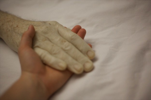
The first and possibly most obvious argument about the rise of digital photography techniques is one that I can directly relate to, being relatively inexperienced at using editing and manipulation software.  What I have learned has been entirely self-taught, using online video tutorials on YouTube.  Like many, I started with wanting to know something specific and have experimented in the margins around that particular topic.  What has been clear to me over the years is the rate of change.  Adobe Photoshop used to be a single program, updated every year or two to bring enhanced feature sets to its devoted users.  In recent years however, the software has moved to a subscription platform where now it appears that updates and functions are added much more frequently.  Whenever I use the software now, I’m acutely aware of the distance between its limitations and my own capabilities.  Far from mimicking what could be done in the darkroom with paper, chemicals, toning, tinting, Photoshop allows for the creation of fantastical images with relative ease.  In Exercise **, I created a composite image of my face blended with a phrenology bust and the result was haunting in appearance but had that element of truth that Barthes referred to in his assertion about the trace of an event.  In the photograph, my eyes and hair are very real, but the glassy surface of my new skin with its virtual tattoos of the areas of the head are clearly not.  The alignment of both images is sufficiently accurate to leave the viewer wondering what I am.  Is this the face of a doll or some experiment in robotics that one might find being reported in some science and technology publication?  What digital media has created then is an image that our first instinct is to believe and second is to question.   As Baudrillard stated though, the event itself isn’t the story but the factors that surround it and the sensationalism or enthusiasm at how it is being reported that tells the truth of it.  In the case of my photograph, its not that clear a connection to draw.  However, the Victorian ghost photography that was created with the similar but more primitive technique of double exposure, had a different cultural meaning.  The Victorians were a superstitious and spiritual generation that wanted desperately to believe their loved ones went onto another place after death.  They treated their dead in a way intended to be as normal as possible, including photographing their corpse in a living scene (below) and many of the traditions we have today with regard wakes and funerals trace back to their time.

_89874322_yong-ldy

Two Victorian death photographs.  On the left, the dead woman is posed with her parents and appears sharp during the long exposure compared to the living.  On the right, a more conventional documentary tribute [1]

Imagine the shock and joy of discovering that photography could capture the spirits of the departed.  As photography was a serious technical endeavour, its use (Campany) was never questioned by the unsuspecting public.  If they had done, they would have uncovered the fraud being committed by the photographers who deliberately sold them images that were manufactured in the darkroom.  In this case, the social clamour for photography to be truthful outweighs the event being captured, with manipulation being a method to achieve an intended goal.

The other argument being made is that the evolution of digital media alongside photography has lent truth to stories that we wouldn’t ordinarily believe or want to focus on.  With citizen photography placing the ability to document an event in the hands of everyone with a mobile phone, the news is captured and made accessible every minute of every day.  This bombardment of news via social media and through the online presences of traditional news outlets, makes it difficult to see what is real and what is not.  Now we have Barthes’ traces of the event, combined with the availability of high resolution video in the hands of the masses and also the socio-political temperature stoked by social media and 24hr news.  The phrase ‘truth and consequences’ perhaps more than ever, has a relevance in modern documentary.  An example of this happened in my region in 2016.  A photograph was shared on social media of a man sitting in a pub garden, wearing a very offensive t-shirt that mocked the deaths of the 96 victims of the Hillsborough tragedy in 1989.  The edited image is shown below:

Hillsborough-t-shirt-pixelated

This image of the man first appeared on social media.  The text was pixellated by the news outlet reporting that he’d been charged with a public order offence [2]

The image was shared as a statement of the horrific poor taste of the t-shirt that the wearer claimed was ‘banter’ at the time of the incident.  However, the strength of feeling in the UK about the Hillsborough tragedy meant that it was circulated widely and quickly at the same time that the police were investigating the man for a public order offence.  The impact of this viral explosion was that the man was quickly identified by people who were present at the pub and soon after that, he was tracked down via social media and made the target of hate campaign.  When the case came to court, the man was fined for the offence but he stated in court that the incident had cost him his job, home, relationship and friends.  He spoke of his remorse for what he had seen as fairly harmless and accepted that the punishments fitted the ‘crime’.    In the context of the crime committed, it is difficult to see its severity but in the context of society and the pain caused by Hillsborough that is still felt 30 years later, the incident was hugely offensive to a great many people.   What interested me about the coverage when I was looking for the photograph for this essay was that the mainstream media outlets all elected to pixellate the text on the t-shirt so as to not cause further offence.  However, some online news sources were not so accommodating.  For me, this plays to the traditional model of the editorial defining how the story is told, despite being of the modern era.

The final point made in the source material was that traditional magazine photojournalism has been in decline for many years because of the way that events are recorded using mixed media.  This makes sense as many magazines have had to move their focus online as this is how many people consume their content.  The need for high-quality, carefully photographed subjects is still there when it comes to lifestyle, travel and the review of art.  However, there is a move towards the authentic experience particularly in travel, which is becoming increasingly satisfied by travelogs and Instagram rather than the traditional glossy publication.  I am reminded of a training course that I taught at work where we explored entrepreneurship in the 21st Century. I would tell the story of having to flick through glossy travel brochures where the hotels were shot sympathetically to emphasise their scale or in some cases hide building works.  The imagery was always oversaturated, shot in ideal weather and generally made to look like somewhere we would want to visit.  Now, of course with the invention of the travel review sites like Trip Advisor in the early part of the century, we want to know what people really think.  The power to make or break a holiday offering now sits with the people as part of the media revolution we’ve all had to adapt to.

Conclusion and Reflection on Part 1

In conclusion, the argument that photography can be used to create a false truth is something that I accept both as an engineer and as someone trying to develop their own creativity.  However, I strongly believe that people make their own mind up what is real and what isn’t.  The photograph needs to have a trace element to something believable as Barthes asserted, but that trace can be miniscule.  The contextual elements in a photograph on their own might lead the viewer to reach the ‘truth’ of the image, but it is more likely that their personal experiences and what is happening around them influence the conclusion that they reach.  The rise of digital and social media mean that people associate truth with the ‘herd’ mentality.  To that end, digital media has changed the way we see the truth in photography.  With the Gulf War example that Baudrillard controversially stated ‘didn’t happen’, our perception of the politics that took a previously supported dictator in Saddam Hussein into an invasion of a neighbouring country, shaped the way we saw the news of the conflict untold.  Instead of describing something that backed up our assumed knowledge, we should think of what truth there is in Baudrillard’s comment about the conflict rather than dismissing it.

At the start of this unit, I assumed documentary photography to be a straight capturing of the event at hand.  In a similar way that at first glance, the decisive moment is seen as an accurate slice of time, I believed that documentary was the no-frills view of what is happening.  However, we know that the decisive moment says little about the pattern of life, the events leading up to and immediately following the snapshot, so why is it such a departure to question the truthfulness of documentary?  Documentary for me is a perspective on an event that we are encouraged to believe, e.g. the FSA images of American migrants.   It blends the reportage of showing only what is needed and seeks to tell the story in either a single frame or series (Cartier Bresson, Lixenburg).  The concepts of being part of the story and being an observer were new to me.  When comparing the works of Arbus and Goldin, I could clearly see how their differing  viewpoints of trans-sexual people provoked different emotions in me.  While Arbus’ observations appeared to focus on the strangeness and unrecognisable, Goldin’s work is warm and affectionate towards the people who were her dearest friends.  Lixenburg achieved the same sense of belonging by becoming part of the community that she was photographing, while still not entirely relating to their plight.

I also learned that when the frame or series contains space for interpretation, we start to move into the realms of documentary art (Seawright, Pickering).  Too little context and the viewer creates their own fantastical narrative.  Too much and the viewer is signposted to the point of the image.  Seawright’s Sectarian Murders collection struck a chord with me as each image takes on greater meaning with the external text as context. Overall, I would say that my understanding of documentary has shifted significantly in Part One with a focus on challenging my interpretation of the image, while not getting hung up on the truth.

References

[1]  Bell, B, 2016, “Taken from life: The unsettling art of death photography, BBC News Article, https://www.bbc.co.uk/news/uk-england-36389581

[2] Stewart, G, 2016. “Man charged over offensive Hillsborough T-shirt”, The Liverpool Echo, https://www.liverpoolecho.co.uk/news/liverpool-news/man-charged-over-offensive-hillsborough-11403422

Exercise 2: Street Photography

The Brief

1) Find a street that particularly interests you – it may be local or further afield.  Shoot 30 colour images and 30 black and white images in a street photography style.

2) In your learning log, comment on the differences between the two formats.

3) What difference does colour make?  Which set do you prefer and why?

Introduction

For this exercise, I chose Tewkesbury High Street which is reasonably local to me.  It interests me because of its history and the fact that my family’s origins can be traced back around 250 years or so.  For the shoot, I decided to use film as the colour and black and white images would be correctly represented, as opposed to performing a conversion in Lightroom.  I shot one roll of Kodak Portra 400 colour and one of Kodak TMax 400 black and white in my Nikon F6 and had them both developed professionally.  After selection, the total images for each type were not quite 30, but I was able to review enough shots to answer the questions set by the brief.

The Colour Images

Throughout my photographic learning, colour has always been the ‘normal’ in pictures.  What I mean by this is that even its most basic in terms of light, composition and interest, colour images represent what we remember how the scene looked when we shot it.  As a child, I randomly shot whatever interested me without any consideration of how the colours balanced or impacted a scene. As I’ve got older, the learning has been around ensuring that colour doesn’t distract from the subject of the photograph.  Finally, with my interest in shooting film in the past few years, I’ve learned that colour can be used to draw attention to a subject, set it within a colour environment that makes it appealing and as a visual frame.  Including elements of colour that complement the subject can help support the story being told just as contrasting colour can distract from it.

For my street photographs in Tewkesbury, I was shooting on a sunny day with intermittent clouds which meant that I also had the colour of the light to work with.

A few examples of my colour images can be seen below:

Ex120200313_12270898_0054-2

In the first shot, I spotted the No Parking sign that had seen better days with two silver cars parked seemingly in violation of the instruction.  My first thought when I took this photograph was that the cars were the same colour (if silver can be considered a colour).  What I didn’t realise until the film was developed was the sense of balance in the frame.  The red brick and the white window frames introduce a symmetry against which the key components contrast.  The signs are both clearly visible but the contrast between their messages is more obvious because of the colour.  A happy accident, but this image works in colour because of the way the frame is filled with a subtle, muted palette.

Ex120200313_12255222_0052-2

The second image was something I noticed as I walked past an old barber’s shop.  The first thing that I saw was their use of tabloid newspapers to screen the windows of the now-empty shop door.  As I looked at the door, I then noticed its bold colour which frames the window.  I think that this image works because of the additional interest introduced by the paper and the door frame.  They create a playful feel to the image, which belies the fact that the door leads into a shop that is now empty.

Ex120200313_12513040_0069-2

The third image selected here is of a bargain basket of Valentine’s Day gifts that I spotted outside a shop.  The Valentine’s theme of pink runs through the whole picture and reinforces the message of the celebration being about love.  The reason I took this photograph was to highlight the sadness of such celebrations, that have become highly commercialised, coming to an end.  I am trying to show the wasteful throw-away culture of our lives with this shot, which I think is enhanced by the impactful colour.

The Black and White Images


Ex120200313_11404149_0002

The first of the black and white images was of a woman walking away from me in some highly colourful trousers.  I was struck by the boldness of this lady’s style and how she confidently down the street.  In order to capture that confidence, I could have shot the picture in colour to highlight the drama of her clothes.  However, I had the black and white film in the camera at this point.  When I look at this photograph, I still see the confidence but I also note the visual clutter of the building works capture in the frame.  The brightly coloured warning foam on the scaffolding and the roadworks sigh would, on reflection, been a clash with the subject.   I think black and white works here because the drama is captured without distraction.

Ex120200313_11582705_0021


The second image is of a scooter rider in the high street.  The weather was turning at the point that I shot this image, with the sun emerging from the clouds. What I think works with this being black and white is the contrast of the tones on the scooter.  Black and white can be very punchy when the light works with the reflectance of the subject and this is a good example of this.  The lower contrast background doesn’t distract or dampen the mood of the image.

Ex120200313_11435365_0006

The third image is of a book shop window.  Tewkesbury has a strong Campaign for Real Ale presence in the town and part of it is a celebration of the history of pubs and brewing. It’s common to see these signs declaring a now-closed pub.  What struck me about this one was sadness at the statement ‘for unknown reasons’.  I shot this in black and white because I wanted to show this feeling of sadness, even though it closed long before I was born and the building still serves the public as a bookshop.  The building itself, typical of Tewkesbury, is from the 1600s and I think the timber frame that is visible in the image is best represented in black and white because it connects with the early photography of this buildings which were all that way.

Conclusion – What are the differences?

If documentary photography is used to tell a story and be used by the photographer to emphasise an element of it, then the differences between colour and black and white can be significant.  In reviewing them, I conclude:

  • Colour can be a distraction. When a scene has many elements, but the story is about one of them, clashing colours can take away from the story.  In my first black and white shot, the subject would have been lost with the addition of colour.
  • Colour can add to the story when it reveals something about subject. My example of the Valentine’s sale has more impact because of the pink theme running through it.
  • In both formats, balance is essential. Too much contrast or colour can distract from the story.  In the examples of No Parking and Scooter, they work because there are no extremes.  The colours are muted and link together in the former and the contrast separates the scooter from the background in the latter.

My personal preference has always been black and white.  When reflecting on why that is, I considered the fact that the images look recognisable but somehow different to how we see the world.  In the days when there was only black and white, we accepted that we couldn’t see the subject as we would if we were looking at it because there was no alternative.  With the advent of colour, the images became more like our observation.  Early pioneers of street photography, such as Meyerowitz and Winogrand saw the progression from black and white to colour as perfectly natural because of that distinction, but they experienced a snobbery from the art world who believed black and white to be higher quality.  For me, I love the way that light can be represented in black and white tones and the punch that can be achieved with it.  However, I also believe that in the hands of a skilled street artist colour can be the differentiator between a good image and one that has impact.  Perhaps it is my own limited experience with the genre that steers me away from it.

Contact Sheets

Project 3 – Reportage

What is Reportage?

In attempting to answer this question, I took the approach that most start with, a Google search.  The answers were particularly puzzling.  Most, including the dictionary definition refer to reporting an event in some form of broadcast media:

reportage

noun [ U ]   formal

UK  /ˌrep.ɔːˈtɑːʒ/ US  /rɪˈpɔːr.t̬ɪdʒ/

the activity of, or style of, reporting events in newspapers or broadcasting them on television or radio

from the Cambridge English Dictionary [1]

The ambiguity in defining the level of objectivity or subjectivity in photography was not really a surprise, given the work so far in Part 1.  The photographer has the power to tell a story that looks like the truth, but from their point of view.  The concept of inside/outside can grant the photographer a form of credibility which they can use to draw attention to the key elements of the story.  This level of manipulation of the viewer, while very clever and often subtle, still needs the elements in the image to make it work.   In the case of the post-event ‘late’ photography the element of time is removed but the juxtaposition of the subject and background, along with the supporting external narrative tells the story.   Intriguingly, the first image in Project 3 is one where an event isn’t occurring at all.   Edgar Martins’ image [2] is of a large empty room, lit from the opposite end to the viewer by French windows.  The only details in the room itself are the elegant architecture, the wooden floor with leaves strewn across it.

05-Conneticut-New-England

A room at 14 Baldwin Farms South, Greenwich Conn., 2009 by Edgar Martins [2]

Why is this image considered to be reportage?  The answer as I see it is that it is a document of the room.  The image shows the elegance of the space that is not in a state of decay but appears to be well looked after. The ‘neglect’ in the image comes from the emptiness and the leaves, suggesting that the room has been abandoned, albeit recently.  The image, for me tells a story in one frame but that story has no supporting context to steer the viewer in any way.  When we consider the series that the image came from, we see a story of the collapse of the American economy following the sub-prime mortgage scandal of 2008.  Power messages of houses in a state of decay or being reclaimed by nature make the series a compelling one.  What was shocking was that the photographs were digitally manipulated by Martins without the knowledge of the commissioning body, The New York Times.  In the image we have, close inspection reveals cloning of the leaves on the floor and of the light switches in the wooden panelling [3].  The outrage caused by Martins’ seemingly distorting the truth about the subject was dismissed by the artist as being a misunderstanding [4]

“It is crucial that both the commissioning entity and the photographer can articulate their goals and parameters clearly. In this specific case there was a clear misunderstanding concerning the values and rights associated with the creative process that led a renowned publication like the New York Times Magazine to commission an artist, such as myself, to depict a very specific view of reality without taking all the necessary measures to ensure that I was fully aware of its journalistic parameters and limits.”

What he was saying was that he didn’t appreciate the newspaper’s intention to limit his creativeness to tell a truthful story.  For me, this lack of expectation management reveals how photography itself can be manipulated to suit a single purpose.

When considering the decisive moment, where the events are unfolding in real time, I see a similarity to modern citizen journalism.  Cartier-Bresson was sensitive to all of the elements in the frame as opposed to the subject matter alone, which allowed him to tell the story through a single moment in time.  Optimal placement of the elements, no matter how subtle can tell a much broader story as with the image in the notes.

Bresson’s Dessau shows a Gestapo spy being shown to the crowd she was trying to hide in.  The elements that make up the frame are compelling as they contain multiple expressions of anger and disgust on the faces of the crowd and the woman who is detaining her.  The prisoner has an expression of shame as the person she is brought before reviews her papers.  It’s little wonder that this image told the tale of the turning tide of the war in a single frame.  The Gestapo were a feared Nazi secret police force who were known for turning citizens into spies and informants within the ranks of ordinary people and resistance fighters alike.  The image of one being captured is about as good a piece of propaganda for the allies as there is, but as with all decisive moment imagery, we interpret what happened immediately before and after the shot by the elements in this single snapshot of time.  Objectivity is not really anywhere to be seen.

References

[1] 2020, Unknown author, ‘Dictionary Definition of Reportage’. Cambridge English Dictionary, https://dictionary.cambridge.org/dictionary/english/reportage

[2] Martins, E, 2008, “This is not a House”, Artist website, http://www.edgarmartins.com/work/this-is-not-a-house/?show=photographs

[3] Various, 2009, “Truthy lies: photographers speak out on Edgar Martins”, Critical Terrain Blog Post, https://criticalterrain.wordpress.com/2009/07/23/truthy-lies-photographers-speak-out-on-edgar-martins/

[4] Beesley, R, 2012, “This is not a House”, Aesthetica Magazine, https://aestheticamagazine.com/this-is-not-a-house/

Documentary and Social Reform


The depression-era  Farm Security Administration (FSA) and it’s approach to documentary is a great example of using photography to bring a national catastrophe to the consciences of people who’s lives were less affected.  Formed in 1935, the FSA sought to use the power of photography to drive socioeconomic change in the period following the Great Depression.   This use of photography was very contrived in the way that the photographers were instructed to look for certain types of images to support the message.  Looking at the story of the FSA, I’m immediately struck by the uneasy conflict of something that undoubtedly was a force for good and the propaganda nature of the imagery itself.   Dorothea Lange complained that the preconception of the photographs meant that they were limited by the photographer’s own preconceptions of the subject.  Pre-vision in photography is a well-known concept with famous artists like Ansel Adams meticulously planning and visualising the photograph he wanted to make.  I’ve always viewed Adams as a hugely skilled technical photographer who’s creativity centred more on emphasising the beauty of the natural world than bringing a message to his photographs.  I guess that is how I became interested in photography as it lent itself to my technical interests more than creative vision.  What’s interesting about the photographs from the FSA era is that it produced what are now considered to be iconic artworks.

Migrant Mother, Dorothea Lange (1936)

Perhaps the most famous is Lange’s Migrant Mother.  When we think about migrants nowadays, we are immediately drawn to the images of people either fleeing persecution in their home country or seeking opportunities somewhere new.  However, migrants in the context of the Great Depression were Americans from the poverty-stricken rural areas of the US.  The first thing I notice when I look at this image is that we are looking at a seemingly Caucasian family, which during the 1930s must have had the desired shock factor when viewed in the context of politics of the time.  This family, comprising a mother and her two children could be anyone’s family.  The clear suffering of the family is told by her distant stare, the way the children look away from the camera and the general poor state of their clothing.  The other element that strikes me is the absence of the father in the image.  Was Lange looking to increase the impact of her suffering by suggesting that it was something she had to do alone?  For me, this missing element also creates a sense of protection and love through the composition that the course notes refer to in the comparison with imagery of the Madonna with Child.

28Lange1-superJumbo

Migrant Mother by Dorothea Lange, 1936 [1]

Further review of the story behind the image reveals a different perspective on the picture.  The mother, Florence Owens Thompson was in fact a Native American Cherokee, which isn’t revealed in photograph itself. When interviewed later many years later [2], Thompson decried the fact that Lange did not talk to her about her situation and even claimed that she promised that the photographs she took would not be published.  Thompson was offered no form of payment or compensation at the time or subsequently when the image became famous, which led to her regretting ever being part of Lange’s document.  Lange took a number of images of Thompson and her children during their brief encounter, and when we look at them we see both carer and sufferer brought out across the series.  Perhaps then, Lange saw this single image being the one that represented both in equal measure.

References

[1] Estrin, J, 2018, ‘Unraveling the Mysteries of Dorothea Lange’s ‘Migrant Mother’, The New York Times, https://wordpress.com/post/richardfletcherphotography.photo.blog/2010

[2] Dotson, B, 1979, “Interview with Florence Owens Thompson, the Mona Lisa of the Dust Bowl, NBC News Broadcast, https://www.nbclearn.com/makeitmemorable/cuecard/1526

Aftermath and Aesthetics

In regard to Campany’s essay ‘Safety in Numbness’

Introduction

Campany’s essay was in response to the post-911 photography project by Joel Meyerowitz, the only photographer given access to the ruins of the World Trade Center towers during the recovery operation.  His assertion is that images shot after an event that capture only traces of what has happened are an aid to memory of it, rather than a document of it.  The stillness created by an image of aftermath is more about the photographer’s skill in creating an aesthetic rather than the impact of the event itself.

My consideration of the essay

When I read this essay, I was already looking at it defensively.  Meyerowitz is arguably my favourite photographer and I initially felt that this was a patronising look at what was a well-intended project to record the tragedy of 911 for the American people.  However as with most challenging material, when we look beyond initial perceptions or even predjudice we can identify with some of the key messages.

I found Campany’s comments about the role of photography with the development of moving picture technology interesting.  In the days before mass print journalism, photography provided the single moment of an event to inform the public of something relating to it.  The lack of real-time information didn’t really matter because there was not alternative at the time.  With the advances in print media, photography became the way of emphasising the impact of an event or series of events, e.g. the great depression of the 1930s.   It was later criticised for being narrow in its perspective when bringing the general hell of war to the people.  However, Campany adds that photography ceased to be used as the primary documentary tool for war zones after Vietnam.  I was a teenager when the first Gulf War took place and hadn’t really appreciated until reading Campany that video and moving imagery were the primary ways for us to understand the conflict.  I remember the first still images (that weren’t freeze frames from video) being after the allies had gone into Kuwait after the Iraqi surrender.  The still nature of those images are, as Campany describes, horrific but numbing.

In terms of he comment on Meyerowitz, I can see the point being made that despite the photographer asserting that the subject ‘told him how to shoot it’, his skill means that the images take on a certain beauty that is almost counter to the idea of documentation. I have the photographs in Meyerowitz’s collected works book ‘Taking my Time’ and they no longer remind me of how tragic 911 was.  Instead, they serve as a collection in the canon of one of my favourite artists.