Monthly Archives: Apr 2020

Exercise 4: Digital Manipulation

The Brief

Use digital software such as Photoshop to create a composite that visually appears to be a documentary photograph but which could never actually be.

My idea

For my composite, I wanted to play with the idea of the human head as a real part of the body and as seen my the medical profession.  This idea actually came about because I remembered someone visiting my house once and remarking that they didn’t like the phrenology head I had on my shelf.  Phrenology heads were part of a popular pseudoscience in the 18th Century that identified the physical shape of regions of the head with corresponding psychology.  By dividing up the regions around the skull into different physiological or behavioural attributes, phrenology could map the shape of the skull and conclude information about the patient.  Phrenology heads were porcelain busts with the regions labelled on the surface as shown in the photograph below.

Phrenology_Head_Bust

Phrenology Heads [1]

It was a head similar to these that my wife and I picked up in a junk shop shortly after we got married and while I like it, clearly others do not.  Using these heads involved taking measurements and comparing the regions on the bust in order to make a ‘medical’ judgement.  My first thought was to create a portrait of me with part of my face removed in Photoshop to reveal the map on the phrenology head beneath it.

I started by shooting two portraits in a carefully set up studio environment.   The first was a portrait of me and the second was of the bust positioned at exactly the same point in space as my head was.  I wanted to make the blending of the two photographs as seamless as possible, so everything including position, angle of incidence and lighting was maintained between the portraits.  The two images can be seen below:

I imported these into Photoshop

My Image

My early attempts to overlay and reveal the phrenology head beneath my skin failed dismally.  As I said, I’m not really a Photoshop guy and struggled to make the image look anything other than obviously fake.  I wanted this image to challenge the viewer perspective rather than be understood at a glance, so I instead decided to try to combine them.  I first converted both to black and white and incorporated them both in one project as layers.  My first job was to try to align the features of the smaller phrenology head with my own features.  I did this by overlaying my image onto the bust and reducing the opacity of the portrait to around 25%.  This meant that I could see the bust beneath my image.  By using the skew and distort transform functions, I was able to align them pretty well using the eyes and mouth as anchor points.  Next, I used a fill layer to provide a base layer background. This would be used to erase any unwanted features in the finished image and ensure that the dark areas of both frames were actually black. The next step was to overlay the images.  I used the pin light overlay on the portrait which forced the two images together.  After some tweaking to reintroduce some of my hair and some raising to shape just the head and remove the shoulders, the image was complete.

Manipulated Portrait2

The Phrenology Man

Review

This photograph turned out better than I could have expected.  When looking at it for the first time, it looks like a human face but something is already wrong before we read the inscriptions.  The completion has stubble but is also glass-like.  The nose looks natural but has a misshapen porcelain shape to it.  The eyes are real but with catchlights that make them also look glass-like.  For me, the face is a document that is only very slightly real and when we see the written inscriptions we wonder how the shape of the face actually relates to the words.

References

[1] Waters, J, ‘Phrenology Head Bust’, Wikipedia Commons

Exercise 1: The impact of Citizen Journalism

Introduction

Before looking at the effect of citizen journalism in terms of ‘the story’, consider the meaning of the word objectivity.  It is given in the Oxford English Dictionary as:  the fact of not being influenced by personal feelings or opinions but considering only facts.  That is, the whole impartial truth and nothing but the truth.   It’s a concept that were all familiar with but that is challenged by the very existence of 24hr news and those who report it.  If our understanding of the news is influenced in any way by how we relate to the subject, how we react to the source of the information or how our loved ones see it, then we cannot claim to be objective.  However, given that a photograph is a moment captured by the camera, surely it stands a good chance of being an objective report of that moment.

Examples of Citizen Journalism

The first example of citizen journalism that came to mind was the 2019 protests in Hong Kong against the planned bill to introduce fugitive deportations to countries where there was no existing agreements to that effect.  The biggest single cause of the protests was that deportations to mainland China would be included in the new legislation which many saw as a potential major impact to the human and civil rights of Hong Kong’s nationals.  People took to the streets in protest of the Hong Kong legislature and indirectly, the Chinese government.  The protests were captured and widely circulated via both mainstream and social media.  An image from the protest can be seen below.

http---com.ft.imagepublish.upp-prod-eu.s3.amazonaws.com-6380bc7a-cc00-11e9-b018-ca4456540ea6

Image of a Hong Kong Protestor [1]

Here we see a protestor dressed in what looks like a makeshift hazard suit with respirator and a shield.  They are about to throw a grenade of some sort towards an unseen attacker outside the right hand side of the frame, separated from the scene by a number of fires.

This image was supplied to the Financial Times by the Associated Press and used in an article describing the protestors having blockaded the city’s airport.

In Support of Objectivity

When we look at this image, it is clearly of an intense protest with a line drawn between the protestors and an unseen party.  The presence of the cannister still releasing tear gas and the protestor’s clothing supports the story of the police reacting heavy handedly to the blockade.  The fire supports the idea in the piece that the protests have escalated to a dangerous level.   The image isn’t staged or posed in any way and for me, the photographer having been able to isolate the protestor from the crowd seems more luck than judgement.  This all points to it being an image based entirely in objective fact, then?

The Counter Argument

If we look at the image again, we can see some elements that don’t lend themselves to objectivity.  The first is the absence of the supposed aggressors, the police.  The image only includes the line between the two sides, so it isn’t completely clear which side is the provocateur in this exchange.  The fact that there is only one protestor appearing to be throwing objects at this point could suggest alternative story where a cannister is being thrown back at the police.  Although makeshift protective clothing suggests being prepared for violence and chemical attack, it could just as easily be that past skirmishes have been that way, that the protection was for defence rather than attack.  The final element is that the image is clearly taken from a protest that wasn’t the main point of the FT’s story, which was about the airport blockade.  The article mentions that the protest follows riots in the financial district, so presumably this is where this image was taken.

In conclusion about this image, the objectivity is certainly questionable because of what is missing from the frame, e.g the opposing side, and the ambiguity of the actions being taken by the main subject.  Images like these that are taken by roving photographers (another can be seen to the left of the frame) are part of a larger set and in many cases, are adjusted in composition through cropping to emphasise the points they are trying to make.  If we had another image of this protestor from a different perspective or wider angle, the message could have been very different.

The image below was a frame-grab from video stream at the Occupy Wall Street demonstrations

A-person-with-an-iPad-tak-008

Occupy Wall Street Demonstration [2]

 Here we see the largely peaceful protest against the imbalance of wealth in the United States, conducted in the heart of its Stock Exchange.  The image of the flag with its reference to the 99%, that is the people who don’t have the majority of the country’s wealth is a powerful one.  The crowd ‘recording’ the demonstration points to the level of support for the protest, while the image seen through the screen of the tablet computer makes it clear that this is a modern crisis.   This example differs slightly from the first in that the image is a still frame from a piece of video.  The newspaper that used it had the choice of which frame to choose and then how to subsequently crop it, but is the fact that it is from video make it any more objective?    This image came from an article in The Guardian [] that discussed Citizen Journalism and how it has folded into conventional reportage.  The piece talks about the use of large quantities of footage shot on the ground in crisis or war zones where conventional journalism is unable to fully reach.  The filmmakers who use these images to reinforce the impact of the events have to go to great lengths to validate them.  Digital technology lends itself to being manipulated or faked on a much larger scale than film media, so the filmmaker must contend with the potential for another agenda to unintentionally influence their own.

In the case of the protest photograph above, different angles, lengths of clips and instances shot will potentially tell a different story depending on how they are stitched together. For example, the more the footage is affected by the jostling of the crowd could suggest something about the mood or size of the crowd without anything being different from the position this shot was taken from.  How can photography be objective when these subtle factors are always at play?

Conclusion

Citizen Journalism is for me modern blessing and a curse.  As a consumer, I find it harder and harder to take an objective view of what I see and read in the media, which leads me to increase the number of sources of news that I access.  The photographic imagery is often the first thing we see in a news article, so how that image is selected and ‘processed’ steers us in the direction of the story that is being told.  What first appears to be a simple document of the event, contains nuances introduced by filmmaker and public alike, sometimes at odds with each other within the same piece.

References

[1]Wong, et al, 2019, ‘ Hong Kong Protestors Blockade City’s Airport, The Financial Times ihttps://www.ft.com/content/84dd7e32-cbe5-11e9-99a4-b5ded7a7fe3f (subscription now needed)

[2] Bulkley, K, 2012, ‘The Rise of Citizen Journalism, The Guardian, https://www.theguardian.com/media/2012/jun/11/rise-of-citizen-journalism


Project 5: The Manipulated Image

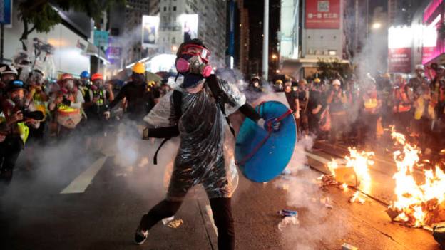
Image Manipulation and Me

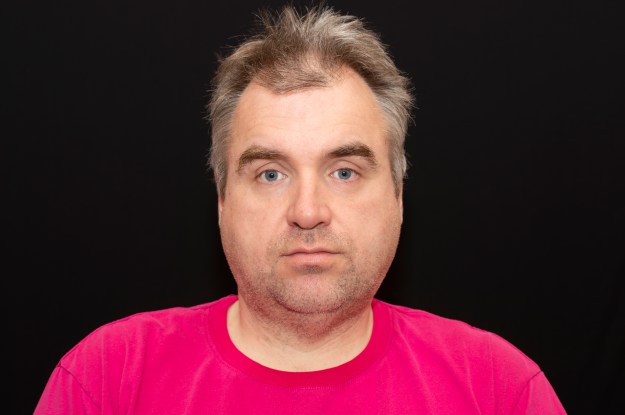
This project discusses the ongoing debate around manipulation of an image to either emphasise or change its ‘meaning’.  Having rediscovered photography well into the digital era, my relationship with image manipulation has changed almost inversely with the enhancements in technology.   I recall the mantra of ‘include only the elements you want in the frame’ and ‘reduce visual debris to take a good picture’, which I adopted during my early use of Photoshop.  Removing or cloning out elements that I hadn’t spotted at the time within the frame, and now considered to be spoiling it in some way, became something I quickly got used to.  However, as I have learned more about photographic technique, my interest and sometime reliance on software such as Photoshop has declined dramatically, despite the tools evolving in their capabilities.  With my emerging interest in film photography, I am much keener in looking more carefully ay my subject and avoiding the need to remove unwanted content after scanning.   My interest now lies in achieving the result in the camera and only using digital techniques to visually enhance what is already present (contrast, toning, dust removal etc).  I hadn’t considered that manipulating an image might change the meaning or the intended context, though.  I recall an occasion where that deliberate altering of an image for my father was intentionally trying to protest manipulation.  My Dad had taken a good photograph of a crane for a competition he was entering.  The image, while sharp and well exposed lacked any interest in the sky as the day it was taken was completely overcast.  He asked me to add a sky from one of my photographs to his in Photoshop to make it look better.  I was so unhappy with this as an approach, given that it was intended for competition that I planned something amusing to make my point that it wasn’t on.  Once complete, I sent him two photographs back; one with a bright, cloud-filled sky and one with an additional feature.  The latter can be seen below.

15676439_10209965778875542_147648957107519762_o

The Crane and the Enterprise

I spent some time locating an image of the Starship Enterprise that had lighting from a similar angle and even matched the mid-tones to the rest of the image.  The result made my Dad laugh but made my point (it didn’t get entered, of course).  When I look a this image again, though my immediate though is, “is this a still from a film?’  Is the ship crashing to Earth?  It has an almost ridiculous SciFi ‘reality’ to it which is far from my intended joke to my Dad.  With this in mind, consider the much earlier image referred to in the notes.

Hippolyte Bayard – Self Portrait as a Drowned Man.

Hippolyte was an early pioneer of photography, claiming to have invented a direct positive process before Fox-Talbot and Daguerre.  Unlike these two men who went on to become well-known historical figures, Bayard was left unrecognised for his invention.  His image ‘Self Portrait as a Drowned Man’ depicts him as a corpse, having committed suicide.  The print of the image had additional external context written on the back in the form of an announcement of his death, but it is signed by Bayard which points to it being a suicide note.   When we look at the two things together, the immediate thought is that it’s real.  Examining the image, the man does indeed appear to be dead and his face and hands in early stages of decay.   The body is partially wrapped in cloth with his hat the only personal possession present.

In actual fact, the manipulation taking place here is on multiple levels.  The writing on the back of the photograph tells us what is going on in the picture before we have really had a chance to look at it.  The assumption is that the camera captures what is in front of it, so in turn is a teller of truth.  As the image is from the early days of photography as a technical discipline, there is no reason to question it.  As it turns out, though the hat is something that Hippolyte used in a number of his images, so it was included here not as a random act but to add authenticity to the image.  The decaying hands and face that the note refers to were created by the photographic process responding to the darker, sunburned skin that Bayard had from a few days before [1].  The final element of deception was the date the photograph was made, 1840.  This was suspiciously only a single year since Fox-Talbot’s announcement of his invention at the Royal Society.  When we see these elements colluding together, the photograph is clearly a staged piece of ‘fake news’.

Perhaps the more telling of the elements is the belief that ‘the camera doesn’t lie’, which would have had its origins in those early days of photography.  People believed science and photography was predominantly a scientific practice to the uninitiated so it must be the source of truth.

Ghost Photographs

I’ve long had a fascination with the supernatural and one of the things that I’ve observed is the desperation that people have to believe what they see.  Whether it’s ghost sightings on reality television shows or ghosts captured on security cameras, the question ‘could this actually be real?’   I believe that I saw a ghost while on a school trip when I was a child.  It was a figure that appeared at a window of a derelict part of the house we were staying at.  Even now, as a rational adult I cannot be certain of what I saw but I remember the experience vividly.

When I look at the photographs of ghosts ‘taken’ in the Victorian era, they certainly appear convincing upon first inspection. The camera has told the truth, surely.  When we consider what else is in the frame, the discrepancies between the living and ‘dead’ subjects becomes clear.  Knowing that the images are almost always double exposures explains them.  For example:

9022533967_d855ed9599_o

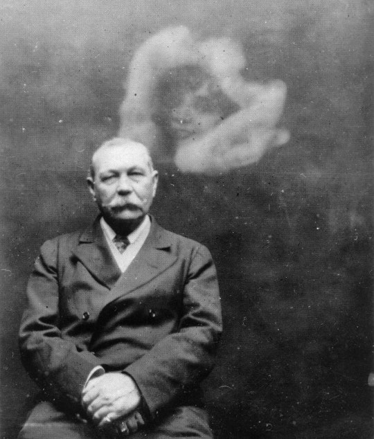
Sir Arthur Conan Doyle and Ghost [2]

In this image, Conan Doyle is seated as if he were having a simple portrait taken.  His expression is that of a man concentrating on staying still, rather than expecting something ethereal to be happening around him.  When we look at the ghost, the face has highlight and shadow contrast around the eyes and left hand side of the face in a similar way to Conan Doyle, without the definition.  Lighting of portraits in 1922 wasn’t particularly sophisticated so it’s not a surprise that the two exposures would have used something similar.  The upper part of the image is also overexposed compared to the lower part, which suggests more light (or twice the exposures) for this region where the ghost happens to be.  Interestingly, Conan Doyle was taken in by this sort of work which resulted in him investigating The Cottingley Fairies.  During his investigation, he worked with Eastman Kodak [] who were regarded as the authority on photography as well as manufacturer of the materials for making negatives and prints.  They concluded that the images of the fairies could be faked with the appropriate level of knowledge of the medium.  Conan Doyle believe that such knowledge was beyond that of any teenage girls, so the photographs must be the truth.

Oscar Gustav Rejlander

Around the same time as Conan Doyle was being fooled by the teenage girls, Oscar Gustav Rejlander was creating deliberate multi-composition artworks that preserved the sense of real, while being entirely fantastical.  His famous Two Ways of Life is an incredible technical achievement with its 30 individual photographs cut and mounted as a collage.  The attention to detail in the individual images with regard to light and shadow mean that the finished tableau works well as a single composition.  Here we have a documentary image that is actually a pure fantast of subjects that could not exist easily in one space.

Conclusion

The advent of photography as a technical medium that offered a truth to most people, also saw its use as a creative tool to introduce alternatives to truth.  The motives for doing so in the early days of photography were undoubtedly different to what we see today.  Where modern image manipulation can be argued as ‘for art’s sake’, the early adopters of the technique used it for exploitative gain.  For a legendarily learned man like Conan Doyle to be utterly taken in by the deceit of a pair of schoolgirls speaks volumes.  Victorian taste for the macabre made it easy to exploit the supposed ghost photographs for profit.   I have never been a true Photoshop guy and am not about to become one.  However, I do see the use of manipulation to create context where there may have not been one previously.  After all, the painters have used manipulation of the real to create art for centuries.

References

[1] Spair, M, 1994, ‘The Impossible Photograph: Hippolyte Bayard’s Self-Portrait as a Drowned Man, John Hopkins University Press, https://muse.jhu.edu/article/20909

[2] Losure, M, 2013, ‘Sir Arthur and the Fairies, The Public Domain Review, https://publicdomainreview.org/essay/sir-arthur-and-the-fairies

Pre-work Exercises 1, 2 and 3

Exercise 1) The Brief

Write a short paragraph or around 5 bullet points identifying what you want and what you might need from this course unit.


What I want and need from this course

  • To further my understanding of how the elements of a photograph create a meaning or affect the viewer’s perception
  • To improve my creativity so that I move further away from my technical comfort zone.
  • Ultimate ambition is to teach photography, so there is a general desire to broaden my view of it as an art form.
  • To reduce the amount of procrastination I encountered in EYV. I want to pick up the pace, so need to try things out quickly to validate my ideas.
  • To do more non-course research. I didn’t write up my experiences in my photography outside of EYV, which I intend to do more of in this unit.


Exercise 2) Setting up your learning log

I have a learning log that I intend to use for C&N.  However, as it forms part of my EYV submission, I want to wait until the assessment is complete in March before using it (to avoid any potential perceptions that I have modified that work.  For now, I will use word documents that are saved in the OCA cloud and will transfer them across to the blog at the end of March.

Exercise 3) Analysing and Reflecting

Choose one of the names from the list of creative practitioners given:

Elina Brotherus

Gideon Mendel

Hannah Starkey

Nigel Shafran

Choose one of their images and write about the elements in the image.  Then write a short piece about how I relate to the image.  Create a blog post for it.

Introduction

The image I selected is from Gideon Mendel’s series called Submerged Portraits.

Description

It shows a woman dressed in water waders, waist deep in flood water in her hallway.  She is looking straight at the camera with a bewildered and angry expression while the rest of the scene has everyday items you’d expect in a British home.  The calm water is almost glass.

What this image means to me

I relate to it firstly because of the topical subject of flooding, but secondly because to the contradictions within.  The glass-like water looks harmless but suggests complete devastation of the woman’s home.  Her expression is one of anger and “why me?” but distress is balanced by her being prepared for standing there.

The actual image