
Introduction
This post is essentially a restructure of my thoughts and comments made immediately after I received the tutor feedback. In preparation for assessment, I’ve further expanded my reflection on this assignment, considering some of the areas where it could have been enhanced or developed further. This includes any additional research carried out and any re-working that I have done to improve the way the photographs meet the original brief. The overall learning points are also summarised in my final post “Reflecting on Expressing Your Vision” which can be found in my Learning Log.
Initial Response to Feedback (from the original blog post)
I had my tutor feedback on this assignment during our first Skype call this week. The feedback offered some insights which, on reflection make perfect sense to me as well as being in agreement with my personal observations. The key points were:
- While my approach to the brief was good, the subject I selected was very broad and as such, the limit of 12 photographs was probably insufficient to do it justice. My tutor highlighted two areas of my submission, the loss of the railway and the village being in a popular television series as being potentially subjects for the assignment in their own right. The absorption of the railway into the landscape following Beeching’s closures could be developed to include the socioeconomic impact on the village as well as other, related industrial absences that have been part of the village’s history. The more interesting idea to me was our discussion about the television series. My tutor comes from a film production background and worked in television. The insight was that when television programmes are made, the producers define how they want the viewer to see the subject, as opposed to how it is in reality. They do this for context as well as creating an asthenic in which the action can take place. In the case of Askrigg, it would be interesting to compare the reality of Yorkshire village life with that created 40 years ago in All Creatures Great and Small. A project for the future, for sure.
- The other notable feedback was on my use of titles for the photographs. When you think about it, a title for a photograph suggests and even directs the viewer to what the photograph is about. If the photographer is telling a story with an image or collection of images, there should be no real need to title the photograph. This isn’t a hard rule, of course as many photographers title their work. The feedback to me was to let the viewer make up their mind and see how effective that narrative is without the aid of direction. I thought this was great advice.
On the whole, the feedback on the assignment was very positive, which has given me a great deal of confidence to proceed with the course.
Expanding my Review
Assignment 1 was the precursor to Expressing Your Vision, which introduced me as a photographer to my tutor. At the time, I didn’t really appreciate the concept of a photograph’s context, that is how an image can have multiple interpretations dependent on a number of internal and external influences. This means that the relatively simple advice of removing the titles from my photographs was a powerful statement. Having not been experienced at assembling a series of photographs on a theme before, I had a need to explain them to the viewer, effectively providing my perspective as their starting position. In other walks of life it can be very frustrating when someone asks a question of us and then proceeds to answer it. By removing the titles of the images and external context out of the assignment, it was easy to see where the weaknesses in the series were. The question I asked myself when reflecting on this assignment later in the course was what really links the photographs together? I knew that my response to the brief was too broad, but leaving that aside the other issue that was apparent was the lack of layers in the connections. There is little beyond the crop ratio and the fact that they are all colour that physically connects them, which led me to thinking again about the aesthetic referred to in the feedback.
Think of a wider context – paintings for example, of even the way the TV crews photographed the village for ACG&S
I mentioned at the time that looking at how the aesthetic of 40 years ago in the TV series compares to real life today would be an interesting project and while I haven’t fully researched this, my thoughts are summarised below.
The TV Series
All Creatures Great and Small was made into a TV series in the 1970s and depicted 1930s rural Yorkshire as the setting for a veterinary practice. As I mentioned originally in the assignment, Askrigg was used as the location for the fictional Darrowby and my immediate thoughts when looking at an image from filming and one of my modern photographs of the village are that things really haven’t changed all that much.

An exterior shot of the stores from the TV series [1]
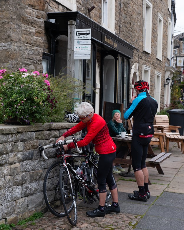
The same shop front, now a cafe (from Assignment 1)
The Aesthetic
Rural North Yorkshire is well known for being traditional and in places, largely untouched so it wasn’t a surprise that the details are similar. However, when looking at the way the TV series portrayed the area a number of visual themes presented themselves. The first is the sense of wide open space and fresh air, which contrasts with the general social and economic problems of the 1930s following the Great War and subsequent economic depression that occurred afterwards. The Herriot stories revolve around a great sense of traditional community set against this rural backdrop, so this is portrayed in the imagery. For example, in the photograph above Heriott is seen settling a dispute in the street between neighbours; something I recall my Grandmother telling me was a common occurrence in rural England. An educated professional such as a vet would be respected by almost everyone, so this image of him involved in a brawl creates the impression of his importance in the setting. In the publicity material for the programme, the sense of gentle nostalgia is further reinforced by the idea that colleagues become family when one works in the countryside. An example of this can be seen below.
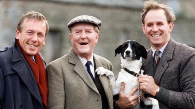
Colleagues, friends and animals. A publicity shot from All Creatures Great and Small [2]
Since looking into the way that the original series was shot, I have learned that a more recent series of prequel stories was planned, but then shelved in 2012. The only photograph I could find from the promotional material is shown below.

Promotional Shot from Young James Herriot [3]
Conclusion
I’m still happy with the photographs I shot for Assignment 1, but with the knowledge gained from the later stages of the course, I can see how their impact could have been increased by reducing the complexity of the theme and through creating an aesthetic that reinforces it. I could have followed the TV series vision of a countryside idyll with the walking or cycling themes or instead picked out viewpoints that steered more towards the industrial railway and roads themes. Either would have potentially stood out on their own but were lost within the broad scope of my actual theme.
I elected not to re-shoot or alter the series because I had completed it during a holiday in the area and was unlikely to have time to re-visit as the course progressed. However, as I learned later on, a project like this can be revisited at any time if there is potential for making it better.
References
[1]. Matheison, D, 2013, “The Stores, Main Street Askrigg, N Yorks, UK – All Creatures Great & Small, Brotherly Love (1990)”, Waymarking.com, https://www.waymarking.com/waymarks/WMH91C_The_Stores_Main_St_Askrigg_N_Yorks_UK_All_Creatures_Great_Small_Brotherly_Love_1990
[2] Gilligan, A, 2018, “Vet quits as home of All Creatures Great and Small goes corporate”, The Times, https://www.thetimes.co.uk/article/vet-quits-as-home-of-all-creatures-great-and-small-goes-corporate-stx7p62gv
[3] Conlan, T, 2012, “BBC axes Young James Herriot drama series, The Guardian, https://www.theguardian.com/media/2012/apr/24/bbc-axes-young-james-herriot-series

Pingback: 4) Project 1 – Captions and Titles | Richard Fletcher OCA Photography Blog