The Brief
Make a Google Images search for ‘landscape’, ‘portrait’ or any ordinary subject such as an ‘apple’ or ‘sunset’. Add a screen grab of a representative page to your learning log and not down the similarities you find between the images.
Now take a number of your own photographs of the same subject, paying special attention to the ‘Creativity’ criteria at the end of Part One. You might like the subject to appear ‘incidental’, for instance by using focus or framing. Or you might begin with the observation of Ernst Haas , or the camera vision of Bill Brandt. Or if you are feeling bold, you might forget about your camera completely and think of the tricky question of originality in a different way – http://penelopeumbrico.net/index.php/project/suns
Add a final image to your learning log, together with a selection of preparatory shots. In your notes describe how your photograph or representation differs from your Google Image search of images of the same subject.
Introduction
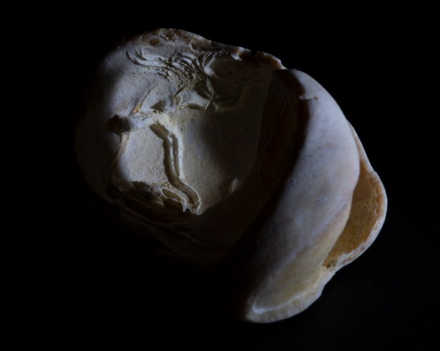
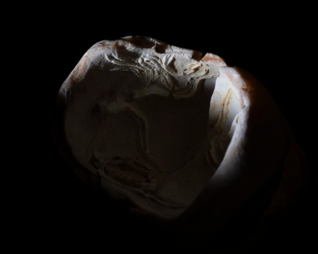
In starting this exercise, I thought about what I had just been working on in Ex 4.3. My subject was a small shell that I found on a beach. Like Haas’ apple[1], I looked at the shell for a very long time, noticing the shape, colour and texture of the inner and outer surfaces. I had seen many shells before, but I looked at the details of this one like it was the first one I’d really looked at. I guess the difference between my reaction and Haas’ was that I wasn’t trying to describe the shell. Instead, I was creating a narrative based upon what I saw and how those elements reminded me of completely different subjects. Both mine and Haas’s reactions were emotional, but our creative viewpoint differed slightly. When reading the notes leading up to this exercise, there was reference to the conflicting viewpoints of celebrated photographers appearing confusing at this stage in our studies. For me, it’s not confusing but their combined effort in seeking originality. As the very first page of this course showed us, the world has been completely photographed already, so our personal voice is how we bring originality to something that has most likely already gone before.
For this exercise, I chose to search for ‘church’ in Google Images, not because I have some connection with religion, but because I’ve always seen them as a part of the British landscape. Living in a rural area, there are plenty of potential subjects and I already knew they were all different from each other in some way; size, layout, how elaborate or simple. However, how would the photographers online see a church in their images?
The Search “Church”
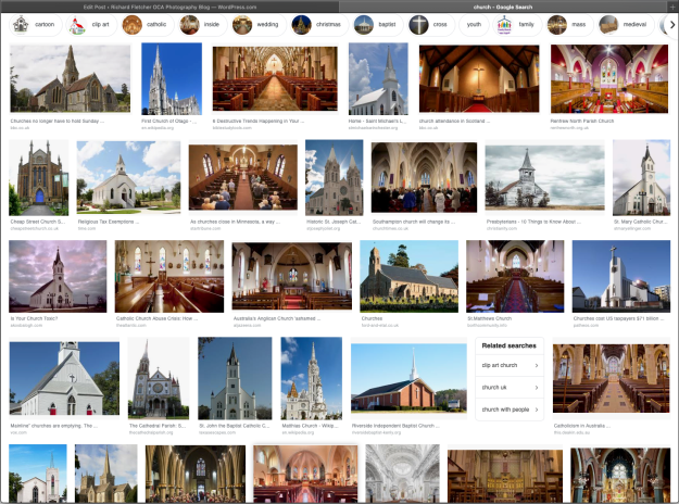
Reviewing the page from Google Images, the first thing I noted was the mix of external vs. internal shots. Of the 32 images in the search window, there are 18 external and 14 internal shots which is pretty evenly balanced. When we look closer at the perspectives of the photographs, we see that the external shots largely follow a pattern of traditional composition. The viewpoints include the gable end of the building, predominantly where the spire or tower is. The photographers compose so that the church is the dominant subject and often use the rule of thirds or centering to emphasise the traditional shape of the building. For example:-

From http://www.christianity.com article about Presbytarians
This image shows the church from the spire end and positioned slightly off the left third line, leaving a large blank area to the right. The photographer looks to emphasise the abandoned feeling by placing the church against natural emptiness with just the trees and hedges surrounding it. The use of high contrast and structure to the finished image further emphasises this.
Another representation of a church exterior shows the structure in symmetry. Here, the emphasis is on the architecture itself with the clear, unfussy plasterwork contrasted against a bright blue sky.

From http://www.texasescapes.com, St John the Baptist Church
Most of the other images in the search follow this style and the same can be seen even more clearly in the interior shots. Here, the perspective of most photographers is to capture scale and symmetry. Most of the shots are wide angle views down the aisle with the huge structures that make up the walls and roof on show in complete balance within the composition. For example:-
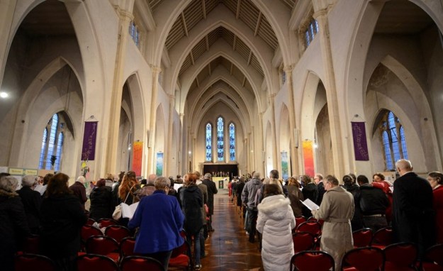
From http://www.churchtimes.co.uk, St Mary’s Church, Southampton
The second detail of the Google search was that the images are from churches all over the world. The two exteriors shown above are both US, but there are also churches from the UK (as above), Australia and an interior shot from India. It would appear, then that the global perspective of churches is about their lofty designs, scale and level of grandeur and that it’s almost unconnected to the denomination or culture.
The final detail I noticed from the search was about Google itself. As a regular user, I’d seen the feature at the top of the window where the search engine groups popular searches together, but hadn’t recognised its significance. In the context of this exercise, what the groups tell us is how people relate to the term ‘church’, particularly where iconography and photography are concerned. With this search we see groups around religions (Catholic and Baptist), symbols such as crosses and alters and the connection with people (youth, family, weddings etc). With this exercise, our voice is informed by what we’ve seen before as well as the subject’s historical relevance or connection to us. This ties in with Burgin:
There can never be any question of ‘just looking’: vision is structured in such a way that the look will always-already entrain a history of the subject. (Burgin, 1982, p 88)
Of the photographers mentioned in the notes, Burgin who is more of a conceptual artist and writer than photographer, interested me the most. I tend to agree with his appraisal that photography is manipulation; the image is constructed to either tell a story or connect with a viewer emotionally. The idea that one cannot look at a subject without some form of idea about it in mind, or a story to tell resonates with me. In his essay Art, Common Sense and Photography, Burgin states that “Photography wouldn’t exist without manipulation”, referring to its use in influencing socio-political points of view.
Developing my own Personal Voice
When I think of churches, I’m reminded of memories of my earliest encounters with them. As a child, I was encouraged to attend Sunday school and the subsequent church service. For some time, this was a given, but as I got older I began to value the weekend time away from school and it soon became a chore more than an enjoyment. As a growing boy, I started to resent the idea of church and my engagement with it. What I saw was an institution where people did what they were told, from kneeling to reciting the Lord’s Prayer out loud, something I refuse to do to this day. Naturally, I progressed my understanding of the importance of church in the community, particularly in the rural areas where I have lived. To Burgin’s point, my history with the church changed. When I first looked at the Google Images search, I related to the grand buildings, vast interiors and orderly gatherings of people receiving the lesson. This is how I started to see the church, more of a symbol than a building and an institution that I have had more contact with as an adult. Now in my mid-forties, I’ve attended many weddings (including my own), christenings and an alarmingly increasing number of funerals in church. Each of these has shaped how I see the physical manifestation of such a building.
For this exercise though, I wanted to create a viewpoint from my childhood.
The Images
The exercise called for a single image, but I elected to select a few that represented my vision.
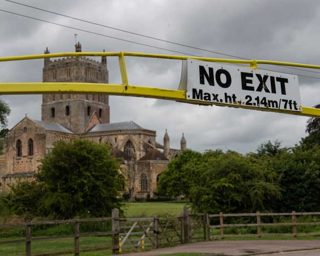
Photo 1

Photo 2
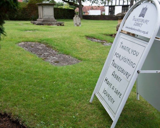
Photo 3
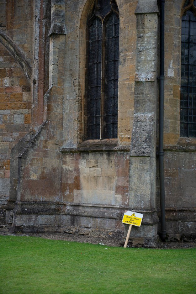
Photo 4
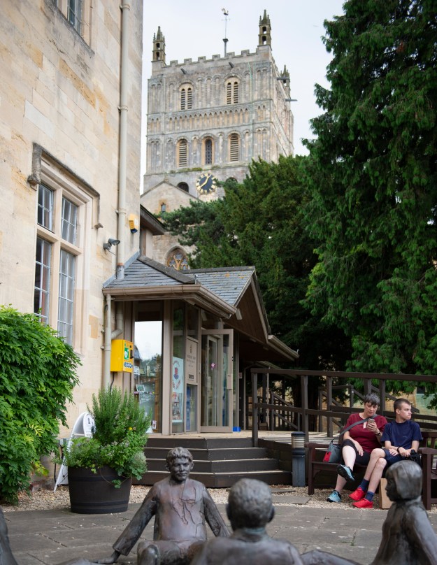
Photo 5
Review
Photo 1
I saw this image whilst paying for my ticket in the car park opposite Tewkesbury Abbey. The building can be seen from pretty much any position in the town, such is its imposing size. Here, the damaged car park sign declaring “No Exit” reminded me of the long slog through the services I attended as a child. I made the Abbey the subject without being the point of focus.
Photo 2
Another view approaching the abbey was inspired by the idea of these buildings being large and important. From the perspective of a child, the huge building partially hidden by the trees is an intimidating prospect and while my own memories are more of a quaint village church, the place still seemed vast to me. The stormy weather adds to the sense of foreboding
Photo 3
This sign reminded me more of my earliest memories of churches for other purposes, in this case pointing to where you might end up if you don’t have a safe journey. The first funeral that I attended that wasn’t an elderly family member was following the death of a friend of mine when we were 17. Sadly, it was the beginning of something more regular in life as I got older. I can’t help seeing the humour in this composition, though.
Photo 4
As with Photo 3, I’ve recently started to notice the impacts and often humour of signs and how they are juxtaposed with another subject. I’m nearing completion of a series of photographs called Mixed Messages and while this isn’t really in keeping with its theme, I noticed the humour of a church being some kind of spiritual construction site. It was certainly an expectation that I would attend church, even though I had no choice in the matter. It was a while before I understood the religion that I was born into and the traditions of Christian worship. Wanted to also emphasise scale in this image against the small construction sign.
Photo 5
This image captures the essence of what I was trying to create in this exercise. The entrance to the Sunday school has what I have always thought as a statue of bored children. While I doubt it’s what the artist intended when they sculpted it, the fact that it is overlooked by the huge bell tower of the abbey made this image fairly easy to visualise. The bonus here was the mother and son who sat on the bench as I was setting up my photograph. Shifting emphasis onto them, I was grateful for their naturally bored expressions, particularly the boy. It reminded me of those Sunday school sessions that led to the long church service.
How do these differ from Google?
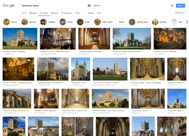
In conclusion, the obvious differences are that my photographs are about the abbey without actually being about the abbey itself. I’ve tried to represent what the building and its purpose means to the child version of me and that is one of presence and purpose. I chose the abbey because it is a typical building that has been photographed many times over the years. A quick Google Image search of ‘Tewkesbury Abbey” yields the following.
The pattern is the same as before. Classical views of the structure both internal and external but unlike before, the grouping of the images is much more about the detail of the abbey itself, without the traditional religious iconography. I look at these photographs and think back to Burgin and the idea that it’s easy to fall back on memory and subsequently easy to relate to everyone’s memories of a particular subject. Breaking away from that requires either looking for something new in the subject, or connecting to something from the past. I was reminded also of a photograph that I took a few years ago during some major flooding around the abbey. What I saw was a proud building standing above the water with its reflection clear and sharp below. I’ve included it here.
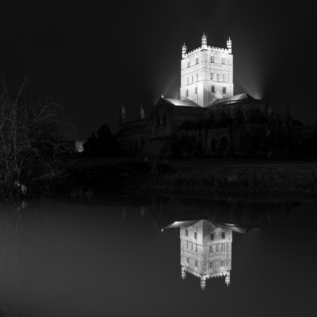
The Flood, by Richard Fletcher
References
[1] Haas, E, ‘Ernst Haas, Colour Correction’, Visura Magazine, http://www.visuramagazine.com/ernst-haas