
I started writing this after completing Assignment 2 and having my tutor feedback during our video call. Among the subjects being discussed, I raised the section that followed Exercise 3.1 – Freeze. In this section, it was suggested that a good way of making selections of photographs for a series or collection would be to produce contact sheets. Contact sheets have been used by photographers for many years and were particularly useful during the film era, when positive prints from negatives were printed in ‘contact’ with photographic paper.
In the days of film, these contact prints could be examined carefully using a magnifying glass, annotated with any changes or crops to be applied later and ultimately selected or rejected. However, in the modern era there are tools to manage digital images in a similar way without the need to print everything. I use Adobe Lightroom, which both manages the my library of photographs and also provides editing and printing capabilities. During the conversation with my tutor, I questioned the merit of printing and reviewing contact sheets when the same could be achieved electronically. In this essay, I look at my workflow and how I use it to select and edit photographs.
Lightroom vs Contact Sheets
I first started using Lightroom about 5 years ago when there were only a few software programs that could manage and edit photographs. Like many photographers, I am fairly lazy when it comes to editing in-camera and often end up importing many images into the computer before narrowing them down to the best shots. I frequently shoot sports events because my wife is a keen triathlete. By the time I’ve finished shooting, I’ve invariably shot 1500 photos, which I import as a complete set into Lightroom. Over the years, I’ve developed a workflow for editing and selecting the images I want to go forward into post-processing with. For 1500 images, I can mostly down-select in around an hour. Once in Lightroom, I make my edits to the photographs and then use the print functionality to produce a print that is optimised for my printer and paper. All sounds good.
However, in reviewing modern editing tools like Lightroom over contact prints, I wanted to understand how effective the paper print is and how it might influence how I shoot in future.
As well as shooting a DSLR, I also have a large collection of film cameras from the past 85 years. What this has taught me is the need to take care in what I am photographing as a roll of film is not only an expense, but is limited to a number of frames in one go. For 35mm, there are 24 or 36 exposures which is pretty comfortable for a walk or family party. However, when I shoot medium format, I am limited to 12 exposures per roll of 120 film. As opposed to my digital life, film photography pushes me to not waste my film or money by recklessly shooting anything in view. It has also taught me about post selection once I’ve had my film developed (or in many cases, I’ve developed myself). I have been scanning the images and importing them into Lightroom, which still bypasses the contact print process. In the review of the images, I will tend to look harder at the quality of each shot rather than dismiss any with minor issue on the basis that I might have something better. I still crop, adjust contrast and remove dust (I live in a Victorian house) so the workflow is the same.
If I had been working prior to the digital era, I would have to review the negative for sharpness as I do now, but also the shadow and highlight areas to determine how much dodging and burning I would have to carry out in the print. Dodging and burning are techniques whereby the paper is exposed more or less in the shadow and highlight regions to balance the image. It can be as crude as waving a hand in front of the darkroom enlarger when the paper is being exposed. As they contact print is also the first time the image is seen as a positive (in the case of negative film), the balance of the composition can be reviewed also. Any visual debris in the frame can potentially be marked for cropping or painting out in the final print. A great example of contact printing and adjusting the decision-making that follows it is from Elliott Erwitt’s Dogs series, below:
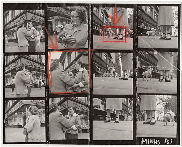
Contact Sheet from Elliott Erwitt’s Dogs Series []
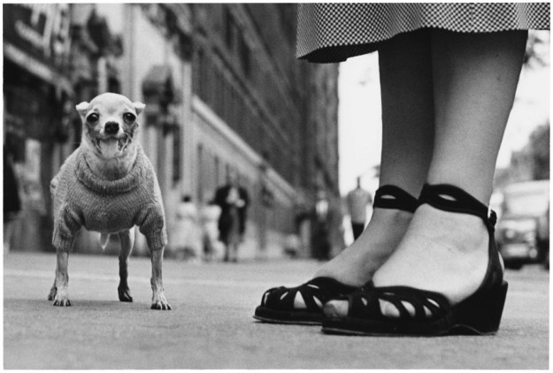
Finished print of Frame 3 (from Elliott Erwitt’s Dogs []
- Original image imported from the camera’s memory card and stored in a specific location on the computer’s hard drive.
- The image is now present in the Lightroom catalog and can be edited using tools that are similar to analogue processing (exposure, contrast etc). Lightroom doesn’t change the original image at any point in the process.
- When editing is complete, the photograph can be printed directly from Lightroom or exported as a final electronic version e.g. as a jpeg. Lightroom applies the changes to a virtual copy of the original image and creates a new file when exporting.
The process of selection is done using Collections, ‘picking/rejecting’ and ratings. Collections are simply virtual albums which are similar to a film photographer gathering all of the developed negatives on contact sheets. Picking and Rejecting are functions that do just that, in a similar way to drawing a border around the frame of interest (as above) or striking through with a pen. Ratings offer a scale of 1 to 5 stars that can be used to identify favourites.
As Lightroom can make crop edits and undo them at any time, experiments with composition can be done more freely. However should the photographer wish to compare crops, the software can create virtual copies of an image and display them next to each other with the option to discard again once the image is finalised.
Example of My Process of Selection (Updated Post Exercise 3.2: Trace)
For Exercise 3.2, I had a shot in mind using a macro lens to capture the visible motion of a guitar’s E string when picked. The shot was illuminated using a continuous LED light source, which took some experimentation to get the placement right. As a result, I shot 49 images with the intention of picking a single frame.
Step 1 was to add the images to their own collection. I called this ‘Guitar’. The virtual contact sheet of all images can be seen below as a screen grab from the Library window in Lightroom.
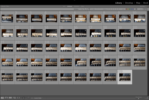
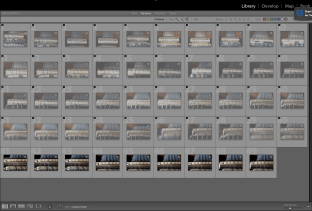
During the shoot, I experimented with the composition, lighting and point of focus on the string. I also needed to test the shot by picking the string and making sure that the vibrations were captured by the slow shutter speed. As long macro lenses are notoriously difficult to focus accurately with their very shallow depth of field, some of the shots weren’t all that sharp. Using the ‘Reject’ function, I effectively ruled out the first 40 images because although they described my thought process, they weren’t going to be the final shot. Lightroom greys out the images that are rejected as below:-
With 9 shots left, it was a case of settling on the composition. The first 3 were shallow angle with just the bridge and strings but little of the fret board. The last 6 images were the composition I was looking for. The best of them was found to be 49. I picked 49 as my target image using the ‘Pick’ function (white flag) shown below:-

Now I could make the edits. I liked the lighting of this shot, but there is no real colour. I decided to convert to black and white and emphasise the strings using contrast adjustments. However, at this point I was still uncertain about the composition. The E String was in the left third but I felt that there may be too much to distract from it with the other strings to the right hand side. To review further, I created a virtual copy of 49 and started experimenting with crops. N.B. I accidentally edited the original rather than the copy, but the point is that by duplicating we can see the comparison during editing; something that would have required multiple contact sheets in the days of film.
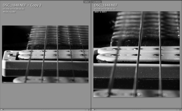
I preferred the square crop of the right hand image in terms of the number of strings but now I felt that I’d made the composition imbalanced by making it a square as the bridge is in the centre of the frame which I wasn’t happy with. Further edits of the duplicate image led to the final version shown below which goes back to landscape but limits the distractions in the frame.

The E String
For Printing
Printing is a more complex evolution of this workflow as an image on paper never looks like an image on the screen. The main reason for this is that the screen is backlit, which means like an old transparency we are viewing the photograph with incident backlight through the image. We can see the details, highlights and shadows with a level of precision and make adjustments for the ideal photograph; only if it were a slide in the first place. With a print, the image is lit by incident light but instead we see what is reflected from the surface of the paper. Now we are dependent on the properties of the paper, the light source and of the printing itself in determining how the photograph looks to the viewer.
Lightroom does a great job of predicting what the photograph will look like for a given paper and use profiles for the digital photo printer being used. Some photo paper manufacturers like Permajet even offer a printer calibration service where they will provide a custom profile for a given printer using a given paper; eliminating any manufacturing variances in the machine. While technically impressive, the only real way of telling how well a print is going to turn out is to make a number of versions of the photograph and place them in different positions on a wall to see them under real conditions. A few years ago, I entered the Taylor Wessing Portrait Competition with a shot of my friend Vikki, who had recently become World Champion in her age group for endurance Duathlon (below)

I am focus by Richard Fletcher, 2015
For this image I printed 8 different versions on 3 different papers with adjustments of contrast and white balance. I hung them in my office for a couple of days and revisited them regularly to see which image had the look that I had in mind for the competition. It was important to take time over this process, something that I also found in Assignment 2 where I considered making the shots black and white. In that case, the conclusion was that the rawness of the make-up free skin was lost in the conversion, which meant that some of the emotions were also lost. The look I was going for was more of an honest visual than a movie poster, which is how I saw the impact of the conversion.
Conclusion
The conversation that started this piece was centred around the need for contact sheets in modern photography and how relevant it was to this course in particular if the work was predominantly digital. It was useful to examine my workflow in more detail as with some subjects that I routinely shoot, the number of images is generally large and the process of selection has become automatic. I’ve had to be efficient with selection, simply because of the time available. I conclude from this that tools such as Lightroom have made the process more efficient, but the core needs of selection remain the same; methodical review, proposed edits to make the image, and maintaining the history so that another print can be made in the future. Does focusing on the selection process change my photography? I believe my approach has evolved through the subjects that I shoot as well as my interest in film. The technologies may differ, but they are analogous in the intention behind the approaches. The irony though, is that where we have to contend with hard drive storage, the contact sheets made by famous film photographers are tangible and in some cases extremely valuable. Perhaps not all that is digital is an improvement after all.
References
[1] Image resource, “Chihuahua, New York City, 1946. © Elliot Erwitt / Magnum Photos”. https://www.featureshoot.com/2015/11/get-lost-in-the-contact-sheets-of-magnum-photographers-elliot-erwitt-martin-parr-eve-arnold-and-more/, accessed July 2019
[2] Image resource “Elliott Erwitt: Dogs”, Huxley-Parlour, https://huxleyparlour.com/elliott-erwitt-dogs/

Pingback: Approaching Printing | Richard Fletcher OCA Photography Blog
Pingback: Part 4: Exercise 1 – Erwitt Analysis | Richard Fletcher OCA Photography Blog