Introduction
After a few hectic weeks at work and with some creative block regarding Assignment 3, I decided to take advantage of the fact that my wife was away and go to London for a few days. My plan was to practice some street photography with my Leica M film cameras, to catch up with some friends and see some exhibitions that I’d been hoping to catch at some point. The three exhibitions were:-
Diane Arbus – In the Beginning at the Hayward Gallery, Southbank.
Don McCullin at Tate Britain
Martin Parr – Only Human at the National Portrait Gallery
These are three well known photographers whose styles and subjects are very different from each other, so I was interested to examine the works being exhibited to gain more of an understanding of their approaches to their craft. Here, I describe what I saw and what I have learned from seeing these collections.
Diane Arbus – In the Beginning
The first exhibition was Diane Arbus, who’s portrait work I was already familiar with and whose tragic end at the age of 48 is well documented. This collection of photographs was curated by the Metropolitan Museum of Art in New York and adapted for the Hayward Gallery. The importance of these photographs in the context of Arbus’ work is that they are from the very early years of her career between 1956 to 62, many of which have never been seen in the UK before.
The way the exhibition was set up was interesting to begin with. The usual introduction abstract on the wall describes the photographs as not being a formal collection that must be seen in sequence. Each photograph was declared to be a ‘beginning’ in its own right. In fact, the area of the Hayward is formed of a number of square pillars arranged in a grid with photographs hanging on opposite faces of each, which lends itself to not walking through the collection like a zombie conga line. The second interesting point was the complete absence of any context within Arbus’s life. These were the beginnings of her career, not the events that led to her suicide, so unlike many retrospectives of late photographers, this exhibition stuck to Arbus working in an informative point in her photography.
Walking around the room, the first thing that struck me was the skill applied to the images. Although early in her career, they could have easily been the result of many years experience. Arbus’ subject matter varied almost as much as the techniques used to shoot them and I was struck by her desire to capture the moment, even if it was at the expense of good exposure, focus or outside the limits of the film she was using. Several images have huge grain in them, which works aesthetically but belies the hard work in developing and printing that must have taken place. In his review of the exhibition [1], Adrian Searle states that ‘Arbus seemed to arrive almost fully formed as a photographer’, a sentiment that I would echo from the impressive quality of the work over a relatively short period of 8 years. The second thing that struck me was the use of very descriptive titles for the photographs. Arbus was almost saying “here is exactly what this photograph is”, while inviting interpretation and development of a narrative based on everything else going on in the picture.
I found her choice of subjects compelling. She photographed circus performers and drag artists getting ready to perform in an almost business-like fashion, showing the potential for any job to be routine. Her street photographs capture the daily life, but also the surprise at being discovered by the camera. Boy stepping off the curb, NYC, 1957-58 sums up Arbus’ approach to street photography. Here we have a boy turning in surprise, but not stopping in his journey to cross the street. Arbus captures his face and expression perfectly in highlight and the movement of his body. The scene must have also surprised Arbus as the image isn’t really sharp anywhere in the frame. The aesthetic of the image doesn’t need it to be, however. When I look at this image I see the surprise, but also distraction from what is a dangerous job of crossing a New York street. The boy is more interested in the viewer than his surroundings.

Boy stepping off the curb, NYC, 1957-58, Diane Arbus
The intimacy of her street work is explored by Jeff L Rosenheim in his essay at the back of the exhibition guide. He contrasts the classical street photographers of 20th Century: Walker Evans, Garry Winogrand, Lee Friedlander etc, with Arbus’ style. Where they hid from their subject, preferring to observe, Arbus looked for ‘the poignancy of a direct encounter’ with her subjects.
“For me, the subject of the picture is always more important than the picture. And more complicated”, Diane Arbus
By interacting in the slightest way with the subject, as with the photograph above, Arbus shows us something about them that we could miss by simple observation.
Arbus also tackled the subject of death and dying in her early work, which is what set the tone for me throughout. Arbus’ own tragic death at the age of 48 following a history of mental illness, makes her observations about the subject of death interesting but sad. A series of photographs of the elderly connect back to the origins of the American way of life, e.g Uncle Sam leaning on a cot at home, NYC, 1960 where an elderly gentlemen dressed as the iconic character, waves a flag in a fairly depressing room. The image contrasts the American ideal with the reality of 1960s New York. In another image, Arbus shoots an elderly lady in the shower (Lady in the Shower, Coney Island, N.Y 1959). This image in contrast to Arbus’s other portraiture is taken without the subject’s knowledge. We get a sense of the way age takes hold of the body physically as well as a feeling of loneliness as she showers in a large, empty changing room at Coney Island. The effect of ageing is more dramatically demonstrated by Old Woman in a Hospital Bed, NYC. 1958 where a clearly frail and sick old woman is lying unconscious in a bed on a ward. The photograph is shot with very low contrast, which creates an almost angelic effect. The old lady, it would seem is close to death.
When she tackled death itself, Arbus’s work takes an almost documentary style. A couple of images show a corpse during autopsy and a disinterred saint. The pictures themselves feel unremarkable as the subjects are striking. It’s not to say that Arbus found only darkness in this subject. In one image, Headstone for “Killer” at Bide a Wee Cemetery, Wantagh, NY, 1960 we have a picture of a gravestone marking the resting place of someone or something called Killer. With this image, Arbus tells the viewer that Killer is a pet by referring to the name of the cemetery in the title. However, there is a dark humour to the image. Killer appears to have lived a short life, but surely its not a nickname for a child. Even if it was, it’s unlikely that any family would use if for a headstone. The word headstone itself has different connotations, depending on what part of the world we are in; it’s a common word for a gravestone in the US. When I looked at this image, with the word ‘headstone’ in the title, my mind wandered around all of these possibilities and I admit to a small grin when I realised how I’d been duped.
In conclusion, I really enjoyed this exhibition as it provided an insight to the early thoughts of someone who became a very famous photographer. It was good to formally separate the work from the tragic course of her life, but that knowledge is always there when connecting with her photographs. I had a sense of someone who recognised and empathised with the mundane and the darkness of her subjects, but also someone who was fascinated by the life going on around her. Her interactions with her subjects add a sense of revelation, something that I am beginning to see in my own thought process.
Don McCullin
The second exhibition was Don McCullin at Tate Britain. I had read reviews of this exhibition as perhaps the definitive collection of his work over many years as a photographer and photojournalist. Th exhibition comprised nearly 270 prints, ranging from McCullin’s early work in the deprived areas of London through to more recent landscapes and ancient architectures.
McCullin is best known as a press photographer who worked in the worst war zones of the second half of the 20th Century. He famously hates the title ‘War Photographer’, likening it to being an abattoir worker [1]. While other famous photographers we fans of his work, McCullin insists to this day that his war photographs take an insignificant role in the horror scenes in front of him and that he wanted to record them as a human, rather than a professional. This modest approach is something I admire, although like many I wonder if the effects of what he saw have created this response in order to protect him emotionally. I recall watching Sebastião Salgado’s TED talk The Silent Drama of Photography in which he talks about photographing the genocide in Rwanda[2]. When he started to suffer with severe physical health issues, his doctor told him that witnessing so much death was effectively killing him. McCullin photographed similar attrocities over a greater length of time, so perhaps it’s not surprising that he build coping strategies in order to protect himself, despite always debunking the notion that he suffers from PTSD. As a side note to visiting this exhibition, I was discussing McCullin with a friend of ours who spent a large part of his career as a press photographer for a major newspaper. He showed me a portrait of McCullin that he shot for a piece many years ago. The setting was his garden and he was holding one of his cats. The portrait, which I sadly don’t have for this article, depicts the photographer at rest which is not how we think of him when viewing most of his exhibition. When my friend attended the launch of the exhibition, he presented McCullin with a print of his photograph which although he didn’t remember the shoot, appreciated nonetheless.
There were many interesting elements to the exhibition, but the first thing that I noticed was the beauty in how the images were shot. Beauty may seem like a strange word to use when the subject is a corpse of a man with half his face missing, but looking at the images from a straight composition and light perspective, McCullin uses highlight and shadow to draw the viewer’s attention to the detail of the subject. Choice of exposure can make or break a photograph and in McCullin’s case, I couldn’t see a single image that didn’t please from the more technical point of view.
Martin Parr
The final exhibition was (mercifully) Martin Parr’s Only Human at the National Portrait Gallery. This was a far cry from McCullin’s work as it takes a light-hearted look at society in stark contrast to the war and deprivation I’d just been looking at. Parr has always been a favourite of mine since I first encountered the chapter on him in the BBC documentary “The Genius of Photography”. Parr’s almost haphazard approach to photography came out in that programme, where he’s seen wandering around a supermarket with a camera and on-board flash gun. His subjects were just members of the public going about their business and I was startled by the fact that few of them seemed bothered by his intrusion. As a consequence of his use of hash direct flash, Parr’s style is one that almost looks like the sort of photographs that everyone took during the film era. Brightly exposed with lots of saturated colours, his famous series “The Last Resort” takes a candid view at the now-declining British seaside holiday through a series of fun images. However, when looking more closely at the photographs, we can see the darker side to human behaviour when people let their hair down. The famous images of the scramble for the buffet suspends any notion of British reserve or politeness and could almost be shot on an African plain around a pride of hungry lions. Under the fun, almost amateurish looking compositions are cleverly worked subjects that I personally find exciting. Perhaps the best examples from Only Human of Parr’s commentary on British identity were those that were set against the backdrop of Brexit. A few of my favourites can be seen below.

Crisp ’N’ Fry, Spring Bank, Hull, England (2017) by Martin Parr
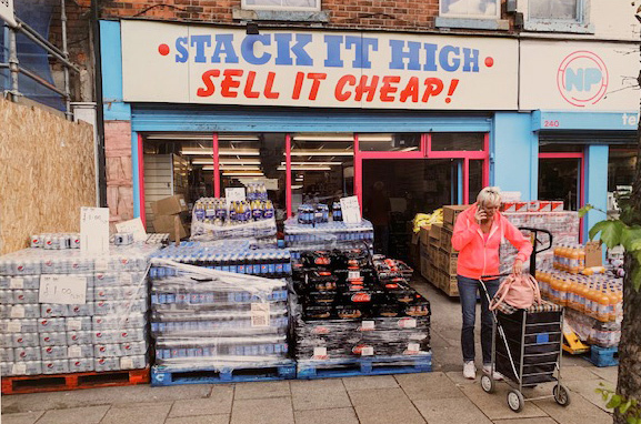
Stack It High, Hessle Road, Hull, England (2017) by Martin Parr
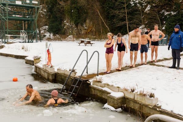
Henleaze Lake. Bristol, England (2018) by Martin Parr
In the first, we see two Muslim girls behind the counter of a fish and chip shop. I found this image to be starling because here is a setting that every British person would recognise with the simple framing of two young women working. When we look at their fairly passive but welcoming expressions, we then jusxtapose with their traditional dress. For me, the sight of these women working is a fish and chip shop isn’t particularly interesting, but my second reaction is framed by the racial disharmony in Britain and picturing how some areas of society would view the image. I found this to be a depressing experience, when the initial feeling was that it was a pleasing and very British scene.
The second image is of the front of a cash and carry-style shop. The huge sign declares that they ‘Stack it High and Sell it Cheap’. A woman leaves with a trolley of goods but not even making a dent in the stack in front of the shop. This image was organised in the section of the exhibition about Brexit, which is known to stoke fear and uncertainty about what happens to our services, NHS etc. It was therefore easy for me to take the perspective that Parr is trying to say that Britain will be poorer and somehow cheapened by leaving Europe. However, I liked this image because of the observational humour of it. The lady leaving the shop is oblivious to the scale of the ‘stacking it high’ and is on her phone. Perhaps she’s telling her friends about it as though she had just discovered that such shops exist. For me, this image is a great example of a photograph that works with our own feelings about a subject to create multiple narratives.
The final image actually made me laugh during the exhibition when I saw it for the first time. Here we have a line of swimmers lining up on a jetty to jump into a frozen lake. They all look nervous and it’s as though they wanted to be anywhere but here. Again, this image was shown as part of Brexit Britain which for me comically described the feeling of uncertainty; lemmings jumping into the unknown. However, the image also had a personal connection to me as I’m also an open-water swimmer and know only too well the horror of preparing to jump into cold water.
Conclusion
This was a great visit to London as I was able to take in three very different exhibitions by very different photographers. From Arbus I learned the importance of strong connections with the subjects, which for me sets her apart from many people who have worked in street photography. Her use of movement and slower exposures in her early work created a warm and ghostly feel to her pictures, which is something I’ve not really explored to date. My images tend to be sharp and with as little grain or noise as possible, but I see the benefit of letting the subject and light speak for itself, regardless of any notions of technical perfection now that I’ve looked at Arbus’ work.
With McCullin I learned that we need to really look at what is going on when documenting something as stark or challenging as war or deprivation. McCullin’s work is factual, but sympathetic to the subjects and leaves the viewer with little doubt as to what is going on. I also learned that it’s really easy to pigeon-hole photographers because of the subjects they photograph. I hadn’t appreciated that McCullin had shot landscapes and to me they were beautiful. However, it took some effort to lift my viewpoint from the impression of McCullin as a documenter of the darker side of humanity. Finally, Parr taught me that humour in photography is something we can employ without it looking contrived or faked. I get the feeling that his work polarises people because of his use of colour and flash, but I think his use of many layers to his work is original and it inspires me to have more fun with my subject matter.
References
[1] 2015, “The Dark Landscapes of Don McCullin, Aperture Magazine, Flashback, https://aperture.org/blog/dark-landscapes-don-mccullin/
[2] 2013, “The Silent Drama of Photography”, TED video, https://www.ted.com/talks/sebastiao_salgado_the_silent_drama_of_photography?language=en
