The Brief
Revisit one of the exercises on daylight, artificial light or controlled light from Part Four (Ex 4.1, Ex 4.2 or Ex 4.3) and develop it into a formal assignment submission. The submission requirement for this assignment is a set of between six and ten high-quality photographic prints.
Introduction
It is natural to expect the assignments for Expressing Your Vision to build on the learning and expansion of our photographic viewpoint and subsequently for the assignments to become more open in brief. During a recent video conference with the cohort, we examined Assignment 5, which most of the students on the call were not ready for, or thinking about at the time. Why would we have read ahead to see what was coming? – a question that I posed internally. The simple reason in this case was to highlight that inspiration and creativity are more of a challenge when there are fewer constraints in place; Assignment 5 being almost entirely free-form. This conversation led me back to where I was in the course at that point and to thinking about which of the exercises in Part 4 I would be interested in expanding for Assignment 4. With the freedom to explore any aspect of Part 4, I elected first to review how my work has evolved on this course and which areas of research have been most impactful. I concluded that thus far, I have benefitted from working outside of what is comfortable, rather than shoot what I am used to, because I learn much more from those experiences.
What has interested me?
Looking back through my coursework, one of the underlying themes has been one of ‘revealing’ something unusual or different about the subject. Way back in The Square Mile, my attention was captured by the evolution of how the rural population moved around their landscape. With Collecting, I was in search of human emotion through the subject’s eyes alone and in The (In)decisive Moment, my aim was to exploit the coincidence of the photographer’s viewpoint with the obscuring of a subject as a moment occurs. Thinking back to the research in Part 4, I found the use of light in the the film ‘In the Mood for Love’ the most fascinating. Naturally, the clever use of light quality and direction is technically of interest, but the effect of the illumination picking out the subject in a seemingly simple way struck a chord with me. The other area of research that followed a similar theme was the work of Sally Mann; not so much her landscapes but the way she uses light to lift a subject from the background. Her work with her children, while controversial owing to their nudity, is for me an intimate perspective on the innocence of childhood; Mann creates this mood by using soft natural light to reveal the angelic [1].
Which Exercise?
The decision here was fairly simple. I’ve had some experience of the studio environment previously and have applied some of these techniques in the macro photography I’ve included here. For Collecting, I used a large octobox diffuser to throw soft, flat light from my studio strobe onto the faces of the subjects which, combined with no make-up or post processing touches, empasised the purity of their expressions. I was concerned that re-visiting the studio might be too comfortable, so ruled Ex 4.3 out quickly. However, as a direct result of that consideration, I had an idea for Assignment 5 at a later date. This left Natural vs Artificial light. During the research on both topics, I became interested in the contrast between natural light and how it changes during the seasons, weather and time-of-day and the hidden beauty of the ‘ordinary’ artificial light we use as illumination. Using the latter with seemingly ordinary subject matter appealed to me throughout and Ex 4.2 got me to look at the way artificial light changes a subject. The ordinary can be interesting; the details of a subject that one would normally view in daylight, taking on a completely different mood. One image that stood out in that research was Brassai’s street vendor from the Paris by Night collection [2]. That image was reminiscent of Rembrandt’s representation of light rolling off from the subject of interest. We are aware of the setting as it is revealed by the light in a way that would not have been obvious without the act of photographing it. The same approach taken by Shintaro in his long-exposure night photography creates a mood that wouldn’t be seen by the naked eye. His elimination of people and their movement from the frame gave his compositions a simplicity, asking the view to simply appreciate the subjects.
Of the three exercises to choose from, 4.2 definitely offered scope for challenge and creativity because of the variety of sources and potential interpretations.
My Theme
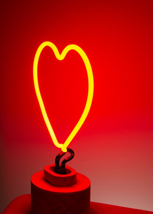
As mentioned previously, there is a theme of ‘revelation’ running through my work on EYV to date. For this assignment, my initial thoughts were toward revealing the detail of a subject as the light falls on it. In Ex 4.2, the photograph that brought home the evenness in terms of glow and colour was the neon (below).

In this photograph, the plain wall has no texture apart from a small flaw in the plasterwork that I didn’t notice until reviewing the images. The only intentional textures are the lamp base and the covering of the chair it is sitting on. In both cases the light is revealing the texture but the effect is very flat owing in part to the light intensity. What I noted with this image is the way the light rolls off to darkness along the left side; I had made the room dark before I started shooting. This led me to think about lighting dark areas, or more specifically dark corners and the use of artificial light to illuminate where there is no natural light. Revealing Dark Corners is my theme for Assignment 4.
Planning the Shoot
My starting point was to plan the scenarios I wanted to include in my theme of lighting dark spaces. The first thought was around the vintage lighting in the area around my home. Malvern is a Victorian spa town that has attracted visitors to walk the hills and drink the water for decades. One of the features of the area is its gas-powered street lamps, which emit a soft, but fairly low intensity light in the more rural parts of the town. However, they are often combined with the more modern tungsten lights that are commonplace in town centres, so the combination of these light sources would potentially be interesting with the right subject. I have a particular fondness of Malvern’s quirkiness, but during the research in Part 4, I learned to look closely at the more innocuous, everyday subjects that take on a different quality when lit by artificial light. Ivan Radman’s simple composition from the OCA notes [2] shows a scene that likely goes completely unnoticed during the daytime, but takes on a haunting mood when lit by the tungsten street lamps.
The shoot would take place over a couple of late evenings when the only source of light would be from the town itself. As it is meteorological summer at the time of writing, shooting would take place after 11pm. To create a consistent series of images, they would all be shot with a 24 to 70mm lens or equivalent in order to cover the type of scenarios encountered by street photographers who typically use primes of 28, 35 and 50mm. The camera would be mounted on a tripod to allow for long exposure and would be set to Manual mode to provide complete control over the shot. I have learned from previous experience that when metering a scene for a landscape, the camera’s onboard spot meter can be sometimes be problematic. The main reason is because selecting the point to meter from is part of observing how the light falls in the scene and can be changed to alter the effect the photographer is looking for. As Adam’s Zone System indicates [4], highlight and shadow can be positioned in a number of zones, depending on the dynamic range of the sensor (film, in his case) and the look that is being achieved. Exposure is determined for the effect being created. In the case of a modern DSLR, if the photographer has a found a composition, they must physically move the camera to spot meter for the selected tone in the image and re-compose. This is repeated for any change in exposure metering that occurs in preparing for the shot. For this reason, I use a handheld meter for spot metering a landscape scene and setting the camera accordingly, This way, the metering can be adjusted without having to change the composition by moving the camera. The kit used for this shoot was as follows:-
- Nikon D4
- Nikon 24 to 70mm f/2.8 lens without filter
- Sekonic L758 Light Meter
- Gitzo Traveller 1 lightweight tripod
- Shutter Release
In considering the temperature the of the light, I adapted my approach from Assignment 4.2 to suit the shoot. Instead of observing and selecting a White Balance for a given colour temperature in camera, I opted to shoot with Auto WB in the RAW image format, which has full control over the information captured by the camera. White Balance would then be corrected in post processing. In Ex 4.2, where the environment was largely under my control, I could take time to observe and adjust in-camera. White Balance in DSLRs ensures that for a subject of a given colour temperature, the rendering of white is correct in the image. As I was to be walking around the town and some residential areas at night, I wanted to limit the time taken for each shot to composing and metering when there would be multiple different light sources in my frames. For me, it was important to observe the light source and have an understanding of the colour temperature, not at which point it was corrected.
Potential Subjects
Following a number of daytime walks around the town, I identified the following potential subjects:
- Gaslights. As mentioned previously, they are a feature of Malvern and after some recent conservation efforts, reliably light at night. They are positioned often in very dark areas, but sometimes combine with other street lighting for effect.
- Tungsten Lamps. A number of buildings have lamps on their walls that point to the street to add additional lighting to that of the gaslights. The fall of light and roll-off into shadow can be interesting with Victorian architecture.
- Shop windows. The are some shops that use subtle lighting to illuminate their shop windows and in some cases, the products that they sell emit some form of light.
- Architecture. Malvern has a mix of architecture dominated by classic Victorian buildings, alleyways and a park, all of which could look very different at night.
The Images
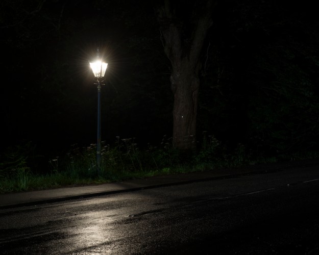
Photo 1 (70mm, 9.7s at f/9, ISO100, 3400K as shot)
Photo 1 was shot on a very dark road leading out of the town after rainfall. The challenge with this image was to preserve the shape and detail of the lamp, while capturing the illumination of its surroundings. Metering for the pavement and using long exposure leads to the the very strong highlight to wash out, resulting in a point of light instead of a Victorian street lamp. I didn’t want to use a filter on the lens because of the potential refraction effect through the glass elements. I overcame the issue by using another light source to help illuminate the surrounding area – the headlights of an approaching vehicle. The shot was metered for the lamp, placing it in Zone 8 to preserve its structure for an aperture of f/9. The resulting shutter speed was determined to be between 10 seconds. The shutter was opened in Bulb mode as a car approached from the left and closed again before it entered the frame. The result was a more illumination of the lamppost and the grass around it, as well as the cat’s eyes on the road and the tree. The highlight on the wet road was present without the car but balanced by its addition as it reveals more of the surface from the gloom. As the scene is dominated by the gas light, I left the colour temperature as shot.
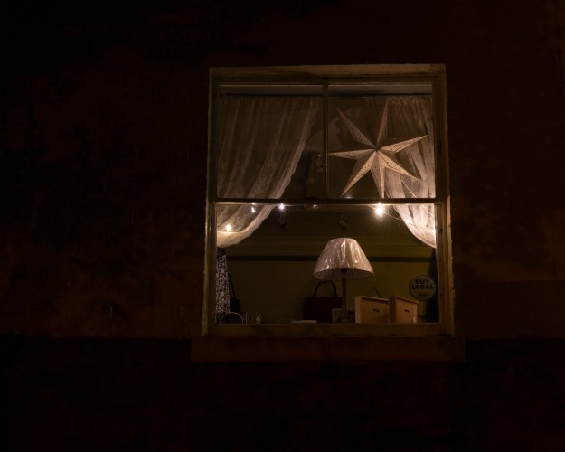
Photo 2 (70mm, 15s at f/8, ISO100, 3100K as shot, adjusted to 3500K)
Photo 2 was taken from the Malvern Priory church yard, which is overlooked by a small curios shop. I noticed the effect of the light from the small string of LEDs on the star in the top right of the window. As the shop is on a corner of a path into the churchyard, there is another window to the right of the room as we see it here. The ambient light from the street light reveals the depth of the space and a very small amount of detail of the wall around this window. The LEDs themselves reveal what the shop sells. I adjusted the White Balance slightly as the LEDs were warmer as observed.
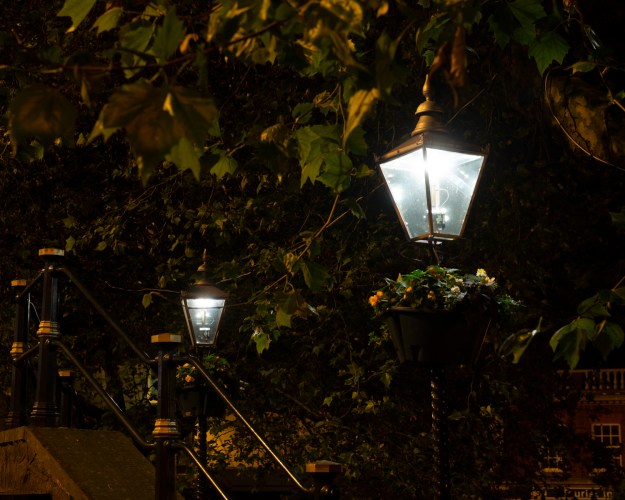
Photo 3 (70mm, 2s at f/8, ISO100, 3200K as shot)
Photo 3 – In the centre of the town, the gaslights are more decorative than practical as there are many large tungsten lamps lighting the streets and stairways. I set this shot up to show more of the detail of the lamps themselves, which is ironically complemented by the other lighting. Metering was on the side face of the stone wall on the lower left of the frame.
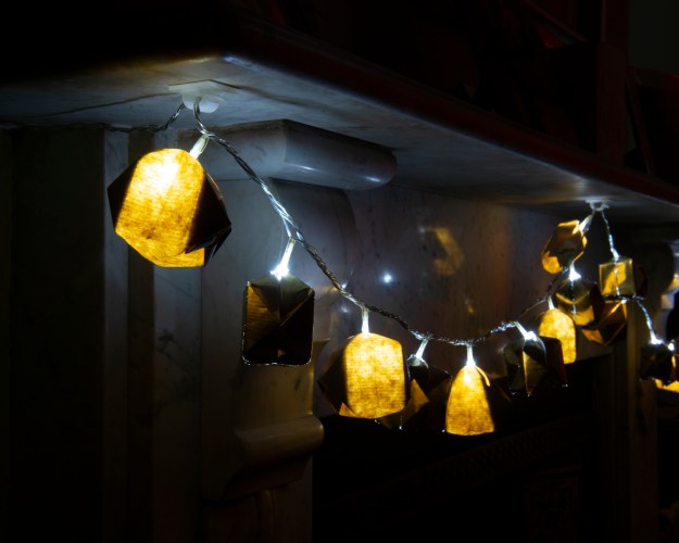
Photo 4 (48mm, 128s at f/22, ISO100, 4350K as shot)
Photo 4 – These origami lanterns were made for us by a friend and contain low power LEDs as their light source. Traditionally hung on the fireplace, I wanted to use them to reveal the subtlety of the marble’s white and grey pattern. The lanterns alternate between translucent and opaque gold, the former throwing light and the latter reflecting it. Overall the camera saw these as warm light sources owing to the paper modifiers, but the light thrown onto the marble changes along the string of lanterns. I left the temperature as shot because the overall effect is warm light, despite the sources being LEDs.
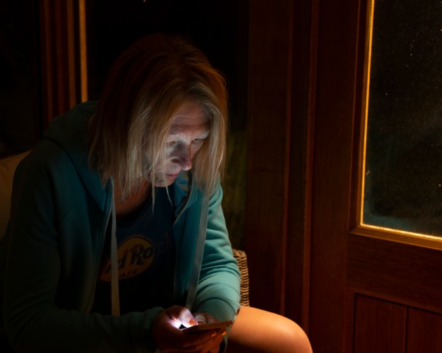
Photo 5 (48mm, 3s at f/4, ISO100, 3200K as shot, adjusted to 3800K)
Photo 5 was inspired by one of my reconnaissance walks around the town one evening. I noticed a woman sitting in a car reading her mobile phone. The ambient light was low, so the her face was illuminated by the screen. From my experience of using strobe and continuous light, I knew that the effect was harsh and unflattering but that it could be balanced in a frame by something more pleasing. My wife kindly posed for this image, which is lit by both the phone and the outside light of our summerhouse (see Photo 9). I metered Jayne’s face for this shot increased the colour temperature slightly to achieve the right look for her knee.
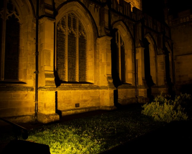
Photo 6 (24mm, 8s at f/22, ISO100, 2500K as shot, adjusted to 2850K)
Photo 6 is a shot of the Malvern Priory, a church in the centre of the town. The building is lit by very large tungsten lights at night, which makes the stone work appear a rich gold colour. I noticed how the position of the source at ground level lit the first window evenly, but the combination of angle and light fall-off results in the leading line into the gloom where the highlights are weaker and shadows stronger. The camera read 2500K for white balance but this left the stonework with a cooler look than observed, so was adjusted to 2850K.
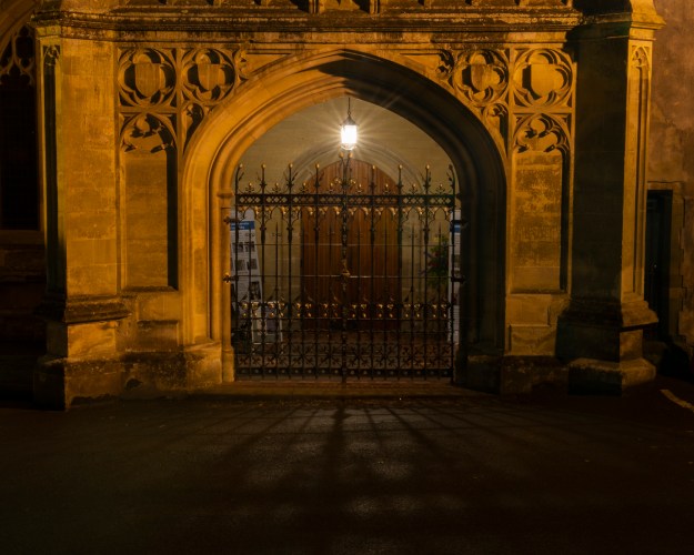
Photo 7 (52mm, 120s at f22, ISO100, 2800K as shot, adjusted to 2850K)
Photo 7 was a similar shot of the Priory, but this time the focus was the lantern in the porch. In this shot, the interior of the porch is revealed by the lantern despite the rest of the wall being illuminated by the building’s exterior lights. What drew me to this composition was the symmetry, the conflicting but complimentary lighting in the light bulb vs. large floodlight and the shadows cast by the railings on the foreground. The image was shot after rain which acts as boost to the contrast of highlight and shadow. The temperature was determined as before by the floodlit stonework.
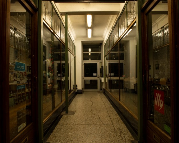
Photo 8 (24mm, 3s at f/22, ISO100, 3400K as shot, adjusted to 4000K)
Photo 8 is of an old Victorian arcade in the town, which is home to three small businesses. What drew me to this composition was the contrast between the traditional fixtures such as the cornicing and glasswork, and the utilitarian 1960s flooring, the end doorframe and above all, the strip lights. There is no other light source in this image and it struck me as purely functional. The elements in the image are revealed with all of their faults, while the light leads us to a doorway into a dark, uninviting space. The camera judged the white balance to be 3400K, but the striplights themselves had very dirty diffusers which made their light more yellow. I wanted to represent their condition in the lighting of the subjects in the frame, so warmed to 4000K.
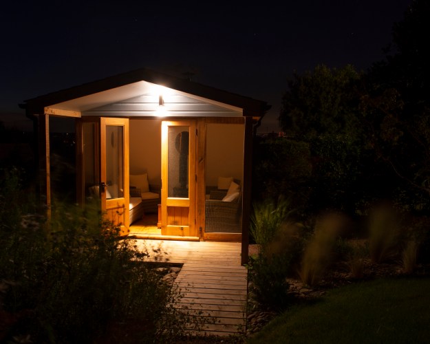
Photo 9 (29mm, 30s at f/10, ISO100, 3000K as shot)
Photo 9 is a shot of our summerhouse at the bottom of the garden. When the building was designed, an external light was included to light the covered deck without the need for the interior lights being on. The lamp comprises two LED arrays that face up to the roof and down toward the deck. The resulting light is concentrated on the doors while being reflected more evenly onto the whole area in front of the house. The tones of the wood reflect a warmer light, which the camera balanced with a temperature of 3000K. This shot was set up at midnight in windy but clear conditions. What appealed with this shot was the way the light spills back into the house, revealing the interior furniture. The roll-off of light towards the camera creates a leading line in the walkway to the deck. The faint light pollution of the area behind the house reveals the clear sky with a few stars visible.
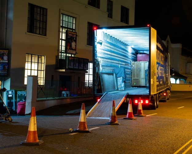
Photo 10 (38mm, 20s at f/13, ISO100, 4050K as shot, adjusted to 2850K)
Photo 10 was a chance encounter with the Malvern Theatre unpacking a set for the next week’s performance. The lorry trailer’s metal interior was being lit by a number of bright halogen lights which have a coolness to them. There are three lights at play here; the lorry, the contrasting yellow of the street lamps to the right and side of the frame and the theatre’s interior lighting. I set this shot up to have a leading line via the traffic cones to the lorry interior and metered the ramp for the exposure. This scene had the removal team walking between the theatre and trailer, so in a similar way to Shintaro [5], I used long exposure to prevent them from appearing in the image. The camera set the white balance to 4050K because of the strong presence of the street lighting, but I wanted to ensure that the cool white halogens were the focal point of the image, so adjusted the balance for tungsten at 2850K
Review
What went well
In review of the series, the first thing to note is how they are ordered. The shoots were a combination of walking around my home town with the exception of Photos 5 and 9, which were set up at home. On this course, I have learned the importance of connecting images together as a series and, despite the brief not requiring a narrative I consider the connections much more carefully than in my previous work. For this series, there was a temptation to order the images logically in terms of the journey around the town. However, when I created a slideshow for the second part of the selection process I considered a number of other connections, including alternate subjects (that is, no similar subjects next to each other), similar light sources and framing the outdoors within the indoor shots. In the end, it was showing the series to my wife that determined the order. She has an issue with her eyesight where her eyes are slow to react to rapid changes in light intensity, which made looking at the series a challenge for her. The sequence is therefore light level, ranging from the ‘lowest’ in Photo 1 to the ‘brightest’ in Photo 10. I was happy with this as a result as previous feedback was to keep it simple. The other connections are that they are all colour and landscape 4 x 5 aspect ratio, so that the can be printed as 8 x 10 inches, a format that I find appealing.
The strongest image for me is Photo 10, which was almost a decisive moment in how it was first seen. Shooting this picture not only required asking permission from the removal crew to take the picture (something I am generally not comfortable with), but also composing in a way where there was enough context in the frame without losing the impact of the trailer’s light. Using long exposure was also beneficial in removing the inconvenience of the people moving around in the scene.
Other positives were the shooting of Photos 1 and 5 for similar reasons. Both images had very strong light in the scene as well as subtle highlights that I wanted to capture. In daylight, I would use a graduated filter but not wanting to risk refraction distortion was an important consideration for shooting at night. In Photo 1, the use of additional light from the car headlights allowed me to concentrate on getting the gaslight right. In Photo 5, it was a trade-off between exposing for Jayne’s face without her having to stay still for many seconds and losing sharpness as a result. I’m naturally grateful also that she agreed to be photographed with such unflattering light!
The final element that I believe worked in this assignment was the act of really looking at the light, almost dismissing the subject to begin with. When doing the reconnaissance for Photo 8, there was a red waste bin outside the door at the end of the arcade, which under the lights, gave a sense of foreboding. When I returned for the shoot, the bin had removed which I thought would ruin the shot. However, I studied the how the light fell on the features in the image, from the classical architecture to the run-down modern elements like the cracked floor. The light revealed the details that I would have missed under natural lighting conditions.
What could be improved
While I am happy with the series, there are a few things I would change. Photo 3 is the weakest image, despite being a combination of light sources that I had seen contrasting each other. The image does represent them well, but as a composition, it lacks interest in the rest of the frame. All of the other images have visual tension to them, while this one feels more like a technical demonstration than a visual.
In addition, Photo 7 has a small error in the composition that I believe I will need to correct. The main element to the composition is symmetry, but in the case of this photograph, the lantern is not within the exact centre of the archway, or the gate. I’ve had this issue before related to where the tripod socket is on my camera with respect to the control on the tripod head. In daylight it is easy to see the offset and correct accordingly before the shot, but in the case of this image at night I missed it. Apart from this issue, I really like the image with the two light sources, the invitation into the porch that has a locked gate barring entry. The good news is, the lighting is always there at night, so I simply need to reshoot after a rain shower, which should not be an issue before assessment.
Conclusion
On the whole, I believe this assignment meets the brief. I selected and re-visited Ex 4.2 and shot a series of photographs that explores artificial light and the way even the most innocuous subject can take on a different mood when lit this way. The light sources may not be beautiful, but alone or in combination can create an image that can be considered beautiful. In the case of Photo 5, where portraits are traditionally shot with diffuse continuous lights or strobes, this image shows that combinations of light sources can create beauty and mystery. The biggest single learning point during Part 4 has been to look closely at the quality of light and how it interacts with the subject and scene.
References
[1] Rong J, 2010, An Exclusive Interview with Sally Mann – “The Touch of an Angel” (2010), https://www.americansuburbx.com/2013/01/interview-sally-mann-the-touch-of-an-angel-2010.html. Accessed May 2019
[2] Ray-Jones, T, 1970, “Tony Ray-Jones Interviews Brassaï, http://www.americansuburbx.com/2011/08/interview-brassai-with-tony-ray-jones.html
[3] Radman I, 2015, Image used by OCA, Photography 1 – Expressing Your Vision course notes
[4] Adams, A, 1948, “Chapter 4, The Zone System”, from the book “The Negative”
[5] Kurt, 2009, “Interview with Sato Shintaro”, http://www.japanexposures.com/2009/08/25/interview-with-shintaro-sato/