Let there be Light
The introduction to this project provided in the course notes, calls out our experiences where our images don’t match our expectations. “Why did that photograph end up under-exposed? Is there something wrong with my camera?”. While this happens to everybody from time to time, my earliest recollection of the phenomenon was a defeating experience. My first camera was 110 Voightländer Vitoret that my father loaned me while I saved for my own. This was a typically simple camera, with zone focusing and autoexposure. I recall shooting my first few cartridges of 110 film with that camera and getting the results back from the local chemist. Some of the frames were ok, but most had the dreaded sticker applied to the print, informing me of what I got wrong. Under or over-exposed was the most commonly suggested by the developer, although a small boy would also get his thumb in front of the lens. Forty years later and with lots of other photographic experiences behind me, the natural conclusion would be that I knew nothing about light, or how the camera would attempt to represent it on the film. Light for me was just a judgement in determining the selection of film speed for my camera.
In beginning research for this project, I wanted to understand the different ways light had been manipulated by photographers; strong and diffuse, natural and artificial, highlight and shadow. In the earliest period of modern photography, light was used to create images for contrast, where a subject’s obscuring of light against the blankness of the paper was the effect being sought. William Henry Fox Talbot, who is credited with the invention of the photographic paper process created a number of photogenic drawings by placing leaves on photo paper and exposing them to sunlight (below). The resulting negative prints show the detail of the leaf structure captured as the light is passed, obscured and partially obscured as it travels to the paper. These early prints were subsequently used by botanists in their research of plant structures. However, in the photographic sense, light was merely the tool to create a drawing [1]; something that Fox Talbot admitted to being poor at.

Photogenic Drawing of a Leaf by William Henry Fox Talbot, c 1839
The technique naturally became the method for making contact prints by placing negatives onto photographic paper to create a positive, but artists continued to create surreal pieces using the original idea, e.g the film strip images by Man Ray [2].
The evolution of the use of light to simply get an exposure continued through the Victorian era with the light being created by exploding magnesium powder. This use of artificially-created light might seem at first glance, but the quality of the exposure could be surprisingly good with its ethereal tones [3]. Victorian photographers experimented with multiple lights, double exposures that led to the infamous paranormal photography craze and was ultimately succeeded by the precision flash tubes of the early 20th Century.
Representation vs Capture
The etymology of the word photography can be traced back to the mid 19th Century coined by Hercule Florence in 1833 [4]. Florence was a draftsman working in a team of sketch artists in Brazil with a botany expedition. Fox Talbot contacted Florence’s employer to pitch his idea of using photogenics for examining the structures of plant life (the image above). He didn’t realise that Florence had already worked out his own method for capturing ‘drawings’ using photosensitive materials, coinciding with both Fox Talbot’s work with silver-salt negatives and Louis Deguerre’s wet ‘tin type’ method. Unlike his more famous European peers in the field, Florence is credited with the first use of the term photographie, literally translated as light drawing in his native French. Although drawing with light was the principle of faithfully reproducing what would have been a sketch of a subject as opposed to art, photography offered some ability to be creative in the early days. However, it would some years until the idea of visualising light and representing it would be part of photography in stark contrast to the painters and sketch artists from history. Their genre required carefully looking at the light on their subject and determining the most impactful way of representing it in the picture. Two renowned painters famous for their mastery of visualising light and representing it on canvass were J.M.W. Turner and Rembrandt Harmenszoon van Rijn.
Turner was known for his dramatic landscapes depicting dramatic scenes set against the backdrop of turbulent weather and the violence of the natural world. To create impact, he was known to experiment with colourisation elements of his paintings, creating a sense of the surreal while maintaining enough realism to the subject. He famous work Rain, Steam and Speed – The Great Western Railway, 1844 demonstrates Turner’s manipulation of light to suit the drama of a scene.

Rain, Steam and Speed – The Great Western Railway, J.M.W. Turner, 1844
The scene depicts a steam train racing over a viaduct on a stormy day. In this image, Turner take what would have been largely defuse light experienced in heavy rain and cloud and creates a complex luminance to the scene. When I first saw this painting many years ago, I asked myself “Where is the light coming from?”. At first glance is is not the obvious but the light under the main and left viaduct suggests the light is coming from the right of the painting. The shadows on the viaduct support also support this assertion. However, the lighting and contrast of the train itself suggests some artist licence to give a sense of thundering movement toward the viewer. Turner’s use of ambiguous colour for both the landscape and cloud suggests chaos in the weather and while there is not clarity in the rain itself, the mood of the sky and blurring of the foreground detail points to a train battling through very bad weather. This painting clearly could not have been painted in real-time, but Turner was able to place the dramatic subject in his equally dramatic landscape and create the impact by manipulating light and colour to great effect.
By contrast, Rembrandt was known predominantly as a portrait painter whose fascination with studying people either singularly or as part of a scene comprising multiple subjects. Rather than create an impressionist aesthetic, Rembrandt wanted to best convey the natural complexity of the subject’s face and expression to allow the viewer to draw conclusions about what is happening for the subject. Rembrandt painted many self-portraits over his later life, documenting the changes in his own physical form.
“Life etches itself onto our faces as we grow older, showing our violence, excesses or kindnesses.” Rembrandt van Rijn
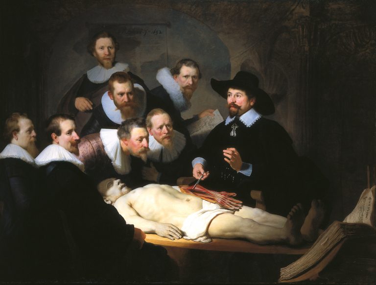
In his famous painting The Anatomy Lesson of Dr Nicolaes Tulp, we see a human dissection taking place in front of a group of students. This painting, regarded as one of Rembrandt’s early masterpieces as it was a commission when Rembrandt was just 26 years old. As well as being a technically detailed work with a realistic representation of the dissection and the expressions of onlookers, it is a great example of Rembrandt’s use of light. The scene is tightly lit from the left of the painting but some unseen source, but presented in a way that reflects the needs of the work being done in the scene. The light rolls away from the centre of the painting so that there are few distractions at the edges of the scene and while the corpse is the brightest element, its face is partially obscured by shadow so as to avoid distracting from Tulp working on the arm. What’s most interesting, though is the lighting of the faces of Tulp’s students. This is an example of Rembrandt’s technique that inspired the well-known Rembrandt Lighting that is used in modern portrait photography.
- The Anatomy Lesson of Dr. Nicolaes Tulp, Rembrandt, 1632
- Closeup of Rembrandt Lighting
The close-up view shows two of the students with similar lighting on their faces. The left side of the face is lit brightly, but the nose casts a shadow onto the right side of the face which results in a partial eclipse effect, apart from a small triangle of light that folds around the bridge of the nose. This effect was used in many of Rembrandt’s paintings to accentuate the details of the face and its expression. It is used as a staple setup in modern studio portrait photography as shown in the photograph below.
For me, Rembrandt was someone who observed the light play on his subjects in almost micro-detail, and as a result his work has an almost photorealistic quality to it. The skill applying natural light in oil paint is essentially hidden from the viewer as they are left to study the subject without distraction. In The Anatomy Lesson of Dr Nicolaes, the first thing that strikes me is the highlighting of the procedure taking place, which points to the importance of the relatively new science of anatomy. The students themselves are not traditional youth, but scholarly middle-aged gentlemen who themselves are already presumably of well regard. When attention is drawn to the dissection itself, the ‘reality’ of the painting comes back into focus. The arm with its musculature and vessels prompts the question “How is this level of detail possible?”. The answer, according a medical paper by the University Medical Center Groningen in the Netherlands [5], is takes us back to the idea of representation rather than capture.
A public anatomic lesson in the 17th century usu- ally started with dissecting the perishable organs of the abdomen and thorax; the extremities were the last to be dissected.1–3 In Rembrandt’s painting, how- ever, the forearm already has been dissected whereas the rest of the body still is intact. This is another reason to believe that Rembrandt’s painting does not record the real situation of Dr. Tulp’s dissection but rather represents a symbolic interpretation.
The Anatomy Lesson of Dr. Nicolaes Tulp by Rembrandt (1632): A Comparison of the Painting With a Dissected Left Forearm of a Dutch Male Cadaver
The paper asserts that the anatomical realism created by Rembrandt is so inaccurate that the artist couldn’t have been in the room, even to sketch the scene.
A portrait painter’s success depended heavily on his skills to produce an acceptable likeness of his sitters following existing visual conventions,37 but did Rembrandt record an exact representation of the public anatomic lesson held on January 31, 1632? None of the anatomy paintings of the Amsterdam Guild of Surgeons display an exact representation of an anatomic lesson They are all group portraits and commemorate the tenure of a Praelector Anatomiae or membership of the Amsterdam Guild of Surgeons. Rembrandt seems to have painted a realistic reproduction of an anatomy lesson.
Middelkoop N, Noble P, Wadum J, Broos B. Rembrandt under the scalpel. The Anatomy Lesson of Dr Nicolaes Tulp dissected
What is clear is that Rembrandt created his masterpiece using some unconfirmed prior medical knowledge or research and painted and idealistic representation of the marvel of modern medicine; a propaganda piece for Dr Tulp. His command of light and its natural ‘behaviour’ allows him to draw the viewer to the action whilst maintaining a sense of gravitas in the subjects themselves. The painting’s accuracy and artistic merit have been debated for over 350 years, which points to the impact of the work.Rembrandt’s lesser known work confirms his abilities with representing natural light. In The Rich Fool, 1632 (below), Rembrandt’s single light source is a candle directly in front of the subject’s face.

The Rich Fool, Rembrandt van Rijn, 1632
When we examine the painting, the first thing we notice is the softness of the candlelight as it rolls off in luminance. We cannot see the flame as the subject’s hand is shielding it, but the light is spread across the the area of the desk and gloomily reveals some detail in the room behind. Shadows are where we would expect them to be on the books and the subject’s face. The artist reveals only the details that support the meaning of the image; the parable of the rich fool from the Bible. The story of the man whose selfish amassing of possession to guarantee his future is shown represented by what the light falls on; the vast ledgers and legal documents, the coins and man’s fine clothes coupled with his pained but determined expression are what Rembrandt uses to press home the need to not be selfish.
The Photographers
The course notes point to three very different photographers in Sally Mann, Michael Schmidt and Eugene Atget. The work of each demonstrates the observing and capturing of light in a way that best enhances their subject.
In the interview “The Touch of an Angel” [6], Mann refers to the translucency and fragility of light, in particular the way that it is affected by location; drawing a distinction between the light in the North and South of the US. As photographers, we all observe the difference is in spring/summer vs. autumn/winter light quality and the variations throughout the day. The more interesting thing about her work in ‘Southern Landcapes’ though, is how Mann uses light to convey a sense of feeling in her photographs. The emphasis of the series of pictures isn’t the interest in the subject matter or the precision of composition and focus. Instead, she uses light and shadow to describe the environment she is in. We can get a sense of the weather, the season and even the temperature from what is essentially a series of monochrome images. She admits in the interview that light is softer owing to the lack of coating on the lens, which enhances the dreamy feel of her pictures. I’ve discovered over the past few years that the age of the lens, coupled with the type of film emulsion used, can create a photograph that has an antique look to it. By making her images more about her observation of the luminance in the scene rather than the technicality of exposure, Mann creates a series that could have been shot 100 years before.
Using what at first looks like boring, flat light, Michael Schmidt’s series Waffenruhe has a ‘what you see is what you get’ feel to them. Simple compositions with the eye drawn to the subjects using depth of focus etc… all things we have learned here already.
‘The viewer must allow the objects portrayed in the photograph to take their effect upon him without being distracted by shadow or other mood effects’ – Michael Schmidt

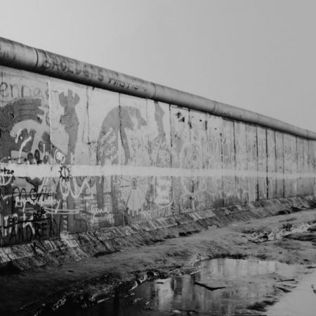
Waffenruhe, Michael Schmidt, 1987
In the photograph from he series, the Berlin Wall can be seen leading away from left to right. The first thing we see is the walls set against a plain sky, which suggests a dull, overcast day where the light is flat. The subject itself has little shadow which reveals the details of the graffiti along its length. The one area of shadowsw and highlight in the photograph is the wasteland area in front of the wall, but there is little to distract from the main subject as described by Schmidt in his quote. In a video documentary [7], Gabriele Franziska Götz, who was involved in printing Schmidt’s book Berlin-Wedding, described printing ‘as grey as possible’, likening the overall effect to being that of a photocopy. By his admission [8], black and white photography also “guarantees the viewer a maximum amount of neutrality within the limits of the medium. It reduces and neutralizes the coloured world to a finely nuanced range of greys, thus precluding an individual way of seeing (personal colour tastes) by the viewer”.
This flatness of exposure can be seen in Eugene Atget’s Documents pour Artistes, the factual, documentary photographs that Atget made his living creating [9]. As he didn’t see himself as an artist in his early years, nor did he care much about the conditions of the light. The film he was using was not particularly sensitive to the blue region of the spectrum, so the skies in many of his photographs were plain white, with no cloud detail. Little is known about his workflow, but at some point he must have realised that the softness and even angular quality of light varies during different parts of the day. Two of Atget’s contrasting works can be seen below.
The first is an image of the Paris Atget was trying to preserve in his documents. Shot with minimal variation in lighting, apart from the rooftops of the buildings. The image is precise in how it reveals the architecture of the city but there is little to describe what it was like to live there. The second image by contrast is from his Parc de Sceaux series and it is immediately clear what the differences are. This photograph uses highlight and shadow to create an ethereal view; the biblical stature looking into the distance where the contrast fades with the luminance of the horizon. This image as a factual document is not as useful as the first in that only the details that create the mood can are revealed by Atget.
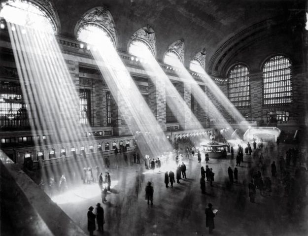
Perhaps the best way to see how Atget developed his approach, without knowing a great deal about the man, is to look at the work of his mentee and champion of his work, Berenice Abbott. Abbott was hugely influenced by Atget, so it isn’t a surprise that when documenting the urban development of New York City that she uses light in a dramatic way. The photograph below shows one of Abbott’s New York scenes; Grand Central Terminus.

Portrait of New York 5, Berenice Abbott, 1929
Conclusion
This project interested me as someone who, like many was taught to use light in a composition without the emphasis being on really observing its behaviour. For me, light has just been a tool for the medium, much like the Fox-Talbot photogenics where it is used to reveal something else. Reviewing Sally Mann’s work and how she uses the light’s own subtle beauty to create a mood, made me realise that looking at a scene was far more than just how to focus, compose and what shutter speed to use. Her emotive landscapes as well as her more controversial portraits of her family, share the use of light to draw more attention from the viewer. Looking at Rembrandt’s mastery of imagining and representing light led me down a different way of thinking, more akin to artificial light and deliberately controlling the aesthetic. In stark contrast to both Mann and Rembrandt, the notion of simply documenting the scene without using light and shadow is also intriguing, particularly as most photographers are taught effectively not to do this. Schmidt’s approach forces us to appreciate the flatly lit detail of each scene, to appreciate the interest in the subject chosen as opposed to any mood it might create. One thing is certain, light whether observed, captured or represented is a complex element to photography and its many uses offer huge diversity in photography.
References
[1] Fleury P, 2015, Salt and Silver, Tate Britain Exhibition, MACK Books
[2] Radnitzky E, 1923, Rayograph, Museum of Modern Art (MOMA), https://www.moma.org/collection/works/46483?artist_id=3716&locale=en&page=1&sov_referrer=artist, accessed May 2019
[3] Cangemi M, 2017, My/AP Workshop Ep4 – Magnesium Flash Photography video, https://www.youtube.com/watch?v=zbAcOL4oR7M, accessed May 2019
[4] Brizuela N, 2014, Light Writing in the Tropics, The Story of Hercule Florence, Aperture. https://aperture.org/blog/light-writing-tropics/, accessed May 2019
[5] Frank F et al, 2006, The Anatomy Lesson of Dr. Nicolaes Tulp by Rembrandt (1632): A Comparison of the Painting With a Dissected Left Forearm of a Dutch Male Cadaver, https://web.archive.org/web/20070926154457/http://www.handsurg.eu/resources/rembrandt_en.pdf. Accessed May 2019
[6] Rong J, 2010, An Exclusive Interview with Sally Mann – “The Touch of an Angel” (2010), https://www.americansuburbx.com/2013/01/interview-sally-mann-the-touch-of-an-angel-2010.html. Accessed May 2019
[7] Langfeld A & Paulsen S, 2016, Werkstatt für Photographie: 1976-1986. Micheal Schmidt. Teil 4, https://www.youtube.com/watch?v=4m4Fc1UPUd8. Accessed May 2019
[8] Schmidt M, 1979, “Thoughts About My Way of Working” (1979), https://www.americansuburbx.com/2010/10/michael-schmidt-thoughts-about-my-way-of-working-1979.html. Accessed May 2019
[9] Dupêcher N, 2017, Eugene Atget, French 1857-1927 – Museum of Modern Art (MOMA), https://www.moma.org/artists/229, accessed May 2019


