
The Brief
Read the reviews by Campany and Colberg (of Thomas Ruff’s Jpegs Series) and, if you haven’t already done so, use them to begin the Research section of your learning log. Try to pick out the key points made by each writer. Write about 300 words.
My Analysis of the Reviews
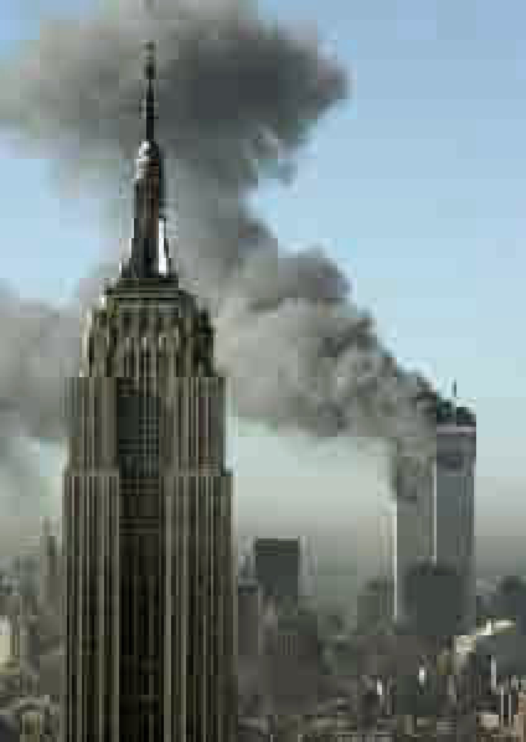
What immediately struck me from reading these reviews was the difference in the writers’ appraisal of Ruff’s art. Both draw on the aesthetic appeal of his images and highlight the almost accidental nature of them coming into being. Campany draws our attention to the fact that the aesthetic of the imperfection of a photograph can ask questions about how the image was created, and indeed looking at the Capa example from the Omaha Beach landings, it is easy to get a sense of panic and haste; the environment not being conducive to formality in composition nor technical accuracy. The fact that the effect was accidentally achieved by mistakes in the darkroom later is less important, almost irrelevant to the viewer. Campany’s paper also highlights that while Ruff’s approach to create art could be compared to the use of large grain by film artists, it speaks to the nature of the modern age; ordered and ‘digital’. Our daily lives are dominated by electronic representations of photographs, a point emphasised at the beginning of this course with the ‘ccamera’ app, which I personally found to be both impressive and shocking in its scale. Both writers highlight Ruff’s use of other people’s images to create his art, beginning with his failed attempt to photograph the events of 911 (Photo 1). For me, the idea of creating art from other’s photographs where I have failed, is completely alien. It begs the question ‘Why?’ even if the results are aesthetically pleasing. Campany goes on to highlight Jpegs and similar work are part of a gradual shift in how we see digital pixels. Far from being simply logical, mathematically derived arrangements in an image, they can convey a completely different perspective depending on the subject. I look to explore this in my conclusions. However, Colberg’s review of Jpegs seems a lot less forgiving of the use of pixels, suggesting that while clever and beautiful, the creative effect appears shallow and almost too easy to achieve.
Ruff’s Images
-
- © Thomas Ruff.
-
- © Thomas Ruff
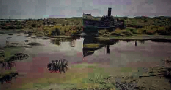
I’ve chosen two of Ruff’s images, one from Jpegsand the other from a later series called Jpegs II to try to describe how I interpret this style of art. The first is from the original photographs of 911 and is in itself an incredibly moving image. The pixilation of Ruff’s version for me offers a modern filter of ‘order’ through which the chaos of the events are witnessed. The beauty of the familiar shapes of the New York skyline appear shuffled from what is expected but the eye lingers to try to make sense of something that doesn’t make sense. The second image of a stranded boat on a low tide doesn’t work for me in the same intense way. The pixels order nature, which emphasises the beauty of the light as well as the formality of the composition, but the impact is not as great as the first image as it lends itself more to impressionist art as an aesthetic. I conclude from how this makes me feel, that I am more in agreement with Colberg than Campany; the technique is very dependent on what is happening in the photograph and loses its impact if the subject does not support it. In the case of the above, both have clear ‘formal quality’ to begin with, but in applying the same technique to both, the aesthetic is very different. I would be interested to see an image where the effect was planned when shot, rather than as a retrospective action.
My images, in the style of Ruff
-

- Photo 1
-
- Photo 2
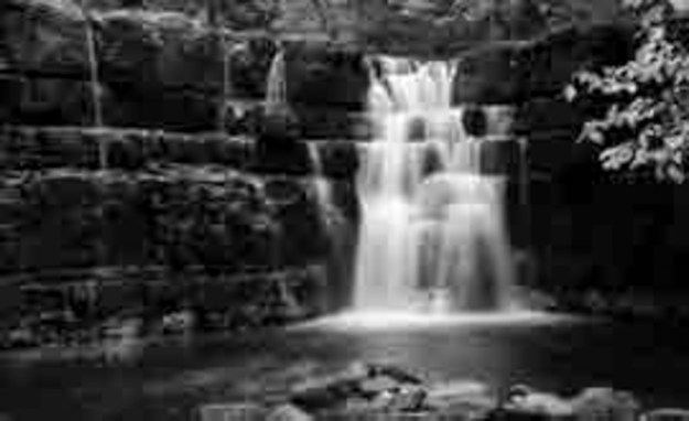
I selected the above photographs to try to validate my interpretation of pixels as an aesthetic. The first is from Exercise 1.4, a neon sign in my home town. The second is a waterfall I shot on holiday in North Yorkshire recently. In the Photo 1, the lines and squares in the image are softened by the pixellation, but the sign is still readable. The sky, which was fairly neutral now has texture akin to daubs of paint one might find in an impressionist painting. The problem for me is that the effect is wasted on this image as there is no drama in the subject. When reviewing Photo 2, the subject has drama in the long exposure of the water falling over the rocks. The rocks themselves are a structure of blocks owing to many years of erosion. The pixellation of the image applies some order to a naturally disordered scene, which has a similar effect on me as the 911 photo by Ruff.
When I think of the Capa example in Campany’s review (Photo 3), the subject is greatly enhanced by the visual effect of blur, but the drama is already in the frame – imagine how it would have looked had the darkroom assistant not hurried the film’s development.
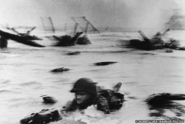
Photo 3 – © Robert Capa
Like all aspects of art and in particular photography, the aesthetic is subjective. I like what I’ve seen of Ruff’s work, but believe it to be an approach that emphasises the need to relate to the subject and composition of the frame.
