
The Brief
Take three or four photographs in which a single point is placed in different parts of the frame. When composing the shots use these three rules: the place of the point shouldn’t be too obvious (such as right in the middle); the composition should hold visual tension and be balanced (the golden section or rule of thirds) and the point should be easy to see. Evaluate the shots according to these rules and select which one you think works best.
Then take a few more shots without any rules, just being aware of the relationship of the point to the frame. Without the rules, how can you evaluate the shots?
Initial Thoughts and Research
When first looking at this exercise, I thought yes, I know about the rule of thirds. It was one of the first things I learned when I first picked up my digital camera in 2010 as a way of taking photographs that looked better than my previous ‘snaps’. The concept of dividing the frame into a 3×3 grid and placing the subject on one of the intersections, made sense and certainly meant for a more appealing image than a subject dominating the centre of a frame.
What was perhaps not as obvious was the concept of holding tension in a photograph. This is the approach of making the viewer see the elements that make up the image by leading them around the frame. Sounds easy enough, but the viewer has the ability to conclude at a glance what the photograph is about, naturally gravitates to the sharpest object first, followed by anything that the brain instantly recognises. A good example of the latter is when the sun or moon are recognisable in the frame; even if out of focus, we cannot help but look at them. If a photograph is composed in such a way that the viewer can quickly assess and, in some cases dismiss the rest of the image, it doesn’t matter how good the photograph is technically. However, if the image is ‘designed’ to grab the viewer’s attention, we have a stand out image. We can achieve visual tension by utilising techniques such as the rule of thirds, but also leading lines, contrast, tone/colour etc. A good example of visual tension can be seen below by Henri Cartier-Bresson.
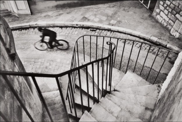
Henri Cartier-Bresson’s Man Cycling Down the Street, 1932
When I look at this image, my eye is drawn to the end of the railing going into the frame as it is sharp. I then find myself drawing back to the steps and then following the curve of them down to the street where I find the subject of the photograph, the cyclist. Although he is not in focus, the fact that he is slightly blurred gives the sense of movement. Bresson adopted a predatory style in approaching a photograph, in this case positioning himself at the top of the stairs, composing the static elements of the composition and waiting to ‘trap life’ when the cyclist appeared [2].
I’m fortunate enough to own an edition print of the photograph by Frank Habicht, from his series Permissive London, which hangs in my bedroom. When thinking about visual tension, I looked at this picture again with the rule of thirds in mind.
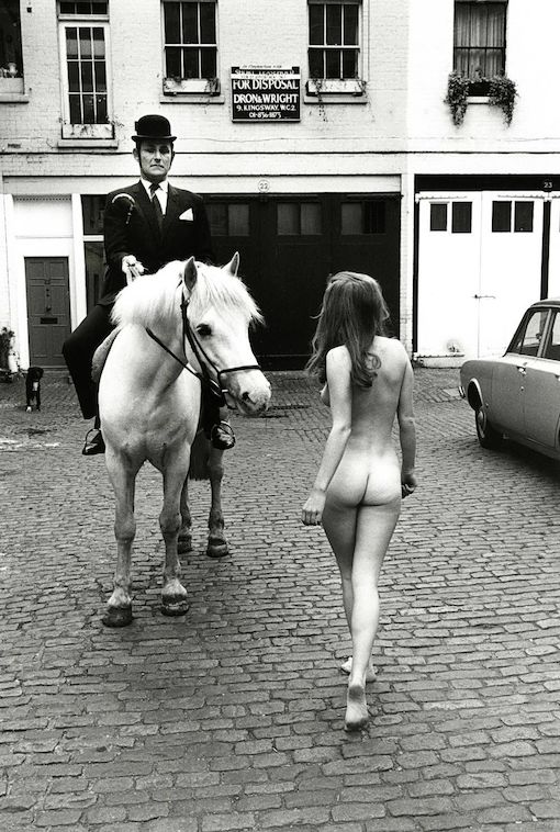
Bare Essentials, Frank Habicht 1969. From the collection ‘London Permissive Sixties’
When I look at this photograph, I’m obviously drawn to the two subjects, the nude girl and the horse and rider. They are placed on the grid of thirds and loosely where the grid intersects. The image is a humorous composition, with the horse looking at the girl while the seemingly stiff city gentleman on its back disapproves of her and her lack of clothes [3]. What interested me in viewing this image again though, was the surroundings. The subjects are not particularly picked out from the background, so the photographer has included just enough detail to describe the setting the two subjects find themselves in, but not cluttering with the unnecessary. In my research [1], I noted the jarring effect of placing the subject too close to the edge of the frame. True, in this case we are directed to look at the subjects in the ‘thirds’, but the fairly sharp background elements achieve a balance that to me, prevents that uncomfortable view. The building’s windows and the car are on the edge of the frame and the chained dog, close to. However, they add to the visual setting and don’t distract from the main subjects. I believe this is largely down to the visual impact of the contrasting subjects and their positions in the photograph, but the clever use of background in this case keeps the eye on the photograph, which creates the visual tension. I prepared to explore the position of ‘other elements’ in my photographs of point subjects.
My Photographs
-
- Photo 1
-
- Photo 2
-

- Photo 3
-

- Photo 4

Evaluation
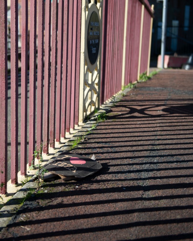
Photo 1
This image was trying to show the clash between the historical bridge and the discarded pizza box, despite the latter blending in to some extent with a colour matching the railings. Placing the box in the lower left and the shadow from the ornate railing on the tarmac on the right, I think there is interest in the image. I aimed to reduce the impact of the distant railing and signpost by shooting wide open at f2.8. On reflection, I could keep the attention on the subjects by moving back and shooting a longer focal length to increase the bokeh and shorten the depth of the image.
Photo 2
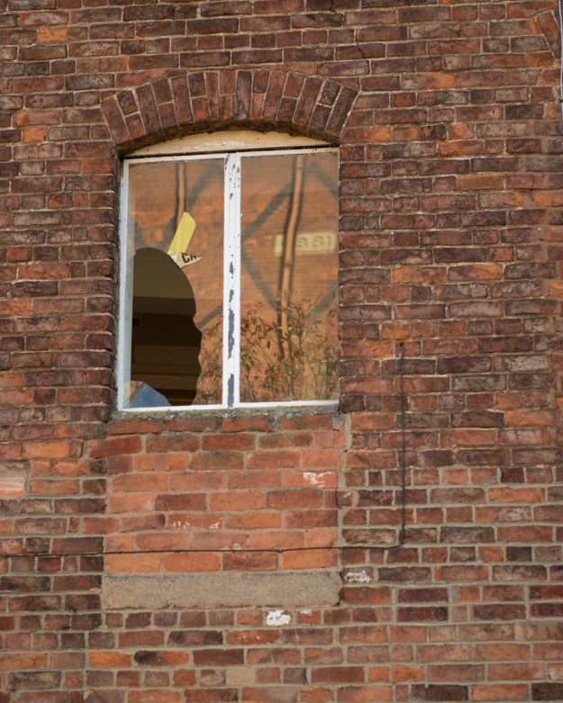
The point that leapt out was the remains of the caution tape on a broken window. The tape is apparently made redundant by the extent of the broken window. I liked the contrast in colour to the rest of the brick wall. The reflection of the building opposite in the window glass isn’t a problem, but may be a little distracting from the point itself.
Photo 3
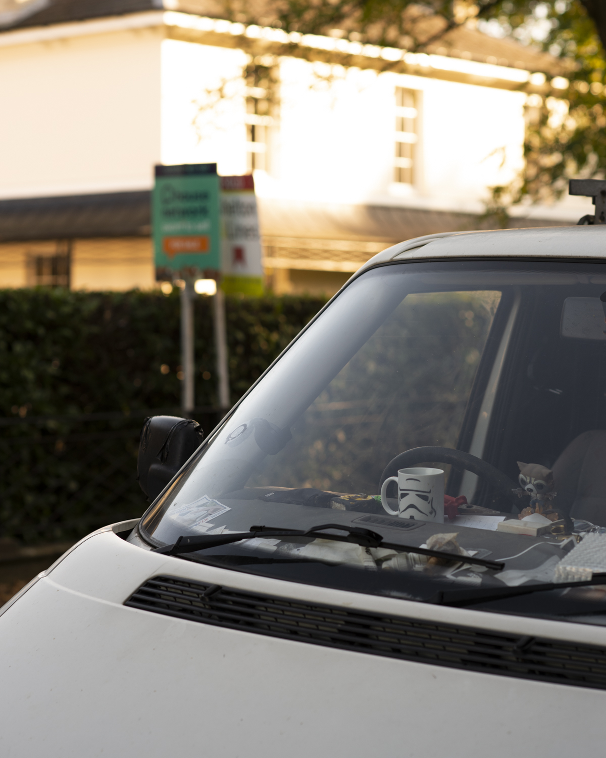
The mug on the dashboard struck me as I passed the van. I think the image creates a story as it’s clearly a workman’s van with messy dashboard and the house behind is for sale. Is the van part of it? Occupants moving in or out? I put them on diagonally opposing thirds to use more of the frame. What was a challenge with this image was exposure. I used spot metering on the mug itself, which overexposed the highlights on the house. I think the image works, though and as with Photo 1, I was drawn to the common colours in the image; white in this case.
Photo 4
This macro photograph of a spider in one of the trees in my garden is an example of creating an interesting composition using cropping. The spider was very industrious and maintaining the focus on it was a challenge. When I reviewed the images, I realised that I had a shot with the spider’s spinneret in sharp focus which was in the same plane as one of its legs, balancing on the web. I placed the spinneret in the top right intersection of the thirds to create the interest. The spider itself is on the edge of the frame, but as it’s out of focus there is no real distraction. What I learned from editing this ‘accidental’ shot was that a square crop can create an image that maximises the use of the space in the frame when the rule of thirds is applied. The original to this photograph had space to the left of the web that was wasted. I’m really happy with how this turned out.
Breaking the Rules
The second part of the exercise was to shoot without rules, but being aware of the relationships between the point and the rest of the frame. I shot the following photographs:
-

- Photo 5

-

- Photo 6

-
- Photo 7

-
- Photo 8
Review – How I evaluate them
Photo 5
I positioned the sign near the lower edge of the frame and waited for some customers to come out. With a low shutter speed of 1/13th at f8 (camera braced against the wall), I managed to get movement in the people. While not obeying the rule of thirds, I think this image is still balanced as the alleyway to the shop and it’s straight, brightly coloured roof provide a frame to the photograph. The sign itself is angled away from the camera toward the people coming out of the doorway, so making best use of the space within the frame. The light from the uncovered part of the alleyway in front of the shop highlights the secondary subject, while the sign has sufficient contrast to stand out while in shadow.
Photo 6
The in this photo appears to be huge in the frame, but the point of focus is the logo on the side of the mug. I’ve tried to balance the rest of the image with enough detail to show that it is a table in a cafe, but with sufficient separation of the subject from the background using aperture of f8. For me it works technically, but on a creative level the dominance mug is distracting and masks detail like the coffee stains on it’s surface and the crumbs on the table. In retrospect, a less bold tone for the mug may have worked better in this composition as long as there was still enough contrast with the logo to bring out the ‘point’
Photo 7
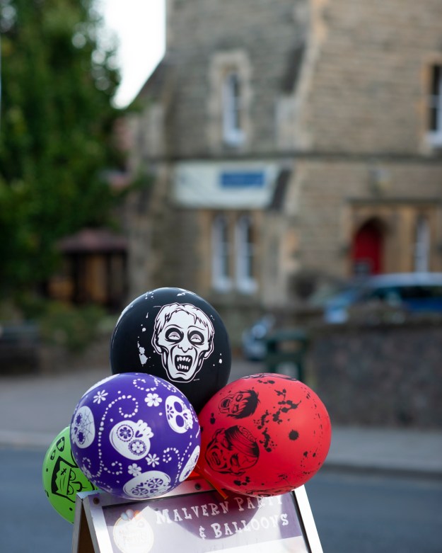
The position of the point in this image is a little confusing as it the balloon face is surrounded by other balloons and the sign it’s mounted on. It is balanced by the chapel building behind while maintaining the contrast between church and halloween, but it subconsciously obeys the rule of thirds. In evaluating it, the image jars slightly by having the subject at the edge of the frame, but is offset by the other details. I shot another of the same subject lower in the frame and it instantly became visually difficult.
Photo 8
I shot this picture to deliberately clash two composition rules, just to see the effect. As well as the rule of thirds, which the point does not fit within, I composed with the rule of symmetry in mind. The image instantly has a problem because the symmetry of the railings is clear and the sign is in the centre. Coupled with it being close to the top of the frame, this image is visually difficult.
Conclusions
My main conclusion from this exercise is that while technically it is good to have rules to follow to get a ‘nice’ photograph, creatively it is more important to place the subject or point in a balanced frame. As long as there is some form of relationship between the subject and the other elements in the photo, the rules can be broken effectively. Placing subjects without visual tension too close to the frame or amongst clutter doesn’t work as well as drawing out the relationship and using the background to enhance the picture’s context as in Bare Essentials. When reflecting on my own photographs here, the first four were easy, where the second four took more effort in trying to make work creatively, with very mixed results.
I also learned that even if the in-camera composition doesn’t work, a good crop can bring a photograph into balance. With Photo 4, my uncooperative subject and relative inexperience with a macro lens meant that cropping was the only way to achieve the image that I wanted; I’m happy with how that photograph looks.
References
[1] Photography Composition- Creating Visual Tension with 2 Subjects, Joshua Cripps, 2015, Youtube media, https://www.youtube.com/watch?v=v-G3Yrupg0Y
[2] Henri Cartier-Bresson Most Important Art, Analysis piece, TheArtStory.org, https://www.theartstory.org/artist-cartier-bresson-henri-artworks.htm
[3] Frank Habicht Bio, Huxley Parlour Gallery website, https://huxleyparlour.com/artists/frank-habicht/
